Commons:Photography critiques/October 2007
 | This is an archive of past discussions. Do not edit the contents of this page. If you wish to start a new discussion or revive an old one, please do so on the current talk page. |
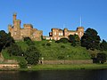
Inverness Castle
-
 processed
 -
 unprocessed, slight tele
 -
 full wide angle


Comment by creator: having adjusted the brightness and converted the perspective to an architecural projection, what else could be said here? -- Klaus with K 15:27, 27 September 2007 (UTC)
- From a image quality standpoint there is alot of noise in the water, the grass is unsharp, and there is CA. I am not knowledgeable enough to comment on the perspective though. --Digon3 talk 15:08, 1 October 2007 (UTC)
- Thank you, Digon. I am including two original photos out-of-camera, unprocessed, do they show the same shortcomings? What about sharpness (I use LowSharpening to avoid oversharpening artefacts), sometimes images are sharp on the left and unsharp on the right. Apart from the flowing water, one does not get much better photography conditions than this. Should the repair folks look once again at my A95? -- Klaus with K 14:41, 2 October 2007 (UTC)
- Yes, both of the others show the same shortcomings. As for the lack of sharpness, it is most noticable on the grass and is the same from left to right. The noise in the water might be caused by underexposure. --Digon3 talk 16:01, 2 October 2007 (UTC)
- Thank you, Digon. I am including two original photos out-of-camera, unprocessed, do they show the same shortcomings? What about sharpness (I use LowSharpening to avoid oversharpening artefacts), sometimes images are sharp on the left and unsharp on the right. Apart from the flowing water, one does not get much better photography conditions than this. Should the repair folks look once again at my A95? -- Klaus with K 14:41, 2 October 2007 (UTC)
Yusupovsky Garden in Saint Petersburg
.jpg)
- Moved here from Commons:Quality_images_candidates --Tony Wills 10:15, 9 October 2007 (UTC)
Yusupovsky Garden in Saint Petersburg -- Sergey kudryavtsev 06:43, 4 October 2007 (UTC)
 Info The photograph intended for article about old park of Saint Petersburg. -- Sergey kudryavtsev 06:43, 4 October 2007 (UTC)
- Info material related to QIC archived --Tony Wills 10:15, 9 October 2007 (UTC)
- Slight counterclockwise tilt; strong fringing that is especially evident on the leafs in the top left; unsharpnes (which look like shake, which it is not, regarding that the exposure time was 1/500th of a second). --Florian Prischl 12:35, 5 October 2007 (UTC)
 Question What is "string fringing"? I don't understand this term. This is color abberations on the leafs? -- Sergey kudryavtsev 13:37, 5 October 2007 (UTC)
- Please excuse me, that was a typo. It should have read: "strong fringing". I corrected the typo in the original text also. --Florian Prischl 13:45, 5 October 2007 (UTC)
- This seems as second colored edge. Through what this is happened? And how i can fix this fringing? -- Sergey kudryavtsev 06:38, 8 October 2007 (UTC)
- Please excuse me, that was a typo. It should have read: "strong fringing". I corrected the typo in the original text also. --Florian Prischl 13:45, 5 October 2007 (UTC)
- The fringing is en:Chromatic_aberration caused by the lens and is usually seen as green and purple fringing, the wikipedia article might help. I do not think the fringing on the tree is important. --Tony Wills 11:11, 9 October 2007 (UTC)
- I consider this fringing is not critical too. Especially in terms using the image in Wikipedia. But i want prevent it in future. Are you know how? -- Sergey kudryavtsev 13:15, 9 October 2007 (UTC)
- The image is not very sharp, it might be improved a little if the image has taken in a higher quality mode (on my Olympus "SHQ" (super high quality) resolution gives the least compression, producing bigger files (1 to 2 megabytes) but better detail). --Tony Wills 11:11, 9 October 2007 (UTC)
- A poor sharpness is a result of tripod's absence. ;-) I taken this image from hands at SHQ mode. -- Sergey kudryavtsev 13:15, 9 October 2007 (UTC)
- In terms of composition, I would probably crop the top off (removing 350 to 400 pixels of sky). --Tony Wills 11:11, 9 October 2007 (UTC)
- I want keep 3:2 aspect ratio (due to popular in Russia 15x10cm paper format). -- Sergey kudryavtsev 13:15, 9 October 2007 (UTC)
September
Mozes en Aaronkerk.jpg
-
 old version
 -
 new version


Comment by creator: There seems to be some kind of perspective distortion, it looks like the two towers are not parallel, doesn't it? I have access to photoshop but I don't know how to fix it. Bottom corners are unsharp, I think it is the lens. Any comments are welcome. S Sepp 23:12, 17 September 2007 (UTC)
- There are probably better ways to fix this, but here's one imprecise way. Select the entire image, then go Edit > Transform > Skew and play with it. Thegreenj 23:57, 18 September 2007 (UTC)
- Unsharp corners in photos are often by design of the lense. The slanting lines are a perspective effect when one does not hold the camera horizontally. Some people prefer an architectural projection where verticals remain vertical in the photo. For that I would use "hugin", a blending program that can also remap one single photo with a virtual lense pointing horizontally. And you could correct barrel distortion with hugin as well, all in one go. -- Klaus with K 10:32, 24 September 2007 (UTC)
- Thank you both. I made a new version using hugin. It is a bit hard to use. I think the new version is an improvement. S Sepp 18:43, 6 October 2007 (UTC)
- Unsharp corners in photos are often by design of the lense. The slanting lines are a perspective effect when one does not hold the camera horizontally. Some people prefer an architectural projection where verticals remain vertical in the photo. For that I would use "hugin", a blending program that can also remap one single photo with a virtual lense pointing horizontally. And you could correct barrel distortion with hugin as well, all in one go. -- Klaus with K 10:32, 24 September 2007 (UTC)
Claremont lake again

![]() Info Another odd shot from me, probably a bit obvious for an attempt at abstraction. It seems to work in some ways, the contrast seems ok to me, but it still seems not quite right. I wonder if someone can identify why? The colour image was unappealing so I went back to my old B&W ways. The post processing is: convert to B&W, a little sharpening, darktones emphasized in 'brightness' (very basic nikon app). There is no crop, perhaps there should be? Very early in the morning, not much DOF. If someone would be kind enough to give some pointers, I can shoot it again and reupload. I'm still finding my way with the new camera and technology, I believe the help I have received already will advance my contributions. Others can learn from my mistakes too. Ta. Cygnis insignis 17:23, 16 October 2007 (UTC)
Info Another odd shot from me, probably a bit obvious for an attempt at abstraction. It seems to work in some ways, the contrast seems ok to me, but it still seems not quite right. I wonder if someone can identify why? The colour image was unappealing so I went back to my old B&W ways. The post processing is: convert to B&W, a little sharpening, darktones emphasized in 'brightness' (very basic nikon app). There is no crop, perhaps there should be? Very early in the morning, not much DOF. If someone would be kind enough to give some pointers, I can shoot it again and reupload. I'm still finding my way with the new camera and technology, I believe the help I have received already will advance my contributions. Others can learn from my mistakes too. Ta. Cygnis insignis 17:23, 16 October 2007 (UTC)
- (disclaimer: This is an amateur's opinion) The thing that stands out most to me is the asymmetry in cropping at the top and bottom. Above the tree there is a lot of space, but under the reflection there is almost no space at all (too little). I think there should be more space under the reflection, and perhaps the amount of space at the top should match the amount at the bottom, to preserve the symmetry of the composition. S Sepp 17:58, 18 October 2007 (UTC)
Cloning - first attempts
-
 Original
 -
 Attempt to remove shaft and lumps of ice by cloning in GIMP
 -
 Quick cloning sample by Thegreenj


![]() Info I have had my first experiences with cloning in GIMP, and would like some feedback on the result. I started out using a large 15 px circle working at 200% zoom with no opacity and then had a few iterations with smaller brushes and more transparency. My largest concern is the area around the blue rope, which I cannot figure out how to do best. I realize the photo can be improved in other ways. What is the recommended sequence of corrections? First clone, then sharpen, then level and colour adjustment, then crop, then perhaps downsample a little to reduce noise?? I feel tempted to remove the rope as well, but would that not be too large a manipulation? -- Slaunger 07:30, 14 October 2007 (UTC)
Info I have had my first experiences with cloning in GIMP, and would like some feedback on the result. I started out using a large 15 px circle working at 200% zoom with no opacity and then had a few iterations with smaller brushes and more transparency. My largest concern is the area around the blue rope, which I cannot figure out how to do best. I realize the photo can be improved in other ways. What is the recommended sequence of corrections? First clone, then sharpen, then level and colour adjustment, then crop, then perhaps downsample a little to reduce noise?? I feel tempted to remove the rope as well, but would that not be too large a manipulation? -- Slaunger 07:30, 14 October 2007 (UTC)
- The cloning unfortunately left a sort of water-ish look to the picture. Instead, I would start by cloning out the areas with a 100% opacity 200px, full softness circle, then use progressively smaller circles, though still at 100% opacacy, to clone out the entire region. Afterwards, I would then use ~85-100% opacacy circles to "sample" various parts of the image and give a unique identity to each plank to get rid of any artificial look the original cloning. Finally, where touchup was unescessary, the history brush would help. I always sharpen last. Definitely don't sharpen then downsample; sharpening is very relative to viewing size (hence 2px radius USM looks nasty on the screen but good in small prints) and should be applied after the resizing. Thegreenj 00:59, 15 October 2007 (UTC)
- Hi Thegreenj, Thank you for taking your time. A few questions: Do you really mean that you start out by using a 200px circle (not 20px)? Concerning a softness ciricle; is that what you get if the hard boundary checkbox is left unchecked? OK, I get the point of using a larger opacity. I think I used too large circles for the touch-up with a too low opacity, which gave it the washed-out or smeared look. Thus, I found it hard to keep details in the texture of the planks. I'm afraid I do not understand what you are referring to concerning the use of that history brush. Could you explain that a little bit more thorough?
- I am actually a litlle bit surprised that you recommend sharpening in the last step, but I have seen that recommendation elsewhere too. With my mathematical backround I had expected that the best place to apply an USM is when you have not removed any information yet by downsampling as this AFAIK is a deconvolution technique. Also the USM amplifies the natural noise in the photo, which is quite effectively reduced again in a subsequent downsampling step. I think I'll try to do my own digital darkroom experiment to see what is actually the difference. I may learn there that I can forget about the math. Our that my math arguments are wrong...
- I uploaded a very hasty edit. Naturally, if you have more time, I'm sure more texture could be preserved with not as heavy-handed editing as I have done. Thegreenj 01:36, 15 October 2007 (UTC)
- Pretty nicely done. So you actually think it would be OK to remove the rope in this case (if cearly stated in the image page)? It gives the impression that the dog is free to wander where it likes (which is quite riksy as loose dogs tend to get shot on the location of the photo). -- Slaunger 06:33, 16 October 2007 (UTC)
- Yes, I'd say do whatever you want to do, just state it clearly in the description page. Of course, if it is misleading, you might want to leave it out. I'm not using the GIMP - I have an ancient copy of Photoshop v.5, which is why my photos are EXIF-less. In Photoshop, I have a brush option that allows me to select radius and hardness. Full softness, or hardness 0 means that the brush looks like this-
 -with the effect blended with the picture everywhere, at a varying degree, except the very middle. And, yes, I used a 200 px brush. Actually, on second though, you probably want to use a slightly smaller brush ~75-100px, but if you go too small, you end up destroying textures that need to stay together in order to look natural. Later, clone out the details (knots, darkened spots, cracks, etc) that make the planks of wood unique to keep it from looking too obvious. For the history brush-do you have one? Basically, it undos any edits you have made since a specified edit, but only in the area of the brush. Since you probably have cloned more than you needed to by the end of edit, you can use the history brush to undo unessesary cloning - the least modification to the image, the better, IMO - less room for mistakes. That's all the history brush is about. If you don't have it, you can do the exact same thing by duplicating the image onto itself, then editing on the upper layer, then using the eraser like the history brush. OK- this is the part where I'm-not-the-right-person-to-ask-but-if-I-understand-it-correctly... I'm not sure what the sharpening first is about. I have no claim to understanding deconvolution/convolution. From what I gather in the WP article, you're saying that downsampling is recovering parts of the image that have been convoluted(?) by noise??? Downsampling only reduces apparent noise. You said that you would want to use USM before information is removed from the photograph, but USM doesn't actually add any information; it only increases contrast on a pixel-to-pixel basis. By downsampling, you are averaging groups of pixels into new pixels, which causes outliers like pixel-to-pixel noise, and also that added contrast, to disappear. Really, don't trust me on that part though. Thegreenj 21:46, 16 October 2007 (UTC)
- Ok, we are using different tools. That explains why I was a bit confused regarding terminology, but-I-guess-I-got-what-you-mean-anyway. Concerning USM and downsampling, I'll will not try to make more clever remarks on that, cuz', honestly; I have not really tried to investigate and understand what happens during an USM. But for sure you are right it does not add information which isn't there. -- Slaunger 23:18, 16 October 2007 (UTC)
Just because something can be done does not mean it should be done. This especially goes for cloning in pictures for encyclopedia use. I know that this kind of postprocessing is fun, needs skills, and is sort of a rewarding accomplishment. But I'd rather suggest checking out Photoshop Friday if you want bring your newly acquired skills to use. No offense. --Dschwen 22:11, 16 October 2007 (UTC)
- He, he. Point taken and I'm not offended. I would say though that removing stuff like the distracting shaft in the BG can't do any harm as it distracts from the subject and has no relevance whatsoever for the subject, right? With the lumps of ice, we are in a grey zone, as the dog in principle interacts with those and uses them to play around. And when it comes to the rope we have probably gone too far as here we begin to really manipulate with reality. But in any case it should of course always be clearly stated in the image page and the original should be available as well as other version. -- Slaunger 23:18, 16 October 2007 (UTC)
Wildflower pictures
-

-

-
 Lotus species


![]() Info These are some pictures of wildflowers that grow in my area. The pictures are all macro photos. Siddharth Patil 21:03, 21 October 2007 (UTC)
Info These are some pictures of wildflowers that grow in my area. The pictures are all macro photos. Siddharth Patil 21:03, 21 October 2007 (UTC)
- The first picture could use a tighter crop to put more emphasis on the flower, a closer shot would have been great if possible. Good colors.
- The clover picture is my favorite though I see two problems with it. First the top is a bit overexposed (see the "ghosts" around the flower edges?) and secondly there's an blurry blade of grass in front of it. This is close to Quality Image status.
- In the last picture neither the closest flower or the fly is in focus. At 1/640 exposure you could have gone up a couple of f-stops to get more depth of field. Calibas 23:22, 21 October 2007 (UTC)
Abert's squirrel

![]() InfoThe original had the squirrel dead center. I'm asking for a critique because I'd like to hear what people say about the crop, though no doubt I'll learn about other things too. —JerryFriedman 03:02, 14 October 2007 (UTC)
InfoThe original had the squirrel dead center. I'm asking for a critique because I'd like to hear what people say about the crop, though no doubt I'll learn about other things too. —JerryFriedman 03:02, 14 October 2007 (UTC)
![]() Comment It's pretty tough to shoot a moving subject in low light (especially at 300mm), and in this case there is noise and a soft focus. I would have gone to at least ISO 400 and maybe even 800 to get a faster exposure and/or more light. Regarding the composition, I don't think the other tree adds anything. I think it would have been best with some green on the left and without right tree in view. Dori - Talk 03:53, 14 October 2007 (UTC)
Comment It's pretty tough to shoot a moving subject in low light (especially at 300mm), and in this case there is noise and a soft focus. I would have gone to at least ISO 400 and maybe even 800 to get a faster exposure and/or more light. Regarding the composition, I don't think the other tree adds anything. I think it would have been best with some green on the left and without right tree in view. Dori - Talk 03:53, 14 October 2007 (UTC)
- Thank you for the suggestion on ISO!
- I wasn't thinking straight when I uploaded this. Whether everything to the right of the squirrel makes the picture look better or not, all those pixels are not useful for an encyclopedia. And the picture looks fine to me (though a little soft-focus and noisy as you say) when it's cropped much tighter, with the squirrel's chest in the center. (By the way, there's no green available on the left, just an out-of-focus tree trunk in the foreground.) —JerryFriedman 18:53, 14 October 2007 (UTC)
Claremont lake

![]() Info I have been taking a few shots at this lake, I like the way the light plays around the area in the early morning. The species forming a question mark (?) is Cygnus atratus, the black swan. I would welcome any feed back on this. Cygnis insignis 15:05, 12 October 2007 (UTC)
Info I have been taking a few shots at this lake, I like the way the light plays around the area in the early morning. The species forming a question mark (?) is Cygnus atratus, the black swan. I would welcome any feed back on this. Cygnis insignis 15:05, 12 October 2007 (UTC)
 Comment - First, the technical issues: the subject of the picture (the swan) is out of focus. The focus seems to be at the herbs in the foreground. Second, the aesthetycal issues: if the subject is the swam, then the photo should put a better emphasis on it. The swan is too smal and there are too many distracting elements, most specially the out-of-focus tree in the foreground. In my opinion, the swan and the wavelets (and perhaps a few herbs) are enough elements to make a great shot. But the swan should be closer to the camera and in a better position. Alvesgaspar 20:37, 12 October 2007 (UTC)
Tirana from Mt. Dajti

![]() Info What do people think of this view at dusk, showing rampant construction in Tirana, Albania? Dori - Talk 04:04, 10 October 2007 (UTC)
Info What do people think of this view at dusk, showing rampant construction in Tirana, Albania? Dori - Talk 04:04, 10 October 2007 (UTC)
- Comment - It is not easy to shoot good photos at this time of day due to the lack of light. The quality of this one is very poor not only because of underexposure but also due to heavy artifacts and blurriness. Under these conditions it is important to ask from the camera everything it can get: maximum resolution (raw mode if possible), raw mode and a correct exposure choice. In this case, a tripode and a higher F number would make the picture a little better. Finally, the composition is a little boring due to excessive symmetry and the absence of a good foreground. The existing one is not interesting enough. - Alvesgaspar 20:52, 12 October 2007 (UTC)
- Thanks for the review. I really wish I'd brought my small tripod with me. There was also lots of dust and smog in the air as it hadn't rained in a long time. This is the best I could get it to technically, but I thought the mood was still pretty good (the detail dissapearing into the dust). Dori - Talk 03:51, 14 October 2007 (UTC)