Commons:Quality images candidates/Archives August 01 2014
-

- Nomination Czechoslovakia monument at Brookwood Czechoslovakia Military Cemetery, Brookwood Cemetery --Lewis Hulbert 18:40, 29 July 2014 (UTC)
- Promotion
 Support ok --Cccefalon 19:22, 29 July 2014 (UTC)
-

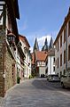
- Nomination Hudiksvall habour. In the background, Hudiksvall kyrka (church). --ArildV 18:35, 29 July 2014 (UTC)
- Promotion Good quality. --Lewis Hulbert 18:49, 29 July 2014 (UTC)
Please, remove the 2 dust spots on the left Poco a poco 18:50, 29 July 2014 (UTC) Done Thank you. --ArildV 19:13, 29 July 2014 (UTC)
-

-

- Nomination View of Alicante, Spain --Poco a poco 17:58, 29 July 2014 (UTC)
- Promotion Support QI for me --Halavar 18:15, 29 July 2014 (UTC)
-

- Nomination Balcón del Mediterráneo, Benidorm, Spain --Poco a poco 17:58, 29 July 2014 (UTC)
- Promotion Support QI for me --Halavar 18:15, 29 July 2014 (UTC)
-

- Nomination View of Benidorm, Spain --Poco a poco 17:58, 29 July 2014 (UTC)
- Promotion Excellent.--ArildV 18:39, 29 July 2014 (UTC)
-

- Nomination General University Hospital of Alicante, Spain --Poco a poco 17:58, 29 July 2014 (UTC)
- Promotion Good quality. --Cccefalon 19:26, 29 July 2014 (UTC)
-

- Nomination Benidorm Island, Spain --Poco a poco 17:58, 29 July 2014 (UTC)
- Promotion Some dust spots in the sky, but beside that good quality. --Cccefalon 19:30, 29 July 2014 (UTC) Fixed Poco a poco 19:45, 29 July 2014 (UTC)
Good quality. --Cccefalon 20:26, 29 July 2014 (UTC)
-

- Nomination Alicante town hall, Spain --Poco a poco 17:58, 29 July 2014 (UTC)
- Promotion Good quality. --Cccefalon 19:28, 29 July 2014 (UTC)
-

- Nomination Hahnbaum, Esplanade, Bad Ischl, Upper Austria --P e z i 17:57, 29 July 2014 (UTC)
- Promotion Good quality. --Poco a poco 18:44, 29 July 2014 (UTC)
-

- Nomination 3 Market Square in Lądek-Zdrój 01 --Jacek Halicki 17:33, 29 July 2014 (UTC)
- Promotion Good quality. --P e z i 18:24, 29 July 2014 (UTC)
-

- Nomination 3 Market Square in Lądek-Zdrój 02 --Jacek Halicki 17:33, 29 July 2014 (UTC)
- Promotion Good quality. --P e z i 18:24, 29 July 2014 (UTC)
-

- Nomination 3 Market Square in Lądek-Zdrój 03 --Jacek Halicki 17:33, 29 July 2014 (UTC)
- Promotion Good quality. --P e z i 18:24, 29 July 2014 (UTC)
-

- Nomination 3 Market Square in Lądek-Zdrój 04 --Jacek Halicki 17:33, 29 July 2014 (UTC)
- Promotion Good quality. --Cccefalon 19:33, 29 July 2014 (UTC)
-
- Nomination 3 Market Square in Lądek-Zdrój 05 --Jacek Halicki 17:33, 29 July 2014 (UTC)
- Promotion Good quality. --Cccefalon 19:33, 29 July 2014 (UTC)
-

- Nomination 3 Market Square in Lądek-Zdrój 06 --Jacek Halicki 17:33, 29 July 2014 (UTC)
- Promotion Not brilliant, but good for QI --Cccefalon 19:33, 29 July 2014 (UTC)
-

- Nomination 3 Market Square in Lądek-Zdrój 07 --Jacek Halicki 17:33, 29 July 2014 (UTC)
- Promotion Ok --Poco a poco 18:44, 29 July 2014 (UTC)
-
- Nomination Bruges, Belgium: Statue of Jan Breydel and Pieter de Coninck on the Grote Markt --Cccefalon 17:10, 29 July 2014 (UTC)
- Promotion Good quality. --Jacek Halicki 17:36, 29 July 2014 (UTC)
-

- Nomination Town hall of Bruges, Belgium --Cccefalon 17:10, 29 July 2014 (UTC)
- Promotion Good quality. --Jacek Halicki 17:36, 29 July 2014 (UTC)
-

- Nomination Door sign of "De Halve Maan brewery" in Bruges, Belgium --Cccefalon 17:10, 29 July 2014 (UTC)
- Promotion Good quality. --Jacek Halicki 17:36, 29 July 2014 (UTC)
-

- Nomination Stained glass window in Saints James and Agnes Basilica in Nysa --Jacek Halicki 16:59, 29 July 2014 (UTC)
- Promotion Good quality. --Cccefalon 19:42, 29 July 2014 (UTC)
-
- Nomination Reckart Mill, a historic grist mill. --Generic1139 16:44, 29 July 2014 (UTC)
- Promotion Support QI for me --Halavar 17:01, 29 July 2014 (UTC)
-

- Nomination Nigel Farage, Member of the European Parliament for the United Kingdom in Strasbourg, France. By User:Diliff --Lewis Hulbert 16:01, 29 July 2014 (UTC)
- Promotion Good quality. --XRay 16:22, 29 July 2014 (UTC)
-

- Nomination Visitor center National Park De Alde Feanen. Coreopsis in the butterfly garden.
Famberhorst 15:33, 29 July 2014 (UTC) - Promotion Good quality. --XRay 16:17, 29 July 2014 (UTC)
- Nomination Visitor center National Park De Alde Feanen. Coreopsis in the butterfly garden.
-

- Nomination Ruins of Zanaana Mosque, Golconda Fort, India --Bgag 13:03, 29 July 2014 (UTC) Support I think: Good quality
Famberhorst 15:39, 29 July 2014 (UTC) - Promotion
- Nomination Ruins of Zanaana Mosque, Golconda Fort, India --Bgag 13:03, 29 July 2014 (UTC)
-

-

-

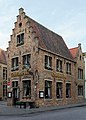
- Nomination Storage building in Kuggörarna, a small fishing villages in Hudiksvall municipality (Sweden). --ArildV 11:52, 29 July 2014 (UTC)
- Promotion
 Comment Small overexposed parts. I left notes. Otherwise QI. --Halavar 12:01, 29 July 2014 (UTC) Support Some small parts at the building are clipping, but not disturbing as there is no false colours for that reason. --Smial 12:29, 29 July 2014 (UTC)
-

-
-

- Nomination Kuggörarnas kapell (chapell) in the small fishing villages of Kuggörarna, Hudiksvall municipality (Sweden). --ArildV 09:53, 29 July 2014 (UTC)
- Promotion Support Good photograph. --Bob Collowân 10:56, 29 July 2014 (UTC)
-

- Nomination View from Kuggörarna, a small fishing villages in Hudiksvall municipality (Sweden). --ArildV 09:53, 29 July 2014 (UTC)
- Promotion Good quality. --Ralf Roletschek 10:13, 29 July 2014 (UTC)
-

- Nomination inside LEO Express train in Prague main station --Ralf Roletschek 09:47, 29 July 2014 (UTC)
- Decline Photo is blurred. I guess due to short exposure time and train vibrations. --Tuxyso 11:23, 29 July 2014 (UTC)
-

- Nomination Ponte Moro in Venice --Archaeodontosaurus 09:44, 29 July 2014 (UTC)
- Promotion Support Good quality --Halavar 10:32, 29 July 2014 (UTC)
-

- Nomination Sculpture below the pulpit of Sint-Salvatorskathedraal, Bruges, Belgium --Cccefalon 09:33, 29 July 2014 (UTC)
- Promotion Good quality. --Poco a poco 18:50, 29 July 2014 (UTC)
-
-

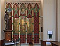
- Nomination Altar in the choir of Sint-Salvatorskathedraal (Bruges, Belgium) --Cccefalon 09:33, 29 July 2014 (UTC)
- Promotion Good quality. --Ralf Roletschek 10:13, 29 July 2014 (UTC)
-

- Nomination Bruges, Belgium: Organ of Sint-Salvatorskathedraal --Cccefalon 09:33, 29 July 2014 (UTC)
- Decline Important parts at the organ and on the upper wall are clearly burnt out. IMHO not fixable because it is still perfect dark gray (rgb (x,x,x) values) due to highlight correction. --Tuxyso 11:28, 29 July 2014 (UTC)
Comment Tja, es scheint nahezu unmöglich zu sein, Innenaufnahmen von Kirchen als QI hinzukriegen, ohne auf HDR zurückzugreifen. --Cccefalon 12:26, 29 July 2014 (UTC)
Ja, so ist es leider. Eine Möglichkeit wäre vielleicht gewesen mit einem Blitz die Helligkeitsunterschiede etwas zu kompensieren oder die Aufnahme am Abend zu machen, wenn keine Sonne in die Kirche scheint. --Tuxyso 12:40, 29 July 2014 (UTC)
Ich hab mir so was schon gedacht, als ich die Aufnahme gemacht habe. Trotzdem "Danke" für die Bewertung; ist ja auch nicht Deine schuld, dass das Licht nicht passt :) --Cccefalon 14:33, 29 July 2014 (UTC)
-

- Nomination ticket automat in Olomouc --Ralf Roletschek 09:23, 29 July 2014 (UTC)
- Promotion Support Good quality --Halavar 09:29, 29 July 2014 (UTC)
A "nomination ticket automat" - wow, new technology for QIC! --Cccefalon 09:39, 29 July 2014 (UTC)
-
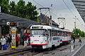
- Nomination Tatra Tram in Olomouc --Ralf Roletschek 09:23, 29 July 2014 (UTC)
- Promotion Rainy and QI. --Tuxyso 11:34, 29 July 2014 (UTC)
-
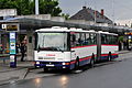
- Nomination Karosa Bus in Olomouc --Ralf Roletschek 09:23, 29 July 2014 (UTC)
- Promotion Rainy and QI. --Tuxyso 11:35, 29 July 2014 (UTC)
-

- Nomination Olomouc main station; Skoda Tram --Ralf Roletschek 09:18, 29 July 2014 (UTC)
- Promotion Support Good quality --Halavar 09:37, 29 July 2014 (UTC)
-

- Nomination old gas station in Olomouc --Ralf Roletschek 09:18, 29 July 2014 (UTC)
- Decline Lacks sharpness, sorry --Poco a poco 18:55, 29 July 2014 (UTC)
-
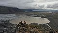
- Nomination View from Skaftafell National Park, Iceland, July 2014 --Martin Falbisoner 08:59, 29 July 2014 (UTC)
- Promotion Good quality. --Lewis Hulbert 17:54, 29 July 2014 (UTC)
-

- Nomination Skógafoss, Iceland, July 2014 --Martin Falbisoner 08:59, 29 July 2014 (UTC)
- Promotion Good quality. --Poco a poco 18:52, 29 July 2014 (UTC)
-
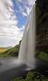
- Nomination Seljalandsfoss, Iceland, July 2014 --Martin Falbisoner 08:59, 29 July 2014 (UTC)
- Promotion Good quality. --Ralf Roletschek 09:20, 29 July 2014 (UTC)
-

- Nomination Seljalandsfoss, Iceland, July 2014 --Martin Falbisoner 08:59, 29 July 2014 (UTC)
- Promotion Good quality. --Ralf Roletschek 09:20, 29 July 2014 (UTC)
-

- Nomination Selfoss, Iceland, July 2014 --Martin Falbisoner 08:59, 29 July 2014 (UTC)
- Promotion Good quality. --Poco a poco 19:00, 29 July 2014 (UTC)
-

- Nomination Old warehouse in Hudiksvall habour. Hudiksvall, Sweden. --ArildV 08:51, 29 July 2014 (UTC)
- Promotion Good quality. --Martin Falbisoner 09:00, 29 July 2014 (UTC)
-

-

-
- Nomination Heppenheim, Kellereigasse --Berthold Werner 06:58, 29 July 2014 (UTC)
- Promotion A tiny bit soft, but still: Good quality. --Martin Falbisoner 09:01, 29 July 2014 (UTC)
-

- Nomination Reading Traim Care Depot. Mattbuck 06:37, 29 July 2014 (UTC)
- Promotion Good quality. --Poco a poco 19:00, 29 July 2014 (UTC)
-
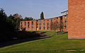
- Nomination Melton Hall. Mattbuck 06:37, 29 July 2014 (UTC)
- Promotion Good quality. --Martin Falbisoner 09:02, 29 July 2014 (UTC)
-
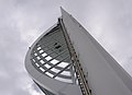
- Nomination The Spinnaker in Portsmouth. Mattbuck 06:37, 29 July 2014 (UTC)
- Promotion Good quality. --Poco a poco 19:00, 29 July 2014 (UTC)
-

- Nomination HMS Victory. Mattbuck 06:37, 29 July 2014 (UTC)
- Decline I am afraid that the focus is wrong (on the street lamp) --Poco a poco 19:00, 29 July 2014 (UTC)
-

-

-

- Nomination Deutzer Brücke, Cologne, North Rhine-Westphalia, Germany --XRay 06:21, 29 July 2014 (UTC)
- Promotion Good quality. --Poco a poco 19:00, 29 July 2014 (UTC)
-

-

- Nomination Entrance door to Gruuthuse Museum in Brugge, belgium --Cccefalon 04:15, 29 July 2014 (UTC)
- Promotion Good quality. --Poco a poco 18:44, 29 July 2014 (UTC)
-
- Nomination Bruges, Belgium: Gruuthuse Hof --Cccefalon 04:15, 29 July 2014 (UTC)
- Promotion Support I think: Good quality.--Famberhorst 07:45, 29 July 2014 (UTC)
-

- Nomination Bruges, Belgium: Sculpture of Virgin Mary in front of Onze-Lieve-Vrouwekerk --Cccefalon 04:15, 29 July 2014 (UTC)
- Promotion Good quality. --Poco a poco 18:55, 29 July 2014 (UTC)
-
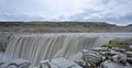
- Nomination Dettifoss, Iceland, July 2014 --Martin Falbisoner 21:49, 28 July 2014 (UTC)
- Promotion Good quality. --undefined 08:59, 29 July 2014 (UTC)
-

- Nomination Gullfoss, Iceland, July 2014 --Martin Falbisoner 21:49, 28 July 2014 (UTC) Comment There are four spots in the sky, easily removed - see notes. This is a dark image, but I suspect that's the way it was? --Generic1139 22:41, 28 July 2014 (UTC)
 Fixed The image is also a tad brighter now - though weather was nasty and dark when I took it --Martin Falbisoner 08:53, 29 July 2014 (UTC)
 - Promotion Good quality --Generic1139 15:21, 29 July 2014 (UTC)
- Nomination Gullfoss, Iceland, July 2014 --Martin Falbisoner 21:49, 28 July 2014 (UTC)
-

- Nomination Hverarönd, Iceland, July 2014 --Martin Falbisoner 21:49, 28 July 2014 (UTC)
- Promotion Good quality. --undefined 08:59, 29 July 2014 (UTC)
-

- Nomination Saint John the Baptist parish church in Pawłowice, Silesia, Poland --Halavar 18:24, 28 July 2014 (UTC)
Church is tilted in ccw direction, too much sky, perspective correction needed (at least on the right) Poco a poco 18:40, 28 July 2014 (UTC) Done Thanks for the hint. I uploaded new version. --Halavar 19:19, 28 July 2014 (UTC) - Promotion Good quality. --Poco a poco 11:46, 29 July 2014 (UTC)
- Nomination Saint John the Baptist parish church in Pawłowice, Silesia, Poland --Halavar 18:24, 28 July 2014 (UTC)
-

- Nomination Manuela Mahnke, german politican --Ralf Roletschek 15:28, 28 July 2014 (UTC)
- Promotion Good quality. --Smial 12:11, 29 July 2014 (UTC)
-

- Nomination Linda Neddermann, german politican --Ralf Roletschek 15:28, 28 July 2014 (UTC)
- Promotion Good quality. --Smial 12:11, 29 July 2014 (UTC)
-

- Nomination Silke Salomon, german politican --Ralf Roletschek 15:26, 28 July 2014 (UTC)
- Promotion Good quality. --Smial 12:11, 29 July 2014 (UTC)
-
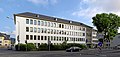
- Nomination Trier, Amts- und Landgericht, Justizstraße --Berthold Werner 08:58, 28 July 2014 (UTC)
Overall good quality; yet right side leaning in. --Cccefalon 09:12, 28 July 2014 (UTC) Done Please check again --Berthold Werner 06:56, 29 July 2014 (UTC)
Good quality. --Cccefalon 08:20, 29 July 2014 (UTC) - Promotion {{{2}}}
- Nomination Trier, Amts- und Landgericht, Justizstraße --Berthold Werner 08:58, 28 July 2014 (UTC)
-

-
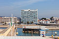
- Nomination Hotel in Coma-ruga. El Vendrell. Tarragona. Catalonia-22 --Lmbuga 03:30, 28 July 2014 (UTC)
- Promotion QI imo --Lewis Hulbert 16:06, 29 July 2014 (UTC)
-

-

-

-

-

- Nomination Keldsnor Lighthouse on the isle of Langeland, Denmark. --Bob Collowân 14:25, 26 July 2014 (UTC)
It is pretty dark and needs a vertical perspective correction (leaning in) Poco a poco 15:00, 26 July 2014 (UTC)
Thank you, I've uploaded a new version, with increased brightness and corrected vertical perspective. --Bob Collowân 21:10, 26 July 2014 (UTC)
Much better, but the house on the left is tilted to the right, either you need a tilt or an additional tilt+perspective Poco a poco 23:30, 26 July 2014 (UTC)
It should be OK now. I tilted it anticlockwise, but then had to make a slight horizontal correction in order to make the edge of the wheat field horizontal, and some more vertical correction to prevent the lighthouse from leaning in. I hope the result is acceptable. --Bob Collowân 20:25, 27 July 2014 (UTC) - Promotion Good quality. --Poco a poco 19:35, 29 July 2014 (UTC)
- Nomination Keldsnor Lighthouse on the isle of Langeland, Denmark. --Bob Collowân 14:25, 26 July 2014 (UTC)
-

- Nomination Arco Quartiere coppedè --Livioandronico2013 21:26, 25 July 2014 (UTC)
Definitely not a QI with that shadowed areas and the perspective distortion. You could save it with a perspective correction and new crop Poco a poco 12:48, 26 July 2014 (UTC)
Done Better? Thanks for review --Livioandronico2013 13:33, 26 July 2014 (UTC)
I'd still crop both sides a bit. Maybe you can also increase sharpening, it is a bit soft. Poco a poco 09:11, 27 July 2014 (UTC) Done Now? Thanks another time for review --Livioandronico2013 09:59, 27 July 2014 (UTC)
The crop is good, but when you sharpen you should use a sharpening mask to avoid sharpening or ares without relieves, e.g. the sky Poco a poco 18:48, 27 July 2014 (UTC) Done and now? I am infinitely grateful for your suggestions :) --Livioandronico2013 19:20, 27 July 2014 (UTC)
I don't understand the last version. You solely changed the color of the sky. I was asking for a sharpening mask applied to the sky so that when you sharpen the sky is not affected, and so avoid noise there due to sharpening Poco a poco 16:50, 28 July 2014 (UTC)
Done Excuse me,I had not realized,see now. Thanks --Livioandronico2013 20:35, 28 July 2014 (UTC)
Far too much sharpening, please, compare the last version with the former one. Poco a poco 13:52, 29 July 2014 (UTC)
Done I think it is fine now, thank you for your patience, I am very grateful --Livioandronico2013 18:38, 29 July 2014 (UTC) - Promotion Ok, let's let it pass --Poco a poco 19:37, 29 July 2014 (UTC)
- Nomination Arco Quartiere coppedè --Livioandronico2013 21:26, 25 July 2014 (UTC)
-

- Nomination Camden Road railway station. Mattbuck 06:57, 24 July 2014 (UTC)
- Promotion Maybe wee UE on the shadows (in such light conditions, it would be expected that the sunny areas would be closer to OE, but I guess it is still QI. --Stegop 20:08, 27 July 2014 (UTC) Done Mattbuck 22:49, 29 July 2014 (UTC)
-

- Nomination Eingangsbauwerk der ehemaligen Margarinefabrik Voss in Hamburg-Barmbek --An-d 20:20, 23 July 2014 (UTC)
Requires perspective correction, seems a little unsharp. --Lewis Hulbert 22:29, 23 July 2014 (UTC)
Hallo Lewis Hulbert better now? --An-d 07:10, 24 July 2014 (UTC) - Promotion QI now --Lewis Hulbert 17:59, 29 July 2014 (UTC)
- Nomination Eingangsbauwerk der ehemaligen Margarinefabrik Voss in Hamburg-Barmbek --An-d 20:20, 23 July 2014 (UTC)
-

-

-
-

-

- Nomination Kłodzka Gate in Paczków --Jacek Halicki 10:34, 22 July 2014 (UTC)
- Decline Big parts of sky are blown out, please have a look at the histogram --Cccefalon 17:02, 29 July 2014 (UTC)
-

- Nomination National Park De Alde Feanen. Location, It Wikelslân. Watery area.
Famberhorst 04:45, 22 July 2014 (UTC) - Promotion Support ok --Cccefalon 17:09, 29 July 2014 (UTC)
- Nomination National Park De Alde Feanen. Location, It Wikelslân. Watery area.
-

- Nomination Saint John the Evangelist church in Paczków 01 --Jacek Halicki 17:53, 21 July 2014 (UTC)
Some ares are burnt (overexposed), can you save it? Btw, I'd appreciate if at the same time that nominate pictures also help out with the reviews of other's contributors. Poco a poco 18:29, 21 July 2014 (UTC) - Decline Done--Jacek Halicki 21:05, 21 July 2014 (UTC)
I am afraid that you cannot save it Poco a poco 20:14, 22 July 2014 (UTC)
Agreed, not fixable. Mattbuck 22:46, 29 July 2014 (UTC)
- Nomination Saint John the Evangelist church in Paczków 01 --Jacek Halicki 17:53, 21 July 2014 (UTC)
-

- Nomination Saint John the Evangelist church in Paczków 03--Jacek Halicki 17:53, 21 July 2014 (UTC)
- Decline Overexposed areas. --Mattbuck 22:46, 29 July 2014 (UTC)
-

- Nomination Italy national roller hockey team, winner at the 2014 CERH Championship in Alcobendas, Spain. --Kadellar 14:33, 21 July 2014 (UTC)
- Promotion Some minor issues (foot crop, more denoising would be great), but it catches a precious moment of frustration and happyness and I consider it as QI in the field of indoor shooting of sport events. --Cccefalon 16:07, 29 July 2014 (UTC)
-

-

- Nomination Lighthouse at Cap Formentor (transformator) --Taxiarchos228 06:02, 21 July 2014 (UTC)
- Decline Needs perspective correction. Person and building edge on the right are distracting. --Kreuzschnabel 05:26, 22 July 2014 (UTC)
you´re right: corrected now, my version is a bit different from your proposition because the white building should be real white --Taxiarchos228 19:23, 24 July 2014 (UTC)
Overexposed area now (see note), colours look oversaturated, contrast too harsh to me --Kreuzschnabel 05:34, 25 July 2014 (UTC)
Per Kreuz. Mattbuck 22:46, 29 July 2014 (UTC)
-

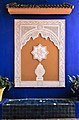
- Nomination Decorative plate, picture by User:Hubertl --Ailura 17:51, 20 July 2014 (UTC)
- Promotion Comment A bit unsharp/soft , perhaps due to jpg-compression. --P e z i 15:35, 26 July 2014 (UTC)
Dust spot needs fixing. Mattbuck 18:56, 27 July 2014 (UTC)
Dust removed--Hubertl 20:07, 28 July 2014 (UTC)
OK. Mattbuck 22:39, 29 July 2014 (UTC)
-

- Nomination A Paris Métro Line 6 train as it crosses the Pont de Bir-Hakeim to reach the rive droite --DXR 10:16, 20 July 2014 (UTC)
Leaning in, a bit dark. Mattbuck 18:56, 27 July 2014 (UTC)
Should be Done, though I'm not 100% sure about the PC, not many obvious straight lines here... --DXR 19:18, 28 July 2014 (UTC) - Promotion OK. Mattbuck 22:39, 29 July 2014 (UTC)
- Nomination A Paris Métro Line 6 train as it crosses the Pont de Bir-Hakeim to reach the rive droite --DXR 10:16, 20 July 2014 (UTC)
-

- Nomination Porte de Versailles (Paris Metro) (by Bellomonte) --Paris 16 05:18, 19 July 2014 (UTC)
- Decline Comment Difficult crop at the right (half person) and on the left (half sign).--XRay 07:34, 24 July 2014 (UTC)
Bad CA. Mattbuck 21:28, 24 July 2014 (UTC) Not done Mattbuck 22:35, 29 July 2014 (UTC)
-
- Nomination Molino Stucky in Venice, Italy -- MJJR 21:06, 7 July 2014 (UTC)
- Promotion Relatively harsh light, but still OK. But take a look on the verticals (see notes). --Tuxyso 21:42, 7 July 2014 (UTC) Done -- MJJR 08:13, 9 July 2014 (UTC)
Left side is leaning in. Mattbuck 21:31, 15 July 2014 (UTC)
Comment It's impossible to correct completely all lens distortions: if one window is straight, another is leaning somewhat... -- MJJR 21:10, 18 July 2014 (UTC) if you don't manage to correct the perspective at left it's certainly a bit tilted on right --Christian Ferrer 22:06, 19 July 2014 (UTC)
You could also distort one corner separately if necessary, though yes, if perspective correction tool isn't fixing it it means the image is tilted. Mattbuck 22:35, 20 July 2014 (UTC) Done New version uploaded -- MJJR 15:05, 28 July 2014 (UTC) Support ok for me --Christian Ferrer 18:51, 29 July 2014 (UTC)


.jpg)


_002.JPG)


_-_H4268.jpg)


Consensual review edit
File:Neo-Riemannian Tonnetz.svg edit

- Nomination The Neo-Riemannian Tonnetz, showing relations between triads --Mate2code 02:03, 13 July 2014 (UTC)
- Promotion
- A useful image, however, the small annotations denoting secondary operations are too small to read except at higher res. Can you make them a larger font, or a darker grey?--Generic1139 12:15, 19 July 2014 (UTC)
- Done The gray letters are now readable on the description page. In my opinion only the letters N, S and H need to be readable from articles, the gray letters are just auxiliary information. Mate2code 12:26, 21 July 2014 (UTC)
- Support --Generic1139 16:08, 21 July 2014 (UTC)
Total: 1 support (excluding the nominator), 0 oppose →  Promoted --Christian Ferrer 05:04, 31 July 2014 (UTC)
File:Burgruine Hohenegg 8666.jpg edit

- Nomination Burgruine Hohenegg, Austria --Hamster28 13:29, 14 July 2014 (UTC)
- Decline Too much softening (fine details in the wall structure are extinguished). Magenta CA bottom right. --Cccefalon 13:34, 14 July 2014 (UTC) Support Sharpness and colours look just right to me. --Stegop 23:30, 17 July 2014 (UTC)
 OpposeThe softened details look nice, like a kind of drawing. Was it intentionally? As an artwork? Then describe it on the description page, and I give a "pro". If not and it should be a "normal" photo, I agree Cccefalon. -- DerFussi 14:35, 21 July 2014 (UTC)
 - Oppose Too processed, perhaps Featured picture, but not Quality Image IMO--Lmbuga 02:08, 25 July 2014 (UTC).
- Oppose too much noise reduction --Christian Ferrer 05:00, 31 July 2014 (UTC)
Total: 1 support (excluding the nominator), 4 oppose →  Declined --Christian Ferrer 05:00, 31 July 2014 (UTC)