Commons:Quality images candidates/Archives August 10 2014
-
- Nomination Beaver Stadium from the east at Pennsylvania State University, State College, Pennsylvania, USA --Acroterion 21:59, 7 August 2014 (UTC)
- Promotion Good quality. --Taxiarchos228 04:20, 8 August 2014 (UTC)
-

- Nomination Bald eagle at the Hawk Conservancy Trust, Andover --Lewis Hulbert 21:18, 7 August 2014 (UTC)
- Promotion Good quality. --Taxiarchos228 04:20, 8 August 2014 (UTC)
-

- Nomination Basel: Museum Tinguely --Taxiarchos228 20:38, 7 August 2014 (UTC)
- Promotion Good quality. -- Spurzem 21:18, 7 August 2014 (UTC)
-

- Nomination Basel: Gate of Saint Alban --Taxiarchos228 20:38, 7 August 2014 (UTC)
- Promotion
 Support Very good quality. -- Spurzem 21:15, 7 August 2014 (UTC)
-

- Nomination Cemetery in Kłodzko --Jacek Halicki 20:35, 7 August 2014 (UTC)
- Promotion Support Good quality --Halavar 22:54, 7 August 2014 (UTC)
-
- Nomination Kruczkowskiego district in Kłodzko --Jacek Halicki 20:35, 7 August 2014 (UTC)
- Promotion Support Good quality --Halavar 22:59, 7 August 2014 (UTC)
-

- Nomination Cologne, Germany: Participants of the Cologne Pride Parade 2014 --Cccefalon 20:02, 7 August 2014 (UTC)
- Promotion Good quality --Livioandronico2013 23:06, 7 August 2014 (UTC)
-

- Nomination VW Karmann Ghia Type 34, built in 1969 -- Spurzem 19:14, 7 August 2014 (UTC)
- Promotion Good quality. --Taxiarchos228 19:50, 7 August 2014 (UTC)
-

- Nomination Entrance of Caesar's thermal baths, as seen from a public garden, Cauterets, Hautes-Pyrénées,France. --JLPC 18:00, 7 August 2014 (UTC)
- Promotion Good quality.--Famberhorst 18:10, 7 August 2014 (UTC)
-
-

- Nomination Machine Curtis & Marble, Worcester Mass, USA. --Rjcastillo 17:07, 7 August 2014 (UTC)
- Promotion Good quality. -- Spurzem 21:28, 7 August 2014 (UTC)
-

- Nomination Tomb of Kulsum Begum, Hyderabad, India --Bgag 16:57, 7 August 2014 (UTC)
- Promotion Support QI --Rjcastillo 17:09, 7 August 2014 (UTC)
-

-

- Nomination Rosa 'moonlight' Moschatahybride. The location Kruidhof.
Famberhorst 15:17, 7 August 2014 (UTC) - Promotion Good quality. --JLPC 18:00, 7 August 2014 (UTC)
- Nomination Rosa 'moonlight' Moschatahybride. The location Kruidhof.
-
-
- Nomination Kilalogen (hayloft) at Delsbo forngård, Hudiksvall Municipality. --ArildV 15:07, 7 August 2014 (UTC)
- Promotion Good quality. --Famberhorst 15:17, 7 August 2014 (UTC)
-

- Nomination A watertower in Haderslev named "Langkær Vandtårn" --Villy Fink Isaksen 12:56, 7 August 2014 (UTC)
- Promotion Please remove spot (see notes), then QI --Generic1139 15:14, 7 August 2014 (UTC)
THX, dust spot is now removed. --Villy Fink Isaksen 15:43, 7 August 2014 (UTC)
... and the "bird" (was overlooked).--Villy Fink Isaksen 16:06, 7 August 2014 (UTC)
Good quality --Generic1139 22:19, 7 August 2014 (UTC)
-

-

-

-

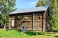
- Nomination Tjärnmyrastugan at Delsbo forngård, Hudiksvall Municipality. Most likely built in the 1600s, moved to Delsbo forngård in 1941. --ArildV 10:59, 7 August 2014 (UTC)
- Promotion Qi to me. --Villy Fink Isaksen 13:08, 7 August 2014 (UTC)
-

-

-
-

-

-

-
-
-

-
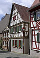
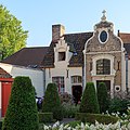
- Nomination Germany, Heppenheim, Kirchengasse 4 --Berthold Werner 07:46, 7 August 2014 (UTC)
- Promotion QI -- Spurzem 07:56, 7 August 2014 (UTC)
-

-

-

-
-

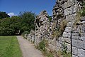
- Nomination Petrela Castle, Petrela, Albania --Poco a poco 07:03, 7 August 2014 (UTC)
- Promotion QI -- Spurzem 08:03, 7 August 2014 (UTC)
-

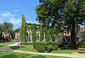
- Nomination Ettal Abbey, Bavaria, Germany --Poco a poco 07:03, 7 August 2014 (UTC)
- Promotion Good quality. --JLPC 17:57, 7 August 2014 (UTC)
-
-

- Nomination Hortus Haren. Fountain in the English garden.
Famberhorst 04:43, 7 August 2014 (UTC) - Promotion Support QI for me--Lmbuga 20:09, 7 August 2014 (UTC)
- Nomination Hortus Haren. Fountain in the English garden.
-

-

-

-

-

-

-

- Nomination Rosa 'Schwarze Madonna' (Rosarium Baden, Baden bei Wien). --Anna reg 22:33, 6 August 2014 (UTC)
- Promotion Good quality. --JLPC 17:45, 7 August 2014 (UTC)
-

-

-

- Nomination Panoramic view of Desenberg, western view --Tuxyso 21:07, 6 August 2014 (UTC)
- Promotion Great image except for the sky which has become posterized or has some other artifact. See the note. The problem also exists along the top edge to the left of center. --Generic1139 22:07, 6 August 2014 (UTC)
 Done Please take another look. --Tuxyso 22:07, 7 August 2014 (UTC)
Fixed. Good quality --Generic1139 01:43, 8 August 2014 (UTC)
-
-

-

- Nomination Near an airlock inside an old NATO station, Belfort, France. --ComputerHotline 17:49, 6 August 2014 (UTC)
- Promotion Good quality. --Bgag 17:02, 7 August 2014 (UTC)
-

- Nomination Alpine Accentor, picture taken at Regenflüeli (near Mount Pilatus, Lucerne, Switzerland) --Chme82 14:42, 6 August 2014 (UTC)
- Promotion A few purple and green CAs to remove and it's QI for me. --Lewis Hulbert 14:54, 6 August 2014 (UTC) Done Thank you--Chme82 09:01, 7 August 2014 (UTC) Support --Lewis Hulbert 21:38, 7 August 2014 (UTC)
-

- Nomination Blosenbergturm (total height 217m), Beromünster (seen from South) --Chme82 14:42, 6 August 2014 (UTC)
- Promotion Good quality. --Jacek Halicki 15:31, 6 August 2014 (UTC)
There's a dust spot or something, added note. --Lewis Hulbert 15:36, 6 August 2014 (UTC) Done Thank you - note removed--Chme82 09:01, 7 August 2014 (UTC)
-

- Nomination Boeing 737 --Livioandronico2013 23:07, 5 August 2014 (UTC)
- Decline The subject is small in the frame - you have 24Mpixel, nearly half of them bright featureless cloud. You could have a tighter crop to feature the subject. The subject, the relatively dark bottom of the plane has a lot of noise, however. Not QI as is. --Generic1139 04:00, 6 August 2014 (UTC)
Done Now? thanks for review --Livioandronico2013 07:20, 6 August 2014 (UTC)
Yes, the crop is much better. The noise problem remains, however, and it looks like sharpened noise at that. The white halo around the plane is now more pronounced as well. It needs more work, if it can be saved at all. --Generic1139 21:36, 6 August 2014 (UTC) Not done I'm sorry but is too complicated for me and honestly I have not even figured out what I should do, thanks all the same --Livioandronico2013 23:12, 6 August 2014 (UTC)
Not QI, excess noise and sharpening on the plane. --Generic1139 14:34, 7 August 2014 (UTC)
-

- Nomination Hawker 800.JPG --Livioandronico2013 23:05, 5 August 2014 (UTC)
- Decline The subject is small in the frame - you have 24Mpixel, nearly half of them dark, featureless cloud. You could have a tighter crop to feature the subject. The subject, the relatively dark bottom of the plane has a lot of noise, however. Not QI as is. --Generic1139 04:00, 6 August 2014 (UTC) Done Now? Thanks for review. --Livioandronico2013 07:24, 6 August 2014 (UTC)
Yes, the crop is much better. The noise problem remains, however, and it looks like sharpened noise at that. The white halo around the plane is now more pronounced as well. It needs more work, if it can be saved at all. --Generic1139 21:36, 6 August 2014 (UTC) Not done I'm sorry but is too complicated for me and honestly I have not even figured out what I should do, thanks all the same --Livioandronico2013 23:12, 6 August 2014 (UTC)
Not QI, excess noise and sharpening on the plane. --Generic1139 14:34, 7 August 2014 (UTC)
-

- Nomination Hortus Haren. Arme food lake.
Famberhorst 04:52, 4 August 2014 (UTC) - Promotion Overall good quality. Some slight magenta/reddish CA on the right side to remove. Done Thank you.
Famberhorst 15:35, 4 August 2014 (UTC)
Good quality. --Cccefalon 17:58, 7 August 2014 (UTC)
- Nomination Hortus Haren. Arme food lake.
-
- Nomination Southend on Sea. Mattbuck 21:02, 3 August 2014 (UTC)
 Comment Too many burned out specular reflections when they aren't balanced by a strong focal point in the image. Composition has horizon cutting the middle also with no balancing subject --Generic1139 05:19, 4 August 2014 (UTC)
 - Decline Not QI, exposure and composition problems. --Generic1139 01:53, 8 August 2014 (UTC)
- Nomination Southend on Sea. Mattbuck 21:02, 3 August 2014 (UTC)


.JPG)


_010.JPG)


_-_church.JPG)


.jpg)


.JPG)
.jpg)
Consensual review edit
File:Haltern_am_See,_Seebucht_Hohe_Niemen_--_2014_--_1152.jpg edit

- Nomination Nature reserve “Seebucht Hohe Niemen”, Haltern am See, Germany --XRay 07:20, 24 July 2014 (UTC)
- Decline
- Support QI imo.--ArildV 13:26, 29 July 2014 (UTC)
 weak oppose Overexposed areas, CAs, a bit blurry. If you want I can write notes--Lmbuga 12:22, 31 July 2014 (UTC)
- Oppose per Lmbuga --Christian Ferrer 17:36, 5 August 2014 (UTC)
Running total: 1 support (excluding the nominator), 2 oppose → Decline? --Cayambe 06:19, 3 August 2014 (UTC)
File:Rode zonnehoed (Echinacea purpurea).JPG edit
.JPG)
- Nomination Echinacea purpurea.
Famberhorst 15:33, 28 July 2014 (UTC) - Decline
- Support Background a bit noisy, but QI overall --Poco a poco 18:36, 28 July 2014 (UTC)
- Oppose Sorry, In my opinion the background and the edges spoils the picture: Artifacts, noise, too sharpened IMO--Lmbuga 18:47, 28 July 2014 (UTC)
- Comment IMHO the photo is oversharpened, especially the background and edges. --Tuxyso 11:50, 29 July 2014 (UTC)
- Oppose per Lmbuga --Christian Ferrer 17:45, 5 August 2014 (UTC)
Running total: 1 support (excluding the nominator), 2 oppose → Decline? --Cayambe 06:04, 3 August 2014 (UTC)
File:Paris,_Litfasssäule_--_2014_--_1169.jpg edit

- Nomination Advertising column, Paris, France --XRay 07:20, 24 July 2014 (UTC)
- Promotion Support IMO it's QI. --Stegop 20:08, 27 July 2014 (UTC)
You should promote it then. Oppose I oppose because a) the lower part of the column is invisible, b) the flat background is disturbing (why not take the pic from the right or left side to gain some depth from central perspective?), and c) top side crop is too tight. Move to CR. --Kreuzschnabel 09:15, 28 July 2014 (UTC) - Support I understand Kreuzschnabel's argument but it is imho no QI concern here. The column is well places between the two white window shutters. --Tuxyso 11:52, 29 July 2014 (UTC)
 Neutral The crop at the top is very tight, and the spire is out of focus and lost in the background. The main subject is partially occluded, and the small shoot of the flowers goes almost 1/2 up the uncovered part of the ad. If the interesting part of the image is the green dome at the top and its spire, it needs more headroom. --Generic1139 16:07, 31 July 2014 (UTC)
- Fixed Thanks. Now there is another crop at the top.--XRay 04:35, 2 August 2014 (UTC)
- Support I do understand some points stated above as well, but I agree Tuxyso - I would accept it as QI -- DerFussi 10:09, 5 August 2014 (UTC)
- Support as for Tuxyso -- Smial 13:28, 5 August 2014 (UTC)
Running total: 4 support (excluding the nominator), 1 oppose → Promote? --Christian Ferrer 15:01, 9 August 2014 (UTC)
File:Balung_Tawau_Sabah_Sawit-Kinabalu-Seeds-Sdn-Bhd-02.jpg edit

- Nomination Entrance to the Seed Production Unit of Sawit Kinabalu Seeds Sdn Bhd in Kg Balung, Sabah --Cccefalon 11:40, 17 July 2014 (UTC) Comment Imo the top background nedds to be generously cropped because it is distracting, even if blurred --Moroder 14:10, 23 July 2014 (UTC) Comment It is intentionally, to see the SAWIT logo in the background. Cropping would destroy the logo as well as the compo. --Cccefalon 21:09, 23 July 2014 (UTC) Comment Than the logo in the back shöuldn't be blurred --Moroder 12:02, 25 July 2014 (UTC)
Dear Mattbuck I already asked you at other occasions not to decline for reason of minor issues which are absolutely easy to fix. The missing constraint operation can be done easily. --Cccefalon 08:06, 28 July 2014 (UTC) and is Done now --Cccefalon 17:27, 28 July 2014 (UTC)
I apologise, but I'm not convinced by this one. Neutral Mattbuck 10:15, 2 August 2014 (UTC) - Promotion Support good IMO --Christian Ferrer 17:29, 5 August 2014 (UTC)
Running total: 1 support (excluding the nominator), 0 oppose → Promote? --Christian Ferrer 14:59, 9 August 2014 (UTC)
File:Male_Ruby-Throated_Hummingbird_Hovering.jpg edit

- Nomination Male Ruby-Throated Hummingbird --Pslawinski 21:43, 24 July 2014 (UTC)
- Promotion
{{s|weak support}}It's a picture hard to take, but I know your other exceptional picture. It's not a photo as good as another, but QI IMO--Lmbuga 00:45, 25 July 2014 (UTC)
It is too dark. Can you please brighten it? At least the background, so there's contrast. Once it's updated, I'll support. --Kadellar 12:41, 25 July 2014 (UTC)
{{Neutral}} I'm agree with Kadellar--Lmbuga 20:08, 25 July 2014 (UTC) Support For me it is ok! But I agree that a higher contrast to the background would improve it. --Uoaei1 06:52, 31 July 2014 (UTC) - Oppose - Too dark, purple CA. Mattbuck 09:54, 2 August 2014 (UTC)
- Comment purple CA --Christian Ferrer 17:42, 5 August 2014 (UTC)
- Comment CA & EV fixed Pslawinski 01:48, 7 August 2014 (UTC)
- Support Much better IMO--Lmbuga 01:57, 7 August 2014 (UTC)
- Support --Hockei 17:31, 8 August 2014 (UTC)
- Support --Christian Ferrer 14:55, 9 August 2014 (UTC)
Running total: 4 support (excluding the nominator), 1 oppose → Promote? --Christian Ferrer 14:55, 9 August 2014 (UTC)
File:Cova_e_xistos_na_praia_de_Augas_Santas_ou_das_Catedrais._Devesa._Ribadeo._Galiza-13.jpg edit

- Nomination Cave and schist. Beach of Augas Santas or beach of the Cathedrals, Devesa, Ribadeo, Galicia (Spain)-13 --Lmbuga 00:05, 20 July 2014 (UTC)
Sorry, "discuss": I want to konw the problem of this image: 5,616 × 3,744 pixels. - Promotion
- Could do with sharpening, especially at the top. Mattbuck 09:55, 2 August 2014 (UTC)
- Thanks for the review. Done, but the upper corners are a bit blurry. I can, if you want, crop the picture (see note). If you like more other crop, please, write a note--Lmbuga 10:53, 2 August 2014 (UTC)
- Thanks for the review.
- Not brilliant but OK. Mattbuck 08:33, 9 August 2014 (UTC)
File:Kirche Bruchenbrücken (1).jpg edit
.jpg)
- Nomination Church in Bruchenbrücken --Hydro 18:05, 16 July 2014 (UTC)
- Promotion
- Oppose Needs perspective correction. Perhaps you can apply a crop that is avoiding the part of a roof at the right side. --Cccefalon 20:19, 16 July 2014 (UTC)
- Not done Mattbuck 16:28, 24 July 2014 (UTC)
- I removed the part of the roof but don't see a need of perspective correction. --Hydro 17:01, 24 July 2014 (UTC)
- Perspective distortion fixed, vertical lines were clearly converging. --Kreuzschnabel 11:49, 26 July 2014 (UTC)
- I removed the part of the roof but don't see a need of perspective correction. --Hydro 17:01, 24 July 2014 (UTC)
- Support QI for me --Halavar 11:01, 1 August 2014 (UTC)
- Support OK. Mattbuck 09:57, 2 August 2014 (UTC)
- Support --Cayambe 06:00, 3 August 2014 (UTC)
Running total: 3 support (excluding the nominator), 1 oppose → Promote? --Cayambe 06:00, 3 August 2014 (UTC)
File:Mallorca_-_Cap_Figuera2.jpg edit

- Nomination Figuera Bay, Majorca --Taxiarchos228 06:02, 21 July 2014 (UTC)
- Promotion
- Support Good quality. --JLPC 14:25, 21 July 2014 (UTC)
Weak Oppose. Nice, but there are areas with good contrast and clarity bordering areas with low contrast and clarity (see note). The horizon is a bit tilted--Lmbuga 17:38, 22 July 2014 (UTC)
Lmbuga: the horizon is straight now, but the different contrasts are result of different angle of the plants and is not a fault auf my or the camera. There are also more of those areas with different contrast, but this is absolutley natural. --Taxiarchos228 19:31, 24 July 2014 (UTC) - I'm not agree, sorry--Lmbuga 21:42, 24 July 2014 (UTC)
- if you agree or not, that are the facts. --Taxiarchos228 07:13, 25 July 2014 (UTC)
- Support good for QI, the contrast is naturally. --Ralf Roletschek 07:57, 25 July 2014 (UTC)
- Oppose until the dust spots are fixed. Mattbuck 09:59, 2 August 2014 (UTC)
- where are the dustspots? --Taxiarchos228 21:02, 4 August 2014 (UTC)
- Comment There are at least 10, I marked the 3 most noticeable by the eye in notes. They are diffuse, and about 60 pixels in diameter, most likely sensor dust. Excuse me if I'm telling you something you already know - the easiest way to spot them quickly is to set the contrast up all the way, or use a curve layer and drag the center of the curve down to the right (which also increases the contrast). It makes then stand out more. Only a few in your image are easily visible and need to be corrected. LR5 has an even easier way to do find them. --Generic1139 22:24, 4 August 2014 (UTC)
- Comment me too I added some notes for the dustspots --Christian Ferrer 17:58, 5 August 2014 (UTC)
- Done new version upload --Taxiarchos228 20:24, 7 August 2014 (UTC)
- Support spots fixed. --Generic1139 01:59, 8 August 2014 (UTC)
- Comment always 4 dustspots (see notes) --Christian Ferrer 18:45, 8 August 2014 (UTC)
- Done --Taxiarchos228 19:50, 9 August 2014 (UTC)
- Support A last dustspot (see note), howecer nice and QI IMO --Christian Ferrer 21:19, 9 August 2014 (UTC)
Running total: 4 support (excluding the nominator), 2 oppose → Promote? --Cayambe 19:57, 2 August 2014 (UTC)