Commons:Quality images candidates/Archives January 08 2018
-

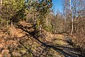
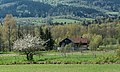
- Nomination Forest road on Bannwaldweg #8 in Winklern, Pörtschach, Carinthia, Austria --Johann Jaritz 03:24, 6 January 2018 (UTC)
- Promotion Good quality. PumpkinSky 03:26, 6 January 2018 (UTC)
-
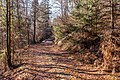
- Nomination Forest road on Bannwaldweg #8 in Winklern, Pörtschach, Carinthia, Austria --Johann Jaritz 03:24, 6 January 2018 (UTC)
- Promotion Good quality. PumpkinSky 03:26, 6 January 2018 (UTC)
-

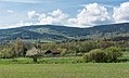
- Nomination Forest road on Bannwaldweg #8 in Winklern, Pörtschach, Carinthia, Austria --Johann Jaritz 03:24, 6 January 2018 (UTC)
- Promotion Good quality. PumpkinSky 03:26, 6 January 2018 (UTC)
-

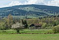
- Nomination Forest road on Bannwaldweg #8 in Winklern, Pörtschach, Carinthia, Austria --Johann Jaritz 03:24, 6 January 2018 (UTC)
- Promotion Good quality. PumpkinSky 03:26, 6 January 2018 (UTC)
-
- Nomination Forest road on Bannwaldweg #8 in Winklern, Pörtschach, Carinthia, Austria --Johann Jaritz 03:24, 6 January 2018 (UTC)
- Promotion Good quality. PumpkinSky 03:26, 6 January 2018 (UTC)
-

- Nomination White Pine and Asian Pear in January 2018 North American blizzard --PumpkinSky 00:00, 6 January 2018 (UTC)
- Promotion Good quality. --GT1976 02:14, 6 January 2018 (UTC)
-
- Nomination House in Stara Bystrzyca 1 --Jacek Halicki 00:00, 6 January 2018 (UTC)
- Promotion Good quality. --PumpkinSky 00:04, 6 January 2018 (UTC)
-

- Nomination House in Stara Bystrzyca 2 --Jacek Halicki 00:00, 6 January 2018 (UTC)
- Promotion Good quality. --PumpkinSky 00:04, 6 January 2018 (UTC)
-
- Nomination House in Stara Bystrzyca 3 --Jacek Halicki 00:00, 6 January 2018 (UTC)
- Promotion Good quality. --PumpkinSky 00:04, 6 January 2018 (UTC)
-
- Nomination House in Stara Bystrzyca 4 --Jacek Halicki 00:00, 6 January 2018 (UTC)
- Promotion Good quality. --PumpkinSky 00:04, 6 January 2018 (UTC)
-

- Nomination House in Stara Bystrzyca 5 --Jacek Halicki 00:00, 6 January 2018 (UTC)
- Promotion Good quality. --PumpkinSky 00:04, 6 January 2018 (UTC)
-

- Nomination Crested hawk-eagle (Nisaetus cirrhatus cirrhatus), Satpura National Park --Charlesjsharp 22:19, 5 January 2018 (UTC)
- Promotion Good quality. --Jacek Halicki 23:57, 5 January 2018 (UTC)
-

- Nomination Crested hawk-eagle (Nisaetus cirrhatus cirrhatus) with Indian garden lizard, Satpura National Park --Charlesjsharp 22:19, 5 January 2018 (UTC)
- Promotion Good quality. --Jacek Halicki 23:57, 5 January 2018 (UTC)
-

- Nomination Pied bushchat (Saxicola caprata bicolor) female, Pench National Parka --Charlesjsharp 22:19, 5 January 2018 (UTC)
- Promotion
 Support - Small bird, so sharp enough. You might want to mention the bird's size, either in your file description and/or in w:Pied bush chat which, unless I missed it, just describes the bird as "small". -- Ikan Kekek 01:40, 6 January 2018 (UTC)
-

- Nomination Plomberg-Upper Austria, panorama from Mondsee (the village) --Michielverbeek 22:16, 5 January 2018 (UTC)
- Promotion Good quality. --PumpkinSky 23:53, 5 January 2018 (UTC)
-
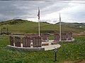
- Nomination Veterans Memorial at the Mt. Pisgah Cemetery in Cripple Creek, CO --Mutter Erde 18:06, 5 January 2018 (UTC)
- Decline Insufficient quality. Sorry. Perspective issues, not sharp, disturbing wires at the top, CAs, composition. --XRay 18:15, 5 January 2018 (UTC)
-

- Nomination Shell of a Top Snail, Umbonium thomasi --Llez 16:31, 5 January 2018 (UTC)
- Promotion Good quality. --Basotxerri 18:01, 5 January 2018 (UTC)
-

- Nomination Poppy, Papaver --Paulparadis 16:05, 5 January 2018 (UTC)
- Promotion OK for me. --Basotxerri 17:59, 5 January 2018 (UTC)
* Comment It looks like the flower is floating above the stem.--Famberhorst 18:23, 5 January 2018 (UTC)
-

- Nomination Yeghishe Charents ( Armenian poet, writer and public activist. ) statue in the central park of Gyumri --Armenak Margarian 15:57, 5 January 2018 (UTC)
- Promotion Suffisant pour moi mais c'est dommage que l'embase ne soit pas nette. --Basotxerri 17:58, 5 January 2018 (UTC) je pense que il est le temps d'acheter un trepied, merci Basotxerri --Armenak Margarian 19:41, 5 January 2018 (UTC)
-

- Nomination Aleksandr Pushkin statue in the central park of Gyumri --Armenak Margarian 15:57, 5 January 2018 (UTC)
- Decline Artefacts on the statue's right leg. --Peulle 18:48, 5 January 2018 (UTC) it's very diffucult condition and i can do any thing, thank you Peulle --Armenak Margarian 19:41, 5 January 2018 (UTC)
-

- Nomination Hovhannes Shiraz (Armenian poet) statue in the central park of Gyumri --Armenak Margarian 15:57, 5 January 2018 (UTC)
- Promotion Good quality. --Poco a poco 21:09, 5 January 2018 (UTC)
-
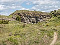
- Nomination Former quarry of Olarizu. Vitoria-Gasteiz, Basque Country, Spain --Basotxerri 15:55, 5 January 2018 (UTC)
- Promotion Good quality --Halavar 16:08, 5 January 2018 (UTC)
-

- Nomination Church of Mendiola. Vitoria-Gasteiz, Basque Country, Spain --Basotxerri 15:49, 5 January 2018 (UTC)
- Promotion Support Good quality.--Famberhorst 17:03, 5 January 2018 (UTC)
-
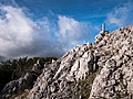
- Nomination Cumbre de Orisol. Álava, País Vasco, España --Basotxerri 15:40, 5 January 2018 (UTC)
- Promotion Good quality --Llez 16:33, 5 January 2018 (UTC)
-
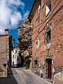
- Nomination Rock in the midst of village houses in Estada. Huesca, Aragon, Spain --Basotxerri 15:29, 5 January 2018 (UTC)
- Promotion Good quality --Armenak Margarian 16:07, 5 January 2018 (UTC)
-

- Nomination Flixbus coach in Nuremberg --Billy69150 13:40, 5 January 2018 (UTC)
- Decline Comment The crop at the left and the right is not good, the composition should be better. You can try to fix it. --XRay 14:42, 5 January 2018 (UTC)
 Oppose Sorry, second view. DoF too small, too much noise. IMO not fixable, too much issues. --XRay 14:43, 5 January 2018 (UTC)
  I withdraw my nomination Ok, sorry --Billy69150 15:14, 5 January 2018 (UTC)
-

- Nomination Views from the ship sailing on the route Ao Nang - Ko Lanta Yai. Krabi Province, Thailand. --Halavar 13:12, 5 January 2018 (UTC)
- Promotion Good quality. --Poco a poco 14:35, 5 January 2018 (UTC)
-

- Nomination Ubosot. Wat Traimit Witthayaram. Samphanthawong District, Bangkok, Thailand. --Halavar 13:12, 5 January 2018 (UTC)
- Promotion Good quality--Armenak Margarian 16:04, 5 January 2018 (UTC)
-

- Nomination Bayon. Angkor Thom, Siem Reap Province, Cambodia. --Halavar 13:12, 5 January 2018 (UTC)
- Decline IMO too unsharp for a QI, sorry. --Basotxerri 18:10, 5 January 2018 (UTC)
-

- Nomination Main temple of Angkor Wat. Siem Reap Province, Cambodia. --Halavar 13:12, 5 January 2018 (UTC)
- Promotion Good quality. --Poco a poco 14:35, 5 January 2018 (UTC)
-

- Nomination Sunset over the Praek Tuek Chhu river. Kampot, Cambodia. --Halavar 13:12, 5 January 2018 (UTC)
- Promotion Nice image, however there are lots of spots (birds?) which I would remove of the image. --Basotxerri 18:07, 5 January 2018 (UTC)
-

- Nomination Church of Mary the Greater, Trieste, Italy --Poco a poco 11:46, 5 January 2018 (UTC)
- Promotion Support Good quality.--Famberhorst 17:07, 5 January 2018 (UTC)
-

- Nomination Government Palace, Trieste, Italy --Poco a poco 11:46, 5 January 2018 (UTC)
- Promotion Good quality --Halavar 12:50, 5 January 2018 (UTC)
-

- Nomination City hall, Trieste, Italy --Poco a poco 11:46, 5 January 2018 (UTC)
- Promotion Good quality --Halavar 12:51, 5 January 2018 (UTC)
-

- Nomination Stock Exchange Square, Trieste, Italy --Poco a poco 11:46, 5 January 2018 (UTC)
- Promotion Good quality--Armenak Margarian 16:01, 5 January 2018 (UTC)
-

- Nomination BMW Isetta --Berthold Werner 09:31, 5 January 2018 (UTC)
- Promotion Good quality. -- Johann Jaritz 11:10, 5 January 2018 (UTC)
-

- Nomination BMW Isetta --Berthold Werner 09:31, 5 January 2018 (UTC)
- Promotion Good quality. -- Johann Jaritz 11:10, 5 January 2018 (UTC)
-

- Nomination Benetton racing car --Hydro 09:18, 5 January 2018 (UTC)
- Promotion Good quality. --Poco a poco 11:54, 5 January 2018 (UTC)
-

- Nomination Baptismal font of the church of St. Bartholomew in Knetzgau --Ermell 08:00, 5 January 2018 (UTC)
- Promotion Good quality. -- Johann Jaritz 11:13, 5 January 2018 (UTC)
-

- Nomination Swimmers on the beach of Fehmarn --Ermell 08:00, 5 January 2018 (UTC)
- Promotion Good quality. -- Johann Jaritz 11:13, 5 January 2018 (UTC)
-

- Nomination Statue of St. Wendelin in the the basilica in Gößweinstein von Martin Mutschelle (1764) --Ermell 08:00, 5 January 2018 (UTC)
- Promotion Good quality. -- Johann Jaritz 11:14, 5 January 2018 (UTC)
-

- Nomination Wreath of light above the crucifixion altar in the basilica in Gößweinstein --Ermell 08:00, 5 January 2018 (UTC)
- Promotion Good quality. -- Johann Jaritz 11:14, 5 January 2018 (UTC)
-
- Nomination Theatro del Lago in Frutillar at Lake Llanquihue --Ermell 08:00, 5 January 2018 (UTC)
- Promotion Good quality. -- Johann Jaritz 11:14, 5 January 2018 (UTC)
-

- Nomination Open wing position of Male Papilio memnon agenor Linnaeus, 1758 – Continental Great Mormon --Atudu 06:40, 5 January 2018 (UTC)
- Decline I'm afraid that this one is not a QI due to the left wing, there is either a halo (on the right next to the head) or it moved (left side) --Poco a poco 12:00, 5 January 2018 (UTC)
-

- Nomination Wijnjeterper Schar, Natura 2000 area of Friesland province. heath lake.
--Famberhorst 06:38, 5 January 2018 (UTC) - Promotion Support Good quality. -- Johann Jaritz 06:53, 5 January 2018 (UTC)
- Nomination Wijnjeterper Schar, Natura 2000 area of Friesland province. heath lake.
-
- Nomination Kop Blokslootpolder (Bloksleatpolder). Mill in a beautiful panorama.
--Famberhorst 06:38, 5 January 2018 (UTC) - Promotion Support Good quality. -- Johann Jaritz 06:53, 5 January 2018 (UTC)
- Nomination Kop Blokslootpolder (Bloksleatpolder). Mill in a beautiful panorama.
-

- Nomination Close wing position of Arhopala bazalus teesta de Nicéville, 1886 – Teesta Powdered Oakblue (by Subhendukhan) --Atudu 06:21, 5 January 2018 (UTC)
- Decline Oppose - Not sharp enough for QI, in my opinion. -- Ikan Kekek 08:46, 5 January 2018 (UTC)
-

- Nomination Mountain trip from Churwalden Mittelberg (1500 meter) via Ranculier and Praden towards Tschiertschen. View of Maladers, (Zwitserland).
--Agnes Monkelbaan 05:46, 5 January 2018 (UTC) - Promotion Support Good quality. -- Johann Jaritz 06:52, 5 January 2018 (UTC)
- Nomination Mountain trip from Churwalden Mittelberg (1500 meter) via Ranculier and Praden towards Tschiertschen. View of Maladers, (Zwitserland).
-

- Nomination Mountain trip from Tschiertschen (1350 meters) via Ruchtobel towards Ochsenalp. Children's learning path.
--Agnes Monkelbaan 05:46, 5 January 2018 (UTC) - Promotion Support Good quality. -- Johann Jaritz 06:52, 5 January 2018 (UTC)
- Nomination Mountain trip from Tschiertschen (1350 meters) via Ruchtobel towards Ochsenalp. Children's learning path.
-

- Nomination Domestic duck (Anas platyrhynchos domesticus) --Cvmontuy 05:15, 5 January 2018 (UTC)
- Promotion Support - Cute, and the head is sharp. -- Ikan Kekek 08:55, 5 January 2018 (UTC)
-

-

- Nomination Tulipe --Paulparadis 21:17, 29 December 2017 (UTC)
- Decline Over exposed, sorry --Cvmontuy 21:51, 5 January 2018 (UTC)


.jpg)
_with_Indian_garden_lizard.jpg)
_female.jpg)

.JPG)


.jpg)
.jpg)
.jpg)
.jpg)
.jpg)


_11.jpg)

_via_Ranculier_en_Praden_naar_Tschiertschen_015.jpg)
_via_Ruchtobel_richting_Ochsenalp_006.jpg)


Consensual review edit
File:17-08-05-Island-Auto-RalfR-DSC_3217.jpg edit

- Nomination Dacia Logan in Keflavik, Island --Ralf Roletschek 00:11, 4 January 2018 (UTC)
- Decline
Good quality.--XRay 06:02, 4 January 2018 (UTC) Neutral Checked again, you're right. Sharpness could be improved, but the image should be sharper. --XRay 10:37, 4 January 2018 (UTC)
 - Oppose Sorrry, this image is still unsharp! --Granada 06:38, 4 January 2018 (UTC)
- Oppose - Not that sharp, per Granada. -- Ikan Kekek 08:28, 4 January 2018 (UTC)
- Oppose Downsampled and unsharp. --Peulle 11:07, 5 January 2018 (UTC)
- Oppose Motion blur. --Smial 17:48, 5 January 2018 (UTC)
Total: 0 support (excluding the nominator), 4 oppose →  Declined --PumpkinSky 14:23, 7 January 2018 (UTC)
File:Eglise Notre-Dame-de-Chargnat 07.jpg edit

- Nomination Side door of the Church of Notre-Dame de Chargnat in Saint-Rémy-de-Chargnat, Puy-de-Dôme, France. --Tournasol7 00:19, 24 December 2017 (UTC)
- Promotion
- Comment Seems tilted CW to me, could you fix that please? Otherwise OK for me. --Basotxerri 16:46, 29 December 2017 (UTC)
 Not done PumpkinSky 13:27, 4 January 2018 (UTC)
 Done I tried to fix it. It's better? Tournasol7 16:17, 4 January 2018 (UTC)
- Comment It's 7 days from 29 December. Tournasol7 16:19, 4 January 2018 (UTC)
- Support OK now. You could crop a bit of the upper part like in your first upload. --Basotxerri 15:04, 5 January 2018 (UTC)
- Support OK now. PumpkinSky 15:07, 5 January 2018 (UTC)
Total: 2 support (excluding the nominator), 0 oppose →  Promoted --PumpkinSky 14:22, 7 January 2018 (UTC)
File:Night_Paris.jpg edit

- Nomination Panthéon de Paris - Long exposure with moon in background and light trails in forground. --Prosthetic Head 09:58, 2 January 2018 (UTC)
- Decline Sorry, I´dont catched it. Long exposere maybee with tripod it´s all, most comp. point are the tires and the wheel rims, nobody will trust you about the story CommentUnsigned reviewer, I'm afraid I don't understand your review and you didn't change the status to any valid one. Could someone else please explain or review this image? --Prosthetic Head 08:53, 3 January 2018 (UTC) CommentMoving to discussion, since the only review recieved I do not understand, broke the formatting, did not set the status to either promotion or decline and is unsigned. --Prosthetic Head 17:13, 3 January 2018 (UTC)
- Oppose The main subject is wonderful clear, but: perspective correction is needed + the flares are disturbing + composition issues: the black car is very disturbing. Sorry. --Milseburg 09:13, 5 January 2018 (UTC)
Total: 0 support (excluding the nominator), 1 oppose → Declined --Peulle 13:45, 7 January 2018 (UTC)
File:Little Loch Broom Panorama 01.jpg edit
![]()
- Nomination A panorama of Little Loch Broom in the Scottish Highlands --Spike 02:17, 2 January 2018 (UTC)
- Promotion
- Support - Good quality. I suppose some might argue it's underexposed, but it was clearly a cloudy day and the amount of light reflects this. -- Ikan Kekek 05:43, 2 January 2018 (UTC)
but the horizon on the left side have to be straight to reach QI level in my eyes.--Milseburg 08:47, 2 January 2018 (UTC)
- Done, raised horizon on left side. Please note center of image has also changed because my stitching tool is now using different parts of the source images. Spike 13:41, 2 January 2018 (UTC)
- Weak Support Could maybe benefit from some white balance tweaks, but overall I like it. PS: I've had a quick fiddle with the WB myself and uploaded it here if interested. --Prosthetic Head 17:55, 3 January 2018 (UTC).
- Thanks for the suggestion and the work. I tried it myself with the white-balance tool in Gimp on my uncompressed original and it looks to me like I got the same result as you did. I have uploaded the smaller JPEG over your version. But I'm not sure if the original or the wb-tweaked version is better. I think some of the clouds look a little overexposed in the wb-tweaked version. Spike 01:11, 4 January 2018 (UTC)
- Support --Ermell 08:19, 4 January 2018 (UTC)
- Support QI now. --Milseburg 09:05, 5 January 2018 (UTC)
Total: 4 support (excluding the nominator), 0 oppose → Promoted --Peulle 13:46, 7 January 2018 (UTC)
File:Virginia_Beach_Courthouse_2.jpg edit

- Nomination Virginia Beach Courthouse 2 --PumpkinSky 00:00, 2 January 2018 (UTC)
- Decline
- Support Good quality, Tournasol7 00:04, 2 January 2018 (UTC)
- Oppose I disagree. I´m not sure, whether it´s relevant for QI, but I think that a shorter exposure time on this daylight shot could avoid this disturbing blurry flag. In any case the framing isn´t good since the top of the mast is cut off. Sorry. --Milseburg 08:56, 2 January 2018 (UTC)
- Weak Oppose - Tough call - this is a large photo of good technical quality, and I think the motion blur on the flags is OK. However, I don't like the cutoff of the top of the mast or the half-a-sign on the left. I may be too nitpicky, though, so I hope someone else will give their opinion on this photo. -- Ikan Kekek 09:09, 5 January 2018 (UTC)
Total: 1 support (excluding the nominator), 2 oppose → Declined --Peulle 13:46, 7 January 2018 (UTC)
File:17-08-04-Arnarseturshraun-RalfR-DSC_2382.jpg edit

- Nomination Lavafeld Arnarseturshraun südlich von Vogar, Island --Ralf Roletschek 10:22, 1 January 2018 (UTC)
- Decline
- Oppose Very nasty green and purple color fringing --Granada 11:41, 1 January 2018 (UTC)
- Support I disagree! Ihr seid ja beide eigenartig, oder Fehlfaben ( daher in deutsch). Ihr beiden versucht die Qualität mehr mit Masse zu überfluten. Ralf ist mehr der "lazy one" deutsch fällt mir dazu nix ein, und Julia ist mehr die Flut in Form von Qua(m)tiät. Bitterfeld (as Wessi) seit ihr nicht nur irgendwie beide! Mea Culpa! --Hans-Jürgen Neubert 18:30, 2 January 2018 (UTC)
- Comment Was mache ich? Meine Anzahl an QI-Bildern kann man immer noch mit fünf Händen abzählen (und die ohne Xiberg an zweien), also nix Massenüberflutung. Nur die Portraits aus dem Landtagsprojekt Vorarlberg habe ich alle quasi durchgepeitscht, damit WM-AT was zum Herzeigen hat, aber das war ja quasi Auftragsarbeit. --Granada 11:09, 3 January 2018 (UTC)
- Oppose Sorry, Ralf, as for Granada. Also somewhat low DOF, f/11 and focus on the hyperfocal distance would have been worth a try. But I like the composition, the picture finally shows a meaningful creative use of a super wide-angle, which is otherwise rarely seen on QIC. --Smial 08:47, 3 January 2018 (UTC)
- Ich sehe die Schuld in der Billigkamera mit künstlich aufgeblasenen Megapixeln. Und ja, f/11 wäre angemessen gewesen. --Ralf Roletschek 10:43, 3 January 2018 (UTC)
- Naja, für die bunten Säume kann die Kamera nix. Sofern die Knipse die Objektivfehler nicht selbst herausrechnen kann, muß man das eben zufuß hinterher machen. --Smial 10:50, 3 January 2018 (UTC)
- Das Tokina 11-20mm f/2,8 ist eine ziemlich schlechte Linse, vor allem im Vergleich zu anderen APS-C-Ultraweitwinkelzooms. --Granada 10:57, 3 January 2018 (UTC)
- "Bearbeitungskonflikt, mal wieder" Ralf ist das wirklich so? Dachte erstmal DX wäre schärfer, andere Sachen wie die Antenne (mittig rechts) und die Säume an den Steinen rechts, mal unerwähnt. Ich wäre von den Mitteltönen niemals drauf gekommen, das es eine Nikon ist, so stelle ich mir "Bitterfeld in Fehlfarben" vor, das purple stört mich dabei gar nicht so, das gibt es am Himmel und Schwefel sieht schlimmer aus. Total seltsame Mitteltöne, liegt´s am Sony-Sensor? --Hans-Jürgen Neubert 12:12, 3 January 2018 (UTC)
- Liegt nicht am Sony-Sensor, sondern an der Scherbe. Das Tokina 11-20 hat am weiten Ende CAs ohne Ende durchgängig von f/2.8 bis f/22. DxOMark hat das im Diagramm, man sieht das an Ralphs Foto und auch auf Youtube in den Tests kann man das sehen. Ich hatte mal nach einem UW-Zoom für die mir zugelaufene D200 geschaut und war auf das Tokina gestoßen, aber das hatte ich dann lieber nicht gekauft. --Granada 11:18, 3 January 2018 (UTC)
- Das Tokina 11-16 ist das mit Abstand beste WW was meine Kamera je gesehen hat. Selbst die teuren Scherben von Nikon haben mehr Verzeichnung. So unterschiedlich können die Wahrnehmungen sein. --Ralf Roleček 11:49, 3 January 2018 (UTC)
- Von Verzeichnungen schrieb ich nicht, ich schrieb von chromatischen Aberrationen. --Granada 11:56, 3 January 2018 (UTC)
- Ihr beiden sprecht etwas arg dekadent, über für viele schon teure Gläser. Als Scherbe würde ich das nicht betiteln. Ist halt DX, mein Händler will mir auch immer Sigma andrehen, kam ich auch nie zurecht, mag an mir liegen. Tests glaube ich ich fast nichts mehr, gerade wegen Sony. Bei einem WA liegt es doch an vielen Dingen, Vignetierung kriegt man digital hin, aber was ist mit Flares? Ich hasse Flares...Aktuell liebäugele ich mit einem TAMRON SP 15-30mm F/2.8 Di VC USD. Macht mal lieber blau! Ist der aktuelle contest ;-) Da fehlt noch Ralf mit der Lagune.--Hans-Jürgen Neubert 14:33, 3 January 2018 (UTC)
- Kauf das Tamron mal und berichte, denn das steht als Ersatz für das uns gestohlene Nikon 14-24 auch auf meiner Einkaufsliste, wenn auch relativ weit hinten. Apropos blau: hab ich schon hinter mir. --Granada 12:55, 3 January 2018 (UTC)
- Das Tamron steht bei mir sogar vor einem neuen body, ist nur leider ählich schwer wie das Nikon. Und Polfilter bei so einem Froschauge wird nicht billig. Bis zur blauen Nacht 2018 wird es schon.-) contest - Warum hast Du nur eines? Übrigens fröhliches hübsches Mädel, wenn man auch schon verdammt genau hinsehen muss, bis man ihre Augen sieht. Das uniqa-Gebäude wäre noch was, bei uns stellt sich die Nürnberger Versicherung etwas an mit dem Gebäude (Panorama-Freiheit mal anders, nicht turkmenisch, was hier (commons) auch Unsinn ist, zudem noch von einem Russen, tsss). Setze und warte da noch auf Ralf, zumindest mi der Lagune. Für Bild 4 kann ich mich wieder nicht entscheiden, hätte da noch dutzende im Angebot. --Hans-Jürgen Neubert 14:45, 3 January 2018 (UTC)
- Hier ist der falsche Ort für diese Diskussion. Ich gehe zur Disk. von Granada. --Ralf Roletschek 22:51, 4 January 2018 (UTC)
- Das Tamron steht bei mir sogar vor einem neuen body, ist nur leider ählich schwer wie das Nikon. Und Polfilter bei so einem Froschauge wird nicht billig. Bis zur blauen Nacht 2018 wird es schon.-) contest - Warum hast Du nur eines? Übrigens fröhliches hübsches Mädel, wenn man auch schon verdammt genau hinsehen muss, bis man ihre Augen sieht. Das uniqa-Gebäude wäre noch was, bei uns stellt sich die Nürnberger Versicherung etwas an mit dem Gebäude (Panorama-Freiheit mal anders, nicht turkmenisch, was hier (commons) auch Unsinn ist, zudem noch von einem Russen, tsss). Setze und warte da noch auf Ralf, zumindest mi der Lagune. Für Bild 4 kann ich mich wieder nicht entscheiden, hätte da noch dutzende im Angebot. --Hans-Jürgen Neubert 14:45, 3 January 2018 (UTC)
- Kauf das Tamron mal und berichte, denn das steht als Ersatz für das uns gestohlene Nikon 14-24 auch auf meiner Einkaufsliste, wenn auch relativ weit hinten. Apropos blau: hab ich schon hinter mir. --Granada 12:55, 3 January 2018 (UTC)
- Ihr beiden sprecht etwas arg dekadent, über für viele schon teure Gläser. Als Scherbe würde ich das nicht betiteln. Ist halt DX, mein Händler will mir auch immer Sigma andrehen, kam ich auch nie zurecht, mag an mir liegen. Tests glaube ich ich fast nichts mehr, gerade wegen Sony. Bei einem WA liegt es doch an vielen Dingen, Vignetierung kriegt man digital hin, aber was ist mit Flares? Ich hasse Flares...Aktuell liebäugele ich mit einem TAMRON SP 15-30mm F/2.8 Di VC USD. Macht mal lieber blau! Ist der aktuelle contest ;-) Da fehlt noch Ralf mit der Lagune.--Hans-Jürgen Neubert 14:33, 3 January 2018 (UTC)
- Von Verzeichnungen schrieb ich nicht, ich schrieb von chromatischen Aberrationen. --Granada 11:56, 3 January 2018 (UTC)
- Das Tokina 11-16 ist das mit Abstand beste WW was meine Kamera je gesehen hat. Selbst die teuren Scherben von Nikon haben mehr Verzeichnung. So unterschiedlich können die Wahrnehmungen sein. --Ralf Roleček 11:49, 3 January 2018 (UTC)
- Liegt nicht am Sony-Sensor, sondern an der Scherbe. Das Tokina 11-20 hat am weiten Ende CAs ohne Ende durchgängig von f/2.8 bis f/22. DxOMark hat das im Diagramm, man sieht das an Ralphs Foto und auch auf Youtube in den Tests kann man das sehen. Ich hatte mal nach einem UW-Zoom für die mir zugelaufene D200 geschaut und war auf das Tokina gestoßen, aber das hatte ich dann lieber nicht gekauft. --Granada 11:18, 3 January 2018 (UTC)
- "Bearbeitungskonflikt, mal wieder" Ralf ist das wirklich so? Dachte erstmal DX wäre schärfer, andere Sachen wie die Antenne (mittig rechts) und die Säume an den Steinen rechts, mal unerwähnt. Ich wäre von den Mitteltönen niemals drauf gekommen, das es eine Nikon ist, so stelle ich mir "Bitterfeld in Fehlfarben" vor, das purple stört mich dabei gar nicht so, das gibt es am Himmel und Schwefel sieht schlimmer aus. Total seltsame Mitteltöne, liegt´s am Sony-Sensor? --Hans-Jürgen Neubert 12:12, 3 January 2018 (UTC)
- Das Tokina 11-20mm f/2,8 ist eine ziemlich schlechte Linse, vor allem im Vergleich zu anderen APS-C-Ultraweitwinkelzooms. --Granada 10:57, 3 January 2018 (UTC)
- Naja, für die bunten Säume kann die Kamera nix. Sofern die Knipse die Objektivfehler nicht selbst herausrechnen kann, muß man das eben zufuß hinterher machen. --Smial 10:50, 3 January 2018 (UTC)
- Ich sehe die Schuld in der Billigkamera mit künstlich aufgeblasenen Megapixeln. Und ja, f/11 wäre angemessen gewesen. --Ralf Roletschek 10:43, 3 January 2018 (UTC)
- Oppose - That green fringing is really not nice, regardless of what's causing it. Can't you remove it? -- Ikan Kekek 09:13, 5 January 2018 (UTC)
Total: 1 support (excluding the nominator), 3 oppose → Declined --Peulle 13:48, 7 January 2018 (UTC)