Commons:Quality images candidates/Archives January 16 2017
-

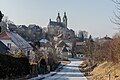
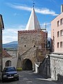
- Nomination Archway building (chapter house) on Domplatz #4, Maria Saal, Carinthia, Austria --Johann Jaritz 03:02, 14 January 2017 (UTC)
- Promotion Good quality. --Frank Schulenburg 03:12, 14 January 2017 (UTC)
-

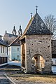
- Nomination Association friends of the Carinthian open-air museum on Museumweg #1, Maria Saal, Carinthia, Austria --Johann Jaritz 03:02, 14 January 2017 (UTC)
- Promotion Good quality. --Frank Schulenburg 03:12, 14 January 2017 (UTC)
-

- Nomination Wandkachel in der Kapelle des Asterius, Antoninus-Pius-Thermen, Karthago --Kritzolina 20:05, 13 January 2017 (UTC)
- Promotion Good quality. --Poco a poco 22:04, 13 January 2017 (UTC)
-
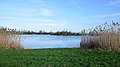
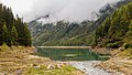
- Nomination Lake Immensen in Hanover Region --Hydro 19:46, 13 January 2017 (UTC)
- Promotion Good quality. --Poco a poco 22:04, 13 January 2017 (UTC)
-

- Nomination Saints John the Baptist and Bartholomew Church from Kazimierz Dolny Market Square, Poland --Scotch Mist 19:43, 13 January 2017 (UTC)
- Promotion A nice composition, but I would have used a lower ISO-value to get more sharpness and less noise --Michielverbeek 21:59, 13 January 2017 (UTC)
-

- Nomination Shop display on outside of tenement building in Saint Anne street in the Old Town of Kraków --Scotch Mist 19:43, 13 January 2017 (UTC)
- Promotion Good quality. --Poco a poco 22:04, 13 January 2017 (UTC)
-

- Nomination Tomb of Władysław Grodyński (1859-1939, former Chief Magistrate of Kraków), wife Zofja (1866-1927), and other family members, at plot 49/PŁN/ZAC in Rakowicki Cemetery, Kraków. --Scotch Mist 19:43, 13 January 2017 (UTC)
- Promotion Good quality. --Poco a poco 22:04, 13 January 2017 (UTC)
-

- Nomination Gravestones at Kraków’s historic Rakowicki Cemetery, Section HE, with local ‘visitor’ a Red Squirrel --Scotch Mist 19:43, 13 January 2017 (UTC)
- Promotion Good enough for me. -- Ikan Kekek 22:45, 13 January 2017 (UTC)
-
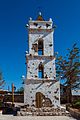
- Nomination Bell tower of San Lucas, Toconao, Chile --Poco a poco 19:28, 13 January 2017 (UTC)
- Promotion Good quality. -- Ikan Kekek 22:47, 13 January 2017 (UTC)
-

- Nomination Salar de Pujsa, Chile --Poco a poco 19:28, 13 January 2017 (UTC))
- Promotion
 Support Good quality.--Scotch Mist 19:40, 13 January 2017 (UTC)~
-

- Nomination Licancabur Volcano, Chile --Poco a poco 19:28, 13 January 2017 (UTC))
- Promotion Support Good quality.--Scotch Mist 19:40, 13 January 2017 (UTC)
-

- Nomination View of Iquique, Chile --Poco a poco 19:28, 13 January 2017 (UTC)
- Promotion Excellent, and in my opinion, featurable. -- Ikan Kekek 20:29, 13 January 2017 (UTC)
-
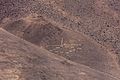
- Nomination Cerros Pintados, Pampa del Tamarugal, Chile --Poco a poco 19:28, 13 January 2017 (UTC)
- Promotion Good. -- Ikan Kekek 20:29, 13 January 2017 (UTC)
-

- Nomination Prague: Roseate Spoonbill in the Zoo --A.Savin 18:01, 13 January 2017 (UTC)
- Promotion Good quality. --Peulle 18:25, 13 January 2017 (UTC)
Yes, good quality. Just curious: What are the white things? -- Ikan Kekek 18:37, 13 January 2017 (UTC) Comment Now that you asked, I'm also curious. By now, I didn't pay much attention to it. It's most likely some reflections, but I don't know of what exactly. --A.Savin 19:15, 13 January 2017 (UTC)
-

- Nomination Prague: Church of Our Lady in front of Týn --A.Savin 18:01, 13 January 2017 (UTC)
- Promotion Nice. -- Ikan Kekek 18:42, 13 January 2017 (UTC)
-
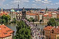
- Nomination Prague: Charles Bridge, view from its western tower --A.Savin 18:01, 13 January 2017 (UTC)
- Promotion Good quality. --Basotxerri 18:16, 13 January 2017 (UTC)
-
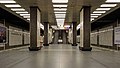
- Nomination Prague: Pankrác metro station --A.Savin 18:01, 13 January 2017 (UTC)
- Promotion Good quality. -- Ikan Kekek 18:36, 13 January 2017 (UTC)
-

- Nomination Prague: detail of Grand Hotel Evropa, at Wenceslas Square --A.Savin 18:01, 13 January 2017 (UTC)
- Promotion Pretty. -- Ikan Kekek 18:38, 13 January 2017 (UTC)
-

- Nomination 11 Funston Avenue, part of the “Officer’s Row” in the Presidio of San Francisco --Frank Schulenburg 16:44, 13 January 2017 (UTC)
- Promotion Good quality. --Basotxerri 16:54, 13 January 2017 (UTC)
-

- Nomination Wolfsberg Castle, Lüdinghausen, North Rhine-Westphalia, Germany --XRay 16:37, 13 January 2017 (UTC)
- Promotion Good quality. --Basotxerri 16:48, 13 January 2017 (UTC)
-

- Nomination Mountain hiking of parking in power station Malga Mare to Lago Lungo (2553m). Restaurant Bar Tavola Calda Malga Mare.
--Famberhorst 16:24, 13 January 2017 (UTC) - Promotion Please look at the verticals, it seems to me that both sides are leaning in. --Basotxerri 16:49, 13 January 2017 (UTC)
 Done. Small correction. Thank you.--Famberhorst 17:16, 13 January 2017 (UTC)
OK now. --Basotxerri 17:57, 13 January 2017 (UTC)
- Nomination Mountain hiking of parking in power station Malga Mare to Lago Lungo (2553m). Restaurant Bar Tavola Calda Malga Mare.
-

- Nomination Beginning Scharsterrijn (Scharster Rijn) from the Tjeukemeer (Tsjûkemar).
--Famberhorst 16:24, 13 January 2017 (UTC) - Promotion Good quality. --Cayambe 20:04, 13 January 2017 (UTC)
- Nomination Beginning Scharsterrijn (Scharster Rijn) from the Tjeukemeer (Tsjûkemar).
-

- Nomination Bridge at Olarizu Park. Vitoria-Gasteiz, Basque Country, Spain --Basotxerri 16:05, 13 January 2017 (UTC)
- Promotion Support Good quality.--Agnes Monkelbaan 16:29, 13 January 2017 (UTC)(UTC)
-
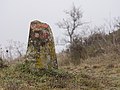
- Nomination Boundary stone no. 220 of the municipal border of Vitoria-Gasteiz, near Ullíbarri-Gamboa. Álava, Basque Country, Spain --Basotxerri 16:05, 13 January 2017 (UTC)
- Promotion Support Good quality.--Famberhorst 16:16, 13 January 2017 (UTC)
-

- Nomination Fruit of the strawberry tree (Arbutus unedo) at the Goros gorge, Badaia mountain range. Basque Country, Spain --Basotxerri 16:05, 13 January 2017 (UTC)
- Promotion Good quality. --Poco a poco 19:34, 13 January 2017 (UTC)
-

- Nomination Trail at Goros gorge, Badaia mountain range. Basque Country, Spain --Basotxerri 16:05, 13 January 2017 (UTC)
- Promotion Good quality. --Poco a poco 19:34, 13 January 2017 (UTC)
-

- Nomination A Socotra Dragon Tree, Dracaena cinnabari in the Jardín Botánico Canario Viera y Clavijo, Gran Canaria --Llez 15:07, 13 January 2017 (UTC)
- Promotion Comment It looks like perspective correction. IMO it's leaning out. --XRay 15:27, 13 January 2017 (UTC)
I agree with you, it looks like. So I checked the picture again. The palms in the uppermost right corner (see annotation) and the nearby mast are exactly vertical. So I think, the perspective is correct despite you may get another imprsssion; BTW I removed some CAs I found while checking the picture --Llez 15:59, 13 January 2017 (UTC)
Good quality. Please have a look to the background for perspektive. --XRay 17:08, 13 January 2017 (UTC)
-
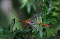
- Nomination Netelia sp. at Kioloa, NSW, Australia --99of9 13:17, 13 January 2017 (UTC)
- Promotion Good quality. --Lucasbosch 15:03, 13 January 2017 (UTC)
-

- Nomination Adrian Fritsch (Gala des Dresdner Sports 2016) --Sandro Halank 12:30, 13 January 2017 (UTC)
- Decline
 Oppose Insufficient quality. Sorry. The eyes are not sharp. But this should be. IMO not fixable. --XRay 15:30, 13 January 2017 (UTC)
-

- Nomination Nutria (Myocastor coypus) --PetarM 11:40, 13 January 2017 (UTC)
- Promotion Good quality. --Sandro Halank 12:30, 13 January 2017 (UTC)
-

- Nomination Yacht in the port of Nice --Ermell 11:16, 13 January 2017 (UTC)
- Promotion Good quality. --Sandro Halank 12:30, 13 January 2017 (UTC)
-

- Nomination Yachts in the port of Nice --Ermell 11:16, 13 January 2017 (UTC)
- Promotion Good quality. --Sandro Halank 12:30, 13 January 2017 (UTC)
-

- Nomination Yachts in the port of Nice --Ermell 11:16, 13 January 2017 (UTC)
- Promotion Good quality. --Sandro Halank 12:30, 13 January 2017 (UTC)
-

-

- Nomination Ship in the harbour of Nice --Ermell 11:16, 13 January 2017 (UTC)
- Promotion Good quality. --Sandro Halank 12:30, 13 January 2017 (UTC)
-

- Nomination Manfrotto ball head with mounted camera plate. --Lucasbosch 10:19, 13 January 2017 (UTC)
- Promotion Good quality. --Jacek Halicki 10:45, 13 January 2017 (UTC)
-

- Nomination Quick release plate for photo tripods --Lucasbosch 10:19, 13 January 2017 (UTC)
- Promotion Good quality. --Ermell 11:05, 13 January 2017 (UTC)
-

- Nomination Quick release plate for photo tripods --Lucasbosch 10:19, 13 January 2017 (UTC)
- Promotion Good quality. --Ermell 11:04, 13 January 2017 (UTC)
-

- Nomination Canon 17–40 mm lens --Lucasbosch 10:19, 13 January 2017 (UTC)
- Promotion Good quality. --Jacek Halicki 10:45, 13 January 2017 (UTC)
-

- Nomination Canon 17–40 mm lens --Lucasbosch 10:19, 13 January 2017 (UTC)
- Promotion Good quality. --Jacek Halicki 10:45, 13 January 2017 (UTC)
-
- Nomination Stroll across the botanical path from Cogolo to Peio Paese.
--Agnes Monkelbaan 06:08, 13 January 2017 (UTC) - Promotion I don't love the unsharpness in the nearest foreground, but overall, excellent. -- Ikan Kekek 07:20, 13 January 2017 (UTC)
- Nomination Stroll across the botanical path from Cogolo to Peio Paese.
-
- Nomination Walking around Lago di Pian Palù (1800 m). in the Parco nazionale dello Stelvio (Italy).
--Agnes Monkelbaan 06:08, 13 January 2017 (UTC) - Promotion Good quality. --Ermell 07:28, 13 January 2017 (UTC)
- Nomination Walking around Lago di Pian Palù (1800 m). in the Parco nazionale dello Stelvio (Italy).
-
- Nomination Walking around Lago di Pian Palù (1800 m). in the Parco nazionale dello Stelvio (Italy).
--Agnes Monkelbaan 06:08, 13 January 2017 (UTC) - Promotion Support Pretty and good quality. -- Johann Jaritz 06:38, 13 January 2017 (UTC)
- Nomination Walking around Lago di Pian Palù (1800 m). in the Parco nazionale dello Stelvio (Italy).
-
- Nomination Saint Christopher at the winged altar of the parish- and pilgrimage church Kefermarkt, Upper Austria --Uoaei1 05:49, 13 January 2017 (UTC)
- Promotion Good quality.--Famberhorst 06:04, 13 January 2017 (UTC)
-

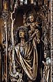
- Nomination Vita of Saint Mary Magdalene at the high altar of the parish church Waldburg, Upper Austria --Uoaei1 05:49, 13 January 2017 (UTC)
- Promotion Support Good quality.--Agnes Monkelbaan 05:58, 13 January 2017 (UTC)
-

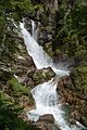
- Nomination Raufenfall in the Groppenstein Canyon near Obervellach, Carinthia --Uoaei1 05:49, 13 January 2017 (UTC)
- Promotion Good quality. -- Johann Jaritz 06:41, 13 January 2017 (UTC)
-
- Nomination Groppensteinfall in the Groppenstein Canyon near Obervellach, Carinthia --Uoaei1 05:49, 13 January 2017 (UTC)
- Promotion Good quality. -- Johann Jaritz 06:41, 13 January 2017 (UTC)
-
- Nomination Parish and pilgrimage church Assumption Day, plague cross and Mary`s institution of Merciful Nuns in Zams, Maria Saal, Carinthia, Austria --Johann Jaritz 02:35, 13 January 2017 (UTC)
- Promotion Good quality. --Uoaei1 05:54, 13 January 2017 (UTC)
-
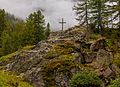
- Nomination Plague cross on Arndorfer Strasse, Maria Saal, Carinthia, Austria --Johann Jaritz 02:35, 13 January 2017 (UTC)
- Promotion Support Good quality.--Agnes Monkelbaan 05:43, 13 January 2017 (UTC)
-
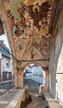
- Nomination Cutout from the fresco painting of Luke the Evangelist and Saint Saint John the Evangelist at the loggia`s vault of the plague cross on Arndorf Street, Maria Saal, Carinthia, Austria --Johann Jaritz 02:35, 13 January 2017 (UTC)
- Promotion Good quality. --Uoaei1 05:54, 13 January 2017 (UTC)
-
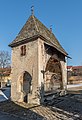
- Nomination Plague cross on Arndorfer Strasse, Maria Saal, Carinthia, Austria --Johann Jaritz 02:35, 13 January 2017 (UTC)
- Promotion Good quality. --Uoaei1 05:54, 13 January 2017 (UTC)
-

- Nomination Canonry building and charnel house on Domplatz #6, Maria Saal, Carinthia, Austria --Johann Jaritz 02:35, 13 January 2017 (UTC)
- Promotion Support Good quality.--Famberhorst 05:49, 13 January 2017 (UTC)
-

- Nomination Defensive walls in Bystrzyca Kłodzka --Jacek Halicki 00:00, 13 January 2017 (UTC)
- Promotion Good quality. --Uoaei1 06:00, 13 January 2017 (UTC)
-
- Nomination Wodna Gate in Bystrzyca Kłodzka 1 --Jacek Halicki 00:00, 13 January 2017 (UTC)
- Promotion Good quality. --Uoaei1 06:00, 13 January 2017 (UTC)
-

- Nomination Albrecht Pallas (SPD) --Sandro Halank 18:08, 12 January 2017 (UTC)
- Promotion Support Good quality. --XRay 15:32, 13 January 2017 (UTC)
-

- Nomination Andreas Heinz (CDU). By User:Stepro --Sandro Halank 18:08, 12 January 2017 (UTC)
- Promotion Weak Support Good quality but this kind of photograph should be in portrait format. --XRay 15:34, 13 January 2017 (UTC)
-

- Nomination Aline Fiedler, CDU, Member of the Parliament of the Free State of Saxony. By User:Martin Kraft --Sandro Halank 18:08, 12 January 2017 (UTC)
- Promotion Weak Support Good quality but this kind of photograph should be in portrait format. --XRay 15:34, 13 January 2017 (UTC)
-

- Nomination Petra Köpping (SPD) --Sandro Halank 18:08, 12 January 2017 (UTC)
- Promotion Good quality. --Cayambe 12:48, 13 January 2017 (UTC)
-

- Nomination Fruit of the strawberry tree (Arbutus unedo) at the Goros gorge, Badaia mountain range. Basque Country, Spain --Basotxerri 16:00, 12 January 2017 (UTC)
- Promotion Support Good quality and nice. -- Ikan Kekek 07:22, 13 January 2017 (UTC)
-
![* Nomination [edit] Rainy golden hour at Muraste Nature Reserve, Estonia.English: Rainy golden hour at Muraste Nature Reserve, Estonia.English: Rainy golden hour at Muraste Nature Reserve, Estonia. By User:Kristoffer Vaikla --1989 12:35, 12 January 2017 (UTC) * Promotion Wow --Lucasbosch 15:07, 13 January 2017 (UTC)](https://upload.wikimedia.org/wikipedia/commons/thumb/8/86/Loojangu_v%C3%A4rvid_2.jpg/120px-Loojangu_v%C3%A4rvid_2.jpg)
- Nomination [edit] Rainy golden hour at Muraste Nature Reserve, Estonia.English: Rainy golden hour at Muraste Nature Reserve, Estonia.English: Rainy golden hour at Muraste Nature Reserve, Estonia. By User:Kristoffer Vaikla --1989 12:35, 12 January 2017 (UTC)
- Promotion Wow --Lucasbosch 15:07, 13 January 2017 (UTC)
-
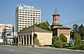
- Nomination Iași, Romania - Saint Nicholas Princely Church and Dosoftei House --Pudelek 10:59, 12 January 2017 (UTC) Comment There is a dustspot in the sky --Berthold Werner 12:35, 12 January 2017 (UTC)
Corrected :) --Pudelek 12:52, 12 January 2017 (UTC) - Promotion Good quality. --Berthold Werner 07:04, 13 January 2017 (UTC)
- Nomination Iași, Romania - Saint Nicholas Princely Church and Dosoftei House --Pudelek 10:59, 12 January 2017 (UTC)
-
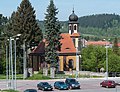
- Nomination Cemetery chapel in Lądek-Zdrój 1 --Jacek Halicki 09:44, 12 January 2017 (UTC)
- Promotion Good quality. --Uoaei1 05:58, 13 January 2017 (UTC)
-

- Nomination Picture of Regina Valenzuela's Drawing --Cvmontuy 05:56, 9 January 2017 (UTC)
- Promotion Support This is one is tricky. First I thought it was painted digitally but it's a photo. So, if I can't identify it as a photo, I think it must be good this way. OK for me. --Basotxerri 16:25, 12 January 2017 (UTC) Comment Sorry, there's just one thing: the category should be more concrete, I've seen that there is one called Drawings for turtles for example. --Basotxerri 16:35, 12 January 2017 (UTC)
Comment Thanks, category has been fixed. --Cvmontuy 16:46, 13 January 2017 (UTC)
-

- Nomination Courtyard of National Museum of Art, Mexico --Cvmontuy 21:31, 8 January 2017 (UTC)
- Withdrawn The image is almost good but I see two problems with it: the perspective and the highlights. Could you try to lower the highlights quite a lot? Currently the left side is too overexposed. Then the image is slightly tilted and possibly needs an additional vertical correction. Could you try this, please? However, I cannot promise the result will be enough for a promotion but let's see. --Basotxerri 18:52, 9 January 2017 (UTC)
Thanks for the review, I will try to reshot the picture on a better time of the day meanwhile I widthdraw mi nomination regads --Cvmontuy 03:24, 12 January 2017 (UTC)
-

- Nomination Motorcycles parking lot, Tehran, Iran --Poco a poco 09:14, 8 January 2017 (UTC) Comment Please fix the tilt, the buildings are leaning clockwise. A category on location should be added (I'm not fmiliar with the administrative divisions of Tehran, this should better known by yourself) --A.Savin 17:54, 8 January 2017 (UTC) Done, thanks Poco a poco 20:53, 11 January 2017 (UTC)
- Promotion Good quality. --Cvmontuy 14:24, 13 January 2017 (UTC)
- Nomination Motorcycles parking lot, Tehran, Iran --Poco a poco 09:14, 8 January 2017 (UTC)
-

- Nomination La vara rota 1892 --The Photographer 10:46, 6 January 2017 (UTC)
- Promotion Good quality. --Livioandronico2013 00:28, 14 January 2017 (UTC)


.jpg)


_vanaf_het_Tjeukemeer_(Tsj%C3%BBkemar)_03.jpg)


_by_Sandro_Halank_(cropped).jpg)
_in_a_partially_frozen_river_Ljubljanica.jpg)


-4070955.jpg)


._in_het_Nationaal_park_Stelvio_(Itali%C3%AB)_07.jpg)
._in_het_Nationaal_park_Stelvio_(Itali%C3%AB)_35.jpg)


_by_Sandro_Halank%E2%80%932.jpg)
_Landtagsprojekt_Sachsen_IMG_9314_LR10_by_Stepro.jpg)

_by_Sandro_Halank.jpg)

![* Nomination [edit] Rainy golden hour at Muraste Nature Reserve, Estonia.English: Rainy golden hour at Muraste Nature Reserve, Estonia.English: Rainy golden hour at Muraste Nature Reserve, Estonia. By User:Kristoffer Vaikla --1989 12:35, 12 January 2017 (UTC) * Promotion Wow --Lucasbosch 15:07, 13 January 2017 (UTC)](/wiki/File:Loojangu_v%C3%A4rvid_2.jpg)


Consensual review edit
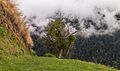
File:Woodland, Nadgigomar Nature Reserve.jpg edit

- Nomination Woodland, Nadgigomar Nature Reserve, NSW -- Thennicke 11:19, 5 January 2017 (UTC)
- Promotion
- Undefined category links, at least one dust spot, partially overexposed and the image suggests that the perspective should be corrected. I would say that unfortunately this isn't good enough for a QI but I would like to hear some other opinion. Meanwhile perhaps you could correct what's fixable, please. --Basotxerri 16:33, 11 January 2017 (UTC)
- Comment @Basotxerri: I've reworked the image and removed the dust spots. Cats are now fixed too. The perspective is not a problem in this case because I am using it for framing, in the same way that an image such as this shouldn't be perspective corrected (Perspective distortion should either have a purpose or be insignificant.) Thank you for the review also, I hadn't noticed the dust. -- Thennicke 23:31, 11 January 2017 (UTC)
- Oppose Hi Thennicke, I've checked the image again and for me personally the overexposure on the trees is too strong. However this is my opinion and if you think that it isn't strong enough to decline it, put this in CR, please, so we'll get other opinions. Sorry and thank you for the fixes you've made. --Basotxerri 16:17, 12 January 2017 (UTC)
- Comment @Basotxerri: I have moved it to CR because I disagree with your review: there is zero clipping on both the RAW histogram and my editing program's zebra function. These trees are white, which is why it might look strange, but I assure you they are exposed appropriately. I don't know how to prove this to you without sending you a RAW, but if you download the image and open it in PS or GIMP I'm sure you'll see the levels are fine. Regards -- Thennicke (talk) 09:50, 13 January 2017 (UTC)
- Support Hello Thennicke, I'm looking at it with my notebook now, the image is OK now. Thanks again for the changes. --Basotxerri 16:27, 13 January 2017 (UTC)
- Support good quality, but add a geotag please. --Alchemist-hp 10:46, 13 January 2017 (UTC)
- Comment @Alchemist-hp: Thanks and Done -- Thennicke 11:51, 13 January 2017 (UTC)
- Support - I accept your argument for the perspective non-correction, and once I've accepted that, the photo looks fine to me. -- Ikan Kekek 16:48, 13 January 2017 (UTC)
- Support - I really like it. And perspective correction is not necessary here. -- DerFussi 21:16, 15 January 2017 (UTC)
Total: 4 support (excluding the nominator), 0 oppose →  Promoted --DerFussi 21:30, 15 January 2017 (UTC)
File:St._Andreas_in_Antlas_Ritten_vier_Heilige.JPG edit

- Nomination Four saints in the Saint Andrew chapel in Antlas Ritten South Tyrol --Moroder 15:46, 4 January 2017 (UTC)
- Promotion
- Comment I disagree --Moroder 23:14, 5 January 2017 (UTC)
- Comment I am changing my oppose to a comment. Still, a histogram of the picture shows that it uses only about 70% of the brightness scale and that means that the dark/bright parts each for itself use even less of it. To my (artistically inexperienced) eye the picture looks much better when brightness is spread to the full scale, even without doing anything about the contrast between the dark and the bright parts (which might be difficult).
- We seem to have extremely high standards about things such as sharpness, aberration, and composition (the latter, btw, is addressed by my remark about symmetry). So why would we be less demanding about lighting? It is not necessary that every object permit quality images (with absolute criteria); we have featured images for such cases. -- Renardo la vulpo 21:28, 7 January 2017 (UTC)
- Your point is well taken. Just as on FPC, we sometimes observe that some motifs can't be FPs, it's also quite possible that some motifs can't be QIs. Ikan Kekek 15:54, 8 January 2017 (UTC)
- We seem to have extremely high standards about things such as sharpness, aberration, and composition (the latter, btw, is addressed by my remark about symmetry). So why would we be less demanding about lighting? It is not necessary that every object permit quality images (with absolute criteria); we have featured images for such cases. -- Renardo la vulpo 21:28, 7 January 2017 (UTC)
- Thanks for the comment. In regard to the comment about lighting problems I'd like to point out that this is not a studio photography but reproduces the real interior lighting of the chapel still keeping both parts upper and lower well legible. I agree with Ikan for the simmetry --Moroder 11:41, 6 January 2017 (UTC)
- I take your point and have struck my opposing vote. -- Ikan Kekek 03:39, 7 January 2017 (UTC)
- Support O.k. for me--Ermell 19:52, 7 January 2017 (UTC)
- Oppose simply bad light situation and the crop ... --Alchemist-hp 12:59, 8 January 2017 (UTC)
- Support Contrast could be better, but ok2go --A.Savin 17:40, 8 January 2017 (UTC)
- Support I agree with the aforementioned comments about the lighting problems, but in total I vote to promote this image on the basis that it has good sharpness despite high resolution.--Peulle 07:52, 12 January 2017 (UTC)
- Oppose Per Alchemist-hp--Lmbuga 16:58, 13 January 2017 (UTC)
Total: 3 support (excluding the nominator), 2 oppose → Promoted --Peulle 19:04, 15 January 2017 (UTC)