Commons:Quality images candidates/Archives July 09 2013
-

-
- Nomination Statue Victoria at Orangery of Schwerin Castle --Ralf Roletschek 14:03, 7 July 2013 (UTC)
- Promotion Good quality. --Smial 14:45, 7 July 2013 (UTC)
-

- Nomination Detail of bridge to the Castle, in Background the Dome (Schwerin, Germany) --Ralf Roletschek 14:03, 7 July 2013 (UTC)
- Promotion Good quality. --Smial 14:45, 7 July 2013 (UTC)
-

- Nomination town hall of Schwerin, Detail --Ralf Roletschek 14:03, 7 July 2013 (UTC)
- Promotion Good quality. --Smial 14:45, 7 July 2013 (UTC)
-
-
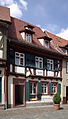
- Nomination Ladenburg am Neckar, Hauptstraße 55 --Berthold Werner 09:42, 7 July 2013 (UTC)
- Promotion Good quality. --Smial 11:03, 7 July 2013 (UTC)
-

- Nomination Aerial refueling probe and cockpit of an Armée de l'Air (French Air Force) Airbus A400M. --Julian Herzog 08:39, 7 July 2013 (UTC)
- Promotion
 Support OK --A.Savin 12:39, 7 July 2013 (UTC)
-

-
- Nomination Creag na Ceapaich, Highland, Scotland --Florian Fuchs 05:59, 7 July 2013 (UTC)
- Promotion Good quality. --Smial 11:03, 7 July 2013 (UTC)
-

- Nomination Culloden Battlefield- Leanach Cottage in Culloden Moor in Scotland --Florian Fuchs 05:35, 7 July 2013 (UTC)
- Promotion Good quality. --Smial 09:27, 7 July 2013 (UTC)
-

- Nomination Figura de Elefante --Rjcastillo 22:05, 6 July 2013 (UTC)
- Promotion QI for me--Lmbuga 01:06, 7 July 2013 (UTC)
-

-

-
-
-
-

- Nomination Warkumerwaard. Valuable nature in Friesland on the coast of the IJsselmeer in management at It Fryske Gea.--
Famberhorst 16:19, 6 July 2013 (UTC) - Promotion Good quality. --Smial 09:33, 7 July 2013 (UTC)
- Nomination Warkumerwaard. Valuable nature in Friesland on the coast of the IJsselmeer in management at It Fryske Gea.--
-

- Nomination New attempt, sharpness should be OK now :) Tokina 28mm RMC f2.8 for Nikon F mount --Tuxyso 17:30, 5 July 2013 (UTC)
- Promotion Good quality. --Smial 22:04, 5 July 2013 (UTC)
 Comment Yes, now the focus is on the right place. Thank you! --Nino Verde 04:27, 7 July 2013 (UTC)
-

- Nomination Ribeira brava coast and dock --Nino Verde 12:33, 5 July 2013 (UTC)
- Withdrawn
 I withdraw my nominationDo not like it anymore. --Nino Verde 04:27, 7 July 2013 (UTC)
-

- Nomination Alpine clover (Trifolium alpestre). --Iifar 12:54, 3 July 2013 (UTC)
- Promotion Support --Christian Ferrer 04:28, 7 July 2013 (UTC)
-

- Nomination: Spatter-and-scoria cone Caldera de los Cuervos on Lanzarote --Chmee2 13:44, 1 July 2013 (UTC)
- Review needed
-

- Nomination: Youth Hostel Kahlenberg in Mülheim an der Ruhr --Tuxyso 12:56, 1 July 2013 (UTC)
- Review needed
-

- Nomination: Ted Lundström from Amon Amarth at Rock am Ring 2013 -- Achim Raschka 11:55, 1 July 2013 (UTC)
- Review needed
-

- Nomination: Passerelle Debilly in Paris, France. --Moonik 10:03, 1 July 2013 (UTC)
- Review needed
-

- Nomination: Rosa 'César', Volksgarten in Vienna --Anna reg 09:28, 1 July 2013 (UTC)
- Review needed
-

- Nomination: Rosa 'About Face' --Captain-tucker 08:57, 1 July 2013 (UTC)
- Review needed
-

- Nomination: Entry to station Wattenscheid (Bochum) --Tuxyso 07:51, 1 July 2013 (UTC)
- Review needed
-

- Nomination: Fields in Derbyshire. Mattbuck 07:21, 1 July 2013 (UTC)
- Review needed
-

- Nomination: The east end of Reading station. Mattbuck 07:21, 1 July 2013 (UTC)
- Review needed
-

- Nomination: 150127 approaches Yatton. Mattbuck 07:21, 1 July 2013 (UTC)
- Review needed
-
- Nomination: Clapton in Gordano. Mattbuck 07:21, 1 July 2013 (UTC)
- Review needed
-

- Nomination: Cardiff Mardi Gras. Mattbuck 07:21, 1 July 2013 (UTC)
- Review needed
-

- Nomination: Italy, Sicily, Letojanni seen from the ancient theatre of Taormina --Berthold Werner 06:41, 1 July 2013 (UTC)
- Review needed
-

- Nomination Sculpture by Manuel Rodríguez. O Grove, Galicia (Spain). --Lmbuga 00:25, 24 June 2013 (UTC)
- Withdrawn Comment I don't know, sculpture looks OK but sky seem overexposed, need another opinion --Christian Ferrer 18:48, 29 June 2013 (UTC)
I don't like too much this picture because the objective was not the best to take this photo (the best objective was being repaired), but I think the image is correct (with lightroom 4 there aren't overexposed areas). If you want, I can withdraw it or, if you want, you can decline it without problems. Next month I will go to O Grove with best weather. Thanks for the revision--Lmbuga 19:48, 29 June 2013 (UTC)
No problem, it's only a picture--Lmbuga 19:52, 29 June 2013 (UTC) Comment Please wait, maybe another user will say its opinion --Christian Ferrer 19:58, 29 June 2013 (UTC)
withdrawn: Nobody likes the image and I can improve it taken other within a few days, thanks and thanks--Lmbuga 01:24, 7 July 2013 (UTC)
-

- Nomination The Sant'Apollinare church in Trento seen from the West. By User:Jaqen --Lmbuga 21:41, 6 July 2013 (UTC)
- Withdrawn Perspective distortion, sorry--Lmbuga 22:11, 6 July 2013 (UTC)
-

- Nomination Sculpture of seagulls in Cangas -73 --Lmbuga 21:21, 6 July 2013 (UTC)
- Promotion Support --Rjcastillo 23:20, 6 July 2013 (UTC)
-

- Nomination Hospital chapel, Cangas -71 --Lmbuga 21:21, 6 July 2013 (UTC)
- Promotion Good Quality --Rjcastillo 22:09, 6 July 2013 (UTC)
-

-

-

-

-

- Nomination Orchis. Plant in the Netherlands is on the red list.--
Famberhorst 18:17, 6 July 2013 (UTC) - Promotion All in focus! Good quality--Lmbuga 21:23, 6 July 2013 (UTC)
- Nomination Orchis. Plant in the Netherlands is on the red list.--
-

-

-

-

- Nomination Heuchera marmalade.
Beautiful leaf. Beautiful in a pot.--
Famberhorst 16:12, 6 July 2013 (UTC) - Promotion Good quality. --JLPC 16:35, 6 July 2013 (UTC)
- Nomination Heuchera marmalade.
-

- Nomination Cathedral Our Lady of Tikhvin, in Dankov, Russia. --A.Savin 15:29, 6 July 2013 (UTC)
- Withdrawn Comment One note added, more exposure will make it better. --Iifar 18:14, 6 July 2013 (UTC)
Yes, several lines not straight. No possibility for the right perspective from that distance. Traffic and so, you know. I withdraw my nomination --A.Savin 20:51, 6 July 2013 (UTC)
-

-

-

-

-

- Nomination Valingu train stop --Iifar 10:23, 6 July 2013 (UTC)
- Promotion Looks good taken at 19:29 h., but not perfect because, IMO, it needs a little perspective correction (the perspective distortion don't disturb). See note, I think that this line must be straight (perhaps I'm wrong)--Lmbuga 10:43, 6 July 2013 (UTC)
QI IMO with or without correction--Lmbuga 10:47, 6 July 2013 (UTC) Perspective fixed --Iifar 10:55, 6 July 2013 (UTC)
Good quaity, thanks--Lmbuga 11:06, 6 July 2013 (UTC)
-
-

-

- Nomination Old warehouse in Gävle. --ArildV 08:45, 6 July 2013 (UTC) Comment I'm thinking that it's QI for me, but probably a bit tilted CW and it needs a bit of perspective correction.--Lmbuga 10:34, 6 July 2013 (UTC)
- Promotion Thank you, new version uploaded.--ArildV 11:50, 6 July 2013 (UTC)
Good quality--Lmbuga 18:05, 6 July 2013 (UTC)
- Nomination Old warehouse in Gävle. --ArildV 08:45, 6 July 2013 (UTC)
-

-

-

-

-
-

-

-

-
-

-

-

-

-

-

-

-

- Nomination Dahlia 'Moonfire'.
Nice selection with dark leaves.--
Famberhorst 05:17, 6 July 2013 (UTC) - Promotion QI for me, but strange halo at left (see note)--Lmbuga 06:56, 6 July 2013 (UTC)
- Nomination Dahlia 'Moonfire'.
-

-

-

-

-

-

-
-
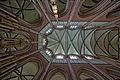
- Nomination Vaults of Doberan Minster --Ralf Roletschek 21:46, 5 July 2013 (UTC)
- Promotion Very interesting perspective. --Steindy 22:04, 5 July 2013 (UTC)
-

- Nomination Mercedes-Benz C 117 --Ralf Roletschek 21:46, 5 July 2013 (UTC)
- Promotion QI for me--Lmbuga 05:19, 6 July 2013 (UTC)
-

- Nomination Theater of Schwerin, Germany --Ralf Roletschek 21:46, 5 July 2013 (UTC)
- Promotion Good quality. --Steindy 22:04, 5 July 2013 (UTC)
-
-

-

- Nomination Laing beim Traumzeit-Festival 2013, photo taken by Krd. --Smial 21:40, 5 July 2013 (UTC)
- Promotion Good quality. --Ralf Roletschek 22:27, 5 July 2013 (UTC)
-

-

- Nomination The roman-catholic Church Maria Rosenkranzkönigin in Munich. --High Contrast 21:05, 5 July 2013 (UTC)
- Promotion Good quality. --Steindy 22:24, 5 July 2013 (UTC)
-

-

-
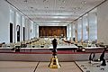
- Nomination Plenarsaal im Landtag Mecklenburg-Vorpommern --Ralf Roletschek 20:16, 5 July 2013 (UTC)
- Decline Sorry, but since only the foreground is sharp. Also found on the left side, a sensor spot. --Steindy 22:44, 5 July 2013 (UTC)
-

- Nomination Erwin Sellering, Ministerpräsident Mecklenburg-Vorpommern. Picture of Agnes Rogowski --Ralf Roletschek 20:16, 5 July 2013 (UTC)
- Promotion Good quality. --Steindy 22:44, 5 July 2013 (UTC)
-
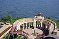
- Nomination part of the Orangery in Castle Schwerin, Germany --Ralf Roletschek 20:16, 5 July 2013 (UTC)
- Promotion Good qualiy. --Steindy 22:44, 5 July 2013 (UTC)
-

- Nomination Orangery in Castle Schwerin, Germany --Ralf Roletschek 20:16, 5 July 2013 (UTC)
- Decline The image is not really sharp. Moreover, the lady has moved to the left straight. --Steindy 22:44, 5 July 2013 (UTC)
-

- Nomination Entrada a Dabajuro --Rjcastillo 18:55, 5 July 2013 (UTC)
- Promotion Good quality. --JLPC 16:32, 6 July 2013 (UTC)
-

-

-

-

-

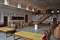
- Nomination Interior Cúpula (Sambil de Paraguana) --Rjcastillo 16:55, 5 July 2013 (UTC)
- Promotion Good quality but needs an English descrition, please. --JLPC 17:38, 5 July 2013 (UTC)
-

- Nomination statue of Herakles, Schwerin, Germany, Orangery in Castle --Ralf Roletschek 15:51, 5 July 2013 (UTC)
- Promotion Good Quality --Rjcastillo 16:52, 5 July 2013 (UTC)
-

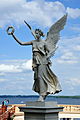
- Nomination statue of Victorya, Orangery in Castle of Schwerin, Germany --Ralf Roletschek 15:51, 5 July 2013 (UTC)
- Promotion Good quality. --Florstein 17:11, 5 July 2013 (UTC)
-

- Nomination detail of the bridge to the Schwerin Castle --Ralf Roletschek 15:51, 5 July 2013 (UTC)
- Decline The compositional idea is good, but the croped top of rhe right building is not. --Tuxyso 10:03, 6 July 2013 (UTC)
-

- Nomination Pfaffenteich, Schwerin --Ralf Roletschek 15:51, 5 July 2013 (UTC)
- Promotion QI for me--Lmbuga 05:59, 6 July 2013 (UTC)
-

-

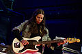
- Nomination Wes Borland of Limp Bizkit at Rock am Ring 2013 -- Achim Raschka 13:13, 5 July 2013 (UTC)
- Promotion nicht ganz scharf aber das ist in der Situation auch nicht verwunderlich. Seltsame EXIF... --Ralf Roletschek 15:51, 5 July 2013 (UTC)
-

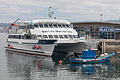
- Nomination View to the Camara de Lobos dock and buildings at back. --Nino Verde 12:33, 5 July 2013 (UTC)* Comment Really i'm not sure is it QI or not. It looks like surrealistic even for me :) --Nino Verde 12:33, 5 July 2013 (UTC)
- Promotion It looks nice for me. :) QI. --Florstein 17:11, 5 July 2013 (UTC)
- Nomination View to the Camara de Lobos dock and buildings at back. --Nino Verde 12:33, 5 July 2013 (UTC)*
-

- Nomination Town hall of Holguin, Cuba --Nino Verde 12:33, 5 July 2013 (UTC)
- Promotion Not really sharp, but useful. --JLPC 17:40, 5 July 2013 (UTC)
-

- Nomination Interior of St. Barbara Church in Mülheim an der Ruhr --Tuxyso 12:24, 5 July 2013 (UTC)
- Promotion Good quality. --Nino Verde 12:37, 5 July 2013 (UTC)
-

- Nomination Ladenburg am Neckar, Hauptstraße 53 --Berthold Werner 12:17, 5 July 2013 (UTC)
- Promotion Good quality. Top a bit unsharp but nevertheless QI to me --Moroder 12:32, 5 July 2013 (UTC)
-

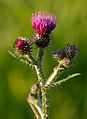
- Nomination Bitter fleabane (Erigeron acer) --Iifar 11:28, 5 July 2013 (UTC)
- Promotion Support Very nice --Christian Ferrer 11:37, 5 July 2013 (UTC)
-
-
- Nomination Tokina 28mm RMC f2.8 for Nikon F mount --Tuxyso 06:37, 5 July 2013 (UTC)
- Withdrawn Comment Looks like focus miss. Or just strange focus point. --Nino Verde 13:09, 5 July 2013 (UTC)
I agree that it could be better, but imho quality is still OK for QI. Mmmh, I've focused by hand. Probably f/13 is the problem? I will photograph is again later. Hardware (105mm AF-S Macro + D7000) should be OK. --Tuxyso 13:34, 5 July 2013 (UTC)
-

- Nomination Tokina 28mm RMC f2.8 für Nikon F (front view) --Tuxyso 06:37, 5 July 2013 (UTC)
- Promotion Good --Nino Verde 13:09, 5 July 2013 (UTC)
-

- Nomination Minehead railway station. Mattbuck 06:33, 5 July 2013 (UTC)
- Promotion Good quality. --Nino Verde 13:09, 5 July 2013 (UTC)
-

- Nomination Panorama over Weston-super-Mare sea front. Mattbuck 06:33, 5 July 2013 (UTC)
- Withdrawn I don't have time to waste fixing this. Mattbuck 06:29, 6 July 2013 (UTC)
-

- Nomination 375808 at Charing Cross. Mattbuck 06:33, 5 July 2013 (UTC)
- Promotion Good Quality --Rjcastillo 15:46, 5 July 2013 (UTC)
-

- Nomination 153321 at Derby. Mattbuck 06:33, 5 July 2013 (UTC)
- Promotion how many stations are there in GB without QI? --Ralf Roletschek 15:59, 5 July 2013 (UTC)
As of the start of May 2013, I had taken photos of 256 mainline railway stations in Britain. That's just over 10%. Mattbuck 18:09, 5 July 2013 (UTC)
-

-
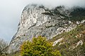
- Nomination The Martinswand in Tyrol. --Haneburger 05:40, 5 July 2013 (UTC)
- Promotion Good quality. Nice! --Moroder 11:00, 5 July 2013 (UTC)
-

- Nomination Final of the French American Football Championship 2013. --Jastrow 05:26, 5 July 2013 (UTC)
- Promotion Quality image for me. --Frank Schulenburg 06:05, 5 July 2013 (UTC)
-

-

- Nomination Mosteiro dos Jerónimos, Lisbon --APPER 23:49, 4 July 2013 (UTC)
- Promotion Very nice; also: high encyclopedic value. --Frank Schulenburg 06:08, 5 July 2013 (UTC)
-

- Nomination Larus argentatus, Herring Gull --Stu Phillips 23:20, 4 July 2013 (UTC)
- Promotion QI for me (but notes)--Lmbuga 23:28, 4 July 2013 (UTC)
-

- Nomination The steam locomotive K582 at Flintholm Station, Denmark. --Bob Collowân 21:23, 4 July 2013 (UTC)
- Withdrawn Sorry, but the locomotive is out of focus. --Steindy 21:56, 5 July 2013 (UTC) I withdraw my nomination --Bob Collowân 17:30, 6 July 2013 (UTC)
-

- Nomination Thierry Asseloos, assistent.coach of France U-19. --Steindy 21:14, 4 July 2013 (UTC)
- Promotion Good quality. --Ralf Roletschek 16:00, 5 July 2013 (UTC)
-
-

- Nomination Serra do Pilar church, Porto, Portugal --Poco a poco 20:36, 4 July 2013 (UTC)
- Promotion Good quality. --Steindy 20:56, 4 July 2013 (UTC)
-
- Nomination BMW Welt, Munich, Germany --Poco a poco 20:36, 4 July 2013 (UTC)
- Promotion Nice and difficult picture, but it needs a bit of noise reduction, in spite of this, QI for me--Lmbuga 00:40, 5 July 2013 (UTC) Done Poco a poco 19:30, 5 July 2013 (UTC)
-

- Nomination Common toad (Bufo bufo), Hartelholz, Munich, Germany --Poco a poco 20:36, 4 July 2013 (UTC)
- Decline Blur and motion blur IMO--Lmbuga 00:36, 5 July 2013 (UTC)
-
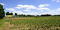
- Nomination Agricultural field in the South of Munich. --High Contrast 20:22, 4 July 2013 (UTC)
- Promotion Good quality--Llorenzi 19:41, 6 July 2013 (UTC)
-

- Nomination Cangas. Galicia (Spain) -42 --Lmbuga 20:01, 4 July 2013 (UTC)
- Withdrawn Withdrawn: Dust spot (see note)--Lmbuga 22:45, 4 July 2013 (UTC) I have no strength to go and work the picture.
-

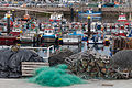
- Nomination Port of Cangas. Galicia (Spain) -49 --Lmbuga 20:01, 4 July 2013 (UTC)
- Promotion Good Quality --Rjcastillo 20:21, 4 July 2013 (UTC)
-

-

-

-

-

-

- Nomination Caryatids (1899), 16, rue d'Abbeville, Paris, 10th arr. France. --JLPC 17:07, 4 July 2013 (UTC)
- Promotion Good Quality --Rjcastillo 19:34, 4 July 2013 (UTC)
 Agree, good quality IMO, but it needs a very little perspective correction--Lmbuga 00:55, 5 July 2013 (UTC)
Done, thanks. --JLPC 18:33, 5 July 2013 (UTC)
-

-

-

-

-
- Nomination High Energy Gamma Ray Telescope (HAGAR),Hanle, Ladakh, India. It belongs to Indian Astronomical Observatory at Hanle. https://en.wikipedia.org/wiki/Indian_Astronomical_Observatory#High_Altitude_Gamma_Ray_Telescope --Trace 12:30, 4 July 2013 (UTC)
- Promotion Support --Iifar 19:16, 4 July 2013 (UTC)
-

- Nomination Old building at Marma läger, Älvkarleby, Sweden. --ArildV 11:10, 4 July 2013 (UTC)
- Promotion Support --Christian Ferrer 11:45, 4 July 2013 (UTC)
-

- Nomination Karlholmsbruk, Tierp Municipality --ArildV 11:10, 4 July 2013 (UTC)
- Promotion Good Quality --Rjcastillo 15:11, 4 July 2013 (UTC)
-

-

-

- Nomination The Baboon Show beim Ruhrpott Rodeo 2013 in Hünxe, Håkan Sörle - Guitar. --Smial 10:17, 4 July 2013 (UTC)
- Decline The crop is bad (hand should be integer - whole right hand. At the top, too much space), clear CAs (right hand and arm). I'm not sure about white balance perhaps because CAs--Lmbuga 02:11, 5 July 2013 (UTC)
-

-

- Nomination Triturus pygmaeus from Andalusia (by User:Benny Trapp) -- Achim Raschka 08:00, 4 July 2013 (UTC)
- Promotion QI for me--Lmbuga 17:58, 4 July 2013 (UTC)
-

- Nomination Blanus strauchi from Turkey (by User:Benny Trapp) -- Achim Raschka 08:00, 4 July 2013 (UTC)
- Promotion Good quality--Lmbuga 18:00, 4 July 2013 (UTC)
-

- Nomination Discoglossus (galganoi) jeannaea from Andalusia (by User:Benny Trapp) -- Achim Raschka 08:00, 4 July 2013 (UTC)
- Promotion Support --Iifar 19:18, 4 July 2013 (UTC)
-

- Nomination Italy, Sicily, Cefalù --Berthold Werner 06:49, 4 July 2013 (UTC)
- Promotion Good quality. --JLPC 17:02, 4 July 2013 (UTC)
-

-

-

- Nomination A seagull in Scarborough. Mattbuck 06:18, 4 July 2013 (UTC)
- Decline Sorry, the seagul has not a good good quality: blur areas and nothing perfectly sharp. The seagul is too little. The crop is not possible because is too little. The roof has poor quality: noise, unsharpened...--Lmbuga 00:51, 5 July 2013 (UTC)
-
-

- Nomination Mikaiah Lei of the Bots at Rock am Ring 2013 -- Achim Raschka 05:51, 4 July 2013 (UTC)
- Promotion Good IMO--Lmbuga 17:56, 4 July 2013 (UTC)
-

-
- Nomination Hérault River. Agde, Hérault, France. --Christian Ferrer 05:02, 4 July 2013 (UTC)
- Promotion Okay. --Florstein 16:02, 4 July 2013 (UTC)
-

- Nomination Hérault River. Agde, Hérault, France. --Christian Ferrer 05:02, 4 July 2013 (UTC)
- Promotion The technical quality is obvious good for QI, but sorry imo its not a good use of extreme wide angle (it is too much uninteresting foreground) and the picture would benefit from a crop (if you want to maintain the aspect ratio, you can crop it also left).--ArildV 06:31, 4 July 2013 (UTC) Done Thanks for opinion, I've cropped it, what do you think about it? --Christian Ferrer 11:27, 4 July 2013 (UTC) Better now imo.--ArildV 20:53, 4 July 2013 (UTC)
-

-

-

-

- Nomination Final of the Volleyball French Cup, Vendée Volley-Ball Club Herbretais - Foyer Laïque Saint-Quentin Volley-Ball, March 30, 2013. Luboš Novák (left) and Joël Soltin of Foyer Laïque Saint-Quentin Volley-Ball jump to block a smash by Charly Engohe of Vendée Volley-Ball Club Herbretais. --Trace 02:47, 4 July 2013 (UTC)
- Promotion Good quality. Very nice --Smial 10:27, 4 July 2013 (UTC)
-

- Nomination Ernst Scherr, keeper-coach of SKN St. Pölten. --Steindy 22:09, 3 July 2013 (UTC)
- Promotion Good quality. --Ralf Roletschek 16:02, 5 July 2013 (UTC)
-

-

- Nomination The male of Euthalia aconthea mudpuddling --Chinmayisk 20:22, 3 July 2013 (UTC)
- Decline Overexposed areas. Unnatural background (oversaturated, overexposed...)--Lmbuga 20:36, 3 July 2013 (UTC)
Also white balance IMO--Lmbuga 01:36, 5 July 2013 (UTC)
-
- Nomination Boats in Cangas, Galicia (Spain) -35 --Lmbuga 19:55, 3 July 2013 (UTC)
It needs a cw tilt Poco a poco 20:37, 3 July 2013 (UTC) Done Thanks--Lmbuga 18:26, 4 July 2013 (UTC) - Promotion Good quality. --Poco a poco 19:28, 4 July 2013 (UTC)
- Nomination Boats in Cangas, Galicia (Spain) -35 --Lmbuga 19:55, 3 July 2013 (UTC)
-

- Nomination Building in Vila Nova de Gaia, Portugal --Poco a poco 18:50, 3 July 2013 (UTC)
- Promotion Good for me. -- Trace 02:47, 4 July 2013 (UTC)
-

- Nomination BMW Welt, Munich, Germany --Poco a poco 18:50, 3 July 2013 (UTC)
- Promotion QI imo.--ArildV 06:46, 4 July 2013 (UTC)
-

- Nomination Patrouille Tranchant Fouga CM-170R Magister. --Julian Herzog 17:49, 3 July 2013 (UTC)
- Decline Too bussy background, not a QI to me, sorry --Poco a poco 20:43, 3 July 2013 (UTC)
Thanks for the review, np, fully understand. --Julian Herzog 20:13, 5 July 2013 (UTC)
-

- Nomination Sukhoi Su-35S at Paris Air Show 2013. --Julian Herzog 17:49, 3 July 2013 (UTC)
- Promotion Good quality. --JLPC 17:00, 4 July 2013 (UTC)
-

- Nomination Sukhoi Su-35S front landing gear. --Julian Herzog 17:49, 3 July 2013 (UTC)
- Promotion Ok although f/5.6 would have been better --Poco a poco 20:46, 3 July 2013 (UTC)
Thanks, not with this lens sadly, but I agree that more background blur would be better. --Julian Herzog 20:13, 5 July 2013 (UTC)
-

-

-

- Nomination The Étang de Thau. Mèze, Hérault, France. --Christian Ferrer 11:04, 3 July 2013 (UTC)
It needs a tilt, see sea level Poco a poco 20:43, 3 July 2013 (UTC) Done --Christian Ferrer 04:48, 4 July 2013 (UTC) - Promotion Good quality. --Poco a poco 19:28, 4 July 2013 (UTC)
- Nomination The Étang de Thau. Mèze, Hérault, France. --Christian Ferrer 11:04, 3 July 2013 (UTC)
-

-

- Nomination Thomas Krüger, MdL Mecklenburg-Vorpommern, SPD Fraktion --Martin Kraft 15:24, 2 July 2013 (UTC)
- Promotion At the first glance a bit too dark, at the second exactly right. The sligthly darker light (ratio 1:2 ?) from the the right is good and gives the portayal plasticity. --Tuxyso 10:53, 4 July 2013 (UTC)
-

- Nomination View of the Nahuel Huapi Lake and Andes, San Carlos de Bariloche, Argentina --Ezarate 22:03, 1 July 2013 (UTC)
- Promotion Horizon tilted --Dirtsc 13:51, 2 July 2013 (UTC) Done Ezarate 19:04, 2 July 2013 (UTC) Comment And again tilted after the color adjustment ;-) --Dirtsc 19:46, 2 July 2013 (UTC) Done reverted to not tilted version but without color adjustment --Ezarate 19:54, 2 July 2013 (UTC) Support Though its not a "postcard shot" I consider it as QI. --Dirtsc 12:40, 6 July 2013 (UTC)
-

- Nomination Common toad (Bufo bufo), Hartelholz, Munich, Germany --Poco a poco 20:13, 1 July 2013 (UTC)
- Promotion Good quality. --Stu Phillips 23:54, 4 July 2013 (UTC)
-

- Nomination View of Vila Nova de Gaia from Jardim do Morro, Portugal --Poco a poco 20:13, 1 July 2013 (UTC)
- Promotion
IMO very nice and good work but too much noise reduction, especialy in the backgroung --Christian Ferrer 05:20, 2 July 2013 (UTC) Done Poco a poco 20:33, 3 July 2013 (UTC) Support Ok now --Christian Ferrer 10:56, 5 July 2013 (UTC)
-

-

- Nomination Ted Lundström from Amon Amarth at Rock am Ring 2013 -- Achim Raschka 11:55, 1 July 2013 (UTC)
- Promotion Good quality. --Ralf Roletschek 14:39, 5 July 2013 (UTC)
-

- Nomination View of the "Ponte Nuevo" bridge in Ronda --Moroder 19:07, 30 June 2013 (UTC)
- Promotion
 Oppose Sorry, I think that it's not QI for me: Slight dust spots (see notes). Big size, but poor detail perhaps due to a strong sharpness. White halo between the sky and the horizon (see notes) and it needs perspective correction (see note, please). Sorry, for me, with this size (very good size) is possible more quality--Lmbuga 22:51, 30 June 2013 (UTC) Done Fixed DS and perspective --Moroder 12:34, 5 July 2013 (UTC)
I saw the picture with 4 megapixels and it looks very good--Lmbuga 09:37, 6 July 2013 (UTC)
-

- Nomination: Open air museum Petronell, Austria - House of Lucius Maticeius Clemens --Pudelek 16:10, 30 June 2013 (UTC)
- Review needed
-

-

-

- Nomination: Joshua Woodward of A Day to Remember at Rock am Ring 2013 (by User:Lyzzy) -- Achim Raschka 06:56, 30 June 2013 (UTC)
- Review needed
-

- Nomination: Wikipedian after GLAM conference meeting (by User:Lyzzy) -- Achim Raschka 06:56, 30 June 2013 (UTC)
- Review needed
-

- Nomination: Fountain nozzle at the open air bath "Westbad" in Munich. --Mummelgrummel 06:07, 30 June 2013 (UTC)
- Review needed
-

- Nomination 57309 at Railfest 2012. Mattbuck 04:54, 30 June 2013 (UTC)
- Promotion Support --Christian Ferrer 19:02 7 July 2013 (UTC)
-

- Nomination Scarborough beach. Mattbuck 04:54, 30 June 2013 (UTC)
- Promotion Support --Christian Ferrer 19:02 7 July 2013 (UTC)
-

- Nomination King's Cross St Pancras tube station. Mattbuck 04:54, 30 June 2013 (UTC)
- Promotion Support --Christian Ferrer 18:56 7 July 2013 (UTC)
-

- Nomination Kings Norton railway station. Mattbuck 04:54, 30 June 2013 (UTC)
- Decline Oppose A bit blurry --Christian Ferrer 18:56 7 July 2013 (UTC)
-
- Nomination Cangas. Galicia (Spain) -20 --Lmbuga 00:23, 30 June 2013 (UTC)
- Promotion Support --Christian Ferrer 18:56 7 July 2013 (UTC)
-

- Nomination The wayside shrine Annakreuz at Walpersdorf, municipality of Inzersdorf-Getzersdorf, Lower Austria. It was erected after someone being saved from lightning. --Herzi Pinki 00:15, 30 June 2013 (UTC)
- Promotion Good quality. --Steindy 23:17, 5 July 2013 (UTC)
-

- Nomination Rievalux Terrace. Mattbuck 07:29, 29 June 2013 (UTC)
- Promotion Comment The left corner at top is disturbing, can you improve it? --Christian Ferrer 20:17, 03 July 2013 (UTC) Done Mattbuck 21:12, 5 July 2013 (UTC) Support --Christian Ferrer 05:15, 6 July 2013 (UTC)
-

- Nomination 378s at Dalston Junction. Mattbuck 07:29, 29 June 2013 (UTC)
- Withdrawn Comment Nice but not enough sharp IMO --Christian Ferrer 20:17, 03 July 2013 (UTC)
No, I wouldn't promote this, never mind. Mattbuck 21:12, 5 July 2013 (UTC)
-

- Nomination: Open air museum Petronell, Austria - House of Lucius Maticeius Clemens --Pudelek 13:49, 28 June 2013 (UTC)
- Review Need perspective correction --Nino Verde 15:01, 28 June 2013 (UTC)
-

- Nomination Cangas, Galicia (Spain) -7 --Lmbuga 19:19, 27 June 2013 (UTC)
- Promotion Unsure - composition feels a bit off on the left, I think it's the moped spoiling it. Mattbuck 22:21, 2 July 2013 (UTC)
Done New version, but if you don't like it, no problem--Lmbuga 23:43, 2 July 2013 (UTC) Support Ok for me --Christian Ferrer 05:25, 6 July 2013 (UTC)
-

- Nomination Russian translator Nina Demurova. --PereslavlFoto 12:58, 27 June 2013 (UTC)
- WARNING: third template parameter added – please remove.
-

- Nomination A Bumblebee approaching a flower, with its glossa extended and ready to extract nectar. --Sputniktilt 12:23, 27 June 2013 (UTC)
- Promotion very good. --Ralf Roletschek 12:03, 5 July 2013 (UTC)
-

- Nomination Grantham railway station. Mattbuck 06:50, 27 June 2013 (UTC)
- Promotion Very darks shadows on the right side. --ArildV 08:24, 27 June 2013 (UTC) Done Mattbuck 21:04, 30 June 2013 (UTC)
Support Ok for me --Christian Ferrer 04:32, 04 July 2013 (UTC)
-

- Nomination Covent Garden tube station. Mattbuck 16:16, 26 June 2013 (UTC)
- Promotion OK. --Christian Ferrer 11:55, 5 July 2013 (UTC)
-

- Nomination Removal of two Jingdezhen Ceramic vases from the entrance of the National Museum of Ceramics of Sèvres. --Coyau 12:35, 26 June 2013 (UTC)
- Withdrawn Please sharpen. Mattbuck 21:51, 2 July 2013 (UTC) I withdraw my nomination or not. --Coyau 15:54, 4 July 2013 (UTC)
-

- Nomination Sculpture to pilgrim. Padron. -2 --Lmbuga 11:03, 26 June 2013 (UTC)
- Promotion Can you do anything about the overexposure? Mattbuck 21:51, 2 July 2013 (UTC)
I'll try tomorrow--Lmbuga 00:01, 3 July 2013 (UTC)
Done--Lmbuga 19:03, 3 July 2013 (UTC) Support Ok for me --Christian Ferrer 05:15, 6 July 2013 (UTC)
-

- Nomination Richard Höger, coach of FK Dukla Banská Bystrica. --Steindy 21:34, 25 June 2013 (UTC)
- Promotion Good quality. --Smial 10:00, 4 July 2013 (UTC)
-

- Nomination: Astilbe 'Gloria Purpurea'. Main Botanical Garden of Academy of Sciences in Moscow. --Kor!An 06:55, 24 June 2013 (UTC)
- Review Comment I don't know there is something disturbing --Christian Ferrer 21:23, 30 June 2013 (UTC)
-

- Nomination The River Isar in Munich. --High Contrast 21:42, 22 June 2013 (UTC)
- Decline Please sharpen. Mattbuck 21:39, 28 June 2013 (UTC)
 Not done Mattbuck 21:00, 5 July 2013 (UTC)
-

- Nomination Aeonium arboreum var. atropurpureum, commonly known as Black rose. --MrPanyGoff 11:33, 22 June 2013 (UTC)
- Decline I find the background a bit distracting. Mattbuck 21:39, 28 June 2013 (UTC)
Would be better with a crop at right and at left --Christian Ferrer 19:23, 29 June 2013 (UTC) Oppose Not done --Christian Ferrer 05:15, 6 July 2013 (UTC)
-

- Nomination The statue of Max von Widnmann in Munich. --High Contrast 11:01, 22 June 2013 (UTC)
- Decline Too much contrast - please raise low levels. Mattbuck 21:39, 28 June 2013 (UTC) Not done Mattbuck 21:00, 5 July 2013 (UTC)
-

- Nomination The Geisler Group in the Dolomites --Moroder 15:02, 21 June 2013 (UTC)
- Decline Comment Purple CA on the shadows on the left low part --Christian Ferrer 11:18, 28 June 2013 (UTC) Oppose Not done --Christian Ferrer 05:15, 6 July 2013 (UTC)
-

- Nomination: Silene maritima.--
Famberhorst 19:08, 19 June 2013 (UTC) - Review Subject seems rather small to me. Mattbuck 19:30, 27 June 2013 (UTC) Comment
The actual cross-section of the flower is 25 mm.--
Famberhorst 16:43, 28 June 2013 (UTC)
- Nomination: Silene maritima.--
-

- Nomination The Olympic Village in Munich in June 2013. Now students housing. --High Contrast 20:26, 17 June 2013 (UTC)
- Decline Comment It's tilted on right --Christian Ferrer 16:47, 25 June 2013 (UTC)
Fixed now. --High Contrast 18:59, 27 June 2013 (UTC)
I think the problem was perspective distortion. Mattbuck 19:14, 27 June 2013 (UTC)
yes, Mattbuck is right --Christian Ferrer 19:44, 27 June 2013 (UTC)
More is not possible at this point - if you start to straighten one line another one looks tilted. Bad building. --High Contrast 13:05, 28 June 2013 (UTC) Oppose Not done --Christian Ferrer 05:15, 6 July 2013 (UTC)


_08.JPG)


.jpg)


.jpg)


.JPG)


_IMGP7390_smial_wp.jpg)
_(Traumzeit_Festival_2013)_IMGP5523_smial_wp.jpg)

.jpg)


.jpg)


.jpg)
.JPG)


,_Hartelholz,_M%C3%BAnich,_Alemania,_2013-04-15,_DD_04.jpg)


_IMGP3896_smial_wp.jpg)
_IMGP6662_smial_wp.jpg)
_(Ruhrpott_Rodeo_2013)_IMGP6629_smial_wp.jpg)
_(Ruhrpott_Rodeo_2013)_IMGP6309_smial_wp.jpg)


_jeannaea.jpg)


.jpg)


,_Hartelholz,_M%C3%BAnich,_Alemania,_2013-04-15,_DD_09.jpg)


.JPG)


.jpg)


.dt.jpg)
Consensual review edit
File:Base_clocher_ancienne_eglise_Notre-Dame_Rungis.jpg edit

- Nomination Remains of the bell tower of the former church of Our Lady in Rungis, France. --Myrabella 21:41, 28 June 2013 (UTC)
- Promotion Comment I don't like the DOF. Why 1/500 sec? --Lmbuga 22:14, 28 June 2013 (UTC)-
Main subject is in focus and then isolated. --Myrabella 22:27, 28 June 2013 (UTC)
{{o}}You do not answer. Random image? The unsharpened tree of the left is disturbing IMO. Poor DOF (1/500 sec). --Lmbuga 22:42, 28 June 2013 (UTC)
The f-number is f/8 to have the remains of the church tower sharp and in focus. These 13th-century remains are almost hidden in the vegetation, which I tried to interpret with this tree on the left side, to give a sense of depth. --Myrabella 22:50, 28 June 2013 (UTC)
Ok, perhaps you're right. Other users can think. Sorry, I don't like the picture (Your photos I tend to like). --Lmbuga 22:59, 28 June 2013 (UTC)
Thanks for the review anyway. --Myrabella 23:02, 28 June 2013 (UTC)
![]() Support Very nice and good quality --Christian Ferrer 19:50, 29 June 2013 (UTC)
Support Very nice and good quality --Christian Ferrer 19:50, 29 June 2013 (UTC)
![]() Support left side is disturbing, but, main subject is in focus. Acceptable imho. --Rjcastillo 22:41, 29 June 2013 (UTC)
Support left side is disturbing, but, main subject is in focus. Acceptable imho. --Rjcastillo 22:41, 29 June 2013 (UTC)
![]() Comment L'effet de profondeur me semble de très bon gout et à mon avis parfaitement maitrisé, peut-etre l'image pourrait-elle etre améliorée avec un crop de 250 ou 300px de la partie gauche car je pense que ce qui peut gèner réellement dans cette image (consciement ou inconsciement), c'est plus la proportion de la végétation que l'effet en lui-meme, ou alors un cadrage plus large aurait rendu mois prédominante cette végétation qui semble tant géner les autres --Christian Ferrer 06:56, 30 June 2013 (UTC)
Comment L'effet de profondeur me semble de très bon gout et à mon avis parfaitement maitrisé, peut-etre l'image pourrait-elle etre améliorée avec un crop de 250 ou 300px de la partie gauche car je pense que ce qui peut gèner réellement dans cette image (consciement ou inconsciement), c'est plus la proportion de la végétation que l'effet en lui-meme, ou alors un cadrage plus large aurait rendu mois prédominante cette végétation qui semble tant géner les autres --Christian Ferrer 06:56, 30 June 2013 (UTC)
- Done As suggested, new version uploaded with a crop on the left side. Merci du commentaire ; comme suggéré, nouvelle version chargée avec un crop du côté gauche. --Myrabella 09:02, 30 June 2013 (UTC)
- Better for me, Support, now the tree is not perceived as an important part--Lmbuga 20:23, 30 June 2013 (UTC)
- Support --JLPC 21:08, 30 June 2013 (UTC)
- Support Good for me. --Moonik 09:25, 2 July 2013 (UTC)
File:Donauinselfest Vienna 2013 FM4-planet.tt-Insel.jpg edit

- Nomination People at Donauinselfest Vienna 2013 --Tsui 23:33, 26 June 2013 (UTC)
- Decline Too many people blurred--Lmbuga 23:58, 26 June 2013 (UTC) Comment On purpose, focus is on the booth+flag, the blur was meant to give the picture depth --Tsui 01:06, 27 June 2013 (UTC)
Therefore, insufficient depth of field. Also, the two people completely blurred of the foreground are disturbing. Sorry, it seems (although it is not) a random picture--Lmbuga 11:08, 28 June 2013 (UTC) Oppose Like Lmbuga. --Steindy 23:32, 5 July 2013 (UTC)
File:Ursynalia_2013,_Dead_by_April_05.jpg edit

- Nomination Zandro Santiago, vocalist of Dead by April band. Ursynalia 2013 Warsaw Student Festival, Poland. --CLI 13:16, 14 June 2013 (UTC)
- Promotion
- Oppose It would look better if it wasn't tilted. --Kadellar 18:44, 22 June 2013 (UTC)
- Support I think it's QI as is. Mattbuck 18:36, 27 June 2013 (UTC)
Although it may be common for concerts, I think in this case there's no need for it to be tilted. --Kadellar 14:36, 28 June 2013 (UTC) - weak Support. I'm somewhat surprised about the fact, that no one critisizes the small amount of blur and noise, which are of course nearly inevitable. -- Smial 09:29, 4 July 2013 (UTC)
- Oppose Improvable. Tilted, like Kadellar--Lmbuga 01:13, 7 July 2013 (UTC)
Total: 2 support (excluding the nominator), 2 oppose →  Inconclusive result after 8 consensual review days --Iifar 18:09, 6 July 2013 (UTC)
File:Beeston MMB 91.jpg edit

- Nomination Sunset in Beeston. Mattbuck 06:50, 27 June 2013 (UTC)
- Decline Support QI imo. --ArildV 08:24, 27 June 2013 (UTC) Oppose sorry, why is it QI? Nothing in focus. Unnatural light IMO. Too noise (sky and there is only sky). Sorry, not QI for me --Lmbuga 20:39, 27 June 2013 (UTC). Oppose And red CA on the branchs --Christian Ferrer 10:46, 28 June 2013 (UTC)
- Oppose Noisy, blurry. May be artistic, but not QI. --Nino Verde 12:40, 28 June 2013 (UTC)
- Support weak support; the blur is passable. --High Contrast 20:39, 5 July 2013 (UTC)
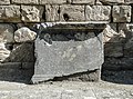
File:Johanniskloster gr kragstein (MHG).dt.jpg edit
.dt.jpg)
- Nomination corbel from the former cloister of St. John in Hamburg --Dirtsc 20:48, 26 June 2013 (UTC)
- Decline Comment The quality does not seems good. There seems to be jpg artifacts (see note) and the definition (detail) is poor--Lmbuga 00:40, 27 June 2013 (UTC).
Please take a look at the new version. Maybe it is better. --Dirtsc 20:55, 27 June 2013 (UTC)
Oppose Sorry, not QI for me: poor detail--Lmbuga 21:32, 27 June 2013 (UTC)
File:Pikk_Hermann,_Tallin,_Estonia,_2012-08-05,_DD_01.JPG edit

- Nomination Pikk Hermann, Toompea castle, Tallinn, Estonia --Poco a poco 18:13, 26 June 2013 (UTC)
- Promotion
- SupportGood quality--Lmbuga 19:25, 26 June 2013 (UTC)
- Oppose Comment Posterized flowers on the foreground. --Iifar 19:35, 26 June 2013 (UTC)
- Yes, there is some posterization, and I could crop them out but the flowers are not the subject of the picture Poco a poco 20:33, 26 June 2013 (UTC)
- Comment Good quality for me in spite of posterization--Lmbuga 21:44, 26 June 2013 (UTC)
- Support Those flowers are really negligible. -- Smial 09:11, 27 June 2013 (UTC)
- Oppose The flowers do not look nice. I personally would crop mich tighter an the top - there is no interesting sky formation. --Tuxyso 21:50, 27 June 2013 (UTC)
- Support QI for me. --Steindy (talk) 23:00, 1 July 2013 (UTC)
File:Lucca_San_Michele_5.jpg edit

- Nomination San Michele in Foro, Lucca --Aconcagua 09:08, 24 June 2013 (UTC)
- Promotion
- Oppose Sharpening halos, not acceptable the way it is but fixable Poco a poco 17:46, 24 June 2013 (UTC)
- Support I don’t see any sharpening halos worth mentioning. The whole pic is a bit soft in contrast, otherwise it’s fine to me. --Kreuzschnabel 04:25, 26 June 2013 (UTC)
- Comment Sharpening halos are on the superior part of the roof and on archangel Michael in more of its aureola --Christian Ferrer 18:30, 29 June 2013 (UTC)
- Support QI for me. --Steindy (talk) 23:02, 1 July 2013 (UTC)
- Support --High Contrast 16:52, 7 July 2013 (UTC)
- Support No issues at 100% view. By pixelpeeping there can be found some minor artifacts. -- Smial 17:02, 7 July 2013 (UTC)
File:Manuel_Ángel_Fernández_Mateo.jpg edit

- Nomination Manuel Ángel Fernández Mateo, mayor of San Sebastián de los Reyes, Madrid, Spain (2007-) --Kadellar 00:02, 23 June 2013 (UTC)
- Promotion Technically quality (sharpness, focus) is good. But the person does not look into the camera and the head is cropped. --Tuxyso 07:24, 23 June 2013 (UTC)
I'm sorry but "the head is cropped" doesn't mean anything bad to me talking about a close portrait, it is one of the most common practices in portrait photography. He's being interviewed, that's why he's not looking at me, I don't think that's too bad either. Not for the ID card, but why not QI? --Kadellar 09:42, 23 June 2013 (UTC) Support Not looking at the camera is definitively no reason to decliine, IMO good overall --Poco a poco 14:52, 23 June 2013 (UTC) Oppose Not looking into the camera with such a portrayal is the same as converging lines on building :) It was the wrong moment of shutter release. It is definitely a QI issue. --Tuxyso 20:47, 23 June 2013 (UTC) - Support Converging lines are primarily a technical issue, not looking into the camera only a matter of taste or composition. The guidelines say "The arrangement of the subject within the image should contribute to the image. Foreground and background objects should not be distracting. Lighting and focus also contribute to the overall result; the subject should be sharp, uncluttered, and well-exposed." Nothing about "persons must look into the camera". Such a rule would make it nearly impossible to nominate any photos of artists on stage. -- Smial 15:20, 27 June 2013 (UTC)
- Overseen the ":)" It was an alusion to Poco's very precise view on converging lines. To the photo: When I review a photo I do not cite guideline X but look at the whole photo. In the case here it was just the wrong time of shutter release and therefore it is not QI for me. --Tuxyso 21:48, 27 June 2013 (UTC)
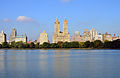
File:Landscape_Panorama_at_Hergiswil_near_Willisau_-_Lucerne_-_Switzerland_-_01.jpg edit
![]()
- Nomination Landscape panorama at Hergiswil near Willisau, canton Lucerne, Switzerland. --NorbertNagel 14:30, 9 June 2013 (UTC)
Needs a crop on the left to remove overexposure. Mattbuck 19:26, 16 June 2013 (UTC) - Promotion Not done --Mattbuck 17:45, 22 June 2013 (UTC) Done Crop is done now, no more overexposure --PJDespa 16:36, 23 June 2013 (UTC) Support QI for me now; --PJDespa 16:39, 23 June 2013 (UTC)
* Support QI for me -- Arcalino 19:21, 27 June 2013 (UTC)
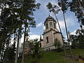
File:Strömsbergs_bruk_Juni_2013_08.jpg edit

- Nomination: Tour Guide showing Strömsberg for some Swedish Wikipedians. Strömsberg is a old iron mill and village in Tierp Municipality, Sweden. --ArildV 20:56, 19 June 2013 (UTC)
- Review
{{s}}Good quality--Lmbuga 21:06, 19 June 2013 (UTC)- OpposeBuilding cropped. Not necessary, since it reaches not much higher. --Ikar.us 13:01, 20 June 2013 (UTC)
- The building is not the main object, the guide and the people are. The composition is strong and all buildings and ruins are cropped (and serves as a striking backdrop to the people in the center of the image). You may have a different taste, but it has nothing to do with image quality.--ArildV 13:11, 20 June 2013 (UTC)
- QI is not just about technical merit. Composition is an equal criterion, and is always a matter of taste. The other buildings dont matter for me, but the guide points to the top of the center building, which is cropped unnecessarily. --Ikar.us 18:34, 20 June 2013 (UTC)
- QI is not about the perfect picture, it is not about the best possible picture. Its about a picture good enough. FP is different, you can vote against a high quality picture just because you do not like the composition, or because you think that it could have been done better. You vote against an image of high quality with a well thought out composition, for one simple reason: you wanted a completely different image. I think we must admit that, for each motif there are several different possibilities and choices (and we must respect that different photographers choose different solutions). In the end of the day, QI is all about quality, and you have not explained from a photographic perspective why this picture (and the choices the photographer made is bad) is bad. The only thing you say is "based on my personal taste, it would have been possible to make a completely different picture suited to my taste". It is ok for FP, but for QI I think we must admit that there are several possible solutions for each motif. Best regards, --ArildV 18:59, 20 June 2013 (UTC)
- How long have you been following QIC assessments? In my recent File:Neckar-Quelle.jpg I deliberately placed the blue backpack to enliven it. Someone judged that it spoils the composition and declined. But I'm not whining. Now yours is in consensual review. So relax and wait for more votes. --Ikar.us 22:10, 20 June 2013 (UTC)
- I'm not whining, and I have followed QI for years. I just question your reasons for oppose here. And it is not unnecessary to crop the building, it is actually necessary to be able take this picture and this composition with the people (not the sky or roof of the building) in focus. You ask about a completely different photo, with the building, the sky and the small people in the foreground. Maybe it's the picture you had taken, but on QI I still think we need to recognize that two different photographers can take two different images (with two different compositions) of a subject (and that both images can be QI). --ArildV (talk) 16:21, 21 June 2013 (UTC)
- How long have you been following QIC assessments? In my recent File:Neckar-Quelle.jpg I deliberately placed the blue backpack to enliven it. Someone judged that it spoils the composition and declined. But I'm not whining. Now yours is in consensual review. So relax and wait for more votes. --Ikar.us 22:10, 20 June 2013 (UTC)
- Support The technical quality of the picture is good. I would only suggest a slight perspective correction, because the walls of the upper tower are widening to the top. The scenery with the guide and the guests is very lively. I like it. --Dirtsc 17:35, 21 June 2013 (UTC)
- Oppose The quality is very good but the Tour Guide is showing with his arm the crop part of Strömsberg, it's a bit disturbing, sorry --Christian Ferrer 20:37, 23 June 2013 (UTC)
 Neutral Christian Ferrer has convinced me, sorry, I'm neutral, not support--Lmbuga 17:40, 24 June 2013 (UTC)
- Support ok. -- Smial 09:15, 27 June 2013 (UTC)
Total: 2 support (excluding the nominator), 2 oppose → Inconclusive result after 8 consensual review days --Iifar 18:01, 6 July 2013 (UTC)
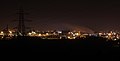
File:Panorama of Chernobyl Nuclear Power Plant.jpg edit
![]()
- Nomination Panorama of Chernobyl Nuclear Power Plant. Kruusamägi 19:56, 6 June 2013 (UTC)
- Decline
- Dust spot, needs brightening at the lower levels? Mattbuck 17:40, 13 June 2013 (UTC)
- Not done Mattbuck 16:47, 18 June 2013 (UTC)
- Done, spot is removed and brightness adjusted --Hic et nunc 07:03, 20 June 2013 (UTC)
- The picture is difficult to understand. Is the water in reality straight? Needs at least geocoding IMO. --Ikar.us 10:29, 21 June 2013 (UTC)
- Oppose for this. --Ikar.us 20:32, 28 June 2013 (UTC)
- Oppose Not QI. It is too dark, blurry in shadows (thus i suppose it is too dark), also unnatural colors. And (probably) need perspective corrections --Nino Verde 12:40, 28 June 2013 (UTC)
File:Aysgarth Falls MMB 58.jpg edit

- Nomination: Aysgarth Falls. Mattbuck 06:45, 19 June 2013 (UTC)
- Review Oppose I don't really see a subject. --Moroder 13:04, 19 June 2013 (UTC)
Does spume not count? Mattbuck 15:57, 19 June 2013 (UTC) Comment It counts certaily less than the ruins of castel Schenkenberg covered by vegetation --Moroder 16:47, 19 June 2013 (UTC)
If you disagreed with those declines, take it to discussion. Mattbuck 22:23, 19 June 2013 (UTC) Support Personally I prefear more larger centring, but main subjet is seen. Is Aysgarth Falls the main subject of this discussion? --Christian Ferrer 05:11, 20 June 2013 (UTC)
- Aysgarth Falls goes on for about a mile, this is spume near the middle falls. Mattbuck 09:35, 22 June 2013 (UTC)
- Support It is QI of water and spume. Why not? --Nino Verde 12:37, 28 June 2013 (UTC)
- Oppose Bad control of movement IMO--Lmbuga 01:52, 29 June 2013 (UTC)
- Support Same advise as Nino Verde? --Grondin 20:54, 29 June 2013 (UTC)
- Oppose Motion blur. To be really "frozen" the exposure time is way to long. To show "floating" intentionally exposure is way to short. -- Smial 09:44, 4 July 2013 (UTC) Ps. I removed category "high speed photography" as this is in no way high speed.
Total: 3 support (excluding the nominator), 3 oppose → Inconclusive result after 8 consensual review days --Ikar.us 21:24, 28 June 2013 (UTC)