Commons:Quality images candidates/Archives July 28 2013
-

-

-

- Nomination The old stores and boiler house on Christiansholm in Copenhagen. --Bob Collowân 14:00, 25 July 2013 (UTC)
- Promotion Good quality. --JLPC 15:38, 25 July 2013 (UTC)
-
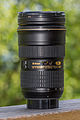
- Nomination Nikon AF-S 24-70/2,8 G ED --ArildV 13:12, 25 July 2013 (UTC)
 Comment Tilted, reflex... --Moroder 14:18, 25 July 2013 (UTC)
 - Withdrawn Tilt is easy to fix, flash reflex harder. I didnt thought it was to disturbing.--ArildV 14:39, 25 July 2013 (UTC)
- Nomination Nikon AF-S 24-70/2,8 G ED --ArildV 13:12, 25 July 2013 (UTC)
-
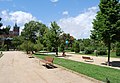
- Nomination Parc de la Ciutadella, Ciutat Vella, Barcelona. -- Felix Koenig 13:03, 25 July 2013 (UTC)
- Promotion Good quality. --JLPC 15:43, 25 July 2013 (UTC)
-

-

- Nomination Parliament building in Athens, Greece. --A.Savin 11:54, 25 July 2013 (UTC)
- Promotion IMO need a very little perspective correction, bulding seem tilted in back --Christian Ferrer 11:58 25 July 2013 (UTC)
I applied several tilt corrections already - imo the building should be OK now - can you add a note? --A.Savin 12:07, 25 July 2013 (UTC) OK, I have add note --Christian Ferrer 18:27 25 July 2013 (UTC) Done I have tilted a very little bit at the sides now, imo no further straightening possible, you're free to decide if you like it or not :) A.Savin 19:04, 25 July 2013 (UTC) Thanks for corrections and for give me the choice, very good quality
  Support --Christian Ferrer 04:49 26 July 2013 (UTC)
-

- Nomination Christ Nativity Church in Dankov, Lipetsk Oblast, Russia. --A.Savin 11:54, 25 July 2013 (UTC)
- Promotion Nice Support--Christian Ferrer 11:58, 25 July 2013 (UTC)
-

-
- Nomination Théatre de la Mer, Sète, Hérault --Christian Ferrer 11:36, 25 July 2013 (UTC)
- Promotion Support OK --A.Savin 11:46, 25 July 2013 (UTC)
-

- Nomination Pascal Street, Sète, Hérault --Christian Ferrer 11:36, 25 July 2013 (UTC)
- Promotion Good quality. --JLPC 15:38, 25 July 2013 (UTC)
-

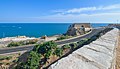
- Nomination Sète Canal, Hérault --Christian Ferrer 11:36, 25 July 2013 (UTC)
- Promotion Support good quality --A.Savin 11:44, 25 July 2013 (UTC)
-

-

-

-

-

-

-

-

- Nomination Ladenburg am Neckar, Kirchenstraße 18 --Berthold Werner 06:14, 25 July 2013 (UTC)
- Promotion Support OK --A.Savin 11:32, 25 July 2013 (UTC)
-

- Nomination Shell of a Scotch Bonnet, Semicassis granulata granulata --Llez 05:52, 25 July 2013 (UTC)
- Promotion Good quality. --Berthold Werner 06:38, 25 July 2013 (UTC)
-

- Nomination Cemetery plaque with prayer request (without sun) on La Couvertoirade, France--Dvillafruela 05:09, 25 July 2013 (UTC)
- Decline
 Oppose clearly blurred --A.Savin 11:30, 25 July 2013 (UTC)
-

- Nomination Stillwater River, Maine --Fredlyfish4 00:16, 25 July 2013 (UTC)
- Promotion Sharpness (especially at the trees in the background) could be better, but the compsosition with the crossing trunks in the center is very good. --Tuxyso 05:40, 25 July 2013 (UTC)
-

-

-

- Nomination Pantocrator. Church of Santa Comba of Rianxo. Galicia (Spain). --Lmbuga 21:52, 24 July 2013 (UTC)
- Promotion Good Quality --Rjcastillo 03:19, 25 July 2013 (UTC)
-
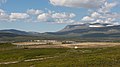
- Nomination Reindeer calf marking enclosures at Ljungris, Berg Municipality, Jämtland County. Ljungris is owned by the Sámi (Handöldalens sameby) and used for calf marking in the summer. --ArildV 21:50, 24 July 2013 (UTC)
- Promotion Support QI for me, but slight dust spot (see note, please) --Lmbuga 22:08, 24 July 2013 (UTC) Thank you, done. --ArildV 12:04, 25 July 2013 (UTC)
-

-

-

-

- Nomination Trollryggen and Trollveggen from Litlefjellet, Møre og Romsdal, Norway in 2013 June --Ximonic 21:20, 24 July 2013 (UTC)
- Promotion Nice composition, maybe slightly overexposed?--ArildV 21:50, 24 July 2013 (UTC) Thanks, there shouldn't be atleast any major overexposures but I can take a closer look and perhaps adjust a little next day. :) --Ximonic 21:55, 24 July 2013 (UTC)
-

- Nomination Panoramic view of Sahlenburg photographed from the mud flat during walking time in the morning --Tuxyso 21:19, 24 July 2013 (UTC)
- Promotion OH!, perhaps FP--Lmbuga 22:15, 24 July 2013 (UTC)
Thanks for the positive review. I will think about an FP candidature, but probably the light is not special (and good) enough. This photo has "only" a very high resolution. BTW: It is stitched from more than 30 single shots. --Tuxyso 05:37, 25 July 2013 (UTC) Nice view but the horizon seems to be a little tilted on the left side. The curved coast could be corrected in Photoshop for example. --Ximonic 09:30, 25 July 2013 (UTC)
I think it depends on the kind if projection. All verticals are completely straight. --Tuxyso 21:03, 25 July 2013 (UTC)
-

-

-

-

-

- Nomination Tower Bridge in London viewed from The Shard. --Bob Collowân 11:21, 24 July 2013 (UTC)
- Promotion Needs perspective corrections, esp. at the left --A.Savin 12:35, 24 July 2013 (UTC) New version uploaded, acceptable? --Bob Collowân 13:06, 25 July 2013 (UTC)
Yes, imo QI now. Support --A.Savin 16:18, 25 July 2013 (UTC)
-

- Nomination The cultural heritage monument Gollierstraße 40-42-44-46-46 a-46 b-46c-48-50-50 a-52 in Schwanthalerhöhe, Munich. --High Contrast 20:18, 23 July 2013 (UTC)
- Promotion I would add some sharpening. There is a tiny object the the left bottom (see note) which should be cropped out. --Tuxyso 20:57, 23 July 2013 (UTC)
All Done --High Contrast 15:12, 24 July 2013 (UTC)
OK now. --Tuxyso 21:48, 24 July 2013 (UTC)
-

-

- Nomination Red-legged Seriema at Weltvogelpark Walsrode (Walsrode Bird Park, Germany) --Fiorellino 01:59, 23 July 2013 (UTC)
- Promotion Good quality. --ArildV 12:01, 25 July 2013 (UTC)
-

- Nomination Funkturm Berlin, view from observation platform --Taxiarchos228 20:29, 22 July 2013 (UTC)
- Decline Comment Nice perspective. A bit of noise, but QI for me if the slight dust spots (notes) were fixed--Lmbuga 11:12, 23 July 2013 (UTC)
Not done--Lmbuga 00:12, 25 July 2013 (UTC)
-
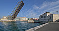
- Nomination Tivoli Bridge, Sète, France. --Christian Ferrer 17:28, 22 July 2013 (UTC)
- Promotion High quality. --ArildV 12:06, 25 July 2013 (UTC)
-

-

-
-

- Nomination: Lateral view of skull of a Dog--Przemek Maksim 06:51, 19 July 2013 (UTC)
- Review needed
-

- Nomination Berlin Friedrichstraße station --Taxiarchos228 04:29, 18 July 2013 (UTC)
- Promotion Support for me --Rolf H. 13:31, 25 July 2013 (UTC)
-

-

- Nomination Church (12th, mid-17th, 19th centuries) and lawns, Châtignac, Charente France. --JLPC 17:37, 16 July 2013 (UTC)
- Promotion Nice image and good quality but shadows of tree foliage (right of the church) and at the door of the church are too much darks Christian Ferrer 17:43, 23 July 2013 (UTC)
Done ? New try. --JLPC 17:03, 24 July 2013 (UTC) Good and nice but now the tree foliage at left is not good (le reste de l'image est maintenant impécable mais le feuillage de l'arbre de gauche n'est plus bon du tout, sur la première version il est très bien) Christian Ferrer 17:26, 24 July 2013 (UTC)
Is it better now ? --JLPC 19:24, 24 July 2013 (UTC) Support Good job, much better Christian Ferrer 04:42, 25 July 2013 (UTC)
-

- Nomination BMW 320d, BMW 335i Gran Turismo, BMW 330d automobiles in front of the exhibition facility BMW Welt. --High Contrast 20:04, 11 July 2013 (UTC)
- Promotion Not quite sure. Good, except for overexposure.
 Weak support I suppose. Mattbuck 10:04, 20 July 2013 (UTC)


_010.JPG)


.jpg)


_-_Weltvogelpark_Walsrode_2013-01.jpg)


,_Slovakia_(2).JPG)


.jpg)
Consensual review edit
File:Tullgården_i_Ratan,_main_entrance.JPG edit

- Nomination The main entrance to the customs building in Ratan ("Tullgården i Ratan"). --Jopparn 12:30, 24 July 2013 (UTC)
- Decline Comment Sharp and good detail, but bad crop (see note) and it needs a perspective correction: vertical distortion and, IMO, barrell distortion.--Lmbuga 16:18, 24 July 2013 (UTC). Great suggestions! I have uploaded another version now! Jopparn 18:13, 24 July 2013 (UTC)
Oppose Better, and it not was a bad image, but distortion. I think that it's not improvable. Other users can think, sorry--Lmbuga 20:14, 24 July 2013 (UTC)
File:Triathlon_Vallée_de_Joux_30-06-2013_-_Epreuve_cycliste_8.jpg edit

- Nomination Triathlon Vallée de Joux 30-06-2013 - Epreuve cycliste --Pleclown 11:46, 24 July 2013 (UTC)
Comment QI for me if the CAs over the cycling cap were fixed--Lmbuga 16:08, 24 July 2013 (UTC)
New version uploaded. Pleclown 16:51, 24 July 2013 (UTC)
Better, but CAs in the new version - Decline Weak opose Sorry, not QI for me. Other users can think--Lmbuga 22:00, 24 July 2013 (UTC)
File:Valais_Cup_2013_-_OM-FC_Porto_13-07-2013_-_Rod_Fanni,_Rafidine_Abdullah_et_Josué.jpg edit

- Nomination Valais Cup 2013 - OM-FC Porto - 20130713 - Rod Fanni, Rafidine Abdullah et Josué --Pleclown 11:22, 22 July 2013 (UTC)
- Promotion
The photo would be good, but the image section is great for an exciting game scene. Would be restricted to the cut scene of the game, but not the size would be less than 2 MP, therefore not QI. --Steindy 17:03, 22 July 2013 (UTC) Support Cannot see your point. Players in the background frame the in-game scene. Regarding image quality this one is MUCH better than most of the still-shots from football players which are nominated here. --Tuxyso 08:12, 23 July 2013 (UTC)
I withdraw my opinion. I realize that I have of sports- and especially football photos no idea. Greetings --Steindy 00:48, 24 July 2013 (UTC) - Support IMO QI -- Smial 14:55, 24 July 2013 (UTC)
- Oppose Sorry, improvable. The image is tilted and the "tilt" (sorry, poor english) is not expresive. I can write notes to ensure it is tilted. Noise and chromatic noise. Improvable--Lmbuga 23:44, 24 July 2013 (UTC)
File:Nova2013_HIM_Ville_Valo_0003.JPG edit

- Nomination en:Ville Valo (by Sven0705) --Jean11 19:29, 17 July 2013 (UTC)
- Promotion Comment I've not problem with the overexposed areas of the face, but the image is tilted IMO (see notes)--Lmbuga 01:59, 18 July 2013 (UTC)
weak support Very nice, but I'm not sure--Lmbuga 22:08, 23 July 2013 (UTC) - Support Ok. -- Smial 14:57, 24 July 2013 (UTC)
- Comment Thanks for your vote when I speak, Smial--Lmbuga 23:18, 24 July 2013 (UTC)
File:P-chizhikov-va-2461.jpg edit

- Nomination Painter Victor Alexandrovich Chizhikov. --PereslavlFoto 13:00, 17 July 2013 (UTC)
- Decline Oppose Unfortunate framing IMHO (space left, ear cut off) --Kreuzschnabel 10:29, 24 July 2013 (UTC)
- You speak of composition, not about image quality. --PereslavlFoto 11:13, 24 July 2013 (UTC)
- Oppose Framing is ok, a profile shot does not need in any case to be complete. But I don't like the hard lighting and the the person in the background. -- Smial 15:01, 24 July 2013 (UTC)
- Oppose As Kreuzschnabel (composition is image quality IMO)--Lmbuga 23:16, 24 July 2013 (UTC)
File:Fischerbrunnen_Cuxhaven_Segelckestraße_2013.jpg edit

- Nomination Fountain of fisher in Cuxhaven at the Segelckestraße --Tuxyso 18:52, 20 July 2013 (UTC)
- Decline
- Oppose overexposed (check histo) --A.Savin 19:43, 20 July 2013 (UTC)
- According to hightlight warning, to overexposure in the RAW file. I worked again on the highlights, on the sky and on the structure of the statue. IMHO this image is a QI. Let's discuss. --Tuxyso 06:48, 21 July 2013 (UTC)
- Good composition but blurred in background and foreground, and also purple CA on the fish Oppose --Christian Ferrer 09:58, 21 July 2013 (UTC)
- Main motive (statue) is sharp. --Tuxyso 10:43, 21 July 2013 (UTC)
- Yes, it's true, so true that the statue and especialy the fish seem paste on the background, because IMO there is something disturbing with the contour of the statue (especialy contour fish/sky) --Christian Ferrer 12:18, 21 July 2013 (UTC)
- Main motive (statue) is sharp. --Tuxyso 10:43, 21 July 2013 (UTC)
- No longer overexposed, but see above: strange haloes at the fish and the roof, probably due to sharpening and/or reducing highlights. (I doubt that it's CA, though) --A.Savin 15:38, 22 July 2013 (UTC)
- Oppose Overprocessed. Perhaps halos resulting from too strong noise reduction in the sky. The roof tiles show some acceptable noise, the sky is noiseless. So it looks like cut out. -- Smial 15:12, 24 July 2013 (UTC)
File:Rolleiflex_f2-8-F.jpg edit

- Nomination Rolleiflex 2.8 F medium format (6x6 cm) camera. --Sputniktilt 13:42, 20 July 2013 (UTC)
- Promotion Support Good quality. --Smial 14:37, 20 July 2013 (UTC)
- you're right. Done I uploaded a new file with longer DoF (f11). --Sputniktilt 12:31, 23 July 2013 (UTC)
- Support Good now. --Berthold Werner 07:40, 24 July 2013 (UTC)
File:Clarissa Stadler ö-töne 2013 b.jpg edit

- Nomination Journalist Clarissa Stadler. --Tsui 02:47, 20 July 2013 (UTC)
- Decline
- Support Good quality. --JLPC 17:29, 20 July 2013 (UTC)
- OpposeI disagree. Sorry but it's pretty blurred --Moroder 17:48, 20 July 2013 (UTC)
- Oppose As Moroder, and, IMO, the microphone in the foreground is disturbing--Lmbuga 20:40, 20 July 2013 (UTC)
- Oppose As Moroder. --Dirtsc 05:04, 23 July 2013 (UTC)
File:Bauma_2007_Loader_Liebherr_6.jpg edit

- Nomination BAUMA 2007, Loader, Liebherr --Aconcagua 09:33, 18 July 2013 (UTC)
why was the bucket cut off? --Taxiarchos228 13:49, 18 July 2013 (UTC)
Because it would have dominated the image. The vehicle is the important part, not the bucket. --Aconcagua 15:51, 18 July 2013 (UTC) - Decline
- Oppose sorry, but with the cut off bucket the composition is not harmonic and I agree not with your opinion --Taxiarchos228 19:53, 20 July 2013 (UTC)
Why not take it to CR then? --Dirtsc 21:23, 20 July 2013 (UTC) - Oppose Sorry, as Taxiarchos228--Lmbuga 21:44, 20 July 2013 (UTC)
 Neutral I'm with Aconcaguas opinion about the bucket, it would have been to dominant. The technical quality of the image is good, but I dislike the confused background. It's not easy to distinguish what part belongs to the main object and what not. --Dirtsc 17:30, 22 July 2013 (UTC)
File:Evangelische_Akademie_Tutzing_-_Rotunde_-_Glocke_002.jpg edit

- Nomination A wall bell at Evangelische Akademie Tutzing. --Mummelgrummel 08:44, 19 July 2013 (UTC)
- Decline
- Oppose Sorry! The upper and lower part of the holder is out of focus. I think that the
sheepssharpness located on the front of the bell. --Steindy 11:07, 19 July 2013 (UTC) - I can't see it this way. For me it looks sharp enough. What do you mean with sheeps located on the front of the bell? --Mummelgrummel 08:00, 20 July 2013 (UTC)
- I think he’s talking of the focus. Steindy sometimes gets confused with English words whose german translations sound similar (Schaf–scharf). Just apply some imagination :) --Kreuzschnabel 09:07, 23 July 2013 (UTC)
 Weak oppose Image is not actually unsharp in my eyes but rather noisy, causing poor level of detail considering the size. --Kreuzschnabel 09:04, 23 July 2013 (UTC)
File:Berlin_-_Funkturm16.jpg edit

- Nomination Funkturm Berlin (detail) --Taxiarchos228 19:14, 17 July 2013 (UTC)
- Decline Comment Perspective distortion (see notes and delete them when you want, please). Improbable IMO--Lmbuga 02:02, 18 July 2013 (UTC) )
sorry, but this is not tiled, this is a curved steal arbor! --Taxiarchos228 04:27, 18 July 2013 (UTC) - Oppose Perspective distortion --Lmbuga 23:09, 18 July 2013 (UTC)
you are definitly wrong, open your eyes --Taxiarchos228 10:27, 19 July 2013 (UTC) Comment But what about the note according the edge of the door? Why don't you set this vertical? --Dirtsc 10:43, 23 July 2013 (UTC)
File:Berlin_-_Funkturm6.jpg edit

- Nomination: Funkturm Berlin, porcelain isolators --Taxiarchos228 19:14, 17 July 2013 (UTC)
- Review Comment Sorry, poor description, I do not know what I see. Strong perspective distortion and probably tilted--Lmbuga 02:21, 18 July 2013 (UTC) the picture is described well now, there is no significant distortion --Taxiarchos228 04:27, 18 July 2013 (UTC)
Oppose Perspective distortion--Lmbuga 23:09, 18 July 2013 (UTC)
no significant distortion for main object --Taxiarchos228 10:27, 19 July 2013 (UTC)
![]() Support imho ok--Steinsplitter 12:04, 20 July 2013 (UTC)
Support imho ok--Steinsplitter 12:04, 20 July 2013 (UTC)
Total: 1 support (excluding the nominator), 1 oppose →  Inconclusive result after 8 consensual review days A.Savin 22:28, 27 July 2013 (UTC)
File:LatadeSchweppespomelo.jpg edit
File:LatadeSchweppespomelo.jpg
- Nomination Can of Schweppes, taste Citrus maxima --Ezarate 22:06, 16 July 2013 (UTC)
- Decline Oppose Sorry,
white balance, perspective distortion,tilted, bad background IMO--Lmbuga 22:10, 16 July 2013 (UTC) andtoo tight IMO--Lmbuga 22:12, 16 July 2013 (UTC)
The new version is better, but not QI for me. If you want you can move the image to discussion--Lmbuga 22:56, 16 July 2013 (UTC)
Let's discuss, please and sorry--Lmbuga 23:43, 16 July 2013
File:LatadeSchweppes-originalfile.JPG uploaded if anyone wants to fix this(UTC) - Oppose Background, perspective. -- Smial 15:14, 24 July 2013 (UTC)
File:Dunkleosteus Vienna 22 04 2013 1.jpg edit

- Nomination Dunkleosteus. --Vassil 23:25, 8 July 2013 (UTC)
- Promotion Are the light parts in the gill arcs and around the eye part of the cranium or the background? --V-wolf 10:52, 16 July 2013 (UTC)You're right, I forget to remove some parts of the background at the bottom of the cranium. The other light parts are the lightened inner parts of the skull. Fixed now.--Vassil 13:36 (UTC) Support Many dark areas are posterized, but I think it's OK. I bring it to discussion to hear more opinions. --V-wolf 17:31, 17 July 2013 (UTC)
File:Wien - Donauuferautobahn.JPG edit

- Nomination Part of the Austrian motorway "Donauuferautobahn" between Kaisermühlen and Floridsdorf. -- Bwag 16:29, 15 July 2013 (UTC)
- Decline
- OpposeIMHO level of detail is not sufficient (that is strange with regard to the good camera used here) --Tuxyso 17:06, 15 July 2013 (UTC)
- Support What details you want? The number plates of the cars? For me is it QI. --Steindy 11:11, 16 July 2013 (UTC)
- Support OK -- Christian Ferrer 04:44, 16 July 2013 (UTC)
- A central aspect for the quality of such cityscape photos is the level of detail. I do not mean "plates of the car", but please look on the trees, on the fassade of the high-riser at the right or on the house at the top right for instance. No details are visible at all. For me the photo looks like an 10 years old shot from a compact camera (and I don't know why because an 18MP APS-C sensor was used) - no QI for me, sorry. In addition the resolution is quite low - also supoptimal for such kind of photo. --Tuxyso 07:19, 16 July 2013 (UTC)
- Oppose I find no real sharp area. The cars at the nearest bridge are pixelated, the lawn at left seems to have artifacts, the trees at right are blurred (see notes). I think the image should be sharp nearly to the river bridge. --Dirtsc (talk) 10:04, 16 July 2013 (UTC)
- Oppose rather soft, and noisy on the sky --A.Savin 21:03, 16 July 2013 (UTC)
- Oppose nice view, but pixalisation is here an issue --Taxiarchos228 19:17, 17 July 2013 (UTC)
 Question Can one describe what is meant by "pixalisation". IMHO it is a term from image editing and does not completely fit here. Possibly it is the same issue raised by me: Loss of detail due to massive in-camera or post-processing?! --Tuxyso 20:48, 17 July 2013 (UTC)
- I think we mean the same issue. This bad processing looks like a pixelization, independent from cause. --Taxiarchos228 04:34, 18 July 2013 (UTC)
- Thanks for the clarification. I also read this lemma, but pixelization is described there as an intended effect from image editing to hide certain details (e.g. eyes) whereas the "pixelization" in this photo is an non-intended effect from post-processing of jpg compression. --Tuxyso 07:44, 18 July 2013 (UTC)
- I think we mean the same issue. This bad processing looks like a pixelization, independent from cause. --Taxiarchos228 04:34, 18 July 2013 (UTC)
File:Hillingdon tube station MMB 01 S-Stock.jpg edit

- Nomination: Hillingdon tube station. Mattbuck 06:39, 15 July 2013 (UTC)
- Review
- Oppose there is aliasing on train doors --A.Savin 09:34, 15 July 2013 (UTC)
- I don't see what you're talking about. Mattbuck 19:04, 15 July 2013 (UTC)
- Comment There is no aliasing, these are reflections from the transparent roof. -- Smial 19:27, 15 July 2013 (UTC)
- Wrong! The issues I mean, aren't reflections, for sure. Just look at the red doors of the train. --A.Savin 21:08, 16 July 2013 (UTC)
- Do you really want to decline because óf some microscopic artifacts, which can be seen at 1000% zoom? Beware! -- Smial 21:28, 16 July 2013 (UTC)
- I don't know what zoom you use for reviewing, but for my part, I use 100 (one hundred) %. --A.Savin 08:14, 17 July 2013 (UTC)
- Please make a note or a magnified crop so I can better understand what you mean. -- Smial 12:32, 17 July 2013 (UTC)
- I cannot explain it any better by adding notes. If you don't see flaws here and find the image OK for QI, I accept it (just opposing, no decline). --A.Savin 18:15, 17 July 2013 (UTC)
- Neutral A.Savin is right, there is aliasing on the train doors, IMO due to a too much red saturation. I don't know if it's fixable --Christian Ferrer 18:51, 18 July 2013 (UTC)
- I do not want to fight for this image ;-) but I believe this is not an typicel aliasing problem, since there are similar structures in other parts of the image that do not show this effect. It's only at these hard red/black edges. I assume an effect due to low resolution of the bayer filter for the red channel. We know that all pixel are interpolated from one blue, one red but two green pixels. If there is no green and no blue amount of light, the real sensor resolution is only a quarter, as there are no values to interpolate from the other colour channels. Und so rät sich die JPG-Engine bzw. der Raw-Entwickler an solchen Stellen irgendwas zusammen. (Don't know how to write this in english). I still believe, the effect is negligible, since it can only be seen in very small areas. -- Smial 09:27, 21 July 2013 (UTC)
- I cannot explain it any better by adding notes. If you don't see flaws here and find the image OK for QI, I accept it (just opposing, no decline). --A.Savin 18:15, 17 July 2013 (UTC)
- Please make a note or a magnified crop so I can better understand what you mean. -- Smial 12:32, 17 July 2013 (UTC)
- I don't know what zoom you use for reviewing, but for my part, I use 100 (one hundred) %. --A.Savin 08:14, 17 July 2013 (UTC)
- Do you really want to decline because óf some microscopic artifacts, which can be seen at 1000% zoom? Beware! -- Smial 21:28, 16 July 2013 (UTC)
- Wrong! The issues I mean, aren't reflections, for sure. Just look at the red doors of the train. --A.Savin 21:08, 16 July 2013 (UTC)
Total: 1 support (excluding the nominator), 1 oppose → Inconclusive result after 8 consensual review days A.Savin 22:24, 27 July 2013 (UTC)
File:U-19 EC-Qualifikation Austria vs. France 2013-06-10 (139).jpg edit
.jpg)
- Nomination: Gaëtan Laborde (FC Girondins Bordeaux), player of the France U-19 footballteam. --Steindy 22:17, 7 July 2013 (UTC)
- Review Good quality. --Smial 19:33, 13 July 2013 (UTC)
Sorry I disagree, noisy background and not really sharp even after downsampling to just above 2 MPix. --D4m1en 09:41, 15 July 2013 (UTC)
::And how much needs? If you want more, the change the rule! And the slight noise in the background is crucial in a portrait, not the person depicted? Your comments are remarkably... --Steindy 00:46, 16 July 2013 (UTC) Support Good quality, the background is not important. Pleclown 11:56, 23 July 2013 (UTC) - Oppose As D4m1en, sorry--Lmbuga 22:35, 23 July 2013 (UTC)
Total: 2 support (excluding the nominator), 2 oppose → Inconclusive result after 8 consensual review days A.Savin 22:23, 27 July 2013 (UTC)
File:Morus_bassanus_Zoo_Bremerhaven_01.jpg edit

- Nomination Morus bassanus --Tuxyso 22:12, 12 July 2013 (UTC)
- Promotion Technically good but beak is blending with the rock in background. --Yndesai 11:31, 13 July 2013 (UTC)
Sorry, but this is no reason for decline. IMHO composition is good that way. Let't discuss. --Tuxyso 13:37, 13 July 2013 (UTC)
- Oppose I would not put this image among Birds since it does not meet composition criteria IMO Yndesai (talk) 10:42, 20 July 2013 (UTC).
- Comment good, but see notes. I'm thinking that it's QI for me--Lmbuga 19:44, 15 July 2013 (UTC)
- Done Thanks for the hint. The "artefacts" were from CA removal. --Tuxyso 20:58, 15 July 2013 (UTC)
- Support Good quality IMO--Lmbuga 21:36, 17 July 2013 (UTC)
- Support Nice portrait of a bird (the rocks in the background don't bother me - in fact, the feathery heap in the foreground confused me more... ;-) ) Anna reg 21:30, 20 July 2013 (UTC)
- Support --Christian Ferrer 09:44, 21 July 2013 (UTC)
File:Tuscan_Landscape_3.JPG edit

- Nomination Tuscan panorama as seen from Montepulciano --Martin Falbisoner 04:20, 8 July 2013 (UTC)
- Decline
- Support Ok for me, nice picture. --Adbar 19:45, 11 July 2013 (UTC)
- Oppose Lack of details, oil painting effect - too strong noise reduction? --Myrabella 21:20, 12 July 2013 (UTC)
- Oppose as Myrabella --Berthold Werner 07:04, 20 July 2013 (UTC)
File:Nottingham railway station MMB 82 222XXX 170103.jpg edit

- Nomination Looking down on Nottingham station. Mattbuck 21:26, 11 July 2013 (UTC)
- Promotion The roof is in large parts overexposed (tracing missing). --Steindy 22:00, 11 July 2013 (UTC)
I'd argue that little of worth is lost here, and would like a 2nd opinion. Mattbuck 23:04, 11 July 2013 (UTC)
Support Yes, it's true, the roof is overexposing, but it's not very disturbing IMO. --Christian Ferrer 05:22, 12 July 2013 (UTC)
{{o}} The perspective distortion is disturbing, too much IMO. Harsh shadows. --Lmbuga 18:29, 15 July 2013 (UTC)- It was taken from several storeys up and barely 10m away laterally. I fixed horizontal perspective, but vertical fixing was not an option. Mattbuck 18:48, 15 July 2013 (UTC)
- Support The overexposing in part of the roof is acceptable. Overall the image is well lit. I can see no perspective "distortion", horizontals are horizontal and any vertical correction would destroy the image. --Dirtsc 09:47, 16 July 2013 (UTC)
- Neutral I have heard you. New review. I am not opposing--Lmbuga 21:34, 17 July 2013 (UTC)
File:Skarpö_June_2013_08.jpg edit

- Nomination Small cottage on the island Skarpö in the Stockholm archipelago. --ArildV 07:35, 10 July 2013 (UTC)
- Promotion Oppose Blurred at left and too much green at left in background, sorry --Christian Ferrer 11:41, 10 July 2013 (UTC)
- Support I disagree. Blur is 'natural' DOF, I believe it is acceptable, regarding lighting, composition and distance to the object. --Smial 13:04, 11 July 2013 (UTC)
- And also purple CA on tree,right is nice and composition is good but IMO the left part of the image have not enough quality and can't be repaired --Christian Ferrer 18:14, 11 July 2013 (UTC)
 Info I removed the small traces of CA that was left.--ArildV 18:53, 11 July 2013 (UTC)
- Support With 4,895 × 3,268 pixels, clear QI for me now--Lmbuga 18:40, 15 July 2013 (UTC)
- Comment Sorry, I think that it's QI, but the image or it's a bit tilted CW or it needs a bit of perspective correction. But I'm not sure: See the vertical lines of the left, please--Lmbuga 18:49, 15 July 2013 (UTC) Perhaps the house was tilted--Lmbuga 18:50, 15 July 2013 (UTC)
- I uploaded a new version, trying to correct it (I hope its better, but I'm not sure)--ArildV 08:07, 16 July 2013 (UTC)
- Better and good quality IMO--Lmbuga 21:21, 17 July 2013 (UTC)
File:The_Devil_Wears_Prada-19.jpg edit

- Nomination: The Devil Wears Prada @ With Full Force Festival 2013. Taken by User:Menschenmaterial --Smial 21:58, 4 July 2013 (UTC)
- Review Insufficient DOF for me. --Mattbuck 21:52, 10 July 2013 (UTC)
I disagree. The face is perfectly sharp. Those musicians tend to jump around the stage, you need short shutter times and in most cases wide open apertures, to catch them properly! --Smial 16:25, 11 July 2013 (UTC){{o}}Motion blur. Only the face and the half of the right arm are sharp. To be QI, it needs more IMO, but nice--Lmbuga 18:53, 15 July 2013 (UTC) It seems tilted, clearly tilted--Lmbuga 18:54, 15 July 2013 (UTC) - Dear Lmbuga, please STOP to argue with this "tilt" reasoning when judging stage photography. In most cases this is part of intended composition. And again: Due to low light situation AND often fast moving persons it is in most cases impossible to get images without noise AND high DOF AND no motion blur. Take two out of three. -- Smial 10:03, 16 July 2013 (UTC)
Comment No comment: I think that you supposed me bad intentions: I can't understand the word "dear" and the use of capital letters. I think that I have the right to be different from you, ...that does not mean that I'm not confused (es: eso no quiere decir que yo no esté confundido) --Lmbuga 02:31, 18 July 2013 (UTC)
Sorry, you are not going to silence me using capital letters--Lmbuga 02:46, 18 July 2013 (UTC)
Comment Others can think, but the lines of the image are not stright (see notes) and to me are disturbing. Can you delete them?--Lmbuga 02:56, 18 July 2013 (UTC)
- It is not my image, so I will not manipulate anything. The point is: I believe it is not acceptable to decline stage photography (or sports) using rules that fit to architectural or studio photography. I have no problem if s.o. declines completely unsharp photos or with strong over/underexposure. I have a problem with declines because auf "too noisy", if it was inevitable to use ISO 3200 or above. Even the best modern full frame DSLR show either noise or lost details above ISO 3200. Compared to DSLR 5, 6 years ago, the technical quality today is astonishing good, but these moderen cameras are not wizards. -- Smial 12:48, 18 July 2013 (UTC)
- Ok, now I understand you but I still think that these images should not be tilted. Usually, I do not vote in images made at night. I have not enough experience at night. But if tilted or distorted, I vote. I will not vote in photos like this, but if the pictures are tilted, I will vote. I'm thinking if the picture can be QI for me, but tilted.--Lmbuga 20:34, 18 July 2013 (UTC)
- It is not my image, so I will not manipulate anything. The point is: I believe it is not acceptable to decline stage photography (or sports) using rules that fit to architectural or studio photography. I have no problem if s.o. declines completely unsharp photos or with strong over/underexposure. I have a problem with declines because auf "too noisy", if it was inevitable to use ISO 3200 or above. Even the best modern full frame DSLR show either noise or lost details above ISO 3200. Compared to DSLR 5, 6 years ago, the technical quality today is astonishing good, but these moderen cameras are not wizards. -- Smial 12:48, 18 July 2013 (UTC)
- New review. Tilted and I think the same as Matbuck; but the important to me is "tilted"--Lmbuga 20:38, 18 July 2013 (UTC). I withdraw my vote: I don't want problems--Lmbuga 20:48, 18 July 2013 (UTC)
- From COM:IG (again):
- Distortions:
- Images should not be unintentionally tilted.
- Images of architecture should usually be rectilinear.
- Perspective distortion should either have a purpose or be insignificant.
- There is nowhere an "every image must be untilted". Not even for architecture this is in every case demanded. If well-founded images may be tilted and may have perspective distortion. -- Smial 12:56, 23 July 2013 (UTC)
- For me, quality is ok, there is no noise, the face is very sharp, the motion blur is ok for a stage photography. I don't mind the tilt, often used in this case to emphasize the action, as long as it is an obvious choice. The only issue is the clear part under the knee, which I find disturbing.--Vassil 7:17, 19 July 2013 (UTC)
- Sorry, I don't want to vote, but as Mattbuck and tilted. Oppose Not QI for me. I can not be in silent--Lmbuga 00:02, 22 July 2013 (UTC)
- Support I cannot see a problem with this photo. DoF is OK for me. Yes, there is a tilt, but correction would lead to a bad crop. IMHO the composition is better as it is (especially regarding digonality). --Tuxyso 22:00, 24 July 2013 (UTC)
- Comment Ok, but the correction of a tilted image always implies a worse image, except if the tilt is minimal. Sorry, I dont think that the tilted image is intentional--Lmbuga 22:31, 24 July 2013 (UTC)
Random image? I don't know. Tilted... but the tilt dosen't is expressive, IMO--Lmbuga 22:33, 24 July 2013 (UTC)
- No other words here. Thanks to everyone and to Smial--Lmbuga 22:49, 24 July 2013 (UTC)
Total: 2 support (excluding the nominator), 2 oppose → Inconclusive result after 8 consensual review days A.Savin 22:18, 27 July 2013 (UTC)
File:Newport railway station MMB 07.jpg edit

- Nomination Newport railway station. Mattbuck 06:46, 3 July 2013 (UTC)
- Promotion
- Support I disagree. Some CA and somewhat underexposed, both is easily fixable. "no" quality is a really too harsh judgement. --Smial 16:34, 11 July 2013 (UTC)
- Yes you're right, I changed my judgement : not enough quality and too much blurred --Christian Ferrer 18:05, 11 July 2013 (UTC)
 Fixed Mattbuck 20:46, 13 July 2013 (UTC)
- Comment Just for information, left and right are leaning out --Christian Ferrer 04:54, 14 July 2013 (UTC)
- I fixed that in the new version, guess it didn't update. I purged it and all seems well now. Mattbuck 20:49, 14 July 2013 (UTC)
- Comment Not good detail for me, perhaps to be too sharpened, but I'm not sure--Lmbuga 03:14, 18 July 2013 (UTC)
- I change to Support, I'm really too harch in my judgement and in my comment, there is now no specific defect in this image --Christian Ferrer 18:56, 25 July 2013 (UTC)
File:Helsinki July 2013-13.jpg edit
- Nomination Lutheran Cathedral of Helsinki, Finland -- Alvesgaspar 18:18, 10 July 2013 (UTC)
- Decline hey, thats my motiv! --Ralf Roletschek 19:57, 10 July 2013 (UTC)
Sorry Joaquim, there are lots of stitching errors. Biopics 20:37, 10 July 2013 (UTC)
Question Where the stitching errors, please? I can't see it, and I can learn --Lmbuga 19:08, 15 July 2013 (UTC) {{s}} It's taken from below and I don't like the perspective correction because it's excessive: Distorted IMO--[[User:Lmbuga|Lmbuga]] 19:13, 15 July 2013 (UTC) <br> New review. I think that it's a good picture and QI--[[User:Lmbuga|Lmbuga]] 10:17, 17 July 2013 (UTC)- Support - good quality and nice view. -- Felix Koenig 13:24, 22 July 2013 (UTC)
- Oppose stitching errors ( Info annotations added), blown whites. --Carschten 15:06, 24 July 2013 (UTC)
- Oppose Thanks Carschten, as you--Lmbuga 23:54, 24 July 2013 (UTC)
File:Hora_Zulú_-_Asaco_Metal_Fest_2013_-_01.jpg edit

- Nomination: Hora Zulú at Asaco Metal Fest 2013, Parla, Spain. --Kadellar 21:16, 2 July 2013 (UTC)
- Review Disturbing cut on the left, could be fixed by cropping --Martin Kraft 21:51, 2 July 2013 (UTC) Done now. --Kadellar 22:06, 2 July 2013 (UTC)
Oppose tilted--Lmbuga 01:25, 5 July 2013 (UTC) - Support I disagree. Many concert photographs are tilted by intention, not a valid reason to decline images of this genre. --Smial 14:57, 7 July 2013 (UTC)
- Support QI to me. --Ralf Roletschek 20:34, 9 July 2013 (UTC)
- Weak oppose As Lmbuga. If it hadn't been for the (supposed) vertical line, the tilt could have been an artistic feature.--V-wolf 15:09, 13 July 2013 (UTC)
Total: 2 support (excluding the nominator), 2 oppose → Inconclusive result after 8 consensual review days A.Savin 22:14, 27 July 2013 (UTC)
File:Clara_Luzia_-_Donauinselfest_Vienna_2013_23.jpg edit

- Nomination Clara Luzia - Donauinselfest 2013 in Vienna, Austria. Image by Tsui. --Smial 20:30, 27 June 2013 (UTC)
- Promotion
- Comment Nice, but the head is not sharpen enough IMO--Lmbuga 20:52, 27 June 2013 (UTC)
- SupportFor me barely OK, but I do not understand why Tsui shot at ISO 5000 and 1/640sec. --Tuxyso 21:53, 27 June 2013 (UTC)
- Oppose It doesn't quite seem QI to me either. Mattbuck 22:21, 2 July 2013 (UTC)
- its a concert, lets discuss.
- For me it is Support a QI --Ralf Roletschek 12:03, 5 July 2013 (UTC)
- Neutral Too tight at top IMO and it can be more sharp (motion blur?)--Lmbuga 09:42, 6 July 2013 (UTC)
- Neutral Overall a good image. But the head of the singer seems out of focus. --Dirtsc 10:19, 16 July 2013 (UTC)
- Weak support The singer's face could be sharper, but concert conditions are difficult. Nice atmosphere. --Jastrow (Λέγετε) 09:56, 20 July 2013 (UTC)
- Support The head is sharp enough! --Jean11 21:55, 26 July 2013 (UTC)