Commons:Quality images candidates/Archives June 19 2014
-

- Nomination The tower buildings at the Hafenspitze in Düsseldorf at sunset --Martin Kraft 20:49, 16 June 2014 (UTC)
- Promotion Good quality. --Ralf Roletschek 20:52, 16 June 2014 (UTC)
-

- Nomination Statue of male nude (Hercules?) on the parapet of the Biblioteca Marciana in Venice. --Moroder 20:28, 16 June 2014 (UTC)
- Promotion Good quality. --Martin Kraft 20:49, 16 June 2014 (UTC)
-

- Nomination Panoramic view of the river front of Rüdesheim am Rhein --Martin Kraft 20:26, 16 June 2014 (UTC)
- Promotion
 Support QI --Rjcastillo 20:46, 16 June 2014 (UTC)
-

- Nomination Drosera rotundifolia in National Park Slobozhanskyi. By User:Ryzhkov Sergey --BaseSat 20:02, 16 June 2014 (UTC)
- Promotion Good quality. --Martin Kraft 20:49, 16 June 2014 (UTC)
-

- Nomination Two garden tiger moth caterpillars --Baykedevries 19:52, 16 June 2014 (UTC)
- Promotion Good quality. --Martin Kraft 20:49, 16 June 2014 (UTC)
-

- Nomination A330 of Garuda Indonesia at Schiphol. By User:Alfvanbeem --Gyrostat 19:25, 16 June 2014 (UTC)
- Promotion Good quality. --Martin Kraft 20:49, 16 June 2014 (UTC)
-

- Nomination Relief with mythological scene on a arch of the Biblioteca Marciana in Venice. --Moroder 18:42, 16 June 2014 (UTC)
- Promotion Good quality. --Poco a poco 18:49, 16 June 2014 (UTC)
-

- Nomination The Vedh Shala, Ujjain, India --Bgag 17:54, 16 June 2014 (UTC)
- Promotion Good quality. --Poco a poco 18:49, 16 June 2014 (UTC)
-

- Nomination Cemetery chapel in Bydlin, Poland --1bumer 17:44, 16 June 2014 (UTC)
- Promotion Good quality. --Poco a poco 18:49, 16 June 2014 (UTC)
-

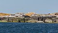
- Nomination Phi Phi Lay Island, Thailand --Poco a poco 16:28, 16 June 2014 (UTC)
- Promotion Good quality. --Joydeep 16:42, 16 June 2014 (UTC)
-

- Nomination Inhabitated cave in Phi Phi Lay Island, Thailand --Poco a poco 16:28, 16 June 2014 (UTC)
- Promotion Good quality. --Joydeep 16:43, 16 June 2014 (UTC)
-

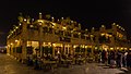
- Nomination Souq Waqif, Doha, Qatar --Poco a poco 16:28, 16 June 2014 (UTC)
- Promotion Good quality. --Cayambe 20:14, 16 June 2014 (UTC)
-

- Nomination Wat Chang, Ayutthaya, Thailand --Poco a poco 16:28, 16 June 2014 (UTC)
- Promotion Support QI --Rjcastillo 18:47, 16 June 2014 (UTC)
-

- Nomination Visually impaired athlete and guide are linked together --Pyb 16:16, 16 June 2014 (UTC)
- Promotion Good quality. --Poco a poco 18:53, 16 June 2014 (UTC)
-
-

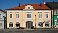
- Nomination Secondary school at Aspang-Markt, Lower Austria --P e z i 14:32, 16 June 2014 (UTC)
- Promotion
 Comment There is a dust spot (see note).--XRay 16:30, 16 June 2014 (UTC)
 Done Thanks for review. New version uploaded. --P e z i 16:36, 16 June 2014 (UTC) Support Good quality. --XRay 16:40, 16 June 2014 (UTC)
-

- Nomination Stained glass window in the choir of Catholic Church St. Anthony, Kuala Lumpur, Malaysia --Cccefalon 13:25, 16 June 2014 (UTC)
- Promotion Support QI --Rjcastillo 13:54, 16 June 2014 (UTC)
-
-

- Nomination Traffic signs in Malaysia: Warning sign "Farm vehicle crossing" --Cccefalon 13:25, 16 June 2014 (UTC)
- Promotion Support QI --Rjcastillo 13:54, 16 June 2014 (UTC)
-

- Nomination Telamon at the entrance of the Biblioteca Marciana in Venice. --Moroder 13:08, 16 June 2014 (UTC)
- Promotion Support QI --Rjcastillo 13:54, 16 June 2014 (UTC)
-

- Nomination Telamon at the entrance of the Biblioteca Marciana in Venice. --Moroder 13:08, 16 June 2014 (UTC)
- Promotion Support QI --Rjcastillo 13:54, 16 June 2014 (UTC)
-

- Nomination Muslim Cemetery along the Eastern Wall of the Old City of Jerusalem --Nikodem Nijaki 11:42, 16 June 2014 (UTC)
- Promotion Good quality. --Poco a poco 18:53, 16 June 2014 (UTC)
-

- Nomination Naples, Gesù Nuovo --Berthold Werner 11:37, 16 June 2014 (UTC)
- Promotion Good quality. --Joydeep 16:44, 16 June 2014 (UTC)
-
-

- Nomination France, Straßburg, Center of town --Ralf Roletschek 11:12, 16 June 2014 (UTC)
- Promotion Good quality. Support --Ivan2010 11:35, 16 June 2014 (UTC)
-

-

-

-

- Nomination Flowering Vanda cultivar. --Bff 10:39, 16 June 2014 (UTC)
- Promotion Support ok --A.Savin 10:46, 16 June 2014 (UTC)
-

-

- Nomination Penampang, Sabah: The Unduk Ngadau 2013, Immaculate Lojuki --Cccefalon 10:18, 16 June 2014 (UTC)
- Promotion Good quality. --Poco a poco 19:00, 16 June 2014 (UTC)
-

- Nomination A320 of Air France at Schiphol. By User:Alfvanbeem --Gyrostat 10:11, 16 June 2014 (UTC)
- Decline Very (!) unfortunate crop left and right. No QI for me. --Cccefalon 10:19, 16 June 2014 (UTC)
-
-

- Nomination Prince Koloni during Rio Loco 2014 in Toulouse. --PierreSelim 06:48, 16 June 2014 (UTC))
- Promotion Good quality. --Poco a poco 19:00, 16 June 2014 (UTC)
-

- Nomination 150214 at hammerton. Mattbuck 06:36, 16 June 2014 (UTC)
- Promotion Not really a reason for objecting, but I think the phoo could be far better with a tighter crop left and right to get rid of some disturbing elements. I made an annotation. However, I support this photo as QI. --Cccefalon 06:46, 16 June 2014 (UTC)
-

-

-
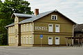
- Nomination Hostel next to Tartu railway station. Kruusamägi 00:46, 16 June 2014 (UTC)
- Decline
 Oppose partially unsharp; and some noise (incl. chromatic one) on shadowed areas --A.Savin 10:34, 16 June 2014 (UTC)
-

- Nomination Supreme Court of Estonia. Kruusamägi 00:46, 16 June 2014 (UTC)
- Promotion Good quality. --Cayambe 09:48, 16 June 2014 (UTC)
-

-

- Nomination Silo bulk storages of Katoen Natie, Wesseling, Köln, Germany --Cccefalon 19:05, 15 June 2014 (UTC)
- Withdrawn Oppose something's wrong with the detail, blurred --A.Savin 10:31, 16 June 2014 (UTC)
yes, something happened there and it proved to be unresolvable. I withdraw. --Cccefalon 21:33, 16 June 2014 (UTC)
-

-
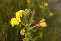
- Nomination Oenothera biennis --Christian Ferrer 17:42, 15 June 2014 (UTC)
- Promotion Support good --A.Savin 10:29, 16 June 2014 (UTC)
-

- Nomination National Park Drents-Friese Wold. Location Fochteloërveen in the Netherlands.
Famberhorst 15:36, 15 June 2014 (UTC) - Promotion Good quality --Llorenzi 10:03, 16 June 2014 (UTC)
- Nomination National Park Drents-Friese Wold. Location Fochteloërveen in the Netherlands.
-

- Nomination Eryngium maritimum --Christian Ferrer 14:21, 15 June 2014 (UTC)
- Promotion Good quality--Llorenzi 08:17, 16 June 2014 (UTC)
-

-

- Nomination Statues of male nudes (Bacchus and Mars?) on the parapet of the Biblioteca Marciana in Venice. --Moroder 07:19, 15 June 2014 (UTC)
Also dust spots here and a bit dark? Poco a poco 11:22, 15 June 2014 (UTC) Done Thanks --Moroder 13:09, 15 June 2014 (UTC)
Not yet, see notes Poco a poco 21:40, 15 June 2014 (UTC) Done I must have killed all the beasts by now including the poor swallow --Moroder 14:06, 16 June 2014 (UTC) - Promotion Just ok, still some remaining areas. I think that the reason for the fil size is the noise in the sky --Poco a poco 18:24, 16 June 2014 (UTC)
- Nomination Statues of male nudes (Bacchus and Mars?) on the parapet of the Biblioteca Marciana in Venice. --Moroder 07:19, 15 June 2014 (UTC)
-

-

- Nomination South facade of St. Vitus Cathedral in Prague --Jacek Halicki 22:11, 11 June 2014 (UTC)
- Promotion Comment Please add english description and geo location.--XRay 16:38, 12 June 2014 (UTC) DoneDescription added, but I do not know how to add geo location Jacek Halicki 11:37, 13 June 2014 (UTC) Comment For geocoding please have a look to Geocoding.--XRay 13:31, 13 June 2014 (UTC) Done Geolocation added Support Good quality. The bottom is not optimal, but IMO it's QI. --XRay 15:23, 16 June 2014 (UTC)
-

- Nomination: Taipei, Taiwan: Taiwanese woman praying after bringing her offerings to Mengjia Longshan Temple --Cccefalon 04:42, 11 June 2014 (UTC)
- Review needed
-

- Nomination: Prague Castle Guard --Jacek Halicki 22:02, 10 June 2014 (UTC)
- Review needed
-

- Nomination: Benton Township, Columbia County, Pennsylvania from the Benton Overlook. Jakec 19:45, 10 June 2014 (UTC)
- Review needed
-

- Nomination: Fishing Creek near its source Jakec 19:45, 10 June 2014 (UTC)
- Review needed
-

- Nomination: Streambed of Fishing Creek near its source Jakec 19:45, 10 June 2014 (UTC)
- Review needed
-

- Nomination: Nescopeck Mountain. Jakec 19:45, 10 June 2014 (UTC)
- Review needed
-

- Nomination: Presentation of two of the contestants for Unduk Ngadau 2014 beauty pageant. --Cccefalon 19:46, 10 June 2014 (UTC)
- Review needed
-

- Nomination: Nationaal Park Drents-Friese Wold. Location Fochteloërveen. Brunstingerplas.
Famberhorst 18:07, 10 June 2014 (UTC) - Review needed
- Nomination: Nationaal Park Drents-Friese Wold. Location Fochteloërveen. Brunstingerplas.
-
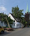
- Nomination: Storm damage at Honigsberger Straße 61 in Mülheim an der Ruhr --Tuxyso 17:53, 10 June 2014 (UTC)
- Review needed
-
- Nomination: Gardens of the Water. Parque das Nações, Lisbon -- Alvesgaspar 17:53, 10 June 2014 (UTC)
- Review needed
-

- Nomination: Gardens of the Water. Parque das Nações, Lisbon -- Alvesgaspar 17:53, 10 June 2014 (UTC)
- Review needed
-
- Nomination: Kalkskär is a small islet and part of Svenska Högarna, a small group of islands in Stockholm Archipelago. In june, thousands of male common eiders (Somateria mollissima) come there to moult. --ArildV 15:10, 10 June 2014 (UTC)
- Review needed
-

- Nomination: Limonium sinuatum (Wavyleaf Sea-lavender) with young peduncle. --Bff 14:30, 10 June 2014 (UTC)
- Review needed
-

-

- Nomination: Nationaal Park Drents-Friese Wold. Location Fochteloërveen. Waterveenmos (Sphagnum cuspidatum), Veenpluis (Eriophorum angustifolium).
Famberhorst 05:15, 10 June 2014 (UTC) - Review needed
- Nomination: Nationaal Park Drents-Friese Wold. Location Fochteloërveen. Waterveenmos (Sphagnum cuspidatum), Veenpluis (Eriophorum angustifolium).
-

-

-

- Nomination Tao Dan Park, Ho Chi Minh City, Vietnam --Poco a poco 07:54, 8 June 2014 (UTC)
- Promotion QI. --P e z i 16:42, 16 June 2014 (UTC)
-
- Nomination Souq Waqif, Doha, Qatar --Poco a poco 07:54, 8 June 2014 (UTC)
- Promotion Good quality. --Moroder 20:40, 16 June 2014 (UTC)
-

- Nomination Musée Gustave Moreau, Paris (by Velvet) --Paris 16 05:47, 8 June 2014 (UTC)
A bit of CA (see chimney) Poco a poco 08:33, 8 June 2014 (UTC) - Promotion Good quality. --Moroder 20:40, 16 June 2014 (UTC)
- Nomination Musée Gustave Moreau, Paris (by Velvet) --Paris 16 05:47, 8 June 2014 (UTC)
-

- Nomination Gelendzhik --Alexxx1979 05:56, 7 June 2014 (UTC) Comment Poor description --Moroder 21:01, 8 June 2014 (UTC)
- Decline Insufficient quality. --Moroder 19:58, 16 June 2014 (UTC)
- Nomination Gelendzhik --Alexxx1979 05:56, 7 June 2014 (UTC)


_-_BW_2013-05-16.jpg)


,_The_Netherlands,_16may2014,_pic-4.JPG)


_Peter_Henisch.jpg)


Consensual review edit
File:Ayuntamiento_Principal,_Gdansk,_Polonia,_2013-05-20,_DD_02.jpg edit

- Nomination Main Town Hall, Gdansk, Poland --Poco a poco 12:11, 7 June 2014 (UTC)
- Promotion
- Support Good quality. --Joydeep 12:33, 8 June 2014 (UTC)
- Overexposure in the umbrellas. --Siipikarja 08:35, 10 June 2014 (UTC)
- Was no real overexposure, but I reduced those brigther spots, Poco a poco 20:24, 10 June 2014 (UTC)
- CommentIt's better now, thank you. --Siipikarja 08:43, 11 June 2014 (UTC)
- We could close it now changing the Discuss by Promotion, if you agree, Poco a poco 20:58, 11 June 2014 (UTC)
- Support You're right, this is within the QI limits. It's actually quite nice photo with vivid colors and good use of perspective. However, for me the contrast/levels have been adjusted a notch too high. --Siipikarja (talk) 08:34, 12 June 2014 (UTC)
- We could close it now changing the Discuss by Promotion, if you agree, Poco a poco 20:58, 11 June 2014 (UTC)
File:Sultan Ahmed I Mosque, Dome detail 2.jpg edit

- Nomination Dome of Blue Mosque, Istanbul --Till.niermann 08:39, 7 June 2014 (UTC)
- Decline Oppose The blurry chains are ruining the photo. Sorry, no QI for me. --Cccefalon 08:54, 10 June 2014 (UTC)
There is no way to avoid those chains. The photo shows the inner center of a cupola from which many lights are hung. --Till.niermann 20:27, 10 June 2014 (UTC)
Comment Well sometimes there are disturbing elements that make it impossible to get easily a quality photo. For that photo, I would say: using a tripod, a good lense and a setting with with big DoF could have done the trick. --Cccefalon 05:03, 11 June 2014 (UTC) - Well, I'd prefer blurry chains over sharp chains because the inner dome surface is the subject, not the chains. I would find sharp chains distracting. --Till (talk) 19:25, 11 June 2014 (UTC)
Total: 0 support (excluding the nominator), 1 oppose →  Declined --Cccefalon 10:41, 18 June 2014 (UTC)
File:Nationaal Park Drents-Friese Wold 014.JPG edit

- Nomination: Nationaal Park Drents-Friese Wold. Rest area for wildlife. Not open to the public
- Review .
Famberhorst 15:32, 2 June 2014 (UTC) Comment Tilted --Moroder 21:25, 7 June 2014 (UTC)
Done Okay now?
Famberhorst 04:49, 8 June 2014 (UTC) Oppose Lacking mid-tone contrast, rather unsharp. Mattbuck 21:12, 9 June 2014 (UTC) Done Correction.
Famberhorst 05:43, 10 June 2014 (UTC)
Oppose Overexposed, details in the sky are washed out. --Siipikarja 12:47, 10 June 2014 (UTC) - Support--Moroder 05:09, 11 June 2014 (UTC)
- Support -- Smial 12:12, 11 June 2014 (UTC)
Total: 2 support (excluding the nominator), 2 oppose →  Inconclusive result after 8 consensual review days --Cccefalon 10:40, 18 June 2014 (UTC)
File:30th_St._Moritz_Polo_World_Cup_on_Snow_-_20140202_-_Cartier_vs_Ralph_Lauren_18.jpg edit

- Nomination 30th St. Moritz Polo World Cup on Snow - 20140202 - Cartier vs Ralph Lauren --Pleclown 11:28, 2 June 2014 (UTC)
- Promotion Support ok --Christian Ferrer 12:09, 10 June 2014 (UTC)
Too tight crop at the top, chromatic aberration on the right most horse. --Siipikarja 12:40, 10 June 2014 (UTC) - Support ql --Steinsplitter 11:08, 13 June 2014 (UTC)
File:Thirsk railway station MMB 15 185103.jpg edit

- Nomination 185103 at Thirsk. Mattbuck 16:25, 1 June 2014 (UTC)
- Promotion Support Good quality. --P e z i 23:05, 9 June 2014 (UTC) Oppose Weird composition. The blue pole on the right distracts. --Siipikarja 12:29, 10 June 2014 (UTC)
- Weak Support, DOF somewhat shallow for such a scene. The pole is ok, it belongs to the platform. Composition is of course an important aspect of QIC, but should not be rated as high as in FPC. If everything else is ok, an "I don't like the composition" should not lead to decline imho, if the composition does not distroy the scene completely. --Smial 11:27, 11 June 2014 (UTC)
- Support QI --Christian Ferrer 17:05, 11 June 2014 (UTC)
Total: 3 support (excluding the nominator), 1 oppose →  Promoted --Cccefalon 10:38, 18 June 2014 (UTC)
File:Puente_de_Piedra,_Prizren,_Kosovo,_2014-04-16,_DD_13.JPG edit

- Nomination: Stone Bridge, Prizren, Kosovo --Poco a poco 18:00, 5 June 2014 (UTC)
- Review
- SupportGood quality. --Moroder 06:22, 9 June 2014 (UTC) Oppose Left side leaning out, bit blurry at the edges. --Mattbuck 21:43, 9 June 2014 (UTC)
- Comment New version uploaded with an improvement of the perspective Poco a poco 20:34, 10 June 2014 (UTC)
Total: 1 support (excluding the nominator), 1 oppose → Inconclusive result after 8 consensual review days --Cccefalon 10:36, 18 June 2014 (UTC)
File:Halichoerus_grypus_June_2014_02.jpg edit

- Nomination Grey seals ((Halichoerus grypus) in Stockholm archipelago. South of Svenska Högarna --ArildV 09:42, 7 June 2014 (UTC)
- Promotion Support Good quality. --Maathavan 10:34, 7 June 2014 (UTC) Oppose Composition: I think the subject is rather small. --Till.niermann 10:34, 8 June 2014 (UTC)
- The size is larger than the minimum size for QI. It is a typical behavior for seals to sunbathe in may/june (when they moulting). The small rocky islet is typical for the outer part of the archipelago. There are also plenty of seals in the water, unfortunately, probably frightened by our boat (although we kept a large distance) In other words, the image's purpose is not to give an extreme close-up of a grey seal. Rather, a typical image of the outer archipelago and the environmental seals live in.--ArildV 06:41, 9 June 2014 (UTC)
- Support composition is an issue when there is something very disturbing, here I see nothing disturbing, good quality IMO --Christian Ferrer 18:21, 9 June 2014 (UTC)
Total: 2 support (excluding the nominator), 1 oppose → Promoted --Cccefalon 10:34, 18 June 2014 (UTC)
File:Halichoerus_grypus_June_2014_01.jpg edit

- Nomination Grey seal ((Halichoerus grypus) in Stockholm archipelago. In the background, Svenska Högarna --ArildV 09:42, 7 June 2014 (UTC)
- Promotion Support Good quality. --Maathavan 10:34, 7 June 2014 (UTC) Oppose Composition: I think the subject is rather small. --Till.niermann 10:34, 8 June 2014 (UTC)
- The size is larger than the minimum size for QI, the named island in the background is part of the composition. It is a typical behavior for seals to sunbathe in may/june (when they moulting). The small rocky islet is typical for the outer part of the archipelago. In other words, the image's purpose is not to give an extreme close-up of a grey seal. Rather, a typical image of the outer archipelago and the environmental seals live in.--ArildV (talk) 06:38, 9 June 2014 (UTC)
- Support composition is an issue when there is something very disturbing, here I see nothing disturbing, good quality IMO --Christian Ferrer 18:22, 9 June 2014 (UTC)
Total: 2 support (excluding the nominator), 1 oppose → Promoted --Cccefalon 10:33, 18 June 2014 (UTC)
File:Wohnhaus_Wöhrmann_Feldthurns_hauptfassade.jpg edit

- Nomination The house "Wöhrmann" in Feldthurns in South Tyrol --Moroder 15:02, 29 May 2014 (UTC)
- Promotion
- Oppose - Sharpening haloes. --Mattbuck 23:56, 3 June 2014 (UTC)
- I disagree. Never done any sharpening on this picture --Moroder 09:49, 4 June 2014 (UTC)
- I think the sharpness is OK, the light is a bit flat but that's natural light. Not sure about the angle/tilt of the image, and the left base of the house is obscured.--Peulle 11:15, 5 June 2014 (UTC)
- Support QI. --P e z i 18:25, 5 June 2014 (UTC)
- Comment Have you done a perspective correction on the image? The building appears to grow larger upwards. --Siipikarja 13:06, 10 June 2014 (UTC)
- Of course I did it as requested from the nomination guidelines for architectonical photos. I usually use doors and windows for old buildings because they do not open/close properly if they are not vertical. I'm not sure i get your point. Thanks for the review --Moroder 16:55, 10 June 2014 (UTC)
- Thank you for your answer. What I mean with growing upwards is that for my eye there seems to be something fishy in the way the perspective correction has been done. That is, the building appears to have more area in the second floor than in the first floor. But maybe it's just an optical illusion. --Siipikarja (talk) 09:01, 11 June 2014 (UTC)
- Well that is obvious because we are used to see the upper part of a building much smaller due to the perspective distortion this is an other view of the building regards --Moroder 10:15, 11 June 2014 (UTC)
- OK.
- Well that is obvious because we are used to see the upper part of a building much smaller due to the perspective distortion this is an other view of the building regards --Moroder 10:15, 11 June 2014 (UTC)
- Thank you for your answer. What I mean with growing upwards is that for my eye there seems to be something fishy in the way the perspective correction has been done. That is, the building appears to have more area in the second floor than in the first floor. But maybe it's just an optical illusion. --Siipikarja (talk) 09:01, 11 June 2014 (UTC)
- Of course I did it as requested from the nomination guidelines for architectonical photos. I usually use doors and windows for old buildings because they do not open/close properly if they are not vertical. I'm not sure i get your point. Thanks for the review --Moroder 16:55, 10 June 2014 (UTC)
 Question Does Commons allow the EXIF copyright holder field to have commercial website address (lusenberg.com)? The .com stands for commercial, right? --Siipikarja (talk) 11:05, 11 June 2014 (UTC)
- Hi, Lusenberg.com is not a commercial website (did you find any advertising on it?)--Moroder 11:31, 11 June 2014 (UTC)
- No I did not. Just wondering what the Commons guidelines say about .com addresses in this case. --Siipikarja 11:59, 11 June 2014 (UTC)
- .com means nothing. Mattbuck 17:11, 12 June 2014 (UTC)
- No I did not. Just wondering what the Commons guidelines say about .com addresses in this case. --Siipikarja 11:59, 11 June 2014 (UTC)
- Hi, Lusenberg.com is not a commercial website (did you find any advertising on it?)--Moroder 11:31, 11 June 2014 (UTC)
- Support QI imho. --Steinsplitter 23:13, 12 June 2014 (UTC)
Total: 2 support (excluding the nominator), 1 oppose → Promoted --Cccefalon 10:31, 18 June 2014 (UTC)
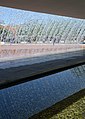
File:Crystalcube_sunny_platform.jpg edit

- Nomination Crystal Cube in Fiss, Tyrol, Austria. --Danbu14 09:42, 30 May 2014 (UTC)
- Promotion *
I disagree Tilted --Moroder 06:22, 1 June 2014 (UTC) Yes, you are right.--ArildV 19:55, 5 June 2014 (UTC) - Fixed the tilt, better version now? --Danbu14 21:20, 8 June 2014 (UTC)
- Support I think it's better now (using the background as a reference, the platform does not seem to be straight)--ArildV 18:22, 10 June 2014 (UTC)
- Support --Moroder 22:11, 14 June 2014 (UTC)
Total: 2 support (excluding the nominator), 0 oppose → Promoted --Cccefalon 10:29, 18 June 2014 (UTC)
File:Ophrys_insectifera_LC0346.jpg edit

- Nomination Fly Orchid (Ophrys insectifera), Leutra valley near Jena, Thuringia, Germany --LC-de 11:43, 25 May 2014 (UTC)
- Promotion OpposeParts of the plant are a bit unsharp. Jakec 12:15, 25 May 2014 (UTC)
- Comment Not only unsharp, big parts of the plant aren't even on the picture!!!11eleven. The only valid question is, if the unsharp parts are important or disturbing. --LC-de 12:42, 25 May 2014 (UTC)
- Oppose Too many blurred areas, f / 3,5 is a bad choice. --Archaeodontosaurus 05:24, 5 June 2014 (UTC)
- Support. Somewhat more DOF would have been nice. Good lighting and composition. -- Smial 06:37, 6 June 2014 (UTC)
- Support DoF sufficient for me since one sample of blossoms is clearly shown. --Kreuzschnabel 16:30, 8 June 2014 (UTC)
- Support ql --Steinsplitter 11:07, 13 June 2014 (UTC)
Total: 3 support (excluding the nominator), 2 oppose → Promoted --Cccefalon 10:28, 18 June 2014 (UTC)