Commons:Quality images candidates/Archives May 02 2015
-
- Nomination Figures at the Naturhistorisches Museum in Vienna, Austria --Hubertl 00:51, 30 April 2015 (UTC)
- Promotion Good quality.--Johann Jaritz 02:16, 30 April 2015 (UTC)
-

- Nomination Central dome at the Kunsthistorisches Museum in Vienna --Hubertl 00:51, 30 April 2015 (UTC)
- Promotion Good quality.--Famberhorst 04:49, 30 April 2015 (UTC)
-

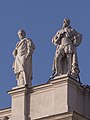
- Nomination Hans Kelsen (1881-1973), bust (dark bronce) in the Arkadenhof of the University of Vienna --Hubertl 00:51, 30 April 2015 (UTC)
- Promotion Good quality.--Johann Jaritz 02:16, 30 April 2015 (UTC)
-

-

- Nomination Marak Parak, Sabah: Bridge over Sungai Kinarom at Marak Parak. This bridge is covering the old track of the Marak Parak Road. After inaugurating the new road with a new bridge some five hundred meters east, the old bridge is only used by the villagers --Cccefalon 00:12, 30 April 2015 (UTC)
- Promotion Good quality. --Hubertl 00:45, 30 April 2015 (UTC)
-

- Nomination Taman Serinsim, Sabah, Malaysia: Ingersoll-Rand Road Roller at Taman Serinsim --Cccefalon 00:12, 30 April 2015 (UTC)
- Promotion Good quality.--Famberhorst 04:52, 30 April 2015 (UTC)
-
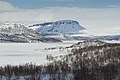
- Nomination Saana fell and Ala-Kilpisjärvi lake in Lapland, Finland, 2015 April --Ximonic 22:44, 29 April 2015 (UTC)
- Promotion Good quality.--Johann Jaritz 02:25, 30 April 2015 (UTC)
-

- Nomination Muotkatakka (Muotkkádat), Lapland, Finland, 2015 April --Ximonic 22:44, 29 April 2015 (UTC)
- Promotion Good quality.--Johann Jaritz 02:25, 30 April 2015 (UTC)
-

- Nomination View to Lapporten and Torneträsk lake in Abisko, Norrbotten, Sweden, 2015 April --Ximonic 22:44, 29 April 2015 (UTC)
- Promotion Beautiful landscape. Good quality.--Johann Jaritz 02:25, 30 April 2015 (UTC)
-

-

- Nomination Monument to the Discoveries in Belém (Lisbon), Portugal --Poco a poco 22:09, 29 April 2015 (UTC)
- Promotion Good quality. --Frank Schulenburg 04:28, 30 April 2015 (UTC)
-

- Nomination Akrafjall volcanic mountain, Akranes, Vesturland, Iceland --Poco a poco 22:09, 29 April 2015 (UTC)
- Promotion Good quality. --Hubertl 22:30, 29 April 2015 (UTC)
-

- Nomination South Harbour, Helsinki, Finnland --Poco a poco 22:09, 29 April 2015 (UTC)
- Promotion Good quality. --Ximonic 23:19, 29 April 2015 (UTC)
-

- Nomination Tourist boat Submarine vision. O Grove. Galicia --Lmbuga 21:37, 29 April 2015 (UTC)
- Promotion Good quality. --Livioandronico2013 22:30, 29 April 2015 (UTC)
-

- Nomination Monument and mausoleum in Weißenthurm, Germany, for the French general Louis Lazare Hoche who died in 1797 only 29 years old -- Spurzem 20:17, 29 April 2015 (UTC)
- Withdrawn
 Comment Good, but it seems tilted CW (see notes) --Lmbuga 20:43, 29 April 2015 (UTC)
I see no lack but I withdraw. -- Spurzem 22:14, 29 April 2015 (UTC)
-

- Nomination Roman catholic parish church of Weißenthurm, Germany -- Spurzem 20:17, 29 April 2015 (UTC)
- Withdrawn Comment See notes: Bad crop (upper edge of the picture), CAs. In my opinion the detail is not good, perhaps the reduction of noise is excessive--Lmbuga 20:57, 29 April 2015 (UTC)
OK. I have no money for better lenses and no program to eliminate the slight CAs. Therefore I withdraw. -- Spurzem 22:14, 29 April 2015 (UTC)
es: No sea usted cínico y al menos, antes de proponer las fotos, recórtelas adecuadamente. Las aberraciones cromáticas se corrigen con programas, todas las lentes presentan aberraciones si se les exige demasiado--Lmbuga 22:31, 29 April 2015 (UTC)
 Done No te preocupes Lmbuga, todo está bien, tranquilo
  --Livioandronico2013 22:57, 29 April 2015 (UTC)
-

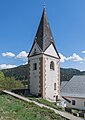
- Nomination The White Tower built around 1400 at Weißenthurm was a customs tower between the electorates of Trier and Cologne -- Spurzem 20:17, 29 April 2015 (UTC)
- Promotion Good quality. --Livioandronico2013 20:32, 29 April 2015 (UTC)
-
-

-

-

-

-

- Nomination Minaret of the Sultan Alaaddin Camii, Antalya, Turkey --Bgag 16:48, 29 April 2015 (UTC)
- Promotion Good quality. --Livioandronico2013 20:32, 29 April 2015 (UTC)
-

-

-

-
-

-

- Nomination Robust banking Location Mirnser Cliff.
Famberhorst 15:26, 29 April 2015 (UTC) - Promotion
 Support Good quality. --XRay 16:47, 29 April 2015 (UTC)
- Nomination Robust banking Location Mirnser Cliff.
-

- Nomination Three Brothers Fountain -- Albertus teolog 14:37, 29 April 2015 (UTC)
- Promotion Good quality. Even, when the background is a bit dark. --Hubertl 22:32, 29 April 2015 (UTC)
-
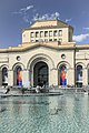
- Nomination The National Gallery of Armenia and the History Museum of Armenia. Yerevan, Armenia. --Halavar 10:58, 29 April 2015 (UTC)
- Promotion Good quality.--Johann Jaritz 12:12, 29 April 2015 (UTC)
-

- Nomination Government House of Armenia. Yerevan, Armenia. --Halavar 10:58, 29 April 2015 (UTC)
- Promotion Good quality.--Johann Jaritz 12:12, 29 April 2015 (UTC)
-

-

-

- Nomination Palace in Bycina (Bitschin, Fichtenrode), Upper Silesia --Pudelek 09:55, 29 April 2015 (UTC)
- Promotion Good quality. --Livioandronico2013 11:52, 29 April 2015 (UTC)
-

- Nomination Pyskowice (Peiskretscham) - market square --Pudelek 09:55, 29 April 2015 (UTC)
- Promotion Good quality. --Livioandronico2013 11:52, 29 April 2015 (UTC)
-

-

- Nomination Church of the Assumption in Kłodzko 2 --Jacek Halicki 08:20, 29 April 2015 (UTC)
- Promotion Good quality. --Livioandronico2013 08:25, 29 April 2015 (UTC)
-

- Nomination Church of the Assumption in Kłodzko 3 --Jacek Halicki 08:20, 29 April 2015 (UTC)
- Promotion Good quality.--Johann Jaritz 14:55, 29 April 2015 (UTC)
-

- Nomination Church of the Assumption in Kłodzko 4 --Jacek Halicki 08:20, 29 April 2015 (UTC)
- Promotion Good quality. --Livioandronico2013 08:23, 29 April 2015 (UTC)
-

- Nomination Church of the Assumption in Kłodzko 5 --Jacek Halicki 08:20, 29 April 2015 (UTC)
- Promotion Good quality. Looks distorted, but its handmade and pretty old ;-) --Hubertl 10:06, 29 April 2015 (UTC)
-

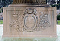
- Nomination Coat of arms of Gregorius XVI on fountain in the Vatican Museums --Livioandronico2013 08:05, 29 April 2015 (UTC)
- Promotion Good quality. --Cayambe 13:25, 29 April 2015 (UTC)
-

- Nomination Mosaic with the inscription Leonardo on the gallery of the Vatican Museums --Livioandronico2013 08:05, 29 April 2015 (UTC)
- Promotion Good quality. --Hubertl 09:47, 29 April 2015 (UTC)
-
- Nomination Coat of arms of Gregorius XVI on fountain in the Vatican Museum --Livioandronico2013 08:04, 29 April 2015 (UTC)
- Promotion Good quality.--Johann Jaritz 12:08, 29 April 2015 (UTC)
-

- Nomination stairs of Vatican Museums --Livioandronico2013 08:04, 29 April 2015 (UTC)
- Promotion Good quality.--Johann Jaritz 12:08, 29 April 2015 (UTC)
-
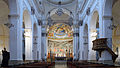
- Nomination Intern of Duomo di Spoleto --Livioandronico2013 07:07, 29 April 2015 (UTC)
- Promotion Good quality.--Johann Jaritz 07:14, 29 April 2015 (UTC)
-

- Nomination Castle ruin with vineyard at Taggenbrunn #11, Sankt Georgen am Längsee, Carinthia, Austria --Johann Jaritz 06:57, 29 April 2015 (UTC)
- Promotion Good quality. --Cccefalon 07:19, 29 April 2015 (UTC)
-

- Nomination Chapel Saint Ulrich (left hand), parish and collegiate church Saint John Baptist (right hand) in Kraig, Frauenstein, Carinthia, Austria --Johann Jaritz 06:55, 29 April 2015 (UTC)
- Promotion Good quality. --Hubertl 10:10, 29 April 2015 (UTC)
-

- Nomination Chapel Saint Ulrich in Kraig, Frauenstein, Carinthia, Austria --Johann Jaritz 06:54, 29 April 2015 (UTC)
- Promotion Good quality. --Livioandronico2013 08:15, 29 April 2015 (UTC)
-
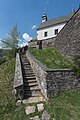
- Nomination Staircase from the priory to the cemetery and collegiate church Saint John the Baptist in Kraig, Frauenstein, Carinthia, Austria --Johann Jaritz 06:52, 29 April 2015 (UTC)
- Promotion Good quality. It is at it look on the first sight: distorted. But the left wall is distorted in real. --Hubertl 10:10, 29 April 2015 (UTC)
-
- Nomination Defense tower at the priory cemetery of Kraig, Frauenstein, Carinthia, Austria --Johann Jaritz 06:51, 29 April 2015 (UTC)
- Promotion Good quality. --Livioandronico2013 08:15, 29 April 2015 (UTC)
-
-

- Nomination Farmersmarket on a saturday at the Karmelitermarkt --Hubertl 06:22, 29 April 2015 (UTC)
- Promotion Good quality.--Johann Jaritz 06:59, 29 April 2015 (UTC)
-

- Nomination Blue cheese from raw milk of Jersey cattles, aged 5 to 8 weeks Origin Toggenburg, St. Gallen - Maître fromager affineur Willi Schmid, Städtlichäsi, Lichtensteig --Hubertl 06:22, 29 April 2015 (UTC)
- Promotion Good quality. --Livioandronico2013 08:15, 29 April 2015 (UTC)
-

- Nomination Karl Ludwig Arndts von Arnesberg (1803-1878), bust (dark bronce) in the Arkadenhof of the University of Vienna --Hubertl 06:22, 29 April 2015 (UTC)
- Promotion Good quality.--Johann Jaritz 06:59, 29 April 2015 (UTC)
-

- Nomination Group of trees on the seawall. Location Mirnser Cliff.
Famberhorst 04:43, 29 April 2015 (UTC) - Promotion Good quality.--Johann Jaritz 06:38, 29 April 2015 (UTC)
- Nomination Group of trees on the seawall. Location Mirnser Cliff.
-

- Nomination Drents-Friese Wold National Park. Location Dieverzand. Dead tree, important food source in a balanced ecosystem.
Famberhorst 04:43, 29 April 2015 (UTC) - Promotion Good quality and good approach to a a well balanced contrast. --Cccefalon 07:10, 29 April 2015 (UTC)
- Nomination Drents-Friese Wold National Park. Location Dieverzand. Dead tree, important food source in a balanced ecosystem.
-

- Nomination Visibility on the IJsselmeer in the bend of Molkwar (Molkwerum). Location, Friese IJsselmeercoast.
Famberhorst 04:43, 29 April 2015 (UTC) - Promotion Good quality. A bit more brightness would be fine --Hubertl 06:26, 29 April 2015 (UTC)
Question: do you want me change the picture?--Famberhorst 15:33, 29 April 2015 (UTC)
- Nomination Visibility on the IJsselmeer in the bend of Molkwar (Molkwerum). Location, Friese IJsselmeercoast.
-

-
- Nomination Singapore: Armenian Church of St. Gregory the Illuminator at 60 Hill Street ----Cccefalon 00:38, 29 April 2015 (UTC)
- Promotion Good quality. --Livioandronico2013 08:15, 29 April 2015 (UTC)
-

-

- Nomination Singapore: Dragon during the traditional dragon dance during Chinese New Year 2015 celebrations ----Cccefalon 00:38, 29 April 2015 (UTC)
- Promotion Scary, but good quality.--Johann Jaritz 12:11, 29 April 2015 (UTC)
-

- Nomination An AN/MPQ-50 Improved Pulse Acquisition Radar, part of the HAWK system on display at Stevnfort Cold War Museum, Denmark. --Slaunger 20:30, 28 April 2015 (UTC)
- Promotion
 Weak support on the left isn't very sharp but is a small part,if somebody wants can oppose --Livioandronico2013 20:55, 28 April 2015 (UTC)
@Livioandronico2013: Thanks for review. I have uploaded a new version, where I have selectively sharpened some semi-soft regions.-- Slaunger 15:49, 29 April 2015 (UTC)
-

- Nomination Frescos by Stephan Kessler in the Our Lady church in the Säben Abbey in South Tyrol --Moroder 17:07, 28 April 2015 (UTC)
- Promotion Good quality, maybe a bit noisy. And I can hardly believe the given camera settings ISO 100, f/13 and 1/6 s?! --Uoaei1 17:45, 28 April 2015 (UTC) Comment Thanks for your review Uoaei1|Uoaei1. Light conditions were good as you see also here. I don't understand where the noise comes from --Moroder 11:53, 29 April 2015 (UTC) {{}}
-

- Nomination Bringhausen - Edersee --Hockei 15:25, 28 April 2015 (UTC)
- Promotion Two blurry birds yet to be cloned out. It would have been better, to use ISO100 for a landscape photography at a sunny day. --Cccefalon 00:59, 29 April 2015 (UTC)
 Fixed New version. The ISO was automatically chosen. Anyway I hardly had to denoise the picture. The problem at the Edersee was it was always hazy even if the sun was shining. --Hockei 05:25, 29 April 2015 (UTC)
Good quality now. I consider automated ISO choice as "devils work". It ruined me a lot of photos in the past. --Cccefalon 06:32, 29 April 2015 (UTC)
-

- Nomination Epitaph for Margareth Silberecker (1514) at the southern wall of the parish church Holy Trinity, Sankt Veit an der Glan, Carinthia, Austria --Johann Jaritz 03:46, 28 April 2015 (UTC)
- Promotion Good quality. --Cayambe 09:25, 29 April 2015 (UTC)
-

- Nomination Museum of Ethnology, Vienna --Hubertl 00:06, 28 April 2015 (UTC)
- Promotion Comment Needs vertical correction and a bit sharpening. --Hockei 16:37, 28 April 2015 (UTC) Done, thanks for another review, Hockei --Hubertl 21:07, 28 April 2015 (UTC) Support Good quality. --Hockei 05:28, 29 April 2015 (UTC)
-

- Nomination: USO-Gloucester Rugby - 20141025 - Ruck --Pleclown 10:34, 23 April 2015 (UTC)
- Review needed


_-_Bust_in_the_Arkadenhof,_University_of_Vienna_-_0289.jpg)


.JPG)
.JPG)
.JPG)


.jpg)
.jpg)
.jpg)
_-_mausoleum_of_family_Posadowsky-Wehner.JPG)
_-_palace.jpg)
_-_market_square.JPG)


_-_Bust_in_the_Arkadenhof,_University_of_Vienna_-_0317.jpg)


._Locatie,_Friese_IJsselmeerkust_06.jpg)


Consensual review edit
File:Hostal_Centro_Histórico_Regina,_México_D.F.,_México,_2013-10-16,_DD_158.JPG edit

- Nomination Historic Center Regina Hostel, Mexico City, Mexico --Poco a poco 17:53, 22 April 2015 (UTC) Comment There is a diproportion between h and w--Moroder 07:31, 26 April 2015 (UTC) New version, better now? Poco a poco 14:43, 26 April 2015 (UTC)
- Decline
- Comment Good quality. --Moroder 16:58, 26 April 2015 (UTC)
 Oppose Unnatural distorsions IMO. The sky at left looks overexposed. I ask for a discussion, please.--Jebulon 23:21, 26 April 2015 (UTC)
- Support OE is irrelevant imho --Moroder 11:28, 27 April 2015 (UTC)
- Oppose Strong perspective distortion (horizontal perspective distortion): Unnatural, it seems overprocesed IMO. Areas of the sky are blown out (As Jebulon)--Lmbuga 13:27, 27 April 2015 (UTC)
- Oppose perspective distortion --Denkmalhelfer 18:46, 27 April 2015 (UTC)
- Support as Moroder.. --Hubertl 22:11, 28 April 2015 (UTC)
File:2014.09.20.-12-Kaefertaler Wald-Mannheim--Wolfspinne-Xerolycosa nemoralis-Weibchen.jpg edit

- Nomination Xerolycosa nemoralis, Weibchen (female) --Hockei 12:30, 23 April 2015 (UTC)
- Decline
- Oppose no clear subject to background --Denkmalhelfer 18:31, 23 April 2015 (UTC)
- Comment I'm convinced it's not the nature's intention.--Hockei 05:53, 24 April 2015 (UTC)
- Oppose Subject blurred, too strong shadows -- Alvesgaspar 11:26, 26 April 2015 (UTC)
- Comment It is not a FPC. And there is no strong shadow at all. Maybe I should take a miniature LED-lamp to illuminate the hole in the wood the next time. --Hockei 14:09, 26 April 2015 (UTC)
- Support Poor contrast to the background is known as mimikry. --Hubertl 21:56, 28 April 2015 (UTC)
File:Iglesia_de_San_Nicolás,_Tallinn,_Estonia,_2012-08-11,_DD_17.JPG edit

- Nomination St. Nicholas' Church, Tallinn, Estonia --Poco a poco 10:17, 7 April 2015 (UTC)
- Decline
- New version Poco a poco 20:58, 13 April 2015 (UTC)
- No reaction, please, let's discuss this one --Poco a poco 20:24, 15 April 2015 (UTC)
- Support Good now. Daniel Case 20:28, 19 April 2015 (UTC)
 Neutral
- Support The tilted lines underline the character of the subject: beeing high. And leads the eye up to the sky in good colour and with beautiful clouds. --ArishG 15:50, 17 April 2015 (UTC)
- Oppose I disagree. Look to the hauses at the right. They don't lead me to the beautiful sky. I only think they will fall in. -- Spurzem 20:47, 17 April 2015 (UTC)
- Comment: you are voting in 2 different directions Poco a poco 10:20, 18 April 2015 (UTC)
- Oppose The verticals should be rectilinear. --Code 16:52, 18 April 2015 (UTC)
- @Daniel Case: Are you still opposing? --Code (talk) 16:54, 18 April 2015 (UTC)
- Support but only without unnatural distortion. Verticlas not must be rectilinear. --Ralf Roletschek 11:05, 20 April 2015 (UTC)
- Oppose Perspective distortion is disturbing--Lmbuga 17:47, 20 April 2015 (UTC)
- Support Correcting the distortion would give an absurd impression of the tower. --ArishG 06:08, 24 April 2015 (UTC)
- Oppose The top of the subject is too unsharp. Alvesgaspar 22:12, 26 April 2015 (UTC)
- Oppose While the tilted lines are ok for the tower itself, it's disturbing on the other buildings. --MB-one 11:52, 28 April 2015 (UTC)
- Oppose Per others --Livioandronico2013 20:42, 28 April 2015 (UTC)