Commons:Quality images candidates/Archives May 25 2014
-
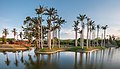
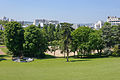
- Nomination Panoramic view --The Photographer 02:46, 23 May 2014 (UTC)
- Promotion Good quality.--ArildV 00:19, 23 May 2014 (UTC)
-

-

- Nomination Arslanagić bridge, Trebinje, Bosnia and Herzegovina --Poco a poco 18:31, 22 May 2014 (UTC)
- Promotion
 Support QI --Rjcastillo 19:42, 22 May 2014 (UTC)
-

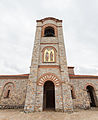
- Nomination Nova Gracanica church, Trebinje, Bosnia and Herzegovina --Poco a poco 18:31, 22 May 2014 (UTC)
- Promotion Good quality.--ArildV 00:19, 23 May 2014 (UTC)
-

- Nomination Old city of Dubrovnik, Croatia --Poco a poco 18:31, 22 May 2014 (UTC)
- Promotion Good quality. --Ralf Roletschek 19:22, 22 May 2014 (UTC)
-

- Nomination (Roof of the) Jakobskerk in Winterswijk, Gelderland, Netherlands --XRay 16:54, 22 May 2014 (UTC)
- Promotion Good quality. --Poco a poco 19:25, 22 May 2014 (UTC)
-

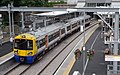
- Nomination Vreten metro station. --ArildV 16:40, 22 May 2014 (UTC)
- Promotion Good quality. --Ralf Roletschek 19:22, 22 May 2014 (UTC)
-

- Nomination Vreten station, Stockholm metro. --ArildV 16:40, 22 May 2014 (UTC)
- Promotion You got inspired! :) --Poco a poco 19:25, 22 May 2014 (UTC)
-
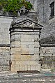
- Nomination 18th-century fountain François I, castle of Cognac, Charente, France. --JLPC 16:31, 22 May 2014 (UTC)
- Promotion Good quality. --Poco a poco 19:31, 22 May 2014 (UTC)
-

- Nomination War monument, Cognac, Charente, France. --JLPC 16:31, 22 May 2014 (UTC)
- Promotion Good quality. --Poco a poco 19:31, 22 May 2014 (UTC)
-

- Nomination Partial view of the War memorial (the statue on the right was formerly holding a sword) ; Cognac , Charente, France. --JLPC 16:31, 22 May 2014 (UTC)
- Promotion Support QI --Rjcastillo 18:30, 22 May 2014 (UTC)
-

- Nomination Fritillaria meleagris. Very rare and legally protected in the Netherlands bulb.
Famberhorst 15:13, 22 May 2014 (UTC) - Promotion Good quality. And nice. --VT98Fan 15:43, 22 May 2014 (UTC)
- Nomination Fritillaria meleagris. Very rare and legally protected in the Netherlands bulb.
-

- Nomination Bauhinia acuminata flower bud. --JDP90 15:14, 22 May 2014 (UTC)
- Promotion Good quality. --Ralf Roletschek 19:22, 22 May 2014 (UTC)
-

-
-

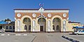
- Nomination Spa hospital in Eupatoria, Crimea, Russia/Ukraine --A.Savin 13:41, 22 May 2014 (UTC)
- Promotion Good quality. --Poco a poco 19:25, 22 May 2014 (UTC)
-

-

-

-

- Nomination Budapest; Entrance to Metro Gellert ter --Ralf Roletschek 10:56, 22 May 2014 (UTC)
- Promotion Good quality. --Poco a poco 19:44, 22 May 2014 (UTC)
-

- Nomination Budapest; rentable Bikes at river Dunaj --Ralf Roletschek 10:56, 22 May 2014 (UTC)
- Promotion Good quality. --JLPC 16:25, 22 May 2014 (UTC)
-

- Nomination Bratislava main station --Ralf Roletschek 10:56, 22 May 2014 (UTC)
- Promotion Good quality. --JDP90 15:28, 22 May 2014 (UTC)
-

- Nomination Canary Wharf. Mattbuck 06:42, 22 May 2014 (UTC)
- Promotion Good quality. --Ralf Roletschek 10:58, 22 May 2014 (UTC)
-
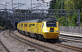
- Nomination 43062 at Tamworth. Mattbuck 06:42, 22 May 2014 (UTC)
- Promotion Good quality. --Poco a poco 19:44, 22 May 2014 (UTC)
-

- Nomination 319s at Tulse Hill. Mattbuck 06:42, 22 May 2014 (UTC)
- Promotion Good quality. --Ralf Roletschek 10:58, 22 May 2014 (UTC)
-

-
-
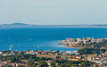
- Nomination Balaruc-les-Bains, Hérault, France. --Christian Ferrer 05:27, 22 May 2014 (UTC)
- Promotion Good quality. --VT98Fan 06:00, 22 May 2014 (UTC)
-

-

- Nomination Im Landschaftsschutzgebiet "Geesthang bei Dägeling mit Bockwischer Moor" --Nightflyer 22:38, 21 May 2014 (UTC)
- Promotion Support Good quality. --XRay 16:56, 22 May 2014 (UTC)
-

-
-

- Nomination Common Brimstone butterfly (Gonepteryx rhamni) --Charlesjsharp 21:21, 21 May 2014 (UTC)
- Decline
 Oppose insufficient detail --A.Savin 13:34, 22 May 2014 (UTC)
-

- Nomination Common darter dragonfly (Sympetrum striolatum) --Charlesjsharp 21:21, 21 May 2014 (UTC)
- Promotion Good quality. --Uoaei1 12:26, 22 May 2014 (UTC)
-

- Nomination 30 Czeska Street in Kłodzko --Jacek Halicki 19:27, 21 May 2014 (UTC)
- Promotion Good quality. --Cayambe 13:44, 22 May 2014 (UTC)
-

-
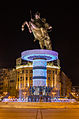
- Nomination Warrior on Horseback, Skopje, Macedonia --Poco a poco 18:43, 21 May 2014 (UTC)
- Promotion Good quality (just one note, see it, please).. --JLPC 16:21, 22 May 2014 (UTC)
 Done Poco a poco 19:21, 22 May 2014 (UTC)
-
- Nomination St Panteleimon church, Ohrid, Macedonia --Poco a poco 18:43, 21 May 2014 (UTC)
- Promotion ok --A.Savin 13:37, 22 May 2014 (UTC)
-

- Nomination Samuil's Fortress, Ohrid, Macedonia --Poco a poco 18:43, 21 May 2014 (UTC)
- Promotion Good quality. --Cayambe 13:46, 22 May 2014 (UTC)
-

- Nomination Gullfoss waterfall in Iceland --Reykholt 17:54, 21 May 2014 (UTC)
- Decline Oppose Lots of
 chromatic aberration, noise --A.Savin 13:32, 22 May 2014 (UTC)
-

-

-

- Nomination Inscription on the "Wandersmann" memorial --Kreuzschnabel 17:38, 19 May 2014 (UTC)
- Promotion Please remove spot at the right. --A.Savin 11:54, 21 May 2014 (UTC) Done--Kreuzschnabel 12:57, 21 May 2014 (UTC) Support OK. --A.Savin 13:24, 22 May 2014 (UTC)
-

- Nomination Interior of the Nova Gracanica church, Trebinje, Bosnia and Herzegovina --Poco a poco 08:35, 17 May 2014 (UTC)
- Promotion Good quality and very interesting picture! --Uoaei1 12:33, 22 May 2014 (UTC)
-
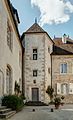
- Nomination Hôtel de Magnoncourt, in Vesoul --ComputerHotline 07:30, 17 May 2014 (UTC)
- Promotion Good quality. --Uoaei1 12:33, 22 May 2014 (UTC)
-

- Nomination: Saloon car racing. Mattbuck 06:59, 16 May 2014 (UTC)
- Review needed
-
- Nomination farm, Vlakhernskoye-Kuzminki, Moscow --Max Ryazanov 14:25, 14 May 2014 (UTC)
Could you add more specific categories? Poco a poco 18:53, 14 May 2014 (UTC) Commentneed help in this --Max Ryazanov 15:55, 16 May 2014 (UTC)
What about "Barns in Russia"? Poco a poco 21:25, 16 May 2014 (UTC) Comment"Farms in Russia" will be better? --Max Ryazanov 15:49, 17 May 2014 (UTC)
It looks like a barn too me, which is more specific than a farm, but if you feel more comfortable with Farms in Russia, go ahead Poco a poco 20:09, 20 May 2014 (UTC) Done --Max Ryazanov 20:36, 21 May 2014 (UTC) - Promotion Good quality. --Poco a poco 20:15, 22 May 2014 (UTC)
- Nomination farm, Vlakhernskoye-Kuzminki, Moscow --Max Ryazanov 14:25, 14 May 2014 (UTC)


,_Jacobskerk_--_2014_--_0174.jpg)


_04.JPG)


.JPG)


.JPG)


.jpg)
Consensual review edit
File:Railway station Opal card reader.jpg edit

- Nomination Train Opal card reader. --MoTorleeb 06:46, 22 May 2014 (UTC)
- Decline Oppose Lacks details, noise, blown highlights, perspective distortion. --JDP90 08:47, 22 May 2014 (UTC) SupportSorry, lets discuss! To me its a good picture. With problems but with atmosphere. To me its QI. --Ralf Roletschek 15:50, 22 May 2014 (UTC) Oppose I agree with Joydeep. This one is far from QI. --A.Savin 15:58, 22 May 2014 (UTC)
- Oppose per JDP90 --P e z i 09:55, 23 May 2014 (UTC)
- Oppose - It's clear it's not QI just from the thumbnail. "With problems", as Ralf called it, is to me a synonym of "not QI". Mattbuck 19:53, 24 May 2014 (UTC)
- Oppose QI is not for atmosphere, but for technical qualities. My God ! How many pictures have we promoted as QI without any kind of atmosphere ?! This one has too many technical flaws.--Jebulon 22:05, 24 May 2014 (UTC)
Running total: 1 support (excluding the nominator), 5 oppose → Decline? --Jebulon 22:05, 24 May 2014 (UTC)
File:14-05-06-bratislava-RalfR-57.jpg edit

- Nomination Eurocity in Bratislava --Ralf Roletschek 13:41, 16 May 2014 (UTC)
- Decline Support Good quality --Halavar 19:30, 16 May 2014 (UTC) Oppose Nothing in focus. --A.Savin 11:56, 17 May 2014 (UTC)
- Ok, i reuce it from 36 to 2 MP, than is it better? --Ralf Roletschek 13:00, 18 May 2014 (UTC)
- Oppose Per A.Savin, to change the size will not change the focus. --Christian Ferrer 14:34, 18 May 2014 (UTC)
Running total: 1 support (excluding the nominator), 2 oppose → Decline? --Cayambe 08:58, 24 May 2014 (UTC)
File:14-05-06-bratislava-RalfR-49.jpg edit

- Nomination Slovak Locomotive 730 in Bratislava --Ralf Roletschek 13:41, 16 May 2014 (UTC)
- Decline Support Good quality --Halavar 19:30, 16 May 2014 (UTC) Oppose Nothing in focus. User:Halavar must be joking, eh? --A.Savin 11:52, 17 May 2014 (UTC)
- Ok, i reuce it from 36 to 2 MP, than is it better? --Ralf Roletschek 13:02, 18 May 2014 (UTC)
- Oppose Per A.Savin, to change the size will not change the focus. --Christian Ferrer 14:34, 18 May 2014 (UTC)
Running total: 1 support (excluding the nominator), 2 oppose → Decline? --Cayambe 08:57, 24 May 2014 (UTC)
File:Festiwal_Naadam_na_stepie_na_obrzeżach_Ułan_Bator_37.JPG edit

- Nomination Naadam festival on the steppe, on the outskirts of Ulan Bator. Mongolia. Mongolian fast food on the steppe. --Halavar 22:20, 14 May 2014 (UTC)
- Decline Oppose Unnatural colors, oversaturated, too much contrast. --Sitacuisses 15:00, 17 May 2014 (UTC) Comment Sorry, but you're wrong. You're overreacting. --Halavar 17:51, 17 May 2014 (UTC)
- Oppose Burnt highlights in important areas of the image. -- Smial 10:45, 19 May 2014 (UTC)
- Oppose per Smial. In general, I like the your images from Mongolia. Please learn to improve your technical skills from the opposes. --Cayambe 08:51, 24 May 2014 (UTC)
Running total: 0 support (excluding the nominator), 3 oppose → Decline? --Cayambe 08:51, 24 May 2014 (UTC)
File:Gloucester railway station MMB 43 170639.jpg edit

- Nomination 170639 at Gloucester. Mattbuck 06:58, 14 May 2014 (UTC)
- Decline Tilted to the right. --Graphium 09:38, 14 May 2014 (UTC)
 Fixed. Mattbuck 21:55, 17 May 2014 (UTC)
 - Oppose The platforms are too important for the composition to leave them underexposed like this. --Sitacuisses 17:21, 19 May 2014 (UTC)
- Support Thanks Mattbuck. @Sitacuisses: The platforms ain't underexposed IMO. That's how they would likely look like on such a cloudy (and perhaps drizzling) day. --Graphium 15:37, 20 May 2014 (UTC)
- Graphium, the human eye is able to adapt much better to such a contrasty situation than a camera. In photography, this can be simulated with HDR technolgy, shadow adjustment and so on. But this didn't happen here. In this image, even the highlights in the sky may be toned brighter without loss, and the shadow parts below the roof are so dark that much of the detail is lost that a human would see in that situation. This is even more important as the perspective (platform and roof edges) draws the view towards the dark platforms; the image tries to show the station from a pedestrian's perspective, and it fails there: pedestrians would be afraid to go to that train station if it was actually as dark as it looks here. Besides that aspect, I would have to judge "unclear subject" since the well-exposed sky and empty tracks aren't that interesting, and the train is too small to be the main subject. --Sitacuisses 16:36, 20 May 2014 (UTC)
- Oppose and again and again a to dark "shadow" image. Please try to take HDR images for better exposures for this kind of images. --Alchemist-hp 22:24, 23 May 2014 (UTC)
File:Railfest 2012 MMB 64 221144.jpg edit

- Nomination 221144 at Railfest 2012. Mattbuck 07:04, 13 May 2014 (UTC)
- Promotion Underexposed. --Graphium 11:19, 13 May 2014 (UTC) Done Mattbuck 21:43, 13 May 2014 (UTC)
Looking at the sky in the photo, I'm afraid it should result in a much brighter day than this. --Graphium 09:35, 14 May 2014 (UTC)
If I brighten it anymore I lose the definition in the sky. Mattbuck 19:10, 15 May 2014 (UTC)
Sorry, then I would have to Oppose this image. Thanks for trying to fix the issue though. --Graphium 10:18, 16 May 2014 (UTC)
I disagree. Mattbuck 21:39, 17 May 2014 (UTC) - Support Brightness is okay, imo. Perhaps the slight CAs could be fixed, though. --DXR 20:53, 19 May 2014 (UTC)
- Support --JDP90 07:14, 20 May 2014 (UTC)
Running total: 2 support (excluding the nominator), 1 oppose → Promote? --Cayambe 08:46, 24 May 2014 (UTC)
File:Festiwal_Naadam_na_stepie_na_obrzeżach_Ułan_Bator_26.JPG edit

- Nomination Naadam festival on the steppe, on the outskirts of Ulan Bator. Mongolia. Mongolian horses and riders. --Halavar 19:06, 11 May 2014 (UTC)
- Decline
- Oppose Overprocessed with too much contrast, blown-out highlights and unnatural colors. --Sitacuisses 13:06, 15 May 2014 (UTC)
 Info I uploaded new version, with less contrast and saturation. But you're wrong about blown highlights. Please other reviewers to take a look. --Halavar 17:59, 17 May 2014 (UTC)
- The new version isn't much different and doesn't tackle the problem. There's no detail left in the brighter parts of the clouds. Color-wise this picture isn't as far off as some of your other recent uploads, but it's still far from natural. When you tone down brightness, you'll notice that the white horse on the right side is green-yellow in your photograph. --Sitacuisses 05:48, 18 May 2014 (UTC)
- Oppose Burnt highlights in important areas of the image. Still too high contrast. -- Smial 10:47, 19 May 2014 (UTC)
- Oppose as Smial. --Cayambe 08:44, 24 May 2014 (UTC)
Running total: 0 support (excluding the nominator), 3 oppose → Decline? --Cayambe 08:44, 24 May 2014 (UTC)
File:Phoenicopterus roseus portrait.jpg edit

- Nomination Greater flamingo, Phoenicopterus roseus, portrait. Martin Mere, UK. --Baresi franco 14:45, 15 May 2014 (UTC)
- Promotion
- Support Good quality. --Ralf Roletschek 16:27, 15 May 2014 (UTC)
- seems over exposed, can you correct? --Charlesjsharp 10:42, 16 May 2014 (UTC)
- Support QI for me. Overexposure inevitable. --Graphium 09:23, 17 May 2014 (UTC)
- Oppose I'm not sure how over-exposure can be inevitable in this kind of image --Charlesjsharp 16:05, 23 May 2014 (UTC)
- Support for me ok. --Alchemist-hp 22:19, 23 May 2014 (UTC)
- Support ok for me --Maathavan 06:54, 24 May 2014 (UTC)
Running total: 4 support (excluding the nominator), 1 oppose → Promote? --Cayambe 08:39, 24 May 2014 (UTC)
File:Tachinid fly.jpg edit

- Nomination Tachinid fly --Charlesjsharp 20:16, 14 May 2014 (UTC)
Good, but can you please add the species? Poco a poco 20:48, 14 May 2014 (UTC) - Decline Oppose unsharp --A.Savin 10:39, 15 May 2014 (UTC) Support Important parts are sharp enough, but dark areas are a bit noisy --Uoaei1 06:17, 16 May 2014 (UTC)
Oppose Head blur, thorax blur. I would expect the entire animal to be sharp. Btw, blur head is straight oppose for me. --Graphium 10:14, 16 May 2014 (UTC) - Oppose Per Graphium --Archaeodontosaurus 05:18, 23 May 2014 (UTC)
File:Gorki-2014-victory-girls-1985.jpg edit

- Nomination Festive evening «We inherited the victory» in the «Ganshin manor» museum. --PereslavlFoto 19:17, 14 May 2014 (UTC)
- Decline
- Support Good quality. --Poco a poco 20:52, 14 May 2014 (UTC)
- Oppose I disagree. Very unfortunate lighting, left girl is looking like dead drunk. Clothing appears like made of cardboard, ugly reflections of direct flash on the boots. --Smial 11:04, 15 May 2014 (UTC)
- Oppose - the expression itself is enough reason to oppose IMO. Mattbuck 20:41, 17 May 2014 (UTC)
- Oppose Unfortunate flash, too harsh effect. Utmost care needed when shooting such contrating materials (light-eating fabric on skirts vs reflective leather in boots). In addition, busy background. --Pitke 16:23, 22 May 2014 (UTC)
File:Пмз-интерьер-02-никольская-2-этаж-0107.jpg edit

- Nomination Interior of Nature department in Pereslavl museum. (NB: aligned with a digital level.) --PereslavlFoto 07:04, 8 May 2014 (UTC)
- Decline
- OpposeUnfortunate reflections. --Mattbuck 17:34, 15 May 2014 (UTC)
- Comment This is a document. Those are the true, real reflections that show the hall itself. --PereslavlFoto 21:50, 15 May 2014 (UTC)
- Irrelevant really. Mattbuck 20:38, 17 May 2014 (UTC)
- What can a photographer do in this case? The showcase glass cannot be removed, it is the necessary part of the museum halls. Thanks for the advice.--PereslavlFoto 22:25, 17 May 2014 (UTC)
- Sometimes it is possible to avoid the reflection of the camera, tripod, and photographer by using a real shift lens. In case of this image in addition it would be necessery to cover the
window(?)decorated room wall behind the camera by a black curtain or similar. Perhaps it is enough to combine the shift lens with a polarizer. Conclusion: it's possible to reduce the reflections, but it needs some more work and tools. -- Smial 10:27, 19 May 2014 (UTC)
- Sometimes it is possible to avoid the reflection of the camera, tripod, and photographer by using a real shift lens. In case of this image in addition it would be necessery to cover the
- What can a photographer do in this case? The showcase glass cannot be removed, it is the necessary part of the museum halls. Thanks for the advice.--PereslavlFoto 22:25, 17 May 2014 (UTC)
- Irrelevant really. Mattbuck 20:38, 17 May 2014 (UTC)
- Comment It's a valued image but these reflections are disturbing, some images have big value but can't be QI --Christian Ferrer 10:24, 18 May 2014 (UTC)
Running total: 0 support (excluding the nominator), 1 oppose → Decline? --Cayambe 08:34, 24 May 2014 (UTC)
File:King's Cross railway station MMB 52.jpg edit

- Nomination King's Cross station. Mattbuck 11:28, 11 May 2014 (UTC)
- Promotion
- Too dark --Poco a poco 12:47, 11 May 2014 (UTC)
- Support Looks ok now Poco a poco 20:17, 22 May 2014 (UTC)
- Brightened Mattbuck 21:06, 13 May 2014 (UTC)
- SupportGood enough for QI IMHO. --Kreuzschnabel 15:03, 15 May 2014 (UTC)
Running total: 2 support (excluding the nominator), 0 oppose → Promote? --Cayambe 08:28, 24 May 2014 (UTC)
File:Crowcombe Heathfield railway station MMB 06 88 60163.jpg edit

- Nomination Trains pass at Crowcombe Heathfield. Mattbuck 08:56, 3 May 2014 (UTC)
- Promotion This could have been a beautiful shot but there are too many dark shadows that mess up the composition, sorry. --Heuschrecke 11:25, 11 May 2014 (UTC) I ask Mattbuck to bright a bit the shadows, maybe I will support --Christian Ferrer 11:54, 11 May 2014 (UTC) Done Mattbuck 21:49, 11 May 2014 (UTC) Support QI IMO --Christian Ferrer 04:47, 12 May 2014 (UTC)
- Support --JDP90 07:00, 24 May 2014 (UTC)
File:Alexandra May 2014-1a.jpg edit

- Nomination Portrait of a young lady -- Alvesgaspar 13:42, 10 May 2014 (UTC)
- Decline
- Oppose Unfortunately the DoF is too shallow for a portrait photo. Even the nose sticker is unsharp. As a courtesy (not relevant for my decline), pimples should be cloned out at woman portraits (right side). --Cccefalon 14:04, 10 May 2014 (UTC)
- I want another opinion, please. Dof is right where I wanted it to be: the eyes are the main subject (no pimples that I see)-- Alvesgaspar 14:18, 10 May 2014 (UTC)
- Comment As you labeled the photo as "portrait", it can be expected, that more than only the eyes are sharp. If it were "Eyepart of a young lady", with the blurry sticker / nose cropped out, I might judge different. Beside that, the actual crop is pretty unharmonic: a high forehead while the nose is touching the bottom of the photo. --Cccefalon 08:41, 13 May 2014 (UTC)
- Support good quality IMO --Christian Ferrer 08:28, 11 May 2014 (UTC)
- Weak Support Composition is not the best, quality is ok. -- Smial 09:22, 15 May 2014 (UTC)
- Oppose Agree with Cccefalon, also focus doesn't lie on the face but the wisp of hair in front of the face. --Pitke 16:12, 22 May 2014 (UTC)
- Oppose blurred. --Alchemist-hp 22:14, 23 May 2014 (UTC)
- Oppose yes blurred. --Maathavan 06:57, 24 May 2014 (UTC)
File:Wrocław_-_Archikatedra_św._Jana_Chrzciciela3.jpg edit

- Nomination towers of Cathedral of St. John the Baptist in Wrocław, Poland --Taxiarchos228 04:35, 7 May 2014 (UTC)
- Promotion
- Support --A.Savin 15:48, 7 May 2014 (UTC)
- Oppose I don't mind the perspective distortion (I like these shots), but I would expect this kind of shot to be centered and-or symmetric, sorry. --Kadellar 19:32, 9 May 2014 (UTC)
- Kadellar: done --Taxiarchos228 19:00, 10 May 2014 (UTC)
- Thanks for reworking. I still think it is tilted, sorry. Could you work on it again? Thanks. --Kadellar 22:32, 12 May 2014 (UTC)
sorry, but there is nothing tilted any more, I've proofed it --Taxiarchos228 07:18, 14 May 2014 (UTC)
- Thanks for reworking. I still think it is tilted, sorry. Could you work on it again? Thanks. --Kadellar 22:32, 12 May 2014 (UTC)
- Comment It is not possible to make this image 100% symmetric, as the camera position was not 100% exact in the middle. Nevertheless I tried an alternative correction with some horizontal distortion reduction. Please review. -- Smial 09:46, 15 May 2014 (UTC)
- Support for me now ok. --Alchemist-hp 22:16, 23 May 2014 (UTC)