Commons:Quality images candidates/Archives November 25 2014
-

- Nomination Large-leaved Lupine -- George Chernilevsky 21:41, 22 November 2014 (UTC)
- Promotion Good quality. --Livioandronico2013 00:02, 23 November 2014 (UTC)
-

-

-

- Nomination Kirchenburg Effeltrich by Rainer Lippert --Brackenheim 19:46, 22 November 2014 (UTC)
- Promotion Good quality. --Hubertl 03:06, 23 November 2014 (UTC)
-
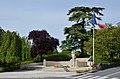
- Nomination War monument and flag, Cognac, Charente, France. --JLPC 17:11, 22 November 2014 (UTC)
- Promotion Good quality. --Livioandronico2013 17:26, 22 November 2014 (UTC)
-

-

- Nomination Conveyor belts, quarry site of Limalonges, Deux-Sèvres, France. --JLPC 17:11, 22 November 2014 (UTC)
- Promotion
 Comment Something strange on the sky. I left a note. --Halavar 17:15, 22 November 2014 (UTC)
 Done : new file uploaded. Sky cleaned. --JLPC 17:55, 22 November 2014 (UTC)
 Support Good now. --Halavar 18:26, 22 November 2014 (UTC)
-

- Nomination Marble quarry, near Jaipur, Rajasthan, India. --Yann 17:11, 22 November 2014 (UTC)
- Promotion Good quality. --Livioandronico2013 17:26, 22 November 2014 (UTC)
-

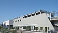
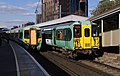
- Nomination Station of Line C Metro in Rome Borghesiana --Livioandronico2013 15:14, 22 November 2014 (UTC)
- Promotion Good quality. --JLPC 17:08, 22 November 2014 (UTC)
-
- Nomination Station of Line C Metro in Rome Monte Compatri - Pantano --Livioandronico2013 14:42, 22 November 2014 (UTC)
- Promotion Support QI for me --Halavar 14:45, 22 November 2014 (UTC)
-

- Nomination Rails End of Line C Metro of Rome --Livioandronico2013 14:33, 22 November 2014 (UTC)
- Promotion Good quality. --Jacek Halicki 18:09, 22 November 2014 (UTC)
-

- Nomination District Kudat, Sabah: A planters home in colonial architectural style at the road to Tj. Simpang Mangayau --Cccefalon 14:13, 22 November 2014 (UTC)
- Promotion Good quality. --Poco a poco 18:31, 22 November 2014 (UTC)
-
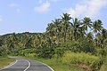
- Nomination Tiga Papan, District Kudat, Sabah: A coconut plantation at Kg Tiga Papan --Cccefalon 14:13, 22 November 2014 (UTC)
- Promotion Good quality. --Livioandronico2013 14:25, 22 November 2014 (UTC)
-
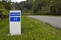
- Nomination District Tambunan: A milestone at the Tambunan-Ranau Road --Cccefalon 14:13, 22 November 2014 (UTC)
- Promotion Good quality. --Livioandronico2013 14:25, 22 November 2014 (UTC)
-

-

- Nomination Eurasian Eagle-owl in captivity -- Alvesgaspar 13:33, 22 November 2014 (UTC)
- Promotion Good quality. --Uoaei1 14:05, 22 November 2014 (UTC)
-

- Nomination A Lilly of the Nile -- Alvesgaspar 13:19, 22 November 2014 (UTC)
- Promotion Good quality. --Uoaei1 14:05, 22 November 2014 (UTC)
-

- Nomination A Bombus sp. bee (cf. pascuorum) on a Verbesina encelioides flowr. Jardin des Plantes, Paris -- Alvesgaspar 13:16, 22 November 2014 (UTC)
- Promotion Good quality. --Uoaei1 14:05, 22 November 2014 (UTC)
-
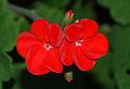
- Nomination A floer of Pelargonium. A very difficult shot because this intense red tends to become blown -- Alvesgaspar 13:06, 22 November 2014 (UTC)
- Promotion Good quality. --Poco a poco 18:28, 22 November 2014 (UTC)
-

-

-

- Nomination Code River, passing through YogyakartaCrisco 1492 11:30, 22 November 2014 (UTC)
- Decline Picture is blurred on the sides, your lens is broken. --Jacek Halicki 22:18, 22 November 2014 (UTC)
At worse it is ghosting from the HDR I needed to get decent lighting in this weather. Do wish people would stop pretending to know my equipment better than me. Crisco 1492 00:06, 23 November 2014 (UTC)
-

- Nomination Pile of garbage along the Code River, YogyakartaCrisco 1492 11:30, 22 November 2014 (UTC)
- Decline Picture is blurred on the sides, your lens is broken. --Jacek Halicki 22:18, 22 November 2014 (UTC)
At worse it is ghosting from the HDR I needed to get decent lighting in this weather. Do wish people would stop pretending to know my equipment better than me. Crisco 1492 00:06, 23 November 2014 (UTC)
-

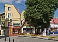
- Nomination Daszyńskiego Street in Kłodzko 1 --Jacek Halicki 10:55, 22 November 2014 (UTC)
- Promotion Good quality. --Florstein 16:50, 22 November 2014 (UTC)
-
- Nomination Daszyńskiego Street in Kłodzko 2 --Jacek Halicki 10:55, 22 November 2014 (UTC)
- Promotion Good quality. --Florstein 16:50, 22 November 2014 (UTC)
-

- Nomination Gothic Bridge and Our Lady of the Rosary church in Kłodzko --Jacek Halicki 10:55, 22 November 2014 (UTC)
- Promotion Support Good quality. P.S. Zgodnie z obowiązującymi zasadami, pamiętaj o odpowiednich nazwach dla swoich nominowanych zdjęć! --Halavar 11:09, 22 November 2014 (UTC)
-

- Nomination Gothic Bridge in Kłodzko 2 --Jacek Halicki 10:55, 22 November 2014 (UTC)
- Promotion Good quality. --Poco a poco 18:31, 22 November 2014 (UTC)
-

- Nomination Gothic Bridge in Kłodzko 3 --Jacek Halicki 10:55, 22 November 2014 (UTC)
- Promotion Good quality. --JLPC 17:08, 22 November 2014 (UTC)
-

-

-

- Nomination Gobi Desert landscape. Dornogovi Province, Mongolia. --Halavar 10:47, 22 November 2014 (UTC)
- Promotion Good quality. --Jacek Halicki 11:00, 22 November 2014 (UTC)
-

- Nomination Stomorhina lunata on Verbascum sinuatum --Christian Ferrer 10:40, 22 November 2014 (UTC)
- Promotion Good quality. --Livioandronico2013 10:51, 22 November 2014 (UTC)
-
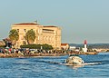
- Nomination Fishing and boat at former biological station, Sète --Christian Ferrer 10:40, 22 November 2014 (UTC)
- Promotion Support Good quality --Halavar 10:49, 22 November 2014 (UTC)
-
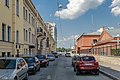
- Nomination Vodoprovodniy lane in Saint Petersburg --Florstein 10:08, 22 November 2014 (UTC)
- Promotion Good quality. --Jacek Halicki 10:18, 22 November 2014 (UTC)
-

- Nomination Gatchinskaya Street in Saint Petersburg --Florstein 10:08, 22 November 2014 (UTC)
- Promotion Support --Christian Ferrer 10:42, 22 November 2014 (UTC)
-

-

- Nomination Avtomobilnaya Street in Saint Petersburg --Florstein 10:08, 22 November 2014 (UTC)
- Promotion Good quality. --Jacek Halicki 10:18, 22 November 2014 (UTC)
-

- Nomination Chyornaya Rechka river in Saint Petersburg --Florstein 10:08, 22 November 2014 (UTC)
- Promotion Good quality. --Jacek Halicki 10:18, 22 November 2014 (UTC)
-
-

- Nomination Childrens’ playground, Schwäbisch Gmünd, Germany --Kreuzschnabel 09:44, 22 November 2014 (UTC)
- Promotion Good quality. --Jacek Halicki 10:20, 22 November 2014 (UTC)
-

- Nomination National natural monument Rovná in the Czech Republic --Chmee2 09:35, 22 November 2014 (UTC)
- Withdrawn Tilted on left (background horizon), a lot of purple CAs --Christian Ferrer 10:49, 22 November 2014 (UTC) Thanks, you are right. I withdrawn the nomination as the CA is not possible to solve it. Best regards --~~~~
-

- Nomination Cayenne, French Guiana: Seventh-day Adventist Church. --Cayambe 08:55, 22 November 2014 (UTC)
- Promotion Support ok with an other category of more --Christian Ferrer 10:53, 22 November 2014 (UTC)
-

- Nomination The house on Ryssänsaari, a small island near the port of Helsinki --DXR 07:48, 22 November 2014 (UTC)
- Promotion Good quality. --Jacek Halicki 10:20, 22 November 2014 (UTC)
-

- Nomination Berenschot's Watermolen, Winterswijk, Netherlands --XRay 07:01, 22 November 2014 (UTC)
- Promotion Good quality.--Famberhorst 07:18, 22 November 2014 (UTC)
-

- Nomination Park Sentmaringen, Münster, North Rhine-Westphalia, Germany --XRay 07:01, 22 November 2014 (UTC)
- Promotion Good quality. --Jacek Halicki 10:18, 22 November 2014 (UTC)
-
-

-

-

- Nomination Detail of Goseck Circle (prehistoric solar observatory) --Kreuzschnabel 06:12, 22 November 2014 (UTC)
- Promotion Good quality and a nice picture. --Code 06:49, 22 November 2014 (UTC)
-

- Nomination Hemerocallis 'Pink Damask'. Location: The Kruidhof.
Famberhorst 05:44, 22 November 2014 (UTC) - Promotion Not your best shot but enough --Livioandronico2013 09:00, 22 November 2014 (UTC)
- Nomination Hemerocallis 'Pink Damask'. Location: The Kruidhof.
-

- Nomination Helianthus x multiflorus (Soleil d'Or). Location: The Kruidhof.
Famberhorst 05:44, 22 November 2014 (UTC) - Promotion Good quality. --Livioandronico2013 09:00, 22 November 2014 (UTC)
- Nomination Helianthus x multiflorus (Soleil d'Or). Location: The Kruidhof.
-

- Nomination Mopr rocks during the fog --Andrew J.Kurbiko 05:28, 22 November 2014 (UTC)
- Decline Insufficient size. --DXR 07:49, 22 November 2014 (UTC)
-
- Nomination Kryvyi Rih Region Map 1914 --Andrew J.Kurbiko 05:28, 22 November 2014 (UTC)
- Decline Not by wikimedian --DXR 08:00, 22 November 2014 (UTC)
-

- Nomination Valahnúkur lighthouse, Suðurnes, Iceland --Poco a poco 04:48, 22 November 2014 (UTC)
- Promotion Good quality. --DXR 07:49, 22 November 2014 (UTC)
-

- Nomination Búlandshöfði, Vesturland, Iceland --Poco a poco 04:48, 22 November 2014 (UTC)
- Promotion OK. --JLPC 17:08, 22 November 2014 (UTC)
-

- Nomination Flowers of a wild Annual Lavatera -- Alvesgaspar 23:57, 21 November 2014 (UTC)
- Promotion The composition is a little awkward, but the exposure and sharpness are fantastic. An obvious QI. Appears to be downsampled, but at that aperature, it's diffraction limited anyway. --Ram-Man 00:38, 22 November 2014 (UTC) --
 Info -- Not downsampled but cropped from a 5520 X 3680 original. Why the camera was not set to maximum size I can't remember. Should have been accidental because all my photos of May 2013 and most of April and June have this reduced size.-- Alvesgaspar 12:56, 22 November 2014 (UTC)
-

-

-

- Nomination The Albaizin neighborhood seen from Generalife, Granada, Spain.--Jebulon 22:35, 21 November 2014 (UTC)
- Promotion Good quality. --Livioandronico2013 20:38, 22 November 2014 (UTC)
-

- Nomination The gold medal game of the European American Football Championship 2014 was decided on the 7th of July at Ernst-Happel-Stadion in Vienna. Germany won over Austria 30-27 by AleXXw
--Hubertl 02:35, 21 November 2014 (UTC) - Decline Insufficient quality. Very soft, looks almost like motion blur or the subject was OOF. --Crisco 1492 11:35, 22 November 2014 (UTC)
- Nomination The gold medal game of the European American Football Championship 2014 was decided on the 7th of July at Ernst-Happel-Stadion in Vienna. Germany won over Austria 30-27 by AleXXw
-
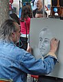
- Nomination Street artist at Place du Tertre, Paris. Alvesgaspar 21:57, 18 November 2014 (UTC)
- Decline
 Oppose Insufficient quality. Sorry. Too unsharp and permission and personality template missing. --XRay 07:12, 22 November 2014 (UTC)
-

- Nomination Street artist at Place du Tertre, Paris. Alvesgaspar 21:56, 18 November 2014 (UTC)
- Promotion Weak Support good but permission missing and there is no personality template.--XRay 07:16, 22 November 2014 (UTC)
-

-

-

- Nomination Fence with gates and Stations of the Cross, 1899, Racibórz, Upper Silesia, Poland --Halavar 20:23, 17 November 2014 (UTC)
- Decline Oppose unsharp and blurred --Christian Ferrer 07:05, 22 November 2014 (UTC)
-
- Nomination Panorama of Rome 2 --Livioandronico2013 17:53, 17 November 2014 (UTC)
- Promotion The left is leaning in, it need also some contrast and sharpening --Christian Ferrer 07:01, 22 November 2014 (UTC)
Done Thanks for review Christian if i be honest, I'm not sure of the result. See you. Merci. --Livioandronico2013 08:40, 22 November 2014 (UTC) Support the cut crane is a bit disturbing however acceptable IMO --Christian Ferrer 09:51, 22 November 2014 (UTC)
Done Crane is out now,thanks --Livioandronico2013 10:18, 22 November 2014 (UTC)


.jpg)
.jpg)
.jpg)


.JPG)


,_Berenschot%27s_Watermolen_--_2014_--_3105.jpg)


._Locatie_De_Kruidhof_01.JPG)


.jpg)


Consensual review edit
File:Austria vs. Russia 20141115 (016).jpg edit
.jpg)
- Nomination Aleksandar Dragović, player of the Austria national football team. --Steindy 21:09, 19 November 2014 (UTC)
- Withdrawn
- Oppose Noise and focus are fine, but the crop is unfortunate (left and right, right more than left). --Kadellar 17:01, 23 November 2014 (UTC)
- Sorry, this is a strange justification. This is a football player during the match and not a model which is posing. --Steindy 23:50, 23 November 2014 (UTC)
- Comment He's not posing, but it's your job to have him into the frame. The hand (which, besides, is ponting somewhere!) is just too close to the edge, so bad crop, bad composition. --Kadellar 12:07, 24 November 2014 (UTC)
- Oppose Per Kadellar --Livioandronico2013 11:59, 24 November 2014 (UTC)
- Oppose Bad crop, unfortunately. --Code 20:06, 24 November 2014 (UTC)
- A „composition“ in a football game? In addition was the additional-referee who runs into the photo and mapped completely blurred and therefore was disturbing. Last but not least equivalent to the photo of the 2/3 of rule. Such photos are often wanted by photo-redactors who want to place the title above and below the text. But no matter, withdrawn! --Steindy 23:39, 24 November 2014 (UTC)
File:Otterington railway station MMB 31 Starscape.jpg edit

- Nomination The stars above South Otterington. Mattbuck 09:52, 22 November 2014 (UTC)
- Decline Unsharp,noise....you must use others objective for this kind of pictures --Livioandronico2013 10:07, 22 November 2014 (UTC)
I disagree, it´s not a question of lenses, 300mm is good enough for the night sky. --Hubertl 19:52, 22 November 2014 (UTC)
OpposeI'm sorry but I have to disagree, serves a purpose much brighter.Anyway unsharp,noise --Livioandronico2013 20:07, 22 November 2014 (UTC) - Oppose Extremely noisy IMHO. --Code 09:13, 23 November 2014 (UTC)
- Oppose Per Code. --The Photographer 09:35, 23 November 2014 (UTC)
- Oppose -- Spurzem 11:59, 23 November 2014 (UTC)
- Comment In this case, the file name is really misleading. Any hint which part of the sky this is? I don’t recognize any constellation, but as far as I know, South Otterington, despite its name, should be northern enough to show a northern sky. (I even once came through it on a bicycle ride from Scorton to Thirsk.) --Kreuzschnabel 12:00, 23 November 2014 (UTC)
- Oppose Quite acceptable as a first try with unguided astrophotography. But far away from anything thats considered state of the art in this field. Furthermore the categories are mostly misleading and the description lacks any hints what part of the sky is pictured. --Dirtsc 09:31, 24 November 2014 (UTC)
File:Amanita_muscaria_mushroom_2.jpg edit

- Nomination Amanita muscaria mushroom --Uberprutser 22:43, 17 November 2014 (UTC)
- Decline
- Support Good quality. --Ram-Man 04:12, 18 November 2014 (UTC)
- Oppose I disagree and very much deslike the tight framing. Let's try CR. Alvesgaspar 22:37, 18 November 2014 (UTC)
- Oppose. It's a pity but the crop is too tight. -- Spurzem 18:29, 19 November 2014 (UTC)
- Oppose To close trimming. This grows the mushroom out of the picture. Sorry. --Steindy 22:02, 21 November 2014 (UTC)
Total: 1 support (excluding the nominator), 3 oppose →  Declined Ram-Man 14:31, 24 November 2014 (UTC)
File:Kipaku_Sabah_Dusun-with-traditional-basket-01.jpg edit

- Nomination Kipaku, Sabah, Malaysia: Kipaku Dusun posing with a traditional basket. --Cccefalon 21:01, 17 November 2014 (UTC)
- Promotion
- Weak Oppose The flash unbalances the lighting. Maybe others think this is not a good reason to reject, if so they should say so. --Ram-Man 01:40, 19 November 2014 (UTC)
- This is one of the most ridiculous declines I ever got here. Other opinions please. --Cccefalon 04:55, 19 November 2014 (UTC)
- The flash does unbalance the lighting with abrupt unnatural changes between light zones (unlike this one which I voted to promote). That said, I did realize that it might be a borderline case, so I suggested that if there was disagreement we should discuss it, and here we are. That's the point of CR afterall. I'm not sure where I was being unreasonable. -- Ram-Man 13:33, 19 November 2014 (UTC)
- This is one of the most ridiculous declines I ever got here. Other opinions please. --Cccefalon 04:55, 19 November 2014 (UTC)
- Weak Support. Flash lighting is part of the composition, and so can be reason to reject. The flash is somewhat too strong and too hard in this image. All in all acceptable though. It's QIC here, not FPC. -- Smial 12:04, 19 November 2014 (UTC)
- Support. I have no objection to QI. It is a good photo. -- Spurzem 18:34, 19 November 2014 (UTC)
- Support --Livioandronico2013 21:57, 19 November 2014 (UTC)
- The weakest Support I’ve ever given: The flashlight is irritating, in the first place for the reflections is caused in the face. But then, all in all it’s a pretty good shot. --Kreuzschnabel 06:09, 20 November 2014 (UTC)
- I would have retouched the picture and removed the reflections in the face, but its still a pro. Support -- DerFussi 07:06, 23 November 2014 (UTC)
- Support Well done --The Photographer 09:52, 23 November 2014 (UTC)
Total: 6 support (excluding the nominator), 1 oppose →  Promoted Ram-Man 14:31, 24 November 2014 (UTC)
File:Flag_of_India,_New_Delhi.jpg edit

- Nomination Flag of India, New Delhi. --Yann 14:00, 16 November 2014 (UTC)
- Promotion Comment 1) The author must be a Wikimedian user! 2) Image must be in a proper category. --Halavar 14:32, 16 November 2014 (UTC)
This is taken with my camera. I think it is a bit silly, if I give proper credit, I can't nominate it here. Anyway, fixed. Yann 17:08, 16 November 2014 (UTC) Support Good now. QI for me. --Halavar 17:16, 16 November 2014 (UTC)
I think it is more useful if the colours (especially green) is corrected to mach with national flag of India. --Jkadavoor 08:22, 17 November 2014 (UTC)
@Jkadavoor: No. I don't think manipulating the colors because they do not match the official colors is the thing to do. This is the picture out of the box without any change. Yann 13:24, 17 November 2014 (UTC)  Neutral I agree; the colours used in the flag are a bit difficult to reproduce, accurately. May be a fine tuning in colour temperature/wb works; but leaving it to other opinions. Jkadavoor 05:34, 18 November 2014 (UTC)
- Support Color manipulation is a tricky proposition that goes beyond simple white balance adjustments. Even the official colors would appear different depending on the time of day and light conditions (various color temperatures). My opinion: it is outside the scope of QI. Ram-Man 20:59, 19 November 2014 (UTC)
Total: 2 support (excluding the nominator), 0 oppose → Promoted Ram-Man 14:30, 24 November 2014 (UTC)
File:Scharlachsichler_Walsrode_2014.jpg edit

- Nomination Scarlet ibis(Eudocimus ruber) in Weltvogelpark Walsrode --Tuxyso 22:57, 15 November 2014 (UTC)
- Decline
- Oppose I really like the picture, but the most of the bird (except the head) isn't really sharp. However, we can discuss if you want to. --Code 04:46, 17 November 2014 (UTC)
- More than sharp enough - take a look on the resolution. IMHO the quality of this photo is quite high. Let's discuss. --Tuxyso 17:47, 17 November 2014 (UTC)
- Oppose Sorry, but per Tuxyso. Look at the bird’s foot, or even the white line in the tail feather. The center plumage is definitely out of focus, and so is the beak. The bokeh looks really weird too. --Kreuzschnabel 18:11, 18 November 2014 (UTC)
- Comment The "weird bokeh" results from the cage the bird is in. Visitors can go into the cage and photograph the birds from the inside. IMHO a weird bokeh is too subjective to be en eligible reason to oppose QI status. --Tuxyso 19:41, 18 November 2014 (UTC)
- Comment That’s why nobody did so. Most of the bird is not sharp. Maybe it could not have been taken better under the circumstances – bad luck, still it’s just below QI threshold for me. --Kreuzschnabel 06:11, 20 November 2014 (UTC)
- Weak Support. Assuming that this is a portrait photo, then that's good enough. The eye is sharp, exactly as it is always required. Somewhat low DOF, but if aperture is stopped down, the background will be distracting. Irgendwas ist immer. -- Smial 09:12, 20 November 2014 (UTC)
Total: 1 support (excluding the nominator), 2 oppose → Declined Ram-Man 14:28, 24 November 2014 (UTC)
File:140531_Forellen_auf_dem_Grill.jpg edit

- Nomination Four rainbow trouts on a grill, wrapped in aluminum foil. --Code 16:57, 16 November 2014 (UTC)
- Promotion
- Oppose Sorry,overexposed,and some aerea not very sharp. --Livioandronico2013 17:08, 16 November 2014 (UTC)
- I disagree. The subject is sharp. I can't see any overexposure. --Code 04:27, 17 November 2014 (UTC)
- Comment Ich checked the histogram in Lightroom again - there are no blown out parts in this picture. --Code 13:53, 18 November 2014 (UTC)
- Details are blown out, but no clipping. A blown out sky doesn't match reality, but reflections look like reflections. The reflections are part of the subject. FYI, see Overexposure vs. Clipping. Ram-Man 15:43, 18 November 2014 (UTC)
- Support Ram-Man is right, the glare is part of the subject here. Vote changed. --Kreuzschnabel 18:16, 18 November 2014 (UTC)
- Details are blown out, but no clipping. A blown out sky doesn't match reality, but reflections look like reflections. The reflections are part of the subject. FYI, see Overexposure vs. Clipping. Ram-Man 15:43, 18 November 2014 (UTC)
- Support I'm going to deviate from my normal voting because I think the nature of this image is a mitigating factor. The atmosphere of the smoke is most effective because of the strong directional lighting. The foil acts as a mirror, but it's not like there is any important detail that is really being lost. Not all clipping (which this is) is overexposure (which this is not). The sharpness is more than adequate for a QI. For me, this is the textbook case of quality beyond raw technical evaluation. -- Ram-Man 14:44, 17 November 2014 (UTC)
- Support --Ralf Roletschek 12:30, 24 November 2014 (UTC)
Total: 3 support (excluding the nominator), 1 oppose → Promoted Ram-Man 18:23, 20 November 2014 (UTC)
File:NR18 + IP Stratton, 2014.JPG edit

- Nomination Indian Pacific train--Bahnfrend 14:36, 16 November 2014 (UTC)
- Promotion
- Oppose Nice composition but not QI I'm afraid. There is some JPEG artifaction under the wheels and in the trees, and it's overall a bit bright. Pretty close to QI though. --Mattbuck 14:57, 16 November 2014 (UTC)
- Support. QI for me. I know much photos of trains which are very dark. But these are not better. -- Spurzem 17:37, 16 November 2014 (UTC)
- Oppose Good light IMO, but JPEG artifaction under and over the wheels and lack of detail in that areas. Poor DOF (f/3.2)--Lmbuga 18:36, 16 November 2014 (UTC)
- Comment: I'm not sure what you mean about artifaction and DOF. It was a long, fast moving train on a dusty track. The ambient temperature was about 35 degrees Celsius, and therefore there is some heat haze. I have brightened the shadows to reduce contrast, but could darken them again a bit. Bahnfrend 00:48, 17 November 2014 (UTC)
- It was too bright already... Mattbuck 08:01, 17 November 2014 (UTC)
- Comment: I'm not sure what you mean about artifaction and DOF. It was a long, fast moving train on a dusty track. The ambient temperature was about 35 degrees Celsius, and therefore there is some heat haze. I have brightened the shadows to reduce contrast, but could darken them again a bit. Bahnfrend 00:48, 17 November 2014 (UTC)
- Oppose Poor image quality (looking like heavy denoising), apart from other issues. Nice shot though. --Kreuzschnabel 10:20, 17 November 2014 (UTC)
- Support This was taken with a point and shoot camera with a 1/1.7" inch sensor. The DoF is a lot higher than the stated aperture would indicate, as it is not a full frame or 1.5x/1.6x SLR. It is approximately equivalent to f/13 @ 20mm on a full frame camera. The artifacts are annoying, but only at large magifications. No point and shoot is going to look good at 100% in shadows. But at normal viewing sizes, this is an easy QI. I strongly encourage opposers to change their vote so as not to set the standard that only an SLR can be used here. Ram-Man 15:04, 17 November 2014 (UTC)
- Comment I got an entirely different point of view here. I hardly ever have a look at the Exif data because I assess the image itself, the result of the photographer’s work. I don’t care which tool he was using as long as the result is sufficient. If we had to take the camera’s limits into account, we had to promote each shoddy phonecam image because the cam just couldn’t do better. And while this picture looks fine downscaled into my 2.2 mpix monitor, Common’s images are not for screen rendering or Wikipedia illustrations only. The idea is to collect media for a far wider range of reuse, needing higher quality standards. And I don’t say this image was bad. It’s just still below QI threshold for me. – This said, I totally agree that good images can be taken with a point-and-shoot as well (several of my QIs have been taken with Olympus XZ-1 or Panasonic DMC-TX25, and I am going to take more with my new Oly XZ-10 which arrived this morning). — Preceding unsigned comment added by Kreuzschnabel (talk • contribs)
- I respect your opinion and don't expect you to change your vote (can't blame me for asking though), but the comment "Poor DOF (f/3.2)" above is misinformed. Ram-Man 19:39, 17 November 2014 (UTC)
- Response: My understanding is that commons images are primarily for encyclopedic use in Wikimedia projects. The guidelines deal with the issue Kreuzschnabel is addressing by requiring quality images to be at least 2 megapixels in size. This image meets that requirement, but not by a large margin. It is therefore not to be directly compared with, eg, a 20 megapixel stitched image. As Kreuzschnabel says, the image looks fine in a 2.2 mpix monitor. Shouldn't that be enough? Bahnfrend 01:52, 18 November 2014 (UTC)
- Quoting from our Image Guidelines: "Graphics located on Commons may be used in ways other than viewing on a conventional computer screen. They may be also used for printing or for viewing on very high resolution monitors. We can't predict what devices may be used in the future, so it is important that our best pictures have as high a resolution as possible." --Kreuzschnabel 18:25, 18 November 2014 (UTC)
- "..as possible." This is very important, because the requirement is that the highest resolution possible is given. That means that people should not submit downsampled images, but it does not mean they have to have a higher resolution then they are capable of producing. This is the only reasonable interpretation of possible, because if we meant it in the broader sense, then we'd have to reject any image that did not come from the highest resolution camera. Those are just guidelines anyway. The more pertinent rules are "images should normally have at least 2 megapixels; reviewers may demand more for subjects that can be photographed easily". Clearly 2MP is the requirement except for easily photographed subjects. Anything beyond that is on the reviewer, not the rules. Ram-Man 15:12, 20 November 2014 (UTC)
- If you are reviewing at anything less than 100% you are reviewing your browser's thumbnail rendering rather than the actual photo. Mattbuck 14:34, 20 November 2014 (UTC)
- Quoting from our Image Guidelines: "Graphics located on Commons may be used in ways other than viewing on a conventional computer screen. They may be also used for printing or for viewing on very high resolution monitors. We can't predict what devices may be used in the future, so it is important that our best pictures have as high a resolution as possible." --Kreuzschnabel 18:25, 18 November 2014 (UTC)
- This is misleading. The browser downsamples the original for display at that particular size. It's still the same photo, just not the same magnification. (Or by the same logic, by viewing at 100% you are looking at a crop of the image and not the same photo.) Sure, if you downsample in photoshop, you can choose your own resampling algorithm, but if it looks fine in firefox (which defaults to a less perfect algorithm) it's going to look even better in photoshop. If it looks bad at 2MP, you could have a false negative, but that's not the case here. Personal standards vary, but the method of evaluation is not at fault here. Ram-Man 14:58, 20 November 2014 (UTC)
- Support as per Ram-Man. Yann 19:03, 17 November 2014 (UTC)
- Response: Photo was taken not with a phone cam, but a Leica D-Lux 6, which I have found usually takes better pictures than my Nikon D5100. It has been cropped because the train was moving fast and I was a bit trigger happy. I enhanced the colours with Microsoft Live (the original version has a blue cast), but the second upload is not denoised or otherwise altered. I still think the second upload is a bit dark. If you want to see what a full size image created with this camera looks like, I've uploaded today another candidate image of the train stationary at East Perth Terminal (with heat haze in the background). Bahnfrend (talk) 01:06, 18 November 2014 (UTC)
- Support.
 Question
 If you used f/3.2 to freeze the motion, then why used ISO80?I see you used a program mode. Jkadavoor 05:28, 18 November 2014 (UTC)- Response: It's a fair question, so I'll answer it, even though you've crossed it out. The Leica program mode is really good for this sort of image. It follows and focuses on the moving locomotive, and also selects automatically the best type of program for what the camera can see. In this particular case, the selected program may not have been ideal, because I was a little trigger happy, and I therefore had to crop the image. However, Western Australian spring and summer sunshine is very bright, and back in the 1980s I used to use Kodachrome 64 to take shots like this, so I think that ISO80 is a pretty good choice. Bahnfrend 13:54, 18 November 2014 (UTC)
- Thanks for the explanation. Jkadavoor 16:03, 18 November 2014 (UTC)
- Response: It's a fair question, so I'll answer it, even though you've crossed it out. The Leica program mode is really good for this sort of image. It follows and focuses on the moving locomotive, and also selects automatically the best type of program for what the camera can see. In this particular case, the selected program may not have been ideal, because I was a little trigger happy, and I therefore had to crop the image. However, Western Australian spring and summer sunshine is very bright, and back in the 1980s I used to use Kodachrome 64 to take shots like this, so I think that ISO80 is a pretty good choice. Bahnfrend 13:54, 18 November 2014 (UTC)
- Support --Christian Ferrer 05:54, 18 November 2014 (UTC)
- Support --Code 08:36, 18 November 2014 (UTC)
- Comment I've now uploaded a third version with the shadows just a little bit brighter than the second. Bahnfrend 13:54, 18 November 2014 (UTC)
- Support Acceptable. -- Smial 15:02, 19 November 2014 (UTC)
- Support Especially nice that the train almost its entire length is visible. Since it is normal that he is out of focus in the back. Of course QI! --Steindy 22:09, 21 November 2014 (UTC)
- Oppose Not nearly good enough on my (large) screen, let alone at 1:1 --DXR 14:47, 22 November 2014 (UTC)
- Support --Ralf Roletschek 12:31, 24 November 2014 (UTC)
Total: 9 support (excluding the nominator), 4 oppose → Promoted --Livioandronico2013 17:20, 23 November 2014 (UTC)
File:London MMB »020 Strand.jpg edit

- Nomination Strand, London. Mattbuck 09:06, 16 November 2014 (UTC)
- Decline Comment. Very dark, tilting building and streetlamp. Please discuss whether it is QI. -- Spurzem 17:59, 16 November 2014 (UTC)
Oppose Per Spurzem--Lmbuga 18:46, 16 November 2014 (UTC)
I have brightened it, but I don't see any major tilt, except in the streetlamp. Mattbuck 07:57, 17 November 2014 (UTC) - Support --Christian Ferrer 05:59, 18 November 2014 (UTC)
- Oppose Per Spurzem --Livioandronico2013 11:58, 21 November 2014 (UTC)
Total: 0 support (excluding the nominator), 2 oppose → Declined Ram-Man 14:22, 24 November 2014 (UTC)
File:West Branch Susquehanna River looking upstream near Montgomery, Pennsylvania.JPG edit

- Nomination West Branch Susquehanna River. Jakec 00:12, 14 November 2014 (UTC)
- Decline Oppose Insufficient quality. Sorry. It's more a kind of snapshot. IMO sharpness is not OK. May be another crop would be better. --XRay 12:48, 16 November 2014 (UTC)
Sharpened and brightened a bit. Jakec 17:21, 16 November 2014 (UTC)
![]() Support Atmospheric haze is not the most attractive (i.e. it's boring subject matter), but the photo itself is well exposed and the lighting acceptable. It's illustrative. It's a QI for me. Ram-Man 15:12, 17 November 2014 (UTC)
Support Atmospheric haze is not the most attractive (i.e. it's boring subject matter), but the photo itself is well exposed and the lighting acceptable. It's illustrative. It's a QI for me. Ram-Man 15:12, 17 November 2014 (UTC)
- Oppose --Livioandronico2013 22:03, 17 November 2014 (UTC)
- Care to state a reason? Jakec 22:35, 17 November 2014 (UTC)
- Yes sorry,too hazy and for above --Livioandronico2013 12:07, 18 November 2014 (UTC)
Total: 1 support (excluding the nominator), 2 oppose → Declined Ram-Man 18:24, 20 November 2014 (UTC)
File:2014_Kłodzko,_kamień_Napoleona_05.JPG edit

- Nomination Stone of Napoleon in Kłodzko 3 --Jacek Halicki 11:27, 10 November 2014 (UTC)
- Decline It's in focus and sharp, but the poor light conditions (for me) are too much. --Ram-Man 13:31, 14 November 2014 (UTC)
I disagree, please discussion --Jacek Halicki 17:58, 16 November 2014 (UTC) - Oppose This side is in the shadow, and disturbing background. Static object, should be easy to do again. Yann 14:42, 18 November 2014 (UTC)
- This side is all the time in the shadow, because it is from north side. --Jacek Halicki 21:14, 18 November 2014 (UTC)
- In this case, some flash would help. Regards, Yann 15:01, 20 November 2014 (UTC)
- This side is all the time in the shadow, because it is from north side. --Jacek Halicki 21:14, 18 November 2014 (UTC)
Total: 0 support (excluding the nominator), 2 oppose → Declined Ram-Man 14:19, 24 November 2014 (UTC)
File:Ampelmann_Shop_Karl-Liebknecht_Strasse_2013-11-24.jpg edit

- Nomination A green Ampelmännchen figure in front of the Ampelmann Shop in DomAquarée, Karl-Liebknecht-Straße 5, Berlin, Germany. --Slaunger 17:23, 9 November 2014 (UTC)
- Promotion
- Oppose Per Christian. Mattbuck 15:21, 16 November 2014 (UTC)
- Comment Christian Ferrer and Mattbuck: Thanks for review, you are right. I have adressed the walking man in a new edit, please check again. -- Slaunger 15:31, 16 November 2014 (UTC)
- Support I would say a bit more around the head, but ok now --Christian Ferrer 16:43, 16 November 2014 (UTC)
- Support --Livioandronico2013 22:01, 17 November 2014 (UTC)
Total: 2 support (excluding the nominator), 1 oppose → Promoted Ram-Man 14:19, 20 November 2014 (UTC)
File:Budda_w_swoich_młodzieńczych_latach_w_klasztorze_Erdene_Dzuu.jpg edit

- Nomination Buddha in his teenage years. Eastern Temple in the Erdene Zuu Monastery. Kharkhorin, Övörkhangai Province, Mongolia. --Halavar 11:06, 7 November 2014 (UTC)
- Promotion The midtones are a bit washed out due to flash firing. Can you correct the curves? Mattbuck 20:56, 11 November 2014 (UTC) Done New, fixed version uploaded. Please take a look again. --Halavar 00:33, 12 November 2014 (UTC)
I'm just not convinced by this. Mattbuck 23:57, 13 November 2014 (UTC) CommentI think other reviewers should decide. --Halavar 18:52, 16 November 2014 (UTC)
And one would have done without you moving it to discuss. Mattbuck 07:59, 17 November 2014 (UTC) - Support Good for me. Yann 19:07, 17 November 2014 (UTC)
Total: 1 support (excluding the nominator), 0 oppose → Promoted Ram-Man 14:19, 20 November 2014 (UTC)
File:Arundina graminifolia at Kadavoor.jpg edit

- Nomination Arundina graminifolia -- Jkadavoor 07:02, 14 November 2014 (UTC)
- Promotion
- Support Good quality. --JLPC 16:16, 14 November 2014 (UTC)
- Oppose
UnderexposedSee comment by Kreuzschnabel --Ram-Man 04:14, 16 November 2014 (UTC) - Oppose Upper part looks blurry and lacks detail. I would excuse this on a 24 mpix image but a 3 mpix QIC has to be crisp sharp IMHO. Not the best lighting too; I wouldn’t say it’s underexposed but contrast was too high for shooting. --Kreuzschnabel 12:20, 16 November 2014 (UTC)
- This is probably a more accurate assessment than mine and I agree with all of those points. Ram-Man 13:15, 16 November 2014 (UTC)
- Indeed a detailed review. The upper part is blurry because it is more than one inch behind. Not the best lighting as in Europe because it is from India. I don't know whether you have any idea about the climate in India now; may be the burnt out wings of this drangonfly helps. (Please don't misunderstand for me that I'm striving for a QI badge. Just responding to the "issues". Fully satisfied with a "QI rejected".) Jkadavoor 07:00, 17 November 2014 (UTC)
- Support Good quality. --Livioandronico2013 18:12, 16 November 2014 (UTC)
- Oppose As Kreuzschnabel. Disturbing thing (see note)--Lmbuga 18:27, 16 November 2014 (UTC)
- May be disturbing to you; but it is life. Scarab beetles will start eating the petals before the flower blooms. :) Jkadavoor 07:00, 17 November 2014 (UTC)
- Support DoF acceptable, ((98%) most of ) the subject is well exposed. --Christian Ferrer 12:03, 17 November 2014 (UTC)
- Support QI for me--Holleday 13:54, 17 November 2014 (UTC)
- Comment The shadow can be brightened IMO. --Hockei 16:15, 18 November 2014 (UTC)
Total: 4 support (excluding the nominator), 3 oppose → Promoted --Livioandronico2013 15:00, 20 November 2014 (UTC)
File:Mongolskie_zapasy_na_lokalnym_festiwalu_Naadam_(25).jpg edit
.jpg)
- Nomination Traditional Mongolian wrestling during the local Naadam festival. Kharkhorin, Övörkhangai Province, Mongolia. --Halavar 17:58, 12 November 2014 (UTC)
- Decline Oppose Insufficient quality. One person in shadow, two only from the back. Sky overexposed. --XRay 15:48, 15 November 2014 (UTC) Done I do not agree that sky is overexposed. I check it precisely. But I uploaded new version. Hope it's better now. --Halavar 22:06, 15 November 2014 (UTC)
![]() Comment It's better. But IMO there are still too many problems.--XRay 12:15, 16 November 2014 (UTC)
Comment It's better. But IMO there are still too many problems.--XRay 12:15, 16 November 2014 (UTC)
![]() Oppose -- Not enough quality: noisy, oversharpened. Alvesgaspar 18:43, 16 November 2014 (UTC)
Oppose -- Not enough quality: noisy, oversharpened. Alvesgaspar 18:43, 16 November 2014 (UTC)
Total: 0 support (excluding the nominator), 2 oppose → Declined Ram-Man 14:17, 20 November 2014 (UTC)
File:Cresta_de_Longiaru.jpg edit

- Nomination The "Cresta de Longiarú" in the Geisler and Puez group (Dolomites). View from the "Odla de Valdusa" peak (2936 m)" --Moroder 05:33, 14 November 2014 (UTC)
- Decline
- Oppose Yet a big collection of dust spots. I didn't made notes, because too much spots --Cccefalon 06:41, 14 November 2014 (UTC)
- Done Thanks indeed --Moroder 07:59, 14 November 2014 (UTC)
- Support Good quality now --Hubertl 10:51, 14 November 2014 (UTC)
- Oppose I disagree, some of the dust spots are not finally erased and some others are visible from the clone-out operation
@Hubertl: It is good practice here to give priority with the judgement to the people who start the review. --Cccefalon 18:34, 14 November 2014 (UTC)
- Oppose per Cccefalon – spots either still there or poorly cloned out (traces are even visible in thumbnail view!). Clouds are blown btw. --Kreuzschnabel 13:05, 15 November 2014 (UTC)
- Oppose The bad cloning is a big no-no for me. Jakec 22:39, 17 November 2014 (UTC)
Total: 1 support (excluding the nominator), 3 oppose → Declined Ram-Man 14:16, 20 November 2014 (UTC)
File:Platzer_in_Schrambach_Feldthurns_Heustadel.jpg edit

- Nomination Farmhouse "Platzer" in Feldthurns in South Tyrol --Moroder 21:57, 13 November 2014 (UTC)
- Decline
- Oppose Blurred, probably due to camera shake --Uoaei1 09:03, 14 November 2014 (UTC)
- I disagree. No motion blur the photo was taken with a tripod. Look at the sign it is crisp clear --Moroder 23:24, 14 November 2014 (UTC)
- Sharp enough considering this is a 36 mpix image. --Kreuzschnabel 12:29, 16 November 2014 (UTC)
- Oppose But the sky at left is overexposed. Alvesgaspar 17:27, 15 November 2014 (UTC)
- Comment You might not like it (there is nothing I can do about it) but it is NOT overexposed it is just a white (cast) sky, please look at the histogram. --Moroder 18:09, 16 November 2014 (UTC)
- Sorry Moroder, but not being blown doesn't mean it is correctly exposed. This is apparently due to the proximity of the sun, as suggested by the glare behind the tiles. Alvesgaspar 18:48, 16 November 2014 (UTC)
- Weak Oppose It is a common mistake to equate overexposure with clipping. This is obviously overexposed. Ram-Man 19:06, 16 November 2014 (UTC)
- Well than please explain me the difference --Moroder 21:14, 16 November 2014 (UTC)

- Sure:
- With your image, the left side of the sky is white, while the right side of the sky is blue, and a somewhat unnatural shade of blue at that. See this example showing an overexposed and correctly exposed sky for the same scene.
- This image has clipping. The bright spots are mirroring the sunlight. If a person were standing there, they might not see the detail either, because it would be too bright for the eye as well. But the image is not overexposed. If it were any darker, the main subject would be too dark and it would be underexposed even if it was not clipping. An HDR composite might fix that, but unless done right it would destroy the mood. The clipping is not causing color shifts either (like this image).
- -- Ram-Man 15:27, 17 November 2014 (UTC)
- Sure:
- All that said, if the color variation in the sky were balanced (completely white instead of that blue shade), I'd support, although I'm not sure anyone else would change their vote. For this subject, a blown white sky doesn't bother me, only the distracting color variation. Ram-Man 16:49, 17 November 2014 (UTC)
- I created a version of the file with an artificially extended sky. I don't know what the policy is regarding this type of manipulation, but I'll put it out there. -- Ram-Man 16:34, 18 November 2014 (UTC)
- Thank you so much for your intensive dedication to my issue but I am not convinced. I still believe that clipping is just a visual effect of overexposure. I still am convinced that the "common mistake" is not to equate overexposure with clipping, imho the same but too light or too dark with over-underexposure. I believe that the over-underexposure ist whenn the pixels are obove and below the limits of the histogram. The rest is just a matter of taste and resolution of the image. Therefor I'd accept that you would say the sky is to light for me. If you like I could try to send you the RAW file of the picture. Anyhow I don't dislike your version since the sky in this picture is imo a irrelevant issue, the object is the barn. Cheers --Moroder 12:11, 19 November 2014 (UTC)
- I certainly respect your opinion. Sorry I can't change mine, but at least we understand one another. Also, I don't edit in RAW, so I won't be much help there. Ram-Man 12:57, 19 November 2014 (UTC)
- Thank you so much for your intensive dedication to my issue but I am not convinced. I still believe that clipping is just a visual effect of overexposure. I still am convinced that the "common mistake" is not to equate overexposure with clipping, imho the same but too light or too dark with over-underexposure. I believe that the over-underexposure ist whenn the pixels are obove and below the limits of the histogram. The rest is just a matter of taste and resolution of the image. Therefor I'd accept that you would say the sky is to light for me. If you like I could try to send you the RAW file of the picture. Anyhow I don't dislike your version since the sky in this picture is imo a irrelevant issue, the object is the barn. Cheers --Moroder 12:11, 19 November 2014 (UTC)
Total: 0 support (excluding the nominator), 3 oppose → Declined Ram-Man 14:20, 21 November 2014 (UTC)
File:Plaque Rotundenbruecke NW DSC 5297a.jpg edit

- Nomination Plaque at Rotundenbrücke, 3rd district of Vienna --P e z i 18:29, 12 November 2014 (UTC)
- Promotion
- OpposeNot sharp enough to see the details --Uoaei1 07:11, 13 November 2014 (UTC)
- Comment Another opinion please. --P e z i 10:31, 13 November 2014 (UTC)
- Support This is perfectly acceptable. Ram-Man 14:42, 14 November 2014 (UTC)
- Support Sharp enough for QI. -- Slaunger 16:22, 14 November 2014 (UTC)
Total: 2 support (excluding the nominator), 1 oppose → Promoted Ram-Man 14:15, 20 November 2014 (UTC)
File:Building_Gloria_Door_in_São_Paulo_center.jpg edit

- Nomination Building Gloria Door in São Paulo. --The Photographer 19:41, 10 November 2014 (UTC)
- Promotion
- OpposeVery unsharp above and a bit of noise in the dark area. --Livioandronico2013 15:44, 12 November 2014 (UTC)
- Due to the size of the image, I think that is enough for QI --The Photographer 15:32, 13 November 2014 (UTC)
- Sure we can discuss,but 1/3 is blurry,and noise,see note --Livioandronico2013 16:12, 13 November 2014 (UTC)
- Due to the size of the image, I think that is enough for QI --The Photographer 15:32, 13 November 2014 (UTC)
- Support At normal viewing distances this looks fine. Even blown up it still looks good. The unsharpness is hardly noticeable to me. Ram-Man 12:37, 14 November 2014 (UTC)
- Support I agree that if looked at in 100% the top stones are both soft in focus and quite noisy, but this is a 40 Mpixel image, and when reviewed in a more reasonable review size, the image quality is fine and in fact very, very good in the most important middle section. Exposure control is good too. -- Slaunger 16:29, 14 November 2014 (UTC)
- Support. -- Spurzem 22:51, 14 November 2014 (UTC)
- Support I'm agree with Livioandronico2013, but with this resolution it's a good picture clearly--Lmbuga 18:31, 16 November 2014 (UTC)
Total: 4 support (excluding the nominator), 1 oppose → Promoted Ram-Man 14:14, 20 November 2014 (UTC)
File:Palacio_de_los_Castejones,_Ágreda,_España,_2012-08-27,_DD_29.JPG edit

- Nomination: Palacio de los Castejones, Ágreda, Spain --Poco a poco 18:08, 7 November 2014 (UTC)
- Review Comment I'm ok with the bit blurred edges, but can you fix WB?--Tobias "ToMar" Maier 22:04, 7 November 2014 (UTC) Done Poco a poco 11:45, 8 November 2014 (UTC)
The bottom left is too blurry for me. Oppose Mattbuck 20:56, 11 November 2014 (UTC) {{s}}Dificult picture and with a 17mm lens. Chromatic noise at bottom left and right, but QI for me. Very good resolution--Lmbuga 23:05, 14 November 2014 (UTC)- Oppose -- Two reasons: the too imposing unfocused foreground; and the door at the top of the staircase, which is supposed to look vertical. Anyway I deslike this type of extreme geometric distortion. Alvesgaspar 18:53, 16 November 2014 (UTC)
- Neutral Like you, Alvesgaspar, I deslike this type of extreme geometric distortion, but unfortunately (IMO), this is not a reason to decline. I'm agree with you --Miguel Bugallo (Lmbuga) 13:16, 18 November 2014 (UTC)
- Support There are three ways you can deal with a subject like this: (1) use a less wide lens and just don't capture the whole thing. (2) use a wide angle lens and accept the perspective. (3) create a panorama to control the projection and increase overall sharpness. For #1, this is just a different picture entirely and not really what I want for this subject. For #3, I'm not sure that I'm getting to the point where I require panoramas for a QI of this type of subject. That leaves #2. The quality is fine (good overall sharpness, good color balance in mixed light, good exposure) and compositionally my eyes are drawn last to the areas of lowest sharpness. This is what you would want. Ram-Man 15:20, 18 November 2014 (UTC)
- Support --Ralf Roletschek 12:35, 24 November 2014 (UTC)
Total: 2 support (excluding the nominator), 2 oppose →  Inconclusive result after 8 consensual review days Ram-Man 12:40, 21 November 2014 (UTC)
File:Arroyo_junto_al_cráter_Eldborg,_Vesturland,_Islandia,_2014-08-14,_DD_032.JPG edit

- Nomination River near the Eldborg crater, Vesturland, Iceland --Poco a poco 18:27, 5 November 2014 (UTC)
- Promotion Comment Would be better with an added sharpness --Halavar 20:24, 5 November 2014 (UTC)
I disagree, more sharpness wouldn't help but rather damage the image Poco a poco 22:01, 5 November 2014 (UTC) Support The fine details are there, so enhancements would be easy. This is already solid image. --Ram-Man 19:26, 10 November 2014
![]() Support Good quality--Lmbuga 22:59, 14 November 2014 (UTC) (UTC)
Support Good quality--Lmbuga 22:59, 14 November 2014 (UTC) (UTC)
Total: 2 support (excluding the nominator), 0 oppose → Promoted Ram-Man 14:11, 20 November 2014 (UTC)
File:2014_Otmuchów,_zespół_zamkowy,_pałac_03.JPG edit

- Nomination Otmuchów Castle 2 --Jacek Halicki 10:38, 4 November 2014 (UTC)
- Promotion Comment I would brighten the dark shadow parts. --Hockei 20:49, 8 November 2014 (UTC) Done--Jacek Halicki 19:39, 9 November 2014 (UTC)
The brightness is good now. But what have you done with the sharpness? --Hockei 11:24, 10 November 2014 (UTC) Done--Jacek Halicki 18:51, 10 November 2014 (UTC)
Not really done. The improvement is hardly visible. Compare with the second one. --Hockei 21:12, 10 November 2014 (UTC) Done--Jacek Halicki 00:20, 11 November 2014 (UTC)
I really don't know what I shall say. You changed the picture completely. Maybe it's better to discuss in order to see what other people think. --Hockei 20:29, 11 November 2014 (UTC) Neutral for me. Quality is ok but the composition is off - for me the framing needs to be flipped horizontally to give lots of space on the right and little on the left. Mattbuck 20:40, 11 November 2014 (UTC) - Support QI for me--Lmbuga 22:57, 14 November 2014 (UTC)
- Support --Ralf Roletschek 12:36, 24 November 2014 (UTC)
Total: 2 support (excluding the nominator), 0 oppose → Promoted Ram-Man 14:10, 20 November 2014 (UTC)
File:Zameczek_Myśliwski_w_Promnicach_4.JPG edit

- Nomination Hunting castle in Kobiór, Silesia, Poland --Halavar 21:37, 1 November 2014 (UTC)
- Comment: Rather noisy. Crisco 1492 15:43, 5 November 2014 (UTC)
- Decline
- Support Hard contrasted, noise is neglectable, QI for me --Hubertl 07:24, 11 November 2014 (UTC)
- Sorry, its really needs some discussion, its not the noise, its about the underexposed areas. --Hubertl 07:53, 11 November 2014 (UTC)
- @Hubertl: You just opposed your own promotion... wtf? I Oppose on grounds of underexposed areas. Mattbuck 20:12, 11 November 2014 (UTC)
- Oppose Blown whites, noise, flowers overexposed and blurry --Kreuzschnabel 12:46, 15 November 2014 (UTC)
Total: 1 support (excluding the nominator), 2 oppose → Declined Ram-Man 14:09, 20 November 2014 (UTC)
File:Rynek_w_Wodzisławiu_Śląskim_1.JPG edit

- Nomination Market Square in Wodzisław Śląski, Silesia, Poland --Halavar 21:37, 1 November 2014 (UTC)
- Decline
- Comment: Rather noisy. Crisco 1492 15:43, 5 November 2014 (UTC)
- Support Hard contrasted, noise is neglectable, QI for me --Hubertl 07:24, 11 November 2014 (UTC) --Hubertl 07:24, 11 November 2014 (UTC)
- Sorry, its really needs some discussion, its not the noise, its about the underexposed areas. --Hubertl 07:53, 11 November 2014 (UTC)
- @Hubertl: You just opposed your own promotion... wtf? I Oppose on grounds of blur. Mattbuck 20:12, 11 November 2014 (UTC)
- Oppose Unsharp and undetailed. Alvesgaspar 18:58, 16 November 2014 (UTC)
Total: 1 support (excluding the nominator), 2 oppose → Declined Ram-Man 14:09, 20 November 2014 (UTC)
File:Argiope in Kadavoor.jpg edit

- Nomination Argiope sp. on the midst of stabilimentum --Jkadavoor 07:08, 11 November 2014 (UTC)
- Decline
- Oppose Not sharp enough, even from normal viewing distances. --Ram-Man 12:57, 11 November 2014 (UTC)
- I disagree , sharp enough for QI --Hubertl 13:24, 11 November 2014 (UTC)
- This image has a number of technical faults. While it has the appearance of "top down", it was taken at an angle, so part of the spider is out of the plane of sharpness. The aperture is probably too low. The abdomen, one set of legs, and the "hairs" on the top of the spider are out of focus. And the resolution of the image is low too. The species of spider has also not been identified and we have better images of this genus (like this). I see no reason to set this image (or the other one in the series) above others on its quality. Ram-Man 13:41, 11 November 2014 (UTC)
- Ram-Man, this is a male; so less than 1/10 of the size of a female as in Muhammad's FP. Here the dia. of the stabilimentum is less than 10mm. Jkadavoor 15:08, 11 November 2014 (UTC)
- It requires more technical skill to get a quality shot, for sure, but I'm not willing to accept a low quality image just because it's tough to take the shot. I've taken pictures of even smaller subjects with high quality, so I don't feel the size of this subject really matters. The web (in perfect focus) was the wrong subject, rather the spider should have been in perfect focus. I might be alone in my opinion, so let's see what others say. Ram-Man 15:15, 11 November 2014 (UTC)
- Ram-Man, this is a male; so less than 1/10 of the size of a female as in Muhammad's FP. Here the dia. of the stabilimentum is less than 10mm. Jkadavoor 15:08, 11 November 2014 (UTC)
- This image has a number of technical faults. While it has the appearance of "top down", it was taken at an angle, so part of the spider is out of the plane of sharpness. The aperture is probably too low. The abdomen, one set of legs, and the "hairs" on the top of the spider are out of focus. And the resolution of the image is low too. The species of spider has also not been identified and we have better images of this genus (like this). I see no reason to set this image (or the other one in the series) above others on its quality. Ram-Man 13:41, 11 November 2014 (UTC)
- Oppose per Ram-Man. The web is sharp enough but the animal isn’t. --Kreuzschnabel 20:23, 11 November 2014 (UTC)
Total: 0 support (excluding the nominator), 2 oppose → Declined Ram-Man 14:07, 20 November 2014 (UTC)
File:Argiope of Kadavoor.jpg edit

- Nomination Argiope sp. on the midst of stabilimentum --Jkadavoor 07:08, 11 November 2014 (UTC)
- Decline
- Oppose Not sharp enough, even from normal viewing distances. --Ram-Man 12:57, 11 November 2014 (UTC)
- I disagree , sharp enough for QI --Hubertl 13:24, 11 November 2014 (UTC)
- Oppose per Ram-Man. The web is sharp enough but the animal isn’t. --Kreuzschnabel 20:26, 11 November 2014 (UTC)
- Oppose Sorry, poor quality. Unsharp, blown out (spider), underexposed (cobweb areas)... Poor, poor detail--Lmbuga 22:52, 14 November 2014 (UTC)
Total: 0 support (excluding the nominator), 3 oppose → Declined Ram-Man 14:07, 20 November 2014 (UTC)
File:Louvre Cour Carree.jpg edit

- Nomination Louvre Museum, Paris (by Benh) --Paris 16 12:45, 10 November 2014 (UTC)
- Promotion
- Support Good quality. --Cccefalon 13:12, 10 November 2014 (UTC)
- Oppose I'm not a fan of this kind of deformations, and this one is not very well managed: the central pavilion is strongly leaning right. Ghosts are too prominent and disturbing. Excellent exposure of course, but needs a discussion--Jebulon 15:40, 10 November 2014 (UTC)
- Neutral now, after corrections. I don't support, because I dislike the artistic choice of deformation for the "squared Square".--Jebulon 21:13, 14 November 2014 (UTC)
- Oppose Per Jebulon --Hubertl 07:30, 11 November 2014 (UTC)
- Neutral It’s not perfect, still it’s by far good enough for the QI seal. The distortion is rather a matter of taste than a flaw. Will support as soon as the CW leaning of the central building is fixed. --Kreuzschnabel 10:32, 11 November 2014 (UTC)
- Support This is excellent quality. Other photos should strive for this. Ram-Man 12:23, 11 November 2014 (UTC)
- Support as per Ram-Man. Yann 11:15, 14 November 2014 (UTC)
Total: 3 support (excluding the nominator), 1 oppose → Promoted Ram-Man 14:07, 20 November 2014 (UTC)
File:2014_Acrobatic_Gymnastics_World_Championships_-_Mixed_pair_-_Qualifications_-_Brazil_2_06.jpg edit

- Nomination: Acrobatic Gymnastics World Championships, Brazil. --Pyb 01:45, 10 November 2014 (UTC)
- Review
- Support Good quality. --Hubertl 06:11, 10 November 2014 (UTC)
- Oppose Too noisy and the sharpness is not convincing. --Hockei 11:40, 10 November 2014 (UTC)
- Oppose Face out of focus (the breast decoration is much sharper). --Kreuzschnabel 10:34, 11 November 2014 (UTC)
- Support. Due to 1250 ISO a bit noisy indeed. But very expressive in a good composition and sharp enough for me. -- Spurzem 21:57, 11 November 2014 (UTC)
- Support IMO it's not the best, but acceptable. --XRay 20:14, 12 November 2014 (UTC)
- Support OK for me. Yann 11:16, 14 November 2014 (UTC)
- Oppose The face is usually the most important part of a person's photograph and this one is too unsharp and undetailed. Alvesgaspar 19:01, 16 November 2014 (UTC)
- Weak Support I don't require perfection and this one is just good enough for me. Ram-Man 19:12, 16 November 2014 (UTC)
- Oppose Per others: quality is average or...--Lmbuga 12:54, 18 November 2014 (UTC)
- Oppose Noise is visible, but not the problem. If you need short exposure time under bad lighting conditions, you will need high ISO setting. But the face is unfortunately out of focus. -- Smial 15:14, 19 November 2014 (UTC)
Total: 5 support (excluding the nominator), 5 oppose → Inconclusive result after 8 consensual review days --Livioandronico2013 17:14, 23 November 2014 (UTC)
File:Rifugio_Capanna_Fassa_Piz_Boe_winter.jpg edit

- Nomination The Rifugio Capanna Fassa hut on the Piz Boè, 3152 m elevation, in the Sella Group. --Moroder 23:13, 9 November 2014 (UTC)
- Promotion Support Good quality --Halavar 23:25, 9 November 2014 (UTC)
See notes --Hubertl 23:33, 9 November 2014 (UTC) Comment Also here the shadow parts are too black. --Hockei 17:40, 10 November 2014 (UTC)
- Support the shadow parts and the small distortions are a minor problem, for me QI --Hubertl 07:34, 11 November 2014 (UTC)
- Support Ram-Man 14:56, 11 November 2014 (UTC)
Total: 4 support (excluding the nominator), 0 oppose → Promoted Ram-Man 14:06, 20 November 2014 (UTC)
File:Moni_Preveli_Monk_Cells_03.JPG edit

- Nomination Buildings with monks' cells in Preveli Monastery (Moni Preveli), Crete --Uoaei1 19:01, 9 November 2014 (UTC)
- Decline
- Oppose Nothing really sharp, not a QI to me, sorry --Poco a poco 19:56, 9 November 2014 (UTC)
- Support Good composition. And I think that is sharp enough. Please discuss. -- Spurzem 22:36, 9 November 2014 (UTC)
- Oppose Camera shake --Kreuzschnabel 09:25, 10 November 2014 (UTC)
- Camera shake with a 18 mm lens and 1/250 seconds exposure time? --Uoaei1 10:06, 10 November 2014 (UTC)
- Please have a look at fine details at 100 percent view. They’re blurred in one direction, so either they or the camera was moving through exposure time. And yes, camera shake is possible at any focal length or shutter speed. It just gets less but never zero. And here is too much of it. --Kreuzschnabel 16:58, 10 November 2014 (UTC)
- Camera shake with a 18 mm lens and 1/250 seconds exposure time? --Uoaei1 10:06, 10 November 2014 (UTC)
- Support The image is fine. Due to the extreme resolution (24MP), 100% zooms look slightly funny, but it's not noticeable otherwise. -- Ram-Man 13:09, 10 November 2014 (UTC)
- Oppose Sorry but strong support to Poco a poco opinion --Livioandronico2013 16:39, 10 November 2014 (UTC)
- Oppose Camera shake and, IMO, subject in shadow is a problem of composition--Lmbuga 22:47, 14 November 2014 (UTC)
Total: 2 support (excluding the nominator), 4 oppose → Declined Ram-Man 14:05, 20 November 2014 (UTC)
File:London MMB T8 Pierhead Lock.jpg edit

- Nomination Pierhead Lock flats. Mattbuck 07:55, 6 November 2014 (UTC)
- Decline
- Oppose Bad top crop, sorry --Poco a poco 18:59, 6 November 2014 (UTC)
- @Poco a poco: there's nothing worth seeing up there, I cut it off to keep the view down lower. I think it looks good like this, keeps the sky in balance. Mattbuck 23:44, 7 November 2014 (UTC)
- It is disturbing to me, sorry, go for CR if not convinced Poco a poco 10:10, 8 November 2014 (UTC)
- @Poco a poco: there's nothing worth seeing up there, I cut it off to keep the view down lower. I think it looks good like this, keeps the sky in balance. Mattbuck 23:44, 7 November 2014 (UTC)
- Oppose @Poco a poco: is right. Tight crop, and some structures on the roof even cut off. --Kreuzschnabel 09:28, 10 November 2014 (UTC)
- Again, there is nothing up there worth including. The crop was intentional to avoid a massive amount of the photo being empty sky. Mattbuck 14:30, 10 November 2014 (UTC)
![]() Support acceptble here IMO --Christian Ferrer 08:36, 12 November 2014 (UTC)
Support acceptble here IMO --Christian Ferrer 08:36, 12 November 2014 (UTC)
- Oppose Per others--Lmbuga 22:44, 14 November 2014 (UTC)
- Support I oppose many pictures on the basis of composition. In this case, the subject (the buildings) take up the vast majority of the frame and are adequately illustrative. It's not a perfect composition, but it does not detract from its usefulness and is thus acceptable. Ram-Man 19:14, 16 November 2014 (UTC)
- Oppose Per others --Livioandronico2013 21:59, 17 November 2014 (UTC)
Total: 2 support (excluding the nominator), 4 oppose → Declined Ram-Man 14:05, 20 November 2014 (UTC)
File:2014_Lądek-Zdrój,_Zakład_przyrodoleczniczy_Wojciech_21.JPG edit

- Nomination Interior of Wojciech Sanatorium in Lądek-Zdrój 7 --Jacek Halicki 12:34, 8 November 2014 (UTC)
- Promotion
- Oppose Generally underexposed, maybe some white balance issue as well. --Ruthven 15:11, 8 November 2014 (UTC)
- Comment I disagree, please discussion --Jacek Halicki 18:06, 8 November 2014 (UTC)
- Support Good enough for me. --Kreuzschnabel 09:31, 10 November 2014 (UTC)
- Support Ram-Man 13:17, 10 November 2014 (UTC)
- Support --Hockei 18:24, 14 November 2014 (UTC)
Total: 3 support (excluding the nominator), 1 oppose → Promoted Ram-Man 14:04, 20 November 2014 (UTC)
File:Aysgarth Falls MMB 66.jpg edit

- Nomination Aysgarth Falls. Mattbuck 10:11, 8 November 2014 (UTC)
- Decline I don't see the value for wikimedia projects (too detailed to illustrata a waterfall). Seems slightly out of focus as well. --Ruthven 14:51, 8 November 2014 (UTC)
I disagree --MB-one 18:39, 8 November 2014 (UTC) - Oppose I agree with Ruthven --Livioandronico2013 15:08, 9 November 2014 (UTC)
- Oppose Unclear subject matter. Ram-Man 13:19, 10 November 2014 (UTC)

Localized contrast applied - To clarify, by "unclear" I mean that the image lacks contrast (what I think others were referring to as focus). It appears "washed out" (pardon the pun). The edited version solves this. I do not agree that the image has no value for wikimedia projects. --Ram-Man 14:35, 10 November 2014 (UTC)
- As nominator and photographer, I would like to present a big "what the hell?" to all these opposes. A photo of a waterfall is too waterfally to illustrate a waterfall? As for unclear subject matter, the entire photo is of the subject matter. Every single pixel is of the subject. There are no distracting backgrounds, nothing obscuring the subject. The photo is of a waterfall. I grant you it's quite zoomed in and short exposure, but if anything that makes it more valuable because these are details you don't see just by looking at a waterfall. Your eye can't process what happens in a thousandth of a second. These opposes are ridiculous. Mattbuck 14:28, 10 November 2014 (UTC)

.jpg)
.jpg)
._Zicht_op_voetpad_naar_Zinal_(1670_m)_achteraan_in_het_Val_d'Anniviers_01.JPG)
.jpg)
- Dear Mattbuck for me, personal opinion of course, this picture is ridiculous.And I can I might add what the hell is this?.Always no offense.Regards. --Livioandronico2013 16:00, 10 November 2014 (UTC)
![]() Support --Christian Ferrer 15:41, 10 November 2014 (UTC)
Support --Christian Ferrer 15:41, 10 November 2014 (UTC)
- Oppose It's a brain thing. When I, as someone who hasn't seen the falls in nature or on other pictures, look at the picture, I don't see a waterfall. I see turbulent water at the bottom and a brown something in the background. On first sight, I thought this was just some kind of rapids with the water streaming into the frame horizontally from the right. Once I discovered that the brown background was not the steep earthen river bank I expected, it took me quite a while to figure out that it was falling water. It's a bit like showing me a picture of a flat wooden surface and telling me it shows a table. Once you're telling me what it is, I can accept it - but from the image alone my brain wouldn't be able to make the right connections. I think the very similar File:Aysgarth Falls MMB 67.jpg works much better in this regard. --El Grafo 14:06, 11 November 2014 (UTC)
- I support El Grafo, what he said word for word --Livioandronico2013 15:14, 11 November 2014 (UTC)
- FYI, I've nominated the superior image for a QI. Ram-Man 15:01, 11 November 2014 (UTC)
Total: 1 support (excluding the nominator), 3 oppose → Declined Ram-Man 14:04, 20 November 2014 (UTC)
File:Amstrad CPC464-IMG 7169.jpg edit

- Nomination Amstrad CPC 464 computer. On display at the Musée Bolo, EPFL, Lausanne. -- Rama 15:10, 6 November 2014 (UTC)
- Decline
- Support Good quality. --Gyrostat 18:23, 6 November 2014 (UTC)
- Oppose Unsharp/diffraction blur? --Tobias "ToMar" Maier 23:43, 6 November 2014 (UTC)
- Oppose agree with Tobias "ToMar" Maier. At f/22 I'm pretty sure that this is due to diffraction. This is a rather flat object, so I'd presume that something like f/11 would have delivered enough depth of field with significantly reduced diffraction. --El Grafo 16:29, 7 November 2014 (UTC)
- Oppose per others plus motion blur (vertical lines are sharper than horizontal ones). That’s not a QI. --Kreuzschnabel 18:33, 10 November 2014 (UTC)
- I took the liberty to crop the image. So much white background is pointless. --Kreuzschnabel 18:39, 10 November 2014 (UTC)
- Oppose - Not sharp, not taken from centrally above causing visible distortion. Mattbuck 19:28, 10 November 2014 (UTC)
Total: 1 support (excluding the nominator), 4 oppose → Declined Ram-Man 14:03, 20 November 2014 (UTC)
File:Hôtel Weisshorn, (2337m). Zicht op voetpad naar Zinal (1670 m) achteraan in het Val d'Anniviers 01.JPG edit
._Zicht_op_voetpad_naar_Zinal_(1670_m)_achteraan_in_het_Val_d%27Anniviers_01.JPG)
- Nomination Location Hotel Weiss Horn (2337m). View footpath to Zinal (1670 m) in the back of the Val d'Anniviers.
Famberhorst 16:10, 5 November 2014 (UTC) - Decline Comment Overprocessed. You've got a RAW file. right?--Tobias "ToMar" Maier 23:32, 5 November 2014 (UTC) Done Small correction.--Famberhorst 05:56, 6 November 2014 (UTC) CommentI don't know what to make of it. Let's hear others--Tobias "ToMar" Maier 23:05, 6 November 2014 (UTC)
- Oppose Nice composition and colours but unfortunately technically inadequate imo --Moroder 10:00, 9 November 2014 (UTC)
- Oppose Per Moroder. Perhaps too much noise reduction, oversposed rocks, oversharpened... Too many issues IMO--Lmbuga 22:39, 14 November 2014 (UTC)
- Oppose Per others. Overprocessed (looks like heavily denoised and then re-sharpened again, looks unnatural), and the path is severely blown in several places. --Kreuzschnabel 12:56, 15 November 2014 (UTC)
Total: 0 support (excluding the nominator), 3 oppose → Declined Ram-Man 14:02, 20 November 2014 (UTC)
File:2014.07.06.-10-Sprotta--Landkaertchen-zweite Generation.jpg edit

- Nomination Landkärtchen - Araschnia levana, zweite Generation --Hockei 18:16, 4 November 2014 (UTC)
- Decline SupportGood quality. --Livioandronico2013 08:46, 5 November 2014 (UTC)
- The crop could have maintained the flower below. --Ruthven 22:24, 6 November 2014 (UTC)
- What is the subjet? The flower? --Livioandronico2013 23:39, 6 November 2014 (UTC)
Sorry, but it is my picture and my decision what I want to show and what the subject is. If you want to determine the species of the thistle, then you can do it. But there is no reason for starting a discussion.--Hockei 06:21, 7 November 2014 (UTC)
- Oppose Sorry, not sharp enough IMO. --Lmbuga 22:37, 14 November 2014 (UTC)
- Oppose -- This is a difficult angle because it is not possible to have all important parts on focus. Alvesgaspar 19:06, 16 November 2014 (UTC)
Total: 1 support (excluding the nominator), 2 oppose → Declined Ram-Man 14:00, 20 November 2014 (UTC)
File:Knock-Out-OriginalIMG_3830.jpg edit

- Nomination Rosa 'Knock Out' in the Volksgarten in Vienna. Identified by sign. New version, cropped, but barely unprocessed. --Hubertl 08:46, 31 October 2014 (UTC)
- Decline Oppose Sorry, too dark. Others can think. Improvable IMO--Lmbuga 12:13, 31 October 2014 (UTC)
Comment New version here--Lmbuga 12:34, 31 October 2014 (UTC)
very fine and bright colors, indeed, but in fact, these are not at all the colour of Rosa Knock Out, even my version is slightly to bright. The name of this special rose is Knock Out and nothing else. I hope, you can understand this! --Hubertl 13:55, 31 October 2014 (UTC)
Comment Thank you. Knowing the reality is possible to improve the image respecting the subject. I do not know the reality, but the picture can be improved IMO. See File:Rosa Knock Out Wien.jpg--Lmbuga 15:26, 31 October 2014 (UTC)
- Again, I worked very carefully, even I have a calibrated monitor. Anna reg did it maybe with full sun (June), I did it in the afternoon (September). Maybe she processed it, maybe not. Mine is the picture of a Double Knock Out at this time with this light. One of almost 10 different breeds I found. Even the Blossoms are different. She obviously took a ordinary Knock Out, mine is a double one. Late summer/early summer. Please send me some general standardisations how Rosa Knock Out has to look like so I can fulfill your expectations.--Hubertl 20:17, 31 October 2014 (UTC)
- Support The brightness is a matter of taste. In the full size for me it is not too dark. --Steindy 10:51, 2 November 2014 (UTC)
- Oppose Underexposed, lost shadows. Not in the background but in the blossom. --P e z i 15:16, 3 November 2014 (UTC)
- Where you have lights, you will find shadows, thats natural. It is dark in some parts, but you can even see the strukture, and it is not underexposed. You can even see the different shadow nuances. Depends, how many blossom leaves are between.--Hubertl 19:49, 4 November 2014 (UTC)
- Support This a very fine quality image. I'd even say FP for my taste. It doesn't seem underexposed at all. Very good use of lightning has made it possible to avoid big shadows. Kruusamägi (talk) 21:23, 4 November 2014 (UTC)
- Support in my eyes its no too dark, where is 100% black? This picture is very sharp and QI. --Ralf Roletschek 22:00, 5 November 2014 (UTC)
- Oppose This is a great source image, but it badly needs to be edited as it is too dark. I worked up my own version, which does not have any red channel clipping (unlike the edit above) but is brighter. Ram-Man 20:29, 11 November 2014 (UTC)
- weak Oppose: looks underexposed to me too (fixable!); there are also two minor problems (see annotations). Otherwise very good and after corrections immediately QI IMO. --Carschten 15:56, 14 November 2014 (UTC)
- Info The fixed version is currently under review for a featured picture. Ram-Man 19:33, 14 November 2014 (UTC)
Total: 3 support (excluding the nominator), 4 oppose → Declined Ram-Man 14:02, 20 November 2014 (UTC)