Commons:Quality images candidates/Archives October 05 2014
-

-

- Nomination Torre de Bélem, Lisbon. -- Felix König 20:39, 2 October 2014 (UTC)
- Promotion Good quality. --Jacek Halicki 21:37, 2 October 2014 (UTC)
-

-

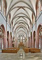
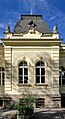
- Nomination The "Marquardtbau" in Stuttgart, Germany. --Julian Herzog 19:19, 2 October 2014 (UTC)
- Promotion Good quality. --Poco a poco 19:28, 2 October 2014 (UTC)
-

- Nomination Sea squill/Sea onion (Drimia maritima). Mersin - Turkey.--Zeynel Cebeci 20:01, 2 October 2014 (UTC)
- Promotion Good quality. --Poco a poco 19:22, 2 October 2014 (UTC)
-

- Nomination Carshi Mosque in Pristina, Kosovo --Pudelek 18:44, 2 October 2014 (UTC)
- Promotion Good quality. --Jacek Halicki 21:37, 2 October 2014 (UTC)
-

- Nomination Sopoćani Monastery, Serbia --Pudelek 18:44, 2 October 2014 (UTC)
- Promotion Good quality. --Poco a poco 19:20, 2 October 2014 (UTC)
-

- Nomination Church of the Holy Apostles Peter and Paul, Ras, Serbia --Pudelek 18:44, 2 October 2014 (UTC)
- Promotion Good quality. --Jacek Halicki 21:37, 2 October 2014 (UTC)
-

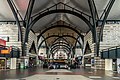
- Nomination Leadenhall Market, London, England --Poco a poco 18:35, 2 October 2014 (UTC)
- Promotion Good quality. --Jacek Halicki 21:37, 2 October 2014 (UTC)
-

- Nomination The Tower, London, England --Poco a poco 18:35, 2 October 2014 (UTC)
- Promotion QI -- Spurzem 19:36, 2 October 2014 (UTC)
-
- Nomination Teatr Wielki, Poznań, Poland --Poco a poco 18:35, 2 October 2014 (UTC)
- Promotion Good quality. --Jacek Halicki 21:37, 2 October 2014 (UTC)
-

- Nomination Raczynski library, Poznan, Poland --Poco a poco 18:35, 2 October 2014 (UTC)
- Promotion Good quality. --JLPC 21:47, 2 October 2014 (UTC)
-

- Nomination Gniezno Cathedral, Gniezno, Poland --Poco a poco 18:35, 2 October 2014 (UTC)
- Promotion Good quality. --Livioandronico2013 19:24, 2 October 2014 (UTC)
-

- Nomination Collegiate church, Poznań, Poland --Poco a poco 18:35, 2 October 2014 (UTC)
- Promotion
 Awesome! --Livioandronico2013 20:12, 2 October 2014 (UTC)
-

- Nomination Poznan Cathedral, Poznan, Poland --Poco a poco 18:35, 2 October 2014 (UTC)
- Promotion Very good though the windows are rather bright. -- Spurzem 19:41, 2 October 2014 (UTC)
-
-

-

- Nomination Theater Buff in Saint Petersburg --Florstein 16:32, 2 October 2014 (UTC)
- Promotion Good quality. --Poco a poco 19:20, 2 October 2014 (UTC)
-

- Nomination Facade of the church of Bioussac (11th century, rebuilt in the beginning of the 20th), Charente, France. --JLPC 16:34, 2 October 2014 (UTC)
- Promotion Good quality. --Livioandronico2013 19:18, 2 October 2014 (UTC)
-

-

-

- Nomination Germany, Schwetzingen, Schloßplatz 2, Palais Hirsch --Berthold Werner 13:33, 2 October 2014 (UTC)
- Promotion Good quality. --JLPC 16:32, 2 October 2014 (UTC)
-

- Nomination Fourmi des dunes, Carpenter ant, Namibia. --Ercé 13:37, 2 October 2014 (UTC)
- Decline Sorry,at least 2 mpx --Livioandronico2013 14:33, 2 October 2014 (UTC)
-

-

- Nomination The Baptistery, Buthrotum, Vlorë County, Albania. --Halavar 12:38, 2 October 2014 (UTC)
- Decline Strong posterization, not a QI, sorry --Poco a poco 19:28, 2 October 2014 (UTC)
-

- Nomination Boats on the Étang de Thau --Christian Ferrer 11:50, 2 October 2014 (UTC)
- Promotion Good quality and nice composition. --Felix König 12:15, 2 October 2014 (UTC)
-

- Nomination Championnat de France de cyclisme handisport - 20140615 - Contre la montre. --Pleclown 11:29, 2 October 2014 (UTC)
- Promotion Good quality. --Poco a poco 19:28, 2 October 2014 (UTC)
-

-

- Nomination Amiens, France: Église Saint-Jacques --~~~~
- Promotion Ok. --DXR 21:14, 2 October 2014 (UTC)
-
-

- Nomination Church of St. Catherine in Kudowa-Zdrój --Jacek Halicki 10:50, 2 October 2014 (UTC)
- Promotion Good quality. --Florstein 17:08, 2 October 2014 (UTC)
-

- Nomination Church of St. Catherine in Kudowa-Zdrój --Jacek Halicki 10:50, 2 October 2014 (UTC)
- Promotion
 Comment Two black dots on the left of the tower. --Halavar 11:25, 2 October 2014 (UTC)
 Done--Jacek Halicki 15:49, 2 October 2014 (UTC)
 Support Good now. --Halavar 16:12, 2 October 2014 (UTC)
-

- Nomination Church of St. Catherine in Kudowa-Zdrój --Jacek Halicki 10:50, 2 October 2014 (UTC)
- Promotion Comment Dust spot. I left a note. Also, there are few black dots on the sky near the tower. --Halavar 11:21, 2 October 2014 (UTC)l Done--Jacek Halicki 15:49, 2 October 2014 (UTC) Support Good now. --Halavar 16:12, 2 October 2014 (UTC)
-

- Nomination Church of St. Catherine in Kudowa-Zdrój --Jacek Halicki 10:50, 2 October 2014 (UTC)
- Promotion Support Good quality --Halavar 11:28, 2 October 2014 (UTC)
-
-

- Nomination Temple of Asclepius, Buthrotum, Vlorë County, Albania. --Halavar 09:24, 2 October 2014 (UTC)
- Promotion Good quality. --Jacek Halicki 10:57, 2 October 2014 (UTC)
-

- Nomination Ancient Greek text, Buthrotum, Vlorë County, Albania. --Halavar 09:24, 2 October 2014 (UTC)
- Promotion Good quality. --Jacek Halicki 10:57, 2 October 2014 (UTC)
-

- Nomination Amphitheatre, Buthrotum, Vlorë County, Albania. --Halavar 09:24, 2 October 2014 (UTC)
- Promotion Good quality. --Jacek Halicki 10:53, 2 October 2014 (UTC)
-

- Nomination Amphitheatre, Buthrotum, Vlorë County, Albania. --Halavar 09:24, 2 October 2014 (UTC)
- Promotion Good quality. --Jacek Halicki 10:53, 2 October 2014 (UTC)
-

- Nomination Ruins, Buthrotum, Vlorë County, Albania. --Halavar 09:24, 2 October 2014 (UTC)
- Promotion Good quality. --Jacek Halicki 10:53, 2 October 2014 (UTC)
-

- Nomination Höchst hl Johannes der Täufer --Böhringer 07:40, 2 October 2014 (UTC)
- Decline Lacks sharpness, sorry --Poco a poco 19:30, 2 October 2014 (UTC)
-
-

-

- Nomination Great Synagogue of Rome --Livioandronico2013 07:11, 2 October 2014 (UTC)
- Promotion Good quality. --JLPC 16:32, 2 October 2014 (UTC)
-

- Nomination Royal Border Bridge. Mattbuck 06:50, 2 October 2014 (UTC)
- Promotion Good quality. --Poco a poco 19:30, 2 October 2014 (UTC)
-
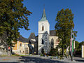
- Nomination Parish church St. Anna in Pöggstall, Lower Austria --Uoaei1 06:07, 2 October 2014 (UTC)
- Promotion Good quality.--Famberhorst 06:30, 2 October 2014 (UTC)
-

-

-

-

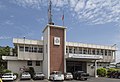
- Nomination Taipei, Taiwan: Sign of Taiwan City Police Department at the Police Station at corner ChengDu Road, Hanzhong Street --Cccefalon 03:59, 2 October 2014 (UTC)
- Promotion Ok --Poco a poco 19:30, 2 October 2014 (UTC)
-

-

-

-

-

-

- Nomination Glockenspiel, Neue Residenz, Salzburg --P e z i 21:05, 1 October 2014 (UTC)
- Promotion Good quality. -- Felix König 12:22, 2 October 2014 (UTC)
-

- Nomination A 3.5" hard disk drive with PATA connections. By User:Evan-Amos --Rodrigo.Argenton 20:35, 1 October 2014 (UTC)
- Promotion Good quality. --Florstein 17:11, 2 October 2014 (UTC)
-

- Nomination A Nestle Aero Mint bar split in half. By User:Evan-Amos --Rodrigo.Argenton 20:35, 1 October 2014 (UTC)
- Promotion Good quality. --Florstein 17:11, 2 October 2014 (UTC)
-

- Nomination The Amiga CD32, a 32-bit, CD-ROM based video game console from Commodore. By User:Evan-Amos --Rodrigo.Argenton 20:35, 1 October 2014 (UTC)
- Promotion Good quality -- Spurzem 21:39, 2 October 2014 (UTC)
-

- Nomination .The Amiga CD32. By User:Evan-Amos --Rodrigo.Argenton 20:35, 1 October 2014 (UTC)
- Promotion Good quality. --Florstein 17:11, 2 October 2014 (UTC)
-

-

- Nomination Church of St. Catherine in Kudowa-Zdrój --Jacek Halicki 19:56, 1 October 2014 (UTC) Comment Please remove dust spots (see notice). --P e z i 20:18, 1 October 2014 (UTC)
- Promotion Done--Jacek Halicki 22:56, 1 October 2014 (UTC) Support OK now. --P e z i 09:14, 2 October 2014 (UTC)
- Nomination Church of St. Catherine in Kudowa-Zdrój --Jacek Halicki 19:56, 1 October 2014 (UTC)
-

- Nomination Church of St. Catherine in Kudowa-Zdrój --Jacek Halicki 19:56, 1 October 2014 (UTC) Comment Please remove dust spots (see notice). --P e z i 20:18, 1 October 2014 (UTC)
- Promotion Done--Jacek Halicki 23:05, 1 October 2014 (UTC) Support OK now. --P e z i 09:14, 2 October 2014 (UTC)
- Nomination Church of St. Catherine in Kudowa-Zdrój --Jacek Halicki 19:56, 1 October 2014 (UTC)
-

- Nomination Quai du Mistral, Sète, France. --Christian Ferrer 17:30, 1 October 2014 (UTC)
Very nice, but CA is yet to be corrected --DXR 20:11, 1 October 2014 (UTC)
Done thanks --Christian Ferrer 22:28, 1 October 2014 (UTC) - Promotion Good quality. --DXR 11:26, 2 October 2014 (UTC)
- Nomination Quai du Mistral, Sète, France. --Christian Ferrer 17:30, 1 October 2014 (UTC)
-

-

- Nomination The Bergpalais of Pillnitz Castle, Dresden, Saxony. -- Felix König 18:47, 30 September 2014 (UTC)
- Promotion Good quality. --Uoaei1 06:25, 2 October 2014 (UTC)
-

- Nomination FIS Sommer Grand Prix 2014 - 20140809 - Stefan Kraft --Pleclown 11:11, 29 September 2014 (UTC)
Could you crop the hand on the left? Poco a poco 19:06, 29 September 2014 (UTC) Done Pleclown 18:13, 1 October 2014 (UTC) - Promotion Good quality. --Poco a poco 19:03, 2 October 2014 (UTC)
- Nomination FIS Sommer Grand Prix 2014 - 20140809 - Stefan Kraft --Pleclown 11:11, 29 September 2014 (UTC)
-

- Nomination Corderie Royale in Rochefort, France --Pline 08:48, 28 September 2014 (UTC)
Right side leans out Poco a poco 09:27, 28 September 2014 (UTC) Done--Pline 06:42, 1 October 2014 (UTC) - Promotion Good quality. --Poco a poco 19:04, 2 October 2014 (UTC)
- Nomination Corderie Royale in Rochefort, France --Pline 08:48, 28 September 2014 (UTC)
-

- Nomination Town hall in Lądek-Zdrój --Jacek Halicki 23:35, 27 September 2014 (UTC)
- Promotion Support Good quality. --XRay 13:14, 2 October 2014 (UTC)
-

-

- Nomination: Old town hall, Cologne, Germany --XRay 04:28, 27 September 2014 (UTC)
- Review needed
-

- Nomination: Parish church „Assumption of Mary“ in Forchtenstein, Burgenland, Austria --Steindy 20:36, 26 September 2014 (UTC)
- Review needed
-

- Nomination: Parish church „Assumption of Mary“ in Forchtenstein, Burgenland, Austria --Steindy 20:36, 26 September 2014 (UTC)
- Review needed
-

- Nomination: Parish church „Assumption of Mary“ in Forchtenstein, Burgenland, Austria --Steindy 20:36, 26 September 2014 (UTC)
- Review needed
-

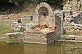
- Nomination: Roman Tomb use as fountaine Piazza del Popolo --Livioandronico2013 19:29, 26 September 2014 (UTC)
- Review needed
-

- Nomination: Church of Our Lady of Sorrows, Skřečoň, Bohumín. Moravian-Silesian Region, Czech Republic. --Halavar 16:10, 26 September 2014 (UTC)
- Review needed
-

- Nomination: Church of Our Lady of Sorrows, Skřečoň, Bohumín. Moravian-Silesian Region, Czech Republic. --Halavar 16:02, 26 September 2014 (UTC)
- Review needed
-

- Nomination: Autobus in Oslo --Ralf Roletschek 15:35, 26 September 2014 (UTC)
I'd appreciate further categories Poco a poco 16:24, 26 September 2014 (UTC) - Review needed
- Nomination: Autobus in Oslo --Ralf Roletschek 15:35, 26 September 2014 (UTC)
-
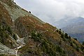
- Nomination: Location Hotel Weiss Horn (2337m). View footpath to Zinal (1670 m) in the back of the Val d'Anniviers.
Famberhorst 15:06, 26 September 2014 (UTC) - Review needed
- Nomination: Location Hotel Weiss Horn (2337m). View footpath to Zinal (1670 m) in the back of the Val d'Anniviers.
-

- Nomination: Oslo, ski jump Holmenkollenbakken, Detail --Ralf Roletschek 14:33, 26 September 2014 (UTC)
- Review needed
-

- Nomination: Oslo, ski jump Holmenkollenbakken, Detail --Ralf Roletschek 14:33, 26 September 2014 (UTC)
- Review needed
-

- Nomination: Oslo, Holmenkollen- Kapelle --Ralf Roletschek 14:33, 26 September 2014 (UTC)
- Review needed
-

- Nomination: Chapel of St. John of Nepomuk, Závada (Petrovice u Karviné). Moravian-Silesian Region, Czech Republic. --Halavar 13:18, 26 September 2014 (UTC)
- Review needed
-

- Nomination: Oslo, Flytoget --Ralf Roletschek 12:42, 26 September 2014 (UTC)
- Review needed
-
- Nomination: Oslo, Flytoget --Ralf Roletschek 12:42, 26 September 2014 (UTC)
- Review needed
-

- Nomination: Oslo, Metro station Frognerseteren --Ralf Roletschek 12:42, 26 September 2014 (UTC)
- Review needed
-

- Nomination: Oslofjord --Ralf Roletschek 12:42, 26 September 2014 (UTC)
- Review needed
-

- Nomination: Germany, Baden-Württemberg, Schwetzingen castle, temple of Minerva --Berthold Werner 11:21, 26 September 2014 (UTC)
- Review needed
-

- Nomination: Baroque Gate on Kościelny Square in Kłodzko --Jacek Halicki 10:36, 26 September 2014 (UTC)
- Review needed
-

- Nomination: Baroque Gate on Kościelny Square in Kłodzko --Jacek Halicki 10:36, 26 September 2014 (UTC)
- Review needed
-
- Nomination: Spa House, Spa park, Darkov, Karviná. Moravian-Silesian Region, Czech Republic. --Halavar 09:15, 26 September 2014 (UTC)
- Review needed
-

- Nomination: 1476 Gothic Church in Kefermarkt, Austria. --Florian Voggeneder 09:12, 26 September 2014 (UTC)
There is some CA Poco a poco 16:39, 26 September 2014 (UTC) - Review needed
- Nomination: 1476 Gothic Church in Kefermarkt, Austria. --Florian Voggeneder 09:12, 26 September 2014 (UTC)
-

- Nomination: Saratov orthodox theological seminary. By User:Ivankozsar --Brateevsky 09:30, 26 September 2014 (UTC)
- Review needed
-
-

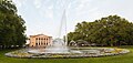
- Nomination Victoria Memorial and Buckingham Palace, London, England --Poco a poco 16:42, 25 September 2014 (UTC)
- Promotion Support Good quality. --XRay 08:34, 2 October 2014 (UTC)
-

- Nomination Westminster from the dome on Methodist Central Hall. --Colin 22:34, 24 September 2014 (UTC)
- Promotion Nice. --Livioandronico2013 14:42, 2 October 2014 (UTC)
-
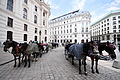
- Nomination Horses in Vienna --Ralf Roletschek 13:19, 24 September 2014 (UTC)
- Promotion Good quality. --Pleclown 11:46, 2 October 2014 (UTC)
-

- Nomination Schwedenbrücke, Vienna --Ralf Roletschek 13:19, 24 September 2014 (UTC)
- Promotion Good quality. --Pleclown 11:46, 2 October 2014 (UTC)
-

- Nomination Marienbrücke, Vienna --Ralf Roletschek 13:19, 24 September 2014 (UTC)
- Promotion Good quality. --Pleclown 11:46, 2 October 2014 (UTC)
-

- Nomination City tunnels tourist route in Kłodzko --Jacek Halicki 08:40, 24 September 2014 (UTC)
- Promotion Support A little bit noisy, but IMO QI. --XRay 07:24, 2 October 2014 (UTC)
-

-

- Nomination Pontoon Dock DLR station. Mattbuck 06:34, 24 September 2014 (UTC)
- Promotion Support --Christian Ferrer 07:13, 2 October 2014 (UTC)
-

- Nomination Gummer's How. Mattbuck 06:34, 24 September 2014 (UTC)
- Promotion Support --Christian Ferrer 07:15, 2 October 2014 (UTC)
-

- Nomination Big Ben, London, England --Poco a poco 17:00, 22 September 2014 (UTC)
Left side leaning in. Also I get the feeling you knew about WLMUK before I did. Mattbuck 21:44, 29 September 2014 (UTC) Done I don't think I have odds in WLMUK btw Poco a poco 20:20, 30 September 2014 (UTC)
You have a pretty decent chance to get in the top few I'd think. Maybe not with this particular image, but generally. As for this, it's QI, but I'm not a fan of remapping overexposure to grey as has been done here. I think it would have been better with the full range of brightness. Mattbuck 22:09, 30 September 2014 (UTC)
You're right, I have reduced removed the grey mapping. Let's see what is the result of WLM. I think that I have odds though in Palestina :) Poco a poco 19:11, 2 October 2014 (UTC) - Promotion
- Nomination Big Ben, London, England --Poco a poco 17:00, 22 September 2014 (UTC)
-

- Nomination Spa complex in Lądek-Zdrój --Jacek Halicki 19:48, 19 September 2014 (UTC)
The top right is a bit blurry, and the right side generally I do not feel is very good - it feels a bit messy. Mattbuck 15:08, 26 September 2014 (UTC) - Decline
 Not done --Mattbuck 23:05, 2 October 2014 (UTC)
- Nomination Spa complex in Lądek-Zdrój --Jacek Halicki 19:48, 19 September 2014 (UTC)
-

-

- Nomination Sierra de Collserola, Cerdanyola del Vallès, Ermita de Santa Maria de les Feixes --Ralf Roletschek 12:25, 19 September 2014 (UTC)
I think the background is too soft. Mattbuck 15:08, 26 September 2014 (UTC) - Decline Not done --Mattbuck 23:05, 2 October 2014 (UTC)
- Nomination Sierra de Collserola, Cerdanyola del Vallès, Ermita de Santa Maria de les Feixes --Ralf Roletschek 12:25, 19 September 2014 (UTC)
-

_near_Bacharach_20141002_1.jpg)


_2.JPG)
_3.JPG)


.JPG)


.jpg)


_1.JPG)


.jpg)
.jpg)
.jpg)


._Zicht_op_voetpad_naar_Zinal_(1670_m)_achteraan_in_het_Val_d%27Anniviers_02.JPG)


_--_2014_--_6867.jpg)
_-_H3616.jpg)
.JPG)
.jpg)
.JPG)
Consensual review edit
File:Patchway railway station MMB 23.jpg edit

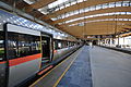
- Nomination Patchway railway station. Mattbuck 06:34, 24 September 2014 (UTC)
- Promotion
- Support Good quality. --XRay 07:24, 2 October 2014 (UTC)
- I think both side are leaning out (see bulding at left and all the fences at right) --Christian Ferrer 08:04, 2 October 2014 (UTC)
- Done Mattbuck 19:49, 4 October 2014 (UTC)
- Support --Christian Ferrer 21:27, 4 October 2014 (UTC)
Total: 2 support (excluding the nominator), 0 oppose →  Promoted --Christian Ferrer 21:27, 4 October 2014 (UTC)
File:Ansitz Mittelweiherburg, Hard.jpg edit

- Nomination Ansitz Mittelweiherburg --Böhringer 06:13, 29 September 2014 (UTC)
- Promotion Declined for reason of flooding --Cccefalon 06:26, 29 September 2014 (UTC) Support. I don't understand the reason for decline. -- Spurzem 08:40, 29 September 2014 (UTC)
See above (imho no flooding) --Tuxyso 18:49, 29 September 2014 (UTC) Support QI to me, minor dust spot (note), easy to remove, and I would prefer a crop without the böring left side (fence), but nevertheless QI to me. --DKrieger 22:53, 3 October 2014 (UTC) :: Done dust spot entfernt, danke euch Beiden für den 's' --Böhringer 12:34, 4 October 2014 (UTC)
File:2014_Kłodzko,_barokowa_brama_13.jpg edit

- Nomination Baroque Gate on Kościelny Square in Kłodzko --Jacek Halicki 19:30, 26 September 2014 (UTC)
- Promotion
- Support. Very good -- Spurzem 19:58, 26 September 2014 (UTC)
 OpposeWhere is the gate? Who is that man ? Not accurate description.--Jebulon 20:26, 28 September 2014 (UTC)
- Support very good photo, here isn't the competition of quality descriptions. --Ralf Roletschek 07:54, 29 September 2014 (UTC)
- Falsch. --Jebulon 22:18, 29 September 2014 (UTC)
- It is not only important, it is just the rule !--Jebulon 21:30, 30 September 2014 (UTC)
- Comment I completed the descriptions. --Jacek Halicki 10:29, 1 October 2014 (UTC)
- Support Good with new, proper description. QI for me --Halavar 01:17, 2 October 2014 (UTC)
- Support Ok now. Yann 09:38, 3 October 2014 (UTC)
File:Dülmen,_Lüdinghauser_Tor_--_2014_--_3336.jpg edit

- Nomination Detail of the Lüdinghauser Tor, Dülmen, North Rhine-Westphalia, Germany --XRay 18:56, 18 September 2014 (UTC)
- Promotion
For me the DOF isn't good enough. Mattbuck 14:47, 26 September 2014 (UTC) Nearly fixed It's sharper now. May be it's good enough. What do you think?--XRay 15:47, 26 September 2014 (UTC)
The thing is, the face is great, but the background to me is too blurry. It's not a decline, so Neutral. Mattbuck 21:48, 27 September 2014 (UTC) Comment Thanks for your review. So I set this review to discussion.--XRay 09:12, 28 September 2014 (UTC)
 - Support DOF is OK. It is quite normal to have a blurry background to make the subject stand out. Yann 16:03, 29 September 2014 (UTC)
- Support Somewhat low DOF, but main parts look acceptable. -- Smial (talk) 08:37, 30 September 2014 (UTC)
File:12-01-20-yog-523.jpg edit

- Nomination Robert-Kent Päll (EST), Curling --Ralf Roletschek 14:46, 25 September 2014 (UTC)
- Decline
- Support QI -- Spurzem 19:53, 25 September 2014 (UTC)
- Oppose meaningless name.--Jebulon 11:19, 27 September 2014 (UTC)
- Oppose Meaningless name. Yann 17:30, 3 October 2014 (UTC)
File:12-01-20-yog-567.jpg edit

- Nomination Rachel Hannen (GBR), Curling --Ralf Roletschek 14:46, 25 September 2014 (UTC)
- Decline
- Support Very good -- Spurzem 19:53, 25 September 2014 (UTC)
- Oppose Meaninless name.--Jebulon 11:19, 27 September 2014 (UTC)
- Oppose Meaningless name. Yann 17:31, 3 October 2014 (UTC)
- In my opinion first we have to judge the photo and not the file name. Finally the description says what form of sport you see and who is doing this. Further I remember that file names had eight digits maximal. -- Spurzem 21:25, 3 October 2014 (UTC)
- And if the WMF servers ran Windows 3.1 that would be an issue, but given that filenames can be 240 bytes it's irrelevant. The QI rules do state that names must be "meaningful" - this is not. Oppose Mattbuck 16:33, 4 October 2014 (UTC)
- And if the WMF servers ran Windows 3.1 that would be an issue, but given that filenames can be 240 bytes it's irrelevant. The QI rules do state that names must be "meaningful" - this is not.
- In my opinion first we have to judge the photo and not the file name. Finally the description says what form of sport you see and who is doing this. Further I remember that file names had eight digits maximal. -- Spurzem 21:25, 3 October 2014 (UTC)
Running total: 1 support (excluding the nominator), 3 oppose → Decline? --Jebulon 23:48, 4 October 2014 (UTC)
File:14-09-02-oslo-RalfR-250.jpg edit

- Nomination Dyna Fyr, Oslo, Norway --Ralf Roletschek 15:30, 18 September 2014 (UTC)
- Promotion Support Good quality. --XRay 11:42, 26 September 2014 (UTC)
I am not opposing as such, but I think this needs brightening. --Mattbuck 21:50, 27 September 2014 (UTC) - Support OK for me. Yann 16:00, 29 September 2014 (UTC)
File:Blumauerhaus Steyr DSC 2743w.jpg edit

- Nomination Middle class house, Blumauerhaus, Upper Austria --P e z i 20:41, 23 September 2014 (UTC)
- Withdrawn
- Support Good quality. --ArildV 06:09, 24 September 2014 (UTC)
- Oppose The contre-jour lighting is unfortunate, I oppose because I would like to read some other opinions.--Jebulon 19:07, 24 September 2014 (UTC)
- Comment Contre-jour lighting very well handled. Weak sharpness in the upper part of the image, probably due to perspective correction. To avoid such unsharpness it is essential to scale down an image after such correction. Does not need as low as 2 MPixels, down to about 80% of the original resolution is in most cases sufficiant. -- Smial 09:18, 25 September 2014 (UTC)
- Oppose Lack of sharpness in the upper part of the photo. --Steindy 18:08, 26 September 2014 (UTC)
- Oppose As Jebulon--Lmbuga 03:15, 27 September 2014 (UTC)
 I withdraw my nomination --P e z i 22:31, 4 October 2014 (UTC)
File:Münster,_Krameramtshaus_(Haus_der_Niederlande)_--_2014_--_6867.jpg edit
_--_2014_--_6867.jpg)
- Nomination Krameramtshaus (House of the Netherlands), Münster, North Rhine-Westphalia, Germany --XRay 03:27, 16 September 2014 (UTC)
- Decline Slight cyan ca at rooftop, Otherwise good. --Johanning 06:19, 16 September 2014 (UTC) Fixed Thanks. It's fixed.--XRay 17:03, 17 September 2014 (UTC)
Sorry, I have made a mess of it. When I had another look at the image I saw, that the ca was gone, thank you. But I saw also, that it had distracted me from the more relevant issue. At the very top the image is getting quite blurry. Now I have to eat my words ... --Johanning 21:33, 17 September 2014 (UTC) Fixed No problem. I improved the sharpness. Hopefully it's good enough.--XRay 11:16, 19 September 2014 (UTC) OpposeI don't think so. But you had a similar debate about the town hall in Münster, that produced pros and cons. Thus, I send it to CR to give it a chance. --Johanning 17:36, 24September 2014 (UTC) - Oppose Not sharp. Also possibly somewhat distorted, all those bicycles seem to have oval wheels. -- Smial 09:54, 25 September 2014 (UTC)
File:20140707_Radkersburg_-_household_items_(Gombocz_collection)_-_H3616.jpg edit
_-_H3616.jpg)
- Nomination Doppelt gebrannter Ziegel, um 1900 mit Stempel --Hubertl 09:58, 23 September 2014 (UTC)
- Promotion Very good -- Spurzem 10:09, 23 September 2014 (UTC)
Comment Perhaps QI for me (perhaps weak support): vertical lines of the right side are not straight. The picture seems tilted. Too much space at top and at bottom IMO. Too much issues IMO to be very good. Others can think. Sorry, the detail is not perfect IMO--Lmbuga 03:01, 24 September 2014 (UTC)
Comment Straightened and better adjusted.--Hubertl 12:04, 24 September 2014 (UTC) - Support. I say once more: Very good. -- Spurzem 15:54, 24 September 2014 (UTC)
- Support I also would prefer a tighter crop (about 1/3) on top, but nevertheless QI for me --DKrieger 20:01, 25 September 2014 (UTC)
- Support Good quality IMO--Lmbuga 16:56, 26 September 2014 (UTC)
- Support Of course QI! --Steindy 18:43, 26 September 2014 (UTC)
File:Horex Regina 400 (2014-09-13 7005 Sp).JPG edit
.JPG)
- Nomination Horex Regina, a famous German bike of the 1950s -- Spurzem 09:55, 15 September 2014 (UTC)
- Promotion Composition: the flower pot is disturbing --MB-one 01:22, 23 September 2014 (UTC)
I know promoted images with much more disturbing things and ask for discussion. -- Spurzem 06:27, 23 September 2014 (UTC) - Support The Horex is properly put in the picture and that's the point. I do not understand what there is to criticize it. Of course QI! --Steindy 18:16, 26 September 2014 (UTC)
- Support--Livioandronico2013 19:53, 26 September 2014 (UTC)
{{o}}As MB-one. Poor composition IMO. CAs (see note). The detail is not good IMO (see note, but there are other areas). Not QI for me --Lmbuga 03:21, 27 September 2014 (UTC)
- @ Lmbuga: Terrible CAs fixed, flower-pot removed. But by the way: I saw promoted images with poorer compositions. -- Spurzem 17:17, 27 September 2014 (UTC)
File:Forchtenstein - Pfarrkirche Maria Himmelfahrt (18).jpg edit
.jpg)
- Nomination Stained-glass-window from Rudolf Nagl in the parish-church Maria Himmelfahrt in Forchtenstein (Austria. --Steindy 19:00, 15 September 2014 (UTC)
- Decline Perspective, see comments on file --Steinsplitter 06:56, 22 September 2014 (UTC)
- Comment It looks vertically somewhat compressed. @Steinsplitter: Are you sure this old masonry has absolutely straight verticals? -- Smial 09:27, 25 September 2014 (UTC)
- @ Steinsplitter: Ganz abgesehen davon, dass es schwierig genug war, das Glasfenster, das sich in fünf Metern Höhe befindet, einigermaßen ins Bild zu bekommen, war ich leider 1655 beim Bau der Kirche und auch 1909 beim Einbau des Glasfensters noch nicht auf der Welt, denn ansonsten hätte ich die Maurer genauestens überwacht. Soll ich vielleicht die senkrechten Linien korrigieren, damit der nächste Benutzer sich darüber mokiert, dass die waagrechten Linien nicht passen? Man kann den Bildautor für vieles, aber nicht alles verantwortlich machen! Aber wenn du möchtest, ziehe ich meine Kandidatur zurück... --Steindy 17:42, 26 September 2014 (UTC)
File:Aachen_Germany_Domschatz_Three-tower-reliquary-01.jpg edit

- Nomination Three tower reliquary, Treasury of the Imeprial Cathedral, Aachen --Cccefalon 03:45, 15 September 2014 (UTC)
- Decline Support Good quality. It's behind glass, I know. In this case it is IMO acceptable. --XRay 15:50, 22 September 2014 (UTC) Oppose I disagree mirror effects are disturbing and there is motion blur at the bottom --MB-one 01:29, 23 September 2014 (UTC)
- Oppose As MB-one. Blurry at bottom (see note) --Lmbuga 03:28, 27 September 2014 (UTC)
- Comment To be exact: With f/2.2 in a dark room, the DoF was limited. It is also not motion blur, as I used a tripod. However, the reliquary itself is sharp enough IMO. --Cccefalon 07:24, 27 September 2014 (UTC)
File:Butterfly_at_Surat.jpg edit

- Nomination Butterfly --Yndesai 10:50, 21 September 2014 (UTC)
- Decline Support. Nice and very good -- Spurzem 11:37, 21 September 2014 (UTC) Comment propper taxa missing, frameing like this is not endorsesed. Is that motion blur on the wings?--Tobias "ToMar" Maier 11:36, 21 September 2014 (UTC) Comment File Updated and removed the frame. Blur is due to very small depth of field. Yndesai 12:22, 21 September 2014 (UTC) OpposeNot really enough DOF unfortunately. Also very noisy, from over sharpening maybe? -- KTC 14:21, 21 September 2014 (UTC)
Oppose Sorry, poor quality IMO,  chromatic aberrations, oversharpened, I don't know if there is noise or a lot of jpg artifacts. Poor quality IMO--Lmbuga 23:04, 21 September 2014 (UTC)
File:Bell_206B_Jet_Ranger_III_September_2014_01.jpg edit

- Nomination Bell 206B Jet Ranger III at Jungfrusund, Ekerö. --ArildV 10:11, 21 September 2014 (UTC)
- Promotion Really ought to capture the whole rotor I think. Sorry -- KTC 14:55, 21 September 2014 (UTC) I strongly disagree! A intentional close-up. Not every photo has to show everything. A photo of window are not a "low quality images" because it not capture the whole building. I dont understand this review at all--ArildV 15:46, 21 September 2014 (UTC)
Support Quiet people, we are not here to fight. For me it's QI. Anyway I think that KTC meant the wings (the rotor is all about them), but there is the discuss for this, peace & love  --Livioandronico2013 16:10, 21 September 2014 (UTC)
It was merely an opinion. Personally, if it were an intentional close-up, I would had expected to be cropped tighter. But of course, others may and does disagree. More than happy to see what others think at CR. :) Comment No hard feelings at all . Of course, I respect KTC opinions but I was surprised. The picture is taken with maximum zoom (200mm), of course it can be be cropped afterwards. But personally I see no reason. The vertical crop is already tight, and I like the non-centered composition (which makes the picture a little more exciting, even if the movement is deliberately frozen here). In my personal opinion is this discussion about a matter of taste, both the image with my crop and the image with a tighter crop (as suggested) is a Quality image. Regards--ArildV 18:32, 21 September 2014 (UTC)
Ok,no harm done --Livioandronico2013 18:43, 21 September 2014 (UTC)
Comment Big dust spot (see note)--Lmbuga 22:56, 21 September 2014 (UTC) Done Thank for note--ArildV 07:18, 22 September 2014 (UTC)
![]() SupportQI to me --DKrieger 21:04, 23 September 2014 (UTC)
SupportQI to me --DKrieger 21:04, 23 September 2014 (UTC)
File:Maracujá em fundo preto (2).JPG edit
.JPG)
- Nomination Passion fruit (Passiflora edulis var. flavicarpa) in black background - Rodrigo.Argenton 04:39, 21 September 2014 (UTC)
- Promotion DoF too shallow - only the half fruit in the foreground is sharp. It would be great, to repeat that compo with other settings or with focus stacking. --Cccefalon 06:35, 21 September 2014 (UTC). This is a f/11, I can't be more sharp, if I up to f/22 the photo gonna be less sharp but with a better DoF, and the idea was be a background element, but ok. Rodrigo.Argenton 08:38, 21 September 2014 (UTC)
You are right about the f/11, more won't help. Only more focal distance or focus stacking would help. For a background element, it probably should be a little bit distant from the foreground element. What about sending to CR? There might be other opinions about a studio shot of fruits. --Cccefalon 08:54, 21 September 2014 (UTC) User:Cccefalon Thanks, this composition, with my equipment, only two photos and PS :D. Actually I'm using this space here as this: Commons:Photography critiques, cause no one answers there, and in the lab also... what is CR? Rodrigo.Argenton 09:14, 21 September 2014 (UTC)
CR means Consensual Review. Simply change the /Decline in this text to /Discuss and you will see a yellow outline. The day after, the QIC-bot transfers your nomination automatically to the CR section. --Cccefalon 09:36, 21 September 2014 (UTC) Well I changed not because I don't believe or give a credit to your opinion, but as you suggested and I'm here to listening opinions (and more can be better), CR could be useful, thank you. --Rodrigo.Argenton 16:26, 21 September 2014 (UTC) - Support Good one. Though it is possible to reach nearly infinite DOF by focus stacking, it is absolutely not necessary for every and any QI. Infinite DOF may be demanded for a featured picture to get enough WOW. This image shows a very nice, natural looking perspective, good colours, good lighting, good composition and good sharpness. -- Smial 13:29, 23 September 2014 (UTC)
- Support Per Smial, but very good composition --DKrieger 20:17, 25 September 2014 (UTC)
- neutral tendent to oppose Very good composition and good resolution, but nothing is really sharp IMO--Lmbuga 03:32, 27 September 2014 (UTC)
File:Münster,_Prinzipalmarkt_--_2014_--_6859.jpg edit

- Nomination Prinzipalmarkt, Münster, North Rhine-Westphalia, Germany --XRay 05:43, 20 September 2014 (UTC)
- Promotion Sky overexposed --MB-one 20:23, 20 September 2014 (UTC) Fixed IMO it's fixed now. Please have a look to the new images. Thank you.--XRay 07:10, 21 September 2014 (UTC)
- Support--Hubertl 20:25, 28 September 2014 (UTC)
File:Amiens_France_Rue-du-Don-01.jpg edit

- Nomination Amiens, France: Colours of "Rue du Don" --Cccefalon 04:03, 20 September 2014 (UTC)
- Oppose Too shallow DoF IMHO Poco a poco 09:57, 20 September 2014 (UTC) CommentErm, I thought, it is obvious, that I did this on purpose. This compo consist almost of vertical, coloured bands which are fading away to the background. It was my intention to focus on the first yellow band, using maximum aperture. for the same reason, I named the image "Colours of Rue du Don" --Cccefalon 12:03, 20 September 2014 (UTC)
Well, fine with me, but is it then a QI? Not sure Poco a poco 22:02, 20 September 2014 (UTC) - Decline Oppose Sorry, poor DOF, f/5,6 is not sufficient here, to QI, IMO. If it's an artistic picture, perhaps FP is a better option--Lmbuga 00:30, 21 September 2014 (UTC)
It would be quite interesting to hear, if artistic depictions are generally excluded from QI assessment. --Cccefalon 05:10, 21 September 2014 (UTC)
Comment Sometimes the artistic fact means low quality IMO. It's not QI for me, but it can be for yourself or others--Lmbuga 23:24, 21 September 2014 (UTC) - Support This is a matter of taste. The small DOF is obviously intended and in technical aspects well done. Though I would have chosen to set the focus according to the rule of thirds, not to the facade on the far left margin. -- Smial 13:44, 23 September 2014 (UTC)
- Oppose. I see what you meant to do, and it was definitely worth trying to see how it would turn out. In this case, though, I don't think the line of doorways regresses into the background deeply enough – they go more across the image rather than into it, and my eye expects to see detail across the board. Kbh3rd 17:34, 23 September 2014 (UTC)
File:Moscow Grand Kremlin Palace4.jpg edit

- Nomination Grand Kremlin Palace in Moscow, Russia (by Ludvig14) --A.Savin 12:24, 19 September 2014 (UTC)
- Decline
- Support Good quality. --Ralf Roletschek 12:28, 19 September 2014 (UTC)
- Oppose Ralf, do you like now "distorted" buildings ? I don't, sorry. It needs a discussion IMO.--Jebulon 17:34, 21 September 2014 (UTC)
- Its totaly distortet, ist a panorama. --Ralf Roletschek 15:15, 22 September 2014 (UTC)
- Oppose as per Jebulon. Yann 15:53, 29 September 2014 (UTC)
File:FIS_Sommer_Grand_Prix_2014_-_20140809_-_Tom_Hilde_2.jpg edit

- Nomination FIS Sommer Grand Prix 2014 - 20140809 - Tom Hilde --Pleclown 11:18, 19 September 2014 (UTC)
- Decline Oppose Why 1/1,000 sec (0.001) and only f/3.2? Random picture?--Lmbuga 23:05, 19 September 2014 (UTC)
- Comment I'd suggest to clone out the pimple, as it is not an immutable characteristic and very distracting. @Lmbuga: I have no problem with f/3.2 as it leads to nice blurring of the background. DOF is ok. -- Smial 23:28, 21 September 2014 (UTC)
- Comment I respect your opinion, but I'm not agree (see two notes as example). Poor DOF to QI IMO. Chromatic noise (see note)--Lmbuga 23:40, 21 September 2014 (UTC)
- @Lmbuga: Because the light was not so good, and that the jumpers where not posing and moving a lot. Pleclown 17:36, 23 September 2014 (UTC)
- I was a ski jumping competition. I was at the end zone, and also tried to take pictures of the jumpers while flying and landing (you can see some picutres in the category Category:FIS Sommer Grand Prix 2014). As I only have one camera, I didn't had time to change the settings between the shots. Pleclown 08:43, 24 September 2014 (UTC)
- Oppose Pleclown, I know the problem that you mention, very good. Exactly why can not really QI each photo. I am closing on the opinion of Lmbuga. --Steindy 18:03, 26 September 2014 (UTC)
File:Geneva_Rugby_Cup_-_20140808_-_SF_vs_LOU_-_Jonathan_Danty_1.jpg edit

- Nomination: Geneva Rugby Cup - 20140808 - SF vs LOU - Jonathan Danty --Pleclown 11:18, 19 September 2014 (UTC)
Ok if the chromatic noise is removed Poco a poco 21:52, 19 September 2014 (UTC) - Review Oppose Chromatic noise. DOF and noise (f/2.8, ISO 3,200, 1/500 sec). --Lmbuga 23:00, 19 September 2014 (UTC)
- Support this one. There is noise which is only visible if you zoom to 100% and look for it. DOF is fine; his eyes are very sharp which is the only thing that matters for a people subject. Lewis Collard 02:43, 21 September 2014 (UTC)
- Comment Should we review the images with a zoom of 20%, 40%, 60%...? Please teach me how I should review images. Thumbail of the picture?--Lmbuga 23:14, 21 September 2014 (UTC)
- Comment The image is very good, but chroma noise is indeed really high. I'm using the same camera but usually have much lesser noise, see e.g. here. @Pleclown: which raw developing tool are you using? -- Smial 23:18, 21 September 2014 (UTC)
- @Smial: I'm using Darktable. Pleclown 17:38, 23 September 2014 (UTC)
- I'm using that Pentax tool, there is a slider to supress chroma noise separate without blurring the image, if used carefully. Luminance noise is nearly unchanged and remains in the image, but this is IMO by far not as disturbing than those colourful areas. In difficult cases I'm using NeatImage. This program works best on uncompressed images (TIFF), but I could try it with your image. -- Smial 09:40, 25 September 2014 (UTC)
- @Smial: I don't have any Windows computer at home, hence the use of darktable. Pleclown 17:25, 25 September 2014 (UTC)
- Please have a look at File:Geneva Rugby Cup - 20140808 - SF vs LOU - Jonathan Danty 1 filtered.jpg, slightly denoised with NeatImage. -- Smial 21:11, 27 September 2014 (UTC)
- @Smial: I don't have any Windows computer at home, hence the use of darktable. Pleclown 17:25, 25 September 2014 (UTC)
- I'm using that Pentax tool, there is a slider to supress chroma noise separate without blurring the image, if used carefully. Luminance noise is nearly unchanged and remains in the image, but this is IMO by far not as disturbing than those colourful areas. In difficult cases I'm using NeatImage. This program works best on uncompressed images (TIFF), but I could try it with your image. -- Smial 09:40, 25 September 2014 (UTC)
- Oppose Sorry, but this photo ist very noisy, not really sharp in front and very unsharp in the back of the head and has CAs. --Steindy 17:55, 26 September 2014 (UTC)
- I can understand your frustration because of some declines of your images, but nitpicking is not the solution. -- Smial 21:11, 27 September 2014 (UTC)
- Support OK for me. Yann 15:52, 29 September 2014 (UTC)
_IMGP0879_smial_wp.jpg)
File:Levisham railway station MMB 05 45407.jpg edit

- Nomination 45407 at Levisham. Mattbuck 06:45, 19 September 2014 (UTC)
- Decline Good quality, but the person in the foreground is disturbing. But still QI imo.--ArildV 10:16, 19 September 2014 (UTC) Comment Sorry. But the person is very disturbing and the image is too dark. Please discuss. -- Spurzem 13:18, 19 September 2014 (UTC)
- Support --Christian Ferrer 17:40, 20 September 2014 (UTC)
- Oppose the person is very disturbing --Livioandronico2013 10:33, 21 September 2014 (UTC)
- Oppose As above. -- Spurzem 12:18, 21 September 2014 (UTC)
- Oppose the person is very disturbing because the person is too unsharp or out of focus--Lmbuga 03:42, 27 September 2014 (UTC)
File:St_Pancras_railway_station_trainshed_2014-09-14.jpg edit

- Nomination St Pancras railway station trainshed. --Colin 22:11, 17 September 2014 (UTC)
Very impressive, and I am inclined to say, you go go straight down, turn right, where it says 'FPC', but perhaps before you go, it appears there are some minor foreground stitching problems, the floor looks 'weird' around the area of the annotation I have added to the file page. -- Slaunger 22:21, 17 September 2014 (UTC)
It's a gap that I filled without perfection. There are some minor stitching errors in the roof. So I don't think it could be FP but hope that overall (considering the 103MP) it is QI. -- Colin 22:29, 17 September 2014 (UTC) - Promotion
- Support The foreground problem is definately a minor issue and a recurring difficult aspect of interior panoramics. The image has huge wow, and it might even pass FP too. -- Slaunger 19:16, 18 September 2014 (UTC) --Slaunger 19:16, 18 September 2014 (UTC)
- Oppose - The perspective here just makes it look wrong. It's as if the shed gets steeper closer to the photographer, and that is not the case in real life. The roof beautiful and a marvel of construction, this photo makes it look ugly. --Mattbuck 08:44, 19 September 2014 (UTC)
- I appreciate that the wide-angle perspective isn't to everyone's taste but I don't think is fair to count that as a reason to oppose. It isn't a technical error. One has to balance the pros and the cons in any picture. Here we have high resolution, careful exposure, low noise and an expansive view. Compare File:St Pancras railway station MMB I7.jpg (your current nom) which is hugely underexposed and very noisy or File:St Pancras railway station MMB 30.jpg (current QI) which is also underexposed and heavily tilted. I'm led to wonder what the point in nominating at QI is, when the technical standard required is apparently ignored. -- Colin 09:48, 25 September 2014 (UTC)
- If you don't think my nominations are QI, then by all means decline them. Relist the one which is currently QI. But if a photo, for all its technical merit, does not accurately depict its subject, how can it be considered a quality image? Mattbuck 17:44, 25 September 2014 (UTC)
- Matt, the issues of wide perspectives have been discussed and debated since da Vinci and before. All transformations of a 3D world to a 2D plane involve distortions from reality. Your retina is not flat, nor do you have any real visual acuity outside of the centre small area. The eye sees an image as wide as this one but can't actually focus/concentrate on more than one small area at a time. So what is reality? Is some random underexposed tilted segment of the roof reality? No, the eye sees far more than that. I mention your nominations because it seems to me that you don't apply QI standards to your nominations, merely dumping your memory card onto QIC for others to sift through. Yet others are held to some higher, subjective standard of your own. So I really do question your impartial judgement wrt train station photos. -- Colin 20:53, 25 September 2014 (UTC)
- I note that Mattbuck has withdrawn the nomination I mentioned, and, well, I may have been a bit grumpy in my comments above. Sorry. -- Colin 17:04, 27 September 2014 (UTC)
- I do try to ensure that all images I nominate are up to scratch, but not all images I upload are QI material, and sometimes some slip through the net as it were. Mattbuck 17:52, 27 September 2014 (UTC)
- I note that Mattbuck has withdrawn the nomination I mentioned, and, well, I may have been a bit grumpy in my comments above. Sorry. -- Colin 17:04, 27 September 2014 (UTC)
- Matt, the issues of wide perspectives have been discussed and debated since da Vinci and before. All transformations of a 3D world to a 2D plane involve distortions from reality. Your retina is not flat, nor do you have any real visual acuity outside of the centre small area. The eye sees an image as wide as this one but can't actually focus/concentrate on more than one small area at a time. So what is reality? Is some random underexposed tilted segment of the roof reality? No, the eye sees far more than that. I mention your nominations because it seems to me that you don't apply QI standards to your nominations, merely dumping your memory card onto QIC for others to sift through. Yet others are held to some higher, subjective standard of your own. So I really do question your impartial judgement wrt train station photos. -- Colin 20:53, 25 September 2014 (UTC)
- If you don't think my nominations are QI, then by all means decline them. Relist the one which is currently QI. But if a photo, for all its technical merit, does not accurately depict its subject, how can it be considered a quality image? Mattbuck 17:44, 25 September 2014 (UTC)
- I appreciate that the wide-angle perspective isn't to everyone's taste but I don't think is fair to count that as a reason to oppose. It isn't a technical error. One has to balance the pros and the cons in any picture. Here we have high resolution, careful exposure, low noise and an expansive view. Compare File:St Pancras railway station MMB I7.jpg (your current nom) which is hugely underexposed and very noisy or File:St Pancras railway station MMB 30.jpg (current QI) which is also underexposed and heavily tilted. I'm led to wonder what the point in nominating at QI is, when the technical standard required is apparently ignored. -- Colin 09:48, 25 September 2014 (UTC)
File:109_Bank_Ottawa_Hydro.jpg edit

- Nomination: Designated heritage building Ottawa Hydro Electric Company Building at 109 Bank Street --MB-one 00:29, 9 September 2014 (UTC)
Needs sharpening. Mattbuck 18:14, 14 September 2014 (UTC) - Review Done--MB-one 18:53, 15 September 2014 (UTC)
It's a bit better, but still missing the crispness in the people I'd expect from a well-lit street scene. This is an Oppose from me I'm afraid. Mattbuck 18:56, 16 September 2014 (UTC)
The people are not meant to be the subject of this image. Do you think the building is sharp enough? --MB-one 00:39, 17 September 2014 (UTC) - Support --Livioandronico2013 10:39, 21 September 2014 (UTC)
File:Benediktinerabtei Seckau, Äußerer Klosterhof 1.jpg edit

- Nomination Seckau Abbey courtyard, Seckau, Styria, Austria. --Dnalor 01 14:10, 15 September 2014 (UTC)
- Decline Oppose sharpness + noise + perspective --A.Savin 11:07, 16 September 2014 (UTC) I disagree on that one. --Dnalor 01 11:20, 16 September 2014 (UTC) Oppose I agree with A.Savin --Uoaei1 13:09, 16 September 2014 (UTC)
- Comment A new, corrected version uploaded. --Dnalor 01 17:10, 16 September 2014 (UTC)
- Weak Support The new version seems okay. --Steindy 21:39, 19 September 2014 (UTC)
- Support --K@rl (talk) 18:07, 25 September 2014 (UTC)
- Oppose Sorry,per A.Savin --Livioandronico2013 10:45, 1 October 2014 (UTC)
File:Basilika Seckau, Gnadenkapelle, Gotisches Glasfenster 3.jpg edit

- Nomination Gothic stained-glass window, Chapel of Grace, Basilica Seckau, Styria, Austria. --Dnalor 01 16:36, 15 September 2014 (UTC)
- Promotion We have assessed a lot of stained glass windows in the past which can be uses as reference what amount of sharpness is expected for a QI of that genre. Unfortunatly, this image does not meet the required sharpness. Sorry. --Cccefalon 17:46, 15 September 2014 (UTC) This is not my view of the things. --Dnalor 01 04:36, 16 September 2014 (UTC)
- Support. In my opinion sharpness can not be much better. I only had cropped the image at the dark lines. -- Spurzem 14:14, 16 September 2014 (UTC)
- Comment Thank you for your important comment, new version uploaded: cropped at the dark lines. I've cropped the other 3 pictures of gothic stained-glass windows in Basilica Seckau at the dark lines too (above in the QIC-nomination of 15th september 2014). Done --Dnalor 01 14:38, 16 September 2014 (UTC)
- Support Thanks to Spurzem. Now QI. --Steindy 21:42, 19 September 2014 (UTC)
- Support Acceptable. -- Smial 09:58, 25 September 2014 (UTC)