Commons:Quality images candidates/Archives October 08 2016
-

- Nomination Winged altar in late gothic style at the filial church St. Michael ob Rauchenödt, Upper Austria --Uoaei1 03:54, 6 October 2016 (UTC)
- Promotion Good quality. --Johann Jaritz 04:04, 6 October 2016 (UTC)
-

- Nomination Pipe organ of Melk Abbey Church, Lower Austria --Uoaei1 03:54, 6 October 2016 (UTC)
- Promotion Good quality. --Johann Jaritz 04:04, 6 October 2016 (UTC)
-

- Nomination Romanesque crucifix at the Museum of Melk Abbey, Lower Austria --Uoaei1 03:54, 6 October 2016 (UTC)
- Promotion Good quality. --Johann Jaritz 04:04, 6 October 2016 (UTC)
-

- Nomination Ancient bell clappers at the parish church Weißkirchen in der Wachau, Lower Austria --Uoaei1 03:54, 6 October 2016 (UTC)
- Promotion Good quality. --Johann Jaritz 04:04, 6 October 2016 (UTC)
-

- Nomination Interior of Geras Abbey Church, Lower Austria --Uoaei1 03:54, 6 October 2016 (UTC)
- Promotion Good quality. --Johann Jaritz 04:04, 6 October 2016 (UTC)
-
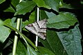
- Nomination Mocis,Erebidae --Vengolis 03:39, 6 October 2016 (UTC)
- Promotion Good quality. --Johann Jaritz 03:52, 6 October 2016 (UTC)
-
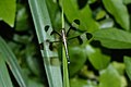
- Nomination Neurothemis tullia --Vengolis 03:39, 6 October 2016 (UTC)
- Promotion Good quality. --Johann Jaritz 03:53, 6 October 2016 (UTC)
-
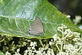
- Nomination Rapala manea --Vengolis 03:39, 6 October 2016 (UTC)
- Promotion Good quality. --Johann Jaritz 03:53, 6 October 2016 (UTC)
-

- Nomination Oxyopes Sp --Vengolis 03:39, 6 October 2016 (UTC)
- Promotion Good quality. --Johann Jaritz 03:52, 6 October 2016 (UTC)
-

- Nomination Michotamia,Asilidae --Vengolis 03:39, 6 October 2016 (UTC)
- Promotion Good quality. --Johann Jaritz 03:54, 6 October 2016 (UTC)
-

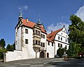
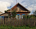
- Nomination Kakesbeck Castle in the hamlet Bechtrup in Lüdinghausen, North Rhine-Westphalia, Germany --XRay 03:27, 6 October 2016 (UTC)
- Promotion
 Support Good quality.--Agnes Monkelbaan 04:41, 6 October 2016 (UTC)
-

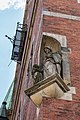
- Nomination Max Ritter von Moro´s bust (created by Prof. Jakob Wald in the year 1900) at the old cemetery of Stein, next to the parish church Saint Florian, Viktring, Klagenfurt, Carinthia, Austria --Johann Jaritz 01:36, 6 October 2016 (UTC)
- Promotion Good quality. --Vengolis 03:25, 6 October 2016 (UTC)
-

- Nomination Statue of an eagle on top of the war memorial at the old cemetery around the parish church Saint Florian in Stein, Viktring, Klagenfurt, Carinthia, Austria --Johann Jaritz 01:36, 6 October 2016 (UTC)
- Promotion Good quality. --Vengolis 03:25, 6 October 2016 (UTC)
-
- Nomination Gravestone of Karoline Edle von Moro at the old cemetery around the parish church Saint Florian in Stein, Viktring, Klagenfurt, Carinthia, Austria --Johann Jaritz 01:36, 6 October 2016 (UTC)
- Promotion Good quality. --Vengolis 03:16, 6 October 2016 (UTC)
-

- Nomination Empire gravestone of Johann von Moro at the southern wall of the parish church Saint Florian in Stein, Viktring, Klagenfurt, Carinthia, Austria --Johann Jaritz 01:36, 6 October 2016 (UTC)
- Promotion Good quality. --Vengolis 03:16, 6 October 2016 (UTC)
-

- Nomination Railway station. Borjomi, Samtskhe-Javakheti, Georgia. --Halavar 00:52, 6 October 2016 (UTC)
- Promotion Good quality. --Johann Jaritz 03:10, 6 October 2016 (UTC)
-

- Nomination Building on the 9 April street. Borjomi, Samtskhe-Javakheti, Georgia. --Halavar 00:52, 6 October 2016 (UTC)
- Promotion Support Good quality.--Agnes Monkelbaan 04:43, 6 October 2016 (UTC)
-

-

-

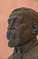
- Nomination Constantin von Economo (1865-1935), bust (marble) in the Arkadenhof of the University of Vienna --Hubertl 23:49, 5 October 2016 (UTC)
- Promotion Good quality. --Johann Jaritz 01:41, 6 October 2016 (UTC)
-

-
-

-

-

- Nomination Immeuble Ennouri --El Golli Mohamed 21:21, 5 October 2016 (UTC)
- Promotion Good quality. --Ermell 21:27, 5 October 2016 (UTC)
-

- Nomination Immeuble Ennouri --El Golli Mohamed 21:21, 5 October 2016 (UTC)
- Decline Sorry but not sharp enough. --Ermell 21:26, 5 October 2016 (UTC)
-

- Nomination Dar Bessrour --El Golli Mohamed 21:21, 5 October 2016 (UTC)
- Promotion Good quality. --Ermell 21:30, 5 October 2016 (UTC)
-

-
-

- Nomination Seifhennersdorf, Saxony - World War memorial --Pudelek 20:35, 5 October 2016 (UTC)
- Promotion Good quality. --Basotxerri 20:39, 5 October 2016 (UTC)
-

-

- Nomination Thann-Bayern, church --Michielverbeek 20:25, 5 October 2016 (UTC)
- Promotion Good quality. --Ermell 21:21, 5 October 2016 (UTC)
-
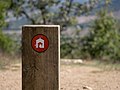
- Nomination Trail blaze on the summit of Eskibel mountain, showing "direction Armentia". Vitoria-Gasteiz, Basque Country, Spain --Basotxerri 18:39, 5 October 2016 (UTC)
- Promotion Good quality--Famberhorst 18:57, 5 October 2016 (UTC)
-

- Nomination Saint Lawrence palace, Funchal, Madeira, Portugal -93 --Lmbuga 18:15, 5 October 2016 (UTC)
- Promotion Good quality. --Basotxerri 18:25, 5 October 2016 (UTC)
-
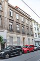
- Nomination House, Bonn, Germany (by Tilman2007).--Leit 17:09, 5 October 2016 (UTC)
- Decline
 Oppose Insufficient quality. Sorry. Problems with perspective, cropped cars, cars itself, overexposed sky, ... --XRay 17:18, 5 October 2016 (UTC)
-

-

-
-

- Nomination Sviyazhsk / Tatarstan: arena of the horseyard --A.Savin 16:34, 5 October 2016 (UTC)
- Promotion Good quality. --Jacek Halicki 17:01, 5 October 2016 (UTC)
-

-

-

- Nomination Catopsilia pyranthe --Vengolis 16:06, 5 October 2016 (UTC)
- Promotion Support Good quality. --Johann Jaritz 16:49, 5 October 2016 (UTC)
-

- Nomination Bara Shiva Temple at Puthia Temple Complex in Rajshahi, Bangladesh. By User:Nahid.rajbd --Tanweer Morshed 15:15, 5 October 2016 (UTC)
- Decline Oppose Insufficient quality. Sorry. IMO too unsharp and resolition too small for this kind of image. --XRay 17:22, 5 October 2016 (UTC)
-

- Nomination Natore palace. By User:Nur - E - Saud --Tanweer Morshed 15:15, 5 October 2016 (UTC)
- Promotion Good quality. --Zcebeci 15:32, 5 October 2016 (UTC)
-

- Nomination Ode to the wolf. Sculpture by Anne Woudwijk. Location, Het Katlijker Schar.
--Famberhorst 15:12, 5 October 2016 (UTC) - Promotion Good quality. --Zcebeci 15:33, 5 October 2016 (UTC)
- Nomination Ode to the wolf. Sculpture by Anne Woudwijk. Location, Het Katlijker Schar.
-

- Nomination Fuchsia 'Jorge'.
--Famberhorst 15:12, 5 October 2016 (UTC) - Promotion Good quality. --Zcebeci 15:33, 5 October 2016 (UTC)
- Nomination Fuchsia 'Jorge'.
-
- Nomination Flowering heathland. Location, Schaopedobbe (Schapenpoel) in the Netherlands.
--Famberhorst 15:12, 5 October 2016 (UTC) - Promotion OK --Jkadavoor 04:51, 6 October 2016 (UTC)
- Nomination Flowering heathland. Location, Schaopedobbe (Schapenpoel) in the Netherlands.
-

- Nomination Trees Avenue in mild evening light. Location, Het Katlijker Schar.
--Famberhorst 15:12, 5 October 2016 (UTC) - Promotion Good quality. --A.Savin 16:28, 5 October 2016 (UTC)
- Nomination Trees Avenue in mild evening light. Location, Het Katlijker Schar.
-

- Nomination Sculptures above the entrance to the Vatican Museums. --MrPanyGoff 14:44, 5 October 2016 (UTC)
- Promotion Support Good quality.--Famberhorst 15:15, 5 October 2016 (UTC)
-

- Nomination A young Calidris alpina in Wales. By User:Alun Williams333 --Llywelyn2000 14:42, 5 October 2016 (UTC)
- Promotion Good quality. --Zcebeci 15:01, 5 October 2016 (UTC)
-
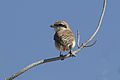
- Nomination Red-backed shrike (Lanius collurio). Mersin - Turkey. --Zcebeci 11:35, 5 October 2016 (UTC)
- Promotion Good quality. --Jacek Halicki 13:12, 5 October 2016 (UTC)
-

- Nomination Grey plover (Pluvialis squatarola). Mersin, Turkey. --Zcebeci 11:35, 5 October 2016 (UTC)
- Promotion Good quality. --Jacek Halicki 13:12, 5 October 2016 (UTC)
-

- Nomination A male imago of African Monarch (Danaus chrysippus) feeding nectar of sea onion (Dirimia maritima). Mersin, Turkey. --Zcebeci 11:35, 5 October 2016 (UTC)
- Promotion Good quality. --Jacek Halicki 13:12, 5 October 2016 (UTC)
-

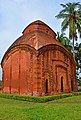
- Nomination Krishna Chandraji Temple in Kalna, West Bengal --Sumitsurai 09:40, 5 October 2016 (UTC)
- Decline Distortion, dark... --Pudelek 10:45, 5 October 2016 (UTC)
-

-

- Nomination Hankirche in Prächting --Ermell 08:52, 5 October 2016 (UTC)
- Promotion Good quality. --Berthold Werner 10:20, 5 October 2016 (UTC)
-
-

- Nomination Jewish cemetery near Sulzdorf and der Lederhecke --Ermell 08:52, 5 October 2016 (UTC)
- Promotion Good quality. --Berthold Werner 10:20, 5 October 2016 (UTC)
-

-

- Nomination Virgin Mary on the crescent, San Jeronimo monastery, Granada, Spain.--Jebulon 08:51, 5 October 2016 (UTC)
- Promotion Good quality. --Berthold Werner 10:19, 5 October 2016 (UTC)
-

- Nomination A plaque to Hernando de Talaver, the first archbishop of Granada, victim of Inquisition as from "morisque" descent, San Jeronimo monastery, Granada, Spain.--Jebulon 08:48, 5 October 2016 (UTC)
- Promotion - Good quality. -- Ikan Kekek 11:32, 5 October 2016 (UTC)
-

- Nomination San Jeronimo monastery, cloister. Granada, Spain.--Jebulon 08:46, 5 October 2016 (UTC)
- Promotion - Good quality and beautiful composition. -- Ikan Kekek 11:32, 5 October 2016 (UTC)
-

- Nomination San Jeronimo monastery, "cimborrio" of the church. Granada, Spain.--Jebulon 08:44, 5 October 2016 (UTC)
- Promotion Support Good quality.--Famberhorst 15:26, 5 October 2016 (UTC)
-

- Nomination Sowia Kopa, Złote Mountains, Sudetes 1 --Jacek Halicki 08:34, 5 October 2016 (UTC)
- Promotion Good quality. --A.Savin 16:25, 5 October 2016 (UTC)
-
- Nomination Sowia Kopa, Złote Mountans, Sudetes 3 --Jacek Halicki 08:34, 5 October 2016 (UTC)
- Promotion Good quality. Could you add some informative annotations about the mountain´s names? --Milseburg 13:50, 5 October 2016 (UTC)
-

- Nomination Gotwaldówka in Kąty Bystrzyckie 1 --Jacek Halicki 08:34, 5 October 2016 (UTC)
- Promotion Good quality. --Aeou 09:25, 5 October 2016 (UTC)
-

- Nomination Gotwaldówka in Kąty Bystrzyckie 2 --Jacek Halicki 08:34, 5 October 2016 (UTC)
- Promotion Good quality. --Ermell 08:41, 5 October 2016 (UTC)
-
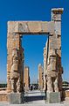
- Nomination Persepolis, Iran --Poco a poco 08:11, 5 October 2016 (UTC)
- Promotion Good quality. --Jacek Halicki 08:35, 5 October 2016 (UTC)
-

- Nomination Naghsh-e rostam, Iran --Poco a poco 08:11, 5 October 2016 (UTC)
- Promotion Good quality. --Jacek Halicki 08:35, 5 October 2016 (UTC)
-

- Nomination Shazdeh Garden, Mahan, Iran --Poco a poco 08:11, 5 October 2016 (UTC)
- Promotion Good quality. --Jacek Halicki 08:35, 5 October 2016 (UTC)
-

- Nomination Citadelle of Meybod, Iran --Poco a poco 08:11, 5 October 2016 (UTC)
- Promotion Good quality. --Ralf Roletschek 08:25, 5 October 2016 (UTC)
-

- Nomination Abbasi Historic House, Kashan, Iran --Poco a poco 08:11, 5 October 2016 (UTC)
- Promotion Good quality. --Ralf Roletschek 08:25, 5 October 2016 (UTC)
-

- Nomination Rīgas Starptautiskā Lidosta --Ralf Roletschek 07:46, 5 October 2016 (UTC)
- Promotion Good quality. --Pudelek 10:45, 5 October 2016 (UTC)
-

- Nomination Babīte railway station in Riga, Latvia --Ralf Roletschek 07:46, 5 October 2016 (UTC)
- Promotion Good quality. --Zcebeci 15:04, 5 October 2016 (UTC)
-

- Nomination Castle of Les Baux-de-Provence, Bouches-du-Rhône, France. --Christian Ferrer 06:14, 5 October 2016 (UTC)
- Promotion Quality high enough forQ1 --Michielverbeek 06:26, 5 October 2016 (UTC)
-

- Nomination Pinus forest. Saint-Rémy-de-Provence, Bouches-du-Rhône, France. --Christian Ferrer 06:14, 5 October 2016 (UTC)
- Promotion The two trees in foreground seem not very sharp. Hope acceptable. --Jkadavoor 04:55, 6 October 2016 (UTC)
-
-
-

- Nomination Spain, Cordoba, Mosque-Cathedral, portal at the west facade --Berthold Werner 06:01, 5 October 2016 (UTC)
- Promotion Support Good quality.--Famberhorst 15:29, 5 October 2016 (UTC)
-

- Nomination Ridge turret of Salvator Church Uhlenhorst in Hamburg. --Ajepbah 05:09, 5 October 2016 (UTC)
- Promotion Support --Christian Ferrer 06:06, 5 October 2016 (UTC)
-

- Nomination Clock of Salvator Church Uhlenhorst in Hamburg. --Ajepbah 05:09, 5 October 2016 (UTC)
- Promotion - Good quality to me. If you see something I missed, please move this to Consensual review. -- Ikan Kekek 18:46, 5 October 2016 (UTC)
-

-

-

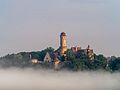
- Nomination Spherical panorama of the interior of the visitation chapel in Ellmau, Tyrol, Austria. To be viewed in the 360° panoramic viewer! --Code 04:47, 5 October 2016 (UTC)
- Promotion - Nice, and definitely a QI. Ikan Kekek 00:04, 6 October 2016 (UTC)
-

-

- Nomination Skyscapers at Potsdamer Platz, Berlin at the end of the blue hour. --Code 04:47, 5 October 2016 (UTC)
- Promotion Support very good --Christian Ferrer 06:08, 5 October 2016 (UTC)
-

- Nomination Location, Lendevallei in Netherlands. Trek through the valley.
--Agnes Monkelbaan 04:39, 5 October 2016 (UTC) - Promotion Support Good quality. --Johann Jaritz 05:32, 5 October 2016 (UTC)
- Nomination Location, Lendevallei in Netherlands. Trek through the valley.
-

-
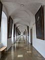
- Nomination Emperor's corridor at Melk Abbey, Lower Austria --Uoaei1 03:58, 5 October 2016 (UTC)
- Promotion Smart! Good quality. --Johann Jaritz 05:35, 5 October 2016 (UTC)
-

- Nomination High altar of Geras Abbey Church, Lower Austria --Uoaei1 03:58, 5 October 2016 (UTC)
- Promotion Sehr sehr schön! Very good quality. --Johann Jaritz 05:35, 5 October 2016 (UTC)
-
-

- Nomination Überwasserkirche in Münster, North Rhine-Westphalia, Germany --XRay 03:26, 5 October 2016 (UTC)
- Promotion Support Good quality.--Famberhorst 15:31, 5 October 2016 (UTC)
-

- Nomination Stadthuys. Malacca City, Malacca, Malaysia. --Halavar 00:41, 5 October 2016 (UTC)
- Promotion Good quality. --Jacek Halicki 08:39, 5 October 2016 (UTC)
-

- Nomination Central Park (Mineral Water Park). Borjomi, Samtskhe-Javakheti, Georgia. --Halavar 00:41, 5 October 2016 (UTC)
- Promotion Good quality. --Jacek Halicki 08:39, 5 October 2016 (UTC)
-

- Nomination Winemaker alley with press houses and wine cellars, Reichsgraben, located in Zellerndorf, Lower Austria. By User:Kellergassen Niederösterreich 2016 --Hubertl 23:31, 4 October 2016 (UTC)
- Promotion - Good quality and nice long depth of field. -- Ikan Kekek 10:23, 5 October 2016 (UTC)
-

- Nomination Schlösser an der Hohenzollernbrücke --Freddy2001 20:24, 4 October 2016 (UTC)
- Decline Unsharp (in focused area) and lots of noise --A.Savin 16:19, 5 October 2016 (UTC)
-
-

-

-
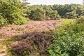
- Nomination Overgrown habitat in mild evening light. Location, nature Delleboersterheide - Cats Poele, in the Netherlands.
--Famberhorst 15:14, 4 October 2016 (UTC) - Promotion - Good quality to my eyes. -- Ikan Kekek 23:57, 5 October 2016 (UTC)
- Nomination Overgrown habitat in mild evening light. Location, nature Delleboersterheide - Cats Poele, in the Netherlands.
-

- Nomination Grazer Uhrturm --Ralf Roletschek 07:39, 4 October 2016 (UTC)
- Decline Insufficient quality. --A.Savin 16:13, 5 October 2016 (UTC)
-

-

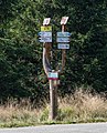
- Nomination Traffic sign at Babīte railway station in Riga, Latvia --Ralf Roletschek 09:17, 3 October 2016 (UTC)
- Promotion
 Comment Please provide proper categories and description. --Halavar 15:55, 3 October 2016 (UTC)
  Done --Ralf Roletschek 16:07, 4 October 2016 (UTC) Support Thanks. Good quality --Halavar 14:23, 5 October 2016 (UTC)
-
- Nomination Sucha Pasa, Bialskie Mountains, Sudetes 2 --Jacek Halicki 08:15, 3 October 2016 (UTC)
- Promotion Good quality. --A.Savin 16:07, 5 October 2016 (UTC)
-

- Nomination Kasba --El Golli Mohamed 17:34, 2 October 2016 (UTC)
- Promotion Could you correct the perspective, please? --Basotxerri 18:46, 2 October 2016 (UTC) Done --perspective corrected El Golli Mohamed 21:30, 3 October 2016 (UTC)
Now the upper palm leaves are disturbing. If you make a slight left crop, this should be OK. --Basotxerri 17:48, 4 October 2016 (UTC) Done new cropEl Golli Mohamed 18:17, 4 October 2016 (UTC)
IMO it would have been sufficient to crop less as I only referred to the leaves on the extreme left, but it's OK now. --Basotxerri 19:52, 5 October 2016 (UTC)
-

-
-

-

- Nomination Akan Gold Weight, Spoon, Ornamented handle. --Ercé 16:34, 2 October 2016 (UTC)
- Promotion - Good quality. -- Ikan Kekek 01:51, 6 October 2016 (UTC)
-

- Nomination Akan Gold Weight, Scorpion --Ercé 16:32, 2 October 2016 (UTC)
- Promotion - Good quality. -- Ikan Kekek 01:51, 6 October 2016 (UTC)
-
- Nomination Chanchra Siva Temple, Jessore. By User:MofradH --Aftabuzzaman 15:33, 2 October 2016 (UTC)
- Decline Insufficient quality. Unsharp, and too tight crop on the left --A.Savin 16:04, 5 October 2016 (UTC)
-

-

- Nomination Kremlin of Pskov at early dawn. Kruusamägi 21:08, 30 September 2016 (UTC)
- Decline Comment IMO color noise and a bit unsharp. --XRay 04:39, 1 October 2016 (UTC) Ok. It was pretty dark at 6 AM and that's the best I got from there. Kruusamägi 01:41, 4 October 2016 (UTC) Oppose The darkness isn't a big problem, it's the noise and the sharpness. I think it isn't fixable. Sorry. --XRay 17:16, 5 October 2016 (UTC)
-

- Nomination Saint Nicholas Church in Gorodishche (Izborsk). Kruusamägi 21:08, 30 September 2016 (UTC)
- Decline Comment Very nice composition. But please have a look to the perspective. It's leaning in or it is tilted CCW. --XRay 04:37, 1 October 2016 (UTC) Indeed, slight perspective fix might be needed. But I'm unsure if I would like to make it, as it would affect the position of the moon, that is already very close to the edge. Kruusamägi 01:41, 4 October 2016 (UTC) Oppose Sorry. IMO it's tilted too much. And it could be sharper too. --XRay 17:14, 5 October 2016 (UTC)
-

- Nomination A fragment of the Feraclos Castle south wall --Ввласенко 06:26, 30 September 2016 (UTC)
- Promotion - Depth of field is OK for QI, and quality is adequate. -- Ikan Kekek 01:38, 6 October 2016 (UTC)
-

- Nomination: Kakesbeck Castle in the hamlet Bechtrup in Lüdinghausen, North Rhine-Westphalia, Germany --XRay 03:27, 30 September 2016 (UTC)
- Review needed
-
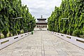
- Nomination The Vivah Mandap temple where Lord Rama and Sita are said to have been married. --Bijay chaurasia 21:24, 28 September 2016 (UTC)
- Promotion OK. --A.Savin 15:57, 5 October 2016 (UTC)
-

- Nomination Light Lamp in Vivah Mandap, Janakpur --Bijay chaurasia 05:07, 28 September 2016 (UTC)
- Promotion OK for me despite some noise --A.Savin 15:55, 5 October 2016 (UTC)
-

- Nomination Old prisoners' barracks, concentration camp of Dachau, Germany --Poco a poco 11:24, 28 September 2016 (UTC)
- Promotion Comment Buildings on the left and right are leaning. Image needs perspective correction. --Halavar 12:34, 28 September 2016 (UTC)
True, please, give me 3 days to fix it Poco a poco 17:11, 2 October 2016 (UTC) Done Poco a poco 16:54, 4 October 2016 (UTC) Support Good now. QI for sure. --Halavar 14:20, 5 October 2016 (UTC)
-

- Nomination собор Кафедральний, Львів, Катедральна пл., 1. By User:Brizhnichenko --Мирослав Видрак 05:27, 28 September 2016 (UTC)
- Promotion - Quite small, but a QI to me. I'd love a second opinion, though. -- Ikan Kekek 10:06, 5 October 2016 (UTC)
-

- Nomination The waiting area at Union Station in New Haven. --Grendelkhan 00:19, 28 September 2016 (UTC)
- Decline Distorted perspective, too dark shadows --A.Savin 15:53, 5 October 2016 (UTC)
-

- Nomination Performer form Great Britain in 1630s costume of the scots brigade. Image taken during the Wallenstein reenactments 2016, in Memmingen, Germany. --Tobias "ToMar" Maier 13:17, 27 September 2016 (UTC)
- Decline Insufficient quality. Disturbing wooden end of a rifle on the left --Moroder 17:10, 5 October 2016 (UTC)
-

- Nomination Kirche in Westerstede --Freddy2001 20:20, 26 September 2016 (UTC)
- Decline Comment IMO, titled to the right. --C messier 14:27, 27 September 2016 (UTC)
 Not done --A.Savin 15:51, 5 October 2016 (UTC)
-

- Nomination Alter Bahnhof in Westerstede --Freddy2001 20:20, 26 September 2016 (UTC) * Comment tilted cw and a bit oversaturated, even when it´s made in the late afternoon. But elsewere ok. --Hubertl 06:03, 27 September 2016 (UTC) Oppose Motion blur. --Tsungam 06:33, 30 September 2016 (UTC) Not done --A.Savin 15:51, 5 October 2016 (UTC)
- Decline
- Nomination Alter Bahnhof in Westerstede --Freddy2001 20:20, 26 September 2016 (UTC) *
-
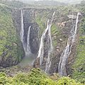
- Nomination Jog Falls, Shivamogga District, Karnataka, India --Nikhilb239 02:08, 26 September 2016 (UTC)
- Promotion Comment There are
 chromatic aberrations. I'm no expert, but isn't this photo actually something for WLE rather than WLM? --A.Savin 16:57, 26 September 2016 (UTC) Comment Hi I too was not sure whether this should be for WLE or WLM. I thought India did not participate in WLE, so uploaded it through WLM. Regarding CAs, I'll get back on this very soon. --Nikhilb239 01:55, 27 September 2016 (UTC)
 After correction, OK --A.Savin 01:16, 28 September 2016 (UTC)The previous version with CA was restored, therefore Oppose --A.Savin 04:45, 28 September 2016 (UTC)
New version uploaded with improved contrast. --Nikhilb239 06:48, 29 September 2016 (UTC) OK. --A.Savin 15:50, 5 October 2016 (UTC)
-
- Nomination: Пам'ятник Хмельницькому Б. М., гетьману України (ск. В.Одрехівський, 1982, мармурова крихта), Жидачів, південна околиця міста, роздоріжжя Журавно Гніздичів --Мирослав Видрак 05:12, 22 September 2016 (UTC)
- Review NO FOP in Ukraine, if I understand correctly the description? --C messier 09:56, 29 September 2016 (UTC)


.jpg)

.jpg)
.jpg)
,_Nr._139,_bust_(marble)_in_the_Arkadenhof_of_the_University_of_Vienna-3637.jpg)
,_psychiatrist,_Nr._136,_bust_(marble)_in_the_Arkadenhof_of_the_University_of_Vienna-3633.jpg)
,_physician,_Nr._135,_bust_(bronze)_in_the_Arkadenhof_of_the_University_of_Vienna-3629-2.jpg)
,_physician,_Nr._134,_bust_(bronze)_in_the_Arkadenhof_of_the_University_of_Vienna-3626.jpg)
,_physician,_Nr._131,_bust_(marble)_in_the_Arkadenhof_of_the_University_of_Vienna-3609.jpg)


_-_Masarykova_ulice.jpg)
_-_Schloss.jpg)

_-_Lu%C5%BEick%C3%A9_n%C3%A1m%C4%9Bst%C3%AD.jpg)


_04.jpg)

_07.jpg)
_02.jpg)


.jpg)
.jpg)

.Turm.4.24409.ajb.jpg)
.Turm.Uhr.1.24409.ajb.jpg)


.jpg)
.jpg)

_(01).jpg)
,_duha.jpg)


.jpg)


.jpg)


_13.jpg)


_(05).jpg)
.jpg)

.jpg)
Consensual review edit
File:Arena_of_the_amphitheatre_of_El_Jem.jpg edit

- Nomination Amphithéâtre --Hamed Gamaoun 10:06, 2 October 2016 (UTC)
- Decline
- Nice composition, but the sunlight spoils the image, only the shadow part is well done. It is a big job, but please repair the overexposed parts of this photo --Michielverbeek 13:27, 2 October 2016 (UTC)
- Dear Michielverbeek, I fixed the overexposed parts of this photos --Hamed Gamaoun 16:46, 2 October 2016 (UTC)
- The overexposed partys are looking much better. I was hoping it would make the photo also sharp enough, but I think it did not. Would like to have more opinions so discuss --Michielverbeek 05:33, 3 October 2016 (UTC)
- I'm not an expert at judging for overexposure, but if it's no longer overexposed, a problem remains with glary light, and the far right side of the arena is indeed unsharp. I would tend not to support a promotion to QI. -- Ikan Kekek 08:22, 3 October 2016 (UTC)
- Dear Ikan Kekek, I fixed the sharpness of the photo -- Hamed Gamaoun 13:57, 3 October 2016 (UTC)
- The far right is better, but I'm not satisfied with the near right. Sorry about that. -- Ikan Kekek 08:29, 4 October 2016 (UTC)
- Oppose Insufficient quality: right part blurred, sharpening artefacts --A.Savin 15:43, 5 October 2016 (UTC)
Total: 0 support (excluding the nominator), 1 oppose →  Declined --A.Savin 16:48, 7 October 2016 (UTC)
File:Reklameskilt Hjemmet.jpg edit

- Nomination Antique advertising sign for the Norwegian weekly "Hjemmet", now at the Norwegian Museum of Cultural History.--Peulle 14:47, 30 September 2016 (UTC)
- Decline
- Support Looks somewhat distorted. Can his imagination. To me well enough.--Famberhorst 15:14, 30 September 2016 (UTC)
- Oppose I disagree. Picture is tilted (go by the the red central line) and you really need to put your pictures in more narrower categories, this one is way to wide. --W.carter 11:00, 1 October 2016 (UTC)
- Oppose Tilted (or needs horizontal correction). WB a bit too blueish, IMO. Could be enhanced by adjusting highlights and shadows. Unsufficient category. --Basotxerri 20:42, 3 October 2016 (UTC)
- Comment I've uploaded a new version to explain the problem. Still pending to correct the categories, though. --Basotxerri 18:12, 4 October 2016 (UTC)
- That's very grand and helpful of you. :) I could of course add just add the proper categories here, same as I often do as an example for new users who don't know how to do that yet. However, this is made and nominated by a very experienced user who should be familiar with the guidelines for QICs and the category system. cart-Talk 18:54, 4 October 2016 (UTC)
- Support Somewhat low DOF, but still ok. I cannot see a problem with perspective, as this is neither achitectural photography nor a technical reproduction. --Smial 08:52, 4 October 2016 (UTC)
- Support as Smial. --Ralf Roletschek 18:57, 4 October 2016 (UTC)
- Oppose Reflection is disturbing. And unsufficient categorization.--Jebulon 21:29, 4 October 2016 (UTC)
- Oppose - Agreed on the reflection. -- Ikan Kekek 11:14, 5 October 2016 (UTC)
- Comment The reflection is essential to discover the 3D appearance of that object and it makes that image "living". I do not understand, why this can be a reason to decline. -- Smial 12:21, 5 October 2016 (UTC)
- Comment - It's glary, and its placement is distracting. -- Ikan Kekek 23:19, 5 October 2016 (UTC)
- Oppose Insufficient sharpness; no meaningful categories --A.Savin 15:46, 5 October 2016 (UTC)
Total: 3 support (excluding the nominator), 5 oppose → Declined --A.Savin 16:47, 7 October 2016 (UTC)