Commons:Quality images candidates/Archives October 2009
-

- Nomination A small pass in the alps --Ikiwaner 18:45, 28 October 2009 (UTC)
- Promotion good --Mbdortmund 22:15, 28 October 2009 (UTC)
-

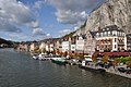
- Nomination Hřensko, Tschechien --Harke 16:50, 28 October 2009 (UTC)
- Promotion The bus is a bit disturbing but still ok. --Berthold Werner 17:35, 28 October 2009 (UTC)
-

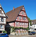
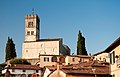
- Nomination Gemany, Bad Wimpfen, "Wormser Hof" --Berthold Werner 12:56, 28 October 2009 (UTC)
- Promotion Good QI -- George Chernilevsky 13:15, 28 October 2009 (UTC)
-

- Nomination The Monument to Flooded ships in 1854. Other photo -- George Chernilevsky 12:14, 28 October 2009 (UTC)
- Promotion Good & better than the other one. -- H005 21:17, 28 October 2009 (UTC)
-
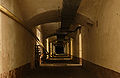
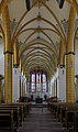
- Nomination Inside the Salbert hill fortifications. --ComputerHotline 10:48, 28 October 2009 (UTC)
- Promotion Good. --Cayambe 18:24, 28 October 2009 (UTC)
-

-

-

- Nomination The Gehry building Der Neue Zollhof in Düsseldorf's Medienhafen, viewed from 7th floor. -- H005 00:05, 28 October 2009 (UTC)
- Promotion In memoriam "Das Cabinet des Dr. Caligari" -Archaeodontosaurus 16:03, 28 October 2009 (UTC)
-
- Nomination Las Docas, ancient restored docks in Belém, Brazil. --Cayambe 21:49, 27 October 2009 (UTC)
- Promotion Archaeodontosaurus 18:06, 28 October 2009 (UTC)
-

-

- Nomination The Monument to Flooded ships in 1854. Sevastopol --George Chernilevsky 12:41, 27 October 2009 (UTC)
- Decline
 Comment There's some CA or a halo in particular where the bird is. I propse this be fixed, if possible. -- H005 13:51, 27 October 2009 (UTC)
The other one is much better. -- H005 21:18, 28 October 2009 (UTC)
-
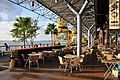
- Nomination Calle Betis y Río Guadalquivir, Sevilla, Espana --Grez 08:19, 27 October 2009 (UTC)
- Promotion Comment Very nice image, but I think the houses are a bit too bright and overexposed and propose reducing their light a bit. -- H005 14:46, 27 October 2009 (UTC)
 Done Light reduced! So ? :-) --Grez 19:27, 27 October 2009 (UTC)
Oui, c'est meilleur. :-) -- H005 20:02, 28 October 2009 (UTC)
-
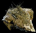
- Nomination Actinolite, Montijos Quarry, Portugal. 8x7.5cm --Archaeodontosaurus 18:36, 25 October 2009 (UTC)
- Promotion Very good and useful. --Cayambe 20:50, 28 October 2009 (UTC)
-
-

-

-

-

- Nomination Medal «Veteran of Labour» --Butko 18:35, 24 October 2009 (UTC)
- Promotion Comment The crop is extremely tight, and appears to cut a sliver off the top of the subject. Can you recrop a little wider? --99of9 22:13, 24 October 2009 (UTC)
the other one, too, else OK --Mbdortmund 23:50, 24 October 2009 (UTC)
I upload new version --Butko 14:29, 26 October 2009 (UTC)
Ok, that has removed the error. Thinking about it I suppose it's ok to crop tight, because there's no point seeing more black canvas. --99of9 12:30, 28 October 2009 (UTC)
-

- Nomination Coat of arms of the Republic of Venice. --Connormah 22:31, 19 October 2009 (UTC)
- Promotion Very good . --Archaeodontosaurus 07:59, 20 October 2009 (UTC)
-
-

- Nomination The Monument to Flooded ships in 1854. Sevastopol --George Chernilevsky 20:13, 27 October 2009 (UTC)
- Promotion Good. -- H005 21:31, 27 October 2009 (UTC)
-

- Nomination Dolní Benešov, Czech republic --Multimotyl 15:52, 27 October 2009 (UTC)
- Promotion IMHO could be tighter cropped on the left side but nevertheless ok. Geocoding would be helpful. --Berthold Werner 18:28, 27 October 2009 (UTC)
-

- Nomination Old russian river tug-pusher ship on Ob river --Игоревич 14:34, 27 October 2009 (UTC)
- Promotion Ok. Geocoding would be appropriate. --Berthold Werner 18:36, 27 October 2009 (UTC)
-

- Nomination Rosa canina --Butko 13:40, 27 October 2009 (UTC)
- Promotion Good -- George Chernilevsky 13:50, 27 October 2009 (UTC)
-

- Nomination In memory of the British who feel in The Crimean war 1854-1856 --George Chernilevsky 12:41, 27 October 2009 (UTC)
- Promotion Very good. -- H005 13:51, 27 October 2009 (UTC)
-

- Nomination In memory of the British who feel in The Crimean war 1854-1856 --George Chernilevsky 12:41, 27 October 2009 (UTC)
- Decline Unfortunate light, column is very dark. -- H005 13:51, 27 October 2009 (UTC)
-

- Nomination Birman cat on marble --Grez 08:19, 27 October 2009 (UTC)
- Decline Very nice cat, but too much noise :((( George Chernilevsky 14:01, 27 October 2009 (UTC)
-

- Nomination Germany, Bamberg, Old townhall at night --Berthold Werner 10:50, 26 October 2009 (UTC)
- Promotion Ok -- Archaeodontosaurus 08:02, 27 October 2009 (UTC)
-

- Nomination Powiśle Railway Station in Warsaw, Poland. Before restoration in 2009. --Blago Tebi 17:01, 26 October 2009 (UTC)
- Decline low resolution 1024x808 --Grez 12:02, 27 October 2009 (UTC)
-
- Nomination Bucharest - Village Museum.Orthodox church from Timişeni --Pudelek 23:37, 25 October 2009 (UTC)
- Decline low resolution < 2Mio --Grez 12:06, 27 October 2009 (UTC)
Incorrect argument, file size and image size not same. But very overcontrasted -- George Chernilevsky 13:02, 27 October 2009 (UTC)
-

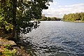
- Nomination Panoramic view over the Ouderkerkerplas lake in the Netherlands (created by Janericloebe) --D-Kuru 00:56, 21 October 2009 (UTC)
- Decline Stitching artifacts : bad alignment of the pictures making the panoramia -- Grez 21:10, 27 October 2009 (UTC)
-

-

-

- Nomination Castle in Roudnice nad Labem, Tschechien --Harke 18:53, 26 October 2009 (UTC)
- Promotion Ok. --Berthold Werner 19:04, 26 October 2009 (UTC)
-

- Nomination The inclined conveyor for filling the blast furnace 5 in the Landschaftspark Duisburg-Nord -- H005 00:15, 26 October 2009 (UTC)
- Promotion Good. --Cayambe 15:00, 26 October 2009 (UTC)
-

-

-

- Nomination Tiny hermit crab Clibanarius erythropus --George Chernilevsky 21:39, 25 October 2009 (UTC)
- Promotion I like this one --Berthold Werner 18:18, 26 October 2009 (UTC)
-

- Nomination Basilica of San Lorenzo, Milan --Fale 21:25, 25 October 2009 (UTC)
- Decline bad perspective, tilted --Pudelek 23:37, 25 October 2009 (UTC)
Can you explain how it would have been made to be right, please? Fale 09:25, 26 October 2009 (UTC) InfoThe image needs perspective correction, as well as contrast enchancement--Blago Tebi 16:37, 26 October 2009 (UTC)
And top of building unsharp --Grez 08:22, 27 October 2009 (UTC)
-

-

- Nomination Allianz Arena lighting in blue, Munich, Germany --Tfioreze 18:28, 25 October 2009 (UTC)
- Decline Sorry, but not sharp, too much noise and large parts are too dark. --Berthold Werner 18:05, 26 October 2009 (UTC)
-

-

-

- Nomination Baba Yaga --Butko 18:35, 24 October 2009 (UTC)
- Decline Unsharp, noisy. --Yerpo 20:16, 24 October 2009 (UTC) InfoAlso, the English description of the image is not very generous. It should at least say the same as Russian--Blago Tebi 16:45, 26 October 2009 (UTC)
-

- Nomination A Starstreak missile launcher set up in a training exercise on Dartmoor, UK. --Nilfanion 14:45, 24 October 2009 (UTC)
- Promotion Great detail. --99of9 12:49, 26 October 2009 (UTC)
-

- Nomination A stitch of the western end of Chepstow castle in Monmouthshire, Wales, UK. --Herbythyme 12:11, 24 October 2009 (UTC)
- Promotion Comment I love that castle! There is a crop error at the top right. I would also prefer more perspective correction. --99of9 12:30, 24 October 2009 (UTC)
And grrr, talk about an elementary mistake :(. Anyway fixed now (& ironically the track I am listening to at present has the line I really f'cked it up this time in....:). I have improved the perspective too I think. Thanks for your comments --Herbythyme 12:40, 24 October 2009 (UTC)
Definitely good to get the crop fixed. Personally I'd still like more perspective correction - a lot (all?) of the verticals have a leftward tilt. I still love the scene. The clouds are also fantastic, I wondered about slightly lowering the exposure to enhance them? --99of9 02:56, 26 October 2009 (UTC)
hoping to get it done today :) Thanks --Herbythyme 11:52, 26 October 2009 (UTC)
Good now!--Mbz1 13:43, 26 October 2009 (UTC)
-

-

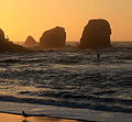
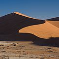
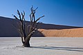
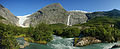
- Nomination River ends in the desert --Ikiwaner 09:44, 24 October 2009 (UTC)
- Promotion good photo --Pudelek 16:46, 24 October 2009 (UTC)
Good picture. Would you mind adding a more detailed description? In English. -- Blago Tebi 16:55, 26 October 2009 (UTC)
-

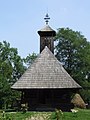
- Nomination: St. Martin church in Dolní Benešov. --Multimotyl 01:26, 20 October 2009 (UTC)
- Review Comment Noise visible, but still OK for me. Sharpening halos too strong and not OK for me. --Johannes Robalotoff 20:38, 20 October 2009 (UTC)
-

- Nomination: Plume cockscomb(Celosia argentea) with a moth. --Doctoroftcm 14:59, 20 October 2009 (UTC)
- Review a crop left and top would be nice imo --Mbdortmund 23:06, 20 October 2009 (UTC)
-

- Nomination: Chongsheng Temple in Dali, Yunnan, China. --Doctoroftcm 14:59, 20 October 2009 (UTC)
- Review Comment The image was leaning and had uncorrected perspective. I fixed both. Good image otherwise. --Ikiwaner 16:24, 20 October 2009 (UTC) Comment Good, but the foreground should be cropped (boring and overexposed). Yann 17:52, 20 October 2009 (UTC)
-

- Nomination Bixa orellana fruit, with the seeds from which Annato is extracted. --Leonardorejorge 23:29, 25 October 2009 (UTC)
- Promotion Good and valuable, DOF is not ideal but acceptable for such a close-up shut -- H005 23:48, 25 October 2009 (UTC)
-

- Nomination Head of a dog in Palau Güell, Barcelona --Bgag 23:20, 25 October 2009 (UTC)
- Decline Bad lighting and composition. Leonardorejorge 23:29, 25 October 2009 (UTC)
-

- Nomination Centaurea cyanus var. alba --Christian Ries 15:57, 25 October 2009 (UTC)
- Decline Low DOF, white flowers unsharp, annoying shadow in one side. Leonardorejorge 11:48, 26 October 2009 (UTC)
-

- Nomination Spondylus regius - Royal or Regal Thorny Oyster - Philippines - 16cm --Archaeodontosaurus 14:43, 25 October 2009 (UTC)
- Promotion Awesome DOF. Leonardorejorge
-

- Nomination A traditional sailboat from the Morbihan Gulf. --Eusebius 12:33, 25 October 2009 (UTC)
- Decline
 Oppose Bad light & perspective. -- H005 12:44, 25 October 2009 (UTC)
Can you please explain? --Eusebius 13:07, 25 October 2009 (UTC)
Hmm, I thought it's obvious. The main object is very dark in particular in front of the reflections on the water. A polar filter would have helped here, and adjusting the gamma curve. As for the perspective: It doesn't show the boat well, it should have been more from the side and from a lower viewpoint. Also the ships in the background are distracting. -- H005 14:04, 25 October 2009 (UTC)
Easier to accept when expressed like that actually (status back to declined). I couldn't do anything at postprocessing about the dark zones (too much noise otherwise), but the perspective issue is rather subjective and I don't find it problematic. --Eusebius 14:51, 25 October 2009 (UTC)
Sorry for the briefness, I agree the perspective question is probably subjective and I should have explained it better. -- H005 15:04, 25 October 2009 (UTC)
-

- Nomination Tilted door in Bamberg (Please don't ask wich part of the house is not tilted ;-)--Berthold Werner 09:02, 25 October 2009 (UTC)
- Promotion Funny :-) -- H005 12:44, 25 October 2009 (UTC)
-

-

- Nomination Sorbus mougeotii --Butko 11:04, 24 October 2009 (UTC)
- Promotion Good -- H005 12:47, 25 October 2009 (UTC)
-

- Nomination: Physics building at the University of Sydney --99of9 06:13, 20 October 2009 (UTC)
- Review needed
-
![* Nomination MacLaurin Hall at the University of Sydney --99of9 03:17, 20 October 2009 (UTC) * Withdrawn CommentThe sky contains too much green. --Berthold Werner 09:25, 20 October 2009 (UTC) Neutral Wrong, the sky has not enough blue ;-) ! The blue channel is blown. The resulting artifact colour of the sky looks unnatural. The people on the lawn are also overexposed. But the main subject is OK. Therefore I will neither support nor oppose. --Johannes Robalotoff 20:32, 20 October 2009 (UTC) CommentThanks for the reviews. I've uploaded a shot taken at the same time with different exposure which I think addresses the issues you've raised. --99of9 23:17, 20 October 2009 (UTC) There is the building a little bit dark. Perhaps you can use [1] to get the brighter version better. --Berthold Werner 17:25, 23 October 2009 (UTC) Thanks for the reference, but I don't use photoshop. I've put a third version up. --99of9 01:28, 25 October 2009 (UTC) Withdrawn: Many thanks to Berthold Werner who has uploaded a better version. 99of9 13:13, 25 October 2009 (UTC)](https://upload.wikimedia.org/wikipedia/commons/thumb/a/a4/SydneyUniversity_MacLaurinHall.jpg/67px-SydneyUniversity_MacLaurinHall.jpg)
- Nomination MacLaurin Hall at the University of Sydney --99of9 03:17, 20 October 2009 (UTC)
- Withdrawn CommentThe sky contains too much green. --Berthold Werner 09:25, 20 October 2009 (UTC)
 Neutral Wrong, the sky has not enough blue ;-) ! The blue channel is blown. The resulting artifact colour of the sky looks unnatural. The people on the lawn are also overexposed. But the main subject is OK. Therefore I will neither support nor oppose. --Johannes Robalotoff 20:32, 20 October 2009 (UTC) CommentThanks for the reviews. I've uploaded a shot taken at the same time with different exposure which I think addresses the issues you've raised. --99of9 23:17, 20 October 2009 (UTC)
There is the building a little bit dark. Perhaps you can use [1] to get the brighter version better. --Berthold Werner 17:25, 23 October 2009 (UTC)
Thanks for the reference, but I don't use photoshop. I've put a third version up. --99of9 01:28, 25 October 2009 (UTC)
Withdrawn: Many thanks to Berthold Werner who has uploaded a better version. 99of9 13:13, 25 October 2009 (UTC)
-

- Nomination: Bucharest - Village Museum. House from Şurdeşti (Dióshalom) --Pudelek 20:49, 19 October 2009 (UTC)
- Review needed
-
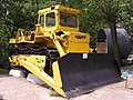
- Nomination: T-33 bulldozer of ChZPT --Butko 08:39, 19 October 2009 (UTC)
- Review Comment Borderline. It seems that the camera couldn't really cope with the dynamic range of the image. Maybe you can do something about it by adjusting the gamma curve, depending on the raw material you still have. ALso I noticed some unfortunate sharpening effects (not really a big issue though) -- H005 22:07, 19 October 2009 (UTC)
-

- Nomination: Thomisus onustus --Butko 08:39, 19 October 2009 (UTC)
- Review Comment The animal is ok, but very strong CA in the stones. This should be fixed. -- H005 21:59, 19 October 2009 (UTC)
-

- Nomination: Balanus improvisus --Butko 08:39, 18 October 2009 (UTC)
- Review you took 1/650 Sek., f/4, picture could have been better with a smaller aperture --Mbdortmund 13:12, 19 October 2009 (UTC)
-

- Nomination: Donax trunculus shell --Butko 08:39, 18 October 2009 (UTC)
- Review same as previous picture --Mbdortmund 13:13, 19 October 2009 (UTC)
-

-

-

-

- Nomination Torre Agbar, Barcelona, by User:Diliff. —Maedin 14:51, 24 October 2009 (UTC)
- Promotion Fabulous. --Yerpo 20:14, 24 October 2009 (UTC)
-

- Nomination Roos Tor on Dartmoor, UK. --Nilfanion 14:45, 24 October 2009 (UTC)
- Promotion Strongly overexposed. -- H005 20:32, 24 October 2009 (UTC)
I've tried uploaded new pic, attempting to solve exposure problem.--Nilfanion 21:09, 24 October 2009 (UTC)
Exposure OK now, maybe a bit oversaturated, but I can't really tell as I haven't been there. -- H005 21:24, 24 October 2009 (UTC)
-

- Nomination Trier, jesuits church, the grave of Friedrich Spee --Berthold Werner 12:37, 24 October 2009 (UTC)
- Promotion
 Support Good. Yann 14:21, 24 October 2009 (UTC)
-
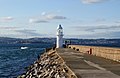
- Nomination The lighthouse at the end of the Breakwater at Brixham in Devon, UK. --Herbythyme 12:11, 24 October 2009 (UTC)
- Promotion Comment Seems to be cw tilted --Berthold Werner 13:40, 24 October 2009 (UTC)
More info please - I can't see anything discernible --Herbythyme 13:44, 24 October 2009 (UTC)
if you look at the left and rigt side of the tower it seems to be tilted to the right, but only a little bit --Mbdortmund 13:55, 24 October 2009 (UTC)
And you can see it at the surface of the sea, it's on the left side somewhat higher. --Berthold Werner 14:11, 24 October 2009 (UTC) Support OK for me. Yann 14:21, 24 October 2009 (UTC)
The tilt at 0.2 degree has been corrected.. --Herbythyme 15:27, 24 October 2009 (UTC) Support --Berthold Werner 08:59, 25 October 2009 (UTC)
-
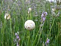
- Nomination Arianta arbustorum on lavender's stalk --Jos. 18:09, 23 October 2009 (UTC)
Main subject imo overexposured and shows no details, sorrry --Mbdortmund 19:01, 23 October 2009 (UTC) - Decline Agree with Mbdortmund - Darius Baužys 07:28, 25 October 2009 (UTC)
- Nomination Arianta arbustorum on lavender's stalk --Jos. 18:09, 23 October 2009 (UTC)
-

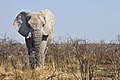
- Nomination Cheetah in Namibia --Ikiwaner 18:43, 22 October 2009 (UTC)
- Promotion Comment Out of interest, why was this image cropped so hard on the legs and tail? --99of9 23:46, 22 October 2009 (UTC) Comment Rule of thirds-placement of the eyes, Viewpoint: A subject can be rendered more dramatic when it fills the frame --Ikiwaner 09:23, 24 October 2009 (UTC)
I like the crop. -- H005 20:25, 24 October 2009 (UTC)
-

- Nomination View of Monte Sant'Angelo in Apulia--LPLT 17:20, 22 October 2009 (UTC)
- Decline shows a lack of details in full solution --Mbdortmund 19:11, 23 October 2009 (UTC)
I agree, nice at thumbnail size, but unsufficient sharpness. -- H005 20:25, 24 October 2009 (UTC)
-

- Nomination Macro shot of a Fernleaf Yarrow inflorescence. --Yerpo 19:34, 21 October 2009 (UTC)
- Decline imo only few parts in focus --Mbdortmund 02:14, 22 October 2009 (UTC) Comment I know, that's why I only nominated for QI. Unfortunately, the light wasn't strong enough for more. But the focus is on individual flowers, not the whole inflorescence. --Yerpo 11:14, 23 October 2009 (UTC)
DOF too low, sorry. -- H005 20:35, 24 October 2009 (UTC)
-
-

- Nomination Bucharest, Romania - 2 x M (Underground and McDonald's) --Pudelek 20:49, 19 October 2009 (UTC)
- Promotion Comment No geocode, not even street names or the building's name. Looks like Unirea Shopping centre, or am I wrong? At least this fact should be documented. -- H005 21:11, 19 October 2009 (UTC) Info this is metro station on piaţa Unirii and probably Unirea Shopping. Geocoding soon --Pudelek 21:19, 19 October 2009 (UTC) Info - location is done --Pudelek 22:49, 23 October 2008 (UTC)
OK. --H005 20:22, 24 October 2009 (UTC)
-

- Nomination: Trucks in Chungara–Tambo Quemado border --Romanceor 16:09, 18 October 2009 (UTC)
- Review needed
-

- Nomination angel trumpet--TrinDee 14:16, 18 October 2009 (UTC)
- Promotion QI for me - Darius Baužys 07:44, 25 October 2009 (UTC)
-

- Nomination: Babylonia spirata shell --Butko 20:21, 17 October 2009 (UTC)
- Review Comment: Annoying shadows. --Snek01 15:20, 18 October 2009 (UTC)
-

-

- Nomination 1961 Corvette --Berthold Werner 18:07, 17 October 2009 (UTC)
- Promotion I've seen sharper images from you, but overall it's acceptable. -- H005 20:30, 24 October 2009 (UTC)
-

- Nomination Panoramic view of Morella (Castellón, Spain) from the castle.--Rastrojo 22:17, 11 October 2009 (UTC)
- Decline Comment Very nice picture, but sharpness is lacking --NormanB 19:54, 15 October 2009 (UTC) Comment I find sharpness really ok, especially in the village. :S Rastrojo 20:24, 16 October 2009 (UTC) Sharpness is good. But the sky is overexposed on the left. (No big problem.) And there is pretty much of distortion. (Main problem for me, although some distorion is unavoidable in panorama pictures.) --Johannes Robalotoff 16:59, 18 October 2009 (UTC) Oppose Sharpness is acceptable, but overexposed sky, distorted horizon and chromatic aberrations are not, sorry. -- H005 20:40, 24 October 2009 (UTC)
-
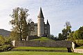
- Nomination Celles (Belgium): Vêves castle -- MJJR 21:07, 23 October 2009 (UTC)
- Promotion good --Mbdortmund 21:47, 23 October 2009 (UTC)
-

- Nomination Heulandite - Lonavala Quarry, India - (7.5x5.5 cm) --Archaeodontosaurus 16:16, 23 October 2009 (UTC)
- Promotion OK --Mbdortmund 21:48, 23 October 2009 (UTC)
-

- Nomination Trier, jesuits church, altar and windows in the east side --Berthold Werner 07:57, 23 October 2009 (UTC)
- Promotion Well done photo -- George Chernilevsky 12:56, 23 October 2009 (UTC)
-

-

- Nomination Trier, Statue of Friedrich Spee --Berthold Werner 13:50, 22 October 2009 (UTC)
- Promotion exposure could imo be a bit darker, but composition is very nice --Mbdortmund 21:52, 23 October 2009 (UTC)
-

- Nomination 100th anniversary of Tel-Aviv - a-100 years old building, in front of a new skyscraper, and the city's official 100th anniversary flag - Rothschild Boulevard, Tel-Aviv, Israel. --Rastaman3000 16:23, 21 October 2009 (UTC)
- Decline not convinced about composition and quality --Mbdortmund 19:14, 23 October 2009 (UTC)
-

- Nomination Ocimum basilicum --Butko 09:29, 21 October 2009 (UTC)
- Promotion here the shallow DOF looks good imo --Mbdortmund 02:28, 24 October 2009 (UTC)
-

- Nomination Vespiary of Polistes gallicus --Butko 18:48, 18 October 2009 (UTC)
- WARNING: third template parameter added – please remove.
-

- Nomination: Scapharca inaequivalvis shell --Butko 08:39, 18 October 2009 (UTC)
- Review needed
-

- Nomination: Close-up of Solanum sisymbriifolium flower. --Leonardorejorge 00:33, 18 October 2009 (UTC)~
- Review needed
-

- Nomination: Foggy Twilight at Ocean Beach San Francisco --Mbz1 22:21, 17 October 2009 (UTC)
- Review needed
-

- Nomination: Balanus improvisus on Mya arenaria shell --Butko 20:21, 17 October 2009 (UTC)
- Review needed
-

- Nomination: Mya arenaria shell --Butko 20:21, 17 October 2009 (UTC)
- Review needed
-

- Nomination Dresden street at dawn. Really nice photo made by Kolossos. --Von.grzanka 16:44, 17 October 2009 (UTC)
- Promotion Good. --Aqwis 14:27, 23 October 2009 (UTC)
-

- Nomination Leeds Castle, Kent, by User:Diliff. —Maedin 06:37, 23 October 2009 (UTC)
- Promotion Superb. --Berthold Werner 07:59, 23 October 2009 (UTC)
-

- Nomination AS-16 "Kickback" Raduga Kh-15, the russian nuclear missile -- George Chernilevsky 15:57, 21 October 2009 (UTC)
- Promotion QI --Mbdortmund 12:49, 22 October 2009 (UTC)
-
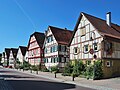
- Nomination Timber framing in Leonberg, southern Germany --Harke 18:12, 19 October 2009 (UTC)
- Promotion Good. --Berthold Werner 13:58, 22 October 2009 (UTC)
-

-

- Nomination Vanessa atalanta --Butko 18:48, 18 October 2009 (UTC) Resolution far below QI limit of 2 MP. --Johannes Robalotoff 20:56, 18 October 2009 (UTC)
I upload full version --Butko 08:56, 21 October 2009 (UTC) Comment Bigger, but the quality is poor (maybe on compression). Butterfly also ragged. - Darius Baužys 19:28, 21 October 2009 (UTC) - Decline The image has more pixels now, but this did not increase the resolution of the subject itself. Resolution of the subject is still low. Moreover, contrast on the butterfly is low, so that details are hardly visible also for this reason. This is not alone due to the dark nature of the species. In the sun even the dark vanessa atalanta has so strongly reflecting parts and therefore much contrast that one can easily reach the limits of camera dynamic range. Commons has several examples in the corresponding category. --Johannes Robalotoff 20:32, 22 October 2009 (UTC)
- Nomination Vanessa atalanta --Butko 18:48, 18 October 2009 (UTC) Resolution far below QI limit of 2 MP. --Johannes Robalotoff 20:56, 18 October 2009 (UTC)
-

- Nomination: Close shops in La Paz central market. --Romanceor 10:48, 17 October 2009 (UTC)
- Review needed
-

- Nomination Panorama of Toruń, one of Seven Wonders of Poland --Msulik 19:04, 12 October 2009 (UTC)
- Promotion very good! --Archaeodontosaurus 07:13, 13 October 2009 (UTC)
-

- Nomination Almost sunken boat. --kallerna 17:02, 12 October 2009 (UTC)
- Promotion Good subject; image a little too dark --Archaeodontosaurus 13:01, 13 October 2009 (UTC)
-

- Nomination: Bucharest - Village Museum. House from Jurilovca --Pudelek 22:56, 23 October 2008 (UTC)
- Review needed
-

- Nomination: Bucharest - Village Museum. Fishery from Jurilovca --Pudelek 22:56, 23 October 2008 (UTC)
- Review needed
-

- Nomination: Bucharest, Village Museum. Church from Dragomireşti (Dragomérfalva) --Pudelek 22:56, 23 October 2008 (UTC)
- Review needed
-

- Nomination: Bucharest - Village Museum. Buildings from Şurdeşti (Dióshalom) --Pudelek 22:56, 23 October 2008 (UTC)
- Review needed
-
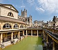
- Nomination Roman Baths in Bath, by User:Diliff. —Maedin 06:40, 22 October 2009 (UTC)
- Promotion Absolutely. --99of9 07:00, 22 October 2009 (UTC)
-

- Nomination Monument a Colom, Barcelona, by User:Diliff. —Maedin 06:40, 22 October 2009 (UTC)
- Promotion Great work. My only regret is not being able to see more of the base of the column, but I presume there was a reason not to go further down? --99of9 07:02, 22 October 2009 (UTC) Comment As far as I know, it's because the simple composition was ruined by the city life and clutter at the base. It did result in a failure at en fpc, though: here. Maedin 07:04, 22 October 2009 (UTC)
-

- Nomination Mulfingen, Germany --Harke 19:36, 21 October 2009 (UTC)
- Promotion imo QI --Mbdortmund 02:15, 22 October 2009 (UTC)
-

-

-

- Nomination Hexaplex cichoreum - Muricidae - Cagayan island, Philippines - 7.6cm --Archaeodontosaurus 18:54, 21 October 2009 (UTC)
- Promotion Good - Darius Baužys 19:22, 21 October 2009 (UTC)
-

- Nomination Dome of the Rock, Jerusalem, Israel --Rastaman3000 18:45, 21 October 2009 (UTC)
- Decline Pixelated and not too sharp. --Ianare 20:27, 21 October 2009 (UTC)
-
-
-

- Nomination Replica of the Hercules Farnese in Alexander's gardens, Saint Petersburg --Butko 09:07, 19 October 2009 (UTC)
- Promotion
 Question Can you stamp out that cable in the background? -- H005 21:56, 19 October 2009 (UTC) Done I remove cable from the background --Butko 09:45, 21 October 2009 (UTC)
Good job.-- H005 19:21, 21 October 2009 (UTC)
-

- Nomination Leptinotarsa decemlineata --Butko 18:48, 18 October 2009 (UTC)
- Decline A dark shadow, a small main subject, questionable composition, the sun reflections on the beetle back. - Darius Baužys 19:37, 21 October 2009 (UTC)
-

- Nomination Crataegus monogyna --Butko 09:29, 21 October 2009 (UTC)
- Promotion Good quality -- George Chernilevsky 10:09, 21 October 2009 (UTC)
-

- Nomination Aeonium arboreum --Butko 09:29, 21 October 2009 (UTC)
- Promotion QI for me -- George Chernilevsky 10:11, 21 October 2009 (UTC)
-
-

- Nomination The "Red House" and the former Townhall "Steipe" --Berthold Werner 09:15, 20 October 2009 (UTC)
- Promotion Good. --Johannes Robalotoff 20:24, 20 October 2009 (UTC)
-

-

- Nomination Marken, the Netherlands --Massimo Catarinella 17:00, 19 October 2009 (UTC)
- Promotion Nice place, excellent shot. --Cayambe 17:46, 20 October 2009 (UTC)
-

- Nomination Çufut Qale kenassa --Butko 08:39, 19 October 2009 (UTC)
- Promotion Still good, because overexposure is only in the clouds that are white anyway. However sharpening halos are hard at the limit where I would decline, especially on the corner column. --Johannes Robalotoff 20:50, 20 October 2009 (UTC)
-

- Nomination Chersones. Greek court --Butko 08:39, 19 October 2009 (UTC)
- Decline Too many overexposed regions. --Johannes Robalotoff 20:45, 20 October 2009 (UTC)
-

- Nomination MacKerricher Beach in en:MacKerricher State Park. --J.smith 00:27, 19 October 2009 (UTC). Comment There is a blue fringe over the trees at right. Can you fix it? --Cayambe 11:58, 19 October 2009 (UTC) Nope, I tried, but I am not not skilled enough to do this kind of surgery. --J.smith 20:25, 19 October 2009 (UTC)
I am not sure I see it. Could you please add a note and maybe I will be able to fix it. Thanks.--Mbz1 03:11, 20 October 2009 (UTC). Comment Note added. It takes less than 3 minutes to remove the fringe.:-) --Cayambe 12:37, 20 October 2009 (UTC)
Seeing that CA is not for my eyes/monitor I am afraid :) I still tried to remove it. I uploaded my edit over the original image. @Cayambe, may I please ask you to remove the note you added to the image (Thank you for adding it). @J.smith, may I please ask you to revert my edit, or delete it,if you do not like it, or if you believe the CA was not fixed? Thanks.--Mbz1 13:05, 20 October 2009 (UTC) - Promotion Note deleted. Sorry, but the fringe is still there. MBZ1: If you can't see it, the picture should be promtoted, because it is otherwise good. Sorry for the trouble. --Cayambe 14:04, 20 October 2009 (UTC)
- Nomination MacKerricher Beach in en:MacKerricher State Park. --J.smith 00:27, 19 October 2009 (UTC).
-

- Nomination The castle of Freÿr, the Meuse ande the Freÿr Rocks (Belgium) -- MJJR 21:05, 18 October 2009 (UTC)
- Promotion good --Mbdortmund 01:00, 21 October 2009 (UTC)
-
- Nomination Trier, jesuits church --Berthold Werner 10:39, 18 October 2009 (UTC)
- Promotion Good. The partly blown windows are acceptable here, because this is unavoidable. --Cayambe 18:21, 20 October 2009 (UTC)
-

- Nomination Mytilus galloprovincialis shell --Butko 20:21, 17 October 2009 (UTC)
- Promotion Good for me -- George Chernilevsky 10:25, 21 October 2009 (UTC)
-

-
- Nomination Curtea Veche in Bucharest --Pudelek 16:39, 15 October 2009 (UTC).
Comment The green fringe (CA) on the roof at top right should be removed. Otherwise good. --Cayambe 09:31, 16 October 2009 (UTC). new version --Pudelek 20:25, 20 October 2009 (UTC) - Promotion Ok now. Cayambe 07:11, 21 October 2009 (UTC)
- Nomination Curtea Veche in Bucharest --Pudelek 16:39, 15 October 2009 (UTC).
-

-
-

- Nomination Timber framing in Leonberg, southern Germany --Harke 18:11, 19 October 2009 (UTC)
- Promotion good --Mbdortmund 00:56, 20 October 2009 (UTC)
-

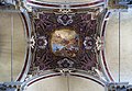
- Nomination Keystone of the rib vault in the sanctuary of the Frauenkirche in Esslingen am Neckar (Germany), showing the Virgin Mary. — Please don’t be too harsh, this is my first attempt to nominate a photograph and I may not fully everything yet … --Aristeas 16:11, 19 October 2009 (UTC). Comment Resolution is far too small (below 1 MB). Otherwise good. --Cayambe 18:54, 19 October 2009 (UTC)
- Promotion Hm? 1.824 × 1.368 Pixel is not so much but enough. Colours, sharpness, noise, exposure, description and geocode ok. --Berthold Werner 17:01, 19 October 2009 (UTC) Support Good! Please nominate more. Yann 21:40, 19 October 2009 (UTC)
- Nomination Keystone of the rib vault in the sanctuary of the Frauenkirche in Esslingen am Neckar (Germany), showing the Virgin Mary. — Please don’t be too harsh, this is my first attempt to nominate a photograph and I may not fully everything yet … --Aristeas 16:11, 19 October 2009 (UTC).
-

- Nomination Trier, Statue at the former townhall. --Berthold Werner 09:17, 19 October 2009 (UTC)
- Decline unfortunate lighting --Mbdortmund 13:10, 19 October 2009 (UTC)
-

- Nomination Leptinotarsa decemlineata --Butko 18:48, 18 October 2009 (UTC)
- Decline white stone not so good as background --Mbdortmund 13:04, 19 October 2009 (UTC)
-

- Nomination Leptinotarsa decemlineata --Butko 18:48, 18 October 2009 (UTC)
- Promotion the best one of the series, camera on the border, structures could be finer --Mbdortmund 13:08, 19 October 2009 (UTC)
-

- Nomination Leptinotarsa decemlineata --Butko 18:48, 18 October 2009 (UTC)
- Decline DOF too short --Mbdortmund 13:08, 19 October 2009 (UTC)
-

- Nomination Leptinotarsa decemlineata --Butko 18:48, 18 October 2009 (UTC)
- Decline white stone not so good as background --Mbdortmund 13:04, 19 October 2009 (UTC)
-

- Nomination Seen of Valparaiso --Romanceor 16:04, 18 October 2009 (UTC)
- Promotion impressive view, structures could be a bit finer --Mbdortmund 13:19, 19 October 2009 (UTC)
-

- Nomination Gafranium tumidum shell --Butko 08:39, 18 October 2009 (UTC)
- Promotion imo good enough --Mbdortmund 13:20, 19 October 2009 (UTC)
-

- Nomination Tectus fenestratus shell shell --Butko 08:39, 18 October 2009 (UTC)
- Decline 1/800 Sekunden, f/4,5 not so good, DOF gets too short, background leans to red --Mbdortmund 13:21, 19 October 2009 (UTC)
-

- Nomination BMW 520i -96. --kallerna 10:58, 17 October 2009 (UTC)
- Decline OpposeColours of the sky are nice, but the car is most definitely severly underexosed.--Korall 17:20, 17 October 2009 (UTC)Funny thing is that when I set my screen as bright as possible, I can actually see the details in the car if I look from a very small angle. Maybe it can be a bit brighter? --Korall 23:32, 19 October 2009 (UTC)
-

- Nomination: Insects in the amber's necklace --Mbz1 17:10, 9 October 2009 (UTC)
- Review CommentWhat is the white haze around the left hand edge of the left hand chunk? --99of9 12:52, 11 October 2009 (UTC)
Could you please add a note that I could see what you're talking about? Thank you.--Mbz1 13:28, 11 October 2009 (UTC)
Added --99of9 09:12, 13 October 2009 (UTC)
Thank you for pointing it out. I am not sure what it is.--Mbz1 03:27, 14 October 2009 (UTC)
-

- Nomination naturalist picture: Oryctes nasicornis (Right eye) --Archaeodontosaurus 10:30, 6 October 2009 (UTC)
- Decline Comment I'd accept the low DOF if it weren't for the very strong CA. But maybe you can fix that. -- H005 20:23, 6 October 2009 (UTC) Info I tried but I can not --Archaeodontosaurus 17:11, 12 October 2009 (UTC)
I am sorry then. -- H005 10:18, 20 October 2009 (UTC)
-

- Nomination Trier, Statue at the former townhall. --Berthold Werner 09:17, 19 October 2009 (UTC)
- Promotion Good. -Cayambe 10:02, 19 October 2009 (UTC)
-

-

- Nomination Ruins of Chersones. Basilica in basilica --Butko 08:39, 19 October 2009 (UTC)
- Promotion good -- George Chernilevsky 09:58, 19 October 2009 (UTC)
-

- Nomination Stained glass from the 1930s in suburban Sydney church --99of9 03:56, 19 October 2009 (UTC)
- Decline This is quite some resolution and a nice stained glass window. However, some dominant light comes from the front which is reflected on the surface and which spoils the colors. Look at the lamb in the hand and from there left to the jamb. In addition, the jambs, particularly at the top, are quite noisy. --AFBorchert 05:47, 19 October 2009 (UTC)
Thankyou for your review, for some reason I looked straight over the reflection patch. I just looked at some of your own stained glass pics - nice work! --99of9 06:47, 19 October 2009 (UTC)
-

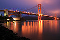
- Nomination Night panorama og Golden Gate Bridge. -Mbz1 02:55, 19 October 2009 (UTC)
- Promotion Well done. --AFBorchert 06:03, 19 October 2009 (UTC)
-

- Nomination Dinant (Belgium): the Meuse and the Freÿr Rocks -- MJJR 21:05, 18 October 2009 (UTC)
- Promotion Well done. --AFBorchert 06:13, 19 October 2009 (UTC)
-

- Nomination View from the south transept into the nave in the ruins of a 15th-century Franciscan friary in Ireland. --AFBorchert 19:41, 18 October 2009 (UTC)
- Promotion Ok. --Berthold Werner 08:45, 19 October 2009 (UTC)
-

- Nomination Crystal Cathedral in Garden Grove, California, in evening. --Ischa1 19:09, 18 October 2009 (UTC)
- Decline Oppose Too noisy, sorry. Yann 07:48, 19 October 2009 (UTC)
-

- Nomination Iphiclides podalirius --Butko 18:48, 18 October 2009 (UTC)
- Promotion Good, although resolution of the main subject itself is hard at the limit. --Johannes Robalotoff 21:02, 18 October 2009 (UTC)
-

- Nomination Lucanus cervus --Butko 18:48, 18 October 2009 (UTC)
- Promotion Good. Cayambe 7:19, 21 October 2009 (UTC)
-

- Nomination Lucanus cervus --Butko 18:48, 18 October 2009 (UTC)
- Decline Noisy, poor quality - Darius Baužys 07:00, 19 October 2009 (UTC)
-

- Nomination Lucanus cervus --Butko 18:48, 18 October 2009 (UTC)
- Promotion Good in spite of some noise and borderline DOF. --Johannes Robalotoff 21:06, 18 October 2009 (UTC)
-
-

- Nomination Dardanus megistos -Diogenidae - Aliguay Island Philipphines - 14x13cm --Archaeodontosaurus 15:56, 18 October 2009 (UTC)
- Promotion Support Very good. Yann 07:49, 19 October 2009 (UTC)
-

- Nomination Eobania vermiculata shell --Butko 20:21, 17 October 2009 (UTC)
- Decline Comment: Annoying shadows. --Snek01 15:20, 18 October 2009 (UTC) Oppose Low DOF. --Johannes Robalotoff 16:35, 18 October 2009 (UTC)
-

- Nomination Helix pomatia--Butko 20:21, 17 October 2009 (UTC)
- Decline Oppose This image is quite bad due of high contrast between ovexposed part and the main part of the image is in the dark. --Snek01 15:20, 18 October 2009 (UTC) Oppose Strong overexposure on the main subject. --Johannes Robalotoff 16:40, 18 October 2009 (UTC)
-

- Nomination Cerastoderma glaucum shell --Butko 20:21, 17 October 2009 (UTC)
- Decline Oppose Cropped on the bottom. --Snek01 15:20, 18 October 2009 (UTC)
-

- Nomination Cerastoderma glaucum shell --Butko 20:21, 17 October 2009 (UTC)
- Promotion Good as a photo. The description page seems a bit minimalistic though. --Johannes Robalotoff 16:47, 18 October 2009 (UTC)
-

- Nomination Nerita exuvia shell --Butko 20:21, 17 October 2009 (UTC)
- Decline Oppose Annoying shadows. This shell is partly covered by sand. --Snek01 15:20, 18 October 2009 (UTC)
-

- Nomination The marina of Anseremme (Belgium) -- MJJR 15:32, 17 October 2009 (UTC)
- Promotion Good. --Johannes Robalotoff 16:27, 18 October 2009 (UTC)
-

- Nomination Bog near Moszne Lake --Von.grzanka 12:16, 17 October 2009 (UTC)
- Promotion QI for me --Pudelek 14:36, 17 October 2009 (UTC) QuestionCan you geocode please? --99of9 09:50, 19 October 2009 (UTC)
-

-

- Nomination Palace garden at Bad Homburg, Germany. --Johannes Robalotoff 18:08, 16 October 2009 (UTC) Comment Overall a good shot, yet sharpness is a little on the soft side, i think. --Maurilbert 01:29, 17 October 2009 (UTC) Info I used rather weak sharpening parameters compared with Canon's default values. I find it sharp enough this way. There is not much in digital photography that I hate more than oversharpening. Is softness really an issue for you here? --Johannes Robalotoff 10:59, 17 October 2009 (UTC)
- Promotion Definitely QI for me, although the image would benefit from a crop of the lower part of the lake, just above the top of the disturbing plant in the middle. --Cayambe 08:54, 18 October 2009 (UTC) Info I tried the crop above the plant in the middle, but found that I loose to much of the lake then. So it's a tradeoff with this plant. --Johannes Robalotoff 16:22, 18 October 2009 (UTC)
- Nomination Palace garden at Bad Homburg, Germany. --Johannes Robalotoff 18:08, 16 October 2009 (UTC)
-

-

- Nomination A panorama of the Old School lawns at the University of Sydney --99of9 03:09, 14 October 2009 (UTC)
- Promotion I really like this panorama, but I think there are a couple of minor issues that should be brought to your attention... first of all, there are some dust spots in the sky. They are faint and would be easy to clone out. A little harder to fix is the halos around some of the people - but it's minor and no one would notice those unless they look really close. The last issue is a very minor stitching error in the upper right. I've marked what I found on the image... please feel free to remove my marks on the image once you've seen them. I didn't think any of them were major enough to detract from the image however. --J.smith 01:22, 19 October 2009 (UTC)
Thankyou for your very careful review. I'm glad you liked it. I forgot to look for the dust spots in the sky - as you say, they will be easy to remove. I had trouble stitching the right hand side, but had concentrated more at the bottom than the top, so will look into that. Thanks for pointing out the halos, I will at least remove the CA colour from them.--99of9 02:05, 19 October 2009 (UTC) Done Thanks again for your constructive criticism. --99of9 07:17, 19 October 2009 (UTC)
-

- Nomination: Untitled, Globule Ubiquity Vibrations by Bruno Peinado--Msulik 19:04, 12 October 2009 (UTC)
- Review needed
-

-

- Nomination Heliconius erato catterpillar --Leonardorejorge 22:40, 17 October 2009 (UTC)
- Promotion Great image.--Mbz1 22:57, 17 October 2009 (UTC)
-

-

-

-

- Nomination Trier, Jesuits church --Berthold Werner 14:16, 17 October 2009 (UTC)
- Promotion Good. Maedin 19:05, 17 October 2009 (UTC)
-

- Nomination Kew Gardens Temperate House, by User:Diliff. —Maedin 13:27, 17 October 2009 (UTC)
- Promotion Good! --Berthold Werner 14:23, 17 October 2009 (UTC)
-

-

-

- Nomination Trucks wait in Chungara–Tambo Quemado mountain pass between Chile and Bolivia. --Romanceor 10:48, 17 October 2009 (UTC)
- Promotion Good. --Berthold Werner 14:23, 17 October 2009 (UTC)
-

- Nomination Trier cathedral, funery monument of bishop Michael Felix Korum --Berthold Werner 08:46, 14 October 2009 (UTC)
- Promotion Comment Underexposed. Otherwise very good. Highest pixel value seen on logarithmic scale is at 194/255. Can you fix it without increasing noise/posterization? --Johannes Robalotoff 18:48, 14 October 2009 (UTC)
Tried to fix it. --Berthold Werner 07:38, 15 October 2009 (UTC) Support Much better now and good for QI. Personally I would not have made the correction so extreme. Some pixels are already blown out now, although nothing is damaged by this yet. --Johannes Robalotoff 18:53, 15 October 2009 (UTC)
Laut FixFoto ist noch alles ok(?) --Berthold Werner 08:51, 16 October 2009 (UTC) Kenne FixFoto nicht. Habe gimp benutzt und direkt alle Pixel mit value 255 anzeigen lassen. Aber wie gesagt, visuell merkt man von den paar überdrehten Pixeln hier noch nichts, daher kein wirkliches Problem. --Johannes Robalotoff 16:41, 17 October 2009 (UTC)
-
- Nomination: Unusual "Sospiri" - Venice - May 2009 --Archaeodontosaurus 09:31, 11 October 2009 (UTC) Comment Sorry, but there is heavy noise and chromatic aberration (green, green-blue and red fringes). I wonder whether this can be fixed... --Cayambe 20:30, 11 October 2009 (UTC)
- Review Info quite true, but there was very little light --Archaeodontosaurus 07:38, 12 October 2009 (UTC)
- Nomination: Unusual "Sospiri" - Venice - May 2009 --Archaeodontosaurus 09:31, 11 October 2009 (UTC)
-

- Nomination: A 1904 cash register --Kozuch 18:06, 10 October 2009 (UTC)
- Review Comment Not bad. But RGB noise disturbs me, if I zoom in by more than 50% resolution. --Johannes Robalotoff 20:44, 11 October 2009 (UTC)
-

- Nomination: Agraulis vanillae caterpillar just before pupating. The white spots are liquid filled regions that will eventually break the skin so that it falls of. Re-nomination because noone reviewed it tha last time i nominated.--Korall 10:40, 9 October 2009 (UTC) Comment A little too dark, noisy background, controversial framing, clarity. - Darius Baužys 06:16, 12 October 2009 (UTC)
- Review needed
- Nomination: Agraulis vanillae caterpillar just before pupating. The white spots are liquid filled regions that will eventually break the skin so that it falls of. Re-nomination because noone reviewed it tha last time i nominated.--Korall 10:40, 9 October 2009 (UTC)
-

- Nomination Anseremme (Belgium): railway bridge crossing the Meuse -- MJJR 21:12, 16 October 2009 (UTC)
- Promotion A good picture, no obvious quality issues. --Maurilbert 01:12, 17 October 2009 (UTC)
-

- Nomination fountain in Soest, detail --Mbdortmund 17:13, 16 October 2009 (UTC)
- Promotion Good.--Mbz1 18:04, 16 October 2009 (UTC)
-

- Nomination Trier cathedral, Agnes altar --Berthold Werner 08:26, 16 October 2009 (UTC)
- Promotion Comment CA in the upper part of the image, especially left. (Can be removed?) There is a flare at the upper left corner of the altar. Otherwise good. --Johannes Robalotoff 16:41, 16 October 2009 (UTC)
CA removed, the flare is from this window File:Trier Dom BW 4.JPG --Berthold Werner 17:41, 16 October 2009 (UTC) Good now, in spite of the probably unavoidable flare. --Johannes Robalotoff 19:24, 16 October 2009 (UTC)
-

- Nomination St Paul's College Oval, The University of Sydney --99of9 01:17, 16 October 2009 (UTC)
- Withdrawn Comment There seem to be too lens flare spots (see annotations), but I don't see the sun. Can you fix those? Sharpness is not great. Did you use mirror-lockup? --NormanB 20:28, 16 October 2009 (UTC) CommentAh, you're right. I hadn't spotted those flares. They look too hard to remove since they are over some detailed sections of the photo. I withdraw the nomination. I'm not sure if I have the option of mirror lock up, I'll look into it. Thanks for the review. --99of9 22:28, 16 October 2009 (UTC)
-

- Nomination Russian farm tractor K-744R --Игоревич 14:19, 16 October 2009 (UTC)
- Promotion Good composition. Resolution only slightly below 2MP. Sharpening halos visible but minor. So QI is just reached IMHO. --Johannes Robalotoff 16:49, 16 October 2009 (UTC)
-

- Nomination Russian old tug-pusher ship type RT on Ob river--Игоревич 14:19, 16 October 2009 (UTC)
- Decline Oppose Nice picture, but resolution is too low for QI and crop is rather tight. Do you have a larger version? --NormanB 20:33, 16 October 2009 (UTC)* Comment Unfortunately I have not larger version. This image has been took by my old camera Canon PowerShot A60 (2Mp)--Игоревич 11:25, 17 October 2009 (UTC)
-

- Nomination Russian car Lada-Niva on off-road competition--Игоревич 14:19, 16 October 2009 (UTC)
- Decline Upright image format inappropriate for subject. Car is cropped in the middle. Some near object got into the way of the lens at lower left corner. --Johannes Robalotoff 16:57, 16 October 2009 (UTC)
-

- Nomination Old city in Bucharest --Pudelek 16:39, 15 October 2009 (UTC)
- Promotion Good. --Johannes Robalotoff 16:32, 16 October 2009 (UTC)
-

- Nomination Building (flat) in Bucharest --Pudelek 16:39, 15 October 2009 (UTC)
- Promotion Also good. --Johannes Robalotoff 16:32, 16 October 2009 (UTC)
-

- Nomination Forest walk at Kockelscheuer, Luxembourg--Cayambe 09:39, 15 October 2009 (UTC).
- Decline Unconvincing quality, blown highlights. --Maurilbert 01:19, 17 October 2009 (UTC)
-

- Nomination Trier cathedral, resurrection altar --Berthold Werner 08:07, 15 October 2009 (UTC)
- Decline Inconsistent sharpness, decreasing toward the top of the picture ; blown window ; strong distortion (picture taken from too close ?) --Maurilbert 01:19, 17 October 2009 (UTC)
-

- Nomination Only on Commons such graphics - Tanner scale -M.Komorniczak 14:59, 14 October 2009 (UTC)
- Promotion Comment Ideally the Tanner scale should show how and when the pubic hair distribution extends onto the inner medial thighs beyond the "triangle". -Stickpen 16:11, 14 October 2009 (UTC) Info This image based in the information and diagrams (you can find it in sources) -- M.Komorniczak 11:22, 15 October 2009 (UTC)<
useful, in use in different wikis, technically good --Mbdortmund 19:17, 16 October 2009 (UTC)
-

- Nomination Close-up of a sunflower with ladybug (Coccinella septempunctata) on it --Tfioreze 09:51, 9 October 2009 (UTC)
- Promotion QI for me - Darius Baužys 09:32, 17 October 2009 (UTC)
-
-
- Nomination The Meuse embankment in Dinant (Belgium) -- MJJR 20:51, 15 October 2009 (UTC)
- Promotion nice --Mbdortmund 21:52, 15 October 2009 (UTC)
-

- Nomination The tower of the Saint Martin church in Zaltbommel, the Netherlands. A vertical panorama of 6x5 segments. (Cropped Version) --NormanB 21:38, 15 October 2009 (UTC)
- Promotion I prefer this one --Mbdortmund 21:53, 15 October 2009 (UTC)
-

-

- Nomination Road no 8 in Croatia Jos. 14:15, 15 October 2009 (UTC)
- Decline looks overexposured and colours lean to blue and green --Mbdortmund 20:04, 15 October 2009 (UTC)
-
- Nomination Briksdalen in Sogn og Fjordane, Norway. --Aqwis 09:59, 14 October 2009 (UTC)
- Promotion Very good image, very good description. Would be even more valuable with geocode. --Johannes Robalotoff 18:41, 14 October 2009 (UTC) Done --Aqwis 12:41, 15 October 2009 (UTC)
-

-

-

-

-

-

-

-

- Nomination
- WARNING: third template parameter added – please remove.
-

- Nomination: The crystal skull at the British Museum. -- Chalger 09:24, 8 October 2009 (UTC)
- Review CommentThere are some blue fringes down the bottom. I'm also worried about noise throughout the image, which is presumably the result of challenging lighting conditions.--99of9 11:44, 10 October 2009 (UTC)
-

- Nomination Chalcolestes viridis, mating wheel --Loz 10:30, 15 October 2009 (UTC)
- Promotion Great work! Multimotyl 11:34, 15 October 2009 (UTC)
-

- Nomination Femal Sympetrum striolatum --Loz 10:30, 15 October 2009 (UTC)
- Promotion Great work! Multimotyl 11:34, 15 October 2009 (UTC)
-

- Nomination Fixed focal lens Multimotyl 21:29, 14 October 2009 (UTC)
- Promotion Good. --Johannes Robalotoff 21:40, 14 October 2009 (UTC)
-

- Nomination St John's Church Ashfield, NSW, Australia --99of9 13:56, 14 October 2009 (UTC)
- Decline Not really sharp and heavy distraction on the right side (take a look at the persons!) --Berthold Werner 16:24, 14 October 2009 (UTC)
-

- Nomination The Wasp spider by User:Butko nominated by --George Chernilevsky 10:47, 14 October 2009 (UTC)
- Decline Messy, bad light Multimotyl 19:57, 14 October 2009 (UTC) Comment I don't think that light is a problem here. The reasons why I did not want to promote this one are: Overexposed regions, noise, borderline DOF. None of these is very bad, but all together they make me feel unhappy. --Johannes Robalotoff 21:25, 14 October 2009 (UTC)
-

- Nomination The Hermit crab Clibanarius erythropus shows claws by User:Butko nominated by --George Chernilevsky 10:47, 14 October 2009 (UTC)
- Promotion Gorgeous --99of9 13:15, 14 October 2009 (UTC)
-

- Nomination A photographer on the ruins of Sutro Bath --Mbz1 00:18, 14 October 2009 (UTC)
- Promotion Great work Multimotyl 19:57, 14 October 2009 (UTC)
-

- Nomination Work of de:Heinrich Charasky baroque sculpture in Schwetzingen --Paddy 23:23, 13 October 2009 (UTC)
- Decline Large regions on the subject are blown out white by overexposure. (Happens easily of course with a golden subject in the sun. Correct exposure measurements of your camera manually next time. --Johannes Robalotoff 19:01, 14 October 2009 (UTC) FYI: it is not my image. I just liked it ;-) --Paddy 19:16, 14 October 2009 (UTC)
-

-

- Nomination A little village church on a bright day --Broadbeer 23:15, 8 October 2009 (UTC)
- Promotion perspektive should be corrected, perhaps have a try with the freeware Shift-N --Mbdortmund 20:59, 9 October 2009 (UTC) Info Used the tool on automatic. --Broadbeer 23:35, 10 October 2009 (UTC)
Looks good now George Chernilevsky 08:44, 15 October 2009 (UTC)
-

- Nomination Begijnhof, Amsterdam, the Netherlands. Tilts are correct in this image. --Massimo Catarinella 19:41, 7 October 2009 (UTC) Neutral Unfortunate light with the statue in the shadow. Otherwise good. --Johannes Robalotoff 20:20, 9 October 2009 (UTC)
- Decline Bad light --Multimotyl 19:35, 14 October 2009 (UTC)
- Nomination Begijnhof, Amsterdam, the Netherlands. Tilts are correct in this image. --Massimo Catarinella 19:41, 7 October 2009 (UTC)
-

- Nomination Flour mill in Ditzingen, Germany --Harke 19:54, 3 October 2009 (UTC)
- Promotion Comment Vertical lines on the houses on the left are tilted clockwise. Whole scene looks cw tilted although vertical lines are nearly upgright on the right side. Can you try to correct perspective without these distortions? Otherwise good. --Johannes Robalotoff 19:48, 6 October 2009 (UTC)
Better now? --Harke 10:20, 9 October 2009 (UTC) Comment It is better now. The vertical lines are now pretty upright all over the picture, if I measure them. But visually it looks a bit strange still, probably because of wrong angles between horizontal and vertical lines. Therefore I am neutral at the moment. Did you try a different projection? --Johannes Robalotoff 19:38, 9 October 2009 (UTC)
Thanks for your very detailed review. It´s one of my first panos, I hope the next ones will be better. --Harke 10:06, 10 October 2009 (UTC) Support good result, QI for me -- George Chernilevsky 06:23, 15 October 2009 (UTC)
-

- Nomination Val Beans (Dolichos lablab). --Sanjay Acharya 00:20, 14 October 2009 (UTC)
- Promotion Nice work. --99of9 02:06, 14 October 2009 (UTC)
-

- Nomination Pachira aquatica fruit. Caño Negro, Costa Rica. -- Lycaon 18:03, 13 October 2009 (UTC)
- Promotion Very good. --Berthold Werner 18:25, 13 October 2009 (UTC)
-

- Nomination Windsor Castle Upper Ward, by User:Diliff. —Maedin 15:53, 13 October 2009 (UTC)
- Promotion Very good -- George Chernilevsky 08:04, 14 October 2009 (UTC)
-

- Nomination Airbus 320-200. --Airwolf 12:06, 13 October 2009 (UTC)
- Decline The image itself has QI level. I would have cropped more of the sky and not the runway, but this does not matter here. The reason for declining is in the guidelines: The image must have been created by a Wikimedia Commons user. This is apparently not the case here. --Johannes Robalotoff 21:04, 13 October 2009 (UTC) Seems as if some similar aircraft pictures passed the review nevertheless. Does anyone know the reason for the creator guideline? --Johannes Robalotoff 21:12, 13 October 2009 (UTC) Info There is a reason for one of the authors' names being linked to a userpage, thank you for noticing. Airwolf 21:30, 13 October 2009 (UTC)
-

-

- Nomination Trier cathedral, funerary monument of archbishop Richard von Greiffenklau --Berthold Werner 06:49, 13 October 2009 (UTC)
- Promotion Good. --Cayambe 20:42, 13 October 2009 (UTC)
-

- Nomination Almandine on schist - Obergurgl, Ötz valley, Tyrol, Austria - (19x11cm) --Archaeodontosaurus 19:35, 12 October 2009 (UTC)
- Decline Blown highlights and wrong file format (should be jpg). Lycaon 20:45, 13 October 2009 (UTC)
-

-

-

- Nomination Brick Lane street scene --Aqwis 11:46, 12 October 2009 (UTC)
- Promotion Worthwhile scene of a London street, fine with me -Herbythyme 16:44, 13 October 2009 (UTC)
-

-

- Nomination A view of Corfe Castle looking over the roofs of the village of the same name, UK. It is a Grade One listed ancient monument. --Herbythyme 09:45, 11 October 2009 (UTC)
- Promotion Nice --Rastrojo 13:55, 13 October 2009 (UTC)
-

- Nomination: Oradea (Nagyvárad, Grosswardein) - pedestrian zone --Pudelek 13:29, 7 October 2009 (UTC)
- Review needed
-

- Nomination I am aware that this is not really meeting QI standards, but neither flashlights nor tripods are allowed in this cave. Maybe that mitigates for some technical flaws - or maybe not. :-) -- H005 21:47, 6 October 2009 (UTC)
- Decline Sorry, QI knows no mitigation for quality. FP does however (sometimes). Lycaon 21:16, 13 October 2009 (UTC)
-

- Nomination Hadrian's Arch in Jerash by User:Askii --Berthold Werner 06:49, 13 October 2009 (UTC)
- Promotion Excellent. --Cayambe 08:12, 13 October 2009 (UTC)
-

- Nomination *Grasshopper on the wall --Multimotyl 23:16, 12 October 2009 (UTC) Comment A little too narrow DOF, can be seen in the background noise, sharpness. - Darius Bauzys 06:16, 13 October 2009 (UTC)
- Decline Details are not sharp enough and the depth of field is a bit narrow. --Estrilda 10:09, 13 October 2009 (UTC)
- Nomination *Grasshopper on the wall --Multimotyl 23:16, 12 October 2009 (UTC)
-
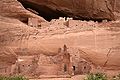
- Nomination White House Ruin at Canyon de Chelly National Park, Arizona. --AFBorchert 19:44, 12 October 2009 (UTC)
- Promotion nice --Mbdortmund 01:36, 13 October 2009 (UTC)
-

-

- Nomination Saint Raphael churches in Venice - ceiling detail--Archaeodontosaurus 15:50, 12 October 2009 (UTC)
- Decline too much noise, composition noot so good --Berthold Werner 18:05, 12 October 2009 (UTC)
-
- Nomination Saint Raphael churches in Venice - ceiling --Archaeodontosaurus 15:50, 12 October 2009 (UTC)
- Decline Not sharp and too much noise --Berthold Werner 18:05, 12 October 2009 (UTC)
-

- Nomination Raduň Castle in Czech Republic - actual photo --Multimotyl 14:10, 12 October 2009 (UTC)
- Promotion Great work!--Kozuch 19:41, 12 October 2009 (UTC)
-

- Nomination Amesbury historic building in Ashfield, NSW, Australia --99of9 13:45, 12 October 2009 (UTC)
- Promotion Good. --Berthold Werner 18:10, 12 October 2009 (UTC)
-

-

- Nomination Thames, by User:Diliff. —Maedin 09:48, 12 October 2009 (UTC)
- Promotion great --Ianare 05:57, 13 October 2009 (UTC)
-

- Nomination Trier cathedral, funerary monument of Johann von Metzenhausen --Berthold Werner 06:56, 12 October 2009 (UTC)
- Promotion Sharp and good. --Cayambe 07:11, 13 October 2009 (UTC)
-

- Nomination Basketball player prepares to shoot a free-throw --JoeJohnson2 23:14, 11 October 2009 (UTC)
- Promotion Good. --Cayambe 07:08, 13 October 2009 (UTC)
-

-

- Nomination Chalcolestes viridis --ComputerHotline 17:55, 9 October 2009 (UTC)
- Promotion Good. --Cayambe 08:08, 13 October 2009 (UTC)
-
- Nomination Chalcolestes viridis --ComputerHotline 17:55, 9 October 2009 (UTC)
- Promotion Very good.--Cayambe 08:08, 13 October 2009 (UTC)
-

- Nomination Lincoln's Inn Fields, by User:Diliff. —Maedin 09:48, 12 October 2009 (UTC)
- Withdrawn QuestionIt's already a QI?? --99of9 10:11, 12 October 2009 (UTC)
Ooooooooooops :-) Sorry! Maedin 10:32, 12 October 2009 (UTC)
-

-

- Nomination Location of Ardeck castle above Aar valley. --Johannes Robalotoff 18:43, 11 October 2009 (UTC)
- Promotion Good... --Cayambe 20:33, 11 October 2009 (UTC)
-

- Nomination Ardeck castle, Germany. --Johannes Robalotoff 18:41, 11 October 2009 (UTC)
- Promotion ... and also good. --Cayambe 20:33, 11 October 2009 (UTC)
-

- Nomination Panorama of Lodalen --Aqwis 18:11, 11 October 2009 (UTC)
- Promotion Very good. Can you add geolocation? (Geolocation is not QI relevant, but important nevertheless.) --Johannes Robalotoff 20:39, 11 October 2009 (UTC) Done --Aqwis 23:05, 11 October 2009 (UTC)
-

- Nomination Timber framing in Leonberg, southern Germany --Harke 15:46, 11 October 2009 (UTC)}
- Promotion Good, although I would crop more of the blue sky above in order to center the house better within the image frame. The car in the right lower corner does not disturb me. --Johannes Robalotoff 18:47, 11 October 2009 (UTC). Done --Harke 20:32, 11 October 2009 (UTC)
-

- Nomination Timber framing in Leonberg, southern Germany --Harke 15:46, 11 October 2009 (UTC)
- Promotion Very good. --Johannes Robalotoff 15:57, 11 October 2009 (UTC)
-

- Nomination Some well worn Scarpa boots encased in Berghaus Yeti gaiters making them suitable for use in wet conditions.--Herbythyme 14:47, 11 October 2009 (UTC)
- Promotion Nice colours. --Cayambe 19:36, 11 October 2009 (UTC)
-

- Nomination Entrance of "Kaiser-Wilhelms-Bad" with statue of Emperor Wilhelm I., Bad Homburg, Germany.--Johannes Robalotoff 14:00, 11 October 2009 (UTC)
- Promotion Excellent. --Cayambe 15:51, 11 October 2009 (UTC)
-
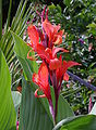
- Nomination Canna indica (in my garden) --Berthold Werner 13:03, 11 October 2009 (UTC)
- Promotion Very nice shot. --Cayambe 15:46, 11 October 2009 (UTC)
-

- Nomination Cypraecassis rufa - Cassidae - 12.2cm --Archaeodontosaurus 12:34, 11 October 2009 (UTC)
- Promotion Good. --Johannes Robalotoff 13:02, 11 October 2009 (UTC)
-
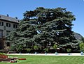
- Nomination Lebanon cedar in front of Bad Homburg castle, Germany. --Johannes Robalotoff 11:21, 11 October 2009 (UTC)
- Promotion Nice clean, clear image -Herbythyme 14:34, 11 October 2009 (UTC)
-

- Nomination St. Michael's Church in Leonberg, southern Germany --Harke 10:39, 11 October 2009 (UTC)
- Decline Composition: Description claims that church is shown, but picture has mainly unimportant dwelling houses and the sunflower in foreground and just a bit of church in background. --Johannes Robalotoff 11:34, 11 October 2009 (UTC)
Sorry, you are right. I did not thought much about the title. Should I modify the description, is it a criterion for QI? --Harke 15:40, 11 October 2009 (UTC) Yes, see here, section "Image page requirements" and here, section "composition". I wonder if simply modifying the description will help in this case. I find composition somewhat unbalanced, whatever the description may be. --Johannes Robalotoff 19:07, 11 October 2009 (UTC)
-

- Nomination Feijoa sellowiana (or acca sellowiana) - Myrtaceae --Archaeodontosaurus 09:39, 11 October 2009 (UTC)
- Promotion Very good. --Cayambe 15:58, 11 October 2009 (UTC)
-

- Nomination Inside Balconies Cave --Mbz1 03:52, 11 October 2009 (UTC)
- Promotion Excellent composition and otherwise also good. --Cayambe 15:30, 11 October 2009 (UTC)
I agree, much better than the last one - also because of the man (I had no idea from the previous image how huge these rocks are) -- H005 19:06, 11 October 2009 (UTC)
-

-

-

- Nomination House Finch --Cephas 20:33, 10 October 2009 (UTC)
- Decline Insufficient DOF. (And strange halo around the bird's head. (?)) --Johannes Robalotoff 20:49, 11 October 2009 (UTC)
-

- Nomination Chalcolestes viridis --ComputerHotline 17:55, 9 October 2009 (UTC)
- Promotion Also good. --Cayambe 07:37, 12 October 2009 (UTC)
-

- Nomination: Ashokan Reservoir in Ulster County, New York. Juliancolton 05:37, 28 September 2009 (UTC)
- Review Comment Good, but the lake shore is slightly distorted. Can you straighten it?. --Cayambe 08:01, 28 September 2009 (UTC)
I can't see a distortion, but the focus apparently was set to the foreground (sign etc.), as a result the lake itself and the hills are rather blurry. -- H005 08:53, 6 October 2009 (UTC) (
-

- Nomination Timber framing in Leonberg, southern Germany --Harke 10:39, 11 October 2009 (UTC)
- Promotion Good. --Johannes Robalotoff 11:27, 11 October 2009 (UTC)
-
- Nomination Timber framing in Leonberg, southern Germany --Harke 10:36, 11 October 2009 (UTC)
- Promotion Hübsch. --Berthold Werner 11:32, 11 October 2009 (UTC)
-

- Nomination A view of Corfe Castle from just outside the village of the same name, UK. It is a Grade One listed ancient monument. --Herbythyme 09:45, 11 October 2009 (UTC)
- Promotion Good. --Berthold Werner 11:32, 11 October 2009 (UTC)
-

- Nomination Trier cathedral, pulpit --Berthold Werner 09:08, 11 October 2009 (UTC)
- Promotion Good. --Johannes Robalotoff 10:29, 11 October 2009 (UTC)
-

- Nomination Seal Rocks and Cliff House after sunset --Mbz1 00:36, 11 October 2009 (UTC)
- Promotion Good topic, good execution--Archaeodontosaurus 10:20, 11 October 2009 (UTC)
-

- Nomination Elisabeth's Well at Bad Homburg, Germany. --Johannes Robalotoff 21:59, 10 October 2009 (UTC)
- Promotion There is a CA-like effect at the leftmost column, but still ok for QI imho --Berthold Werner 09:29, 11 October 2009 (UTC)
-

-
- Nomination Fort Point National Historic Site and Golden Gate Bridge --Mbz1 17:55, 10 October 2009 (UTC)
- Promotion Wow, Mila, this is gorgeous. A pleasure to promote. Would definitely support at FPC, too. (Minor point, there are 2 dust spots in the sky, left of middle) Maedin 19:16, 10 October 2009 (UTC)
Dust spots on my image??? Never!!! I hope I removed them. Thanks.--Mbz1 00:18, 11 October 2009 (UTC)
-

- Nomination Frontal wall of Schönburg castle, Germany --Johannes Robalotoff 17:08, 10 October 2009 (UTC)
- Promotion Ok. --Berthold Werner 17:46, 10 October 2009 (UTC)
-

- Nomination Star Inn, Alfriston, by User:Diliff. —Maedin 15:29, 10 October 2009 (UTC)
- Promotion Ok. --Berthold Werner 17:46, 10 October 2009 (UTC)
-

-

- Nomination Stacked Pink Lady apples. --99of9 11:37, 10 October 2009 (UTC)
- Promotion Seems good enough. Juliancolton 22:06, 10 October 2009 (UTC)
-

- Nomination Stacked tangelos. --99of9 10:50, 10 October 2009 (UTC)
- Decline Really nothing is in focus. Juliancolton 22:06, 10 October 2009 (UTC)
-

- Nomination Green lizard in Guadeloupe --KoS 16:45, 10 October 2009 (UTC)
- Decline Insufficient DOF. --Johannes Robalotoff 18:35, 10 October 2009 (UTC)
-

-

- Nomination Chalcolestes viridis --ComputerHotline 17:55, 9 October 2009 (UTC).
- Promotion Good. --Cayambe 08:39, 11 October 2009 (UTC)
-
- Nomination Chalcolestes viridis --ComputerHotline 17:55, 9 October 2009 (UTC)
- Promotion Good. Would benefit from cloning away the structures at the left bottom.--Cayambe 08:39, 11 October 2009 (UTC)
-

-

- Nomination Cliff Palace at Mesa Verde National Park --AFBorchert 19:14, 7 October 2009 (UTC)
- Promotion Comment Overall good quality, but in the lower left part strong CA and I do not understand the crop - you can see much surrounding wood on the right, but to the left the palace is cut off. Is there a reason for that? -- H005 19:32, 7 October 2009 (UTC) Info CA in lower left corner has been removed thanks to Mbz1. --AFBorchert 22:17, 7 October 2009 (UTC)
Great quality image of a very interesting place!--Mbz1 17:58, 10 October 2009 (UTC)
-

- Nomination Dutch F-16 --Airwolf 12:50, 5 October 2009 (UTC)
- Withdrawn Comment Not so sharp. --Eusebius 12:53, 5 October 2009 (UTC) Info Quite sharp for something that's moving at about 140-170 knots, I'd say. Airwolf 13:04, 5 October 2009 (UTC)
That's why I didn't oppose, but you've been able to take sharper images of faster aircrafts, so I guess the mitigating factor has limits. --Eusebius 13:16, 5 October 2009 (UTC)
Sharp enough considering the conditions, but I do not fancy the unbalanced crop. -- H005 20:30, 6 October 2009 (UTC) Question How much and where would you crop? I could do it. Airwolf 18:12, 7 October 2009 (UTC)
Ideally I'd add more sky on top, bottom and right, but if that isn't possible I'd cut off something on the left. -- H005 20:24, 8 October 2009 (UTC)
OK, I withdraw for now, I'll find the original and make a different crop, and then I'll re-nominate. Dschwen 03:21, 11 October 2009 (UTC)
-

- Nomination Kobelschlucht --Böhringer 21:00, 4 October 2009 (UTC).
Comment Excellent composition, nice shot. There is some chromatic aberration on the stones at right. Can you fix it? --Cayambe 14:42, 5 October 2009 (UTC) - Promotion IMHO good enough for QI --Berthold Werner 18:01, 10 October 2009 (UTC)
- Nomination Kobelschlucht --Böhringer 21:00, 4 October 2009 (UTC).
-

- Nomination Western shore of Brela, Croatia. --Jos. 13:54, 25 September 2009 (UTC)
- Promotion Comment Tilted clockwise. Purple fringing visible at the houses on the right side. --Johannes Robalotoff 17:42, 30 September 2009 (UTC)
I don't really know about witch houses are you talking about? Do you mean the first? Tilted clokwise is simple to fix. :) Jos. 16:45, 2 October 2009 (UTC) For the houses, I added marks on the image page now. --Johannes Robalotoff 18:32, 2 October 2009 (UTC)
CA is hardly visible, I'd say it's fine if the tilt is removed. -- H005 08:49, 6 October 2009 (UTC)
I removed tilt. What do you think now? Jos. 16:37, 9 October 2009 (UTC)
The image itself is QI now for me, but can you add a geocode? -- H005 22:19, 9 October 2009 (UTC)
Added Jos. 08:44, 10 October 2009 (UTC)
Thanks! -- H005 22:29, 10 October 2009 (UTC)
-

- Nomination Germany, Trier, Porta Nigra at night --Berthold Werner 10:45, 10 October 2009 (UTC)
- Promotion Good. -- H005 10:47, 10 October 2009 (UTC)
-

- Nomination Stacked rockmelons. --99of9 10:19, 10 October 2009 (UTC)
- Promotion Texture well shown, good photo -- George Chernilevsky 10:25, 10 October 2009 (UTC)
-
- Nomination Remaining wall of Oberneisen castle. (Perspective is intentional and should remain as is.) --Johannes Robalotoff 22:42, 9 October 2009 (UTC)
- Promotion Good explanation, good work --Archaeodontosaurus 09:19, 10 October 2009 (UTC)
-

- Nomination Ziegenschädel --Böhringer 20:42, 9 October 2009 (UTC)
- Promotion nice colours and composition --Mbdortmund 20:55, 9 October 2009 (UTC)
-

-

- Nomination Fasciolaria tulipa - side face from the same specimen - - Size 15cm --Archaeodontosaurus 16:32, 9 October 2009 (UTC)
- Promotion Good. --Johannes Robalotoff 19:42, 9 October 2009 (UTC)
-

- Nomination A 1908 Stanley Steamer automobile at the 2009 Newport Antique Auto Hill Climb in Newport, Indiana. --Huwmanbeing 16:29, 9 October 2009 (UTC)
- Promotion Exposure is a bit at the upper limit in many regions but it is still visually OK. I've heard some people complain about PNG, but there is no rule that forbids lossless compression in the guidelines as far as I can see (would be absurd IMHO). PNG compression is also good so that the file size is still OK. --Johannes Robalotoff 19:54, 9 October 2009 (UTC)
-

- Nomination Portrait of a Great White Pelican (Pelecanus onocrotalus) --Kemmi.1 16:08, 9 October 2009 (UTC)
- Promotion Excellent. --Johannes Robalotoff 19:39, 9 October 2009 (UTC)
-

-

- Nomination Budapest (Hungary): Fine Arts Museum -- MJJR 16:04, 9 October 2009 (UTC)
- Promotion Good. --Johannes Robalotoff 20:01, 9 October 2009 (UTC)
-

- Nomination Wakehurst Place, by User:Diliff. —Maedin 15:28, 9 October 2009 (UTC)
- Promotion Very good -- George Chernilevsky 15:58, 9 October 2009 (UTC)
-

- Nomination Eastern Grey squirrel, by User:Diliff. —Maedin 15:28, 9 October 2009 (UTC)
- Promotion good composition, fine structures --Mbdortmund 17:37, 9 October 2009 (UTC)
-

- Nomination Kennick Reservoir in Devon, UK --Nilfanion 14:45, 9 October 2009 (UTC)
- Promotion Good, in spite of the very tight crop at the bottom. --Johannes Robalotoff 20:10, 9 October 2009 (UTC)
-

- Nomination View of Lake Lucerne in Switzerland near the town of Beckenried. --NormanB 02:08, 9 October 2009 (UTC) Comment There is a continuous blue-green halo (fringe) on the mountain horizon. Can you fix it? Otherwise very good. --Cayambe 13:21, 9 October 2009 (UTC)
Info Fringe is fixed. Tanx Cayambe! I've uploaded a new version, please review. --NormanB 20:16, 9 October 2009 (UTC) - Promotion Well done. --Cayambe 21:08, 9 October 2009 (UTC)
- Nomination View of Lake Lucerne in Switzerland near the town of Beckenried. --NormanB 02:08, 9 October 2009 (UTC)
-

- Nomination A hungry tree :-) --Alchemist-hp 23:03, 8 October 2009 (UTC)
- Promotion Comment Can you explain how several letters could move from the sheet of paper to the hungry tree excrescence? :-) --Cayambe 13:16, 9 October 2009 (UTC)
It is a painted metal sheet label. --Alchemist-hp 13:47, 9 October 2009 (UTC)
Good. -- H005 16:40, 9 October 2009 (UTC)
-

- Nomination Village of Kalborn, Oesling, Luxembourg. --Cayambe 17:07, 8 October 2009 (UTC)
- Promotion Comment should be rotated clockwise by ca. 1°. -- H005 20:12, 8 October 2009 (UTC).
Done 1.1° --Cayambe 09:27, 9 October 2009 (UTC)
Good now (although I still find your images all a tiny bit overexposed ...) -- H005 16:38, 9 October 2009 (UTC)
-

- Nomination Trier cathedral, tomb of Johann Philipp von Walderdorf --Berthold Werner 07:52, 8 October 2009 (UTC).
Comment Can you remove the chromatic aberration (violet fringes). See annotation mark. --Cayambe 17:28, 8 October 2009 (UTC)
I needed a 300% view to see it ;-), tried to remove it --Berthold Werner 17:45, 9 October 2009 (UTC) - Promotion Ok now :-) --Cayambe 21:06, 9 October 2009 (UTC)
- Nomination Trier cathedral, tomb of Johann Philipp von Walderdorf --Berthold Werner 07:52, 8 October 2009 (UTC).
-

- Nomination Close-up of the ceiling of the Pantheon in Rome (Italy) highlighted by a sunbeam.
Info This pictures highlights the colour, structure and relief of the mainly rather dark ceiling. --NormanB 20:22, 7 October 2009 (UTC) - Promotion Comment Interesting shot, but it seems to me that the white balance is a bit odd (purple tone in the stone) -- H005 16:30, 8 October 2009 (UTC) Info I don't believe the white balance to be incorrect. Please also compare with other pictures of the same ceiling after refurbishment, like this one and this one --NormanB 20:33, 9 October 2009 (UTC).
OK. -- H005 22:59, 9 October 2009 (UTC)
- Nomination Close-up of the ceiling of the Pantheon in Rome (Italy) highlighted by a sunbeam.
-

- Nomination Debrecen - Small Evangelical Church --Pudelek 13:29, 7 October 2009 (UTC) Comment A bit dark IMO. Can you lighten it up? There is also some CA (violet fringes) that can easily be fixed. --Cayambe 15:45, 8 October 2009 (UTC)
new version (not so dark) --Pudelek 13:42, 9 October 2009 (UTC) - Promotion Good now. --Cayambe 13:55, 9 October 2009 (UTC)
- Nomination Debrecen - Small Evangelical Church --Pudelek 13:29, 7 October 2009 (UTC)
-

- Nomination Entrance to Balconies Cave at Pinnacles National Monument --Mbz1 02:04, 7 October 2009 (UTC). Comment Would benefit IMO from a crop of a large part of the dark shadow: right and bottom. --Cayambe 15:29, 8 October 2009 (UTC) Done--Mbz1 16:46, 8 October 2009 (UTC)
- Promotion Well done. --Cayambe 13:06, 9 October 2009 (UTC)
- Nomination Entrance to Balconies Cave at Pinnacles National Monument --Mbz1 02:04, 7 October 2009 (UTC).
-
- Nomination Il duomo di Barga -- H005 16:02, 6 October 2009 (UTC) Comment Excellent shot IMO, but: There is a nagging perspective distortion: the vertical lines of the tower are straight, but not so le left wall of the main building, and the roof is tilted upwards. This seems unavoidable to me when the camera is directed upwards. Can these images be QI? What do others think? --Cayambe 14:05, 9 October 2009 (UTC).
- Promotion After reflection: the distortion is acceptable here, therefore QI IMO. --Cayambe 14:52, 9 October 2009 (UTC)
- Nomination Il duomo di Barga -- H005 16:02, 6 October 2009 (UTC)
-

-

- Nomination Filling a liquid nitrogen dewar --99of9 13:18, 7 October 2009 (UTC). Comment Somewhat heavy chromatic aberration (violet fringes), above all at right. Can you fix it? Otherwise good. --Cayambe 15:38, 8 October 2009 (UTC) DoneThanks for picking that up, should be gone now. --99of9 02:14, 9 October 2009 (UTC)
- Promotion Good now. --Cayambe 09:30, 9 October 2009 (UTC)
- Nomination Filling a liquid nitrogen dewar --99of9 13:18, 7 October 2009 (UTC).
-

- Nomination Celadon (ceramic) incense burner from the Goryeo Dynasty (918-1392). National Treasure of South Korea #95 at the National Museum of Korea, Seoul. --Steve46814 21:28, 3 October 2009 (UTC). Comment Good. Can you remove the slight chromatic aberration (see annotation mark)? --Cayambe 10:47, 6 October 2009 (UTC) Comment Attempted to correct the slight chromatic aberration but had difficulty spotting the flaw. Uploaded a revised image that may correct the issue.Steve46814 20:39, 8 October 2009 (UTC)
- Promotion Much better now. --Cayambe 09:42, 9 October 2009 (UTC)
- Nomination Celadon (ceramic) incense burner from the Goryeo Dynasty (918-1392). National Treasure of South Korea #95 at the National Museum of Korea, Seoul. --Steve46814 21:28, 3 October 2009 (UTC).
-
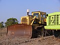
- Nomination Caterpillar D9H bullozer. --MathKnight 17:51, 8 October 2009 (UTC)
- Decline Main object partly covered by another bulldozer. -- H005 20:10, 8 October 2009 (UTC)
-
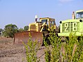
- Nomination Caterpillar D9H bullozer. --MathKnight 17:51, 8 October 2009 (UTC)
- Decline Main subject partly covered by another bulldozer and branches. -- H005 20:10, 8 October 2009 (UTC)
-

-

-

-

-

-

- Nomination The pipe organ of the Bartholomäuskirche Markgröningen, Germany --Pilettes 08:54, 8 October 2009 (UTC)
- WARNING: third template parameter added – please remove.
-

- Nomination Castle of the Latvian town Varakļāni--Ichneumon 23:36, 7 October 2009 (UTC)
- Decline Comment Tilt, vignetting, spotted sky due to saturation increase by color. Aber ein nettes Motiv. -- H005 22:38, 7 October 2009 (UTC)
Uploaded an improved version, but I think the camera is too bad. --Berthold Werner 15:40, 8 October 2009 (UTC) Oppose Better, but I don't think you can get it good enough for QI without having the original version as it came out of the camera. This one is screwed up, sorry. -- H005 17:14, 8 October 2009 (UTC)
-

-

-

-
-

- Nomination Trier cathedral, John the Baptist altar --Berthold Werner 08:16, 7 October 2009 (UTC)
- Promotion Good. --Cayambe 15:34, 8 October 2009 (UTC)
-

- Nomination Toadstool in New Hampshire. --99of9 09:19, 8 October 2009 (UTC)
- Withdrawn Comment Full ID need and bit overexplosed (not so bad). Try -1/3EV in a very solar days -- George Chernilevsky 09:35, 8 October 2009 (UTC) Comment I can tell it's Agaricus, but I'm no taxonomist to go beyond that, so I withdraw the nomination. --99of9 10:32, 8 October 2009 (UTC)
-

- Nomination Sydney Opera House, by User:Diliff. —Maedin 07:55, 8 October 2009 (UTC)
- Promotion Nice to see my home city in all it's glory. --99of9 09:14, 8 October 2009 (UTC)
-

- Nomination Young hedgehog. Karori, Wellington, New Zealand. Photo by Tony Wills nominated by -- George Chernilevsky 07:06, 8 October 2009 (UTC)
- Promotion Good. - Darius Bauzys 09:49, 8 October 2009 (UTC)
-

- Nomination Debrecen - Tram in the evening --Pudelek 13:29, 7 October 2009 (UTC)
- Decline Unfavorable light, too much noise --Berthold Werner 15:34, 7 October 2009 (UTC)
-
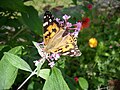
- Nomination A Painted Lady (Vanessa cardui) sitting on a summer lilac (Buddleja davidii). --Ichneumon 10:50, 7 October 2009 (UTC) Comment Would benefit from a crop, just below the tongue-shaped leaf below the head of the insect. --Cayambe 12:41, 7 October 2009 (UTC)
- Decline Too many strongly overexposed regions on the main subject virtually force me to decline. --Johannes Robalotoff 16:10, 7 October 2009 (UTC)
- Nomination A Painted Lady (Vanessa cardui) sitting on a summer lilac (Buddleja davidii). --Ichneumon 10:50, 7 October 2009 (UTC)
-

- Nomination Il duomo di Barga from NW -- H005 20:34, 6 October 2009 (UTC)
- Promotion Good. Just a question: would the picture not benefit from cloning away the sign at right? --Cayambe 14:36, 7 October 2009 (UTC)
I think it should be removed --Berthold Werner 15:37, 7 October 2009 (UTC)
I thought of it, but wasn't sure, if you both think it'll be better I'll give it a try. -- H005 18:48, 7 October 2009 (UTC) Done -- H005 19:14, 7 October 2009 (UTC)
-

- Nomination Castel and Ponte Sant'Angelo in Rome (Italy) by night --NormanB 01:22, 5 October 2009 (UTC)
- Promotion Good night shot, despite some CA to the left, if you'd be able to fix that it would be even much better. -- H005 08:39, 6 October 2009 (UTC) Info Thanks for the feedback! I've uploaded an updated version in which I have removed the CA as much as I can. --NormanB 20:12, 7 October 2009 (UTC)
-

- Nomination VW Golf 6 --Blackfalcon 16:00, 4 October 2009 (UTC)
- Promotion Truly astonishing. I'm really curious about the postprocessings. I guess the car wasn't shot at 1s, I could bet one week of wikibreak on that one. --Eusebius 21:31, 4 October 2009 (UTC) the camera is fixed at the car and the car moved slowly to get such effects for promotional content --Mbdortmund 20:35, 5 October 2009 (UTC)
See you in a week, Eusebius ;-) --Dschwen 22:28, 7 October 2009 (UTC)
-

- Nomination Dol cathedral. --Eusebius 15:06, 4 October 2009 (UTC) Comment There are some disturbing birds in the sky (I think it are birds) --Berthold Werner 16:43, 4 October 2009 (UTC)
Yes, it's birds. They could be removed, is it really necessary? --Eusebius 16:51, 4 October 2009 (UTC)
The birds do not disturb me at all - it is a good image. I do feel there is a slight tilt though (to the left)? --Herbythyme 16:55, 4 October 2009 (UTC)
The perspective makes the tilt difficult to judge (impossible to shoot from the axis). I based my tilt correction on the central vertical line of the building, which should be vertical. But I'm ready to try another angle. --Eusebius 20:50, 4 October 2009 (UTC). - Promotion The slight perspective problems are acceptable here IMO. Therefore QI. --Cayambe 15:54, 7 October 2009 (UTC)
- Nomination Dol cathedral. --Eusebius 15:06, 4 October 2009 (UTC)
-

- Nomination This is an alternative (uncropped) view of File:Strandkörbe Eckernförde.jpg, which some didn't like for its crop and DOF. I still like the cropped version more, but if others think different, so be it. I haven't shot it with a different DOF though. -- H005 12:48, 2 October 2009 (UTC)
- Promotion I like the absence of crop on this one. In my opinion the DOF is a matter of choice here, both would look nice in different ways. When a series of objects are the same as each other, there's no need to see the details, and the blur actually enhances the impression that they extend to infinity.--99of9 11:17, 7 October 2009 (UTC) Comment In case it does get controversial (!) I agree with this promotion I think. However I think the crop is slightly better :) -Herbythyme 12:42, 7 October 2009 (UTC)
-

- Nomination: Mexican fireleg tarantula Brachypelma boehmei --George Chernilevsky 18:48, 1 October 2009 (UTC)
- Review needed
-

- Nomination: Mexican fireleg tarantula Brachypelma boehmei --George Chernilevsky 18:48, 1 October 2009 (UTC)
- Review needed
-
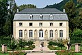
- Nomination Building in the Orangerie at Echternach. --Cayambe 09:55, 7 October 2009 (UTC)
- Promotion Wunderschön. --Berthold Werner 10:54, 7 October 2009 (UTC)
-

-

- Nomination Keble College Chapel, by User:Diliff. —Maedin 06:34, 7 October 2009 (UTC)
- Promotion Excellent! -- George Chernilevsky 09:25, 7 October 2009 (UTC)
-

- Nomination House sparrow, by User:Diliff. —Maedin 06:34, 7 October 2009 (UTC)
- Promotion Excellent! -- George Chernilevsky 09:20, 7 October 2009 (UTC)
-

- Nomination A Centralwings Boeing 737-400. --Airwolf 22:26, 6 October 2009 (UTC)
- Promotion good -- George Chernilevsky 09:28, 7 October 2009 (UTC)
-
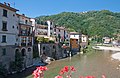
-

- Nomination Nymphaea caerulea (also known as Blue Egyptian water lily) --Kemmi.1 21:19, 6 October 2009 (UTC)
- Promotion Excellent DOF and noise. -- H005 21:49, 6 October 2009 (UTC)
It looks very artificial on my screen (?) --Berthold Werner 09:12, 7 October 2009 (UTC)
-

-
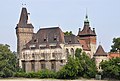
- Nomination Budapest (Hungary): Vajdahunyad Castle seen from the west -- MJJR 20:51, 6 October 2009 (UTC)
- Promotion Good. --Berthold Werner 06:08, 7 October 2009 (UTC)
-

- Nomination The Paddle Steamer Waverley moored at Swanage in Dorset,Uk, taken in late evening light. --Herbythyme 16:14, 6 October 2009 (UTC)
- Promotion Comment I'd use a different crop: less water, cut off a bit on the left. -- H005 16:17, 6 October 2009 (UTC)
I hate giving crop advice but I think you are right :). Refresh cache if necessary, amended. I left the red bouy in as I think it ads something! -Herbythyme 16:25, 6 October 2009 (UTC)
Great, much better now, although personally I'd keep the sky. Rule of thirds is a good advisor here I think. -- H005 16:47, 6 October 2009 (UTC)
Done? :) -Herbythyme 16:50, 6 October 2009 (UTC)
Ah, great now! :-) -- H005 19:55, 6 October 2009 (UTC)
-

- Nomination Side view of Ponte della Maddalena -- H005 15:06, 6 October 2009 (UTC)
- Promotion Good. --Johannes Robalotoff 19:24, 6 October 2009 (UTC)
-

- Nomination London's "gherkin" viewed from Bishopsgate -- H005 11:22, 6 October 2009 (UTC)
- Withdrawn I'm sorry, but this photo below minimal size, 1.32 Megapixels only, 2Mpx need -- George Chernilevsky 14:51, 6 October 2009 (UTC)
Uh, yes, I was sloppy and didn't notice that. -- H005 15:03, 6 October 2009 (UTC)
-

- Nomination Ponte della Maddalena near Bagni di Lucca. -- H005 11:17, 6 October 2009 (UTC)
- Promotion Clean clear image nicely composed -Herbythyme 15:03, 6 October 2009 (UTC) Comment Good, but would benefir from CA reduction, see annotation mark. --Cayambe 21:14, 6 October 2009 (UTC) Done 20 wrong pixels out of 12 million ... and you spot them. :-) -- H005 22:14, 6 October 2009 (UTC)
-

-

-

- Nomination An albino female Clouded Sulphur (Colias philodice) --Meganmccarty 21:45, 5 October 2009 (UTC) Comment Beautiful butterfly. I clone-out grasses on the left side (imho). And noisy background. - Darius Bauzys 06:52, 6 October 2009 (UTC) Comment I'm not an expert on cloning and I'm afraid if I did clone-out the grasses the photo would look altered. --Meganmccarty 18:25, 6 October 2009 (UTC)
- Promotion
So let it go. QI for me. --Cayambe 09:18, 7 October 2009 (UTC)
- Nomination An albino female Clouded Sulphur (Colias philodice) --Meganmccarty 21:45, 5 October 2009 (UTC)
-

-

-

-

-

- Nomination October, 3rd : Olivier Besancenot in Colmar --ComputerHotline 18:50, 3 October 2009 (UTC)
- Promotion I don't know who he is, but this is a quality image whoever he is. Very clear. --99of9 12:41, 6 October 2009 (UTC)
Agree with 99of9.--Cayambe 14:02, 6 October 2009 (UTC)
-

- Nomination The Lasseter Highway in central Australia --99of9 14:06, 3 October 2009 (UTC)
- Promotion Comment A tad overexposed IMHO, and visible vignetting. Can you do something about that? -- H005 20:07, 6 October 2009 (UTC) CommentHow does it look now? I'm learning so much this week about correcting aberrations! --99of9 03:08, 7 October 2009 (UTC)
Great! -- H005 09:00, 7 October 2009 (UTC)
-

- Nomination Bamberg cathedral, Kirchgattendorfer Altar --Berthold Werner 10:22, 3 October 2009 (UTC)
- Promotion Support Loss of sharpness in the upper left corner, but overall still a good and detailed image. -- H005 20:05, 6 October 2009 (UTC)
-
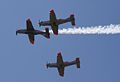
-

-

- Nomination A Czech JAS-39 Gripen --Airwolf 06:07, 2 October 2009 (UTC)
- Promotion Comment File size is very small. --Cayambe 10:17, 2 October 2009 (UTC) Comment I know, but there is nothing I can do about it, unfortunately. Airwolf 12:11, 2 October 2009 (UTC)
The good educational value mitigates for the just average technical quality. After all it's not easy to capture a flying jetfighter sharp. -- H005 16:15, 6 October 2009 (UTC)
-
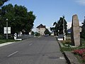
- Nomination Sátoraljaújhely - Slovenské Nové Mesto - former border crossing point. View from Hungary --Pudelek 16:59, 1 October 2009 (UTC)
- Decline Comment Too many JPG compression artefacts. Can you save it in higher quality? And add a geocode? -- H005 08:58, 6 October 2009 (UTC) Info now is smaller version with location --Pudelek 12:36, 6 October 2009 (UTC)
Why smaller? Images should always be provided in the maximum available resolution. -- H005 12:43, 6 October 2009 (UTC) Comment
Old version was maximum resolution --Pudelek 13:30, 6 October 2009 (UTC)
That's what I assumed, but it doesn't answer the question why you reduced it. I'd recommend the original resolution saved in better JPEG quality, provided you have the original JPG image from the camera or even the RAW file. -- H005 16:11, 6 October 2009 (UTC) Comment I have only JPG photo - smaller version seems better, less visible artifacts --Pudelek 19:34, 6 October 2009 (UTC)
Yes, but also it makes it even more blurry. If you don't have a higher quality copy I fear this won't become QI in my view, sorry. -- H005 20:15, 6 October 2009 (UTC)
-

-

-
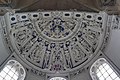
- Nomination Trier cathedral, ceiling in the west apsis --Berthold Werner 08:09, 6 October 2009 (UTC)
- Promotion Good work -- H005 09:53, 6 October 2009 (UTC)
-
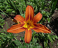
- Nomination Orange Daylily Hemerocallis fulva --George Chernilevsky 05:57, 6 October 2009 (UTC).
- Promotion Excellent. --Cayambe 11:12, 6 October 2009 (UTC)
-
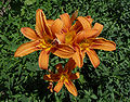
- Nomination Orange Daylily Hemerocallis fulva --George Chernilevsky 05:57, 6 October 2009 (UTC)
- Promotion Good for me - Darius Bauzys 06:58, 6 October 2009 (UTC) Comment Thanks! It is my 100-th QI -- George Chernilevsky 07:07, 6 October 2009 (UTC)
-

-

- Nomination Budapest (Hungary): Buda Castle seen from the south -- MJJR 19:48, 5 October 2009 (UTC)
- Promotion Ok. --Berthold Werner 08:17, 6 October 2009 (UTC)
-

-

-

-

- Nomination Tinder fungus (Fomes fomentarius) inside view --George Chernilevsky 12:31, 5 October 2009 (UTC)
- Promotion Very good image indeed -Herbythyme 15:58, 5 October 2009 (UTC)
-

-

-

- Nomination Yongdingmen gate and square,Beijing --Charlie fong 03:47, 5 October 2009 (UTC)
- Promotion Good composition and otherwise also good IMO. --Cayambe 10:20, 6 October 2009 (UTC)
-

- Nomination Protestant Great Church in Debrecen --Pudelek 11:55, 4 October 2009 (UTC) Comment Can you lighten up this one too? Even a bit more than the other one would be good IMO. --Cayambe 07:52, 5 October 2009 (UTC) Info done --Pudelek 20:18, 5 October 2009 (UTC)
- Promotion Ok now. --Cayambe 20:38, 5 October 2009 (UTC)
- Nomination Protestant Great Church in Debrecen --Pudelek 11:55, 4 October 2009 (UTC)
-
-

- Nomination Trier, Chapel of the main cemetry --Berthold Werner 09:09, 4 October 2009 (UTC)
- Promotion Comment Can you fix the chromatic aberration? See top tree branches at left. --Cayambe 08:00, 5 October 2009 (UTC)
An den Stämmen habe ich jetzt heftiges CA gesehen und entfernt. --Berthold Werner 06:56, 6 October 2009 (UTC) Support Good now. -- H005 08:17, 6 October 2009 (UTC)
-

-
- Nomination River Red Gum in central Australia. --99of9 00:28, 2 October 2009 (UTC)
- Promotion Question The tree itself looks great, but there's a lot of CA in the stones. Any chance to fix that? -- H005 19:45, 2 October 2009 (UTC)
Well spotted, I hadn't noticed that, I will have a go this weekend. --99of9 05:58, 3 October 2009 (UTC)
Ok, I think the blue rocks are gone, but there were a lot to go through. See what you think. --99of9 13:20, 4 October 2009 (UTC)
Thanks for the effort, but frankly, I can't see much of a difference. I've made an image annotation to point you to a very visible example. Do you have the image in RAW format? Then I could try to fix it if you want. -- H005 08:36, 5 October 2009 (UTC)
Thanks for your patience! I must have uploaded an incomplete version before. I've uploaded again. --99of9 00:55, 6 October 2009 (UTC)
Thanks, good enough for me now. -- H005 05:26, 6 October 2009 (UTC)
-

- Nomination Mexican fireleg tarantula Brachypelma boehmei --George Chernilevsky 18:48, 1 October 2009 (UTC)
- Promotion This one facing us is the best composed of the three IMO. --99of9 02:43, 6 October 2009 (UTC)
-

- Nomination Bilsdorf, a village of the Ardennes, Luxembourg. --Cayambe 13:29, 28 September 2009 (UTC)
- Promotion Comment Something strange has happened to the horizon, probably due to postprocessing; also I find it a bit overexposed, the green too yellowish. Also I'm missing a geocode (no QI req, but still ...) . Can you fix these issues? -- H005 09:46, 5 October 2009 (UTC),
Thanks for the comments. I'll go back to the original file. --Cayambe 12:59, 5 October 2009 (UTC).
I have addressed all those issues. Geotag has been added. Please, have a look if it's better now. --Cayambe 20:40, 5 October 2009 (UTC)
Gorgeous. --99of9 02:41, 6 October 2009 (UTC)
-

- Nomination Bamberg cathedral, left side aisle --Berthold Werner 07:42, 5 October 2009 (UTC)
- Promotion Excellent. --Cayambe 08:12, 5 October 2009 (UTC)
-
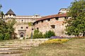
-
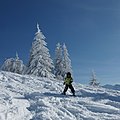
-

- Nomination Siena, Italy. --Myrabella 16:29, 4 October 2009 (UTC)
- Promotion CommentThere are some artefacts on the upper right corner and the left edge in the sky --Berthold Werner 16:38, 4 October 2009 (UTC)
Thanks for your eye! Artefacts removed; new version uploaded. --Myrabella 17:44, 4 October 2009 (UTC)
Ok now --Berthold Werner 18:02, 4 October 2009 (UTC)
-

- Nomination Remote bronze age stone circle on northern Dartmoor. --Herbythyme 14:16, 4 October 2009 (UTC)
- Promotion Good. --Cayambe 19:40, 4 October 2009 (UTC)
-
- Nomination Bronze age stone circle on northern Dartmoor. It was early in the day so there is dew on the ground! --Herbythyme 14:15, 4 October 2009 (UTC)
- Promotion Comment Stitching error on horizon (above large stone to left of centre)--Nilfanion 17:45, 4 October 2009 (UTC)
Sorted --Herbythyme 18:26, 4 October 2009 (UTC)
Fine now.--Nilfanion 19:46, 4 October 2009 (UTC)
-

- Nomination Shows Steeperton Tor on northern Dartmoor. This image is of interest because it shows the fact that live firing by the army was taking place at the time. -Herbythyme 14:08, 4 October 2009 (UTC)
- Promotion Nice view, good. --Cayambe 08:01, 5 October 2009 (UTC)
-

-

-

-
- Nomination Protestant Great Church in Debrecen --Pudelek 11:55, 4 October 2009 (UTC)
Comment Very good, though slightly underexposed IMO. What do others think? --Cayambe 19:59, 4 October 2009 (UTC) Info I uploaded new version - a little correction --Pudelek 22:06, 4 October 2009 (UTC) - Promotion Better now. --Cayambe 07:51, 5 October 2009 (UTC)
- Nomination Protestant Great Church in Debrecen --Pudelek 11:55, 4 October 2009 (UTC)
-

-

- Nomination Pier 39 --Mbz1 23:43, 3 October 2009 (UTC) Comment Good, but there is a slight clockwise tilt. Can you fix it? --Cayambe 14:58, 4 October 2009 (UTC)
Come on now, it is not the image that is tilted, it is the building. I uploaded a new version. Any better?--Mbz1 16:29, 4 October 2009 (UTC) - Promotion
Excellent now, with a slight regret: the unfortunate presence of the man in front :-) --Cayambe 18:59, 4 October 2009 (UTC)
- Nomination Pier 39 --Mbz1 23:43, 3 October 2009 (UTC)
-

-

- Nomination A panoramic view of Corfe Castle in Dorset, UK showing both the castle & its setting --Herbythyme 10:53, 3 October 2009 (UTC)
- Promotion Excellent. --Cayambe 15:10, 4 October 2009 (UTC)
-

- Nomination Žilina - old houses on market place --Pudelek 16:59, 1 October 2009 (UTC)
- Promotion Comment The awning seems to have blotchy pixellized colour patches. Can this be fixed? --99of9 00:41, 2 October 2009 (UTC) Comment Hmm... In my opinion is OK --Pudelek 10:08, 2 October 2009 (UTC) CommentIt's not there when I look again, must have been some weird glitch on my comp. Recommending promotion - I love the clouds as well as the buildings. --99of9 14:13, 4 October 2009 (UTC)
-

- Nomination Panorama of Barcelona, Spain - Till.niermann 15:17, 30 September 2009 (UTC)
- Promotion Good QI --UrLunkwill 15:29, 2 October 2009 (UTC)
Impressive. Very few (if at all) stitching errors. Well done. Lycaon 19:58, 4 October 2009 (UTC)
-

-

- Nomination Ski Jumping Hills in Ramingstein, Austria. BartekPtaszyński 20:12, 26 September 2009 (UTC)
- Decline Oppose Sharpness, noise, many JPG artefacts. -- H005 09:37, 5 October 2009 (UTC)
-

- Nomination Voivodeship road in Mogielnica, Poland BartekPtaszyński 15:31, 26 September 2009 (UTC)
- Decline Dark and tilted to the right. --Airwolf 20:06, 4 October 2009 (UTC)
-

-

- Nomination The original upload of this has already been assessed as QI, but I have uploaded a slightly 'improved' version, so am re-submitting it to check that others agree that it is no worse ;-) --Tony Wills 21:29, 3 October 2009 (UTC)
- Promotion This version is even better than the first. --UrLunkwill 11:23, 4 October 2009 (UTC)
-

- Nomination Soldering a surface-mount component --Omegatron 16:15, 3 October 2009 (UTC)
- Promotion Very good. --Berthold Werner 17:58, 3 October 2009 (UTC)
-

- Nomination Railway building in Heimerdingen, Germany --Harke 19:55, 2 October 2009 (UTC)
Less saturation would be better imho --Berthold Werner 08:40, 3 October 2009 (UTC)
Better now? (It looks oversaturated, but I reduced allready the saturation and the contrast in my first version. Maybe it comes from a slight underexposure.) --Harke 19:07, 3 October 2009 (UTC) - Promotion Now ok for me. --Berthold Werner 20:28, 3 October 2009 (UTC)
- Nomination Railway building in Heimerdingen, Germany --Harke 19:55, 2 October 2009 (UTC)
-

- Nomination Underwater roots of Black Alder (Alnus glutinosa) --David Perez 14:45, 2 October 2009 (UTC)
- Promotion Excellent! -- George Chernilevsky 15:42, 3 October 2009 (UTC)
-

-

- Nomination Torre Guinigi in Lucca, Tuscany -- H005 23:58, 2 October 2009 (UTC)
- Promotion Good shot & nice image --Herbythyme 08:09, 3 October 2009 (UTC)
-

- Nomination Budapest: lantern on Szabadság híd -- MJJR 21:10, 2 October 2009 (UTC)
- Promotion Good enough, although it could have been better, if highlights where not overexposed. Orientation is good, I would definitley not correct perspective or tilt here ;-) -- Johannes Robalotoff 21:38, 2 October 2009 (UTC)
-

- Nomination Stellklappläden (sorry, I do not know the English neither the Italian name) in Lucca, Tuscany. -- H005 20:56, 2 October 2009 (UTC)
Folding shutters. - Promotion Simple clean image, I am sure it would be possible to argue about crops but it is a quality image as I see it. -Herbythyme 11:04, 3 October 2009 (UTC)
- Nomination Stellklappläden (sorry, I do not know the English neither the Italian name) in Lucca, Tuscany. -- H005 20:56, 2 October 2009 (UTC)
-

- Nomination Church in Heimerdingen, Germany --Harke 19:57, 2 October 2009 (UTC)
- Promotion Good in my opinion, although some might complain about noise in the sky and nearly invisible sharpening halos at some edges. This still OK for me here. --Johannes Robalotoff 21:45, 2 October 2009 (UTC)
-

-

-

- Nomination College football stadium in Norman, Oklahoma by Nmajdan. Perspective corrected. --Berthold Werner 17:06, 2 October 2009 (UTC)
- Promotion OK. -- H005 19:21, 2 October 2009 (UTC)
-

- Nomination Part of the Gehry Buildings in the Medienhafen, Duesseldorf, Germany --Kemmi.1 16:26, 2 October 2009 (UTC)
- Promotion Good and interesting. --Berthold Werner 17:07, 2 October 2009 (UTC)
-

- Nomination Schefflenz Brook in Allfeld, Germany, --UrLunkwill 15:48, 2 October 2009 (UTC)
- Decline Unlike the first version, it lacks clarity and the colours are too pale. -- H005 19:42, 2 October 2009 (UTC)
-

- Nomination A view of a typical Dartmoor valley in Devon, UK--Herbythyme 15:24, 2 October 2009 (UTC)
- Promotion OK -- H005 19:25, 2 October 2009 (UTC)
-

- Nomination Monument of the Warsaw Mermaid - On the Vistula --M.Komorniczak 13:53, 2 October 2009 (UTC)
- Decline Strong oversharpening halos around the main subject. --Johannes Robalotoff 21:52, 2 October 2009 (UTC)
-

-
- Nomination Swan Goose (Anser cygnoides) --UrLunkwill 13:51, 1 October 2009 (UTC)
- Promotion Good - Darius Bauzys 09:59, 3 October 2009 (UTC)
-

-
![* Nomination Argentine cellist Sol Gabetta. --S[1] 19:56, 26 September 2009 (UTC) * Decline It's a weak oppose only. I know it is very hard to get good quality portraits of celebrities, but on the other hand the standard here is not really what QI demands. Besides some technical shortcomings (sharpness, noise), she ought to look into the camera and not have a micro before her face. Sorry. -- H005 20:00, 2 October 2009 (UTC)](https://upload.wikimedia.org/wikipedia/commons/thumb/5/5d/Sol_Gabetta_2009.jpg/80px-Sol_Gabetta_2009.jpg)
- Nomination Argentine cellist Sol Gabetta. --S[1] 19:56, 26 September 2009 (UTC)
- Decline It's a weak oppose only. I know it is very hard to get good quality portraits of celebrities, but on the other hand the standard here is not really what QI demands. Besides some technical shortcomings (sharpness, noise), she ought to look into the camera and not have a micro before her face. Sorry. -- H005 20:00, 2 October 2009 (UTC)
-
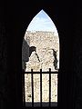
-

-

-

- Nomination Bamberg cathedral, Riemenschneider-Altar --Berthold Werner 08:22, 2 October 2009 (UTC)
- Promotion Very good. --Cayambe 10:16, 2 October 2009 (UTC)
-

- Nomination Marbled rock crab Pachygrapsus marmoratus -- George Chernilevsky 06:30, 2 October 2009 (UTC)
- Promotion Gorgeous. --99of9 07:31, 2 October 2009 (UTC)
-

-
- Nomination College football stadium in Norman, Oklahoma. --Nmajdan 20:23, 1 October 2009 (UTC)
- Promotion Good impression. Bit distorted, but it is IMO applicable for this angle of view. Overall - QI -- George Chernilevsky 05:34, 2 October 2009 (UTC)
I prefer a perspective corrected version: File:OMSFront-2.jpg --Berthold Werner 11:02, 2 October 2009 (UTC)
-

- Nomination Three Red Arrows. --Airwolf 19:58, 1 October 2009 (UTC)
- Promotion Good --Johannes Robalotoff 20:21, 1 October 2009 (UTC)
-
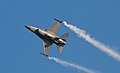
- Nomination Yet another photo of the Belgian F-16. --Airwolf 19:58, 1 October 2009 (UTC)
- Promotion Ok -- George Chernilevsky 20:14, 1 October 2009 (UTC)
-

- Nomination Mexican fireleg tarantula Brachypelma boehmei --George Chernilevsky 18:48, 1 October 2009 (UTC)
- Promotion good.--Mbz1 19:27, 1 October 2009 (UTC)
-

- Nomination Mexican fireleg tarantula Brachypelma boehmei --George Chernilevsky 18:48, 1 October 2009 (UTC)
- Promotion good.--Mbz1 19:27, 1 October 2009 (UTC)
-

- Nomination Mexican fireleg tarantula Brachypelma boehmei --George Chernilevsky 18:48, 1 October 2009 (UTC)
- Promotion good.--Mbz1 19:27, 1 October 2009 (UTC)
-

-

- Nomination Žilina - Church of the Holy Trinity and Burian Tower --Pudelek 16:59, 1 October 2009 (UTC)
- Promotion Light conditions were not perfect, but good enough here. I cannot see anything that speaks against QI. --Johannes Robalotoff 20:16, 1 October 2009 (UTC)
-

- Nomination Coats of arms of Fontcoberta, Girona, Spain. --Xavigivax 15:57, 1 October 2009 (UTC)
- Promotion very good -- George Chernilevsky 18:23, 1 October 2009 (UTC)
-

-

- Nomination: Hersberg oak in wintertime. --Cayambe 11:03, 26 September 2009 (UTC)
- Review needed
-

- Nomination: flower with bee by ADwarf --Mbdortmund 21:14, 25 September 2009 (UTC)
- Review I think, that the smudgy flower in front of is a bit distracting --Jos. 10:11, 26 September 2009 (UTC)
-

- Nomination: Araneus diadematus --ComputerHotline 16:54, 25 September 2009 (UTC)
- Review Comment Too much noise, unnecessary items (plant leaves in the lower right corner of the picture). Darius Bauzys 10:25, 26 September 2009 (UTC)
-
- Nomination: Castel Sant'Angelo and Ponte Sant'Angelo in Rome (Italy) by night --NormanB 14:49, 25 September 2009 (UTC)
- Review needed
-

- Nomination Red Bull's AH-1 Cobra helicopter. --Airwolf 12:07, 25 September 2009 (UTC)
- Promotion Comment It seems that there was some dust and dirt on the lense; please see my image annotations. Can you fix that? Also geotag is missing (not required for QI, but preferred). Can you fix that too? Finally I feel that the crop could be a bit tighter, so the helicopter would have a little less Headroom. --NormanB 20:00, 29 September 2009 (UTC)
* Comment I'll have it fixed tomorrow (I hope). Airwolf 20:13, 29 September 2009 (UTC) Info I've uploaded a new version, without the dustspots an generally retouched. See, if you like it now. If you think the previous colours were better, let me know by reverting, I'll re-upload it just with the dustspots cleaned. Airwolf 14:54, 1 October 2009 (UTC) Support now excellent result -- George Chernilevsky 18:54, 1 October 2009 (UTC) Support Excellent work! Big improvement, definitely QI now. --NormanB 23:26, 1 October 2009 (UTC)
-

- Nomination The Grass Snake - Darius Bauzys 11:28, 1 October 2009 (UTC)
- Promotion Excellent -- George Chernilevsky 11:32, 1 October 2009 (UTC)
-

- Nomination Bamberg cathedral, Mühlhausener Altar --Berthold Werner 09:39, 1 October 2009 (UTC)
- Promotion good quality, nice object -- George Chernilevsky 09:46, 1 October 2009 (UTC)
-

- Nomination Glen Helen gorge in central Australia --99of9 03:15, 1 October 2009 (UTC)
- Decline Sorry but oversaturated and unsharp --Berthold Werner 06:13, 1 October 2009 (UTC)
-

- Nomination Spruce Log on end --Relic38 03:02, 1 October 2009 (UTC)
- Promotion Excellent -- George Chernilevsky 05:38, 1 October 2009 (UTC)
-

- Nomination Menger Sponge after 6 iterations. preview limitation :-( - --Niabot 16:27, 30 September 2009 (UTC)
- Decline To get there click here File:Menger-Schwamm-6-iterations.png --Relic38 19:02, 30 September 2009 (UTC) Oppose Very interesting, but the perspective distortion spoils it. Could you correct it? Yann 21:30, 30 September 2009 (UTC)
-

- Nomination Leptophyes punctatissima --Leviathan1983 14:11, 30 September 2009 (UTC)
- Promotion good.--Mbz1 23:09, 30 September 2009 (UTC)
-

- Nomination Tagus River, Toledo, by User:Diliff. —Maedin 11:46, 30 September 2009 (UTC)
- Promotion Ok, no question. -- Smial 14:36, 30 September 2009 (UTC)
-

- Nomination Bamberg cathedral, Veit-Stoß-Altar --Berthold Werner 07:38, 30 September 2009 (UTC)
- Promotion Not perfect, but difficult lighting situation, so ok for me. -- Smial 14:35, 30 September 2009 (UTC)
-

- Nomination Himba by Hans Stieglitz --Mbdortmund 22:09, 29 September 2009 (UTC)
- Promotion Of course.--Mbz1 23:31, 29 September 2009 (UTC) Question Great portrait! Can you add geocoding? --NormanB 12:53, 30 September 2009 (UTC)
-
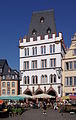
- Nomination Trier, the mediaval townhall called "Steipe" --Berthold Werner 12:27, 29 September 2009 (UTC)
- Promotion Good.-Cayambe 18:53, 30 September 2009 (UTC)
-
-

-

-
- Nomination Water tank in the West MacDonnell Ranges --99of9 05:45, 29 September 2009 (UTC). Comment Sharpness and composition are good. But there is CA (blue fringe) on top of the tank. Can you fix it? --Cayambe 19:00, 30 September 2009 (UTC) CommentNice pickup, thanks! I've had a bit of a fix, see if you like it now. --99of9 01:00, 1 October 2009 (UTC)
- Promotion Good job. Ok for me now. --Cayambe 06:15, 1 October 2009 (UTC)
- Nomination Water tank in the West MacDonnell Ranges --99of9 05:45, 29 September 2009 (UTC).
-

- Nomination Aerial view of Tembisa Extention outside Johannesburg in the late afternoon --Simisa 10:18, 26 September 2009 (UTC)
- Decline Quite noisy. Motion blur. May be ambitious shot, but not QI. --Johannes Robalotoff 18:06, 30 September 2009 (UTC)
-

- Nomination: Campanile of St. Mark's Basilica tower. Geotaged via category. --Kozuch 21:17, 23 September 2009 (UTC)
- Review Comment bit tilt CCW --George Chernilevsky 07:22, 24 September 2009 (UTC)
Comment You can't add camera position to the category, as each image is taken from a different position. For instance, here it would be useful to know where the camera was, because only then you know which sides are shown. Can you do that? -- H005 17:32, 24 September 2009 (UTC)
-

- Nomination In the Vaudois hill fortifications. --ComputerHotline 11:08, 23 September 2009 (UTC)
- Decline Comment Some minor stitching errors (grey clouds around tree in the sky)? -- Smial 13:58, 23 September 2009 (UTC) Oppose The strange "ghost" artifacts at the border between trees/walls and the sky, whether they come from stitching or not, are not minor in my opinion. --Johannes Robalotoff 17:30, 30 September 2009 (UTC)
-

- Nomination Salmon pink birdeater Lasiodora parahybana --George Chernilevsky 08:40, 23 September 2009 (UTC)
- Promotion Good. --Johannes Robalotoff 17:21, 30 September 2009 (UTC)
-
![* Nomination: Westertoren, Amsterdam, the Netherlands --Massimo Catarinella 22:17, 22 September 2009 (UTC) * Review Comment Excellent sharpness and color! Very nice. But the tower seems to be falling to the left. It needs some perspective correction. Can you fix that? --NormanB 07:06, 25 September 2009 (UTC) The tower is tilted and even bent in real life, so I'm not going to correct this. For more information see the ongoing discussion [here]. --Massimo Catarinella 10:02, 25 September 2009 (UTC)](https://upload.wikimedia.org/wikipedia/commons/thumb/c/ce/WestertorenAmsterdam.jpg/49px-WestertorenAmsterdam.jpg)
- Nomination: Westertoren, Amsterdam, the Netherlands --Massimo Catarinella 22:17, 22 September 2009 (UTC)
- Review Comment Excellent sharpness and color! Very nice. But the tower seems to be falling to the left. It needs some perspective correction. Can you fix that? --NormanB 07:06, 25 September 2009 (UTC) The tower is tilted and even bent in real life, so I'm not going to correct this. For more information see the ongoing discussion [here]. --Massimo Catarinella 10:02, 25 September 2009 (UTC)
-

- Nomination: Incubator for premature. Yann 11:17, 22 September 2009 (UTC)
- Review Comment Strongly tilted clockwise, unfortunate cut at lower image border. Rather noisy. Unsure if editing will help. --Johannes Robalotoff 20:12, 24 September 2009 (UTC)
-

- Nomination Flowering European Cornel, Luxembourg City. --Cayambe 16:30, 21 September 2009 (UTC)
- Decline Comment This looks tilted (to the left) to me? --Herbythyme 08:40, 22 September 2009 (UTC)
The cornel tree is tilted in reality and also so the tree at the right. The conifer at the left stands upright, which shows that the picture itself is not tilted. --Cayambe 09:35, 22 September 2009 (UTC)
Comment I do not see a tilt in this shot. I am neutral here as the composition doesn't allow the subject to stand out. --Relic38 03:23, 23 September 2009 (UTC) Oppose Too many overexposed pixels. Bright exposure also visually not attractive because of overall colour lightness. --Johannes Robalotoff 17:15, 30 September 2009 (UTC)
-

-

-

- Nomination U-Bahn station Brandenburger Tor, Berlin, Germany --Kemmi.1 18:27, 29 September 2009 (UTC)
- Promotion IMHO ok. Perhaps a bit noisy but that is ok in this situation (and really good for ISO 3200!) --Berthold Werner 06:11, 30 September 2009 (UTC)
-

- Nomination Hemerocallis fulva. --kallerna 16:55, 29 September 2009 (UTC)
- Promotion A bit spotty second plan (imho). - Darius Bauzys 17:03, 29 September 2009 (UTC)
-

- Nomination An old Ursus tractor --Airwolf 12:57, 29 September 2009 (UTC)
- Promotion Is Łukasz Golowanow a Wikipedian? --Mbdortmund 13:01, 29 September 2009 (UTC)
That happens to be me. Airwolf 13:18, 29 September 2009 (UTC)*g* sorry --Mbdortmund 15:52, 29 September 2009 (UTC)
-
-

- Nomination Sea shell from the Ranellidae family on sandstone foreshore --99of9 04:16, 29 September 2009 (UTC)
- Promotion nice --Mbdortmund 13:02, 29 September 2009 (UTC)
-

- Nomination Panorama from Strečno castle --Pudelek 14:15, 28 September 2009 (UTC)
- Promotion
Comment Very minor Stitching error in the tallest peak. It's not easily noticeable, but it should be easy to fix. --Relic38 02:03, 29 September 2009 (UTC) Comment hmm... on a single image this peak look the same. Probably this is not stitching error --Pudelek 11:22, 29 September 2009 (UTC)
OK, I believe you. Promoted --Relic38 12:16, 29 September 2009 (UTC)
-

- Nomination Grey heron looking for breakfast in the early morning light, Devon, UK.--Herbythyme 16:38, 27 September 2009 (UTC)
- Promotion Comment Excellent quality - except for the distorted horizon. Can you fix that? -- H005 18:34, 27 September 2009 (UTC)
More info on the distortion? Then maybe I can do something about it - I might even have some more taken at the same time :) Thanks --Herbythyme 19:59, 27 September 2009 (UTC)
Well, first the left end of the horizon is higher on the image than the right end - that shouldn't happen with a sea horizon. Second, it is not straight but having a curve, i.e. in the center its lower than to the left an right. This is probably coming from the automatic perspective correction of the camera, which apparently is working a bit over the top here. -- H005 20:44, 27 September 2009 (UTC)
Don't you think that it might be an illusion? I am not sure, if a single image taken with a good camera and a good lens could have such problems.--Mbz1 21:09, 27 September 2009 (UTC)
All fixed now, thanks to those who advised me :) --Herbythyme 14:50, 28 September 2009 (UTC). Excellent now IMO. --Cayambe 16:34, 28 September 2009 (UTC)
I agree, both issues (tilt and curve) are resolved, good work! -- H005 16:14, 29 September 2009 (UTC)~
-

- Nomination A Bell 407 helicopter --Airwolf 10:41, 27 September 2009 (UTC)
- Promotion Good quality. -- JovanCormac 11:22, 27 September 2009 (UTC) Question The left crop is rather tight - any chance to make it wider? -- H005 18:35, 27 September 2009 (UTC) Comment On the original image itself - no. However, since there are no clouds there, it should be easy to "stretch" the blue sky a bit to the right without it being noticeable. Airwolf 09:18, 28 September 2009 (UTC)
That would most certainly make it much better. -- H005 16:16, 29 September 2009 (UTC)
-

- Nomination Aeshna cyanea --ComputerHotline 16:54, 25 September 2009 (UTC)
- Decline Comment It's very difficult object to shooting, but too low sharpness for QI, too mutch noise, controversial framing. Darius Bauzys 10:43, 26 September 2009 (UTC) Oppose It is a pitty, but for reasons mentioned by Darius, IMO not good enough for QI --NormanB 19:44, 29 September 2009 (UTC)
-

- Nomination Sympetrum striolatum --ComputerHotline 16:54, 25 September 2009 (UTC)
- Decline Neutral Generally good, but not enough sharpness. Darius Bauzys 10:52, 26 September 2009 (UTC) Oppose Sorry, but the DOF (Depth Of Field, Profondeur de champ) is simply too low for QI --NormanB 19:41, 29 September 2009 (UTC)
-

- Nomination Vanessa atalanta --Böhringer 20:04, 23 September 2009 (UTC)
- Decline Comment Generally very good, but the overexposed spots on the wings are somewhat disturbing. I am in doubt. --Johannes Robalotoff 20:54, 23 September 2009 (UTC) Comment Central bracketing is not appropriate in this photo, and need to be adjusted shadows/highlights. -- Darius Bauzys 06:03, 25 September 2009 (UTC)
I tried to do some curves adjustment of the insect itself, but I could not find a good balance. --Relic38 12:54, 29 September 2009 (UTC)
-

- Nomination Aeshna cyanea --Korall 18:53, 20 September 2009 (UTC)
- Decline Comment Very nice shot. But I am in doubt if sharpness is sufficient for QI. I know that it is sooo difficult to get such a subject any sharper... --Johannes Robalotoff 21:38, 23 September 2009 (UTC) Comment I think the settings of my camera will not let me expose pictures with flash shorter time than 1/200 sec. This litte fella is a very ski9lled and fast flyer and can also hover in midair like a helicopter. The sad thing is that I did not bring my external flash that day and the last days I went to the same spot it was not there, so I guess Ill have to wait til nexter summer to get at better shot.-- Korall 15:24, 24 September 2009 (UTC) Oppose Sorry, but quality is not enough for QI. - Darius Bauzys 07:24, 30 September 2009 (UTC)
-
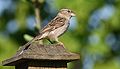
- Nomination Female House Sparrow (Passer domesticus) --Relic38 03:45, 29 September 2009 (UTC)
- Promotion Good. - Darius Bauzys 04:07, 29 September 2009 (UTC)
-

-

- Nomination Crepuscular Rays Golden Gate Bridge and San Francisco (similar to the one down below, but with a different tree) --Mbz1 17:54, 28 September 2009 (UTC)
- Promotion nice --Mbdortmund 17:56, 28 September 2009 (UTC)
-

-

-

- Nomination Sommerhausen, "Main" gate --Berthold Werner 08:42, 28 September 2009 (UTC)
- Promotion Good. --Cayambe 16:26, 28 September 2009 (UTC)
-

- Nomination Royal Crescent, Bath, by User:Diliff. —Maedin 06:51, 28 September 2009 (UTC)
- Promotion Sharp and good. --Cayambe 07:36, 29 September 2009 (UTC)
-

- Nomination Richmond, by User:Diliff. —Maedin 06:51, 28 September 2009 (UTC)
- Promotion Ok. But I'm wondering if those resolution is really useful. --Berthold Werner 08:46, 28 September 2009 (UTC)
Hi Berthold, I'm not quite sure what you mean? Do you want the resolution to be lower? Maedin 09:11, 28 September 2009 (UTC)
No. It was a rhetorical question ;-) --Berthold Werner 10:57, 28 September 2009 (UTC)
Ok, :) Maedin 12:18, 28 September 2009 (UTC)
-

- Nomination San Francisco with two bridges --Mbz1 22:30, 27 September 2009 (UTC)
- Promotion Would it be possible to geotag this photo? --J.smith 22:36, 27 September 2009 (UTC)
I added an aproximate location of the image. The image was taken from Alexander Ave. at w:Marin Headlands. The Avenue itself was in a very heavy fog in some places. I kept driving until I got out og the fog and was able to see the city and the bridge. I stopped in few places.Thank you for your question.--Mbz1 23:31, 27 September 2009 (UTC). Excellent. --Cayambe 16:39, 28 September 2009 (UTC)
-

- Nomination Pilgrimage oak, >500 y old, at Hersberg, Luxembourg. --Cayambe 10:58, 26 September 2009 (UTC)
- Promotion Good technical and aesthetic Albertus teolog 13:54, 28 September 2009 (UTC)
-

-

- Nomination Schoppernau --Böhringer 21:10, 23 September 2009 (UTC)
- Promotion
composition is really good but the church is slightly tilted cw --Mbdortmund 22:03, 23 September 2009 (UTC) Info Birds removed and rotated images by 0.5 ° --Böhringer 21:57, 25 September 2009 (UTC)
OK now --Mbdortmund 12:38, 28 September 2009 (UTC)
-

- Nomination Salmon pink birdeater Lasiodora parahybana --George Chernilevsky 08:40, 23 September 2009 (UTC)
- Promotion Good image. I think the subject looks better in this one. 99of9 06:01, 29 September 2009 (UTC)
-


_(30).jpg)


.jpg)


![* Nomination MacLaurin Hall at the University of Sydney --99of9 03:17, 20 October 2009 (UTC) * Withdrawn CommentThe sky contains too much green. --Berthold Werner 09:25, 20 October 2009 (UTC) Neutral Wrong, the sky has not enough blue ;-) ! The blue channel is blown. The resulting artifact colour of the sky looks unnatural. The people on the lawn are also overexposed. But the main subject is OK. Therefore I will neither support nor oppose. --Johannes Robalotoff 20:32, 20 October 2009 (UTC) CommentThanks for the reviews. I've uploaded a shot taken at the same time with different exposure which I think addresses the issues you've raised. --99of9 23:17, 20 October 2009 (UTC) There is the building a little bit dark. Perhaps you can use [1] to get the brighter version better. --Berthold Werner 17:25, 23 October 2009 (UTC) Thanks for the reference, but I don't use photoshop. I've put a third version up. --99of9 01:28, 25 October 2009 (UTC) Withdrawn: Many thanks to Berthold Werner who has uploaded a better version. 99of9 13:13, 25 October 2009 (UTC)](/wiki/File:SydneyUniversity_MacLaurinHall.jpg)


.jpg)


.jpg)


.JPG)
.JPG)


.jpg)


.JPG)


.jpg)
.jpg)


_(7).jpg)
_(8).jpg)


.jpg)
.jpg)


.jpg)


_(11).jpg)

.jpg)
.jpg)


_(9).jpg)
_(10).jpg)


_1.jpg)


_-_pia%C5%A3a_Unirii_1.JPG)
_-_pia%C5%A3a_Unirii_2.jpg)
_-_pia%C5%A3a_Unirii.JPG)

.jpg)


.jpg)


_-_Mari%C3%A1nske_n%C3%A1mestie.jpg)


.jpg)


![* Nomination Argentine cellist Sol Gabetta. --S[1] 19:56, 26 September 2009 (UTC) * Decline It's a weak oppose only. I know it is very hard to get good quality portraits of celebrities, but on the other hand the standard here is not really what QI demands. Besides some technical shortcomings (sharpness, noise), she ought to look into the camera and not have a micro before her face. Sorry. -- H005 20:00, 2 October 2009 (UTC)](/wiki/File:Sol_Gabetta_2009.jpg)


_-_Kostol_Najsv%C3%A4tej%C5%A1ej_Trojice_a_Burianova_ve%C5%BEa.JPG)


.JPG)


-Relic38.JPG)

.JPG)


.jpg)


.JPG)
.JPG)


-Relic38.jpg)


.jpg)
-Relic38.JPG)
_(11).jpg)
_installation.jpg)
_(13).jpg)
.jpg)
Consensual review edit
File:Sommerhausen BW 25.JPG edit

- Nomination Germany, Sommerhausen, Flurersturm ("Flurers" tower) --Berthold Werner 08:30, 27 September 2009 (UTC)
- Withdrawn
- Oppose Strong chromatic aberration in the tree top. -- JovanCormac 11:26, 27 September 2009 (UTC)
- I'm not sure about this --Berthold Werner 06:32, 28 September 2009 (UTC)
- Comment Berthold, please look at the violet fringe around the tree branches on both sides. --Cayambe 12:39, 28 September 2009 (UTC)
- Oppose per JC. CA also visible on the top edge of the dormer. Otherwise, this is a nice shot. --Relic38 03:53, 29 September 2009 (UTC)
- Oppose Yes, CA is quite strong. Also tilted clockwise. --Johannes Robalotoff 18:50, 30 September 2009 (UTC)
File:Pont Napoléon (Luz-Saint-Sauveur).jpg edit
.jpg)
- Nomination Napoleonic bridge at Luz-Saint-Sauveur in Hautes-Pyrénées, France.--Herbythyme 10:11, 27 September 2009 (UTC)
- Decline
- Oppose Strong tilt and blown sky. Landscape is very nice, but not QI, really sad --George Chernilevsky 10:24, 27 September 2009 (UTC)
- I can't actually see the tilt (the bridge is level?) but the blown sky I accept :( Thanks George --Herbythyme 10:39, 27 September 2009 (UTC)
- At first glance I was tend to agree about the tilt, but then I looked at the trees in foreground and realized that there's no tilt, but rather an illusion of the tilt. Of course the sky is blown, but IMO the image could be improved, if most of the sky is cut off. --Mbz1 17:10, 27 September 2009 (UTC)
- Comment Tilt CW 1.5-2 - look trees at foreground and background and vertical elements of this bridge -- George Chernilevsky 17:51, 27 September 2009 (UTC)
- Oppose per George. Using the lamp post on the left and the house on the right, there is definitely a tilt/distortion of some kind. The blown sky is probably worse than the tilt. --Relic38 03:50, 29 September 2009 (UTC)
- Comment If the tilt was corrected and the picture was slightly cropped (cut a bit of left and top) I would support, because I can see this picture being used (e.g. in an article on Wikipedia). --NormanB 20:13, 29 September 2009 (UTC)
File:Sutro bath11.jpg edit

- Nomination Sutro Bath --Mbz1 18:39, 27 September 2009 (UTC)
- Decline nice details, interesting people, but isn't it tilted ccw when you look at the buildings? geo-coding would be nice --Mbdortmund 20:08, 27 September 2009 (UTC)
Thank you for the review. I thought it was OK because the standing people look OK to me. It is why I nominated it on QI to find out, if it is tilt because I am not sure. It will be interesting to see what other people think. I will add geo-coding now.--Mbz1 20:31, 27 September 2009 (UTC)
I agree with Mbdortmund. -- H005 20:46, 27 September 2009 (UTC)
I suppose it's more a perspective distortion, due to the fact that the camera was pointed downwards - so the buildings at the left side are slightly CCW tilted, but those at the right side are not. -- MJJR 20:52, 27 September 2009 (UTC)
Thank you. Of course anything is possible with that image. I took pictures from a very narrow {one person) staircase just above the breaking waves. One leg of my tripod was put to a lower step while two otheres to the upper, and btw that staircase is prohibited to go to because it considered to be unsafe. I tried to do my best, but with such conditions...--Mbz1 21:09, 27 September 2009 (UTC) Support Considerated the difficult shooting conditions and the general quality of the picture, the very slight and almost invisible tilt is negligible. QI! -- MJJR 08:58, 28 September 2009 (UTC) Oppose Sorry, I have to disagree. I see a strong tilt. Not sure whether one can use the buildings as a reference, these have apparently suffered a lot from their environment, but the water in the basin is clearly not level. This could easily be fixed, no matter how hard the conditons of taking the image were. -- H005 16:14, 29 September 2009 (UTC) Oppose Strong tilt ccw. Red channel is overexposed at the rock on the left. Besides huge file size is inappropriate. (Could be less than half as large without visible quality loss.) --Johannes Robalotoff 18:39, 30 September 2009 (UTC) Comment I don't see the "strong tilt" at all: unless one can see the horizon (which is not the case here), the vertical lines in a picture are the true guidelines for evaluating a tilt, and the verticals here are almost not tilted. By the way, it's also the first time I see a huge file size - which is normally considered as a quality - used as a negative argument. This is not only a pretty strange reasoning, it is also in contradiction with the Commons image guidelines where is stated: "Graphics located on Commons may be used in ways other than viewing on a conventional computer screen. They may be also used for printing or for viewing on very high resolution monitors. We can't predict what devices may be used in the future, so it is important that our best pictures have as high a resolution as possible." -- MJJR 19:14, 30 September 2009 (UTC)
- Concerning the strong tilt: Look at the water surface, as H005 wrote before. In our world water surfaces are always horizontal, if the water is not flowing fast. The basins show water in a static condition, but the surface is not horizontal at all on the picture. Concerning file size: I opposed against QI because of the tilt and the overexposure. I just mentioned the unfortunate file size, but this was obviously misunderstood. The image guidelines have quality in mind. Higher quality may increase file size, of course. But larger file size does not necessarily increase quality. There is a point where a picture does not win any more from larger JPEG file size. You can even open any JPEG file and store it again with larger file size, but this does obviously not increase quality, because you cannot add information this way that was lost before. Therefore my remark did not aim to "too much JPEG quality" but to "inappropriate JPEG compression". It does not damage the picture and it is no reason to oppose against QI. But it is something that should be corrected nevertheless, because large files cost storage, bandwidth and download time. Hope you understand me now. --Johannes Robalotoff 18:03, 1 October 2009 (UTC)
- I agree with your remark about the "inappropriate JPEG compression" and the uselessness of too big files. But I still disagree about the "strong tilt" of the water surface, which is IMHO mainly an optical effect. -- MJJR 18:31, 2 October 2009 (UTC)
- Don't know what you mean by "optical effect", but it is very clearly tilted. Compare it to File:SutroBathsandCliffHouse.jpg, this one is more or less straight. I'd fix it if I had the full image, an absolute no-brainer. -- H005 19:16, 2 October 2009 (UTC)
- I agree with your remark about the "inappropriate JPEG compression" and the uselessness of too big files. But I still disagree about the "strong tilt" of the water surface, which is IMHO mainly an optical effect. -- MJJR 18:31, 2 October 2009 (UTC)
- Concerning the strong tilt: Look at the water surface, as H005 wrote before. In our world water surfaces are always horizontal, if the water is not flowing fast. The basins show water in a static condition, but the surface is not horizontal at all on the picture. Concerning file size: I opposed against QI because of the tilt and the overexposure. I just mentioned the unfortunate file size, but this was obviously misunderstood. The image guidelines have quality in mind. Higher quality may increase file size, of course. But larger file size does not necessarily increase quality. There is a point where a picture does not win any more from larger JPEG file size. You can even open any JPEG file and store it again with larger file size, but this does obviously not increase quality, because you cannot add information this way that was lost before. Therefore my remark did not aim to "too much JPEG quality" but to "inappropriate JPEG compression". It does not damage the picture and it is no reason to oppose against QI. But it is something that should be corrected nevertheless, because large files cost storage, bandwidth and download time. Hope you understand me now. --Johannes Robalotoff 18:03, 1 October 2009 (UTC)
File:Brela's beach02.jpeg edit

- Nomination Rock beach in Brela, Croatia --Jos. 10:07, 26 September 2009 (UTC)
- Decline
- Support Good for me. Juliancolton 05:39, 28 September 2009 (UTC)
- Oppose Horizon is tilted and distracted --Berthold Werner 07:41, 30 September 2009 (UTC)
- Comment I cropped it. What do u think about it now? --Jos. 15:21, 30 September 2009 (UTC)
- Oppose A crop can't help for the tilt issue, it can only conceal it. But anyway, I oppose because of CA. (Look at the purple fringes on the rocks.) --Johannes Robalotoff 18:58, 30 September 2009 (UTC)
File:Strečno - view from castle2.jpg edit

- Nomination View from Strečno castle --Pudelek 14:15, 28 September 2009 (UTC)
- Decline
- Support Good in my opinion --Jos. 17:09, 28 September 2009 (UTC)
- Oppose Not as sharp in the background as the other one, and since this is about the view, I have to oppose. --Relic38 03:24, 29 September 2009 (UTC)
- Oppose I agree with Relic38 --NormanB 20:06, 29 September 2009 (UTC)
File:Admiral, Vanessa atalanta 3.JPG edit

- Nomination Vanessa atalanta --Böhringer 20:26, 26 September 2009 (UTC)
- Decline
- Support Fine with me.--Mbz1 22:42, 26 September 2009 (UTC)
- Oppose Sorry, the black splotches in the background distract me too much to recommend this. The butterfly itself is beautiful!--99of9 10:45, 29 September 2009 (UTC)
- Oppose Controversial angles (viewing angle is difficult to identify a butterfly), dark shadows, a narrow DOF. - Darius Bauzys 07:32, 30 September 2009 (UTC)
File:Campanile di Duomo di Lucca.jpg edit

- Nomination Campanile di Duomo di Lucca, Italia. -- H005 21:32, 18 September 2009 (UTC)
- Promotion
- Comment Unless this is a leaning tower, the image should be rotated (I'd say CW, 1-2 degrees). -- JovanCormac 06:59, 19 September 2009 (UTC)
- I'm pretty sure this wouldn't make it better, 1 to 2 degrees is much. Please check, the wall borders of the tower are exactly vertical. -- H005 08:54, 19 September 2009 (UTC)
- The tower is perfectly vertical as you can check with the ruler guides in gimp. But in my eyes perspective is overcorrected here. It makes me think that the tower gets wider towards the top, although you can measure with a ruler that this is not true. A similar visual effect might also have lead to the leaning impression for JovanCormac. --Johannes Robalotoff 12:33, 19 September 2009 (UTC)
- Second glance: The front wall of the tower is perfect. But the perspective correction had inconsistent effect on horizontal lines on the right wall that point away from the image plane. Hence my impression that the tower gets wider at the top and JovanCormac's impression that it is tilted. --Johannes Robalotoff 17:44, 19 September 2009 (UTC)
- Possibly. I'll upload a new version as soon as the current upload bug is fixed. -- H005 09:32, 20 September 2009 (UTC)
- I did check the sides with rulers, and the right edge is not perfectly aligned, but tilted counterclockwise. But Johannes is probably right that this is due to a perspective correction error. -- JovanCormac 13:37, 20 September 2009 (UTC)
- Info New version uploaded, better now? -- H005 22:24, 23 September 2009 (UTC) Comment Sky with error, look it at top right --George Chernilevsky 07:25, 24 September 2009 (UTC)
- Ooops, indeed, what an oversight, I'll fix that tonight. But apart from that, do you feel better about the tilt / perspective issue? -- H005 08:01, 24 September 2009 (UTC)
- The tilt / perspective are ok, but sky noised at blue areas --George Chernilevsky 08:20, 24 September 2009 (UTC)
- The geometry problems (tilt and perspective correction artifacts) are removed now. The noise in the blue regions is no problem for me. It is not really visually disturbing. You have already noticed the black upper right corner and said you will correct it. But why are the clouds now overexposed? This was not the case in the previous image version! --Johannes Robalotoff 17:09, 24 September 2009 (UTC)
- Info Fixed flaw in sky, exposure corrected, noise reduced. Anything else? ;-) I have no idea what happened to the exposure, hugin must ave done this when I restitched it. -- H005 21:38, 24 September 2009 (UTC)
- I do not want to get on your nerves, but although the last version is better than the previous one it is such a pity that the cloud is still blown out around the pinnacle. Compare it with the first version (the one with the geometry problems). It was so well exposed. Why does hugin do this to your picture? I never experienced that hugin touched my exposure, if I just stiched and did not click anything on the exposure tab. I am eagerly waiting to promote this picture one day ... ;-) --Johannes Robalotoff 20:13, 25 September 2009 (UTC)
- I do not know, apparently I accidentally fiddled around with the exposure setting, but I corrected it back to the original value. If I set the exposure any darker, the whole image is getting too dark. It seems that this is just because of the different projection. I don't think the small spot of white around the pole is really an issue. Btw, it's dominant only on thumbnail view, not in full size view. -- H005 21:28, 27 September 2009 (UTC)
- I do not want to get on your nerves, but although the last version is better than the previous one it is such a pity that the cloud is still blown out around the pinnacle. Compare it with the first version (the one with the geometry problems). It was so well exposed. Why does hugin do this to your picture? I never experienced that hugin touched my exposure, if I just stiched and did not click anything on the exposure tab. I am eagerly waiting to promote this picture one day ... ;-) --Johannes Robalotoff 20:13, 25 September 2009 (UTC)
- Support Great detail. 99of9 04:22, 1 October 2009 (UTC)
File:Duomo di Lucca back.jpg edit


- Nomination Lucca Cathedral viewed from the back -- H005 23:32, 18 September 2009 (UTC)
- Decline Support Good.--Mbz1 00:20, 19 September 2009 (UTC) Oppose Clockwise tilted --Berthold Werner 11:06, 19 September 2009 (UTC) Comment Nice subject but I do see tilt -Herbythyme 12:59, 19 September 2009 (UTC) Comment Yes, it looks tilted. If you measure it, the walls on the right are nearly vertical (tilt < 0.3 degrees). But the campanile at the left is tilted by about 1 degree, which is clearly visible. Can you rotate counter-clockwise by 0.5 degrees? Then it looks visually OK for me. I would not try to make all lines exactly vertical with perspective correction, because this could have visual side effects. --JRff (talk) 13:53, 19 September 2009 (UTC)
Info I have restitched it and will upload the new version as soon as the current upload bug is fixed. -- H005 09:34, 20 September 2009 (UTC) Info New version uploaded, any better now? -- H005 22:25, 23 September 2009 (UTC)
- The tilt of the Campanile is gone now. A bit less of perspective correction could even further improve the picture, as it has improved the Campanile-only image. Is this possible?--Johannes Robalotoff 17:36, 24 September 2009 (UTC)
- This isn't a result of perspective correction, but of Hugin. To me perspective looks just right, but if you think it'll be better I've slightly changed the viewing angle for a try, please have a look. -- H005 21:57, 24 September 2009 (UTC)
- You are right, it is not the perspective. I had this bent effect with hugin before. The third version does not make it better, but only makes the tower more leaning. Support I recommend the second version and give you support for this now. --Johannes Robalotoff 20:04, 25 September 2009 (UTC)
- You are right, it is not the perspective. I had this bent effect with hugin before. The third version does not make it better, but only makes the tower more leaning.
- This isn't a result of perspective correction, but of Hugin. To me perspective looks just right, but if you think it'll be better I've slightly changed the viewing angle for a try, please have a look. -- H005 21:57, 24 September 2009 (UTC)
- The tilt of the Campanile is gone now. A bit less of perspective correction could even further improve the picture, as it has improved the Campanile-only image. Is this possible?--Johannes Robalotoff 17:36, 24 September 2009 (UTC)
- What do you think of my proposal? --Mbdortmund 19:16, 28 September 2009 (UTC)
- Jeez, this must become FP when we're finished, after all those debates and edits. ;-) Thanks for your proposal. I see pros and cons. The rooftop is more straight and the tower less leaning, but the tower looks skew/distorted and the right end seems to be leaning now - more or less the same issues that I had in the first versions of this image and of the tower-only image above. Geometrically correct, but somehow it just doesn't look right. -- H005 20:07, 28 September 2009 (UTC)
- Oppose I'm sorry, but crop at bottom is very unhappy. I regret for the big done work -- George Chernilevsky 08:56, 29 September 2009 (UTC)
- Oppose I'm afraid I have to agree with George. If only we could see the bottom of the building. --99of9 04:19, 1 October 2009 (UTC)
- Info Which image are you referring to? We're voting for the first one here, and on this we can see the bottom of the building. Everything of it you can see in real life standing there is visible, just the surrounding grass strip can be considered too narrow. -- H005 15:05, 1 October 2009 (UTC)
- I was talking about the one on the right. The one on the left still seems to have a tilt. If we're voting on the left hand one, why is the right hand one here at all? 99of9 06:28, 2 October 2009 (UTC)
- Mbdortmund added it as an alternative. I do not believe it has a tilt anymore, see discussion above. -- H005 10:18, 2 October 2009 (UTC)
- I was talking about the one on the right. The one on the left still seems to have a tilt. If we're voting on the left hand one, why is the right hand one here at all? 99of9 06:28, 2 October 2009 (UTC)
File:Sharp Tor, Bolt Head.jpg edit

- Nomination Rock formation in South Devon, UK--Nilfanion 00:53, 2 October 2009 (UTC)
- Promotion
- Support Sharp tor is really sharp :)--Mbz1 04:06, 2 October 2009 (UTC)
- Support Good image & good quality now. --Herbythyme 16:44, 4 October 2009 (UTC)
- Support Good QI for me.--Cayambe 19:53, 4 October 2009 (UTC)
- Support Good for me.--99of9 22:35, 4 October 2009 (UTC)
File:Cormorant at Seaton.jpg edit

- Nomination A Great Cormorant resting in Cornwall --Nilfanion 00:53, 2 October 2009 (UTC)
- Decline
- Comment Not bad, but (IMO): there is not the central composition, dark shadows, the lack of sharpness. - Darius Bauzys 05:24, 2 October 2009 (UTC)
- Support Good and detailed --David Perez 16:51, 2 October 2009 (UTC)
- Oppose Oversharpened (haloes) and few details for the size. Lycaon 18:42, 2 October 2009 (UTC)
- Oppose Per Lycaon. --kallerna 21:20, 4 October 2009 (UTC)
- Oppose Too much of the bird is in the shadow so that you can't see much of it there. -- H005 08:54, 5 October 2009 (UTC)
File:ViewFromKingsCanyon.JPG edit

- Nomination View from Kings Canyon, Northern Territory, Australia. --99of9 00:31, 2 October 2009 (UTC)
- Promotion
- Support Nice rocks formation.--Mbz1 04:06, 2 October 2009 (UTC)
- Done Thanks for noticing Lycaon, I wasn't sure whether to go with my hand or the horizon. I've just uploaded a tilt corrected version. --99of9 04:06, 3 October 2009 (UTC)
- Support Good QI now. --Cayambe 19:54, 4 October 2009 (UTC)
- Support -- MJJR 21:11, 4 October 2009 (UTC)
- Support -- George Chernilevsky 05:33, 5 October 2009 (UTC)
File:Back-scattering crepuscular rays panorama.jpg edit

- Nomination Back-scattering crepuscular rays panorama (stitched manually) --Mbz1 19:27, 1 October 2009 (UTC)
- Promotion
- Support Wood for elves. Fantastic! -- George Chernilevsky 19:35, 1 October 2009 (UTC)
- OpposeStrong posterization and awkward use of DOF. Lycaon 18:47, 2 October 2009 (UTC)
I am not sure what does it mean "awkward use of DOF", but here's one of the original images (not postprocessed at all) that was used for the panorama File:Back-scattering crepuscular rays original.jpg. As you could see from the setting I've used F10 with Aperture priority. So what "awkward use of DOF" we are talking about?--Mbz1 19:13, 2 October 2009 (UTC)- This is Q(quality)I. Strong posterization should not be allowable. That is not quality. WOW is for FP. Lycaon 16:11, 4 October 2009 (UTC)
- Support Excellent! Yann 23:16, 2 October 2009 (UTC)
- Support Good - Darius Bauzys 10:09, 3 October 2009 (UTC)
- Support per Yann -Herbythyme 11:08, 3 October 2009 (UTC)
- Support Beautiful. Support levels indicate promotion. --99of9 14:16, 4 October 2009 (UTC)
- Oppose Posterization visible even on thumbnails. --kallerna 21:22, 4 October 2009 (UTC)
- Oppose for QI. I like very much the picture, but for FP. As Lycaon said "WOW is for FP".--DPC (talk) 09:10, 5 October 2009 (UTC)
File:Budapest_Gellért_R01.jpg edit

- Nomination Budapest (Hungary): Gellért Hotel seen from Szabadság Bridge -- MJJR 21:18, 28 September 2009 (UTC)
- Promotion Support Good QI and value --Mbz1 22:00, 28 September 2009 (UTC)
perspective should be corrected --Mbdortmund 21:46, 29 September 2009 (UTC)
I don't see a significant perspective distortion. Could you specify your remark, please? -- MJJR 19:31, 30 September 2009 (UTC)
Street lights on the left lean to the right side, walls of the buildings on the left, too, but not so strong --Mbdortmund 21:12, 1 October 2009 (UTC) Done Perspective corrected -- MJJR 18:20, 2 October 2009 (UTC)
- Comment Left side much better now. But street lights and walls on the right side still lean slightly outward, i.e. to the right. Otherwise very good. --Johannes Robalotoff 21:29, 2 October 2009 (UTC)
- In fact, one of the poles of the tram overhead wire at the right side is really leaning to the right; otherwise I think that the verticals are almost OK. It was never my intention to take a perfect picture, I am happy with a "very good" one ;-) -- MJJR 15:02, 3 October 2009 (UTC)
- Support OK. It is very good. --Johannes Robalotoff 15:34, 4 October 2009 (UTC)
File:Hrad Strečno - window.jpg edit

- Nomination Castle Strečno - window --Pudelek 11:24, 26 September 2009 (UTC)
- Decline
- Sorry, but the window is tilted. --Alchemist-hp 16:13, 26 September 2009 (UTC)
- Your are right, the window ist tilted, not the photograph ;-) --Berthold Werner 18:01, 26 September 2009 (UTC)
- Comment In the castle windows often are tilted :) --Pudelek 22:07, 26 September 2009 (UTC)
- Weak Oppose, not because of the tilt, but because of the cleanliness of the window. -- H005 08:50, 5 October 2009 (UTC)~
File:San Francisco with two bridges the fog and superior mirage.jpg edit
![]()
- Nomination San Francisco with two bridges the fog and superior mirage --Mbz1 04:06, 2 October 2009 (UTC)
- Promotion
- Support Very good. --Cayambe 10:16, 2 October 2009 (UTC)
- Oppose CW tilt. Lycaon 18:43, 2 October 2009 (UTC) ~- Tilt has been fixed but on closer viewing, sharpness of the bridges seems insufficient. Lycaon 16:03, 4 October 2009 (UTC)
- That's why I took the image of the bridge with most of it bellow the fog that nobody would see how unsharp it really is .--Mbz1 16:34, 4 October 2009 (UTC)
- I uploaded a new version. Is it fixed now? Thanks.--Mbz1 23:20, 3 October 2009 (UTC)
- Support I think Lycaon is a little too used to subjects where it is possible to get ultimate sharpness. This is quality image to me. --Herbythyme 16:43, 4 October 2009 (UTC)
- Again, this is not quality. If you think it has enough wow, then try FP by all means. You seem to be confusing FP, QI and even VI lately. Lycaon 19:49, 4 October 2009 (UTC)
- As a matter of fact the bridges that are seen as a silhouettse are really sharp enough, and they were not denoised. It is strange to say that the bridges are not sharp. The city is behind the bridge and it is sharp, and the bridges are not? Bay Bridge of course is far away, but is still sharp enough to see each individual cable. Besides one should take into accound atmospheric conditions. There are some layers above the fog that might be an issue. I aslo wonder, if opposers read the description of the image. There was a superior mirage at the hills. Seeing superior mirage is possible only, if something is going on in the atmosphere.--Mbz1 10:28, 5 October 2009 (UTC)
- The city isn't sharp either. Usually a sharp edge sould span two or three pixels, here it's five to six. It may be an effect of the stitching, too, I've noticed several times that stitched images lose sharpness. I read about the superior mirage, but it's hardly visible, I couldn't tell whether it's not just the usual hills. As I said, it's a great image that I really like - but our guidelines do not say anything about atmosphere. Anyway, I'm not really feeling strictly wrong about it being promoted, thus I change my admittedly weak oppose to Neutral. -- H005 17:38, 5 October 2009 (UTC)
- Please see this image File:Two frames image of superior mirage.jpg and compare the hills in two frames. Do you see how different they look? It is what superior mirage does with lanscape. Thanks.--Mbz1 21:02, 5 October 2009 (UTC)
- The city isn't sharp either. Usually a sharp edge sould span two or three pixels, here it's five to six. It may be an effect of the stitching, too, I've noticed several times that stitched images lose sharpness. I read about the superior mirage, but it's hardly visible, I couldn't tell whether it's not just the usual hills. As I said, it's a great image that I really like - but our guidelines do not say anything about atmosphere. Anyway, I'm not really feeling strictly wrong about it being promoted, thus I change my admittedly weak oppose to
- As a matter of fact the bridges that are seen as a silhouettse are really sharp enough, and they were not denoised. It is strange to say that the bridges are not sharp. The city is behind the bridge and it is sharp, and the bridges are not? Bay Bridge of course is far away, but is still sharp enough to see each individual cable. Besides one should take into accound atmospheric conditions. There are some layers above the fog that might be an issue. I aslo wonder, if opposers read the description of the image. There was a superior mirage at the hills. Seeing superior mirage is possible only, if something is going on in the atmosphere.--Mbz1 10:28, 5 October 2009 (UTC)
- Comment If this was just a photo of a bridge, it would fail badly (as you can not see much of the bridge ;-). But it is a photo of atmospheric conditions, fuzzy things like fog, and distortions caused by atmospheric layers, and the scene as observed under those conditions. Do we complain a reproduction of a black and white photo lacks colour? Similarly can you complain that photographs of clouds are not sharp, when in fact clouds are not sharp edged objects. "Quality" is in terms of the scene - how well the photographer depicts the subject. --Tony Wills 11:23, 5 October 2009 (UTC)
File:Strandkörbe Eckernförde.jpg edit

- Nomination Info This image was discussed during the past couple of weeks; some didn't like the DOF and crop, others did, overall it was a straw. Thus I'm renominating it together with the uncropped version (as a separate nomination). Please note: The idea about the crop and DOF is that the row of strandkorbs should seem to have no beginning and no end, that reach from some indefinite place close to the viewer until the horizon. -- H005 12:48, 2 October 2009 (UTC)
- Decline
- Support I certainly see this as a quality image. --Herbythyme 15:25, 2 October 2009 (UTC)
- Oppose Too far not QI for me. Low DOF, too blue -- George Chernilevsky 05:39, 5 October 2009 (UTC)
- I told you about the colour, it's end of season, cloudy, cold, the strandkorbs have become useless - that's the point of the image - see its description. I don't think a sunny shot or manipulating white balance would improve the point here. -- H005 09:07, 6 October 2009 (UTC)
- Personally I am happy to accept the fact that the image is what the photographer saw (within reason). As such changing the colour to "unreal" would seem wrong. As to DOF I think it adds something to the image in the the foreground is in sharp focus & the distant object less so emphasising the quantity? -Herbythyme 09:33, 6 October 2009 (UTC)
- My voting is my sincere fair decision. I did not wish to offend personally H005. But promotion of photo with avergade quality is not well for customers. -- George Chernilevsky 10:15, 6 October 2009 (UTC)
- I value your opinion, it's just not mine, thus I wanted to comment on it. :-) -- H005 16:04, 6 October 2009 (UTC)
- My voting is my sincere fair decision. I did not wish to offend personally H005. But promotion of photo with avergade quality is not well for customers. -- George Chernilevsky 10:15, 6 October 2009 (UTC)
- Personally I am happy to accept the fact that the image is what the photographer saw (within reason). As such changing the colour to "unreal" would seem wrong. As to DOF I think it adds something to the image in the the foreground is in sharp focus & the distant object less so emphasising the quantity? -Herbythyme 09:33, 6 October 2009 (UTC)
- I told you about the colour, it's end of season, cloudy, cold, the strandkorbs have become useless - that's the point of the image - see its description. I don't think a sunny shot or manipulating white balance would improve the point here. -- H005 09:07, 6 October 2009 (UTC)
- OpposeI don't like the crop on this one, but I don't mind the DOF, so I will support the other version. --99of9 11:14, 7 October 2009 (UTC)
File:Kirche-Habenscheid-JR-G6-3792-2009-08-06.jpg edit

- Nomination Medieval church at Habenscheid, Germany. --Johannes Robalotoff 21:03, 24 September 2009 (UTC)
- Promotion
- Comment Perspektive should be corrected, could be crisper at full solution --Mbdortmund 23:06, 24 September 2009 (UTC)
- Info You are right. I will try to correct it tomorrow. --Johannes Robalotoff 20:56, 25 September 2009 (UTC)
- Info Just uploaded the corrected version. Please review again. --Johannes Robalotoff 20:47, 27 September 2009 (UTC)
- Comment Perspective looks OK now, but I don't see the crispiness. By the way: I liked the previous crop better. --NormanB 01:05, 4 October 2009 (UTC)
- Oppose Viewpoint is not good: object looks flat and empty: there are only some colored areas (blue, gray, dark gray, green) and nothing else. Too much cropped.--Kae
- Explanation. IMO the most problem is too flat view: object looks like 2 pieces of plywood. I'd suggest to take a shot from other point of view to avoid flatness, in softer light, probably with some clouds on background sky. --Kae 19:31, 6 October 2009 (UTC)
- Info According to the history, the anonymous decline came from user Kae. Please sign correctly next time.
- Comment I find the color argument strange. If the purpose is to show a very old church and this object is not more colourful, I cannot add colours just to make it look nicer. I have seen QI images here that did not envolve more different and more saturated colours. Concerning the "crispiness": I used rather low sharpening parameters, because I liked it better this way. But I can try to add more sharpening this evening, if crispiness is really an issue for you. --Johannes Robalotoff 15:13, 4 October 2009 (UTC)
- Info Just uploaded a "crispier" version with wider crop. Please review again. --Johannes Robalotoff 16:12, 4 October 2009 (UTC)
- Support The crop is a lot better now and the crisp is there too. IMO good enough for QI now. --NormanB 00:22, 6 October 2009 (UTC)
- Support The top crop is a bit tight and generally I liked the crop of the first uploaded version more, but nonetheless I think it's a QI as it is now. -- H005 16:08, 6 October 2009 (UTC)
File:Pine Siskin Female (10776)-Relic38.JPG edit
-Relic38.JPG)
- Nomination Female Pine Siskin --Relic38 03:49, 30 September 2009 (UTC)
- Promotion
- Comment Around bird and feeder visible light bar. - Darius Bauzys 07:15, 30 September 2009 (UTC)
- Comment I'll have to check the original, as I didn't do much sharpening at all, as it didn't need much. --Relic38 19:02, 30 September 2009 (UTC)
- Info Moving to Discuss. It is in the original from the camera as well. It's 1-2 pixels wide around the bird's breast and other areas to a lesser extent. Until it was pointed out I didn't notice it. --Relic38 02:06, 1 October 2009 (UTC)
- Support It's good for me.--UrLunkwill 14:02, 1 October 2009 (UTC)
- Support good quality -- George Chernilevsky 20:17, 1 October 2009 (UTC)
- Oppose Oversharpening haloes and CA (check legs for instance). Lycaon 18:54, 2 October 2009 (UTC)
- Oppose Agree with Lycaon. --Johannes Robalotoff 21:19, 2 October 2009 (UTC)
- Oppose Mostly because of CA. --kallerna 21:24, 4 October 2009 (UTC)
- Support CA and halos are hardly visible. -- H005 08:52, 5 October 2009 (UTC)
- Support --David Perez 09:06, 5 October 2009 (UTC)
- Comment I agree the CA is minimal, QI has never been about perfect images --Tony Wills 11:30, 5 October 2009 (UTC)
- Support Overall quality is good IMO. Agree with H005 and Tony Wills. --Cayambe 10:16, 7 October 2009 (UTC)
File:Radiotélescopes du Plateau de Bure.JPG edit

- Nomination Radio telescopes of Plateau de Bure (France) --Qdou 16:11, 3 October 2009 (UTC)
- Promotion
- Support Interesting & clear picture. --99of9 02:30, 4 October 2009 (UTC)
- Oppose Sorry, the telescope near the left edge is cropped, spoiling the composition. - Till.niermann 10:54, 6 October 2009 (UTC)
- Comment I am missing a geocode. -- H005 11:06, 6 October 2009 (UTC)
- Info Geolocation added. -- Qdou 16:12, 6 October 2009 (UTC)
- Thanks, I just noticed that I've been just a few hundred meters from there in spring and didn't know of those telescopes being there! Interesting ... If I return there I'll have a closer look! -- H005 16:26, 8 October 2009 (UTC)
- Comment I do like the image however the crop is a little unfortunate, reflecting on this one. -Herbythyme 10:50, 7 October 2009 (UTC)
- Support unusual subject. ----Archaeodontosaurus 06:25, 8 October 2009 (UTC)
- Weak Support The crop is indeed bad, but the rest is really good. -- H005 16:26, 8 October 2009 (UTC)
File:Piper L-4H Grasshopper Góraszka 2008 2.JPG edit

- Nomination Piper L-4H Grasshopper --Airwolf 21:11, 2 October 2009 (UTC)
- Decline Support Nice. I'm glad someone cares about planes more than I do :). --99of9 13:33, 4 October 2009 (UTC)
- Oppose Subject is far too dark, features can hardly be seen. --Eusebius 16:05, 4 October 2009 (UTC)
- Oppose As per Eusebius above. - Till.niermann 11:01, 6 October 2009 (UTC)
- Oppose for the same reason. -- H005 16:18, 8 October 2009 (UTC)
- Oppose To dark indeed. -- Ichneumon 14:36, 8 October 2009 (UTC)
File:Strandkörbe Eckernförde.jpg edit
- Nomination Info This image was discussed during the past couple of weeks; some didn't like the DOF and crop, others did, overall it was a straw. Thus I'm renominating it together with the uncropped version (as a separate nomination). Please note: The idea about the crop and DOF is that the row of strandkorbs should seem to have no beginning and no end, that reach from some indefinite place close to the viewer until the horizon. -- H005 12:48, 2 October 2009 (UTC)
- Decline
- Support I certainly see this as a quality image. --Herbythyme 15:25, 2 October 2009 (UTC)
- Oppose Too far not QI for me. Low DOF, too blue -- George Chernilevsky 05:39, 5 October 2009 (UTC)
- I told you about the colour, it's end of season, cloudy, cold, the strandkorbs have become useless - that's the point of the image - see its description. I don't think a sunny shot or manipulating white balance would improve the point here. -- H005 09:07, 6 October 2009 (UTC)
- Personally I am happy to accept the fact that the image is what the photographer saw (within reason). As such changing the colour to "unreal" would seem wrong. As to DOF I think it adds something to the image in the the foreground is in sharp focus & the distant object less so emphasising the quantity? -Herbythyme 09:33, 6 October 2009 (UTC)
- My voting is my sincere fair decision. I did not wish to offend personally H005. But promotion of photo with avergade quality is not well for customers. -- George Chernilevsky 10:15, 6 October 2009 (UTC)
- I value your opinion, it's just not mine, thus I wanted to comment on it. :-) -- H005 16:04, 6 October 2009 (UTC)
- My voting is my sincere fair decision. I did not wish to offend personally H005. But promotion of photo with avergade quality is not well for customers. -- George Chernilevsky 10:15, 6 October 2009 (UTC)
- Personally I am happy to accept the fact that the image is what the photographer saw (within reason). As such changing the colour to "unreal" would seem wrong. As to DOF I think it adds something to the image in the the foreground is in sharp focus & the distant object less so emphasising the quantity? -Herbythyme 09:33, 6 October 2009 (UTC)
- I told you about the colour, it's end of season, cloudy, cold, the strandkorbs have become useless - that's the point of the image - see its description. I don't think a sunny shot or manipulating white balance would improve the point here. -- H005 09:07, 6 October 2009 (UTC)
- OpposeI don't like the crop on this one, but I don't mind the DOF, so I will support the other version. --99of9 11:14, 7 October 2009 (UTC)
File:Kirche-Habenscheid-JR-G6-3792-2009-08-06.jpg edit
- Nomination Medieval church at Habenscheid, Germany. --Johannes Robalotoff 21:03, 24 September 2009 (UTC)
- Promotion
- Comment Perspektive should be corrected, could be crisper at full solution --Mbdortmund 23:06, 24 September 2009 (UTC)
- Info You are right. I will try to correct it tomorrow. --Johannes Robalotoff 20:56, 25 September 2009 (UTC)
- Info Just uploaded the corrected version. Please review again. --Johannes Robalotoff 20:47, 27 September 2009 (UTC)
- Comment Perspective looks OK now, but I don't see the crispiness. By the way: I liked the previous crop better. --NormanB 01:05, 4 October 2009 (UTC)
- Oppose Viewpoint is not good: object looks flat and empty: there are only some colored areas (blue, gray, dark gray, green) and nothing else. Too much cropped.--Kae
- Explanation. IMO the most problem is too flat view: object looks like 2 pieces of plywood. I'd suggest to take a shot from other point of view to avoid flatness, in softer light, probably with some clouds on background sky. --Kae 19:31, 6 October 2009 (UTC)
- Info According to the history, the anonymous decline came from user Kae. Please sign correctly next time.
- Comment I find the color argument strange. If the purpose is to show a very old church and this object is not more colourful, I cannot add colours just to make it look nicer. I have seen QI images here that did not envolve more different and more saturated colours. Concerning the "crispiness": I used rather low sharpening parameters, because I liked it better this way. But I can try to add more sharpening this evening, if crispiness is really an issue for you. --Johannes Robalotoff 15:13, 4 October 2009 (UTC)
- Info Just uploaded a "crispier" version with wider crop. Please review again. --Johannes Robalotoff 16:12, 4 October 2009 (UTC)
- Support The crop is a lot better now and the crisp is there too. IMO good enough for QI now. --NormanB 00:22, 6 October 2009 (UTC)
- Support The top crop is a bit tight and generally I liked the crop of the first uploaded version more, but nonetheless I think it's a QI as it is now. -- H005 16:08, 6 October 2009 (UTC)
File:Pine Siskin Female (10776)-Relic38.JPG edit
- Nomination Female Pine Siskin --Relic38 03:49, 30 September 2009 (UTC)
- Promotion
- Comment Around bird and feeder visible light bar. - Darius Bauzys 07:15, 30 September 2009 (UTC)
- Comment I'll have to check the original, as I didn't do much sharpening at all, as it didn't need much. --Relic38 19:02, 30 September 2009 (UTC)
- Info Moving to Discuss. It is in the original from the camera as well. It's 1-2 pixels wide around the bird's breast and other areas to a lesser extent. Until it was pointed out I didn't notice it. --Relic38 02:06, 1 October 2009 (UTC)
- Support It's good for me.--UrLunkwill 14:02, 1 October 2009 (UTC)
- Support good quality -- George Chernilevsky 20:17, 1 October 2009 (UTC)
- Oppose Oversharpening haloes and CA (check legs for instance). Lycaon 18:54, 2 October 2009 (UTC)
- Oppose Agree with Lycaon. --Johannes Robalotoff 21:19, 2 October 2009 (UTC)
- Oppose Mostly because of CA. --kallerna 21:24, 4 October 2009 (UTC)
- Support CA and halos are hardly visible. -- H005 08:52, 5 October 2009 (UTC)
- Support --David Perez 09:06, 5 October 2009 (UTC)
- Comment I agree the CA is minimal, QI has never been about perfect images --Tony Wills 11:30, 5 October 2009 (UTC)
- Support Overall quality is good IMO. Agree with H005 and Tony Wills. --Cayambe 10:16, 7 October 2009 (UTC)
File:Inside Balconies Cave at Pinnacles National Park.jpg edit

- Nomination Inside Balconies Cave --Mbz1 17:44, 8 October 2009 (UTC)
- Withdrawn Comment looks like you added too much blue (?) -- H005 20:14, 8 October 2009 (UTC)
Do you mean to the sky or all over?--Mbz1 20:35, 8 October 2009 (UTC)
All over. Those blue spots on the rocks look like what happens if you play around with saturation, luminance and tone of the blue channel to make the sky look more blue. I might be wrong, but what else could they come from? -- H005 20:39, 8 October 2009 (UTC)
I did not do any of the things you mentioned. It is my first HDR try. I did not do anything manually in HDR and let the program to figure out what to do. It was very dark inside the cave, yet the sky overhead was very bright. It was a hard image to take. I have no idea what real colors of the rocks were, but maybe a long exposure and HDR done something to add those blue? So know you know what was done to the image. Do you still believe the blue color should be reduced? Thanks.--Mbz1 20:55, 8 October 2009 (UTC)
I corrected the colors. Is it better now?--Mbz1 23:10, 8 October 2009 (UTC) Oppose Sorry, no. It's an interesting image and might even run for FP, but for QI it just looks too wrong to me. But I'd be interested in more opnions. -- H005 17:27, 10 October 2009 (UTC)
You are right, there's something wrong with the colors. Thank you for review --Mbz1 03:08, 11 October 2009 (UTC)
File:Kirschblüte mit Hummel.jpg edit

- Nomination Bumblebee. --Ichneumon 22:06, 7 October 2009 (UTC)
- Decline
- Support The insect itself is not the sharpest, but the overall image is very nice and of good quality. -- H005 20:17, 7 October 2009 (UTC)
- Tree has full ID and bumblebee is not the main object. I do not think you can get much better than the current category here. -- H005 16:22, 8 October 2009 (UTC)
- Oppose I'm not worried about the ID, but I'd want the bee sharper, because even if it's not the main object, it's pretty central to the image! --99of9 01:25, 9 October 2009 (UTC)
- Oppose ID and category now OK, but i fully agree with 99of9 after second look -- George Chernilevsky 05:26, 9 October 2009 (UTC)
File:Sbots.jpg edit

- Nomination Two S-bots mobile robots on a glass table. --Stéphane Magnenat 08:26, 7 October 2009 (UTC)
- Promotion
- Support Excellent, though I do not understand what these robots are capable of :-). --Cayambe 12:37, 7 October 2009 (UTC)
- Question Sorry, I would like to understand the reason for the low DOF. -- H005 19:17, 7 October 2009 (UTC)
- The picture was originally made to illustrate the behaviour of a scientific experiment whereby robots are attracted by other robots when they signal a source of food (original paper). The limited DOF is meant to illustrate the distance that the attracted robot is about to cross toward the food token. Abeyeler (talk) 21:42, 8 October 2009 (UTC)
File:VespaFrance.jpg edit

- Nomination European Hornet. Vespa crabro (Head 6mm) --Archaeodontosaurus 14:29, 10 October 2009 (UTC).
- Decline Support Impressive and good. --Cayambe 08:25, 11 October 2009 (UTC)
- Oppose Unsharp. --kallerna 17:25, 12 October 2009 (UTC)
Depends what you are focussing on - the eyes are sharp for example. I would not expect the whole of such an image to be sharp so I Support -Herbythyme 16:39, 13 October 2009 (UTC) - Oppose Indeed nothing sharp and also quite noisy. Lycaon 20:35, 13 October 2009 (UTC)
File:Damülser Mittagspitze Herbst.JPG edit

- Nomination Autumn on Damülser Mittagsspitze --Böhringer 21:20, 10 October 2009 (UTC)
- Promotion Comment Would benefit a lot if cropped at the top, so that mountains gain more weight relative to the sky. Otherwise good. --Johannes Robalotoff 22:07, 10 October 2009 (UTC) SupportGood idea and good execution . --Archaeodontosaurus 17:17, 12 October 2009 (UTC) SupportI think it's good as is (peak positioned according to rule of thirds), although I wouldn't object to the suggested crop. --99of9 06:56, 12 October 2009 (UTC) Support good clear image, crop if you like but I'm happy. -Herbythyme 16:37, 13 October 2009 (UTC)
File:Seestern Wendemanöver.jpg edit

- Nomination Seestern beim Wenden --Böhringer 20:21, 9 October 2009 (UTC)
- Decline Support Very Good Naturalist Work--Archaeodontosaurus 17:14, 10 October 2009 (UTC) Oppose Not identified. Lycaon 22:05, 11 October 2009 (UTC) Comment This is illustrating starfish motion, not illustrating a particular species, as such I don't think species ID is crucial. --Tony Wills 00:22, 12 October 2009 (UTC) OpposeIf it is about the locomotion, why is the first picture rotated with respect to the second two? --99of9 00:09, 13 October 2009 (UTC)
For locomotion it should be a film or more frames. --Estrilda 10:22, 13 October 2009 (UTC)
File:Barbar.jpg edit

- Nomination Belgian shepherd dog - Malinois --Multimotyl 20:09, 14 October 2009 (UTC)
- Decline
- Support Good. --Johannes Robalotoff 21:20, 14 October 2009 (UTC)
- Oppose the flash is distracting, first of all concerning the eyes --Mbdortmund 09:47, 15 October 2009 (UTC)
- Oppose For a posed shot, the composition is poor : the tree looks like it's growing out of the dog's head. --Ianare 03:42, 16 October 2009 (UTC)
File:ComputerHotline - Fort du Salbert (by) (11).jpg edit
_(11).jpg)
- Nomination Inside the Salbert hill fortifications. --ComputerHotline 16:16, 14 October 2009 (UTC)
- Decline
- Oppose Mess, bad light Multimotyl 19:57, 14 October 2009 (UTC)
- Comment I would like to understand what you mean with 'bad' here. Why is it bad? There could be a white balance problem and a tilt, as far as I can see. But just 'bad' is too simple for me to decline a serious effort. --Johannes Robalotoff 21:35, 14 October 2009 (UTC)
- Comment Wall structure isn't fine, no contrast there. I don't see the texture of the wall (as on the ceiling) Its just a point and click photo, not "quality photo".
- Comment The colors are good for me. The problem is the crop at the top IMO. Yann 00:31, 15 October 2009 (UTC)
- Comment What's wrong about the "mess"? That's a natural part of the scene. And preparing a tone-mapped HDR whose colours still look somewhat natural is anything but "point and click", it's a serious effort, well-documented and geocoded. If the tilt is removed, I'll support it. -- H005 22:03, 15 October 2009 (UTC)
- Comment I just expect of a quality picture quality. If this picture's purpose is to illustrate the mess in the Fort du Salbert, then it does in good way. But if it's purpose is to show us what such a fort looks like, then it is not good.
- Oppose Colors are not right, looks like too much yellow. Mess is fine for me, it's an accurate reprensentation of the fort in modern times. --Ianare 03:40, 16 October 2009 (UTC)
File:Bothus mancus in Hawaii.jpg edit

- Nomination Bothus mancus in Hawaii --Mbz1 22:27, 11 October 2009 (UTC)
- Promotion
- Support Very Good Naturalist Work- --Archaeodontosaurus 07:53, 12 October 2009 (UTC)
- Comment looks like color balance is a little off (too blue), should be easy adjust. --Ianare 13:59, 14 October 2009 (UTC)
- How one could tell what color that fish was, if the fish himself was not sure about that :) This is a very, very unusual flounder. He should not have been bi-color as he was. I have seen many flouners in the wild, but not a single time like that one before. About the blue, here I uploaded a close up image of his head, the original one, the one that was not post processed at all File:Bothus mancus in Hawaii close up.JPG. How about blue now? --Mbz1 15:27, 14 October 2009 (UTC)
- Didn't mean the flounder in particular, but the sand on upper right seems a bit blue shifted. In any case it's not sufficiently pronounced for me to oppose. --Ianare 03:33, 16 October 2009 (UTC)
- How one could tell what color that fish was, if the fish himself was not sure about that :) This is a very, very unusual flounder. He should not have been bi-color as he was. I have seen many flouners in the wild, but not a single time like that one before. About the blue, here I uploaded a close up image of his head, the original one, the one that was not post processed at all File:Bothus mancus in Hawaii close up.JPG. How about blue now?
- Support Multimotyl 15:29, 15 October 2009 (UTC)
- Support - Darius Baužys 05:48, 16 October 2009 (UTC)
File:Shalechet (Fallen leaves) installation.jpg edit
- Nomination Fallen leaves-installation in the Jewish Museum Berlin --Kemmi.1 18:54, 12 October 2009 (UTC)
- Promotion
- Support Powerful image!--Mbz1 19:03, 12 October 2009 (UTC)
I get the impression that nothing is actually in focus here and that there is quit a bit of color noise? --Estrilda 10:12, 13 October 2009 (UTC)
- The image was taken with ISO 5.600, so of course there is some visible noise. Noise reduction via software may have caused the loss of absolute sharpness and some details.--Kemmi.1 16:30, 13 October 2009 (UTC) - Oppose Why ISO 5600? Why not tripod + long exposure? --kallerna 16:51, 13 October 2009 (UTC)
- You're right - But the use of Tripods is not allowed within the Jewish Museum...Kemmi.1 17:30, 13 October 2009 (UTC) - Support because the picture shows something of the atmosphere under difficult conditions --Mbdortmund 22:54, 14 October 2009 (UTC)
File:Seal Rocks from Cliff House before sunrise 1.jpg edit

- Nomination Seal Rocks from Cliff House before sunrise --Mbz1 18:45, 12 October 2009 (UTC)
- Promotion
- Support nice --Ianare 05:53, 13 October 2009 (UTC)
Nice, out-of-this-world effect with the mist, but it also looks very much over saturated. --Estrilda 10:15, 13 October 2009 (UTC)
- It is not over saturated at all. The Exposure time was 110/1 sec (110).--Mbz1 12:40, 13 October 2009 (UTC)
Support -Herbythyme 16:41, 13 October 2009 (UTC)
- It is not over saturated at all. The Exposure time was 110/1 sec (110).--Mbz1 12:40, 13 October 2009 (UTC)
- CommentI didnt know that kind of camera could have so long exposure time. Did you hold the button down in manual mode for two minutes? Or how did you do?--Korall 17:17, 13 October 2009 (UTC)
- My camera has "bulb". I'm using cable release in order do not disturb the camera, and I could do the exposure for as long as I like or untill the battery lasts anyway :)--Mbz1 19:56, 13 October 2009 (UTC)
- CommentGood thing with the forums here is that I learn a lot about photography. Cool thing with cable release, i think ill look around for one. --Korall 20:32, 14 October 2009 (UTC)
- You could even get remote control I guess.--Mbz1 03:15, 15 October 2009 (UTC)
- Support - Darius Baužys 12:59, 14 October 2009 (UTC)
- Support No question about it, this is QI. --NormanB (talk) 19:44, 15 October 2009 (UTC)
File:Duomo di Barga from below.jpg edit

- Nomination Il duomo di Barga from below -- H005 20:21, 6 October 2009 (UTC)
- Decline Nothing special, bad composition. Multimotyl 19:19, 14 October 2009 (UTC)
Thanks for the review, but can you elaborate on what you dislike about the composition? (Btw, "special" is a requirement for FP, not QI.) -- H005 21:42, 15 October 2009 (UTC)
![]() Oppose I agree that "special" is no requirement for QI. But the composition does not please me either. Therefore I was neutral for a long time. The bulky wall in foreground is very dominant, yet it is cropped. It also hides the lower part of the main subject, the church itself. Moreover, the very dark bush at the lower right corner, with even totally black pixel regions is somewhat distracting. So if have to decide now if I support or oppose, I would rather oppose, sorry. --Johannes Robalotoff 15:25, 17 October 2009 (UTC)
Oppose I agree that "special" is no requirement for QI. But the composition does not please me either. Therefore I was neutral for a long time. The bulky wall in foreground is very dominant, yet it is cropped. It also hides the lower part of the main subject, the church itself. Moreover, the very dark bush at the lower right corner, with even totally black pixel regions is somewhat distracting. So if have to decide now if I support or oppose, I would rather oppose, sorry. --Johannes Robalotoff 15:25, 17 October 2009 (UTC)
Thanks. These are at least some reasonable arguments (although I do not share your opinion for various reasons, but I don't want to argue about it, I just wanted an explanation. -- H005 19:19, 17 October 2009 (UTC)
File:Walkway Over the Hudson 5.JPG edit

- Nomination Walkway Over the Hudson, a footbridge over the Hudson River in New York, United States Juliancolton 22:09, 11 October 2009 (UTC)
- Decline Oppose not convinced of the composition --Mbdortmund 22:49, 14 October 2009 (UTC)
Can you explain what exactly is wrong with the composition? Juliancolton 14:07, 15 October 2009 (UTC)
the boy on the left is cut in half, and its not clear what you want to show, main object in this composition seams to be the balustrade which is not so interesting. Other opinions? --Mbdortmund 20:30, 15 October 2009 (UTC) OpposeAm I right that you were trying to capture both the walkway and the river? In the end you didn't have the field of view to capture the whole walkway, and the balustrade spoils the river. If only you were 15 feet tall. --99of9 22:34, 15 October 2009 (UTC)
Oppose Per 99of9. --Johannes Robalotoff 16:56, 17 October 2009 (UTC)
File:Lehtiä tuulessa.JPG edit

- Nomination Birch in wind. --kallerna 17:02, 12 October 2009 (UTC)
- Decline
- Sorry, even in windy conditions the bark should be sharp. --Cayambe 13:21, 13 October 2009 (UTC)
- Comment I would really like to hear another opinion, because this is not about the tree, it's about the wind. The bark is just OOF, the focus is on leaves. --kallerna 16:37, 13 October 2009 (UTC)
- Question If the tree is not important, why not remove it from the picture? And how is the wind visible in this picture? --NormanB 19:51, 15 October 2009 (UTC)
File:Zygaena lonicerae.jpg edit

- Nomination Narrow-bordered Five-spot Burnet (Zygaena lonicerae) - Darius Baužys 07:55, 13 October 2009 (UTC)
- Promotion
- Excellent, with a slight regret for the relatively small file size. --Cayambe 08:10, 13 October 2009 (UTC)
- Oppose Stark processing haloes. Details also suffered. Strong composition though. Lycaon 21:01, 13 October 2009 (UTC)
- Oppose This photo could have been so good if there were not the sharpening halos and, above all, strong posterization effects. The file size alone is no sufficient explanation for this defect. --Johannes Robalotoff 21:22, 13 October 2009 (UTC)
- Info I upload new version. Maybe now problems are fixed ? - Darius Baužys 12:42, 14 October 2009 (UTC)
- Not improved: Sadly to no avail. Quality is still very poor. Lycaon 17:47, 14 October 2009 (UTC)
- Have you identified more specifically: color, sharpness or something else. IMO no worse than File:Albino_Clouded_Sulphur,_MM158.jpg. Thank You. - Darius Baužys 19:41, 14 October 2009 (UTC)
- Comment Agree with Lycaon and still oppose. Far too much is still lost in posterization. Noise should be no problem at ISO 100. Why did your camera software kill the image? It is really a pity because the image would have been an excellent shot otherwise. --Johannes Robalotoff 18:04, 14 October 2009 (UTC)
- About posterization - or I do not see it here, or do not understand what is it. Can you define with NOTE, where you see posterization. Thank You. - Darius Baužys 19:17, 14 October 2009 (UTC)
- For what it is, see here. I have marked one of several regions in your image now, where I see a loss of detail characterized by flat spots in the same colour without colour gradients between. But maybe the pixels were just washed out by your overly-eager noise reduction in the camera software, and this might have caused something like local colour quantization. --Johannes Robalotoff 21:59, 14 October 2009 (UTC)
- About posterization - or I do not see it here, or do not understand what is it. Can you define with NOTE, where you see posterization. Thank You. - Darius Baužys 19:17, 14 October 2009 (UTC)
- Support good result -- George Chernilevsky 13:51, 14 October 2009 (UTC)
- Support Absolutely fine with me.--Mbz1 17:05, 14 October 2009 (UTC)
- Support small picture, great effect.--Archaeodontosaurus 20:00, 14 October 2009 (UTC)
- Oppose Per Lycaon. --kallerna 12:57, 15 October 2009 (UTC)
- Support Multimotyl 15:31, 15 October 2009 (UTC)
- Oppose oversharpened --Ianare 03:44, 16 October 2009 (UTC)
- Support This is way better than the spiders directly above. QI for me. 99of9 08:51, 19 October 2009 (UTC)
File:Inside Balconies Cave at Pinnacles National Monument 1.jpg edit

- Nomination Inside Balconies Cave at Pinnacles National Monument. --Mbz1 20:05, 11 October 2009 (UTC)
- Promotion
- Support. --Cayambe 07:05, 13 October 2009 (UTC)
- Strange colours and weird DOF fluctuations (OOF alternates with IF). Lycaon 20:41, 13 October 2009 (UTC)
- The place is very hard to take an image of. It is even hard to simply carry a tripod. The light is very, very uneven. Here's one of the images I found on Flickr to give you an idea how it looks.--Mbz1 00:39, 14 October 2009 (UTC)
- Support. --Archaeodontosaurus 16:03, 18 October 2009 (UTC)
File:SydneyUniversity_MainBuilding_Panorama.jpg edit

- Nomination Sydney University Main Building and Great Hall, morning. --99of9 03:55, 19 October 2009 (UTC)
- Decline
- Oppose Perspective needs correcting, plus there are some pretty strong halos on the left and right. It appears that the left and right-most images were not in good focus. --Relic38 15:37, 19 October 2009 (UTC)
- Question Thanks for your review. Perspective was corrected with ShiftN at 100%, what do you see as wrong with the perspective? Regarding the focus, the originals are all in equally good focus - I think the extremes look a little stretched because of the rectilinear projection. Perhaps I need to shoot this image with more than 3 frames? --99of9 20:44, 19 October 2009 (UTC)
- Comment The lack of sharpness at both ends of the panorama are created by Hugin; in my experience the problem can be reduced by playing around with Hugin's paramters a bit. -- H005 22:13, 19 October 2009 (UTC)
- Oppose This is an interesting discussion thus I move this review down here. When you are experimenting with multi row panoramics I recommend to use PTGui instead of Hugin. The newer versions of Hugin are called PTGui but unfortunately they are not free.
- The main critique I have for this picture is that there is no tone mapping. The dark building is too dark while the sky is just right. Tools like PTGui have such an option alternatively one can do this in Photoshop with shadows/highlights adjustment.
- I agree with Relic38 on the perspective. The vertical lines on the side of the image are tilted ~2°. Don't correct this until they are perfectly straight but leave about 0.5-1.0° to avoid overcorrection.
- When using a mediocre kit lens one can partially compensate for this by shooting in raw format and correct chromatic aberrations afterwards.
- Otherwise your pictures have potential to become really excellent. I'm looking forwart to your future projects. --Ikiwaner 06:35, 20 October 2009 (UTC)
File:Zaltbommel - Sint Maartenskerk - Panorama van de toren final medium.jpg edit

- Nomination The tower of the Saint Martin church in Zaltbommel, the Netherlands. A vertical panorama of 6x5 segments. --NormanB 19:19, 15 October 2009 (UTC)
- Decline Oppose nice details on the tower but why don't you crop the lower parts which are underexposured and not important for your main object? --Mbdortmund 20:36, 15 October 2009 (UTC) Info I have uploaded that as a separate version, but I like the detail of the sunlight shining through the old fence in this one. Other people I showed it to said the same. That's why. --NormanB 21:11, 15 October 2009 (UTC)
![]() Question Mbdortmund likes this one better, but does that mean that this one is not QI? --NormanB 23:18, 15 October 2009 (UTC)
Question Mbdortmund likes this one better, but does that mean that this one is not QI? --NormanB 23:18, 15 October 2009 (UTC)
no, it is possible that someone promotes this picture, too --Mbdortmund 17:14, 16 October 2009 (UTC)
![]() Oppose Lower region too dark. I'm not convinced the shadows add anything. --99of9 03:14, 17 October 2009 (UTC)
Oppose Lower region too dark. I'm not convinced the shadows add anything. --99of9 03:14, 17 October 2009 (UTC)
![]() Comment I agree that it is a matter of taste whether someone likes the foreground or not. But I wonder if the picture should be declined QI-status because of that. More opinions would be welcome. --NormanB 15:02, 18 October 2009 (UTC)
Comment I agree that it is a matter of taste whether someone likes the foreground or not. But I wonder if the picture should be declined QI-status because of that. More opinions would be welcome. --NormanB 15:02, 18 October 2009 (UTC)![]() Comment Composure and exposure are certainly declinable criteria, but I'm not particularly experienced here, so I'm also happy to hear other opinions.--99of9 10:01, 19 October 2009 (UTC)
Comment Composure and exposure are certainly declinable criteria, but I'm not particularly experienced here, so I'm also happy to hear other opinions.--99of9 10:01, 19 October 2009 (UTC)
![]() Comment I agree with others that the shadows in the foreground do not add any value to the image. --Cayambe 16:10, 19 October 2009 (UTC)
Comment I agree with others that the shadows in the foreground do not add any value to the image. --Cayambe 16:10, 19 October 2009 (UTC)
![]() Oppose The lower > 25% of the image should be cropped away, when this is done I'd support it. -- H005 11:01, 20 October 2009 (UTC)
Oppose The lower > 25% of the image should be cropped away, when this is done I'd support it. -- H005 11:01, 20 October 2009 (UTC)
File:Two Eobania vermiculata shell.jpg edit

- Nomination Eobania vermiculata shell --Butko 20:21, 17 October 2009 (UTC)
- Promotion
- OpposeThis is good image, but to be usuable in the encyclopedic article, it should be rotated left 90 degrees. Then it would be good for an article. But it is an ordinary photo, it is taken in sharp, but there are shadows. If there can be any quality image of an EMPTY shell, then it must be taken without shadows. --Snek01 15:20, 18 October 2009 (UTC)
- I rotate image --Butko 14:02, 19 October 2009 (UTC)
- Support Good. Yann 10:37, 22 October 2009 (UTC)
- Support QI for me -- George Chernilevsky 12:27, 22 October 2009 (UTC)
- Support for me, too --Mbdortmund 02:20, 25 October 2009 (UTC)
File:San Francisco with two bridges and the low fog .jpg edit
![]()
- Nomination Golden Gate Bridge and San Francisco --Mbz1 14:35, 16 October 2009 (UTC)
- Promotion Comment Nice shot, but sharpness could have been better I think. Did you use mirror-lockup? --NormanB 20:20, 16 October 2009 (UTC)
No I did not. It was windy and foggy. Even, where you do not see the fog on the image, it does not mean it was not present, very thin, but it was there. The city was rather far. So I guess I am happy with the sharpness under such conditions :)Thank you for the review.--Mbz1 20:41, 16 October 2009 (UTC) - Support Good imo. --Cayambe 12:49, 21 October 2009 (UTC)
- Support Good one. - Till.niermann 10:49, 22 October 2009 (UTC)
File:ComputerHotline - Fort du Salbert (by) (13).jpg edit
_(13).jpg)
- Nomination Inside the Salbert hill fortifications. --ComputerHotline 16:16, 14 October 2009 (UTC)
- Decline
- Support Good. Yann 00:31, 15 October 2009 (UTC)
- Oppose Looks like there is a yellow cast. Lycaon 09:10, 16 October 2009 (UTC)
- Info There is some colors of old leaves of trees. --ComputerHotline 15:58, 16 October 2009 (UTC)
- Comment The following might be of interest to some of us. In bright sunshine, when positioned on A (Automatic), the Nikon SLRs (at least the D300 and D700) produce images with a yellowish cast. You get used to it and won't see it anymore... The solution is to position the camera on 'bright sunshine'... or to shoot in the RAW-mode with later adjustment of the white balance. --Cayambe 18:59, 18 October 2009 (UTC)
- Oppose as per Lyacon. At Cayambe: Canons don't perform better in the forest. Forest pictures are a typical situation where a grey card is very useful. --Ikiwaner 18:44, 21 October 2009 (UTC)
File:Pettingen Luxembourg 20090918 01.jpg edit

- Nomination Pettingen chapell next to castle ruin, Luxembourg. --Christian Ries 16:59, 13 October 2009 (UTC)
- Promotion CommentThere are five dustspots that should be removed and IMHO perspective should be corrected --Berthold Werner 18:25, 13 October 2009 (UTC) Comment Seriously underexposed. (Can be probably corrected with curve tool.) Perspective correction needed. (Church seems to lean strongly back.) --Johannes Robalotoff 20:51, 13 October 2009 (UTC) Comment I fixed the problems mentioned above. Now it's OK to me but pictures with chromatic aberrations of 8 (Photoshop scale) in red/cyan channel should normally not become QI --Ikiwaner 17:02, 20 October 2009 (UTC) Comment As far as I understand things here, you should not upload your image as a new version, if you fix the work of another author. You have to upload it as a separate derivative work with according license. --Johannes Robalotoff 18:36, 20 October 2009 (UTC) Comment As far as I see it this is a Wiki. The idea is that you can edit the content may it be a text an image or a sound file. Several current versions of basically the same image should be avoided since i.e. this image without dust spots replaces the one with the spots. --Ikiwaner 20:32, 20 October 2009 (UTC) Comment It is a wiki, but the image page is not a normal wiki page because it names a single person, in this case Christian Ries, as the author of the image and the licenses demand to cite his name. Editors of the wiki page are not included in the image license. The image license is seperate from the page license in the page footer. --Johannes Robalotoff 21:07, 20 October 2009 (UTC) Comment removed dust spots do not create a new copyright. --Ikiwaner 18:20, 21 October 2009 (UTC) Comment C:ownership: "There is usually no need to say anything about subsequent versions uploaded over the top of a file as long as it's under the same as the original licence and the file history at the bottom of the page fully identifies all those who have worked on the file." --99of9 Comment Thanks for the guidelines citation. I did not know that different authors from the history are not in contradiction with the license above, as it looks very much so. (And I was not talking about dust spots alone.) I remember that some weeks ago someone else raised the same question on this page and there was no answer. --Johannes Robalotoff 21:04, 22 October 2009 (UTC)
- Support But let us come back from the license discussion to the image itself, which looks quite good now. --Johannes Robalotoff 21:04, 22 October 2009 (UTC)
- Support --Berthold Werner 08:06, 23 October 2009 (UTC)
- Support Good now. --Cayambe 12:50, 23 October 2009 (UTC)
- Support --99of9 13:05, 24 October 2009 (UTC)
File:Паук_в_Донецке_3.jpg edit

- Nomination The Wasp spider by User:Butko nominated by --George Chernilevsky 10:47, 14 October 2009 (UTC)
- Promotion
- Support Good. - Darius Bauzys 12:51, 14 October 2009 (UTC)
- Oppose Low DOF. --Johannes Robalotoff 18:20, 14 October 2009 (UTC)
- Support DOF is pretty good actually. It's a point and shoot, so it doesn't need a small aperture. --Ianare 03:37, 16 October 2009 (UTC)
- Oppose Insufficient DOF to get feet of spider. Model of camera is irrelevant to QI, we are judging the quality of the image, however it was created. --99of9 03:25, 17 October 2009 (UTC)
- Support Fine with me.--Mbz1 22:02, 24 October 2009 (UTC)
File:SydneyUniversity_InstituteBuilding_DarlingtonCentre.jpg edit

- Nomination Institute Building at the University of Sydney --99of9 05:21, 15 October 2009 (UTC)
- Promotion
- Comment Rectilinear projections don't work since the building is not flat at the front. --99of9 05:21, 15 October 2009 (UTC)
- Question Wouldn't a counter-clockwise rotation help? --NormanB 20:01, 15 October 2009 (UTC)
- Done You're right, thanks NormanB. --99of9 22:26, 15 October 2009 (UTC).
- Support Some distortion is unavoidable here. --Cayambe 10:02, 18 October 2009 (UTC)
- CommentYes. Also, stepping back any further to get a better angle would lead to all kinds of distracting stuff in the foreground. 99of9 10:09, 18 October 2009 (UTC)
- Oppose The strong distortion of the towers is disturbing. It may be true that this subject cannot be done better. (I assume that you tried different projections?) But then it probably cannot be done at all. --Johannes Robalotoff 18:54, 20 October 2009 (UTC)
- Support As far as I can see the only real 'problem' with this picture is that it was not taken from the exact center of the front of the facade. One could argue that the crop at the bottom is too tight, but neither issues are enough for me to not support. I don't see any major distortion. Maybe 'deformation' (as a result of the projection) was meant, but if I compare this picture to this one I don't see that either. Maybe someone can point it out? --NormanB 22:24, 20 October 2009 (UTC)
- Comment Whether you call it deformation or distortion (that results in a deformation) and whether it comes from a projection or from anything else, it does not change the outcome for me: The tops of the towers look disturbingly unnatural in my eyes. The comparison with the unprojected reference image even confirms this impression. One could only argue that all architecture pictures with extreme field of view more or less will look like this, and hence it is no point against the image. There are even people who like the effect. Yet, I do not share this opinion. --Johannes Robalotoff 21:14, 22 October 2009 (UTC)
- Comment I think another 0.5 degree of counter-clockwise rotation would be nice. The pilars next to the front door should both be as vertical as possible, or at least equally vertical. --NormanB (talk) 00:01, 21 October 2009 (UTC)
- Support I like the effect that the distortion produces. The image is illustrative and exposure is very goot. There are two obvious stitching errors: Left of the I of institute and above and below the l of building. --Ikiwaner 18:48, 21 October 2009 (UTC)
- Comment Not sure why this isn't going away. Is it because I recorded the promotion? Was I supposed to leave someone else to close it? 99of9 12:33, 28 October 2009 (UTC)
- Comment now fixed -- George Chernilevsky 12:49, 28 October 2009 (UTC)
File:Puerto Banús Dusk Panorama, Andalucia, Spain - Sept 2009.jpg edit
![]()
- Nomination Puerto Banús at dusk, by User:Diliff. —Maedin 07:27, 28 October 2009 (UTC)
- Withdrawn Excellent -- George Chernilevsky 11:00, 29 October 2009 (UTC)
- Comment I'm not really opposing, it's a great image, but this image has been declined in September (see here), don't know if renominating it is ok? -- H005 11:21, 29 October 2009 (UTC)
- Comment I'm sorry, I completely forgot that it had already been nominated. Lycaon pointed out some stitching errors that were too small for Diliff to fix. Thanks for reminding me. I've withdrawn. Maedin 17:23, 29 October 2009 (UTC)
File:Bucharest - Village Museum 7 - old CoA.JPG edit

- Nomination Bucharest - Village Museum. Old coat of arms of Romania on wine barrel --Pudelek 23:37, 25 October 2009 (UTC)
- Promotion
low resolution < 2Mio--Grez 12:06, 27 October 2009 (UTC)- Incorrect vote -- George Chernilevsky 12:33, 28 October 2009 (UTC)
- Support Size is OK. Quality IMO acceptable for QI -- George Chernilevsky 13:09, 27 October 2009 (UTC)
File:Cerastoderma glaucum shell.jpg edit

- Nomination Cerastoderma glaucum shell --Butko 20:21, 17 October 2009 (UTC)
- Promotion
- Oppose Annoying shadows. This could be better on white paper instead of sand. --Snek01 15:20, 18 October 2009 (UTC)
- SupportImo Ok, sand is the absolute natural surrounding --Mbdortmund 01:02, 21 October 2009 (UTC)
- Support The shadows are OK for me, because they do not hide any detail from the shells. Of course perfect lighting would be better, but it is still good enough for QI in my opinion. --Johannes Robalotoff 21:47, 26 October 2009 (UTC)
File:Палач у экспозиции орудий пыток (ретушь).jpg edit
.jpg)
- Nomination Executioner in Peter & Paul Fortress --Butko 09:35, 19 October 2009 (UTC)
- Promotion Striking image, well executed. Can you geocode the fortress? --99of9 09:45, 19 October 2009 (UTC) Done --Butko 10:04, 19 October 2009 (UTC) Comment Strong halos on the left shoulder from oversharpening. I like the image, but these should be removed. -- H005 21:54, 19 October 2009 (UTC)
I apply Gaussian blur 0,4 px and upload new version --Butko 10:53, 21 October 2009 (UTC)
By this you sacrified sharpness for halo reduction. Don't you have the original, unsharpened version anymore? -- H005 20:50, 24 October 2009 (UTC)
Original is here --Butko 06:32, 25 October 2009 (UTC)
Hmmm, then probably the camera screwed it up when creating the JPG. Anyway, it's not a bad image overall, and a good edit job, thus Support. -- H005 23:44, 26 October 2009 (UTC)