Commons:Quality images candidates/Archives September 15 2023
-

- Nomination Holy Name of Mary church in Brójce, Lubusz V., Poland. --Tournasol7 04:10, 13 September 2023 (UTC)
- Promotion
 Support Good quality. --Johann Jaritz 04:16, 13 September 2023 (UTC)
-

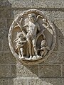
- Nomination Portal of the St Adalbert church in Trzciel, Lubusz V., Poland. --Tournasol7 04:10, 13 September 2023 (UTC)
- Promotion Support Good quality. --Johann Jaritz 04:19, 13 September 2023 (UTC)
-

- Nomination Window of the St Adalbert church in Trzciel, Lubusz V., Poland. --Tournasol7 04:10, 13 September 2023 (UTC)
- Promotion Support Good quality. --Johann Jaritz 04:17, 13 September 2023 (UTC)
-
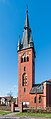
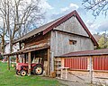
- Nomination Saint Adalbert church in Trzciel, Lubusz Voivodeship, Poland. --Tournasol7 04:10, 13 September 2023 (UTC)
- Promotion Support Good quality. --Johann Jaritz 04:17, 13 September 2023 (UTC)
-

- Nomination Bell tower of the Saint Adalbert church in Trzciel, Lubusz Voivodeship, Poland. --Tournasol7 04:10, 13 September 2023 (UTC)
- Promotion Support Good quality. --Jakubhal 04:32, 13 September 2023 (UTC)
-

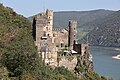
- Nomination Holy Trinity Church (Αγία Τριάδα) in Platanes district, Rethymno, Crete, Greece --XRay 03:48, 13 September 2023 (UTC)
- Promotion Support Good quality. --Terragio67 03:49, 13 September 2023 (UTC)
-

- Nomination Dove on a wall ledge at the Venetian fountain Rimondi (Ενετική Κρήνη Ριμόντι) in Rethymno, Crete, Greece --XRay 03:48, 13 September 2023 (UTC)
- Promotion Support Good quality. --Johann Jaritz 04:18, 13 September 2023 (UTC)
-

- Nomination Venetian fountain Rimondi (Ενετική Κρήνη Ριμόντι) in Rethymno, Crete, Greece --XRay 03:48, 13 September 2023 (UTC)
- Promotion Support Good quality.--Tournasol7 04:12, 13 September 2023 (UTC)
-

- Nomination View of the coast from the Fortezza, Rethymno, Crete, Greece --XRay 03:48, 13 September 2023 (UTC)
- Promotion Support Good quality.--Tournasol7 04:13, 13 September 2023 (UTC)
-

- Nomination Horse Chariot in Gorai Beach near MumbaiI --Rangan Datta Wiki 02:17, 13 September 2023 (UTC)
- Promotion Support Good quality. --XRay 03:54, 13 September 2023 (UTC)
-

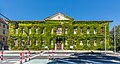
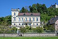
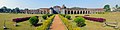
- Nomination Parkschlössl at the city park on Bahnhofstraße 1a, Spittal an der Drau, Carinthia, Austria -- Johann Jaritz 01:50, 13 September 2023 (UTC)
- Promotion Good quality. --XRay 03:53, 13 September 2023 (UTC)
-

- Nomination Parkschlössl at the city park on Bahnhofstraße 1a, Spittal an der Drau, Carinthia, Austria -- Johann Jaritz 01:50, 13 September 2023 (UTC)
- Promotion Support Good quality. --Terragio67 03:51, 13 September 2023 (UTC)
-

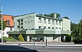
- Nomination Commercial and residential building on Tiroler Straße #10, Spittal an der Drau, Carinthia, Austria -- Johann Jaritz 01:50, 13 September 2023 (UTC)
- Promotion Good quality. --XRay 03:53, 13 September 2023 (UTC)
-

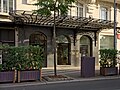
- Nomination Bookshop on Tiroler Straße #12, Spittal an der Drau, Carinthia, Austria -- Johann Jaritz 01:50, 13 September 2023 (UTC)
- Promotion Support Good quality. --Terragio67 03:51, 13 September 2023 (UTC)
-
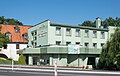
- Nomination District commission’s headquarter on Tiroler Straße, Spittal an der Drau, Carinthia, Austria -- Johann Jaritz 01:50, 13 September 2023 (UTC)
- Promotion Good quality. --XRay 03:53, 13 September 2023 (UTC)
-
- Nomination Impressionen aus dem "Naturerlebnisraum Itzequelle" in Itzehoe, Aufnahmedatum Mai 2012. --Nightflyer 22:14, 12 September 2023 (UTC)
- Promotion Support Good quality. --Jakubhal 04:34, 13 September 2023 (UTC)
-

- Nomination Saint Francis in Ecstasy - Francisco de Zurbarán --GoldenArtists 21:30, 12 September 2023 (UTC)
- Promotion Support Good quality. --Jakubhal 04:37, 13 September 2023 (UTC)
-
-

-

-
-

- Nomination La Verna Sanctuary - details - Chiusi della Verna, Arezzo. --Terragio67 17:30, 12 September 2023 (UTC)
- Promotion Support Good quality. --Liridon 19:03, 12 September 2023 (UTC)
-

- Nomination Memorial to the Civilian Victims of the Japanese Occupation 1942 – 1945 --Bijay Chaurasia 16:47, 12 September 2023 (UTC)
- Decline
 Oppose no enough sharp, the tower is blown --Ezarate 23:05, 12 September 2023 (UTC)
-

- Nomination 1924 Ford Model T Flivver at IAA 2023.--Alexander-93 15:47, 12 September 2023 (UTC)
- Promotion Support Good quality. --Poco a poco 16:46, 12 September 2023 (UTC)
-
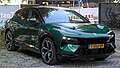
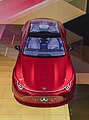
- Nomination Lotus Eletre at IAA 2023.--Alexander-93 15:47, 12 September 2023 (UTC)
- Promotion Support Good quality. --Poco a poco 16:46, 12 September 2023 (UTC)
-

- Nomination The chapel Zum Heiligen Kreuz on the Munich Woodland Cemetery --FlocciNivis 14:14, 12 September 2023 (UTC)
- Promotion Support Good quality. --Poco a poco 16:51, 12 September 2023 (UTC)
-

- Nomination A building of the Ensemble Brauerei Becker --FlocciNivis 14:14, 12 September 2023 (UTC)
- Promotion Support Good quality. --Poco a poco 16:51, 12 September 2023 (UTC)
-
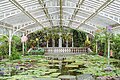
- Nomination View through the Victoria House of the Botanical Garden in Munich --FlocciNivis 14:14, 12 September 2023 (UTC)
- Promotion Support Good quality. --GoldenArtists 21:30, 12 September 2023 (UTC)
-
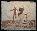
- Nomination Tomb of the diver in Paestum - east wall --PaestumPaestum 13:54, 12 September 2023 (UTC)
- Promotion Support Good quality. --Poco a poco 16:51, 12 September 2023 (UTC)
-
- Nomination Tomb of the diver in Paestum - North wall --PaestumPaestum 13:53, 12 September 2023 (UTC)
- Promotion Support Good quality. --FlocciNivis 14:12, 12 September 2023 (UTC)
-

- Nomination Buff-tailed coronet (Boissonneaua flavescens') --Charlesjsharp 11:51, 12 September 2023 (UTC)
- Promotion Support Good quality. --JoachimKohler-HB 12:14, 12 September 2023 (UTC)
-

- Nomination Buff-tailed coronet (Boissonneaua flavescens) --Charlesjsharp 11:51, 12 September 2023 (UTC)
- Promotion Support Good quality. --JoachimKohler-HB 12:14, 12 September 2023 (UTC)
-

- Nomination Buff-tailed coronet (Boissonneaua flavescens) --Charlesjsharp 11:51, 12 September 2023 (UTC)
- Promotion Support Good quality. --JoachimKohler-HB 12:14, 12 September 2023 (UTC)
-

- Nomination Buff-tailed coronet (Boissonneaua flavescens) --Charlesjsharp 11:51, 12 September 2023 (UTC)
- Promotion Support Good quality. --JoachimKohler-HB 12:55, 12 September 2023 (UTC) Support Good quality. --Ermell 13:00, 12 September 2023 (UTC)
-
- Nomination Buff-tailed coronet (Boissonneaua flavescens) --Charlesjsharp 11:51, 12 September 2023 (UTC)
- Promotion Support Good quality. --JoachimKohler-HB 12:55, 12 September 2023 (UTC) Support Good quality. --Ermell 13:00, 12 September 2023 (UTC)
-

- Nomination BYD Han at IAA 2023.--Alexander-93 10:18, 12 September 2023 (UTC)
- Promotion Support Good quality. --PaestumPaestum 13:55, 12 September 2023 (UTC)
-

- Nomination Opel Experimental Concept at IAA 2023.--Alexander-93 10:18, 12 September 2023 (UTC)
- Promotion Support Good quality. --Poco a poco 16:55, 12 September 2023 (UTC)
-

-

- Nomination Zebra and Heron in Shai Hills Resource Reserve --MB-one 09:35, 12 September 2023 (UTC)
- Promotion Support Good quality. --PaestumPaestum 13:55, 12 September 2023 (UTC)
-

- Nomination Open frunk of a Lucid Air Dream edition at Lucid Motors store Munich during IAA Mobility 2023 --MB-one 09:35, 12 September 2023 (UTC)
- Promotion Support Good quality. --Poco a poco 16:55, 12 September 2023 (UTC)
-

- Nomination Graves in the courtyard of Cape Coast Castle --MB-one 09:35, 12 September 2023 (UTC)
- Promotion Support Good quality. --PaestumPaestum 13:55, 12 September 2023 (UTC)
-
- Nomination Cupra stand in the Kaiserhof of the Munich Residence at IAA Open Space 2023 in Munich --MB-one 09:35, 12 September 2023 (UTC)
- Promotion Support Good quality. --PaestumPaestum 13:56, 12 September 2023 (UTC)
-

-

-

- Nomination Grave sites at the cemetery in Sonnenfeld --Ermell 08:33, 12 September 2023 (UTC)
- Promotion Support Good quality. --FlocciNivis 14:12, 12 September 2023 (UTC)
-

- Nomination Burgk Castle seen from the Saale Tower --Ermell 08:33, 12 September 2023 (UTC)
- Promotion Support Good quality --Virtual-Pano 11:48, 12 September 2023 (UTC)
-

- Nomination Organ of the catholic branch church in Schirnaidel OT of Eggolsheim --Ermell 08:33, 12 September 2023 (UTC)
- Promotion Support Good quality. --Virtual-Pano 11:48, 12 September 2023 (UTC)
-

- Nomination Interior of the monastery church Sonnefeld --Ermell 08:33, 12 September 2023 (UTC)
- Promotion Support Good quality. --Virtual-Pano 11:48, 12 September 2023 (UTC)
-
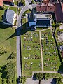
- Nomination Cemetery and Catholic Parish Church of St. Martin in Steinfeld, aerial view. --Ermell 08:33, 12 September 2023 (UTC)
- Promotion Support Good quality. --FlocciNivis 14:12, 12 September 2023 (UTC)
-

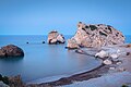
- Nomination Petra tou Romiou (Aphrodite's rock). Blue hour before sunrize at long exposure, Cyprus Nino Verde 08:31, 12 September 2023 (UTC)
- Promotion Support Good quality. --Ermell 08:37, 12 September 2023 (UTC)
-
- Nomination Petra tou Romiou (Aphrodite's rock). Blue hour before sunrize at long exposure, Cyprus Nino Verde 08:31, 12 September 2023 (UTC)
- Promotion Support Magnifique & good quality.--Tournasol7 11:59, 12 September 2023 (UTC)
-

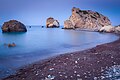
- Nomination Petra tou Romiou (Aphrodite's rock). Blue hour before sunrize at long exposure, Cyprus Nino Verde 08:31, 12 September 2023 (UTC)
- Promotion Support Good quality. --JoachimKohler-HB 12:14, 12 September 2023 (UTC)
-
- Nomination Petra tou Romiou (Aphrodite's rock). Blue hour before sunrize at long exposure, Cyprus Nino Verde 08:31, 12 September 2023 (UTC)
- Promotion Support Good quality. --PaestumPaestum 13:57, 12 September 2023 (UTC)
-

- Nomination Petra tou Romiou (Aphrodite's rock). Blue hour before sunrize at long exposure, Cyprus Nino Verde 08:31, 12 September 2023 (UTC)
- Promotion Support Good quality. --PaestumPaestum 13:57, 12 September 2023 (UTC)
-

- Nomination Lucerne: Chapel Bridge and houses on Rathausquai --JoachimKohler-HB 07:56, 12 September 2023 (UTC)
- Promotion
Image looks a bit rotated to right --Nino Verde 09:48, 12 September 2023 (UTC)
You are right. It's corrected. Thank you! --JoachimKohler-HB 12:11, 12 September 2023 (UTC) Support It is nice now --Nino Verde 14:17, 12 September 2023 (UTC)
-
-
-

-
-

- Nomination Mural, Hauptstrasse 47 in Linz-Urfahr, Upper Austria --Isiwal 07:31, 12 September 2023 (UTC)
- Promotion Support Good quality. --Nino Verde 09:48, 12 September 2023 (UTC)
-

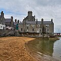
- Nomination War memorial - Lerwick, Shetland - seen from NE --Virtual-Pano 07:09, 12 September 2023 (UTC)
- Promotion Support Good quality. --Poco a poco 07:25, 12 September 2023 (UTC)
-

- Nomination 1 and 2 Aitken's Place (right to left)- Lerwick, Shetland - seen from SW --Virtual-Pano 07:09, 12 September 2023 (UTC)
- Promotion Support Good quality. --Nino Verde 09:48, 12 September 2023 (UTC)
-

- Nomination St. Olaf Hall - Lerwick, Shetland - former church now used as an office - seen from SE --Virtual-Pano 07:09, 12 September 2023 (UTC)
- Promotion Support Good quality. --Poco a poco 07:25, 12 September 2023 (UTC)
-
- Nomination Queens Hotel - Lerwick, Shetland - seen from SE --Virtual-Pano 07:09, 12 September 2023 (UTC)
- Promotion Support Good quality. --Poco a poco 07:25, 12 September 2023 (UTC)
-

- Nomination The Lodberrie - Lerwick, Shetland - seen from E --Virtual-Pano 07:09, 12 September 2023 (UTC)
- Promotion Support Good quality. --PaestumPaestum 13:56, 12 September 2023 (UTC)
-

- Nomination Cupra DarkRebel Concept, IAA, Munich, Germany --Poco a poco 06:45, 12 September 2023 (UTC)
- Promotion Support Good quality. --Ermell 08:39, 12 September 2023 (UTC)
-

- Nomination BMW Vision Neue Klasse, IAA, Munich, Germany --Poco a poco 06:45, 12 September 2023 (UTC)
- Promotion Support Good quality. --Ermell 08:40, 12 September 2023 (UTC)
-

- Nomination Audi Activesphere Concept, IAA, Munich, Germany --Poco a poco 06:45, 12 September 2023 (UTC)
- Promotion Support Good quality. --Ermell 08:40, 12 September 2023 (UTC)
-

- Nomination Mercedes-Benz Concept CLA Class, IAA, Munich, Germany --Poco a poco 06:45, 12 September 2023 (UTC)
- Promotion Good quality. --Smial 11:31, 12 September 2023 (UTC)
-
- Nomination Mercedes-Benz Concept CLA Class, IAA, Munich, Germany --Poco a poco 06:45, 12 September 2023 (UTC)
- Promotion Good quality. --Smial 11:31, 12 September 2023 (UTC)
-

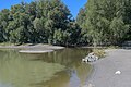
- Nomination View of Plan d'eau de Merchin, in Lesquin, France --Velvet 06:42, 12 September 2023 (UTC)
- Promotion Support Good quality. --GoldenArtists 21:31, 12 September 2023 (UTC)
-

-
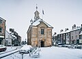
- Nomination Brackley Town Hall in January 2019 --Julian Herzog 06:15, 12 September 2023 (UTC)
- Promotion Support Good quality. --Poco a poco 07:22, 12 September 2023 (UTC)
-

- Nomination St. Peter's Church, Brackley --Julian Herzog 06:15, 12 September 2023 (UTC)
- Promotion Support Good quality. --Poco a poco 07:22, 12 September 2023 (UTC)
-

- Nomination Catholic filial church St. Vitus, built from the beginning of the 16th century, south and east side
--F. Riedelio 05:50, 12 September 2023 (UTC) - Promotion Support Good quality. --Jakubhal 05:55, 12 September 2023 (UTC)
- Nomination Catholic filial church St. Vitus, built from the beginning of the 16th century, south and east side
-

- Nomination Catholic filial church St. Vitus, built from the beginning of the 16th century, east side
--F. Riedelio 05:50, 12 September 2023 (UTC) - Promotion Support Good quality. --Ermell 08:41, 12 September 2023 (UTC)
- Nomination Catholic filial church St. Vitus, built from the beginning of the 16th century, east side
-

- Nomination Catholic filial church St. Vitus, built from the beginning of the 16th century, east and north side
--F. Riedelio 05:50, 12 September 2023 (UTC) - Promotion Support Good quality. --JoachimKohler-HB 07:58, 12 September 2023 (UTC)
- Nomination Catholic filial church St. Vitus, built from the beginning of the 16th century, east and north side
-
- Nomination Catholic filial church St. Vitus, built from the beginning of the 16th century, east and north side
--F. Riedelio 05:50, 12 September 2023 (UTC) - Promotion Support Good quality. --Ermell 13:16, 12 September 2023 (UTC)
- Nomination Catholic filial church St. Vitus, built from the beginning of the 16th century, east and north side
-
- Nomination Mulhouse Fortified Tower, Écomusée d’Alsace, Ungersheim, France --Llez 05:40, 12 September 2023 (UTC)
- Promotion Support Good quality. --Poco a poco 07:22, 12 September 2023 (UTC)
-

-
- Nomination Access to the Mulhouse Fortified Tower, Écomusée d’Alsace, Ungersheim, France --Llez 05:40, 12 September 2023 (UTC)
- Promotion Support Good quality. --Poco a poco 07:22, 12 September 2023 (UTC)
-

-

- Nomination Holy Trinity Church (Αγία Τριάδα) in Platanes district, Rethymno, Crete, Greece --XRay 04:52, 12 September 2023 (UTC)
- Promotion Good quality --Michielverbeek 05:27, 12 September 2023 (UTC)
-

-

-

- Nomination Kirche, Old Sarepta, Volgograd --Mike1979 Russia 04:27, 12 September 2023 (UTC)
- Promotion Support Good quality. --XRay 05:18, 12 September 2023 (UTC)
-

- Nomination Kirche, Old Sarepta, Volgograd --Mike1979 Russia 04:27, 12 September 2023 (UTC)
- Promotion Support Good quality. --Poco a poco 07:23, 12 September 2023 (UTC)
-

- Nomination Gateway 1, Volgo-Don Canal, Volgograd --Mike1979 Russia 04:27, 12 September 2023 (UTC)
- Promotion Support Good quality. --Poco a poco 07:23, 12 September 2023 (UTC)
-

- Nomination DK «Sudoverf», Volgograd --Mike1979 Russia 04:27, 12 September 2023 (UTC)
- Promotion Good quality --Michielverbeek 05:30, 12 September 2023 (UTC)
-
- Nomination Our Lady of Czestochowa church in Mostki, Lubusz Voivodeship, Poland. --Tournasol7 04:14, 12 September 2023 (UTC)
- Promotion Support Good quality. (A little bit dark. I've added a category for the rain.) --XRay 05:17, 12 September 2023 (UTC)
 Comment Above the spire I see some spots in the sky, please remove it --Michielverbeek 05:55, 12 September 2023 (UTC)
Comment This is the snow. Tournasol7 12:03, 12 September 2023 (UTC)
-

- Nomination St Michael Archangel church in Brójce, Lubusz V., Poland. --Tournasol7 04:14, 12 September 2023 (UTC)
- Promotion Support Good quality. --XRay 05:16, 12 September 2023 (UTC)
-
- Nomination Panoramic view of Adina Masjid --Rangan Datta Wiki 02:52, 12 September 2023 (UTC)
- Decline Unsharp, oversaturated, CAs --Llez 05:42, 12 September 2023 (UTC)
-

- Nomination Victoria Memorial at night --Rangan Datta Wiki 02:50, 12 September 2023 (UTC)
- Decline Oppose Sorry, sharpness too low. --XRay 05:15, 12 September 2023 (UTC)
-

-

-

- Nomination Ludwigstraße during IAA 2023.--Alexander-93 21:15, 11 September 2023 (UTC)
- Promotion Support Good quality. --Nino Verde 09:52, 12 September 2023 (UTC)
-

- Nomination BYD Seal U at IAA 2023.--Alexander-93 18:14, 11 September 2023 (UTC)
- Promotion Support Good quality. --Velvet 06:59, 12 September 2023 (UTC)
-

- Nomination Genesis GV60 at IAA 2023.--Alexander-93 18:14, 11 September 2023 (UTC)
- Promotion Support Good quality. --Velvet 06:59, 12 September 2023 (UTC)
-
- Nomination Hotel and restaurant Śnieżnik in Kłodzko 1 --Jacek Halicki 07:37, 11 September 2023 (UTC)
- Promotion Support Good quality. --Velvet 06:56, 12 September 2023 (UTC)
-
- Nomination Hotel and restaurant Śnieżnik in Kłodzko 2 --Jacek Halicki 07:37, 11 September 2023 (UTC)
- Promotion Support Good quality. --Ezarate 11:08, 12 September 2023 (UTC)
-

- Nomination Gesamtanlage Bereich Damaschkestraße, Oberursel (Taunus) --MB-one 06:53, 11 September 2023 (UTC)
- Promotion Support Cozy place) --Nino Verde 09:56, 12 September 2023 (UTC)
-

- Nomination Former school building with teacher's residence, built 1913, north and west side
--F. Riedelio 06:36, 11 September 2023 (UTC) - Promotion Support Good quality. --FlocciNivis 14:10, 12 September 2023 (UTC)
- Nomination Former school building with teacher's residence, built 1913, north and west side
-

-

- Nomination Row houses, Rue Faidherbe 97 to 103, in Lesquin, France --Velvet 06:30, 11 September 2023 (UTC)
- Promotion Support Good quality. --FlocciNivis 14:11, 12 September 2023 (UTC)
-

- Nomination Panorama of Promenade du Cap Martin lined with hi-rise apartment buildings, view from the south, Roquebrune, France --Tagooty 04:07, 11 September 2023 (UTC)
- Promotion
The left edge of the picture is leaning right, and perspective correction is needed. There are also some artifacts in the sky (after dust spot removal). I noted those. --Jakubhal 04:22, 11 September 2023 (UTC) Done @Jakubhal: Thanks for the review. Please see the new version. --Tagooty 07:51, 12 September 2023 (UTC) Support Thank you! Good quality. --Jakubhal 15:26, 12 September 2023 (UTC)
-

- Nomination Catholic parish church St. Johann Baptist und Georg, built 1470, side altars and choir with high altar
--F. Riedelio 06:25, 9 September 2023 (UTC) - Promotion Support Good quality (maybe a bit noisy in the ceiling? but still looks ok to me) --ThibautRe 20:54, 10 September 2023 (UTC) New version Noise reduced. Thanks for the review. --F. Riedelio 14:17, 12 September 2023 (UTC)
- Nomination Catholic parish church St. Johann Baptist und Georg, built 1470, side altars and choir with high altar
-

-

-

-

- Nomination Andean emerald (Uranomitra franciae franciae) male --Charlesjsharp 11:51, 7 September 2023 (UTC)
- Promotion Support Good quality. --Atudu 06:40, 12 September 2023 (UTC)
-
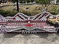
- Nomination: Bench at Lázaro Cárdenas Park, Puerto Vallarta --Another Believer 20:38, 6 September 2023 (UTC)
- Review needed
-

- Nomination: Bench at Lázaro Cárdenas Park, Puerto Vallarta --Another Believer 20:38, 6 September 2023 (UTC)
- Review needed
-

- Nomination: Malecón, Puerto Vallarta --Another Believer 20:38, 6 September 2023 (UTC)
- Review needed
-

- Nomination: Bench at Lázaro Cárdenas Park, Puerto Vallarta --Another Believer 20:38, 6 September 2023 (UTC)
- Review needed
-

- Nomination: Saint Laurent church in en:Valcivières, France, from the rear --Touam 18:43, 6 September 2023 (UTC)
- Review needed
-

- Nomination: Close wing posture of Amblypodia anita (Hewitson, 1862) - Purple Leaf Blue (Male) gathering nutrients from bird dropping (2) WLB --Anitava Roy 17:25, 6 September 2023 (UTC)
- Review needed
-

- Nomination: Open wing Basking of Spindasis ictis (Hewitson, 1865) - Common Shot Silverline (Male) WLB --Anitava Roy 17:15, 6 September 2023 (UTC)
- Review needed
-

- Nomination: Granary, designated 1578, southwest and southeast side
--F. Riedelio 15:13, 6 September 2023 (UTC) - Review needed
- Nomination: Granary, designated 1578, southwest and southeast side
-
- Nomination: Granary, designated 1578, southwest and northwest side
--F. Riedelio 15:13, 6 September 2023 (UTC) - Review needed
- Nomination: Granary, designated 1578, southwest and northwest side
-
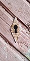
- Nomination Keyhole of Harlu railway station building. Harlu, Pitkyarantsky District, Karelia, Russia. By User:Charoplet --Красный 07:55, 5 September 2023 (UTC)
- Promotion Support Good quality. --F. Riedelio 05:47, 12 September 2023 (UTC)
-

- Nomination Lungau near St. Margarethen, Austria. --DimiTalen 10:28, 4 September 2023 (UTC)
- Promotion Support Good quality. --F. Riedelio 05:42, 12 September 2023 (UTC)
-

- Nomination Iolaire wreck memorial seen from E --Virtual-Pano 10:01, 4 September 2023 (UTC)
- Promotion Support Good quality. --F. Riedelio 05:39, 12 September 2023 (UTC)
-

- Nomination Iolaire wreck memorial seen from NE --Virtual-Pano 10:01, 4 September 2023 (UTC)
- Promotion Good quality. --Milseburg 15:10, 12 September 2023 (UTC)
-
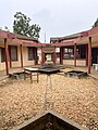
- Nomination Vue de bâtiments sur le campus de l'INSTI Lokossa --Fawaz.tairou 23:24, 3 September 2023 (UTC)
- Decline
Center tilts to the left side, fixable? --Grunpfnul 15:50, 5 September 2023 (UTC)
Not only tilted, but there is a perspective distortion as well, that needs to be fixed --Jakubhal 17:28, 5 September 2023 (UTC) Oppose Not fixed after more than a week --Jakubhal 04:39, 13 September 2023 (UTC)
-

- Nomination A street in Hof, Germany at night. --PantheraLeo1359531 17:55, 1 September 2023 (UTC)
- Promotion
Lens flare, fixable? --F. Riedelio 15:30, 8 September 2023 (UTC) Done Thanks for the hint, flares in the sky removed. Rays around light sources cannot be removed, so I hope this suits now :) --PantheraLeo1359531 14:49, 11 September 2023 (UTC) Support Good Quality now. --F. Riedelio 13:23, 12 September 2023 (UTC)
-

- Nomination Place de l'Albertine Brussels.--Alexander-93 17:22, 1 September 2023 (UTC)
- Promotion
Visible chromatic aberration should be removed. --F. Riedelio 06:14, 9 September 2023 (UTC)
@F. Riedelio: Done Uploaded a new version.--Alexander-93 21:11, 11 September 2023 (UTC) Support Good quality now. --F. Riedelio 14:19, 12 September 2023 (UTC)
.jpg)
.jpg)
.jpg)
.jpg)
.jpg)
,_Rethymno,_Platanes,_Church_%22Holy_Trinity%22_--_2023_--_8173.jpg)
,_Rethymno,_Mauervorsprung_--_2023_--_8178.jpg)
,_Rethymno,_Venezianischer_Brunnen_Rimondi_--_2023_--_8181.jpg)
,_Rethymno,_Fortezza,_Blick_auf_die_K%C3%BCste_--_2023_--_8258.jpg)


.jpg)


_Caldas_2.jpg)
_Las_Tangaras.jpg)
_Caldas.jpg)
_Caldas.jpg)
_Caldas_2.jpg)


.jpg)
.jpg)
.jpg)
.jpg)
.jpg)


_Kirche_Luftbild_-20230811-RM-154949.jpg)


.jpg)


,_Rethymno,_Platanes,_Church_%22Holy_Trinity%22_--_2023_--_8171.jpg)
,_Rethymno,_Moschee_Neratze_--_2023_--_8176.jpg)
,_Rethymno,_Platte_auf_einem_Gehweg_--_2023_--_8177.jpg)


.jpg)
.jpg)


.jpg)
.jpg)
_(P1090781).jpg)


_male_in_flight_Las_Tangaras_(2).jpg)


_-_Purple_Leaf_Blue_(Male)_gathering_nutrients_from_bird_dropping_(2)_WLB.jpg)
_-_Common_Shot_Silverline_(Male)_WLB.jpg)


.jpg)
_Cooper_S_IAA_2023_1X7A0724.jpg)
Consensual review edit
File:Loreen_-_Melodifestivalen_2023,_Malmö_508.jpg edit

- Nomination Loreen performing at Melodifestivalen 2023 (by Josve05a) --Ktkvtsh 02:18, 11 September 2023 (UTC)
- Promotion
- Oppose Sorry, but bad bottom crop (on hands). Also quite noisy --Jakubhal 04:10, 11 September 2023 (UTC)
- @Ktkvtsh: please don't nominate pictures by other authors as your own. Include authors in your nominations as described in the instructions. --Jakubhal 05:03, 11 September 2023 (UTC)
- Support Good quality. --Tagooty 04:20, 11 September 2023 (UTC)
- Support Noise is acceptable for an available light shot. JPEG compression settings somewhat too high, contrast somewhat high, but sharpness is excellent and colours appear realistic. Image cropping in live concert photography, that's another very special topic. If the hands were still visible, you would possibly have cell phones held up in the air or funny headgear from fans at the bottom of the image, which would then also be criticized. Sometimes you just can't pick and choose in front of the stage and have to make decisions in a matter of milliseconds. I think a crop like in this picture is still acceptable. --Smial 09:04, 11 September 2023 (UTC) Translated with www.DeepL.com/Translator (free version)
Total: 2 support (excluding the nominator), 1 oppose →  Promoted --Peulle 06:43, 14 September 2023 (UTC)
File:Ломаха_(2).jpg edit
.jpg)
- Nomination Lomakha, Lomonosovsky District, Leningrad Oblast, Russia. --Красный 05:34, 4 September 2023 (UTC)
- Promotion
- Support Good quality. --Ktkvtsh 02:59, 11 September 2023 (UTC)
- Oppose Low level of details --Jakubhal 04:43, 11 September 2023 (UTC)
- Support Is this "Low level of details" now the new "your camera and/or kit lens is too cheap"? According to EXIF, the photographer has done everything right here: Low ISO, aperture near the sweet spot, camera held straight, perfectly exposed. But unfortunately not over-sharpened to fool the pixelpeepers into thinking it's pixel-sharp. The image is not outstanding, but perfectly usable for a print in A4 size. --Smial 09:43, 11 September 2023 (UTC)
- @Smial: when I mention a lack of detail, I mean exactly that. Please refrain from attributing malicious intent to me or from making personal attacks ("pixelpeepers"). I don’t check the type of camera used. Here, I see a blurred building and overly sharp grass with numerous artifacts on that grass due to over-sharpening. Additionally, the white balance seems off, with the sky appearing too green. --Jakubhal 10:37, 11 September 2023 (UTC)
- Comment In the 100% view without pixel peeping, I can't detect any sharpening artifacts, neither in the grass nor anywhere else in the image. When viewed as an A4 print, the image is "sharp enough" in every way. The too-green sky thing seems to be on the rise lately. A lot of cameras seem to be broken. Other artfully and dramatically enhanced sky versions, on the other hand, are readily accepted. If you feel personally attacked, I'm sorry, that was meant as a general comment about the developments and trends in reviewing here on QIC, not personal. English is not my native language, I have to rely on what the translation program delivers as soon as sentences get a bit longer. --Smial 12:01, 11 September 2023 (UTC)
- Comment While I respect your viewpoint, I'd appreciate it if any concerns about reviewing trends were addressed in a broader discussion rather than under the consensual review discussion started by me. As for any unfairly (because of the dramatically enhanced sky) supported images, you are free to start a consensual review for any of them as well.
--Jakubhal 14:00, 11 September 2023 (UTC)
- Weak Support: Not completely sharp at full size, but the overall level of details is good. We see individual bricks, and while the ruffles on the roof aren't clear everywhere, enough of them are well-defined for us to extrapolate the rest. -- Ikan Kekek 21:25, 11 September 2023 (UTC)
Total: 3 support (excluding the nominator), 1 oppose → Promoted --Peulle 06:42, 14 September 2023 (UTC)
File:Il_mini_di_italiano.jpg edit

- Nomination Dictionary - Italian; Dizionario della lingua italiana, pubblicato da Zanichelli: scritto da Elena Pallottini --多多123 16:08, 26 August 2023 (UTC)
- Promotion
- Oppose IMHO unfavorable cropping (portrait instead of landscape). --F. Riedelio 06:43, 2 September 2023 (UTC)
- Support Pleasing to the eye. Good detail. --Ktkvtsh 18:10, 8 September 2023 (UTC)
- Support Perfectly good to me. Sure, portrait would be the natural orientation, but that doesn't seem to me like a good basis for declining this photo. -- Ikan Kekek 21:30, 11 September 2023 (UTC)
Total: 2 support (excluding the nominator), 1 oppose → Promoted --Peulle 06:42, 14 September 2023 (UTC)
File:Kurhaus_Wiesbaden_in_Ukrainian_colours.jpg edit

- Nomination Kurhaus Wiesbaden in Ukrainian colours for concert with the Kyiv Symphony Orchestra. By User:Gerda Arendt --A1Cafel 13:53, 7 September 2023 (UTC)
- Decline
- Support Good quality.--Alexander-93 14:38, 7 September 2023 (UTC)
- Oppose I disagree. No QI in my eyes. Unfavorable crop, perspective correction needed, strange foreground. --Milseburg 13:21, 8 September 2023 (UTC)
- Support Good quality. --N. Johannes 20:44, 8 September 2023 (UTC)
- Oppose I can disagree too. Near the half of photo is unfocused close-up of water, building is placed on-side and doesn't look like as epicenter of photograph. Красный 16:49, 10 September 2023 (UTC)
- Oppose per others. The funny structures in the foreground can also be found elsewhere in the image, wherever the camera "intelligence" couldn't decide whether it should massively suppress the noise or rather over-sharpen it. Btw: Such lighting, usually with almost monochromatic LED spotlights, is extremely difficult for our camera sensors to handle. The "real" colors can usually only be captured with extremely narrow exposure - and then the rest of the image in such evening scenes is completely drowned in image noise, especially if the colour is "blue" and the image contrast of the subject is already severely limited due to the high ISO setting. --Smial 12:19, 11 September 2023 (UTC)
Total: 2 support (excluding the nominator), 3 oppose →  Declined --Peulle 06:42, 14 September 2023 (UTC)
File:Mini_Hatch_(J01)_Cooper_S_IAA_2023_1X7A0724.jpg edit
_Cooper_S_IAA_2023_1X7A0724.jpg)
- Nomination Mini Hatch (J01) Cooper S at BMW World Munich 2023.--Alexander-93 08:12, 7 September 2023 (UTC)
- Promotion Support Good quality. --N. Johannes 17:05, 7 September 2023 (UTC) Oppose Distracting flares. --Vasmar1 17:07, 7 September 2023 (UTC)
- Comment The bright blue part behind the blue car is very annoying. In addition, the information board is too bright. Perhaps a correction is possible. -- Spurzem 13:55, 8 September 2023 (UTC)
- Weak Support: The purple reflections are a little distracting, but I think this is barely acceptable and better than many photos we see with loads and loads of bisected people in them. -- Ikan Kekek 00:19, 10 September 2023 (UTC)
- weak Support per Ikan. Better than those parking lot snapshots. --Smial 12:06, 11 September 2023 (UTC)
Total: 2 support (excluding the nominator), 1 oppose → Promoted --Peulle 06:41, 14 September 2023 (UTC)
File:Münsing_Am_Kirchberg_2_022_2023_04_26.jpg edit

- Nomination Catholic parish church Mariä Himmelfahrt, built from 1640, baptismal font
--F. Riedelio 06:56, 4 September 2023 (UTC) - Decline
- Oppose The figures are out of focus. Sorry. --Ermell 19:37, 6 September 2023 (UTC)
 Fixed Improved version IMHO sharp enough for QI. --F. Riedelio 14:30, 7 September 2023 (UTC)
- Support Very pleasing to the eye and nice detail --Ktkvtsh 18:01, 8 September 2023 (UTC)
- Oppose Still quite unsharp. -- Ikan Kekek 18:13, 8 September 2023 (UTC)
- Support Not pixelsharp but good enough for an a4 size print. --Smial 18:20, 9 September 2023 (UTC)
- Oppose As Ermell. Tournasol7 05:07, 10 September 2023 (UTC)
- Oppose +1--Peulle 11:21, 11 September 2023 (UTC)
Total: 2 support (excluding the nominator), 4 oppose → Declined --Peulle 06:41, 14 September 2023 (UTC)
File:Vue_aérienne_du_bloc_administratif_principal_de_l'INSTI_05.jpg edit

- Nomination: Vue aérienne du bloc administratif principal de l'INSTI Lokossa --Fawaz.tairou 23:24, 3 September 2023 (UTC)
- Review
- The verticals are not straight. the perspective fix is needed --Jakubhal 03:31, 4 September 2023 (UTC)
- Support Good quality - its an aerial image, how should an image from the sky should show straight verticals? On the horizontal plane could it be more centered, but still in this stage good enough --Grunpfnul 15:49, 5 September 2023 (UTC)
- Oppose I disagree. The distortion is huge, it does not seem to have any intentional purpose. There were a lot of aerial photos here, which were not distorted. It is not an excuse. --Jakubhal 17:27, 5 September 2023 (UTC)
- Comment made an PC attempt. No vote therefore. --Smial 10:18, 6 September 2023 (UTC)
- Support Now is ok. Thank you Smial. --Jakubhal 12:04, 6 September 2023 (UTC)
 Question Is the sky too green? -- Ikan Kekek 06:04, 7 September 2023 (UTC)
- Comment Colour saturation probably a bit high, but the sky looks still ok. --Smial 09:34, 7 September 2023 (UTC)
- Oppose Thanks for your opinion, but I've decided to vote against and let Fawaz address this. -- Ikan Kekek 18:25, 8 September 2023 (UTC)
- Oppose lack of detail, WB off --Virtual-Pano (talk) 11:11, 10 September 2023 (UTC)
Total: 2 support (excluding the nominator), 2 oppose →  Inconclusive result after 8 consensual review days --Peulle 06:40, 14 September 2023 (UTC)