Commons:Quality images candidates/Archives September 27 2020
-

-

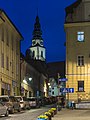
- Nomination Entrance of the St. Laurentius Church, Ahrweiler, Bad Neuenahr-Ahrweiler, Rhineland-Palatinate, Germany --XRay 03:53, 25 September 2020 (UTC)
- Promotion
 Support Good quality -- Johann Jaritz 04:11, 25 September 2020 (UTC)
-

- Nomination Spiers of the Lüdinghausen Gate, Dülmen, North Rhine-Westphalia, Germany --XRay 03:53, 25 September 2020 (UTC)
- Promotion Support Good quality.--Agnes Monkelbaan 04:42, 25 September 2020 (UTC)
-

- Nomination St. Mauritz Border (immunitas localis) in Münster, North Rhine-Westphalia, Germany --XRay 03:53, 25 September 2020 (UTC)
- Promotion Support Good quality -- Johann Jaritz 04:11, 25 September 2020 (UTC)
-
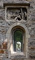
- Nomination Detail of St. Josef Church, Kinderhaus, Münster, North Rhine-Westphalia, Germany --XRay 03:53, 25 September 2020 (UTC)
- Promotion Support Good quality -- Johann Jaritz 04:11, 25 September 2020 (UTC)
-
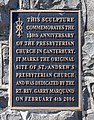
- Nomination Memorial sculpture of the Presbyterian Church, Christchurch, New Zealand --Podzemnik 03:02, 25 September 2020 (UTC)
- Promotion Support Good quality -- Johann Jaritz 03:08, 25 September 2020 (UTC)
-

- Nomination Memorial sculpture of the Presbyterian Church, Christchurch --Podzemnik 03:02, 25 September 2020 (UTC)
- Promotion Support Good quality -- Johann Jaritz 03:08, 25 September 2020 (UTC)
-

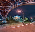
- Nomination Convention Centre Precinct, Christchurch, New Zealand --Podzemnik 03:02, 25 September 2020 (UTC)
- Promotion Support Good quality -- Johann Jaritz 03:08, 25 September 2020 (UTC)
-

-

-

- Nomination Walled up entrance of the Ursulinen Gymnasium (built in 1878) on Ursulinengasse #3, inner city, Klagenfurt, Carinthia, Austria -- Johann Jaritz 02:35, 25 September 2020 (UTC)
- Promotion Support Good quality. --Podzemnik 03:05, 25 September 2020 (UTC)
-

- Nomination Inscription at the school building in the Ursulinengasse #5, inner City, Klagenfurt, Carinthia, Austria -- Johann Jaritz 02:35, 25 September 2020 (UTC)
- Promotion Support Good quality. --Podzemnik 03:05, 25 September 2020 (UTC)
-

- Nomination Coats of arms of the cathedral chapter at the overdoor of the western portal of the Gurk cathedral chapter`s building on Dr.-Herrmann-Gasse, inner city, Carinthia, Austria -- Johann Jaritz 02:35, 25 September 2020 (UTC)
- Promotion Support Good quality. --XRay 03:55, 25 September 2020 (UTC)
-

- Nomination 1905 Polk County Courthouse Annex in Livingston, Texas, U.S. By User:Nv8200pa --Another Believer 22:18, 24 September 2020 (UTC)
- Decline
 Oppose IMo the crop is too tight and it's too small for 2020 --Podzemnik 03:10, 25 September 2020 (UTC)
-

- Nomination 50 Pfennig Notgeld banknote of Mühlhausen (Thuringia) (1921). --Palauenc05 21:47, 24 September 2020 (UTC)
- Promotion Support Good quality. --Podzemnik 03:10, 25 September 2020 (UTC)
-

- Nomination Cruise Liner Birger Jarl (1953), Stockholm, Sweden --Chme82 21:07, 24 September 2020 (UTC)
- Promotion Support Good quality. --Augustgeyler 22:05, 24 September 2020 (UTC)
-

- Nomination The Palazzo del Podestà in Bologna, Italy. --Velvet 20:21, 24 September 2020 (UTC)
- Promotion Good quality --Michielverbeek 20:39, 24 September 2020 (UTC)
-
- Nomination Panorama of the October Palace in the evening lights, Aleya Heroyiv Nebesnoyi Sotni (former Instytutska str.), 1, Kyiv, Ukraine. --Moahim 19:51, 24 September 2020 (UTC)
- Promotion Support Good quality. --Augustgeyler 22:05, 24 September 2020 (UTC)
-

-

-

-

-

-
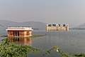
- Nomination Man Sagar Lake with Jal Mahal Palace, Jaipur --Jakubhal 16:30, 24 September 2020 (UTC)
- Promotion Support GQ --Palauenc05 16:46, 24 September 2020 (UTC)
-
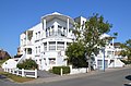
- Nomination Koksijde (België) - Kubistisch hoekhuis in zogenaamde internationale stijl naar ontwerp van architect L. Van Castel van 1931. --Jmh2o 15:54, 24 September 2020 (UTC)
- Promotion Support Good quality, geocode would be fine. --Palauenc05 16:43, 24 September 2020 (UTC)
-
-

-

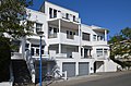
- Nomination Koksijde (België) - Kubistisch hoekhuis in zogenaamde internationale stijl naar ontwerp van architect L. Van Castel van 1931. --Jmh2o 15:54, 24 September 2020 (UTC)
- Decline Oppose Tree is covering the main object to much --Augustgeyler 22:05, 24 September 2020 (UTC)
-

- Nomination Langhaarziegenbock, Untere Bachgewanne, Harthausen, Rheinland-Pfalz, Deutschland. --Fischer.H 14:52, 24 September 2020 (UTC)
- Promotion Support GQ --Palauenc05 16:48, 24 September 2020 (UTC)
-

- Nomination A brown wood owl (Strix leptogrammica) at a bird's show in the Zoo Neunkirchen. The owl is eating a dead chick from the hand of a man. During this the owl spreads its wings --DavidJRasp 14:46, 24 September 2020 (UTC)
- Decline Oppose Tilted, the bird is out of focus --Podzemnik 03:11, 25 September 2020 (UTC)
-

- Nomination Zoo, Amersfoort Holland. By User:Bogomolov.PL --DavidJRasp 14:46, 24 September 2020 (UTC)
- Decline Oppose Eyes not sharp --Jakubhal 17:34, 24 September 2020 (UTC)
-

- Nomination A Nutria (Myocastor coypus) at the pond near the Schloss Buseck in Bubach-Calmesweiler , part of Eppelborn. The nutria stand on two length and reaches with its snout in the direction of the camera lens --DavidJRasp 14:46, 24 September 2020 (UTC)
- Decline Oppose Dark, distracting shadows --Podzemnik 03:11, 25 September 2020 (UTC)
-
- Nomination Wasserspeier in der Schlossstraße in Hambach, unterhalb des Hambacher Schlosses, Rheinland-Pfalz, Deutschland. --Fischer.H 14:07, 24 September 2020 (UTC)
- Decline Oppose The quality is below requirements, and also I fail to understand what shall be the main subject -- the sculpture (which is underexposed) or the building in background (which is out of focus). --A.Savin 21:24, 24 September 2020 (UTC)
-
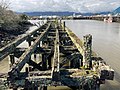
- Nomination Former cattle wharf, harbour loop on the Kawatiri River Trai by User:Giantflightlessbirds --Hangman'sDeath 12:28, 24 September 2020 (UTC)
- Decline Oppose The resolution is below minimum reguirements. --Augustgeyler 13:00, 24 September 2020 (UTC)
-

- Nomination Harbour loop on the Kawatiri River Trail, Westport, New Zealand by User:Giantflightlessbirds --Hangman'sDeath 12:18, 24 September 2020 (UTC)
- Decline Oppose Very nice composition. But the resolution is below minimum reguirements. --Augustgeyler 13:00, 24 September 2020 (UTC)
-

-

-

-
-

-
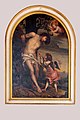
- Nomination Painting of Saint Sebastian in the Katharinenkapelle in Treis -- Spurzem 11:45, 24 September 2020 (UTC)
- Promotion Support Good quality. --Scotch Mist 13:34, 24 September 2020 (UTC)
-

-
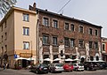
- Nomination Landau's tenement house. 2 Szeroka Street/41 Miodowa Street. Kraków, Lesser Poland Voivodeship, Poland. --Halavar 11:00, 24 September 2020 (UTC)
- Promotion Good quality. --Jacek Halicki 14:45, 24 September 2020 (UTC)
-

-

-

-

- Nomination Visby Cathedral. --ArildV 10:30, 24 September 2020 (UTC)
- Promotion Support Good quality. --Scotch Mist 13:18, 24 September 2020 (UTC)
-

- Nomination House No. 43a w Bojanicach --Jacek Halicki 08:37, 24 September 2020 (UTC)
- Promotion Support Good quality. --ArildV 10:36, 24 September 2020 (UTC)
-
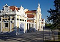
- Nomination Lissabon, Parque Eduardo VII, Pavilhão Carlos Lopes --Berthold Werner 08:32, 24 September 2020 (UTC)
- Promotion Support Good quality. --Halavar 14:23, 24 September 2020 (UTC)
-
- Nomination Kościelna Street in Bystrzyca Kłodzka --Jacek Halicki 08:27, 24 September 2020 (UTC)
- Promotion Support Good quality. --Halavar 10:24, 24 September 2020 (UTC)
-

- Nomination Portal of Palazzo Cominelli in Cisano, San Felice del Benaco on lake Garda. --Moroder 07:47, 24 September 2020 (UTC)
- Promotion
Appears quite dark overall - is it possible to brighten\enhance the image to reveal more details of the wooden doors? --Scotch Mist 13:40, 24 September 2020 (UTC) Done Thanks for the hint --Moroder 21:02, 24 September 2020 (UTC) Support Good quality. --Scotch Mist 22:24, 24 September 2020 (UTC)
-

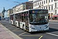
- Nomination Tram on the street, Prague. By User:Jorgeroyan --Andrew J.Kurbiko 07:36, 24 September 2020 (UTC)
- Promotion Beautiful image and good quality -- Spurzem 10:03, 24 September 2020 (UTC)
-

- Nomination 25 Pfennig Notgeld banknote of Braunschweig (1921). --Palauenc05 07:31, 24 September 2020 (UTC)
- Promotion Support Good quality. --Aristeas 07:50, 24 September 2020 (UTC)
-

- Nomination Tower in Ząbkowice Śląskie 2 --Jacek Halicki 07:22, 24 September 2020 (UTC)
- Decline Oppose I don't think we should promote nearly identical images --Podzemnik 03:14, 25 September 2020 (UTC)
-
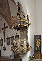
- Nomination Pulpit in the church St. Georg in Effeltrich --Ermell 06:58, 24 September 2020 (UTC)
- Promotion Good quality. --Jacek Halicki 07:24, 24 September 2020 (UTC)
-

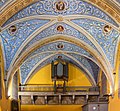
- Nomination Organ gallery in the church St. Georg in Effeltrich --Ermell 06:58, 24 September 2020 (UTC)
- Promotion Good quality. --Jacek Halicki 07:24, 24 September 2020 (UTC)
-

- Nomination Altar in the pilgrimage church Käppele Würzburg --Ermell 06:58, 24 September 2020 (UTC)
- Promotion Good quality. --Jacek Halicki 07:24, 24 September 2020 (UTC)
-

- Nomination Pulpit in the pilgrimage church Käppele Würzburg --Ermell 06:58, 24 September 2020 (UTC)
- Promotion Good quality. --Jacek Halicki 07:24, 24 September 2020 (UTC)
-

- Nomination Altar in the pilgrimage church Käppele Würzburg --Ermell 06:58, 24 September 2020 (UTC)
- Promotion Good quality. --Jacek Halicki 07:24, 24 September 2020 (UTC)
-

- Nomination Yererouk Basilica in Shirak province, Armenia. --Armenak Margarian 06:52, 24 September 2020 (UTC)
- Promotion Support Good quality. --Aristeas 07:47, 24 September 2020 (UTC)
-

- Nomination Basilica, Ottobeuren, Germany --Poco a poco 06:33, 24 September 2020 (UTC)
- Promotion Support Good quality. --Tournasol7 13:22, 24 September 2020 (UTC) Support Good quality. --Scotch Mist 13:23, 24 September 2020 (UTC)
-

- Nomination High altar of parish church Traunkirchen, Upper Austria --Isiwal 06:28, 24 September 2020 (UTC)
- Withdrawn
The hightlights at the window are blown but the rest is very good. Any solution possible? --Ermell 06:52, 24 September 2020 (UTC)
Thanks for review. Of course you are right. I could cut it off, but I want it as is. Feel free to decline, no problem. I'll take a better picture another time. --Isiwal 07:15, 24 September 2020 (UTC)
-

-

-

-

- Nomination Facade of House of Blackheads in Riga --Scotch Mist 05:54, 24 September 2020 (UTC)
- Promotion Good quality -- Spurzem 09:33, 24 September 2020 (UTC)
-

- Nomination (Saint) Roland Statue in front of House of Blackheads --Scotch Mist 05:54, 24 September 2020 (UTC)
- Promotion Good quality -- Spurzem 09:34, 24 September 2020 (UTC)
-

- Nomination Renovated Facade of House of Blackheads with Clock-Calendar --Scotch Mist 05:54, 24 September 2020 (UTC)
- Promotion Good quality -- Spurzem 09:36, 24 September 2020 (UTC)
-

- Nomination Saint Peter's Church Tower in Riga 'guarded' by (Saint) Roland --Scotch Mist 05:54, 24 September 2020 (UTC)
- Promotion Support Good quality. --ArildV 10:39, 24 September 2020 (UTC)
-
- Nomination Interior of the Saint Martin church in Portet-sur-Garonne, Haute-Garonne, France. --Tournasol7 05:16, 24 September 2020 (UTC)
- Promotion Support Good quality. --Scotch Mist 05:55, 24 September 2020 (UTC)
-

- Nomination Saint Blaise church in Seysses, Haute-Garonne, France. --Tournasol7 05:16, 24 September 2020 (UTC)
- Promotion Good quality --Michielverbeek 05:45, 24 September 2020 (UTC)
-

- Nomination Windows of the Saint James church in Muret, Haute-Garonne, France. --Tournasol7 05:16, 24 September 2020 (UTC)
- Promotion Support Good quality. --Scotch Mist 05:56, 24 September 2020 (UTC)
-

- Nomination St John the Baptist church in La Roche-sur-Foron, Haute-Savoie, France. --Tournasol7 05:16, 24 September 2020 (UTC)
- Promotion Support Good quality. --Scotch Mist 05:58, 24 September 2020 (UTC)
-
- Nomination Our Lady church in Saubens, Haute-Garonne, France. --Tournasol7 05:16, 24 September 2020 (UTC)
- Promotion Good quality. --Berthold Werner 08:02, 24 September 2020 (UTC)
-

- Nomination Leijepolder pumping station. Wetterskip Fryslân in Súdwest-Fryslân.
--Agnes Monkelbaan 04:29, 24 September 2020 (UTC) - Promotion Support Good quality -- Johann Jaritz 05:21, 24 September 2020 (UTC)
- Nomination Leijepolder pumping station. Wetterskip Fryslân in Súdwest-Fryslân.
-

- Nomination Westpolderbrêge. A new bridge over Broeresleat, will be realized in 2020. Detail of the supporting structure.
--Agnes Monkelbaan 04:29, 24 September 2020 (UTC) - Promotion Support Good quality -- Johann Jaritz 05:21, 24 September 2020 (UTC)
- Nomination Westpolderbrêge. A new bridge over Broeresleat, will be realized in 2020. Detail of the supporting structure.
-

- Nomination Supine cat sleeping on the back on a bamboo and wicker armchair in Don Det, Si Phan Don, Laos. --Basile Morin 02:58, 24 September 2020 (UTC)
- Promotion Support Good quality -- Johann Jaritz 03:15, 24 September 2020 (UTC) Support Lovely shot, good quality. --Crep171166 06:54, 24 September 2020 (UTC)
-

- Nomination Piazza dell'Esedra square at the Vittoriale degli Italiani. --Moroder 01:21, 24 September 2020 (UTC)
- Promotion Good quality --Michielverbeek 05:52, 24 September 2020 (UTC)
-

- Nomination Wiki Loves Earth 2020. By User:Cleitondiasteixeira --Rodrigo.Argenton 20:22, 23 September 2020 (UTC)
- Promotion Support Currently, this is the best image of this species in Commons and capturing it would have been a challenge in the rain forests of Brazil. IMHO, sharpness and DoF, if not perfect in this case, are acceptable for QI. Captioning and documentation are fine. Would have liked to have seen the full meta data. --GRDN711 13:16, 24 September 2020 (UTC)
-

-

- Nomination Joker Clubman 24 RHIB at Interboot 2020, Friedrichshafen --MB-one 18:55, 23 September 2020 (UTC)
- Promotion Good quality --Michielverbeek 05:57, 24 September 2020 (UTC)
-

- Nomination Gmunden town hall, Gmunden / Upper Austria --Isiwal 18:37, 23 September 2020 (UTC)
- Promotion
Verticals at the right side should be checked. --Ermell 19:03, 23 September 2020 (UTC)
Done thanks for review --Isiwal 19:41, 23 September 2020 (UTC) Support Good quality. --Ermell 08:34, 24 September 2020 (UTC)
-

- Nomination St John the Baptist Cathedral, Badajoz, Spain --Poco a poco 09:44, 23 September 2020 (UTC)
- Promotion Support Good quality. --ArildV 10:41, 24 September 2020 (UTC)
-

- Nomination St John the Baptist Cathedral, Badajoz, Spain --Poco a poco 09:44, 23 September 2020 (UTC)
- Promotion Support Good quality. --ArildV 10:41, 24 September 2020 (UTC)
-

- Nomination Alcedo atthis (Common kingfisher) hunting in water. Natural reserves and contiguous areas of the Po river belt (Q94313626)This image was uploaded as part of Wiki Loves Earth 2020. By User:Luca Casale --Rodrigo.Argenton 21:55, 22 September 2020 (UTC)
- Promotion Support Good quality. Amazing shot! --George Chernilevsky 22:16, 22 September 2020 (UTC) Support Excellent image! --Tagooty 01:06, 23 September 2020 (UTC) Support Great shot, excellent capture. --Crep171166 06:24, 24 September 2020 (UTC)
-

- Nomination Death mask of Ludwig Moroder, Urtijëi. --Moroder 07:43, 22 September 2020 (UTC)
- Promotion Support Good quality. --Scotch Mist 13:29, 24 September 2020 (UTC)
-

- Nomination Squacco heron (Ardeola ralloides) --Zcebeci 14:48, 20 September 2020 (UTC)
- Decline Oppose lack of detail, not sharp enough --Augustgeyler 22:05, 24 September 2020 (UTC)
-

-

- Nomination Mindelburg Castle, Mindelheim, Germany --Poco a poco 10:00, 19 September 2020 (UTC)
- Promotion Good quality. --Moroder 04:00, 25 September 2020 (UTC)
-

- Nomination: Statue of René-Robert Cavelier, Sieur de La Salle in Navasota, Texas, U.S. By User:Nv8200pa --Another Believer 04:07, 19 September 2020 (UTC)
- Review Please sharpen the image and please provide a better resolution.--XRay 04:48, 19 September 2020 (UTC)
-

-

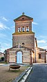
- Nomination Pilgrimage chapel Steinknock in Mistendorf near Bamberg --Ermell 06:40, 17 September 2020 (UTC)
 Comment Ganz rechts erscheint bei mir in 1:1 Ansicht eine helle gestrichelte Linie die leicht schräg verläuft. Kannst du das mal überprüfen. --Berthold Werner 09:45, 17 September 2020 (UTC)
 - Promotion Support Great shot. --Crep171166 06:33, 24 September 2020 (UTC)
- Nomination Pilgrimage chapel Steinknock in Mistendorf near Bamberg --Ermell 06:40, 17 September 2020 (UTC)
-

- Nomination The Lielupe River flows around The Rastrelli Palace ‘Under Restoration’ outside Jelgava --Scotch Mist 05:51, 17 September 2020 (UTC)
- Decline Oppose It's unsharp, and parts of the white highlights are overexposed. --A.Savin 21:32, 24 September 2020 (UTC)
-

- Nomination Orthodox Cathedral in Jelgava, Latvia --Scotch Mist 05:51, 17 September 2020 (UTC)
- Withdrawn
Slightly dark and dark shadows. Would also benefit from sharpeness. Fixable. --ArildV 07:12, 17 September 2020 (UTC) Done Thank you for your constructive feedback - have attempted changes but not sure if these sufficient --Scotch Mist 09:31, 18 September 2020 (UTC) CommentThe bottom left of the Cathedral still looks too dark compared to the rest, and there seems to be compression. --Vincent60030 08:44, 22 September 2020 (UTC)
The new version is better, but I agree with Vincent here. --ArildV 17:23, 22 September 2020 (UTC) I withdraw my nomination Will have another attempt when I have more time --Scotch Mist 08:55, 24 September 2020 (UTC)
-

- Nomination Embankment of the Lielupe River in Jelgava --Scotch Mist 05:01, 16 September 2020 (UTC) Comment It's a bit hanging to the right. Just out of curiosity, why ISO 400 (It happens to me when I forget to adjust the camera ;-) --Moroder 07:23, 23 September 2020 (UTC)
@Moroder: Thank you for your review - I think the image appears to 'hang to the right' because the bridge\flyover is at an angle rising from an intermediate island (ISO400 not deliberately intended here - I can also be forgetful!:) --Scotch Mist 08:49, 24 September 2020 (UTC) - Promotion Good quality. --Moroder 10:46, 24 September 2020 (UTC)
- Nomination Embankment of the Lielupe River in Jelgava --Scotch Mist 05:01, 16 September 2020 (UTC)
-
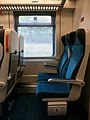
- Nomination Czech EuroCity interior --MB-one 21:54, 11 September 2020 (UTC) Comment Can we have a version with more light? --Cvmontuy 12:14, 14 September 2020 (UTC)?
- Decline
it is cropped to much on the right and to less on the left --Augustgeyler 23:51, 14 September 2020 (UTC)
@MB-one: Hmm you might have missed out the light comment. --Vincent60030 09:03, 22 September 2020 (UTC) Oppose  no response after 10 days --Augustgeyler 22:05, 24 September 2020 (UTC)
- Nomination Czech EuroCity interior --MB-one 21:54, 11 September 2020 (UTC)


_50_Pfennig_1921_RV_Tilly.jpg)


.jpg)
.jpg)


.jpg)
.jpg)
.jpg)
.jpg)
.jpg)
.jpg)


.jpg)


_12.jpg)
_08.jpg)


;.jpg)

.jpg)


.jpg)


.jpg)


.jpg)
.jpg)
.jpg)
Consensual review edit
File:Potton_House_Big_Spring_Texas.jpg edit

- Nomination Potton House in Big Spring, Texas, U.S. By User:Nv8200pa --Another Believer 22:18, 24 September 2020 (UTC)
- Decline
- Support Good quality. --Halavar 22:33, 24 September 2020 (UTC)
- Oppose Sorry but it looks like heavily downsized phone picture. Straightening verticals would be good --Podzemnik 03:10, 25 September 2020 (UTC)
- Oppose per Podzemnik. -- Ikan Kekek 07:48, 25 September 2020 (UTC)
- Oppose The sky near the horizon is badly artifacted --ReneeWrites 12:24, 25 September 2020 (UTC)
Running total: 1 support (excluding the nominator), 3 oppose → Decline? --ReneeWrites 11:44, 26 September 2020 (UTC)
File:Piazzetta_dalmata_nudo_Vittoriale_degli_Italiani.jpg edit

- Nomination Nude on Piazzetta dalmata square at the Vittoriale degli Italiani. --Moroder 09:55, 24 September 2020 (UTC)
- Promotion
- Support Good quality. --Halavar 10:24, 24 September 2020 (UTC)
- Oppose I think it is a bit overexposed. Please discuss. -- Spurzem 12:02, 24 September 2020 (UTC)
- Comment @Spurzem: This is the histogram of the photo. Thanks --Moroder 21:07, 24 September 2020 (UTC)
- Support OK for me. -- Ikan Kekek 07:52, 25 September 2020 (UTC)
- Support QI without having to look into the histrogram --Poco a poco 22:05, 25 September 2020 (UTC)
- Support per Poco. --Aristeas 11:04, 26 September 2020 (UTC)
Running total: 4 support (excluding the nominator), 1 oppose → Promote? --ReneeWrites 11:43, 26 September 2020 (UTC)
File:WLM_-_2020_-_Stralsund_-_Rathaus.jpg edit

- Nomination The Town hall of Stralsund, Mecklenburg-Vorpommern, Germany. --Moahim 15:21, 18 September 2020 (UTC)
- Decline
- Comment A bit oversaturated. The guy with the bag looks weired. --Ermell 20:14, 18 September 2020 (UTC)
- Done Done with saturation. I cannot fix the guy now. --Moahim 18:58, 21 September 2020 (UTC)
- Oppose No QI for me. Sorry. --Ermell 19:11, 21 September 2020 (UTC)
- Oppose This fits more for an Instagram post, but sorry not a QI. --Vincent60030 05:57, 23 September 2020 (UTC)
- Oppose probably exposure bracketing? Doesn't work well with moving objects or persons in the scene. --Smial 11:22, 23 September 2020 (UTC)
Total: 0 support (excluding the nominator), 3 oppose →  Declined --Peulle 12:37, 26 September 2020 (UTC)
File:WLM_-_2020_-_Stralsund_-_Lotsenhaus.jpg edit

- Nomination The "Pilot House", Stralsund, Mecklenburg-Vorpommern, Germany. --Moahim 07:57, 18 September 2020 (UTC)
- Promotion
- Comment Good quality but the sky is to dark imo. --ArildV 08:07, 18 September 2020 (UTC)
- Comment Actually, I think it looks great against the dark (polarised?) sky. But I'd crop out a lot of the bottom which shows too much dead space. (I might also try cropping out the portable toilets and see whether that worked.) --Bobulous 20:39, 19 September 2020 (UTC)
- Done Yes, the sky is polarized. I tried new crop. --Moahim 18:56, 21 September 2020 (UTC)
- Comment Yes, that's much better, giving more attention to the building and the boat. --Bobulous 21:26, 21 September 2020 (UTC)
- Oppose Sorry, we need to discuss the dark sky. --ArildV 17:33, 22 September 2020 (UTC)
- Oppose Sorry, the sky looks over-edited which does not appear natural. --Vincent60030 05:56, 23 September 2020 (UTC)
- Comment The darkened sky is not the result of editing, but a natural effect of using a polarising filter. I think in this case it gave a very dramatic look, and focused attention on the rich texture and colour of the building. --Bobulous 19:09, 23 September 2020 (UTC)
 Neutral hmm after the edit I think it is more balanced now as it was really intense. --Vincent60030 10:18, 24 September 2020 (UTC)
- Support Setting the polarizer to maximum effect is a matter of taste. I can not see technical issues preventing QI status. --Smial 11:20, 23 September 2020 (UTC)
- Oppose Too dark. --Kallerna 11:30, 23 September 2020 (UTC)
- Done So. let's try new version. --Moahim 18:47, 23 September 2020 (UTC)
- Support Am I right in thinking that each time a new version is created, all votes are effectively zeroed, and only votes made after the change are counted? If so, count this as a vote for the new version. --Bobulous 19:21, 24 September 2020 (UTC)
- Comment No, all previous votes for the old version remain. --ReneeWrites 22:08, 23 September 2020 (UTC)
- Support IMHO it’s OK now. --Aristeas 07:41, 24 September 2020 (UTC)
- Oppose Looks much better now, but the upper part of the building and its roof are showing too much distortion.--Augustgeyler 10:35, 24 September 2020 (UTC)
- Comment Sorry, but I disagree with this remark. This is rather a feature of architecture. --Moahim 18:46, 24 September 2020 (UTC)
 Question What kind of distortion do you mean? No offence, I just wanted to ask. --Aristeas 16:00, 24 September 2020 (UTC)
- Comment @Moahim and Aristeas: The outer vertical lines are opening to the top and getting strongly closer to the bottom. --Augustgeyler (talk) 21:48, 24 September 2020 (UTC)
- Comment @Augustgeyler: Ah, thank you! Yes, I see this, but I would assume that this is a historical building which just does not have perfectly straight walls. In photos like this one it is often not possible to find a correction which makes all vertical lines perfectly vertical. If I compare other vertical lines in the photo, e.g. the lamp posts or the railing of the stairs, I would guess that Moahim has done a good job and found the a good compromise; because if we would make the vertical lines of the building straight, other vertical lines would be leaning in. Best, --Aristeas 09:04, 25 September 2020 (UTC)
- Comment @Aristeas: You are absolutely right. That's why I would try to take such a picture with a longer focal length or try to find a higher standpoint for not having to tilt the camera to the sky that much. But, well, it might be a matter of taste. There is still a majority voting pro. Best regards --Augustgeyler 09:47, 25 September 2020 (UTC)
- Support Per others, but geocode would be fine. --Palauenc05 06:37, 25 September 2020 (UTC)
- Done I added geocode --Moahim 08:30, 25 September 2020 (UTC)
 --Palauenc05 10:19, 25 September 2020 (UTC)
- Support because it's a very good photo. I doubt the sky was really that dark, though. -- Ikan Kekek 09:53, 26 September 2020 (UTC)
Running total: 5 support (excluding the nominator), 3 oppose → Promote? --ReneeWrites 11:42, 26 September 2020 (UTC)
File:SEG_5992_3-5000-114.jpg edit

- Nomination Rothschild Boulevard 89. By User:Degser --Andrew J.Kurbiko 08:14, 15 September 2020 (UTC)
- Decline
- Comment Hi there, parts of it look tilted. Degser could a perspective correction be done? --Vincent60030 10:29, 19 September 2020 (UTC)
- Oppose Please fill in a reason why the image does not meet the guidelines. --Andrew J.Kurbiko 21:18, 22 September 2020 (UTC)
- Comment Excuse me @Andrew J.Kurbiko: , please open your eyes before you move this to discussion. I asked for a perspective correction, and I never rejected the picture. --Vincent60030 05:47, 23 September 2020 (UTC)
- Oh, sorry, I simply used a standard template red template to remove nomination by myself. I can not fix it by myself, and the author is most probably inactive. --Andrew J.Kurbiko 07:36, 23 September 2020 (UTC)
- Oppose I think the cars are a disturbing foreground element as they are depicted.--Peulle 07:53, 23 September 2020 (UTC)
- Oppose Per Peulle --Michielverbeek 06:01, 24 September 2020 (UTC)
Total: 0 support (excluding the nominator), 3 oppose → Declined --Peulle 12:36, 26 September 2020 (UTC)
File:Diamond DA62, AERO 2018, Friedrichshafen (1X7A4399-HDR).jpg edit
.jpg)
- Nomination Diamond DA52 at AERO Friedrichshafen 2018 --MB-one 08:52, 21 September 2020 (UTC)
- Decline
- Support Good quality. --Basile Morin 10:27, 21 September 2020 (UTC)
- Oppose Unfortunate crop, wings cut off, distracting tent in the background, sloppy description. --Palauenc05 17:38, 21 September 2020 (UTC)
- Oppose I have to agree with Palauenc05. I like to allow a lot of leeway in composition for QIs, but this composition is a real jumble to my eyes. -- Ikan Kekek 11:52, 22 September 2020 (UTC)
- Comment Crispy sharp and good light for me. The current composition highlights the fuselage with open doors. This is a choice of the photographer to display the plane in full or to focus on some specific parts. See Category:Aircraft doors and Category:Aircraft fuselages. The file was named "Diamond DA52, AERO 2018, Friedrichshafen". This is a descriptive title in my opinion. Diamond DA52 is the model of this plane. "AERO 2018" probably the exposition, and Friedrichshafen the city in Germany. Now the description has been improved by the author accordingly -- Basile Morin 00:08, 23 September 2020 (UTC)
- Comment If it is meant to focus on the details, the caption should have been more specific. Captions are very important, which provides another form of description for the picture. --Vincent60030 05:52, 23 September 2020 (UTC)
- Oppose Distracting background. --Kallerna 11:29, 23 September 2020 (UTC)
- Yes, the distracting background is still there, the picture looks like a random shot rather than a quality one. The file name does not replace a proper description. Although this has been done in the meantime, I keep my oppose vote for the above-mentioned reason. --Palauenc05 12:26, 23 September 2020 (UTC)
Total: 1 support (excluding the nominator), 3 oppose → Declined --Peulle 12:36, 26 September 2020 (UTC)
File:Train_station,_Flensburg_(P1060149).jpg edit
.jpg)
- Nomination Elevator at Flensburg train station --MB-one 08:52, 21 September 2020 (UTC)
- Promotion
- Support Good quality. --Basile Morin 10:27, 21 September 2020 (UTC)
- Oppose Bad lighting situation --Augustgeyler 11:01, 21 September 2020 (UTC)
- Support Good quality, and perfectly OK lighting for this kind of motif. -- Ikan Kekek 11:56, 22 September 2020 (UTC)
- Support We know you have a picky taste Augustgeyler, and a number of others as well, but QI isn't a FP candidate. This is just describing a lift from the staircase. I expect some objectiveness, and lighting is perfectly fine here so I do not know what's the issue. --Vincent60030 05:55, 23 September 2020 (UTC)
- Comment @Vincent60030: I know that this is not about FP candidates. In this case I see your point. But I thought the chosen perspective does not give enough light. Perhaps you are right. And of course I respect every majority voting different to me. But could you please be so kind not reviewing my taste or whatever you think my taste might be?--Augustgeyler 22:29, 24 September 2020 (UTC)
- Oppose Too dark. --Kallerna 11:24, 23 September 2020 (UTC)
Total: 3 support (excluding the nominator), 2 oppose →  Promoted --Peulle 12:35, 26 September 2020 (UTC)
File:Jelgava_01.jpg edit

- Nomination Sign-posted Way (on Lielā iela) into Jelgava, in Latvia, with Holy Trinity Tower on left --Scotch Mist 05:53, 15 September 2020 (UTC)
- Decline
- Comment The picture should be cropped if it is to describe the sign. --Vincent60030 07:03, 19 September 2020 (UTC)
- Comment Thank you for your review but do not agree the image should be cropped further as the first part of the sign refers to the Holy Trinity Church Tower which is visible on the left --Scotch Mist 08:41, 19 September 2020 (UTC)
- Comment Hmm how about we take this to discussion? The caption is not on point in this case. --Vincent60030 10:24, 19 September 2020 (UTC)
- Comment I think the picture's fine, and doesn't need to be changed or cropped, though I think the description would be more accurate if it included the name of the street as well (it's part of the picture, after all). I would also like if the information about the church was included in the summary, and/or if the summary included information of that street or area generally, rather than a short history of the entire city. --ReneeWrites 15:12, 20 September 2020 (UTC)
- Done @ReneeWrites: Thank you for your constructive comment the details of which I have implemented --Scotch Mist 18:12, 21 September 2020 (UTC)
- Oppose There is too much sky. Its cropped to hard at the bottom. The shadows are too dark due to hard lighting conditions. --Augustgeyler (talk) 10:37, 21 September 2020 (UTC)
- @Augustgeyler: The first reviewer indicated that the image should be cropped further but your comment indicates that the image was cropped too hard at the bottom - these appear to be both opposing and subjective opinions and neither appear to reflect the 'balance' I intended being of course my own subjective opinion!:) --Scotch Mist 18:12, 21 September 2020 (UTC)
- @Scotch Mist: You are right. I think that this is exactly what it is about: It is about making a decision. You could decide to only tell about the sign. In that case, there can be much more cropping like @Vincent60030: said. On the other hand you could decide to tell something about the hole scenery, including the street, the church and the sign. In this case, I really suggest to show more street. Your version did not decide for any of this options. That's why I opposed. --Augustgeyler 22:28, 21 September 2020 (UTC)
- Support Disagree with the above comment. --ReneeWrites 17:06, 21 September 2020 (UTC)
- Oppose Bad light, not sure about the subject. --Kallerna 11:27, 23 September 2020 (UTC)
Total: 1 support (excluding the nominator), 2 oppose → Declined --Peulle 12:35, 26 September 2020 (UTC)
File:Monumento_a_Giuseppe_Zanardelli_a_Salò.jpg edit

- Nomination Detail monument to Giuseppe Zanardelli in Salò. --Moroder 00:27, 16 September 2020 (UTC)
- Decline
- Support Good image quality. --Tagooty 03:17, 17 September 2020 (UTC)
- Oppose shoes are cropped --Augustgeyler 12:20, 18 September 2020 (UTC)
- Oppose per Augustgeyler. --Fischer.H 17:22, 19 September 2020 (UTC)
- Support Good image quality - IMO a tiny portion of missing shoe sole does not distract from the image of this impressive sculpture, dominated by Giuseppe's expressive head\face!--Scotch Mist 18:31, 21 September 2020 (UTC)
- Support I'll admit the cropping isn't ideal, but both shoes are shown in full, so the full figure is included in the picture. It seems like too small a thing to reject an otherwise good image for QI for that. --ReneeWrites 18:48, 21 September 2020 (UTC)
- Oppose Perspective. --Smial 11:27, 22 September 2020 (UTC)
- Comment @Smial: The object is a statue not the architecture --Moroder 13:19, 22 September 2020 (UTC)
- Comment Of course. But tons of images are rejected here because of perspective issues in irrelevant background. Here we have a very prominent background. No double standards. --Smial 11:28, 23 September 2020 (UTC)
- Support While the bottom isn't perfectly cropped, the perspective and composition is very well done, which perfectly describes the statue. QI for me. --Vincent60030 06:01, 23 September 2020 (UTC)
- Oppose Perspective. --Kallerna 11:25, 23 September 2020 (UTC)
- Oppose Please look to the verticals in the background and the bottom cropped is not well done --Michielverbeek 06:06, 24 September 2020 (UTC)
- Oppose Bottom crop apart from perspective Poco a poco 22:23, 25 September 2020 (UTC)
- Oppose Bottom crop. There was room to avoid cutting the feet.--Peulle 12:33, 26 September 2020 (UTC)
Running total: 4 support (excluding the nominator), 7 oppose → Decline? --Michielverbeek 06:06, 24 September 2020 (UTC)