Commons:Featured picture candidates/Log/May 2014
File:Endangered species Iguana Iguana from Margarita Island.jpg, featured edit
Voting period is over. Please don't add any new votes.Voting period ends on 30 Apr 2014 at 18:32:30 (UTC)
Visit the nomination page to add or modify image notes.

 Info All by -- Wilfredo R. Rodríguez H. (talk) 18:32, 21 April 2014 (UTC)
 Support Can it be specified whether this is a male or a female individuum? --Uoaei1 (talk) 06:07, 22 April 2014 (UTC)
 Done In description female. Thanks --Wilfredo R. Rodríguez H. (talk) 10:47, 22 April 2014 (UTC)
- Support --JLPC (talk) 17:02, 23 April 2014 (UTC)
 Oppose Unwelcome and distracting blurness around the nostrils. --(✉→Arctic Kangaroo←✎) 17:00, 24 April 2014 (UTC)
 Comment Have you ever tried to make a photo of a wild animal? It's a miracle it's that sharp! --Alexander Vasenin (talk)
- And without a macro lens :). I think I took about 300 photos to select only this. Iguanas often feel fear when a human is nearby, and always in the tops of tall trees. However, I understand that this is circumstantial, only the final result is evaluated. Thank Alex --Wilfredo R. Rodríguez H. (talk) 23:41, 24 April 2014 (UTC)
- @Alexander: 98% of the time I'm photographing animals. ;) So...yeah. There you go. --(✉→Arctic Kangaroo←✎) 13:56, 25 April 2014 (UTC)
 Question @Arctic Kangaroo: the right question I think he wanted to do, are you tried to make a photo of wild Iguana in this distance?. You'll need camouflage in most cases --Wilfredo R. Rodríguez H. (talk) 12:13, 26 April 2014 (UTC)
- I've never seen an iguana before. --(✉→Arctic Kangaroo←✎) 23:23, 26 April 2014 (UTC)
- Support Well done! --Alexander Vasenin (talk)
- Support --Baresi F (talk) 14:43, 26 April 2014 (UTC)
- Support Christian Ferrer (talk) 17:19, 26 April 2014 (UTC)
- Support Yann (talk) 11:02, 27 April 2014 (UTC)
- Support Jee 02:43, 29 April 2014 (UTC)
- Support --Joydeep Talk 12:24, 29 April 2014 (UTC)
File:Ossuary in Sedlec.JPG, featured edit
Voting period is over. Please don't add any new votes.Voting period ends on 30 Apr 2014 at 19:23:59 (UTC)
Visit the nomination page to add or modify image notes.

- Info created & uploaded by Jan Kameníček - nominated by Tomer T -- Tomer T (talk) 19:23, 21 April 2014 (UTC)
- Support -- Tomer T (talk) 19:23, 21 April 2014 (UTC)
- Support At least something different !--Jebulon (talk) 20:56, 21 April 2014 (UTC)
- Support Always useful --Archaeodontosaurus (talk) 05:33, 22 April 2014 (UTC)
- Support --JLPC (talk) 10:17, 22 April 2014 (UTC)
 Abstain or Comment Good idea and well composed. I'd support if general sharpness were (much) better. But I guess I'm asking too much of a small point and shoot camera... --Martin Falbisoner (talk) 14:21, 22 April 2014 (UTC)
- Support --Baresi F (talk) 21:14, 22 April 2014 (UTC)
- Support --Wilfredo R. Rodríguez H. (talk) 01:59, 23 April 2014 (UTC)
- Support Yann (talk) 05:29, 23 April 2014 (UTC)
- Oppose Ossuary certainly makes for an arresting image but I don't think this one rises above a well taken tourist photo. The technical quality and lighting is satisfactory rather than outstanding, and Sedlec Ossuary has lots of potential (see Google Images). -- Colin (talk) 21:17, 23 April 2014 (UTC)
- Support —Clockery Fairfeld who, me? 11:31, 24 April 2014 (UTC)
- Oppose I agree with Colin. Saffron Blaze (talk) 13:23, 24 April 2014 (UTC)
- Support Michael Barera (talk) 05:32, 27 April 2014 (UTC)
- Weak oppose That place is just crazy and in my to-visit-list for some time. I agree with Colin that this shot is different but does not capture the potential of the place. Furthermore I think that this picture is too small and lacks detail, and probably needs a horizontal perspective correction (see border in the bottom). Poco2 09:40, 27 April 2014 (UTC)
- CommentI did some perspective correction. I am afraid there cannot be done more, because in reality the edge at the bottom was not very straight either. Jan Kameníček (talk) 11:11, 27 April 2014 (UTC)
- Oppose per Colin. Kruusamägi (talk) 21:49, 28 April 2014 (UTC)
- Support I am the author of the picture and I must say that I was pleasantly surprised when I found out that it was nominated for FP (originally I uploaded it for the purpose of a Photo Challenge contest). I understand the opposing votes and their reasons, but I believe that the pluses, such as the composition and the whole idea, prevail. As for the technical quality, it may not be astounding, but the conditions in the ossuary (especially really bad light and no possibility to use a tripod) do not allow much more. Because I will not be online in the time of closure, I would like to thank all reviewers here for their votes and comments, both supporting and opposing, no matter of the final result of this nomination. Jan Kameníček (talk) 17:10, 29 April 2014 (UTC)
- Comment Thanks for uploading this photo to commons and Thank you very much for your comment, you sound like an educated person of good feelings --Wilfredo R. Rodríguez H. (talk) 12:59, 30 April 2014 (UTC)
File:La Grace (ship, 2010), Sète, Hérault 01.jpg, featured edit
Voting period is over. Please don't add any new votes.Voting period ends on 1 May 2014 at 10:30:14 (UTC)
Visit the nomination page to add or modify image notes.
,_S%C3%A8te,_H%C3%A9rault_01.jpg)
- Info all by Christian Ferrer
- Support --Christian Ferrer 10:29, 22 April 2014 (UTC)
- Oppose Subject not isolated from very busy background and in least dramatic form (at port, sails furled). See Commons:Featured pictures/Objects/Vehicles#Water for examples of featured ships. See File:La Grace-At Sea1-full.jpg for more impressive capture of this replica ship. And Google Images too. -- Colin (talk) 11:28, 22 April 2014 (UTC)
- Support I think the title/name of the image is just wrong, but the picture itself is very good to me, with a lot of things to be seen, like in real in a port. The light is excellent and I'm satisfied with the composition. Maybe the inflatable boat is not the best, but it was here.--Jebulon (talk) 15:46, 23 April 2014 (UTC)
- Jebulon, I choose this name because it's the yellow boat that we see in first, but you're right, there is a lot of things in this image and others titles are possible. --Christian Ferrer 05:10, 24 April 2014 (UTC)
- Support --JLPC (talk) 17:01, 23 April 2014 (UTC)
- Support --A.Savin 19:28, 23 April 2014 (UTC)
- Support --XRay talk 14:40, 25 April 2014 (UTC)
- Support maybe a tighter crop? --Martin Falbisoner (talk) 09:45, 26 April 2014 (UTC)
- Thanks Martin for your support and your suggestion, it's indeed a good idea, I tried and the visual impact seems better with your suggestion but I'm a 16:10 format fanatic, and I despair when I find a good image on the internet and when I view it with black strips at the top and at bottom. It is little as haircuts, when we too much cut it is too late. As soon as I can, in 95 % of my images, I prefer to propose this 16:10 format by condolence to those who as me are the enemies of the black strips. --Christian Ferrer 14:39, 26 April 2014 (UTC)
- Comment That's all right, you've got my support anyway... Martin Falbisoner (talk) 09:06, 27 April 2014 (UTC)
- Support Michael Barera (talk) 05:34, 27 April 2014 (UTC)
- Weak oppose I mostly agree with Colin's comment. Good quality, good lighting, but cluttered composition without anything that clearly draws the attention of the viewer. Poco2 09:23, 27 April 2014 (UTC)
- Support --Ivar (talk) 16:55, 28 April 2014 (UTC)
File:Kenzo Building, 1 rue du Pont-Neuf, Paris.jpg, not featured edit
Voting period is over. Please don't add any new votes.Voting period ends on 5 May 2014 at 14:55:51 (UTC)
Visit the nomination page to add or modify image notes.

- Info created by Luc Boegly - uploaded by & nominated by Paris 16 -- Paris 16 (talk) 14:55, 26 April 2014 (UTC)
- Support -- Paris 16 (talk) 14:55, 26 April 2014 (UTC)
- Oppose How unusual to get a picture where the "corrected" vertical perspective results in distortion at ground level rather than among the spires and weather vanes. It does, unfortunately, give the effect that the pavement is about to slope off the face of the earth. The bright lights aren't handled as well as required for FP imo -- some HDR technique is needed for this. Some people in the street would be nice too. -- Colin (talk) 20:01, 26 April 2014 (UTC)
- Oppose Badly blown highlights on sidewalk, plus light pole is a little distracting. Daniel Case (talk) 03:41, 27 April 2014 (UTC)
- weak Oppose sorry not a bad photo but to many problem for FP imo (per above).--ArildV (talk) 21:58, 30 April 2014 (UTC)
File:Fluitenkruid (Anthriscus sylvestris).JPG, not featured edit
Voting period is over. Please don't add any new votes.Voting period ends on 6 May 2014 at 00:54:58 (UTC)
Visit the nomination page to add or modify image notes.
.JPG)
- Info created and uploaded by Famberhorst - nominated by Arctic Kangaroo -- (✉→Arctic Kangaroo←✎) 00:54, 27 April 2014 (UTC)
- Support -- (✉→Arctic Kangaroo←✎) 00:54, 27 April 2014 (UTC)
- Oppose Cluttered composition with distracting background; white balance feels a little off. Might've been more interesting in closeup. Daniel Case (talk) 03:37, 27 April 2014 (UTC)
File:Iglesia de Santiago Tlatelolco, México D.F., México, 2013-10-16, DD 38.JPG, featured edit
Voting period is over. Please don't add any new votes.Voting period ends on 3 May 2014 at 17:04:28 (UTC)
Visit the nomination page to add or modify image notes.

- Info Church of Santiago Tlatelolco, host of the Colegio de Santa Cruz de Tlatelolco (first European school of higher learning in the Americas), Mexico City, Mexico. All by me, Poco2 17:04, 24 April 2014 (UTC)
- Support -- Poco2 17:04, 24 April 2014 (UTC)
- Support -- Berthold Werner (talk) 17:29, 24 April 2014 (UTC)
- Support Heh Poco, the standard for church interiors is forty megapixels these days, not fourteen :-). I would have liked to see more detail, and the bright lights handled a little better, but we aren't all Diliff. The subject has wow enough for me. -- Colin (talk) 20:07, 24 April 2014 (UTC)
- Support --P e z i (talk) 22:07, 24 April 2014 (UTC)
- Support --JLPC (talk) 17:20, 25 April 2014 (UTC)
- Support --Joydeep Talk 08:51, 26 April 2014 (UTC)
- Support and seven! --Martin Falbisoner (talk) 09:43, 26 April 2014 (UTC)
- Support Christian Ferrer (talk) 17:27, 26 April 2014 (UTC)
- Support Michael Barera (talk) 05:38, 27 April 2014 (UTC)
- Support --King of ♥ ♦ ♣ ♠ 23:47, 1 May 2014 (UTC)
File:Darya Zhukova (12106365364).jpg, not featured edit
Voting period is over. Please don't add any new votes.Voting period ends on 6 May 2014 at 10:57:33 (UTC)
Visit the nomination page to add or modify image notes.
.jpg)
- Info created by Александр Каргальцев (Sasha Kargaltsev) - uploaded by Fæ
- Support as nominator. Some participants at FPC may be offended by male nudity, I believe this photograph justifies that risk and worth consideration due to being an exemplar work of a well established LGBT artist, as well as for its educational value in relation to parody and protest of contemporary racism and a reaction by Kargaltsev to his own experience of homophobia.
- Kargaltsev is a photographer and film producer known for his gay related artworks featuring the male nude, describing himself as a queer artist who fled oppression in Russia by emigrating to America. This photograph is both an interesting LGBT cultural work with historical and artistic resonances in the areas of American racism and the original Allen Jones' "chair" from 1969, along with being a political protest against Zhukova's recent racially offensive photograph. See the links on the image page for press impact of this artwork. -- Fæ (talk) 10:57, 27 April 2014 (UTC)
- Comment I am sure there are folks here offended by any nudity. Cultural sensitivities differ. I think if we stop talking about the fact it is a nude whenever anyone nominates a nude it will be less of an issue. That aside, images here need more than just EV or a strong social commentary, although these certainly help. Images nominated at COM:FPC should be the finest of their kind and even where systemic bias may exist this basic principle is not waived. When I first looked at the thumb I was hopeful it would be good enough to have a legitimate chance, as it would be nice for FPC to be more than just butterflies, landscapes and architecture. As to the image itself, I noted a few technical flaws with softness in areas and the general lighting that make me think this will not stand up well against the guidelines. Using past FP images wasn't much help, as even the female form is well under-represented in the people category. I did a search in Google for examples of male nudes and this does not compare well. I finally asked myself if this was an image of two beautiful women and nothing else changed would I support and it was an adamant no. Saffron Blaze (talk) 19:54, 27 April 2014 (UTC)
- Oppose As a photograph and as a work of art, this has not achieved greatness: it has failed to provoke an original response, it is technically flawed, and imo it is artistically weak.
- EV: The photograph featuring Zhukova sitting on on a chair that looked like a contorted half-naked black woman was highly controversial and provocative (and publicity-forming for all those concerned). It generated a huge amount of comment in the press and online. Like it or not, this is what modern art does. The artist behind the chair (Bjarne Melgaard) is known for highly controversial and provocative works. And the original Allen Jones chair (with a white woman) in the Tate is itself controversial and provocative, though it causes offence for other reasons. So much deliberate provocation and controversy. So much building on or commenting on the work of others. So much publicity-seeking or advocacy-making. While Kargaltsev's protest has achieved a tiny amount of publicity, nobody is talking about the photo itself (beyond a perfunctory description). The news is merely that "a gay Russian artist" created the photo to make a point, for which he gets a moment to put across in his own words, before the news stories rehash the previous week's much more interesting story about the Russian oligarch's wife. So I see a "political protest" about Zhukova's photograph, which has been widely interpreted as racist, but I don't see "an interesting LGBT cultural work with historical and artistic resonances in the areas of American racism and the original Allen Jones' "chair" from 1969".
- Technically, the photo suffers from being just plain out of focus. If one looks at the floor, it is clear the focus is much closer to the photographer than either of the two subjects. It fails on that alone really.
- Artistically, the image isn't strong imo. We have two naked people in an awkwardly-held pose in a photographer's studio. Nothing especially new about that: the internet is, frankly, absolutely chock full of such pictures. What does the picture say? Why are they there? Why are they arranged like that? Without the accompanying explanation, one really has no clue what is going on here or why we should care. We know it wasn't just intended as a study of the male nude form. Compare that to the controversial Zhukova photo. One one level it is a fashionable and famous young lady sitting at a dressing table, smiling slightly for the camera. Then one notices the outrageous chair and considers if it is hers or why she chose to be photographed sitting in it. The awkward pose of the black "woman" and sat-upon situation makes sense [!] in her bondage attire and function as an actual seat. But strangely "she" appears to be happy and looking directly at Zhukova -- "her" eyeline linking the two "subjects". One wonders if the black chair is really a woman (it isn't) and if not, why "she" needs a rug to lie on. And the rest of the image, with the dressing table, the bare uncluttered room, and the three mirrors framing the subject are all carefully arranged. The Zhukova photo, no matter what one thinks of it ethically, is a work of art. Kargaltsev's hurried protest image, is not. -- Colin (talk) 20:57, 28 April 2014 (UTC)
- Oppose Bad try...so with racism against racism. --Mile (talk) 09:32, 1 May 2014 (UTC)
File:Facade på Aarhus Rådhus.jpg, not featured edit
Voting period is over. Please don't add any new votes.Voting period ends on 2 May 2014 at 11:35:12 (UTC)
Visit the nomination page to add or modify image notes.

- Info created, uploaded and nominated by Villy Fink Isaksen| -- Villy Fink Isaksen (talk) 11:35, 23 April 2014 (UTC)
- Support -- Villy Fink Isaksen (talk) 11:35, 23 April 2014 (UTC)
- Comment I quite like the photo but there's a fair amount of CA, chroma noise and moire that could be addressed with e.g. Lightroom. -- Colin (talk) 11:59, 24 April 2014 (UTC)
- Comment I have tried to fix the errors. --Villy Fink Isaksen (talk) 14:05, 24 April 2014 (UTC)
- Support Christian Ferrer (talk) 17:24, 26 April 2014 (UTC)
- Support Michael Barera (talk) 05:35, 27 April 2014 (UTC)
- Oppose Good quality, but boring building. Sorry. Yann (talk) 11:00, 27 April 2014 (UTC)
- Oppose per Yann. Kruusamägi (talk) 21:46, 28 April 2014 (UTC)
- Support Amandajm (talk) 10:21, 30 April 2014 (UTC), regardless of how boring the building might be, the photo is interesting. The interest lies in the surface texture and the irregularities of the windows. It is a useful photo of a Palazzo-style building reduced to minimalist form. Having found it, I am about to use it in an article. Wow, it's 1941! — Preceding unsigned comment added by Amandajm (talk • contribs) 10:27, 30 April 2014 (UTC)
- Oppose No wow, sorry. It's not just the building; the lighting is not ideal either. --King of ♥ ♦ ♣ ♠ 23:46, 1 May 2014 (UTC)
File:Peacock butterfly (inachis io).jpg, featured edit
Voting period is over. Please don't add any new votes.Voting period ends on 6 May 2014 at 00:58:25 (UTC)
Visit the nomination page to add or modify image notes.
.jpg)
- Info created and uploaded by Charlesjsharp - nominated by Arctic Kangaroo -- (✉→Arctic Kangaroo←✎) 00:58, 27 April 2014 (UTC)
- Support -- (✉→Arctic Kangaroo←✎) 00:58, 27 April 2014 (UTC)
- Support Very good focus --Alexander Vasenin (talk)
- @JDP90: "Lacks sharpness"? IMHO this is within the desired sharpness range for butterfly photography. --(✉→Arctic Kangaroo←✎) 08:45, 27 April 2014 (UTC)
- I think it could have been sharper. Please view this FP. --Joydeep Talk 09:06, 27 April 2014 (UTC)
- Yup of course. But I think it's good enough. :P Never mind, thanks for your comment and vote. --(✉→Arctic Kangaroo←✎) 09:08, 27 April 2014 (UTC)
- I don't see much sharpness issue in Joydeep's work other than the DOF issue of the closeup filter he used. The background was busy compared to this and the specimen had damaged wings. Remember, a butterfly will lose his glory within one day due to aging and the troubles they faced from the predators.
- It may good to clone out the "half flower" on right here. Here the subject is not fully "parallel"; so the forewing tips are OOF. ;) Jee 13:18, 27 April 2014 (UTC)
- Yes, got the point of Jee, and I know as does Jee that how difficult it is to take a macro without a dedicated macro lens. But I thought that with 400mm the distance of the subject from camera is enough to adjust and take a technically better photo (as I use a 50mm prime lens with closeup filter, so I have to go very very close to the subject and then adjust my camera). Nevertheless Support. --Joydeep Talk 17:40, 27 April 2014 (UTC)
- Yes; subject distance is the key element affecting DOF than focal length. Closeup filters need very close subject distance (merely 10cm for my Reynox DCR 250 while capturing Blues) so DOF is very limited. Longer macro lens (like 180/200mm) have more subject distance than 60/100mms to make the same magnification; so better DOF. If we can't afford them; one compromise is to use a tele as The Photographer does even though we loss some fine details. Jee 04:29, 28 April 2014 (UTC)
- Yes, got the point of Jee, and I know as does Jee that how difficult it is to take a macro without a dedicated macro lens. But I thought that with 400mm the distance of the subject from camera is enough to adjust and take a technically better photo (as I use a 50mm prime lens with closeup filter, so I have to go very very close to the subject and then adjust my camera). Nevertheless
Alternative edit
_2.jpg)
- Info Created / uploaded / nominated by --Charles (talk) 14:24, 27 April 2014 (UTC)
- Support --(✉→Arctic Kangaroo←✎) 14:46, 27 April 2014 (UTC)
- Support --Joydeep Talk 17:40, 27 April 2014 (UTC)
- Support Better. Jee 04:18, 28 April 2014 (UTC)
- Support --Uoaei1 (talk) 10:33, 28 April 2014 (UTC)
- Support -- Saffron Blaze (talk) 14:20, 28 April 2014 (UTC)
- Support -- Christian Ferrer (talk) 14:55, 28 April 2014 (UTC)
- Support --Ximonic (talk) 00:02, 29 April 2014 (UTC)
- Support --Martin Falbisoner (talk) 04:54, 30 April 2014 (UTC)
- Support --Archaeodontosaurus (talk) 05:10, 30 April 2014 (UTC)
- Support --JLPC (talk) 10:02, 30 April 2014 (UTC)
File:USO-Sale Sharks - 20131205 - Derrière la melée ouverte.jpg, not featured edit
Voting period is over. Please don't add any new votes.Voting period ends on 6 May 2014 at 09:58:15 (UTC)
Visit the nomination page to add or modify image notes.

- Info created by, uploaded by, nominated by Pleclown -- Pleclown (talk) 09:58, 27 April 2014 (UTC)
- Support This picture was taken during the match opposing the USO to the Sale Sharks, competing in the European Challenge Cup, which was attended by two accredited photographers, thanks to Wikimedia CH. The USO player (in beige with the hlemet) has just got the ball on his hands and is starting his run. The Sharks player on the left is advancing to try to tackle him. Behind him is the ruck from which the ball was extracted. -- Pleclown (talk) 09:58, 27 April 2014 (UTC)
- Oppose I think having the scrum cut in half is a major disappointment for this image. Everything else seems fine. Saffron Blaze (talk) 20:01, 27 April 2014 (UTC)
- I understand what you say. But I'd like to point that this is not a scrum, but a ruck, and that the blue players on the right are the defensive line of the Sales Sharks, not the forward lines. This is the result of this tackle (tackle, ruck, ball coming out to the offensive player on the left of the picture). Pleclown (talk) 11:11, 28 April 2014 (UTC)
 Neutral I agree with Saffron, I like and know rugdy and I understand that the image is centered on the action, it's a good centring for a tv camera but for this photo I want to see a bit more at right, the cut mens on the right are, like it or not, a part of the composition and they are cut. However it's a good and nice image. Christian Ferrer (talk) 17:43, 28 April 2014 (UTC)
File:Ta Phrom, Angkor, Camboya, 2013-08-16, DD 39.JPG, not featured edit
Voting period is over. Please don't add any new votes.Voting period ends on 2 May 2014 at 15:48:07 (UTC)
Visit the nomination page to add or modify image notes.

- Info Interior of the Ta Phrom temple in Angkor, Cambodia. All by me, Poco2 15:48, 23 April 2014 (UTC)
- Support -- Poco2 15:48, 23 April 2014 (UTC)
- Comment percpectives (left and right are leaning out) -- Christian Ferrer 18:11, 23 april 2014 (UTC)
- Corrected, which does not mean that everything is vertical now (right side), because it isn't vertical in reality Poco2 21:56, 23 April 2014 (UTC)
- Support Sharpness id not the best on the edges, however I like it very much. -- Christian Ferrer 04:49, 24 april 2014 (UTC)
- Oppose Composition, lighting and sharpness not really saying "wow" to me. Location is very wow. -- Colin (talk) 21:44, 23 April 2014 (UTC)
- Oppose Agree with Colin. I don't understand the composition.--Jebulon (talk) 10:00, 24 April 2014 (UTC)
- Support Nice chaos! --Uoaei1 (talk) 10:23, 24 April 2014 (UTC)
- Support - Sadly reality is not clear foregrounds and no canopy. This reminds me of the mess surrounding Prambanan, which is one of the reasons I haven't been able to get a really good image of that temple yet. Now, for this particular image, I get the vision of Indiana Jones going through the temple, dodging darts. Very evocative. — Crisco 1492 (talk) 01:42, 25 April 2014 (UTC)
- Tomb Raider, maybe ?--Jebulon (talk) 11:28, 25 April 2014 (UTC)
- Never did get into that series, though you're right that this is the wrong part of the world. The other one I was thinking of was Eternal Darkness: Sanity's Requiem, but that's Angkor Wat. — Crisco 1492 (talk) 12:19, 25 April 2014 (UTC)
- Tomb Raider, maybe ?--Jebulon (talk) 11:28, 25 April 2014 (UTC)
- Support Michael Barera (talk) 05:35, 27 April 2014 (UTC)
- Support --Llorenzi (talk) 09:18, 29 April 2014 (UTC)
- Support --Joydeep Talk 16:55, 29 April 2014 (UTC)
- Oppose -- Not convinced by the composition. Saffron Blaze (talk) 13:04, 1 May 2014 (UTC)
- Oppose Horizon is too centered and bottom crop seems a bit random. --King of ♥ ♦ ♣ ♠ 23:47, 1 May 2014 (UTC)
File:View of Uchisar.JPG, featured edit
Voting period is over. Please don't add any new votes.Voting period ends on 6 May 2014 at 16:50:34 (UTC)
Visit the nomination page to add or modify image notes.

- Info created by Moroder - uploaded by Moroder - nominated by Moroder -- Wolfgang Moroder (talk) 16:50, 27 April 2014 (UTC)
- Support -- Wolfgang Moroder (talk) 16:50, 27 April 2014 (UTC)
- Support -- Christian Ferrer (talk) 05:03, 28 April 2014 (UTC)
- Support -- Godhulii 1985 (talk) 09:37, 28 April 2014 (UTC)
- Support Think I have to go there someday ... --P e z i (talk) 10:11, 28 April 2014 (UTC)
- Support --Uoaei1 (talk) 10:29, 28 April 2014 (UTC)
- Support --Joydeep Talk 13:19, 28 April 2014 (UTC)
- Support So painterly and fantastic ... Daniel Case (talk) 14:16, 28 April 2014 (UTC)
- Support I like it, fantastic light. Tolle Lichtstimmung! --Alchemist-hp (talk) 14:53, 28 April 2014 (UTC)
- Support --Martin Falbisoner (talk) 15:15, 28 April 2014 (UTC)
- Support --JLPC (talk) 16:17, 28 April 2014 (UTC)
- Support --Ivar (talk) 16:51, 28 April 2014 (UTC)
- Support --Tuxyso (talk) 17:26, 28 April 2014 (UTC)
- Support --Stryn (talk) 20:39, 28 April 2014 (UTC)
- Support Excellent quality for a magic place --Wilfredo R. Rodríguez H. (talk) 21:16, 28 April 2014 (UTC)
- Support Sky seems a bit underexposed, though. I like File:Castle Uçhisar in CappadociaJPG.jpeg too. -- Colin (talk) 21:17, 28 April 2014 (UTC)
- Support Kruusamägi (talk) 21:57, 28 April 2014 (UTC)
- Support Jacopo Werther iγ∂ψ=mψ 11:08, 29 April 2014 (UTC)
- Support --DXR (talk) 17:54, 29 April 2014 (UTC)
- Neutral Yes, very nice, but... To me, the shadow at left is a bit disturbing, the metal houses too. And above all, I'm very surprised that nobody noticed the strange (and ugly) cropped "thing" in the lower right corner. All in all, I'm sure there is a better point of view for this very beautiful place...--Jebulon (talk) 19:40, 29 April 2014 (UTC)
- @Jebulon: I fixed the bottom right corner. Thanks for the hint ;-)) --Wolfgang Moroder (talk) 05:24, 2 May 2014 (UTC)
- thank you. Better, no ?--Jebulon (talk) 21:56, 2 May 2014 (UTC)
- I'd care for your support--Wolfgang Moroder (talk) 22:27, 2 May 2014 (UTC)
- thank you. Better, no ?--Jebulon (talk) 21:56, 2 May 2014 (UTC)
- @Jebulon: I fixed the bottom right corner. Thanks for the hint ;-)) --Wolfgang Moroder (talk) 05:24, 2 May 2014 (UTC)
- Support I wished it was a little more space to the right, but otherwise nice.--ArildV (talk) 07:42, 30 April 2014 (UTC)
- Support --King of ♥ ♦ ♣ ♠ 23:53, 1 May 2014 (UTC)
- Support --XRay talk 06:40, 2 May 2014 (UTC)
File:Arizona grand cayon 2013.jpg edit
Voting period is over. Please don't add any new votes.Voting period ends on 8 May 2014 at 17:21:59 (UTC)
Visit the nomination page to add or modify image notes.

- Info created, uploaded, nominated by -- Tomascastelazo (talk) 17:21, 29 April 2014 (UTC)
- Support -- Tomascastelazo (talk) 17:21, 29 April 2014 (UTC)
- Oppose HDR look is much too strong here. Also, don't you already have that image as FP, but in more realistic colours? --DXR (talk) 17:43, 29 April 2014 (UTC)
 I withdraw my nomination Opps, didn´t remember! And thanks for the opinion! --Tomascastelazo (talk) 17:55, 29 April 2014 (UTC)
- What luxury to forget your own FPs! ;-) --DXR (talk) 18:26, 29 April 2014 (UTC)
File:2014 - Puits Arthur - 30 - Crop.JPG edit
Voting period is over. Please don't add any new votes.Voting period ends on 6 May 2014 at 10:23:56 (UTC)
Visit the nomination page to add or modify image notes.

- Info created, uploaded and nominated by Bourgeois.A.
- Support -- Bourgeois.A (talk) 11:39, 29 April 2014 (UTC)
- Oppose No wow, sorry. Daniel Case (talk) 22:15, 29 April 2014 (UTC)
- This opinion is unjust and not argued. For me this picture expresses the beauty of the buildings sinking in vegetation. Explain to me it is less impressive than that : A B ?
- PS : more, trees form waves of vegetation which supports the "sinking effect". Are you insensible to it ? This image is yet technically able and judicious framing ! Bourgeois.A (talk) 23:17, 29 April 2014 (UTC)
- Generally, I do not think it is good style here to compare entirely unrelated nominations, but clearly A shows an impressive natural phenomenon in nice light, while B is an aerial image of a church that can practically not be photographed from the ground. Your image is a good quality image that shows a subject well, but I cannot see how it would be extraordinary enough to be identified as one of the very best. --DXR (talk) 10:31, 30 April 2014 (UTC)
- Ok I understand, but it's a pity ! I believe this aesthetic is intersting and impressive. Bourgeois.A (talk) 14:14, 30 April 2014 (UTC)
 |
Thank you for nominating this image. Unfortunately, it does not fall within the Guidelines and is unlikely to succeed for the following reason: Invalid licence(s) for FP. Please add a free licence in addition to GFDL, such as CC BY-SA or FAL. - Colin (talk) 14:23, 30 April 2014 (UTC) | Anyone other than the nominator who disagrees may override this template by changing {{FPX}} to {{FPX contested}} and adding a vote in support. Voting will then continue in the usual way. If not contested within 24 hours, this nomination may be closed. |
- I withdraw my nomination Bourgeois.A (talk) 16:31, 30 April 2014 (UTC)
File:2014 - Puits Arthur - 30.JPG edit
Voting period is over. Please don't add any new votes.Voting period ends on 6 May 2014 at 10:23:56 (UTC)
Visit the nomination page to add or modify image notes.

- Info created, uploaded and nominated by Bourgeois.A.
- Support -- Bourgeois.A (talk) 10:23, 27 April 2014 (UTC)
- Oppose The composition leaves much to be desired. The pile of rocks in the foreground is rather distracting. The ruins are but a small fraction of the image and they are the only interesting thing in the picture. Saffron Blaze (talk) 19:56, 27 April 2014 (UTC)
- Oppose Per Saffron = No wow. --(✉→Arctic Kangaroo←✎) 11:48, 28 April 2014 (UTC)
- I withdraw my nomination Bourgeois.A (talk) 18:50, 29 April 2014 (UTC)
File:Momordica charantia 25042014.jpg edit
Voting period is over. Please don't add any new votes.Voting period ends on 5 May 2014 at 08:43:33 (UTC)
Visit the nomination page to add or modify image notes.

- Info 3 days old fruit of Momordica charantia. Created / uploaded / nominated by Joydeep Talk 08:43, 26 April 2014 (UTC)
- Support -- Joydeep Talk 08:43, 26 April 2014 (UTC)
- Oppose -- The background is distracting. Lighting is a bit harsh with clipped areas. Saffron Blaze (talk) 21:12, 26 April 2014 (UTC)
- Oppose Per Saffron.--(✉→Arctic Kangaroo←✎) 23:34, 26 April 2014 (UTC)
Alternative edit
.jpg)
- Info Created / uploaded / nominated by Joydeep
- Support -- Joydeep Talk 07:52, 27 April 2014 (UTC)
- Oppose I find the blurness at the yellow end of the fruit distracting. --(✉→Arctic Kangaroo←✎) 11:52, 28 April 2014 (UTC)
- Support --JLPC (talk) 15:54, 27 April 2014 (UTC)
![]() I withdraw my nomination. Thanks for the reviews. --Joydeep Talk 18:41, 1 May 2014 (UTC)
I withdraw my nomination. Thanks for the reviews. --Joydeep Talk 18:41, 1 May 2014 (UTC)
File:Hotel Daniel Skulptur Erwin-Wurm-Boot DSC 9082w.jpg, not featured edit
Voting period is over. Please don't add any new votes.Voting period ends on 3 May 2014 at 22:02:29 (UTC)
Visit the nomination page to add or modify image notes.

- Info created, uploaded and nominated by -- P e z i (talk) 22:02, 24 April 2014 (UTC)
- Info Sculpture based on the shape of a sailing boat by Austrian artist Erwin Wurm. Situated on the roof of hotel Daniel, 3rd district of Vienna
- Support -- P e z i (talk) 22:02, 24 April 2014 (UTC)
- Support I was thinking of a nomination here when I saw it in QIC... Remembers me Salvador Dalí, in some way.--Jebulon (talk) 11:24, 25 April 2014 (UTC)
- Comment Thanks for supporting; to be honest, your comment was the trigger for the nomination ;-) --P e z i (talk) 11:29, 25 April 2014 (UTC)
- Support --JLPC (talk) 08:03, 26 April 2014 (UTC)
- Support --Archaeodontosaurus (talk) 15:20, 26 April 2014 (UTC)
- Support Michael Barera (talk) 05:38, 27 April 2014 (UTC)
- Oppose Sorry, but this one doesn't work for me. The subject is relatively small (the building is too predominating in the composition, 48 mm was not the best option here), the street lamp is really distracting (too close to the subject, maybe a different POV would have solved the problem), some areas are too bright, there are strange lines in the top left corner (dust I guess), part of the ship is hidden. Summing up I think that the subject has potential but the composition is not at FP level. A portrait shot from a different POV with higher focal length would have made it to me (something in this direction). Poco2 09:13, 27 April 2014 (UTC)
- Comment Thanks for the hint - dust spots removed. You are right, the linked image is showing the complete "boat", but I'm owning neither a camera crane nor a helicopter :-) Besides that IMO the location on the roof of a building is better visible here (the lamp can be seen as distracting, but also as an alternation from the boring facade, or as the target of the boat's melting gaze ...). --P e z i (talk) 13:13, 27 April 2014 (UTC)
- Comment Agree with P e z i about the lamp post. That's a "plus" for this picture.--Jebulon (talk) 14:18, 27 April 2014 (UTC)
- Oppose as per Poco. Yann (talk) 10:59, 27 April 2014 (UTC)
- Oppose per Poco. Kruusamägi (talk) 21:52, 28 April 2014 (UTC)
File:Neutral density filter demonstration.jpg, featured edit
Voting period is over. Please don't add any new votes.Voting period ends on 4 May 2014 at 01:38:43 (UTC)
Visit the nomination page to add or modify image notes.

- Info created by Robert Emperley - uploaded by NotFromUtrecht - nominated by Crisco 1492 -- — Crisco 1492 (talk) 01:38, 25 April 2014 (UTC)
- Support -- — Crisco 1492 (talk) 01:38, 25 April 2014 (UTC)
- Support - Godot13 (talk) 04:24, 25 April 2014 (UTC)
- Oppose It maybe high EV, but not FP. -- -donald- (talk) 08:43, 25 April 2014 (UTC)
- I respectfully disagree. The "Wow!" is certainly there, owing to the drastic shift between the (blown-out) area outside the filter and the (well-balanced) area within it. The position of the filter, a little off center, draws the eye, and the visible fingers provide some scale as well as a visual indication that this is not how a filter is meant to be used, but is in this instance being used to illustrate a technique (I mean, otherwise everyone who ever used a filter would have fingers in their photographs. Even UV filters.). — Crisco 1492 (talk) 11:14, 25 April 2014 (UTC)
- Support per Crisco --Martin Falbisoner (talk) 09:42, 26 April 2014 (UTC)
- Support --Christian Ferrer (talk) 05:32, 27 April 2014 (UTC)
- Support Michael Barera (talk) 05:38, 27 April 2014 (UTC)
- Support Pleclown (talk) 11:22, 27 April 2014 (UTC)
- Support --Uoaei1 (talk) 10:24, 28 April 2014 (UTC)
- Oppose Sorry, but I cannot help thinking that this image, useful as it might be, would not be placed well among other FPs. ~60% of the image are overexposed and yes, this is the point of the image, but imo that cannot work for FP. --DXR (talk) 12:11, 28 April 2014 (UTC)
- Oppose I agree with other opposers. This has high EV, but for me it is hard to see it as a FP. Kruusamägi (talk) 21:56, 28 April 2014 (UTC)
- Oppose as per above. Yann (talk) 06:29, 29 April 2014 (UTC)
- Support it is a quality and interesting photo.--Monfie (talk) 08:13, 30 April 2014 (UTC)
- Support Works for me. One of very rare cases where an obvious non-QI is eligible for FP. A real original idea. --A.Savin 19:15, 1 May 2014 (UTC)
- Support Fine for me. This is not an ordinary photograph and should not be evaluated under standards for one. If FPs required for there to be no large blown-out areas, then File:Mitochondrion (standalone version)-en.svg and File:Achelousaurus dinosaur.png would not be allowed to be FP. --King of ♥ ♦ ♣ ♠ 23:51, 1 May 2014 (UTC)
- Neutral I've had supported an image with a better crop, like a square, in some way. IMO, almost the half part of the right side is useless and is too much attractive.--Jebulon (talk) 21:41, 2 May 2014 (UTC)
File:A day of fishing aground.jpg, featured edit
Voting period is over. Please don't add any new votes.Voting period ends on 4 May 2014 at 16:29:21 (UTC)
Visit the nomination page to add or modify image notes.

- Info All by -- The Photographer (talk) 16:29, 25 April 2014 (UTC)
- Support --Steinsplitter (talk) 16:35, 25 April 2014 (UTC)
- Comment Very nice view, interesting, with a good light and composition. I think it needs more denoising, the tire tracks are disturbing a little, and I see some color artefacts in the trees of the background, at right. Do you think you could do something ?--Jebulon (talk) 16:45, 25 April 2014 (UTC)
- Done @Jebulon: Nice review. What do you think? --The Photographer (talk) 18:06, 25 April 2014 (UTC)
- Support Very well done. Yann (talk) 19:15, 25 April 2014 (UTC)
- Support --Joydeep Talk 08:51, 26 April 2014 (UTC)
- Support some minor technical issues (e.g. sharpness), but great composition and awesome mood. Clearly FP to me. --Martin Falbisoner (talk) 09:41, 26 April 2014 (UTC)
- Oppose A rotting abandoned boat attracts photographers like flies. But this one just isn't atmospheric enough imo in both subject and composition. The image has been a bit over-processed -- I don't mind bringing some sky back but the result here is very flat tone and grainy and an oddness with blue sky but evening-like shadow. The image below is I suspect a more faithful version. The boat leads the eye towards the rather dull group of trees on the right, whereas it should be drawn to a characterful boat, which this one isn't. Perhaps shot from another angle in some more atmospheric light (blue hour?) may make something of it? -- Colin (talk)
- Comment You could try a better develop. Thanks --The Photographer (talk) 01:34, 27 April 2014 (UTC)
- Support Michael Barera (talk) 05:40, 27 April 2014 (UTC)
- Neutral The composition is not striking but the main problem I see is the lack of sharpness, I have troubles to figure out where is the focus of the image Poco2 08:55, 27 April 2014 (UTC)
- Support --Uoaei1 (talk) 10:27, 28 April 2014 (UTC)
- Neutral Giving the daylight situation for me the noise level is relatively high. --Tuxyso (talk) 07:28, 2 May 2014 (UTC)
- Support I preffer this version --The Photographer (talk) 00:03, 4 May 2014 (UTC)
- Support--ℳ₪Zaplotnikcontribs 10:10, 4 May 2014 (UTC)

- Info Another version developed with CaptureNX2 --The Photographer (talk) 21:02, 25 April 2014 (UTC)
- Comment The nice sky is all gone here. :( Yann (talk) 05:10, 26 April 2014 (UTC)
- Comment Please use sRGB for web images, not AdobeRGB: the result is the wrong colours for most and non-smooth gradients for others. There's really no advantage to using it for JPGs. -- Colin (talk) 19:55, 26 April 2014 (UTC)
- It is Nikon Adobe RGB imported from CaptureNX in Adobe Photoshop. I invite you to read this. Nice review --The Photographer (talk) 01:34, 27 April 2014 (UTC)
- User:The Photographer The difference between official and Nikon variants of the colourspaces seems to concern how the profile is defined, not how the colours are stored or ultimately what the 255/0/0 RGB value in your JPG maps onto on your monitor. JPGs only have 8-bits to express each colour and so are not a good choice of wide-colour-gamut profiles like AdobeRGB. Almost everyone viewing images on the web has an sRGB monitor and their OS and browser only really handle sRGB well. It is really only colour professionals (such as a print shop) who can handle AdobeRGB images. I keep meaning to write up a page on this issue. But briefly, your raw file has no colourspace so it is only when you save to JPG (or TIFF) that a colourspace needs chosen. For Commons JPGs we should only use sRGB. -- Colin (talk) 08:15, 27 April 2014 (UTC)
- It is Nikon Adobe RGB imported from CaptureNX in Adobe Photoshop. I invite you to read this. Nice review --The Photographer (talk) 01:34, 27 April 2014 (UTC)
Alternative edit

- Comment Thanks Wilfredo for the NEF file, I gave a try -- Christian Ferrer (talk) 06:28, 27 April 2014 (UTC)
- Support Also OK. Yann (talk) 10:57, 27 April 2014 (UTC)
- Oppose The removal of the tyre tracks shows. --Charles (talk) 17:23, 27 April 2014 (UTC)
File:Angela guianensis MHNT male vol.jpg, featured edit
Voting period is over. Please don't add any new votes.Voting period ends on 8 May 2014 at 18:34:47 (UTC)
Visit the nomination page to add or modify image notes.

- Info created by Archaeodontosaurus - uploaded by Archaeodontosaurus - nominated by kasir -- Kasir (talk) 18:34, 29 April 2014 (UTC)
- Support -- Kasir (talk) 18:34, 29 April 2014 (UTC)
- Support --Cayambe (talk) 21:28, 29 April 2014 (UTC)
- Support Strange...Mother Nature is really strange. What a beast !--Jebulon (talk) 21:57, 29 April 2014 (UTC)
- Support --Martin Falbisoner (talk) 04:52, 30 April 2014 (UTC)
- Support Thank you to kasir. The insect in its presentation looks like a ballerina wearing a Romantic Tutu. — Preceding unsigned comment added by Archaeodontosaurus (talk • contribs)
- Support --ArildV (talk) 07:36, 30 April 2014 (UTC)
- Support --JLPC (talk) 09:59, 30 April 2014 (UTC)
- Support --Llez (talk) 10:36, 30 April 2014 (UTC)
- Support Now I more understood the value of conserved specimens. Jee 10:41, 30 April 2014 (UTC)
- Support --Baresi F (talk) 20:51, 30 April 2014 (UTC)
- Support --Christian Ferrer (talk) 12:27, 1 May 2014 (UTC)
- Support --Joydeep Talk 12:58, 1 May 2014 (UTC)
- Support -- Saffron Blaze (talk) 13:01, 1 May 2014 (UTC)
- Support --Lewis Hulbert (talk) 13:50, 1 May 2014 (UTC)
- Support Michael Barera (talk) 01:19, 4 May 2014 (UTC)
- Support Poco2 16:09, 4 May 2014 (UTC)
File:Crimea South Coast 04-14 img10 Gaspra Swallows Nest.jpg, featured edit
Voting period is over. Please don't add any new votes.Voting period ends on 4 May 2014 at 16:55:47 (UTC)
Visit the nomination page to add or modify image notes.

- Info created and uploaded by A.Savin - nominated by Jebulon -- Jebulon (talk) 16:55, 25 April 2014 (UTC)
- Support The Swallow's Nest Castle, in Crimea. Incredible place and building, very nice photograph, with a good light, almost perfect sharpness, lovely composition. A FP to me.-- Jebulon (talk) 16:55, 25 April 2014 (UTC)
- Support Perhaps slightly tilted CCW, but wow and unusual. --DXR (talk) 17:27, 25 April 2014 (UTC)
- Support Of course; thank you Jebulon! In fact, this photo I wanted to nominate soon. You know my taste, I guess ;) --A.Savin 18:10, 25 April 2014 (UTC)
- Support Nice. I added a note about a white aura --Wilfredo R. Rodríguez H. (talk) 18:17, 25 April 2014 (UTC)
- Support Yann (talk) 19:14, 25 April 2014 (UTC)
- Support --JLPC (talk) 08:01, 26 April 2014 (UTC)
- Support --Joydeep Talk 08:51, 26 April 2014 (UTC)
- Support great! --Martin Falbisoner (talk) 09:37, 26 April 2014 (UTC)
- Support --Alex Florstein (talk) 09:50, 26 April 2014 (UTC)
- Support --Cayambe (talk) 10:12, 26 April 2014 (UTC)
- Neutral I'm not really sure that having the horizon and the veranda at the same level is a very good idea, Alexander, it feels a bit strange to me. Wasn't it possible to have them separated? Did you do it on purpose? --Kadellar (talk) 14:49, 26 April 2014 (UTC)
- No, it wasn't on purpose. On the staircase down to the castle, there are just a few points with good vista. Alternative image: here, all other attempts I deleted as much less successful. I don't mind the position of the horizon here. --A.Savin 15:31, 26 April 2014 (UTC)
- I think this one of the "keys" of this picture, and I disagree with Kadellar here: oh yes, it is a good idea ! I see it like a picture "in mirror". The upper part is sophisticated and baroque, the lower part is nature and chaos, that's fine !--Jebulon (talk) 16:19, 26 April 2014 (UTC)
- The other image is just "good", and less interesting IMO.--Jebulon (talk) 16:22, 26 April 2014 (UTC)
- I think this one of the "keys" of this picture, and I disagree with Kadellar here: oh yes, it is a good idea ! I see it like a picture "in mirror". The upper part is sophisticated and baroque, the lower part is nature and chaos, that's fine !--Jebulon (talk) 16:19, 26 April 2014 (UTC)
- No, it wasn't on purpose. On the staircase down to the castle, there are just a few points with good vista. Alternative image: here, all other attempts I deleted as much less successful. I don't mind the position of the horizon here. --A.Savin 15:31, 26 April 2014 (UTC)
- Comment When I did a Google search this resulted: https://www.google.ca/search?q=Gaspra+Swallows+Nest&source=lnms&tbm=isch&sa=X&ei=AtZbU_TMN-nA2AWwmYG4Dg&ved=0CAgQ_AUoAQ&biw=2560&bih=1315 While I like this image (I like your other one more) I just think there are so many more dramatic compositions that could have been done. This is perfect for Wikipedia purposes but I am not sure it lives up to the wow that could have been. Saffron Blaze (talk) 15:54, 26 April 2014 (UTC)
- This is perfect for Wikipedia purposes : Yeah !! --Jebulon (talk) 16:22, 26 April 2014 (UTC)
- Indeed, I suggest you nominate it there, as this is Commons :-) Saffron Blaze (talk) 16:29, 26 April 2014 (UTC)
- "there"? What do you mean by "there" ? And indeed, this is "Commons", and there is no better international place for such a nomination ;)--Jebulon (talk) 19:23, 26 April 2014 (UTC)
- Are you debating me here? My point was I would probably support this at one of the Wikipedias FP's but not here on Commons. You took a QI image of a high EV subject; such images are suited to places like en:FP because of their focus on EV. This is Commons FPC, and here wow should take precedence. This lacks overall wow because of the compositional choice and I supported that opinion with dozens of spectacular images of this subject found elsewhere on the internet. I simply did not oppose because the support is overwhelming and I thought it would be simply fruitless and perhaps even rude to do so at this point. Saffron Blaze (talk) 21:08, 26 April 2014 (UTC)
- Not the place for such a discussion, I'm afraid. But I strongly disagree with almost all your statements above. --Jebulon (talk) 22:47, 26 April 2014 (UTC)
- Oppose It is a very wow subject but I agree with Saffron that this angle/composition does it no justice. This side elevation view and shadowless lighting loses much 3D effect. Most of the context of the location is lost. It is hard, even, to determine how big it is (though the lack of gawping tourists is a plus). -- Colin (talk) 20:16, 26 April 2014 (UTC)
- Support WOW!!!!! Totally agree with Jebulon. --(✉→Arctic Kangaroo←✎) 23:32, 26 April 2014 (UTC)
- Support Michael Barera (talk) 05:40, 27 April 2014 (UTC)
- Support Christian Ferrer (talk) 06:30, 27 April 2014 (UTC)
- Support Looking at Google images I also think that this subject has lots of potential, but the execution of this one is at FP level to me, though Poco2 08:52, 27 April 2014 (UTC)
- Support --ArildV (talk) 22:04, 30 April 2014 (UTC)
- Support --King of ♥ ♦ ♣ ♠ 23:52, 1 May 2014 (UTC)
File:David Bizet - Marathon de Paris 2014.jpg, featured edit
Voting period is over. Please don't add any new votes.Voting period ends on 4 May 2014 at 22:49:22 (UTC)
Visit the nomination page to add or modify image notes.

- Info created & uploaded by Jastrow - nominated by Paris 16 -- Paris 16 (talk) 22:49, 25 April 2014 (UTC)
- Support -- Paris 16 (talk) 22:49, 25 April 2014 (UTC)
- Support -- Saffron Blaze (talk) 00:47, 26 April 2014 (UTC)
- Support Yann (talk) 05:09, 26 April 2014 (UTC)
- Support --Joydeep Talk 08:51, 26 April 2014 (UTC)
- Support --Martin Falbisoner (talk) 09:33, 26 April 2014 (UTC)
- Support --Kadellar (talk) 14:43, 26 April 2014 (UTC)
- Comment, tending to oppose. The crop is too large, right and left, and the orange "Vittel" advertising is very distractive and eye catching.--Jebulon (talk) 19:17, 26 April 2014 (UTC)
- Oppose Per Jebulon. The runner is lit nicely but the subject (Bizet) is in shadow. The walking man in blue behind is distracting and the man in stripes just not enthusiastic. I think for this sort of street sports image to work, the crowd either have to help the picture or be eliminated by angle/crop/blur. -- Colin (talk) 20:42, 26 April 2014 (UTC)
- Support Michael Barera (talk) 05:41, 27 April 2014 (UTC)
- Neutral Agree with Jebulon's comment, on the other side the moment captured is at FP level to me Poco2 08:47, 27 April 2014 (UTC)
- Support Nice moment. Pleclown (talk) 10:18, 27 April 2014 (UTC)
- Oppose Agree with Colin that the subject appears to be the runner rather than Bizet. Plus, really nothing striking about the composition. Daniel Case (talk) 15:28, 3 May 2014 (UTC)
- Oppose Per my comment above.--Jebulon (talk) 17:09, 3 May 2014 (UTC)
- Support--ℳ₪Zaplotnikcontribs 10:11, 4 May 2014 (UTC)
- Support Amazing composition. - Anonimski (talk) 14:52, 4 May 2014 (UTC)
File:Klara kyrka february 2013 01.jpg, featured edit
Voting period is over. Please don't add any new votes.Voting period ends on 4 May 2014 at 22:48:02 (UTC)
Visit the nomination page to add or modify image notes.

- Info Original Nomination. Created and uploaded by Arild Vågen (ArildV) - nominated by Arion -- ArionEstar (talk) from Google Translate. 22:48, 25 April 2014 (UTC)
- Support -- ArionEstar (talk) from Google Translate. 22:48, 25 April 2014 (UTC)
- Support One can see from this image how hard it would be to capture this building in a photo from the ground (see File:Klara Kyrka.jpg). But this is a great solution and sets the church in its surrounds. The tall sculpture up the top right is a bonus. I wish the crop at the top wasn't quite so close. -- Colin (talk) 21:28, 26 April 2014 (UTC)
- Support Michael Barera (talk) 05:41, 27 April 2014 (UTC)
- Support Poco2 08:44, 27 April 2014 (UTC)
- Support --Cayambe (talk) 09:14, 27 April 2014 (UTC)
- Support --Joydeep Talk 13:19, 28 April 2014 (UTC)
- Abstain as author. Thank you for nomination! The church tower is 116 meters high, Scandinavia's second tallest church. The sculpture up the top right mentioned by Colin is Category:Kristallvertikalaccent. --ArildV (talk) 21:34, 30 April 2014 (UTC)
- Support Christian Ferrer (talk) 04:38, 1 May 2014 (UTC)
- Support--ℳ₪Zaplotnikcontribs 10:12, 4 May 2014 (UTC)
File:Thiara cancellata 01.JPG, featured edit
Voting period is over. Please don't add any new votes.Voting period ends on 6 May 2014 at 09:58:20 (UTC)
Visit the nomination page to add or modify image notes.

- Info created by Llez - uploaded by Llez - nominated by Llez -- Llez (talk) 09:58, 27 April 2014 (UTC)
- Support -- Llez (talk) 09:58, 27 April 2014 (UTC)
- Support — Crisco 1492 (talk) 15:34, 27 April 2014 (UTC)
- Support --Cayambe (talk) 22:52, 27 April 2014 (UTC)
- Support --Joydeep Talk 13:19, 28 April 2014 (UTC)
- Support Question Could you add a spanish and deutsch description from the current english version?. Nice quality --Wilfredo R. Rodríguez H. (talk) 21:12, 28 April 2014 (UTC)
- Info You find the German version in the description page (for I'm a German, I add always a description in German). Unfortunately I'm not familiar with Spanish, perhaps somebody can help and add a Spanish translation --Llez (talk) 05:02, 29 April 2014 (UTC)
- You could translate hell of own collection, therefore not geocoded. Dorsal, lateral (right side), ventral, back, and front view to german and I to spanish, what do you think? --Wilfredo R. Rodríguez H. (talk) 12:12, 29 April 2014 (UTC)
- Done for the German version. --Llez (talk) 13:01, 29 April 2014 (UTC)
- Done for the Spanish version. --Wilfredo R. Rodríguez H. (talk) 13:05, 30 April 2014 (UTC)
- Done for the French version.--Jebulon (talk) 19:43, 3 May 2014 (UTC)
- Thanks! --Llez (talk) 15:08, 30 April 2014 (UTC)
- Maybe another language like portuguese. @Beria: --Wilfredo R. Rodríguez H. (talk) 01:18, 4 May 2014 (UTC)
- Thanks! --Llez (talk) 15:08, 30 April 2014 (UTC)
- Done for the Portuguese version. Béria L. Rodríguez msg 01:38, 4 May 2014 (UTC)
- You could translate hell of own collection, therefore not geocoded. Dorsal, lateral (right side), ventral, back, and front view to german and I to spanish, what do you think? --Wilfredo R. Rodríguez H. (talk) 12:12, 29 April 2014 (UTC)
- Support -- Christian Ferrer (talk) 11:22, 29 April 2014 (UTC)
- Support --Archaeodontosaurus (talk) 05:08, 30 April 2014 (UTC)
- Support --Jebulon (talk) 19:43, 3 May 2014 (UTC)
- Support Michael Barera (talk) 01:17, 4 May 2014 (UTC)
- Support Poco2 16:20, 4 May 2014 (UTC)
- Support -- Norbert Nagel (talk) 19:07, 4 May 2014 (UTC)
File:Zeppellin NT amk.JPG, not featured edit
Voting period is over. Please don't add any new votes.Voting period ends on 4 May 2014 at 18:41:12 (UTC)
Visit the nomination page to add or modify image notes.

- Info created by AngMoKio - uploaded by AngMoKio - nominated by kasir -- Kasir (talk) 18:41, 25 April 2014 (UTC)
- Support -- Kasir (talk) 18:41, 25 April 2014 (UTC)
- Support I like! ;P ArionEstar (talk) from Google Translate. 22:36, 25 April 2014 (UTC)
- Oppose Useful for WP but as an image it has a very boring composition. -- Colin (talk) 21:21, 26 April 2014 (UTC)
- Neutral This is more like "Valued Picture" material to me... Anonimski (talk) 14:53, 4 May 2014 (UTC)
File:Marmota monax UL 04.jpg, featured edit
Voting period is over. Please don't add any new votes.Voting period ends on 9 May 2014 at 12:10:25 (UTC)
Visit the nomination page to add or modify image notes.

- Info created & uploaded by Cephas - nominated by Tomer T -- Tomer T (talk) 12:10, 30 April 2014 (UTC)
- Support -- Tomer T (talk) 12:10, 30 April 2014 (UTC)
- Support --Martin Falbisoner (talk) 17:16, 30 April 2014 (UTC)
- Support Pleclown (talk) 10:55, 1 May 2014 (UTC)
- Support --Joydeep Talk 12:58, 1 May 2014 (UTC)
- Support --JLPC (talk) 15:24, 1 May 2014 (UTC)
- Support Usually I don't vote on animal pictures, but who can resist this one? Well done ... I like the way you can see all the malenky li'l 'airs on his back. Daniel Case (talk) 17:40, 1 May 2014 (UTC)
- Support --King of ♥ ♦ ♣ ♠ 23:54, 1 May 2014 (UTC)
- Support --XRay talk 06:40, 2 May 2014 (UTC)
- Support Yann (talk) 07:36, 2 May 2014 (UTC)
- Support Michael Barera (talk) 01:20, 4 May 2014 (UTC)
- Support Pretty cool! Poco2 16:08, 4 May 2014 (UTC)
- Support Lewis Hulbert (talk) 00:53, 5 May 2014 (UTC)
- Support WOW --Steinsplitter (talk) 01:33, 5 May 2014 (UTC)
File:Trinity College Chapel, Oxford - Diliff.jpg, featured edit
Voting period is over. Please don't add any new votes.Voting period ends on 9 May 2014 at 12:13:46 (UTC)
Visit the nomination page to add or modify image notes.

- Info created & uploaded by Diliff - nominated by Tomer T -- Tomer T (talk) 12:13, 30 April 2014 (UTC)
- Support -- Tomer T (talk) 12:13, 30 April 2014 (UTC)
- Support Great detail, impressive place... and image. --Cayambe (talk) 14:32, 30 April 2014 (UTC)
- Support All is straight, even the "pews"
 ! Very nice, excellent quality (as usual?...) typically english place, make me think to Handel, or to elizabethan music I like very much.--Jebulon (talk) 15:58, 30 April 2014 (UTC)
 - Support of course --Martin Falbisoner (talk) 17:14, 30 April 2014 (UTC)
- Support Question Excellent Sharpening and EV. In order to make this section a learning mechanism for all of us. Could be nice if Diliff add EXIF data to this image, what do you think about that?. Thanks --Wilfredo R. Rodríguez H. (talk) 18:50, 30 April 2014 (UTC)
- There is a little EXIF data and a comment saying "Stitched with PTGui and tonemapped using Photomatix from 50 images - ten segments, each comprised of five exposures: f/10 and 1/8s, 0.5s, 2s, 8s and 30s at ISO 640." Some EXIF data from the original JPG/RAW files gets lost or becomes irrelevant/misleading as an image goes through PTGui/Photomatix/Photoshop. My own stitched images using Hugin/Photoshop seem to retain camera details, timestamp and Hugin projection information but not lens or exposure details. Even Hugin information like field-of-view can be misleading if the image is further cropped. -- Colin (talk) 12:01, 1 May 2014 (UTC)
- Question I underestand, What is the best way that you recommend, to re-add this information to the photo?. Thanks --Wilfredo R. Rodríguez H. (talk) 12:06, 1 May 2014 (UTC)
- Do you think it is important to embed this in the photo rather than just add to the image description page? I suppose one could use any description field. It would be hard to mandate using the EXIF for this because some tools don't offer a lot of control. It is hard enough making sure the JPG has a colourspace defined, even though that is a basic requirement for any JPG. Seems some software doesn't care much about accurate colour, or has export options that trim off the vital EXIF data along with the optional. -- Colin (talk) 06:54, 2 May 2014 (UTC)
- Support Pleclown (talk) 10:56, 1 May 2014 (UTC)
- Support Usual fine quality. However, there is no colour space saved with the file, which there should be. -- Colin (talk) 12:01, 1 May 2014 (UTC)
- Support --Joydeep Talk 12:58, 1 May 2014 (UTC)
- Support -- Not my choice for the crop, but no arguments on the quality or subject. Saffron Blaze (talk) 14:12, 1 May 2014 (UTC)
- Support --JLPC (talk) 15:23, 1 May 2014 (UTC)
- Support Excellent. --DXR (talk) 17:28, 1 May 2014 (UTC)
- Support --King of ♥ ♦ ♣ ♠ 23:54, 1 May 2014 (UTC)
- Support Yann (talk) 07:35, 2 May 2014 (UTC)
- Support Christian Ferrer (talk) 16:17, 3 May 2014 (UTC)
- Support Michael Barera (talk) 01:20, 4 May 2014 (UTC)
- Support Poco2 16:20, 4 May 2014 (UTC)
- Support --Wladyslaw (talk) 18:23, 4 May 2014 (UTC)
File:UK-2014-Oxford-Keble College 01.jpg, not featured edit
Voting period is over. Please don't add any new votes.Voting period ends on 5 May 2014 at 05:45:46 (UTC)
Visit the nomination page to add or modify image notes.

- Info Keble College Chapel created, uploaded, and nominated by Godot13 -- Godot13 (talk) 05:45, 26 April 2014 (UTC)
- Support -- Godot13 (talk) 05:45, 26 April 2014 (UTC)
- Oppose -- The can on the steps, noise in the shadows, soft in areas, not convinced about the colour balance as the grass is a rather vivid lime green. The girl reading the book is a lovely touch though. Saffron Blaze (talk) 21:16, 26 April 2014 (UTC)
- Oppose File:Keble College Chapel - Oct 2006.jpg has better composition. Taking it straight-on is less interesting imo. The softness I can forgive given that this is a 56MP image and if I downsize to 75% with a little sharpening, it looks very crisp and still 31MP. The lighting is a little too bright imo. Btw, I don't think your edit to the picture did it any improvement. There was no CA to begin with that I could see (certainly not enough to justify setting Lightroom's defringe to 3 pixels. Also the new version has JPG gnats whereas the old one was clear -- did you open the JPG in Lightroom or save it with lesser quality? I see the old one was AdobeRGB which I don't consider appropriate choice for web photos, but if you aren't working from the RAW file then I don't support converting a AdobeRGB JPG to an sRGB JPG -- that just loses colour fidelity as there aren't enough bits to play with. -- Colin (talk) 22:02, 26 April 2014 (UTC)
- @Colin-I do appreciate your comments and they make me realize how much I still need to learn about the more technical side of digital photography. The original files (from this camera) are .MOS which I save as .TIF as a working file. I only convert to .JPG at the end for uploading and "reduction" in overall file size. I opened the .TIF in Lightroom, but was unable to figure out how to export the file as a TIF when saved (it would only come out as a JPG). I am working with a new monitor (and a recently purchased updated version of Lightroom), so my hunt for CA may have been misguided. Do you feel that this image could become an FP or is it simply QI material? I understand your comment about the composition and that (at this point) isn't going to change. Thanks.--Godot13 (talk) 23:34, 26 April 2014 (UTC)
- Godot13, in my Lightroom 5, after you open the "Export" menu, if you scroll down there is a "File settings" menu where you can select TIFF from a drop-down menu (as well as the output quality, say 95 for JPG or whatever). — Crisco 1492 (talk) 15:40, 27 April 2014 (UTC)
- Thanks Crisco 1492, got the export figured out.-Godot13 (talk) 23:50, 30 April 2014 (UTC)
- @Colin-I do appreciate your comments and they make me realize how much I still need to learn about the more technical side of digital photography. The original files (from this camera) are .MOS which I save as .TIF as a working file. I only convert to .JPG at the end for uploading and "reduction" in overall file size. I opened the .TIF in Lightroom, but was unable to figure out how to export the file as a TIF when saved (it would only come out as a JPG). I am working with a new monitor (and a recently purchased updated version of Lightroom), so my hunt for CA may have been misguided. Do you feel that this image could become an FP or is it simply QI material? I understand your comment about the composition and that (at this point) isn't going to change. Thanks.--Godot13 (talk) 23:34, 26 April 2014 (UTC)
- Support Michael Barera (talk) 05:42, 27 April 2014 (UTC)
- Support Amandajm (talk) 09:51, 30 April 2014 (UTC) I like the composition of this image. The fact that the building is side on, the view that is usually seen, but has its forms clearly defined by the shadows cast by the buttresses and other projections is good. The asymmetry of Neo-Gothic design is shown well, as is the polychrome.
Ascalaphus sinister, featured edit
Voting period is over. Please don't add any new votes.Voting period ends on 9 May 2014 at 06:15:13 (UTC)
-
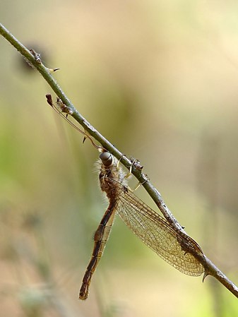 male
male -
 female


- Info These owlflies seem crepuscular and rest most of the time "on stems and twigs with the body, legs, and antennae pressed to the stem." I was in search for small damselflies and robberflies, and it flew away when I accidentally touched the branch of the Mimosa pudica where it was resting. I'm able to locate it's new perch and slowly approached from behind. It is a very alert subject and difficult to approach from front or side. But I succeeded to made some side views from a distance with my tele focal length, by laying on the bed of thorns. Later I searched for them and fond the similar ones from almost same environment, although from different plants. These are Ascalaphus sinister Walker, 1853, male and female; identified by Joshua R Jones at Texas A&M University. Created, uploaded and nominated by me. -- Jee 06:15, 30 April 2014 (UTC)
- Support -- The story: I found them four years ago in the summer 2010. As soon as I published them at Flickr with a CC license, Prof. John D. Oswald of Texas A&M University contacted me requesting permission to use them in their Lacewing Digital Library. But he can't identify them. Since then I posted these pictures in many sites, contacted many experts; but no results. Now one of my friend posted a similar image in an Entomology FB group and Shyamal shared it to a Neuropterology expert group. Joshua R Jones stepped in an identify both species. Dr. Joshua noted: "These species were described 160 years ago and only reviewed in 1949. Although common, they are difficult to identify, and the classification of the genera and tribes to which they belong is in need of a modern taxonomic revision." Roberto A. Pantaleoni, another expert said "Being curious, I tried to understand something. Unfortunately the good revision of Kimmins (1949) was based on dried and conserved specimens, the ID by photos is completely different." Anyway we finally got a result and I'm glad to share it with you. More information collected so far about this species is available in file description. Enjoy! (I agree, the photo quality is average; so not bothered about whether they get featured or not.) Jee 06:15, 30 April 2014 (UTC)
- Support Mainly for the scientific and educational value, but nothing wrong with the quality either.--ArildV (talk) 07:33, 30 April 2014 (UTC)
- Support - Passes the bug bar IMHO. — Crisco 1492 (talk) 10:44, 30 April 2014 (UTC)
- Support Yann (talk) 14:26, 30 April 2014 (UTC)
- Support per above --Martin Falbisoner (talk) 17:16, 30 April 2014 (UTC)
- Support --Baresi F (talk) 20:50, 30 April 2014 (UTC)
- Support --Christian Ferrer (talk) 12:25, 1 May 2014 (UTC)
- Support for all the efforts of people included for identification, and image quality is good to go for FP. --Joydeep Talk 12:57, 1 May 2014 (UTC)
- Support --JLPC (talk) 15:24, 1 May 2014 (UTC)
- Support Michael Barera (talk) 01:19, 4 May 2014 (UTC)
- Support Poco2 16:08, 4 May 2014 (UTC)
File:Crimea South Coast 04-14 img01 Simferopol-Yalta trolley.jpg, withdrawn edit
Voting period is over. Please don't add any new votes.Voting period ends on 14 May 2014 at 16:37:38 (UTC)
Visit the nomination page to add or modify image notes.

- Info All by A.Savin. --A.Savin 16:37, 5 May 2014 (UTC)
- Support --A.Savin 16:37, 5 May 2014 (UTC)
- Oppose It would be helpful if you could explain why this is an FP, in your opinion. What raises above the multitude of public transport pictures at QI? -- Colin (talk) 19:26, 5 May 2014 (UTC)
- Let's resume: no wow, because anything else is hypocrisy as usual. A more impartial reviewer might want to know that Krymtroleybus is in several respects a unique system and a "must-ride" for any visitor of Crimea. Besides, there are much less QI on public transport than on buildings etc., and not a single FP of trolleys. --A.Savin 20:05, 5 May 2014 (UTC)
- It would be helpful if you could explain why this image is an FP, in your opinion. That you find the subject interesting or unique is not enough. Every third picture on QI is a train. I'll be sure to let Mattbuck know about the new standards at FP. -- Colin (talk) 20:58, 5 May 2014 (UTC)
- Just take it easy and relax. The nomination has failed; FPC is a volunteer project and I'm not accountable to anyone. --A.Savin 21:42, 5 May 2014 (UTC)
- I'm totally chilled and not the one calling anyone a hypocrite or partial reviewer. -- Colin (talk) 22:03, 5 May 2014 (UTC)
- Just take it easy and relax. The nomination has failed; FPC is a volunteer project and I'm not accountable to anyone. --A.Savin 21:42, 5 May 2014 (UTC)
- It would be helpful if you could explain why this image is an FP, in your opinion. That you find the subject interesting or unique is not enough. Every third picture on QI is a train. I'll be sure to let Mattbuck know about the new standards at FP. -- Colin (talk) 20:58, 5 May 2014 (UTC)
- Let's resume: no wow, because anything else is hypocrisy as usual. A more impartial reviewer might want to know that Krymtroleybus is in several respects a unique system and a "must-ride" for any visitor of Crimea. Besides, there are much less QI on public transport than on buildings etc., and not a single FP of trolleys. --A.Savin 20:05, 5 May 2014 (UTC)
- Oppose Interesting subject but deficient composition centered. --Wilfredo R. Rodríguez H. (talk) 20:17, 5 May 2014 (UTC)
- Oppose Fine on the technical aspects, although the bit jutting out on the lower left is distracting. I am struggling whether a QI photo of a bus is featurable on its own without something else to give it that wow (dramatic light or driving though an interesting area). Saffron Blaze (talk) 22:21, 5 May 2014 (UTC)
- Comment I congratulate you on a choice of subject other than a wonderful castle or a unicorn, however I agree with Saffron for the distracting bit jutting out on the lower left and on the importance of the wow. Can you propose an alternative less cropped with the whole rail and also much more space at bottom, the trolleybus is in movement, and I think much more space at bottom of it will suggest the effect of movement. Your crop is not bad, even good but I'm not sure a square crop so tight is the best idea for a vehicule in horizontal movement. -- Christian Ferrer (talk) 05:46, 6 May 2014 (UTC)
![]() I withdraw my nomination. --A.Savin 09:30, 6 May 2014 (UTC)
I withdraw my nomination. --A.Savin 09:30, 6 May 2014 (UTC)
- Oppose average composition, the ramp on the left side of the frame spoils the whole image --Luxetowiec (talk) 17:18, 6 May 2014 (UTC)
- Really not necessary to oppose a withdrawn image... --DXR (talk) 17:37, 6 May 2014 (UTC)
File:Blick von St Othmar auf Donaucity DSC 9615w.jpg edit
Voting period is over. Please don't add any new votes.Voting period ends on 12 May 2014 at 17:41:26 (UTC)
Visit the nomination page to add or modify image notes.

- Info View from church tower of the parish church St. Othmar unter den Weißgerbern with Prater in the foreground and behind the St. Francis of Assisi Church. In the background the Donau City with DC1, UNO-City, Hochhaus Neue Donau and many other buildings. Created, uploaded and nominated by -- P e z i (talk) 17:41, 3 May 2014 (UTC)
- Support -- P e z i (talk) 17:41, 3 May 2014 (UTC)
- Comment Any chance you have the same image, but where the focus is on the buildings? It appears to be on the foreground, although it may just be the haze. Saffron Blaze (talk) 18:26, 3 May 2014 (UTC)
- Oppose I am sorry but the buildings are unsharp, I cant underestand what happend here. IMHO This image is not FP --Wilfredo R. Rodríguez H. (talk) 23:29, 3 May 2014 (UTC)
- Oppose IMO the haze which spoilt the "wow" of the image. :( --(✉→Arctic Kangaroo←✎) 06:20, 4 May 2014 (UTC)
- Oppose with regrets. Unfortunately the points mentioned before are true, even when allowing leeway for the D7100's high demand on lenses. Perhaps you can repeat that photo on a slightly clearer day (perhaps with a tripod?), and I will happily support. --DXR (talk) 06:54, 4 May 2014 (UTC)
- I withdraw my nomination Thanks for all the comments. It was definitively the haze; rain stopped just half an hour earlier and there was very much humidity in the air ... --P e z i (talk) 15:30, 4 May 2014 (UTC)
File:Greater Flamingos, Lido de Thau, Sète 14.jpg edit
Voting period is over. Please don't add any new votes.Voting period ends on 12 May 2014 at 16:12:38 (UTC)
Visit the nomination page to add or modify image notes.

- Info all by Christian Ferrer
- Support --Christian Ferrer 16:12, 3 May 2014 (UTC)
- Oppose -- Colours seem off. Setting is not remarkable. Saffron Blaze (talk) 18:31, 3 May 2014 (UTC)
- Oppose Per Saffron. Some of the earlier versions of flamingos imo were FP standards, but not this one. --(✉→Arctic Kangaroo←✎) 06:22, 4 May 2014 (UTC)
- I withdraw my nomination ok thanks Christian Ferrer (talk) 09:17, 4 May 2014 (UTC)
File:Ham hanging in a shop in Trevélez 2014.jpg edit
Voting period is over. Please don't add any new votes.Voting period ends on 11 May 2014 at 07:25:38 (UTC)
Visit the nomination page to add or modify image notes.

- Info Hanging raw ham (Jamón) in a shop in Trevélez
all by me -- Tuxyso (talk) 07:25, 2 May 2014 (UTC) - Support -- Tuxyso (talk) 07:25, 2 May 2014 (UTC)
- Oppose Sorry, it's certainly a nice lot of ham but I do not really like the square format and the composition here (the lower parts of the top row do not really look nice to me, I would have preferred a slightly lower POV). Perhaps the DOF is also a bit too narrow for my taste. --DXR (talk) 19:48, 2 May 2014 (UTC)
- Comment IMO the perspective effect is killed because of the square crop. Christian Ferrer (talk) 09:20, 4 May 2014 (UTC)
- I withdraw my nomination --Tuxyso (talk) 09:17, 5 May 2014 (UTC)
File:USO-Sale Sharks - 20131205 - Plaquage 2.jpg, not featured edit
Voting period is over. Please don't add any new votes.Voting period ends on 10 May 2014 at 11:10:55 (UTC)
Visit the nomination page to add or modify image notes.

- Info created by, uploaded by, nominated by Pleclown -- Pleclown (talk) 11:10, 1 May 2014 (UTC)
- Support This picture was taken during the match opposing the USO to the Sale Sharks, competing in the European Challenge Cup, which was attended by two accredited photographers, thanks to Wikimedia CH. The Sale scrum-half (Will Cliff) is tackling USO fullback (Silvère Tian) The other Sale players are James Gaskell (with the helmet), Mark Jennings (with the mohawk) and Tom Brady. The other USO players are Mahamadou Diaby (on the left) and Agustín Figuerola (behind the Sale players) -- Pleclown (talk) 11:10, 1 May 2014 (UTC)
- Oppose A bit overprocessed IMO, and the composition (1 people cut at left) is not the best Christian Ferrer (talk) 09:06, 4 May 2014 (UTC)
File:2013-Fort de la Miotte 13 - Crop.jpg, not featured edit
Voting period is over. Please don't add any new votes.Voting period ends on 9 May 2014 at 14:08:51 (UTC)
Visit the nomination page to add or modify image notes.

- Info created, uploaded and nominated by Bourgeois.A
- Support, great composition for this old stones and interesting effect between the flag and the cloud. -- Bourgeois.A (talk) 14:08, 30 April 2014 (UTC)
- Question Why they are no more vote ? Bourgeois.A (talk) 11:20, 3 May 2014 (UTC)
- @Bourgeois.A: I guess because the motif is not that eye-catching for an architectural photo which we have lots of on COM:FP; plus not the best sharpness, chromatic aberrations. --A.Savin 11:57, 3 May 2014 (UTC)
File:Krentenboompje (Amelanchier). Bloemen 06.JPG, featured edit
Voting period is over. Please don't add any new votes.Voting period ends on 5 May 2014 at 16:35:02 (UTC)
Visit the nomination page to add or modify image notes.
._Bloemen_06.JPG)
- Info Delicate flowers of Amelanchier (Amelanchier) created by Famberhorst - uploaded by Famberhorst - nominated by Famberhorst -- Famberhorst (talk) 16:35, 26 April 2014 (UTC)
- Support -- Famberhorst (talk) 16:35, 26 April 2014 (UTC)
*Saffron Blaze (talk) 21:10, 26 April 2014 (UTC) Saffron Blaze (remove oppose)(talk) 20:04, 27 April 2014 (UTC)
![]() Oppose -- WB or green cast by the diffuse light through the foliage makes these flowers greenish when they should be white.
Oppose -- WB or green cast by the diffuse light through the foliage makes these flowers greenish when they should be white.
- Support Only a tiny bit of green cast, which isn't obvious at all. --(✉→Arctic Kangaroo←✎) 23:35, 26 April 2014 (UTC)
- Done New Update. --Famberhorst (talk) 17:18, 27 April 2014 (UTC)
- Support -- Happy to support this version. Saffron Blaze (talk) 20:04, 27 April 2014 (UTC)
- Support --Uoaei1 (talk) 10:33, 28 April 2014 (UTC)
- Support Beautiful!!! As usual!! (✉→Arctic Kangaroo←✎) 11:50, 28 April 2014 (UTC)
- Support --Joydeep Talk 13:19, 28 April 2014 (UTC)
- Support --JLPC (talk) 16:16, 28 April 2014 (UTC)
- Support --Cayambe (talk) 16:45, 28 April 2014 (UTC)
- Temporary Oppose I'm not an expert for flower images, but I do see a lot of blotchy noise in the bokeh, more than I find acceptable for a good camera at Iso 200. Could it be addressed? --DXR (talk) 17:37, 28 April 2014 (UTC)
- Support--ℳ₪Zaplotnikcontribs 21:26, 4 May 2014 (UTC)
File:Munich subway station Georg-Brauchle-Ring.JPG, featured edit
Voting period is over. Please don't add any new votes.Voting period ends on 9 May 2014 at 18:01:25 (UTC)
Visit the nomination page to add or modify image notes.
- Info Munich subway station Georg-Brauchle-Ring (U1), all by -- Martin Falbisoner (talk) 18:01, 30 April 2014 (UTC)
- Support -- Martin Falbisoner (talk) 18:01, 30 April 2014 (UTC)
- Comment Well, it obviously is a featurable scene (and I am jealous of the amazing subway stations you have in Munich!), but I am not yet quite convinced by the execution to be honest. I don't think the perspective correction is perfect yet (at least on the sides the verticals are not quite right), it appears a bit noisy on the colored tiles (although I have a feeling that Canons generally tend to struggle a bit more with that) and it is not quite sharp in the center. Could you try to improve that? --DXR (talk) 18:58, 30 April 2014 (UTC)
 Fixed, at least I tried. Sharpness should be better now, perspective correction as well (though I'm not sure that the single colored tiles form absolutely perfect verticals in reality). As far as noise is concerned: I gave it a shot too, but I'm afraid there's not much I can do. --Martin Falbisoner (talk) 10:36, 1 May 2014 (UTC)
- Support Better! --DXR (talk) 14:22, 1 May 2014 (UTC)
- Support Another striking image (albeit I see a better crop again) Saffron Blaze (talk) 14:13, 1 May 2014 (UTC)
- Done yes, I had already considered this crop before. You're right, it's better. --Martin Falbisoner (talk) 15:36, 1 May 2014 (UTC)
- Support Another well-captured Munich U-bahn station. Daniel Case (talk) 17:37, 1 May 2014 (UTC)
- Comment I don't want to spoil, but... COM:FOP Germany: only exteriors of buildings are covered. --A.Savin 19:20, 1 May 2014 (UTC)
- Should'nt you start a DR ?--Jebulon (talk) 19:51, 1 May 2014 (UTC)
- Well, honestly, you'd have to delete hundreds of pics from Munich U-Bahn alone - not mentioning maybe several thousands of images of train and/or public transport stations throughout Germany, considering that FOP in the narrow sense doesn't apply to any pictures taken from e.g. platforms, as these might technically be considered private area in the property of transport companies. Which leads me to the question of the legality of any indoor pictures taken in Germany and uploaded to commons... churches, castles, state buildings... And what about parks and gardens? Not public space in a narrow sense... Don't get me wrong, I don't take legal questions lightly, not at all (being a media archivist...), but apparently nobody ever took offense here. In any case, even if you open a DR, let's stick to the pictorial and photographic qualities of candidates here on FP. --Martin Falbisoner (talk) 20:47, 1 May 2014 (UTC)
- I just wanted to draw your attention on a possible problem (now or in future), it's only about copyright issues (not "Hausrecht" etc.), no RfD from my side (maybe I'm wrong and there is a court decision in Germany that any train stations including the underground ones are to be handled as exteriors; who knows, ianal). Anyway, for my part I would be cautious with nominating this kind of pictures for QI or FP. And yes, in the past I have myself uploaded many dozens of U-Bahn (Rhein-Ruhr, Berlin etc.) photos on Commons. If I was aware of that legal restriction at that timepoints, I wouldn't have. Should anyone now or ever nominate all this stuff for deletion, I'd find it pity but comprehensible. --A.Savin 21:35, 1 May 2014 (UTC)
- Sorry if my reply seemed too harsh, I had no intention of attacking you, Alexander! Yes I admit, the situation is tricky. If the "great purge" should ever come upon us, Commons will be much poorer. In the meantime: be bold and assume good faith. ;-) --Martin Falbisoner (talk) 21:47, 1 May 2014 (UTC)
- Your reply I didn't find harsh or otherwise inappropriate; no reason to be sorry. --A.Savin 21:59, 1 May 2014 (UTC)
- Sorry if my reply seemed too harsh, I had no intention of attacking you, Alexander! Yes I admit, the situation is tricky. If the "great purge" should ever come upon us, Commons will be much poorer. In the meantime: be bold and assume good faith. ;-) --Martin Falbisoner (talk) 21:47, 1 May 2014 (UTC)
- I just wanted to draw your attention on a possible problem (now or in future), it's only about copyright issues (not "Hausrecht" etc.), no RfD from my side (maybe I'm wrong and there is a court decision in Germany that any train stations including the underground ones are to be handled as exteriors; who knows, ianal). Anyway, for my part I would be cautious with nominating this kind of pictures for QI or FP. And yes, in the past I have myself uploaded many dozens of U-Bahn (Rhein-Ruhr, Berlin etc.) photos on Commons. If I was aware of that legal restriction at that timepoints, I wouldn't have. Should anyone now or ever nominate all this stuff for deletion, I'd find it pity but comprehensible. --A.Savin 21:35, 1 May 2014 (UTC)
- Well, honestly, you'd have to delete hundreds of pics from Munich U-Bahn alone - not mentioning maybe several thousands of images of train and/or public transport stations throughout Germany, considering that FOP in the narrow sense doesn't apply to any pictures taken from e.g. platforms, as these might technically be considered private area in the property of transport companies. Which leads me to the question of the legality of any indoor pictures taken in Germany and uploaded to commons... churches, castles, state buildings... And what about parks and gardens? Not public space in a narrow sense... Don't get me wrong, I don't take legal questions lightly, not at all (being a media archivist...), but apparently nobody ever took offense here. In any case, even if you open a DR, let's stick to the pictorial and photographic qualities of candidates here on FP. --Martin Falbisoner (talk) 20:47, 1 May 2014 (UTC)
- Should'nt you start a DR ?--Jebulon (talk) 19:51, 1 May 2014 (UTC)
- Can you honestly say a U-Bahn station has an exterior? A photographable one? Daniel Case (talk) 15:26, 3 May 2014 (UTC)
- As I said, no idea how Germany's judges would argue. From the logical point, however, the (underground) hall is the station's interior; whereas the aboveground entrance building is the exterior. I admit that most U-Bahn entrances in Germany look somewhat like this; but there are also some with true entrance buildings, like that. --A.Savin 17:12, 3 May 2014 (UTC)
- Can you honestly say a U-Bahn station has an exterior? A photographable one? Daniel Case (talk) 15:26, 3 May 2014 (UTC)
- Support --King of ♥ ♦ ♣ ♠ 23:55, 1 May 2014 (UTC)
- Support --XRay talk 06:40, 2 May 2014 (UTC)
- Support Yann (talk) 07:34, 2 May 2014 (UTC)
- Support --Joydeep Talk 08:16, 2 May 2014 (UTC)
- Support --JLPC (talk) 09:56, 3 May 2014 (UTC)
- Support Christian Ferrer (talk) 16:20, 3 May 2014 (UTC)
- Support Michael Barera (talk) 01:21, 4 May 2014 (UTC)
- Support Btw, do you know this guy and his photographs? I think you are the Munich version of him :) Poco2 16:19, 4 May 2014 (UTC)
- Thanks Diego, I didn't know him - I just wish I were as good! --Martin Falbisoner (talk) 17:56, 4 May 2014 (UTC)
File:Rouen France Panoramic-View-02.jpg, featured edit
Voting period is over. Please don't add any new votes.Voting period ends on 6 May 2014 at 11:58:36 (UTC)
Visit the nomination page to add or modify image notes.

- Info created and uploaded by Cccefalon - nominated by Arion -- ArionEstar (talk) from Google Translate. 11:58, 27 April 2014 (UTC)
- Support -- ArionEstar (talk) from Google Translate. 11:58, 27 April 2014 (UTC)
- Support --(✉→Arctic Kangaroo←✎) 15:16, 28 April 2014 (UTC)
- Comment At least 3 dustspots Christian Ferrer (talk) 04:41, 1 May 2014 (UTC)
- ping @Cccefalon: --(✉→Arctic Kangaroo←✎) 13:28, 4 May 2014 (UTC)
- Thank you for informing me; I was not aware, that the photo is here for review. I fixed the dust spots; thank you for the hint, Christian. --CEphoto, Uwe Aranas (talk) 15:41, 4 May 2014 (UTC)
- Support Christian Ferrer (talk) 17:37, 4 May 2014 (UTC)
- Support --Kikos (talk) 11:33, 1 May 2014 (UTC)
- Support Michael Barera (talk) 01:18, 4 May 2014 (UTC)
- Support--ℳ₪Zaplotnikcontribs 21:27, 4 May 2014 (UTC)
- Support-- The Herald 04:04, 6 May 2014 (UTC)
File:Westfaelischer Friede in Muenster (Gerard Terborch 1648).jpg, not featured edit
Voting period is over. Please don't add any new votes.Voting period ends on 7 May 2014 at 09:15:23 (UTC)
Visit the nomination page to add or modify image notes.
![A noteable historical event, from a noteable artist [[1]]](/wiki/File:Westfaelischer_Friede_in_Muenster_(Gerard_Terborch_1648).jpg)
- Info created by Gerard_ter_Borch - uploaded by User:STBR - nominated by User:godhulii_1985 -- Godhulii 1985 (talk) 09:15, 28 April 2014 (UTC)
- Support -- Godhulii 1985 (talk) 09:15, 28 April 2014 (UTC)
- Support --Martin Falbisoner (talk) 15:14, 28 April 2014 (UTC)
- Oppose -- Amandajm (talk) 10:09, 30 April 2014 (UTC) The problems are two: The tone has been lightened to a point that defies the artist's "tonal composition". This lessens the intensity by removing the dark background against which the figures are contrasted. Just because there are some details in the woodwork of the panelling doesn't mean that it requires lightening to a point where it all becomes clearly visible. The effect of bleaching out the shadows means that shadows on the faces have also been lost, so they lack intensity. In other place, there is a serious loss of form, because tone is one of the ways in which the artist creates form. This is particularly noticeable on the red cloak to the right, and the flag- in the less-adjusted images the form of the flag, and its hanging vertical edge is much more pronounced. Secondly, the colours have ben changed. The whole colour palette has been made warm, rather than cool. The blacks, which should be slightly greenish black, are blue-black. The robe of the Franciscan friar to the right has seriously changed colour. All the greys which should be a slightly yellowed or greenish grey are blue grey. This is wrong. The browns are also affected. They are too warm; the chair in the foreground is the best test. The golds are all too warm. Once again, the chair is the test. Its metal fittings and studs would be yellowish brass, as would the hanging candelabra, not warm pinkish gold. Lastly, because all the reddish-browns have become truly red, one gentleman now has a moustache of a hue that is really extraordinary!
- It is good to see such a high resolution image, but the colour and tone needs fixing. I also should comment that it is not really appropriate to crop the bottom of an image just because it has a cast shadow. It changes the composition of the artist's work. With Photoshop, you could isolate the floor in the foreground and make the shadow much lighter.
- Comment Thank you for your detailed comment. I wasn't aware about such details, I learnt something enw :-) Godhulii 1985 (talk) 22:48, 3 May 2014 (UTC)
Image:Große Springkraut (Impatiens noli-tangere).jpg, not featured edit
Voting period is over. Please don't add any new votes.Voting period ends on 8 May 2014 at 09:47:32 (UTC)
Visit the nomination page to add or modify image notes.
.jpg)
- Info created by Merops - uploaded by Merops - nominated by Merops -- Merops (talk) 09:47, 29 April 2014 (UTC)
- Support Jee 11:52, 29 April 2014 (UTC)
- Support Christian Ferrer (talk) 04:45, 1 May 2014 (UTC)
- Support Michael Barera (talk) 01:19, 4 May 2014 (UTC)
- Support I assume it was in a dimmer location. --(✉→Arctic Kangaroo←✎) 06:08, 4 May 2014 (UTC)
Crystal Palace, not featured edit
Voting period is over. Please don't add any new votes.Voting period ends on 8 May 2014 at 07:05:36 (UTC)

- Info created by Philip Henry Delamotte - uploaded by Petrusbarbygere - nominated by Monfie -- Monfie (talk) 07:05, 29 April 2014 (UTC)
- Support -- Monfie (talk) 07:05, 29 April 2014 (UTC)
- Oppose -- The earlier version of these pictures have a neutral, cream or beige background. The change to a stark white background is unnecessary, is out of keeping with the date of the image, and is less aesthetically appealing. On no account should a starkly black and white image be uploaded over a photographic image or printed image that originally has a tinted ground. Amandajm (talk) 09:07, 30 April 2014 (UTC)
- Comment I think exactly the opposite. But resolution is too low here to be FP. Yann (talk) 14:29, 30 April 2014 (UTC)
- Comment Yann, it's not entirely about personal taste. It is about the appropriate use and modification of a heritage item/primary source, which is someone's artwork, whether it is in copyright or not. The only justification for changing a photo on a coloured ground to a white ground, or changing a sepia photo to black and white is because the media in which it is going to be printed (e.g. a journal) is in monochrome, not colour. I would like to see the images on coloured paper reinstated, along with the black an white option. Amandajm (talk) 09:48, 1 May 2014 (UTC)
- Sorry to disagree, but there never was any color on these pictures. It was a fashion at that time to print pictures in sepia tone. I don't think there is any valid reason to continue this, except if you want to make a picture "look old", but this is not an educational purpose. Regards, Yann (talk) 11:00, 1 May 2014 (UTC)
- If these are scans of prints and the prints are sepia tone, isn't it a lie to convert them to B&W and say this is what the artist intended? Saffron Blaze (talk) 13:08, 1 May 2014 (UTC)
- @Saffron Blaze: "Lie" is a strong statement, and knowning what the artist intended is wide speculation. Sepia tone prints were done for technical reason: they withstand better the test of time, but with digital pictures, this reason disappeared. In my opinion, black and white represents better the reality of the original shot. Regards, Yann (talk) 06:31, 3 May 2014 (UTC)
- Sepia tone prints were made for more than just technical reasons. There are many who deliberately used sepia toning for aesthetic reasons as well as what they considered as improving the image itself. Just because the negative is black and white does not mean we should be overriding the published product. It is not as if they were forced to use sepia toning. If they wanted the image to be truly black and white they could have published it as such. Saffron Blaze (talk) 13:59, 3 May 2014 (UTC)
- Interesting discussion. I agree with Saffron Blaze: if the original work used sepia toning, the digital copy should by no means remove that. But of course it would always be possible to offer an additional derivative version convertet to BW... --Martin Falbisoner (talk) 19:49, 3 May 2014 (UTC)
- Support Michael Barera (talk) 01:18, 4 May 2014 (UTC)
File:Tilia May 2014-2.jpg edit
Voting period is over. Please don't add any new votes.Voting period ends on 10 May 2014 at 15:04:29 (UTC)
Visit the nomination page to add or modify image notes.

- Info Minimalism again: two leaves of a Lime tree sprouting from the trunk. All by Alvesgaspar (talk) 15:04, 1 May 2014 (UTC)
- Support -- Alvesgaspar (talk) 15:04, 1 May 2014 (UTC)
- Support --XRay talk 06:44, 2 May 2014 (UTC)
- Support --Joydeep Talk 08:15, 2 May 2014 (UTC)
- Oppose Works in no manner for me. Minimalism can be interesting but in the case here I only see two randomly positioned leafes. There is nothing eye-catching for me, especially the overlapping parts of unsharp foreground leaf and sharp background leaf at the right is unfortunate and only looks like a heep of green. Such an idea (exchange of sharp / unsharp layers from left to right and front to back) can work if you have to structures which stronger differ from each other or which are not that flat as the leafes in your photo are. --Tuxyso (talk) 11:21, 2 May 2014 (UTC)
- Oppose --- very much per Tuxyso. Saffron Blaze (talk) 14:00, 2 May 2014 (UTC)
- Support --(✉→Arctic Kangaroo←✎) 06:33, 4 May 2014 (UTC)
- Oppose I'm not bothered by the leaves, but the dual backgrounds ruin whatever they achieve. Daniel Case (talk) 03:13, 8 May 2014 (UTC)
- I withdraw my nomination -- Alvesgaspar (talk) 21:20, 8 May 2014 (UTC)
File:Ex1402-dive12.webm, not featured edit
Voting period is over. Please don't add any new votes.Voting period ends on 13 May 2014 at 14:01:49 (UTC)
Visit the nomination page to add or modify image notes.
- Info created by US/NOAA - uploaded, nominated by Anonimski -- Anonimski (talk) 14:01, 4 May 2014 (UTC)
- Support as nominator. One of the most amazing underwater exploration videos I've seen, there are many fields of science that this relates to. -- Anonimski (talk) 14:01, 4 May 2014 (UTC)
- Oppose I'm struggling to see what is "most amazing" about this video both in terms of subject, video presentation and technical quality. Btw, the "source" for the image description page needs to be a bit more precise than the welcome page for the ship's website. -- Colin (talk) 15:36, 4 May 2014 (UTC)
- Fixed source URL now. What I meant was that the discovery (the volcanic geological formation with the organisms around it) is aspect of the video that I thought was remarkable, it was covered in news sources too. - Anonimski (talk) 17:08, 4 May 2014 (UTC)
File:Hylobates lar - Kaeng Krachan WB.jpg, featured edit
Voting period is over. Please don't add any new votes.Voting period ends on 13 May 2014 at 19:58:44 (UTC)
Visit the nomination page to add or modify image notes.

- Info created & uploaded by JJ Harrison - nominated by Citron -- Citron (talk) 19:58, 4 May 2014 (UTC)
- Support -- Citron (talk) 19:58, 4 May 2014 (UTC)
- Support --AmaryllisGardener talk 00:01, 5 May 2014 (UTC)
- Support Poco2 07:57, 5 May 2014 (UTC)
- Support --King of ♥ ♦ ♣ ♠ 08:00, 5 May 2014 (UTC)
- Support --Joydeep Talk 08:22, 5 May 2014 (UTC)
- Strong support Sharp, nice colours, beautiful monkey, and follows rule-of-thirds. --(✉→Arctic Kangaroo←✎) 09:11, 5 May 2014 (UTC)
- Support --JLPC (talk) 09:47, 5 May 2014 (UTC)
- Support very good! --Martin Falbisoner (talk) 10:04, 5 May 2014 (UTC)
- Support -- Colin (talk) 11:41, 5 May 2014 (UTC)
- Support -- Saffron Blaze (talk) 15:56, 5 May 2014 (UTC)
- Support —Clockery Fairfeld who, me? 18:25, 5 May 2014 (UTC)
- Support - Benh (talk) 21:25, 5 May 2014 (UTC)
- Support --Ximonic (talk) 23:53, 5 May 2014 (UTC)
- Support Yann (talk) 04:36, 6 May 2014 (UTC)
- Support Christian Ferrer (talk) 04:57, 6 May 2014 (UTC)
- Support --Lewis Hulbert (talk) 12:35, 6 May 2014 (UTC)
- Support -- --Luxetowiec (talk) 17:24, 6 May 2014 (UTC)
- Support --Jebulon (talk) 17:58, 6 May 2014 (UTC)
- Support The bigger you make it, the better it gets. Daniel Case (talk) 18:25, 6 May 2014 (UTC)
- Support --Kadellar (talk) 19:52, 9 May 2014 (UTC)
File:Panoramic of Juan Griego 45.jpg, featured edit
Voting period is over. Please don't add any new votes.Voting period ends on 9 May 2014 at 21:18:29 (UTC)
Visit the nomination page to add or modify image notes.

- Info All by -- Wilfredo R. Rodríguez H. (talk) 21:18, 30 April 2014 (UTC)
- Support --(✉→Arctic Kangaroo←✎) 23:26, 30 April 2014 (UTC)
- Weak Support. Perhaps highlights could be pulled back a bit and there could be more land on the left, but overall nice view. --King of ♥ ♦ ♣ ♠ 23:57, 1 May 2014 (UTC)
- Support --Joydeep Talk 08:16, 2 May 2014 (UTC)
- Support Michael Barera (talk) 01:21, 4 May 2014 (UTC)
- Support Nice view and photo - Anonimski (talk) 14:47, 4 May 2014 (UTC)
- Support --Wilfredo R. Rodríguez H. (talk) 12:50, 7 May 2014 (UTC)
- Support Maybe a bit soft, but all in all, it deserves a seventh "pro".--Jebulon (talk) 19:52, 8 May 2014 (UTC)
- Support but can you improve the description, please? --Kadellar (talk) 20:03, 9 May 2014 (UTC)
- Done Thanks --Wilfredo R. Rodríguez H. (talk) 21:36, 9 May 2014 (UTC)
File:Presa del llano.jpg, not featured edit
Voting period is over. Please don't add any new votes.Voting period ends on 14 May 2014 at 03:22:41 (UTC)
Visit the nomination page to add or modify image notes.

- Info created by McOil - uploaded by McOil - nominated by McOil -- McOil (talk) 03:22, 5 May 2014 (UTC)
- Support -- McOil (talk) 03:22, 5 May 2014 (UTC)
- Oppose Oversaturated, lacking sharpness. --(✉→Arctic Kangaroo←✎) 09:12, 5 May 2014 (UTC)
- Oppose My eyes! Way over processed. -- Colin (talk) 11:51, 5 May 2014 (UTC)
- Oppose -- per others opposes. Saffron Blaze (talk) 15:56, 5 May 2014 (UTC)
- Oppose As overprocessed per others. A good example of the road to photographic hell being paved with good intentions. Daniel Case (talk) 03:12, 6 May 2014 (UTC)
- Oppose per Colin and AK. --AmaryllisGardener talk 01:46, 7 May 2014 (UTC)
File:Bill Clinton Boulevard February 2013.jpg, not featured edit
Voting period is over. Please don't add any new votes.Voting period ends on 10 May 2014 at 11:04:32 (UTC)
Visit the nomination page to add or modify image notes.

- Info Bill Clinton Boulevard, Pristina, Kosovo. It is not the world's most beautiful city landscape, but that's not the point. The point is to capture the chaotic urban landscape that has emerged in Pristina during the last decade during rapid growth.The picture also shows various attempt with urban planning (the road, new traffic lights). The picture is taken in the very city center. Created, uploaded and nominated by -- Arild Vågen (talk) 11:04, 1 May 2014 (UTC)
- Support -- ArildV (talk) 11:04, 1 May 2014 (UTC)
- Support --Joydeep Talk 08:15, 2 May 2014 (UTC)
- Support --Ximonic (talk) 13:17, 3 May 2014 (UTC)
- Support Christian Ferrer (talk) 16:21, 3 May 2014 (UTC)
- Oppose The motion blur of the cars is the deal-breaker for me, the photo should have been taken in brighter weather and have shorter exposure time. - Anonimski (talk) 14:50, 4 May 2014 (UTC)
- Oppose The picture is not saying much to me to support it as featurable Poco2 16:04, 4 May 2014 (UTC)
- Support very nice light + mood --Wladyslaw (talk) 18:21, 4 May 2014 (UTC)
- Oppose Banal picture with poor quality. Bourgeois.A (talk) 18:30, 4 May 2014 (UTC)
- Comment @Bourgeois.A: If you wanted to say "no wow", say so; but "poor quality" is certainly a wrong and unjust assumption here. --A.Savin 21:13, 4 May 2014 (UTC)
- Support--ℳ₪Zaplotnikcontribs 21:25, 4 May 2014 (UTC)
- Support I like the mood. --King of ♥ ♦ ♣ ♠ 07:55, 5 May 2014 (UTC)
- Oppose Very high EV and I'm glad we have it, but it's not featurable. No wow, just another well-done shot of a city street. Daniel Case (talk) 03:16, 6 May 2014 (UTC)
- Support-- --Luxetowiec (talk) 17:41, 6 May 2014 (UTC)
- Oppose The best part of chaos isn't visible. Low resolution compared to camera. --Mile (talk) 15:15, 8 May 2014 (UTC)
- Oppose Not a bad picture but nothing remarkable IMHO. Barcex (talk) 11:31, 9 May 2014 (UTC)
File:Estrela April 2014-2.jpg, not featured edit
Voting period is over. Please don't add any new votes.Voting period ends on 10 May 2014 at 16:12:10 (UTC)
Visit the nomination page to add or modify image notes.

- Info Second try of this subject. The first is here and deserves a look... I repeat here the words I have used then to present the nomination: I expected that a shot from below would capture more effectively the expression of this Saint Mary Magadalena of Pazzy. In this interpretation the unfocused hands represent the material and imperfect world, while the face represents the imortal spirit... Basilica of Estrela, Lisbon, Portugal. This new version is much better technically. -- Alvesgaspar (talk) 16:12, 1 May 2014 (UTC)
- Support -- Alvesgaspar (talk) 16:12, 1 May 2014 (UTC)
- Support I like this perspective (I'd also have supported your first image back then...) --Martin Falbisoner (talk) 07:29, 2 May 2014 (UTC)
- Support --Joydeep Talk 08:15, 2 May 2014 (UTC)
- Support Michael Barera (talk) 01:23, 4 May 2014 (UTC)
- Oppose No wow in this image. To me, this statue is not very impressive. --Uoaei1 (talk) 13:06, 5 May 2014 (UTC)
File:Le Ngauruhoe et le Ruapehu vus du sommet du Tongariro.jpg, featured edit
Voting period is over. Please don't add any new votes.Voting period ends on 10 May 2014 at 19:52:08 (UTC)
Visit the nomination page to add or modify image notes.

- Info created by Eusebius - uploaded by Eusebius - nominated by Eusebius -- Eusebius (talk) 19:52, 1 May 2014 (UTC)
- CommentGlad to see you back here around ! There is a green CA all along the Ngauruhoe to be corrected.--Jebulon (talk) 20:58, 1 May 2014 (UTC)
- I uploaded an updated version. I tried to limit the CA, I hope it is better and not worse. --Eusebius (talk) 02:57, 4 May 2014 (UTC)
- Support I will assume the CA will be corrected. Saffron Blaze (talk) 22:40, 1 May 2014 (UTC)
- Support per Saffron Blaze --Martin Falbisoner (talk) 07:24, 2 May 2014 (UTC)
- Support --Joydeep Talk 08:15, 2 May 2014 (UTC)
- Support --JLPC (talk) 09:55, 3 May 2014 (UTC)
- Support --G Furtado (talk) 12:27, 3 May 2014 (UTC)
- Support --Ximonic (talk) 13:16, 3 May 2014 (UTC)
- Support Michael Barera (talk) 01:24, 4 May 2014 (UTC)
- Strong support --(✉→Arctic Kangaroo←✎) 06:31, 4 May 2014 (UTC)
- Support --Cayambe (talk) 09:08, 4 May 2014 (UTC)
- Support Poco2 16:01, 4 May 2014 (UTC)
- Support Wow, So sharp ! Congrat ! Bourgeois.A (talk) 18:29, 4 May 2014 (UTC)
- Oppose (for now) There are (still?) red CA's on some stones in the foreground. Imo easy to fix. --A.Savin 21:19, 4 May 2014 (UTC)
- Support -- Colin (talk) 09:57, 5 May 2014 (UTC)
- Support Amazing!!. Question You could say something further about the route to get there to make that picture? --Wilfredo R. Rodríguez H. (talk) 18:05, 5 May 2014 (UTC)
- With a kind of map overlay or something? What do you have in mind? It's really just about following an advertised path. --Eusebius (talk) 20:33, 5 May 2014 (UTC)
- Support -- --Luxetowiec (talk) 17:37, 6 May 2014 (UTC)
- Support ♫♫ Leitoxx ♪♪ 22:53, 6 May 2014 (UTC)
- Support --Kadellar (talk) 19:53, 9 May 2014 (UTC)
File:Samadhi Mandir of Srila Prabhupada, Mayapur 07102013 02.jpg, not featured edit
Voting period is over. Please don't add any new votes.Voting period ends on 10 May 2014 at 18:48:19 (UTC)
Visit the nomination page to add or modify image notes.

- Info Created / uploaded / nominated by Joydeep Talk 18:48, 1 May 2014 (UTC)
- Support -- Joydeep Talk 18:48, 1 May 2014 (UTC)
- Comment very nice, but apparently in need of further perspective correction --Martin Falbisoner (talk) 07:26, 2 May 2014 (UTC)
- Thank you, I have reprocessed the image. --Joydeep Talk 08:12, 2 May 2014 (UTC)
- Support much better --Martin Falbisoner (talk) 09:45, 2 May 2014 (UTC)
- Thank you, I have reprocessed the image. --Joydeep Talk 08:12, 2 May 2014 (UTC)
- Support --JLPC (talk) 15:50, 2 May 2014 (UTC)
- Support —Clockery Fairfeld who, me? 18:20, 5 May 2014 (UTC)
File:Semuc Champey, Guatemala.jpg, featured edit
Voting period is over. Please don't add any new votes.Voting period ends on 13 May 2014 at 16:12:29 (UTC)
Visit the nomination page to add or modify image notes.

- Info created by Christopher Crouzet - uploaded by Christopher Crouzet - nominated by Christopher Crouzet -- Christopher Crouzet (talk) 16:12, 4 May 2014 (UTC)
- Support -- Christopher Crouzet (talk) 16:12, 4 May 2014 (UTC)
NoNot enough wow + overexposed at certain parts.- Support Better. --(✉→Arctic Kangaroo←✎) 09:56, 8 May 2014 (UTC)
- Comment I'm not sure I'd agree with the "no wow" comment, though it doesn't look much in preview size. The subject is certainly capable of wow. Looking on Google, this photo seems to be take from a popular viewpoint, and is perhaps the only way to get the whole complex in one shot. A closer, lower photo might capture part of the pools in more detail and more three-dimension than this practically birds-eye-view. It is a bit over exposed and I see from the exif you've actually increased the exposure half a stop in Lightroom. Perhaps a bit more work in Lightroom would be worthwhile, though the top left may be irretrievably harshly lit by the sun. -- Colin (talk) 10:55, 5 May 2014 (UTC)
- I think I didn't express myself properly. :P It's a great image (if not for the overexposure), I would have liked it actually, but I find that it doesn't meet the required amount of "wow" for FP. --(✉→Arctic Kangaroo←✎) 12:19, 5 May 2014 (UTC)
I can fix the overexposure if neededI've fixed the overexposure, let me know if it is better. Now, I'm sorry to have failed both of my attempts at interpreting what makes an image go “wow” on Wikimedia. I've tried my best though—I'm new over here but I've been doing a lot of reading in order to understand the rules the best I could. I acknowledge that this is quite a subjective matter and respect any point of view but after seeing some simple basic building pictures being approved, I thought “how come a natural and beautiful place such as Semuc Champey could not produce a wow?”. I guess I was wrong, sorry again. --Christopher Crouzet (talk) 16:25, 5 May 2014 (UTC)
- I'll have a look at the new version later (busy just now). I think this suffers a bit from not being eye-catching in the small preview and from the rather remote flat aerial view. The subject itself is certainly wow, but you've got to capture that. I encourage others to click on the picture as it does look better larger. -- Colin (talk) 18:22, 5 May 2014 (UTC)
- Thanks for the feedback—I understand your point of view and agree with it. I've just updated the file with a new crop that focuses more on the pools by stripping out the foliage on the left part of the image. Not sure if it's enough to fix the issue in the small preview, maybe there's simply no way out. The jungle there didn't give me much choice about the locations from where I could take a snap—only one lookout was available afaik. But I've got a close-up shot from down there if it can be of any interest: https://www.flickr.com/photos/christophercrouzet/11780516846/ --Christopher Crouzet (talk) 19:27, 5 May 2014 (UTC)
- Support The crop helps. I'm sufficiently wowed. I've looked online too and this is one of the better ones. Your close-up Flickr pic is a bit over-exposed (blown whites) but if that was fixed it could be a QI. I like your File:Copacabana, Bolivia.jpg pic-- certainly worth a shot at FP (bearing in mind the 2-photo-at-a-time limit). You're aiming high with nominating at FP for your first few images, but as long as you take a "win some, lose some" attitude then you'll be fine. And there's nothing bad about achieving QI for an image. Also consider if your pictures are superior to the ones illustrating Wikipedia articles. If they are, then use them there and they could be considered for Wikipedia FP, which has slightly different emphasis on Encyclopaedic Value. -- Colin (talk) 21:42, 5 May 2014 (UTC)
- Colin, thanks again for the feedback! I'll fix the overexposure bit in the other one and will post it in the QI section. I didn't post the photo of Copacabana neither in the FP nor QI sections because it has some stitching issues visible at full resolution and thought that this wouldn't be acceptable as per the quality requirements. Since the stitching was processed directly by the camera, there's no way for me to fix it. I've posted it instead as a candidate for the VI section but it sounds like it won't make it for an obscure warning that I don't understand yet. Also, yes—I love the Open Source spirit and like everyone my goal with Wikimedia is to share a few photos for anyone to use. Then it's even better if I can get some sort of recognition for my work but it isn't the priority. What I like so far about posting in the FP section is that it provided me with better feedbacks than I've ever had after years of Flickr. That's enough for me to make it worth it to post here and I hope that I can keep doing so for the photos that “wows” me (I'll aim for the other categories when more appropriate). To finish, I'm a bit hesitant at modifying Wikipedia pages with my own photos as it could fall in the category of “self-promotion” that I've read somewhere. A photo being better than an other is after all quite subjective, especially since I might be biased with my own work, so I thought I'd rather let that kind of changes to the judgement of others Wikipedians? --Christopher Crouzet (talk) 22:32, 5 May 2014 (UTC)
- @Christopher: You stated you like the open source spirit. Then why are your photos uploaded here under CC BY-SA, while the same photo on Flickr is under CC BY-NC-ND? ;) I'm just curious. Usually my Flickr photos are uploaded under all rights reserved, but for those I upload here, they are also under CC BY-SA on Flickr. BTW I've followed your Flickr album. I'm the guy with called graphium evemon. Cheers. --(✉→Arctic Kangaroo←✎) 02:25, 10 May 2014 (UTC)
- I've always wanted to make my code open source but have only recently been thinking about doing the same for my photos. As such, I'm doing the transition slowly, one photo at a time, by uploading them on WikiCommons. As I'm still not sure about the “consequences” of this politic yet, I won't update the licensing on Flickr for now. I hope this make sense (it doesn't necessarily for me). --Christopher Crouzet (talk) 12:18, 10 May 2014 (UTC)
- Oh no, don't leave it to text editor Wikipedians. In most cases I decide what is or isn't a suitable image for an article. You are no less an editor for using images and this concern over self-promotion is bunk. They don't seem to mind promoting their version of the text so you should have qualms about promoting your version of the illustrative aspect. In the rare instance that someone disagrees we discuss on the talk page, just as we would for any other kind of edit. Saffron Blaze (talk) 15:06, 7 May 2014 (UTC)
- I'll reply later, on your talk page, as this is getting a little off-topic for this nom. -- Colin (talk) 07:49, 6 May 2014 (UTC)
- Support Yann (talk) 04:38, 6 May 2014 (UTC)
- Support -- --Luxetowiec (talk) 17:28, 6 May 2014 (UTC)
- Support --Martin Falbisoner (talk) 19:12, 6 May 2014 (UTC)
- Support ♫♫ Leitoxx ♪♪ 22:56, 6 May 2014 (UTC)
- Support --Joydeep Talk 13:31, 8 May 2014 (UTC)
- Comment Agree with Colin. Thanks for cropping. I have changed my oppose vote to support due to the increased wow. --(✉→Arctic Kangaroo←✎) 02:18, 10 May 2014 (UTC)
- Weak support Nice subject with enough wow to me. On the other side other topics are improvable: sharpness, lighting with shadowed area in the lower area and on the subject and the POV results in a too flat view without any perspective (I'd rather go for perspective than for trying to catch the whole thing in one frame). Poco2 08:24, 10 May 2014 (UTC)
- Unfortunately, and as already stated above, there was no other chances for me to take photos because of the dense jungle. Either I could take snaps directly from down there, which was crowded with people everywhere like if it was Disneyland by the time I reached it, or from that lookout. I'll leave the climbing to the trees to others :) --Christopher Crouzet (talk) 12:18, 10 May 2014 (UTC)
- Support --Christian Ferrer (talk) 16:44, 10 May 2014 (UTC)
File:Castillo Linderhof, Baviera, Alemania, 2014-03-22, DD 08.JPG edit
Voting period is over. Please don't add any new votes.Voting period ends on 11 May 2014 at 15:53:57 (UTC)
Visit the nomination page to add or modify image notes.

- Info The Linderhof Palace, located in Ettal, Bavaria, Germany, was constructed in different phases between 1870 and 1886. It is one of the three palaces built by order of King Ludwig II of Bavaria (1845-1886) (together with Neuschwanstein and Herrenchiemsee), and the only one finished before his death. All by me, Poco2 15:53, 2 May 2014 (UTC)
- Support -- Poco2 15:53, 2 May 2014 (UTC)
- Comment IMO, Atlas should hold a round bowl, not an egg...--Jebulon (talk) 21:52, 2 May 2014 (UTC)
- True, I fixed that. Poco2 22:20, 2 May 2014 (UTC)
- Well done ! --Jebulon (talk) 20:31, 4 May 2014 (UTC)
- True, I
- Support --Joydeep Talk 16:47, 3 May 2014 (UTC)
- Support Michael Barera (talk) 01:25, 4 May 2014 (UTC)
- Support Christian Ferrer (talk) 09:01, 4 May 2014 (UTC)
- Support Good use of the wide angle, which is not easy! Bourgeois.A (talk) 18:22, 4 May 2014 (UTC)
- Oppose Technically fine but the dullest possible view of this castle at the dullest time of the year. Compare File:Linderhof1.jpg, File:Linderhof-1.jpg, File:Schloss Linderhof 2.JPG, File:SchlossLinderhof05.jpg, File:Linderhof Winter01.jpg. -- Colin (talk) 10:21, 5 May 2014 (UTC)
- I don't see your point. The pictures you show are taken from completely different angles. In this picture you have a closeup of the building without any disturbing tourists or elements in the background, and I don't see either a problem with the lighting. Poco2 10:47, 5 May 2014 (UTC)
- By "dull" I mean boring, uninteresting rather than poor light. The trees are bare. And the little sheds on each side of the building are disturbing and not present in other photos. The angle and point-of-view is the main problem -- only the front façade is visible and there's no context, whereas this building is set in dramatic context and has an interesting roof. Choosing a good viewpoint for the subject is part of what makes a winning picture. -- Colin (talk) 12:05, 5 May 2014 (UTC)
- I withdraw my nomination Poco2 20:36, 10 May 2014 (UTC)
File:Kruzenshtern (ship, 1926), Sète, Hérault 01.jpg edit
Voting period is over. Please don't add any new votes.Voting period ends on 13 May 2014 at 17:47:32 (UTC)
Visit the nomination page to add or modify image notes.
,_S%C3%A8te,_H%C3%A9rault_01.jpg)
- Info all by Christian Ferrer
- Support --Christian Ferrer 17:47, 4 May 2014 (UTC)
- Neutral The composition doesn't really look balanced to me; it's a bit too bottom-heavy. --King of ♥ ♦ ♣ ♠ 07:59, 5 May 2014 (UTC)
- Support --JLPC (talk) 09:48, 5 May 2014 (UTC)
- Oppose It is possible to make a good composition where the subject forms only a tiny (0.5MP) portion of the image but the context then has to be something special. Here we have an odd mix of sightseeing boats, small yachts and a freight ship. And a graveyard. And the tops of some trees. See Category:Kruzenshtern (ship, 1926) for closer views of this ship, for example File:Крузенштерн 8.JPG, File:Крузенштерн 9.JPG, File:Крузенштерн 10.JPG. Plus, of course, Google Images shows more dramatic photographs of this ship in greater number than I care to count. -- Colin (talk) 11:23, 5 May 2014 (UTC)
- Oppose per Colin --Uoaei1 (talk) 12:51, 5 May 2014 (UTC)
- Support ...and again a bad title...--Jebulon (talk) 19:59, 5 May 2014 (UTC)
- Oppose I think the location the shot was taken from did not allow you to get a composition that placed the tallship and the ossuary in some kind of visual relationship. The other ships and boats are a distraction as are the trees. Saffron Blaze (talk) 22:16, 5 May 2014 (UTC)
- I withdraw my nomination --Christian Ferrer 18:23, 9 May 2014 (UTC)
File:Mol (Talpa europaea) 04.JPG edit
Voting period is over. Please don't add any new votes.Voting period ends on 15 May 2014 at 16:12:35 (UTC)
Visit the nomination page to add or modify image notes.
_04.JPG)
- Info created by Famberhorst - uploaded by Famberhorst - nominated by Famberhorst -- Famberhorst (talk) 16:12, 6 May 2014 (UTC)
- Support -- Famberhorst (talk) 16:12, 6 May 2014 (UTC)
- Comment Useful image for sure and well composed, but isn't the colour boosted? Extra saturation may be suitable in some images but this seems to be a bit much. Saffron Blaze (talk) 00:04, 7 May 2014 (UTC)
- Done Desaturate. --Famberhorst (talk) 05:04, 7 May 2014 (UTC)
- Oppose Sorry, but this is just too disturbing. --AmaryllisGardener talk 01:51, 8 May 2014 (UTC)
- Support Because its "too disturbing" (and a good image). We're not a "pretty picture"-site, after all. Kleuske (talk) 10:20, 8 May 2014 (UTC)
- Oppose If the animal was alive, I don't think it would get much support here since it is a rather plain image. Sorry, but that is not featurable to me. --DXR (talk) 10:22, 8 May 2014 (UTC)
- Support Tecnically excellent. Visually hard, but unusual and interesting. FP IMO.--Jebulon (talk) 19:57, 8 May 2014 (UTC)
- Support (after contradictory thoughts.) --JLPC (talk) 08:56, 9 May 2014 (UTC)
- Comment Your dislike I can imagine good, but it's a sharp realistic picture of the fate that hundreds of thousands of Talpa happens every year. Famberhorst (talk) 15:48, 9 May 2014 (UTC)
- Note this discussion before placing this to POTD. It seems we have so many softhearted people here and there. :) Jee 03:19, 10 May 2014 (UTC)
- Oppose in bad taste --Wladyslaw (talk) 19:51, 10 May 2014 (UTC)
- Oppose Not my tastes --Christian Ferrer (talk) 06:29, 11 May 2014 (UTC)
- I withdraw my nomination it is not my intention to shock, but assumed that Wikimedia an open window is focused on all aspects of society.--Famberhorst (talk) 15:58, 11 May 2014 (UTC)
File:Dülmen, Umland -- 2014 -- 14.jpg, not featured edit
Voting period is over. Please don't add any new votes.Voting period ends on 11 May 2014 at 06:36:20 (UTC)
Visit the nomination page to add or modify image notes.

- Info created by XRay - uploaded by XRay - nominated by XRay -- XRay talk 06:36, 2 May 2014 (UTC)
- Support -- XRay talk 06:36, 2 May 2014 (UTC)
- Comment marvelous mood! But could you please correct the horizon? --Martin Falbisoner (talk) 07:20, 2 May 2014 (UTC)
- Hmm. Correct the horizon? I which way? The image is not tilted. --XRay talk 10:30, 2 May 2014 (UTC)
- Fixed Anyway. A new image with a corrected horizon was uploaded. IMO it looks more naturally. The appearance of the image is better. Thanks for your advice. --XRay talk 10:42, 2 May 2014 (UTC)
- Comment Nice photo, but is it dirt on your lens at the left edge of the photo (see note). It does not look like foggy air. --Tuxyso (talk) 07:31, 2 May 2014 (UTC)
- It is real fog. There was a bank of fog through the trees. --XRay talk 10:34, 2 May 2014 (UTC)
- Support --Martin Falbisoner (talk) 10:52, 2 May 2014 (UTC)
- Oppose -- I just can't accept that this kind of exposure, lighting and motif are representative of our finest works. It is as if one very bad back lit tree photo got promoted and inexplicably ended up as a POTY finalist that everyone thinks they need one now. Saffron Blaze (talk) 13:59, 2 May 2014 (UTC)
- Comment :Saffron Blaze, if a picture ended up as a POTY finalist, it is not a bad image. You sound like one of the 20th century dictators: there is my opinion and there is wrong opinion. Others have long forgotten the image you are talking about but you are still disturbed by it. Poor Saffron. You and Colin had a nice self-praising conversation at Colin's talk page. Hope you feel better now. But don't forget that POTY is vox populi. You don't decide what is good or bad, people do. If you don't agree with people, it means you are bad reviewer. --194.150.65.40 22:48, 5 May 2014 (UTC)
- Comment I'd like to defend this nomination, I really like the picture very much. Does exposure always have to be "correct"? And if it were in this case, wouldn't the whole atmosphere be gone just like the fog only one hour later? Sometimes it appears to me that FP is a captive of Straight Photography suffering from some kind of Stockholm Syndrome. Give Pictorialism a chance - at least occasionally ;-) --Martin Falbisoner (talk) 16:10, 2 May 2014 (UTC)
- Comment Do you honestly believe I need a lecture on Straight Photography or Pictorialism? I have supported all kinds of art here at FPC and have in fact fostered the promotion of works other than landscapes, buildings and bugs. What I have not done is lower my standards in response to the onslaught of mediocre images being offered here. As an example of the genre you are espousing this is truly lacking. Saffron Blaze (talk) 19:07, 2 May 2014 (UTC)
- Comment Fine then. Let's agree to disagree here. I really didn't intend to raise a personal quarrel... --Martin Falbisoner (talk) 22:03, 2 May 2014 (UTC)
- Support Agree with Martin. Yann (talk) 16:30, 2 May 2014 (UTC)
- Oppose Generally agree with Saffron, sorry. Also large PC artifact left at bottom. --DXR (talk) 19:43, 2 May 2014 (UTC)
- Sorry, what do mean with "PC artifact"? --XRay talk 06:27, 3 May 2014 (UTC)
- The white arc at the bottom, approx. in the middle. View the image on a black background and you'll see it. --DXR (talk) 07:15, 3 May 2014 (UTC)
- Done Sorry for my carelessness. It is now corrected.--XRay talk 10:15, 3 May 2014 (UTC)
- Oppose I see what the photographer was thinking, but I agree with Saffron that this is too underexposed. Also, the location of the horizon line just doesn't work for me. Daniel Case (talk) 15:20, 3 May 2014 (UTC)
- Support Michael Barera (talk) 01:24, 4 May 2014 (UTC)
- Oppose 1. Exposure 2. The fog on the right, unfortunately, spoils the photo as it looks more like a smudge on the camera lens. Basically it wasn't a good angle. --(✉→Arctic Kangaroo←✎) 06:26, 4 May 2014 (UTC)
- Oppose per AK. I'm not sure the atmosphere at the time has translated well here. -- Colin (talk) 10:01, 5 May 2014 (UTC)
- Support Nice. -- Smial (talk) 15:27, 5 May 2014 (UTC)
- Comment IMO a part of this discussion is ugly. I do not understand Safron's opinion too, but of course I accept his vote. And please: It's only an image. And the discussion should relate only to the picture - in a friendly way.--XRay talk 16:37, 8 May 2014 (UTC)
- Oppose Shadowed areas are underexposed IMO, this kind of photo is certainly hard to realize correctly. -- Christian Ferrer (talk) 16:34, 10 May 2014 (UTC)
File:Pabellón del Arte, Zagreb, Croacia, 2014-04-20, DD 05.JPG, featured edit
Voting period is over. Please don't add any new votes.Voting period ends on 11 May 2014 at 11:03:57 (UTC)
Visit the nomination page to add or modify image notes.

- Info Art Pavilion, Zagreb, capital of Croatia. The building was finished in 1898 and is located in the heart of the city, in the Nikola Šubić Zrinski Square, opposite to the Central Station. The pavilion, oldest gallery in the Southeast Europe, is used for exhibitions of contemporary art. All by me, Poco2 11:03, 2 May 2014 (UTC)
- Support -- Poco2 11:03, 2 May 2014 (UTC)
- Support -- Sharp, fine composition, lovely building and setting. Scale reference is nice (next time have him sit up and read a paper or something :-)) I'd love to see this again in full bloom on a sunnier day. Saffron Blaze (talk) 14:14, 2 May 2014 (UTC)
- Support --JLPC (talk) 09:55, 3 May 2014 (UTC)
- Support --Joydeep Talk 16:47, 3 May 2014 (UTC)
- Support --Martin Falbisoner (talk) 19:43, 3 May 2014 (UTC)
- Support Michael Barera (talk) 01:25, 4 May 2014 (UTC)
- Support Christian Ferrer (talk) 08:49, 4 May 2014 (UTC)
- Support--ArildV (talk) 09:47, 4 May 2014 (UTC)
- Oppose The framing is not good. It should be more fit down. the sky is not required, but the circle of plant around the fountain if. Bourgeois.A (talk) 18:25, 4 May 2014 (UTC)
- Actually, I cropped the bottom on purpose because the grass around it is not symmetric and it didn't help the composition. Poco2 21:26, 4 May 2014 (UTC)
- Support --King of ♥ ♦ ♣ ♠ 07:54, 5 May 2014 (UTC)
- Support -- Colin (talk) 10:04, 5 May 2014 (UTC)
- Support Maybe too much contrast (maybe...). But the sky makes me support.--Jebulon (talk) 08:56, 6 May 2014 (UTC)
- Support Colors work well here! --DXR (talk) 17:39, 6 May 2014 (UTC)
File:Uro boy.jpg, not featured edit
Voting period is over. Please don't add any new votes.Voting period ends on 11 May 2014 at 13:32:52 (UTC)
Visit the nomination page to add or modify image notes.

- Info created by Christopher Crouzet - uploaded by Christopher Crouzet - nominated by Christopher Crouzet -- Christopher Crouzet (talk) 13:32, 2 May 2014 (UTC)
- Support -- Christopher Crouzet (talk) 13:32, 2 May 2014 (UTC)
- Oppose When I looked at this I said to myself... "so what?". It is not a brilliant portrait (lighting, etc), the expresssion is not readily definable, the description only compounds the blandness of the motif. Am I supposed to go "WOW... a Uro boy?!!!" Is this what defines Uro boys? They ride around in the front of boat going to places unknown? I have no doubt this had meaning to the photgrapher, but it doesn't convey that meaning to me. It is little more than someone's pleasant snapshot from the backyard BBQ. Saffron Blaze (talk) 14:10, 2 May 2014 (UTC)
- I appreciate the honest critic, thank you. I could have go long on the description but it would have been subjective and might indeed have had only a meaning to me. --Christopher Crouzet (talk) 15:15, 2 May 2014 (UTC)
- Support Michael Barera (talk) 01:25, 4 May 2014 (UTC)
- weak Oppose Nice but the light is a bit harsh and I don't know exactly why but the fact that the child looks behind the camera is also a bit disturbing Christian Ferrer (talk) 08:57, 4 May 2014 (UTC)
- weak Oppose Sorry but I agree with Saffron.--ArildV (talk) 09:58, 4 May 2014 (UTC)
- Support The more I look at this picture, the more I like it. It's hard to explain why, but I'll give it a try. First of all, I like the composition: The boy is placed according to the "rule of thirds", his eyes are where the left vertical and the top horizontal meet. With the waterline, we have a strong horizontal not too far away from the center and a strong vertical right in the middle. The other great thing about this image is that it tells a story – or, even better, just a part of it: So here we have a child on a boat on a bright sunny day, obviously going somewhere (nicely supported by our vertical). One might expect him to scream "Yay, adventure!" and go look out for imaginary pirates or something like that – but he doesn't. He's looking back with a strange expression on his face that's hard to interpret, but whatever it is: He doesn't look comfortable. And, strangely, that's what I like about the picture: I'm really puzzled. Is that fear in his eyes? And if yes: Is he afraid of where he's going? Or where he's coming from? Or maybe it's his first ride on a boat and he just doesn't know how to deal with this new situation? This is nicely underlined by the almost-too-bright general appearance of the whole situation on the one hand and the significant but not too dark shadow on his face. So in the end, it seems like my reasons for supporting are more or less the same reasons others have opposed – should I worry? --El Grafo (talk) 13:18, 4 May 2014 (UTC)
- Thank you for taking the time to share such a detailed point of view! If I may, I also like the expression on his face and can't explain it myself. I interacted with him a few moments before and he had a soft smile. He's holding a biscuit in his right hand (that we can barely see here) and has been happily devouring it from times to times. Maybe was he a bit concerned to get inbetween all those foliages? I don't know. I like it without knowing anyways—no one would enjoy Mona Lisa anymore if we knew what her smile meant. --Christopher Crouzet (talk) 15:41, 4 May 2014 (UTC)
- Support Yann (talk) 19:42, 4 May 2014 (UTC)
- Oppose per Saffron. --AmaryllisGardener talk 00:00, 5 May 2014 (UTC)
- Support I really like it. Pleclown (talk) 11:33, 8 May 2014 (UTC)
- Support Well documenting their lifestyle. And, another "little camera" magic. (Description slightly improved with the help of links.) Jee 03:25, 9 May 2014 (UTC)
File:Brevik February 2013.jpg, featured edit
Voting period is over. Please don't add any new votes.Voting period ends on 12 May 2014 at 08:23:15 (UTC)
Visit the nomination page to add or modify image notes.

- Info Brevik is a historic estate in the municipality of Värmdö, Stockholm archipelago. Originally founded in the 1500s, but destroyed in 1719 and later rebuilt. The estate is owned by the Wallenberg family. The picture is taken from a chartered helicopter, part of Wikimedia Sveriges aerial photo project. Created , uploaded and nominated by -- Arild Vågen (talk) 08:23, 3 May 2014 (UTC)
- Support -- ArildV (talk) 08:23, 3 May 2014 (UTC)
- Support --Ximonic (talk) 13:12, 3 May 2014 (UTC)
- Support --Joydeep Talk 16:47, 3 May 2014 (UTC)
- Support Michael Barera (talk) 01:26, 4 May 2014 (UTC)
- Support --XRay talk 08:31, 4 May 2014 (UTC)
- Support Christian Ferrer (talk) 09:11, 4 May 2014 (UTC)
- Support --JLPC (talk) 17:41, 4 May 2014 (UTC)
- Comment The bottom is too distracting and uninteresting, a crop would welcome! Bourgeois.A (talk) 18:20, 4 May 2014 (UTC)
- Support Breathtaking. --King of ♥ ♦ ♣ ♠ 07:56, 5 May 2014 (UTC)
File:Castle Uçhisar in Cappadocia.jpg, featured edit
Voting period is over. Please don't add any new votes.Voting period ends on 12 May 2014 at 07:21:40 (UTC)
Visit the nomination page to add or modify image notes.

- Info created by Moroder - uploaded by Moroder - This is the magic location of the movie Medea (1969 film) by P.P. Pasolini Moroder -- Wolfgang Moroder (talk) 07:21, 3 May 2014 (UTC)
- Support -- Wolfgang Moroder (talk) 07:21, 3 May 2014 (UTC)
- Support Yann (talk) 08:47, 3 May 2014 (UTC)
- Support --Joydeep Talk 16:47, 3 May 2014 (UTC)
- Support --Martin Falbisoner (talk) 19:42, 3 May 2014 (UTC)
- Support --Kikos (talk) 19:52, 3 May 2014 (UTC)
- Support --Wilfredo R. Rodríguez H. (talk) 00:00, 4 May 2014 (UTC)
- Support Michael Barera (talk) 01:26, 4 May 2014 (UTC)
- Comment Please remove the swallow near the top left corner and I will support. It's very distracting. --(✉→Arctic Kangaroo←✎) 06:14, 4 May 2014 (UTC)
- Done thanks for the hint --Wolfgang Moroder (talk) 07:06, 4 May 2014 (UTC)
- Support --(✉→Arctic Kangaroo←✎) 07:24, 4 May 2014 (UTC)
- Support --ArildV (talk) 09:52, 4 May 2014 (UTC)
- Oppose Unsharp.--Jebulon (talk) 11:43, 4 May 2014 (UTC)
- Oppose +1. 18,58 MB unsahrp pixels. Why??? --Alchemist-hp (talk) 12:25, 4 May 2014 (UTC)
- Comment As my policy, supported by Commons, I don't resize my images. If you don't like my photo you are free to oppose like Jebulon did --Wolfgang Moroder (talk) 14:01, 4 May 2014 (UTC)
- Comment Sorry dear Wolfgang. Do you really think that this picture is unsharp because you did not resize it ? Do you think it is impossible to obtain a sharp picture at full size ? --Jebulon (talk) 20:21, 4 May 2014 (UTC)
- Comment do you want a good picture or a sharp picture "at full size". That is the point --Wolfgang Moroder (talk) 21:24, 5 May 2014 (UTC)
- Comment Sorry. Do we want better and better pictures, or bigger and bigger pictures ? That is the point. I want both, but it seems impossible right now.--Jebulon (talk) 09:00, 6 May 2014 (UTC)
- User:Jebulon, if Moroder had uploaded a sharp 14MP image, would you have supported? Or would you oppose for being too small at 14MP, which is all my camera can take in one shot? Or would you have complained he had downsampled it? What if there were no EXIF data to even indicate the original was more than 14MP? We all might like big and sharp but what does FP require? -- Colin (talk) 09:49, 6 May 2014 (UTC)
- User:Colin. -Yes. -No. -How to know ? -Don't care, did not look at the data. -Sharpness.--Jebulon (talk) 11:38, 6 May 2014 (UTC)
- Well this image seems to have sufficient support that uploading an alternative 14MP version seems pointless. Sharpness at 100% is not the same thing as resolution. IMO assessing sharpness at 100% is pixel peeping -- just because you can look at an image with a magnifying glass doesn't mean that's a reasonable way to assess it. This image is nearly 2 metres wide at 100% on a computer screen -- gallery size. We should instead judge whether the image captured sufficient resolution in the scene. Because, as Moroder says, one can ask the MediaWiki software to render the image at any size, including the 14MP you'd have supported. -- Colin (talk) 12:35, 6 May 2014 (UTC)
- User:Colin. -Yes. -No. -How to know ? -Don't care, did not look at the data. -Sharpness.--Jebulon (talk) 11:38, 6 May 2014 (UTC)
- User:Jebulon, if Moroder had uploaded a sharp 14MP image, would you have supported? Or would you oppose for being too small at 14MP, which is all my camera can take in one shot? Or would you have complained he had downsampled it? What if there were no EXIF data to even indicate the original was more than 14MP? We all might like big and sharp but what does FP require? -- Colin (talk) 09:49, 6 May 2014 (UTC)
- Oppose Sharpness is definitely and issue and the picture is tilted cw Poco2 16:06, 4 May 2014 (UTC)
- Weak support The Nikkor 24-70, which I guess was used here, is a pain at 24 (I have one, too), but I feel that the image is sharp enough at a size that is normal (~10 MP or so). I have however never really been happy with Wolfgang's sharpening style (or lack thereof...) I am almost sure that there is much more to get out of the file, at least in the center. --DXR (talk) 18:58, 4 May 2014 (UTC)
- Support Fine with me. Jebulon: Yes, it really is impossible to obtain pixel-level sharpness on the corners using the Nikon 24-70 at 24 mm. --King of ♥ ♦ ♣ ♠ 07:53, 5 May 2014 (UTC)
- Comment Thanks for this interesting answer. But should we consider this as a "mitigating circumstance" for our assessments ? I think no. I've several time read here that only the result counts... and here, I find the result unsharp, sorry.--Jebulon (talk) 09:00, 5 May 2014 (UTC)
- Support Please would those opposing over sharpness simply put the full-size image into e.g. Irfanview and reduce this to 75% with the sharpening tick box on (because downsampling inherently softens an image slightly). Would you oppose that 20MP image if nominated? Or if one wants to compare with one's 14MP camera, try reducing to 62%. Would you be happy with that if it was yours? As sensor resolutions increase but our ability to afford Zeiss glass remains constantly out of reach, we're going to see more nominations that disappoint at full size. There may well be things and techniques Moroder could use to improve the sharpness a little, but to me the 20MP reduced version is perfectly sharp. Do we really want to see people upload two versions of a file: the 36MP one produced by the camera and the 16MP one we dare to nominate at FP? -- Colin (talk) 10:37, 5 May 2014 (UTC)
- Comment Thanks Colin for your technical and "moral support". How much do extreme levels of sharpness matter for the quality and value of an image. Not very much IMO. We want to have NICE images which say something. The rest is sterile virtuosism. That is at least according to what is the sense of FP. If you want to know the sex of the bird on the peak on the left, this surely is not a good image... --Wolfgang Moroder (talk) 21:17, 5 May 2014 (UTC)
- Comment The image size can probably be shrunk down dramatically without losing information (slightly OOF, any image adds 2/3 made up data anyways). That said, I love this magical place ! - Benh (talk) 21:31, 5 May 2014 (UTC)
- I don't have to do it Wikimedia does it automatically. You can choose from a numer of sizes to download any picture. --Wolfgang Moroder (talk) 21:43, 5 May 2014 (UTC)
- Although on a wiki page, one can ask the Mediawiki software to render the image at any size, the image description page only offers a few choices and there's a huge jump from the largest to 100%. I think this lack of viewing flexibility encourages overly negative comments, because one jumps from screen-sized to 100% in one go, and it isn't so easy to view at 50%, 75% or 6MP, 12MP, unless one uses an external image viewer. I'm not opposed to downsampling where there is no loss of detail, and on this picture I estimate one could downsample to 66% without loss but no further.
- Btw, Benh's "2/3 is made up data" claim isn't correct. I suspect you meant to say 1/3. To some extent this is an internet myth. It is true that the resolution captured by a Bayer sensor isn't as high as its stated resolution, and the colour resolution is significantly worse than luminance (which is fine, because the eye doesn't mind). But the conclusion made by some, that since e.g. the sensor only captures 2/3 the stated resolution, one can downsample to 2/3 size without loss of detail is easily proven to be false. Take one of your sharp pictures that are 100% copies out-of-camera. Downsample it to 66% then upsample it back to the original size. Flip between the two. Look at fine lettering in a sign, say. Depending on your eyesight and monitor dot-pitch, you might need to compare the two at 200% to see what is lost. You can get close if you apply some sharpening when you upsample. But it is still not as good. -- Colin (talk) 12:35, 6 May 2014 (UTC)
- disclaimer : I know not much about signal processing and all. My claim was more to say "space is not free, no need to provide this big an image, when most of the data is irrelevant". If it's really about providing something as good as it gets, then we would upload plain TIFF but what does the extra space really bring ? Colin, I meant 2/3. One pixel on any sensor (bayer or not) captures either B, R or G channel. The two other channels value are recovered through interpolation, so I believe that, basically, 2/3 of the data is made up. The only case (to my knowledge) where downsampling equals throwing away data is Sigma's FOVEON sensor where each pixel really captures the RGB channels light. - Benh (talk) 15:08, 6 May 2014 (UTC)
- It doesn't work that way. The demosaicing considers luminance and colour data separately. The reasons the Bayer sensor is so successful is because the eye isn't sensitive to colour resolution. This is also why many still and moving image formats store the colour data at lower resolution. The luminance is reconstructed mostly from the two green sensors in the grid but also from the other colours. While mathematically and on test charts, the sensor can't capture all XX MP it claims to, it will at times capture accurate pixel level detail and at other times smudge it. The demosaicing algorithms are more than just crude interpolation, and describing it as "made up" is unkind. Provided one uses a reasonable lens and low ISO, there really is pixel-level luminance detail in a JPG. The mistake that is made is assuming that downsampling is simply the inverse of the demosaicing algorithm. It isn't and is much cruder. So data is lost.
- But back on topic, I agree that modest downsampling can be justified if the image suffers no loss. This may happen more with huge stitched images and with the latest 24MP APC or 36MP FF sensors coupled with modest quality lenses. Or with high ISO images with heavy NR. But remember that JPG is pretty good at removing wasted data, which although not free, is pretty cheap. But can downsampling be demanded? Is looking at a 2-metre wide image from a distance of 20cm with one's reading glasses on, actually a fair way to judge? -- Colin (talk) 19:37, 6 May 2014 (UTC)
- I'm staying off topic since it seems "interesting" (for the rest we look to pretty much agree). Again, not to be necessarily taken for granted : Probably eyes are more sensitive to luminance data. That is why sensors have more green pixels. As far as I understood, Bayer pattern is more successful because it's easier to interpolate (always a data in the neighborhood of a blank pixel for a given channel). Far more than, say, X-trans pattern from Fuji which are troublesom to interpolate (but which have better low light capabilities because of the more green pixels). I'd like to point out that of course demosaicing is not "crude make up". But the only tweak we can bring to that process is to make the image look better. We can't guess data we don't have. But since most subjects we take have kind of predictible pattern, we often guess with good certainty. In some cases however, everything is torn appart. The monkey nomination above is a good example of where demosaicing struggles : the monkey details are just a mess because the patterns are not predictible and similar in size to a pixel (btw Author did a good job with careful selective NR). IMO a good approach is the one taken by Nokia in its latests smartphone : using a N zillion pixel sensor but outputing much smaller pictures because they are big enough container for the relevant data. - Benh (talk) 09:01, 7 May 2014 (UTC)
- So in short : all pictures (good lense or not and all) can be downscaled to some extent without losing relevant data (Which btw should be the reason behind Nokia approach in their smartphone). - Benh (talk) 09:24, 7 May 2014 (UTC)
- Hmm. I'm not sure then what you mean by "without losing relevant data". You seem to imply "only chucking away stuff that was made up anyway" or even "getting closer to the truth". The transform that demosaicing makes isn't simply an enlargement so why should a reduction transform take one closer to the truth? The downsampling process is just as likely to eliminate reasonably faithful pixels as it does totally unfaithful pixels -- both get averaged out. It's like saying that because a 128Kbps MPG has lost a lot of fidelity, one might as well just play it back on a cheap portable stereo, or even that it will sound better on a cheap stereo compared to a decent hifi. The cheap stereo isn't capable of representing the full audio but in quite a different way to how MPG fails. If one wants an algorithm that is good a chucking away irrelevant picture data, one need look no further than JPG itself. A soft image will be capable of greater compression than a crisp one. Using compression is far more intelligent than a downsample that effectively averages every three pixels to two. -- Colin (talk) 12:14, 7 May 2014 (UTC)
- Another consideration is the three stages of sharpening: capture, creative and output. The first is designed to compensate for the loss due to the Bayer filter, AA filter, lens softness, etc. The second is up to the photographer as an artist. And the final step depends on the presentation medium (screen or print). Most image presentation websites (including MediWiki) apply some sharpening when presenting downsampled images. For MediWiki, a reduction of 85% or more will trigger "-sharpen 0x0.4" to be passed to ImageMagick when it downsamples.[2][3]. I don't know if this value is a good one or not, and whether Commons or Wikipedia actually use that default. The point is that it is only when rendering at the viewed size that one makes the final judgement about how much sharpening to apply. Theoretically, we should upload our images without any output-sharpening and let MediaWiki apply it on the final rendered JPG in Wikipedia. Re-users of Commons content would want the JPG without any "output sharpening" so they can resize it and choose the appropriate sharpening for their output size/format. You don't want to apply output sharpening twice.
- Back to what FP should be judging? The candidate above is soft at 100% but if a re-user resizes it or prints it at modest size while applying the appropriate output sharpening, then it can look really sharp. Commons is a repository of educational images that can be used for any purpose. Commons isn't a photo portfolio website -- if it was then the image would certainly be offered at a size that doesn't expose any flaws, and sharpened already to a degree that looks crisp on screen. Perhaps we really do need to find a way to nominate an image at FP for review at a certain size, which may not correspond to the size of the uploaded JPG. So Moroder could nominate a 16MP sized rendering of this image but still, if he wants to, upload the 36MP version. -- Colin (talk) 12:14, 7 May 2014 (UTC)
- disclaimer : I know not much about signal processing and all. My claim was more to say "space is not free, no need to provide this big an image, when most of the data is irrelevant". If it's really about providing something as good as it gets, then we would upload plain TIFF but what does the extra space really bring ? Colin, I meant 2/3. One pixel on any sensor (bayer or not) captures either B, R or G channel. The two other channels value are recovered through interpolation, so I believe that, basically, 2/3 of the data is made up. The only case (to my knowledge) where downsampling equals throwing away data is Sigma's FOVEON sensor where each pixel really captures the RGB channels light. - Benh (talk) 15:08, 6 May 2014 (UTC)
- Support ♫♫ Leitoxx ♪♪ 22:55, 6 May 2014 (UTC)
- Support--Cayambe (talk) 06:29, 7 May 2014 (UTC)
- Thank you Benh and Colin for those most interesting and helpful comments. --Cayambe (talk) 06:29, 7 May 2014 (UTC)
File:Leaves of zinnia flower in jaffna.JPG, not featured edit
Voting period is over. Please don't add any new votes.Voting period ends on 16 May 2014 at 09:31:44 (UTC)
Visit the nomination page to add or modify image notes.

- Info all by User:Aathavan jaffna -- Aathavan jaffna (talk) 09:31, 7 May 2014 (UTC)
- Support -- Aathavan jaffna (talk) 09:31, 7 May 2014 (UTC)
- Oppose Nothing featurable for me, sorry. Also very small. --DXR (talk) 11:13, 7 May 2014 (UTC)
- Oppose Not quite sharp enough, and bad lighting. Sorry. --AmaryllisGardener talk 12:45, 7 May 2014 (UTC)
- Oppose Cluttered and the shadows are distracting. Daniel Case (talk) 03:08, 8 May 2014 (UTC)
File:Puits Arthur 19-02-2013 (7).JPG, not featured edit
Voting period is over. Please don't add any new votes.Voting period ends on 16 May 2014 at 14:55:08 (UTC)
Visit the nomination page to add or modify image notes.
.JPG)
- Info created, uploaded and nominated by Bourgeois.A
- Oppose -- Poor light and image quality (check the sky) -- Alvesgaspar (talk) 13:40, 8 May 2014 (UTC)
- Oppose per Avelgaspar and also there is CAs on the chimney -- Christian Ferrer (talk) 05:06, 9 May 2014 (UTC)
- Oppose per Avelgaspar and Christian Ferrer. --P e z i (talk) 18:25, 12 May 2014 (UTC)
File:Romagne 86 Châtaigniers&colza 2014.jpg, featured edit
Voting period is over. Please don't add any new votes.Voting period ends on 12 May 2014 at 16:42:22 (UTC)
Visit the nomination page to add or modify image notes.

- Info Created and uploaded by JLPC, nominated by Joydeep Talk 16:42, 3 May 2014 (UTC)
- Support -- Joydeep Talk 16:42, 3 May 2014 (UTC)
- Support --P e z i (talk) 17:35, 3 May 2014 (UTC)
- Support That's a proper way to do the lone tree motif. Saffron Blaze (talk) 18:30, 3 May 2014 (UTC)
- Support Agree with Saffron Blaze.--Jebulon (talk) 19:18, 3 May 2014 (UTC)
- Support --Martin Falbisoner (talk) 19:41, 3 May 2014 (UTC)
- Support --Kikos (talk) 19:54, 3 May 2014 (UTC)
- Support --Cayambe (talk) 21:39, 3 May 2014 (UTC)
- Support Michael Barera (talk) 01:27, 4 May 2014 (UTC)
- Support Beautiful composition. --Famberhorst (talk) 05:00, 4 May 2014 (UTC)
- Support Per Saffron. Daniel Case (talk) 05:09, 4 May 2014 (UTC)
- Support --(✉→Arctic Kangaroo←✎) 06:14, 4 May 2014 (UTC)
- Support Christian Ferrer (talk) 09:12, 4 May 2014 (UTC)
- Support I was skeptical at first (regarding FP), but I like the pictures more every time I watch it--ArildV (talk) 10:01, 4 May 2014 (UTC)
- Support nice "rule of thirds" composition. --Alchemist-hp (talk) 12:22, 4 May 2014 (UTC)
- Support The colours and composition are good. The tree itself isn't the most appealing, though. -- Colin (talk) 15:38, 4 May 2014 (UTC)
- Support Still, I'd reduce a bit the noise in the sky Poco2 15:59, 4 May 2014 (UTC)
- Support Thanks to Joydeep for nomination and to Christian Ferrer for the hint in QI. --JLPC (talk) 17:40, 4 May 2014 (UTC)
- Oppose Banal image that everyone is able to take, without interest. Sharpness leaves open to be desired... Bourgeois.A (talk) 18:18, 4 May 2014 (UTC)
- Support -- Norbert Nagel (talk) 19:42, 4 May 2014 (UTC)
- Support "everyone is able to take"... may be, but he did. -- Smial (talk) 14:53, 5 May 2014 (UTC)
- Support with minor sharpening. --Ivar (talk) 17:52, 5 May 2014 (UTC)
- Support "banal" and excellent --Wladyslaw (talk) 04:38, 8 May 2014 (UTC)
- Support --A.Savin 22:55, 8 May 2014 (UTC)
File:Star bavarian Order of Saint Hubert Schatzkammer Residenz Munich.jpg, featured edit
Voting period is over. Please don't add any new votes.Voting period ends on 12 May 2014 at 17:03:33 (UTC)
Visit the nomination page to add or modify image notes.

- Info all by me -- Jebulon (talk) 17:03, 3 May 2014 (UTC)
- Support Strange and remarkable jewel, this breast star of the bavarian chivalric Order of Saint Hubert. 19th-century. Enamel, gold, diamonds and emeralds. In the center, the legend of the deer of Saint Hubertus, with the cross between the horns. Schatzkammer, Residenz, Munich, Bavaria, Germany.-- Jebulon (talk) 17:03, 3 May 2014 (UTC)
- Support Striking and technically sound. Saffron Blaze (talk) 18:29, 3 May 2014 (UTC)
- Support per Saffron Blaze --Martin Falbisoner (talk) 19:41, 3 May 2014 (UTC)
- Support --Cayambe (talk) 21:43, 3 May 2014 (UTC)
- Support Michael Barera (talk) 01:27, 4 May 2014 (UTC)
- Support --XRay talk 08:30, 4 May 2014 (UTC)
- Support I'm not a fan of the black background here but per Saffron Blaze Christian Ferrer (talk) 09:15, 4 May 2014 (UTC)
- Oppose Image great encyclopedic value, unfortunately the clarity is not the best, perhaps because environmental conditions was not taken with tripod, ISO 800 was used to prevent hand tremor, however, this has a cost, sharpness that my view IMHO is not enough for FP. --Wilfredo R. Rodríguez H. (talk) 11:36, 4 May 2014 (UTC)
- Wrong for part: no tripod allowed indeed, but ISO 800 was used because of lack of light.--Jebulon (talk) 11:41, 4 May 2014 (UTC)
- If you need light use more exposition and this will allow a sharp picture. I remember taking pictures in dark places where no tripod allowed, then I realized many shots per section with high ISO and then joined, then reduce the size of the photo and now have a picture sharp, consisting of several photos of a small object . --Wilfredo R. Rodríguez H. (talk) 11:48, 4 May 2014 (UTC)
- Oppose It is technically adequate, but not outstanding. There is a lack of fine detail and crisp edges and the specular highlights are off-white rather than dazzling. I agree with Wilfredo that the high iso (and corresponding NR) reduces the detail captured (I have a similar sensor in my camera). The super-zoom lens used probably isn't best for close-up product photography where filling the frame with the subject could have added another 50% more resolution on the same camera (black surround then added afterwards as needed). -- Colin (talk)
 Since some days ago, I think I've to write to you about your comments. I'm not happy that the occasion is because of one of my pictures, but looking at your recent ratio support/oppose, dear Colin, I'm not surprised by your opposition I was waiting of. For sure, you should be very very unhappy these times, and wearing the white knight armor should not be easy every day... Please be sure that like you, I'm able to oppose any picture with any argument, regardless of which (with your way to do, pseudo technical are better, indeed). (Almost ? ) all your recent opinions are negative, you never (or rarely) support, this is discouraging and not constructive. I'm only here since four years and a half, but I've seen many reviewers like you, suffering of the syndrome :"It was better before". Of course it is wrong. My friendly advice: have a little break from this page...--Jebulon (talk) 17:48, 4 May 2014 (UTC)
- Thanks Jebulon for your concern for my happiness. I agree with you that one could formulate some complaint over any picture and that one should not vote when unhappy. But I disagree that I "never (or rarely) support". I'm sure you appreciate that voting ratios are meaningless. We have numerous voters who only ever support -- are they to be requested to refrain until they can recalibrate their opinions? Since you think I'm out of step, I made an analysis of voting since the beginning of March. The community made 1614 supports and 498 opposes (76% support) yet of the 253 nominations, only 98 were promoted (38.7% promotion). This disconnect between explicit voting and nomination outcome indicates that measuring explicit votes is not an accurate measure of what a voter (or community of voters) actually think about all the nominations. Most voters are going "meh" and not voting, or are disinclined to pile on existing opposition. They are, to some degree, freeloading on the actions of others. You and I have disagreed on a couple of recent nominations but also agreed on many others. Look at User:Colin/ColinFPVoting and User:Colin/JebulonFPVoting for all our votes since the beginning of March. Of the 67 images I opposed, the community promoted 11 of them (16%), though I was rarely alone in my opposition. Of the 18 images you opposed, the community promoted 6 of them (33%). In addition, you are more likely than me to make a neutral/absent vote alongside a clearly negative comment, but of those, the vast majority got promoted. So I ask, do you think my judgement is any more at odds with the consensus result than yours? No, rather we are just a community of mixed opinions and some of us are more bold in expressing them than others. Nostalgia is certainly not the issue: we have plenty poor quality old FPs to disprove that. Mediocrity is the issue and frequent complaint throughout the history of FP. The only defence against promoting mediocrity is to vote oppose. -- Colin (talk) 22:18, 4 May 2014 (UTC)
- "Mediocrity" is a subjective concept, and statistics mean nothing more than statistics. You counted my Comment like my "neutral", and "neutral" is a vote, but not "comment"...And what about human factor ?(place of the vote during the process, what to do after six "pro", revenge votes, hidden canvassing, etc...etc...)--Jebulon (talk) 22:14, 8 May 2014 (UTC)
- "Neutral" is just explicitly saying "I looked at this photo and can neither persuade myself to support nor oppose" (yes). Leaving a comment without a vote is implicitly doing the same thing (no). And most such comments (by anyone) are negative or give a reason why support is not offered. I don't find the distinct important (I do) as it doesn't directly affect the outcome, and you'll see above I called them "neutral/absent". Your first sentence, which dismisses my entire response, has no argumentative weight whatsoever. You might as well written "Pah!" (but I did not). Of course of opinions are subjective -- even measurable aspects such as sharpness or dynamic range have to be weighed subjectively against the quality of composition, subject, wow, etc. We are not machines. Statistics are of course only as good as the extent to which they measure something real rather than imaginary. I listed all the FP candidates you and I voted/commented on. You can see for yourself that I'm no more likely to vote oppose against community consensus than you are. As I said to Saffron on my talk page, given nearly 2/3 of nominations fail, as one tends towards voting on more nominations, one's ratio would also tend to approximate 2/3 oppose without necessarily being harsher. This is all you are seeing, Jebulon. I suggest you've noticed a couple of recent candidates where I opposed and you supported and have assumed I'm consistently negatively "wrong" and "never (or rarely) support". Rather than base my opinions on a couple of recent candidates that caught my attention, I sought to gather unbiased facts. They speak for themselves. -- Colin (talk) 07:18, 9 May 2014 (UTC)
- I'm afraid that as this point, there is no way for a mutual agreement between us in this discussion. No offense, but I suggest we stop here, as I make you spend too much time, and as for me, I've no time enough, neither the relevant nor precise english vocabulary to argue efficiently in a debate which is more and more far from the assessments of the wonderful picture I offer here to the community ... Sorry and thank you.--Jebulon (talk) 09:59, 9 May 2014 (UTC)
- I'm glad to spend no longer on the off-topic issue of my voting patterns. But Jebulon, I don't know why you think a "close-up product shot" taken without tripod at high iso using a 18-250mm super-zoom lens should be immune from criticism when offered as an example of our finest work. The question is whether its good attributes outweigh the bad. This subjective judgement is not easy and why I'm happy it is done by consensus of a group rather than one individual. And you should be happy too, because the consensus is in your favour. -- Colin (talk) 11:50, 9 May 2014 (UTC)
- Rrrhôôô... I don't think what you say (a "close-up... etc etc immune for criticisme etc etc...finest work). I never said that. Please re-read my first comment, it was off-topic since the beginning (my fault, sorry), and was only about my feeling about your way of voting in general. I admit that I should have written this on your talk page, better than here. Have a nice week-end, dear Colin.--Jebulon (talk) 14:55, 9 May 2014 (UTC)
- I'm glad to spend no longer on the off-topic issue of my voting patterns. But Jebulon, I don't know why you think a "close-up product shot" taken without tripod at high iso using a 18-250mm super-zoom lens should be immune from criticism when offered as an example of our finest work. The question is whether its good attributes outweigh the bad. This subjective judgement is not easy and why I'm happy it is done by consensus of a group rather than one individual. And you should be happy too, because the consensus is in your favour. -- Colin (talk) 11:50, 9 May 2014 (UTC)
- I'm afraid that as this point, there is no way for a mutual agreement between us in this discussion. No offense, but I suggest we stop here, as I make you spend too much time, and as for me, I've no time enough, neither the relevant nor precise english vocabulary to argue efficiently in a debate which is more and more far from the assessments of the wonderful picture I offer here to the community
- "Neutral" is just explicitly saying "I looked at this photo and can neither persuade myself to support nor oppose" (yes). Leaving a comment without a vote is implicitly doing the same thing (no). And most such comments (by anyone) are negative or give a reason why support is not offered. I don't find the distinct important (I do) as it doesn't directly affect the outcome, and you'll see above I called them "neutral/absent". Your first sentence, which dismisses my entire response, has no argumentative weight whatsoever. You might as well written "Pah!" (but I did not). Of course of opinions are subjective -- even measurable aspects such as sharpness or dynamic range have to be weighed subjectively against the quality of composition, subject, wow, etc. We are not machines. Statistics are of course only as good as the extent to which they measure something real rather than imaginary. I listed all the FP candidates you and I voted/commented on. You can see for yourself that I'm no more likely to vote oppose against community consensus than you are. As I said to Saffron on my talk page, given nearly 2/3 of nominations fail, as one tends towards voting on more nominations, one's ratio would also tend to approximate 2/3 oppose without necessarily being harsher. This is all you are seeing, Jebulon. I suggest you've noticed a couple of recent candidates where I opposed and you supported and have assumed I'm consistently negatively "wrong" and "never (or rarely) support". Rather than base my opinions on a couple of recent candidates that caught my attention, I sought to gather unbiased facts. They speak for themselves. -- Colin (talk) 07:18, 9 May 2014 (UTC)
- "Mediocrity" is a subjective concept, and statistics mean nothing more than statistics. You counted my
- Thanks Jebulon for your concern for my happiness. I agree with you that one could formulate some complaint over any picture and that one should not vote when unhappy. But I disagree that I "never (or rarely) support". I'm sure you appreciate that voting ratios are meaningless. We have numerous voters who only ever support -- are they to be requested to refrain until they can recalibrate their opinions? Since you think I'm out of step, I made an analysis of voting since the beginning of March. The community made 1614 supports and 498 opposes (76% support) yet of the 253 nominations, only 98 were promoted (38.7% promotion). This disconnect between explicit voting and nomination outcome indicates that measuring explicit votes is not an accurate measure of what a voter (or community of voters) actually think about all the nominations. Most voters are going "meh" and not voting, or are disinclined to pile on existing opposition. They are, to some degree, freeloading on the actions of others. You and I have disagreed on a couple of recent nominations but also agreed on many others. Look at User:Colin/ColinFPVoting and User:Colin/JebulonFPVoting for all our votes since the beginning of March. Of the 67 images I opposed, the community promoted 11 of them (16%), though I was rarely alone in my opposition. Of the 18 images you opposed, the community promoted 6 of them (33%). In addition, you are more likely than me to make a neutral/absent vote alongside a clearly negative comment, but of those, the vast majority got promoted. So I ask, do you think my judgement is any more at odds with the consensus result than yours? No, rather we are just a community of mixed opinions and some of us are more bold in expressing them than others. Nostalgia is certainly not the issue: we have plenty poor quality old FPs to disprove that. Mediocrity is the issue and frequent complaint throughout the history of FP. The only defence against promoting mediocrity is to vote oppose. -- Colin (talk) 22:18, 4 May 2014 (UTC)
- Neutral I am not convinced either by the sharpness, but good work overall and nice subject. Poco2 15:58, 4 May 2014 (UTC)
- Support --JLPC (talk) 17:37, 4 May 2014 (UTC)
- Support --Lewis Hulbert (talk) 12:52, 6 May 2014 (UTC)
File:Himantopus leucocephalus - Christopher Watson.jpg edit
Voting period is over. Please don't add any new votes.Voting period ends on 19 May 2014 at 21:48:24 (UTC)
Visit the nomination page to add or modify image notes.

- Info created by Christopher Watson - uploaded by JJ Harrison - nominated by Citron -- Citron (talk) 21:48, 10 May 2014 (UTC)
- Support -- Citron (talk) 21:48, 10 May 2014 (UTC)
- Comment Nice, but a bit small and that flotsam on the water is major visual irritant. Saffron Blaze (talk) 22:19, 10 May 2014 (UTC)
- Oppose The image is blurred. The lighting is also a little harsh at the breast and legs of the bird. --(✉→Arctic Kangaroo←✎) 02:55, 11 May 2014 (UTC)
|
Thank you for nominating this image. Unfortunately, it does not fall within the Guidelines and is unlikely to succeed for the following reason: Resolution below 2Mpx | Anyone other than the nominator who disagrees may override this template by changing {{FPX}} to {{FPX contested}} and adding a vote in support. Voting will then continue in the usual way. If not contested within 24 hours, this nomination may be closed. |
--Uoaei1 (talk) 10:16, 11 May 2014 (UTC)
- Support --Braegel (talk) 19:16, 12 May 2014 (UTC)
File:Americo-avaí.jpg edit
Voting period is over. Please don't add any new votes.Voting period ends on 15 May 2014 at 19:01:54 (UTC)
Visit the nomination page to add or modify image notes.

- Info Original nomination. Created by Pedro Américo - uploaded by Tetraktys - nominated by Arion -- ArionEstar (talk) 19:01, 6 May 2014 (UTC)
- Support -- ArionEstar (talk) 19:01, 6 May 2014 (UTC)
- Comment I am certain that the image is very impressive in real life, but I think this is a scan of a postcard and the quality does not really convince me. --DXR (talk) 11:15, 7 May 2014 (UTC)
- Support Michael Barera (talk) 06:13, 11 May 2014 (UTC)
- I withdraw my nomination ArionEstar (talk) 17:06, 11 May 2014 (UTC)
- Oppose good quality, but sure it is not featured picture quality. tetraktys (talk) 11:03, 14 May 2014 (UTC)
File:Wrocław - Jahrhunderthalle6.jpg, featured edit
Voting period is over. Please don't add any new votes.Voting period ends on 17 May 2014 at 04:33:44 (UTC)
Visit the nomination page to add or modify image notes.

- Info all by Wladyslaw -- Wladyslaw (talk) 04:33, 8 May 2014 (UTC)
- Support -- Wladyslaw (talk) 04:33, 8 May 2014 (UTC)
- Support --(✉→Arctic Kangaroo←✎) 09:14, 8 May 2014 (UTC)
- Support --Uoaei1 (talk) 12:26, 8 May 2014 (UTC)
- Support --Cayambe (talk) 12:49, 8 May 2014 (UTC)
- Support --AmaryllisGardener talk 12:58, 8 May 2014 (UTC)
- Support --Joydeep Talk 13:30, 8 May 2014 (UTC)
- Support --JLPC (talk) 13:36, 8 May 2014 (UTC)
- Support -- Wimox (talk) 17:21, 8 May 2014 (UTC)
- Support --Alchemist-hp (talk) 17:36, 8 May 2014 (UTC)
- Support You and your towers :-) Saffron Blaze (talk) 18:33, 8 May 2014 (UTC)
- Please distinguish between towers, poles and pole similar sculptures ;-) --Wladyslaw (talk) 18:53, 8 May 2014 (UTC)
- Support --Jebulon (talk) 19:32, 8 May 2014 (UTC)
- Support Would look better without that great big spiky thing in the way. -- Colin (talk) 20:36, 8 May 2014 (UTC)
- Support --King of ♥ ♦ ♣ ♠ 01:23, 9 May 2014 (UTC)
- Support -- Christian Ferrer (talk) 05:09, 9 May 2014 (UTC)
- Support A party I don't want to miss! ;-) --Martin Falbisoner (talk) 10:01, 9 May 2014 (UTC)
- Support --ArildV (talk) 12:33, 9 May 2014 (UTC)
- Support Yann (talk) 06:25, 10 May 2014 (UTC)
- Support Outstanding! still a plus would have been not to cut off the columns at both sides Poco2 08:31, 10 May 2014 (UTC)
- Support Almost looks like a rendering. Daniel Case (talk) 17:57, 10 May 2014 (UTC)
- Support Michael Barera (talk) 06:14, 11 May 2014 (UTC)
- Support --Braegel (talk) 19:41, 12 May 2014 (UTC)
File:BMW Polo Masters Megève - 20140126 - Ladies Charriol Cup 3.jpg, not featured edit
Voting period is over. Please don't add any new votes.Voting period ends on 17 May 2014 at 11:50:41 (UTC)
Visit the nomination page to add or modify image notes.

- Info created by, uploaded by, nominated by Pleclown -- Pleclown (talk) 11:50, 8 May 2014 (UTC)
- Support This picture was taken during a match of Snow polo in en:Megève, during the BMW Polo Masters Megève 2014, which featured a women only competition called the Ladies Charriol Cup (Polo is a mixed sport). The horse has a hunter clip and its tail his clipped, braided and wrapped for safety reasons. The player is going to try a backhand shot to throw the ball behind her.-- Pleclown (talk) 11:50, 8 May 2014 (UTC)
- Comment Do you have one wihout the banner sticking up from the horse's back? Saffron Blaze (talk) 13:59, 8 May 2014 (UTC)
- Unfortunately, no. Pleclown (talk) 20:14, 8 May 2014 (UTC)
- weak Oppose Per Saffron, because of the banner sticking up from the horse's back. --Christian Ferrer (talk) 06:41, 11 May 2014 (UTC)
File:Peter Paul Rubens - The Fall of Phaeton (National Gallery of Art).jpg, not featured edit
Voting period is over. Please don't add any new votes.Voting period ends on 13 May 2014 at 11:40:54 (UTC)
Visit the nomination page to add or modify image notes.
.jpg)
- Info created by Peter Paul Rubens - uploaded by Civvi - nominated by The Herald -- The Herald 11:40, 4 May 2014 (UTC)
- Support -- The Herald 11:40, 4 May 2014 (UTC)
- Support --Martin Falbisoner (talk) 18:09, 4 May 2014 (UTC)
- Support --King of ♥ ♦ ♣ ♠ 07:58, 5 May 2014 (UTC)
- Oppose Sometimes Rubens is difficult to follow... A bit busy, isn't it ? But it is very interesting and technically perfect photograph. My reason for oppose is that I've a problem to support photos made by a bot. It is a good thing to have this picture with us in "Commons", but what or who will we feature ? Peter Paul Rubens ? A bit presomptuous, isn't it ?--Jebulon (talk) 20:11, 5 May 2014 (UTC)
- Jebulon, are we not supposed to judge the result, not who took the picture? Yann (talk) 15:11, 6 May 2014 (UTC)
- Jebulon, are we not supposed to judge the result, not who took the picture?
- Support Yann (talk) 04:41, 6 May 2014 (UTC)
- Support Michael Barera (talk) 06:08, 11 May 2014 (UTC)
File:01-01-2014 - Messeturm - trade fair tower - Frankfurt- Germany - 01.jpg, featured edit
Voting period is over. Please don't add any new votes.Voting period ends on 13 May 2014 at 19:09:39 (UTC)
Visit the nomination page to add or modify image notes.

- Info created and uploaded by Norbert Nagel - nominated by Christian Ferrer
- Support --Christian Ferrer 19:08, 4 May 2014 (UTC)
- Support — Julian H.✈ (talk/files) 21:10, 4 May 2014 (UTC)
- Support --AmaryllisGardener talk 00:01, 5 May 2014 (UTC)
- Support --McOil (talk) 03:26, 5 May 2014 (UTC)
- Support Nice composition, slightly tilted ccw Poco2 07:56, 5 May 2014 (UTC)
- Agree, tilt should be fixed. — Julian H.✈ (talk/files) 11:01, 5 May 2014 (UTC)
- I measure 0.1 degree. -- Colin (talk) 11:40, 5 May 2014 (UTC)
- Support --King of ♥ ♦ ♣ ♠ 07:59, 5 May 2014 (UTC)
- Support --Joydeep Talk 08:22, 5 May 2014 (UTC)
- Support --JLPC (talk) 09:48, 5 May 2014 (UTC)
- Oppose Yes the composition is good but the dull January evening light has resulted in an underexposed and undramatic capture. Compare File:MesseturmPlaza.jpg for colour (that image is also much higher resolution but unfortunately the stitching is flawed). Just an hour later you got File:01-01-2014 - Messeturm - trade fair tower - Frankfurt- Germany - 05.jpg which is far superior in many ways. That composition includes more towers at the bottom, the building colours are far more vivid and of course the lighting and blue hour are great. If only the bottom part of the lighting wasn't over exposed, that would be a clear winner. Perhaps you can try again with an HDR approach? -- Colin (talk) 11:40, 5 May 2014 (UTC)
- Oppose To me it looks like a drawing not a picture. The light is too flat to give this any pop. Saffron Blaze (talk) 15:59, 5 May 2014 (UTC)
- Comment Tilt corrected now. -- Norbert Nagel (talk) 20:18, 5 May 2014 (UTC)
- Support --Kadellar (talk) 20:01, 9 May 2014 (UTC)
- Support Michael Barera (talk) 06:09, 11 May 2014 (UTC)
- Support -- Nice View! Arcalino (talk) 18:00, 12 May 2014 (UTC)
File:Jeune fille et son chien, Jean-Honoré Fragonard, HUW 35, Alte Pinakothek Munich.jpg, featured edit
Voting period is over. Please don't add any new votes.Voting period ends on 13 May 2014 at 17:31:13 (UTC)
Visit the nomination page to add or modify image notes.

- Info created by Jean-Honoré Fragonard - uploaded and nominated by me -- Jebulon (talk) 17:31, 4 May 2014 (UTC)
- Support A lot of explanations are on display in the file description page. -- Jebulon (talk) 17:31, 4 May 2014 (UTC)
- Support very well done - both photograph and documentation --Martin Falbisoner (talk) 18:06, 4 May 2014 (UTC)
- Support --Lewis Hulbert (talk) 00:46, 5 May 2014 (UTC)
- Support --JLPC (talk) 09:49, 5 May 2014 (UTC)
- Support Yann (talk) 04:41, 6 May 2014 (UTC)
- Support --Cayambe (talk) 06:12, 7 May 2014 (UTC)
- Support Michael Barera (talk) 06:09, 11 May 2014 (UTC)
- Oppose Not my taste; wardrobe malfunction. :) Jee 08:56, 13 May 2014 (UTC)
- Comment Wardrobe malfunction ? Not at all ! Be sure that in this picture, nothing is accidental, nor innocent !--Jebulon (talk) 19:37, 13 May 2014 (UTC)
File:Altental hdr mantiuk06.jpg edit
Voting period is over. Please don't add any new votes.Voting period ends on 21 May 2014 at 19:39:14 (UTC)
Visit the nomination page to add or modify image notes.

- Info created by User:braegel - uploaded by User:braegel - nominated by User:braegel -- Braegel (talk) 19:39, 12 May 2014 (UTC)
- Support -- Braegel (talk) 19:39, 12 May 2014 (UTC)
- Oppose -- Could be a great photo if the image quality were not so poor. -- Alvesgaspar (talk) 20:46, 12 May 2014 (UTC)
|
Thank you for nominating this image. Unfortunately, it does not fall within the Guidelines and is unlikely to succeed for the following reason: HDR effects far too strong for |
Anyone other than the nominator who disagrees may override this template by changing {{FPX}} to {{FPX contested}} and adding a vote in support. Voting will then continue in the usual way. If not contested within 24 hours, this nomination may be closed. |
File:Torkilstöten July 2013 02.jpg edit
Voting period is over. Please don't add any new votes.Voting period ends on 21 May 2014 at 15:24:02 (UTC)
Visit the nomination page to add or modify image notes.

- Info Typical Scandinavian Montane Birch forests with a small creek. Torkilstöten, Ljungdalen, Jämtland County (Sweden). Created, uploaded and - nominated by -- Arild Vågen (talk) 15:24, 12 May 2014 (UTC)
- Support -- ArildV (talk) 15:24, 12 May 2014 (UTC)
- Oppose I don't see anything that anchors this image and gives it that something extra. Perhaps if you had made more use of the stream at a lower angle. Regardless, I also find the lighting a bit flat despite the obvious brightness. Perhaps the result of an over application of highlight/shadow or some similar utility. Saffron Blaze (talk) 16:36, 12 May 2014 (UTC)
- Oppose No wow. --Graphium 01:58, 13 May 2014 (UTC)
- I withdraw my nomination I think Saffron Blaze have a point regarding the colours (and the raw-file is lost).--ArildV (talk) 08:12, 13 May 2014 (UTC)
File:Estadio da Luz 2012.jpg edit
Voting period is over. Please don't add any new votes.Voting period ends on 16 May 2014 at 19:21:40 (UTC)
Visit the nomination page to add or modify image notes.

- Info created by Florent Dusonchet - uploaded by Flickr upload bot - nominated by kasir -- Kasir (talk) 19:21, 7 May 2014 (UTC)
- Support -- Kasir (talk) 19:21, 7 May 2014 (UTC)
- Oppose Great view, great composition but clouds in sky horrifically overprocessed. Daniel Case (talk) 03:08, 8 May 2014 (UTC)
- Strong oppose Per Daniel. --(✉→Arctic Kangaroo←✎) 09:48, 8 May 2014 (UTC)
- Oppose per Daniel. --AmaryllisGardener talk 12:59, 8 May 2014 (UTC)
- Oppose Real shame about the clouds. --Lewis Hulbert (talk) 13:19, 9 May 2014 (UTC)
- Oppose Per others --Christian Ferrer (talk) 16:46, 10 May 2014 (UTC)
|
Thank you for nominating this image. Unfortunately, it does not fall within the Guidelines and is unlikely to succeed for the following reason: I'm afraid there is no more chance for any success, due to the flaws noticed and the number of "contra" votes.--Jebulon (talk) 11:36, 12 May 2014 (UTC) | Anyone other than the nominator who disagrees may override this template by changing {{FPX}} to {{FPX contested}} and adding a vote in support. Voting will then continue in the usual way. If not contested within 24 hours, this nomination may be closed. |
File:Chloris chloris female.jpg, featured edit
Voting period is over. Please don't add any new votes.Voting period ends on 17 May 2014 at 21:37:25 (UTC)
Visit the nomination page to add or modify image notes.

- Info European greenfinch, Chloris chloris, female. There was the top of a male visible at the bottom of the original, in the OOF background. I removed him by combining with another exposure of the same branch, taken a few seconds later after he'd flown off. All by -- Baresi F (talk) 21:37, 8 May 2014 (UTC)
- Support -- Baresi F (talk) 21:37, 8 May 2014 (UTC)
- Support stunning quality (as always) --Martin Falbisoner (talk) 10:02, 9 May 2014 (UTC)
- Support Very good --Rjcastillo (talk) 14:18, 9 May 2014 (UTC)
- Support --Cayambe (talk) 15:34, 9 May 2014 (UTC)
- Support per Martin + myself. ;) --(✉→Arctic Kangaroo←✎) 02:31, 10 May 2014 (UTC)
- Support Excellent --Uoaei1 (talk) 07:16, 10 May 2014 (UTC)
- Support --JLPC (talk) 15:53, 10 May 2014 (UTC)
- Support Michael Barera (talk) 06:15, 11 May 2014 (UTC)
- Support Christian Ferrer (talk) 06:43, 11 May 2014 (UTC)
- Support --Joydeep Talk 07:32, 11 May 2014 (UTC)
- Support Try in the future less contrast, background too dark and foreground too iluminated --Wilfredo R. Rodríguez H. (talk) 11:43, 11 May 2014 (UTC)
- Thanks Wilfredo. I don't usually get much sun to work with here in the northern UK, so I tend to get over-excited when it finally makes an appearance :) The female is quite a low contrast subject - in fact it normally looks fairly dull - and I think direct sunlight works to "lift" it here; however, I'll investigate tweaking the contrast in the original and see how it looks. Cheers --Baresi F (talk) 20:12, 11 May 2014 (UTC)
- @Baresi franco: "not much sun to work with" I don't quite get what you mean. Sunlight not strong enough? Or days are not long enough? :) --Graphium 01:49, 13 May 2014 (UTC)
- Dull, grey skies are the norm here, @Graphium: - think L. S. Lowry paintings. Days are never long enough, of course - that goes without saying ;) --Baresi F (talk) 11:37, 13 May 2014 (UTC)
- @Baresi franco: "not much sun to work with" I don't quite get what you mean. Sunlight not strong enough? Or days are not long enough? :) --Graphium 01:49, 13 May 2014 (UTC)
- Thanks Wilfredo. I don't usually get much sun to work with here in the northern UK, so I tend to get over-excited when it finally makes an appearance :) The female is quite a low contrast subject - in fact it normally looks fairly dull - and I think direct sunlight works to "lift" it here; however, I'll investigate tweaking the contrast in the original and see how it looks. Cheers --Baresi F (talk) 20:12, 11 May 2014 (UTC)
- Support Very good! --Alexander Vasenin (talk) 06:33, 13 May 2014 (UTC)
File:Fiddler crabs fighting in La Restinga.jpg, not featured edit
Voting period is over. Please don't add any new votes.Voting period ends on 14 May 2014 at 01:09:27 (UTC)
Visit the nomination page to add or modify image notes.

- Info Two Uca cumulata fighting in La Restinga Lagoon .All by -- Wilfredo R. Rodríguez H. (talk) 01:09, 5 May 2014 (UTC)
- Comment Is there a way to identify the species? Poco2 08:10, 5 May 2014 (UTC)
- Done It was not easy, however, I have managed to talk to a biologist friend --Wilfredo R. Rodríguez H. (talk) 10:40, 5 May 2014 (UTC)
- Support Yann (talk) 17:12, 6 May 2014 (UTC)
- Support -Kadellar (talk) 19:52, 9 May 2014 (UTC)
File:Lilienstein and Elbe river from Koenigstein Saxony.jpg, not featured edit
Voting period is over. Please don't add any new votes.Voting period ends on 17 May 2014 at 22:09:46 (UTC)
Visit the nomination page to add or modify image notes.

- Info Original nomination - Areal view of the Saxon Switzerland in Saxony (Germany). The perspectiv gives a better view of the landscape than the previous nominated photography. - created by Wimox - uploaded by Wimox - nominated by Wimox -- Wimox (talk) 22:09, 8 May 2014 (UTC)
- Support -- Wimox (talk) 22:09, 8 May 2014 (UTC)
- Oppose The view has some wow, but not enough sharpness / significant blur at the sides; I'm sorry, not enough for an FP to me --A.Savin 23:06, 8 May 2014 (UTC)
- Oppose The lighting is not very interesting as it was taken too close to noon. Also blur on left side as mentioned by A.Savin. --King of ♥ ♦ ♣ ♠ 01:23, 9 May 2014 (UTC)
- Strong oppose *Very* blur, and slightly underexposed. What a pity as the picture was "wow". --(✉→Arctic Kangaroo←✎) 02:30, 10 May 2014 (UTC)
- Oppose When I linked to this image in the oprevious nomination it was not a suggestion to nominate this version. Sorry if I misguided you in that regard. I was just highlighting how the previous image had lost much of the potential for visual appeal by the compositional choice. This is a better compositional choice, but it is let down by the technical aspects. Saffron Blaze (talk) 15:04, 12 May 2014 (UTC)
File:Parasol oder Riesenschirmpilz, Macrolepiota procera 3.JPG, featured edit
Voting period is over. Please don't add any new votes.Voting period ends on 14 May 2014 at 01:03:43 (UTC)
Visit the nomination page to add or modify image notes.

- Info Original nomination. Created and uploaded by Böhringer - nominated by Arion -- ArionEstar (talk) from Google Translate. 01:03, 5 May 2014 (UTC)
- Support -- ArionEstar (talk) from Google Translate. 01:03, 5 May 2014 (UTC)
- Support- now don't withdraw it dear.. The Herald 06:58, 5 May 2014 (UTC)
- Oppose No wow. Can be QI, but not FP --Uoaei1 (talk) 12:49, 5 May 2014 (UTC)
- @Uoaei1: ok, I respect your opinion, but do you think that the picture did not capture a good angle of the mushroom?! Look at the details of it. To me, this image is amazing! Cheers! ;) ArionEstar (talk) from Google Translate. 16:38, 5 May 2014 (UTC)
- This is a very common mushroom in my area, so I prefer to see it on my plate rather than on the screen --Uoaei1 (talk) 07:15, 6 May 2014 (UTC)
- Support Christian Ferrer (talk) 04:59, 6 May 2014 (UTC)
- Support danke für die Nominierung --Böhringer (talk) 10:52, 6 May 2014 (UTC)
- Support Interesting perspective. -- Wimox (talk) 17:25, 8 May 2014 (UTC)
- Support Michael Barera (talk) 06:09, 11 May 2014 (UTC)
- Support Technicaly very good (Böhringer's work), and fascinating details (Nature's work). Good cooperative job !--Jebulon (talk) 20:52, 11 May 2014 (UTC)
- danke :-)) --Böhringer (talk) 10:31, 12 May 2014 (UTC)
- Support --Joydeep Talk 10:14, 12 May 2014 (UTC)
File:Chambord Castle Northwest facade.jpg, featured edit
Voting period is over. Please don't add any new votes.Voting period ends on 14 May 2014 at 06:54:14 (UTC)
Visit the nomination page to add or modify image notes.

- Info created and uploaded by Benh - nominated by The Herald -- The Herald 06:54, 5 May 2014 (UTC)
- Support -- The Herald 06:54, 5 May 2014 (UTC)
- Support --King of ♥ ♦ ♣ ♠ 08:00, 5 May 2014 (UTC)
- Strong support --(✉→Arctic Kangaroo←✎) 09:14, 5 May 2014 (UTC)
- Support --Martin Falbisoner (talk) 10:03, 5 May 2014 (UTC)
- Support -- Colin (talk) 11:54, 5 May 2014 (UTC)
- Support However, the image is not symmetrical, there is a bit more space on the left than on the right. Please correct this! --Uoaei1 (talk) 14:32, 5 May 2014 (UTC)
- The middle of the building is in the dead centre of the image. -- Colin (talk) 14:52, 5 May 2014 (UTC)
- The whole building is not symmetrical. And you can see the north wing (left on the photo) is shorter than the south one (probably because the construction was done in several phases). As pointed out by Colin, I probably gave priority to the center of the building (but can't remember). - Benh (talk) 15:00, 5 May 2014 (UTC)
- Support -- Saffron Blaze (talk) 15:55, 5 May 2014 (UTC)
- Support --Kikos (talk) 19:06, 5 May 2014 (UTC)
- Support Yann (talk) 04:35, 6 May 2014 (UTC)
- Support Christian Ferrer (talk) 05:15, 6 May 2014 (UTC)
- Support --JLPC (talk) 07:27, 6 May 2014 (UTC)
- Oppose sorry, can't find s.th. featureable here. A very high resulution image with sadly just average technical accomplishment. The light isn't very distinguished too. A great building: yes. A QI for sure, but not a great image. --Wladyslaw (talk) 11:12, 6 May 2014 (UTC)
- Support Sky over building is a bit noisy but that may be unavoidable with those wisps of cloud. Daniel Case (talk) 18:24, 6 May 2014 (UTC)
- Support --Alchemist-hp (talk) 00:08, 7 May 2014 (UTC)
- Support --Joydeep Talk 13:30, 8 May 2014 (UTC)
- Support --Kadellar (talk) 19:53, 9 May 2014 (UTC)
- Weak support Very nice shot but with a proper reflexion in the water (it is cut off) it would have turned excellent to me Poco2 08:18, 10 May 2014 (UTC)
- Support --Jebulon (talk) 22:21, 10 May 2014 (UTC)
- Support Michael Barera (talk) 06:10, 11 May 2014 (UTC)
- Support --Braegel (talk) 19:42, 12 May 2014 (UTC)
File:Koch – Mayor of the City of New York.jpg, not featured edit
Voting period is over. Please don't add any new votes.Voting period ends on 14 May 2014 at 16:30:08 (UTC)
Visit the nomination page to add or modify image notes.

- Info Previous nomination (failed because of 1 invalid vote). Created and uploaded by DmitryBorshch; nominated by A.Savin 16:30, 5 May 2014 (UTC)
- Support to quote myself: Well, honestly I can't say much about the artistic qualities of this portrait - I'm no expert at all on contemporary drawings. But I certainly do appreciate that prominent artists voluntarily provide their work under a free license, thus supporting this project significantly. Featuring such a fine example would further promote "our cause". --Martin Falbisoner (talk) 17:14, 5 May 2014 (UTC)
- Support When we actually have a few more perhaps we can start to say... is this the finest? Til then per Martin. Saffron Blaze (talk) 17:20, 5 May 2014 (UTC)
- Support Could be SVG --Wilfredo R. Rodríguez H. (talk) 17:42, 5 May 2014 (UTC)
- Is "ink on paper, 50 x 27 inches" an invalid medium for art? -- Colin (talk) 19:20, 5 May 2014 (UTC)
- One SVG version ensures quality when reproduced on paper --Wilfredo R. Rodríguez H. (talk) 19:25, 5 May 2014 (UTC)
- Are you saying that rather than ink the artist, who's graphic artwork now resides in the National Portrait Gallery, should have used Inkscape and printed it on an inkjet? Or that someone on Commons should try to trace it? Some context: here: ""Ed Koch loved graphic art. He saw my drawings in May of 2011, invited me to his law office, Bryan Cave LLP, and posed for "Koch – Mayor of the City of New York". About four months later the portrait was finished and I invited him to look at it. He was pleased, "I love the blue lines! This drawing looks like me."" Dmitry Borshch" and the artist's entry at the National Portrait Gallery. -- Colin (talk) 20:52, 5 May 2014 (UTC)
- One SVG version ensures quality when reproduced on paper --Wilfredo R. Rodríguez H. (talk) 19:25, 5 May 2014 (UTC)
- Support -- Colin (talk) 19:20, 5 May 2014 (UTC)
- Oppose Not my taste, sorry. Frankly, I find this design rather ugly. And I strongly disagree with Martin or Saffron, no offense. I cant share their argument for a support. I think it is not a good idea to "feature" any picture in order to promote "our cause", but because of our consensus regarding the own qualities of the picture.--Jebulon (talk) 19:41, 5 May 2014 (UTC)
- No worries. I suppose this kind of work is not for everyone. I will say in addition to the desire to see more works like this I am still impressed with the work in and of itself. Saffron Blaze (talk) 22:23, 5 May 2014 (UTC)
- De Gustibus et coloribus non disputandum, but I agree with you, we need more and more of this kind of major works, modern art under free licenses, given by their authors, here in "Commons". However this, in itself, should not be "the" reason for a support vote (IMO).-Jebulon
- No worries. I suppose this kind of work is not for everyone. I will say in addition to the desire to see more works like this I am still impressed with the work in and of itself. Saffron Blaze (talk) 22:23, 5 May 2014 (UTC)
- I think it is really great that the artist himself made this available under a free license. I can't vote on the artistic value of this – I have no expertise here. What's bugging me is, that this doesn't appear to be a faithful digital reproduction of the original ink on paper work: Most parts of the background are plain white (ffffff) where I would expect to see the structure of the paper. Also, most of the filled blue areas have the exact same blue color (000c8b) – you can't tell me that that's possible with ink. Some major digital post-processing seems to have taken place here. That's not necessarily a bad thing, as this comes from the original artist himself – I would tend to consider this as a separate work (similar maybe to Van Gogh painting multiple versions of his Bedroom in Arles). The problem I have with this is, that it is not poperly documented on the file description page, where it simply says "ink on paper". So that's an Oppose for me at the moment. --El Grafo (talk) 10:13, 6 May 2014 (UTC)
- Support as earlier.
- 1. I was away for a week; just saw the discussion on talk page now. Agree with the decision to remove the FP badge as one vote was invalid. And sorry; I should be more careful.
- 2. I remember that case. It was a strange nomination and from a newcomer here. As a result, he made many mistakes, including making "request to vote" on the talk page of many regulars here. I noticed it and discouraged. Now I understand how that invalid vote came. Not a sock as he is an established user at EN. But rules are rules; so we need another run. ;(
- 3. Hope this second run (due to my mistake) will not insult that very valuable artist. Jee 17:01, 6 May 2014 (UTC)
- Comment Dear All, it's me whose vote was invalid and such situation arised. I didn't notice that I must have 50 contribution before I should vote, so I voted last time (thinking that the voting rule is same here as in english wiki). I am sorry for my mistake and assure you that it was unintentional.......Have a nice evening...Godhulii 1985 (talk) 18:00, 6 May 2014 (UTC)
- Oppose per Jebulon. --AmaryllisGardener talk 01:44, 7 May 2014 (UTC)
- Support Thank you to all who supported this nomination! My image description is accurate: ink on very white paper. The drawing was photographed in pieces and reconnected using Photomerge. Some distortion always happens during photographing. Areas of uniform (blue) color are possible with ink -- airbrushing is one method.
- "Koch – Mayor of the City of New York" has been exhibited at the Institute of Oriental Studies (Moscow), DePaul University (Chicago), Brecht Forum (New York), CUNY Graduate Center (New York), and Palace of Culture and Science (Warsaw).
- Oppose I find the esthetics quite poor and the educational value of depicted content not very useful. Yann (talk) 10:14, 7 May 2014 (UTC)
- Yann, I don't think this should be judged like a photograph or self-made-illustration where educational value of the subject might be relevant. Nor are we, imo, judging whether this is a good portrait of the subject. Instead, the criteria at "Artworks, illustrations, and historical documents" should apply. So one might judge if this portrait is notable enough, or a good example of a particular type or school of art (i.e. graphic art), or historically valuable. For me, I think this is a good example of this kind of artwork, even if it might not be to my taste. -- Colin (talk) 12:25, 7 May 2014 (UTC)
- Oppose per Yann. --Alchemist-hp (talk) 18:00, 7 May 2014 (UTC)
- Support Pleclown (talk) 11:34, 8 May 2014 (UTC)
- Support --CyberXRef☎ 17:22, 8 May 2014 (UTC)
- Support --Baresi F (talk) 15:24, 9 May 2014 (UTC)
- Support Michael Barera (talk) 06:11, 11 May 2014 (UTC)
- Oppose Not my taste --Christian Ferrer (talk) 06:31, 11 May 2014 (UTC)
- Support Lotje (talk) 03:52, 12 May 2014 (UTC)
File:Basílica Menor de Nuestra Señora del Valle, Isla Margarita.jpg edit
Voting period is over. Please don't add any new votes.Voting period ends on 23 May 2014 at 10:35:49 (UTC)
Visit the nomination page to add or modify image notes.

- Info Español: Basílica Menor de Nuestra Señora del Valle, Isla Margarita-- Wilfredo R. Rodríguez H. (talk) 10:35, 14 May 2014 (UTC)
- Oppose A bit noisy for my taste, and I'm not sure it can be fixed without a loss of fine details, sorry --Christian Ferrer 17:58, 15 May 2014 (UTC)
![]() I withdraw my nomination You are right Wilfredo R. Rodríguez H. (talk) 18:47, 15 May 2014 (UTC)
I withdraw my nomination You are right Wilfredo R. Rodríguez H. (talk) 18:47, 15 May 2014 (UTC)
File:A Chinook helicopter and a Royal Marine rigid-inflatable boat (RIB), off Studland Bay, Dorset, UK. MOD 45155975.jpg, featured edit
Voting period is over. Please don't add any new votes.Voting period ends on 14 May 2014 at 07:11:49 (UTC)
Visit the nomination page to add or modify image notes.
,_off_Studland_Bay,_Dorset,_UK._MOD_45155975.jpg)
- Info created by "LA PHOT HAMISH BURKE" - uploaded by Fæ - nominated by Pine -- Pine✉ 07:11, 5 May 2014 (UTC)
- Support -- Pine✉ 07:11, 5 May 2014 (UTC)
- Support Oddly, I had this on my backlog to think about nominating as a FP. The MoD publishes around 50 photographs a month on its images archive, representing what they feel are the best of its photography library of interest to the public and using their API I upload these as they become available; it would be great to have an exemplar photograph to FP status in order to showcase the collection. This photograph was part of the Royal Navy Peregrine Trophy photography competition. As well as aesthetically pleasing in composition and colour, this would have been a technically challenging shot, to get a clear silhouette directly against the low sunlight. --Fæ (talk) 07:24, 5 May 2014 (UTC)
- Thanks Fæ. Would you also put this note on the English Wikipedia nomination? I think the additional information is valuable for evaluators. Thanks, --Pine✉ 07:34, 5 May 2014 (UTC)
- Done --Fæ (talk) 08:15, 5 May 2014 (UTC)
- Thanks Fæ. Would you also put this note on the English Wikipedia nomination? I think the additional information is valuable for evaluators. Thanks, --Pine✉ 07:34, 5 May 2014 (UTC)
(Temporary) Weak oppose Horizon is tilted. --(✉→Arctic Kangaroo←✎) 09:16, 5 May 2014 (UTC)- Support Better now. --(✉→Arctic Kangaroo←✎) 13:55, 5 May 2014 (UTC)
- Support but please correct the tilted horizon --Uoaei1 (talk) 12:47, 5 May 2014 (UTC)
- Done I have corrected the tilt. There may be a slight effect from the line of clouds above the sea horizon line that exaggerated the tilt. If the correction could be done better, please do overwrite again using the original. --Fæ (talk) 13:26, 5 May 2014 (UTC)
- Support --Mile (talk) 15:14, 5 May 2014 (UTC)
- Question before a support: is this license suitable ? --Jebulon (talk) 19:50, 5 May 2014 (UTC)
- Yes.
 For those unfamiliar with {{OGL}}, it acts in the same way as a public domain licence you might see from US Government, e.g. {{PD-USGov}}, but it may have an additional attribution that is required to persist with image reuse under the normal "moral rights" provisions for copyright in UK law. Since the licence was introduced by UK Government a couple of years ago, Commons has over 14,000 images using the licence, a good chunk of those uploaded by me.--Fæ (talk) 20:03, 5 May 2014 (UTC)
- Yes.
- Support Thank you for the explanation. I was indeed unfamiliar with this license. I usually don't support government's pictures, but this one deserves an exception !--Jebulon (talk) 20:27, 5 May 2014 (UTC)
- Support Striking. Given detail is not really an issue perhaps some noise reduction would be warranted. Saffron Blaze (talk) 23:07, 5 May 2014 (UTC)
- Neutral Looks oversaturated. --Ximonic (talk) 23:47, 5 May 2014 (UTC)
- Support --Luxetowiec (talk) 17:21, 6 May 2014 (UTC)
- Support --Baresi F (talk) 15:25, 9 May 2014 (UTC)
- Comment Wow!, ...but it is disappointing to see so much noise at full resolution. Is there a way to reduce it? Poco2 08:16, 10 May 2014 (UTC)
- Support Michael Barera (talk) 06:10, 11 May 2014 (UTC)
- Oppose Good compo, but oversarured and insufficient quality IMO --Christian Ferrer (talk) 06:36, 11 May 2014 (UTC)
- Oppose per Christian Ferrer. --P e z i (talk) 18:16, 12 May 2014 (UTC)
![]() Comment I am satified this is a featurable subject, but some technicasl issues were raised and should be addressed. Most notably the noise. Saffron Blaze (talk) 14:09, 14 May 2014 (UTC)
Comment I am satified this is a featurable subject, but some technicasl issues were raised and should be addressed. Most notably the noise. Saffron Blaze (talk) 14:09, 14 May 2014 (UTC)
- Comment Echoing Saffron. I suggest the issue(s) be fixed first before this picture is promoted to FP status. --Graphium 14:43, 14 May 2014 (UTC)
- I have uploaded a new version with colour noise reduced using a standard filter in Photoshop (don't forget to refresh your version). I am not sure if this is sufficient or excessive, happy for others to have a go at this using their own tools. --Fæ (talk) 15:11, 14 May 2014 (UTC)
- Given the low detail motif I would say that is sufficient. I think anyone would agree it's not perfect technically, but the striking visual and composition makes the difference. Thanks. Saffron Blaze (talk) 00:23, 15 May 2014 (UTC)
File:Beijing China Forbidden-City-06.jpg, not featured edit
Voting period is over. Please don't add any new votes.Voting period ends on 15 May 2014 at 11:49:02 (UTC)
Visit the nomination page to add or modify image notes.

- Info created by Cccefalon - uploaded by Cccefalon - nominated by Cccefalon -- CEphoto, Uwe Aranas (talk) 11:49, 6 May 2014 (UTC)
- Support -- CEphoto, Uwe Aranas (talk) 11:49, 6 May 2014 (UTC)
- Support -- --Luxetowiec (talk) 17:05, 6 May 2014 (UTC)
- Neutral Something I might support at en:FP but not here. Saffron Blaze (talk) 00:05, 7 May 2014 (UTC)
- Comment I'm afraid the light comes from the wrong direction IMO.--Jebulon (talk) 22:16, 7 May 2014 (UTC)
File:Benny Trapp Rhinechis scalaris Jugendzeichnung Portugal.jpg, not featured edit
Voting period is over. Please don't add any new votes.Voting period ends on 15 May 2014 at 08:35:49 (UTC)
Visit the nomination page to add or modify image notes.

- Info created & uploaded by Benny Trapp - nominated by Tomer T -- Tomer T (talk) 08:35, 6 May 2014 (UTC)
- Support -- Tomer T (talk) 08:35, 6 May 2014 (UTC)
- Support --Uoaei1 (talk) 11:30, 6 May 2014 (UTC)
- Weak oppose Too much blurred areas for comfort, and they are very pixellated. --(✉→Arctic Kangaroo←✎) 09:52, 8 May 2014 (UTC)
- weak Oppose per AK -- Christian Ferrer (talk) 05:11, 9 May 2014 (UTC)
- weak oppose per Arctic Kangaroo. Nikhil (talk) 06:48, 9 May 2014 (UTC)
File:Lepus europaeus (Uitkerke).jpg, not featured edit
Voting period is over. Please don't add any new votes.Voting period ends on 15 May 2014 at 08:38:51 (UTC)
Visit the nomination page to add or modify image notes.
.jpg)
- Info created & uploaded by Biopics - nominated by Tomer T -- Tomer T (talk) 08:38, 6 May 2014 (UTC)
- Support -- Tomer T (talk) 08:38, 6 May 2014 (UTC)
- Support --Uoaei1 (talk) 11:29, 6 May 2014 (UTC)
- Support -- --Luxetowiec (talk) 17:07, 6 May 2014 (UTC)
- Support --Christian Ferrer (talk) 04:38, 7 May 2014 (UTC)
- Support Hans has returned to dry land. Hope he does more like this. --MichaelMaggs (talk) 07:33, 7 May 2014 (UTC)
- Support --Schnobby (talk) 08:07, 7 May 2014 (UTC)
- Support well, the focus seems to be somewhat behind the eye and paws are cut off unfortunately... but anyway more than enough wow for this wonderfully lit fellow --Martin Falbisoner (talk) 09:03, 7 May 2014 (UTC)
- Oppose I understand the difficulty of taking pictures of these animals, however, I would have preferred that the bushes not filled, partially green her face --Wilfredo R. Rodríguez H. (talk) 12:48, 7 May 2014 (UTC)
- Oppose Per Martin Falbisoner, but per Wilfredo R. Rodriguez.--Jebulon (talk) 22:22, 7 May 2014 (UTC)
- Oppose Per Wilfredo. --(✉→Arctic Kangaroo←✎) 09:50, 8 May 2014 (UTC)
- Weak Support. The tall grasses are unfortunate, but I really like the lighting in this. --King of ♥ ♦ ♣ ♠ 01:25, 9 May 2014 (UTC)
- Oppose As Jebulon. –Makele-90 (talk) 18:16, 9 May 2014 (UTC)
- Oppose I like the lighting and expression of the fellow, the sharpness is acceptable but not outstanding. On the other side the grass is partially disturbing but the cut paws is a real problem IMHO Poco2 08:14, 10 May 2014 (UTC)
- Support I think the grass highlights hideous nature of the hare more than it distracts a viewer. Best images tells stories the same way as this one. --Alexander Vasenin (talk) 06:45, 13 May 2014 (UTC)
- Weak Oppose Surely a nice picture, but as King of Hearts already mentioned, the grasses are just unfortunate.--M49314 (talk) 14:17, 14 May 2014 (UTC)
File:Monumento Virgen de La Paz II.jpg, not featured edit
Voting period is over. Please don't add any new votes.Voting period ends on 15 May 2014 at 14:28:46 (UTC)
Visit the nomination page to add or modify image notes.

- Info created by Rjcastillo - uploaded by Rjcastillo - nominated by Rjcastillo -- Rjcastillo (talk) 14:28, 6 May 2014 (UTC)
- Support -- Rjcastillo (talk) 14:28, 6 May 2014 (UTC)
- Oppose Amazing sculpture but the lighting is flat and it appears to have sharpening halos. The perspective is interesting but the composition is unbalanced. Saffron Blaze (talk) 00:01, 7 May 2014 (UTC)
- Comment You would expect a statue of the Virgin Mary to have halos, wouldn't you? Daniel Case (talk) 03:10, 8 May 2014 (UTC)
- Good one. I didn't even think of the connection when I wrote that. Saffron Blaze (talk) 18:03, 8 May 2014 (UTC)
- Support We haven't many outstanding of this style. Excellent quality --Wilfredo R. Rodríguez H. (talk) 12:45, 7 May 2014 (UTC)
- Oppose sadly per Saffron Blaze --Wladyslaw (talk) 14:38, 8 May 2014 (UTC)
- Oppose per others, sorry --Christian Ferrer (talk) 05:02, 9 May 2014 (UTC)
File:The Impact of Wikipedia Adrianne Wadewitz.webm, not featured edit
Voting period is over. Please don't add any new votes.Voting period ends on 19 May 2014 at 19:12:22 (UTC)
Visit the nomination page to add or modify image notes.
- Info created by Vgrigas - uploaded by Vgrigas - nominated by Cirt -- -- Cirt (talk) 19:12, 10 May 2014 (UTC)
- Support -- -- Cirt (talk) 19:12, 10 May 2014 (UTC)
- Info -- This is a featured picture on the English language Wikipedia (Featured pictures) and is considered one of the finest images. Verify at en:Wikipedia:Featured picture candidates/The Impact of Wikipedia by Adrianne Wadewitz. -- Cirt (talk) 19:14, 10 May 2014 (UTC)
- Oppose Imho, this has little relevance for COM:FP. A decent video, even though I do not like the jumping between normal and behind-the-scenes, but frankly no wow. --DXR (talk) 19:43, 10 May 2014 (UTC)
- Oppose perhaps valued, but absolutely not featured for me. I see nothing special here. --Alchemist-hp (talk) 21:13, 12 May 2014 (UTC)
File:Sedov (ship, 1921), Sète, Hérault 07.jpg edit
Voting period is over. Please don't add any new votes.Voting period ends on 19 May 2014 at 04:51:57 (UTC)
Visit the nomination page to add or modify image notes.
,_S%C3%A8te,_H%C3%A9rault_07.jpg)
- Info created & uploaded by Christian Ferrer - nominated by Paris 16 -- Paris 16 (talk) 04:51, 10 May 2014 (UTC)
- Support -- Paris 16 (talk) 04:51, 10 May 2014 (UTC)
- Support Thanks for this nomination Paris 16, I've just uploaded a bigger file not downsampled. For those who will ask, I am the first one disappointed of that but not I have no photo with the boat under veil completely in the sun. And in spite of my good camera I have no bigger photo because even with the 200mm the boat did not occupy all the photo and I cropped a big part of the sea. -- Christian Ferrer (talk) 05:49, 10 May 2014 (UTC)
- Support Very nice. I actually prefer this elevated viewpoint over more "dramatic" ones from other boats. --DXR (talk) 06:28, 10 May 2014 (UTC)
- Support Yann (talk) 06:33, 10 May 2014 (UTC)
- Support --Uoaei1 (talk) 07:20, 10 May 2014 (UTC)
- Support Poco2 08:40, 10 May 2014 (UTC)
- Support --Martin Falbisoner (talk) 08:51, 10 May 2014 (UTC)
- Support Maybe irreal blue, but this is too beautiful --Wilfredo R. Rodríguez H. (talk) 09:56, 10 May 2014 (UTC)
- Support --Kadellar (talk) 09:56, 10 May 2014 (UTC)
- Support --(✉→Arctic Kangaroo←✎) 13:18, 10 May 2014 (UTC)
- Support --JLPC (talk) 15:51, 10 May 2014 (UTC)
- Support Michael Barera (talk) 06:16, 11 May 2014 (UTC)
- Support --Joydeep Talk 07:32, 11 May 2014 (UTC)
- Support --Lewis Hulbert (talk) 10:36, 11 May 2014 (UTC)
- Support --ArildV (talk) 13:24, 11 May 2014 (UTC)
- Oppose Main part of ship in shadow. --Kikos (talk) 16:35, 11 May 2014 (UTC)
- Oppose The level of support here might make one think nobody had seen a tall ship before, let alone looked on Commons to see if this among our finest photographs. Is this a rebound-effect from the recent nomination? Well whatever is going on, it doesn't stand scrutiny when examined against our criteria and body of work.
- Framing. The ship is too far to the right in the picture and the top third blue/grey sky isn't helping to interest the viewer. Let's try a 21:9 crop rather than the 16:10 here:
- 21:9 crop
- I'd prefer a bit more room above the mast but I think this is an improvement.
- Detail and colour. The ship was quite some distance from the photographer and a longer lens (or crop-format camera) would have helped with reach but not with clarity. Let's compare with another photograph of this ship:
- Sedov, Gdynia, 20090705, 3
- Since the above looks a little soft at 100%, here's a link I've resized so the ship is the same height as the nomination at 100%. (The ships appear different widths because of the angle of view). The contrast, sharpness and clarity in the above picture is just many orders of magnitude better. One can make out the ring round the portholes. But compare also the colours. In the nomination, the vibrance knob in Lightroom was cranked up to +62 (it has a remarkable ability to cut through haze and restore a little contrast/colour, but with some side effects). But it can't work miracles and the result for the ship is like an underexposed picture whereas the sea ends up too blue. In the above picture, fully lit by sun, the brown colours of the mast and woodwork are clear and faithful, and the dark paint contrasts with the white. In the nomination, we have it lit by two colour temperatures: warm sunlight at the very front and cold blue shade for the rest. The leading mast looks almost pink and the paintwork washed out.
- Presentation The nomination has the ship's sails unfurled, which is good. I like the shadow of the sails on the sails behind -- that's a nice effect. But overall the ship is too much in shadow. The above photo isn't as fully unfurled. However it appears to have been taken by a photographer in a boat circling the ship. So we can have a look at the other side (from 45 mins earlier and even closer):
- Sedov, Gdynia, 20090705, 1
- Which makes a pair with strong EV in addition to technical superiority -- a possible Featured Picture Set? -- Colin (talk) 20:14, 11 May 2014 (UTC)
- Comment I prefer the 21:9 crop indeed. The upper third with the grey sky makes the composition somewhat boring for me. --A.Savin 07:52, 12 May 2014 (UTC)
- Of course Alexander, if you want to see the 21:9 cropped version promoted, you can propose it as an alternative (or/and oppose this one), this version is not my taste however I will respect that. But I would be grateful to you and to the others for not putting previews of all the photos of categories. Because if all of us we add 3 differents prewiew at all the nominations, where are we go? where is the limit? 1,2,3...10 prewiews? You can oppose by being very strict and severe however the voluntary disturbances of this page are to be banished IMO. --Christian Ferrer 11:08, 12 May 2014 (UTC)
- Christain, instead of viewing Colin's efforts as strict and severe you could have taken them as well considered constructive criticism. Perhaps if more people did this we would't have a 75% failure rate at COM:FPC. If 75% of the nominations are failing it is because photgraphers are not self-curating and/or ignoring the guidelines. Saffron Blaze (talk) 16:44, 12 May 2014 (UTC)
- Support Needs a little crop at left IMO, but I like the shadows of the veils very much.--Jebulon (talk) 09:25, 12 May 2014 (UTC)
- Comment For clarity: I removed the previews by converting the to links when I read the concern by the author on A.Savin's talk. I did it as a long time (not so) participant here, to avoid the friction I'm seeing here nowadays. It doesn't meant I support any side. My opinion:
- I had removed off topic previews earlier, as it affect the nomination. But here they are on topic. But still I prefer links than a preview as far as they are alternative candidates.
- I see now A.Savin prefer an alt. But adding alts at this stage is not very helpful counting the supports.
- My best suggestion: I see many times other nominating works of active participants here. IMHO, it is not good. Give the author enough time to select his preferred one or discuss it with him prior to the nomination. (Nomination of works of JJH or Yathin is a different case as they are not very active here.) Otherwise we will end up featuring not the best which is not our purpose here.
- I've "no comment" about this nomination as this is not my area of expertise.
- I wish more friendlier environment here than nowadays. It doesn't mean everybody support all nominations. Be truthful to your reviews. Authors should be more tolerant to positive criticisms. Hope you all understand what I mean. Jee 11:58, 12 May 2014 (UTC)
- Everyone knows that alternative nominations are done using a subheading, that they are usually only done by the nominator, and they would typically have a support vote after them otherwise what would be the point. If Christian felt my comments/images were confusing, he could have asked me and I'd have clarified, or possibly turned them into links myself. Could we all please allow editors a chance to improve/fix their own edits rather running off to some admin accusing them of sabotage. As for nominating others' works: I think it polite to ask the photographer first (with the obvious exception for those photographers who don't frequent Commons). -- Colin (talk) 12:21, 12 May 2014 (UTC)
- Pardon me if I were wrong. I took the freedom here as I know both of you and consider as friends. As I said earlier, I didn't part with any side in this case. Just trying for FP's good. :) Jee 12:34, 12 May 2014 (UTC)
- No, you did nothing wrong -- your edit was in good faith. -- Colin (talk) 12:54, 12 May 2014 (UTC)
- Pardon me if I were wrong. I took the freedom here as I know both of you and consider as friends. As I said earlier, I didn't part with any side in this case. Just trying for FP's good. :) Jee 12:34, 12 May 2014 (UTC)
- Everyone knows that alternative nominations are done using a subheading, that they are usually only done by the nominator, and they would typically have a support vote after them otherwise what would be the point. If Christian felt my comments/images were confusing, he could have asked me and I'd have clarified, or possibly turned them into links myself. Could we all please allow editors a chance to improve/fix their own edits rather running off to some admin accusing them of sabotage. As for nominating others' works: I think it polite to ask the photographer first (with the obvious exception for those photographers who don't frequent Commons). -- Colin (talk) 12:21, 12 May 2014 (UTC)
- Oppose -- I use high end hardware calibrated monitors and when I look at Christian images I always get the sense the colour is off. This is the case here too. However, that is not the root of the oppose. I just don't think an image of a zoomed in, heavily cropped tall ship in questionable light represents the finest we can expect for such works. Saffron Blaze (talk) 12:05, 12 May 2014 (UTC)
- Oppose -- can follow Colins arguments Arcalino (talk) 17:54, 12 May 2014 (UTC)
- Support --P e z i (talk) 18:39, 12 May 2014 (UTC)
- Oppose the composition doesn't works for me. --Alchemist-hp (talk) 21:15, 12 May 2014 (UTC)
- I'm rather satisfied. Thanks to you I finally discovered something on me, I think Colin is right on the fact I'm intolerant, I have just seen that. I think that he tried to tell it to me several time. And I am also satisfied to learn that I've just to ask to him to not put previews on the nominations page : ok : please don't do it again (links:ok, previews: not ok). I was intolerant in the right to talk(vote, comment) of others : yes, but if you think that I am going to listen to you on the choice on the nominations you're wrong. I don't care about your 75% or of any percentages. For me more nominations=more participants=more votes=more representative of the finest. And in more my nominations and all the connectred discussions make me learn I was intolerant = I was right to insist; of course. I am going to continue; no doubt. Really, thank you very much. --Christian Ferrer (talk) 05:10, 13 May 2014 (UTC)
- This whole preview/link thing is overblown and just your own, as you say, intolerance, and seeing bad motives where there was none. I'm not persuaded at all that they caused any real problem, and shall decided for myself in future whether they help my reviews rather than be bossed about by you. You don't own this page and this isn't even your nomination. -- Colin (talk) 07:44, 13 May 2014 (UTC)
- Christian, more nominations does not = more finest. Quality, not quantity, is what counts when it comes to selecting nominations and selecting winners. If this forum stops representing highest-quality images then some of our photographers will simply leave. There has to be a point where the award "finest on Commons" actually means something. And if all it takes to achieve FP is a bunch of "like" votes from one's friends, then proper critical reviewing will also stop. And those who actually want to learn from the comments and advice of others in order to improve, they will also leave. The uncritical support votes at the start of this nomination represent FP failing at its job. "Oh look, Christian's taken a picture of a pretty ship rather than some dull scrub land". Never mind we have better photographs of the very same ship. Never mind it is so murky that it shouldn't even pass QI. *sigh*. -- Colin (talk) 07:44, 13 May 2014 (UTC)
- I understood nothing but it must certainly be true, thank you. --Christian Ferrer (talk) 10:59, 13 May 2014 (UTC)
- Noone is asking you to stop participating. Some are concerned that images are getting a pass at COM FPC that shouldn't. This is a good example because technically it is very deficient. Almost every light and colour setting has been manipulated to the extreme (see EXIF) such that you have people saying the water colour is "irreal". Frankly I find all the colours are incorrect. Sorry Christain, this is not a good picture by any objective standard and it is certainly not one of the finest on Commons. Yet we have this situation where all these people are supporting it. So the question becomes why are they supporting... do they want to lower standards here? Do they honestly belive this is the finest? Are they feeling sorry that so many of your images fail here? I don't actually know what percentage of your images pass here. I am of the opinion, unless 80%+ of my nominations pass, I am doing something wrong and not meeting the expectations of the project. Saffron Blaze (talk) 13:49, 13 May 2014 (UTC)
- I'm busy and I've not the time to answer in english sorry. Je n'ai pas nominé cette photo, qu'est que tu veux? que je withdraw? qu'est que tu fais des autres votes? il semble que bien qu'imparfaite, elle plaise. Dans cette page tu supporte une image qui est IMO bien moins réussi techniquement que celle-ci, pourquoi tu la supporte? peut-etre elle a quelquechose de spécial, (pas besoin de m'expliquer ce que tu lui trouve, je respecte ton opinion de toutes façon). On en vient donc à pourquoi j'ai tous ces supports?, peut etre que certains y voit quelque chose qui leur plait, et peut etre qu'il y a aussi des votes de sympathie, c'est tout à fait juste. Mais je n'ai rien demandé et si (Colin en tete depuis des semaines et des mois!!) vous arretiez d'attirer l'attention sur moi, j'en aurais surement moins des votes de sympathie. Et tu sais quoi : Je ne demande que çà! Christian Ferrer (talk) 17:16, 13 May 2014 (UTC)
- I won't pretend to understand half of what is written here, but I do accept this was not Christian's nomination. However, File:Kruzenshtern (ship, 1926), Sète, Hérault 01.jpg was you are gaining from a rebound effect. I don't know of any other FP-regular who refuses to select their finest works, but instead over-nominates QI-level material on a constant basis, with the effect that we get weird results like this one. It really isn't fair on the Commoners who select their finest yet still end up getting a hard time over the slightest CA or noise or sharpness at 100% or some other triviality. I'm quite certain that if this image was some random Flickr picture that a newbie nominated, most of those supporting above would have torn it to shreds with glee. This, together with allegations of sabotage make this candidacy reflect very poorly on the community. -- Colin (talk) 18:49, 13 May 2014 (UTC)
- I think some of you are going somewhat too far with your statements here. You can argue that the not very accurate representation of the colors (which is certainly far more difficult to achieve from a mountain than from another boat) should have kept me from supporting in hindsight, but effectively implying that supporters only supported out of mercy or out of incompetence is not fair and also not correct, imo. I genuinely like the image and as mentioned, I find the perspective from an elevated viewpoint more interesting and less usual than the perspective chosen in Colin's examples. --DXR (talk) 20:05, 13 May 2014 (UTC)
- DXR your early support comment was more considered than most. And in any picture one will have a spread of opinion and not all of us will ever agree (which is good and wonderful). I don't expect many/any people to change their minds because we are all too defensive by nature. All of us must decide whether the good points outweigh the bad. And on that measure I'd expect this picture to be a much closer call than it is. What we see here is simply an uncritical pile-on of support. And I cannot understand any reason to support the previous dreadful nomination that reflects well on those who did so. So I think there's an unconscious rebound effect going on here, which will continue to benefit the strategy of nominating bad, bad, mediocre, bad, bad, mediocre. I find myself wanting to find a reason to support Christian's pictures because of so many opposes and so many failures. But then catch myself because I should be judging the picture and that alone. You say you "genuinely like the image" and it is a fine ship to regard. But "like" is for Flickr and Facebook. -- Colin (talk) 22:31, 13 May 2014 (UTC)
- ... and that is exactly why images of tallships I have taken have stayed on Flickr. Saffron Blaze (talk) 22:36, 13 May 2014 (UTC)
- Well, you could just swap "like" with "wow", in that case, but of course many points you mention do make sense. But that is basically due to the fundamentally flawed FPC voting process. The main reason for my comment was that I just think that all sides here should try to make an effort not to get too obsessed with their respective opinions of what is right and wrong, here and on some talk pages, since this really has been a recurring theme for weeks now. --DXR (talk) 22:50, 13 May 2014 (UTC)
- DXR your early support comment was more considered than most. And in any picture one will have a spread of opinion and not all of us will ever agree (which is good and wonderful). I don't expect many/any people to change their minds because we are all too defensive by nature. All of us must decide whether the good points outweigh the bad. And on that measure I'd expect this picture to be a much closer call than it is. What we see here is simply an uncritical pile-on of support. And I cannot understand any reason to support the previous dreadful nomination that reflects well on those who did so. So I think there's an unconscious rebound effect going on here, which will continue to benefit the strategy of nominating bad, bad, mediocre, bad, bad, mediocre. I find myself wanting to find a reason to support Christian's pictures because of so many opposes and so many failures. But then catch myself because I should be judging the picture and that alone. You say you "genuinely like the image" and it is a fine ship to regard. But "like" is for Flickr and Facebook. -- Colin (talk) 22:31, 13 May 2014 (UTC)
- I think some of you are going somewhat too far with your statements here. You can argue that the not very accurate representation of the colors (which is certainly far more difficult to achieve from a mountain than from another boat) should have kept me from supporting in hindsight, but effectively implying that supporters only supported out of mercy or out of incompetence is not fair and also not correct, imo. I genuinely like the image and as mentioned, I find the perspective from an elevated viewpoint more interesting and less usual than the perspective chosen in Colin's examples. --DXR (talk) 20:05, 13 May 2014 (UTC)
- I won't pretend to understand half of what is written here, but I do accept this was not Christian's nomination. However, File:Kruzenshtern (ship, 1926), Sète, Hérault 01.jpg was you are gaining from a rebound effect. I don't know of any other FP-regular who refuses to select their finest works, but instead over-nominates QI-level material on a constant basis, with the effect that we get weird results like this one. It really isn't fair on the Commoners who select their finest yet still end up getting a hard time over the slightest CA or noise or sharpness at 100% or some other triviality. I'm quite certain that if this image was some random Flickr picture that a newbie nominated, most of those supporting above would have torn it to shreds with glee. This, together with allegations of sabotage make this candidacy reflect very poorly on the community. -- Colin (talk) 18:49, 13 May 2014 (UTC)
- I'm busy and I've not the time to answer in english sorry. Je n'ai pas nominé cette photo, qu'est que tu veux? que je withdraw? qu'est que tu fais des autres votes? il semble que bien qu'imparfaite, elle plaise. Dans cette page tu supporte une image qui est IMO bien moins réussi techniquement que celle-ci, pourquoi tu la supporte? peut-etre elle a quelquechose de spécial, (pas besoin de m'expliquer ce que tu lui trouve, je respecte ton opinion de toutes façon). On en vient donc à pourquoi j'ai tous ces supports?, peut etre que certains y voit quelque chose qui leur plait, et peut etre qu'il y a aussi des votes de sympathie, c'est tout à fait juste. Mais je n'ai rien demandé et si (Colin en tete depuis des semaines et des mois!!) vous arretiez d'attirer l'attention sur moi, j'en aurais surement moins des votes de sympathie. Et tu sais quoi : Je ne demande que çà! Christian Ferrer (talk) 17:16, 13 May 2014 (UTC)
- Noone is asking you to stop participating. Some are concerned that images are getting a pass at COM FPC that shouldn't. This is a good example because technically it is very deficient. Almost every light and colour setting has been manipulated to the extreme (see EXIF) such that you have people saying the water colour is "irreal". Frankly I find all the colours are incorrect. Sorry Christain, this is not a good picture by any objective standard and it is certainly not one of the finest on Commons. Yet we have this situation where all these people are supporting it. So the question becomes why are they supporting... do they want to lower standards here? Do they honestly belive this is the finest? Are they feeling sorry that so many of your images fail here? I don't actually know what percentage of your images pass here. I am of the opinion, unless 80%+ of my nominations pass, I am doing something wrong and not meeting the expectations of the project. Saffron Blaze (talk) 13:49, 13 May 2014 (UTC)
- I understood nothing but it must certainly be true, thank you. --Christian Ferrer (talk) 10:59, 13 May 2014 (UTC)
- Colin, you said I've to ask you if I want something, ok. Saffron Blaze, Colin, You said your points of view, so please now I ask you to not add comment for now. And for the others (who have supported) : Paris 16, Yann, DXR,Uoaei1, Poco, Martin Falbisoner, Wilfredo R. Rodríguez H., AK, JLPC, Michael Barera, Joydeep, ArildV, Jebulon, P e z i, it is suggered by Saffron that many of you have supported because you are feeling sorry that so many of my images fail here, ok if you did a vote like that its nice from you but I don't want a thing like that, so please I ask you sincerely if you did that, don't do it again for my future nominations and also for all because it deserve the project and here we search the finest. And if you really supported my image as the finest, I'm happy if you like my image. You're all free to add comments after that but my comment don't need answers. Christian Ferrer (talk) 04:29, 14 May 2014 (UTC)
- And of course you can remove you support if you can follow Colin's arguments, it is not a problem and even I ask you for that. Christian Ferrer (talk) 04:38, 14 May 2014 (UTC)
- What's that ? I read this discussion very carefully, but I don't want to be involved more than my vote. I'm not a schoolboy. I've supported (furthermore, with explanations!). I still have no reasons to change my vote. Period.--Jebulon (talk) 09:05, 14 May 2014 (UTC)
- Christian, I really love this photograph and believe that it deserves to be a featured picture. My vote certainly wasn't a pity vote. While I think that some of your nominations are more along the lines of quality images than featured pictures, I won't ever hesitate to vote for your photographs if I believe they deserve FP status. And, to reiterate, I really believe that this image should be featured. Thanks for taking it, uploading it, and nominating it here. Take care! Michael Barera (talk) 04:45, 14 May 2014 (UTC)
- Michael Barera, I've a complaint about your voting style. You seem to be visiting the FPC page once in every week (mostly on Sundays) and add a support to almost all nominations within few minutes. I can see more than vote within a minute. May be you pre reviews all images and adding votes altogether. Otherwise, I think it is not helpful to our process. Many of those nominations should have speedy closed per 5 day rule if you didn't do so. Just a fair criticism. :) Jee 06:15, 14 May 2014 (UTC)
- I don't want to join this overboiling discussion. Just a comment to my vote: I love windjammer and this picture has wow even in the preview size. The only modification I'd like to suggest is cropping a part of the sky. --P e z i (talk) 10:02, 14 May 2014 (UTC)
Christian Ferrer, I know you've asked me not to comment but what you have done here is to ask only one question when there are a multitude of possible reasons why the pile-on of uncritical support occurred. And the question you asked is least likely to be admitted to. If "feeling sorry for you" had any influence on voting patterns here it is likely to be subconscious and only only aspect of voting failure. Nobody is going to respond "Yes, Christian, I voted support simply because I am sorry your last ship photo failed, and also because I knew it would annoy Colin". Anyone doing so would be asked to leave the forum. You've pinged a lot of folk to look at this discussion, which is probably a good thing if they haven't already. Please, folks, read from the top, look at the links I gave to that other photo of the same ship. Compare the contrast, colours, detail. Consider if you'd have supported any other subject that was so much in shadow, so unfaithfully coloured, and so murky from the distance. But really, I wouldn't expect anyone here to respond other than utterly defensively. I know I would. So a pile-on of responses like Michael's above tells us nothing. Please let's just close this discussion with agreement between me and Christian that we should all be trying to select the "finest", and not just going "like". -- Colin (talk) 07:04, 14 May 2014 (UTC)
- When we see that there are several supporters of this nomination who are normally well-known for their critical, objective and careful FPC reviews, this picture perhaps indeed isn't as far from our FP standards as you have claimed all the time. --A.Savin 08:52, 14 May 2014 (UTC)
- A.Savin, that is a valid point. It is because you and others are highly credible reviewers that annomalies like this vote draw so much attention. Particulaly since this is not the first time we have seen a result like this lately. I don't expect everyone to vote with a single hive mind mentality, but I honestly believe that things are changing here and that those changes are not in line with this project's mandate or long standing ideals. Saffron Blaze (talk) 15:18, 14 May 2014 (UTC)
- A.Savin's point is essentially peer pressure and an appeal to authority, which is one explanation for the long unbroken run of supports. Peer pressure is generally considered a bad thing, being responsible for a run on the banks, stock market crashes and the popularity of "drop crotch pants [trousers]". I'd prefer to be swayed by quality of argument rather than quantity. And ultimately prefer for everyone to make up their own minds rather than go along with others, no matter what their track-record. But consider this: the first critical comment, expressing disappointment, noting the ship was in shadow, and that the photographer was too far away from the subject, was not made by me. I'm quite persuaded by that argument of Christian's, even though (understandably) he still supported. -- Colin (talk) 17:48, 14 May 2014 (UTC)
I understand that there is a frustration from primary two users towards Christian (based on how he nominates images here). I understand if Christian gets frustrated that the same criticism is repeated again and again in different nominations and discussion pages.
(I once wrote about why the third reply causes many conflicts on Wikipedia. User A writes some critical observations to user B. User B read the message, understand, but responds a little defensive. User A have two choices here; either let user B think about it and choose how he will act in the future or write the third reply. In the third reply repeat user A the same thing, just a little more aggressive and irritated. And user B reply more aggressive and irritated. And here we go...)
I am concerned that the conflict is escalating here. Innocent civilians like I myself (which only in good faith carefully review images) are being drawn into the conflict. The conflict is based upon various assumptions, assumption that characterize participants' views of each other and the conflict. Very few people outside the conflict share the assumptions.
I would please ask you to be more careful while making negative assumptions about each other (but also about the rest of us).--ArildV (talk) 07:18, 14 May 2014 (UTC)
- Personally I agree with ArildV. Cast the vote and run away; never ever visit that page even somebody pinged you. Same applicable to the nominator too. Make a nom; go away, and come back after 9 days to see the result. :) Jee 09:18, 14 May 2014 (UTC)
- This section has devolved to "Ask a stupid question, get a stupid answer". Please everyone, if you've come here to defend your vote, don't waste your time. If you are interested at all in why this is a waste of time, see the comment I made on ArildV's talk page. It is long past time to move on. -- Colin (talk) 10:07, 14 May 2014 (UTC)
- I suggest you not to "vote and run away" but just run away. Go away and don't come back after 9 days. This project has very little to do with photography, the voting is very political. The only way to improve the situation is to include more reviewers. Colin and Saffron are playing god here right now. They seem to know when people are objective and when they are confused. In my opinion the only reason why their comments are stronger and dominate over this project is that they are native speakers. Their fluent and rich language is impressive indeed. This however does not add any weight to their opinion. Don't be fooled. They have also just one vote, just like you. You are all equal here. Now you can make fun of my mistakes... --146.255.183.19 11:36, 14 May 2014 (UTC)
- If my photos make debate fortunately that I does not write books (Or maybe I should and make a fortune). -- Christian Ferrer (talk) 12:05, 14 May 2014 (UTC)
- Support .--M49314 (talk) 14:19, 14 May 2014 (UTC)
- Support -- Wolf im Wald 11:27, 15 May 2014 (UTC)
- I withdraw my nomination Sorry all, I supported by reflex when I saw my name, but it is not featured IMO, and in more, I'm very busy and I have not edit all the photos of this ship, maybe I have one witch is better. Christian Ferrer (talk) 04:55, 16 May 2014 (UTC)
File:Openluchtmuseum Arnhem - Laboratorium Zuivelfabriek Freia.jpg, not featured edit
Voting period is over. Please don't add any new votes.Voting period ends on 15 May 2014 at 21:36:59 (UTC)
Visit the nomination page to add or modify image notes.

- Info created by BaykedeVries - uploaded by BaykedeVries - nominated by BaykedeVries (talk) 21:36, 6 May 2014 (UTC)
- Support -- Baykedevries (talk) 21:36, 6 May 2014 (UTC)
- Support --JLPC (talk) 17:03, 7 May 2014 (UTC)
- Oppose Maybe valuable but too many elements are cut (table, chair, furniture at left) IMO --Christian Ferrer (talk) 16:39, 10 May 2014 (UTC)
File:Presa de El Atazar - 01.jpg, featured edit
Voting period is over. Please don't add any new votes.Voting period ends on 20 May 2014 at 12:06:17 (UTC)
Visit the nomination page to add or modify image notes.

- Info El Atazar Dam, Community of Madrid, Spain. The dam is 134 m high. Created, uploaded and nominated by -- Kadellar (talk) 12:06, 11 May 2014 (UTC)
- Support -- Kadellar (talk) 12:06, 11 May 2014 (UTC)
- Support High EV, quality not very high but I understand the need for extreme wide angle (11mm) which may affects the quality.--ArildV (talk) 13:01, 11 May 2014 (UTC)
- Support --Kikos (talk) 16:34, 11 May 2014 (UTC)
- Support Poco2 17:50, 11 May 2014 (UTC)
- Support Also best in category IMO. -- Norbert Nagel (talk) 19:00, 11 May 2014 (UTC)
- Support Saffron Blaze (talk) 20:18, 11 May 2014 (UTC)
- Support --Joydeep Talk 10:12, 12 May 2014 (UTC)
- Support -- Colin (talk) 11:24, 12 May 2014 (UTC)
- Support But per ArildV.--Jebulon (talk) 16:02, 12 May 2014 (UTC)
- Support Very good --Rjcastillo (talk) 13:24, 13 May 2014 (UTC)
- Support Christian Ferrer (talk) 05:05, 14 May 2014 (UTC)
- Support .--M49314 (talk) 14:19, 14 May 2014 (UTC)
- Support -- Wolf im Wald 11:27, 15 May 2014 (UTC)
File:Torreón de la presa del lago Mavrovo, Macedonia, 2014-04-17, DD 28.JPG, featured edit
Voting period is over. Please don't add any new votes.Voting period ends on 19 May 2014 at 20:42:00 (UTC)
Visit the nomination page to add or modify image notes.

- Info Winter scene of the watching tower, dam and Mavrovo Lake, Mavrovo National Park, Republic of Macedonia. The park, founded in 1949, is the largest (of the three existing) in the country with 780 km2, while the lake has a length of 10 km and a width of 5 km. Poco2 20:42, 10 May 2014 (UTC)
- Support -- Poco2 20:42, 10 May 2014 (UTC)
- Support Michael Barera (talk) 06:19, 11 May 2014 (UTC)
- Oppose Comment It is noted, a heterogeneous sky due to weather which bore the composition. An object in front instead of balancing the composition obstuye visibility to the end of the lake (I've added a note). This is a very good picture, this is just my humble opinion --Wilfredo R. Rodríguez H. (talk) 10:51, 11 May 2014 (UTC)
- Well, as you can see in the title the tower is an essential element of the composition rather that something disturbing, but I understand though what you say. Poco2 12:16, 11 May 2014 (UTC)
- Support but, in my opinion, this one is much better. I also think the grey sky adds to the composition. --Kadellar (talk) 12:10, 11 May 2014 (UTC)
- Support the composition is excellent imo!--ArildV (talk) 13:13, 11 May 2014 (UTC)
- Support Per Arild --DXR (talk) 16:45, 11 May 2014 (UTC)
- Support --Joydeep Talk 10:12, 12 May 2014 (UTC)
- Support Just for the record: I assume the object in foreground is not a watching tower but a flood alleviation. (And Gecoding would be highly appreciated) --P e z i (talk) 19:24, 12 May 2014 (UTC)
- Geodata added but I am not sure about your comment. I believe that it is a watching tower, the flood alleviation you talk about is in the south side (please, follow the geodata). Poco2 20:54, 12 May 2014 (UTC)
- Comment Thanks for geodata and info. Since it is near to the dam, I'm still believing it's a flood alleviation; but perhaps it's a multipurpose object ... :-) --P e z i (talk) 21:44, 12 May 2014 (UTC)
- Comment I think Pezi is right and the "tower" is an entrance to an underground hydroelectric plant (similar structures are found in many reservoirs). It also looks like a dam on the satellite image. I guess this is the same tower?--ArildV (talk) 22:15, 12 May 2014 (UTC)
- Yes Arild, that's the same tower. I haven't been inside (the door was locked) but you may be right and be a way to get somewhere. Still, I have my doubts that there is a hydroelectric power plant somewhere down there because there was no water flow at the other side of the dam (but it could be guided in pipes under the surface). I have been searching for more information in the net but haven't found a clear answer. Poco2 20:29, 13 May 2014 (UTC)
- It is this hydro power plant. Some more information in German language; the pipes are 5km long. --P e z i (talk) 16:22, 15 May 2014 (UTC)
- Yes Arild, that's the same tower. I haven't been inside (the door was locked) but you may be right and be a way to get somewhere. Still, I have my doubts that there is a hydroelectric power plant somewhere down there because there was no water flow at the other side of the dam (but it could be guided in pipes under the surface). I have been searching for more information in the net but haven't found a clear answer. Poco2 20:29, 13 May 2014 (UTC)
- Support --King of ♥ ♦ ♣ ♠ 13:01, 13 May 2014 (UTC)
- Support --Rjcastillo (talk) 13:33, 13 May 2014 (UTC)
- Support --JLPC (talk) 14:52, 14 May 2014 (UTC)
- Support --Jean11 (talk) 14:53, 14 May 2014 (UTC)
Image:Putterersee vom Kulm 01.JPG, not featured edit
Voting period is over. Please don't add any new votes.Voting period ends on 20 May 2014 at 11:59:00 (UTC)
Visit the nomination page to add or modify image notes.

- Info created by Uoaei1 - uploaded by Uoaei1 - nominated by Uoaei1 -- Uoaei1 (talk) 11:59, 11 May 2014 (UTC)
- Support -- Uoaei1 (talk) 11:59, 11 May 2014 (UTC)
- Neutral Sorry but I have some problem with the composition, why not take a few steps to the right to avoid the tree and get more of the lake and the mountains? I have a strange feeling that the left part of the picture is missing.--ArildV (talk) 13:09, 11 May 2014 (UTC)
- The hiking trail to the small mountain named Kulm, from where this image is taken, bends into a forrest right after this position, so you cannot get the entire lake. --Uoaei1 (talk) 18:18, 11 May 2014 (UTC)
- Thank you for your explanation. I understand the difficulties, but unfortunately I don't think the composition (although it is the best possible) is good enough for FP. That said, it's a nice photo and a beautiful landscape. Regards --ArildV (talk) 14:59, 12 May 2014 (UTC)
- The hiking trail to the small mountain named Kulm, from where this image is taken, bends into a forrest right after this position, so you cannot get the entire lake. --Uoaei1 (talk) 18:18, 11 May 2014 (UTC)
- Oppose Nice but per ArildV, sorry --Christian Ferrer (talk) 04:50, 15 May 2014 (UTC)
File:Bakhchysarai 04-14 img10 Palace Golden Fountain.jpg, featured edit
Voting period is over. Please don't add any new votes.Voting period ends on 16 May 2014 at 17:30:19 (UTC)
Visit the nomination page to add or modify image notes.

- Info All by A.Savin. The image is not tilted, but several lines you can see are in fact not perfectly straight. --A.Savin 17:30, 7 May 2014 (UTC)
- Support --A.Savin 17:30, 7 May 2014 (UTC)
- Support --Jebulon (talk) 19:36, 8 May 2014 (UTC)
- Support --Joydeep Talk 20:11, 8 May 2014 (UTC)
- Support -- Christian Ferrer (talk) 05:08, 9 May 2014 (UTC)
- Support --Cayambe (talk) 07:23, 9 May 2014 (UTC)
- Support --JLPC (talk) 08:48, 9 May 2014 (UTC)
- Support Yann (talk) 06:26, 10 May 2014 (UTC)
- Weak oppose Perfect execution (and therefore nothing no room for criticism to the photographer) but the picture is not telling much to me (call it wow, eyecatcher,...). I see no elements (maybe water?) that make it outstanding. Poco2 08:29, 10 May 2014 (UTC)
- Support Michael Barera (talk) 06:14, 11 May 2014 (UTC)
- Support --Jean11 (talk) 14:45, 14 May 2014 (UTC)
- Oppose Per Poco a poco: QI for sure, probably also a good candidate for VI, but something's missing imho. Sorry, --El Grafo (talk) 11:14, 16 May 2014 (UTC)
File:Cèdre du Chélia 3 (Algeria).JPG, not featured edit
Voting period is over. Please don't add any new votes.Voting period ends on 17 May 2014 at 10:00:24 (UTC)
Visit the nomination page to add or modify image notes.
.JPG)
- Info created by Vikoula5 - uploaded by Vikoula5 - nominated by Vikoula5 -- Vikoula5 (talk) 10:00, 8 May 2014 (UTC)
- Support -- Vikoula5 (talk) 10:00, 8 May 2014 (UTC)
- Support Very interesting scene --Uoaei1 (talk) 12:30, 8 May 2014 (UTC)
- Oppose Most of the image is blurred. Please read Commons:Image guidelines. Yann (talk) 12:31, 8 May 2014 (UTC)
- There are an other pics with the invers blurre
 --Vikoula5 (talk) 18:16, 8 May 2014 (UTC)
.JPG)
,_Sète,_Hérault_01.jpg,_featured)
.JPG,_not_featured)
.jpg,_not_featured)
.jpg,_featured)
._Bloemen_06.JPG,_featured)
.jpg,_not_featured)
.jpg,_not_featured)
,_Sète,_Hérault_01.jpg)
_04.JPG)
.JPG,_not_featured)
.jpg,_not_featured)
,_off_Studland_Bay,_Dorset,_UK._MOD_45155975.jpg,_featured)
.jpg,_not_featured)
,_Sète,_Hérault_07.jpg)
.JPG,_not_featured)
.jpg)
_-_Kalkofen_07.JPG,_not_featured)
_cairn_02.JPG,_not_featured)
_04.JPG)
_(13667838704).jpg,_not_featured)
_04.JPG,_not_featured)
,_S%C3%A8te,_H%C3%A9rault_01.jpg&action=edit§ion=T-1)
,_S%C3%A8te,_H%C3%A9rault_01.jpg)
,_Sète,_Hérault_01.jpg,_featured)
,_Sète,_Hérault_01.jpg,_featured)
.JPG&action=edit§ion=T-1)
.JPG)
.JPG,_not_featured)
.JPG,_not_featured)
.jpg&action=edit§ion=T-1)
.jpg)
.jpg,_not_featured)
.jpg,_not_featured)
.jpg&action=edit§ion=T-1)
.jpg)
.jpg,_featured)
.jpg&action=edit§ion=T-2)
_2.jpg)
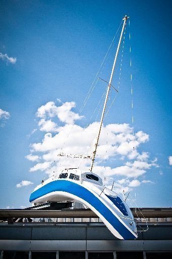
-en.svg)
._Bloemen_06.JPG&action=edit§ion=T-1)
._Bloemen_06.JPG)
._Bloemen_06.JPG,_featured)
._Bloemen_06.JPG,_featured)
._Bloemen_06.JPG,_featured)
.jpg)
.jpg&action=edit§ion=T-1)
.jpg)
.jpg,_not_featured)
.jpg,_not_featured)
.jpg&action=edit§ion=T-1)
.jpg)
.jpg,_not_featured)
.jpg,_not_featured)
,_S%C3%A8te,_H%C3%A9rault_01.jpg&action=edit§ion=T-1)
,_S%C3%A8te,_H%C3%A9rault_01.jpg)
,_Sète,_Hérault_01.jpg)
_04.JPG&action=edit§ion=T-1)
_04.JPG)
_04.JPG)
.JPG&action=edit§ion=T-1)
.JPG)
.JPG,_not_featured)
.JPG,_not_featured)
.jpg&action=edit§ion=T-1)
.jpg)
.jpg,_not_)
.jpg,_not_)
,_off_Studland_Bay,_Dorset,_UK._MOD_45155975.jpg&action=edit§ion=T-1)
,_off_Studland_Bay,_Dorset,_UK._MOD_45155975.jpg)
.jpg&action=edit§ion=T-1)
.jpg)
.jpg,_not_featured)
.jpg,_not_featured)
,_S%C3%A8te,_H%C3%A9rault_07.jpg&action=edit§ion=T-1)
,_S%C3%A8te,_H%C3%A9rault_07.jpg)
,_Sète,_Hérault_07.jpg)
,_S%C3%A8te,_H%C3%A9rault_07_crop.jpg)
,_Sète,_Hérault_07.jpg)
,_Sète,_Hérault_07.jpg)
.JPG&action=edit§ion=T-1)
.JPG)
.JPG,_not_featured)
- Oppose Poor composition (mainly due to the background) and image quality. Alvesgaspar (talk) 13:37, 8 May 2014 (UTC)
- Oppose Bad lighting, blur, little wow. --(✉→Arctic Kangaroo←✎) 02:32, 10 May 2014 (UTC)
- Oppose Disturbing background Christian Ferrer (talk) 16:56, 10 May 2014 (UTC)
.JPG,_not_featured)
File:KotaKinabalu Sabah CityMosque-08.jpg, featured edit
Voting period is over. Please don't add any new votes.Voting period ends on 21 May 2014 at 05:16:19 (UTC)
Visit the nomination page to add or modify image notes.

- Info created and uploaded by Cccefalon - nominated by Cccefalon -- CEphoto, Uwe Aranas (talk) 05:16, 12 May 2014 (UTC)
- Support -- CEphoto, Uwe Aranas (talk) 05:16, 12 May 2014 (UTC)
- Support very nice--Famberhorst (talk) 06:01, 12 May 2014 (UTC)
- Support --Uoaei1 (talk) 07:00, 12 May 2014 (UTC)
- Support --A.Savin 07:56, 12 May 2014 (UTC)
- Support Some minor issues (distorsion of cupola, little boats at right not sharp, denoising a bit too strong, disturbing people...), but a very good FP nevertheless.--Jebulon (talk) 09:29, 12 May 2014 (UTC)
- Support --Joydeep Talk 10:12, 12 May 2014 (UTC)
- Support Per Jebulon. There is no need to turn the luminance and colour NR up to 50 for an ISO 200 image. Suggest taking the luminance down to around 10 or 20 at most, and leave the colour at the default 25. -- Colin (talk) 11:18, 12 May 2014 (UTC)
- Comment I am not sure, if we are talking of the same photo, but my nominated photo is a ISO 100 image (see metadata) where the luminance was untouched and the colour NR is at the default 25. --CEphoto, Uwe Aranas (talk) 20:12, 12 May 2014 (UTC)
- Cccefalon, sorry I misread. However this claims the Luminance Smoothing is 46 (and the Colour Smoothing 25 default). I was looking wrongly at the "Luminance Noise Reduction Detail" and "Color Noise Reduction Detail" fields. Perhaps you have your import defaults set to apply a high degree of luminance smoothing? -- Colin (talk) 11:46, 13 May 2014 (UTC)
- No, nothing, I worked on that image from scratch. However, I went to the mosque in the early morning and I got this wonderful light that made the sky and the water look in wonderful colours. You can check with the other photos of this series. If necessary to convince you, I can make a screenshot of the image in the Lightroom window. --CEphoto, Uwe Aranas (talk) 12:05, 13 May 2014 (UTC)
- Well I'm puzzled and just curious how the exif tool could get it wrong -- I trust what you see. Might you have exported the JPG earlier when you had some stronger NR? Are you using virtual copies and looking at a different one? File:KotaKinabalu Sabah CityMosque-07.jpg appears to have "Luminance smoothing" 52. Is that wrong too? Are the other exif settings wrong too (e.g. "Vibrance", "Clarity 2012")? As for the image, possibly the painted exterior walls are making us think it has heavy NR because we are used to stone/brick having more fine texture. There's plenty detail in the shot so I've no problem supporting. -- Colin (talk) 12:47, 13 May 2014 (UTC)
- No earlier exports and no virtual copies. In total only few things were done to get the photo exported (in this order): Activate lense profile and CA removal. Sharpening +61, Noise reduction +46, Clarity +20, Vibrance +18, Cropping, reducing whites -24. That's it. For the other photo, the noise reduction is indeed +52 and vibrance +20, clarity +22. --CEphoto, Uwe Aranas (talk) 14:41, 13 May 2014 (UTC)
- Support --Kikos (talk) 11:54, 12 May 2014 (UTC)
- Support -- Saffron Blaze (talk) 12:17, 12 May 2014 (UTC)
- Support Nice harmony for my eye. --Ximonic (talk) 13:04, 12 May 2014 (UTC)
- Support --Martin Falbisoner (talk) 13:49, 12 May 2014 (UTC)
- Support -- Arcalino (talk) 17:51, 12 May 2014 (UTC)
- Support --P e z i (talk) 18:57, 12 May 2014 (UTC)
- Support --Braegel (talk) 19:15, 12 May 2014 (UTC)
- Support --Wilfredo R. Rodríguez H. (talk) 01:43, 13 May 2014 (UTC)
- Comment IMO, the distortion is very disturbing. I will support the photo if the problem is fixed. --Graphium 01:57, 13 May 2014 (UTC)
- Comment I don't think so. I added two markers at the outer walls of the mosque and you can see that they are rectilinear. --CEphoto, Uwe Aranas (talk) 05:30, 13 May 2014 (UTC)
- Yup, I know that. The distortion is at the dome, and those towers (or whatever they are called) at the top of the mosque. --Graphium 06:31, 13 May 2014 (UTC)
- The distortion is due to being a wide-angle rectilinear photograph. The effect is more noticeable and disturbing in some subjects than others. See this excellent website for details on the distortions. It's been a problem since at least Leonardo da Vinci's day. The only viable solution is to take the picture from further back (and more vertically central) thus decreasing the angle-of-view. But of course that isn't always practical and the scene changes its depth characteristics with distance too. -- Colin (talk) 12:01, 13 May 2014 (UTC)
- Yup, I know that. The distortion is at the dome, and those towers (or whatever they are called) at the top of the mosque. --Graphium 06:31, 13 May 2014 (UTC)
- Support Per Colin's reply. --Graphium 12:57, 13 May 2014 (UTC)
- Support --King of ♥ ♦ ♣ ♠ 13:00, 13 May 2014 (UTC)
- Support --DXR (talk) 14:17, 13 May 2014 (UTC)
- Support Christian Ferrer (talk) 05:09, 14 May 2014 (UTC)
- Support --AmaryllisGardener talk 13:39, 14 May 2014 (UTC)
- Support --JLPC (talk) 14:50, 14 May 2014 (UTC)
- Support Not a thing wrong with this one. Daniel Case (talk) 19:03, 14 May 2014 (UTC)
- Support Poco2 21:06, 14 May 2014 (UTC)
- Support -- Wolf im Wald 11:27, 15 May 2014 (UTC)
File:Sagres 1970-1.jpg, not featured edit
Voting period is over. Please don't add any new votes.Voting period ends on 17 May 2014 at 21:26:19 (UTC)
Visit the nomination page to add or modify image notes.

- Info Steering wheel of the Portuguese sailing ship Sagres. Shot made in 1970 while in a tall ship race from Plymouth to Tenerif. Same twin-lens camera as in this photo. Maybe this one is only special for me... Alvesgaspar (talk) 21:26, 8 May 2014 (UTC)
- Support -- Alvesgaspar (talk) 21:26, 8 May 2014 (UTC)
- Support -- Wimox (talk) 22:34, 8 May 2014 (UTC)
- Oppose Composition don't work for me , sorry -- Christian Ferrer (talk) 16:50, 10 May 2014 (UTC)
- Oppose I am concerned this has been over processed yet does not pop. The monotone nature of the image probably doesn't aid the subject. Also, take note of the different light levels in the spokes. I get that it is an old image but that doesn't give it a pass. Saffron Blaze (talk) 15:11, 12 May 2014 (UTC)
File:Wrocław - Jahrhunderthalle1.jpg, featured edit
Voting period is over. Please don't add any new votes.Voting period ends on 19 May 2014 at 19:21:44 (UTC)
Visit the nomination page to add or modify image notes.

- Info all by Wladyslaw. Centennial Hall in Wrocław, Poland was built 1911 to 1913 and is a major milestone of reinforced concrete structures. The dome (masked by the exterior facade) was the largest cantilever of the world. In the Centennial Hall there is place for three times the St. Peter's Basilica of Rome. -- Wladyslaw (talk) 19:21, 10 May 2014 (UTC)
- Support -- Wladyslaw (talk) 19:21, 10 May 2014 (UTC)
- Support Is it possible to clone out those 2 guys? Poco2 17:53, 11 May 2014 (UTC)
- yes, but are they so disturbing? --Wladyslaw (talk) 18:23, 11 May 2014 (UTC)
- Comment I would clone out the guys that are walking. The other two guys that are sitting on a bench are not disturbing to me. Barcex (talk) 11:06, 12 May 2014 (UTC)
- Comment +1. And I'd crop the foreground until the next grey line.--Jebulon (talk) 11:31, 12 May 2014 (UTC)
- Sorry, but especially the two persons walking in front are good for having an idea of the dimensions of this structure. --Wladyslaw (talk) 13:32, 12 May 2014 (UTC)
- Jebulon: I tried your proposition, to cut of the front grey line. It sounds good because the image would be "open" in front. But the attempt to do so didn`t convince me. The grey line gives the picture a kind of framing, gives an idea of depth of space and appears more harmonic in my eyes than without. --Wladyslaw (talk) 04:18, 13 May 2014 (UTC)
- Thanks for the try. You are probably right. Anyway, I understand your arguments. Sometimes, an empty foreground is useless, but in this case, due to the overall composition of the photograph, the foreground (which is not "empty" btw: see the lines) is useful here, for the depth impression. Strange result: I agree with you ;).--Jebulon (talk) 08:52, 13 May 2014 (UTC)
- Support incl. the guys and other peoples. --Alchemist-hp (talk) 21:12, 12 May 2014 (UTC)
- Support --JLPC (talk) 13:14, 13 May 2014 (UTC)
- Comment Per Barcex, the couple that are walking need to go. There are plenty other clues to scale (bins, benches, the couple on the bench). Sorry, but the guy in the bright t-shirt is the first thing that the eye catches. They absolutely spoil the picture. -- Colin (talk) 20:13, 13 May 2014 (UTC)
- Barcex, Jebulon and Colin: I'm convinced now and have tried it out without the pedestrians. The impression gets better now. So I have retouched them. --Wladyslaw (talk) 19:19, 14 May 2014 (UTC)
- Close to support. But there's a stitching error in the leftmost lamp-post near the top. There are three ways I've fixed such issues. Firstly is to use Smartblend rather than the built-in blending tool. Diliff should know how to set that up for PTGui as he uses it too. It is more intelligent about where to place the seams and copes better with parallax errors. Second is to export the warped frames that the blend tool uses and import as layers to Photoshop (Gimp?) - again I only know how to do this in Hugin but Diliff does this with PTGui. You can then uses these to manually adjust the faulty stitch seams and also to clone people out where there is overlap and people have moved. Thirdly is to just patch up the image by moving the top of the lamp post so that it lines up with the rest -- not always easy to do convincingly so this is a last resort. -- Colin (talk) 20:23, 14 May 2014 (UTC)
- fixed now --Wladyslaw (talk) 04:23, 15 May 2014 (UTC)
- Close to support. But there's a stitching error in the leftmost lamp-post near the top. There are three ways I've fixed such issues. Firstly is to use Smartblend rather than the built-in blending tool. Diliff should know how to set that up for PTGui as he uses it too. It is more intelligent about where to place the seams and copes better with parallax errors. Second is to export the warped frames that the blend tool uses and import as layers to Photoshop (Gimp?) - again I only know how to do this in Hugin but Diliff does this with PTGui. You can then uses these to manually adjust the faulty stitch seams and also to clone people out where there is overlap and people have moved. Thirdly is to just patch up the image by moving the top of the lamp post so that it lines up with the rest -- not always easy to do convincingly so this is a last resort. -- Colin (talk) 20:23, 14 May 2014 (UTC)
- Support thanks -- Colin (talk) 19:53, 16 May 2014 (UTC)
- Support I must say I am surprised how much better this looks without the walkers. I usually like a scale reference, but in this case they distracted from the nice lines of the composition. I am glad the front grey line stayed. That was the right decision too. @Taxi, please fix the stitching errors. Saffron Blaze (talk) 22:57, 14 May 2014 (UTC)
- I guess this time the distraction was because the top of the man was so conspicuous in matter (strap) and color (turquoise). --Wladyslaw (talk) 04:23, 15 May 2014 (UTC)
- Support --Christian Ferrer (talk) 04:42, 15 May 2014 (UTC)
- Support ...and seven. A "retouched" template in the file description page should be fair.--Jebulon (talk) 11:37, 15 May 2014 (UTC)
- Support Yann (talk) 13:19, 16 May 2014 (UTC)
- Support --P e z i (talk) 18:34, 17 May 2014 (UTC)
File:Equus quagga burchellii - Etosha, 2014.jpg, featured edit
Voting period is over. Please don't add any new votes.Voting period ends on 18 May 2014 at 08:31:58 (UTC)
Visit the nomination page to add or modify image notes.

- Info created by Yathin sk - uploaded by Yathin sk - nominated by Pine -- Pine✉ 08:31, 9 May 2014 (UTC)
- Support -- Pine✉ 08:31, 9 May 2014 (UTC)
- Oppose
Overprocessed?The picture looks very artificial. --(✉→Arctic Kangaroo←✎) 02:28, 10 May 2014 (UTC)
- See the discussion at EN. It was supposed to be taken on the last available sun-rays of the day! Jee 03:15, 10 May 2014 (UTC)
- Support Yann (talk) 06:31, 10 May 2014 (UTC)
- Support --Uoaei1 (talk) 07:24, 10 May 2014 (UTC)
- Support --Alchemist-hp (talk) 08:16, 10 May 2014 (UTC)
- Weak oppose Good quality overall although I would have preferred another lighting. What makes me oppose is the pose of the zebra, it is too static, and therefore the picture lacks interest to me. Poco2 08:39, 10 May 2014 (UTC)
- Support Michael Barera (talk) 06:16, 11 May 2014 (UTC)
- Support Well done IMO Christian Ferrer (talk) 06:57, 11 May 2014 (UTC)
- Support --Joydeep Talk 07:32, 11 May 2014 (UTC)
- Support --Cayambe (talk) 08:39, 11 May 2014 (UTC)
- Oppose The light works very well, but I find the subject not sharp enough at full size. Background a bit too noisy, IMO.--Jebulon (talk) 09:36, 12 May 2014 (UTC)
- Support -- Saffron Blaze (talk) 12:21, 12 May 2014 (UTC)
- Support --Alexander Vasenin (talk) 06:31, 13 May 2014 (UTC)
- Support --King of ♥ ♦ ♣ ♠ 13:02, 13 May 2014 (UTC)
- Neutral Excellent image but We need more sharpening here --Wilfredo R. Rodríguez H. (talk) 01:46, 14 May 2014 (UTC)
- Support .--M49314 (talk) 14:18, 14 May 2014 (UTC)
- Oppose per Wilfredo R. Rodríguez H.--Claus (talk) 15:17, 14 May 2014 (UTC)
- Support although the sharpness is not perfect. -- Wolf im Wald 11:26, 15 May 2014 (UTC)
File:Niagara Falls - ON - Niagarafälle.jpg, not featured edit
Voting period is over. Please don't add any new votes.Voting period ends on 22 May 2014 at 10:22:12 (UTC)
Visit the nomination page to add or modify image notes.

- Info all by Wladyslaw -- Wladyslaw (talk) 10:22, 13 May 2014 (UTC)
- Support -- Wladyslaw (talk) 10:22, 13 May 2014 (UTC)
- Oppose Very nice and useful panorama but the horizon is falling on the left, as are the buildings. I suspect you have problems with your stitch. Can you redo? -- Colin (talk) 11:01, 13 May 2014 (UTC)
- Colin:This picture was take from top of the Skylon Tower (about 150 meters over the niagra falls level), so that this kind of view never can be free of distortion. But I have reprocessed this image. Now the horizon is in line and the buildings are vertical. --Wladyslaw (talk) 21:02, 13 May 2014 (UTC)
- Hmm. This one is overcooked in terms of contrast (like the Clarity slider turned up too far). But it remains very distorted. The buildings on the left may be vertical but they are now very fat. And the buildings on the right are sloping now. I see you use PTGui Pro. I'm not familiar with that. I know Diliff uses it and might be willing to help you with the stitching. -- Colin (talk) 21:21, 13 May 2014 (UTC)
- I'll ask him. Wladyslaw (talk) 04:17, 14 May 2014 (UTC)
- I've reprocessed and restitched it for Wlady and emailed the corrected version to him for consideration and upload. I hadn't noticed your comments on the contrast being too high but I think you're right. In order to match his processing, I did have to bump up the contrast considerably. I would have processed it differently myself but as my aim was merely to correct the stitching, I didn't mess with his processing decisions. Wlady, I can reprocess it with less contrast if you'd like me to combine the corrected stitch with Colin's suggested adjustment to the contrast. Diliff (talk) 11:35, 18 May 2014 (UTC)
- I'll ask him. Wladyslaw (talk) 04:17, 14 May 2014 (UTC)
- Hmm. This one is overcooked in terms of contrast (like the Clarity slider turned up too far). But it remains very distorted. The buildings on the left may be vertical but they are now very fat. And the buildings on the right are sloping now. I see you use PTGui Pro. I'm not familiar with that. I know Diliff uses it and might be willing to help you with the stitching. -- Colin (talk) 21:21, 13 May 2014 (UTC)
- Comment Lol Colin beat me to it. --Graphium 11:05, 13 May 2014 (UTC)
- Oppose Very nice and useful panorama, but heavily distorted and unsharp. -- -donald- (talk) 10:04, 15 May 2014 (UTC)
File:Sri Krishna Temple, ISKCON, Mayapur.jpg, not featured edit
Voting period is over. Please don't add any new votes.Voting period ends on 22 May 2014 at 08:08:05 (UTC)
Visit the nomination page to add or modify image notes.

- Info Sri Krishna Temple at ISKCON, Mayapur. Created/uploaded/nominated by Joydeep Talk 08:08, 13 May 2014 (UTC)
- Support -- Joydeep Talk 08:08, 13 May 2014 (UTC)
- Oppose the light is a bit harsh, the plant at bottom right is a bit disturbing and quality is good but not outstanding --Christian Ferrer 18:07, 15 May 2014 (UTC)
File:Threskiornis molucca - Perth.jpg, featured edit
Voting period is over. Please don't add any new votes.Voting period ends on 18 May 2014 at 06:03:42 (UTC)
Visit the nomination page to add or modify image notes.

- Info created and uploaded by JJ Harrison - nominated by Nikhil -- Nikhil (talk) 06:03, 9 May 2014 (UTC)
- Support --I would like to take credit for this nom. Seems JJ Harrision's works are a safe bet at FPC. :) Nikhil (talk) 06:03, 9 May 2014 (UTC)
- He has 300+ EN FPs; almost 9% of all the FPs there (per his own words). Honestly there is not much fun in re-reviewing them all here. (Excellent work, as usual.) Jee 06:13, 9 May 2014 (UTC)
- At least three pictures of his show up as picture of the day on en:wiki every month. Nikhil (talk) 06:44, 9 May 2014 (UTC)
- No offense, but these are useless comments: I don't know what happens in ENWP, and I don't care. Is this an attempt to influence voters ? I know that it is not the case, but it could be. Please, stop to reference to ENWP, here we are on "Commons"...--Jebulon (talk) 14:50, 17 May 2014 (UTC)
- He has 300+ EN FPs; almost 9% of all the FPs there (per his own words). Honestly there is not much fun in re-reviewing them all here. (Excellent work, as usual.)
- Support --Cayambe (talk) 07:27, 9 May 2014 (UTC)
- Support Very good --Rjcastillo (talk) 14:18, 9 May 2014 (UTC)
- Oppose Overexposed. –Makele-90 (talk) 18:06, 9 May 2014 (UTC)
- Oppose Per Makele-90 and this is not the standard I would have expected from JJ. :( Lack of detail on the wings due to the overexposure. --(✉→Arctic Kangaroo←✎) 02:29, 10 May 2014 (UTC)
- Support--Uoaei1 (talk) 07:28, 10 May 2014 (UTC)
- Support Expo seems ok IMO --Christian Ferrer (talk) 07:00, 11 May 2014 (UTC)
- Support -- I can see fine detail of the feathers even in the whitest part of the bird. It's a rather clean bird, but I doubt it is overexposed. Saffron Blaze (talk) 15:18, 12 May 2014 (UTC)
- Oppose it look like overexposed and washed out colors. --Alchemist-hp (talk) 07:35, 17 May 2014 (UTC)
- Support Per Saffron. No overexposure, white is white, and details of feathers are visible. The sharpness of the beak-to-neck part is outstanding, IMO. And seven against three !--Jebulon (talk) 14:50, 17 May 2014 (UTC)
File:Topographie des Terrors November 2013.jpg, not featured edit
Voting period is over. Please don't add any new votes.Voting period ends on 22 May 2014 at 17:09:36 (UTC)
Visit the nomination page to add or modify image notes.

- Info The site of Topography of Terror, an outdoor and indoor history museum in Berlin built on the site of buildings which during the Nazi regime from 1933 to 1945 were the headquarters of the Gestapo and the SS. The composition is carefully chosen to show the different layers in the topography of terror. To the right is the remains of the Berlin Wall and of the basement of the Gestapo headquarter, where many political prisoners were tortured and executed. I had the opportunity to re-take this images during sunny weather, but I decided not to do it. I think the gray cloudy weather (rather than beautiful and aesthetically sunny weather) is suitable for this terrible place. I also believe that it is the same approaches that the architects have chosen, with the low-profile gray museum building. The image also captures different aspects of Berlin's history, in the background are two historic government buildings (Martin-Gropius-Bau and the Preußischer Landtag building). To the left are some postwar buildings and in the background to the right new office building built after reunification.
- Created, uploaded and nominated by -- Arild Vågen (talk) 17:09, 13 May 2014 (UTC)
- Support -- ArildV (talk) 17:09, 13 May 2014 (UTC)
- Oppose Lots of EV. Not much wow. Saffron Blaze (talk) 12:17, 14 May 2014 (UTC)
- Comment Wow is important for FP, I agree. But is it possible (or even desirable) for this type of object. I have no simple answer, but it's an interesting question.--ArildV (talk) 12:31, 14 May 2014 (UTC)
- It has always been my understanding when a subject is important, like this, but the images of it are unlikely to generate wow, then they could be nominated at inididual WPs such as en:FP or de:FP. In those projects EV has primacy. There is also VI here on Commons, where valuable images may be recognised. On a personal note, I have been to this spot myself and took many images. I found the location difficult, as it was very much a challenge to convey its significance visually in one image. My images were certainly no better than yours even though I had the benifit of a partly sunny day. My conclusion was... to really capture this site in a compelling way (i.e with wow) required a set, where each image would provide a part of the whole. That doesn't mean we don't need images like this to provide context. I just think they don't meet the intent of COM:FPC, and this is why I chose not to nominate my images. Saffron Blaze (talk) 13:44, 14 May 2014 (UTC)
- weak Oppose good quality but I would want a view more on the remains of the Berlin Wall. How can I say? a biggest perspective, maybe from the same point but with a view more on the right with a less part of the left (less interesting IMO however certainly valuable of course). Christian Ferrer (talk) 11:54, 15 May 2014 (UTC)
File:Garudas in the bot of the Wat Phra Kaew.jpg edit
Voting period is over. Please don't add any new votes.Voting period ends on 27 May 2014 at 07:44:25 (UTC)
Visit the nomination page to add or modify image notes.

- Info created by Supercarwaar - uploaded by Supercarwaar - nominated by Supercarwaar -- Supercarwaartalk 07:44, 18 May 2014 (UTC)
- Support -- Supercarwaartalk 07:44, 18 May 2014 (UTC)
- Oppose 60% is out of focus and here the perspective don't work and close the image -- Christian Ferrer (talk) 08:19, 18 May 2014 (UTC)
- Oppose per Christian. Foreground figure unattractively cropped and not really in focus. --Cayambe (talk) 09:34, 18 May 2014 (UTC)
- Oppose Per Christian Ferrer. Perspective does not work and only the first statue is completely sharp. --Jakob (talk) 15:04, 18 May 2014 (UTC)
|
Thank you for nominating this image. Unfortunately, it does not fall within the Guidelines and is unlikely to succeed for the following reason: of the relevant opposing opinions. Moreover the perspective is distorded and the sky is overexposed. The overall quality is not enough for FP, sorry.--Jebulon (talk) 19:29, 18 May 2014 (UTC) | Anyone other than the nominator who disagrees may override this template by changing {{FPX}} to {{FPX contested}} and adding a vote in support. Voting will then continue in the usual way. If not contested within 24 hours, this nomination may be closed. |
Image:Taraxacum sect. Ruderalia 02.JPG edit
Voting period is over. Please don't add any new votes.Voting period ends on 26 May 2014 at 07:26:33 (UTC)
Visit the nomination page to add or modify image notes.

- Info created by Uoaei1 - uploaded by Uoaei1 - nominated by Uoaei1 -- Uoaei1 (talk) 07:26, 17 May 2014 (UTC)
- Support -- Uoaei1 (talk) 07:26, 17 May 2014 (UTC)
- Support Quite an interesting picture. --Jakob (talk) 15:01, 18 May 2014 (UTC)
- Oppose -- There are many good pictures in Commons depicting this kind of fruit head (I have taken some myself). This one is not special enough in my opinion. Alvesgaspar (talk) 15:13, 18 May 2014 (UTC)
- Oppose Per Alvesgaspar.--Jebulon (talk) 19:24, 18 May 2014 (UTC)
- Oppose -- Simple and easy to photograph subjects must be exceptional when offered to FP. This is a bit underwhelming in lighting. Saffron Blaze (talk) 20:57, 18 May 2014 (UTC)
![]() I withdraw my nomination --Uoaei1 (talk) 06:10, 19 May 2014 (UTC)
I withdraw my nomination --Uoaei1 (talk) 06:10, 19 May 2014 (UTC)
File:Saint-Sulpice, Paris, Interior View 140515 1.jpg edit
Voting period is over. Please don't add any new votes.Voting period ends on 25 May 2014 at 10:28:45 (UTC)
Visit the nomination page to add or modify image notes.

- Info created & uploaded by DXR - nominated by Tomer T -- Tomer T (talk) 10:28, 16 May 2014 (UTC)
- Support -- Tomer T (talk) 10:28, 16 May 2014 (UTC)
- Support -- Saffron Blaze (talk) 04:24, 17 May 2014 (UTC)
- Support Yann (talk) 06:08, 17 May 2014 (UTC)
- Support --Uoaei1 (talk) 07:36, 17 May 2014 (UTC)
- Support Thanks Tomer for the nomination. I am very new to church panoramas, do please all feel free to comment and make suggestions! --DXR (talk) 12:11, 17 May 2014 (UTC)
- Support Not perfect (choir windows are clearly overexposed), but very good. In general view the lacks didn't carry weight compared to that amazing panoramic view of the nave. --Wladyslaw (talk) 17:31, 17 May 2014 (UTC)
- Support -- Christian Ferrer (talk) 05:23, 18 May 2014 (UTC)
- Support -- Wolf im Wald 08:46, 18 May 2014 (UTC)
- Support. I would have used rectilinear projection though, cylindrical projection isn't needed for a panorama of this angle of view IMO. Diliff (talk) 16:39, 18 May 2014 (UTC)
- Oppose Per Diliff. Overexpo of the choir window (the correction is not convincing). And the distortions of Pigalle's stoups is really to much.--Jebulon (talk) 20:07, 18 May 2014 (UTC)
- Comment -- This is a great and dramatic picture which impressed me the first time I looked at it. Yes, there are image quality issues but they are probably inevitable given the conditions. What I don't like, like "Master Diliff", is the type of distortion. -- Alvesgaspar (talk) 21:27, 18 May 2014 (UTC)
- I withdraw my nomination. I have the source files to do a HDR, my laptop just cannot handle it. Getting nominated tends to make cases like this a bit tough, but I will redevelop it in the next weeks on my desktop and renominate it if, after using your advice, the image is good enough. Thanks for your participation! --DXR (talk) 21:59, 18 May 2014 (UTC)
File:BMW Polo Masters Megève - 20140126 - Finale 4.jpg edit
Voting period is over. Please don't add any new votes.Voting period ends on 24 May 2014 at 11:54:18 (UTC)
Visit the nomination page to add or modify image notes.

- Info created by, uploaded by, nominated by Pleclown -- Pleclown (talk) 11:54, 15 May 2014 (UTC)
- Support This picture was taken during the final match of the BMW Polo Masters Megève 2014, a Snow polo competition in en:Megève. The horse's tail is clipped, braided and wrapped for safety reasons. The player is sporting a white polo outfit, marked with the BMW logo, BMW being the sponsor of one the team, in addition to being the main sponsor of the event. -- Pleclown (talk) 11:54, 15 May 2014 (UTC)
- As long as I focus on the subject, that's a great action shot: great poses of horse and rider, reasonably sharp, position of the subject within the frame is great, maybe a bit too dark though. But unfortunately, the subject doesn't really stand out against the very busy background, the upper part of the horse's head nearly disappears. Maybe opening up the Tamron to F2.8 might have helped a bit? I'm sorry, but I'll have to Oppose here. --El Grafo (talk) 12:29, 16 May 2014 (UTC)
- Oppose -- Decent and honest picture, no more. Alvesgaspar (talk) 14:45, 18 May 2014 (UTC)
![]() I withdraw my nomination Pleclown (talk) 09:37, 19 May 2014 (UTC)
I withdraw my nomination Pleclown (talk) 09:37, 19 May 2014 (UTC)
File:Shipyard Craft Chacachacare, Margarita Island.jpg, not featured edit
Voting period is over. Please don't add any new votes.Voting period ends on 19 May 2014 at 11:22:33 (UTC)
Visit the nomination page to add or modify image notes.

- Info All by -- Wilfredo R. Rodríguez H. (talk) 11:22, 10 May 2014 (UTC)
- Support --Wilfredo R. Rodríguez H. (talk) 11:22, 10 May 2014 (UTC)
- Support Interesting panorama. Añade descripción en español ;) --Kadellar (talk) 12:07, 11 May 2014 (UTC)
- Done Alguna vez te dije que eres un fastidio? :P --Wilfredo R. Rodríguez H. (talk) 01:38, 13 May 2014 (UTC)
- Support I like the centered boat --Christian Ferrer (talk) 04:54, 15 May 2014 (UTC)
- Comment - I rather like this, but the image seems a bit noisy and soft in places. — Crisco 1492 (talk) 17:09, 16 May 2014 (UTC)
- Oppose I find the composition confusing and image quality far from excellent. Alvesgaspar (talk) 14:56, 18 May 2014 (UTC)
- Support · Favalli ⟡ 02:03, 19 May 2014 (UTC)
File:Tavira Street 01.jpg, not featured edit
Voting period is over. Please don't add any new votes.Voting period ends on 19 May 2014 at 10:39:30 (UTC)
Visit the nomination page to add or modify image notes.

- Info A central street in Tavira, Portugal. All by me. --Heuschrecke (talk) 10:39, 10 May 2014 (UTC)
- Support -- Heuschrecke (talk) 10:39, 10 May 2014 (UTC)
- Oppose Not enough "wow"
+ photo is blur.Just looked again. Oh yeah. Thanks Kadellar. --(✉→Arctic Kangaroo←✎) 13:16, 10 May 2014 (UTC) - Support I didn't find any blur, I think it is perfectly sharp. I find the antennas a bit disturbing, but it's part of the place I guess. Nice composition imo. --Kadellar (talk) 12:15, 11 May 2014 (UTC)
- Support Poco2 17:49, 11 May 2014 (UTC)
- Support --Joydeep Talk 10:12, 12 May 2014 (UTC)
- Oppose -- I fail to see what is featured in this image. The lighting is flat, the sky is drab and the architecture is not all that interesting given the distracting elements. Saffron Blaze (talk) 16:49, 12 May 2014 (UTC)
- Oppose Per Arctic --Wilfredo R. Rodríguez H. (talk) 01:44, 14 May 2014 (UTC)
- Support --Christian Ferrer (talk) 04:47, 15 May 2014 (UTC)
- Oppose -- As above Alvesgaspar (talk) 14:57, 18 May 2014 (UTC)
File:Pieta Sankt Laurentius Felthurns.jpg, not featured edit
Voting period is over. Please don't add any new votes.Voting period ends on 19 May 2014 at 07:44:05 (UTC)
Visit the nomination page to add or modify image notes.

- Info created by Moroder - uploaded by Moroder - nominated by Moroder -- Wolfgang Moroder (talk) 07:44, 10 May 2014 (UTC)
- Support -- Wolfgang Moroder (talk) 07:44, 10 May 2014 (UTC)
- Support Michael Barera (talk) 06:16, 11 May 2014 (UTC)
- Support Christian Ferrer (talk) 05:04, 14 May 2014 (UTC)
- Oppose-- Poor image quality (faces are unsharp), nothing really magic in the subject and composition. Alvesgaspar (talk) 14:58, 18 May 2014 (UTC)
File:ISR-2013-Jerusalem-Holy Sepulchre-dome.jpg, featured edit
Voting period is over. Please don't add any new votes.Voting period ends on 24 May 2014 at 01:58:52 (UTC)
Visit the nomination page to add or modify image notes.

- Info created, uploaded, and nominated by Godot13 -- Godot13 (talk) 01:58, 15 May 2014 (UTC)
- Support -- Godot13 (talk) 01:58, 15 May 2014 (UTC)
- Support Beautiful. Yann (talk) 12:39, 15 May 2014 (UTC)
- Support --Cayambe (talk) 14:15, 15 May 2014 (UTC)
- Support Nice, still there is a bit of red CA and I believe that the exposure was a bit too long (how long actually?) Poco2 20:11, 15 May 2014 (UTC)
- It is faint but I see the CA. I will work on it when I get home. The exposure was 9 seconds (an eternity with tour groups on the move).--Godot13 (talk) 21:07, 15 May 2014 (UTC)
- Most of the CA removed.-Godot13 (talk) 22:35, 15 May 2014 (UTC)
- It is faint but I see the CA. I will work on it when I get home. The exposure was 9 seconds (an eternity with tour groups on the move).--Godot13 (talk) 21:07, 15 May 2014 (UTC)
- Support Very nice. --DXR (talk) 22:12, 15 May 2014 (UTC)
- Support --El Grafo (talk) 11:51, 16 May 2014 (UTC)
- Support --Jean-Éric Poclain (talk) 13:33, 16 May 2014 (UTC)
*
![]() Oppose this kind of picture needs a perfect centering, this is not the case. I find the colors a bit strange.--Jebulon (talk) 20:12, 16 May 2014 (UTC)
Oppose this kind of picture needs a perfect centering, this is not the case. I find the colors a bit strange.--Jebulon (talk) 20:12, 16 May 2014 (UTC)
- Support but I feel that the colors could be a bit more vivid --Uoaei1 (talk) 07:41, 17 May 2014 (UTC)
- Support I change my vote after a new thought. Sharpness is really excellent, and my previous comments were not enough for a serious oppose.--Jebulon (talk) 14:34, 17 May 2014 (UTC)
- Support I'm not sure if I'm voting for the picture or for the subject! Probably for both! Quality is notexcellent but I suppose it would have been very difficult to do better, giving the difficult conditions. Not very common to see a professional camera around! A shame that the Exif info is not shown. Alvesgaspar (talk) 21:18, 18 May 2014 (UTC)
- Support I thought it was picture of a plate at first. Then I read the title. Saffron Blaze (talk) 19:12, 19 May 2014 (UTC)
File:Dome of Samadhi Mandir of Srila Prabhupada, Mayapur 07102013.jpg, not featured edit
Voting period is over. Please don't add any new votes.Voting period ends on 20 May 2014 at 13:19:25 (UTC)
Visit the nomination page to add or modify image notes.

- Info Dome of Samadhi Mandir (temple commemorating the dead) of Srila Prabhupada at ISKCON, Mayapur. Created / uploaded / nominated by Joydeep Talk 13:19, 11 May 2014 (UTC)
- Support -- Joydeep Talk 13:19, 11 May 2014 (UTC)
- Oppose No wow. It would (probably) have been more FP-worthy if you just shot the whole mosque. But I do understand that in this instance you just wanted to capture the dome. --Graphium 02:02, 13 May 2014 (UTC)
- There is a shot of the whole mosque but the crane ruins the photo. --Joydeep Talk 06:31, 13 May 2014 (UTC)
- And I've nominated the photo because I thought this is the best photo of the subject available on Commons. --Joydeep Talk 06:59, 13 May 2014 (UTC)
- That is exactly the purpose of the VI project !--Jebulon (talk) 19:22, 13 May 2014 (UTC)
- Yes, you are very much right. But I nominate pictures here for reviews (and not necessarily to become FP) that will help me taking better photos. I am not very good at taking architecture or landscape photos so I want to improve that. Reviews here will help me improve. --Joydeep Talk 09:13, 14 May 2014 (UTC)
- That is exactly the purpose of the VI project !--Jebulon (talk) 19:22, 13 May 2014 (UTC)
- Support --JLPC (talk) 13:47, 13 May 2014 (UTC)
- Oppose I do not support the practice of expecting this project to be a photography class. Photos nominated here should have a reasonable chance of making FP. It should not be about throwing a pot of spaghetti at the wall and hoping a noodle sticks. Saffron Blaze (talk) 12:25, 14 May 2014 (UTC)
- So now professional or better learned photographers should join this page instead of us. --Joydeep Talk 13:41, 14 May 2014 (UTC)
- If that was meant as sarcasm it failed. I don't care who provides the images so long as they are good. This isn't good. The composition is unbalanced, the lighting is flat, the colours in the sky are suspect, there is no attempt at creating something akin to symmetry, aspects of the subject are randomly cut off. I am not convinced the dissected bits of a wonderful piece of architecture have much chance of conveying wow. More directly, I am not wow'd by this subject. It is a snap shot of a dome. Saffron Blaze (talk) 14:02, 14 May 2014 (UTC)
- Now this is the comment (or a reason of oppose) I expect from a contributor like you (and I respect that), not the previous one. --Joydeep Talk 14:14, 14 May 2014 (UTC)
- I think you have summarised exactly what is wrong with this nomination and those of some others. People are nominating images here that make it clear they do not respect the goals and ideals of this project. They use this project to further their own personal agenda, such as improving their photography or collecting awards. These things are welcomed by-products of one's participation here but they should not be the primary reason. Saffron Blaze (talk) 14:48, 14 May 2014 (UTC)
- Then my 300+ uploads are not valuable to the project. Then I must stop uploading today. Or I should think they are valuable to the project but not for this page. --Joydeep Talk 15:00, 14 May 2014 (UTC)
- They may be valuable to the Commons and many other WMF projects, but it doesn't mean they deserve FP status and it doesn't mean you should subject us to reviewing all 300+ because you want to improve your photography. If you honestly believe some of them are FP worthy, and they meet the FPC guidelines, then by all means nominate them. Saffron Blaze (talk) 15:38, 14 May 2014 (UTC)
- If you see my nominations you'll know I never nominate a lot of photos (I have been here for more than 2 years and may be nominated some 30 photos including mine and others). And by no means I wanted to nominate 300+ pictures. Some can be FP and some simply cannot but that does not mean "...about throwing a pot of spaghetti at the wall and hoping a noodle sticks." And about "improving their photography or collecting awards", I think if FPC,QIC,VIC pages were not available Commons would not have that much files uploaded that it has today. --Joydeep Talk 15:49, 14 May 2014 (UTC)
- Joydeep, Saffron is responding to your comment "But I nominate pictures here for reviews (and not necessarily to become FP)" and not to your track record, and some of the comments Saffron made are general rather than about you. If you didn't nominate this to become FP, why did you support? I don't think anyone here disagrees with you that these awards are motivating and nice to collect (Saffron's talk page is full of them). But a support-nomination at FP means one already believes the image is among the finest on Commons and is making a request to see if one's peers agree. As an aside, there is Commons:Photography critiques but it seems not really have taken off and no longer used. Perhaps there is merit in considering folding that project into this one (in order to take advantage of all the eyes here), where people can explicitly nominate their photographs simply for review but not for FP. Just an idea. -- Colin (talk) 18:17, 14 May 2014 (UTC)
- I know that Saffron is talking more about in general than this nomination and this is somewhat a by-product of the other discussion which is going on. He is talking about the betterment of this project. At the other discussion he said that we have 75% failure rate at COM:FPC. So pictures which are not FP-worthy are not promoting here. Does that mean we should curb nominations? Is less participation or less nomination help the project in long run? --Joydeep Talk 06:53, 15 May 2014 (UTC)
- Now this is the comment (or a reason of oppose) I expect from a contributor like you (and I respect that), not the previous one. --Joydeep Talk 14:14, 14 May 2014 (UTC)
- If that was meant as sarcasm it failed. I don't care who provides the images so long as they are good. This isn't good. The composition is unbalanced, the lighting is flat, the colours in the sky are suspect, there is no attempt at creating something akin to symmetry, aspects of the subject are randomly cut off. I am not convinced the dissected bits of a wonderful piece of architecture have much chance of conveying wow. More directly, I am not wow'd by this subject. It is a snap shot of a dome. Saffron Blaze (talk) 14:02, 14 May 2014 (UTC)
- Oppose I like the colors, this kind of photo must be perfect to be promoted, here the lack of symmetry don't help IMO -- Christian Ferrer (talk) 12:04, 15 May 2014 (UTC)
- Thanks for the review. --Joydeep Talk 12:23, 15 May 2014 (UTC)
File:Glocknergruppe von Süden.jpg, not featured edit
Voting period is over. Please don't add any new votes.Voting period ends on 20 May 2014 at 09:09:08 (UTC)
Visit the nomination page to add or modify image notes.

- Info created by Geiserich77 - uploaded by Geiserich77 - nominated by Geiserich77 -- Geiserich77 (talk) 09:09, 11 May 2014 (UTC)
- Support -- Geiserich77 (talk) 09:09, 11 May 2014 (UTC)
- Support --Uoaei1 (talk) 10:10, 11 May 2014 (UTC)
- Oppose Its a very nice view but the sharpness and level of details is not high enough for FP imo.--ArildV (talk) 13:11, 11 May 2014 (UTC)
- Oppose Too soft as per ArildV. Saffron Blaze (talk) 20:17, 11 May 2014 (UTC)
- Oppose Not really sharp and the vignetting in upper corners is too heavy. --P e z i (talk) 18:52, 12 May 2014 (UTC)
File:Iglesia San Juan Kaneo, Ohrid, Macedonia, 2014-04-17, DD 22.JPG, featured edit
Voting period is over. Please don't add any new votes.Voting period ends on 20 May 2014 at 12:35:57 (UTC)
Visit the nomination page to add or modify image notes.

- Info The Macedonian Orthodox church of Saint John at Kaneo, located on the cliff over the Kaneo Beach at the Ohrid Lake nearby the city of Ohrid, Republic of Macedonia, is a pilgrimage iman in country. The age of the cruciform-shaped temple is uncertain but it was probably erected in the middle of the 14th century. All by me, Poco2 12:35, 11 May 2014 (UTC)
- Support -- Poco2 12:35, 11 May 2014 (UTC)
- I have uploaded a new version following an advice of Kadellar. Thanks Carlos! Poco2 16:23, 11 May 2014 (UTC)
- The new version is better.--ArildV (talk) 16:15, 13 May 2014 (UTC)
- Support --Kadellar (talk) 16:19, 11 May 2014 (UTC)
- Support --DXR (talk) 16:44, 11 May 2014 (UTC)
- Support -- Caecilius Mauß (talk) 19:30, 11 May 2014 (UTC)
- Support -- Would love to see this on a clear sunny day. Saffron Blaze (talk) 20:18, 11 May 2014 (UTC)
- Support --Joydeep Talk 10:12, 12 May 2014 (UTC)
- Support --Graphium 02:03, 13 May 2014 (UTC)
- Support --King of ♥ ♦ ♣ ♠ 13:01, 13 May 2014 (UTC)
- Support --JLPC (talk) 13:20, 13 May 2014 (UTC)
- Support --Rjcastillo (talk) 13:23, 13 May 2014 (UTC)
- Support Christian Ferrer (talk) 05:06, 14 May 2014 (UTC)
- Cancelled my support vote above after new version and Oppose now because 1)Would have been better and more "wow" if full scenery is shown like in earlier version; just correct the tilt 2) Partly cloudy day became a cloudy day. Not a reflection of the reality --Graphium 11:55, 14 May 2014 (UTC)
- I haven't understood your logic. The version that you supported and now opposed was uploaded 2 days before your supporting vote and didn't change since then. Poco2 14:58, 14 May 2014 (UTC)
- @Poco a poco: I noticed the discussion over the new version just a few hours ago, and this brought my attention to the original version. My sincere apologies if this may have been a little unfair to you. Regards --Graphium 15:21, 14 May 2014 (UTC)
- @Graphium: Well, whatever, no problem with that. To your comments: I see no tilt (I take the water see level as reference and it is pretty horizontal), and regarding the "transformation" of partly cloudy to cloudy, I guess that this is mainly due to the fact that in order to draw more attention to the church I cropped the sky and had to get rid of the blue part of it. Poco2 18:43, 14 May 2014 (UTC)
- @Poco a poco: Tilt: I don't see any, but just responding to your "tilt" correction in the second version. Transformation: Did you adjust the exposure? The third version is darker than the previous two, hence my reason. --Graphium 02:34, 15 May 2014 (UTC)
- Support .--M49314 (talk) 14:20, 14 May 2014 (UTC)
- Oppose -- Sorry Poco a Poco but I find the composition unbalanced owing to the imposing and less interesting foreground. Image quality (detail, sharpness) is not on the excellent side either. Alvesgaspar (talk) 14:54, 18 May 2014 (UTC)
- Oppose The foreground is too bright (I'd say overexposed) in comparison to the subject. — Julian H.✈ (talk/files) 09:46, 19 May 2014 (UTC)
- @Julian Herzog: If that was the main reason for your oppose, it believe that is corrected now. Poco2 10:41, 19 May 2014 (UTC)
- @Julian Herzog: If that was the main reason for your oppose, it believe that is
- Oppose sorry Poco, but the uninteresting large foreground destroys the nice view. --Alchemist-hp (talk) 07:14, 20 May 2014 (UTC)
File:Open sarcophagus, in San Juan Bautista Cemetery, Margarita Island.jpg, not featured edit
Voting period is over. Please don't add any new votes.Voting period ends on 24 May 2014 at 18:49:27 (UTC)
Visit the nomination page to add or modify image notes.

- Info All by -- Wilfredo R. Rodríguez H. (talk) 18:49, 15 May 2014 (UTC)
- Oppose Lacks wow. --Graphium 10:04, 16 May 2014 (UTC)
- Oppose -- Does not feature the subject in a compelling way. Saffron Blaze (talk) 21:06, 18 May 2014 (UTC)
File:Rhinechis scalaris cropped.jpg, featured edit
Voting period is over. Please don't add any new votes.Voting period ends on 20 May 2014 at 17:17:28 (UTC)
Visit the nomination page to add or modify image notes.

- Info created by Benny Trapp - uploaded and cropped by Papa Lima Whiskey 2 - nominated by Arion -- ArionEstar (talk) 17:17, 11 May 2014 (UTC)
- Support -- ArionEstar (talk) 17:17, 11 May 2014 (UTC)
- Support Poco2 17:51, 11 May 2014 (UTC)
- Support --Graphium 02:01, 13 May 2014 (UTC)
- Support --Alexander Vasenin (talk) 06:28, 13 May 2014 (UTC)
- Support --AmaryllisGardener talk 13:40, 14 May 2014 (UTC)
- Support Yann (talk) 06:09, 17 May 2014 (UTC)
- Support and the seventh :-) wow --Alchemist-hp (talk) 07:33, 17 May 2014 (UTC)
- Support --Signed by User:$oliton (talk) 14:30, 19 May 2014 (UTC)
File:Klaus Meine - Scorpions Unplugged 2014.jpg, not featured edit
Voting period is over. Please don't add any new votes.Voting period ends on 25 May 2014 at 08:31:54 (UTC)
Visit the nomination page to add or modify image notes.

- Info created by Grombo - uploaded by Grombo - nominated by Grombo -- Tobias Cohrs (talk) 08:31, 16 May 2014 (UTC)
- Support -- Tobias Cohrs (talk) 08:31, 16 May 2014 (UTC)
- Comment That's a great piece of concert photography (lightning, sharpness, etc), but there are a few things that are bugging me. First of all, I didn't recognize him until I read the file name – but maybe that's just him getting old ;-) Second, his cap is disappearing in the black background. And lastly, there's that strange shadow of the microphone, which to me almost looks like some liquid running down from his mouth. Is that enough to oppose an otherwise great portrait? I'll have to think about that for a while … --El Grafo (talk) 12:48, 16 May 2014 (UTC)
- Oppose The picture "doesn`t work". Here we have distracting background and the black hat of Meine is not to distinguish from the dark aera of the background. --Wladyslaw (talk) 06:22, 19 May 2014 (UTC)
- Oppose Per Wladyslaw and the microphone shadow. -- Saffron Blaze (talk) 19:08, 19 May 2014 (UTC)
File:Rose Window of Sainte-Chapelle de Vincennes, Interior View 140308 1.jpg, not featured edit
Voting period is over. Please don't add any new votes.Voting period ends on 25 May 2014 at 10:30:51 (UTC)
Visit the nomination page to add or modify image notes.

- Info created & uploaded by DXR - nominated by Tomer T -- Tomer T (talk) 10:30, 16 May 2014 (UTC)
- Support -- Tomer T (talk) 10:30, 16 May 2014 (UTC)
- Oppose I think there is no space enough above and below. Furthermore, the perspective correction is disturbing with the stone structure of the window: would look like a horizontal view, but obviously taken from below...
- Comment I'm afraid that the stained glass windows are modern, and therefore copyrighted...--Jebulon (talk) 19:35, 16 May 2014 (UTC)
- Jebulon, I could obviously upload the original which has more space, but there is litte point if it will be DR'ed away anyways. Do you have a source on the windows (and is mere restauration without adding a new design copyrightable?) --DXR (talk) 21:31, 16 May 2014 (UTC)
- Oppose too tight crop -- Christian Ferrer (talk) 08:22, 18 May 2014 (UTC)
File:Sarrabus - Torrente.JPG edit
Voting period is over. Please don't add any new votes.Voting period ends on 30 May 2014 at 09:31:06 (UTC)
Visit the nomination page to add or modify image notes.

- Info created, uploaded and nominated by Roberto Mura. Riu Picocca, river in SE Sardinia -- Roberto Segnali all'Indiano 09:31, 21 May 2014 (UTC)
- Neutral -- Roberto Segnali all'Indiano 09:31, 21 May 2014 (UTC)
| Nomination denied. Thank you for nominating this image. Unfortunately, it does not fall within the Guidelines because only two active nominations per user are allowed. --DXR (talk) 12:03, 21 May 2014 (UTC) |
![]() I withdraw my nomination --Roberto Segnali all'Indiano 14:15, 21 May 2014 (UTC)
I withdraw my nomination --Roberto Segnali all'Indiano 14:15, 21 May 2014 (UTC)
File:Tavolara profilo.jpg edit
Voting period is over. Please don't add any new votes.Voting period ends on 30 May 2014 at 09:29:38 (UTC)
Visit the nomination page to add or modify image notes.

- Info created, uploaded and nominated by Roberto Mura. Clouds cap on Tavolara island, Sardinia -- Roberto Segnali all'Indiano 09:29, 21 May 2014 (UTC)
- Neutral -- Roberto Segnali all'Indiano 09:29, 21 May 2014 (UTC)
- Oppose Some kind of noise in the sky... possibly chroma. Colours seem unnatural. Overal picture is unsharp likely due to the unsteady playform. Saffron Blaze (talk) 12:10, 21 May 2014 (UTC)
- Oppose I agree. Although interesting composition.--ArildV (talk) 13:06, 21 May 2014 (UTC)
![]() I withdraw my nomination --Roberto Segnali all'Indiano 14:15, 21 May 2014 (UTC)
I withdraw my nomination --Roberto Segnali all'Indiano 14:15, 21 May 2014 (UTC)
File:Jerzu - Primavera sotto i tacchi.JPG edit
Voting period is over. Please don't add any new votes.Voting period ends on 30 May 2014 at 09:28:17 (UTC)
Visit the nomination page to add or modify image notes.

- Info created, uploaded and nominated by Roberto Mura. Dolostone rocks near Jerzu, Sardinia -- Roberto Segnali all'Indiano 09:28, 21 May 2014 (UTC)
- Neutral -- Roberto Segnali all'Indiano 09:28, 21 May 2014 (UTC)
- Oppose Generic landscapes need to at least have the technical issues perfect. This is soft and that blotchiness in the sky is there again. Saffron Blaze (talk) 12:13, 21 May 2014 (UTC)
![]() I withdraw my nomination --Roberto Segnali all'Indiano 14:15, 21 May 2014 (UTC)
I withdraw my nomination --Roberto Segnali all'Indiano 14:15, 21 May 2014 (UTC)
File:Xerus inauris - Etosha 2014.jpg edit
Voting period is over. Please don't add any new votes.Voting period ends on 29 May 2014 at 17:53:33 (UTC)
Visit the nomination page to add or modify image notes.

- Info all by -- ~y (talk) 17:53, 20 May 2014 (UTC)
- Abstain -- ~y (talk) 17:53, 20 May 2014 (UTC)
- Oppose sorry, but to unsharp: out of focus. --Alchemist-hp (talk) 19:05, 20 May 2014 (UTC)
- you're right, it's silly that I didn't notice that before. Thanks! :-) -- ~y (talk) 19:10, 20 May 2014 (UTC)
![]() I withdraw my nomination
I withdraw my nomination
File:Berlin reichstag west panorama 2.jpg edit
Voting period is over. Please don't add any new votes.Voting period ends on 29 May 2014 at 06:43:11 (UTC)
Visit the nomination page to add or modify image notes.

- Info created by Mfield - uploaded by Waugsberg - nominated by Pine -- Pine✉ 06:43, 20 May 2014 (UTC)
{Support}} -- Pine✉ 06:43, 20 May 2014 (UTC)
|
Thank you for nominating this image. Unfortunately, it does not fall within the Guidelines and is unlikely to succeed for the following reason: Sorry but our new "unfair" rule says: Licensing - Images licensed with solely "GFDL" or "GFDL and an NC-only license" are not acceptable due the restrictions placed on re-use by these licenses. Otherwise an FP-image for me! --Alchemist-hp (talk) 06:55, 20 May 2014 (UTC) | Anyone other than the nominator who disagrees may override this template by changing {{FPX}} to {{FPX contested}} and adding a vote in support. Voting will then continue in the usual way. If not contested within 24 hours, this nomination may be closed. |
- See Commons:Featured picture candidates/File:Berlin reichstag west panorama.jpg. This version is just rotated 0.4 degrees. -- Colin (talk) 11:56, 20 May 2014 (UTC)
![]() I withdraw my nomination thanks for the information. --Pine✉ 06:45, 21 May 2014 (UTC)
I withdraw my nomination thanks for the information. --Pine✉ 06:45, 21 May 2014 (UTC)
File:Oryx gazella male 8054.jpg edit
Voting period is over. Please don't add any new votes.Voting period ends on 25 May 2014 at 11:26:02 (UTC)
Visit the nomination page to add or modify image notes.

- Info created, uploaded, nominated by me: -- Alchemist-hp (talk) 11:26, 16 May 2014 (UTC)
- Support -- Alchemist-hp (talk) 11:26, 16 May 2014 (UTC)
- Comment Cool walk; but don't happy with the wagging tail (?) Jee 16:31, 16 May 2014 (UTC)
- "don't happy with the wagging tail" --> but this is typical for that animals: he scares the mosquitoes! Take a look to the water surface too and you can see a lot of insects. --Alchemist-hp (talk) 17:34, 16 May 2014 (UTC)
- Support After a rethought. Yes; it adds some coolness to his walk! Jee 17:46, 16 May 2014 (UTC)
- "don't happy with the wagging tail" --> but this is typical for that animals: he scares the mosquitoes! Take a look to the water surface too and you can see a lot of insects. --Alchemist-hp (talk) 17:34, 16 May 2014 (UTC)
- Support --Baresi F (talk) 20:36, 16 May 2014 (UTC)
- Support Yann (talk) 06:07, 17 May 2014 (UTC)
- Support although the legs are noisy, since it is inevitable in this situation. --Graphium 08:55, 17 May 2014 (UTC)
- Oppose Sorry but I've been thinking about this nomination for while and I can't support. At the end of the day, it is a decent telephoto zoom picture of an animal in profile. Not bad at all, decent sharpness and DOF! But no wow imo. The strong colors in the background is distracting (despite perfect DOF), the composition is not exciting.--ArildV (talk) 18:46, 17 May 2014 (UTC)
- I've noticed this. But IMHO, this (busy bg) is the price we have to give if we need "more fine details" with a medium tele than a picture like this with 500mm F4. Jee 16:41, 18 May 2014 (UTC)
.jpg)
- Oppose -- No need to invoke minor technical flaws. What lacks in this picture, to be outstandig and become a FP, is a special touch. Alvesgaspar (talk) 14:35, 18 May 2014 (UTC)
- Oppose Per Avelgaspar --Christian Ferrer (talk) 19:22, 18 May 2014 (UTC)
- Oppose -- A lower perspective would have added some drama I suspect. As it is the animal doesn't stand out well. Saffron Blaze (talk) 20:55, 18 May 2014 (UTC)
- Oppose The background is too sharp. --King of ♥ ♦ ♣ ♠ 10:05, 19 May 2014 (UTC)
- ... but a "typical" view of animals on safaris in the Etosha National Park at water holes :-)
- "The background is too sharp.": the DOF of the animal will be more unsharp with a less then f/8. --Alchemist-hp (talk) 07:25, 20 May 2014 (UTC)
- The animal has quite sufficient DOF. I'm pretty sure it'll look fine at f/5.6 or perhaps even f/4. --King of ♥ ♦ ♣ ♠ 09:26, 20 May 2014 (UTC)
- Oppose -- nice photograph, but I feel the light and animal appearance should be better for FP. -- ~y (talk) 18:19, 20 May 2014 (UTC)
- I withdraw my nomination Thanks for all votings and bye bye ... Alchemist-hp (talk) 19:02, 20 May 2014 (UTC)
File:Moon jellyfish at Gota Sagher.JPG, featured edit
Voting period is over. Please don't add any new votes.Voting period ends on 22 May 2014 at 06:23:57 (UTC)
Visit the nomination page to add or modify image notes.

- Info all by -- Alexander Vasenin (talk) 06:23, 13 May 2014 (UTC)
- Support -- Alexander Vasenin (talk) 06:23, 13 May 2014 (UTC)
- Support --Graphium 06:32, 13 May 2014 (UTC)
- Oppose The image is bearing artefacts. --CEphoto, Uwe Aranas (talk) 08:15, 13 May 2014 (UTC)
- Support --Baresi F (talk) 16:12, 13 May 2014 (UTC)
![]() Support -- Shaon
Support -- Shaon
- Support -- Wolf im Wald 11:21, 15 May 2014 (UTC)
- Support --Alchemist-hp (talk) 18:55, 15 May 2014 (UTC)
- Support Yann (talk) 06:09, 17 May 2014 (UTC)
- Oppose -- A magic picture for me. What a shame that focus and image quality are not better! -- Alvesgaspar (talk) 14:50, 18 May 2014 (UTC)
- Support due to the special challenges of underwater photography I think the less than perfect optics are acceptable. Beautiful colors. --Pine✉ 22:23, 18 May 2014 (UTC)
- Support - Amazing. — Crisco 1492 (talk) 07:54, 19 May 2014 (UTC)
- Support --JLPC (talk) 16:11, 21 May 2014 (UTC)
File:Veluwse Papiermolen, Openluchtmuseum Arnhem.jpg, not featured edit
Voting period is over. Please don't add any new votes.Voting period ends on 21 May 2014 at 18:49:51 (UTC)
Visit the nomination page to add or modify image notes.

- Info all done by Uberprutser (talk) 18:49, 12 May 2014 (UTC)
- Support -- Uberprutser (talk) 18:49, 12 May 2014 (UTC)
- Support --Braegel (talk) 19:14, 12 May 2014 (UTC)
- Weak oppose Reflection cut off, making the photo both confusing and distracting, especially since the photo was shot probably around noon/under bright sunlight. --Graphium 02:00, 13 May 2014 (UTC)
- Oppose per --Gra Saffron Blaze (talk) 13:21, 13 May 2014 (UTC)
- Support -- -donald- (talk) 10:05, 15 May 2014 (UTC)
- Support --Baykedevries (talk) 12:32, 15 May 2014 (UTC)
- Oppose Nice but per others, sorry --Christian Ferrer 17:54, 15 May 2014 (UTC)
- Oppose per Graphium; and in addition very low resolution coming out of a 16MP cam. --P e z i (talk) 18:55, 18 May 2014 (UTC)
- Oppose per Graphium. Would be great with full reflection. --Kreuzschnabel (talk) 19:20, 20 May 2014 (UTC)
File:Railway station Opal card reader.jpg edit
Voting period is over. Please don't add any new votes.Voting period ends on 31 May 2014 at 06:58:32 (UTC)
Visit the nomination page to add or modify image notes.

- Info created by MoTorleeb - uploaded by MoTorleeb - nominated by MoTorleeb -- MoTorleeb (talk) 06:58, 22 May 2014 (UTC)
|
Thank you for nominating this image. Unfortunately, it does not fall within the Guidelines and is unlikely to succeed for the following reason: Insufficient image quality, subject not very interesting, random composition. --DXR (talk) 12:01, 22 May 2014 (UTC) | Anyone other than the nominator who disagrees may override this template by changing {{FPX}} to {{FPX contested}} and adding a vote in support. Voting will then continue in the usual way. If not contested within 24 hours, this nomination may be closed. |
File:NationalGrandTheaterBeijing.jpg edit
Voting period is over. Please don't add any new votes.Voting period ends on 31 May 2014 at 04:26:58 (UTC)
Visit the nomination page to add or modify image notes.

- Info created by Flickr user Francisco Diez - uploaded by MGA73bot2 - nominated by Daniel Case -- Daniel Case (talk) 04:26, 22 May 2014 (UTC)
- Support -- Daniel Case (talk) 04:26, 22 May 2014 (UTC)
- Oppose very nice, but also strong noisy and a typical Flickr kitsch. --Alchemist-hp (talk) 07:09, 22 May 2014 (UTC)
- Oppose It could be a very interesting image, but the quality is obviously not good and somebody appears to have PPed the original from flickr in quite an extreme way. The subject itself, composed well, would certainly be featurable, imo. --DXR (talk) 12:05, 22 May 2014 (UTC)
- Oppose It certainly has wow, but the image quality is poor and
 Overprocessed for my taste. I also find the crop at the sides is too tight. --Slaunger (talk) 19:40, 22 May 2014 (UTC)
![]() I withdraw my nomination Daniel Case (talk) 20:40, 22 May 2014 (UTC)
I withdraw my nomination Daniel Case (talk) 20:40, 22 May 2014 (UTC)
File:Capilla del Señor de Celontla, Real del Monte, Hidalgo, México, 2013-10-10, DD 01.JPG edit
Voting period is over. Please don't add any new votes.Voting period ends on 29 May 2014 at 19:08:20 (UTC)
Visit the nomination page to add or modify image notes.

- Info Chapel of the Lord of Celontla, Mineral del Monte, Hidalgo, Mexico. The church was constructed end of the 19th century and is dedicated to Celontla, the saint of the pitmen, main activity of this region in Mexico. All by me, Poco2 19:08, 20 May 2014 (UTC)
- Support -- Poco2 19:08, 20 May 2014 (UTC)
- Comment This is a nice picture, but it lacks something... The blue house on the right is eye catching. Do you have room for a different crop with more (yes more) of this blue house and less street on the left ? Pleclown (talk) 11:45, 22 May 2014 (UTC)
- Hi Pleclown, I do have a landscape format view of the church which I didn't uplod, and will not upload because it doesn't really help. The black shadow corner in the bottom right belongs to a truck parked in front of the house. Therefore, no chance to have a better view of that house. Poco2 20:32, 22 May 2014 (UTC)
- Oppose Soft focus on top of the tower and could use a perspective correction. I agree with Pleclown, regarding the composition, which seems a little out of balance. Otherwise nice. --Slaunger (talk) 20:18, 22 May 2014 (UTC)
- I withdraw my nomination Ok, thanks for your comments, I take back this nomination Poco2 20:32, 22 May 2014 (UTC)
File:Moonrise over Nationalpark Müritz.jpg, not featured edit
Voting period is over. Please don't add any new votes.Voting period ends on 22 May 2014 at 19:52:33 (UTC)
Visit the nomination page to add or modify image notes.

- Info The image shows the moon rising over a field adjacent to the Müritz National Park, which is one of the least light polluted areas in Germany, and a likely candidate for a future dark sky park. The image also contains the constellations Orion, Taurus, and Gemini, the planet Jupiter, and a faint meteor. Compared to other "moonrise" photos on the commons, it stands out in that it's the only photo with stars. Photo created by Pmisson - uploaded by Ckyba - nominated by Ckyba -- Ckyba (talk) 19:52, 13 May 2014 (UTC)
- Support -- Ckyba (talk) 19:52, 13 May 2014 (UTC)
- Oppose The noise on the field is a pity. Beautiful sky, stars, Jupiter, capture nonetheless. I'm still waiting for the day I will see this kind of night sky. :/ --Graphium 10:02, 14 May 2014 (UTC)
- Support Amazing image. The sharpness and noise problems are forgiveable due to mitigating factors (astrophotography). --King of ♥ ♦ ♣ ♠ 18:48, 14 May 2014 (UTC)
- Comment I just wanted to expand on why it is so difficult to take such a shot. First timewise. You need a perfectly clear night, and the moon can't rise during twilight. You only have about 1-2 minutes to take such shots before the moon is no longer on the horizon, and each shot is a 30 second exposure. You can't use a longer exposure to cut down on noise, or the stars won't appear as points (they already have small trails). And if an airplane happens to fly by, or if car or tractor headlights shine on the background, your chance is burned. Second, spatial. MeckPomm is actually one of the only places in Europe where such a shot is even possible, due to the lack of light pollution. The moon rises in a different place each night, making preparing composition challenging. And the site is (necessarily) ~100 km away from the nearest city. As a final point, this is a subject that used to be as universal as sunrises, but is no longer something that regular people experience: there are 180 monrise photos in the commons, but this is the only one that features stars. Ckyba (talk) 20:19, 14 May 2014 (UTC)
- Weak support considering the difficulties, I'm going to "forgive" the noise. I really do love this sky, complete with moon, Jupiter and lots of stars. @Ckyba: I assume Jupiter is the biggest white dot in Gemini? --Graphium 02:26, 15 May 2014 (UTC)
- Comment @Ckyba do you mind tagging those constellations and planets in the image description? I'm not used to this kind of starry skies, so I can't find Orion's bow, or the three stars in a row. --Graphium 02:28, 15 May 2014 (UTC)
- Comment @Graphium Yes, Jupiter is the big white dot. An annotated version is here. Ckyba (talk) 06:01, 15 May 2014 (UTC)
- Support With this explanation, it is easier to understand the value of this image, and the technical difficulties to make it. Yann (talk) 12:37, 15 May 2014 (UTC)
- Support Jee 03:15, 16 May 2014 (UTC)
- Support after some consideration - per Yann. Pixelpeeping really doesn't help here. --Martin Falbisoner (talk) 05:24, 16 May 2014 (UTC)
- Support --El Grafo (talk) 11:43, 16 May 2014 (UTC)
- Weak support As I see from meta data, some kind of compact camera has been used for this image, which is probably not the best choice. So there are some technical problems (noise, stars are not perfect points due to long exposure time). Nevertheless, the photographer has done a good job, and the image is impressive. --Uoaei1 (talk) 07:51, 17 May 2014 (UTC)
- Oppose -- Image quality is poor and difficulty should not be, in my opinion, a criterium for promotion. Is it possible to do better with this subject? Yes, I believe so. Alvesgaspar (talk) 14:48, 18 May 2014 (UTC)
- Oppose per Alvesgaspar. — Julian H.✈ (talk/files) 09:43, 19 May 2014 (UTC)
- Oppose the quality is far from an FP-image. --Alchemist-hp (talk) 21:35, 19 May 2014 (UTC)
- Comment I am not sure that the "noise" in the sky is actually noise - it's probably stars. The instructions emphasize the value of an image, and say that "A bad picture of a very difficult subject is a better picture than a good picture of an ordinary subject" and that "Given sufficient “wow factor” and mitigating circumstances, a featured picture is permitted to fall short on technical quality." This is a very unusual photo (1 of 180 in its category i.e. top 1st percentile) of a universal theme. If someone eventually takes a better photo, then certainly replace this with the new one. But based on the difficulty and the rarity of such photos in the commons, it's unlikely to happen anytime soon.Ckyba (talk) 22:55, 19 May 2014 (UTC)
- Oppose excellent subject for a photo but there is far too much noise. Take this same photo with a better camera and I will likely support. --Pine✉ 06:49, 20 May 2014 (UTC)
- Comment You sure that could be done the same picture with another camera? Why there are so few moorises with stars at google images? Example Here you have a time lampse with the same LX7 and a Nikon D3. Except for the fisheye pictures, the panoramas look the same. I have a Nikon D3, but for some images is more usefull my LX7. I have it with me always and luminosity of your goal is f/1.4. It's almost impossible to have brighter lens.----Pmisson (talk) 10:18, 20 May 2014 (UTC)
- Strong support - About perfect. I'm so glad I can witness these nightskies regularily, as I live in the Müritz region. Cheers, Horst-schlaemma (talk) 11:57, 20 May 2014 (UTC)
- Oppose Per Alvesgaspar and Pine, and welcome to Horst-schlaemma....--Jebulon (talk) 21:10, 20 May 2014 (UTC)
- Info -- Sorry Pmisson but yoiu cannot vote according to the rules. You don't have 50 edits and have not nominated this picture -- Alvesgaspar (talk) 10:45, 21 May 2014 (UTC)
- It wasn't clear to us if it was 50 edits on the commons, or on any wiki project. pmisson is an active wikipedian (in Spanish): https://es.wikipedia.org/w/index.php?title=Especial:Contribuciones/Pmisson&offset=&limit=100&target=Pmisson Ckyba (talk) 12:08, 21 May 2014 (UTC)
- Comment Ckyba asked me on my talk page if I'm sure what I'm seeing is noise and not stars. Yes I'm sure. Look at file:NGC_6528_hst_11664_51_R814G555B390_9453_62_R814G606B.png and compare the sky to this photo. The background black looks solid. Here in file:Moonrise_over_Nationalpark_Müritz.jpg the background is not solid anything. Also notice the noise if you look at the ground in this nomination. As I said before, I think this same photo taken with a better camera would have my support. --Pine✉ 06:43, 21 May 2014 (UTC)
- Comment Thanks for taking a look Pine. I don't think your comparison is the correct one to use in this case. That image has an extraordinarily narrow field of view, and was taken from space itself by the Hubble Space Telescope! A better comparison would be to this image. The noise and star motion are very similar (the sky is darker in the ESO image because the moon is not lighting the sky), and the speckling in the foreground objects is actually worse. But that image was taken using 37 individual frames taken over a total of 30 minutes.
It's not possible to do that during a moonrise, because you have at the very most 2 minutes to capture the scene.That image actually includes a moonrise (I didn't see it at first), and if you look at the noise near the moon it is very similar. But since the sky is so dark, the rest of the 37 frames were presumably taken before the moon rose. I would ask Pine, Alvesgaspar, Julian_Herzog, Alchemist-hp, and Jebulon to also please consider this image, which was picture of the year in 2010 and has noise in both the sky and the foreground objects (particularly near the horizon, even more in the foreground). Finally, regarding the camera, it's true it's not a full frame DSLR, but it's not some crummy pocket camera either. It's a recent model high end point and shoot with a f1.4 lens that pmisson specifically bought for the flexibility of taking such astrophotos when serendipity provides the chance for a shot like this.Ckyba (talk) 09:29, 21 May 2014 (UTC)- I think you make a few good points and I therefore want to specify exactly why I think the quality is not good enough for FP status here. The important thing in this is not noise, it's the signal to noise ratio. I think the best comparison photo among the ones you showed is the one with the laser in it. It has a very significant amount of noise, but that's because none of the noise was removed. It was left in there because our brains are very good at seeing the information behind the noise and all the information is preserved that way. The stars are sharp and the contrast is good. There is also a very intersting foreground object that actually makes this photo interesting, but that's a different story. In the photo that we vote on here, there is noise despite the fact that a lot of noise reduction has happened to the photo, smearing all minor details and higher magnitude stars. This is coupled with motion blur of the stars from a long exposure (presumably), which can't really be avoided, but because your foreground is also not sharp, this means that no single object/edge in the whole photo gives the viewer an impression of sharpness and definition. And that's not at 100%, I'm talking about a normal viewing distance of the full photo on my monitor. In this viewing mode, the laser photo seems totally sharp and the noise is hardly noticeable.
Now I do admit that it is hard to take such a photo without the problems that I mentioned. But I think that FP is not about the best photo that can be achieved relatively easily of a certain subject, it's about great photos, and in the final result, this one doesn't convince me. At this point, the fact that it is hard to do it better doesn't matter. Nevertheless, I think there are ways that would improve a similar shot significantly apart from using a more expensive camera. Those are: 1) A more wide-angle shot. That way, using the same exposure time, the stars and objects are less blurred from the motion of the earth and wind on the leaves. Everything immediately seems sharper. 2) Better editing. I'm quite certain that with the RAW data of the shot you took, at least the definition of the stars could be improved. The foreground is probably impossible to get to a point where it's not extremely noisy or very blurred. A way to fix this would be to take several shots and stack them together and just use this for the foreground and not for the stars. Stacking is amazing for reducing noise on non-moving objects, and it can be done for parts of an image. 3) Composition. This image, to me, lacks any defined setup of the general order of things on the canvas. The moon is almost but not in the center, the tree is somewhat in the foreground but not really enought that it acts as a counterbalance to the moon. Placing the moon according to the golden ratio, a tree/bush/house/object in the opposite spot with significant presence and using an angle wide enought that the transition of the sky horizontally is more visible would make this a much better shot to me.
Now I have to say that I haven't done any of this, and similar efforts didn't turn out quite as well as I had hoped, and for everything that I say, someone probably has the opposite opinion. But that's why I opposed this image. I hope you take it as an encouragement and as constructive feedback, I tried to be as objective and helpful as I could. — Julian H.✈ (talk/files) 10:19, 21 May 2014 (UTC)- Thank you for your detailed explanation Julian H.. I happen to agree with you on many of the points, particularly regarding the composition (it was done that way to keep Orion in the frame). I don't deny that a better photo is possible, I just think that this photo is very valuable, given that it's a universal (but extremely difficult to capture) subject. So I would agree that if someone someday gets a better photo, this one should be de-listed. But the description on the featured picture page seems to indicate that value is more important than technical quality, and the image guidelines say that Given sufficient “wow factor” and mitigating circumstances, a featured picture is permitted to fall short on technical quality. Of course, "value" and "wow" are obviously debatable: my main point is that the picture should be promoted or not based on whether it's valuable and exciting, not based on the amount of noise when blown up. If you look back at the votes for the laser image, it barely scraped by after very similar objections were raised, and then ended up becoming image of the year. FWIW, I don't notice the noise on my retina display at full size, and it also looks great on a printed version I got by chance today (the cover of a formal invitation to an event in MeckPomm, near where the photo was taken). Thanks again for taking the time to write such a detailed comment.Ckyba (talk) 12:03, 21 May 2014 (UTC)
- I think you make a few good points and I therefore want to specify exactly why I think the quality is not good enough for FP status here. The important thing in this is not noise, it's the signal to noise ratio. I think the best comparison photo among the ones you showed is the one with the laser in it. It has a very significant amount of noise, but that's because none of the noise was removed. It was left in there because our brains are very good at seeing the information behind the noise and all the information is preserved that way. The stars are sharp and the contrast is good. There is also a very intersting foreground object that actually makes this photo interesting, but that's a different story. In the photo that we vote on here, there is noise despite the fact that a lot of noise reduction has happened to the photo, smearing all minor details and higher magnitude stars. This is coupled with motion blur of the stars from a long exposure (presumably), which can't really be avoided, but because your foreground is also not sharp, this means that no single object/edge in the whole photo gives the viewer an impression of sharpness and definition. And that's not at 100%, I'm talking about a normal viewing distance of the full photo on my monitor. In this viewing mode, the laser photo seems totally sharp and the noise is hardly noticeable.
- There is a project that deals specifically with images that are valuable but may not be featurable. Saffron Blaze (talk) 12:28, 21 May 2014 (UTC)
- Oppose Nice idea but too much noise. --P e z i (talk) 19:07, 21 May 2014 (UTC)
- Ckyba the example that I used was one that was linked from the page you linked to me on my talk page. (: For what it's worth, I've looked around for information about the best cameras for night photography and it seems that even the best full frame cameras have a bit of noise unless the images are downsampled, and I think the counterexamples that you gave in your response are good to point out. Would it be possible for you to take the same photograph with multiple shots and then downsample the stitched image? I bet you could get a very good quality image that way. --Pine✉ 06:27, 22 May 2014 (UTC)
- Hi Pine - I was trying to point out that since the sky is full of stars, it's inherently "noisy" no matter what you do. Regarding taking the photo again: as said above, there are very few locations in all of Europe where such images are possible; this site is about a two hour drive from my home in Berlin. (This slide shows roughly where the photo was taken, along with the modeled skyglow of Europe.) To avoid too much moonlight, the phase needs to be near new moon, so there are only a few nights per year for which the moonrise time is late enough that such a shot is possible (summer is out because we're too far North). It has to be perfectly clear (about 1/3 of all days in our region), and if a farmer is working at night or an airplane drives by the shot could be ruined. Multiple shots would be difficult, because the stars move fastest near the ecliptic, but I suppose a talented astrophotographer (not me, I didn't even take the photo) could possibly do something like that. Ckyba (talk) 07:48, 22 May 2014 (UTC)
- I have read the debate here and was conflicted about whether to support or oppose. Some of the arguments for support sounded compelling particularly from a European perspective. However, here in Canada, and many other places of the world, finding a spot to take a shot like this would be little more than walking out the back door of one’s house. Even if in a Canadian city, it isn’t a big deal to drive for a few minutes to access completely black skies filled with so many stars that you can actually see the Milky Way with the naked eye. Then I had to consider the fact that while the combination of the moonrise and the star field had some visual impact I also recognised that this is not an image anyone would ever see. It looks more like a sunrise in some respects. It is a bit like those long-exposure shots of waterfalls, which I shoot myself frequently and have had featured. They are pretty but how much do they deviate from reality? I saw these on Flickr: https://www.flickr.com/photos/xclearmindx/8980598548/ https://www.flickr.com/photos/davetoussaint/8445481293/ https://www.flickr.com/photos/fortphoto/7802210432/ https://www.flickr.com/photos/22982057@N03/12201527484/ Which is the finest or is either any good? Still conflicted and remaining neutral on this one. Saffron Blaze (talk) 14:34, 22 May 2014 (UTC)
File:Sodiumlamp.jpg edit
Voting period is over. Please don't add any new votes.Voting period ends on 31 May 2014 at 16:06:24 (UTC)
Visit the nomination page to add or modify image notes.

- Info created/uploaded by Anonimski (talk) 16:06, 22 May 2014 (UTC) - nominated by Anonimski -- Anonimski (talk) 16:06, 22 May 2014 (UTC)
- Support as nominator. -- Anonimski (talk) 16:06, 22 May 2014 (UTC)
- Oppose I think this is pretty good photo, I like the subject and also the idea of putting it on a light table to better see the internal structure of the lamp. However, the downside of this strong backlighting only is that no details regarding the socket is seen. Thus, you do not get a good idea of the lamp in its entirety. I would propose to supplement with some foreground lighting as well. See File:ZM1210-operating edit2.jpg and File:Gluehlampe 01 KMJ.jpg for existing FPs of related objects, where you better see the entire structure of the lamp. --Slaunger (talk) 19:35, 22 May 2014 (UTC)
- I withdraw my nomination - I see, but I will withdraw since I don't have a light source for the other side that's good enough in this context. - Anonimski (talk) 20:55, 22 May 2014 (UTC)
File:Vlakhernskoye-Kuzminki (09).jpg edit
.jpg&action=edit§ion=T-1)
Voting period is over. Please don't add any new votes.Voting period ends on 30 May 2014 at 19:57:31 (UTC)
Visit the nomination page to add or modify image notes.
.jpg)
.jpg)
- Info created & uploaded by Max Ryazanov - nominated by Tomer T -- Tomer T (talk) 19:57, 21 May 2014 (UTC)
- Support -- Tomer T (talk) 19:57, 21 May 2014 (UTC)
- Oppose Nice, but no wow --Uoaei1 (talk) 12:59, 22 May 2014 (UTC)
- Oppose Nothing really stands out for me when it comes to the technical quality, composition (except for the reflection). Not sufficiently eye-catching for me to be an FP, sorry. --Slaunger (talk) 19:50, 22 May 2014 (UTC)
.jpg)
![]() I withdraw my nomination Tomer T (talk) 09:55, 23 May 2014 (UTC)
I withdraw my nomination Tomer T (talk) 09:55, 23 May 2014 (UTC)
.jpg)
File:Dôme des Invalides, Paris 15 May 2014.jpg, not featured edit
Voting period is over. Please don't add any new votes.Voting period ends on 27 May 2014 at 14:08:06 (UTC)
Visit the nomination page to add or modify image notes.

- Info created by DXR - uploaded and nominated by Paris 16 -- Paris 16 (talk) 14:08, 18 May 2014 (UTC)
- Support -- Paris 16 (talk) 14:08, 18 May 2014 (UTC)
- Neutral -- Nothing to say technically. The subject is beautiful, composition is correct and image quality is excellent. But lacks the touch of magic... Alvesgaspar (talk) 15:02, 18 May 2014 (UTC)
- Info I've asked for a rename of the file. It is not the Hôtel des Invalides, but the church of the Dome, in the Invalides complex. I hope it will not affect the polling process.--Jebulon (talk) 19:20, 18 May 2014 (UTC)
- Done. Thank Jebulon!--Paris 16 (talk) 20:19, 18 May 2014 (UTC)
- A better alternative:
 ??? --Alchemist-hp (talk) 07:06, 20 May 2014 (UTC)
- How is this better? The whole point of my image is showing the thing without those harsh shadows that are making photos during the day unpleasant, as obvious in the image shown by you (perhaps my image is a bit warm, admittedly). I'm not claiming that my image should be FP (mainly due to probable lack of wow), but I would like to refer you to the KEB discussion on your proposed alt, on which you voted just "weak pro" and which got declined there. --DXR (talk) 07:38, 20 May 2014 (UTC)
- We have here a discusion, and I only asked it with three "???" :-) OK? --Alchemist-hp (talk) 19:47, 20 May 2014 (UTC)
- Sorry Alchemist, I think I sounded harsher than I wanted to. I would just prefer constructive criticism, saying what features of the other image you like better, that's a bit more helpful for me, okay? --DXR (talk) 08:52, 21 May 2014 (UTC)
- We have here a discusion, and I only asked it with three "???" :-) OK? --Alchemist-hp (talk) 19:47, 20 May 2014 (UTC)
File:Mokre (Mokrau) - Kalkofen 07.JPG, not featured edit
_-_Kalkofen_07.JPG&action=edit§ion=T-1)
Voting period is over. Please don't add any new votes.Voting period ends on 23 May 2014 at 10:46:12 (UTC)
Visit the nomination page to add or modify image notes.
_-_Kalkofen_07.JPG)
_-_Kalkofen_07.JPG)
- Info all by Pudelek -- Pudelek (talk) 10:46, 14 May 2014 (UTC)
- Support -- Pudelek (talk) 10:46, 14 May 2014 (UTC)
- Oppose Everything is sunny except the subject. Saffron Blaze (talk) 12:21, 14 May 2014 (UTC)
- Oppose Bad lighting. --AmaryllisGardener talk 13:38, 14 May 2014 (UTC)
- Support The light and the shadows are here acceptable IMO Christian Ferrer (talk) 11:55, 15 May 2014 (UTC)
- Oppose No wow. Pleclown (talk) 11:25, 19 May 2014 (UTC)
_-_Kalkofen_07.JPG,_not_featured)
_-_Kalkofen_07.JPG,_not_featured)
File:Notre Dame de Paris DSC 0846w.jpg, not featured edit
Voting period is over. Please don't add any new votes.Voting period ends on 26 May 2014 at 23:00:41 (UTC)
Visit the nomination page to add or modify image notes.

- Info created, uploaded and nominated by -- P e z i (talk) 23:00, 17 May 2014 (UTC)
- Support Fortunately, when I captured this picture there was a stage set up for an event providing an elevated point of view within near distance of the building. This gives a good feeling of the dimensions of this huge cathedral. -- P e z i (talk) 23:00, 17 May 2014 (UTC)
- Oppose -- Good picture but far from outstanding (what a FP should be). The top of the cathedral is too soft and the crop is too tight for my taste. Alvesgaspar (talk) 14:27, 18 May 2014 (UTC)
- Question@Alvesgaspar: I agree with you regarding the crop and the softness, but what kind of picture of the western facade of Notre-Dame de Paris could be "outstanding" ? It is as it is...--Jebulon (talk) 19:40, 18 May 2014 (UTC)
- Comment It is a good question @Jebulon: , and I have been wondering the same thing. I had a look at some of the many other photos of the Western facade on Commons, and this one is one of the very best or perhaps the best at giving an "encyclopedic" clean view of the facade, well justified by its VI status within a daylight scope. One option could be to illustrate the size of it by moving closer, such that the perspective is seen, but personally I think it makes it worse. But although a very valuable illustration of the topic it is not so interesting as depicted (to be frank I find it boring, there, I said it), so I agree with Alvesgaspar on this point. So what can you do? The degrees of freemdom are the wheather, light, and camera position or you can spice it up with another element to it, for improving the "wow". Quasimodo would have been a nice touch, but, naah, nor realistic. I think though that the light could have been better, e.g., evening sun with a black rain shower in the background, or as in this case add some spice in the form of a flock of flying birds. Or taken suspended from a drone to get a more interesting POV, but there may be legal issues.... --Slaunger (talk) 20:20, 18 May 2014 (UTC)
- @Jebulon: (This "ping thing" is very useful!) -- Well, a possibility is that no matter what you do, no featurable photo of this "boring" monument is possible! But you will agree with me that the variables are so many that some outstanding result is possible with the right combination of light, angle, sky ... ~~ Alvesgaspar (talk) 20:22, 18 May 2014 (UTC)
- Amazing coincidence, this edit conflict of two users (Slaunger and I) saying basically the same thing!! -- Alvesgaspar (talk) 20:24, 18 May 2014 (UTC)
- @Jebulon: , @Alvesgaspar: , I am only pinging you now because I am a physicist trying to see if I can start a chain reaction .--Slaunger (talk) 20:29, 18 May 2014 (UTC)
- Ping-ping to both of you ! I agree, the light is a bit flat. But as for the point of view, remember it is unique: it was taken from a stage built for celebrating the 850th anniversary of the building, so I'm afraid we will have to wait a bit until.... Some time...--Jebulon (talk) 20:30, 18 May 2014 (UTC)
- @Jebulon: , it is a good point you have regarding the rather unique camera position, but if you do a Google seacrh for drone views of the Notre Dame, you can get a pretty spectacular view of the Western facade from 100 m height from a drone. Unfortunately, I cannot post a link here as it is being blocked by the spamfilter, but it is www dot 360cities dot net. --Slaunger (talk) 20:43, 18 May 2014 (UTC)
- @Jebulon: , @Alvesgaspar: , I am only pinging you now because I am a physicist trying to see if I can start a chain reaction
- Amazing coincidence, this edit conflict of two users (Slaunger and I) saying basically the same thing!! -- Alvesgaspar (talk) 20:24, 18 May 2014 (UTC)
- Sorry: illegal.--Jebulon (talk) 20:47, 18 May 2014 (UTC)
- OK. --Slaunger (talk) 20:52, 18 May 2014 (UTC)
- Oppose --Very interesting POV but unfortunately the upper half of the image is too blurred; needs lens correction post-processing. Sting (talk) 00:17, 21 May 2014 (UTC)
File:Altstadt Zürich.jpg, not featured edit
Voting period is over. Please don't add any new votes.Voting period ends on 28 May 2014 at 07:32:27 (UTC)
Visit the nomination page to add or modify image notes.

- Info all by Der Wolf im Wald -- Wolf im Wald 07:32, 19 May 2014 (UTC)
- Support -- Wolf im Wald 07:32, 19 May 2014 (UTC)
- Oppose The sky is rather unattractive and the composition doesn't really offer much in the way of wow. Saffron Blaze (talk) 16:19, 19 May 2014 (UTC)
File:2014-Wandersmann von Südwest.jpg, not featured edit
Voting period is over. Please don't add any new votes.Voting period ends on 28 May 2014 at 17:59:19 (UTC)
Visit the nomination page to add or modify image notes.

- Info Wandersmann memorial, Hesse – c/u/n by Kreuzschnabel -- Kreuzschnabel (talk) 17:59, 19 May 2014 (UTC)
- Support -- Kreuzschnabel (talk) 17:59, 19 May 2014 (UTC)
- Oppose A rather straightforward photo of a rather plain and vandalised memorial. Just a QI. -- Colin (talk) 19:09, 19 May 2014 (UTC)
File:Don Quijote de La Mancha, Teresa Carreño Teather.jpg, featured edit
Voting period is over. Please don't add any new votes.Voting period ends on 28 May 2014 at 14:21:26 (UTC)
Visit the nomination page to add or modify image notes.

- Info All by -- The Photographer (talk) 14:21, 19 May 2014 (UTC)
- Comment The noise is exceptionally well controlled and it is sharp. I think there is a better crop in there with the cut off actor on the left removed and the floating hand on the right removed. Saffron Blaze (talk) 16:17, 19 May 2014 (UTC)
- Done Thanks --The Photographer (talk) 16:46, 19 May 2014 (UTC)
- Support -- That really is quite lovely. Saffron Blaze (talk) 18:26, 19 May 2014 (UTC)
- Support Good composition and colours. -- Colin (talk) 19:12, 19 May 2014 (UTC)
--84.248.221.64 20:09, 19 May 2014 (UTC)--Ximonic (talk) 22:25, 19 May 2014 (UTC)
- Support Forgot to log in. --Ximonic (talk) 22:25, 19 May 2014 (UTC)
- Support --Baresi F (talk) 20:42, 19 May 2014 (UTC)
- Support -- Bravo, The Photographer! Nothing more to say... Alvesgaspar (talk) 21:52, 19 May 2014 (UTC)
- Support -- nice, colours and The moment of image capture, brightness in Darkness..--محمد بوعلام عصامي «Md.Boualam» (talk) 00:28, 20 May 2014 (UTC)
- Support --Martin Falbisoner (talk) 05:44, 20 May 2014 (UTC)
- Question Very good, but is it legal? Usually, all rights of theatre productions are reserved by the theatre! --Uoaei1 (talk) 12:52, 20 May 2014 (UTC)
- I don't think there would be any right on a picture. On a video with sound, there could be, yes. Yann (talk) 18:17, 20 May 2014 (UTC)
- There's more that may be copyrightable just a performance or song. In the UK, the set would be copyright[4] and I would think also a highly complex arrangement of cast/costume on stage. I assumed The Photographer had permission. Perhaps an OTRS is needed? -- Colin (talk) 18:50, 20 May 2014 (UTC)
- I don't think there would be any right on a picture. On a video with sound, there could be, yes. Yann (talk) 18:17, 20 May 2014 (UTC)
- Support Excelente captura --Rjcastillo (talk) 12:56, 20 May 2014 (UTC)
- Support Yann (talk) 18:17, 20 May 2014 (UTC)
- Abstain I would have cropped more at the bottom, but otherwise great picture. However, we need to be sure about the copyright issues. In addition to the set, the costumes might be copyrightable, and I think in the US (and in some other countries as well) stills from produced plays are covered by both the play's copyright and the production's (after all, the actors' pose is as much the result of creative choices as the sets and costumes). Daniel Case (talk) 00:57, 21 May 2014 (UTC)
- In Venezuela the show producer's rights for reproduction of the performance in photographs or recordings works in a similar way to most other countries (such as the US or UK), going by the explanation given in Chapter II (Performance Contract) in the Law on Copyright, 1993.[5] The costume and stage design rights are reasonably assumed under the show production rights, it is these that would need validation. A release providing evidence of this via OTRS, or a statement about this performance elsewhere (i.e. an official event website which explained how photography is allowed at the event) would be sufficient. --Fæ (talk) 10:24, 21 May 2014 (UTC)
- strong Support from a photographic point of view. I hope the photographer has permission.--ArildV (talk) 13:09, 21 May 2014 (UTC)
- It is probably a good thing to separate a possible issue of copyright verification from the FP vote. Perhaps someone with experience of past situations like this would like to create a separate discussion to link to? There is no doubt this is an excellent photograph. --Fæ (talk) 13:52, 21 May 2014 (UTC)
- I'd just give The Photographer a chance to respond here and if things fall apart then the DR process will be appropriate. Saffron Blaze (talk) 14:33, 21 May 2014 (UTC)
- Comment Estoy en este momento tomando fotografías y no tengo computador, escribo rápidamente en español. Estoy escribiendo rápido para aclarar este problema de permisologia. La autora de Esta obra es La usuario Laura, ella es la autora de la coreografía y autora de la obra. Esta usuaria me invito a la obra y es la razon de esta foto, no hay ningún problema con esto y estoy seguro que ella podrá hacer lo mismo que esto. Los participantes han sido informados de estas fotografías y la licencia asi como tambien el Teatro. Voy a seguir tomando fotos así que, por favor, contactar a @Laura Fiorucci: en Wikipedia en espanol, mientras regreso. Un abrazo y gracias a todos. --The Photographer (talk) 02:22, 22 May 2014 (UTC)
@ Fæ, in your experience, is what has been provided by Wilfreor sufficient for Commons' requirements? Or is OTRS the only way to resolve the doubt? Saffron Blaze (talk) 13:42, 23 May 2014 (UTC)
- Not quite sufficient. Were I the OTRS volunteer, I would expect an email from the producer or production company (which seems to be Fiorucci if I read this right). Depending on the email, such as whether the source happens to match a website domain or is a freebie account, this might need some background verification, or additional questions to ensure that the copyright holder has understood the free release licence allows commercial reuse, this being the most frequent issue that crops up. The hassle of OTRS could be avoided altogether if an equivalent verifiable statement is made elsewhere, such as on the producer's website or Flickrstream, if the photo appeared in those places. If anyone wants this done quickly, it might be an idea to contact a Spanish speaking OTRS & Commons volunteer, like Jcb, for obvious reasons. --Fæ (talk) 14:23, 23 May 2014 (UTC)
- Support Amazing pic. Well done! --P e z i (talk) 10:24, 23 May 2014 (UTC)
- Support --Heinz-Josef Lücking (talk) 10:51, 23 May 2014 (UTC)
- Support Very good, interesting, well done and... Different !--Jebulon (talk) 19:37, 23 May 2014 (UTC)
- Comment Es absolutamente absurdo lo del copyright ¿borraremos todas las imágenes de esta categoría? ¿o quizá las de esta categoría... los automóviles tienen diseñadores ¿pidieron permiso para tomarles fotos? Los aviones tienen diseñadores, todo tiene diseñadores. El vestido de Oscar de la Renta hay que borrarlo!!! hay que borrarlo Creo que se están excediendo. El espectáculo Don Quijote que monté en el Teatro Teresa Carreño fue visto por cerca de 10000 personas. De verdad, chicos, esto se fue de madre. Saludos, con todo mi respeto, a todos. Laura Fiorucci (talk) 21:33, 26 May 2014 (UTC)
File:Phoenicopterus roseus portrait.jpg, not featured edit
Voting period is over. Please don't add any new votes.Voting period ends on 24 May 2014 at 17:04:29 (UTC)
Visit the nomination page to add or modify image notes.

- Info Up close and personal with a Greater Flamingo, Phoenicopterus roses, at Martin Mere, Lancashire, UK. All by -- Baresi F (talk) 17:04, 15 May 2014 (UTC)
- Support -- Baresi F (talk) 17:04, 15 May 2014 (UTC)
- Support Good --Wilfredo R. Rodríguez H. (talk) 18:51, 15 May 2014 (UTC)
- Support Very nice --Alexander Vasenin (talk) 04:18, 16 May 2014 (UTC)
- Thanks @Martin Falbisoner - a fair comment regarding the colour. I've added a little saturation, and adjusted the exposure slightly to make it less washed-out - do you think it looks any better? --Baresi F (talk) 16:13, 16 May 2014 (UTC)
- yes, it does look better now. The bird's still not my all-time favorite, but the image is good enough to Support --Martin Falbisoner (talk) 16:59, 16 May 2014 (UTC)
- yes, it does look better now. The bird's still not my all-time favorite, but the image is good enough to
- Thanks @Martin Falbisoner - a fair comment regarding the colour. I've added a little saturation, and adjusted the exposure slightly to make it less washed-out - do you think it looks any better? --Baresi F (talk) 16:13, 16 May 2014 (UTC)
- Support I never fail to enjoy your work @Baresi franco. --Graphium 10:07, 16 May 2014 (UTC)
![]() Neutral Very tight crop --Uoaei1 (talk) 07:40, 17 May 2014 (UTC)
Neutral Very tight crop --Uoaei1 (talk) 07:40, 17 May 2014 (UTC)
- Support tight, but impressive -- Wolf im Wald 08:45, 18 May 2014 (UTC)
- Oppose Being high resolution and showing detail is not enough for reaching the star. For me the composition is poor and the crop too tight. By the way, the top of the head is overexposed in the red channel and no significant detail is shown. -- Alvesgaspar (talk) 14:44, 18 May 2014 (UTC)
- Oppose Tight crop --Christian Ferrer (talk) 19:17, 18 May 2014 (UTC)
- Support per "Wolf im Wald". --Alchemist-hp (talk) 07:09, 20 May 2014 (UTC)
- Oppose see C. Ferrer and Alvesgaspar above. --Heinz-Josef Lücking (talk) 11:01, 23 May 2014 (UTC)
- Oppose Tight crop, poor composition Gidip (talk) 18:28, 23 May 2014 (UTC)
- Question Isn't it tilted ? (See the droplet...)--Jebulon (talk) 10:39, 24 May 2014 (UTC)
File:Plateau d'emparis, (2250 m.) cairn 02.JPG, not featured edit
_cairn_02.JPG&action=edit§ion=T-1)
Voting period is over. Please don't add any new votes.Voting period ends on 25 May 2014 at 04:54:26 (UTC)
Visit the nomination page to add or modify image notes.
_cairn_02.JPG)
_cairn_02.JPG)
- Info Plateau d'emparis, (2250 m.) cairn) Cairns are landmarks in a mountain landscape. Cairns are important landmarks (especially in bad weather) ineenzame rugged mountain areas. Created by Famberhorst - uploaded by Famberhorst - nominated by Famberhorst -- Famberhorst (talk) 04:54, 16 May 2014 (UTC)
- Support -- Famberhorst (talk) 04:54, 16 May 2014 (UTC)
- Support --Graphium 10:08, 16 May 2014 (UTC)
- Support. Very nice lighting. Perhaps including more to the right would improve the composition. --King of ♥ ♦ ♣ ♠ 18:53, 16 May 2014 (UTC)
- Comment mean the cairn in the middle?--Famberhorst (talk) 04:55, 17 May 2014 (UTC)
_cairn_02.JPG,_not_featured)
- Composition is fine with me. --Graphium 08:42, 17 May 2014 (UTC)
- Support --Uoaei1 (talk) 07:37, 17 May 2014 (UTC)
- Oppose -- Sorry but 'fine' is far from enough, in my opinion, to gain the star. The subject is interesting but the composition and quality are trivial. By the way, the main subject is slightly out of focus. -- Alvesgaspar (talk) 14:39, 18 May 2014 (UTC)
- Oppose I like the idea and the background but per Avelgaspar, however it would have been able to work for me with a much wider view -- Christian Ferrer (talk) 19:31, 18 May 2014 (UTC)
- Oppose -- Lacks drama that would be there with a different perspective. It seems to lack depth as well. Saffron Blaze (talk) 21:01, 18 May 2014 (UTC)
- Support --JLPC (talk) 16:24, 24 May 2014 (UTC)
- Oppose a heap of stones is to simple to be featured for me. --Alchemist-hp (talk) 01:39, 25 May 2014 (UTC)
_cairn_02.JPG,_not_featured)
File:2013-06-08 Highflyer HP L4729.JPG, not featured edit
Voting period is over. Please don't add any new votes.Voting period ends on 25 May 2014 at 17:37:24 (UTC)
Visit the nomination page to add or modify image notes.

- Info created, uploaded, nominated by me: -- Alchemist-hp (talk) 17:37, 16 May 2014 (UTC)
- Support -- Alchemist-hp (talk) 17:37, 16 May 2014 (UTC)
- Comment IMO there's no clear subject in the photo. Please improve the description. --Graphium 08:57, 17 May 2014 (UTC)
- weak Support Its a very good quality aerial shoot with high EV. The images would benefit from a tighter left crop and a perspective correction (both sides lean outward).--ArildV (talk) 09:49, 17 May 2014 (UTC)
- Support --Wladyslaw (talk) 17:27, 17 May 2014 (UTC)
- weak Oppose high EV but very busy -- Christian Ferrer (talk) 08:15, 18 May 2014 (UTC)
- Oppose Good quality but trivial picture (a FP should be outstanding!) -- Alvesgaspar (talk) 14:34, 18 May 2014 (UTC)
- Hm, what will be a better one? Can you help me please? This is a small point and simple to change it. Thanks, --Alchemist-hp (talk) 07:05, 19 May 2014 (UTC)
- @Graphium I have something corrected. Now better for you? --Alchemist-hp (talk) 07:14, 19 May 2014 (UTC)
- Thanks --Graphium 08:44, 19 May 2014 (UTC)
- Support --Graphium 08:44, 19 May 2014 (UTC)
- Support --Signed by User:$oliton (talk) 14:29, 19 May 2014 (UTC)
- Oppose Well executed but I am not convinced these types generic city skylines images offer much in the way of wow. I can appreciate the effort and technical excellence but this seems like a fine QI or even VI, but not FP. Saffron Blaze (talk) 16:25, 19 May 2014 (UTC)
- Support --Brackenheim (talk) 22:09, 21 May 2014 (UTC)
- Oppose Nice shot from above, but no wow, as noted. Daniel Case (talk) 01:48, 22 May 2014 (UTC)
- Oppose Now wow, cold flair --Heinz-Josef Lücking (talk) 10:59, 23 May 2014 (UTC)
- Support --ST ○ 19:53, 23 May 2014 (UTC)
File:Cape Disappointment and Cape Disappointment Light.jpg, not featured edit
Voting period is over. Please don't add any new votes.Voting period ends on 29 May 2014 at 18:31:47 (UTC)
Visit the nomination page to add or modify image notes.

- Info all by Adbar -- Adbar (talk) 18:31, 20 May 2014 (UTC)
- Support -- Adbar (talk) 18:31, 20 May 2014 (UTC)
- Oppose Nice image but nothing featurable. --Graphium 09:46, 21 May 2014 (UTC)
- Neutral For me a quite interesting scenery. I like the timing of the waves, the lighthouse in the background and the composition is quite good. But still not quite good enough for FP in my opinion. --Slaunger (talk) 20:22, 22 May 2014 (UTC)
- Comment I like the setting too. I don't think the light was your friend here and cutting off the logs turns them into a bit of distraction instead of being a framing device. Saffron Blaze (talk) 22:20, 23 May 2014 (UTC)
File:Puente Arslanagić, Trebinje, Bosnia y Herzegovina, 2014-04-14, DD 28.jpg, featured edit
Voting period is over. Please don't add any new votes.Voting period ends on 25 May 2014 at 19:21:25 (UTC)
Visit the nomination page to add or modify image notes.

- Info The Arslanagić Bridge is a 80 m long and 6 m high Ottoman bridge built originally in 1574 by order of the Grand Vizier Sokollu Mehmed Pasha, and rebuilt in 1972 in the city of Trebinje, Bosnia and Herzegovina. The bridge was an important trading link over the Trebišnjica river between Novi (today Herceg Novi in Montenegro) and Ragusa (today Dubrovnik in Croatia). All by me, Poco2 19:21, 16 May 2014 (UTC)
- Support -- Poco2 19:21, 16 May 2014 (UTC)
- Support --A.Savin 19:44, 16 May 2014 (UTC)
- Support wow, cool! --Alchemist-hp (talk) 20:02, 16 May 2014 (UTC)
- Support Love the reflection. The big green patch on the left isn't adding much but I can't see how to eliminated it from this particular viewpoint. The fact that the top of the mountains are hidden behind the bridge isn't ideal (compare File:Puente Arslanagić, Trebinje, Bosnia y Herzegovina, 2014-04-14, DD 29.jpg, which sadly doesn't have such good reflections). Am I the only person who, when first looking at this image, "saw" horrendous stitching "errors" -- like the top of the bridge was really badly stitched to the bottom. -- Colin (talk) 21:15, 16 May 2014 (UTC)
- I cannot see anything, but for sure there are no stitching errors because this picture is the result of one single frame Poco2 07:10, 17 May 2014 (UTC)
- Poco, as Saffron makes clear, it is an illusion -- that's why I put "saw" and "errors" in quotes. Sorry if it didn't translate. -- Colin (talk) 07:46, 17 May 2014 (UTC)
- Support That second arch lends to the stitching error illusion in the thumb. At full res it's gone and the view is even more impressive. Saffron Blaze (talk) 04:21, 17 May 2014 (UTC)
- Support (Note: Coordinates are missing.)--Famberhorst (talk) 05:01, 17 May 2014 (UTC)
- Support Yann (talk) 05:44, 17 May 2014 (UTC)
- Support--Uoaei1 (talk) 07:34, 17 May 2014 (UTC)
- Support --Cayambe (talk) 07:40, 17 May 2014 (UTC)
- Support --Martin Falbisoner (talk) 07:46, 17 May 2014 (UTC)
- Weak support Great picture and viewpoint. But I personally feel that the mountains were ended quite abruptly by the bridge, hence the "weak". --Graphium 09:03, 17 May 2014 (UTC)
- Support Overall very high quality an great composition, i don't mind the mountains behind the bridge.--ArildV (talk) 09:42, 17 May 2014 (UTC)
- Support --Kikos (talk) 16:58, 17 May 2014 (UTC)
- Support The bridge could be sharper, but overall good quality and very good composition. --Wladyslaw (talk) 17:25, 17 May 2014 (UTC)
- Support Wish it was a bit sharper but it's well worthy of support anyway. Lewis Hulbert (talk) 23:27, 17 May 2014 (UTC)
- Support -- Christian Ferrer (talk) 05:34, 18 May 2014 (UTC)
- Support As others have said, wish it was a little bit sharper, but great image!--Godot13 (talk) 06:34, 18 May 2014 (UTC)
- Comment -- As Colin, I love the reflection. But the composition seems somehow unnatural to me (distortion is perhaps one the cause) and image quality is just regular (too agressive jpeg compressure?) -- Alvesgaspar (talk) 15:18, 18 May 2014 (UTC)
- Oppose Very good, and the reflection is very nice. The distortion is a bit disturbing. Sorry if I am alone to dare to oppose due to the lack of sharpness, which is not sufficient for a FP in my opinion.--Jebulon (talk) 19:58, 18 May 2014 (UTC)
- Support · Favalli ⟡ 01:50, 19 May 2014 (UTC)
- Support --JLPC (talk) 16:13, 21 May 2014 (UTC)
- Support --Heinz-Josef Lücking (talk) 10:49, 23 May 2014 (UTC)
- Support --AmaryllisGardener talk 19:05, 25 May 2014 (UTC)
File:Wasserkraftwerk Laufenburg1.jpg, featured edit
Voting period is over. Please don't add any new votes.Voting period ends on 29 May 2014 at 13:22:32 (UTC)
Visit the nomination page to add or modify image notes.

- Info all by Wladyslaw. The hydroelectric power station is a cultural properties of national significance in Switzerland and became this year 100 years old. If you look detailed on the picture you'll identify the national border between Germany and Switzerland, whichs runs in the middle of the river Rhine. -- Wladyslaw (talk) 13:22, 20 May 2014 (UTC)
- Support -- Wladyslaw (talk) 13:22, 20 May 2014 (UTC)
- Comment Great panorama. But some dust spots in the sky, also a strange line (above of the border) in the very top.--ArildV (talk) 15:24, 20 May 2014 (UTC)
- ArildV: should be eliminated now, if not leave a not at the image. --Wladyslaw (talk)
- Support High quality and EV, nice light and composition.--ArildV (talk) 06:49, 21 May 2014 (UTC)
- Support --· Favalli ⟡ 01:16, 22 May 2014 (UTC)
- Support Very nice! Just two things: I'd suggest adding the panorama template and please remove the (tiny) CW tilt. --P e z i (talk) 12:20, 22 May 2014 (UTC)
- Support --ClandestineSurveillance (talk) 15:22, 22 May 2014 (UTC)
- Support -- George Chernilevsky talk 17:38, 22 May 2014 (UTC)
- Support --Rjcastillo (talk) 18:51, 22 May 2014 (UTC)
- Support At first sight I was unconvinced regarding the wow, but it is really a very interesting and valuable subject filled with little details once you start scrutinizing it. The image quality is crisp and the light good, so: support. --Slaunger (talk) 20:27, 22 May 2014 (UTC)
- Support --Alchemist-hp (talk) 10:37, 23 May 2014 (UTC)
- Support --JLPC (talk) 16:14, 23 May 2014 (UTC)
- Support Per Slaunger.--Jebulon (talk) 19:44, 23 May 2014 (UTC)
File:Narcis grootkronig (Narcissus) 04.JPG edit
_04.JPG&action=edit§ion=T-1)
Voting period is over. Please don't add any new votes.Voting period ends on 2 Jun 2014 at 04:53:08 (UTC)
Visit the nomination page to add or modify image notes.
_04.JPG)
_04.JPG)
- Info Daffodil (Narcissus). Group: cupped. created by Famberhorst - uploaded by Famberhorst - nominated by Famberhorst -- Famberhorst (talk) 04:53, 24 May 2014 (UTC)
- Support -- Famberhorst (talk) 04:53, 24 May 2014 (UTC)
- Oppose nice, but a bit to soft: out of focus?! and the background is to noisy. --Alchemist-hp (talk) 07:58, 24 May 2014 (UTC)
- Oppose below quality standards, particularly for an easily repeatable image. Saffron Blaze (talk) 14:55, 24 May 2014 (UTC)
- I withdraw my nomination --Famberhorst (talk) 15:51, 25 May 2014 (UTC)
_04.JPG)
File:Tower in Taman Sari, 2014-05-19.jpg edit
Voting period is over. Please don't add any new votes.Voting period ends on 1 Jun 2014 at 09:56:24 (UTC)
Visit the nomination page to add or modify image notes.

- Info created & uploaded by Crisco 1492 - nominated by Tomer T -- Tomer T (talk) 09:56, 23 May 2014 (UTC)
- Support -- Tomer T (talk) 09:56, 23 May 2014 (UTC)
- Comment - This is currently at QIC and I think we should wait for that to finish. That being said, I think this is worth FP... just don't want two concurrent processes right now. — Crisco 1492 (talk) 10:10, 23 May 2014 (UTC)
- so I I withdraw my nomination until QIC is finished. Tomer T (talk) 18:46, 23 May 2014 (UTC)
- so I
- There is no link between QIC and FPC. A FP can fail as QI. A FP is not "better" than a QI. It is something else, different.--Jebulon (talk) 19:25, 23 May 2014 (UTC)
- Yes, but if QI asks for things which FP ends up opposed to, we end up torn between two opinions. It's simpler to have one at a time. — Crisco 1492 (talk) 00:22, 24 May 2014 (UTC)
- I agree. QI often sorts out minor issues that would otherwise being a distraction here. I think it is often in the best interests of the creator and the project that images go through QI first. Almost every image I upload goes through QI whether I nominate it here or not. I credit QI with improving my photography and the success rate of image I submit here. Saffron Blaze (talk) 14:58, 24 May 2014 (UTC)
File:Fortaleza de Skopie, Macedonia, 2014-04-17, DD 86.JPG, not featured edit
Voting period is over. Please don't add any new votes.Voting period ends on 29 May 2014 at 23:38:28 (UTC)
Visit the nomination page to add or modify image notes.

- Info created by Poco a poco - uploaded by Poco a poco - nominated by Kiril Simeonovski -- Kiril Simeonovski (talk) 23:38, 20 May 2014 (UTC)
- Support -- Kiril Simeonovski (talk) 23:38, 20 May 2014 (UTC)
- Oppose Noise, reflection on the lens, structure is coloured orange from the street lights, and lastly, no wow. --Graphium 09:50, 21 May 2014 (UTC)
- Oppose I could get past the monochrome nature of the image if the lights added real drama to the scene. They don't. Saffron Blaze (talk) 14:22, 21 May 2014 (UTC)
- Comment Independently whether this picture meets FP standard I want to thank you you, Kiril for the nomination. Poco2 18:55, 21 May 2014 (UTC)
- You're welcome. I've noticed that your photographs are of exceptional quality and plan to nominate others as well.--Kiril Simeonovski (talk) 07:15, 22 May 2014 (UTC)
- Oppose Certainly a good and valuable image, but not quite FP level IMO, per opposers above. --Slaunger (talk) 20:04, 22 May 2014 (UTC)
- Oppose The monochrome nature of the image could work however the ligth rays are a bit disturbing here IMO --Christian Ferrer (talk) 06:49, 25 May 2014 (UTC)
File:Caminandes- Llama Drama - Short Movie.ogv, featured edit
Voting period is over. Please don't add any new votes.Voting period ends on 29 May 2014 at 22:21:57 (UTC)
Visit the nomination page to add or modify image notes.
- Info created by Pablo Vazquez, Beorn Leonard, and Francesco Siddi. Music and Sound by Jan Morgenstern - uploaded and nominated by Russavia -- russavia (talk) 22:21, 20 May 2014 (UTC)
- Comment This film was a nominee for the 2012 Suzanne Award for Best Short Film
- Support -- russavia (talk) 22:21, 20 May 2014 (UTC)
- Support Made my day. Lupo 14:58, 21 May 2014 (UTC)
- Support Cute. --King of ♥ ♦ ♣ ♠ 17:03, 21 May 2014 (UTC)
- Support --Paris 16 (talk) 17:45, 21 May 2014 (UTC)
- Support Lovely --· Favalli ⟡ 00:51, 22 May 2014 (UTC)
- Support Yes. Nicely done. Pleclown (talk) 11:42, 22 May 2014 (UTC)
- Support oh yes. --Martin Falbisoner (talk) 15:42, 22 May 2014 (UTC)
- Support Fantastic - Anonimski (talk) 16:53, 22 May 2014 (UTC)
- Support Leitoxx 01:14, 23 May 2014 (UTC)
- Support funny and very nice --Wladyslaw (talk) 04:35, 23 May 2014 (UTC)
- Support Saffron Blaze (talk) 15:01, 24 May 2014 (UTC)
- Support --Steinsplitter (talk) 19:35, 24 May 2014 (UTC)
- Support! — Julian H.✈ (talk/files) 16:35, 25 May 2014 (UTC)
- Support --AmaryllisGardener talk 19:02, 25 May 2014 (UTC)
File:Notre-Dame de Paris and Île de la Cité at dusk 140516 1.jpg, featured edit
Voting period is over. Please don't add any new votes.Voting period ends on 26 May 2014 at 02:20:02 (UTC)
Visit the nomination page to add or modify image notes.

- Info created and uploaded by DXR - nominated by Paris 16 -- Paris 16 (talk) 02:20, 17 May 2014 (UTC)
- Support -- Paris 16 (talk) 02:20, 17 May 2014 (UTC)
- Support -- Exceptional. Saffron Blaze (talk) 04:18, 17 May 2014 (UTC)
- Support Yann (talk) 05:45, 17 May 2014 (UTC)
- Support--Uoaei1 (talk) 07:34, 17 May 2014 (UTC)
- Support --Cayambe (talk) 07:39, 17 May 2014 (UTC)
- Support --Martin Falbisoner (talk) 07:46, 17 May 2014 (UTC)
- Oppose Good quality, but the composition here does not say much to me. Maybe it's because it does not show a unified ensemble or a part of such. All it shows is the back side (!) of Notre-Dame, plus an unrelated building. Also, the lighting of the bridge at the right with the shadow like an upside-down triangle is really distracting for me. --A.Savin 09:26, 17 May 2014 (UTC)
- Support Thanks Paris 16. I have fixed the noise and also some perspective issues. I can see that the bridge lighting might irritate, and I think that whoever commissioned that wasn't thinking very far... I do not know how showing the back side of Notre-Dame would be bad (I find it far more interesting than the front which is a bit straightforward). IMO, the image shows the eastern Île de la Cité as some sort of ensemble with references to both sides of the river, but each to their own.--DXR (talk) 09:41, 17 May 2014 (UTC)
- CommentI do not know how showing the back side of Notre-Dame would be bad (I find it far more interesting than the front which is a bit straightforward): +++1 ! --Jebulon (talk) 14:38, 17 May 2014 (UTC)
- Support The flashy light of the Pont Saint-Louis (right) is a bit deflective, but nevertheless a outstanding picture. --Wladyslaw (talk) 17:22, 17 May 2014 (UTC)
- Support I agree the bright bridge is a bit of a distraction. A 4:3 crop of the left hand side is good too, and avoids this. -- Colin (talk) 18:07, 17 May 2014 (UTC)
- Support It's true the bridge is a bit distracting, but I like this one -- Christian Ferrer (talk) 05:29, 18 May 2014 (UTC)
- Support--Godot13 (talk) 06:32, 18 May 2014 (UTC)
- Oppose As Savin Alvesgaspar (talk) 15:15, 18 May 2014 (UTC)
- Oppose Not your fault, but the place does not work for a FP IMO. The embankment at left is busy by people an not really interesting. The right part with the triangle under the bridge is a no-go for me. What remains ? The cathedral, and a part of the Seine river. Maybe you could have another try with a tighter framing.--Jebulon (talk) 20:18, 18 May 2014 (UTC)--Jebulon (talk) 20:18, 18 May 2014 (UTC)
- Oppose As Savin. Pleclown (talk) 11:32, 19 May 2014 (UTC)
- Oppose Sorry, but that triangle is way too dominating imho. Since you seem to live in that area: Might worth a try to re-visit the location and try to make the triangle the main subject. That probably wouldn't be very useful for Commons, but could be interesting from a more "artistic" point of view … --El Grafo (talk) 19:29, 20 May 2014 (UTC)
- Well, since today, I am no longer in Paris, therefore I cannot take more images. If it gets declined, it does, no worries. However I wonder why so few people have commented on the alt that has no triangle... --DXR (talk) 20:10, 20 May 2014 (UTC)
- You left Paris, and we did not met ? What a pity ! --Jebulon (talk) 21:13, 20 May 2014 (UTC)
- You're right, Jebulon... Somehow time was just flying during the last weeks and before I knew, I was already in the train back! --DXR (talk) 12:10, 22 May 2014 (UTC)
- You left Paris, and we did not met ? What a pity ! --Jebulon (talk) 21:13, 20 May 2014 (UTC)
- Well, since today, I am no longer in Paris, therefore I cannot take more images. If it gets declined, it does, no worries. However I wonder why so few people have commented on the alt that has no triangle... --DXR (talk) 20:10, 20 May 2014 (UTC)
- Support --JLPC (talk) 16:16, 21 May 2014 (UTC)
- Support --P e z i (talk) 12:25, 22 May 2014 (UTC)
Alternative crop edit

- Info Based on Colin's and also A.Savin's comment, I have uploaded a 5x7 version that focuses on the left arm of the Seine and Notre-Dame. (please feel free to correct me if I handled the alt wrong, I have no experience with that...) --DXR (talk) 18:41, 17 May 2014 (UTC)
- Support No ugly modern distraction here. -- Colin (talk) 19:41, 17 May 2014 (UTC)
- Support Whichever gets the most supports. Saffron Blaze (talk) 21:51, 17 May 2014 (UTC)
- Support Also very nice. Yann (talk) 22:22, 17 May 2014 (UTC)
- Oppose I support the not cropped version -- Christian Ferrer (talk) 05:28, 18 May 2014 (UTC)
- Oppose --Paris 16 (talk) 07:34, 18 May 2014 (UTC)
File:Oryx gazella - Etosha 2014.jpg, featured edit
Voting period is over. Please don't add any new votes.Voting period ends on 29 May 2014 at 22:02:20 (UTC)
Visit the nomination page to add or modify image notes.

- Info Portrait of a Gemsbok (Oryx gazella) from the Etosha National Park - all by Yathin sk -- ~y (talk) 22:02, 20 May 2014 (UTC)
- Abstain -- ~y (talk) 22:02, 20 May 2014 (UTC)
- Support -- Saffron Blaze (talk) 22:28, 20 May 2014 (UTC)
- Support --Alexander Vasenin (talk) 04:11, 21 May 2014 (UTC)
- Support --Graphium 09:47, 21 May 2014 (UTC)
- Support -- George Chernilevsky talk 17:52, 21 May 2014 (UTC)
- Support --· Favalli ⟡ 01:07, 22 May 2014 (UTC)
- Support but maybe you can reduce the noise in the background --Uoaei1 (talk) 13:02, 22 May 2014 (UTC)
- Support --Martin Falbisoner (talk) 15:43, 22 May 2014 (UTC)
- Support --Rjcastillo (talk) 18:49, 22 May 2014 (UTC)
- Comment This is a very good photo of great detail level, timing, exposure and light, and I like that you have left some empty space to the left, allowing the animal "to breathe". But I am wondering if the composition could be improved by cropping some more from the left? Have you tried experimenting with a quadratic crop? It may (or may not?) look better. --Slaunger (talk) 20:14, 22 May 2014 (UTC)
- Support --Wladyslaw (talk) 04:38, 23 May 2014 (UTC)
- Support nice portrait, a bit overexposed for my taste and/or the light reflection an the head are a bit disturbing too. I'm missing the rest of this animal and I'd like to see where the animal lives ;-) The main: I prefer exact and only this current crop! A quadratic crop looks prmitive and to simple. --Alchemist-hp (talk) 07:31, 23 May 2014 (UTC)
- Support Very nicely done ! -- Dey.sandip (talk) 10:50, 23 May 2014 (UTC)
- Support --Heinz-Josef Lücking (talk) 10:51, 23 May 2014 (UTC)
- Support Superb portrait. One of the best photos I've seen here. Chapeau! And don't you dare change the crop! Gidip (talk) 17:54, 23 May 2014 (UTC)
- Info I have dared to upload a square crop as a new file: File:Oryx gazella - Etosha 2014 square crop.jpg. I actually think that makes a quite good composition as well. I am not suggesting to nominate it as an alternative version, it is just for information. --Slaunger (talk) 17:20, 24 May 2014 (UTC)
- Now has the oryx a wall in front of its head ... no, unfortunately unattractive composition. --Alchemist-hp (talk) 18:55, 24 May 2014 (UTC)
- Yeah, and if it tilts it head back a bit in either version, its horns will get stuck on the wall to the right. Poor onyx-in-a-cage! . --Slaunger (talk) 19:27, 24 May 2014 (UTC)
- Yeah, and if it tilts it head back a bit in either version, its horns will get stuck on the wall to the right. Poor onyx-in-a-cage!
- Now has the oryx a wall in front of its head ... no, unfortunately unattractive composition. --Alchemist-hp (talk) 18:55, 24 May 2014 (UTC)
- Comment Thanks for all the excellent comments and feedback. As usual, it's always nice to see read about other creative perspectives and see derivatives. :-) --~y (talk) 18:25, 24 May 2014 (UTC)
- Support Light very well managed, I like this portrait very much, excellent background, a bit noisy though. I like this crop, and not the squared one.--Jebulon (talk) 19:28, 24 May 2014 (UTC)
- Support Convinced now. --Slaunger (talk) 19:31, 24 May 2014 (UTC)
- Support --Christian Ferrer (talk) 15:57, 25 May 2014 (UTC)
- Support --AmaryllisGardener talk 19:03, 25 May 2014 (UTC)
File:Bald Eagle Fuerstenfeldbruck 2014 -2.JPG, not featured edit
Voting period is over. Please don't add any new votes.Voting period ends on 26 May 2014 at 15:20:11 (UTC)
Visit the nomination page to add or modify image notes.

- Info Not the most impressive resolution as I had to crop a lot. Still, I guess I was pretty lucky that I got access to this marvelous equipment the moment the bird finally looked in my direction - and even opened its beak. All by --Martin Falbisoner (talk) 15:20, 17 May 2014 (UTC)
- Support --Martin Falbisoner (talk) 15:20, 17 May 2014 (UTC)
- Support --Uoaei1 (talk) 15:35, 17 May 2014 (UTC)
- Support cool )) --A.Savin 17:42, 17 May 2014 (UTC)
- Oppose -- Very nice catch. But there are a lot of very good pictures of bald eagles already in the FP gallery. And this one doesn't stand from the group. Alvesgaspar (talk) 14:32, 18 May 2014 (UTC)
- Support It is one of the eagles the most photographed and I would tend to agree with Avelgaspar however when we look at this category, it is the one which to my opinion has most wow effect which we search here. Colors and composition work for me. Christian Ferrer (talk) 18:18, 18 May 2014 (UTC)
- Oppose -- The only thing I find remarkable about this is the vibrant background. Unfortunately given the lighting this detracts from the subject. Saffron Blaze (talk) 20:53, 18 May 2014 (UTC)
- Comment Good live expression and better lighting compared to Martin's own previous FP. But I still prefer File:Bald Eagle Portrait.jpg. Jee 03:00, 19 May 2014 (UTC)
- Oppose Underexposed, but I like the eagle and its expression. Is the background unnatural? That won't impress me ("wow"!). --Graphium 06:43, 19 May 2014 (UTC)
- Info I adjusted brightness a bit. And to everybody wondering about the background (Graphium, Saffron Blaze, ...): actually it's super artificial - blue jackets/raincoats...! ;-) --Martin Falbisoner (talk) 16:27, 19 May 2014 (UTC)
- Support --JLPC (talk) 08:49, 26 May 2014 (UTC)
File:Legend of the Holy Ermit Anthony, Meister der Hl Sippe, W.A.F. 452, Alte Pinakothek Munich.jpg, featured edit
Voting period is over. Please don't add any new votes.Voting period ends on 26 May 2014 at 14:23:56 (UTC)
Visit the nomination page to add or modify image notes.

- Info created by the Meister der heiligen Sippe - photographied, uploaded and nominated by me -- Jebulon (talk) 14:23, 17 May 2014 (UTC)
- Support Sorry, again a work of art... This is a 15th-century comic strip, showing the meeting between Saint Anthony the Great, the "father of monks" (left), and Saint Paul of Thebes (right), "the first Hermit". In background, details of the legend of Saint Anthony, and of some of the temptations to which he was subjected by the Devil and other fallen angels. A lot of details are funny, I think. Other informations in the file page.-- Jebulon (talk) 14:23, 17 May 2014 (UTC)
- Support --Martin Falbisoner (talk) 15:25, 17 May 2014 (UTC)
- Support Refreshing! Jee 17:02, 18 May 2014 (UTC)
- Support --Christian Ferrer (talk) 19:26, 18 May 2014 (UTC)
- Support --Cayambe (talk) 07:06, 19 May 2014 (UTC)
- Support --JLPC (talk) 16:12, 23 May 2014 (UTC)
- Support --P e z i (talk) 23:30, 23 May 2014 (UTC)
- Support Very interesting, even for a historical ignorant as me - and valuable. --Slaunger (talk) 21:11, 24 May 2014 (UTC)
File:G8 leaders watching football.jpg, not featured edit
Voting period is over. Please don't add any new votes.Voting period ends on 27 May 2014 at 22:56:27 (UTC)
Visit the nomination page to add or modify image notes.

- Info created by Pete Souza - uploaded by Itu - nominated by Arion -- ArionEstar (talk) 22:56, 18 May 2014 (UTC)
- Support -- ArionEstar (talk) 22:56, 18 May 2014 (UTC)
- Oppose I like the documentary photos made by Pete Souza. But here I can't finde s.th. featureable. --Wladyslaw (talk) 06:13, 19 May 2014 (UTC)
- Support Nice expressions and reactions. --Graphium 06:49, 19 May 2014 (UTC)
- Support Per Graphium — Preceding unsigned comment added by Kleuske (talk • contribs) 08:53, 19 May 2014 (UTC)
- Oppose because of crops right and left. The fact that my President is blurry is not an issue: 1) he obviously don't care of the result and of the match, and 2) a lot of my fellow citizens thinks he is blurry in real .--Jebulon (talk) 12:04, 19 May 2014 (UTC)
- Oppose Fine for a newspaper. But not a high quality image by any measure. -- Colin (talk) 19:25, 19 May 2014 (UTC)
- Oppose Unexceptional, as noted. Daniel Case (talk) 03:09, 21 May 2014 (UTC)
- Support I think it is very special. The left crop is a bit problematic, maybe tighten it a bit so that the person is not cut in half? I also think that all people in the photo should be idenitifed, I guess all of them hold important positions. Gidip (talk) 04:03, 24 May 2014 (UTC)
- Oppose newspaper image, but not featured for me. --Alchemist-hp (talk) 01:35, 25 May 2014 (UTC)
File:Pleiades large.jpg, not featured edit
Voting period is over. Please don't add any new votes.Voting period ends on 27 May 2014 at 22:17:05 (UTC)
Visit the nomination page to add or modify image notes.

- Info created by NASA, ESA, AURA/Caltech, Palomar Observatory - uploaded by Bluepjs23 - nominated by Pine -- Pine✉ 22:17, 18 May 2014 (UTC)
- Support -- Pine✉ 22:17, 18 May 2014 (UTC)
- Support I'm seriously not sure how to oppose astronomy photos. Everything in the universe IMO is just so beautiful and "wow". --Graphium 06:48, 19 May 2014 (UTC)
- Oppose Essentially for the reason offered by Graphium. Of all the amazing space images we see this is rather bland. Saffron Blaze (talk) 16:14, 19 May 2014 (UTC)
- Oppose Per Saffron. If all images of sth are nice, then the featured ones have to be even better. This one appears rather limited and is mainly characterized by big lensflares... --DXR (talk) 17:16, 19 May 2014 (UTC)
- Oppose Per others. -- Colin (talk) 19:27, 19 May 2014 (UTC)
- Support not per Saffron, not per others. Simply a very good and an FP-image for me. --Alchemist-hp (talk) 06:59, 20 May 2014 (UTC)
- Oppose Per others. --P e z i (talk) 22:09, 21 May 2014 (UTC)
- Oppose Where is the unicorn? --Heinz-Josef Lücking (talk) 21:31, 23 May 2014 (UTC)
- Oppose per Saffron. --AmaryllisGardener talk 19:04, 25 May 2014 (UTC)
File:Timelapse of Tacloban Flightline.ogv, not featured edit
Voting period is over. Please don't add any new votes.Voting period ends on 27 May 2014 at 19:37:41 (UTC)
Visit the nomination page to add or modify image notes.
- Info created by Cpl Adam Miller - uploaded and nominated by Russavia -- russavia (talk) 19:37, 18 May 2014 (UTC)
- Support -- russavia (talk) 19:37, 18 May 2014 (UTC)
- Support --Graphium 06:45, 19 May 2014 (UTC)
- Support Pleclown (talk) 11:34, 19 May 2014 (UTC)
- Support --Signed by User:$oliton (talk) 14:29, 19 May 2014 (UTC)
- Oppose The activity is in shadow for much of the day. The low angle of the sun probably didn't help. As a consequence I spent more time looking at the clouds and moonrise than the actual subject matter. Saffron Blaze (talk) 16:16, 19 May 2014 (UTC)
- Support Definitely WOW! --Kikos (talk) 20:40, 19 May 2014 (UTC)
- Support absolutely not per Saffron, definitely wow for me too. --Alchemist-hp (talk) 07:02, 20 May 2014 (UTC)
- Absolutely not per Alchemist, as I took the time to google some airport timelapse videos. This is not the finest by any means. Saffron Blaze (talk) 10:41, 20 May 2014 (UTC)
- Oppose -- Per Saffron Blaze. There are certainly better realizations of the same subject. Alvesgaspar (talk) 12:05, 20 May 2014 (UTC)
- Oppose Nothing featurable. -- -donald- (talk) 07:26, 22 May 2014 (UTC)
- Oppose Tell me if that's just my player but there is a double-image a few pixels down that makes everything look unsharp. — Julian H.✈ (talk/files) 16:54, 25 May 2014 (UTC)
- Oppose -- Per Saffron Blaze. --P e z i (talk) 18:04, 27 May 2014 (UTC)
File:Gotischer Saal im Rathaus von Brügge.jpg, not featured edit
Voting period is over. Please don't add any new votes.Voting period ends on 1 Jun 2014 at 08:45:55 (UTC)
Visit the nomination page to add or modify image notes.
- Info created by Heinz-Josef Lücking - uploaded by Heinz-Josef Lücking - nominated by Heinz-Josef Lücking -- Heinz-Josef Lücking (talk) 08:45, 23 May 2014 (UTC)
- Support -- Heinz-Josef Lücking (talk) 08:45, 23 May 2014 (UTC)
- Oppose sorry, but very noisy and artificial for an FP-image. --Alchemist-hp (talk) 10:36, 23 May 2014 (UTC)
- Oppose It is a very impressive hall, but there is too much image noise and the photo is unfortunately overprocessed. Sorry. --Slaunger (talk) 20:32, 23 May 2014 (UTC)
File:Coelom-en.svg, not featured edit
Voting period is over. Please don't add any new votes.Voting period ends on 28 May 2014 at 13:16:09 (UTC)
Visit the nomination page to add or modify image notes.

- Info created by KDS444 - uploaded by KDS444 - nominated by KDS444 -- KDS444 (talk) 13:16, 19 May 2014 (UTC)This began as an attempt just to make a better image of a coelom, but then I got carried away and decided to do a complete body section of an annelid worm. I have attempted to show every organ I could find in any text book (this is a segment from behind the head, and so contains no nerve ganglia, mouth, etc.). Compare with external images here, here, and here for starters.
- Support -- KDS444 (talk) 13:16, 19 May 2014 (UTC)
- Support --Alexander Vasenin (talk) 04:16, 21 May 2014 (UTC)
- Support --Cayambe (talk) 19:30, 26 May 2014 (UTC)
- Support -- I suspect this took some rather detailed work. That said, not a fan of the varied colours of the arrows. Saffron Blaze (talk) 03:39, 27 May 2014 (UTC)
File:Jan Vermeer van Delft 011.jpg, not featured edit
Voting period is over. Please don't add any new votes.Voting period ends on 2 Jun 2014 at 00:18:03 (UTC)
Visit the nomination page to add or modify image notes.

- Info created by Godhuli - uploaded by File Upload Bot - nominated by Godhuli
- Support -- Godhulii 1985 (talk) 00:18, 24 May 2014 (UTC)
- Oppose No source.--Claus (talk) 04:55, 24 May 2014 (UTC)
- I don't understand. en:File:Jan_Vermeer_van_Delft_011.jpg has the source, check? Godhulii 1985 (talk) 09:56, 24 May 2014 (UTC)
- This is the source of the old version.--Claus (talk) 10:23, 24 May 2014 (UTC)
- This is the same picture from google art project. Is it possible to replace? Godhulii 1985 (talk) 18:15, 24 May 2014 (UTC)
- This is the source of the old version.--Claus (talk) 10:23, 24 May 2014 (UTC)
- I don't understand. en:File:Jan_Vermeer_van_Delft_011.jpg has the source, check? Godhulii 1985 (talk) 09:56, 24 May 2014 (UTC)
File:Cannon-diagram2.svg, featured edit
Voting period is over. Please don't add any new votes.Voting period ends on 29 May 2014 at 12:31:10 (UTC)
Visit the nomination page to add or modify image notes.

- Info created by KDS444 - uploaded by KDS444 - nominated by KDS444 -- KDS444 (talk) 12:31, 20 May 2014 (UTC)
- Support -- KDS444 And no, it's obviously not a photograph... I created this image myself de novo in Adobe Illustrator, which was still very difficult! (talk) 12:31, 20 May 2014 (UTC)
* Incompréhensible et sans intérêt pour qui ne comprend pas l'anglais. Peut-être valable pour une candidature sur la wikipedia anglophone ? --Jebulon (talk) 20:56, 20 May 2014 (UTC)
![]() Oppose
Oppose
- Jebulon, is it your intent to object to all illustrations offered in English only? As Sting points out as an SVG this is easily edited to other languages. Saffron Blaze (talk) 16:28, 21 May 2014 (UTC)
- Please do so. Just remember: Commons is a multilingual project (or "should be", as english speakers often say...)--Jebulon (talk) 18:43, 21 May 2014 (UTC)
- Sorry, still not sure I understand the intent of the oppose. How many languages does this need to be in before you support? Saffron Blaze (talk) 19:17, 21 May 2014 (UTC)
- Not only one. Sorry, I'm not sure I apreciate your questioning. My English is not that good, and I feel you are on the way of patronizing with me. Are you a teacher and am I your pupil ? I hope no, and I hope being wrong...--Jebulon (talk) 09:07, 22 May 2014 (UTC)
- Si j'avais voulu vous contrarier, il aurait été très clair. Ce qui n'était pas clair, c'est pourquoi vous avez opposé. Je suis d'accord que de nombreuses langues est mieux, mais je ne pense pas que cela devrait être une exigence. Saffron Blaze (talk) 13:43, 22 May 2014 (UTC)
- Jebulon, is it your intent to object to all illustrations offered in English only? As Sting points out as an SVG this is easily edited to other languages. Saffron Blaze (talk) 16:28, 21 May 2014 (UTC)
- Support --Je ne suis pas d'accord avec toi Jebulon : le svg permet de réaliser très facilement des versions traduites dans n'importe quelle langue et c'est là l'un des intérêts de ce format... du moment qu'on connaît les termes, évidemment, mais c'est vrai pour n'importe quel diagramme. Technically nicely made but I'm not able to judge the accuracy of the terms. Valuable for easy translation. Note: opens fine in Inkscape but had display bugs in Firefox. Sting (talk) 00:36, 21 May 2014 (UTC)
- Comment --Une version numérotée (c'est peut-être à ça que tu faisais référence) aurait été plus pratique pour la traduction mais àmha pas pour la compréhension lors d'une visualisation de l'image dans laquelle n'apparaîtront pas les noms au vu de la quantité de termes. Sting (talk) 00:42, 21 May 2014 (UTC)
- Comment Si vous préférez, je pourrais faire la totalité de l'image en français ... Mais alors, aucun des anglophones voudrais soutenir sa candidature! Qu'est-ce qu'un homme? Fichiers SVG sont structurés de telle sorte que n'importe quelle image peut être ré-étiqueté dans n'importe quelle langue. J'ai déjà attaché un modèle pour les informations de fichier qui pointe vers un outil conçu pour le faire pour vous (je ne l'ai jamais utilisé, mais je suppose que cela va fonctionner). Ma question est, est l'image agréable pour vous? Si je pouvais vous rassurer que tous mes termes sont précis et mon placement de toutes les pièces est très précise, seriez-vous alors sa candidature? KDS444 (talk) 11:06, 21 May 2014 (UTC)
- Comment No worry about the quality of your design, very nice and pretty. I just want to explain that a multilingual caption would be good, and gain of course my support.--Jebulon (talk) 18:43, 21 May 2014 (UTC)
- Multilingual... English/ French? Also, I believe I modeled my image on a Prussian cannon, so maybe German as well? I am interested in garnering your support vote. KDS444 (talk) 03:50, 22 May 2014 (UTC)
- Something like that ? Right now, I'm trying to find the relevant french translations...--Jebulon (talk) 09:07, 22 May 2014 (UTC)
- Multilingual... English/ French? Also, I believe I modeled my image on a Prussian cannon, so maybe German as well? I am interested in garnering your support vote. KDS444 (talk) 03:50, 22 May 2014 (UTC)
- Support --Alexander Vasenin (talk) 04:13, 21 May 2014 (UTC)
- Support Pleclown (talk) 11:45, 22 May 2014 (UTC)
- Question Ist das ein bestimmter Kanonentyp? Oder einfach eine "prototypische Kanone"? Wenn ja, aus welcher Epoche usw? Bitte deutlich mehr Infos. Danke. --Martin Falbisoner (talk) 15:47, 22 May 2014 (UTC)
- Comment I agree with Martin Falbisoner, that some more information on the file page regarding the type of cannon would be valuable. --Slaunger (talk) 20:41, 22 May 2014 (UTC)
- Support I do not know much about cannons and their terminology (especially not in English), so I will just assume the parts have been given their right terms. With that said I think it is a very clear and useful illustration, and I highly appreciate that the svg has been constructed in a manner where the translation to other languages is very simple by using the tool which is linked to from the image page. I do not think it is the responsibility of the creator to find all those specialist terms in other languages, than those he is familiar with. The terms could easily get wrong. Derived versions can be added as cannon experts native in other languages add them in. --Slaunger (talk) 20:37, 22 May 2014 (UTC)
- I like the design very much nevertheless. My suggestion: numbers or letters instead of words, and a related caption in the file page. No need of a lot of versions, just one version, and everybody can add the caption in his best language (and help in translations). But we need to know more about this cannon. Per Martin Falbinsoner: what kind of cannon is it ? Seems prussian (not french for sure) ? Beginning of the 19th century ? Is it a design of an imagination work ? A prototype, a stereotype ? If it is a real cannon, could we have more informations (standards, size, etc... ), and therefore better categorized. So, mybe the design alone is featurable (it is, IMO), but not the file. Some more work is necessary. --Jebulon (talk) 21:07, 22 May 2014 (UTC)--Jebulon (talk) 21:07, 22 May 2014 (UTC)
- I would find it very tedious to have to reference a number then look it up in a key; however, having just one version of the file makes life easier for some. Saffron Blaze (talk) 21:50, 22 May 2014 (UTC)
- This is one of the very reasons that I chose not to use a key here-- there are too many words for a key to be practical. I used to do illustrations with keys in order to make them more convenient for a multilingual audience, and that was fine when there were only five or six things to point out, but this illustration has 30 terms on it. It is in SVG format, which at least implies it can be easily modified for different language contexts (I recently tried to do this with the Commons language tool to make a French version... Trickier than I would have thought, though not impossible, and I have now uploaded that version as well).
- Now, with regard to the type of cannon. I have been trying to retrace my steps back to when I first drew it two years ago, with only limited success so far. My intent was to create a generalized European cannon of the 19th century, but I believe that the image I ended up generating is rather close to the 18-pound brass British cannon included on page 35 of this document, as well as to the cannon shown on this web page on the bronze guns of Leutze Park (though neither of these was in my browser history and I must have been looking at something else for reference). Clearly I should not have waited two years to nominate the image, as even I can't seem to remember where or how I began. If anyone disagrees with these comparisons then please say so! I claim no expertise in cannon design or history, and was aiming for a conceptual piece rather than a specific cultural-historic one. Are there ways one can tell it is NOT, say, a Spanish cannon or an Austrian one? Also, this was in my browser history-- does this tell you anything? KDS444 (talk) 22:37, 22 May 2014 (UTC)
- Support -- Saffron Blaze (talk) 23:07, 22 May 2014 (UTC)
- Comment Opposition removed.--Jebulon (talk) 19:34, 23 May 2014 (UTC)
- Support though I'd prefer to see annotation lines without arrows. --Cayambe (talk) 08:24, 24 May 2014 (UTC)
- Done: arrows replaced with annotation lines. KDS444 (talk) 22:05, 24 May 2014 (UTC)
edit
Voting period is over. Please don't add any new votes.Voting period ends on 2 Jun 2014 at 20:39:29 (UTC)
Visit the nomination page to add or modify image notes.

- Info created and uploaded by DXR - nominated by Paris 16 -- Paris 16 (talk) 20:39, 24 May 2014 (UTC)
- Support -- Paris 16 (talk) 20:39, 24 May 2014 (UTC)
- Support -- Looks vaguely familiar. Saffron Blaze (talk) 20:52, 24 May 2014 (UTC)
- Support -- Wow2!. Congratz. That is an amazing piece of work and a massive panorama. Very good exposure control, resolution and DOF. Some inevitable overexposure of the light coming in from some of the windows, but I think you have chosen right to focus on the interior lighting. How much have you struggled with the stitch? Any problems with parallax errors in the process? (I have spend some time scrutinizing for stitching errors, but have not found any). --Slaunger (talk) 21:20, 24 May 2014 (UTC)
- Support Thanks Paris 16. Obviously this is the same subject as in the last nomination (I'm sorry for the confusion surrounding the last one). I have redeveloped everything from scratch using the raw files, and using rectillinear projection, as suggested, and also an HDR approach (while I cannot make them perfect, the windows are also better now) . I think this version is much nicer and closer to reality overall and also quite detailled. Thanks Slaunger for the kind words. I, like some others here, use a panoramic head that gives the possibility to move the camera in a way that avoids parallax pretty well if used carefully (some might still occur, but far less than usual). Honestly, most of the production time spent here is the automated stiching itself which takes quite some time, even with a good pc. --DXR (talk) 21:38, 24 May 2014 (UTC)
- Support Wow, excellent job. Congrats. --Cayambe (talk) 08:53, 25 May 2014 (UTC)
- Support :-) --XRay talk 13:03, 25 May 2014 (UTC)
- Support --P e z i (talk) 06:58, 26 May 2014 (UTC)
- Support --Martin Falbisoner (talk) 15:28, 26 May 2014 (UTC)
- Support Yann (talk) 20:57, 26 May 2014 (UTC)
- Support --Wladyslaw (talk) 09:01, 27 May 2014 (UTC)
- Support --Böhringer (talk) 10:52, 27 May 2014 (UTC)
- Support Impressive indeed. --PierreSelim (talk) 13:16, 27 May 2014 (UTC)
- Support. Congrats on the quality image, you seem to be using a very similar technique as myself (interiors using a panoramic head and HDR tone mapping). You've got Paris, I've got London. ;-) One thing is that you seem to have overexposed the glass. I recommend going for 5 exposures, as far as -5EV to +5EV. That usually covers everything from the shadows to the sunlit stained glass windows. Diliff (talk) 19:58, 27 May 2014 (UTC)
- Thanks Diliff. It's certainly no coincidence, I have tried to emulate your process after seeing your great results. You are clearly right that I should expand my EV range (it is quite annoying that the D800 is limited to 1EV bracketing...). --DXR (talk) 14:02, 28 May 2014 (UTC)
- Are you sure that it's limited to 1EV bracketing?? I know that many other Nikon cameras for many years have been able to do +-5EV bracketing, long before Canon allowed it and for some time I lusted after a Nikon for that very reason. My first 5D Mk i had 3 bracket maximum with +-3EV which was quite limiting, but now I can do up to 7 bracketed exposures with 3EV steps for a total of 18EV (+-9EV) range. Quite incredible really what a difference that makes for interiors, but 5 bracketed exposures is usually more than enough. Diliff (talk) 12:17, 29 May 2014 (UTC)
- Well, I guess you're right. I did a bit of Googling and it appears that Nikon has taken a backward step with the D800 and it's not possible. There's even a Facebook group dedicated to petitioning Nikon for a firmware update to fix it! :-) Diliff (talk) 12:21, 29 May 2014 (UTC)
- Are you sure that it's limited to 1EV bracketing?? I know that many other Nikon cameras for many years have been able to do +-5EV bracketing, long before Canon allowed it and for some time I lusted after a Nikon for that very reason. My first 5D Mk i had 3 bracket maximum with +-3EV which was quite limiting, but now I can do up to 7 bracketed exposures with 3EV steps for a total of 18EV (+-9EV) range. Quite incredible really what a difference that makes for interiors, but 5 bracketed exposures is usually more than enough. Diliff (talk) 12:17, 29 May 2014 (UTC)
- Thanks Diliff. It's certainly no coincidence, I have tried to emulate your process after seeing your great results. You are clearly right that I should expand my EV range (it is quite annoying that the D800 is limited to 1EV bracketing...). --DXR (talk) 14:02, 28 May 2014 (UTC)
- Support --Claus (talk) 08:04, 28 May 2014 (UTC)
- Support This was on my todo-list for long time but u came up with it before me. Nice thing that the exposure blending doesn't introduce ghosting artifacts on the people. And congrats for all your amazing pictures of Paris ! - Benh (talk) 13:28, 28 May 2014 (UTC)
- Thanks Benh! Photomatix 5 seems to works really well with ghosts. --DXR (talk) 14:02, 28 May 2014 (UTC)
- I find that it doesn't do a great job. At least, it spoils the tones of the region that has been corrected for ghosts. It has to use either the overexposed or the underexposed bracketed image(s), and when it does that, it has very limited dynamic range to work with and this area often has a flatter tone. Much better to avoid the ghosts in the first place than to assume you can correct them afterwards. I know, not so easy. :-) Diliff (talk) 12:17, 29 May 2014 (UTC)
- Not so easy, or most of the time impossible :). I don't find anything is spoiled on that picture. And when I do that (manually, I don't have a Photomatix to play with) I find it also give a pleasant result. It's only a matter of post-overexposing and underexposing the normal shot and clone the areas with people on the associated bracketed shots. In the end, the only spoil you get is more noise, which can be worked around easily without too much damage, especially when one has a 5DmkIII or a D800! - Benh (talk) 19:53, 29 May 2014 (UTC)
- I find that it doesn't do a great job. At least, it spoils the tones of the region that has been corrected for ghosts. It has to use either the overexposed or the underexposed bracketed image(s), and when it does that, it has very limited dynamic range to work with and this area often has a flatter tone. Much better to avoid the ghosts in the first place than to assume you can correct them afterwards. I know, not so easy. :-) Diliff (talk) 12:17, 29 May 2014 (UTC)
- Thanks Benh! Photomatix 5 seems to works really well with ghosts. --DXR (talk) 14:02, 28 May 2014 (UTC)
- Support --King of ♥ ♦ ♣ ♠ 04:14, 29 May 2014 (UTC)
File:Castro Marim Fort 01.jpg, not featured edit
Voting period is over. Please don't add any new votes.Voting period ends on 2 Jun 2014 at 16:32:12 (UTC)
Visit the nomination page to add or modify image notes.

- Info All by Heuschrecke (talk) 16:32, 24 May 2014 (UTC)
- Support -- Heuschrecke (talk) 16:32, 24 May 2014 (UTC)
- Oppose No wow. --Graphium 17:46, 24 May 2014 (UTC)
- Oppose the part of the right side is unhappy cropped. Composition: to much uninteresting foreground. --Alchemist-hp (talk) 19:05, 24 May 2014 (UTC)
- Oppose Per Alchemist-hp. --Slaunger (talk) 21:36, 24 May 2014 (UTC)
- Oppose I am going to be plain and very direct here. This has nothing that could ever hope to be featured. Irrespective of is historical significance it is first and foremost a boring photo of a boring wall. I hope the nominator will take some time to review the FP galleries before nominating another image to FPC. Saffron Blaze (talk) 15:16, 25 May 2014 (UTC)
- Oppose Uninteresting composition. --AmaryllisGardener talk 18:59, 25 May 2014 (UTC)
File:Teotihuacán, México, 2013-10-13, DD 15.JPG edit
Voting period is over. Please don't add any new votes.Voting period ends on 3 Jun 2014 at 20:25:39 (UTC)
Visit the nomination page to add or modify image notes.

- Info Pyramid of the Moon and Avenue of the Dead, UNESCO World Heritage Site of Teotihuacan (Place of the Gods in Nahuatl), a pre-Columbian Mesoamerican city located in the State of Mexico, Mexico. The pyramid was constructed between 200 and 450 AD with a slope in front of the staircase that gives access to the Avenue of Dead, whereas the platform atop the pyramid was used to conduct ceremonies in honor of the Great Goddess of Teotihuacan. All by me, Poco2 20:25, 25 May 2014 (UTC)
- Support -- Poco2 20:25, 25 May 2014 (UTC)
- Oppose Both the quality and value is there for sure. The photo is very good at showing the sorroundings for this well known and often photographed pyramid. But the wow is limited for me, sorry. As an aside: Please geocode. It is interesting to understand where your camera position is if you do not know the area. --Slaunger (talk) 18:59, 26 May 2014 (UTC)
- Oppose Per Slaunger, the composition and lighting just lack the magic spark, and the features are quite small even full-screen. Wrt geocode, from looking at other pictures, it looks like you were on the Pyramid of the Sun, which is also relevant info. Btw, I appreciate the descriptive nominations. -- Colin (talk) 12:23, 27 May 2014 (UTC)
- I withdraw my nomination Poco2 16:47, 28 May 2014 (UTC)
File:Common Redpoll (Acanthis flammea) (13667838704).jpg, not featured edit
_(13667838704).jpg)
_(13667838704).jpg&action=edit§ion=T-1)
Voting period is over. Please don't add any new votes.Voting period ends on 3 Jun 2014 at 18:44:19 (UTC)
Visit the nomination page to add or modify image notes.
_(13667838704).jpg)
_(13667838704).jpg)
- Info A female Acanthis flammea in Horsham, UK created by Ron Knight (sussexbirder) - uploaded by Josve05a - nominated by Josve05a -- Josve05a (talk) 18:44, 25 May 2014 (UTC)
- Support -- Josve05a (talk) 18:44, 25 May 2014 (UTC)
- Oppose Sorry, but the level of bird photographs is very high for FP. The image nominated here falls below that threshold, imo. --DXR (talk) 19:40, 25 May 2014 (UTC)
- Oppose per DXR, sorry. To be more precise: There is significant banding in the blurred areas and the focus is behind the head and body of the bird. Noise is also quite high, but detail is very good so that's not a problem in my opinion. — Julian H.✈ (talk/files) 21:42, 25 May 2014 (UTC)
- Oppose As Julian H. –Makele-90 (talk) 17:22, 26 May 2014 (UTC)
- Oppose per others. --P e z i (talk) 18:21, 27 May 2014 (UTC)
_(13667838704).jpg,_not_featured)
_(13667838704).jpg,_not_featured)
File:Donner Lake as seen from Donner Pass.jpg, featured edit
Voting period is over. Please don't add any new votes.Voting period ends on 30 May 2014 at 19:53:35 (UTC)
Visit the nomination page to add or modify image notes.

- Info created & uploaded by Frank Schulenburg - nominated by Tomer T -- Tomer T (talk) 19:53, 21 May 2014 (UTC)
- Support -- Tomer T (talk) 19:53, 21 May 2014 (UTC)
- Support --Uoaei1 (talk) 12:58, 22 May 2014 (UTC)
- Support nice view --Rjcastillo (talk) 18:48, 22 May 2014 (UTC)
- Support --King of ♥ ♦ ♣ ♠ 19:54, 22 May 2014 (UTC)
- Neutral I like the high detail level, the soft light and shadows in the foreground a lot. The Donner Lake is quite nice as well. The only reason I do not support is the composition, which is good, but it looks somehow a bit arbitrary. I am afraid I cannot express myself clearer. I just does not quite catch my eye as a typical FP would do. I think it has to do with the position of the slightly off-centered lake. Had it been positioned according the "rule of thirds" to the left or right, I think it would have been a little better. --Slaunger (talk) 19:57, 22 May 2014 (UTC)
- Support --Wladyslaw (talk) 04:40, 23 May 2014 (UTC)
- Support Excellent. A little curved I think. — Julian H.✈ (talk/files) 16:48, 25 May 2014 (UTC)
- Support Yann (talk) 21:04, 26 May 2014 (UTC)
File:Lady Blunt top.jpg, featured edit
Voting period is over. Please don't add any new votes.Voting period ends on 3 Jun 2014 at 13:53:35 (UTC)
Visit the nomination page to add or modify image notes.

- Info HQ photo of the Lady Blunt Stradivarius, one of the best preserved Strads, imho the picture has an high illustrative value too. Created by Tarisio Auctions - uploaded by Violachick68 at English Wikipedia - nominated by Tino -- Tino (talk) 13:53, 25 May 2014 (UTC)
- Support -- Tino (talk) 13:53, 25 May 2014 (UTC)
- Support Good and useful I think. — Julian H.✈ (talk/files) 16:37, 25 May 2014 (UTC)
- Support --AmaryllisGardener talk 19:06, 25 May 2014 (UTC)
- Support Per nom. Wow.--Jebulon (talk) 09:14, 26 May 2014 (UTC)
- Support --Martin Falbisoner (talk) 15:29, 26 May 2014 (UTC)
- Support Yann (talk) 20:52, 26 May 2014 (UTC)
- Support --Uoaei1 (talk) 14:21, 27 May 2014 (UTC)
- Support --Cayambe (talk) 19:08, 27 May 2014 (UTC)
- Support Daniel Case (talk) 21:27, 27 May 2014 (UTC)
- Support --Lewis Hulbert (talk) 14:59, 29 May 2014 (UTC)
File:Kievitsbloem (Fritillaria meleagris) 04.JPG, not featured edit
_04.JPG&action=edit§ion=T-1)
Voting period is over. Please don't add any new votes.Voting period ends on 4 Jun 2014 at 04:56:27 (UTC)
Visit the nomination page to add or modify image notes.
_04.JPG)
_04.JPG)
- Info Fritillaria meleagris. Very rare and legally protected in the Netherlands bulb. created by User:Famberhorst - uploaded by Famberhorst - nominated by Famberhorst -- Famberhorst (talk) 04:56, 26 May 2014 (UTC)
- Support -- Famberhorst (talk) 04:56, 26 May 2014 (UTC)
- Comment I think you missed an opportunity here with the crop. A bit too much off top cuts the complimentary arc of the leaf. Do you have the room in the original to give that back? Additionally, there is a distracting bit on the left that could be removed. Saffron Blaze (talk) 18:52, 26 May 2014 (UTC)
- Very valuable due to the rarity, and a potentially nice composition, but I agree with Saffron Blaze regarding both of his observations. --Slaunger (talk) 19:30, 26 May 2014 (UTC)
- Done Distraction links removed. Above unfortunately impossible. Perhaps as an alternative https://commons.wikimedia.org/wiki/File:Kievitsbloem_(Fritillaria_meleagris).JPG --Famberhorst (talk) 05:40, 27 May 2014 (UTC)
- Comment noo but is it full size? crop on top? uff... and the spider? you can remove the spider? --Pava (talk) 01:16, 31 May 2014 (UTC)
_04.JPG,_not_featured)
.JPG)
![]() Done Spin removed.--Famberhorst (talk) 05:16, 31 May 2014 (UTC)
Done Spin removed.--Famberhorst (talk) 05:16, 31 May 2014 (UTC)
_04.JPG,_not_featured)
_04.JPG,_not_featured)
File:Pelophylax ridibundus JdP 2013-06-16.jpg, not featured edit
Voting period is over. Please don't add any new votes.Voting period ends on 3 Jun 2014 at 22:37:57 (UTC)
Visit the nomination page to add or modify image notes.

- Info created by Jastrow - uploaded by Jastrow - nominated by Pine -- Pine✉ 22:37, 25 May 2014 (UTC)
- Support -- Pine✉ 22:37, 25 May 2014 (UTC)
- Neutral The light, composition and colours are very good, and it is good and well-suited taxobox image - and I see it is use as such already. The part of the back closest to the camera is in focus and you clearly see the texture of the skin there. But it sacrifices the focus on the head and especially the mouth, which has a soft focus. Had it been a more unusual frog species than the marsh frog, I would have supported.--Slaunger (talk) 19:18, 26 May 2014 (UTC)
- Comment The image this replaced in the taxo box was better and already an FP on en:FP. Saffron Blaze (talk) 03:35, 27 May 2014 (UTC)
- Saffron Blaze no, that other image had been nominated for FP and barely failed, which I noted on the new nomination page for this image on en:FPC. If you prefer that one feel free to propose it as an alt. The photographer is the same. --Pine✉ 04:57, 27 May 2014 (UTC)
- I sit corrected. It did fail despite my support! The temerity :-) Saffron Blaze (talk) 12:02, 27 May 2014 (UTC)
File:Female Sambar Deer.jpg edit
Voting period is over. Please don't add any new votes.Voting period ends on 1 Jun 2014 at 16:28:40 (UTC)
Visit the nomination page to add or modify image notes.

- Info created by Dey.sandip - uploaded by Dey.sandip - nominated by Dey.sandip -- Dey.sandip (talk) 16:28, 23 May 2014 (UTC)
- Support -- Dey.sandip (talk) 16:28, 23 May 2014 (UTC)
- Comment I cannot make up my mind what to vote on this image. On the positive side I really like how the colors of the animal blends quite perfect with its sorroundings. I also think the timing is good. The pose of the animal is suboptimal though and the focus on the deer is a little soft, and it does not have a high wow factor as compared to, e.g., File:Oryx gazella - Etosha 2014.jpg. But then again a deer which blends well into its surroundings will naturally be a bit "anonymous". --Slaunger (talk) 20:45, 23 May 2014 (UTC)
- Comment The intention here was to show it in its natural state as it is, therefore no processing done as well -- Dey.sandip (talk) 14:27, 24 May 2014 (UTC)
- Comment It appears there is a stick coming out if its ear and it has a leaf earring. Saffron Blaze (talk) 20:56, 23 May 2014 (UTC)
- Comment Leaf earring :-) It's not possible to control these situations when you do not have much control over your shooting position, the branch you mentioned here is part of the background. Since, the animal was intended to be shown in its natural state, the photograph has been presented as it is -- Dey.sandip (talk) 14:27, 24 May 2014 (UTC)
- Oppose Head is blur. Ditto Saffron. --Graphium 03:35, 24 May 2014 (UTC)
- Comment The animal was not absolutely static, as it was moving its head. Some of the things that you can do while shooting a static subject can not be done while you photograph an animal. Therefore, in my humble opinion, you should review the photograph keeping in mind the context and shooting conditions a bit. -- Dey.sandip (talk) 14:27, 24 May 2014 (UTC)
- Then standard of the photo is not good enough for FP. --Graphium 16:59, 24 May 2014 (UTC)
- Support i like the animal position, wow for me -- Christian Ferrer (talk) 05:41 25 May 2014 (UTC)
- Comment It seems like, people don't have much interest in this, for whatever reasons. Probably, should withdraw then -- Dey.sandip (talk) 06:58, 28 May 2014 (UTC)
- Yes, the lack of interest is usually a symptom that reviewers do not find a candidate very eye-catching. For me the photo seems much more suited for COM:VI. --Slaunger (talk) 20:07, 28 May 2014 (UTC)
- Please don't cry: try to nominate a work of art and you will discover what "solitude" means...;)--Jebulon (talk) 19:17, 30 May 2014 (UTC)
- People like Yathin sk recently created a high standard in FP mammals gallery as Slaunger mentioned above. But we need a variety of subjects and from all parts of the world. So pictures like this is also welcome even though not fall under FP/QI. So keep contributing. (The quality issues are more of the limitations of the equipment you are using.) Jee 03:23, 31 May 2014 (UTC)
.jpg)
- I withdraw my nomination Thank you everyone for the review. Appreciated.