Decline Nice, but color problems with the wheels and lower edges of wings. Ianaré 16:23, 28 February 2008
NominationHeliconius hecale by Lilly M. YarlTalk • PL 12:27, 23 February 2008 (UTC)
Decline Out of focus on the wings --Ianaré 16:23, 28 February 2008
Nomination Hansa Coupé by Spurzem . --Kolossos 10:29, 19 February 2008 (UTC)
Decline It is wasteful to opposition so car is beautiful, but noisy. _Fukutaro 16:17, 26 February 2008 (UTC)
Nomination Castel Montaigle (Belgium) --Luc Viatour 12:54, 18 February 2008 (UTC)
Promotion I'm bothered with this composition, but color and detail are enough QI. _Fukutaro 16:17, 26 February 2008 (UTC)
Nomination Metro station Heidelberger Platz in Berlin ~~~~
Decline Clearly overexposed on the lights. HDR may help. guillom 10:20, 26 February 2008 (GMT)
Nomination Oxalis triangularis Stereoimage You need a Anaglyph to view this picture --~~~~
Promotion -- I also supported the FPC nomination of this picture. -- MJJR 21:05, 25 February 2008 (UTC)
Nomination Phallus impudicus Stereoimage You need a Anaglyph to view this picture --~~~~
Promotion -- Excellent 3D effect! -- MJJR 21:05, 25 February 2008 (UTC)
Nomination Phallus impudicus Stereoimage You need a Anaglyph to view this picture --~~~~
Promotion -- Nice anaglyph, but you should crop the lower edge of the picture, which is not stereographic. -- MJJR 21:00, 25 February 2008 (UTC) Aye, its fixed :-)) --~~~~
Nomination Long exposition on waterfalls in Plitvika lakes (Croatia), by Romanceor 16:39, 25 February 2008 (UTC)
Promotion A little bit of sharpening and curves and this would have a chance at FP. ~~~~
Nomination Orange letterbox in Paris, by Romanceor 16:45, 25 February 2008 (UTC)
Decline Underexposed and shadow. guillom 10:20, 26 February 2008 (GMT)
Nomination The Eiffel tower is 300 meters high]], by Romanceor 17:00, 25 February 2008 (UTC)
Decline Composition: the tower is somewhat castrated by this crop. guillom 10:20, 26 February 2008 (GMT)
Nomination The Paris Panthéon by night, by Romanceor 17:00, 25 February 2008 (UTC)
Decline Distortion is very disturbing. guillom 10:20, 26 February 2008 (GMT)
Nomination: Porsche 550 by Spurzem . --Kolossos 10:29, 19 February 2008 (UTC)
Review I would support but editing is poor. Suggest to either clone out background or leave untouched. It would be also better if the shadow were not cut off, but this is of less importance --Ianare 21:31, 19 February 2008 (UTC)
NominationHeliconius erato by Lilly M. YarlTalk • PL 12:27, 23 February 2008 (UTC)
Decline Unsharp -- Lestat 18:17, 24 February 2008 (UTC)
Nomination Typical bloodhound --Pypaertv 20:23, 23 February 2008 (UTC)
Decline Unsharp -- Lestat 18:12, 24 February 2008 (UTC)
Nomination Bell pepper"Capsicum annuum" by Lviatour 14:20, 22 February 2008 (UTC)
Promotion I think a tighter crop might improve this but still good quality. ~~~~
Nomination Zieleniec Wielkopolski park in Warsaw Sfu 13:09, 21 February 2008 (UTC)
Decline Nice composition and view, but it is a bit not enough to sharpness on the whole, and Chromatic Aberration is there. _Fukutaro 11:06, 24 February 2008 (UTC)
Nomination Horned Starfish --Digon3 18:22, 20 February 2008 (UTC)
Promotion I was unable to find some problem... Very interesting. _Fukutaro 11:06, 24 February 2008 (UTC)
NominationPassiflora citrifolia flower near Kourou, French Guiana. Arria Belli | parlami 09:24, 20 February 2008 (UTC)
Decline Very noisy. Lycaon 08:55, 24 February 2008 (UTC)
Nomination: Blankenberge (Belgium): the lighthouse. -- MJJR 21:31, 17 February 2008 (UTC)
Review needed
Nomination: The sea in Porto Covo at sunset (edited version) --Alvesgaspar 17:58, 17 February 2008 (UTC)
Review needed
Nomination Technically this is not a very good picture. But I love the lighting. Hariadhi 08:54, 23 February 2008 (UTC)
Decline Nice colors, but it's a pity that the photo is overexposed and reflections on water are so distracting. guillom 08:56, 23 February 2008 (UTC)
Nomination Fruits. by Lviatour 14:20, 22 February 2008 (UTC)
Decline A bit colorful shade is a cause of higher chroma. _Fukutaro 14:44, 22 February 2008 (UTC)
Nomination Garden Strawberry "Fragaria" by Lviatour 14:20, 22 February 2008 (UTC)
Decline I can see a bit JPG artifacts at the Strawberry and noise at the shade part. _Fukutaro 14:44, 22 February 2008 (UTC)
Nomination Clouds in Brussels, by Romanceor 12:20, 22 February 2008 (UTC)
Nomination Goelands leucophées in Crotia, by Romanceor 12:20, 22 February 2008 (UTC)
Decline Not identified. Lycaon 14:43, 22 February 2008 (UTC)
Nomination Tree in Soignes forest in Brussels, by Romanceor 12:20, 22 February 2008 (UTC)
Decline Interesting subject, though the lack of light makes the photo underexposed (+noisy background). guillom 12:23, 22 February 2008 (UTC) New version. Romanceor 14:20, 22 February 2008 (UTC)
Nomination Compagnon blanc (Silene latifolia), in Aisne (France), by Romanceor 12:20, 22 February 2008 (UTC)
Decline Nice, but the background is too distracting (try a smaller f number). guillom 12:23, 22 February 2008 (UTC)
Nomination Tree in Soignes forest in Brussels, by Romanceor 12:20, 22 February 2008 (UTC)
Decline Very noisy, no ID. Lycaon 15:43, 22 February 2008 (UTC)
Nomination Electrophone, by Romanceor 12:20, 22 February 2008 (UTC)
Decline too small. If it had been color version, might be more better, for me. _Fukutaro 09:57, 23 February 2008 (UTC)
Nomination Serres de Laeken in Brussels, by Romanceor 12:20, 22 February 2008 (UTC)
Decline Very tasteful view. But very noisy at the whole.. too noisy... _Fukutaro 14:44, 22 February 2008 (UTC)
Nomination Panorama in Trogir, Croatia, by Romanceor 12:20, 22 February 2008 (UTC)
Decline Compression artifacts (e.g. white rim around flag on harbor tower). Otherwise nice panorama. - Till.niermann 15:42, 22 February 2008 (UTC)
Nomination Dubrovnik's walls, Croatia, by Romanceor 12:20, 22 February 2008 (UTC)
Decline The upper section of building is blur and cutting off. _Fukutaro 09:57, 23 February 2008 (UTC)
Nomination National Library in Warsaw Sfu 13:09, 21 February 2008 (UTC)
Promotion Nic photo, good colours. -- Lestat 20:01, 22 February 2008 (UTC)
Nomination (by MichaelMaggs. Thegreenj 22:41, 19 February 2008 (UTC)) QWERTY keyboard --norro 17:46, 19 February 2008 (UTC)
Promotion Good typical example image of QWERTY keybord. _Fukutaro 14:44, 22 February 2008 (UTC)
Nomination: Church in Saint Petersburg. #!George Shuklin 17:19, 16 February 2008 (UTC)
Review Very nice composition and color. But slightly tilt to the left and the electric wire bother me. Could you correct a tilte and remove the electric wire? _Fukutaro 22:56, 16 February 2008 (UTC)
Nomination Beach, Prerow, Germany --Simonizer 18:03, 21 February 2008 (UTC)
Decline Nice composition, but a little bit too blue, background too unsharp, and many artifacts in the sand. -- MJJR 20:12, 21 February 2008 (UTC)
Nomination mosaïc in Ravenna by Romanceor --B.navez 15:54, 21 February 2008 (UTC)
Decline Unfortunate composition. guillom 10:40, 22 February 2008 (UTC)
Nomination Old fishing boat, Zingst, Germany --Simonizer 13:21, 21 February 2008 (UTC)
Decline Nice subject, unfortunately underexposed due to backlighting. guillom 10:45, 22 February 2008 (UTC)
Nomination Pier Prerow, Germany --Simonizer 08:32, 21 February 2008 (UTC)
Promotion Nice composition and atmosphere. -- MJJR 20:12, 21 February 2008 (UTC)
Nomination Pier Prerow, Germany --Simonizer 08:32, 21 February 2008 (UTC)
Promotion Ok for me. Good light, good framing, DOF, reasonable sharpness. Sfu 12:46, 21 February 2008 (UTC)
Decline Image has problems with sharpness, especially on the right. Sfu 13:01, 21 February 2008 (UTC)
Nomination Prospect of Smolny (and Smolny Cathedral at backplane) #!George Shuklin 21:10, 17 February 2008 (UTC)
Promotion I like how the light increases the further away you look until you reach the cathedral. Very nice. ~~~~ (Arria Belli)
Nomination French Broom (Genista monspessulana). -Calibas 19:41, 17 February 2008 (UTC)
Promotion Composition is in a somewhat mess, but beautiful color and nice detail. _Fukutaro 09:38, 22 February 2008 (UTC)
Nomination Schloss Ambras & the Spanish Hall, Innsbruck, Austria --Bossi (talk • gallery • contrib) 17:28, 17 February 2008 (UTC)
Decline cause: slightly surturation over, somewhat there is JPG artifacts on the whole, not good sharpness and not good detail. _Fukutaro 09:38, 22 February 2008 (UTC)
Nomination A morning view southward over Grindelwald, CH --Bossi (talk • gallery • contrib) 17:28, 17 February 2008 (UTC)
Decline Great view but Chromatic Aberration and not good sharpness. _Fukutaro 09:38, 22 February 2008 (UTC)
Nomination I love wild flowers. This one is known as a Rocket (Eruca sativa) -- Alvesgaspar 16:02, 16 February 2008 (UTC)
Decline Beautiful. Though tip of peatals (the upper and right) are out of forcus. _Fukutaro 09:38, 22 February 2008 (UTC)
Nomination The doors of the main building of the university - Wrocław (Breslau) --Pudelek 23:07, 15 February 2008 (UTC)
Decline It`s not sharp enough to see the details in the door. The framing is bad as for me - sculptures in the top are cut off. I think it could have looked beter if perspective correction was adjusted. Sfu 12:51, 21 February 2008 (UTC)
Nomination: Fukuyama Castle in Japan. taken by 663highland. _Fukutaro 22:22, 15 February 2008 (UTC)
Review needed
Nomination: Aizuwakamatsu castle in Fukuhsima Japan. taken by Σ64. _Fukutaro 22:22, 15 February 2008 (UTC)
Review needed
Nomination: Kanazawa Castle in Ishikawa Japan. taken by Fg2. I can't found some kind of artifacts in this... _Fukutaro 22:22, 15 February 2008 (UTC)
Review needed
Nomination: Tokushima castle Museum (found in present-day. one of kind of the Japanese modern architecture) in Japan. taken by 663highland. _Fukutaro 22:22, 15 February 2008 (UTC)
Decline Too dark. I sympathize with you on the gray weather; here it's the rainy season and very difficult to go out, much less take photographs. Arria Belli | parlami 19:09, 21 February 2008 (UTC)
Promotion Some location info would be nice. Lycaon 07:16, 18 February 2008 (UTC) DoneCalibas 04:25, 19 February 2008 (UTC) Nice. Samat 10:07, 21 February 2008 (UTC)
Nomination Matsumoto Castle in Nagano Japan. taken by Fg2. It may scanned image from 35mm positive-film. _Fukutaro 22:22, 15 February 2008 (UTC)
Promotion I think the birds on the lake make it look a bit cluttered, but OK. Arria Belli | parlami 13:03, 20 February 2008 (UTC)
Nomination Okayama Castle in Japan. taken by 663highland. _Fukutaro 22:22, 15 February 2008 (UTC) Is it just me, or is the building slightly tilted? (I'm notoriously bad at lining up horizons, so I ask just in case.) Arria Belli | parlami 13:51, 18 February 2008 (UTC) No. Probably building is not good precision. _Fukutaro 14:25, 18 February 2008 (UTC)
Promotion OK, I think. Arria Belli | parlami 13:03, 20 February 2008 (UTC)
Nomination: Sculputure of John the Baptist in Wrocław (Breslau) -- Pudelek 15:57, 14 February 2008 (UTC)
Review needed
Nomination Young Common Buzzard (Buteo buteo) --Loz 09:43, 13 February 2008 (UTC)
Promotion Good Image, well done, good focus, good perspective --Jourdy288 00:49, 21 February 2008 (UTC)
Decline An art production (use of colorisation) but not a quality image (bad light, sad scenery)--B.navez 08:47, 20 February 2008 (UTC)
Nomination Very young Cecropia near Kourou, French Guiana. The green leaf to the right belongs to the same plant as well. The younger leaf is still completely white. Arria Belli | parlami 20:58, 19 February 2008 (UTC)
Decline Amazing but not photographed to show it clearly--B.navez 08:47, 20 February 2008 (UTC) It's difficult to do so in the dark underbrush, but oh well, it was worth a shot. I'm still amazed at how strange Cecropia look at that age. Arria Belli | parlami 09:26, 20 February 2008 (UTC)
Nomination An 8cm tall Coca-Cola bottle. --Jorgebarrios 20:32, 19 February 2008 (UTC)
Decline Surprising size, but that is not enough to qualify (bottle unsharp, chromatic aberrations along the graduations)--B.navez 08:47, 20 February 2008 (UTC)
Promotion Good composition, fine on the body--B.navez 08:47, 20 February 2008 (UTC)
Nomination (by LC-deThegreenj 02:33, 20 February 2008 (UTC)) Almond flower --Anna reg 14:47, 19 February 2008 (UTC)
Promotion Good composition & quality --Ianare 21:31, 19 February 2008 (UTC)
Nomination mechanical calculator by Spurzem . --Kolossos 10:29, 19 February 2008 (UTC)
Decline Exif info removed, blurry at pixel size (can't find a spot that is sharp)--Ianare 21:31, 19 February 2008 (UTC)
Nomination historical formula 2 car (1970) by Spurzem . --Kolossos 10:29, 19 February 2008 (UTC)
Decline Of historical interest, but way too noisy --Ianare 21:31, 19 February 2008 (UTC)
Nomination Blankenberge (Belgium): harbour entrance and eastern pier. -- MJJR 21:31, 17 February 2008 (UTC)
Promotion very nice composition -Pudelek 16:15, 19 February 2008 (UTC)
Nomination Convergent ladybugs converging. -Calibas 19:41, 17 February 2008 (UTC)
Promotion nice photo - Pudelek 16:15, 19 February 2008 (UTC)
Nomination: A sculpture part of the stall that used to be Japanese traditional festival "Nada no Kenka Matsuri (Nada fighting festival)". taken by Jnn. --Fukutaro 15:03, 13 February 2008 (UTC)
Review needed
Nomination Sculputure on the main building of the university - Wrocław (Breslau) -- Pudelek 20:32, 10 February 2008 (UTC)
Decline Too much contrast & uncertain composition (is window with or not with?) --B.navez 17:14, 18 February 2008 (UTC)Info widnow is without Pudelek 16:12, 19 February 2008 (UTC)
Nomination Snowy landscape in the Netherlands, by Moody. Arria Belli | parlami 01:34, 19 February 2008 (UTC)
Decline Well under the 2MP limit. Thegreenj 03:02, 19 February 2008 (UTC)
Nomination A stream fed pond after a winter storm --Juliancolton 22:16, 18 February 2008 (UTC)
Decline It's a very nice photo, but the resolution is way too low… sorry. --bdesham 02:14, 19 February 2008 (UTC)
Decline Not properly identified. Lycaon 06:43, 19 February 2008 (UTC)
Nomination Canelle Cinnamomum verum --Luc Viatour 12:54, 18 February 2008 (UTC)
Decline Surface of the sticks too much smoothed, powder out of focus.--B.navez 18:02, 18 February 2008 (UTC)
Nomination Drinking fountain on a hot sunny day --Peripitus 10:23, 18 February 2008 (UTC)
Decline Unfortunate lighting. Lycaon 06:44, 19 February 2008 (UTC)
Nomination Only Stone Arch Bridge in Yuanmingyuan(Old Summer Palace) --Shizhao 12:25, 18 February 2008 (UTC)
Decline Overexposed. Lycaon 06:44, 19 February 2008 (UTC)
Nomination Hikone Castle in Shiga Japan. taken by Jnn. _Fukutaro 22:22, 15 February 2008 (UTC)
Promotion I wish the trees to the left were lower so the entire building could be seen without obstructions, but the nice light compensates for that. Arria Belli | parlami 13:35, 18 February 2008 (UTC)
Nomination The roofs part of Osaka Castle in Japan. taken by Peppi17. _Fukutaro 22:22, 15 February 2008 (UTC)
Promotion Nice composition --Ianare 23:25, 18 February 2008 (UTC)
Nomination Maldive Islands -Nevit 18:22, 15 February 2008 (UTC)
Decline Not sharp enough and very strong chromatic aberrations (left edges of trunks and shadows are red, right ones are blue)--B.navez 17:17, 18 February 2008 (UTC)
Promotion It goes through the animation a bit too fast - it takes a little time to understand what's going on, and it doesn't give you time to think. Could it be slowed down a tad? Adam Cuerden 14:14, 18 February 2008 (UTC) Nice. --Beyond silence 14:28, 18 February 2008 (UTC)
Nomination: Liberty Bridge and Gellért Hill in Budapest -- Samat 12:37, 12 February 2008 (UTC)
Nomination A ferry in Ancona, Italy --Orlovic(talk) 22:19, 10 February 2008 (UTC)
Decline Not sharp enough IMO--B.navez 17:27, 18 February 2008 (UTC)
Nomination Salginatobel bridge --Ikiwaner 22:40, 17 February 2008 (UTC)
Promotion very nice. so beautiful image. _Fukutaro 12:10, 18 February 2008 (UTC)
Nomination De Haan (Belgium): dunes. -- MJJR 21:31, 17 February 2008 (UTC)
Promotion a peaceful barbed wire, good composition and exposure. Would benefit of more sharpening. --Ikiwaner 21:57, 17 February 2008 (UTC)
Nomination Golden Gate Bridge pillar. -Calibas 19:41, 17 February 2008 (UTC)
Promotion Good job! -- MJJR 21:34, 17 February 2008 (UTC)
Nomination Church in Innsbruck, Austria --Bossi (talk • gallery • contrib) 17:28, 17 February 2008 (UTC)
Decline A nice place! Overexposed clouds, burnt shadows->too high dynamic range --Ikiwaner 21:53, 17 February 2008 (UTC)
Nomination A beautiful cluster of Bermuda Buttercup flowers (Oxalis pes-caprae) -- Alvesgaspar 14:43, 17 February 2008 (UTC)
Promotion Most obnoxious invasive plant ever, all over the place in my city. Was wondering what they were called. Calibas 20:52, 17 February 2008 (UTC)
Nomination You can tell that it's been a dull day when I'm out shooting random people's cars (A Nissan Maxima). Thegreenj 03:25, 17 February 2008 (UTC)
Promotion very dynamic image! --Ikiwaner 21:58, 17 February 2008 (UTC)
Decline Since the pictures pretty much show the same subject, I don't think putting them all together really adds much. Individually, the pictures are poorly lit and not too sharp, and the way they are stacked seems a little arbitrary. Thegreenj 18:54, 17 February 2008 (UTC) Then, it doesn't seem to be Helix pomatia--B.navez 03:07, 18 February 2008 (UTC)
Nomination A Chartreux Cat by Simon.zfn 12:56, 17 February 2008 (UTC)
Decline overexposure in the most important image part: the eyes --Ikiwaner 21:59, 17 February 2008 (UTC)
Nomination Coat of arms of (Lower) Silesia in Wrocław (Breslau) --Pudelek 15:21, 14 February 2008 (UTC)
Promotion Composition seems slightly off to me, but good technical quality. Calibas 06:07, 18 February 2008 (UTC)
Nomination Liberty Bridge and Gellért Hill in Budapest -- Samat 12:37, 12 February 2008 (UTC)
PromotionComment A bit tilt to the right and it need of correct contrast, I think. _Fukutaro 11:40, 15 February 2008 (UTC) Done Fixed. -- Samat 11:07, 18 February 2008 (UTC) Nice atmospheric perspective and composition. _Fukutaro 12:10, 18 February 2008 (UTC)
Nomination: Kobe Water Science Museum, complated 1917. taken by 663highland. --Fukutaro 10:28, 12 February 2008 (UTC)
Review needed
Nomination: Wood carved Japanese monk in Todaiji. Here is taken by 663highland. --Fukutaro 18:14, 11 February 2008 (UTC)
Promotion I love the color of the sun on its fur. Moo. Arria Belli | parlami 22:02, 17 February 2008 (UTC)
Nomination: The Xylocopa violacea (male) is a big, black, handsome and harmless bee. But it is also fast moving and restless in his work. That's why it is so hard to get a good shot - Alvesgaspar 12:17, 11 February 2008 (UTC)
Review needed
Nomination Detail of the Mycenean Lions Gate --Orlovic(talk) 22:47, 10 February 2008 (UTC)
Promotion So sad to see lovely sculptures such as these damaged. Arria Belli | parlami 21:40, 17 February 2008 (UTC)
Nomination Fly on a flower on Dachstein, Obertraun, Austria --Bossi (talk • gallery • contrib) 06:01, 17 February 2008 (UTC)
Decline Not identified. Lycaon 10:22, 17 February 2008 (UTC)
Nomination Flower in Salzburg, Austria --Bossi (talk • gallery • contrib) 06:01, 17 February 2008 (UTC)
Decline Not identified. Lycaon 10:22, 17 February 2008 (UTC)
Nomination Flowers in Salzburg, Austria --Bossi (talk • gallery • contrib) 06:01, 17 February 2008 (UTC)
Decline Not identified. Lycaon 10:22, 17 February 2008 (UTC)
Nomination Rose in Salzburg, Austria --Bossi (talk • gallery • contrib) 06:01, 17 February 2008 (UTC)
Decline Not identified. Lycaon 10:22, 17 February 2008 (UTC)
Nomination I love wild flowers. This one is a Cut-leaved Crane's-bill (Geranium dissectum) -- Alvesgaspar 15:57, 16 February 2008 (UTC)
Promotion Very nice composition and detail. _Fukutaro 22:56, 16 February 2008 (UTC)
Nomination I love wild flowers. This one is a Small-leaved Crane's-bill (Geranium dissectum) -- Alvesgaspar 15:57, 16 February 2008 (UTC)
Promotion I can see pink halos at the petal. _Fukutaro 22:56, 16 February 2008 (UTC) -- Done Fixed. - Alvesgaspar 00:59, 17 February 2008 (UTC) Thanks. Nice detail. _Fukutaro 11:14, 17 February 2008 (UTC)
Nomination: Slavutich 13 --Orlovic(talk) 13:59, 10 February 2008 (UTC)
Review needed
Nomination A Tropical Kingbird by Mdf, slightly under size but keep in mind that it could have had 500K more pixels of background without adding anything to the image. --Dori - Talk 06:21, 16 February 2008 (UTC)
Decline Yet, image is too small. (Good for VI). Lycaon 08:47, 16 February 2008 (UTC)
Nomination A Yellowish Flycatcher by Mdf --Dori - Talk 06:21, 16 February 2008 (UTC)
Promotion Very nice. (^^)/ -- Laitche 06:59, 16 February 2008 (UTC)
Nomination Another Yellowish Flycatcher by Mdf --Dori - Talk 06:21, 16 February 2008 (UTC)
Promotion Mdf-quality. Lycaon 08:47, 16 February 2008 (UTC)
Nomination Female Austrolestes cingulatus, by Fir0002. Arria Belli | parlami 00:14, 16 February 2008 (UTC)
Decline Too small. (Good for VI). Lycaon 08:47, 16 February 2008 (UTC)
Promotion nice softly flower. _Fukutaro 22:22, 15 February 2008 (UTC)
Nomination Rainbow over the house in the sugar cane fields --B.navez 18:05, 14 February 2008 (UTC)
PromotionComment If rainbow and the house is main subject, crop and make composition, then more better, I think. _Fukutaro 11:40, 15 February 2008 (UTC) Thanks for advice, just a bit recropped cause I want to keep the row of houses and the drawings of clouds--B.navez 19:24, 15 February 2008 (UTC)) I see. I said that just "for may taste", so don't mind. The houses (on a grassy plain) and the rainbow with clouds, O.K, I understand. _Fukutaro 22:22, 15 February 2008 (UTC)
Nomination hi, here is an other version of (Buteo buteo), little less cropped, >2MP, but resulution is the same, it´s the max --Loz 17:58, 14 February 2008 (UTC)
Promotion I think it is good. Lycaon 18:03, 14 February 2008 (UTC) agree, good. _Fukutaro 22:22, 15 February 2008 (UTC)
Nomination Zooming into Sierpinski triangles. made by Avenafatua. _Fukutaro 09:32, 14 February 2008 (UTC)
Promotion Well done. --Calibas 05:12, 16 February 2008 (UTC)
Nomination Notre-Dame Cathedral, Luxembourg, last -- Benh 21:00, 13 February 2008 (UTC)
Promotion The window is a bit overexposed, but I think it's QI. --JDrewes 15:06, 15 February 2008 (UTC)
Nomination Sutures in a deer skull. Thegreenj 22:23, 12 February 2008 (UTC)
Promotion Could you explain why the skull has sutures? Amazing shot and subject. Arria Belli | parlami 13:13, 14 February 2008 (UTC) I honestly don't know. w:Suture (joint) mentions that they permit some elasticity. I remember leaning something about (and the article briefly mentions something to the effect) that in order to prevent head damage at birth, the skull is somewhat flexible at these joints, and they become like this as the baby grows older. Thegreenj 20:59, 14 February 2008 (UTC)
Decline Unsharp, some CA and unfortunate lighting. Lycaon 16:13, 14 February 2008 (UTC)
Nomination Hanabi (Fireworks) in Nagaoka Japan. taken by Kropsoq. _Fukutaro 09:32, 14 February 2008 (UTC)
Promotion This one is the best of the three on all accounts. Lycaon 10:26, 14 February 2008 (UTC)
Nomination Hanabi (Fireworks) in Adachi-ku Tokyo. taken by Shin-改. _Fukutaro 09:32, 14 February 2008 (UTC)
Decline A bit noisy. Lycaon 10:26, 14 February 2008 (UTC)
Nomination Lower Yellowstone Falls. Yellowstone National Park, Wyoming, USA. --Zaui 20:13, 13 February 2008 (UTC)
Decline Rather unsharp image. Can't tell the focus point and the aperture is too small for a landscape to be sharp- Peripitus 02:29, 14 February 2008 (UTC)
Nomination The ending of a nerium oleander without flowers. -Lissen 18:18, 13 February 2008 (UTC)
Decline Flash spoils it. Lycaon 10:29, 14 February 2008 (UTC)
Nomination Prisonner's graffiti in Fontevraud --Berru 10:43, 13 February 2008 (UTC)
PromotionNot categorized. Lycaon 21:45, 13 February 2008 (UTC) Well, now, it is. --Berru 08:27, 14 February 2008 (UTC) Sharp and good composition. Surely QI. Lycaon 10:31, 14 February 2008 (UTC)
Nomination Young Common Buzzard (Buteo buteo) --Loz 09:43, 13 February 2008 (UTC)
Decline Good composition but too small. Lycaon 21:42, 13 February 2008 (UTC)
NominationEumorpha anchemolus in Kourou, French Guiana. Arria Belli | parlami 19:28, 12 February 2008 (UTC) Your identification is not correct. It is an Eumorpha anchemolus. Lycaon 21:15, 12 February 2008 (UTC) Thanks, that's been corrected now. Arria Belli | parlami 23:01, 12 February 2008 (UTC)
Promotion Not the best background but sharp and detailed enough for QI. Lycaon 15:12, 13 February 2008 (UTC)
Nomination Japanese traditonal private house. taken by 663highland. --Fukutaro 10:28, 12 February 2008 (UTC)
Promotion I don't see what could be wrong with this picture -- Benh 20:34, 12 February 2008 (UTC) Level of detail is only so-so, but I won't hold it. Lycaon 10:33, 14 February 2008 (UTC)
DeclineQuestion You nominated same image as this image? --Fukutaro 10:28, 12 February 2008 (UTC) Reply: no, it was taken a few seconds earlier.--Piotr Konieczny aka Prokonsul PiotrusTalk 21:01, 12 February 2008 (UTC) Hummm.... I think same possible(noisy wall and slightly jpg artifacts at the whole) is there, too. Let will be wait for other opinion. --Fukutaro 22:43, 12 February 2008 (UTC) Ac Fukutaro. --Lestat 10:24, 14 February 2008 (UTC)
Nomination: Common groundsel Senecio vulgaris flowers and a fruiting flower head. -carol 08:42, 8 February 2008 (UTC)
Decline Watermarked & poor choice of colours (too little contrast in the yellows). Lycaon 21:08, 12 February 2008 (UTC)
Nomination Corvinus University of Budapest, main building -- Samat 12:37, 12 February 2008 (UTC)
Promotion Very nice picture (perpestive corrected ?)... except for the cranes which really spoil it !!! I think it could be nicer at spring or summer time, and without the mess in front of the building. - Benh 20:30, 12 February 2008 (UTC) Thanks! It is the original picture whithout any correction. Sadly there is a construction of a new metro station in front of the building, so I have to wait about one year... Samat 21:49, 12 February 2008 (UTC)
Decline tilt and not good ditailes. --Fukutaro 22:43, 12 February 2008 (UTC)
Nomination The theatre of Epidaurus --Orlovic(talk) 22:47, 10 February 2008 (UTC)
Promotion Good composition and detail - the single figure really works --WikiWookie 01:42, 13 February 2008 (UTC)
Nomination The train station in the Magic Kingdom in Florida. --bdesham 22:11, 10 February 2008 (UTC)
Promotion a bit noisy sky and soft contrast, however, I think well detail and nice composition, and enough to QI. --Fukutaro 13:54, 12 February 2008 (UTC)
Decline Noisy and unsharp. --Lestat 22:40, 11 February 2008 (UTC)
Nomination Bonfire in Vorarlberg, --Böhringer 22:34, 10 February 2008 (UTC)
Decline Very noisy, sorry --Orlovic(talk) 14:52, 11 February 2008 (UTC)
Nomination Bonfire in Vorarlberg, --Böhringer 22:34, 10 February 2008 (UTC)
Decline Very noisy, sorry --Orlovic(talk) 14:52, 11 February 2008 (UTC)
Nomination Looks fine, in my opinion QI. abf/talk to me/ 15:29, 10 February 2008 (UTC)
Decline This is a 14 hole golf course? -- carol 19:44, 10 February 2008 (UTC)The purpose of a map is to provida a scale model, not a 1:1 rendering :-). Lycaon 14:08, 11 February 2008 (UTC)
Nomination Pink rose -Lissen 19:02, 10 February 2008 (UTC)
Decline overexposure and over saturation at the red part. --Fukutaro 22:09, 10 February 2008 (UTC)
Nomination Photograph of the Brazilian Reservoir Guarapiranaga.-- Naosei610 (WANNA TALK??) 18:04, 10 February 2008 (UTC)
Decline too small. --Fukutaro 21:00, 10 February 2008 (UTC)
Nomination Dover sole (Solea solea) from the Belgian coastal waters. Lycaon 14:05, 10 February 2008 (UTC)
Promotion Can't see any fault on this image, and I can only trust you for the accuracy of the caption :) Benh 17:10, 10 February 2008 (UTC)
Nomination Fertile and sterile fronts of Blechnum spicant. in Tillegem bos, Belgium. -- Lycaon 11:44, 10 February 2008 (UTC)
Promotion nice botanical tasete. I like it. --Fukutaro 13:43, 10 February 2008 (UTC)
NominationChiton tuberculatus with Nerita tessellata in Guadeloupe. -- Lycaon 11:44, 10 February 2008 (UTC)
Promotion Thank you! -- carol 18:30, 10 February 2008 (UTC)
Nomination Sausage making --Beyond silence 21:55, 9 February 2008 (UTC)
Decline Histogram tells me of heavy overexposure in the red channel. Lycaon 13:38, 10 February 2008 (UTC)
Nomination Pigeon (what happens to it foot?) #!George Shuklin 18:10, 9 February 2008 (UTC)
Decline It seems it was taken with a "front" flash, which flattens the subject and casts an annoying shadow (my reasons for opposing are rather subjective though). Benh 12:33, 10 February 2008 (UTC)
Nomination Kungsleden hiking trail in Lappland, Sweden. --Nattfodd 12:35, 9 February 2008 (UTC)
Promotion Very nice view. A bit noisy sky, but enough for QI. And if you will have added location, might be more better. --Fukutaro 18:04, 9 February 2008 (UTC)
NominationSphaerophoria scripta on Setaria sp. at Lanquais, France. -- Lycaon 11:55, 9 February 2008 (UTC)
Promotion Good detail on the head of this male. Not easy, as they are really small -- Alvesgaspar 13:59, 9 February 2008 (UTC)
NominationHelophilus pendulus on Hemp-agrimony (Eupatorium cannabinum) in Kalmthout, Belgium. -- Lycaon 11:52, 9 February 2008 (UTC)
Promotion A bit soft (due to de-noising?) but the composition is fine and the hoverfly is gorgeous (I never saw one of these) -- Alvesgaspar 13:57, 9 February 2008 (UTC)
Nomination Tattered Common Blue (Polyommatus icarus) in Oostende, Belgium. -- Lycaon 11:46, 9 February 2008 (UTC)
Promotion Two reasons I hesitated, the wing is a little not sharp and also early promotion means it will be removed from this page more quickly -- very pretty image. -- carol 00:03, 10 February 2008 (UTC)
Nomination Land crab (Cardisoma guanhumi) in Dominica, W.I.. -- Lycaon 11:37, 9 February 2008 (UTC)
Promotion Well done, your photographs keep getting better and better. Go buy yourself a better camera, : ). Calibas 18:33, 9 February 2008 (UTC)
Promotion Fine, acute ! --B.navez 17:07, 9 February 2008 (UTC) Question: are these edible? -- carol 01:38, 10 February 2008 (UTC) When they are young and the gills are still white, they are actually very nice. Just don't pick them close to busy roads (where unfortunately they seem to like to grow). Lycaon 12:30, 10 February 2008 (UTC)
Nomination Sheep. --Lestat 11:19, 8 February 2008 (UTC)
Decline Back of the foreground animal partly overexposed and unsharp, background animals badly cut--B.navez 11:17, 10 February 2008 (UTC)
Nomination Pigeons. --Lestat 11:19, 8 February 2008 (UTC)
Promotion Cute but not too cute (and they look delicious!) -- image should be rotated some. -- carol 23:09, 9 February 2008 (UTC) Done : rotated--B.navez 13:20, 10 February 2008 (UTC) Done : rotated again, but this one is big enough for QI and print (now I can't support it, maybe)-- carol 19:27, 10 February 2008 (UTC) Worth it --B.navez 09:24, 11 February 2008 (UTC)
Nomination Polish mountain hostel in Śnieżnik (Glatzer Schneeberg), Kłodzko Valley (Grafschaft Glatz) -- Pudelek 21:18, 7 February 2008 (UTC)
DeclineRecropped version, now QI though tilted, was better. --B.navez 17:11, 9 February 2008 (UTC)
NominationGraz Clocktower (Uhrturm) at Night --Rampensau 21:00, 7 February 2008 (UTC)
Decline Nice picture, but isn`t it tilted? The very top of the tower if out of frame. Maybe try again with better camera position, and another file name? Sfu 20:08, 10 February 2008 (UTC)
Decline noisy, tilt, lighting and composition are not good. --Fukutaro 09:47, 8 February 2008 (UTC) Somehow, I found that one really poetic. Darkoneko 00:03, 10 February 2008 (UTC)
Nomination A bud of a garden Daisy (Chrysnthemum sp.) -- Alvesgaspar 23:53, 6 February 2008 (UTC)
Promotion Great closeup. Good sharpness. Lycaon 12:49, 9 February 2008 (UTC)
Nomination Chicago on a particularly cloudy day. --bdesham 21:06, 6 February 2008 (UTC)
Decline I would have preferred to see the color version. -- carol 23:01, 9 February 2008 (UTC)
Nomination Canterra Tower (177 m) in downtown Calgary --Tobi 87 14:56, 4 February 2008 (UTC)
Decline Bit noisy, some posterization on the overexposed reflecting cloud and too blue. Lycaon 13:35, 10 February 2008 (UTC)
Nomination The King Alfred statue at Alfred University. --bdesham 18:25, 3 February 2008 (UTC)
Promotion Would you add this location to caption? --Fukutaro 09:33, 9 February 2008 (UTC) A town, or even a country would be nice already :-). Lycaon 15:55, 9 February 2008 (UTC) Done both, sorry for the omission! --bdesham 16:10, 9 February 2008 (UTC) O.K. nice image. --Fukutaro 18:04, 9 February 2008 (UTC)
Nomination Human Skull. --Sujit Mahapatra 19:30, 8 February 2008 (UTC)
Decline Lighting, noise. Is this a real skull? The texture looks... off. Thegreenj 21:54, 8 February 2008 (UTC)
Nomination Heliconius melpomene. --Richard Bartz 16:01, 8 February 2008 (UTC)
Promotion great dof and good sharpness. Fabelfroh 19:01, 8 February 2008 (UTC)
Nomination The Turkish cargo ship UND Adriyatik under fire off Croatia --Orlovic(talk) 17:06, 7 February 2008 (UTC)
Decline Hummm... too far these ships.. --Fukutaro 14:27, 8 February 2008 (UTC)
Decline The highlights on the flower are blown. Way too much contrast. Calibas 03:07, 9 February 2008 (UTC)
Nomination The church St George the Elder in Plomin, Croatia. --Aqwis 22:01, 5 February 2008 (UTC)
Decline It's tasteful for me that the darkness. But I was irresolute to vote, I can see some jpg artifacts on the stone wall and the ground. --Fukutaro 09:33, 9 February 2008 (UTC)
Nomination Padrão dos Descobrimentos Monument --Plenumchamber 22:27, 4 February 2008 (UTC)
Promotion Seems a bit flat to me, I little more contrast would give it much more depth. Calibas 05:52, 8 February 2008 (UTC)Done I have played with leveling, I hope this much change is Ok, thx for the comment by the way. --Plenumchamber 12:38, 8 February 2008 (UTC) Changed image is enough to QI. --Fukutaro 16:35, 8 February 2008 (UTC)
Nomination A beautiful flower head of a wild Coleostephus myconis -- Alvesgaspar 13:12, 7 February 2008 (UTC)
Promotion Some people don't like that kind of centered pictures, but here it's doing very well. Nice lighting! -- MJJR 22:01, 7 February 2008 (UTC)
Nomination A beautiful flower head of a garden Chrysanthemum. I can't precise the exact species, it is a cultivar for sure -- Alvesgaspar 00:04, 6 February 2008 (UTC)
Promotion Beautiful indeed. Can somebody provide the species name? -- MJJR 22:06, 7 February 2008 (UTC)
Nomination March fly in flight Benjamint 10:39, 4 February 2008 (UTC)
Promotion Although DOF is actually a little bit too narrow, this picture is an astonishing achievement. -- MJJR 22:14, 7 February 2008 (UTC)
Nomination Another Pena Palace image. this time with no rotation needed :) Striking,scary, well balanced composition ++Lar: t/c 01:35, 24 January 2008 (UTC)
Promotion Nice composition and an interesting angle. Have you tried it with a hint less blue? --WikiWookie 12:22, 25 January 2008 (UTC) I made an edited version, perhaps best suited for a Quality Image status.--Berru 17:23, 28 January 2008 (UTC) Done a few blue side color, green sky upper left, unsharp, these problem fixed. --Fukutaro 13:45, 3 February 2008 (UTC) Borderline case, still a bit bluish, but good enough for QI IMO. Lycaon 08:45, 8 February 2008 (UTC)
Nomination A weevil of the Curcolionidae family (Lixus angustatus) -- Alvesgaspar 10:14, 7 February 2008 (UTC)
Promotion Proper portrait, good sharpness on the head (where it matters). Lycaon 10:45, 7 February 2008 (UTC)
Nomination Mangoes in an orchard --B.navez 17:56, 6 February 2008 (UTC)
Promotion Mangos that look like apples! -- carol 04:47, 7 February 2008 (UTC)
Nomination Frauenkirche Dresden Germany. --Kolossos 21:11, 5 February 2008 (UTC)
Promotion Beautiful image.. But it is poorly for dark side level of the green, isn't it? --Fukutaro 17:06, 6 February 2008 (UTC)
Nomination A ferry in Split, Croatia. There was a strange early morning sky --Orlovic(talk) 14:23, 3 February 2008 (UTC)
Promotion Simple but fine, good light and balance--B.navez 02:26, 7 February 2008 (UTC)
Nomination Elephant in the St. Louis Zoo. --Dschwen 22:57, 31 January 2008 (UTC)
Promotion Subject might need a cleaning, but the image is sharp and the lens seems to be clean.... -- carol 17:55, 6 February 2008 (UTC)
Nomination: Rainbow in a fountain in Pole Mokotowskie park, Warsaw Sfu 20:51, 31 January 2008 (UTC)
Promotion Odd almost comical composition; promotion even if the too white water spots on beak could be easily repaired. -- carol 23:41, 5 February 2008 (UTC)
Nomination Entrance of Mount Robson Provincial Park --Tobi 87 14:30, 4 February 2008 (UTC)
Decline Overexposed snow and clouds. Lycaon 12:09, 5 February 2008 (UTC)
Nomination EMD G26 Diesel locomotive--Orlovic(talk) 13:58, 3 February 2008 (UTC)
Promotion Good documentary image; acceptable quality. Perhaps a slight cropping, especially at the lower part of the picture, may improve the composition -- MJJR 21:50, 4 February 2008 (UTC) done, thx--Orlovic(talk) 00:27, 5 February 2008 (UTC)
Nomination Main street in Pula, Croatia--Orlovic(talk) 13:19, 2 February 2008 (UTC)
Promotion Poor light, but good enough for QI. --Aqwis 12:36, 4 February 2008 (UTC)
Nomination Samotnia Hostel (Teichbaude) in Giant Mountains -- Pudelek 19:03, 29 January 2008 (UTC)
Decline Composition, the main subject is in the dark and almost invisible. Also, not very sharp. - Keta 13:04, 4 February 2008 (UTC)
Decline I think a little work would do wonders to this picture. Perhaps a different crop and some sharpening? Calibas 01:38, 2 February 2008 (UTC) Already with sharpening halos, further sharpening would worsen this. Lycaon 12:12, 5 February 2008 (UTC)
Promotion Excellent quality, maybe try FP --Ianare 22:05, 3 February 2008 (UTC) * Thanks. I already nominated this to FP :) -- Laitche 09:37, 4 February 2008 (UTC)
Nomination Ambulance in action, St. Louis. --Dschwen 20:30, 31 January 2008 (UTC)
Promotion Well-done, dynamic shot. - Till 15:49, 1 February 2008 (UTC) Question -- the motion is nice in this picture -- is that a flare on the bumper? -- carol 23:11, 3 February 2008 (UTC)
NominationAnas platyrhynchos A sweet couple ;-)) --Richard Bartz 17:26, 28 January 2008 (UTC)
Promotion I've got nothing to say. --Fukutaro 13:51, 3 February 2008 (UTC)
Nomination Hallstätter See viewed from Hallstatt, Austria --Bossi (talk • gallery • contrib) 05:20, 28 January 2008 (UTC)
Decline Very very nice view. Though unsharp(hand blur?) and noisy jpg artifacts are there. Not good for QI. --Fukutaro 13:51, 3 February 2008 (UTC)
Nomination Kornhamnstorg, Stockholm --MRB 15:42, 2 February 2008 (UTC)
Promotion The bus is a little blurry but otherwise QI. --Ianare 22:52, 2 February 2008 (UTC)
Nomination Kastellholmen, Stockholm --MRB 15:42, 2 February 2008 (UTC)
Promotion Excellent quality. Can you ad a geographic location tag please? -- MJJR 20:53, 2 February 2008 (UTC) Comment Done --MRB 20:57, 2 February 2008 (UTC)
Nomination Depth of field example (aka Wellington Green Gecko) --Tony Wills 11:03, 2 February 2008 (UTC)
Promotion Nice color and example for DOF. --Fukutaro 12:38, 2 February 2008 (UTC)
Nomination Loriga, a small town in a big mountain range, in Portugal -- Trebaruna 03:41, 2 February 2008 (UTC)
Decline Here the houses are overexposure, and unsharp deatile. --Fukutaro 12:38, 2 February 2008 (UTC)
Nomination Polish mountain hostel in Śnieżnik (Glatzer Schneeberg), Kłodzko Valley (Grafschaft Glatz) -- Pudelek 22:05, 1 February 2008 (UTC)
Promotion well chosen perspective --Ikiwaner 18:21, 2 February 2008 (UTC)
Nomination A highrise building in Auckland, New Zealand. --Ingolfson 09:04, 1 February 2008 (UTC)
Decline no perspective correction, too thight crop, overexposed elements --Ikiwaner 18:21, 2 February 2008 (UTC)
Nomination:Columba livia (Сизый голубь) (sorry, don't know an english name) #!George Shuklin 12:41, 27 January 2008 (UTC)
ReviewComment Oh yes you know the English name! Just follow the english interwiki from Сизый голубь!! Lycaon 12:55, 27 January 2008 (UTC)
Nomination Basaltic blue scoria from Amsterdam island volcano --B.navez 08:58, 26 January 2008 (UTC)
Decline Could use some sharpening Calibas 07:11, 31 January 2008 (UTC) here it is --B.navez 15:18, 31 January 2008 (UTC) Too shalow DOF --Ikiwaner 18:31, 2 February 2008 (UTC)
Nomination A Red Admiralty butterfly (Vanessa atalanta) on a Blue Gem flower -- Alvesgaspar 13:15, 30 January 2008 (UTC)
Promotion The colors are slightly off though this picture makes me smile. Calibas 01:43, 2 February 2008 (UTC)
Nomination A ground bug in the sun (Lygaeus equestris) -- Alvesgaspar 00:28, 30 January 2008 (UTC)
Promotion A little bit unsharp and I think you could crop a little bit more off the top and bottom. But still a QI in my book. Calibas 01:41, 2 February 2008 (UTC)
Nomination Graffiti in a skate park in London. --bdesham 02:48, 29 January 2008 (UTC)
Promotion Dark parts are a tad noisy but I love the atmosphere. Calibas 01:36, 2 February 2008 (UTC)
Promotion Nice. Calibas 01:33, 2 February 2008 (UTC)
NominationNoctua comes caterpillar --Banangraut 11:53, 27 January 2008 (UTC)
Decline The flash has produced harsh lighting, you should be able to take one in better light. --Dori - Talk 18:14, 31 January 2008 (UTC) I'm pretty sure these are nocturnal. Calibas 01:26, 2 February 2008 (UTC)
Nomination Albanian miners protesting in front of prime minister's office. --Dori - Talk 20:31, 31 January 2008 (UTC)
Promotion Nothing wrong with it. --Dschwen 22:58, 31 January 2008 (UTC)
Nomination Felt cowboy hat on white background --Iamunknown 15:38, 31 January 2008 (UTC)
Decline Considering the camera and the subject, the image should be much larger. There is also significant overexposure on the upper right of the image that's distracting. --Dori - Talk 18:36, 31 January 2008 (UTC)
Nomination A Red Admiralty butterfly (Vanessa atalanta) peeping from behind some Blue Gem leaves -- Alvesgaspar 13:03, 30 January 2008 (UTC)
Decline The composition is too cluttered in my opinion, and also some of the out of focus elements are distracting. --Dori - Talk 21:13, 31 January 2008 (UTC)
Promotion Just passes for me. The highlight almost spoiled it. Lycaon 08:06, 1 February 2008 (UTC)
Nomination Carrion Crow in Planten un Blomen, Hamburg, Germany --Loz 15:14, 28 January 2008 (UTC)
Promotion Good portrait. Lycaon 08:06, 1 February 2008 (UTC)
Nomination Schloss Mirabell, Salzburg, Austria --Bossi (talk • gallery • contrib) 05:20, 28 January 2008 (UTC)
Decline The chimneys and the people show ghosting effect. --Dori - Talk 18:28, 31 January 2008 (UTC)
Nomination Schloss Mirabell, Salzburg, Austria --Bossi (talk • gallery • contrib) 05:20, 28 January 2008 (UTC)
Decline Declining this version due to cut off top. --Dori - Talk 18:28, 31 January 2008 (UTC)
Nomination A rose from Epcot --bdesham 04:16, 28 January 2008 (UTC)
Decline Background is quite unfortunate. Lycaon 08:07, 1 February 2008 (UTC)
Nomination A traditional windmill in Normandy --Berru 21:42, 27 January 2008 (UTC)
Decline The main issue I have with this is the tight frame at the bottom. If the original image has more space I'd recommend not cropping so tight. The blades may also be a bit overexposed, but that's not as big a concern as the crop for me. --Dori - Talk 18:14, 31 January 2008 (UTC) I understand your point. the original is less tightly cropped, but is tilted. The blades are made of white lacked wood. They are burnt in this picture, but that correspond to what you see in real life.--Berru 18:21, 31 January 2008 (UTC)
Nomination A red-tail hawk, Buteo jamaicensis. I'm thinking of nominating this on FPC, let me know what you think (if it's the best one in the series). --Dori - Talk 19:31, 27 January 2008 (UTC)
Decline The eye and face are a little fuzzy for QI. -- carol 22:24, 31 January 2008 (UTC)
Nomination A handsome male hoverfly (Scaeva pyrastri) profiting from a sunny winter -- Alvesgaspar 14:24, 27 January 2008 (UTC)
Promotion The leaf looks kinda funny, but the eyes and thorax on the fly are well done. Calibas 07:18, 31 January 2008 (UTC) Is that hoverfly flatulence about the rear parts? -- carol 22:36, 31 January 2008 (UTC)
Nomination Owl relief of Finnish National Theatre --Thermos 13:50, 27 January 2008 (UTC)
Decline It's sorry to too dark. Other factor of photograph is O.K. If it had been RAW converted, should you try to more light? --Fukutaro 09:28, 29 January 2008 (UTC) Replaced the original with alternate version (suppose it makes it nomination again) --Thermos 04:22, 30 January 2008 (UTC) Selection halo around lower portion of the owl; send an alternative version through again! -- carol 22:33, 31 January 2008 (UTC) Sorry, I feel still underexposure. Because poor light side level. --Fukutaro 09:48, 1 February 2008 (UTC)
Decline Halo around the head and lots of noise in wings. Calibas 07:16, 31 January 2008 (UTC) Yeah, selection halo. Will the RAW version be available? -- carol 22:02, 31 January 2008 (UTC)
Nomination The setting of Plan de Baix, a small village in southern Vercors.--Berru 21:36, 26 January 2008 (UTC)
Promotion A bit soft, but I think it's good enough for QI. --Dori - Talk 18:09, 31 January 2008 (UTC)
Nomination View from Mönchsberg, Salzburg, Austria --Bossi (talk • gallery • contrib) 06:49, 26 January 2008 (UTC)
Decline Lighting isn't very good, and there is significant noise in the dark parts. Was this handheld? --Dori - Talk 18:09, 31 January 2008 (UTC)
Nomination Quaking Aspens in Utah. --Zaui 06:55, 31 January 2008 (UTC)
Promotion Nice color and angle! --Fukutaro 11:06, 31 January 2008 (UTC)
Nomination The Washington Monument with cherry blossoms (1 week after bloom), Washington DC, USA --Bossi (talk • gallery • contrib) 05:18, 31 January 2008 (UTC)
Decline Cloud is noisy, did you use heigh ISO? Tree is unsharp because Chromatic aberration. --Fukutaro 11:06, 31 January 2008 (UTC)
Nomination Buildings in Iseltwald, CH --Bossi (talk • gallery • contrib) 05:18, 31 January 2008 (UTC)
Promotion I like it, I think a different crop and some sharpening might make this an FP. I'd cut some of the water off the bottom. Calibas 06:44, 31 January 2008 (UTC)
Nomination Bar and bottles (available light) --- Ralf 19:25, 30 January 2008 (UTC)
Decline Very nice view and very noisy.. Try to with lower ISO if You would shoted in poor light. --Fukutaro 11:06, 31 January 2008 (UTC)
Promotion Great action shot--Acarpentier 18:21, 30 January 2008 (UTC)
NominationDark Small-branded Swift -- Laitche 09:14, 30 January 2008 (UTC) Very good, but posterization and noise is slight on the borderline --Richard Bartz 14:59, 30 January 2008 (UTC)
Promotion
Nomination Samotnia Hostel (Teichbaude) in Giant Mountains -- Pudelek 18:36, 29 January 2008 (UTC)
Decline Nice subject and good sharpness, but the foreground is too blueish and too dark. -- MJJR 21:41, 30 January 2008 (UTC)
Nomination 335 place D'Youville Montreal. --Acarpentier 15:23, 27 January 2008 (UTC)
Promotion Excellent detail for a night shot. Calibas 07:19, 31 January 2008 (UTC)
Promotion Nice Calibas 07:11, 31 January 2008 (UTC)
Nomination 80mm fans, modelling and rendering by cappie2000. Adamantios 18:54, 29 January 2008 (UTC) I know that it was a lot of work to make a picture like this. Now we have 2008 and the 3D technology developed very well, so i expect as a minimum that a 3d model should be rendered with raytracing or better raydiosity. It looks very artificial to me, so it's not to feel up to the mark --Richard Bartz 23:56, 29 January 2008 (UTC)
Decline
NominationNoctua comes caterpillar --Banangraut 18:14, 29 January 2008 (UTC) Actually a nice pic which is sharp but the harsh flashlight absorbed all the fine datails and boosted not so nice details, as a example, the thousands of grainy overexposed spots on the leaf. If there is a unedited source i can offer you that i try to fix it cause the picture has potential. --Richard Bartz 23:59, 29 January 2008 (UTC)
Decline
NominationDolichomitus imperator Oviposition --Richard Bartz 13:56, 29 January 2008 (UTC)
Promotion Good and encyclopedic (^^)/ -- Laitche 18:49, 29 January 2008 (UTC)
Nomination A bud of a Galactites tomentosa -- Alvesgaspar 10:26, 29 January 2008 (UTC)
Promotion Nice color and subject Acarpentier 12:29, 29 January 2008 (UTC)
Promotion very nice photo --Pudelek 11:32, 30 January 2008 (UTC)
Nomination Sculpture of an angel in the cathedral Notre-Dame in Amiens, France. --Eusebius 07:51, 27 January 2008 (UTC)
Decline This picture lost any details due to a much 2 harsh postproduction --Richard Bartz 00:12, 30 January 2008 (UTC)
Nomination Großen Iserwiese - glade in Jizera Mountains - Pudelek 18:02, 26 January 2008 (UTC)
Decline Quality is good enough although composition is a bit boring IMO. But the picture is tilted to the left (check the trees), needs to be corrected -- Alvesgaspar 21:06, 26 January 2008 (UTC) The tilt should be fixed first, otherwise a nice picture --Richard Bartz 00:14, 30 January 2008 (UTC)
Nomination Common reed. Adamantios 17:37, 26 January 2008 (UTC)
Decline I miss a bit more sharpness and the composition is so so, otherwise the colors are nice --Richard Bartz 00:16, 30 January 2008 (UTC)
Nomination Genesis at Olympiastadion, München, Germany --Bossi (talk • gallery • contrib) 06:49, 26 January 2008 (UTC)
Decline Very cool photograph; unfortunately blurry though. -- carol 13:55, 29 January 2008 (UTC)
Nomination: Sunset at Porto Covo, west coast of Portugal -- Alvesgaspar 21:30, 5 February 2008 (UTC)
Review
Oppose Nice mood, but too dark, and a bit soft. Try some post processing to brighten dark parts ? Benh 12:25, 10 February 2008 (UTC)
But I love this picture, just look at the colours!... -- Alvesgaspar 12:40, 10 February 2008 (UTC)
I think sunsets have this "thing" which make them all very yummy, and I like looking at this picture too. But it could be better technically, and composition is a little boring to my taste. I oppose (for a lot of subjective reasons) since Commons has lot of other great sunset shots. Benh 14:11, 10 February 2008 (UTC)
Support light --Beyond silence 12:58, 10 February 2008 (UTC)
Comment Well.. Could you add this location to some your sea pictures? --Fukutaro 22:09, 10 February 2008 (UTC)
Info - Location added to the three of them -- Alvesgaspar 23:13, 10 February 2008 (UTC)
Comment Last month there were sunset pictures; in between then and this one there was somewhat rude suggestions from the cool kids to take the sunset and sunrise photographs to QI -- could this comment be formed (by someone else) into a really good question? -- carol 09:53, 16 February 2008 (UTC)
Question If this photograph falls out of CR with a draw, can it be resubmitted at a later date? -- carol 09:53, 16 February 2008 (UTC)
Oppose The difference in the sharpness of the backgrounds kind of bothers me. -- carol 23:01, 9 February 2008 (UTC)I don't think my opinion matters now -- carol 04:33, 16 February 2008 (UTC)
Support OK and encyclopedic --Orlovic(talk) 12:43, 18 February 2008 (UTC)
Oppose I don't think the field depth of the individual images is enough. Estrilda 09:12, 24 February 2008 (UTC)
SupportLighting and sky could have been more exciting, but the picture is OK--B.navez 17:06, 15 February 2008 (UTC)
Oppose I can see some jpg artifacts on the whole sculputure. But it's border line case, I think. I'd like sombody to more opinion. _Fukutaro 11:14, 17 February 2008 (UTC)
Support I see no JPG artifacts. There was significant CA which I corrected. Looks OK for me. --Ikiwaner 22:36, 17 February 2008 (UTC)
Support Looks good to me. --Ianare 23:29, 18 February 2008 (UTC)
Result orginal: 3 support (excluding the nominator), 1 oppose -> promoted to QI -- Lycaon 09:01, 24 February 2008 (UTC)
Nomination Direction sign --- Ralf 21:20, 11 February 2008 (UTC)
Promotion
Comment I really like this image; should it get a crop on the lower part though? -- carol 00:20, 16 February 2008 (UTC)
Now I am unsure.... -- carol 09:18, 16 February 2008 (UTC)
Comment I like the left image more than the right one. And then if the sky is more blue, would be my taste. As for "for WP", I think that explanation is far to few. _Fukutaro 12:56, 18 February 2008 (UTC)
SupportUncroped good too. --Beyond silence 14:25, 18 February 2008 (UTC)
Support - The uncropped one is better. --Ianare 23:31, 18 February 2008 (UTC)
Result orginal: 2 support (excluding the nominator), 0 oppose -> promoted to QI -- Lycaon 09:01, 24 February 2008 (UTC)
Support It's completly QI. _Fukutaro 09:32, 14 February 2008 (UTC)
reluctant Oppose. I think it is a fine image, but there are two points that bother me: first, I think you overcompressed it - look maybe at the names written on the wall, there seem to be jpg-artifacts. Second, you designate this as an HDR, but the altar(?) region is really overexposed. What exposure steps did you use? How did you do the tone mapping? This should really be fixable, which is the true reason for my opposition. Will support when fixed, will try to assist if requested... --JDrewes 15:19, 15 February 2008 (UTC)
Question - What names? I think this comment is for the next picture... Alvesgaspar 18:48, 15 February 2008 (UTC)
Support - for me - QI --Pudelek 23:09, 15 February 2008 (UTC)
Nomination Notre-Dame Cathedral, Luxembourg, again -- Benh 21:00, 13 February 2008 (UTC)
Decline
reluctant Oppose for mostly the same reasons as Luxembourg_Cathedral_HDR, see above. Will support both when fixed. --JDrewes 15:19, 15 February 2008 (UTC)
Oppose The altar is really overexposed and I don't like the extreme geometric distortion -- Alvesgaspar 18:49, 15 February 2008 (UTC)
Comment Sorry for replying that late. I'll try to fix the issues raised above. JDrewes, This is a 3 exposures shot. I let the camera calculate the normal exposition, and use the bracketing function of my camera to get the +1 and -1 exposure compensated shots. Apparently, this wasn't enough to get rid of the overexposure on the altar. But maybe it's also because I don't master my HDR software (FDR tools, free version). -- Benh 15:28, 18 February 2008 (UTC)
Comment What does the -1 exposure look like, is the altar overexposed? If not, a different tonemapping might solve the problem. --JDrewes 00:02, 19 February 2008 (UTC)
it looks slightly overexposed, but I may do something... I'll nominate a new version later, and let you know. Thanks a lot for suggestion and review. Benh 21:29, 26 February 2008 (UTC)
Nomination Mitsukoshi main branch of a department store in Nihonbashi Tokyo. taken by 663highland. --Fukutaro 10:28, 12 February 2008 (UTC)
Promotion
Oppose slight tilt to the right to me, otherwise would be a clear QI. -- Benh 20:30, 12 February 2008 (UTC)
Done Yes, I had thought very very a few tilted too. therefore fixed. --Fukutaro 22:43, 12 February 2008 (UTC)
Comment The middle of the curved section is vertical but it still looks a little tilted to me - optical illusion? --WikiWookie 01:22, 13 February 2008 (UTC)
Maybe. At the center grid is fully vertical. So I guess that looks like tilted comes from this building's shape(and composition). Indeed my editing was rotate it only 0.14 degrees. --Fukutaro 13:13, 13 February 2008 (UTC)
Thanks but still everywhere CA (green and pink). 1. 2. 3. 4. Will you be trying to fix? :) -- Laitche 12:19, 15 February 2008 (UTC)
Done be correcting within bounds.. _Fukutaro 14:31, 15 February 2008 (UTC)
Not perfect but good job. (^^)/ -- Laitche 15:11, 15 February 2008 (UTC)
Support Good detail --Beyond silence 22:10, 14 February 2008 (UTC)
Neutral Distortion. -- Laitche 14:59, 15 February 2008 (UTC)
What's that distortion? Perspective? It's aim of this in, isn't it? _Fukutaro 22:22, 15 February 2008 (UTC)
I don't like this distortion(歪み), composition(構図) a little(ちょっとだけ) and I didn't oppose. :) -- Laitche 07:59, 16 February 2008 (UTC)
Support This is one messed up image :) I just played with it for a little while; I tried to make the sides straight and I succeeded but the rest of the image is incredibly screwed up now! There should be a category for photographs to play with.... -- carol 09:36, 16 February 2008 (UTC)
Oppose Hmmm.. nothing really wrong, and certainly it's only me but I think it's too dark too. Maybe other people will disagree -- Benh20:39, 12 February 2008 (UTC)[reply]
Nomination Himeji Castle(:Cultural heritage), taken by Gorgo. --Fukutaro 18:14, 11 February 2008 (UTC)
Promotion
Support Wonderful composition by Gorgo. Odd foreground object doesn't detract - Peripitus 20:34, 11 February 2008 (UTC)
Oppose Composition is fine, I'm only missing the quality side of this nom: Overexposed, not really sharp and little detail. Lycaon 08:31, 12 February 2008 (UTC)
Exposed to my taste and I'd guess that the sharpness is about as good as the 4MP camera's system can achieve. Looks good in an A4 print - Peripitus 03:09, 13 February 2008 (UTC)
Questions about the image:
It was a POTD in 2006, but since then altered and nominated here -- is that a problem?
That should not be a problem. POTD was not linked to FP or QI in those days. Lycaon 22:15, 13 February 2008 (UTC)
What changed since it was a POTD?
Isn't it interesting how a not good review can change how you (in reality I) look at an image?
1>in 2004, isn't it? What is the problem with you or QI or WP? 2>a bit contrast and tilt. 3>? You seid, some review would changed my how look?? --Fukutaro 13:41, 13 February 2008 (UTC)
It could be me; if I read a few points about where an image goes wrong before I look at it, perhaps I am the only person who has that on my mind when I look at the image. It was a POTD in 2006, not 2004. And another problem, I was stuck in the past when I looked at this image thinking about the day that I figured out to just stop using 400 whateverSO film.... -- carol 09:47, 16 February 2008 (UTC)
Support It is at least as good as several that are QI and definitely more interesting than many. -- carol 09:47, 16 February 2008 (UTC)
Nomination Kinkakuji in snow, taken by Fg2--Fukutaro 18:14, 11 February 2008 (UTC)
Decline
Oppose Nice snow view, but with dust spots, especially in the water (scanned slide?) -- MJJR 22:28, 11 February 2008 (UTC)
Oppose Lots of noise (not snow related), green snow (sic!!!) and dirt (lint). Lycaon 08:33, 12 February 2008 (UTC)
Done Probably it's a scanned image from 35mm film, MJJR told so (as far as I see, perhaps old film about ISO400). And I tried remove dusts and green snow as far as possible. But still being left noise is film's perticles(and or snow), I think. --Fukutaro 10:28, 12 February 2008 (UTC)
Oppose Very nice, but detail, noise so bad. Sorry --Beyond silence 22:07, 14 February 2008 (UTC)
Comment Indeed noisy.. May here is marginal ditail for old 35mm (negative) film. _Fukutaro 11:40, 15 February 2008 (UTC)
Oppose It's a excellent picture, but small size for QI. Could you re-upload large size more than 2M pixel version? --Fukutaro 15:16, 11 February 2008 (UTC)
Comment It's not mine, it's Diliff's. I'll contact him and see what he can do. Arria Belli | parlami 15:24, 11 February 2008 (UTC)
Oppose Too small for QI. Lycaon 08:35, 12 February 2008 (UTC)
Oppose too smal --Lestat 10:25, 14 February 2008 (UTC)
Nomination View over Paris, at dusk -- Benh 12:22, 10 February 2008 (UTC)
Promotion
Support Impressive, and what a waste of energy ;-). Lycaon 12:26, 10 February 2008 (UTC)
I can only agree :)... But I wonder how Paris can compare to cities such as New York or Tokyo -- Benh 12:39, 10 February 2008 (UTC)
Fractionally ;-). Lycaon 13:21, 10 February 2008 (UTC)
WeakOppose Well.. It's unquestionable super shot. But I feel not like lens distortion. Benh, could you add any exif date? --Fukutaro 13:43, 10 February 2008 (UTC)
Hugin takes away the EXIF datas, but I write most of the useful settings in the caption. As for the distorsion, I could remove them, but chose to use a "fisheye like" projection to get a curved horizon line, to "simulate" the shape of the Earth. if it annoys that much people over here, I may switch back to some more conventional projection. Benh 14:02, 10 February 2008 (UTC)
There is the rounded ground for intention of what is like some kind of miniatured Paris, all right, and agree on. Though my point was building leaning. I wait for any other opinions. --Fukutaro 15:03, 10 February 2008 (UTC)
Buildings would "lean" the same way if the picture had been taken with a fisheye. I'll wait for other opinions too, that's why I submit the picture here (I'd like to make it a featured picture candidate actually, but want a "pre" review). Tonight, I think I'll make a "straight" buildings version because it's almost free ;) Benh 17:07, 10 February 2008 (UTC)
Fantastic image, excellent quality! It would be even better, if you could correct the leaning of the buildings, but for me already QI now. -- MJJR 21:32, 10 February 2008 (UTC)
Support WOW! Fantastic photo!! --Lestat 22:54, 10 February 2008 (UTC)
Support Stunning panorama - Peripitus 06:42, 11 February 2008 (UTC)
Support wow. Pudelek 15:27, 11 February 2008 (UTC)
Support definitely a QI for me! --Rampensau 21:04, 11 February 2008 (UTC)
Support I'd support this as an FP. The distortion is a bit disorienting, but I don't think this shot would be possible without it. Calibas 04:24, 12 February 2008 (UTC)
Support I'm quite sick of Paris (overdose?) but this shot would make me love Paris again! --TwoWings * to talk or not to talk... 14:55, 12 February 2008 (UTC)
Info I uploaded a new version of it, which is a restitch using another projection and another anchor point. It partially fixes the leaning issue raised by Fukutaro (but the buildings still lean since I wanted to keep the curved horizon). I believe it's an improvement, so I replaced the old one. Thanks for your reviews and supports. Benh 20:24, 12 February 2008 (UTC)
Support It's super view. --Fukutaro 22:43, 12 February 2008 (UTC)
Support Clear, sharp image, beautiful lights. Samat 19:54, 13 February 2008 (UTC)
Question Does this picture fit to copyright law in France? (Freedom of panorama) Samat 20:21, 13 February 2008 (UTC)
It does. Even though taking night pictures of the Eiffel Tower is not permitted, because here the Eiffel Tower blends into a much larger place, which is Paris, and which has no copyright over it. See Commons:Featured picture candidates/File:Louvre 2007 02 24 c.jpg for a similar discussion. I'd add that setting copyrights over the night light scheme of the Eiffel Tower simply because it's been renewed seems to me outlaw... I wonder how this case would be settled in court. -- Benh 21:08, 13 February 2008 (UTC)
Support Might as well hop on the bandwagon! This earns it. --Bossi (talk • gallery • contrib) 06:13, 17 February 2008 (UTC)
Result: 10 support (excluding the nominator), 0 oppose -> promoted to QI --Fukutaro 09:38, 22 February 2008 (UTC)
Nomination A tulip (specific species unknown). --bdesham 21:57, 9 February 2008 (UTC)
Promotion
Oppose Borderline case... Color is beautiful but noisy background, feel flatten image from this lighting, so I vote here. --Fukutaro 11:40, 10 February 2008 (UTC)
Comment perhaps the background can be edited without hurting the tulips -- carol 19:39, 10 February 2008 (UTC)
I've tried to fix the background a bit… comments? --User:Bdesham
weakOppose The noise has gone allright, but the colours have gone in overdrive. The histogram has changed radically, with in both overexposure of the reds. Lycaon 00:10, 11 February 2008 (UTC)
I think I've fixed it now. --User:Bdesham 00:49, 11 February 2008 (UTC)
It looks better but the histogram still tells the same story (anyway, once overexposed in a channel, it is hard to undo that). Lycaon 22:32, 13 February 2008 (UTC)
I've tried a fix. Thegreenj 19:42, 17 February 2008 (UTC)
Support detail, resol. --Beyond silence 08:22, 13 February 2008 (UTC)
Support now enought. _Fukutaro 09:32, 14 February 2008 (UTC)
Nomination Monument Valley seen from Artist Point --Tobi 87 10:53, 4 February 2008 (UTC)
Promotion
Support Very well done! -- Ianare 04:40, 6 February 2008 (UTC)
Oppose Very overexposed sky! Lycaon 12:40, 8 February 2008 (UTC)
Support An emotional support -- I cannot stand to see another of the photographers images not make it into the collection. -- carol 23:43, 9 February 2008 (UTC)
I tried to make the sky not so over-exposed. -- carol 04:20, 10 February 2008 (UTC)
Support high resol. --Beyond silence 13:01, 10 February 2008 (UTC)
Support Nice resolution, sharpness, and color. --bdesham 21:40, 10 February 2008 (UTC)
Support Nice view, colors. Samat 20:13, 13 February 2008 (UTC)
Nomination: A bud of Hydrangea macrophilla --Luigi Chiesa 22:23, 31 January 2008 (UTC)
Review
Support Sharp where it should be, objective, categorically well done. -- carol 17:52, 6 February 2008 (UTC)
Oppose I don't see any of those. Maybe in CR? ;-). Lycaon 08:44, 8 February 2008 (UTC)
From my background as a gardner, that plant is going to survive or perhaps make a new plant even; it is as described a 'bud'. The image page itself is wonderfully and thoughtfully laid out with thumbnails to images of more matured plants of the same species of plant -- the only thing missing from that is some fertilizer tips (nitrogen is one of the ways to change the flower color from pink to blue). The image while sharp where it should be, is not as large as the recommendation suggests, but it is nice to see a well laidout image page and perhaps that should also be part of the VI requirements. -- carol 23:43, 9 February 2008 (UTC)
A good image page is important for the VI guidelines, and it is already stated there that relevant information should be added there. -- Slaunger 20:23, 23 February 2008 (UTC)
Oppose This is focused on the front of the pupa, thought not focused on the whole pupa. noise, color, lightness, O.K. I'm sorry to vote. --Fukutaro14:11, 7 February 2008 (UTC)[reply]
The belly and back (or both of the long sides) are soft, but the detailed tip and the less detailed tip are both really sharp as is the majority of the body. I don't really know what to look for in images like this though. -- carol23:43, 9 February 2008 (UTC)[reply]
"both really sharp as is the majority of the body" I don't think you so. I can see that the back, the stomach, the behinde side, both tips are unsharp. This pupa having a body that is look like a rock surface, so I think it must be really sharpness. Color, lighting, composition, noise, exposure are very good indeed and look only these be enough to QI. But even then not good only focused-point. --Fukutaro10:06, 10 February 2008 (UTC)[reply]
Comment - I don't see how the soft edges are a problem, given the resolution. I wanted to capture as much detail of the texture, this meant sacrificing a little focus around the edges (it's not flat, obviously). The image is barely cropped, keep in mind the chrysalis was only about 3 cm long. If you look at this image: , it is even less in focus and at a lower resolution, and got promoted right away, if memory serves correctly. --Ianare23:20, 18 February 2008 (UTC)[reply]
The problem I see is that you left the camera on auto-exposure mode and it ran at max aperture giving the unfortuante DOF. One stop smaller and the whole chrysalis may have been crisp - Peripitus11:05, 23 February 2008 (UTC)[reply]
Nomination Interior of Our Lady of Sorrows Basilica, Chicago, Illinois. --JeremyA 00:55, 7 February 2008 (UTC)
Promotion
Support I think this is about perfect -- you should try it at FP even -- maybe the lights on the walls are too bright for them. -- carol 04:44, 7 February 2008 (UTC)
Oppose Overprocessed: Bad DOF for a static picture, not focussed, especially on the sides. Also some kind of de-noising has erased a lot of details. Lycaon 07:19, 7 February 2008 (UTC)
Support good composition and light. --Beyond silence 16:27, 7 February 2008 (UTC)
Oppose agree with Beyond silence. But just only losed sharpness and so not for QI. --Fukutaro 21:55, 7 February 2008 (UTC)
Support The majority of the image is sharp. A slightly higher DOF and a little polish would have made this an FP contender. Calibas 05:24, 8 February 2008 (UTC)
Support The sharpness and (noise ?) artifacts are issues to me, but I find the subject and composition great. Beautiful colors ! -- Benh 12:55, 10 February 2008 (UTC)
Oppose Beautiful colors and lights, perfect composition, but the imige quality is not enough for QI. Samat 20:28, 13 February 2008 (UTC)
Nomination Polish airmans monument in Warsaw Sfu 20:51, 31 January 2008 (UTC)
Decline
Oppose That is not good composition. Monument's base is not there. Dark part is too dark, light part is overexposed. --Fukutaro 12:57, 3 February 2008 (UTC)
Support It is not so badly over-exposed. -- carol 03:47, 6 February 2008 (UTC)
WeakSupport Nice photo, interesting monument, average tech. condition.--Beyond silence 16:33, 7 February 2008 (UTC)
Oppose Disturbing tilted low shot. And probably a copyright problem. --TwoWings * to talk or not to talk... 15:00, 12 February 2008 (UTC)
I`ve made this picture from public place, what kind of problem? Sfu 16:54, 12 February 2008 (UTC)
Even if it's a public place it's a contemporary artwork and I don't think the author is dead since 70 years. And since the photo is clearly focused on the artwork FOP might not apply. --TwoWings * to talk or not to talk... 15:51, 13 February 2008 (UTC)
Result: 1.5 support (excluding the nominator), 2 oppose -> not promoted to QI -- Lycaon 15:16, 23 February 2008 (UTC)
Oppose Nice pose but unfortunately it's too dark. --Ianare 22:52, 2 February 2008 (UTC)
Support, dark? Parts of the bird are almost overexposed. --Aqwis 12:33, 4 February 2008 (UTC)
Comment It looks like the sun is low, it is definitely in front of the camera, making the swan dark and the duck above very dark. -- Ianare 04:29, 6 February 2008 (UTC)
Nomination Grain elevators at Arcola, Illinois. --Dschwen 16:26, 25 January 2008 (UTC)
Promotion My eyes see some distortions in this picture, is this a composite? --Dori - Talk 21:35, 25 January 2008 (UTC)
Comment UFO and mean spirited clone tool abuse -- for no good reason! -- carol 18:37, 26 January 2008 (UTC)
It is an excellent photograph. If I could get a copy of the dusty version, I would (I think) be able to fix the problem that I can see in it. -- carol 00:50, 28 January 2008 (UTC)
You can download a copy of the dusty version by first clicking on the thumbnail, then clicking view original. What you mistook for mean spirited clone tool abuse (kinda forgot about AGF too, didn't you?) are the dust spots. Anyways, the new edit should take care of those. --Dschwen 16:21, 29 January 2008 (UTC)
Some of the drama was because there were so many images with problems like that to respond to -- all within a few days. I might need an infobox that declares my legally nearsightedness (but not enough to need corrective lens).
Comment I would support the most recent edit, except that I recently learned that it is either against the rules or not in good form to support your own edits. This is a great image; it is a typical sight in the corn belt of United States. The star permanently afixed to the conveyor (but only lit for the one holiday season) really made this image for me. -- carol 17:24, 29 January 2008 (UTC)
Info uploaded an edit over the original. Yes it is a composite (four frame pano). --Dschwen 16:21, 29 January 2008 (UTC)
Support the edited version. Nice concept and good execution. --bdesham 15:10, 31 January 2008 (UTC)
Oppose I think the edited original should be better. -- carol 00:21, 5 February 2008 (UTC)
Nomination The London Eye at night, from across the Thames. --Mike Peel 23:28, 23 January 2008 (UTC)
Decline
Support Lovely lighting. Arria Belli | parlami 12:52, 24 January 2008 (UTC)
Oppose It is not sharp enough and in need of noise reduction. Lycaon 07:56, 25 January 2008 (UTC)
Support detail Lovely lighting. --Beyond silence 23:29, 25 January 2008 (UTC)
Oppose noise -- carol 06:40, 26 January 2008 (UTC) original version
Edited version on right, with reduced noise. Mike Peel 09:14, 26 January 2008 (UTC)
Neutral edited version. The subject is in focus and while the colors are not too my taste, it is not about that. Perhaps if the out of focus stuff on the right was cropped out? I also am only guessing at improvements -- carol 09:53, 26 January 2008 (UTC)
Reluctant Support to the edited version. The composition is the main asset of this photo. The denoising has resulted in some loss of sharpness; the radial rods supporting the wheel are very faint in some areas. -- Slaunger 22:30, 1 February 2008 (UTC)
Opposeboth I believe the camera used is capable of much better results than this. Lack of sharpness and visible noise due to wrong settings used (f/3.5 and iso 400). Composition don't save it in my opinion. Benh 13:05, 10 February 2008 (UTC)
Result original: 2 support (excluding the nominator), 3 oppose -> not promoted to QI -- Lycaon 15:18, 23 February 2008 (UTC)
Result edit: ½ support (excluding the nominator), 1 oppose -> not promoted to QI -- Lycaon 15:18, 23 February 2008 (UTC)
The third edit is very nice. The original image was uploaded on 25 January and this latest version on 11 February. Can the retouched template be understood and used by such a skillful image editor? And should the edited version start over here? -- carol 20:44, 11 February 2008 (UTC)
*Support Lycaon's edit (panorama version). Could be FP :) -- Laitche 11:19, 12 February 2008 (UTC)
Not for voting image. Canceled. -- Laitche 18:33, 13 February 2008 (UTC)
Oppose Lycaon's stitch. The stitching line is visible and colours are inconsistent across the picture (red sky on the left, more blue on the right.) -- Benh 20:42, 12 February 2008 (UTC)
Comment Sorry! Panorama was not for voting, just for fun as the other image was available, though not purpose-shot. Though I could adjust the colour balance if I chose to ;-)). Lycaon 20:45, 12 February 2008 (UTC)
ooops then ! I though that was a version to be reviewed. Benh 20:53, 12 February 2008 (UTC)
I'm sure it is too different to be in the same nomination. ;-) Lycaon 20:58, 12 February 2008 (UTC)
Comment So, can there be some more definitive votes about the two versions that were originally nominated here? -- carol 21:22, 12 February 2008 (UTC)
Support Lycaon's edit --Beyond silence 08:16, 13 February 2008 (UTC)
Support Looks good to me! --bdesham 20:11, 3 February 2008 (UTC)
Question Tilted O.K? --Fukutaro 12:51, 4 February 2008 (UTC)
I don't really see any tilting… where do you see it? --bdesham 16:50, 5 February 2008 (UTC)
some trees, red dustbox?, poles, dog, and a man... I could seemed to lean to right. Perhaps the road behind trees that is slope road? --Fukutaro 17:56, 6 February 2008 (UTC)
Oppose Even when it gets a tilt in the right direction, the image seems to be kind of soft. -- carol 04:28, 7 February 2008 (UTC)
Oppose sharpness sorry --Beyond silence 08:17, 13 February 2008 (UTC)
Nomination Spiny Gecko in rocky desert habitat near Salinas del Janubio on the Canary Island of Lanzarote. Photograph by Yummifruitbat. Nom by Ben Aveling 05:52, 9 February 2008 (UTC)
Decline
Oppose Good, but below recommended size --Ianare 10:32, 9 February 2008 (UTC)
Question This image size is 1,565 × 1,043, too small? --Fukutaro 11:40, 10 February 2008 (UTC)
Oppose yes, sorry it is < 2 Mpx, only just over 1.5 Mpx. Lycaon 11:57, 10 February 2008 (UTC)
Nomination Semi-albino Dover sole (Solea solea) from the Belgian coastal waters. Lycaon 15:09, 10 February 2008 (UTC)
Promotion .
SupportOK for QI --Orlovic(talk) 11:01, 11 February 2008 (UTC)
Oppose Tip of head really too much in shadow--B.navez 16:26, 11 February 2008 (UTC)
OK now
Done fix attempted. Lycaon 10:37, 12 February 2008 (UTC)
Comment I can see dark gray part at the head side. Black part (#000).Dark gray part is nearly this color(#151515). --Fukutaro 22:43, 12 February 2008 (UTC)
Fixed You are good as seeing that kind of errors ;-). Lycaon 06:28, 13 February 2008 (UTC)
Support he he.. my pleasure. I feel a grain of rice(?) at the his face, but sharpness and ditail so enough to QI. _Fukutaro 09:32, 14 February 2008 (UTC)
Support detail, resol. --Beyond silence 08:24, 13 February 2008 (UTC)
Nomination Don't you dare!!. -- Lycaon 08:36, 8 February 2008 (UTC)
Promotion
Support clearly image. --Fukutaro 14:27, 8 February 2008 (UTC)
Oppose Foliage obscuring the message. -- carol 23:04, 9 February 2008 (UTC).
Comment The message is very clear, the sign is not 'obscured' either, if you just want to see the sign out of context then maybe an SVG? :-) --Tony Wills 07:06, 10 February 2008 (UTC)
It says 'NO SWIMMIIG' -- carol 19:32, 10 February 2008 (UTC)
Support sharp --Beyond silence 12:59, 10 February 2008 (UTC)
Support No doubt: this is a QI! -- MJJR 21:23, 10 February 2008 (UTC)
Nomination A flower head of a wild Common Hawkweed. Yes, I konw I have already two other QI with the same subject but this one is the best so far... -- Alvesgaspar 23:41, 7 February 2008 (UTC)
Promotion
Support Technically up there with the rest of the best :-). Lycaon 08:38, 8 February 2008 (UTC)
Comment Your flower is usually beautiful. But there is traces of clone-tool on the upper, and so it need remove this mark. --Fukutaro 08:45, 8 February 2008 (UTC)
Comment That green blotch is natural, not a clone tool mark -- Alvesgaspar 09:05, 8 February 2008 (UTC)
Commentthis --Fukutaro 09:47, 8 February 2008 (UTC)
Done I got it, thank you. It is fixed now - Alvesgaspar 11:58, 8 February 2008 (UTC)
Comment sorry, and more on the bottom left. --Fukutaro 13:46, 8 February 2008 (UTC)
Support O.K. thanks. --Fukutaro 14:27, 8 February 2008 (UTC)
Comment Perhaps you could clone a leaf back into the image. -- carol 23:03, 9 February 2008 (UTC)
Question ???? -- Alvesgaspar 09:42, 10 February 2008 (UTC)
Instead of taking all of the green out of the image, put some back in. It would be bokeh...? --carol 19:33, 10 February 2008 (UTC)
But I didn't take the green out. There were some minor imperfections but I beileve were not green -- Alvesgaspar 19:47, 10 February 2008 (UTC)
I am using a word that I don't completely understand, but doesn't this image lack bokeh? -- carol 23:53, 10 February 2008 (UTC)
Heh, with the green back into the image; the image size is .04MB larger than the original. What is up with that? -- carol 01:28, 11 February 2008 (UTC)
Nomination Bear in ZOO. --Lestat 11:19, 8 February 2008 (UTC)
Promotion
Support Nice and well illustrating Image. abf/talk to me/ 17:14, 9 February 2008 (UTC)
Comment 'Illustrative' of abnormal behaviour induced in zoo animals --Tony Wills 06:51, 12 February 2008 (UTC)
Oppose The 'cuteness' destroys the quality. -- carol 23:09, 9 February 2008 (UTC)
Quality is entirely independent of cuteness. --bdesham 00:49, 10 February 2008 (UTC)
I don't like the way it makes me feel about myself (I have spent time watching the bears perform at the zoo -- I never went to the dump to watch them there though....); my vote reflects that. -- carol 01:33, 10 February 2008 (UTC)
Oppose She is very pretty, but the lighting is off and the sharpness is also not there. Suggestion that the photographer raised the bar on his own photograph. -- carol 23:43, 5 February 2008 (UTC)
Support Humm... not sharpness? I seem that the lighting and technique bring about very soft feather. --Fukutaro 22:11, 7 February 2008 (UTC)
Support Sharpness seems absolutely O.K. (only the top of the head is slightly out of focus); good, soft light and very nice composition. -- MJJR 22:20, 7 February 2008 (UTC)
Nomination My favourite spot at Porto Covo, when the night comes. Please compare with this one -- Alvesgaspar 21:30, 5 February 2008 (UTC)
Promotion
OpposeNeutral too dark. --Fukutaro 17:06, 6 February 2008 (UTC) Changed my vote, I found of the seeing difference what either day time or night time in my room. Hummm... --Fukutaro 10:12, 10 February 2008 (UTC)
Well, it is a night shot. Otheropinions? -- Alvesgaspar 19:41, 6 February 2008 (UTC)
Yes, "night shot" I knew it. Had it shot with fast shutter-speed when after sundown? I think: It's poor lighting presented that is not clearly view. Even if it will have corrected, it will become just low quality. --Fukutaro 10:07, 7 February 2008 (UTC)
SupportGood balance between the night coming atmosphere (light enough to make it clearly visible) and sharpness of the moving waves.--B.navez 22:01, 8 February 2008 (UTC)
Support light on sky --Beyond silence 20:43, 9 February 2008 (UTC)
Nomination The Dalles Bridge. --Cacophony 09:04, 28 January 2008 (UTC)
Promotion
Question A better caption would add value to this Image. Where are we (country, continent, etc.) what river is this? how old is the Bridge? etc.--Berru 07:58, 29 January 2008 (UTC)
Support Sky lighting is a bit unfortunate, but detail on the bridge is good. --Dori - Talk 18:28, 31 January 2008 (UTC)
Withdrawing support until the fix, it's a pretty easy crop to do so I don't see why you don't just upload a new version. --Dori - Talk 20:43, 6 February 2008 (UTC)
OpposeFrame problems in upper right corner. -- carol 07:02, 1 February 2008 (UTC)
Comment Good catch, should be easy enough to fix. --Dori - Talk 07:34, 1 February 2008 (UTC)
Should be is the operative phrase here, I think -- carol 23:35, 5 February 2008 (UTC)
Nomination British Rail Class 81s awaiting scrapping. (In before "it's too noisy".) Lewis Collard! (hai thar, wut u doin) 07:40, 4 February 2008 (UTC)
Decline
Opposephoto has a yellowish tint and is unsharp to the edges (especially the bottom right part). this can be fixed with reasonably good image editing software. Fabelfroh 15:56, 4 February 2008 (UTC)
Comment Unsharpness cannot be fixed with software. Thegreenj 21:30, 4 February 2008 (UTC)
Support strong composition, out of focus region is foreground weed and doesnt detract from the composition Gnangarra 02:55, 6 February 2008 (UTC)
Oppose Not sharp. -- carol 04:22, 7 February 2008 (UTC)
Support Nice. Calibas 01:33, 2 February 2008 (UTC)
Oppose Hot spots(?) -- carol 23:02, 3 February 2008 (UTC)
Comment See comment on different kinds of highlights. --Thermos 17:12, 5 February 2008 (UTC)
Oppose I have this same lense with 350D and it does poorly sometimes on low light, such as in this case on the shadowed neck. It really irritates me, and it's more visible in some of my images (see File:Deer 3378.jpg), but I also see it here. --Dori - Talk 05:07, 6 February 2008 (UTC)
Support I like the composition. Calibas 01:35, 2 February 2008 (UTC)
Oppose Some of the water drops are completely over-exposed. -- carol 23:08, 3 February 2008 (UTC)
Comment I beg to disagree. When highlights are considered, one must understand the difference between reflecting and non-reflecting highlights. In non-reflecting highlights, the lightest area is simply white. Take clouds or white side of tyres as an example. However, in reflecting highlights, the highlights simply reflect the light source, where no detail exists. Hence, in reflective highlights, it would actually be unnatural to get some detail in highlight area. Typical examples of this would be chrome bumber or for that matter - drops of water. Consequently, this should not be declined on the basis of blown highlights. --Thermos 17:12, 5 February 2008 (UTC)
Support, the "overexposed" water drops ADD to the picture. --Aqwis 21:48, 5 February 2008 (UTC)
Nomination Ornate ghost pipefish, Solenostomus paradoxus, defined against pink coral background. Taken at Lembeh straits, Indonesia --Jnpet 11:38, 1 February 2008 (UTC)
Decline
Oppose
Too small for QI. Lycaon 12:11, 5 February 2008 (UTC)
Lycaon, why am I not surprised? First complain about a an image of ghost pipefish because it had no "outline" and when it does it still is not to your liking with no explanation. Is it the tail? At least explain, otherwise it would be personal. It's certainly not too small for QI. --Jnpet 16:24, 5 February 2008 (UTC)
Per resolution guidelines. I'm not inventing anything here! Please read guidelines before venting complaints. Why do you think I have never nominated this image? Lycaon 16:32, 5 February 2008 (UTC)
My apologies, I see I was wrong. I didn't even realize it had reduced so much in size. I had cropped it to fill the screen. Anyway, the guidelines appears to be merely a suggestion. If it's a strict rule, it should probably say so. I'll withdraw the nomination. Going to Anilau, Philippines to go diving tonight. So I'll be off line for a few days. --Jnpet 03:49, 6 February 2008 (UTC)
Have a nice trip. Lycaon 07:21, 6 February 2008 (UTC)
Oppose I'm sorry but it is too small, well below 2 Mpixels. I do not see Lycaons vote here as personal. It would be a good Valued images candidate though, once we get that process going, although it is compteting with other Solenostomus paradoxus. Very interesting fish by the way. -- Slaunger 23:25, 5 February 2008 (UTC)
In this case a VI gallery would probably be appropriate because the fish comes in such a variety. From white, red, yellow to black. A gallery, would show the variety. Looking forward to see VI come on line. --Jnpet 03:49, 6 February 2008 (UTC)
If the different varieties of the species are considered sufficiently valued for the VI reviewers to consider as different aspects of the same species, The VI guideline is open for giving several images of the same species the VI designation. I'd say the gallery or image set idea in the VI proposal is more reserved for images which relate to each other in a process or something similar. I am working as much as my time and real life permits to get VI online. I am glad you are looking forward to it.-- Slaunger 15:12, 9 February 2008 (UTC)
Comment I think we may want to make some exceptions for underwater photography. Nearly every single one here gets declined for either being too small or unsharp. Go check the quality image gallery, every underwater image is either about the same quality as this, or of something in an aquarium. For those who don't understand the challenges of underwater photography, try taking picture in a dust storm. Calibas 05:42, 8 February 2008 (UTC)
Comment I think we can find a reason for exception for any kind of picture (e.g. desert picture -> it is hot, so allow for more noise; night shot -> it is dark so allow for underexposure; old picture -> old hardware so allow for unfocussed pictures; underwater -> different diffractive index so allow for CA fringing; and so on ...) , or alternatively we could give every image a QI stamp indiscriminately ;-). If the quality is not there, sorry then it is not there, full stop. If it has real value, fine, VI will be running soon, but QI is meant (as a concept) for high (technical) quality images. Lycaon 08:20, 8 February 2008 (UTC)
Comment One of the purposes with QI is to encourage and acknowledge users, who do a real effort in obtaining a good technical quality within their domain (I think that is in the spirit of the project). So, if a User contributes with underwater photos, which are of high technical quality relative to what is normally acheivable in underwater photography, I think this should be acknowledged as being QI worthy. The same goes for, e.g., scanning electron microscopy images. You would only very seldomly get that in the same technical quality as a good photograph of, e.g., a building. However, if it is of high technical quality compared to what is normally acheivable in SEM, it should be recognised as well.-- Slaunger 15:12, 9 February 2008 (UTC)
Commentquod dixit. Lycaon 15:22, 9 February 2008 (UTC)
Running total: 0 support (excluding the nominator), 2 oppose -> not promoted -- carol 23:43, 9 February 2008 (UTC)
Oppose There is something weird with the light. Overexposed buildings in the BG, yet not bright. Foreground rather drab in all versions. Lycaon 09:03, 8 February 2008 (UTC)
Nomination: Panorama taken at Mahana Beach (aka Green Sands Beach) on the Big Island of Hawai'i. Self-nomination. --jonny-mt 17:04, 14 January 2008 (UTC)
Review
Support Great view. Removed sky noise might be better. --Fukutaro 10:40, 15 January 2008 (UTC)
Oppose I see too much noise and also stitching error(s). Estrilda 16:22, 15 January 2008 (UTC)
I'll see if I can't do something about the noise, and if you'd be so kind as to point out where the stitching errors are I'll take a crack at those, too. I checked it before I uploaded but wasn't able to find any. --jonny-mt 01:49, 16 January 2008 (UTC)
noise was removed. Where is stiching error? --Fukutaro 15:46, 16 January 2008 (UTC)
Ah. Found and fixed the stitching errors. They were subtle, but they were there. --jonny-mt 04:41, 17 January 2008 (UTC)
Yes you found the stitching error, sorry for not replying earlier BTW. But now the denoising has erased a lot of the detail that was previously there. Estrilda 14:02, 19 January 2008 (UTC)
Done Detail unsharp was already fixed. --Fukutaro 04:30, 23 January 2008 (UTC)
OpposeI assume you have changed your vote to the later support --Tony Wills 04:46, 31 January 2008 (UTC) I didn't see (or look at) the original nomination. There is noise in the water by the beach. The rocks and land features on the washed out wall seem unsharp and I would have liked a less mottled sky (which can be repaired). I would be neutral with only two of the three problems. -- carol 14:19, 19 January 2008 (UTC)
Support nice view --Beyond silence 12:04, 21 January 2008 (UTC)
Support you can only vote once Lycaon 11:50, 28 January 2008 (UTC) -- carol 03:19, 28 January 2008 (UTC)
One vote cancels out the other, which way do you actually want to vote? --Tony Wills 07:49, 28 January 2008 (UTC)
Is this a valid vote? --Fukutaro 01:11, 10 February 2008 (UTC)
::Info It seems reasonable to either take it that one opinion cancels out the other, or the second opinion represents a change of mind, either way this would result in a promote. --Tony Wills 04:46, 31 January 2008 (UTC) Seems reasonable, but not right ;-) --Tony Wills 10:53, 31 January 2008 (UTC)
Comment last chance, one more vote or it goes into limbo --Tony Wills 10:53, 31 January 2008 (UTC)
Support Nice photo. --bdesham 15:20, 31 January 2008 (UTC)
Oppose Trying to stitch two photos across an area of the sea with reasonably large waves as here is an unforgiving task. I actually tried that today myself with much smaller waves and I gave up. There is a clear vertical dead band due to a bad stitch on the outermost large rock and it progresses down as a line in the sea, where it is clear that the waves simply do not match. I think it is a pretty impossible job to stitch that right. Perhaps it can be fixed if you are a really good cloner. I read the article about the rare type of green sand beach this is. Very interesting by-the-way. There is a faint olive-green taint to the beach, which I guess must be due to the olivine. I had actually anticipated that the olive-green colour had been a more prominent coloured feature of the sand there. Are the colours as you remember them? The image is somewhat noisy and lacks some sharpness. Personally, I think I would downsample it to around 50% of its present area to lower the noise. I do not think you will loose much detail by doing that. Finally, I recommend adding some geodata to the image page. Adds value. Sorry for the long comment and for casting a vote, which will prolong the CR even further. -- Slaunger 21:53, 1 February 2008 (UTC)
Neutral A little blurry; interesting enough for QI with the shadows? -- carol 22:28, 31 January 2008 (UTC)
The other ones were better as far as outright quality, the only reason why I put this on was to show it in a more "natural", camouflaged pose. It doesn't usually hang out in the open. --Dori - Talk 18:01, 2 February 2008 (UTC)
CommentThis poor hawk had the most monotonous sky; after uploading a version with an edited sky, I thought the new sky might be a little too green. -- carol 12:00, 3 February 2008 (UTC) Grabbed two blues from FPC.... -- carol 00:24, 4 February 2008 (UTC)
Oppose sharpness weak, sorry --Beyond silence 10:55, 4 February 2008 (UTC)
Running total: 0 support (excluding the nominator), 1 oppose -> not promoted -- carol 00:49, 7 February 2008 (UTC)
Nomination Dingo Flour mill, North Fremantle Western Australia, Gnangarra 15:19, 23 January 2008 (UTC)
Decline
OpposeNice composition and colours, but sky treatment very rough and weeds on left foreground not interesting--B.navez 18:50, 28 January 2008 (UTC)
Comment sky treatment rough please explain, typical sunset colouring for Western Australia. forground left isnt "weeds" is part of the planting for sand dune restoration additionally it hides the carpark and train line in between camera and the subject. Gnangarra 15:04, 30 January 2008 (UTC)
sky colouring is really valuable, but passage from pale blue to pale pink is very mottled and I think it has something to do with the photograph not with the sunset ; plantations with blue protections are also interesting elements but grasses just in the left corner are really too dark and too much out of focus. --B.navez 16:01, 30 January 2008 (UTC)
Running total: 0 support (excluding the nominator), 1 oppose -> not promoted -- carol 00:47, 7 February 2008 (UTC)
Comment I don't quite get the connection between the Hawaii Pano. and this image... In any case, it just isn't quality image material! --Booksworm 15:30, 29 January 2008 (UTC)
In my opinion, in a quality ranking, this image is several multiples of more quality. The amount of noise, the sharpness, etc. -- carol 17:01, 29 January 2008 (UTC)
Support For me, the technical condition of the photo is of sufficiently high quality, and I think it illustrates the subject well. Side-issue: It is also refreshing to see some new topics. Good idea.-- Slaunger 23:46, 30 January 2008 (UTC)
Support Usually the cheaters are the most quiet -- carol 21:51, 31 January 2008 (UTC)
Oppose noisy, underexposed. Lycaon 06:59, 1 February 2008 (UTC)
Support I know those moments.. Super picture! --Petar Marjanovic 13:52, 4 February 2008 (UTC)
Support even if it's silly that ABF shows his teacher how he cheats ;) Ireastalk•de•en 14:17, 4 February 2008 (UTC)
Nomination Schloss Reinbek (near Hamburg). --IqRS 17:07, 25 January 2008 (UTC)
Promotion
Support Nice light, good sharpness & composition. -- MJJR 19:46, 25 January 2008 (UTC)
Oppose Really boring. -- carol 23:13, 29 January 2008 (UTC)
@carol: What do you mean with "make a little clone mark"? The image is straightened, I didn't remove any dust. This is the original image as it came out of the camera: Schloss Reinbek. --IqRS 22:06, 29 January 2008 (UTC)
Ooo, it is a little boring for me to point out every single mark in these skies. Perhaps look at the original and see where the dust was and then assume that the mark is right above that. -- carol 23:13, 29 January 2008 (UTC)
As pointed out earlier: you are mistaking the out of focus dust spots for clone marks. The problem is not that bad cloning has been done in this image, the problem (if at all) is that no measure has been taken to remove the dust spots. --Dschwen 00:13, 31 January 2008 (UTC)
It is a problem that I have had when using the clonetool in areas similarly shaded gradients of color. I have never seen one of my photographs express dust this way. This doesn't mean that my diagnosis is correct -- but what tool do people use to remove dust spots from the sky? -- carol 08:40, 31 January 2008 (UTC)
You'll only get dust spots like this when you use a digital SLR with exchangable lenses. The clonetool is bad for removing since you'll never clone the exact gradient region. Come on, you are a Gimp-Expert, there is the heal-tool, which acts similar to the clone tool, but adapts the cloned area to local color gradients. --Dschwen 13:46, 31 January 2008 (UTC)
GIMP expertise seems to be highly dependent on corporate employment and access to cameras such that you describe; I challenge you to find any evidence that I ever existed from within the records of GIMP O'Softvell, as it should possibly be named. Healtool makes old people have the complexion of a babysbutt, and that is all I know about that. To reproduce this problem that has appeared on many many of the photographs here recently, I could do this by using a soft brush with clonetool to remove regular dust spots. What has made so many people have dusty lens? -- carol 15:41, 31 January 2008 (UTC)
Support I agree with MJJR. Nice photo! --bdesham 15:07, 31 January 2008 (UTC)
Nomination Citroen AX --Orlovic(talk) 16:26, 15 January 2008 (UTC)
Promotion
Comment I have uploaded a different version to the same file name, after a discussion I will probably decline both versions. The uploading is the interesting thing right now to me. -- carol 08:17, 24 January 2008 (UTC) -- carol 16:07, 28 January 2008 (UTC)
I don't think it is wise to support your own here in CR... Lycaon 16:17, 28 January 2008 (UTC)
Comment I like this photograph and will support it if it is allowed for me to support my edit (rotated and slight color adjustment -- I can't call this a color correction...) and if the edit persists. It is a place where the rules seem fuzzy to me and also votes can be gathered and then versions get changed. -- carol 08:17, 25 January 2008 (UTC)
your edit is OK --Orlovic(talk) 11:41, 26 January 2008 (UTC)
Comment Thanks. I didn't do that much to it. -- carol 13:28, 26 January 2008 (UTC)
Support Personally I do not find the subject very interesting, but it is in fact a good illustration, and I find it has sufficient technical qualities. It is also IMO the best illustration of this car model on Commons. --Slaunger 22:34, 1 February 2008 (UTC)
Comment Humm... I think it is the difficulty vote. I'm not sure of that image had taken eather car or street. --Fukutaro 15:21, 3 February 2008 (UTC)
Nomination Focus office building in Warsaw. --Sfu 13:09, 19 January 2008 (UTC)
Promotion
Comment ISTM that the picture needs to be rotated counterclockwise a bit. --bdesham 17:44, 19 January 2008 (UTC)
Comment ISTM it is just perspective distortion (for the right angle of the frontage is vertical) but I find it acceptable--B.navez 18:30, 19 January 2008 (UTC)
Question Ease of fixing the perspective reduces quality of the original? -- carol 06:10, 29 January 2008 (UTC)
Good question. It was my idea, to go so far from the building in order not to correct distortion. When compering this two versions, I can see some quality loss, but I must look very deep. The quality is almost the same. That`s why now I think edited version in better. Sfu 11:25, 29 January 2008 (UTC)
First picture (not edited) is better : perspective distortion gives out like human eye. On edited version, right rear angle is tilted and the wrong way.--B.navez 14:27, 29 January 2008 (UTC)
Support the edited version. --bdesham 18:07, 31 January 2008 (UTC)
Support the edit although the perspective correction could be sub-optimized (left edge of building is not completely vertical). -- Slaunger 22:22, 1 February 2008 (UTC)
Comment I tried it again; re-edit is now in the old edit namespace. -- carol 12:14, 3 February 2008 (UTC)
Sory for late reaction. It`s just beacause left edge is not vertical in fact. It`s noded few degrees. I`ve uploaded corrected version over original.Sfu 16:24, 3 February 2008 (UTC)
Support I withdrew my attempt(s), the original is much better now. -- carol 18:54, 3 February 2008 (UTC)
Nomination An abstract panorama which blends in multiple panoramas of the same scene shot on the same day at different times by Fir0002 -- carol 00:59, 28 January 2008 (UTC)
Promotion
Comment It is wasteful to slightly stitching are there and not smooth color in the sky. --Fukutaro 13:36, 28 January 2008 (UTC)
Support An excellent idea, and an excellent picture too!--Berru 17:42, 28 January 2008 (UTC)
Comment I said there is problem of sky... --Fukutaro 09:19, 29 January 2008 (UTC).
CommentYes you did, but it was a comment, not a promote/decline decision. Anyway, now you decided to move from Promote to discuss, let's wait for somebody else to choose--Berru 10:24, 29 January 2008 (UTC)
Support Like the idea. QI IMHO. Please geotag if possible. --Alberto Fernandez Fernandez 14:13, 30 January 2008 (UTC)
I really like this image. They opposed it in English Wikipedia because it was not encyclopedic enough for non-earthlings. Then, they continued to begin to understand the image and its abstraction the way that an educated earthling might. I like this image in that jealous way, where I wish I had not only taken the image but had had the idea to take it. I would like to be able to vote for it, but can't as nominator. -- carol 16:00, 30 January 2008 (UTC)
Support. Not much to discuss here, the quality is superb. I don't see how you could blend the sky significantly better, each shot had completely different lighting. --Dschwen 16:21, 30 January 2008 (UTC)
Support. Strange but very interesting and original composition, excellent quality. -- MJJR 21:19, 30 January 2008 (UTC)
Support Encyclopedically quite useless, but technically very well done! So certain QI. Lycaon 20:19, 1 February 2008 (UTC)
Support Its encyclopedic value could be improved if it were geocoded. --Bossi (talk • gallery • contrib) 20:55, 1 February 2008 (UTC)
In general yes, but this shot is taken from the photographers front porch, and he has privacy concerns. --Dschwen 14:58, 2 February 2008 (UTC)
Nomination An example of the Orton effect --bdesham 04:16, 28 January 2008 (UTC)
Decline
Support An excellent image, perhaps worth FP --Berru 17:38, 28 January 2008 (UTC).
Oppose Yes, nice color. But I think it had over-corrected. It's not natural for me. --Fukutaro 09:19, 29 January 2008 (UTC)
Are you talking about the saturation? That's sort of the point of the Orton effect… --bdesham 13:59, 29 January 2008 (UTC)
"saturation" yes, "Orton effect" yes too. They are needn't for QI/WP unless you have some especial intention (e.g., example for explain about OrtonEffect). However, it's photogenic veiw for my individual taste. ;) --Fukutaro 18:53, 29 January 2008 (UTC)
No effect Yes, the intention of the picture is to show the effect. An identical picture without the effect is shown at right. --bdesham 20:37, 29 January 2008 (UTC)
Oppose The efx should be more discreet, maybe less saturation or different grading. Honestly i must say (and won't offend anyone) that the original source is not the best --Richard Bartz 00:24, 30 January 2008 (UTC)
Support I find it OK that the effect has been dosed quite high given that it is made to illustrate the Orton effect. I think the end result is quite nice at showing the intention of the effect, which among other things is to add a "glow" or warmth to the photo (as I understand it). I do not see it as a problem that the original material could be better. That actually demonstrates quite nicely how much the effect can change the original. -- Slaunger 23:55, 30 January 2008 (UTC)
Oppose No big deal. -- carol 13:30, 31 January 2008 (UTC)
Nomination Hitching post (shed) for Amish Buggies on the parkking lot of a bank in Arcola IL, an area with a significant Amish population. --Dschwen 21:10, 24 January 2008 (UTC)
Promotion
Commentperspective distortion at vertical-line, and it's have to need cropped. detail is O.K. --Fukutaro 13:39, 25 January 2008 (UTC)
I certainly hope that at 12.8MP detail is more than just O.K., the perspective distortion is minimal, and I disagree about the cropping. --Dschwen 14:19, 25 January 2008 (UTC) I think it's certainly QI, but I would have cropped as well mainly to get rid of some vignetting on the upper right side. --Dori - Talk 21:20, 25 January 2008 (UTC)
see the window of the brown building on the right, vertical-line is leaned to the left, and also the edge of the white building is leaned to right. And the tire of the silver sedan which is warped. I think they are not minimal for especially a building photograph that like a here is image. --Fukutaro 17:29, 28 January 2008 (UTC)
Comment These girls, especially Dschwen are just being mean. -- carol 18:30, 26 January 2008 (UTC)
I think that what I am seeing is places where dust was removed from the image. This image has one large spot like this, right above the tree. -- carol 05:53, 29 January 2008 (UTC)
I just don't get your incoherent obscure remarks most of the time... --Dschwen 16:18, 29 January 2008 (UTC)
Before Lycaon's sunset, most images did not have these problems. After that sunset, many many images did. It is difficult not to see a pattern when one exists. My reports of feeling traumatized -- this was incoherent? Do help me to communicate with you more efficiently. -- carol 17:39, 29 January 2008 (UTC)
My guess is, the pattern is your perception. You noticed the spots on Lycaon sunset which made you aware of them, now you started looking for them. The same thing happened to me a few months ago when i first noticed those spots on somebody elses image. I guess I've gotten sloppy again. --Dschwen 18:06, 29 January 2008 (UTC)
Info uploaded an edit over the original. Please re-evaluate. --Dschwen 16:18, 29 January 2008 (UTC)
Support Thunks! enough to QI. --Fukutaro 17:33, 29 January 2008 (UTC)
Nomination Iron truss bridge, Chesterville, Illinois. --Dschwen 16:57, 25 January 2008 (UTC)
Promotion
Support Reminds me of how many times I've passed over the Lincoln bridge but never gotten a picture of it and other bridges around there. --Dori - Talk 21:35, 25 January 2008 (UTC)
Support The clonetool spots -- they are there to torture my eyes? Discussion of undue cruelty.... -- carol 07:55, 26 January 2008 (UTC) Thanks. It isn't easy cleaning dust from areas with as fine a gradient as a pretty sky can have. -- carol 22:59, 27 January 2008 (UTC)
My educated guess is that the slightly darker spot (original image version) is a dust particle inside the lense. Had that with one of my cameras for a while. --Klaus with K 17:45, 29 January 2008 (UTC)
definetely is. I'll have to clean it real soon, the frequent lens changes left quite a bit of sirt on my sensor. By the way, dustspot removal in the sky is easy, the Gimp healing tool takes care of the fine gradients. I wouldn't recommend using the clone tool at all for this job.--Dschwen 18:01, 29 January 2008 (UTC)
Preliminary Support I can't see any clonetool spots. Where exactly are they? --JDrewes 14:52, 27 January 2008 (UTC)
Question Yes, where are they ? --Richard Bartz 20:36, 27 January 2008 (UTC)
Follow the line from the tallest stem of the tree to the most right and behind the bridge at the same angle that the branch is. The spot is more than 1/4 the distance to the photograph edge and less than 1/3. Moving the photograph might also help to see it -- which I think is something like using peripheral vision to see the Pleiades constellation while star gazing. -- carol 22:07, 27 January 2008 (UTC)
Ok got it, thanks. --Richard Bartz 22:12, 27 January 2008 (UTC)
That looks like a run of the mill dust spot. Should be cleaned up, but it doesn't look at all like the work of the clone tool to me. --Dori - Talk 22:10, 27 January 2008 (UTC)
Done it is gone (I hope). Lycaon 22:42, 27 January 2008 (UTC)
Nomination A stormwater management system in Obertraun, Austria --Bossi (talk • gallery • contrib) 17:57, 13 January 2008 (UTC)
Decline
Comment Quality is not bad, but the composition is pretty confusing, which makes me reluctant to promote. --Dschwen 16:03, 18 January 2008 (UTC)
Comment Agreed, it's hard to figure out what's going on, and then I think it's still an odd composition… too close to the subject, and perhaps a bit tilted. --bdesham 17:49, 19 January 2008 (UTC)
Neutral as per comments. The image of quality and composition such that I would like to know more. -- carol 09:49, 26 January 2008 (UTC)
Oppose Interesting subject, but the composition is not optimal and there are too many distracting elements like bottles, a pot and a water hose. It should be quite easy to retake such a photo at a better angle and with those objects removed. -- Slaunger 22:15, 1 February 2008 (UTC)
Running total: 0 support (excluding the nominator), 1 oppose 1 Neutral -> Declined -- carol 13:38, 4 February 2008 (UTC)
Nomination Please see the FP nom ... I think this is a striking image, of an architecturally significant and historic palace that does not have much coverage on Commons. It's not going to pass FP but it deserves recognition IMHO. Photo taken by User:Husond --++Lar: t/c 17:20, 22 January 2008 (UTC)
Promotion
Comment True, it's a nice one. But please correct the distortion (verticals). And clipping the right edge would get rid of a distracting dark building part. When that's done, I will support. - Till 12:01, 23 January 2008 (UTC)
I have tried to rotate it (1.2 degrees left) and crop to preserve the tower but remove the building sliver to the right. I had to fill in the sky a bit in the upper left. (else would lose more of the tower. ++Lar: t/c 03:46, 25 January 2008 (UTC)
Oppose Image has improved but sharpness is insufficient and crop of the spires denies this image promotion. Lycaon 11:15, 25 January 2008 (UTC)
Comment The image never had all of the spires in it (unless the version history lies). I did what I could to construct a better version and I would like to discuss both versions while not interferring with the beating it is taking as an FPC. -- carol 17:41, 25 January 2008 (UTC)
I lost some of the existing parts of the front spire
there is a purple outline around parts of the tower -- is that Chromatic Aberration?
Edit: has been rotated, has a reconstructed spire, the sky has been isolated and blurred because the original was splotchy to me. I have question about if the part I straightened was the best choice -- the taller part of the tower is now leaning some....
Supportedit: detail, composition. --Beyond silence 23:32, 25 January 2008 (UTC)
In FPC you opposed bcs of "detail"?! Did anything change concerning "detail"? --AngMoKio 19:18, 31 January 2008 (UTC)
Comment Original and edit, unless other problems can be fixed or excused -- carol 06:38, 26 January 2008 (UTC) I am kind of mostly happy with this most recent (and I think final) edit to this image. The two most important vertical lines are vertical now and the fuzzy of the spires seems not such a problem now. -- carol 14:54, 29 January 2008 (UTC)
Support(can't vote for own pic in QI)edit: detail, composition. Húsönd 15:32, 27 January 2008 (UTC)
Info You can not nominate and vote on the same image, but if it is nominated by someone else, then you can vote. In this case they are voting for the edited version anyway. --Tony Wills 05:17, 31 January 2008 (UTC)
Support edit. --Dori - Talk 19:35, 31 January 2008 (UTC)
Support I think the edit is good. Nice place by the way. Visited it some ten years ago and liked the climate and atmosphere a lot. A pity with all the tourists, but it is probably hard to get pics without them on this highly visited location. -- Slaunger 22:44, 1 February 2008 (UTC)
Running total: 4 support (excluding the nominator), 0 oppose -> promoted edited version -- carol 13:42, 4 February 2008 (UTC)
Nomination A rusty fence. --AngMoKio 20:52, 22 January 2008 (UTC)
Promotion
Support Fine and well-balanced picture--B.navez 17:40, 26 January 2008 (UTC)
Oppose Very very shallow. -- carol 09:12, 27 January 2008 (UTC)
Shallow concerning what? --AngMoKio 12:37, 27 January 2008 (UTC)
The area of focus. I laughed when I saw it because I wondered if the fence were moving very fast that the photograph might have been more in focus. -- carol 12:49, 27 January 2008 (UTC)
Don't you think your position on DOF is almost religious ? Too much DOF would make it flat.--B.navez 13:47, 27 January 2008 (UTC)
Well it was my intention to have only a small part of the fence in focus. With the speed you are refering to my car photos, I guess...well sometimes I enjoy when my "models" are not moving ;) --AngMoKio 13:58, 27 January 2008 (UTC)
Support B.navez said right. And I think that if it would be Pan-Focused(focused only the whole fence), then might be more better for WP in this veiw/composition. But it is no problem for QI. --Fukutaro 14:13, 27 January 2008 (UTC)
Nomination A fountain in the France pavilion at Epcot. --bdesham 22:27, 21 January 2008 (UTC)
Decline
Oppose Contre-jour doesn't usually produce good quality, and that's the case here as well IMO. --Dori - Talk 21:15, 25 January 2008 (UTC)
Just out of curiosity, specifically what is the problem? Composition, or just technical stuff like noise and sharpness? --bdesham 23:44, 25 January 2008 (UTC)
The parts that I don't like are the big spot of overexposed sun, underexposure in many other parts, and the sun flare at the bottom. --Dori - Talk 23:51, 25 January 2008 (UTC)
Support No, it's GREAT!. --Beyond silence 23:34, 25 January 2008 (UTC)
weakOppose on technical grounds (sharpness, colour fringing), compositionally I agree with Beyond silence. But I think it is quite challenging to get this kind of shot up to QI levels. Lycaon 09:45, 26 January 2008 (UTC)
Oppose I think Lycaon put it perfectly: it's certainly a neat photo, but an extremely difficult one to get which could make it to QI. The very nature of the subject and the intended lighting makes it prone to technical issues. --Bossi (talk • gallery • contrib) 05:28, 31 January 2008 (UTC)
Result: 1 support (excluding the nominator), 2.5 oppose -> not promoted to QI -- Lycaon 08:11, 1 February 2008 (UTC)
Nomination A fleeting blue sky above the Jungfraujoch, CH --Bossi (talk • gallery • contrib) 17:57, 13 January 2008 (UTC)
Comment I think contrast is a little dark.--Fukutaro 14:45, 14 January 2008 (UTC)
Decline
Oppose Funny name, beautiful landscape/sky -- noisy and compositionally challenged image. -- carol 07:34, 22 January 2008 (UTC)
It's funny that is opposition with funny name. --Fukutaro 04:30, 23 January 2008 (UTC)
Two reasons that I liked the image and then two reasons that I opposed it being in the QI collection -- not as funny as the name. -- carol 12:06, 23 January 2008 (UTC)
Yes, let see 100%-size image. Your uploaded images may are good useful for WP, but I don't think enough to QI. Maybe, your image's noise, unshrp forcus, these are from parformance of the camera. If you next shooting, try to slowly shutter speed, lower ISO, not use digital zoom, highest image mode, use tripod, as possible. --Fukutaro 03:04, 20 January 2008 (UTC)


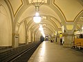


![* Nomination The Eiffel tower is 300 meters high]], by Romanceor 17:00, 25 February 2008 (UTC) * Decline Composition: the tower is somewhat castrated by this crop. guillom 10:20, 26 February 2008 (GMT)](https://upload.wikimedia.org/wikipedia/commons/thumb/5/55/La_Tour_Eiffel_surplombant_Paris.jpg/120px-La_Tour_Eiffel_surplombant_Paris.jpg)


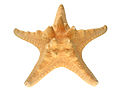


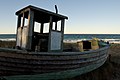
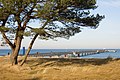


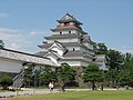


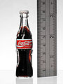


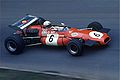
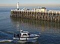
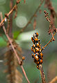


 Info widnow is without Pudelek 16:12, 19 February 2008 (UTC)

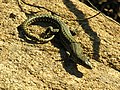


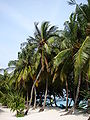

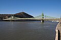

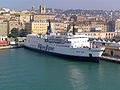


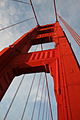


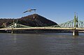
 Comment A bit tilt to the right and it need of correct contrast, I think. _Fukutaro 11:40, 15 February 2008 (UTC)
 Done Fixed. -- Samat 11:07, 18 February 2008 (UTC) Nice atmospheric perspective and composition. _Fukutaro 12:10, 18 February 2008 (UTC)


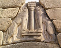


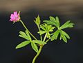


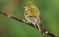
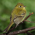
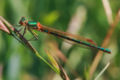


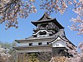


 I withdraw my nomination Oops, It's 1.9MP. _Fukutaro 17:54, 14 February 2008 (UTC)


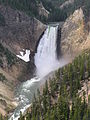


 Question You nominated same image as this image? --Fukutaro 10:28, 12 February 2008 (UTC)


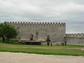

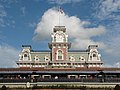

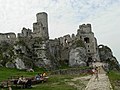

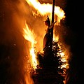


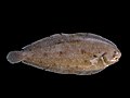


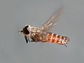


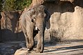


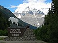

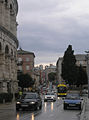


![* Nomination The Eiffel tower is 300 meters high]], by Romanceor 17:00, 25 February 2008 (UTC) * Decline Composition: the tower is somewhat castrated by this crop. guillom 10:20, 26 February 2008 (GMT)](/wiki/File:La_Tour_Eiffel_surplombant_Paris.jpg)

.jpg)


.jpg)


.jpg)


.jpg)


.JPG)


.jpg)


.JPG)


.JPG)


.JPG)


.JPG)


.JPG)

.jpg)


.jpg)
.jpg)

.jpg)


.jpg)


.JPG)


.jpg)


.JPG)


 Oppose Nice mood, but too dark, and a bit soft. Try some post processing to brighten dark parts ? Benh 12:25, 10 February 2008 (UTC)
 Support light --Beyond silence 12:58, 10 February 2008 (UTC)


 Neutral Distortion. -- Laitche 14:59, 15 February 2008 (UTC)


 , it is even less in focus and at a lower resolution, and got promoted right away, if memory serves correctly. --Ianare 23:20, 18 February 2008 (UTC)


.jpg)


.jpg)


 File:Warszawa-Focus-perspective-edit.jpg -- Withdrawn


