Commons:Quality images candidates/Archives January 2007
-
- Nomination Adligenswil and mount pilatus, Switzerland -- Simonizer 08:00, 30 January 2007 (UTC)
- Promotion I'll probably also say "wow" once the noise fixed ... Alvesgaspar 12:36, 30 January 2007 (UTC). Better now. I'll vote yes for the atmosphere and composition and despite some remaining noise in the fog. Alvesgaspar 09:09, 31 January 2007 (UTC)
-

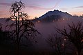
- Nomination view from the Seebodenalp - Switzerland -- Simonizer 08:00, 30 January 2007 (UTC)
- Promotion Nothing to say, except Wow! - Alvesgaspar 11:22, 30 January 2007 (UTC)
-

-

- Nomination Sydney Harbour Bridge. --Wj32 05:57, 29 January 2007 (UTC)
- Decline good composition and wikipedia usable. But this would require serious photoshopping: So many defective white pixels, strong moiré around the lights in the center and colour fringes around the bar in the left. --Ikiwaner 08:47, 31 January 2007 (UTC)
-

- Nomination HK USP. created by User:Bobbfwed nominated by Nemo5576 10:02, 29 January 2007 (UTC)
- Decline Noisy, low image quality norro 20:16, 31 January 2007 (UTC)
-
-
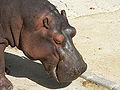
- Nomination Hippopotamus head at Lisbon Zoo - Alvesgaspar 23:45, 27 January 2007 (UTC)
- Promotion Technical ok! -- Simonizer 11:10, 30 January 2007 (UTC)
-
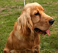
- Nomination English Cocker Spaniel --Pharaoh Hound 19:05, 27 January 2007 (UTC)
- Promotion Technically good for me. Passes the criteria. Arjun 23:06, 31 January 2007 (UTC)
-

-

- Nomination Striped eel catfish, Plotosus lineatus --Jnpet 14:36, 23 January 2007 (UTC)
- Decline the image has a lot of noise, many of the fishes are either blury or completly out of focus. and those that are in focus are not in first plane-LadyofHats 07:24, 31 January 2007 (UTC)
-

-
- Nomination Prostitute speaks with her pimp --Graham Wellington 21:00, 29 January 2007 (UTC)
- Decline I have tagged this picture for speedy deletion. See file info - Alvesgaspar 21:40, 29 January 2007 (UTC)
-
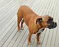
- Nomination A dog. Standing. --Wj32 10:50, 29 January 2007 (UTC)
- Decline Bad framing and poor shooting position. Only the head of the animal is focused. Alvesgaspar 12:20, 29 January 2007 (UTC)
-

- Nomination Archeology exhibition in museum in Bielsko-Biała. --Lestat 22:04, 28 January 2007 (UTC)
- Decline Composition: background is distracting. An English caption is welcome. Alvesgaspar 12:23, 29 January 2007 (UTC)
-
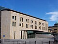
- Nomination Uniwersity of Silesia - Faculty of Theology. --Lestat 22:04, 28 January 2007 (UTC)
- Decline Geometric distortion due to the use of a wide-angle lens is disturbing. Note, for example, the structure protecting the tree, at right. - Alvesgaspar 12:26, 29 January 2007 (UTC)
-
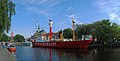
- Nomination --Ikiwaner 20:31, 28 January 2007 (UTC)
- Promotion Excellent composition and colours, good image quality. As MPF would say, the trees are Platanus occidentalis... Alvesgaspar 15:23, 29 January 2007 (UTC)
-

- Nomination Sagamiji in Kasai, Hyogo, Japan-created by 663highland nominated by LadyofHats--LadyofHats 04:36, 28 January 2007 (UTC)
- Promotion Nice colours, good composition. Pity the small cw tilt. Alvesgaspar 09:38, 29 January 2007 (UTC)
-

- Nomination Painted frogfish. Antennarius pictus --Jnpet 15:17, 23 January 2007 (UTC)
- Decline it anoys me that so much of the image is out of focus. the colors are burnt wich directs to a overexposed image. or manipulated colors. Specially the area just infront of the fish head seems completly destroyed by this. -LadyofHats 23:15, 29 January 2007 (UTC)
-

- Nomination Field of wheat. Alentejo, Portugal. The trees are Quercus ilex (oaks). Created by Nuno Sequeira André, edited and nominated by Alvesgaspar 00:41, 28 January 2007 (UTC)
- Promotion Beautifu space. Lestat 21:37, 28 January 2007 (UTC)
-

- Nomination The bright beaches of Portugal during Summer - Alvesgaspar 00:17, 28 January 2007 (UTC)
- Decline Low contrast. Lestat 21:37, 28 January 2007 (UTC)
-
-

-

- Nomination Leonberger --Pharaoh Hound 19:05, 27 January 2007 (UTC)
- Promotion Good work - good quality. Lestat 20:02, 27 January 2007 (UTC)
-

- Nomination Macro shot of Helianthus decapetalus --norro 12:25, 27 January 2007 (UTC)
- Decline Somewhat blurry throughout. Blurry petal in the foreground is distracting. Showing the whole flower would be more encyclopedic, --Pharaoh Hound 18:58, 27 January 2007 (UTC)
-

- Nomination Spring-cover pocket clock --norro 12:25, 27 January 2007 (UTC)
- Promotion Nice watch, good photo. Pity the highlights on the top border - Alvesgaspar 21:47, 27 January 2007 (UTC)
-

- Nomination White Stork (Ciconia ciconia ciconia) --norro 12:25, 27 January 2007 (UTC)
- Promotion Very nice. Good exposure on the white feathers, it would be extremely easy to over or underexpose them. Sharp. --Pharaoh Hound 18:58, 27 January 2007 (UTC)
-

- Nomination Cornfield in South Africa --norro 12:25, 27 January 2007 (UTC)
- Decline Not uploaded by the copyright holer, and therefore ineligible. --Pharaoh Hound 18:58, 27 January 2007 (UTC)
-

-

- Nomination an old picture i still love.kind of proud from it since i do not take photos that often.and also the bear was quite far away :P. --LadyofHats 11:08, 26 January 2007 (UTC)
- Promotion Meets quality guidelines as far as I can see. norro 12:31, 27 January 2007 (UTC)
-

- Nomination DNA replication. --LadyofHats 01:17, 24 January 2007 (UTC)
- Promotion Great image. I'm impressed. --Jnpet 18:14, 27 January 2007 (UTC)
-
-

- Nomination Siberian Husky exhibiting heterochromia --Pharaoh Hound 13:35, 23 January 2007 (UTC)
- Decline
English image description missing. --Leyo 17:49, 23 January 2007 (UTC)Bad crop, and depth of field. --Lestat 19:53, 27 January 2007 (UTC)
-

- Nomination Pharaoh Hounds --Pharaoh Hound 13:35, 23 January 2007 (UTC)
- Promotion
English image description missing. --Leyo 17:49, 23 January 2007 (UTC)
all those photos fixed --Pharaoh Hound 13:13, 24 January 2007 (UTC) Nice picture and good quality. --Lestat 19:53, 27 January 2007 (UTC)
-

- Nomination Saluki portrait --Pharaoh Hound 13:35, 23 January 2007 (UTC)
- Promotion
English image description missing. --Leyo 17:49, 23 January 2007 (UTC)We don't see the entire body, but it's a quality image of the dog's head. norro 12:13, 27 January 2007 (UTC)
-

- Nomination Chart Polski --Pharaoh Hound 13:35, 23 January 2007 (UTC)
- Promotion
English image description missing. --Leyo 17:49, 23 January 2007 (UTC)We don't see the entire body, but it's a quality image of the dog's head. norro 12:13, 27 January 2007 (UTC)
-

-

- Nomination will you kill me if i nominate this romantic winter sundawn over french village? --Diligent 12:58, 25 January 2007 (UTC)
- Decline No, but I will ask you to level your camera next time :-) --Dschwen 17:59, 25 January 2007 (UTC)-- i wouldnt mind it either -LadyofHats 04:40, 26 January 2007 (UTC)
-

- Nomination Gothic sculpture of the Nativity. --Diligent 10:52, 25 January 2007 (UTC)
- Decline blury foto, with bad light and shaking hand -LadyofHats 04:40, 26 January 2007 (UTC)
-

- Nomination another dinosaur. only the skull was known so i made only the head.-LadyofHats 04:40, 26 January 2007 (UTC)
- Promotion I don't have the courage to say "no" to this guy... Alvesgaspar 09:08, 26 January 2007 (UTC)
-
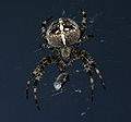
- Nomination Spider with prey. --Dschwen
- Promotion i had one of those in my window. they are really impresive animals. and quite shy ;)-LadyofHats 04:45, 26 January 2007 (UTC)
-

- Nomination Closter in Rudy Raciborskie. --Lestat 10:33, 21 January 2007 (UTC) 10:33
- Promotion it does has quality-LadyofHats 11:13, 26 January 2007 (UTC)
-

-

-

-

-
-

-

-

-

-
-

-

- Nomination Joshua tree --Pomakis 02:35, 22 January 2007 (UTC)
- Promotion Nice and simple: no obvious flaws, balanced composition and illustrative. Here is a good example how we can use inexpensive equipment to shoot a QI - Alvesgaspar 14:32, 22 January 2007 (UTC)
-

- Nomination Telescope --Falense 11:34, 20 January 2007 (UTC)
- Promotion Interesting composition, good depiction of a "tourist" telescope - Alvesgaspar 11:18, 22 January 2007 (UTC)
-

-

- Nomination Allium schoenoprasum --Pharaoh Hound 21:01, 21 January 2007 (UTC)
- Decline Flowers can be a difficult subject to shoot mainly due to DOF constraints. In this case a poor exposure choice was made (1/500, f2.6) resulting in an unfocused picture. For macro photos better use "priority to aperture program" and chose small f-stop numbers. - Alvesgaspar 14:39, 22 January 2007 (UTC)
-

-

-

-

- Nomination Aerial view of Guanajuato, México -- User:Drini
- Decline Shadows are a bit too dark, and I love to have more detail in a shot like this --Dschwen 21:11, 22 January 2007 (UTC)
+ not the best image quality norro 17:47, 23 January 2007 (UTC)
-

- Nomination Suadero tacos -- User:Drini
- Decline Too short shutter speed (motion blur on spoon and hand), overexposed in the foreground and plate is partly covered norro 17:47, 23 January 2007 (UTC)
-

- Nomination Equus quagga --Pharaoh Hound 14:16, 15 January 2007 (UTC)
- Promotion same as the one at the side -LadyofHats 03:57, 23 January 2007 (UTC)
-

- Nomination Equus quagga burchelli --Pharaoh Hound 14:16, 15 January 2007 (UTC)
- Promotion interesting patern on the skin, but a rahter borin straight foward composition-LadyofHats 03:54, 23 January 2007 (UTC)
-

-

- Nomination Gorywodas' cellars. --Lestat 10:58, 21 January 2007 (UTC)
- Promotion This one is on the limit, mainly because the sofa is overexposed, and I won't be surprised if someone contests my review. I think the picture would improve in sharpness and quality with a downsampling (to 2000px ?) - Alvesgaspar 23:14, 21 January 2007 (UTC)
-

-

-
-

-

-

-

-

- Nomination Tamiasciurus hudsonicus (American Red Squirrel) --Leyo 18:21, 17 January 2007 (UTC)
- Promotion Nice catch and an excellent picture. Pitty that those branches in the background are a bit distracting, otherwise might be a good FP candidate. But we never know... - Alvesgaspar 00:31, 18 January 2007 (UTC)
-

-

-

- Nomination Delicate Arch in Arches National Park --Digon3 17:49, 15 January 2007 (UTC)
- Promotion Comment: I prefer this version. --Leyo 18:34, 17 January 2007 (UTC) But the Quality of this picture is ok -- Simonizer
-

-

- Nomination Equus quagga --14:16, 15 January 2007 (UTC)
- Promotion Great picture. Certainly QI in my opinion Jnpet 18:35, 18 January 2007 (UTC)
-

- Nomination Loxodonta africana --Pharaoh Hound 14:16, 15 January 2007 (UTC)
- Promotion Meets QI standards as far as I can see. --Leyo 17:51, 19 January 2007 (UTC)
-

-

- Nomination Did she lose something in the sand? Summer 2006, Porto Covo, Portugal. Alvesgaspar 02:21, 6 January 2007 (UTC)
- Promotion I like this image, simple yet elegant. (Tech stuff is there also ;) Arjun 20:30, 7 January 2007 (UTC)
-

- Nomination Labrador Retriever in snow --Pharaoh Hound 13:49, 7 January 2007 (UTC)
- Promotion Well done edit, illustrative --Ikiwaner 15:07, 7 January 2007 (UTC)
-

- Nomination Anas americana --Pharaoh Hound 13:49, 7 January 2007 (UTC)
- Promotion Nothing to say but: Perfect --Ikiwaner 15:01, 7 January 2007 (UTC)
-
-

- Nomination Tamias rufus --Pharaoh Hound
- Promotion I have no words to praise this picture. The theme is wonderful and the photographic quality is superb. I suppose it is already a FP on the English WP. - Alvesgaspar 20:33, 6 January 2007 (UTC)
-

- Nomination Larus glaucoides --Pharaoh Hound 15:48, 6 January 2007 (UTC)
- Promotion Even if the white bird on an ice background gives fairly low contrast, the image remains easy to read CyrilB 21:38, 6 January 2007 (UTC)
-

- Nomination tulip cultivar --Pharaoh Hound 15:48, 6 January 2007 (UTC)
- Promotion Simple, and illustrative CyrilB 21:38, 6 January 2007 (UTC)
-

- Nomination Typical house in Porto Covo, west coast of Portugal. - Alvesgaspar 12:49, 6 January 2007 (UTC)
- Promotion Nice colors CyrilB 21:38, 6 January 2007 (UTC)
-

- Nomination The International School Bangalore Kprateek88 08:51, 6 January 2007 (UTC)
- Decline not horizontal, and subject non notable CyrilB 21:38, 6 January 2007 (UTC)
-

- Nomination reconstruction of a Afrovenator,It was a bipedal predator, with a mouthful of sharp teeth and three claws on each hand. Judging from the one skeleton known--LadyofHats 01:39, 6 January 2007 (UTC)
- Promotion Yet again one of your very good drawings. Congratulations for your work CyrilB 21:33, 6 January 2007 (UTC)
-

- Nomination Coragyps atratus --Pharaoh Hound 14:31, 4 January 2007 (UTC)
- Promotion Sharp, good depth of focus CyrilB 21:32, 6 January 2007 (UTC)
-

- Nomination Certhia americana --Pharaoh Hound 14:31, 4 January 2007 (UTC)
- Promotion Nice colors, good depth of focus 21:32, 6 January 2007 (UTC)
-

- Nomination Wii console and Wii Remote --Hołek ҉ 16:41, 4 January 2007 (UTC)
- Decline Too noisy and unsharp at full resolution - Alvesgaspar 17:13, 5 January 2007 (UTC)
-

- Nomination Bucephala albeola --Pharaoh Hound 14:31, 4 January 2007 (UTC)
- Promotion Very good. Beautiful image, while it is not as good as the one on the right, this image is still Excellent.Arjun 15:07, 5 January 2007 (UTC)
-

- Nomination Anas strepera --Pharaoh Hound 14:31, 4 January 2007 (UTC)
- Promotion Amazing photographic quality. I've just nominated this picture for FP promotion. - Alvesgaspar 10:58, 5 January 2007 (UTC)
-

- Nomination The Empire State Building from Washington Square Park - Jonathan71 20:23, 3 January 2007 (UTC)
- Decline The photo is tilted and very noisy in full resolution. A good edit (including a perpective correction) might save it for QI. - Alvesgaspar 21:37, 3 January 2007 (UTC)
-

- Nomination Nipponosaurus, asian dinnosaur --LadyofHats 19:07, 3 January 2007 (UTC)
- Promotion Very good drawing, with good illustrating value CyrilB 21:30, 6 January 2007 (UTC)
-

- Nomination Waves in January. Porto Covo, Portugal - Alvesgaspar 00:31, 3 January 2007 (UTC)
- Promotion Obviously meets the criteria in all aspects. Good job. Arjun 04:15, 3 January 2007 (UTC)
-

- Nomination Typical house in Porto Covo, Portugal - Alvesgaspar 00:31, 3 January 2007 (UTC)
- Promotion Beautiful image, love it. Meets all the criteria. Arjun 14:46, 4 January 2007 (UTC)
-

- Nomination top of Holy Trinity Column in Olomouc --Jan.Kamenicek 00:15, 3 January 2007 (UTC)
- Promotion Very nice image, meets all the criteria. Arjun 14:46, 4 January 2007 (UTC)
-
-

- Nomination Larus delawarensis --Pharaoh Hound 16:58, 2 January 2007 (UTC)
- Promotion While the wing on the bird is a little blurry, the rest is very clear and meets the criterion. Arjun 17:52, 2 January 2007 (UTC)
-

- Nomination Archilochus alexandri --Pharaoh Hound 16:58, 2 January 2007 (UTC)
- Promotion Very nice, meets the criteria as far as I can see. Arjun 17:50, 2 January 2007 (UTC)
-

- Nomination A beautiful photograph of Tarn River in France. --Koernerbroetchen 23:07, 1 January 2007 (UTC)
- Decline Okay while it seems to be a good shot from the thumbnail, I see some problems. 1. It appears too blurry. 2. Too much grain. 3. I dislike the harsh sun lighting from the top left. Arjun 02:20, 2 January 2007 (UTC)
-
- Nomination Picoides villosus --Pharaoh Hound 13:52, 31 December 2006 (UTC)
- Promotion Certainly meets the criteria as far as I'm concerned. Very crisp and beutiful. Arjun 19:07, 1 January 2007 (UTC)
-

- Nomination Perisoreus canadensis --Pharaoh Hound 13:52, 31 December 2006 (UTC)
- Promotion While in my mind it is the worse of the 3 it is still nice and meets the criteria. I think it is cropped too much however. Arjun 22:42, 1 January 2007 (UTC)
-

- Nomination Catoptrophorus semipalmatus --Pharaoh Hound 13:52, 31 December 2006 (UTC)
- Promotion Very nice work, the bird is clearly in focus and this obviously meets the quality image guidelines. I see no glaring problems --Arjun 14:28, 1 January 2007 (UTC)
-

-

-

- Nomination Digestive system diagram by LadyofHats, edited by Joaquim Alves Gaspar - Alvesgaspar 23:24, 28 December 2006 (UTC)
- Promotion Very nice and descriptive diagram...I wish I had this in health class :D Arjun 16:52, 2 January 2007 (UTC)
-

- Nomination Prometheus by Nicolas-Sébastien Adam. --Diligent 19:20, 28 December 2006 (UTC)
- Promotion very good work! --Ikiwaner 07:50, 29 December 2006 (UTC)
-

- Nomination Greater blue-ringed octopus, Hapalochlaena lunulata --Jnpet 06:19, 11 January 2007 (UTC)
- Promotion Though not great simply by image quality, considering the difficulties of underwater photography and that this species is very venomous I think it's worthy --Pharaoh Hound 19:09, 13 January 2007 (UTC)
-

- Nomination Greater blue-ringed octopus, Hapalochlaena lunulata --Jnpet 06:19, 11 January 2007 (UTC)
- Decline the first image is far more better. this one is moved (blusy) and lacks of a good composition -LadyofHats 19:54, 15 January 2007 (UTC)
-

- Nomination Panthera tigris altaica --Pharaoh Hound 14:44, 10 January 2007 (UTC)
- Promotion Good picture, albeit not in a natural surrounding --Leyo 17:18, 12 January 2007 (UTC)
-

- Nomination Panthera tigris tigris --Pharaoh Hound 14:44, 10 January 2007 (UTC)
- Promotion Good picture, albeit not in a natural surrounding --Leyo 17:18, 12 January 2007 (UTC)
-

- Nomination Female hoverfly of the genus Eristalis on a flower - Alvesgaspar 12:26, 10 January 2007 (UTC)
- Promotion Small blown out highlights, but just minimal. Apart from that, it meets the criteria. norro 23:19, 15 January 2007 (UTC)
-

- Nomination Danish cow --Pharaoh Hound 23:26, 9 January 2007 (UTC)
- Promotion Ahh...the simpler things in life, yes I like this image alot and is on par with QI, but the lighting is not "great". Arjun 20:00, 12 January 2007 (UTC)
-

- Nomination Domestic sheep --Pharaoh Hound 23:26, 9 January 2007 (UTC)
- Promotion Great picture in any way except oversharpened --Ikiwaner 23:41, 9 January 2007 (UTC)
-

- Nomination Osmia rufa --Pharaoh Hound 23:26, 9 January 2007 (UTC)
- Decline Why nominate a FP in this place? - Alvesgaspar 23:58, 9 January 2007 (UTC) Featured already. --Ikiwaner 21:38, 17 January 2007 (UTC)
-

- Nomination Aeshna cyanea head closeup --Pharaoh Hound 23:26, 9 January 2007 (UTC)
- Decline Why nominate a FP in this place? - Alvesgaspar 23:58, 9 January 2007 (UTC) Featured already. --Ikiwaner 21:38, 17 January 2007 (UTC)
-

- Nomination Kitten --Pharaoh Hound 23:26, 9 January 2007 (UTC)
- Decline Meets the criteria, but is already featured picture. norro 23:20, 15 January 2007 (UTC)
-
- Nomination Sympetrum sanguineum --Pharaoh Hound 23:26, 9 January 2007 (UTC)
- Promotion again try making it a FP-LadyofHats 19:53, 15 January 2007 (UTC)
-
- Nomination Bufo bufo --Pharaoh Hound 23:26, 9 January 2007 (UTC)
- Promotion nice image, only a detail with half of the frog already going out of focus. still the quality is outstanding, try to make it a FP-LadyofHats 19:50, 15 January 2007 (UTC)
-

- Nomination Equus grevyi --Pharaoh Hound 23:26, 9 January 2007 (UTC)
- Promotion the composition could surely be more interesting. yet the photo is sharp and balanced -LadyofHats 00:04, 11 January 2007 (UTC)
-

- Nomination Macro shot at the Butterfly Farm in La Guacima near Alajuela in Costa Rica. See also unsuccessfull FP nomination --Donarreiskoffer 14:47, 9 January 2007 (UTC)
- Decline even when it has a lot of quality your picture has a big composition problem. your main character is cut down in such a way that it gives the feeling to be falling to the left. stare at it for a moment and you will realise that your head tilts to compensate that. think on it next time.-LadyofHats 19:44, 15 January 2007 (UTC)
-

- Nomination a autumn landcape picture. Simonizer 09:20, 9 January 2007 (UTC)
- Promotion Excellent composition and awesome image. I wonder if the nominator could be a little more ambitious... Alvesgaspar 13:31, 9 January 2007 (UTC)
-
-

- Nomination gap junction and its main element. connexon. together with the structure of the connexin--LadyofHats 02:43, 9 January 2007 (UTC)
- Promotion I like that graphic, even though imho the text "terminal domains (N and C)" should not overlap the grey bar. --Leyo 20:53, 17 January 2007 (UTC)
-

- Nomination Fallasburg Bridge on a clear fall day. by ++Lar: t/c 21:17, 8 January 2007 (UTC)
- Promotion Correct picure and nice composition a little unsharp though. I would use a softer light like the photographer in Robert Waller's "The Bridges of Madison County"... Alvesgaspar 23:30, 9 January 2007 (UTC)
-

- Nomination Lioness at zoo --Pharaoh Hound
- Decline even when it is a great angle, the image mises contrast and is blury-LadyofHats 23:58, 10 January 2007 (UTC)
-

- Nomination Lioness --Pharaoh Hound 15:02, 8 January 2007 (UTC)
- Promotion Glorious! Nominate it for FP! --Ikiwaner 20:30, 8 January 2007 (UTC)
-

- Nomination Lioness --Pharaoh Hound 15:02, 8 January 2007 (UTC)
- Promotion Perfect catch of predator predating. --Diligent 19:53, 9 January 2007 (UTC)
-
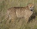
- Nomination Cheetah --Pharaoh Hound 15:02, 8 January 2007 (UTC)
- Promotion this one is ok. even when the composition is rather dull.-LadyofHats 10:38, 17 January 2007 (UTC)
-

- Nomination Jutland horses grazing --Pharaoh Hound 23:39, 7 January 2007 (UTC)
- Promotion Nice colours and composition, although the framing is a little too tight - Alvesgaspar 00:18, 8 January 2007 (UTC)
-

- Nomination A grey horse --Pharaoh Hound 23:39, 7 January 2007 (UTC)
- Promotion Obviously, meets the requirements, and is a very beautiful image. Arjun 00:27, 8 January 2007 (UTC)
-

- Nomination A horse at sunset --Pharaoh Hound 23:39, 7 January 2007 (UTC)
- Decline Being at sunset doesn't justify the poor lighting: the head of the animal is in the shadow - Alvesgaspar 00:18, 8 January 2007 (UTC)
-

- Nomination Very, very old Chinese Statue. Arjun 22:36, 7 January 2007 (UTC)
- Decline If this is indeed an old object, a reference to its origin and date should be made. And why not represent the whole statue? The background is distracting, should be neutral - Alvesgaspar 09:37, 8 January 2007 (UTC)
-

- Nomination Excavator --Luigi Chiesa 22:17, 7 January 2007 (UTC)
- Promotion good technical documentation, could benefit from a higher quality lens and better composition --Ikiwaner 23:38, 9 January 2007 (UTC)
-
- Nomination Goldendoodle puppies --Pharaoh Hound 13:49, 7 January 2007 (UTC)
- Decline License and image description --Ikiwaner 15:07, 7 January 2007 (UTC)
-

- Nomination Post and rail fence circa 1840 Gnangarra 23:31, 6 January 2007 (UTC)
- Decline the image is overexposed(see the missing detail on the back meadow), and blury.-LadyofHats 19:37, 15 January 2007 (UTC)
-

-

-
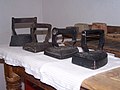
- Nomination Collection of Irons Gnangarra 23:31, 6 January 2007 (UTC)
- Decline using the flash in a so bad iluminated room and so close from the main object (black) with a reflective surface even closer ( the white mantel). as a result the picture is overexposed on the front and too dark on the background. all this are very interesting objects that you want to show. but remember a picture is not only the main subject but also all arround it -LadyofHats 04:05, 16 January 2007 (UTC)
-

- Nomination hand operated meat Mincers Gnangarra 23:31, 6 January 2007 (UTC)
- Decline Composition (objects cut at left), harsh flash lighting, image tilted - Alvesgaspar 00:20, 12 January 2007 (UTC)
-
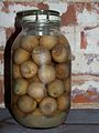
- Nomination Pickled Onions Gnangarra 23:31, 6 January 2007 (UTC)
- Decline Bad lighting, reflections, poor image quality (looks rather badly compressed, not sufficiently sharp) --Pharaoh Hound 23:21, 10 January 2007 (UTC)
-

- Nomination Toy truck Gnangarra 23:31, 6 January 2007 (UTC)
- Decline the flash creates overexposed edges. the background doesnt help to the composition, try a second source of light-LadyofHats 23:56, 10 January 2007 (UTC)
-
- Nomination Telescope --Falense 11:34, 20 January 2007 (UTC)
- Decline The existing flaws, like the grain in the telescope and background can be ignored IMO. But not the tilt of the buildings. This is a very nice composition and I will support it after the tilt is corrected. - Alvesgaspar 18:15, 20 January 2007 (UTC)


_-_kultura_puchowska.JPG)


.jpg)


.jpg)


_2.JPG)


.jpg)
.jpg)
.jpg)
.jpg)
.jpg)
.jpg)
_sucking_a_banana.JPG)


Consensual Review edit

- Nomination Church in Göttingen. --Dschwen
- Promotion a clear image-LadyofHats 04:45, 26 January 2007 (UTC)
- For me - bad perspective. Lestat 19:50, 27 January 2007 (UTC)
- Please remember, that this is not FP. You are probably alluding to the wide-angle effect. Whether this is bad is probably a matter of personal taste. There are no obvious flaws such as tilt in the picture. --Dschwen 18:56, 28 January 2007 (UTC)
- what would be wrong in the perspectie?-LadyofHats 02:43, 28 January 2007 (UTC)
- In my opinion it isn't wide-angle shot, but photo combined from 2 or more photos in program like Panorama Tools. So, perspective is unnatural and fake. Tower is wider on the top then in the middle of builiding. "Hedersche Buchhandlung" has crooked roof. Pictures with little perspective problems has declined on QI. Why this image should have QI title? Lestat 21:26, 28 January 2007 (UTC)
- How the wide angle is achieved doesnt matter. As for the tower being wider on the top then in the middle, this is simply wrong. The perspective was corrected to achive perfectly vertical building corners. Some work went into this picture and I'm fairly happy with the outcome. The crooked roof is a result of the projection that was used. A rectilinear projection would have led to unpleasant areawise unproportianality. --Dschwen 22:18, 28 January 2007 (UTC)
- In my opinion it isn't wide-angle shot, but photo combined from 2 or more photos in program like Panorama Tools. So, perspective is unnatural and fake. Tower is wider on the top then in the middle of builiding. "Hedersche Buchhandlung" has crooked roof. Pictures with little perspective problems has declined on QI. Why this image should have QI title? Lestat 21:26, 28 January 2007 (UTC)
- I think you can argue about, wether you like the perspective or not - some famous photographers do that because of artistic reasons others decline that catigorical. But beside that the quality of the picture is superb. So i would promote it. Simonizer 12:47, 31 January 2007 (UTC)
2 Support 1 Oppose ---> Promoted

- Mayby consensual review for this photo? I don't understand Ikiwaner review. Croping pictures when picture perfectly see concepts of modern architecture of this building? Shadows and color fringes aren't high and on permissible level for QI. WarX 21:57, 28 January 2007 (UTC)
 Oppose Lighting is not good (too harsh), resulting in part of the building being in shadow. - Alvesgaspar 12:48, 29 January 2007 (UTC)
1 Support 2 Oppose ---> Not promoted

- Nomination image created by Nino Barbieri, nominated by me--LadyofHats 06:14, 26 January 2007 (UTC)
- Decline Nothing interesting, bad crop. Lestat 20:03, 27 January 2007 (UTC)
- interesting subject or not has nothing to do weather it has quality. and i do not find the crop bad-LadyofHats 02:43, 28 January 2007 (UTC)
0 Support 1 Oppose ---> Not promoted

- If there was a problem with the image itself, such as focus, over exposure , etc., I wouldn't have an issue, but when it's declined because of subject matter, I have a problem. This is not FP. Took me long enough to understand the difference. This is an image of a tassled scorpionfish. They are ambush preditors. They look like a rock to blend in so they can surprise their prey. Practically every picture of a scorpionfish would be like this in the wild. Possibly a better picture could be done in a white washed aquarium, but frankly, I would prefer real wild-life shots. Jnpet 16:35, 27 January 2007 (UTC)
- There is another important effect which was not mentioned here, that is the fact that light becomes more and more bluish with depth as a result of the longer wavelengths (red) being absorbed by the water. The effect may be dramatic in underwater photo. I tried to correct it in this edited version, but it might be overdone. What do you think? Alvesgaspar 18:19, 27 January 2007 (UTC)
- what i find wrong on the picture is not the subgect but the missing contrast wich removes volume on the texture. wich is completly fixed on the edited version (even when i would sugest doing it no so dramatically as Alvesgaspar did). that the fish looks like the background i find actually as a good thing for the foto subject.in any case i would support an edited version-LadyofHats 02:58, 28 January 2007 (UTC)
0 Support 3 Oppose ---> Not promoted

- I disagree with this promotion. The image has an overall green tint and it's not really sharp. Furthermore the subject is that cropped that you can hardly identify it to be a ray. Leyo is right, it is a submarine shot, but even submarine shots can meet the QI demands. norro 11:51, 27 January 2007 (UTC)
- I also disagree with the promotion. A quick google search turned up some much better images (though small), for example this or this, both of which show the whole ray and have better colours. --Pharaoh Hound 12:57, 27 January 2007 (UTC)
- I sort of agree, this was a shot of the most cooperative ray I've ever encountered. They are very common, but they tend to swim away when you get too close. Unfortunately, the flash didn't bring out the colors in this instance. Hence the green. But I do like the details though. Only problem with this image is the color. Jnpet 16:35, 27 January 2007 (UTC)
- I have created an edit which improves the colour and is downsized somewhat to increase sharpness here. However, the image is still too blurry to qualify (in my opinion). --Pharaoh Hound 19:17, 27 January 2007 (UTC)
- May I ask what photo editing tool you used to achieve this edit? (Question also for Alvesgaspar on his edit of the Scorpionfish). I've been exploring Gimp for my editing, but new to photo editing software. Would appreciate some advice on this. Jnpet 07:18, 29 January 2007 (UTC)
- I believe any standard photo editing tool is capable of doing it. I use Corel PhotoPaint 9 to manipulate the "tone curves" of the image (Photoshop is too expensive!). A "tone curve" of a colour chanel (R, B and G) is the distribution of the intensity of that ink (0 to 100%) along the various tones of gray (0 to 256). This tool allows, for example, to change the intensity of only the darker blue parts of the image. Much easier to do than to explain... Alvesgaspar 11:07, 29 January 2007 (UTC)
- I used Adobe Photoshop Elements version 3.0, as can be seen on the extended metadata. My brother purchased the program, and therefore saved me the expense of having good software (on of the few instances where he is genuinely helpful to me). --Pharaoh Hound 22:28, 29 January 2007 (UTC)
- May I ask what photo editing tool you used to achieve this edit? (Question also for Alvesgaspar on his edit of the Scorpionfish). I've been exploring Gimp for my editing, but new to photo editing software. Would appreciate some advice on this. Jnpet 07:18, 29 January 2007 (UTC)
- there is a point in wich i disagree on your argumentation. that there are other better pictures should not in any case afect weather this one has quality or not. less if you show a FP! gallery to compare. the subject can be recognised as a ray. you keep confusing what the image subject with its quality. i find the image suficient to be OI. but have to admit the eddited version is better--LadyofHats 03:04, 28 January 2007 (UTC)
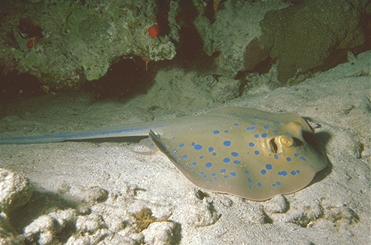
1 Support 3 Oppose ---> Not promoted

- Yes it is. But the image needs some downsampling in order to eliminate (some of) that noise. After that, who knows?... Also, there is a considerable CCW tilt which should be corrected. Alvesgaspar 19:04, 21 January 2007 (UTC)
- Then, you might prefer the first version that has been uploaded. --Leyo 19:40, 21 January 2007 (UTC)
- Yes, I do, but it might be too small. Was the original picture upsampled? - Alvesgaspar 23:16, 21 January 2007 (UTC)
- I have no idea, sorry. --Leyo 23:59, 21 January 2007 (UTC)
- Yes, I do, but it might be too small. Was the original picture upsampled? - Alvesgaspar 23:16, 21 January 2007 (UTC)
- The exposure of this image is very good, and the ambiance itself should make it QI! I'm not sure there is much to do with the noise, which I admit is not really nice, but the resolution is so big that we can live with it CyrilB 19:51, 22 January 2007 (UTC)
- Yes, there is something quite easy to do with the noise: to downsample the image, or rather, to put it back to its original dimensions (the first version mentioned above?). Why keep an oversized and extremely noisy picture? - Alvesgaspar 00:19, 25 January 2007 (UTC)
- After your annotations I have made some changes. 1° clockwise rotation, resized the image and reduced the noise (the original file is very noisy because if the high ISO-value and and the necessary exposure correction . Paul_Morphy 12:18, 26 January 2007 (UTC)
- Yes, there is something quite easy to do with the noise: to downsample the image, or rather, to put it back to its original dimensions (the first version mentioned above?). Why keep an oversized and extremely noisy picture? - Alvesgaspar 00:19, 25 January 2007 (UTC)
 Support After these changes, it is just a great picture! --Leyo 13:40, 26 January 2007 (UTC)
- Support promotion now, despite remaining noise ;-) - Alvesgaspar 13:44, 26 January 2007 (UTC)
3 Support 0 Oppose ---> Promoted
- Image already FP! --Leyo 17:58, 23 January 2007 (UTC)
- Is that a reason to decline? Anyways it was promoted to FP after I nominated it here (didn't count on the nomination to pass. So remove it if you wish. --Dschwen 22:37, 23 January 2007 (UTC)
- Please do not change a verdict of a reviewed image. If you wish to dispute the verdict, please follow the instructions as set out for consensual review above. Jnpet 05:07, 24 January 2007 (UTC
- Support if anybody asks for my opinion although i do think Dschwen should humbly withdraw his nomination to QI as FP is acheived. --Diligent 13:07, 25 January 2007 (UTC)
- As I said its fine with me either way. FP and QI are two different things, and the opposite (first QI then FP) has happened befre as well). But I'm not hell bent on getting that green seal. The thing is just: I see QI as a service for commons users, not as a reward for uploaders (so humility is of no concern here). The goal of QI should be forming a subset of good pictures which people can browse (not appealing to the personal vanity). Declining QI to FPs means the users will have to browse two collections instead of one. But this is just my view. If everyone else things I'm a greedy award-snatcher ;-) just decline QI status to the pic, I won't be upset. --Dschwen 16:40, 25 January 2007 (UTC)
- This time I have to acknowledge Dschwen ;-). QI is a database of good quality pictures, FP is (also) a "vanity fair" for greedy award-raiders. But there is still some confusion. Please check the going-on QI and FP discussions here. - Alvesgaspar 17:24, 25 January 2007 (UTC)
3 Support 1 Oppose ---> Promoted

- Nomination Old State House Boston --Dschwen 15:11, 20 January 2007 (UTC)
- Promotion Nice composition and dramatic perspective. Sharp image, good colouring. - Alvesgaspar 18:12, 20 January 2007 (UTC)
- Visible chromatic aberration, that dramatic perspective isn't good in my opinion. Lestat 10:23, 21 January 2007 (UTC)
- There is some purple fringing, but it is restricted to the bright sky and not affecting the central subject. The perspective is used to emphasize the small building among the high rises. --Dschwen 10:48, 22 January 2007 (UTC)
Result: 2 Support 1 Oppose ---> Promoted
Where is third support? I see only two... Dschwen is nominator. Lestat 19:46, 27 January 2007 (UTC)
Corrected. Jnpet 05:55, 28 January 2007 (UTC)

- I'm sorry to discord again, that was a nice try but didn't work. I agree this is a beatiful picture, almost like a painting, but the strong posterization doesn't allow a promotion to QI in the light of the existing guidelines. Maybe some recognizion of "beatiful picture" can be created in which image quality and resolution/size is not as critical as in here. - Alvesgaspar 17:10, 20 January 2007 (UTC)
- But it looks ok after downsampling a bit. I'm currently unsure whether overly large size should be held against a picture when downsampled to a still acceptable size it looks good. --Dschwen 20:49, 20 January 2007 (UTC)
- This wasn't posterization but a tiny selective gaussian blur (with a very small radius and delta). This may still NOT be feature image quality, but hey! this is NOT featured image candidates. -- Drini 22:06, 20 January 2007 (UTC)
- Besides, which guidelines you refer to? the purpose of QIC is to encourage people, to enhance pictures. Commons:Quality images guidelines DOES suggest to tweak your pictures before posting them here (check for instance about perspective distortion). There's nothign on the guidelines that pictures can't be improved to reach QI status and as far as I understand, it suggests you to do that. -- Drini 22:09, 20 January 2007 (UTC)
- Support I might prefer the "unedited" version, but both of them are outstanding! color, depth of focus, and, mainly, the subjects! make it QI! CyrilB 20:01, 22 January 2007 (UTC)
- Support Meets all the required criteria, in my view. --MichaelMaggs 20:10, 22 January 2007 (UTC)
- Support to be fair. i complained about the grain and stated it is a beautiful picture. grain gone -> my vote :-) --Diligent 13:04, 25 January 2007 (UTC)
6 Support 1 Oppose ---> Promoted

- Nomination: Scarpe abbandonate sotto la pioggia a Napoli --Mattia Luigi Nappi 21:25, 14 December 2006 (UTC),(UTC)
- Review Let's wait for the FP decision, Support if not a FP --Ikiwaner 18:35, 16 December 2006 (UTC)
- What FP decision, the image was not even nominated? I'm sorry but I don't like it, either aesthetically or as a photo. Some parts of the image are blown by excessive light. Is it dirty water in the ground? Alvesgaspar 17:18, 17 December 2006 (UTC)
- This decision. I think its good photography because everybody asks "why are the shoes abandoned in the dirty water"? The overexposure here is no problem since there would not be any interesting details in the blown out area. Just very few images here tell a story for reflexion. --Ikiwaner 23:51, 17 December 2006 (UTC)
- But this photo was never nominated in the Commons:Featured picture candidates page! Please check again and proceed with the nomination, if you like, acording to the procedure explained in the page. Alvesgaspar 10:45, 18 December 2006 (UTC)
- never mind, I did it myself! :-) Alvesgaspar 14:55, 18 December 2006 (UTC)
- like Alvesgaspar, I am disturbed by the excessive light (surexposition) - this shot is not that difficult to take with nice grey shades and it fails in that account. Not QI. --Diligent 13:47, 28 December 2006 (UTC)
- I agree with both Alvesgaspar and Diligent. Not a QI, in my view, for the reasons they give. --MichaelMaggs 16:42, 2 January 2007 (UTC)
Result: 1 support, 2 oppose >> not promoted - Alvesgaspar 20:36, 4 January 2007 (UTC)

- Nomination digestive system diagram--LadyofHats 19:08, 17 December 2006 (UTC)
- Decline Nice illustration, but needs improvements in the text (better alignment, no need for so many colours) and in the segments linking the organs to the tags (random orientations, conflict with text). Alvesgaspar 19:58, 17 December 2006 (UTC)
- This image is outstanding! I agree the texts are not perfecty aligned (I suppose this is due to the svg conversion server-side), but it is a minor issue, as this is a svg and therefore easy to edit. Maybe a png low-res version (400-1000px) for the projects with an link to this svg "master" might help. For me this is definitely a quality image! CyrilB 23:35, 19 December 2006 (UTC)
- It is so easy to correct those flaws and improve the image, that I really don't understand why it hasn't been done yet. For example, the conflict between the line segments and the tags is not acceptable in a QI. Alvesgaspar 00:00, 20 December 2006 (UTC)
- I was unaware that QI is for non-photographic images too. This said, I support this one. --Diligent 13:47, 28 December 2006 (UTC)
 Info I have edited the original drawing to correct the "offending" flaws and submitted it to QI as a new nomination. Alvesgaspar 23:27, 28 December 2006 (UTC)
- Info New version has been promoted to QI. The present one will be archived. Alvesgaspar 20:34, 4 January 2007 (UTC)
Result: not promoted Alvesgaspar 20:34, 4 January 2007 (UTC)

- Nomination Melospiza melodia --Pharaoh Hound 16:58, 2 January 2007 (UTC)
- Decline Hmm...as you notice there is some image noise, and blurry in some areas. Arjun 17:57, 2 January 2007 (UTC)
- There is just very few noise and unsharpness in the birds tail. The bird itself is sharp and clear. The composition is perfect. I think this is an excellent image for Wikimedia commons. Arjun can learn something from this contributor. --Ikiwaner 22:11, 3 January 2007 (UTC)
- Agree with Ikiwaner, this is an excellent photo, as usual. Alvesgaspar 08:01, 4 January 2007 (UTC)
- I also agree with Ikiwaner -- Simonizer 08:21, 5 January 2007 (UTC)
- I agree too, this image is very good CyrilB 18:41, 5 January 2007 (UTC)
- Hmm...I said that yikes! Perfect image, sorry if I caused any offense. An honest screw up on my review. Arjun 23:11, 5 January 2007 (UTC)
Result: 5 support, 0 oppose >> promoted to QI Alvesgaspar 12:55, 6 January 2007 (UTC)

- I suppose it is a bit late to oppose the vote on this image, but I find it really informative, clear, and its relative softness is a minor defect, especially in such low-light. I also disagree on the cropping, which I find fine. For me this image fullfills all the requirements of a quality picture, as it represents clearly its subject, and has a good enough quality for any support including print. CyrilB 23:46, 19 December 2006 (UTC)
- If we want to follow the guidelines, yes, it is too late: the image has been rejected more than 10 days ago. I think we should be a little more regular in the closing process... Alvesgaspar 23:54, 19 December 2006 (UTC)
- I could re-nominate it. Should I? (Or we could just give it a vote here...) -- Pomakis 03:33, 20 December 2006 (UTC)
- I support Pomakis' proposal. --Diligent 13:47, 28 December 2006 (UTC)
Result: no concensus reached (suggest renomination) >> not promoted Alvesgaspar 12:53, 6 January 2007 (UTC)

- Nomination The only thing IMHO that prevents this being a FP is the tail is cut, but with so many good features it deserves to be QI Gnangarra 12:06, 14 January 2007 (UTC)
- Decline Poor image quality: very grainy, rather blurry, cut-off tail doesn't help. --Pharaoh Hound 16:31, 14 January 2007 (UTC)
- I disagree, the blurred areas are either due to movement ie the wings; or focal length ie the background the grain is in the background so doesnt have any impact on the subject. Gnangarra 05:02, 20 January 2007 (UTC)
- Have you looked at it at full res? The whole image including the hands and the bird is severely grainy. --Pharaoh Hound 13:47, 20 January 2007 (UTC)
- I agree with Pharaoh Hound. Lestat 16:52, 20 January 2007 (UTC)
- Very heavy grain and artifacts in full resolution. The rejection as a QI is obvious for me - Alvesgaspar 17:22, 20 January 2007 (UTC)
Result: 1 support, 3 oppose >> not promoted -Jnpet 17:13, 24 January 2007 (UTC)

- Nomination Colorado State University --KyleThayer 17:54, 13 January 2007 (UTC)
- Decline It's nice you try to improve your pictures with editing. In this case it didn't work because exposure is wrong. Only the asphalt is correctly esposed. The sky had been more interesting. --Ikiwaner 22:22, 17 January 2007 (UTC)
- In a "contre-jour" photo, can we speak of a "right exposure"? Due to a high dynamic range, it is impossible not to have underexposed and overexposed parts in the same picture. IMO the photo deserves the status of QI for the composition. Alvesgaspar 16:43, 18 January 2007 (UTC)
- See the image below for a good example of "contre-jour" photo. --Ikiwaner 17:27, 18 January 2007 (UTC)
- This is a QI image but IMHO this File:CSU IMFields2.jpg original is a better presentation Gnangarra 05:10, 20 January 2007 (UTC)
- I dont feel it. Maybe a matter of taste, but the pic seems unbalance to me, with the large dark shadow area and the not very interesting sky. All the action is concentrated in a small area. The sprinklerwater looks great, and I think a telephoto pic of dark silouettes against the water would look great. --Dschwen 21:22, 22 January 2007 (UTC)
Result: 3 support, 2 oppose >> promoted --Ikiwaner 20:27, 27 January 2007 (UTC)

- Nomination Härzlisee, Engelberg --MRB 21:36, 12 January 2007 (UTC)
- Promotion This a nice composition and a beatifull picture. But the quality in full resolution is low probably due to too much compression. - Alvesgaspar 23:22, 12 January 2007 (UTC)
- I think it's a well exposed image with good composition. I simply see no compression artifacts. At 100% there is a slight amount of noise but on an image larger than screen resolution this is no valid argument against a picture imo. Those pictures get downsampled anyways when viewed on a screen. On a printout resolution is much higher (200-300dpi) so you won't see it there too. --Ikiwaner 21:33, 17 January 2007 (UTC)
- From the guidelines: Graphics located on Commons may be used not only for viewing them on a screen. They may be also used for printing or for viewing on very high resolution monitors. - Alvesgaspar 08:22, 18 January 2007 (UTC)
- Have you ever seen a monitor with more than 1600x1200 pixels? I have not. 95% of image views here are at thumnail size (guessing), 4% at "large view" and maybe some dozens of posters get printed a year. A quality image should be allowed to have a minor flaw and that is imo this slight amount of noise at 100%. --Ikiwaner 17:34, 18 January 2007 (UTC)
Result: 2 support, 1 oppose >> promoted -Jnpet 17:10, 24 January 2007 (UTC)

- Nomination Horse racing --Pharaoh Hound 00:07, 8 January 2007 (UTC)
- Promotion Poor image quality: pixelation visible in full resolution - Alvesgaspar 00:12, 8 January 2007 (UTC)
- I disgree with declining this image as the subject is well presented, the motion isnt restricted with space for the horses to move into, the legs are clear and the jockeys differing riding positions makes this image QI IMHO Gnangarra 02:43, 13 January 2007 (UTC)
- i also disagree, pixelation is visible in full resolution, but the image is so big that this is not a real problem. (all images are pixelated if you come close enough) it is not that easy to get such a clear image from a moving object. i think it is good enough to be promoted as QI -LadyofHats 05:04, 14 January 2007 (UTC)
- The picture doesn't lose its documental interest by the fact of not being a QI. Remember that this Quality Image forum is precisely about image quality, not about rarity or difficulty. To ignore the fact is to subvert the main objective of this page. For me it is not acceptable to promote a picture with so obvious flaws. Also, it is a captious argument to say that "all images are pixelated if you come close enough". In this case, the pixelation is obvious at its nominal resolution and size (see, for example, the back and faces of the jockeys). Maybe a downsampling can help. Alvesgaspar 11:19, 14 January 2007 (UTC)
- The only flaw that I can see in this image is the cropped tail of one of the horses. You have to consider the term quality as good images on commons that are not up to featured level. The actual technical quality of the image (size, resolution, ...) is very important yet it is not the only aspect of the evaluation. Here the depth of field is good, the horses and jockeys are sharp enough, this document can be reused on a wikipedia article or on a printed document for whatever reason, then IMO it is a quality image. And yes, rarity and difficulty are important in the decision, too: some of the best photojournalism documents are grainy and blurry, but they are still awesome [1] ! CyrilB 19:30, 22 January 2007 (UTC)
- Pixelization at 100% in an image larger than screen resolution is no valid argument against a picture imo. Those pictures get downsampled anyways when viewed on a screen. On a printout resolution is much higher (200-300dpi) so you won't see it there too. CA is a real problem here but good enough for QI. Composition excellent. --Ikiwaner 21:10, 17 January 2007 (UTC)
- From the guidelines: Graphics located on Commons may be used not only for viewing them on a screen. They may be also used for printing or for viewing on very high resolution monitors. - Alvesgaspar 08:22, 18 January 2007 (UTC)
![[1]](https://en.wikipedia.org/wiki/File:Capa%2C_D-Day2.jpg)
Result: 4 support, 1 oppose >> promoted -Jnpet 17:07, 24 January 2007 (UTC)

- Nomination Male lions fight for the prey in the Etosha National Park --Leyo 09:23, 10 January 2007 (UTC)
- Promotion Not sharp, blown highlights in sky, needs crop. --Pharaoh Hound 14:44, 10 January 2007 (UTC)
- About sharpness: Show me some 500% crop that doesn't look like a sharp downscaled image. It just couldn't be sharper
- about highlights: Yes there is a tiny spot at the right where the image is overexposed in all channels. It's a spot where you're looking in the sun of about 10% image with. That isn't really bad exposure.
- about crop: I like to see some of the surrounding. On a very tight crop the lions would walk out of the image.
- What makes this image so wikipedia-worthy: It shows wildlife lions fighting for food. We should encourage contributors to shoot more pictures like this even if there's some shadow in the lions side --Ikiwaner 19:50, 10 January 2007 (UTC)
- i also think it is not a quality image. it is not a tiny spot on the right what is overexposed but half of the sky. and that this is so, indicates that colors are out of balance already.
- about crop, you are right that having surrounding land aboids the lions to "come out" from the image. but your surrounding land is not only space but also trees and dust, and everything is giving you a unstable composition. not only the white sky distract you, but also the eyes jump between the dust cloud and the stones infront. since your main subject are the lions this removes value to the composition.
- your lions loose already a lot of detail having the light from behind, more being so far away, and even more from the dust cloud . not to mention one of them is looking away, wich takes out compositional "weight" on it.
- it is surely a dificul subject, and has clearly a lot of value. yet not enough to substitut the missing quality -LadyofHats 16:45, 11 January 2007 (UTC)
Please allow me to make a short comment:
- I know that the image quality is not really good (therefore, I didn't nominate it as a FP). However, it's a snapshot of a very short fight (about 1 second), which made it difficult to take the picture. I also couldn't choose a better position, avoiding back light.
- The dust cloud is made by the fighting lions and makes part of the scene.
- By the way, there is another version with a darker sky that was made in the Graphic Lab. --Leyo 17:28, 11 January 2007 (UTC)
- I currently stand by my review and would like to offer a quote from the quality image page: "Quality images don't have to be particulary extraordinary, impressive or outstanding among pictures on Commons. All they have to do is to meet certain mostly technical quality standards". That being said, I think the subject matter is quite impressive. I will fool around on photoshop elements and see if I can improve on it. --Pharaoh Hound 16:37, 14 January 2007 (UTC)
- I vote to promote. If all the flaws mentioned were adddressed, this could be a featured image. As it is, it is a striking and unusual image IMO deserving of the "Quality" category. -- Infrogmation 22:51, 19 January 2007 (UTC)
Result: 3 support, 2 oppose >> promoted - Jnpet 17:02, 24 January 2007 (UTC)

- Nomination Young women, Chichicastenango, Guatemala by User:Nanosmile (Reinhard Jahn). --Infrogmation 00:37, 8 January 2007 (UTC)
- Decline I love it but find it a bit grainy. --Diligent 19:52, 9 January 2007 (UTC)
- "A bit grainy" is no valid argument against a Quality image imo. The image performs will up to SVGA resolution. It is very valuable for Wikimedia projects and I'd like to have more pictres like this. --Ikiwaner 21:26, 9 January 2007 (UTC)
- There is a question though: since these are clearly identifiable people I presume an authorization for the reprodution of their photo is necessary. Forgive me if I'm wrong. - Alvesgaspar 00:22, 10 January 2007 (UTC)
unable to answer this right now, maybe tomorrow --Ikiwaner 19:50, 10 January 2007 (UTC)
- Presumably Guatemalan law would be relevent here. Many countries do not require specific reproduction authorization in addition to simple permission to be photographed. -- Infrogmation 05:30, 13 January 2007 (UTC)
- Yes this is the kind of images that shoulnd't be rejected. This is not Featured Images, remember? -- Drini 18:37, 16 January 2007 (UTC)
- It is a very nice photo in thumbnail size, I agree, I like the compositions and the colouring. But when we enlarge it, the poor technical quality becomes quite obvious: heavy grain and posterization (see the faces). Quite far from QI, IMO. - Alvesgaspar 23:50, 16 January 2007 (UTC)
- I agree on posterization but not on grain. This is an old scanned image. Grain was a stylistic device in analog photography. It's a nice image for a Wikipedia article. I won't print a poster out of it so it's worth to be QI imo. --Ikiwaner 21:20, 17 January 2007 (UTC)
- From the guidelines: Graphics located on Commons may be used not only for viewing them on a screen. They may be also used for printing or for viewing on very high resolution monitors. - Alvesgaspar 08:22, 18 January 2007 (UTC)
- Good, so I'll know that I'll have to downsize my images before uploading so any grain or imperfections they have won't be noticeable at full resolution. -- Drini 00:48, 20 January 2007 (UTC)
- Following [2]:
- The purpose of quality images is to encourage the people that are the foundation of Commons, the individual users who provide the unique images that expand this collection. While featured pictures identifies the absolute best of all the images loaded into Commons, Quality images sets out to identify and encourage users efforts in providing quality images to Commons.
- Additionally quality images should be a place to refer other users to when explaining methods for improving an image.
- I went and improved the image, there's a nomination of the new image at top. We shouldn't be just criticizing, we should be improving the images as well and encouraging users telling them how. -- Drini 01:03, 20 January 2007 (UTC)
Result: Not promoted, see alternate version

- Nomination Garden of Five Senses, New Delhi--Kprateek88 15:24, 2 January 2007 (UTC)
- Decline Sorry but if you notice towards the sky/top it is very dusty/grainy which is very distracting. Arjun 16:50, 2 January 2007 (UTC)
- I agree with Arjun that the original version was very noisy. I corrected this and the slight leaning. To me it's now a quite good night image. Therefore I'd like to relaunch the vote. --Ikiwaner 19:04, 5 January 2007 (UTC)
- It is really a nice picture. Unfortunately the sky is still too noisy for QI standards. Alvesgaspar 12:57, 6 January 2007 (UTC)
- I managed to improve denoise level. It's better now. Please also consider it's shot in plain night therefore image quality can't be the same level as for a daylight picture. --Ikiwaner 15:20, 7 January 2007 (UTC)
- It is better now. May I suggest the removal of those white spots on the sky (unless thay are fireflies....)? - Alvesgaspar 18:24, 7 January 2007 (UTC)
- Removing the white spots in the sky would be easy but I think it's stars! --Ikiwaner 22:05, 7 January 2007 (UTC)
- I don't think so... Both the white and black dots on the sky seem to be noise (or artifacts) Alvesgaspar 22:44, 7 January 2007 (UTC)
- I am still stinking with my original review, I agree with Alvesgaspar on the "stars" as being noise or even artifacts. Arjun 00:29, 8 January 2007 (UTC)
- Your original review is "decline because dusty/grainy". There is no dust or grain now anymore except the few pixels that could easily be removed. What's up Arjun? This image certainly meets basic quality requirements. --Ikiwaner 21:40, 9 January 2007 (UTC)
- I dont think it meets QI requirements. Its too blurred in my opinion, even for a night shot. -- Simonizer 08:50, 10 January 2007 (UTC)
- Checked usage of this image and it's used on English Wiki article as an example of night photography. In the discussion page of said article, it's mentioned that this is an acceptable example of a night photo. Sounds like QI to me. Jnpet 08:24, 11 January 2007 (UTC)
Result: 3 support, 3 oppose >> not promoted Jnpet 16:40, 24 January 2007 (UTC)

- Nomination Beach at Progreso, Yucatán Kprateek88 09:00, 6 January 2007 (UTC)
- Decline This image would require at list a rotation to bring the sea level to horizontality CyrilB 21:38, 6 January 2007 (UTC)
- I have rotated it slightly. I hope it's better. Kprateek88 17:51, 7 January 2007 (UTC)
- Several flaws affect the quality of this picture, the more serious ones being the composition (no clearly identfied subject, no first plan to suggest depth) and the overexposure (sand too white). Also, the building at left is tilted to the right and the image is blurred (note that the human figures are not sharp enough). The guidelines are a nice help for producing good quality images. - Alvesgaspar 19:20, 7 January 2007 (UTC)
- Ack Alvesgaspar on composition sharpness and tilted buildings (no QI) but there is no overexposure at all. --Ikiwaner 23:57, 9 January 2007 (UTC)
- I dont see the overexposure either, but I agree with Alvesgaspar and Ikiwaner. The picture is far away from QI standards. -- Simonizer 08:55, 10 January 2007 (UTC)
Result: 1 support, 4 oppose >> not promoted - Jnpet 16:33, 24 January 2007 (UTC)