Commons:Quality images candidates/Archives July 25 2016
-
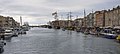
- Nomination The Canal de Sète during the event "Escale à Sète 2016". --Christian Ferrer 04:39, 23 July 2016 (UTC)
- Promotion Good quality. --Johann Jaritz 04:48, 23 July 2016 (UTC)
-

- Nomination Jolie Biche (ship, 1956). --Christian Ferrer 04:39, 23 July 2016 (UTC)
- Promotion Good quality. --Johann Jaritz 04:50, 23 July 2016 (UTC)
-

- Nomination Beekdal Linde Bekhofplas. A valuable nature of Staatsbosbeheer. Location profince Friesland in the Netherlands.
--Agnes Monkelbaan 04:31, 23 July 2016 (UTC) - Promotion Nice. Good quality. --Johann Jaritz 04:47, 23 July 2016 (UTC)
- Nomination Beekdal Linde Bekhofplas. A valuable nature of Staatsbosbeheer. Location profince Friesland in the Netherlands.
-
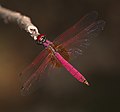
- Nomination Trithemis aurora male --Jkadavoor 03:49, 23 July 2016 (UTC)
- Promotion Good quality. --Johann Jaritz 04:49, 23 July 2016 (UTC)
-

- Nomination Ceriagrion cerinorubellum mating pair --Jkadavoor 03:49, 23 July 2016 (UTC)
- Promotion Good quality. --Johann Jaritz 03:55, 23 July 2016 (UTC)
-

- Nomination Winemaker alley with press houses and wine cellars, Maulavern In Zellerndorf, Lower Austria (Weinviertel), Austria. By User:Kellergassen Niederösterreich 2016 --Hubertl 03:24, 23 July 2016 (UTC)
- Promotion
 Support Good quality.--Agnes Monkelbaan 04:36, 23 July 2016 (UTC)
-

- Nomination Winemaker alley with press houses and wine cellars, Maulavern In Zellerndorf, Lower Austria (Weinviertel), Austria. By User:Kellergassen Niederösterreich 2016 --Hubertl 03:24, 23 July 2016 (UTC)
- Promotion Good quality. --Johann Jaritz 03:28, 23 July 2016 (UTC)
-

- Nomination horse-drawn buggy, Maulavern In Zellerndorf, Lower Austria (Weinviertel), Austria. By User:Kellergassen Niederösterreich 2016 --Hubertl 03:24, 23 July 2016 (UTC)
- Promotion Good quality. --Johann Jaritz 03:28, 23 July 2016 (UTC)
-

- Nomination Western rustication portal of the Landhaus on Landhaushof #1, Klagenfurt, Carinthia, Austria --Johann Jaritz 02:17, 23 July 2016 (UTC)
- Promotion Good quality. --Vengolis 02:42, 23 July 2016 (UTC)
-

- Nomination Portal with balcony of the Sichl-Egger house on Villacher Ring #31, Klagenfurt, Carinthia, Austria --Johann Jaritz 02:17, 23 July 2016 (UTC)
- Promotion Good quality. --Vengolis 02:42, 23 July 2016 (UTC)
-

- Nomination Baroque portal of palais Rosenberg, formerly municipal office on Alter Platz #1, Klagenfurt, Carinthia, Austria --Johann Jaritz 02:17, 23 July 2016 (UTC)
- Promotion Good quality. --Vengolis 02:53, 23 July 2016 (UTC)
-

- Nomination Renaissance portal of the town hall on Neuer Platz #1, Klagenfurt, Carinthia, Austria --Johann Jaritz 02:17, 23 July 2016 (UTC)
- Promotion Good quality. --Vengolis 02:36, 23 July 2016 (UTC)
-

- Nomination Baroque portal of palais Stampfer on Alter Platz #29, Klagenfurt, Carinthia, Austria --Johann Jaritz 02:17, 23 July 2016 (UTC)
- Promotion Good quality. --Vengolis 02:36, 23 July 2016 (UTC)
-
-

-

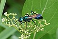
- Nomination Crab Spider - male --Vengolis 01:53, 23 July 2016 (UTC)
- Promotion Good quality. --Johann Jaritz 02:19, 23 July 2016 (UTC)
-

- Nomination Stenaelurillus albus --Vengolis 01:53, 23 July 2016 (UTC)
- Promotion Good quality. --Johann Jaritz 02:24, 23 July 2016 (UTC)
-

- Nomination Olepa ricini --Vengolis 01:53, 23 July 2016 (UTC)
- Promotion Good quality. --Johann Jaritz 02:19, 23 July 2016 (UTC)
-

-

-
-

- Nomination water surface under a small fountain at Holma seat farm in Brastad, Sweden. --W.carter 21:34, 22 July 2016 (UTC)
- Promotion Support Good quality.--Agnes Monkelbaan 04:39, 23 July 2016 (UTC)
-
- Nomination Internal view of the parish church Schöngrabern, Weinviertel, Lower Austria. By User:Kellergassen Niederösterreich 2016 --Hubertl 21:06, 22 July 2016 (UTC)
- Promotion Good quality. --Vengolis 02:01, 23 July 2016 (UTC)
-

- Nomination Internal view of the parish church Schöngrabern, Weinviertel, Lower Austria. By User:Kellergassen Niederösterreich 2016 --Hubertl 21:06, 22 July 2016 (UTC)
- Promotion Good quality. --Vengolis 02:01, 23 July 2016 (UTC)
-

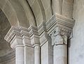
- Nomination Romanesque figures (13th Century) at the outside of the apsis of the parish Church Schöngrabern, Lower Austria. By User:Kellergassen Niederösterreich 2016 --Hubertl 21:06, 22 July 2016 (UTC)
- Promotion Good quality. --Vengolis 02:01, 23 July 2016 (UTC)
-
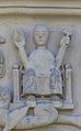
- Nomination Romanesque figures (13th Century) at the outside of the apsis of the parish Church Schöngrabern, Lower Austria. By User:Kellergassen Niederösterreich 2016 --Hubertl 21:06, 22 July 2016 (UTC)
- Promotion Good quality. --Johann Jaritz 03:25, 23 July 2016 (UTC)
-
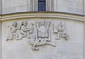
- Nomination Romanesque figures (13th Century) at the outside of the apsis of the parish Church Schöngrabern, Lower Austria. By User:Kellergassen Niederösterreich 2016 --Hubertl 21:06, 22 July 2016 (UTC)
- Promotion Good quality. --Johann Jaritz 03:25, 23 July 2016 (UTC)
-
-

- Nomination Kalderimi in Chora of Serifos. --C messier 13:37, 22 July 2016 (UTC)
- Promotion Good quality. --Poco a poco 19:27, 22 July 2016 (UTC)
-

- Nomination Church of Ayios Konstantinos, Serifos. --C messier 13:37, 22 July 2016 (UTC)
- Promotion Good quality. --Poco a poco 19:27, 22 July 2016 (UTC)
-

- Nomination Male mallard at Varenna, Lake Como, Italy.--لا روسا 17:02, 22 July 2016 (UTC)
- Promotion Support --Christian Ferrer 04:41, 23 July 2016 (UTC)
-
-

- Nomination Chimney in Serifos. --C messier 12:50, 22 July 2016 (UTC)
- Promotion Nice.--Famberhorst 17:56, 22 July 2016 (UTC)
-

- Nomination Bridge between two houses of the Stone Age Village Sipplingen, Pfahlbaumuseum Unteruhldingen, Germany --Llez 16:57, 22 July 2016 (UTC)
- Promotion GQ --Palauenc05 17:46, 22 July 2016 (UTC)
-

- Nomination Eendenkooi De Grote Otterskooi, in the province of Overijssel in the Netherlands. Kooiplas.
--Famberhorst 16:40, 22 July 2016 (UTC) - Promotion Good quality. --Hubertl 16:44, 22 July 2016 (UTC)
- Nomination Eendenkooi De Grote Otterskooi, in the province of Overijssel in the Netherlands. Kooiplas.
-

- Nomination War Memorial in wall of St. Nicholas Church in Broekhuizen (Horst aan de Maas) in province of Limburg in the Netherlands.
--Famberhorst 16:40, 22 July 2016 (UTC) - Promotion Good quality. This is really the war memorial with St. George? --Hubertl 16:44, 22 July 2016 (UTC)
Answer:::Zie this foto, same place: --Famberhorst 16:51, 22 July 2016 (UTC) *
  Comment ok, Saint George is the patron saint of England, and the memorial refers to english troops. --Hubertl 17:16, 22 July 2016 (UTC)
Thank you for your explanation. Have you studied earlier history?--Famberhorst 17:54, 22 July 2016 (UTC) - no, not history, law. But this was Wikipedia... en basiskennis van de Nederlandse taal --Hubertl 18:42, 22 July 2016 (UTC)
- Nomination War Memorial in wall of St. Nicholas Church in Broekhuizen (Horst aan de Maas) in province of Limburg in the Netherlands.
-

- Nomination Église Saint-Saturnin de Montesquieu-des-Albères, France. --Palauenc05 15:10, 22 July 2016 (UTC)
- Promotion Good quality. --Ralf Roletschek 15:51, 22 July 2016 (UTC)
-

-

-

-

-
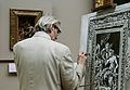
- Nomination Artist recreating a painting in Louvre. --Rijinatwiki 13:59, 22 July 2016 (UTC)
- Decline It is a good motif, no doubt, but there are CA in a "rainbow-effect"-way all over the pic, especially on his back and the painting. You could try it in black & white though but as a different nomination. W.carter 15:22, 22 July 2016 (UTC)
-

-

-

-

-
- Nomination '49 TRally de Ourense ' in 2016, in the city of Ourense, scoring for the CERA. --Harpagornis 11:57, 22 July 2016 (UTC)
- Promotion Good quality. --DXR 12:25, 22 July 2016 (UTC)
-

- Nomination Spain, Sevilla, Avenida de la Constitución, 26 --Berthold Werner 11:38, 22 July 2016 (UTC)
- Promotion Good quality. --Poco a poco 11:56, 22 July 2016 (UTC)
-

-

- Nomination Evening near the Krzna river, Poland --Pudelek 11:06, 22 July 2016 (UTC)
- Promotion Good quality. --Poco a poco 11:56, 22 July 2016 (UTC)
-

-

-

- Nomination Erannis defoliaria --Verum 09:43, 22 July 2016 (UTC)
- Promotion Comment Same goes for this butterfly, try to identify it, please. W.carter 14:29, 22 July 2016 (UTC) done --Verum 15:00, 22 July 2016 (UTC)
Very nice. It is also a little bit dark, hard to see the details of the butterfly, do you think you can brighten it a notch? W.carter 15:06, 22 July 2016 (UTC) Done - and better crop. --Verum 17:47, 22 July 2016 (UTC)
Yes, much better crop. Good quality. You should also think about renaming both pics once they are off this list so that they will be more identifiable for people searching for these butterflies. W.carter 18:06, 22 July 2016 (UTC)
-

- Nomination Aphantopus hyperantus --Verum 09:43, 22 July 2016 (UTC)
- Promotion Comment A genus level identification is appreciated; at least. You may get help at de:Wikipedia:Redaktion Biologie/Bestimmung. Jkadavoor 10:09, 22 July 2016 (UTC) Done, Please wait with Promotion. --Verum 11:26, 22 July 2016 (UTC) Done --Verum 15:00, 22 July 2016 (UTC)
Good quality. W.carter 15:06, 22 July 2016 (UTC)
-

- Nomination Mishkenot Sha’ananim, Jerusalem --Ralf Roletschek 09:11, 22 July 2016 (UTC)
- Promotion Good quality. --Poco a poco 11:56, 22 July 2016 (UTC)
-

- Nomination Church in Stary Gierałtów 1 --Jacek Halicki 08:36, 22 July 2016 (UTC)
- Promotion GQ --Palauenc05 08:50, 22 July 2016 (UTC)
-

- Nomination Church in Stary Gierałtów 2 --Jacek Halicki 08:36, 22 July 2016 (UTC)
- Promotion Good quality. --Johann Jaritz 09:53, 22 July 2016 (UTC)
-

- Nomination Church in Stary Gierałtów 3 --Jacek Halicki 08:36, 22 July 2016 (UTC)
- Promotion Good quality. --Johann Jaritz 09:53, 22 July 2016 (UTC)
-

- Nomination Church in Bielice 1 --Jacek Halicki 08:36, 22 July 2016 (UTC)
- Promotion GQ --Palauenc05 08:50, 22 July 2016 (UTC)
-

- Nomination Church in Bielice 2 --Jacek Halicki 08:36, 22 July 2016 (UTC)
- Promotion QI --Verum 09:46, 22 July 2016 (UTC)
-

- Nomination Mishkenot Sha’ananim, Jerusalem --Ralf Roletschek 08:25, 22 July 2016 (UTC)
- Promotion GQ --Palauenc05 08:51, 22 July 2016 (UTC)
-

- Nomination Marktplatz Eberswalde --Ralf Roletschek 08:25, 22 July 2016 (UTC)
- Promotion Good quality. --Jacek Halicki 09:26, 22 July 2016 (UTC)
-

- Nomination Mishkenot Sha’ananim, Jerusalem --Ralf Roletschek 07:39, 22 July 2016 (UTC)
- Promotion Good quality. --Hubertl 07:51, 22 July 2016 (UTC)
-

-

- Nomination A west view of the First Baptist Church, located at S Perry St, Montgomery, Alabama --DXR 07:02, 22 July 2016 (UTC)
- Promotion Good quality. --Jacek Halicki 08:40, 22 July 2016 (UTC)
-

-

- Nomination An east view of Cathedral Basilica of the Immaculate Conception, Mobile, Alabama --DXR 07:02, 22 July 2016 (UTC)
- Promotion Quality high enough for a Q1photo --Michielverbeek 07:19, 22 July 2016 (UTC)
-

- Nomination A south view of the northern part of Enterprise Mill, part of the Historic Augusta Canal and Industrial District --DXR 07:02, 22 July 2016 (UTC)
- Promotion Good quality. --Jacek Halicki 08:40, 22 July 2016 (UTC)
-

- Nomination Watch tower in the Danube Delta, Romania --Poco a poco 06:51, 22 July 2016 (UTC)
- Promotion Good quality. --Jacek Halicki 08:40, 22 July 2016 (UTC)
-

- Nomination People greeting at Danube Delta, Romania --Poco a poco 06:51, 22 July 2016 (UTC)
- Promotion Good quality. --DXR 07:04, 22 July 2016 (UTC)
-

- Nomination Ships in Danube Delta, Romania --Poco a poco 06:51, 22 July 2016 (UTC)
- Promotion Good quality. --Jacek Halicki 08:41, 22 July 2016 (UTC)
-
- Nomination Landscape in the Danube Delta, Romania --Poco a poco 06:51, 22 July 2016 (UTC)
- Promotion Good quality. --Jacek Halicki 08:41, 22 July 2016 (UTC)
-

- Nomination Western Wall of the Temple Mount, Jerusalem --Ralf Roletschek 06:43, 22 July 2016 (UTC)
- Promotion Good quality. --Poco a poco 06:57, 22 July 2016 (UTC)
-
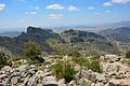
- Nomination view from the top of mountain Zaghoan --IssamBarhoumi 06:50, 22 July 2016 (UTC)
- Promotion Good quality. --Poco a poco 06:59, 22 July 2016 (UTC)
-

- Nomination The lighthouse of Galite island --IssamBarhoumi 06:50, 22 July 2016 (UTC)
- Promotion Support Good quality.--Famberhorst 16:43, 22 July 2016 (UTC)
-
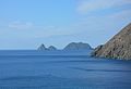
- Nomination Galite island view --IssamBarhoumi 06:50, 22 July 2016 (UTC)
- Promotion Good quality. --Hubertl 16:42, 22 July 2016 (UTC)
-

- Nomination Tower of St. Nicholas Church in Broekhuizen (Horst aan de Maas) in province of Limburg in the Netherlands.
--Famberhorst 05:45, 22 July 2016 (UTC) - Promotion Good quality. --Johann Jaritz 06:17, 22 July 2016 (UTC)
- Nomination Tower of St. Nicholas Church in Broekhuizen (Horst aan de Maas) in province of Limburg in the Netherlands.
-

- Nomination Drielandenpunt (Vaals) in the Netherlands.
--Famberhorst 05:45, 22 July 2016 (UTC) - Promotion Good quality. --Poco a poco 07:01, 22 July 2016 (UTC)
Ah, you edit conflicted me, I soo wanted to promote this pic of a sign without any logo-trouble! :-) W.carter 07:09, 22 July 2016 (UTC)
- Nomination Drielandenpunt (Vaals) in the Netherlands.
-

- Nomination Akan Gold Weight, Bovid --Ercé 05:33, 22 July 2016 (UTC)
- Promotion Good quality. --Johann Jaritz 05:44, 22 July 2016 (UTC)
-

- Nomination Akan Gold Weight, Bovid --Ercé 05:33, 22 July 2016 (UTC)
- Promotion Good quality. --Poco a poco 06:57, 22 July 2016 (UTC)
-

-

- Nomination Sandakan, Sabah: Plywood Factory; A barge with timbers mooring at the logpond --Cccefalon 05:19, 22 July 2016 (UTC)
- Promotion Good quality. --Johann Jaritz 05:42, 22 July 2016 (UTC)
-
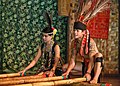
- Nomination Kg. Kuai Kandazon, Penampang, Sabah: Members of Monsopiad Cultural Village during the performance of traditional danses --Cccefalon 05:19, 22 July 2016 (UTC)
- Promotion Good quality. nice to see the Pocahontas costumes and the maori tribe tattoo motifs *ggg* --Hubertl 06:29, 22 July 2016 (UTC)
-

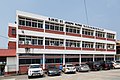
- Nomination Kudat, Sabah: SK St. James Kudat, a primary school in Sabah --Cccefalon 05:19, 22 July 2016 (UTC)
- Promotion Good quality. --Johann Jaritz 05:42, 22 July 2016 (UTC)
-
-

- Nomination Nationaal Park Weerribben-Wieden. Wandeling over het Laarzenpad door veenmoeras van De Wieden.
--Agnes Monkelbaan 04:21, 22 July 2016 (UTC) - Promotion * Comment some more overall brightness would be fine. --Hubertl 04:50, 22 July 2016 (UTC)
 Done. Small correction.. Thank you.--Agnes Monkelbaan 05:59, 22 July 2016 (UTC)
- Nomination Nationaal Park Weerribben-Wieden. Wandeling over het Laarzenpad door veenmoeras van De Wieden.
-

- Nomination Alpincenter on slag heap Prosperstraße, Bottrop, North Rhine-Westphalia, Germany --XRay 03:27, 22 July 2016 (UTC)
- Promotion Support Good quality.--Famberhorst 16:46, 22 July 2016 (UTC)
-

- Nomination “Mordkreuz der Mersche von Tilbeck”, Havixbeck, North Rhine-Westphalia, Germany --XRay 03:27, 22 July 2016 (UTC)
- Promotion Good quality. --Poco a poco 06:59, 22 July 2016 (UTC)
-

-

-

- Nomination Alley Schiessgraben in Scheßlitz --Ermell 08:35, 21 July 2016 (UTC)
- Promotion It is a very nice view but the photo is a bit too grainy and there is CA in the trees, sorry. W.carter 11:14, 21 July 2016 (UTC) Comment
Tried to fix. Maybe you take a look again. Thanks for the review--Ermell 19:37, 21 July 2016 (UTC)
Amazingly, you actually fixed it! Good enough for me now. :) W.carter 07:16, 22 July 2016 (UTC)
-

- Nomination Cordell Crockett with Ugly Kid Joe performing at Sofia Rocks Fest 2012. --MrPanyGoff 08:05, 21 July 2016 (UTC)
- Promotion It is really impossible to take photos at a rock festival without getting the black on black on black and a crop would unbalance it, right now it has a sort of "yin and yang"-effect so ok for me. W.carter 08:01, 22 July 2016 (UTC)
-

- Nomination Rally Sur do Condado 2016 --Harpagornis 00:45, 21 July 2016 (UTC)
- Decline Too much "just dark" in the picture and part of the car is missing. You should have taken the pic about 1/4 sek later. W.carter 21:26, 21 July 2016 (UTC) The light at that time had a 35 ° elevation, 1/4 doubt shoot later, had solved that.--Harpagornis 11:50, 22 July 2016 (UTC) A bit closer and you might have had the whole car at least. W.carter 16:07, 22 July 2016 (UTC)
-

- Nomination Chevrolet Tracker showed in Sociedad Rural 2016, Buenos Aires Argentina --Ezarate 23:04, 19 July 2016 (UTC) Comment
CA has to be removed--Ermell 07:47, 20 July 2016 (UTC) Done Ezarate 18:13, 20 July 2016 (UTC) Comment
Sorry but I cannot see any difference. See my annotations.--Ermell 22:07, 20 July 2016 (UTC) Done Thanks Ermell Ezarate 00:53, 21 July 2016 (UTC) - Promotion Good quality. --Ermell 06:35, 22 July 2016 (UTC)
- Nomination Chevrolet Tracker showed in Sociedad Rural 2016, Buenos Aires Argentina --Ezarate 23:04, 19 July 2016 (UTC)
-

-

- Nomination Cygnus olor (Mute swan) at Coulon in the Marais poitevin. --Medium69 10:22, 19 July 2016 (UTC)
Can you please reduce the highlights? Poco a poco 19:05, 19 July 2016 (UTC) Done --Medium69 11:10, 20 July 2016 (UTC) - Promotion Good quality. --Poco a poco 19:24, 22 July 2016 (UTC)
- Nomination Cygnus olor (Mute swan) at Coulon in the Marais poitevin. --Medium69 10:22, 19 July 2016 (UTC)
-

- Nomination St Mary's Chrch caernarfon, Gwynedd. --Llywelyn2000 07:18, 19 July 2016 (UTC)
- Promotion Ok --Uoaei1 18:39, 22 July 2016 (UTC)
-

- Nomination St Mary's Church, Tremadog, Gwynedd, Wales. --Llywelyn2000 07:18, 19 July 2016 (UTC)
- Decline Perspective - verticals should be vertical --Uoaei1 18:39, 22 July 2016 (UTC)
-

- Nomination Islami Bank Medical College located in Rajshahi. In short, it is known as IBMC. In 2003, it has started its journey with 50 students. --Nahid.rajbd 06:26, 19 July 2016 (UTC)
- Decline Perspective issues and tilted --Uoaei1 18:41, 22 July 2016 (UTC)
-

- Nomination Femegerichtsstuhl, Lüdinghausen, North Rhine-Westphalia, Germany --XRay 03:24, 19 July 2016 (UTC)
- Promotion The perspective looks weird to me, it seems tilted to the right. --Dirtsc 07:55, 21 July 2016 (UTC) Fixed Sorry. You're right, it was tilted. Now it's fixed. --XRay 04:36, 22 July 2016 (UTC)
 OK Good now. --Dirtsc 13:05, 22 July 2016 (UTC)
-

- Nomination Kath. parish church, Philipp and Jake, Zellerndorff, Weinviertel, Niederösterreich. By User:Kellergassen Niederösterreich 2016 --Isiwal 17:48, 18 July 2016 (UTC)
- Promotion QI --Verum 10:38, 22 July 2016 (UTC)
-

- Nomination Winemaker alley with press houses and wine cellars, Reichsgraben, located In Zellerndorf, Lower Austria (Weinviertel). By User:Kellergassen Niederösterreich 2016 --Isiwal 17:48, 18 July 2016 (UTC)
- Promotion QI --Verum 10:38, 22 July 2016 (UTC)
-

- Nomination Winemaker alley with press houses and wine cellars, Maulavern In Zellerndorf, Lower Austria (Weinviertel). By User:Kellergassen Niederösterreich 2016 --Isiwal 17:48, 18 July 2016 (UTC)
- Promotion QI --Verum 10:38, 22 July 2016 (UTC)
-

- Nomination Location, Lendevallei in Netherlands. Grass path between wooded banks.
--Famberhorst 15:35, 18 July 2016 (UTC) - Promotion Ok for me. --Hubertl 11:09, 22 July 2016 (UTC)
- Nomination Location, Lendevallei in Netherlands. Grass path between wooded banks.
-

- Nomination A fire engine, and rescue automobile and a patroller on Bicentennial of independence of Argentina in Mar del Plata, Argentina --Ezarate 00:43, 17 July 2016 (UTC)
- Promotion The pic is a bit too bright, do you think you could tone it down a bit? It would also be better to crop out some of the right side for better balance, the pic is about the cars and not about the shopping window. W.carter 11:50, 21 July 2016 (UTC) Done Ezarate 01:45, 22 July 2016 (UTC)
Hmmm... now it's actually too dark, a middle thing would be nice, but the crop is good now. Sorry for being a bit picky. W.carter 07:28, 22 July 2016 (UTC) Done don´t worry --Ezarate 13:52, 22 July 2016 (UTC)
Ah, now you got it! A good pic is worth waiting for. :) Thank you for your patience. Good quality. --W.carter 18:11, 22 July 2016 (UTC)
-

- Nomination Maastricht-NL, bridge: de Servaasbrug --Michielverbeek 20:23, 16 July 2016 (UTC)
- Withdrawn Comment Please check again tilt/perspective. --C messier 14:33, 16 July 2016 (UTC)
Is the railing near the river the problem? If so, I just did not make this photo in a good position --Michielverbeek 21:36, 16 July 2016 (UTC) Comment Check the buildings in the background. --C messier 14:21, 16 July 2016 (UTC)
Done I did a small perspective correction --Michielverbeek 20:05, 17 July 2016 (UTC) Comment Check a bit vertical perspective, and crop the white borders top, right and down. --C messier 18:06, 19 July 2016 (UTC) Done White border? Oeps, I forgot to touch one button. A new development from RAWfile still gives white borders but why? So withdraw --Michielverbeek 13:51, 22 July 2016 (UTC)
-

- Nomination: Sunrise over Polonyna Labieska, Carpathian National Park. By User:Haidamac --Ата 18:37, 15 July 2016 (UTC)
- Review 4 MPix out of a 24 Mpix camera is not what we expect in QIC. --Cccefalon 06:14, 16 July 2016 (UTC)
-

- Nomination Czerwonogrod Waterfall. By User:Haidamac --Ата 18:37, 15 July 2016 (UTC)
- Decline Comment The sky looks weird, with branches eaten at the trees. --C messier 06:54, 15 July 2016 (UTC)
 Not done --C messier 13:35, 22 July 2016 (UTC)
-

- Nomination Espanya place in Barcelona. Old and new (street) lights in composition regarding the Fountain de l'Exposició (1929). Taken with a telephoto lens. --Mummelgrummel 16:49, 10 July 2016 (UTC)
- Promotion Comment the lamps don't work in the composition IMHO... --Carschten 09:20, 18 July 2016 (UTC) Comment Thank you for the comment. I found especially this composition interesting. But probably you're right. --Mummelgrummel 05:38, 21 July 2016 (UTC)
My problem is the tight lamp crop on the left and the overlapping part of the lamp on the right. But I see the interesting idea indeed. So I don't want to decide this one. --Carschten 11:53, 21 July 2016 (UTC)
Technically it's a rather good pic and I totally get the idea with old versus new lamps in the same pic, so I'd say good enough for me. BUT once the pic is off this list, you should rename it to "Old and new lamps at Platz Espanya Barcelona" and also mention this in the description of the file. Otherwise people will think that it is a "bad" pic of the statue. I'll add some good categories to it. W.carter 18:18, 22 July 2016 (UTC)
Comment Thank you again for commenting it. It's a pretty good idea to adopt the description of the picture and add categories to it. So I have done it. Thanks @W.carter and @Carschten. --Mummelgrummel 02:55, 23 July 2016 (UTC)

,_S%C3%A8te_cf02.jpg)


_05947.jpg)


.jpg)


_in_provincie_Limburg_in_Nederland_03.jpg)


.jpg)


.jpg)
.jpg)
.jpg)


.jpg)

.jpg)
.jpg)


_in_provincie_Limburg_in_Nederland_04.jpg)
.jpg)


-St-Joseph-(M)-02.jpg)


_-_20150810_15h12_(11058).jpg)


Consensual review edit
File:Elne Maillol Terrus.jpg edit

- Nomination Bust of Étienne Terrus by Aristide Maillol, Elne, France. --Palauenc05 11:18, 21 July 2016 (UTC)
- Promotion
- Support Good quality. --Hubertl 11:25, 21 July 2016 (UTC)
- Comment please adjust the white balance, too low contrast IMHO. --Carschten 12:01, 21 July 2016 (UTC)
- Comment I've given it a bit more contrast. --Palauenc05 14:44, 21 July 2016 (UTC)
- Comment the white balance is still too greenish. --Carschten 19:19, 22 July 2016 (UTC)
File:Mohnnudel.jpg edit

- Nomination Mohnnudels --A,Ocram 16:02, 20 July 2016 (UTC)
- Promotion
- Support Good quality. --XRay 16:09, 20 July 2016 (UTC)
{{o}} Ich hoffe, es kommt nicht in den falschen Hals: Gerade bei Studioaufnahmen ist das Herrichten bzw. das Ausklonen von Fehlern im Hintergrundbereich besonders wichtig, weil es den Blick auf das Objekt reduziert. In diesem Fall sind es zwei Haare, dazu noch unnötige helle Stellen (das ist Zucker, aber unscharf). Das muss einfach raus. Ich wundere mich, warum du es nicht gemacht hast, es war bereits Gegenstand einer Diskussion!--Hubertl 03:28, 21 July 2016 (UTC)
![]() Comment Die Haare und die runtergefallenen Zuckerkristalle sowie die Fehler im Hintergrund wurden weggepinselt. Gruss --Nightflyer 22:25, 21 July 2016 (UTC)
Comment Die Haare und die runtergefallenen Zuckerkristalle sowie die Fehler im Hintergrund wurden weggepinselt. Gruss --Nightflyer 22:25, 21 July 2016 (UTC)
- Vom Raw-File, Nightflyer? --Hubertl 04:30, 22 July 2016 (UTC)
- Natürlich nicht. Wer jetzt noch rumschrauben will, muss eben meine kleine Arbeit wiederholen :-) Gruss --Nightflyer 12:54, 22 July 2016 (UTC)
- Vielen Dank an Nightflyer! --A,Ocram 19:56, 22 July 2016 (UTC)
- Natürlich nicht. Wer jetzt noch rumschrauben will, muss eben meine kleine Arbeit wiederholen :-) Gruss --Nightflyer 12:54, 22 July 2016 (UTC)
- Support ok now! --Hubertl 03:30, 23 July 2016 (UTC)
File:Schleswig-Holstein,_Nordhastedt,_Fieler_Moor_NIK_0508.JPG edit

- Nomination Norwegische Fjordpferde als Landschaftspfleger im Naturschutzgebiet "Fieler Moor" im Kreis Dithmarschen, Schleswig-Holstein. --Nightflyer 19:56, 19 July 2016 (UTC)
- Promotion
- Support Good quality. --Peulle 20:12, 19 July 2016 (UTC)
 Oppose Review: Technisch OK aber schlechte Motivwahl. Weder ein Mensch noch ein Pferd wird als Hauptmotiv von hinten photografiert. Für mich so kein QI. --Verum 16:55, 20 July 2016 (UTC)
- Support Good quality. @Verum: Nonsense argument. If you want to show the back of an animal it is not very clever to take a photo of the nose. --Smial 09:18, 21 July 2016 (UTC)
- Lass es mich deutsch schreibven. Es gibt durchaus hauotberufliche Pferde- und Kuhfotografen. Einer derselben hat mir da die nötigen Basics versucht zu erklären. Und da geht so ein Bild von hinten gar nicht. Erst einmal wäre es von den Lichtverhältnissen kein Problem gewesen, das Bild seitlich von vorne aufzunehmen. Und wenn wirklich das Hinterteil gewünscht ist muss man halt warten, bis das Tier den Kopf dreht wozu es idR mit relativ einfachen Tricks bewegt werden kann. Aber wenn ihr meint ist es ein QI. --Verum 13:12, 21 July 2016 (UTC)
- Support We need pics showing off all parts of a horse's anatomy, the magnificent tail and the muscles on the back of the front legs are clearly defined. No trouble with the photo as such, I think a cropped version would make a good pic in the en:Horsehair article. W.carter 10:52, 21 July 2016 (UTC)
- Support The image is not meant to show a "Fjord horse" as a horse breed but to show "Horse doing landscape protection in the Fieler Moor". So its quite good to show the horse with its head down at the grass doing its "job". The technical quality is good. --Dirtsc 13:16, 22 July 2016 (UTC)
File:Apartment building - Niš.jpg edit

- Nomination Apartment building in Niš. --MrPanyGoff 13:44, 15 July 2016 (UTC)
- Promotion
- Support QI. Dmitry Ivanov 16:03, 15 July 2016 (UTC).
- Oppose Sunlit side looks a bit washed out with some clipping in highlights; perspective also looks fractionally unnatural, as if converging verticals have been over-corrected. (The fact that verticals appear to be completely parallel would support this guess). --Ubcule 12:18, 17 July 2016 (UTC)
- Comment The perspective correction of verticals was minimal because the photo is taken from a long distance. As for the colors, it is normal for a mid-day photo but this doesn't make it of a low quality, after all this is not a FP candidate.--MrPanyGoff 16:39, 20 July 2016 (UTC)
- Comment To be fair, the perspective issue I described is marginal in this example (emphasis "fractionally unnatural") so perhaps I'm being picky because it reminds me of more egregious examples of the blanket "corrected verticals must be parallel" dogma. But the fact that it's noticeable at all is still annoying; the perspective in the roofline indicates that it isn't a *very* long distance shot (with near-parallel lack of perspective) and very minor convergence would still be expected.
There *is* verifiable clipping on some (non-highlight) window reflections, though I accept that how big a problem this is considered may be a matter of opinion too.
(Pulling down the gamma seems to improve the sunny face, but it also makes the rest of the image quite dark. Though that isn't advice or something I'm asking you to do; it's just an observation). --Ubcule (talk) 21:08, 20 July 2016 (UTC)
- Oppose as for Ubcule. Also slight pincushion distortion. -- Smial 14:02, 18 July 2016 (UTC)
- Support ok for me --Christian Ferrer 18:37, 20 July 2016 (UTC)
- Support ok for me too.--Hubertl 03:35, 23 July 2016 (UTC)
File:Block in Pirot.jpg edit

- Nomination Residential building in the city center of Pirot. --MrPanyGoff 17:33, 12 July 2016 (UTC)
- Decline
- Support Good quality. --Code 07:02, 16 July 2016 (UTC)
- Oppose Good photo, and maybe I'm being picky but... perspective not quite right. Looks like converging verticals have been a little over-corrected (i.e. near-parallel) which in itself always appears a bit unnatural to me- you'd expect a *little* convergence in nature. I'm guessing from the angle of the non-verticals that the original was quite noticeably different? --Ubcule 23:41, 17 July 2016 (UTC)
- Oppose too strong distortrt. --Ralf Roletschek 14:10, 18 July 2016 (UTC)
- Support Images of architecture should usually be rectilinear. --C messier 14:23, 18 July 2016 (UTC)
- Comment Where does this "rule" originate from? I understand that some architectural projections use it, but that doesn't mean it's natural in appearance or suitable for every purpose. My suspicion is that it's being blindly applied as a blanket rule beyond its original intended use. The simple fact is that unless it's been photographed from a significant distance using a telephoto, a tall building like this would always show at least *some* vertical perspective (both in photos and when viewed in person). Because it doesn't do that, the "corrected" photo gives the opposite (and vaguely unnatural) impression of bulging at the top.
That would apply even if it had been taken straight on, and the roof line was horizontal. However, in this case there's the additional problem that one *can't* correct perspective in all directions in post-processing, so the angled roof line looks more exaggerated and mismatched with the verticals. (If it was a genuine telephoto image, the roof line would show a corresponding reduction in perspective). In short, this isn't a perspective you'd see in nature, which is why (IMHO) it looks slightly unnatural.
I want to make clear that I'm not opposed to correction of converging verticals. Frankly, they *can* make buildings look like they're "falling over" and if the corrected result retains a plausible amount of perspective like this, it's fine. What I'm opposed to is over-correction to an extent that goes beyond natural.
I also *don't* want to come across as if I'm being overly harsh on this specific image. It's not an especially bad example of the issues described; it just happens to be the one we're judging. If anything, this image shows it more strongly.
There may be a case for vertically-aligned ("architectural"?) projections in some situations, but it has to be accepted that this isn't always going to look natural, nor flattering to the subject. --Ubcule (talk) 19:21, 18 July 2016 (UTC)
- Oppose IMHO overcorrected perspective. Ubcule made a very good and clear statement to that point. Thanks! --Dirtsc 13:19, 22 July 2016 (UTC)
- Oppose as others --Hubertl 03:36, 23 July 2016 (UTC)