Commons:Quality images candidates/Archives June 2007
-

- Nomination Irish Lake --Pedroserafin 07:02, 26 June 2007 (UTC)
- Decline The picture is ok, but the title and description are poor. Which lake is it exactly? Where is it? Using coordinates would be very useful here. Categorization is poor, too. See guidelines for image pages! -- Aleph
-
-

-

- Nomination Railway viaduct near Freudenstadt -- Klaus with K 13:35, 23 June 2007 (UTC)
- Promotion one can get dizzy with this photos.. good work-LadyofHats 13:38, 25 June 2007 (UTC)
-

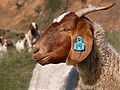
- Nomination Goat taking care its offspring in Ireland --Pedroserafin 10:48, 25 June 2007 (UTC)
- Decline noisy and overexposed-LadyofHats 15:13, 26 June 2007 (UTC)
-

- Nomination Construction Worker moving concrete barrier DSC 0474.jpg Ben Aveling 05:26, 24 June 2007 (UTC)
- Decline overexposed and moved-LadyofHats 15:07, 26 June 2007 (UTC)
-
- Nomination Sunset over The Brickworks, Sydney Park, Sydney. Ben Aveling 05:00, 24 June 2007 (UTC)
- Decline
 Comment I'd weaken the vignette before promoting this. –Dilaudid 19:27, 25 June 2007 (UTC)
Agreed. Let's decline it for now, and I'll re-nominate it once I get time to do so. Ben Aveling 07:32, 26 June 2007 (UTC)
-
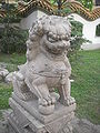
- Nomination Lion statue in chinese park in St. Piterstburg. #!George Shuklin 20:08, 23 June 2007 (UTC)
- Decline the image seems undeexposed, but in a closer look the bird sh*t and the shine in the ceilling are overexposed. i would decline it, anyone has a second opinion?-LadyofHats 13:38, 25 June 2007 (UTC) The lack of contrast is a problem and the composition could be better. –Dilaudid 19:27, 25 June 2007 (UTC)
-

- Nomination Altus Skyscraper in Katowice. --Lestat 17:54, 22 June 2007 (UTC)
- Decline the image is clarly overexposed. -LadyofHats 13:27, 25 June 2007 (UTC)
-

- Nomination Wawadit'la, also known as Mungo Martin House, a Kwakwaka'wakw "big house", with heraldic pole. --HighInBC 15:01, 22 June 2007 (UTC)
- Promotion Massive resolution, good composition and exposure --MichaD | Michael Apel 19:37, 24 June 2007 (UTC)
-

- Nomination Sorry, I'm newbie, could this counded as a quality image? #!George Shuklin 14:43, 23 June 2007 (UTC)
- Decline Sorry, but it is too overexposed to be a QI. --Digon3 talk 16:37, 23 June 2007 (UTC)
-

-

-
-

- Nomination en:Blue Mountains --Przykuta 12:04, 21 June 2007 (UTC)
- Decline
 Info nice view, but camera sharpening artefacts and two dust spect above the distant valley - second opinion anyone? --Klaus with K 19:13, 22 June 2007 (UTC) for me it is the overexposed clouds, and too saturated color, i will decline it- LadyofHats 10:01, 23 June 2007 (UTC) foreground colours can be that intense in real life, but blown white in clouds, I agree on inspection, as is the blue channel for the sky -- Klaus with K 12:16, 23 June 2007 (UTC)
-

- Nomination A Keel-billed Toucan photographed in Zürich Zoo Nikola Smolenski 20:04, 22 June 2007 (UTC)
- Decline Subject much too small. Strange noise or filter (apparent on the edges of the branches)? --Florian Prischl 22:19, 22 June 2007 (UTC)
-
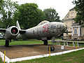
- Nomination Il-28 jet bomber --Ranger 18:07, 22 June 2007 (UTC)
- Decline Size <2Mpixels - please please read the guidelines before submitting inelegible images --Klaus with K 19:04, 22 June 2007 (UTC)
-
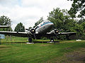
- Nomination Li-2P transport aircraft --Ranger 18:07, 22 June 2007 (UTC)
- Decline Size <2Mpixels --Klaus with K 19:04, 22 June 2007 (UTC)
-

- Nomination 85 mm air defense gun M1939 --Ranger 18:07, 22 June 2007 (UTC)
- Decline Size <2Mpixels --Klaus with K 19:04, 22 June 2007 (UTC)
-

- Nomination ZSU-57-2 self-propelled anti-aircraft gun --Ranger 18:07, 22 June 2007 (UTC)
- Decline Size <2Mpixels --Klaus with K 19:04, 22 June 2007 (UTC)
-

-
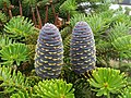
- Nomination Korean Fir cone. --Lestat 22:34, 21 June 2007 (UTC)
- Promotion Amazing picture! If it weren't for the background at right I would consider its nomination for FPC. Maybe you should try. - Alvesgaspar 16:19, 22 June 2007 (UTC)
-

- Nomination Some nice cattles from bavaria, where i come from --Makro Freak 13:41, 21 June 2007 (UTC)
- Decline overexposed-LadyofHats 10:16, 23 June 2007 (UTC)
-
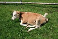
- Nomination Some nice cattles from bavaria, where i come from --Makro Freak 13:41, 21 June 2007 (UTC)
- Promotion a tic overexposed still-LadyofHats 10:16, 23 June 2007 (UTC)
-
- Nomination Some nice cattles from bavaria, where i come from --Makro Freak 13:41, 21 June 2007 (UTC)
- Decline overexposed-LadyofHats 10:16, 23 June 2007 (UTC)
-

- Nomination Some nice cattles from bavaria, where i come from --Makro Freak 13:41, 21 June 2007 (UTC)
- Decline over exposed and too much of the image is blury-LadyofHats 10:01, 23 June 2007 (UTC)
-

- Nomination Some nice cattles from bavaria, where i come from --Makro Freak 13:41, 21 June 2007 (UTC)
- Decline overexposed-LadyofHats 10:01, 23 June 2007 (UTC)
-

- Nomination Some nice cattles from bavaria, where i come from --Makro Freak 13:41, 21 June 2007 (UTC)
- Decline overexposed-LadyofHats 10:01, 23 June 2007 (UTC)
-

- Nomination Some nice cattles from bavaria, where i come from --Makro Freak 13:41, 21 June 2007 (UTC)
- Decline overexposed-LadyofHats 10:01, 23 June 2007 (UTC)
-

- Nomination Tatra Mountains - western side in winter Przykuta 12:04, 21 June 2007 (UTC)
- Decline
 Questionis the colour noise on the snow too strong? --Klaus with K 19:19, 22 June 2007 (UTC)* CommentYes, definitely too noisy, accross the whole spectrum. --Florian Prischl 22:18, 22 June 2007 (UTC)
-

- Nomination Gorner and Grenz glaciers. In the foreground on the bottom right Monte Rosa Hut Przykuta 12:04, 21 June 2007 (UTC)
- Promotion one of your best -LadyofHats 10:01, 23 June 2007 (UTC)
-

- Nomination the pond in the middle of village Rossoszyca in central Poland Przykuta 12:04, 21 June 2007 (UTC)
- Promotion noisy but tolerable-LadyofHats 10:01, 23 June 2007 (UTC)
-

- Nomination Quercus Robur range of species Przykuta 12:04, 21 June 2007 (UTC)
- Decline This is quite an eloquent example of poor generalization and of what a thematic map shouldn't be. Do anyone really believe this is the distribution of Quercus robur? Where is the distribution detail? Where is the background information? What colours are these? Please be a little more judicious in choosing the pictures you nominate here. Alvesgaspar 18:48, 21 June 2007 (UTC)-- and it should be svg :P -LadyofHats 09:28, 23 June 2007 (UTC)
-

- Nomination Map of Suwalszczyzna --Przykuta 12:04, 21 June 2007 (UTC)
- Decline must be SVG - LadyofHats 09:28, 23 June 2007 (UTC)
-
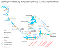
- Nomination Canoe way on Rospuda, Blizna, Czarna Hancza rivers and on the Augustow Chanel (Poland) Przykuta 12:04, 21 June 2007 (UTC)
- Decline all text is the same size and confuses in what you actually want to show. too much empty space and then sudenly too much information. try using diferent sizes and arrows, maybe a bit more details in the map.-LadyofHats 09:28, 23 June 2007 (UTC)
-
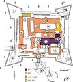
- Nomination Plan of Jasna Góra --Przykuta 12:04, 21 June 2007 (UTC)
- Decline should be svg-LadyofHats 09:28, 23 June 2007 (UTC)
-
- Nomination Map of Rawskie Voivodeship (1462-1793) Przykuta 12:04, 21 June 2007 (UTC)
- Decline should be svg -LadyofHats 09:28, 23 June 2007 (UTC)
-

- Nomination Wrocław, eastern islands on the Odra River, 2005/2006 Przykuta 12:04, 21 June 2007 (UTC)
- Decline should be svg-LadyofHats 09:28, 23 June 2007 (UTC)
-
- Nomination Railway network in Wrocław Przykuta 12:04, 21 June 2007 (UTC)
- Decline should be svg -LadyofHats 09:28, 23 June 2007 (UTC)
-

- Nomination Map of Pojezierze Iławskie and Garb Lubawski Przykuta 12:04, 21 June 2007 (UTC)
- Decline should be svg-LadyofHats 09:28, 23 June 2007 (UTC)
-

- Nomination Map of Zamość Przykuta 12:04, 21 June 2007 (UTC)
- Decline this file should be svg.-LadyofHats 09:28, 23 June 2007 (UTC)
-

- Nomination Municipalities in Poland deprived of town privileges Przykuta 12:04, 21 June 2007 (UTC)
- Decline this file was clearly created in a vector program and should be uploaded as svg-LadyofHats 09:28, 23 June 2007 (UTC)
-

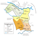
- Nomination Mesoregions of Mazowieckie Voivodeship (Poland) Przykuta 12:04, 21 June 2007 (UTC)
- Decline file should be svg -LadyofHats 09:28, 23 June 2007 (UTC)
-

- Nomination Prunus - flowers Przykuta 12:04, 21 June 2007 (UTC)
- Decline overexposed -LadyofHats 09:28, 23 June 2007 (UTC)
-

- Nomination Botanical gardens in Cracow, Poland Przykuta 12:04, 21 June 2007 (UTC)
- Promotion good enough- LadyofHats 09:28, 23 June 2007 (UTC)
-

- Nomination Rana temporaria Przykuta 12:04, 21 June 2007 (UTC)
- Decline out of focus-LadyofHats 09:28, 23 June 2007 (UTC)
-

- Nomination Larus canus - seagull Przykuta 12:04, 21 June 2007 (UTC)
- Decline Size is < 2 Megapixels - please read the guidelines before submitting inelegible images. --Florian Prischl 22:18, 22 June 2007 (UTC)
-
- Nomination Frogspawn. Photo taken in Beskid Makowski, Poland. Przykuta 12:04, 21 June 2007 (UTC)
- Promotion Over exposed but tolerable -LadyofHats 09:28, 23 June 2007 (UTC)
-

- Nomination Hyles euphorbiae Przykuta 12:04, 21 June 2007 (UTC)
- Promotion clearly one of your best -LadyofHats 09:28, 23 June 2007 (UTC)
-

- Nomination Melanargia galathea Przykuta 12:04, 21 June 2007 (UTC)
- Promotion nice one -LadyofHats 09:28, 23 June 2007 (UTC)
-

- Nomination Pieris napi Przykuta 12:04, 21 June 2007 (UTC)
- Promotion it is within the limits of QI.-LadyofHats 09:28, 23 June 2007 (UTC)
-

- Nomination Świętokrzyska Hut in Kakonin / Swietokrzyskie Mountains. Przykuta 12:04, 21 June 2007 (UTC)
- Decline I'm sorry for that nice shot but white wall is blown highlight --Klaus with K 19:26, 22 June 2007 (UTC)
-

- Nomination St. Loius Cathedral, New Olreans. Przykuta 12:04, 21 June 2007 (UTC)
- Decline blury and jpg aberrations -LadyofHats 09:28, 23 June 2007 (UTC)
-

- Nomination Shrine in Brenna, Poland Przykuta 12:04, 21 June 2007 (UTC)
- Promotion noisy but in a reasonable point-LadyofHats 09:28, 23 June 2007 (UTC)
-

- Nomination Ruins of St Simeon Stylites, Syria. Przykuta 12:04, 21 June 2007 (UTC)
- Promotion this is a good one, the trees are a bit anoying but not so much -LadyofHats 09:28, 23 June 2007 (UTC)
-
- Nomination Toruń, Virgin Mary church, vault in main nave. Przykuta 12:04, 21 June 2007 (UTC)
- Decline Unsharp, grainy/noisy. (Sorry, I initially forgot my review.) --Florian Prischl 09:55, 23 June 2007 (UTC)
-

- Nomination lighthouse in Hirtshals, Denmark Przykuta 12:04, 21 June 2007 (UTC)
- Decline Much noise, many artifacts make it unsharp. --Florian Prischl 22:18, 22 June 2007 (UTC)- i agree and decline, the image misses contrast and has JPG aberrations-LadyofHats 09:28, 23 June 2007 (UTC)
-

- Nomination Panorama of Kielce, Poland Przykuta 12:04, 21 June 2007 (UTC)
- Decline noisy and with jpg aberrations-LadyofHats 13:42, 22 June 2007 (UTC)
-

- Nomination Kathedrale Saint-Etienne von Bourges bei Nacht Przykuta 12:04, 21 June 2007 (UTC)
- Promotion it is a tic overexposed but i think has enough to be a QI.-LadyofHats 13:42, 22 June 2007 (UTC)
-

- Nomination Castle in Janowiec, Poland, panorama Przykuta 12:04, 21 June 2007 (UTC)
- Decline bad foto unions, repeated pixels, oversized image-LadyofHats 13:42, 22 June 2007 (UTC)
-

- Nomination Jarkko Aaltonen from Korpiklaani during Metalmania 2007 festival Przykuta 12:04, 21 June 2007 (UTC)
- Decline overexposed and moved-LadyofHats 13:29, 22 June 2007 (UTC)
-
- Nomination Pencils Przykuta 12:04, 21 June 2007 (UTC)
- Decline out of focus-LadyofHats 13:29, 22 June 2007 (UTC)
-

- Nomination Benedict XVI coat of arms like graphic. Przykuta 12:04, 21 June 2007 (UTC)
- Decline this one is a rather flat one, you could work some volume on it like in the other ones.a bit of shadows or so. under normal circustances i would promote this one but you already showed that you can do more-LadyofHats 13:29, 22 June 2007 (UTC)
-

- Nomination "Ostoja" - Polish coat of arms Przykuta 12:04, 21 June 2007 (UTC)
- Promotion standar quality-LadyofHats 13:29, 22 June 2007 (UTC)
-

- Nomination Płock Voivodship coat of arms Przykuta 12:04, 21 June 2007 (UTC)
- Promotion i think my favorite so far was Czernihów Coat of Arms. but this one is still ok-LadyofHats 13:29, 22 June 2007 (UTC)
-

- Nomination Czernihów Coat of Arms Przykuta 12:04, 21 June 2007 (UTC)
- Promotion you like repetitive work?-LadyofHats 13:29, 22 June 2007 (UTC)
-

- Nomination Coat of Arms Trzaska of Polish noble families Przykuta 12:04, 21 June 2007 (UTC)
- Promotion for next time try using diferent thickness of lines-LadyofHats 13:29, 22 June 2007 (UTC)
-

- Nomination Coat of arms of the British Antarctic Territory Przykuta 12:04, 21 June 2007 (UTC)
- Promotion i was about to complain in the horrible lion but after a few research i found out it should be that horrible. -LadyofHats 13:29, 22 June 2007 (UTC)
-

- Nomination Coat of Ornano, Comte de l'Empire, Marechal de France Przykuta 12:04, 21 June 2007 (UTC)
- Decline the white feathers mis with the background and there is a red line above the sword that doesnt belong there. i would promote if fixed this-LadyofHats 13:29, 22 June 2007 (UTC)
-

- Nomination Lancelet's anatomy scheme Przykuta 12:04, 21 June 2007 (UTC)
- Decline this image should be SVG-LadyofHats 13:29, 22 June 2007 (UTC)
-

- Nomination Lines of typefont Przykuta 12:04, 21 June 2007 (UTC)
- Promotion simple but clear-LadyofHats 13:29, 22 June 2007 (UTC)
-

- Nomination Structures of the kidney Przykuta 12:04, 21 June 2007 (UTC)
- Decline please check where the number 10 is, the line is not really clear where it points to. Also it should be an SVG file not png.-LadyofHats 13:29, 22 June 2007 (UTC)
-

- Nomination lipid raft organisation scheme Przykuta 12:04, 21 June 2007 (UTC)
- Promotion i would make border lines a bit heavier, so they are visible in smaller size, but otherwise i think it is a clear diagram-LadyofHats 13:29, 22 June 2007 (UTC)
-
- Nomination Halite Przykuta 12:04, 21 June 2007 (UTC)
- Decline nice and informative, but out of focus and ocerexposed-LadyofHats 13:29, 22 June 2007 (UTC)
-

- Nomination The beach of El Rompido (Spain) at low tide -- MJJR 20:52, 20 June 2007 (UTC)
- Decline too dark in one side and over exposed in the other ( the white in the ships is burn out)-LadyofHats 12:54, 22 June 2007 (UTC)
-
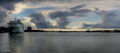
- Nomination The cruise ship "The World" at port in Aalborg, Denmark --Malene Thyssen 19:03, 20 June 2007 (UTC)
- Promotion Nice atmosphere, correct picture (I think I was once here with my ship but I may be wrong...). What is that red pixel right in the water line of the destroyer, a bomb? - Alvesgaspar 20:22, 21 June 2007 (UTC) Hmm good question, it might be a buoy? --Malene Thyssen 20:49, 21 June 2007 (UTC) - Nope, at this distance, the red wouldn't be so vivid. Looks like an artifact or a bad pixel. Alvesgaspar 22:41, 21 June 2007 (UTC)LadyofHats keeps a minute of silence for the dead pixel -LadyofHats 12:56, 22 June 2007 (UTC)
-

- Nomination Argynnis pandora on Cotton thistle (Onopordum acanthium) --LC-de 20:44, 19 June 2007 (UTC)
- Promotion clear one.-LadyofHats 12:51, 22 June 2007 (UTC)
-

- Nomination Old Bridge over the River Lahn in Limburg, Germany (build in 1341) --SBT 18:06, 19 June 2007 (UTC)
- Promotion Good composition, Its a pity that lighting was not the best --Simonizer 14:38, 20 June 2007 (UTC)
Not quite QI for me. Seems slightly overexposed, and I don't like the van on the bridge or the plant in the foreground. Personal taste I guess. Regards, Ben Aveling 10:53, 21 June 2007 (UTC)- it is overexposed, but not that much, i would actually promote it-LadyofHats 12:51, 22 June 2007 (UTC) OK. Ben Aveling 04:20, 23 June 2007 (UTC)
-

- Nomination Castel of Weilburg, Germany --SBT 18:06, 19 June 2007 (UTC)
- Decline actually the picture is a bit out of focus and has minimal jpg aberrations, yet they are not visible in full screen. i would personally decline the nomination, bt would like a secnd opinion on this one-LadyofHats 12:51, 22 June 2007 (UTC)
Agree. Not sharp enough, and composition is a bid odd on the left. Decline. Ben Aveling 04:20, 23 June 2007 (UTC)
-

- Nomination Riomaggiore in Cinque Terre --Klaus with K 15:47, 18 June 2007 (UTC)
- Promotion that is a BIG foto-LadyofHats 12:38, 22 June 2007 (UTC)
-

- Nomination Fountains Abbey in Yorkshire --Klaus with K 15:38, 18 June 2007 (UTC)
- Promotion in full size is a bit out of focus but it disapears in the full screen version so i think is good enough-LadyofHats 12:38, 22 June 2007 (UTC)
-

- Nomination National Gallery of Scotland in Edinburgh --Klaus with K 15:28, 18 June 2007 (UTC)
- Promotion nice respective excersice, the composition could improve since one has the feeling to fall down a bit, but still good enough.-LadyofHats 12:38, 22 June 2007 (UTC)
-
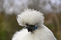
- Nomination A Silkie is a minature ornamental hen--Benjamint 09:34, 18 June 2007 (UTC)
- Decline too much empty space arround the main subject. i would promote a croped version-LadyofHats 12:38, 22 June 2007 (UTC)
-

- Nomination Light pink Iris. -- Ram-Man 16:04, 17 June 2007 (UTC)
- Decline the second flower that is in the midle and out of focus is just tooo anoying-LadyofHats 12:26, 22 June 2007 (UTC)
-

- Nomination Purple Iris. -- Ram-Man 16:04, 17 June 2007 (UTC)
- Promotion please aboid croped objects in the corners-LadyofHats 12:26, 22 June 2007 (UTC)
-

- Nomination Purple fringed white Iris.. -- Ram-Man 16:04, 17 June 2007 (UTC)
- Promotion still there is this anoyed croped flower on the top left-LadyofHats 12:26, 22 June 2007 (UTC)
-
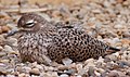
- Nomination Cape Thick-knee (Burhinus capensis). -- Ram-Man 13:09, 14 June 2007 (UTC)
- Decline even when the image is a bit noisy and the composition rather flat i think it should be promoted.. or? i am not sure in this one -LadyofHats 12:01, 22 June 2007 (UTC)
*I think it should not be promoted. Too noisy, too flat. If you disagree, please move it to CR. --Florian Prischl 22:30, 22 June 2007 (UTC)
-

- Nomination Map of the Polish-Lithuanian Commonwealth 1619 Przykuta 12:04, 21 June 2007 (UTC)
- Decline Poor lettering and colours (these should be lighter and land areas clearly distinct from wet areas and ocean). No indication of North and of geographic coordinates - Alvesgaspar 18:28, 21 June 2007 (UTC)
-
-

-
-

- Nomination Map of Pieniny Mountains on the border of Poland Przykuta 12:04, 21 June 2007 (UTC)
- Decline Please! This looks like a standard output from ArcGis. Useful information in the "map" is almost nil. No altitude information, no toponimy, no land covergae, no legend, etc... - Alvesgaspar 18:38, 21 June 2007 (UTC)
-
-
-

-

-
-

-

-

-

-

-

-
-

-
-

-

-

-
-

- Nomination Pont du Gard, France -- MJJR 20:52, 20 June 2007 (UTC)
- Promotion There is a slight ccw tilt and focus in on the soft side, but the composition and overall quality are quite good - Alvesgaspar 20:25, 21 June 2007 (UTC)
-

- Nomination The Fenestrelle Tower at Uzès, France -- MJJR 20:52, 20 June 2007 (UTC)
- Promotion Good composition and correct picture though once again sharpness is not the best. Reminds me of this picture of mine. By the way, the tree is a horse-chestnut (Aesculus hippocastanum) - Alvesgaspar 20:29, 21 June 2007 (UTC)
-

- Nomination Dandelion --Pharaoh Hound 20:12, 15 June 2007 (UTC)
- Decline colors are oversaturated, centered boring composition -LadyofHats 12:06, 22 June 2007 (UTC)
-
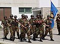
- Nomination Croatian soldiers during an oath ceremony --Orlovic (talk) 12:56, 15 June 2007 (UTC)
- Decline very bad composition, croped elements in all ends, maybe a diferent croped version would do, but still there are many objects that distract from the main subject-LadyofHats 12:06, 22 June 2007 (UTC)
-
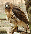
- Nomination Red-tailed Hawk (Buteo jamaicensis). -- Ram-Man 11:35, 15 June 2007 (UTC)
- Promotion nice image, even when a bit noisy-LadyofHats 12:06, 22 June 2007 (UTC)
-

- Nomination Red-tailed Hawk (Buteo jamaicensis). -- Ram-Man 11:35, 15 June 2007 (UTC)
- Decline Bad crop, tree. --Lestat 21:51, 21 June 2007 (UTC)
-

- Nomination Celandine Poppy Stylophorum diphyllum flower. -- Ram-Man 13:09, 14 June 2007 (UTC)
- Promotion nice one-LadyofHats 12:01, 22 June 2007 (UTC)
-

- Nomination Caladium bicolor. -- Ram-Man 13:07, 14 June 2007 (UTC)
- Promotion even when it is a tic out of focus the quality is wonderfull-LadyofHats 12:01, 22 June 2007 (UTC)
-

- Nomination Dried Bluebeard flowers. -- Ram-Man 12:43, 14 June 2007 (UTC)
- Promotion good quality and composition-LadyofHats 11:51, 22 June 2007 (UTC)
-

- Nomination Blue Star (Amsonia hubrichtii). Maximal DoF and sharpness. -- Ram-Man 12:34, 14 June 2007 (UTC)
- Decline very bad composition, not really centered and with many leaves croped out-LadyofHats 11:51, 22 June 2007 (UTC)
-

- Nomination Blue Phlox (Phlox divaricata) flowers. -- Ram-Man 12:34, 14 June 2007 (UTC)
- Decline many of the flowers are ou of focus-LadyofHats 11:51, 22 June 2007 (UTC)
-

- Nomination Atlas Cedar cone. -- Ram-Man 12:29, 14 June 2007 (UTC)
- Decline much of the image is out of focus, and since it is a vertical composition the only way to apreciate it is a full screen, yet in this form much of the detail is lost. i sugest a croped version.-LadyofHats 11:51, 22 June 2007 (UTC)
-

- Nomination Mountain Laurel (Kalmia latifolia) flowers. -- Ram-Man 02:29, 14 June 2007 (UTC)
- Promotion Nice image. It can be QI. --Lestat 21:54, 21 June 2007 (UTC)
-

- Nomination Yellow Coneflower (Echinacea paradoxa). -- Ram-Man 01:35, 14 June 2007 (UTC)
- Promotion nice one -LadyofHats 11:28, 22 June 2007 (UTC)
-
- Nomination Common Milkweed (Asclepias syriaca). -- Ram-Man 18:19, 12 June 2007 (UTC)
- Promotion it is a rather boring composition. straight foward and without much to offer. it does has the minimal quality but please work in the compositions-LadyofHats 11:22, 22 June 2007 (UTC)
-

- Nomination Common Milkweed (Asclepias syriaca) unopened flower head. -- Ram-Man 18:15, 12 June 2007 (UTC)
- Promotion better than the one before -LadyofHats 11:22, 22 June 2007 (UTC)
-

- Nomination Tulip Tree leaf underside. -- Ram-Man 20:21, 11 June 2007 (UTC)
- Promotion nice patern you have there-LadyofHats 11:16, 22 June 2007 (UTC)
-

- Nomination Tulip Tree leaf topside. -- Ram-Man 20:14, 11 June 2007 (UTC)
- Decline the picture is flat. its main problem is the shadow of the leave it is croped and so it breaks the centered composition. it is still a soft opposition..LadyofHats 11:16, 22 June 2007 (UTC)
-

- Nomination Butterfly Weed (Asclepias tuberosa) flower buds. -- Ram-Man 19:10, 11 June 2007 (UTC)
- Decline Its very noisy --Makro Freak 19:39, 11 June 2007 (UTC)-too much of the image is out of focus -LadyofHats 11:12, 22 June 2007 (UTC)
-

- Nomination Battle of the Little Big Horn Przykuta 12:04, 21 June 2007 (UTC)
- Promotion it is svg-LadyofHats
-
- Nomination Aporia crataegi --MichaD | Michael Apel 19:36, 19 June 2007 (UTC)
- Promotion Great! --Simonizer 14:36, 20 June 2007 (UTC)
-

- Nomination fruiting Cotton-grass (Eriophorum vaginatum) --LC-de 05:48, 19 June 2007 (UTC)
- Promotion Very nice. --norro 09:08, 21 June 2007 (UTC)
-
-
-

-

- Nomination Japanese astronaut in the ISS. João Felipe C.S 18:15, 18 June 2007 (UTC)
- Decline Not uploaded by the copyright holder (NASA) and therefore ineligible --Pharaoh Hound 19:47, 18 June 2007 (UTC)
There is no copyright holder: it's public domain. -- Ram-Man 19:51, 18 June 2007 (UTC)
It's a technicality. It's OK for us to have the image, but to be a QIC, it must have been created by a 'commoner'. The purpose of QI is not actually recognition of Quality Images, it's to encourage the creation of Quality Images. Giving recognition to Quality Images is just the means to that end. Regards, Ben Aveling 10:41, 19 June 2007 (UTC)
-

- Nomination The International Space Station. João Felipe C.S 18:15, 18 June 2007 (UTC)
- Decline Not uploaded by the copyright holder (NASA) and therefore ineligible --Pharaoh Hound 19:47, 18 June 2007 (UTC)
-

- Nomination Rio do Rastro Mountain Range, in Santa Catarina, Brazil. João Felipe C.S 18:15, 18 June 2007 (UTC)
- Decline Underexposed, tilted --LC-de 05:51, 19 June 2007 (UTC)
-

- Nomination A black swan Cygnus atratus--Benjamint 09:34, 18 June 2007 (UTC)
- Promotion Good detail, overall good image quality. --Pharaoh Hound 19:47, 18 June 2007 (UTC)
-

- Nomination Beautiful (and unknown) species of hoverfly on a flower of wild carrot (Daucus carota). Any help with the ID? - Alvesgaspar 23:56, 17 June 2007 (UTC)
- Decline Not quite sharp, some distracitng white blobs (presumably more flower heads) in the background. Species ID would really help. --Pharaoh Hound 19:47, 18 June 2007 (UTC)
-

- Nomination Olympus_C-750 self portrait --Tony Wills 04:04, 16 June 2007 (UTC)
- Promotion Sharp, well illuminated. QI! --LC-de 06:05, 19 June 2007 (UTC)
-

- Nomination Japanese Stewartia (Stewartia pseudocamellia) leaves. -- Ram-Man 18:15, 12 June 2007 (UTC)
- Promotion Good composition, DoF and Illumation, QI. --LC-de 06:02, 19 June 2007 (UTC)
-

- Nomination Japanese Stewartia (Stewartia pseudocamellia) leaves closeup. -- Ram-Man 18:15, 12 June 2007 (UTC)
- Decline You cropped a leave of the second sprout and another one at the bottom of the image. This is a little bit distracting. You solved the problem better in the other image. --LC-de 05:59, 19 June 2007 (UTC)
-

- Nomination Columbine hybrid (Aquilegia). -- Ram-Man 17:22, 17 June 2007 (UTC)
- Promotion Beautiful. Composition is clearly improving - Alvesgaspar 08:51, 18 June 2007 (UTC)
-

- Nomination Blue Iris. -- Ram-Man 16:04, 17 June 2007 (UTC)
- Decline Cluttered composition - Alvesgaspar 08:49, 18 June 2007 (UTC)
-

- Nomination Pair of purple fringed white Irises. -- Ram-Man 16:04, 17 June 2007 (UTC)
- Promotion Beautiful composition and quality. For me this one is the best despite the foreground at the lower right side. Alvesgaspar 08:49, 18 June 2007 (UTC)
-

-

- Nomination Siberian Iris (Iris siberica). -- Ram-Man 20:56, 14 June 2007 (UTC)
- Promotion high quality picture --Simonizer 08:29, 18 June 2007 (UTC)
-

- Nomination QEII and Sydney Harbour Bridge Gnangarra 01:45, 16 June 2007 (UTC)
- Decline No, sorry. Too noisy, not sharp. Nice composition of the bridge and boat. Regards, Ben Aveling 01:55, 16 June 2007 (UTC)
-

-
- Nomination Monarch Butterfly (Danaus plexippus) feeding. -- Ram-Man 17:54, 13 June 2007 (UTC)
- Promotion Excellent quality and good composition, QI for sure (though I would like to see a little more of "green" in those leaves...) - Alvesgaspar 19:24, 13 June 2007 (UTC)
-

- Nomination Bee, My Argument: Makrofreak style --Makro Freak 16:21, 11 June 2007 (UTC)
- Promotion It's borderline, but I think it's good enough. -- Ram-Man 14:48, 15 June 2007 (UTC)
-
- Nomination Fly, My Argument: Nice detail --Makro Freak 16:21, 11 June 2007 (UTC)
- Promotion While the subject is a little small, I think it is still good enough for QI. I like the wings. --Florian Prischl 21:28, 14 June 2007 (UTC)
-

- Nomination Wasp, My Argument: Nice composition --Makro Freak 16:21, 11 June 2007 (UTC)
- Promotion Nice and sharp. -- Ram-Man 01:38, 14 June 2007 (UTC)
-
- Nomination Wasp, My Argument: Nice composition --Makro Freak 16:21, 11 June 2007 (UTC)
- Promotion Nice and sharp. -- Ram-Man 01:38, 14 June 2007 (UTC)
-

- Nomination Carpenter Ant, My Argument: Nice detail --Makro Freak 16:21, 11 June 2007 (UTC)
- Promotion Nice and sharp. -- Ram-Man 01:38, 14 June 2007 (UTC)
-

- Nomination Carpenter Ant, My Argument: Nice detail --Makro Freak 16:21, 11 June 2007 (UTC)
- Promotion Nice and sharp. -- Ram-Man 01:38, 14 June 2007 (UTC)
-

- Nomination Abbey Königsfelden in Switzerland --Brian67 15:30, 14 June 2007 (UTC)
- Decline Low quality: Poor fine details in the roof shingles. For an 8MP image, the quality is really low, probably due to camera quality. It doesn't look good, even downsampled to 1600x1200 and with an unsharp mask applied. -- Ram-Man 15:04, 15 June 2007 (UTC)
-

-

-

- Nomination Cloudless Surfer Butterfly (Phoebis sennae) --Scrumshus 23:55, 13 June 2007 (UTC)
- Decline Sorry, but quality is not good enough when seen in full resolution. The image is blurry and the whites are blown. Also, the image should be categorized. - Alvesgaspar 08:14, 14 June 2007 (UTC)
-

- Nomination Monarch Butterfly (Danaus plexippus) by Simonizer. The butterfly is sharp, that's what's important. -- Ram-Man 17:54, 13 June 2007 (UTC)
- Decline Sorry, but I don't agree. A high quality image of a butterfly on a blurry red flower is not enough for QI... Alvesgaspar 08:17, 14 June 2007 (UTC)
-

- Nomination Japanese Larch (Larix kaempferi) cone and twigs. -- Ram-Man 13:59, 13 June 2007 (UTC)
- Decline Poor composition and distracting background, it's hard to decide what is the main subject in this image - Alvesgaspar 19:26, 13 June 2007 (UTC)
-

- Nomination Freudenberg near St.Gallen, Switzerland -- grendel|khan 20:05, 12 June 2007 (UTC)
- Decline I voted pro for the promotion of this image to FP, despite the obvious technical flaws. If an example is needed of a non-QI FP here it is. I hope someone will contest this review and moves this nomination to CR so we can continue the discussion... - Alvesgaspar 19:32, 13 June 2007 (UTC)
-

- Nomination Sanctuary in the National Cathedral in Washington -- grendel|khan 19:56, 12 June 2007 (UTC)
- Decline I said it before: amazing subject and wonderful picture. But an image with so obvious stitching errors should't be considered as an example of technical quality - Alvesgaspar 19:28, 13 June 2007 (UTC)
-

- Nomination Image of Medusa worms Synaptula lamberti feeding on soft corals. Member of the order Holothuroidea, sea cucumbers. --Jnpet 01:51, 12 June 2007 (UTC)
- Decline Not sharp enough: most of the elements are blurry and the worms are not that sharp either. The lighting isn't the best either. -- Ram-Man 14:48, 15 June 2007 (UTC)
-

-

- Nomination Bee, My Argument: Makrofreak style --Makro Freak 16:21, 11 June 2007 (UTC)
- Decline DoF is too shallow. This image has the detail that I desire. -- Ram-Man 14:48, 15 June 2007 (UTC)
-

- Nomination Bee, My Argument: Makrofreak style --Makro Freak 16:21, 11 June 2007 (UTC)
- Decline Focus is off (on the wings instead of elsewhere) and the DoF too shallow for this type of shot. Backing up would include more of the bee and increase the DoF. -- Ram-Man 14:48, 15 June 2007 (UTC)
-

- Nomination Korean Rhododendron. -- Ram-Man 15:13, 11 June 2007 (UTC)
- Decline The flowers that are in focus (and that just barely, it seems) are too small overall. --Florian Prischl 21:06, 14 June 2007 (UTC)
-

- Nomination Bee, My Argument: Makrofreak style --Makro Freak 16:21, 11 June 2007 (UTC)
- Promotion Good quality and composition. Water droplet makes it a possible FP candidate. -- Ram-Man 12:12, 13 June 2007 (UTC)
-

- Nomination Fly, My Argument: Top macro!!! --Makro Freak 16:21, 11 June 2007 (UTC)
- Promotion
 SupportSurely it is a top macro and nice photograph, but the title and description is irrelevant. Maybe you should change to "Calliphora vicina's head" Hariadhi 18:30, 12 June 2007 (UTC)
-

- Nomination Bumblebee, My Argument: Nice colors --Makro Freak 16:21, 11 June 2007 (UTC)
- WARNING: third template parameter added – please remove.
-

- Nomination Windmill near Kottmarsdorf, Germany --LC-de 19:19, 11 June 2007 (UTC)
- Promotion Nicely captured --Makro Freak 19:39, 11 June 2007 (UTC)
-

- Nomination Corn poppy (Papaver rhoeas) --LC-de 18:54, 11 June 2007 (UTC)
- Promotion Great detail --Makro Freak 19:39, 11 June 2007 (UTC)
-

- Nomination Bee, My Argument: Makrofreak style --Makro Freak 16:21, 11 June 2007 (UTC)
- Promotion Sharp. Good DoF usage. -- Ram-Man 19:19, 11 June 2007 (UTC)
-

- Nomination Bee, My Argument: Makrofreak style --Makro Freak 16:21, 11 June 2007 (UTC)
- Promotion Good DoF usage and clear composition. -- Ram-Man 19:19, 11 June 2007 (UTC)
-

- Nomination Bee, My Argument: Makrofreak style --Makro Freak 16:21, 11 June 2007 (UTC)
- Promotion Beautiful composition, good detail (...and DoF ;)) I like this pic. --LC-de 19:28, 11 June 2007 (UTC)
-

- Nomination Bee, My Argument: Makrofreak style --Makro Freak 16:21, 11 June 2007 (UTC)
- Promotion Correct DoF usage, nice closeup, nice composition. -- Ram-Man 19:31, 11 June 2007 (UTC)
-
- Nomination Male Monarch Butterfly. -- Ram-Man 15:19, 11 June 2007 (UTC)
- Promotion The head is OoF --Makro Freak 19:39, 11 June 2007 (UTC)
-

-
- Nomination False blister beetle (Oedemera lurida) on a chamomile flower -Alvesgaspar 06:40, 11 June 2007 (UTC)
- Promotion Great detail, background is a little bit distracting --Makro Freak 19:39, 11 June 2007 (UTC)
-

-

- Nomination Bee, My Argument: Makrofreak style --Makro Freak 16:21, 11 June 2007 (UTC)
- Decline A difficult evaluation. The focus is technically wrong: sharp on two different edges, blurry in the middle. The eye doesn't know where to look. Focus should be a little closer I think. -- Ram-Man 12:12, 13 June 2007 (UTC)
-

- Nomination Bee, My Argument: Makrofreak style --Makro Freak 16:21, 11 June 2007 (UTC)
- Decline Composition: cluttered with blurry second bee and the main bee is cut-off. There are better pictures of the sharp elements in this picture. -- Ram-Man 12:12, 13 June 2007 (UTC)
-

- Nomination Adult Yellow-legged Gull (Larus michahellis) --LC-de 19:23, 10 June 2007 (UTC)
- Promotion QI ! -- Benh 21:13, 10 June 2007 (UTC)
-

- Nomination Twin flowers of yellow hawkweed - Alvesgaspar 18:26, 10 June 2007 (UTC)
- Promotion Good colors and sharpness. Very classic centered composition - but why should that be wrong?! -- MJJR 18:44, 10 June 2007 (UTC)
-

- Nomination Twin flowers of Gazania rigens - Alvesgaspar 18:26, 10 June 2007 (UTC)
- Promotion Right flower out of focus, therefore only just promoted. --Florian Prischl 22:28, 10 June 2007 (UTC)
-

- Nomination Flower and leaves of Lantana camara - Alvesgaspar 18:26, 10 June 2007 (UTC)
- Promotion I supported the candidature for FP on english wikipedia, and I think it's at least QI :) Benh 21:11, 10 June 2007 (UTC)
-

- Nomination Mayapple (Podophyllum peltatum) leaves. -- Ram-Man 02:38, 10 June 2007 (UTC)
- Promotion Sharpness, colors, light, composition: everything is excellent. So, it's certainly a QI. And it has encyclopedic relevance too. -- MJJR 18:36, 10 June 2007 (UTC)
-

- Nomination Rice terraces on the island of Bali --Jnpet 08:25, 12 June 2007 (UTC)
- Decline I like the subject matter, though I'm unsure about the composition. It isn't really about either the trees or the terraces. Has it been downsampled? Or cropped? For whatever reason, it's smaller than it should be. Lastly, it's not quite sharp. Sorry, Ben Aveling 11:38, 12 June 2007 (UTC)
-

- Nomination A white flower in a creek. --Scrumshus 20:08, 11 June 2007 (UTC)
- Decline I really like this one, both it and the one it's cropped from. I'd love to recommend it for promotion. I've actually spotted the original before and thought long and hard about nominating it. But it, and this crop, are just too noisy. What ISO did you use? Could you have used a lower ISO and a longer exposure? Better luck next time. Ben Aveling 11:45, 12 June 2007 (UTC)
-

- Nomination Bee, My Argument: Makrofreak style --Makro Freak 16:21, 11 June 2007 (UTC)
- Decline Nice form, but unsharp. -- Ram-Man 19:19, 11 June 2007 (UTC)
-

- Nomination Bee, My Argument: Makrofreak style --Makro Freak 16:21, 11 June 2007 (UTC)
- Decline Shallow DoF and an unclear composition. -- Ram-Man 19:22, 11 June 2007 (UTC)
-

- Nomination Bee, My Argument: Makrofreak style --Makro Freak 16:21, 11 June 2007 (UTC)
- Decline Shallow DoF coupled with visible noise kills the detail in the eye. -- Ram-Man 19:29, 11 June 2007 (UTC)
-

- Nomination Bee, My Argument: Makrofreak style --Makro Freak 16:21, 11 June 2007 (UTC)
- Decline The focus is in the wrong location. It should be on the back part of the bee. -- Ram-Man 19:29, 11 June 2007 (UTC)
-

- Nomination Bee, My Argument: Makrofreak style --Makro Freak 16:21, 11 June 2007 (UTC)
- Decline Too shallow DoF for the subject matter. The other version is much better without a blurry bee. -- Ram-Man 19:31, 11 June 2007 (UTC)
-

- Nomination Watermelon leaf. -- Ram-Man 02:40, 10 June 2007 (UTC)
- Decline Nice quality but poor composition and framing, affecting not only the aesthetics of the image but also its illustrative value. Alvesgaspar 21:44, 10 June 2007 (UTC)
Illustrative value is leaf form and detail. Context would be a different picture. -- Ram-Man 03:20, 11 June 2007 (UTC)
-

- Nomination El Gouna (Red Sea, Egypt) -- MJJR 15:00, 9 June 2007 (UTC)
- Decline Geometrical composition confusing (lines do not match up), background dissapointing. --Florian Prischl 22:25, 10 June 2007 (UTC)
-

- Nomination Doñana National Park (Andalusia, Spain) -- MJJR 15:00, 9 June 2007 (UTC)
- Decline Quality seems good enough, although colours are a bit washed out. But composition is weak due to excessive symmetry. Because this is somehow subjective, I vote neutral. - Alvesgaspar 21:49, 10 June 2007 (UTC)
* Colours washed out (should be better with more sun or a pol-filter), foreground not distinctive, which makes the composition very flat and unresting. --Florian Prischl 22:25, 10 June 2007 (UTC)
-

- Nomination Stained glass window in the Church Kilianskirche of Heilbronn --Joachim Köhler 16:21, 7 June 2007 (UTC)
- Decline Slightly blown highlights but midtone range ok. --Klaus with K 12:11, 9 June 2007 (UTC)
* Additionally to the blown highlights, it seems to be a little out of focus. Therefore declined. --Florian Prischl 22:21, 10 June 2007 (UTC)
-
- Nomination Effigy of Sibelius, part of the en:Sibelius monument. Ben Aveling 02:33, 9 June 2007 (UTC)
- Decline Part of the monument is badly cropped at left, and overall composition also doesn't strike me. Pko 21:29, 9 June 2007 (UTC)
-

-

-

-

- Nomination Trunk and leaves of a horse-chestnut (Aesculus hippocastanum) - Alvesgaspar 22:43, 6 June 2007 (UTC)
- Promotion Meets basic QI requirements. The lack of wow factor does not apply here. -- Ram-Man 17:07, 8 June 2007 (UTC)
-

-
- Nomination Bridge in southern Sweden. -- Klaus with K 15:39, 7 June 2007 (UTC)
- Promotion No obvious stitching problems. Quality is a little low at 100%, but when downsampled it looks good enough. -- Ram-Man 00:11, 8 June 2007 (UTC)
-

- Nomination While it lacks the wow for FP and I do spot one tiny sign of wear, I nevertheless think it is a well-done photo. --Klaus with K 09:26, 7 June 2007 (UTC)
- Promotion Sufficient quality; lightning and shadow works well. –Dilaudid 21:20, 7 June 2007 (UTC)
-

- Nomination Stadtbahn tram-train in winter sunshine. --Klaus with K 18:50, 6 June 2007 (UTC)
- Promotion Looks good and sharp at 2MP. -- Ram-Man 12:13, 7 June 2007 (UTC)
-

-

- Nomination Mountain Laurel (Kalmia latifolia). -- Ram-Man 21:16, 31 May 2007 (UTC)
- Promotion Not too impressive at thumbnail size but has good composition and nice focus! –Dilaudid 08:20, 8 June 2007 (UTC)
-

-

- Nomination Weather wasn't with me, but I think it may get a QI status. -- Benh 21:16, 6 June 2007 (UTC)
- Promotion Yes, it may. Good composition and nice atmosphere though ligthing is not the best. Alvesgaspar 11:02, 7 June 2007 (UTC)
-
-

-

-

- Nomination Siberian Iris flower. -- Ram-Man 04:34, 6 June 2007 (UTC)
- Promotion It's really a shame that this flower isn't straight up, it would be easily featured - Alvesgaspar 21:44, 6 June 2007 (UTC)
-
- Nomination Leaves and flowers of a Grevillea robusta tree - Alvesgaspar 23:38, 3 June 2007 (UTC)
- Decline Overexposed elements caused by less than ideal lighting, and the noise threshold is right at the threshold of critical detail. The resolution is too low for so much detail and it makes the image look unsharp. A difficult nom to evaluate. -- Ram-Man 12:02, 7 June 2007 (UTC)
-

- Nomination White Trillium (Trillium grandiflorum) flower. -- Ram-Man 15:19, 2 June 2007 (UTC)
- Promotion Some parts of the flower seem slightly overexposed, but the rest makes up for it. --Florian Prischl 22:25, 6 June 2007 (UTC)
-

-

- Nomination Korean Rhododentron flowers. -- Ram-Man 13:07, 5 June 2007 (UTC)
- Promotion BG distracts from the flowers that are in focus, which are also partially overexposed. --Florian Prischl 09:36, 6 June 2007 (UTC)
-

-

- Nomination Sweetbay Magnolia (Magnolia virginiana) leaves. -- Ram-Man 16:08, 2 June 2007 (UTC)
- Promotion Sharp, good quality picture. But I would have tried a higher DOF - Alvesgaspar 08:40, 6 June 2007 (UTC)
-

- Nomination Purple Phacelia (Phacelia bipinnatifida) flowers. -- Ram-Man 16:08, 2 June 2007 (UTC)
- Promotion At full resolution, the DoF seems to be somewhat problematic. Nevertheless, it's a very nice picture with good colors and encyclopedic value. And I like the compostion. -- MJJR 19:41, 5 June 2007 (UTC)
-

- Nomination Another false blister beetle (Anogcodes fulvicollis) on a chrisanthemum - Alvesgaspar 14:28, 2 June 2007 (UTC)
- Promotion The beetle is sharp and I like the colors. -- Ram-Man 13:19, 5 June 2007 (UTC)
-

-

-

-

-

- Nomination Portrait of a 8 years old girl - Alvesgaspar 09:30, 1 June 2007 (UTC)
- Promotion Superb portrait, definitely QI --Tony Wills 11:51, 5 June 2007 (UTC)
-

-

-

- Nomination Woman deep in contemplation at the Menin Gate memorial. --Ben Aveling 11:45, 6 June 2007 (UTC)
- Decline I think there are too many overexposed parts. Benh 11:54, 6 June 2007 (UTC)
-

- Nomination Karelian Bear Dog (nice photo of a fairly rare breed) --Pharaoh Hound 21:46, 5 June 2007 (UTC)
- Decline Muzzle and face in focus, but everything else not. Is that deliberate?, I would have expected a static 'illustration of the breed' type photo to have the whole dog in focus. --Tony Wills 07:39, 6 June 2007 (UTC)
-

- Nomination Alpine Dachsbracke --Pharaoh Hound 21:46, 5 June 2007 (UTC)
- Decline Too much shake/blur. --Florian Prischl 09:36, 6 June 2007 (UTC)
-

- Nomination Locomotive front detail --Orlovic (talk) 20:41, 5 June 2007 (UTC)
- Decline Strange angle, too much shown for a "detail", too little for a full shot. --Florian Prischl 09:36, 6 June 2007 (UTC)
-

- Nomination Solitary bee of Halictidae family covered with white pollen - Alvesgaspar 23:53, 3 June 2007 (UTC)
- Decline It's close, but the focus is off of the bee and the composition is slightly weak. -- Ram-Man 04:38, 6 June 2007 (UTC)
-

- Nomination False blister beetle (Oedemera femorata) feeding on a hawkweed flower - Alvesgaspar 14:23, 2 June 2007 (UTC)
- Decline Overall unsharpness. -- Ram-Man 13:19, 5 June 2007 (UTC)
-

- Nomination Icelandic cyprine (Arctica islandica) -- Lycaon 07:17, 2 June 2007 (UTC)
- Decline A neutral grey background may have been better. Harsh reflection on right shell. Difficult to make out the detail. Is this an old dried out shell? --Tony Wills 12:28, 5 June 2007 (UTC)
-

-

- Nomination Different approach to your standard "Zoo shot" Gnangarra 13:34, 3 June 2007 (UTC)
- Decline A nice idea, but the focus has landed on the bamboo rather than the monkeys. The keepers are pretty much in focus, but there the angle was against you. The front keeper has her back to us, and she's blocking the view of the other keeper. Bugger. Ben Aveling 10:27, 5 June 2007 (UTC)
-

- Nomination Some marmelade, photograph by Malene Thyssen. --norro 19:29, 2 June 2007 (UTC)
- Decline There is something wrong with this picture. The background looks unnatural and quality is poor (note the edges of the orange) - Alvesgaspar 09:12, 4 June 2007 (UTC) Comment: The background is real, but i agree the quality is poor, and the white balance is somehow wrong. The photo was "painted with light" --Malene Thyssen 18:10, 4 June 2007 (UTC)
-

- Nomination Portrait of a 8 years old girl - Alvesgaspar 09:30, 1 June 2007 (UTC)
- Decline Great subject & lighting, but the flat top of the head and bits of background showing through her hair, where you couldn't edit them out, let it down --Tony Wills 11:41, 5 June 2007 (UTC)
-

-

-

- Nomination Mature Gymnopilus junonius, yes over exposed background, but you want to see the mushroom, right ? :-)
Right, and the mushroom has a nice detail and quality. Alvesgaspar 12:05, 3 June 2007 (UTC)--Tony Wills 10:26, 3 June 2007 (UTC) - Promotion
- Nomination Mature Gymnopilus junonius, yes over exposed background, but you want to see the mushroom, right ? :-)
-
- Nomination Gymnopilus junonius (not edible) --Tony Wills 10:18, 3 June 2007 (UTC)
- Promotion Wow, obesity also occurs in the vegetal world! Say again in which planet this was taken. Alvesgaspar 12:05, 3 June 2007 (UTC)
-

- Nomination British Columbia Parliament Buildings --HighInBC 13:42, 2 June 2007 (UTC)
- Decline Unnatural gradient in the blue sky (but image could be used to point out this HDR side effect).
-
- Nomination Backward glance --Tony Wills 11:56, 2 June 2007 (UTC)
- Decline Blurry, badly compressed, some chromatic aberration around the tail. --Pharaoh Hound 13:04, 2 June 2007 (UTC)
-

- Nomination Papio or Baboon
My Argument: Nice scene --Makro Freak 13:45, 31 May 2007 (UTC) - Promotion A little noisy, but excellent all around. -- Ram-Man 16:01, 2 June 2007 (UTC)
- Nomination Papio or Baboon
-
-

-
- Nomination Vernal crab (Liocarcinus vernalis) -- Lycaon 07:17, 2 June 2007 (UTC)
- Promotion Very nice quality and detail. I now understand why the first point of Aries, in the eclyptic, is also called the vernal point... Alvesgaspar 11:13, 2 June 2007 (UTC)
-

-

- Nomination Oyster catcher --Tony Wills 13:00, 1 June 2007 (UTC)
- Decline I was going to promote this one for the nice theme, composition and colours. But then I opened the full resolution version and realized the poor quality. By the way, those are mussels, not oysters... Alvesgaspar 11:09, 2 June 2007 (UTC)
-

- Nomination Single dried flower of Bigleaf Hydrangea (Hydrangea macrophylla). -- Ram-Man 12:36, 1 June 2007 (UTC)
- Promotion Not a FP but clearly a QI - Alvesgaspar 11:05, 2 June 2007 (UTC)
-

- Nomination Male African Lion (Panthera leo) in the snow. -- Ram-Man 12:33, 1 June 2007 (UTC)
- Promotion Good subject, composition and quality - Alvesgaspar 11:03, 2 June 2007 (UTC)
-

-
-

-

-

-

-

-

- Nomination Formica rufa front. My Argument: Nice to watch, psychedelic colors ;)--Makro Freak 13:59, 29 May 2007 (UTC)
- Promotion Great shot! Cacophony 07:39, 31 May 2007 (UTC)
-

- Nomination Taraxacum sp. dandelion clock. My Argument: Different aspect, visualizing the unseen ;)--Makro Freak 13:59, 29 May 2007 (UTC)
- Promotion Extremely nice composition and sharpness. Wonderful. -- Ram-Man 13:39, 30 May 2007 (UTC)
-

- Nomination Formica. My Argument: Encyclopedic, magnification and sharpness --Makro Freak 13:59, 29 May 2007 (UTC)
- Promotion Very sharp. Great DoF at this magnification. -- Ram-Man 13:08, 30 May 2007 (UTC)
-

- Nomination Wild Boar piglet, petting. My Argument: Very cute, nice moment and good details. --Makro Freak 13:59, 29 May 2007 (UTC)
- Decline Overexposed highlights. -- Ram-Man 12:49, 30 May 2007 (UTC)
-
- Nomination Wild Boar piglet Portrait. My Argument: Very cute, nice mood and good details. --Makro Freak 13:59, 29 May 2007 (UTC)
- Decline Visible noise at a too low resolution. -- Ram-Man 12:49, 30 May 2007 (UTC)
-
- Nomination Wild Boar piglet is rubbing on a tree. My Argument: Very cute, sharp and nice details. --Makro Freak 13:59, 29 May 2007 (UTC)
- Decline Resolution is too low. Lighting is on the harsh side. -- Ram-Man 12:49, 30 May 2007 (UTC)
-

- Nomination Wild Boar. My Argument: Very encyclopedic, sharp and nice details. --Makro Freak 13:59, 29 May 2007 (UTC)
- Promotion Easily meets QI requirements. -- Ram-Man 12:49, 30 May 2007 (UTC)
-

- Nomination Formica rufa. My Argument: Very encyclopedic and nice colors --Makro Freak 13:59, 29 May 2007 (UTC)
- Promotion Also very sharp. -- Ram-Man 12:49, 30 May 2007 (UTC)
-

- Nomination Ensifera adult. My Argument: Magnification of 4x --Makro Freak 13:59, 29 May 2007 (UTC)
- Promotion Very excellent. -- Ram-Man 13:08, 30 May 2007 (UTC)
-
- Nomination Ensifera larvae. My Argument: Composition and Colors --Makro Freak 13:59, 29 May 2007 (UTC)
- Decline Flash hotspot or overexposure on the bug. Filename is a little too short too. -- Ram-Man 12:42, 30 May 2007 (UTC). I don't think there is any QI requirement regarding filenames! --Tony Wills 08:30, 31 May 2007 (UTC)
Didn't oppose for that reason, just a note. -- Ram-Man 12:04, 31 May 2007 (UTC)
-

- Nomination Formica, Panorama Sideview. My Argument: Detail and Size --Makro Freak 13:59, 29 May 2007 (UTC)
- Decline It has quite a bit more overexposed elements than this image. -- Ram-Man 13:10, 30 May 2007 (UTC)
-
- Nomination Thricops semicinereus on Ranunculus acris. My Argument: Colors and Dynamic --Makro Freak 13:59, 29 May 2007 (UTC)
- Promotion Sharp and beautiful. -- Ram-Man 12:42, 30 May 2007 (UTC)
-

-

-

-

-

- Nomination Same cobweb, different view. --Adamantios 19:08, 28 May 2007 (UTC)
- Decline Neutral, leaning to support. I like the colors and the composition. But the spiderweb doesn't quite stand out enough, unless you zoom in, at which point you see the spider isn't quite sharp. Ben Aveling 21:47, 28 May 2007 (UTC)
Spiderweb isn't clear and it's not sharp if you zoom in. Send this to CR if Ben changes to support. -- Ram-Man 12:29, 30 May 2007 (UTC) No, it's close, but it just falls short. Ben Aveling 11:38, 31 May 2007 (UTC)
-
-

-

- Nomination English Bulldog (not my photo) --Pharaoh Hound 12:16, 27 May 2007 (UTC)
- Promotion Good detail. Sharp. -- Ram-Man 12:26, 30 May 2007 (UTC)
-
- Nomination Hairy Alumroot (Heuchera villosa). -- Ram-Man 12:23, 25 May 2007 (UTC)
- Decline Decent quality, but why is the DOF so low on a subject as flat as a leaf? --Dschwen 08:26, 27 May 2007 (UTC)
No good reason. I just assumed it had to be enough DoF because the leaf was flat, but I was not perpendicular to the leaf. Oh well. -- Ram-Man 20:34, 30 May 2007 (UTC)
-

-
-

- Nomination Red Buckeye (Aesculus pavia). -- Ram-Man 21:16, 31 May 2007 (UTC)
- Promotion A bit unsharp on part of one leaf, but the rest of the picture is sharp enough for QI. Barcex 07:13, 1 June 2007 (UTC)
-

-

-

- Nomination Nick Holmes from Paradise Lost during Metalmania 2007 festival by Lilly M --Przykuta 20:30, 31 May 2007 (UTC)
- Decline very noisy -- Lycaon 21:15, 31 May 2007 (UTC)
-

-

- Nomination Stadhuis van Antwerpen (City Hall of Antwerp) --Klaus with K 13:55, 31 May 2007 (UTC)
- Promotion Looks good to me. Perspective is ok, colours are nice and the image is well balanced. Lycaon 14:45, 31 May 2007 (UTC)
-

-

-

- Nomination USB to PS/2 mouse adapter. Barcex 22:30, 30 May 2007 (UTC)
- Promotion Photo sharp, good work in making the white background.--Klaus with K 21:01, 31 May 2007 (UTC)
-
-

- Nomination Unknown grasshopper. My Argument: Fantastic scene --Makro Freak 13:59, 29 May 2007 (UTC)
- Decline Unsharp. Lesser Objection: Obscured subject. -- Ram-Man 12:19, 31 May 2007 (UTC)
-

- Nomination Formica rufa a la carte. My Argument: Delicious colors, yummie! --Makro Freak 13:59, 29 May 2007 (UTC)
- Decline Very low resolution. Very little resolution dedicated to the ant. -- Ram-Man 12:21, 31 May 2007 (UTC)
-

- Nomination Rana temporaria. My Argument: Because i like it, a brave frog --Makro Freak 13:59, 29 May 2007 (UTC)
- Promotion Good use of DoF. -- Ram-Man 12:19, 31 May 2007 (UTC)
-

- Nomination A strange sailing boat. My Argument: Freaky scene --Makro Freak 13:59, 29 May 2007 (UTC)
- Decline Low resolution and quality. -- Ram-Man 12:19, 31 May 2007 (UTC)
-
- Nomination Munich Airport. My Argument: Unique scene, fantastic colors, realism --Makro Freak 13:59, 29 May 2007 (UTC)
- Promotion Meets the basic requirements for a QI. -- Ram-Man 12:19, 31 May 2007 (UTC)
-

- Nomination The Alps via plane. My Argument: Nice colors, perfect time --Makro Freak 13:59, 29 May 2007 (UTC)
- Decline Remove the numerous dust spots and this will be a QI. -- Ram-Man 12:19, 31 May 2007 (UTC)
-
-

- Nomination Formica. My Argument: Magnification and colors and its a FP --Makro Freak 13:59, 29 May 2007 (UTC)
- Promotion The sharpness makes this an exceptional quality image. -- Ram-Man 00:56, 30 May 2007 (UTC)
-

- Nomination Syrphus torvus or hoverfly . My Argument: Its a FP allready --Makro Freak 13:59, 29 May 2007 (UTC)
- Promotion Beautiful. -- Ram-Man 00:56, 30 May 2007 (UTC)
-

- Nomination Phyllobius calcaratus. My Argument: Its a FP allready --Makro Freak 13:59, 29 May 2007 (UTC)
- Promotion Wonderful quality. -- Ram-Man 00:56, 30 May 2007 (UTC)
-

- Nomination Pristella maxillaris. My Argument: Very encyclopedic, sharp and nice details. Its hard to do do sharp aquarium shots, because of the refraction of the glass... --Makro Freak 13:59, 29 May 2007 (UTC)
- Promotion ... and this one is good. Focus on the head is near perfect. Lycaon 11:33, 30 May 2007 (UTC)
-

- Nomination Tyne Cot War Cemetry "Cross of Sacrifice" --Ben Aveling 12:35, 29 May 2007 (UTC)
- Decline Tilted, bad lightning --Orlovic (talk) 14:53, 29 May 2007 (UTC)
-

- Nomination Leaves of a weeping willow (Salix babylonica) - Alvesgaspar 18:12, 26 May 2007 (UTC)
- Decline I don't like the high contrast, which desaturates the colors. -- Ram-Man 00:59, 30 May 2007 (UTC)
-
- Nomination Pont de l'Eveche, Namur, Belgium --Ben Aveling 04:27, 26 May 2007 (UTC)
- Decline The reflections are nice, but the sky is overexposed and the image is slightly unsharp. -- Ram-Man 00:59, 30 May 2007 (UTC)
-

- Nomination Sizes of various Secure Digital cards. victorrocha 14:02, 28 May 2007 (UTC)
- Decline Font size of the text is too small, the half right part of the picture is empty. You could also replace the physicar ruler with drawed one, and replace the background with white colour. IMHO Barcex 09:00, 29 May 2007 (UTC)
-

- Nomination Leatherhead Turtle preparing to lay. Ben Aveling 21:47, 28 May 2007 (UTC)
- Promotion Very much QI -- Lycaon 22:10, 28 May 2007 (UTC)
-
- Nomination Cobweb. --Adamantios 19:08, 28 May 2007 (UTC)
- Decline Would be better if spider were sharp. Don't like the composition. Ben Aveling 21:47, 28 May 2007 (UTC)
-

- Nomination European brown bear (Ursus arctos arctos) --Malene Thyssen 21:31, 28 May 2007 (UTC)
- Promotion Love it. DOF/focus not perfect bu t good, nicely composed, good subject. Possible FP in here. Ben Aveling 21:47, 28 May 2007 (UTC)
-

-

- Nomination My first flower photo --Orlovic (talk) 11:51, 27 May 2007 (UTC)
- Decline Nice try but I'm afraid it isn't good enough. Most part of the flower, including the center, is unfocused. - Alvesgaspar 12:13, 27 May 2007 (UTC)
-
- Nomination Goeldi's Marmoset (Callimico goeldii) --Malene Thyssen 14:45, 27 May 2007 (UTC)
- Decline Unfortunate composition with a distracting foreground, too dark - Alvesgaspar 15:32, 27 May 2007 (UTC)

_crop.jpg)


_a_Kwakwaka%27wakw_big_house.jpg)
.jpg)


.JPG)


_04.jpg)


.JPG)


.jpg)


.jpg)


.JPG)


.jpg)


_running.jpg)

.jpg)
.jpg)
Consensual Review edit
Halo in cirrostratus edit

- Nomination Halo in cirrocumulus near the city of Łódź, Poland --Przykuta 12:04, 21 June 2007 (UTC)
- Promotion
- does it really needs that much space? i mean the trees give him stavility to the composition but i am not sure if it is enough to promote it, any second opinion? -LadyofHats 09:28, 23 June 2007 (UTC)
- Support the trees add dimension and depth, Gnangarra 01:35, 24 June 2007 (UTC)
- Support i would agree in promoting it then -LadyofHats 13:17, 25 June 2007 (UTC)
Result: 2 support (excluding the nominator), 0 oppose -> promoted to QI --Tony Wills 13:15, 29 June 2007 (UTC)
Bubo bubo winter edit

- Nomination Eurasian Eagle Owl (Bubo bubo) Przykuta 12:04, 21 June 2007 (UTC)
- Promotion
- same as the one after. overexposed but tolerable, i would promote it what do you think? -LadyofHats 09:28, 23 June 2007 (UTC)
- Support snow background, use of flash to compensate has slightly flattened the owl but IMHO it meets the requirements Gnangarra 01:29, 24 June 2007 (UTC)
- Support agree with Gnangarra --AngMoKio 13:02, 26 June 2007 (UTC)
Result: 2 support (excluding the nominator), 0 oppose -> promoted to QI --Tony Wills 13:06, 29 June 2007 (UTC)
Lviv Panorama edit

- Nomination Downtown Lviv (Ukraine). --Lestat 22:10, 21 June 2007 (UTC)
- Promotion
 Oppose perspective distortion and a bit blurry around the trees. --Digon3 talk 16:31, 23 June 2007 (UTC)
- Info This is panorama view - it can has little perspective distortion... and if You want sharper view You can resample it - resolution is enought. --Lestat 21:09, 23 June 2007 (UTC)
Running total: 0 support (excluding the nominator), 1 oppose -> decline? --Tony Wills 22:05, 23 June 2007 (UTC)
- One second, it should be here longer. You recapitulate it after 1 hour. --Lestat 10:13, 24 June 2007 (UTC)
- (sorry, I was not trying to hasten the decision! :-) --Tony Wills 12:35, 26 June 2007 (UTC)
- Info Lestat, voting is still running, notice the questionmark. Question The brown tree bottom left is blurred,
looks to me like the bad habit of feathering some stitiching programs have.Is that present in the original image(s)? yes, it is in the original image as well, not a stitching bug--Klaus with K 12:16, 24 June 2007 (UTC) - Support shows town structure nicely, simulating a wide angle lense one cannot avoid some distortion - and on balance I accept the slanting lines let's keep it in the voting for now -- Klaus with K 12:16, 24 June 2007 (UTC)
- Support i do not find it so disorted, i think is a false impresion of the almust destryed buildings. i would promote it-LadyofHats 13:09, 25 June 2007 (UTC)
Result: 2 support (excluding the nominator), 1 oppose -> promoted to QI --Tony Wills 12:59, 29 June 2007 (UTC)
Anemone Thalictrum thalictroides Flower edit

- Nomination Rue Anemone (Thalictrum thalictroides) flower. -- Ram-Man 02:34, 8 June 2007 (UTC)
- Promotion
- I'm not sure on this one. Both composition and sharpness are great, as well as the texture of the flower. But the image seems somber and undersaturated. I think that a little more colour and light would make the pictute much more attractive. - Alvesgaspar 21:53, 10 June 2007 (UTC)
- Yes, it may be a little undersaturated/ underexposed. However, this brings out the glitter in the petals. Very good focus, therefore I promote it. (I hope this is allright, because it wasn't in CR). --Florian Prischl 22:17, 10 June 2007 (UTC)
- Edit: Therefore, I Support both the old and new version (I guess the only one we are voting on here is the new one anyway, since it overwrote the old one, right?). --Florian Prischl 22:22, 22 June 2007 (UTC)
 Neutral --LC-de 18:43, 28 June 2007 (UTC)
- Comment I uploaded and overwrote the old version. The new one is levels-adjusted and should be much brighter now. -- Ram-Man 17:31, 17 June 2007 (UTC)
- Support - Only because the white texture of the flower is superb, and despite the so so composition and leaves out of focus. - Alvesgaspar 18:10, 23 June 2007 (UTC)
- Support the picture is nice, the white would be oversaturated if more light was used.-LadyofHats 13:01, 25 June 2007 (UTC)
Result: 3 support (excluding the nominator), 0 oppose -> promoted to QI --Tony Wills 12:53, 29 June 2007 (UTC)
King Vulture closeup edit

- Nomination King vulture closeup. Adamantios 18:28, 23 June 2007 (UTC)
- Decline
- Oppose The feather thingy is overexposed and the photo is too tight. Otherwise a marvellous shot. –Dilaudid 11:21, 25 June 2007 (UTC)
- Support I wouldn't call this picture overexposed only if there were a tiny white area with little contrast in the object pictured as a tiny white area with no contrast. An the tight crop... ok, maybe it won't be FP, but in my opinion it's good enough for QI. --LC-de 12:08, 25 June 2007 (UTC)
- Oppose- unfortunatly for you the tiny white area ( wich is not so tiny) is in the midle of the atention focus. and that detail kills the wonderfull picture that this is -LadyofHats 13:23, 25 June 2007 (UTC)
- The ironic thing is that, from the other photos (Sarcoramphus_papa), the white feather is not part of the head but a stray feather just plucked from its chest. --Tony Wills 13:26, 26 June 2007 (UTC)
Result: 1 support (excluding the nominator), 2 oppose -> not promoted to QI --Tony Wills 13:19, 29 June 2007 (UTC)
Áskirkja edit
- Nomination The "stern" of Áskirkja, church designed with a nod to Viking ships. - Stalfur 15:46, 18 June 2007 (UTC)
- Decline
![]() Info if the dust speck in the sky (right side mid height) were properly removed, I'd make that QI despite the marginal 1600x1200 resolution -- Klaus with K 20:49, 20 June 2007 (UTC)
Info if the dust speck in the sky (right side mid height) were properly removed, I'd make that QI despite the marginal 1600x1200 resolution -- Klaus with K 20:49, 20 June 2007 (UTC)
- - i do not think the composition is that good, surely is in focuss and all, but there is just too much empty space-LadyofHats 12:38, 22 June 2007 (UTC)
- I agree with LadyofHats and therefore decline it. Also, it seems to "collapse" a little - the building looks very hard to caputre, though. --Florian Prischl 22:33, 22 June 2007 (UTC)
Result: 0 support (excluding the nominator), 2 oppose -> not promoted to QI --Tony Wills 13:17, 29 June 2007 (UTC)
Zabrze-panorama-v2 edit
![]()
- Nomination panorama of Zabrze, Poland Przykuta 12:04, 21 June 2007 (UTC)
- Decline
- i have the idea many parts are either overexposed or deformed.. what do you think?-LadyofHats 13:42, 22 June 2007 (UTC)
- oppose - from Wieza cisnien to Kosciol sw. Pawla the focus moves forward off the central area, while the noted points remain there. Gnangarra 01:20, 24 June 2007 (UTC)
Result: 0 support (excluding the nominator), 1 oppose -> not promoted to QI' --Tony Wills 13:03, 29 June 2007 (UTC)
Crocodylus porosus edit

- Nomination Crocodile (Crocodylus porosus) --AngMoKio 20:53, 17 June 2007 (UTC)
- Decline
- ilumination problems, or is it a filter? any case shadow on the right side-LadyofHats 12:20, 22 June 2007 (UTC)
- I don't think that this shadow is reason enough for the a decline. I think the photo is very sharp and shows very well the details of this crocodile - the shadow is a tree near by but doesn't affect the view on the main subject - the crocodile --AngMoKio 15:16, 22 June 2007 (UTC)
- if it was a natural shadow maybe, but it is a color distortion in the whole image and that takes away quality. since color is also a detail from the subject -LadyofHats 08:26, 23 June 2007 (UTC)
- This is strange. It does not look like an illumination problem, more like a filter to me. The subject is pictured very well, but the dark area is very distracting, especially on the front of the snout. I'll think about this one. --Florian Prischl 22:24, 22 June 2007 (UTC)
- Oppose Maybe it's a filter, maybe bad illumination, after all it's an odd thing and very distracting. --LC-de 05:58, 25 June 2007 (UTC)
- Oppose i would also decline it-LadyofHats 13:03, 25 June 2007 (UTC)
- (I think you already did in your original review above :-) --Tony Wills 12:05, 26 June 2007 (UTC)
- Oppose Same reason as LC-de --Simonizer 13:03, 25 June 2007 (UTC)
Result: 0 support (excluding the nominator), 3 oppose -> not promoted to QI --Tony Wills 12:55, 29 June 2007 (UTC)
Edinburgh Scottish Parliament01 2006-04-29.jpg edit
 *
*
- Nomination Scottish Parliament in Edinburgh seen from Salisbury Crags. -- Klaus with K 15:39, 7 June 2007 (UTC)
- Decline
- Oppose Tilted towards left, uninteresting frame/crop. --Florian Prischl 22:50, 7 June 2007 (UTC)
- I still Oppose, also the second version. The cropping does not add to it - it remains distracting, I think. A photo taken closer to it and more to the left (of the current viewpoint) would be better. --Florian Prischl 22:57, 10 June 2007 (UTC)
- Info Have a look at this panorama in the early morning, further left as you suggest but also higher up. One problem is the white tent of Dynamic Earth getting in the way, the second is access on the steep slope. --Klaus with K 10:20, 11 June 2007 (UTC)
- I still
- Comment Currently discussed on Commons:Photography critiques,
will prepare a version of File:Edinburgh Scottish Parliament01 2006-04-29 crop1.jpghave prepared this aligned image crop File:Edinburgh Scottish Parliament01crop2 2006-04-29.jpg (right image) without multiple-jpeg-saves generation loss. -- Klaus with K 09:50, 9 June 2007 (UTC) - Support new version. Ben Aveling 11:35, 10 June 2007 (UTC)
- Oppose the picture is overexposed and blury -LadyofHats 12:57, 25 June 2007 (UTC)
Result: 1 support (excluding the nominator), 2 oppose -> not promoted to QI --Tony Wills 12:51, 29 June 2007 (UTC)
Kea filtered2.jpg edit

- Nomination A Kea (mountain parrot) on the Franz Josef Glacier, New Zealand. –Dilaudid 21:24, 7 June 2007 (UTC)
- Decline
- Oppose Although a nice picture, and I appreciate the rarity of the species, until the chromatic aberration on the gravel is fixed I can't support it. --Pharaoh Hound 21:33, 7 June 2007 (UTC)
- Comment Extracted from gallery so some work can be done on this before QICbot files it away :-) --Tony Wills 10:58, 8 June 2007 (UTC)
- I'm asking for help and hints on how to acheive this on the critique page. –Dilaudid 13:51, 8 June 2007 (UTC)
- Thermos has uploaded a revised version with significantly less fringing. You will probably have to do a shift-refresh or similar in your browser to clear the cached version --Tony Wills 07:54, 9 June 2007 (UTC)
- Support Good photo, colours are better now. It seems a little blurred, but I think that is just me... --Florian Prischl 23:00, 10 June 2007 (UTC)
- Oppose The newly uploaded version worsens the CA issue sigificantly. --Dschwen 13:00, 15 June 2007 (UTC)
- Support The bird looks good, even at reasonably large magnifications. The CA is a non-issue as I didn't even notice it on the rocks without all this discussion. People looking at this image pay attention to the subject (the bird) anyway. The quality of the main subject is sufficient. -- Ram-Man 15:16, 15 June 2007 (UTC)
- Oppose Is not that difficult to fix the CA issue, I will support it then --Simonizer 08:33, 18 June 2007 (UTC)
- Info I've now replaced the candidate photo with a new version. I tried to work on the CA problem and there should now be less magenta and cyan glow on the rubble. Please tell me what you think. –Dilaudid 11:38, 25 June 2007 (UTC)
- Oppose if after so long it hasnt come to an agreement the image should be taken out and fixed. -LadyofHats 12:56, 25 June 2007 (UTC)
- Comment Fixing is exactly what I was trying to do. Can you be more specific as to which parts of the photo are still suffering of excess CA? –Dilaudid 18:08, 25 June 2007 (UTC)
- CA is nothing you can so easily fix, it apears basically in every "line" or "border" of objects. it is normally a group of pixels wich are of a completly diferent colot. in your case blue pixels all arround the feathers and bird. together with a lot of green in the stones. the problem is that if not done right messing so much with the image make end giving it a "fake" feeling. colors tend to overexpose, and lines become really blury.
still if you like to work on it, there is a chance to save it, but if you have never done it before and want to save yourself from hours of pixel per pixel work, then just try taking another picture-LadyofHats 09:54, 26 June 2007 (UTC)
Result: 2 support (excluding the nominator), 4 oppose -> not promoted to QI' --Tony Wills 12:50, 29 June 2007 (UTC)
![]() Comment The voting is difficult to untangle because peoples votes refer to different versions. Latest version does have a lot of artifacts after all this processing and is twice the size of the original kea picture. Perhaps go back to original and start again ;-) --Tony Wills 12:50, 29 June 2007 (UTC)
Comment The voting is difficult to untangle because peoples votes refer to different versions. Latest version does have a lot of artifacts after all this processing and is twice the size of the original kea picture. Perhaps go back to original and start again ;-) --Tony Wills 12:50, 29 June 2007 (UTC)
Panorama of Mt Elizabeth and hills.jpg edit

- Nomination Fainting range and farmland --Benjamint 08:40, 19 June 2007 (UTC)
- Promotion
- What I like: The ways the top of the hills roll, especially the lone tree. The colors. What I dislike: the shadow of one hill on the other. The shadow of I don't know what at the extreme right. (Maybe crop that?). The way the trees on the distant range sort of merge into the trees on the middle ground hills. Wouldn't object to a bit more detail, but that's more minor. Ben Aveling 10:53, 21 June 2007 (UTC)
- - actually i like it all excet from the shadow on the right end, since it comes from the back of the photographer and mixes with the trees. if croped that part i would promote it-LadyofHats 12:51, 22 June 2007 (UTC)
- OK.
Declined. But crop the shadow and we'll support promotion. Ben Aveling 04:20, 23 June 2007 (UTC)
![]() SupportThe showed image is already the croped one, if so then i would support the image. i think you would agree or?-LadyofHats 13:20, 25 June 2007 (UTC)
SupportThe showed image is already the croped one, if so then i would support the image. i think you would agree or?-LadyofHats 13:20, 25 June 2007 (UTC)
- I was wondering about which shadow was meant, but now I see a new image has been uploaded over the old :-) --Tony Wills 13:06, 26 June 2007 (UTC)
- SupportYes. I like the sinosoidal wave of the new crop. Pity about the shadow of the hill, but still very nice. Ben Aveling 10:42, 27 June 2007 (UTC)
Running total: 2 support (excluding the nominator), 0 oppose -> promote? --Tony Wills 13:06, 26 June 2007 (UTC)
Church of Holy Trinity edit

- Nomination Church of Holy Trinity in Gornji Milanovac Nikola Smolenski 20:04, 22 June 2007 (UTC)
- Decline
- Support Good for QI. --Digon3 talk 16:31, 23 June 2007 (UTC)
- Oppose I disagree, the image is overexposed and blury -LadyofHats 13:32, 25 June 2007 (UTC)
- Info This photo apparently comes straight out of the camera. -- Klaus with K 15:25, 25 June 2007 (UTC)
- Oppose Looking at the picture it does not seem overexposed, but the histogram says otherwise. --Digon3 talk 20:17, 25 June 2007 (UTC)
- Yepp, the blue channel saturates. --Klaus with K 13:08, 27 June 2007 (UTC)
- Could something be done to it so that it is not overexposed and blurry? Nikola Smolenski 20:47, 25 June 2007 (UTC)
- (1) set you camera to underexposure if possible
- (2) go for better quality compression if camera allows
more on your talk page -- Klaus with K 13:08, 27 June 2007 (UTC)
- Oppose as per above. –Dilaudid 08:51, 27 June 2007 (UTC)
Result: 0 support (excluding the nominator), 3 oppose -> not prompoted to QI –- Tony Wills 12:11, 29 June 2007 (UTC)
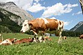
Cattle I edit

- Nomination Some nice cattles from bavaria, where i come from --Makro Freak 13:41, 21 June 2007 (UTC)
- Decline
- one can see you are proud of this cows. this one is overexposed but within limits-LadyofHats 10:16, 23 June 2007 (UTC)
- Oppose - Poor framing and composition, not a good example to show in the QI archive of what a photo of a cow should be - Alvesgaspar 16:55, 23 June 2007 (UTC)
- Oppose the composition is a bit too straight forward. Try to place main objects not in the middle of the picture - this results mostly (not always) in a more interesting composition. --AngMoKio 17:00, 23 June 2007 (UTC)
- Oppose - The other cows in the background distract from the subject, especially the cut-off cow on the right side. Exposure is OK, but the composition seems a bit random/not planned. --Florian Prischl 17:05, 23 June 2007 (UTC)
Result: 1 support (excluding the nominator), 3 oppose -> not promoted to QI --Tony Wills 12:27, 26 June 2007 (UTC)
ControlSurfaces edit

- Nomination Plane controling Przykuta 12:04, 21 June 2007 (UTC)
- Decline
- can you make it move slowler? and also make the arrows on the small plane a bit more obvious. otherwise i think is a wonderfull image-LadyofHats 13:29, 22 June 2007 (UTC)
- Oppose -- animation speed is too fast, if it could be slowed down to less than half the current rate then I'd support. Gnangarra 01:03, 24 June 2007 (UTC)
- Oppose Agreed. The viewer needs enough time to look at the controls, and then look at the impact. Regards, Ben Aveling 01:18, 24 June 2007 (UTC)
- Opposethen it is desided. the image must be fixed-LadyofHats 13:10, 25 June 2007 (UTC)
Result: 0 support (excluding the nominator), 3 oppose -> not promoted to QI --Tony Wills 12:39, 26 June 2007 (UTC)
Wien Hofburg Leopoldinischer Trakt edit
 *
*
- Nomination Leopoldinischer Trakt, Hofburg Wien -- Klaus with K 15:13, 23 June 2007 (UTC)
- Discussion
- Oppose Underexposed, can be easily corrected with editing. --Digon3 talk 16:39, 23 June 2007 (UTC)


- Question The photo looks underexposed on the linear histogram, but the logarithmic histogram shows that brightening up (white triangle) introduces clipping as in the right version. How to choose 100% brightness? -- Klaus with K 17:40, 23 June 2007 UTC)
- Oppose - Image quality of the sky and distant buildings is quite poor. I don't like the trees in the shadow either. - Alvesgaspar 18:04, 23 June 2007 (UTC)
- Info I did not downscale the almost 5Kx3K stitch despite distant building possibly looking sharper scaled 50% (would still be >3MB), shall investigate the noisy sky (will take time, stitch not on this computer), even the sunlit part of trees appear dark because of the high contrast (did not change gamma), without the slanting light the wall relief would be less pronounced -- Klaus with K 18:41, 23 June 2007 (UTC)
Running total: 0 support (excluding the nominator), 2 oppose -> decline? --Tony Wills 22:04, 23 June 2007 (UTC)
- in particular the noisy sky needs the stitching to be revisited (suspect noise in flatfield), something I do not have time for now, hence
 for the time being -- Klaus with K 19:48, 24 June 2007 (UTC)
Cattle excrement I edit

- Nomination Some nice cattles from bavaria, where i come from --Makro Freak 13:41, 21 June 2007 (UTC)
- Decline
- ??? --Lestat 21:57, 21 June 2007 (UTC)
- - i disagree in declining a picture becouse of the subject it portraits. Qi is about the image only, not what apears on it. and this image is sligtly overexposed but i think could be promoted. -LadyofHats 10:16, 23 June 2007 (UTC)
- Oppose - Irrelevant, bad lighting, bad framing, not a good example of a quality picture - Alvesgaspar 16:19, 23 June 2007 (UTC)
- Oppose the image and I also oppose the claim of irrelevance as made by Alvesgaspar. Although the subject might be offensive or inappropriate for some, it can be (very) useful. Yes, the image is not very well framed or lighted. That is why I oppose, not because of the subject. --Florian Prischl 16:27, 23 June 2007 (UTC)
- Oppose i agree with Florian Prischl - such a photo can be helpful. But this one is not of a good quality --AngMoKio 17:03, 23 June 2007 (UTC)
Result: 1 support (excluding the nominator), 4 oppose -> not promoted to QI' --Tony Wills 12:25, 26 June 2007 (UTC)
Cattle excrement II edit

- Nomination Some nice cattles from bavaria, where i come from --Makro Freak 13:41, 21 June 2007 (UTC)
- Decline the backgowund is quite overexposed but still i think the image enters the standards-LadyofHats 10:16, 23 June 2007 (UTC)
- Oppose - Irrelevant, bad framing, not a good example of a quality picture - Alvesgaspar 16:19, 23 June 2007 (UTC)
- Oppose the image and again I also oppose the claim of irrelevance as made by Alvesgaspar. Although the subject might be offensive or inappropriate for some, it can be (very) useful. In this photo, the framing is bad, the cow in the back obscures the view of the subject. --Florian Prischl 16:31, 23 June 2007 (UTC)
- Oppose i agree with Florian Prischl - such a photo can be helpful. But this one is not of a good quality --AngMoKio 17:06, 23 June 2007 (UTC)
Result: 0 support (excluding the nominator), 3 oppose -> not promoted to QI --Tony Wills 12:25, 26 June 2007 (UTC)
Sunflower-wide edit

- Nomination A bunch of daisies (Leucanthemum vulgare) in a creek. -- Scrumshus 16:33, 13 June 2007 (UTC)
- Decline
- Support Nice quality, beautiful composition. What about the "bug"? - Alvesgaspar 19:21, 13 June 2007 (UTC)
- Oppose The contrast curve on this image is all wrong. The flowers are overexposed and the shadows are underexposed. There is very little detail in this image. -- Ram-Man 13:25, 14 June 2007 (UTC)
- Oppose as per Ram-Man. This appears to be heavily post-shot edited, or it was shot with some strange filter. Like Alvesgaspar, I would be happy to know what bug this is (this is not a point of critique, though). FYI, I will remove the QI template from the image description until CR for it is over. --Florian Prischl 21:21, 14 June 2007 (UTC)
- Of course you can support your own nomination , but your vote is assumed and not actually counted in CR (see rules section above). But please do upload your original version. --Tony Wills 13:12, 15 June 2007 (UTC)
Result: 1 support (excluding the nominator), 2 oppose -> not promoted to QI --Tony Wills 21:33, 23 June 2007 (UTC)
Wikipe-tan full length edit

- Nomination Wikipe-tan, as drawn by Kasuga -- grendel|khan 15:04, 8 June 2007 (UTC)
- Decline
- Oppose The borders and strokes are very rough, and should be better anti-aliased. Besides that, I would say it is good. Maybe Kasuga can produce a better anti-aliased version? --Florian Prischl 22:17, 10 June 2007 (UTC)
- Support It's a good one. Rough strokes and border reflects the creator's technique and ekspression. I believe Kasuga created this illustration for printing purpose, right? Antialiasing makes it better for display but it will not work well for printing. 13:57, 11 June 2007 (UTC) —the preceding unsigned comment is by Hariadhi (talk • contribs)
- Comment Moved here because there is 1 support and 1 oppose. In such a case, it have been set to discuss, not to promote. Not a problem, but please be more careful next time. Regards, Ben Aveling 12:31, 13 June 2007 (UTC)
- Support I think this is fine. This is obviously not a photograph and the rough edges look artistic to me: more like a real drawing would be. -- Ram-Man 13:27, 14 June 2007 (UTC)
- Oppose - And where do we find quality? --Arad 21:50, 14 June 2007 (UTC)
- Oppose - The image is pixelated and not special enough - Alvesgaspar 23:44, 23 June 2007 (UTC)
- Oppose. Lovely character, but the detail just isn't high enough quality. Nothing that couldn't be fixed. –Dilaudid 11:42, 25 June 2007 (UTC)
Running total: 2 support (excluding the nominator), 4 oppose -> Decline –Dilaudid 11:42, 25 June 2007 (UTC)
Sawtooth Oak Trunk edit

- Nomination Sawtooth Oak bark. -- Ram-Man 15:20, 11 June 2007 (UTC)
- Decline
- OpposeDont understand the screw, why its not cropped?--Makro Freak 19:39, 11 June 2007 (UTC)
- CommentThe screw is there to add a sense of scale, just like adding a ruler or some other common object. Tree bark can be size ambiguous, so having this helps you understand it. While it may take away from the "magic" if this was a FP candidate, it is not a quality issue. -- Ram-Man 19:45, 11 June 2007 (UTC)
- Oppose per Makro Freak. It breaks the picture for me. Otherwise, OK. Ben Aveling 12:25, 13 June 2007 (UTC)
- This isn't FP, there is now "wow factor" requirement. If you want to add a wow factor to QI, then QI becomes FP. Sure, it's easy enough to crop out the screw, but I shouldn't be required. Obviously a picture without a screw is going to be more pretty, but then it loses some encyclopedic value. Does this image have sufficient quality or not? -- Ram-Man 12:52, 13 June 2007 (UTC)
- I think it comes under composition rather than 'wow' - the edge of the sign makes me want to see the whole sign, but if the whole sign was there it would be even more distracting :-). I've been thinking about a photo of a worm (a very large worm :-) that I photographed today, in one photo I included my set of keys for scale, but I am considering using that to allow me to insert a small (unobtrusive) scale in the corner of the image (like you get on maps) as the keys will be very distracting. --Tony Wills 12:20, 14 June 2007 (UTC)
- Feeling like HAL3000 and say "i have to think about it" --Makro Freak 15:54, 13 June 2007 (UTC)
- Comment The rules say ...
- The arrangement of the subject within the image should contribute to the image. Foreground and background objects should not be distracting. Lighting and focus also contribute to the overall result; the subject should be sharp, uncluttered, and well-exposed.
- And i still have the feeling that the screw is distracting. We have to wait for more comments. --Makro Freak 16:18, 13 June 2007 (UTC)
- For me, it's not the screw, it's the picture? sign? hanging off it. My eye is drawn straight to it, and off the picture. Anyway, a screw and sign is also size ambiguous. Regards, Ben Aveling 20:48, 13 June 2007 (UTC)
- And i still have the feeling that the screw is distracting. We have to wait for more comments. --Makro Freak 16:18, 13 June 2007 (UTC)
- The arrangement of the subject within the image should contribute to the image. Foreground and background objects should not be distracting. Lighting and focus also contribute to the overall result; the subject should be sharp, uncluttered, and well-exposed.
- Oppose and agree with Makro Freak and Ben Aveling. Composition is a quality factor for any photograph and is (and should be) one for QI. Instead of a sign, maybe an insect or an unobtrusive ruler (a transparent plastic one with black numbers held to the side of the tree, for example) would show scale better and be less distracting. Maybe the screw alone would have been unobtrusive enough for this to pass. But, as Ben Aveling said, the cut-off sign is a problem, too. Besides that, the photo is fine. --Florian Prischl 21:17, 14 June 2007 (UTC)
Result: 0 support (excluding the nominator), 3 oppose -> Not promoted to QI --Tony Wills 22:16, 17 June 2007 (UTC)
Apis mellifera carnica edit

- Nomination Bee, My Argument: Makrofreak style --Makro Freak 16:21, 11 June 2007 (UTC)
- Decline
- Oppose Review, Good focus, but unclear composition. --LC-de 19:33, 11 June 2007 (UTC) ]] 14:45, 12 June 2007 (UTC)
- Comment Dont agree, why is the composition unclear? --Makro Freak 14:46, 12 June 2007 (UTC)
- Comment The shallow DoF and the angle that the shot was taken at make it unclear what exactly we are looking at. It is not obvious without a caption. The blurry foreground doesn't help the composition either. -- Ram-Man 18:27, 12 June 2007 (UTC)
- Oppose It seems to be focused on the part in front of the bee's head, if I am not mistaken. Besides, I agree with Ram-Man that the subject is not made clear by the photograph itself. --Florian Prischl 21:10, 14 June 2007 (UTC)
Result: 0 support (excluding the nominator), 2 oppose -> Not promoted to QI --Tony Wills 22:14, 17 June 2007 (UTC)
GrozaOC14 edit

- Nomination Excellent quality, nearly real look but more clear than any photo could be --PioM EN DE PL 08:48, 31 May 2007 (UTC)
- Decline
- My Firefox is not able to display this SVG. Barcex 10:21, 31 May 2007 (UTC)
- worked fine on mine good detail cleanlines, not sure about the muzzle but presume its correct Gnangarra 14:04, 3 June 2007 (UTC)
- Did you try to look at the full sized version? I get:
XML Parsing Error: prefix not bound to a namespace
Location: http://upload.wikimedia.org/wikipedia/commons/f/fd/GrozaOC14.svg
Line Number 181, Column 3:
<linearGradient id="id31" gradientUnits="userSpaceOnUse" xlink:href="#id30" x1="9474" y1="28693" x2="13273" y2="28693">
--^
Something is wrong, is it the image at fault, commons, or our browsers? --Tony Wills 12:45, 5 June 2007 (UTC)
- Oppose The alinearly aligned detail of the ammo pad is disturbing. –Dilaudid 21:08, 7 June 2007 (UTC)
- Comment I've put a page of the thing at different sizes at /GrozaOC14. Ben Aveling 00:45, 9 June 2007 (UTC)
- Oppose This doesn't appear to be passing, and there are concerns with both the details and the SVG code itself. -- Ram-Man 15:17, 15 June 2007 (UTC)
- Comment IE displays it correctly, but displays "Unrecognised DOCTYPE declaration. Image might not display correctly.". I suggest that when the problems are corrected the image be resubmitted to QI --Tony Wills 22:11, 17 June 2007 (UTC)
Result: 1 support (excluding the nominator), 2 oppose -> Not promoted to QI --Tony Wills 22:11, 17 June 2007 (UTC)
Fulmer Falls Closeup edit

- Nomination Fulmer Falls. -- grendel|khan 20:35, 7 June 2007 (UTC)
- Promotion
- Comment Why QI nomination when it is already FP?? --Klaus with K 16:21, 8 June 2007 (UTC)
- Oppose Great photo as such, but too much noise. --Florian Prischl 22:21, 10 June 2007 (UTC)
- For a Nikon Coolpix its ok i think --Makro Freak 18:10, 11 June 2007 (UTC)
- Comment I really don't care whether this becomes a QI, but I am concerned about the precedent. This was an 8MP camera at the lowest ISO setting. We get a LOT of cameras that have lower resolution and similar noise levels through QI. This noise is not visible except at poster size magnifications, and even then it isn't that noticeable unless you specifically look for it. We should probably reject most images non-SLR automatically if this one gets rejected. At 2MP, the noise is not visible. If it was downsampled, there wouldn't be any noise. -- Ram-Man 03:38, 11 June 2007 (UTC)
- Support I think you should care, if this one doesn't get QIfied then I would question the QI qualification process. Lots of QI pictures aren't nearly as good as this one. Benh 07:14, 11 June 2007 (UTC)
- My point was that it was already a FP, so being a QI as well doesn't mean all that much to me one way or the other. Much more important is setting a precedent where this level of quality is unacceptable. We'd have to expect closer to technical perfection. -- Ram-Man 12:39, 11 June 2007 (UTC)
- Support - Agree - Alvesgaspar 08:05, 11 June 2007 (UTC)
- Support per RamMan. Ben Aveling 12:56, 11 June 2007 (UTC)
- Info QI vs FP conversation moved to Commons talk:Quality images candidates#QI vs FP. Regards Ben Aveling 12:46, 13 June 2007 (UTC)
- Support It mustnt allways has the best quality, this picture has quality because of the scene and the colors --Makro Freak 18:10, 11 June 2007 (UTC)
Result: 4 support (excluding the nominator), 1 oppose -> Promoted to QI --Tony Wills 12:07, 14 June 2007 (UTC)
Two Hens and Chicks 3264px edit

- Nomination Two hens and chicks. -- Ram-Man 00:04, 8 June 2007 (UTC)
- Promotion
- Oppose if this is not QI, then I think this one can't be for the same reasons. Support. This picture is well centered and lighting is good. Overall, quality is good enough. Benh 17:47, 8 June 2007 (UTC)
- Comment Noisy and unsharp? Are we looking at the same picture? The image you have compared it to has visible noise in a prominent location at 2MP, but more importantly the buds are not very sharp. This image does not have much noise (except of course at large magnifications, but so do all digital camera images) and is very sharp. -- Ram-Man 17:55, 8 June 2007 (UTC)
- Comment If you have a problem with my assessment of another image, comment on that image instead. Judge each image on its own merits. -- Ram-Man 18:06, 8 June 2007 (UTC)
- well, the other picture hasn't much more noise. This pic has some unwanted artifacts as well, due to noise from sensor or due to compression (which would still be noise, since it deviates from what the ideal picture should be). I agree this one is a bit sharper but I still think it's artificial, and due to (in camera or not) post processing. I'll have another look tomorrow, maybe I'll change my mind. Benh 18:08, 8 June 2007 (UTC)
- I changed my vote and decided to support this instead of opposing this one. Benh 09:39, 10 June 2007 (UTC)
- Support - Good quality, colouring and composition, and genus identified. I don't see any obvious flaw. Alvesgaspar 19:09, 8 June 2007 (UTC)
- Support quality sufficient in my opinion --norro 08:50, 9 June 2007 (UTC)
- Support No complaints! –Dilaudid 15:20, 9 June 2007 (UTC)
- Support ACK Dilaudid, norro and Alvesgaspar. --Florian Prischl 22:47, 10 June 2007 (UTC)
- Support The framing is really on the border! The resolution compensate this --Makro Freak 16:39, 11 June 2007 (UTC)
Result: 6 support (excluding the nominator), 0 oppose -> Promoted to QI --Tony Wills 11:52, 14 June 2007 (UTC)
Verdon_pano01_hs edit


- Nomination Not very eye catching, but I like it and think it's very good technically. -- Benh 17:47, 8 June 2007 (UTC)
- Decline
- OpposeColours look washed out due to overexposure. Nothing a little edit can't solve. Alvesgaspar 22:36, 8 June 2007 (UTC)
- I don't think it is too bright. I think the brightness conveys the atmosphere of strong sunshine. Feel free to move to review section below.--Klaus with K 10:46, 9 June 2007 (UTC)
- I disagree with Alvesgaspar too, but will edit the picture if other people think like him. Benh 09:26, 10 June 2007 (UTC)
- Info - I tried to improve the colour and contrast of the image but that is a difficult task due to the brightness distribution, which clearly shows overexposed zones. Still I think it is a little better now Alvesgaspar 22:19, 10 June 2007 (UTC)
- Oppose both versions. Now the front of the house is even brighter - although the rest is better in the new version. --Florian Prischl 22:40, 10 June 2007 (UTC)
- Comment I still have the RAWs and will try to work on them again. But I'm really surprised by the consistency of the votes over here... Benh 07:11, 11 June 2007 (UTC)
Result: 0 support (excluding the nominator), 2 oppose -> Not promoted to QI --Tony Wills 12:05, 14 June 2007 (UTC)
Tyne Cot Cross edit


- Nomination Tyne Cot Cross. --Ben Aveling 05:19, 9 June 2007 (UTC)
- Decline
![]() InfoThe original was declined on the grounds of tilt and lighting. I've rotated and cropped it. And I've done a bit of mucking with the levels, though not much. I didn't want to overdo it, not the least because this shouldn't be a 'pretty' shot. Ben Aveling 05:19, 9 June 2007 (UTC)
InfoThe original was declined on the grounds of tilt and lighting. I've rotated and cropped it. And I've done a bit of mucking with the levels, though not much. I didn't want to overdo it, not the least because this shouldn't be a 'pretty' shot. Ben Aveling 05:19, 9 June 2007 (UTC)
- Question Was ist foggy? The trees in the background seem to be obscured by fog. --Florian Prischl 22:43, 10 June 2007 (UTC)
- Info A bit.
 Ben Aveling 23:32, 10 June 2007 (UTC)
- Oppose I am not satisfied by the first or second version - The fog makes the colours washed out and the pedestal is cropped off. --Florian Prischl 23:36, 10 June 2007 (UTC)
- Yes, decline. Ben Aveling 12:55, 11 June 2007 (UTC)

Result: 0 support (excluding the nominator), 1 oppose (excluding the nominator) -> Not promoted to QI --Tony Wills 12:00, 14 June 2007 (UTC)
Bombus lucorum edit

- Nomination Bombus lucorum. –Dilaudid 23:42, 7 June 2007 (UTC)
- Decline The flowers are a little out of focus, the bee is OK. The background is noisy. It's close, but I'm not sure it's quite there. Ben Aveling 10:50, 9 June 2007 (UTC)
- Oppose Also, composition is weak, with the subject right on the center, and the bee is too small and unconspicuous. Alvesgaspar 21:59, 10 June 2007 (UTC)
- Oppose ACK Ben Aveling; also, the bee itself seems to be not fully in focus. --Florian Prischl 22:44, 10 June 2007 (UTC)
- Support The colors are fantastic, the quality is so so but enough i think. Its not just the bumblebee, this picture has more to offer. The composition is nice --Makro Freak 16:37, 11 June 2007 (UTC)
Result: 1 support (excluding the nominator), 2 oppose -> Not promoted to QI --Tony Wills 11:56, 14 June 2007 (UTC)
Prunus spec sprout edit

- Nomination Sprouts and trunk of a Prunus sp. tree (probably a cherry-tree - Prunus avius) - Alvesgaspar 22:40, 6 June 2007 (UTC)
- Decline
- Oppose It seems noisy and unsharp to me. Composition/Subject is really nice though. -- Ram-Man 12:10, 8 June 2007 (UTC)
- Info Moved to CR because of Benh's comments above, which seem to imply that my assessment is wrong. -- Ram-Man 18:03, 8 June 2007 (UTC)
- ah :) I don't say it's wrong, but I think this wouldn't be consistent. Benh 18:10, 8 June 2007 (UTC)
- Neutral I find the image not in balance, sprout in the middle and trunk to the right but nothing to balance it on the left. I would have turned the camera 10-20 percent further right, crop would be second best only. And the nearmost sprout is slightly out of focus. --Klaus with K 18:35, 8 June 2007 (UTC)
- Support quality sufficient in my opinion --norro 11:31, 9 June 2007 (UTC)
- Support To me too. A bit soft, but overall it's good, and it has nice blurred background. Benh 09:43, 10 June 2007 (UTC)
- Oppose ACK Klaus with K and Ram-Man - The right side is too heave due to the tree. Also, there are focus and noise issues. --Florian Prischl 22:48, 10 June 2007 (UTC)
- Neutral I like the composition. But I agree it's too noisy, and focus isn't what it should be. Ben Aveling 22:56, 10 June 2007 (UTC)
- Oppose The comp is so so, the colors are very boring ... i think with the propper light on a other time it looks like more dramamtical and plastical and minor Focus problems --Makro Freak 16:40, 11 June 2007 (UTC)
Result: 2 support (excluding the nominator), 3 oppose -> Not promoted to QI --Tony Wills 11:50, 14 June 2007 (UTC)
SonyF717.jpg edit

- Nomination Sony Cyber-shot DSC-F717 -- Thegreenj 03:03, 6 June 2007 (UTC)
- Decline
- Support The long shadow behind looks a little odd, but clearly QI --Tony Wills 07:44, 6 June 2007 (UTC)
- Oppose I've been thinking about this and the shadow and white surface really bug me too much. Yes the camera itself is splendidly captured but as a whole I don't think this should be set up as an example of good product photography. –Dilaudid 16:52, 8 June 2007 (UTC)
- Oppose ack Dilaudid. A product shot like this should be near perfect. I think it needs a second diffuse lighting source to eliminate the shadow. -- Ram-Man 18:08, 8 June 2007 (UTC)
- Oppose ack the above. Ben Aveling 00:45, 9 June 2007 (UTC)
- Oppose both version, the first one just barely - the shadow, background and blue-ish tone are too distracting, however. ACK Ram-Man: With a second diffuse light source, the first one would probably be QI (the angle is good!). The second one is too flat. --Florian Prischl 22:52, 10 June 2007 (UTC)
Result: 1 support (excluding the nominator), 4 oppose -> Not promoted to QI --Tony Wills 11:49, 14 June 2007 (UTC)

- Nomination Sony Cyber-shot DSC-F717 -- Thegreenj 03:03, 6 June 2007 (UTC)
- Promotion
- New Version Thegreenj 23:11, 8 June 2007 (UTC)
- Support new version. Ben Aveling 01:00, 9 June 2007 (UTC)
- Support new version. -- Ram-Man 03:32, 9 June 2007 (UTC)
- Question I prefer the angle of the first one, but the second one seems generally sharper. I can find a few areas that aren't perfectly clear in each one, but both seem pretty good to me (apart from the long trailing shadow on the first one). Ignoring the shadow, why do you think the first one is such a better image of the camera? Ben Aveling 08:17, 9 June 2007 (UTC)
- Ignoring the shadow :-), The first one has depth, the second looks flat (clinical). The first one is better lit and a better angle (eg front of lens detail, flash shoe, options dial). The cameras surface looks noisier on the second one (but maybe that's better focus and it's showing surface texture better?). I don't like the dark shadow under the lens of the second. (and what colour is that 'M' logo on the front meant to be). It might be an emotional reaction rather than technical appraisal, but 'attractive' vs 'clinical' sums it up. --Tony Wills 12:07, 9 June 2007 (UTC)
- (don't really oppose it though I liked the original --Tony Wills 12:23, 9 June 2007 (UTC))
- The Memory Stick logo is the same material as the grip, so the second photo is a little more accurate in that sense, depending on how your eye corrects for shadow. The first one used a higher ISO (my mistake), so I cannot see why the second would appear more noisy. Thegreenj 19:20, 9 June 2007 (UTC)
- Support That's more like it, though it does seem to have lost some of its depth. –Dilaudid 15:17, 9 June 2007 (UTC)
- Comment The 2nd photo does have less depth and is flatter. It's taken from a different angle, so we are looking down on it instead of along the top of it. Yes, the options dial is rendered less distinct, but the controls behind it are clearer, as is the side of camera. The lens is better in the first, the Sony logo better in the second. The shadow under the lens (and also under the body )in the second shot isn't great, but it doesn't leap out like the shadow behind the camera in the first shot. If it wasn't for the shadow, I guess I would prefer the first shot, but not by a big margin. And with the shadows, the 2nd clearly wins. Question How would a professional deal with the shadow? Put it on a stand? Use more indirect lighting? Photoshop? Regards, Ben Aveling 23:12, 9 June 2007 (UTC)
- Oppose both version, the first one just barely - the shadow, background and blue-ish tone are too distracting, however. ACK Ram-Man: With a second diffuse light source, the first one would probably be QI (the angle is good!). The second one is too flat. --Florian Prischl 22:52, 10 June 2007 (UTC)
- Support very advertisingly --Makro Freak 16:43, 11 June 2007 (UTC)
Result: 4 support (excluding the nominator), 1 oppose -> Promoted to QI --Tony Wills 11:49, 14 June 2007 (UTC)
Unidentified Grain Field Lancaster 3008px edit

- Nomination A field of grain in Lancaster County, Pennsylvania, USA. -- Ram-Man 00:04, 8 June 2007 (UTC)
- Decline
- OpposeThe field itself is superbly caught but the background doesn't work – I'm sure there were better options available. –Dilaudid 14:01, 8 June 2007 (UTC)
- I disagree: The background is the farm associated with the field. When used as example of a typical Lancaster County farm, this is ideal: show the field and the farm buildings in proper context. This is way too picky for QI, but perhaps not a FPC. -- Ram-Man 14:05, 8 June 2007 (UTC)
- I fully understand what you're aiming at, it's just that I personally would've preferred the buildings not to be as central in the composition. I might be picky but then again, as I see it, there's plenty of room for doing that here – I'm not going to complain if someone else wants this one promoted :) –Dilaudid 16:43, 8 June 2007 (UTC)
- I disagree: The background is the farm associated with the field. When used as example of a typical Lancaster County farm, this is ideal: show the field and the farm buildings in proper context. This is way too picky for QI, but perhaps not a FPC. -- Ram-Man 14:05, 8 June 2007 (UTC)
- Oppose The background is basically OK, but the building seem to be titled (look at the silo - it looks a little strange). The background is too close vertically to the top of the spikes, and the sky is a strange shade of gray. --Florian Prischl 22:55, 10 June 2007 (UTC)
Result: 0 support (excluding the nominator), 2 oppose -> Not promoted to QI --Tony Wills 11:44, 14 June 2007 (UTC)
Library of Congress Great Hall - Jan 2006.jpg edit
 *
*
- Nomination The Great Hall of the Library of Congress --grendel|khan 01:38, 1 June 2007 (UTC)
- Decline
- This needs barrel distortion correction before it can be promoted. I understand that this is a panorama, but this is correctable. -- Ram-Man 12:07, 5 June 2007 (UTC)
- This has nothing to do with barrel distortion (a lens defect), it just is a choice of projection. And every projection has its pros and cons. This one is a sensible choice for a confined room like the Great Hall. Barrel distortion is corrected automatically in the individual constituent images. --Dschwen 12:16, 5 June 2007 (UTC)
- The correction you are aiming for will most likely convey a false sense of the proportions. --Dschwen 12:18, 5 June 2007 (UTC)
- Yeah, you're right, "correction" will likely be unsuccessful. Still, the center of the image bows out like barrel distortion and I find it very distracting. However, the outside edges of the image are pinched. The projection looks highly unnatural to me. I'm glad this is in CR, so others can discuss it. -- Ram-Man 12:29, 5 June 2007 (UTC)
- As suspected, any attempt to eliminate the barrel-type "distortion" in the first image results in distortion at the edges and edge cropping, as shown in the example above. However the lines straighten out and are much less "annoying". The relative sizes also look better, with nearer objects appearing larger, albiet stretched. Let's see what others think. -- Ram-Man 01:11, 6 June 2007 (UTC)
- While I'm not others :-) the edit introduces skews and tilts. Plus we loos the front of the stairs. IMO it is just not worth it, the original is fine. Plus relative sizes also look better is a conclusion you could only take if you have seen the Great hall in person (have you?). --Dschwen 07:43, 6 June 2007 (UTC)
- I agree, this edit was just an example only. The cropped out elements, skewing, and the lower quality make it a poor candidate. It's main purpose is to show why I don't like the original. The original has many straight lines in reality, but many are all horribly curved. You can see from this panorama the correct relative sizes. -- Ram-Man 11:51, 6 June 2007 (UTC)
- While I'm not others :-) the edit introduces skews and tilts. Plus we loos the front of the stairs. IMO it is just not worth it, the original is fine. Plus relative sizes also look better is a conclusion you could only take if you have seen the Great hall in person (have you?). --Dschwen 07:43, 6 June 2007 (UTC)
- The correction you are aiming for will most likely convey a false sense of the proportions. --Dschwen 12:18, 5 June 2007 (UTC)
- Oppose as per above, I don't like the projection. Everything else is fine. -- Ram-Man 14:13, 8 June 2007 (UTC)
- Neutral. I dislike the seeming bowing of the ceiling. But the walls are really nice. Maybe this image is trying to do too much? Ben Aveling 08:58, 9 June 2007 (UTC)
- OpposeACK Ram-Man, but just barely oppose. However, I do not like the projection and the sharpnes seems a little weird - unfortunately, I cannot point out yet what it is that bugs me, sorry. --Florian Prischl 23:02, 10 June 2007 (UTC)
Result: 0 support (excluding the nominator), 2 oppose -> Not promoted to QI --Tony Wills 11:38, 14 June 2007 (UTC)
Cygnus olor flirt edit edit

- Nomination Cygnus olor flirt, retouched version. My Argument: Fantastic scene --Makro Freak 13:59, 29 May 2007 (UTC)
- Decline
- It pains me to Oppose this since it shows that image editing is becoming more accepted but I feel that the edit is far too visible in the form of the jagged edge. I will see what I can do in the way of fixing it --Benjamint444 08:49, 1 June 2007 (UTC)
You have done more editing to the left of clone area that you declared, what is it? You have clonestamped large areas in the original in at least two places and they have not been declared there or in the this edit. I don't know why nobody has noticed but I want to know what you did before I go any further with this. --Benjamint444 09:11, 1 June 2007 (UTC)Since I may be wrong.- Comment I wonder what and how much image editing is acceptable here in QI. Apart from the editing issue I think the photo is fine. I also see this image being discussed on FPC.--Klaus with K 09:17, 1 June 2007 (UTC)
- In my opinion any amount of editing is acceptable as long as it is flawless because I do a lot of editing myself but the other problem is that it is undeclared --Benjamint444 10:00, 1 June 2007 (UTC)
Commons:Featured picture candidates/File:Cygnus olor flirt.jpg - Comment Why you think its not declared ? There is a retouched picture tag on it, above the description which says ... removed a 3rd swan, so whats your problem? Should i write a long story how i did it? This lasts longer than the 30sec retouche. As i said before, cant understand why you are wasting so much time with this. And if you disagree with the quality, oppose. Be happy! :) :) :) --Makro Freak 13:56, 1 June 2007 (UTC)
- Support If we allow retouched photos, then this should be a QI. --Digon3 16:27, 2 June 2007 (UTC)
- Support the quality of the retouching is such that it alone warrants promotion Gnangarra 13:50, 3 June 2007 (UTC)
- Question Is it tilted? Ben Aveling 10:34, 5 June 2007 (UTC)
- Oppose Tilted, noisy and way to many distractions.--ReeceWarner 00:52, 6 June 2007 (UTC)
- Oppose Tilted in a way that the weight slopes to the right. –Dilaudid 21:08, 7 June 2007 (UTC)
- Oppose Tilted too much; the posterior of the right swan is awkwardly distorted. --Florian Prischl 17:16, 8 June 2007 (UTC)
- Support both versions. The title said "Flirt", right? Then we can not say the background/foreground are distracting, because they also build the set. Anyway, it's not a product shot, so we dont really have to worry about the tilt. Hariadhi 14:59, 11 June 2007 (UTC)
Result: 3 support (excluding the nominator), 4 oppose -> Not promoted to QI --Tony Wills 11:36, 14 June 2007 (UTC)

- Nomination Cygnus olor flirt, retouched version. --Makro Freak 13:59, 29 May 2007 (UTC)
- Promotion
- Comment Have uploaded a rotated and cropped version. Ben Aveling 01:37, 9 June 2007 (UTC)
- Support Both versions. --Klaus with K 10:55, 9 June 2007 (UTC)
- Support The new version. –Dilaudid 15:22, 9 June 2007 (UTC)
- Support the new version. Ben Aveling 23:24, 9 June 2007 (UTC)
- I still Oppose, also the new version. I stand by my arguments. --Florian Prischl 23:03, 10 June 2007 (UTC)
- This is the 'donor' photo:
 The posterior of the right swan has been faithfully copied. Regards, Ben Aveling 23:48, 10 June 2007 (UTC)
- This is the 'donor' photo:

_Flowers_3264px.JPG)
Running total:
3 support - Counting only explicit support for this version.
3 oppose - Counting Benjamint444, Reece, and Florian, and not counting Dilaudid because
the tilting seems to have been resolved? he explicitly voted for this one --Tony Wills 09:42, 10 June 2007 (UTC)
More input needed please. Ben Aveling 23:24, 9 June 2007 (UTC)
(I'd have counted the other two previous supports if I was going to count the previous opposes as the tilt change didn't seem to be a factor that would affect their support, so either (3 support 0 oppose) or (5 support, 3 oppose), but we'll see where this goes --Tony Wills 09:42, 10 June 2007 (UTC))
- Support both versions. The title said "Flirt", right? Then we can not say the background/foreground are distracting, because they also build the set. Anyway, it's not a product shot, so we dont really have to worry about the tilt. Hariadhi 14:59, 11 June 2007 (UTC)
- Comment Funny discussion! You meant it serious, eh? :) :) :) --Makro Freak 16:19, 11 June 2007 (UTC)
Result: 4 support (excluding the nominator), 1 oppose -> Promoted to QI --Tony Wills 11:36, 14 June 2007 (UTC)
Santa Cruz do Sul catedral 2005-03-21 edit

- Nomination Catedral de São João Batista in Santa Cruz do Sul --Klaus with K 17:21, 5 June 2007 (UTC)
- Discussion
- Oppose Left and right towers in different perspectives - makes it skewed. --Florian Prischl 09:36, 6 June 2007 (UTC)
- Question Although it is a stitched image, converging lines are what an observer and a standard camera would see. Would rotating the image suffice? Or is full architectural correction (see File:Santa Cruz do Sul catedral vertical 2005-03-21.jpg) required - this looks unnatural to me?--Klaus with K 15:06, 6 June 2007 (UTC)
- Support Both, but with a large preference for the corrected version. bottom part looks very clean !. Benh 18:29, 6 June 2007 (UTC)
Running total: 1 support (excluding the nominator), 1 oppose -> redundant if corrected version promoted -- Tony Wills 10:41, 8 June 2007 (UTC)
Santa Cruz do Sul catedral vertical 2005-03-21 edit

- Nomination Catedral de São João Batista in Santa Cruz do Sul --Klaus with K 17:21, 5 June 2007 (UTC)
- Promotion
- Support The corrected version. -- Ram-Man 15:58, 6 June 2007 (UTC)
- Support Both, but with a large preference for the corrected version. bottom part looks very clean !. Benh 18:29, 6 June 2007 (UTC)
- This Brazilian city is proud of its German heritage (and virtues...) --Klaus with K 16:27, 8 June 2007 (UTC)
- Support Neat one, the correction brings out the architectural exaggeration. –Dilaudid 21:08, 7 June 2007 (UTC)
Result: 3 support (excluding the nominator), 0 oppose -> Promoted to QI --Tony Wills 21:17, 9 June 2007 (UTC)
Lothianbridge viaduct01 2000-05-28 edit

- Nomination Lothianbridge viaduct near Edinburgh (photo taken in 2000) --Klaus with K 17:14, 31 May 2007 (UTC)
- Decline
- Oppose I was going to say it looked like it was taken with a Fuji camera and then I found out it was. Very blotchy and low out-of-camera quality. -- Ram-Man 16:04, 2 June 2007 (UTC)
- Question The reviewer has pointed out that he declined QI solely on camera-techical grounds. Using this 1800x1200 pixel (2.16MB) photo from a FUJI MX-2700 (1999 vintage) as a benchmark, may I politely ask for a few second opinions whether this camera and QI are incompatible. (Maybe a topic for the discussion page?) --Klaus with K 14:48, 5 June 2007 (UTC)
- If this is the best you can get out of this camera then I'd have to agree with Ram-man. solely on camera-techical grounds is a bit misleading as the camera-techical grounds are very serious in this picture. Low res and washed out detail would require a downsampling to image sizes way below the threshold for QI to get acceptable quality. Sorry, but cellphone camera pics would have it equally hard. --Dschwen 07:57, 6 June 2007 (UTC)
- It depends on your subject. I've got 1 FP and 2 QI out of my point and shoot, but they've all been of interesting things I've been fortunate enough to get close to (like meters, not cm). Anything further away and the images just aren't quite sharp enough, even with a tripod. So it depends on conditions and subject. But on the other hand, 2.16MB really doesn't give much margin for error; if your shot isn't perfect, it's going to be hard to crop it and still have something large enough. Probably time to upgrade if you can. Regards, Ben Aveling 11:36, 6 June 2007 (UTC)
- I have upgraded several years ago, but do have a sizeable pre-upgrade collection.--Klaus with K 14:32, 6 June 2007 (UTC)
- It depends on your subject. I've got 1 FP and 2 QI out of my point and shoot, but they've all been of interesting things I've been fortunate enough to get close to (like meters, not cm). Anything further away and the images just aren't quite sharp enough, even with a tripod. So it depends on conditions and subject. But on the other hand, 2.16MB really doesn't give much margin for error; if your shot isn't perfect, it's going to be hard to crop it and still have something large enough. Probably time to upgrade if you can. Regards, Ben Aveling 11:36, 6 June 2007 (UTC)
- If this is the best you can get out of this camera then I'd have to agree with Ram-man. solely on camera-techical grounds is a bit misleading as the camera-techical grounds are very serious in this picture. Low res and washed out detail would require a downsampling to image sizes way below the threshold for QI to get acceptable quality. Sorry, but cellphone camera pics would have it equally hard. --Dschwen 07:57, 6 June 2007 (UTC)
- Oppose ACK Ram-Man. --Florian Prischl 09:43, 6 June 2007 (UTC)
- Oppose Indeed, Fuji-ish. –Dilaudid 21:08, 7 June 2007 (UTC)
Result: 0 support (excluding the nominator), 3 oppose -> Not promoted to QI --Tony Wills 21:15, 9 June 2007 (UTC)
Crown of Thorns Euphorbia x lomi (Unidentified Cultivar) Flowers 3264px.JPG edit
_Flowers_3264px.JPG) *
*_Flowers_Crop_3264px.JPG)
- Nomination Crown of Thorns. -- Ram-Man 13:27, 30 May 2007 (UTC)
- Decline
- maybe a cr image for a wider opinion, I thnk the focal point is off the flower Gnangarra 13:58, 3 June 2007 (UTC)
- Oppose - Poor composition/framing, the viewer's attention is dispersed by the presence of the flower in the foreground and the aesthetics of the image is affected. Alvesgaspar 08:08, 5 June 2007 (UTC)
- Info How about the cropped version? -- Ram-Man 12:21, 5 June 2007 (UTC)
- Oppose Almost there. Composition-wise, the right-hand edge and the bottom are a problem. –Dilaudid 21:08, 7 June 2007 (UTC)
Result: 0 support (excluding the nominator), 2 oppose -> Not promoted to QI --Tony Wills 11:54, 10 June 2007 (UTC)
Falco biarmicus 001 edit

- Nomination Falco biarmicus (head) by Lilly M --Przykuta 20:30, 31 May 2007 (UTC)
- Promotion
- Neutral - I'm not sure on this one. Photo quality is good enough but the framing is unfortunate and the background distracting. Alvesgaspar 07:44, 5 June 2007 (UTC)
- Support. Clearly way above the average in terms of quality. The bg doesn't bother me, and the framing is acceptable for QI. --Dschwen 13:56, 5 June 2007 (UTC)
- Support -- Ram-Man 12:32, 7 June 2007 (UTC)
- Support The background's ok to me. A powerful photo overall. –Dilaudid 21:08, 7 June 2007 (UTC)
- Comment Now I see what bothered me somewhat – it's the steep slope of the bird's back (and how it reacts with the wing) that weakens the composition. –Dilaudid 23:52, 7 June 2007 (UTC)
Result: 3 support (excluding the nominator), 1 neutral, 0 oppose -> Promoted to QI --Tony Wills 11:51, 10 June 2007 (UTC)
Nicotiana Tobacco Plants 1909px edit
_in_a_field_in_Intercourse,_Pennsylvania..jpg)
- Nomination
- InfoTobacco in a field. -- Ram-Man 13:27, 30 May 2007 (UTC)
- Promotion
- Comment The horizon is not straight. I tried to straighten it but it resulted in the bottom leaf being cropped. I think it is worthy of QI otherwise. Can you try to correct that? Cacophony 07:36, 31 May 2007 (UTC)
- Comment I'm 95% sure the horizon is a hill and was really curved like that (the lens doesn't have this much distortion). The barn only a couple pixels off. -- Ram-Man 12:00, 31 May 2007 (UTC)
- OpposeHorizon - as Cacophony. Lestat 17:29, 1 June 2007 (UTC)
- Info I've fixed the lens's barrel distortion. I had to perform a little edge extension on the sky only, but it doesn't affect the integrity of the image. Could this image be reevaluated based on the correction? -- Ram-Man 21:38, 1 June 2007 (UTC)
- Support If you are 95% sure the horizon is a hill, then it is a quality image for me. --Digon3 16:27, 2 June 2007 (UTC)
- Well I fixed the lens distortion and rotated the picture (very slightly) so the horizon was flatter. It looks much better now than it did when the reviewers above were commenting on it. Notice how the line of tobacco is not parallel to field behind it? It's either a hill or uneven plant growth. Distortion can't account for that effect. -- Ram-Man 19:50, 2 June 2007 (UTC)
- Support the subject is well presented, if the horizon is anissue why not just crop it off either way its QI Gnangarra 13:50, 3 June 2007 (UTC)
- Support I might prefer a cropped version though. –Dilaudid 21:08, 7 June 2007 (UTC)
Result: 3 support (excluding the nominator), 1 oppose -> Promoted to QI --Tony Wills 21:11, 9 June 2007 (UTC)
Red billed gull-05 edit

- Nomination Juvenile Redbilled gull --Tony Wills 13:00, 1 June 2007 (UTC)
- Promotion
- Blurry, purple fringing around the bottom edge of the wing and the thing it's standing on. --Pharaoh Hound 13:04, 2 June 2007 (UTC)
- I have removed purple fringing from feathers and bollard --Tony Wills 00:21, 3 June 2007 (UTC)
- Support Good fix. I'm still seeing some fringing, but I think that's just my glasses (the darn things do that a lot, stupid anti-reflective coating). --Pharaoh Hound 13:13, 3 June 2007 (UTC)
- Support looks fine to me, composition is a little central but nothing serious. Gnangarra 13:50, 3 June 2007 (UTC)
- Support, although it could still use some de-fringing, if I am not mistaken. --Florian Prischl 09:43, 6 June 2007 (UTC)
- Support Interesting composition! –Dilaudid 21:08, 7 June 2007 (UTC)
Result: 3 support (excluding the nominator), 0 oppose -> Promoted to QI -- Ram-Man 12:30, 7 June 2007 (UTC)

- Nomination Hayward Field in Eugene, Oregon. --Cacophony 01:06, 31 May 2007 (UTC)
- Promotion
- Support Looks good, sharp and the clouds effect is nice. Barcex 18:53, 31 May 2007 (UTC)
- I uploaded a higher resolution image that corrects this stiching problem. Cacophony 06:09, 1 June 2007 (UTC)
- Comment It corrects the problem indeed. --Klaus with K 09:17, 1 June 2007 (UTC)
- Support stitching issue appears to be gone, good composition Gnangarra 13:50, 3 June 2007 (UTC)
- Support Impressive colours! –Dilaudid 21:08, 7 June 2007 (UTC)
Running total: 2 support (excluding the nominator), 0 oppose -> Promoted to QI -- Ram-Man 12:28, 7 June 2007 (UTC)

- Nomination Chelicera of Ixodes ricinus. My Argument: Scientific approach, imagine the size of a ticks head which is approx 0,3 mm in size!!! --Makro Freak 13:59, 29 May 2007 (UTC)
- Promotion
- OpposeThe size is precisely the problem of this guy: he is too small according to the guidelines... Alvesgaspar 22:47, 29 May 2007 (UTC)
- Support !! This is a really good photo of a tick's head. Surely the size of the subject is a sufficient mitigating circumstance. As viewed at 100% on a 17" screen the real tick would fit in the gap between those two protruding mouth parts. --Tony Wills 03:20, 31 May 2007 (UTC)
- Support I think that precious few 1000x600 images should be considered QI, and with the subject matter being so tiny, this should be accepted. It is a very illustrative pic. Cacophony 07:50, 31 May 2007 (UTC)
- Support agreed Lycaon 09:10, 31 May 2007 (UTC)
- Support perfect example of a mitigating reason, since he is so very small. -- Ram-Man 12:23, 31 May 2007 (UTC)
- Info This picture was the startingpoint for me to donate pictures to Wikimedia. I had no usage for my personal gallery so i decided to donate it for a scientific use. And now see what happen ;) iam Wikiadict! --Makro Freak 15:06, 31 May 2007 (UTC)
- Support strong mitigating reasons for small size! --Benjamint444 08:51, 1 June 2007 (UTC)
Running total: 5 support (excluding the nominator), 1 oppose -> Promoted to QI --Tony Wills 11:20, 5 June 2007 (UTC)

- Nomination People riding in an amusement park. Barcex 18:25, 28 May 2007 (UTC)
- Decline
- Good enough for QP. Nice colors, composition, subject. Not perfectly sharp, understandable, but unfortunate. Ben Aveling 21:47, 28 May 2007 (UTC)
- Oppose Also, I think the bacgr. and foreground are distracting --Orlovic (talk) 14:52, 29 May 2007 (UTC)
- Oppose Very nice motif with fantastic colors but with a disturbing element ... the tree. I think there was light enough to set a larger ISO value and fasten up the closure time. A picture like this needs a minimum of
1000ms-1600ms1/1000s - 1/1600s. Taken by a Canon EOS 400d, this result doesnt convince me for a skillfull camera like this. Even the static counter on the left side is blurry. --Makro Freak 15:05, 30 May 2007 (UTC)- So you're suggesting a 1 to 1.6 second exposure for this? Thegreenj 16:38, 30 May 2007 (UTC)
- I could be wrong, but I think he really means a "faster" shutter speed of 1/1000 - 1/1600, which bumping up the ISO would provide. Either way, I think that the shutter should be faster to stop the action or slower to cause the motion to blur substantially for effect (probably just the former though). -- Ram-Man 17:27, 30 May 2007 (UTC)
- Oppose I agree that the tree is really distracting. It looks like the shutter speed is ok, it is just focused on the tree instead of the people. I love the girl's hair though. Cacophony 07:50, 31 May 2007 (UTC)
Result: 1 support (excluding the nominator), 3 oppose -> Not promoted to QI --Tony Wills 11:20, 5 June 2007 (UTC)

- Nomination Trees against a turbulent sky --Thegreenj 02:17, 28 May 2007 (UTC)
- Decline
- fringing + needs noise reduction Lycaon 11:31, 29 May 2007 (UTC)
- Yeah, there is fringing, but it is 1 pixel width at maximum and not noticable at 100%. Where's the noise? It's not perfectly smooth, but then again, these clouds were not perfectly smooth. Thegreenj 00:11, 30 May 2007 (UTC)
- The sky doesnt look that turbulent to me. The info sound better than the result. --Makro Freak 15:24, 30 May 2007 (UTC)
- Comment There is purple and green fringing on tree branches that is noticeable at 100%. --Tony Wills 08:58, 31 May 2007 (UTC)
Result: 0 support (excluding the nominator), 1 oppose -> Not promoted to QI --Tony Wills 11:20, 5 June 2007 (UTC)

- Nomination Fairy Wrens - Malurus cyaneus - composite --Benjamint444 07:17, 25 May 2007 (UTC)
- Promotion
- Modifications list adding detail into blue blown areas on male bird, where did the detail come from? Even in this new version the blues are still blown. --Dschwen 07:28, 25 May 2007 (UTC)
- They're definitely not clipping like they did in the old version, I just rechecked, I got the detail from one of the channels (red, if I remember correctly) and brushed it in on the blue areas at a low opacity. --Benjamint444 07:44, 25 May 2007 (UTC)
- Question The blue bird appears to have been sitting at an angle of maybe 45 degrees to camera? But the other bird was much more like front on? Regards, Ben Aveling 22:23, 26 May 2007 (UTC)
- I'm not sure what the question is but I'll see if I can answer anyway, both shots were taken within minutes of each other so that I was in the same position relative to the birds for both shots and the wire was close enough to being perpendicular to the direction the camera was pointing in. It was exactly the same in both shots. It looks as though the female is facing slightly towards the camera more than the male (what difference does it make apart from compositionaly?) I haven't skewed either of them or rotated them at all, so the angles are all real. :-) --Benjamint444 09:57, 27 May 2007 (UTC)
![]() Support --Makro Freak 15:05, 30 May 2007 (UTC)
Result: 1 support (excluding the nominator), 0 oppose -> Promoted to QI --Tony Wills 13:08, 2 June 2007 (UTC)
Support --Makro Freak 15:05, 30 May 2007 (UTC)
Result: 1 support (excluding the nominator), 0 oppose -> Promoted to QI --Tony Wills 13:08, 2 June 2007 (UTC)

- Nomination Auguste Rodin's signature on The Thinker. --Dschwen 06:02, 25 May 2007 (UTC)
- Promotion
- I am sorry for taking ever more to CR, but I am totally split on this one since having seen it for the first time yesterday. The only sharp part is the middle of the "R", and besides that, the photo is blurred. However, the metal gives it a great structure, and makes it really lively. It may not be technically great, but the subject is so compelling...--Florian Prischl 22:56, 25 May 2007 (UTC)
- Support I don't think the blurring matters, if anything, it moves the focus to the signature itself. Yes, there are imperfections that appear at full zoom, but remember that full zoom on this one is 4368 × 2912. Overall, it looks great. Ben Aveling 22:38, 26 May 2007 (UTC)
- Support Yes --Makro Freak 15:05, 30 May 2007 (UTC)
Result: 2 support (excluding the nominator), 0 oppose -> Promoted to QI --Tony Wills 13:08, 2 June 2007 (UTC)

- Nomination This is Natures GOLD! Yes the DoF is a issue and where to put it ? I decided to put it on the head of this beautiful critter which beams with pride. My Argument: Colors. --Makro Freak 17:44, 24 May 2007 (UTC)
- Promotion
- Comment ID is not correct (sorry). Lycaon 18:49, 24 May 2007 (UTC)
- Barely promoted due to DoF, but great focus on the eyes. Makro Freak,
- I don't get what you mean by "ID" - the classification of the fly? Could maybe use a CR. --Florian Prischl 22:33, 25 May 2007 (UTC)
- I feel that an animal image can't be promoted until the species is known Lycaon 22:47, 25 May 2007 (UTC)
- I definitely agree with you. However, I was unsure what you meant by "ID". I was assuming that the uploader indentified the fly correctly. Not being an expert on hoverflies (or a biologist anyway), I did not know. If it is indeed incorrectly classified, I oppose it. --Florian Prischl 22:56, 25 May 2007 (UTC)
- !!! Last minute !!! Its a Xylota segnis. It was hard to find out. --85.181.15.55 00:21, 30 May 2007 (UTC)
- I definitely agree with you. However, I was unsure what you meant by "ID". I was assuming that the uploader indentified the fly correctly. Not being an expert on hoverflies (or a biologist anyway), I did not know. If it is indeed incorrectly classified, I oppose it. --Florian Prischl 22:56, 25 May 2007 (UTC)
- Support, very sharp on the head, DOF sufficient and species correctly identified. Lycaon 05:57, 30 May 2007 (UTC)
- Support --Tony Wills 11:12, 30 May 2007 (UTC)
Result: 2 support (excluding the nominator), 1 oppose -> Promoted to QI --Tony Wills 13:08, 2 June 2007 (UTC)


- Nomination Red billed gull --Tony Wills 07:09, 24 May 2007 (UTC)
- Promotion
- Underexposed. --Dschwen 07:42, 24 May 2007 (UTC).
- Deliberately so. If I use normal exposure the white feathers will be over-exposed and lack detail. This is a photo of the gull, not the background :-) --Tony Wills 08:34, 24 May 2007 (UTC)
- User:Makro Freak has uploaded an enhanced version --Tony Wills 20:43, 24 May 2007 (UTC)
- Looks better, although slightly softer lighting would have improved the shot. My comment was too quick and not really to the point, sorry. What I meant was the harsh lighting. --Dschwen 06:09, 25 May 2007 (UTC)
- I liked the older version better and Support the old version. The new version looks too artificial. --Florian Prischl 20:53, 24 May 2007 (UTC)
- I liked the older version better and
- Support the older version. The lighting looks more natural than the one with the enhanced shadows. The underexposure is fine, as it preserved the all-important white detail. -- Ram-Man 22:13, 24 May 2007 (UTC)
- Support Nice. Version 1 and 2 --Makro Freak 15:05, 30 May 2007 (UTC)
Result: 3 support (excluding the nominator), 1 oppose -> Promoted to QI -- Ram-Man 15:11, 2 June 2007 (UTC) Someone other than me should close this --Tony Wills 11:26, 30 May 2007 (UTC) No one else is really doing these promotions. This one is obvious, so please just go ahead and promote it. It wouldn't be the first time someone has promoted their own image. -- Ram-Man 17:44, 1 June 2007 (UTC)