Commons:Quality images candidates/Archives November 09 2021
-

- Nomination Colombo comercial mall,Lisbon. -- Alvesgaspar 00:11, 7 November 2021 (UTC)
- Promotion
 Support Good quality. --Steindy 00:23, 7 November 2021 (UTC)
-
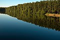
- Nomination Russia, Elektrostal. Lake "Zapadnoe" at sunrise. --Knopik-som 21:09, 6 November 2021 (UTC)
- Promotion Support Good quality. --Steindy 21:31, 6 November 2021 (UTC)
-

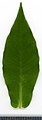
- Nomination Aronia mitschurinii. Leaf adaxial side. --Knopik-som 21:09, 6 November 2021 (UTC)
- Promotion Support Good quality. --Steindy 21:30, 6 November 2021 (UTC)
-

- Nomination Aronia mitschurinii. Leaf abaxial side. --Knopik-som 21:09, 6 November 2021 (UTC)
- Promotion Support Good quality. --Steindy 21:30, 6 November 2021 (UTC)
-
- Nomination Phlox paniculata. Leaf adaxial side. --Knopik-som 21:09, 6 November 2021 (UTC)
- Promotion Support Good quality. --Steindy 21:30, 6 November 2021 (UTC)
-

- Nomination Phlox paniculata. Leaf abaxial side. --Knopik-som 21:09, 6 November 2021 (UTC)
- Promotion Support Good quality. --Steindy 21:30, 6 November 2021 (UTC)
-

-

- Nomination Ponte Sant'Angelo in Rome (by Tournasol7) --Sebring12Hrs 20:35, 6 November 2021 (UTC)
- Promotion Good quality. --KaiBorgeest 23:19, 6 November 2021 (UTC)
-

-

-

- Nomination Ponte Vittorio Emanuele II in Rome (by Tournasol7) --Sebring12Hrs 20:23, 6 November 2021 (UTC)
- Promotion Support Good quality. --Knopik-som 21:13, 6 November 2021 (UTC)
-

- Nomination The east window of Old Christ Church is by Shrigley and Hunt and depicts Christ with angels, saints and Old Testament figures. --Rodhullandemu 20:18, 6 November 2021 (UTC)
- Promotion Support Good quality. --Knopik-som 21:15, 6 November 2021 (UTC) Support Good quality. --Steindy 21:19, 6 November 2021 (UTC)
-

- Nomination West window of Old Christ Church, Waterloo by Shrigley and Hunt depicting the Apostles. --Rodhullandemu 20:18, 6 November 2021 (UTC)
- Promotion Support Good quality. --Knopik-som 21:15, 6 November 2021 (UTC) Support Good quality. --Steindy 21:19, 6 November 2021 (UTC)
-

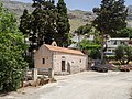
- Nomination Stone made wine press in Kainourgio Chorio, Crete. --C messier 19:48, 6 November 2021 (UTC)
- Promotion Support Good quality. --Knopik-som 21:18, 6 November 2021 (UTC)
-
-

-

- Nomination Fortress of Guaita - First Tower (San Marino) --Commonists 18:47, 6 November 2021 (UTC)
- Promotion Support Good quality. --Knopik-som 21:19, 6 November 2021 (UTC)
-

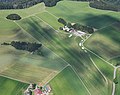
- Nomination Aerial image of the Bremgarten airfield, Germany --Carsten Steger 18:44, 6 November 2021 (UTC)
- Promotion Support Good quality. --Steindy 22:26, 6 November 2021 (UTC)
-

- Nomination Aerial image of the Herten-Rheinfelden airfield, Germany --Carsten Steger 18:44, 6 November 2021 (UTC)
- Promotion Support Good quality. --Knopik-som 21:21, 6 November 2021 (UTC)
-
- Nomination Aerial image of the Hütten-Hotzenwald gliding site, Germany --Carsten Steger 18:44, 6 November 2021 (UTC)
- Promotion Support Good quality. --Knopik-som 21:21, 6 November 2021 (UTC)
-

- Nomination Demolition of former locomotive repair shop in Trier. --Palauenc05 18:05, 6 November 2021 (UTC)
- Promotion Support Good quality. --Commonists 18:48, 6 November 2021 (UTC)
-

- Nomination Iron bridge on Sava river at Radeče (IG. GRIDL fabrik, 1894) --PetarM 16:24, 6 November 2021 (UTC)
- Promotion Support Good quality. --Commonists 18:48, 6 November 2021 (UTC)
-

- Nomination Christ crucified in the church of Rendufe, Portugal. -- Alvesgaspar 14:01, 6 November 2021 (UTC)
- Promotion Support Good quality. --XRay 16:15, 6 November 2021 (UTC)
-

- Nomination Christ crucified in the church of the convent of Tibães, Portugal. Alvesgaspar 13:55, 6 November 2021 (UTC)
- Promotion Support Good quality. --Commonists 18:48, 6 November 2021 (UTC)
-
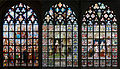
- Nomination Three stained-glass windows in the Cathedral of Our Lady, Antwerp. -- Alvesgaspar 13:53, 6 November 2021 (UTC)
- Promotion Support Good quality. --Rjcastillo 18:26, 6 November 2021 (UTC)
-

- Nomination Pannel of glazed tiles (azulejos) in São Bento railway station. Porto, Portugal. -- Alvesgaspar 13:53, 6 November 2021 (UTC)
- Promotion Support Good quality. --Knopik-som 21:25, 6 November 2021 (UTC)
-

- Nomination Main entrance to the Palace of Holyroodhouse, Edinburgh, Scotland --Domob 09:37, 6 November 2021 (UTC)
- Promotion Support I'd have retouched the WB to make it warmer, but ok --Poco a poco 09:55, 6 November 2021 (UTC)
 Done Thanks for the review, I agree. I've updated with warmer WB. --Domob 11:11, 6 November 2021 (UTC)
-

- Nomination Ford Fiesta MK7 (Facelift) at Auto Zuerich 2021.--Alexander-93 09:34, 6 November 2021 (UTC)
- Promotion Support Good quality. --Poco a poco 09:57, 6 November 2021 (UTC)
-

- Nomination Kia EV6 at Auto Zuerich 2021.--Alexander-93 09:34, 6 November 2021 (UTC)
- Promotion Support Good quality. --Poco a poco 10:01, 6 November 2021 (UTC)
-

- Nomination Fuggerei, Augsburg, Germany --Poco a poco 09:22, 6 November 2021 (UTC)
- Promotion Support Good quality. --XRay 10:53, 6 November 2021 (UTC)
-

- Nomination Fuggerei, Augsburg, Germany --Poco a poco 09:22, 6 November 2021 (UTC)
- Promotion Support Good quality. --Knopik-som 21:27, 6 November 2021 (UTC)
-

- Nomination Augsburger Puppenkiste, Augsburg, Germany --Poco a poco 09:22, 6 November 2021 (UTC)
- Promotion Support Good quality. --Knopik-som 21:27, 6 November 2021 (UTC)
-
- Nomination Fuggerei, Augsburg, Germany --Poco a poco 09:22, 6 November 2021 (UTC)
- Promotion Support Good quality. --Commonists 18:48, 6 November 2021 (UTC)
-

- Nomination War memorial at the church St. Bartholomäus in Kirchehrenbach --Ermell 09:04, 6 November 2021 (UTC)
- Promotion Support Good quality. --Poco a poco 09:24, 6 November 2021 (UTC)
-

- Nomination Crucifix at the church St. Bartholomäus in Kirchehrenbach --Ermell 09:04, 6 November 2021 (UTC)
- Promotion Support Good quality. --Poco a poco 09:24, 6 November 2021 (UTC)
-

- Nomination Land consolidation monument in Zeil --Ermell 09:04, 6 November 2021 (UTC)
- Promotion Support Good quality. --Poco a poco 09:24, 6 November 2021 (UTC)
-

- Nomination Aerial view of tax office in Bamberg --Ermell 09:04, 6 November 2021 (UTC)
- Promotion Support Good quality. --Poco a poco 09:24, 6 November 2021 (UTC)
-

- Nomination Crucifix in Kirchehrenbach --Ermell 09:04, 6 November 2021 (UTC)
- Promotion Support Good quality. --Poco a poco 09:24, 6 November 2021 (UTC)
-

- Nomination Ecletic house, Rue Faidherbe 77, La Madeleine, France --Velvet 07:33, 6 November 2021 (UTC)
- Promotion Good quality --Michielverbeek 07:35, 6 November 2021 (UTC)
-

- Nomination Eclectic house, Rue de Paris 61, La Madeleine, France --Velvet 07:32, 6 November 2021 (UTC)
- Promotion Support Good quality. --Sebring12Hrs 08:37, 6 November 2021 (UTC)
-
-

-

-

- Nomination “Farbleiter” artwork (Peter Lacroix, 1973) at the registry office in Aachen, North Rhine-Westphalia, Germany --XRay 06:46, 6 November 2021 (UTC)
- Promotion Support Good quality -- Johann Jaritz 07:26, 6 November 2021 (UTC)
-

- Nomination Tower of the Electoral Palace in Bonn, North Rhine-Westphalia, Germany --XRay 06:46, 6 November 2021 (UTC)
- Promotion Support Good quality -- Johann Jaritz 07:26, 6 November 2021 (UTC)
-

-

-

-

- Nomination Detail of a Amanita muscaria in decay. Location De Famberhorst. Focus stack of 29 photos.
--Famberhorst 06:24, 6 November 2021 (UTC) - Promotion Support Good quality -- Johann Jaritz 06:25, 6 November 2021 (UTC)
- Nomination Detail of a Amanita muscaria in decay. Location De Famberhorst. Focus stack of 29 photos.
-

- Nomination Fallen chestnuts from a Castanea sativa . Focus stack of 19 photos.
--Famberhorst 06:24, 6 November 2021 (UTC) - Promotion Support Good quality -- Johann Jaritz 06:25, 6 November 2021 (UTC)
- Nomination Fallen chestnuts from a Castanea sativa . Focus stack of 19 photos.
-

- Nomination Schloßstraße 26 in Neuenstein, Baden-Württemberg, Germany. --Tournasol7 06:17, 6 November 2021 (UTC)
- Promotion Support Good quality -- Johann Jaritz 06:26, 6 November 2021 (UTC)
-

- Nomination Storchsnestturm in Öhringen, Baden-Württemberg, Germany. --Tournasol7 06:17, 6 November 2021 (UTC)
- Promotion Support Good quality.--Famberhorst 06:28, 6 November 2021 (UTC)
-

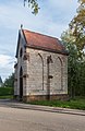
- Nomination Protestant church in Daun, Rhineland-Palatinate, Germany. --Tournasol7 06:17, 6 November 2021 (UTC)
- Promotion Support Good quality -- Johann Jaritz 06:26, 6 November 2021 (UTC)
-
- Nomination Hochturmkapelle am Zwinger in Rottweil, Baden-Württemberg, Germany. --Tournasol7 06:17, 6 November 2021 (UTC)
- Promotion Support Good quality -- Johann Jaritz 06:29, 6 November 2021 (UTC)
-

- Nomination Castle of Kirchberg an der Jagst, Baden-Württemberg, Germany. --Tournasol7 06:17, 6 November 2021 (UTC)
- Promotion Support Good quality -- Johann Jaritz 06:26, 6 November 2021 (UTC)
-

-

- Nomination Volleyball, German Bundesliga Women, Dresdner SC - Allianz MTV Stuttgart: runner-up Allianz MTV Stuttgart, team photo. By --Stepro 05:51, 6 November 2021 (UTC)
- Promotion Support Good quality. --Tournasol7 06:19, 6 November 2021 (UTC)
-

- Nomination Volleyball, German Bundesliga Women, Dresdner SC - Allianz MTV Stuttgart: Champion DSC, Dresdner SC; celebration; Award Ceremony. By --Stepro 05:51, 6 November 2021 (UTC)
- Promotion Support Good quality. --Tournasol7 06:19, 6 November 2021 (UTC)
-

- Nomination Volleyball, German Bundesliga Women: Sindy Lenz (Schwarz-Weiss Erfurt, 8). By --Stepro 05:51, 6 November 2021 (UTC)
- Promotion Support Good quality. --Tournasol7 06:19, 6 November 2021 (UTC)
-

- Nomination Volleyball, German Bundesliga Women: Antonia Stautz (Schwarz-Weiss Erfurt, 6). By --Stepro 05:51, 6 November 2021 (UTC)
- Promotion Support Good quality. --Tournasol7 06:19, 6 November 2021 (UTC)
-

- Nomination Walk on the Tongeren Heide. Dead tree on marshy heath.
--Agnes Monkelbaan 05:22, 6 November 2021 (UTC) - Promotion Support Good quality -- Johann Jaritz 05:55, 6 November 2021 (UTC)
- Nomination Walk on the Tongeren Heide. Dead tree on marshy heath.
-

- Nomination Walk on the Tongeren Heide. Flowering heather with Pinus sylvestris.
--Agnes Monkelbaan 05:22, 6 November 2021 (UTC) - Promotion Support Good quality -- Johann Jaritz 05:55, 6 November 2021 (UTC)
- Nomination Walk on the Tongeren Heide. Flowering heather with Pinus sylvestris.
-

- Nomination Hundreds of protesters took to the streets of Chile --Rjcastillo 04:28, 6 November 2021 (UTC)
- Promotion Support Good quality -- Johann Jaritz 05:54, 6 November 2021 (UTC)
-

- Nomination Porch and side chapel at the parish church Saint Rupert, Völkermarkt, Carinthia, Austria -- Johann Jaritz 03:46, 6 November 2021 (UTC)
- Promotion Support Good quality.--Agnes Monkelbaan 05:16, 6 November 2021 (UTC)
-

- Nomination South portal of the parish church Saint Rupert, Völkermarkt, Carinthia, Austria -- Johann Jaritz 03:46, 6 November 2021 (UTC)
- Promotion Support Good quality.--Agnes Monkelbaan 05:18, 6 November 2021 (UTC)
-

- Nomination Southern side chapel at the parish church Saint Rupert, Völkermarkt, Carinthia, Austria -- Johann Jaritz 03:46, 6 November 2021 (UTC)
- Promotion Support Good quality.--Agnes Monkelbaan 05:17, 6 November 2021 (UTC)
-

-

- Nomination Daniel Hautzinger, footballplayerof SV Stripfing. --Steindy 00:10, 6 November 2021 (UTC)
- Promotion Support Good quality. --Carsten Steger 18:58, 6 November 2021 (UTC)
-

- Nomination Daniel Hautzinger, footballplayerof SV Stripfing. --Steindy 00:10, 6 November 2021 (UTC)
- Promotion Support Good quality. --Commonists 18:48, 6 November 2021 (UTC)
-

- Nomination Honda HR-V Hybrid at Auto Zürich 2021.--Alexander-93 08:35, 5 November 2021 (UTC)
- Promotion Support Good quality. --Velvet 07:29, 6 November 2021 (UTC)
-

- Nomination Kia EV6 at Auto Zürich 2021.--Alexander-93 08:35, 5 November 2021 (UTC)
- Promotion Support Good quality. --Velvet 07:29, 6 November 2021 (UTC)
-

- Nomination Church of the Holy Life-Giving Trinity in Orekhovo-Borisovo, Moscow. Bottom-up view of the two-headed eagle and the dome. --Andrey Korzun 08:33, 5 November 2021 (UTC)
- Promotion Support Good quality. --Velvet 07:29, 6 November 2021 (UTC)
-

-
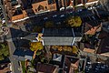
- Nomination Maria Hilf Catholic Parish Church in Bamberg, aerial view. --Ermell 11:11, 3 November 2021 (UTC)
- Promotion Support Good quality. --Carsten Steger 19:05, 6 November 2021 (UTC)
-

- Nomination: Statue of Madonna and Child in Saint Martin church of Replonges, France. --Chabe01 20:50, 31 October 2021 (UTC)
- Review needed
-

- Nomination: Church Mariä Himmelfahrt in Pfons, Tyrol, Austria - interior, detail of the ceiling --Kritzolina 17:47, 31 October 2021 (UTC)
- Review needed
-
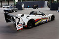
- Nomination: Paris - Bonhams 2013 - Peugeot 905 - 1993 (by Thesupermat) --Sebring12Hrs 12:44, 31 October 2021 (UTC)
- Review needed
-

- Nomination: Paris - Bonhams 2013 - Peugeot 905 - 1993 (by Thesupermat) --Sebring12Hrs 12:44, 31 October 2021 (UTC)
- Review needed
-
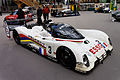
- Nomination: Paris - Bonhams 2013 - Peugeot 905 - 1993 (by Thesupermat) --Sebring12Hrs 12:44, 31 October 2021 (UTC)
- Review needed
-

- Nomination: Wooden sculpture of Madonna with Child. --Moroder 12:43, 31 October 2021 (UTC)
- Review needed
-

- Nomination: Underwater photographic gear for a wide angle lens. --Poco a poco 08:34, 31 October 2021 (UTC)
- Review needed
-

- Nomination: A Coast Guard ship "Kerch' under construction, Saint Petersburg. --Andrey Korzun 08:32, 31 October 2021 (UTC)
- Review needed
-

- Nomination: Das rekonstruierte Nordtor im Archäologischen Park Xanten. --Nightflyer 13:07, 30 October 2021 (UTC)
- Review
There seems to be too much perspective correction. The towers are leaning outward. There also seems to be some pincushion distortion that should be removed. --Carsten Steger 15:44, 30 October 2021 (UTC) Comment Sorry, you are wrong. Gruss --Nightflyer 21:03, 30 October 2021 (UTC) Comment Two points on the rightmost edge of the building are (row,column): (1378,4594) and (2828,4585), i.e., the top part is 9 pixels to the right of the bottom part of the edge in the image. Two points on the leftmost edge of the building are: (1128,1917) and (2119,1930), i.e., the top part is 13 pixels to the left of the bottom part. Therefore, the building appears to be wider at the top than at the bottom. This is what causes my impression of too much perspective correction. --Carsten Steger 06:02, 31 October 2021 (UTC)
-

- Nomination Fuggerei, Augsburg, Germany --Poco a poco 06:22, 30 October 2021 (UTC)
- Promotion Support Bottom crop could be better, but still good quality. --C messier 20:03, 6 November 2021 (UTC)
-

- Nomination Büs de la Palü pond in Manerba del Garda. --Moroder 05:50, 30 October 2021 (UTC)
- Promotion
Looks tilted, check the trees and their reflexions --Poco a poco 06:31, 30 October 2021 (UTC) Done Thanks for the hint --Moroder 22:16, 5 November 2021 (UTC) Support Good quality. --Poco a poco 09:51, 6 November 2021 (UTC)
-

- Nomination Sunset over the Praek Tuek Chhu river. Kampot, Cambodia. --Halavar 00:19, 30 October 2021 (UTC)
- Promotion Good quality. --KaiBorgeest 23:22, 6 November 2021 (UTC)
-

-

- Nomination Feces of black sea cucumber (Holothuria forskali), Arrábida Natural Park, Portugal --Poco a poco 17:08, 29 October 2021 (UTC)
- Decline
 Oppose The left part is unsharp even at preview size. --C messier 20:08, 6 November 2021 (UTC)
-

-
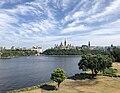
- Nomination: Canada's Parliament Hill across the river as seen from the Canadian Museum of History. --Oscitare 13:57, 28 October 2021 (UTC)
- Review
Buildings in the left side are leaning inward; verticals should be straight. Picture needs perspective correction. --Halavar 19:06, 28 October 2021 (UTC)
Halavar, the respective corrections have been made, I believe. Oscitare 04:48, 1 November 2021 (UTC)
-
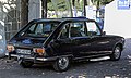
- Nomination Renault 16 TS from 1976 at Classic-Gala Schwetzingen 2021.--Alexander-93 17:08, 27 October 2021 (UTC)
- Decline
Oppose The picture is quite soft (in particular for a subject like this), and I'm also not a big fan of the burnt background. Both issues taken together IMHO disqualify this image from QI, sorry. --Domob 09:39, 6 November 2021 (UTC)


.jpg)
.jpg)


.jpg)


.jpg)


_--_2021_--_6728.jpg)
._Locatie_De_Famberhorst._31-10-2020_(d.j.b.)_02.jpg)
_31-10-2021_(d.j.b.)_01.jpg)

.jpg)
.jpg)
.jpg)
.jpg)


._30-08-2021._(actm.)_14.jpg)
._30-08-2021._(actm.)_02.jpg)


.jpg)
.jpg)
.jpg)


_-_2021-10-30_-_5.jpg)


.jpg)

,_Parque_natural_de_la_Arr%C3%A1bida,_Portugal,_2020-07-31,_DD_88.jpg)


_Classic-Gala_2021_1X7A0290.jpg)
Consensual review edit
File:Niflettes_de_Seine_et_Marne.jpg edit

- Nomination Niflettes, traditional pastries from Seine et Marne --Aloxe 21:52, 3 November 2021 (UTC)
- Decline
- Oppose Sorry! Not sharp enough and too low DOF. --Steindy 00:11, 4 November 2021 (UTC)
 Weak support, short DoF, but I think the ones in front are sharp enough. -- Ikan Kekek 08:50, 4 November 2021 (UTC)
- Oppose Unsharp overall -- Alvesgaspar 14:13, 5 November 2021 (UTC)
- Oppose WB far off, too low DOF. --Smial 01:31, 7 November 2021 (UTC)
Total: 1 support (excluding the nominator), 3 oppose →  Declined --Augustgeyler 01:38, 9 November 2021 (UTC)
File:Riserva_naturale_della_Rocca_di_Manerba_del_Garda.jpg edit

- Nomination La Rocca peak in the natural reserve Park. --Moroder 05:50, 30 October 2021 (UTC)
- Decline
- Oppose Sorry. The image is too blurry. In addition, there are stitching artifacts in the sky because the vignetting has not been completely removed. --Carsten Steger 09:19, 30 October 2021 (UTC)
- Sorry but this comment doesn't make sense --Moroder 15:31, 30 October 2021 (UTC)
- Comment I have added a note to the image in the part where I perceive the residual vignetting in the sky. I assume this is a panorama image because the resolution of the Hasselblad X1D camera is much smaller than the resolution of the image. --Carsten Steger 15:53, 30 October 2021 (UTC)
- Sorry but this comment doesn't make sense --Moroder 15:31, 30 October 2021 (UTC)
- Support This is a humongous and beautiful file. The fact that there are artifacts at unusually high resolution when we are sitting at our computers and looking at a large screen from a meter or less is irrelevant. -- Ikan Kekek 23:59, 3 November 2021 (UTC)
- Comment I agree that the composition is beautiful. I don't understand your second point, unfortunately. To me, what is the point of having a 170 megapixel image that is unsharp? My estimate is that the optical resolution of the image is at most sufficient for a quarter of its present size (10000×4285, i.e., a 42.5 megapixel image). --Carsten Steger 10:03, 4 November 2021 (UTC)
- Isn't the point of a very large image to print it and look at it from a few meters away? -- Ikan Kekek 19:38, 4 November 2021 (UTC)
- Comment I have pondered your comment for a while now. I must confess that I don't understand the point you are trying to make. As an example, a 2 m wide print of an image viewed from a distance of 6 m will look exactly identical to a 1 m wide print of an image viewed from a distance of 3 m. This is a basic fact of projective geometry and holds for any image size (i.e., number of pixels in the image). Could you provide me with a reference so that I can try to understand the point you are trying to make better? In any event, I am reasonably sure that the main purpose of having larger images (images with more pixels) is the ability to discern more details, i.e., a larger image resolution, and image resolution is primarily determined by the optical resolution of the lens and not the number of pixels of the sensor. Consequently, the larger the number of pixels in the image, the better the optical resolution of the lens must be. Otherwise, you will simply get blurred images. --Carsten Steger 19:32, 6 November 2021 (UTC)
- Comment I take your point: maybe this photo is larger than it needs to be. But photos aren't supposed to be downsampled, and even at 100% on my 23.5-inch monitor, it hardly looks unforgivably blurred, especially considering how far away I should look at it (maybe more like 3 meters). -- Ikan Kekek 05:56, 7 November 2021 (UTC)
- Comment I’m sorry. I just realized that I didn’t make the point I was trying to make in my last comment explicit enough. By just specifying the distance at which to look at a print of the image, one important piece of information is missing: the dimensions of the print. Without this information, it is impossible to judge the visual appearance the print would have. It makes a significant difference whether you look at a 20 cm or a 10 m wide print at a distance of 3 m (I’m exaggerating the widths to make my point clear). What width do you have in mind for the print if you imagine looking at it at a distance of 3 m? --Carsten Steger 08:42, 7 November 2021 (UTC)
- I haven't calculated how large a print we would get if we printed it out at full size. However, I guess 3 meters would be too far, maybe 2 1/4, whatever is equivalent to about 7 feet. -- Ikan Kekek 09:39, 7 November 2021 (UTC)
- Comment I have done some calculations. The human eye has an optical resolution of approximately 1 arcminute. At a distance of 3 m, a pixel in an image would have to be printed at a side length of approximately 0.87 mm to match the optical resolution of the human eye. Therefore, at this resolution, the image would have to be printed at a width of approximately 17.5 m to match the resolution of the human eye. (It you want to use your 7 feet (2.1 m) as the distance, scale every quantity by 0.7.) If the image is printed smaller, the optical resolution of the human eye becomes the limiting factor. Essentially, what would happen is that the image would be subsampled (downscaled) by the human eye. This shows that high-resolution should be looked at from short distances; otherwise the high resolution is just wasted. --Carsten Steger 12:14, 7 November 2021 (UTC)
- Comment Do you feel the same way about large paintings? The point of things being large is partly that a large composition gives a particular feeling that's different from a smaller one. I don't normally peer at large paintings up close. -- Ikan Kekek 22:50, 7 November 2021 (UTC)
- Comment I'm also getting the distinct feeling that people are saying that photos that are "too big" should be downsampled, yet downsampling is not recommended here. Should we have a discussion on the talk page to clarify things? -- Ikan Kekek 22:52, 7 November 2021 (UTC)
- Oppose odd sky, too saturated colours (is it HDR?). --Kallerna 08:08, 4 November 2021 (UTC)
- Oppose As Carsten Steger. What's the point of composing such a huge blurred image? Motion blur due to non-stabilized lens or unwanted artificial enlargement by the stitching application?-- Alvesgaspar 13:36, 6 November 2021 (UTC)
Total: 1 support (excluding the nominator), 3 oppose → Declined --Augustgeyler 22:55, 8 November 2021 (UTC)
File:Playa_Vasco_de_Gama,_Sines,_Portugal,_2021-09-12,_DD_27-38_PAN.jpg edit
![]()
- Nomination Vasco de Gama Beach, Sines, Portugal --Poco a poco 11:27, 28 October 2021 (UTC)
- Promotion
- Support Qoog Quality. --ADARSHluck 15:22, 28 October 2021 (UTC)
- Oppose Unrealistic depiction of the place (which I know quite well) due to an extreme perspective manipulation -- Alvesgaspar 15:54, 28 October 2021 (UTC)
- Weak Support I also find such cylindrical projections unappealing from an aesthetic point of view, but it seems to me to be technically flawlessly executed and therefore meets the conditions for QIC. --Smial 11:59, 3 November 2021 (UTC)
- Comment According to my interpretation of the guidelines, quality is not only about technical perfection: vertical lines vertical, absence of stitching errors, absence of blown areas, absence of noise, sharpness, etc. It is also about a balanced and pleasant composition, making justice to the object being photographed. In my opinion, such a drastic perspective transformation clearly collides with the norm that "perspective distortion should either have a purpose or be insignificant". Alvesgaspar 17:14, 3 November 2021 (UTC)
- Comment Indeed a panoramic view with cylindrical projection has purpose. --Smial 17:24, 3 November 2021 (UTC)
 Question And what should that purpose be? By the way, there is a prominent stitching error along the central vertical line. -- Alvesgaspar 18:03, 3 November 2021 (UTC)
- I uploaded a new version addressing that issue Poco a poco 20:19, 3 November 2021 (UTC)
- I don't think the problem was solved. In fact, there are three stitching lines easily spotted in thumbnail size. Alvesgaspar 20:58, 3 November 2021 (UTC)
- The purpose of panoramic photos is described here --Smial 09:17, 4 November 2021 (UTC)
- I uploaded a new version addressing that issue Poco a poco 20:19, 3 November 2021 (UTC)
- Oppose A bit too much going on here, at least for the moment. Both sides are leaning out, especially the left; there are
 chromatic aberrations...--Peulle 11:16, 4 November 2021 (UTC)
- Peulle: Along with additional improvements of stitching areas, I've reduced the CA and improved the perspective --Poco a poco 19:04, 5 November 2021 (UTC)
- Support I think you should state somewhere on the page that this is a cylindrical projection, but as such, it seems good to me, and the CAs I see are very minor at full or nearly full size on a 23.5-inch monitor, so I consider that really de minimis. -- Ikan Kekek 21:21, 4 November 2021 (UTC)
- Comment It doesn't really matter what kind of projection it is, when reality is so extremely distorted. Nominations are opposed in QIC when vertical lines are not shown perfectly parallel to each other, while they are supported despite the gross distortions caused by the application of some magic projection. Well, I am a mathematical cartographer and know that there is nothing magical or intrinsically true about map projections, which are just tools used to preserve some chosen geometric properties or obtain some chosen effect. The same happens with the projections used in Photography, whose main purpose is - or should be - to represent the 3D reality captured by a camera as closely as possible to what our eyes perceive. Or, alternatively, to obtain some artistic effect, which is not the case here. What about the obvious stitching lines left by joining the individual images that are part of this panorama? Are they also minor flaws mitigated by the magical result of a cylindrical projection? Come on guys, what's going on here? Is this the competent, reliable and helpful forum we all would like QIC to be, or has been transformed into something else? I would urge Poco a poco to withdraw the nomination of this photo, which doesn't make justice to his otherwise excellent work. -- Alvesgaspar 23:27, 4 November 2021 (UTC)
- Comment I've been a geography buff since I was 6, and Mercator's Projection for world maps is not more accurate than this, but it was until fairly recently standard and often seen for such maps. I think that as long as the type of distortion is specified, it is a matter of taste. -- Ikan Kekek 01:40, 5 November 2021 (UTC)
- Comment More improvements in stitching areas. Btw the affirmation that stitching issues were visible at thumbnail size is not just insulting but bullshit. Poco a poco 19:04, 5 November 2021 (UTC)
 Info Here: https://commons.wikimedia.org/wiki/File:Playa_Vasco_de_Gama,_Sines,_Portugal,_2021-09-12,_DD_27-38_PAN.jpg . Three stitching lines are visible, as well as slightly different colours and patterns on each side. -- Alvesgaspar 19:29, 5 November 2021 (UTC)
- Comment @Alvesgaspar: I don't quite understand your comment “It doesn't really matter what kind of projection it is, when reality is so extremely distorted.” Any panorama must have these kinds of distortions since a panorama essentially must map a (part of a) sphere to a plane (identically to what needs to be done in cartography). Are you implying that panorama images cannot be quality images? What about images taken with fisheye lenses? These also exhibit (by design) strong distortions. Would such an image qualify as a quality image in your opinion? --Carsten Steger 12:32, 7 November 2021 (UTC)
- Question Poco a poco, I supported, but don't you think you should inform the viewer who doesn't know what this beach really looks like that this is a cylindrical projection? I think you should. -- Ikan Kekek 01:16, 6 November 2021 (UTC)
- Done Poco a poco 09:49, 6 November 2021 (UTC)
 Neutral It is very hard for me to say, if that kind of projection is suitable for that purpose. --Augustgeyler 19:18, 7 November 2021 (UTC)
Total: 3 support (excluding the nominator), 2 oppose →  Promoted --Peulle 08:33, 8 November 2021 (UTC)