Commons:Quality images candidates/Archives September 07 2013
-

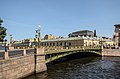
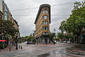
- Nomination Landsort Lighthouse, Öja Island, Stockholm archipelago. --ArildV 20:39, 5 September 2013 (UTC)
- Promotion Very good. -- Felix Koenig 20:45, 5 September 2013 (UTC)
-

- Nomination Residential house on Beckholmen built in 1893. Beckholmen is a small island and historic shipyard in central Stockholm, Sweden. --ArildV 20:29, 5 September 2013 (UTC)
- Promotion
 Support QI --Rjcastillo 20:53, 5 September 2013 (UTC)
-
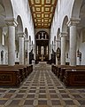
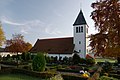
- Nomination Schottenkirche St. Jakob Innenraum Richard Bartz 19:32, 5 September 2013 (UTC)
- Promotion Support Very good --Rjcastillo 19:58, 5 September 2013 (UTC)
-

- Nomination Hermitage Saint-Antoine, Castelnau-de-Guers, Hérault, France. --Christian Ferrer 19:22, 5 September 2013 (UTC)
- Promotion Support QI --Rjcastillo 20:14, 5 September 2013 (UTC)
-

- Nomination Hermitage Saint-Antoine, Castelnau-de-Guers, Hérault, France. --Christian Ferrer 19:22, 5 September 2013 (UTC)
- Promotion Good quality. --VT98Fan 20:25, 5 September 2013 (UTC)
-

- Nomination Hermitage Saint-Antoine, Castelnau-de-Guers, Hérault, France. --Christian Ferrer 19:22, 5 September 2013 (UTC)
- Promotion Support QI --Rjcastillo 20:14, 5 September 2013 (UTC)
-

- Nomination Castelnau-de-Guers, Hérault, France. --Christian Ferrer 19:20, 5 September 2013 (UTC)
- Promotion Good quality. --VT98Fan 20:25, 5 September 2013 (UTC)
-

- Nomination Taipei 101 --AngMoKio 19:03, 5 September 2013 (UTC)
- Promotion Support ok --Christian Ferrer 19:30, 5 September 2013 (UTC)
-
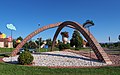
- Nomination Roundabout decoration, Eschach-Holzhausen, Germany. The painted flowers and clouds have been created by local children. --Kreuzschnabel 18:18, 5 September 2013 (UTC)
- Promotion Good quality. --Ralf Roletschek 18:42, 5 September 2013 (UTC)
-
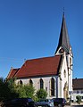
- Nomination Protestant Church St. John, Göggingen, Germany, seen from the west --Kreuzschnabel 17:58, 5 September 2013 (UTC)
- Withdrawn Very good but there is a white frame in the low part --Christian Ferrer 19:32, 5 September 2013 (UTC)
 I withdraw my nomination for some minor stitching errors I haven’t got the time to fix now --Kreuzschnabel 20:11, 5 September 2013 (UTC)
-

- Nomination Oliwa Cathedral, Gdansk, Poland --Poco a poco 17:17, 5 September 2013 (UTC)
- Promotion Support OK --Christian Ferrer 19:35, 5 September 2013 (UTC)
-

- Nomination Promenade pier of Sopot, Poland --Poco a poco 17:17, 5 September 2013 (UTC)
- Promotion Good quality. --Ralf Roletschek 17:25, 5 September 2013 (UTC)
-

- Nomination Malbork Castle, Poland --Poco a poco 17:17, 5 September 2013 (UTC)
- Promotion Good quality. --Ralf Roletschek 17:25, 5 September 2013 (UTC)
-

- Nomination Malbork Castle, Poland --Poco a poco 17:17, 5 September 2013 (UTC)
- Promotion Support
 Comment left side a bit blurry but otherwise QI --Rjcastillo 20:03, 5 September 2013 (UTC)
-

- Nomination Malbork Castle, Poland --Poco a poco 17:17, 5 September 2013 (UTC)
- Promotion Support QI --Rjcastillo 20:03, 5 September 2013 (UTC)
-
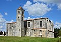
- Nomination SE view of church of Saint-Étienne, remains of the abbey built in the 11th century, Baignes-Sainte-Radegonde, Charente, France. --JLPC 17:13, 5 September 2013 (UTC)
- Promotion Good quality. --Poco a poco 18:06, 5 September 2013 (UTC)
-

-
-

-

-

-

-

- Nomination Moulin Legumes No.2 --Ralf Roletschek 15:09, 5 September 2013 (UTC)
- Promotion Excellent photo -- Spurzem 15:55, 5 September 2013 (UTC)
-

- Nomination Lemons --Ralf Roletschek 15:09, 5 September 2013 (UTC)
- Promotion Very good quality -- Spurzem 16:04, 5 September 2013 (UTC)
-

- Nomination The ambulance station of German Red Cross in Loßburg, Black Forest. -- Felix Koenig 14:58, 5 September 2013 (UTC)
- Promotion Good quality.--ArildV 20:50, 5 September 2013 (UTC)
-

- Nomination The Eschenheim Tower, a city gate part of the late-medieval fortifications of Frankfurt am Main, Hesse. -- Felix Koenig 14:45, 5 September 2013 (UTC)
- Promotion Good quality. --Poco a poco 18:10, 5 September 2013 (UTC)
-
- Nomination Antigua escuela Martin Tovar y Busto a Simón Bolívar en la Plaza Bolívar. Colonia Tovar --Rjcastillo 13:25, 5 September 2013 (UTC)
- Promotion Good quality. --JLPC 17:04, 5 September 2013 (UTC)
-
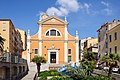
- Nomination Casa Benitz o Café Muhstall --Rjcastillo 13:25, 5 September 2013 (UTC)
- Promotion Good quality. --Florstein 15:59, 5 September 2013 (UTC)
-

- Nomination Tian Tan Buddha --Beria 12:54, 5 September 2013 (UTC)
- Promotion Support QI --Rjcastillo 13:26, 5 September 2013 (UTC)
-

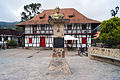
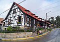
- Nomination Germany, Schlüsselfeld, Marktplatz 6, "Schwarzer Adler" (Black eagle) --Berthold Werner 12:54, 5 September 2013 (UTC)
- Promotion Support QI --Rjcastillo 13:41, 5 September 2013 (UTC)
-

- Nomination Canon EOS 70D body without lens --Martin Kraft 12:26, 5 September 2013 (UTC)
- Promotion Good quality.--ArildV 20:50, 5 September 2013 (UTC)
-

- Nomination Lutherkirche in Wetter an der Ruhr --Smial 10:19, 5 September 2013 (UTC)
- Promotion Good quality. --Martin Kraft 12:34, 5 September 2013 (UTC)
-
-

-

-

- Nomination Clematis 'Princess Diana'. Flowering time: 8-10. height: 2 meters.--
Famberhorst 05:43, 5 September 2013 (UTC) - Promotion Ok for QI --Martin Kraft 12:34, 5 September 2013 (UTC)
- Nomination Clematis 'Princess Diana'. Flowering time: 8-10. height: 2 meters.--
-

-
- Nomination Hotel Europe, Vancouver --Xicotencatl 04:39, 5 September 2013 (UTC)
- Promotion Good quality. --JLPC 17:04, 5 September 2013 (UTC)
-

- Nomination Aeroflot stewardess with both natural and artificial light --Firedrop 05:56, 5 September 2013 (UTC)
- Promotion Could be brigther, but ok for QI --Martin Kraft 12:34, 5 September 2013 (UTC)
-
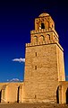
- Nomination Grande Mosquée (Sidi Okba), Kairouan --Dyolf77 01:14, 5 September 2013 (UTC)
- Decline Unsharp, oversaturated sky --Xicotencatl 04:42, 5 September 2013 (UTC)
-

- Nomination A Setra S 416 HDH coach in Vilshofen an der Donau, Bavaria. --High Contrast 01:06, 5 September 2013 (UTC)
- Promotion Good quality. --Ralf Roletschek 06:46, 5 September 2013 (UTC)
-

- Nomination Medieval window in Vilshofen an der Donau, Bavaria. --High Contrast 22:52, 4 September 2013 (UTC)
- Promotion Good quality. --Ralf Roletschek 09:14, 5 September 2013 (UTC)
-

- Nomination Cultural heritage monument in Vilshofen an der Donau, Bavaria. --High Contrast 22:52, 4 September 2013 (UTC)
- Promotion Good quality. --JLPC 17:08, 5 September 2013 (UTC)
-

- Nomination St Matthew's Church interior - choir and furniture. --Colin 21:43, 4 September 2013 (UTC)
- Promotion Support QI --Rjcastillo 23:26, 4 September 2013 (UTC)
-

- Nomination Taipei 101 --AngMoKio 21:39, 4 September 2013 (UTC)
- Promotion Support QI --Rjcastillo 23:26, 4 September 2013 (UTC)
-

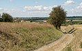
- Nomination Vixán lagoon, Carreira, Ribeira, Galicia (Spain) --Lmbuga 20:18, 4 September 2013 (UTC)
- Promotion Good quality. --Ralf Roletschek 21:03, 4 September 2013 (UTC)
-

- Nomination Valira d'Orient river, Canillo, Andorra. --Lmbuga 20:18, 4 September 2013 (UTC)
- Promotion Good quality. --Ralf Roletschek 21:03, 4 September 2013 (UTC)
-

- Nomination Bell tower of the chapel of Santa Creu of Canillo, Andorra. --Lmbuga 20:18, 4 September 2013 (UTC)
- Promotion Support QI --Rjcastillo 20:52, 4 September 2013 (UTC)
-

- Nomination Detail of Canillo. Andorra. --Lmbuga 20:18, 4 September 2013 (UTC)
- Promotion Good quality. --Poco a poco 20:51, 4 September 2013 (UTC)
-

-
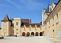
- Nomination Partial view (W and N) of the courtyard, château de l'Oisellerie (15th and 16th centuries), La Couronne, Charente, France. --JLPC 20:11, 4 September 2013 (UTC)
- Promotion Good quality. --Poco a poco 20:51, 4 September 2013 (UTC)
-
- Nomination Hel Lighthouse, Poland --Poco a poco 19:25, 4 September 2013 (UTC)
- Promotion Good quality. --Colin 19:43, 4 September 2013 (UTC)
-

- Nomination Hel Lighthouse, Poland --Poco a poco 19:25, 4 September 2013 (UTC)
- Promotion Support QI for me--Lmbuga 19:29, 4 September 2013 (UTC)
-

- Nomination Malbork Castle, Poland --Poco a poco 19:25, 4 September 2013 (UTC)
- Promotion Support Good quality--Lmbuga 19:31, 4 September 2013 (UTC)
-

- Nomination Lutheran church, Sopot, Poland --Poco a poco 19:25, 4 September 2013 (UTC)
- Promotion Good quality -- Spurzem 20:15, 4 September 2013 (UTC)
-

- Nomination Malbork Castle, Poland --Poco a poco 19:25, 4 September 2013 (UTC)
- Promotion Good quality. --JLPC 20:07, 4 September 2013 (UTC)
-

-

- Nomination Wayside cross in Offemont (1716), France --ComputerHotline 18:38, 4 September 2013 (UTC)
- Promotion Good quality. --Poco a poco 19:40, 4 September 2013 (UTC)
-

- Nomination View to the Ipatiev monastery from Volga river, Kostroma, Russian Federation --Nino Verde 16:50, 4 September 2013 (UTC)
- Promotion Good quality. --Colin 19:02, 4 September 2013 (UTC)
-
-
-

-
- Nomination traffic sign in Abu Dhabi --Ralf Roletschek 15:42, 4 September 2013 (UTC)
- Promotion Good IMO--Lmbuga 21:09, 4 September 2013 (UTC)
-

- Nomination traffic scene in Abu Dhabi --Ralf Roletschek 15:42, 4 September 2013 (UTC)
- Promotion Good quality. --Poco a poco 19:47, 4 September 2013 (UTC)
-
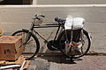
- Nomination Bicycle in Abu Dhabi --Ralf Roletschek 15:42, 4 September 2013 (UTC)
- Promotion QI -- Spurzem 20:09, 4 September 2013 (UTC)
-

- Nomination police car in Abu Dhabi --Ralf Roletschek 15:42, 4 September 2013 (UTC)
- Promotion QI -- Spurzem 20:09, 4 September 2013 (UTC)
-

- Nomination Convolvulus arvensis. The terror of every gardener.--
Famberhorst 15:41, 4 September 2013 (UTC) - Promotion Good quality. --Vassil 16:28, 4 September 2013 (UTC)
- Nomination Convolvulus arvensis. The terror of every gardener.--
-
- Nomination Katholische Kirche Christ-König in Fröndenberg-Warmen, Nordrhein-Westfalen, Deutschland. --Smial 15:11, 4 September 2013 (UTC)
- Promotion Good quality. --Poco a poco 19:40, 4 September 2013 (UTC)
-

-

-

- Nomination Religious people of Maracaibo --The Photographer 13:06, 4 September 2013 (UTC)
- Promotion QI -- Spurzem 08:29, 5 September 2013 (UTC)
-

- Nomination Sculpture to Carlemany. Canillo, Andorra --Lmbuga 11:11, 4 September 2013 (UTC)
- Promotion Good quality. --Poco a poco 19:47, 4 September 2013 (UTC)
-

- Nomination Boats, Portosín, Porto do Son, Galicia (Spain) --Lmbuga 11:11, 4 September 2013 (UTC)
- Promotion Good quality. --Poco a poco 19:47, 4 September 2013 (UTC)
-

-

- Nomination Entrada a la Colonia Tovar --Rjcastillo 01:38, 4 September 2013 (UTC)
- Promotion Good quality. --Poco a poco 19:47, 4 September 2013 (UTC)
-

- Nomination Sheraton Hotel, Sopot, Poland --Poco a poco 18:39, 3 September 2013 (UTC)
- Promotion Good quality. --Xicotencatl 04:46, 5 September 2013 (UTC)
-

- Nomination 4ème manche du championnat suisse de Pony games 2013 - Laconnex --Pleclown 10:54, 3 September 2013 (UTC)
- Promotion Funny capture. QI I think. Heuschrecke 21:45, 4 September 2013 (UTC)
-

- Nomination 17th-century stone stairs and railing, Château de Beynac, Dordogne, France.--Jebulon 09:56, 3 September 2013 (UTC)
- Promotion Good quality. Heuschrecke 21:45, 4 September 2013 (UTC)
-

- Nomination Martin Harnik beim Freundschaftsspiel Österreich gegen Griechenland am 14. August 2013 --Ailura 07:05, 3 September 2013 (UTC)
- Promotion Good quality. --Ralf Roletschek 09:16, 5 September 2013 (UTC)
-

- Nomination Marko Arnautovic beim Freundschaftsspiel Österreich gegen Griechenland am 14. August 2013 --Ailura 07:05, 3 September 2013 (UTC)
- Promotion Good quality. --Ralf Roletschek 09:16, 5 September 2013 (UTC)
-
- Nomination Castelnau-de-Guers, Hérault, France. --Christian Ferrer 05:24, 3 September 2013 (UTC)
- Promotion Good quality. --VT98Fan 21:18, 4 September 2013 (UTC)
-

- Nomination Castelnau-de-Guers, Hérault, France. --Christian Ferrer 05:24, 3 September 2013 (UTC)
- Promotion Good quality. --VT98Fan 21:18, 4 September 2013 (UTC)
-

- Nomination Três Pontas downtown --WOtP 00:22, 3 September 2013 (UTC)
- Decline Insufficient quality – loss of detail due to noise reduction --Kreuzschnabel 18:15, 4 September 2013 (UTC)
-

-

- Nomination Placa a Cristóbal Mendoza --Rjcastillo 21:58, 1 September 2013 (UTC)
- Promotion There is a perspective distortion in the upper right corner, maybe combined with a slight barrel distortion. Resolution a bit low, but acceptable. The file page could benefit from a geocode. --Slaunger 20:11, 4 September 2013 (UTC)
 Done Comment Thanks for reviews. --Rjcastillo 02:03, 5 September 2013 (UTC)
OK now IMO. --Slaunger 19:51, 5 September 2013 (UTC)
-

-

-
- Nomination Walls and towers at Château de Beynac, Dordogne, France.--Jebulon 14:04, 1 September 2013 (UTC)
- Promotion Nice compo but somewhat noisy (sky, parts in the shade). Fixable? --Myrabella 21:46, 2 September 2013 (UTC) Est-ce mieux ? (Je déteste les ciels bleus, j'arrive pô à faire ce que je veux...) --Jebulon 17:45, 3 September 2013 (UTC)
Bon ciel calme, mais je trouve l'image affadie ; meilleur contraste dans la 1e version AMA ; un peu du bruit chromatique dans les ombres. --Myrabella 06:41, 4 September 2013 (UTC) et là ?--Jebulon 22:33, 4 September 2013 (UTC) Yes! --Myrabella 11:46, 5 September 2013 (UTC)
-

- Nomination Chapel in the Rue Centrale, Fingig, Luxembourg --VT98Fan 09:32, 1 September 2013 (UTC)
It is tilted, and it is a bit soft, I'd also crop out the road at the bottom Poco a poco 09:39, 1 September 2013 (UTC) Done I corrected the tilt and the sharpness, but I don't want to change the crop. --VT98Fan 16:52, 1 September 2013 (UTC)
Better, but not yet there, I added a note Poco a poco 19:46, 1 September 2013 (UTC) You were right, I changed the crop. But I can't apply more sharpness there, could you help me? --VT98Fan 20:06, 1 September 2013 (UTC) Done Tilt and perspectives --Christian Ferrer 17:50, 2 September 2013 (UTC) - Promotion Good quality. --Poco a poco 18:57, 4 September 2013 (UTC)
- Nomination Chapel in the Rue Centrale, Fingig, Luxembourg --VT98Fan 09:32, 1 September 2013 (UTC)
-

- Nomination Fonçage Robert (France), light painting. Bourgeois.A 07:52, 1 September 2013 (UTC)
- Promotion Looks tilted. Heuschrecke 10:22, 2 September 2013 (UTC) Done, better now ? Bourgeois.A 13:23, 4 September 2013 (UTC)
Yes, thank you! Heuschrecke 23:35, 4 September 2013 (UTC)
-

- Nomination Superior Technical School of Architecture of Madrid, Spain. --Kadellar 14:25, 31 August 2013 (UTC)
It needs some perspective corrections Poco a poco 14:42, 31 August 2013 (UTC) Done Fixed. --Kadellar 16:59, 3 September 2013 (UTC) - Promotion Good quality. --Poco a poco 18:13, 5 September 2013 (UTC)
- Nomination Superior Technical School of Architecture of Madrid, Spain. --Kadellar 14:25, 31 August 2013 (UTC)
-

- Nomination Bridge Governador Nobre de Carvalho, Macau --Poco a poco 14:05, 31 August 2013 (UTC)
- Promotion Very nice perspective but it's slightly tilted CCW. --Kadellar 14:29, 31 August 2013 (UTC) Fixed Poco a poco 18:22, 31 August 2013 (UTC)
I can see only half of the image, is it just me or an upload related problem? I have refreshed the page several times. --Kadellar 17:05, 3 September 2013 (UTC)
It was actually not properly uploaded, it is fixed now Poco a poco 19:18, 4 September 2013 (UTC)
Thanks! QI. --Kadellar 19:23, 5 September 2013 (UTC)
-
![* Nomination: Folk dancing on stilts in Courcoury-Charente] in France --Moroder 12:45, 30 August 2013 (UTC) * * Review needed](https://upload.wikimedia.org/wikipedia/commons/thumb/6/67/Folk_dancing_in_Courcoury-Charente.jpg/80px-Folk_dancing_in_Courcoury-Charente.jpg)
- Nomination: Folk dancing on stilts in Courcoury-Charente] in France --Moroder 12:45, 30 August 2013 (UTC)
- Review needed
-

- Nomination: 4ème manche du championnat suisse de Pony games 2013 - Laconnex --Pleclown 11:03, 30 August 2013 (UTC)
- Review needed
-

- Nomination: "Sieben Zeichen an der Ruhr" by German artist Veronika Pögel. FOP Germany. --Smial 10:17, 30 August 2013 (UTC)
- Review needed
-

- Nomination: "Sieben Zeichen an der Ruhr" by German artist Veronika Pögel. FOP Germany. --Smial 10:17, 30 August 2013 (UTC)
- Review needed
-

- Nomination: Grand Junction, Birmingham. Mattbuck 06:55, 30 August 2013 (UTC)
- Review needed
-

- Nomination Barbecue Booth of "Wacken Nacken" at Wacken Open Air 2013 -- Achim Raschka 19:24, 29 August 2013 (UTC)
- Decline The people - some of the main subjects in the image are too dark in my opinion (even considering their dark clothes). Light is flat, good resolution though. --Slaunger 20:17, 4 September 2013 (UTC)
-

-

- Nomination Helenium Rauchtopas. An award-winning selection.--
Famberhorst 15:56, 29 August 2013 (UTC) - Decline The photo appears oversaturated and/or overprocessed with low detail level in the flowers. Have the knobs been cranked a bit to high in the postprocessing? Was there a slight motion blur during the 1/13 s exposure? --Slaunger 20:29, 4 September 2013 (UTC) Done Small correction --
Famberhorst 05:28, 5 September 2013 (UTC)
Thanks for the effort, but I actually think it got worse, as now it is also oversharpened IMO, the background is noisier and the colours are beginning to be posterized. Sorry. --Slaunger 20:04, 5 September 2013 (UTC)
- Nomination Helenium Rauchtopas. An award-winning selection.--
-

- Nomination: Silke Gajek, MdL Mecklenburg-Vorpommern, Fraktion Bündnis 90/Die Grünen --Martin Kraft 12:51, 28 August 2013 (UTC)
- Review Guidelines for QI : Note: Please evaluate the oldest images first and, if possible, for every picture you nominate, please review at least one of the other candidates. --Christian Ferrer 18:05, 28 August 2013 (UTC)
I already some reviews, and will do more. But I honestly can't locate any guideline demanding that?? --Martin Kraft 22:40, 29 August 2013 (UTC)
This sentence and also the previous are yet copy and paste from the QIC Guidelines --Christian Ferrer 04:38, 30 August 2013 (UTC)
Ah, it's in the guidelines for evaluation. That's not realy the first place to look at, when searching a nomination guideline?! // Martin Kraft 09:18, 30 August 2013 (UTC) Yes maybe, but it's also good to read completely the text --Christian Ferrer 11:23, 30 August 2013 (UTC)
-

- Nomination Nowe Leśne Bohatery (Новыя Лясныя Багатыры), Poland --Pudelek 09:03, 28 August 2013 (UTC)
- Promotion Support ok --Christian Ferrer 17:59, 4 September 2013 (UTC)
-

- Nomination A Northern Line train. Mattbuck 07:18, 28 August 2013 (UTC)
- Promotion Support ok --Christian Ferrer 17:59, 4 September 2013 (UTC)
-

- Nomination Schlüsselfeld, market place, St. Peter fountain --Berthold Werner 19:41, 24 August 2013 (UTC)
Needs sharpening. Mattbuck 11:03, 31 August 2013 (UTC) Done --Berthold Werner 06:46, 2 September 2013 (UTC)
Quite a bit of CA on the shadows at the bottom (sorry, didn't notice before). Mattbuck 18:34, 3 September 2013 (UTC) Done ;-) --Berthold Werner 13:59, 4 September 2013 (UTC) - Promotion OK. Mattbuck 17:57, 4 September 2013 (UTC)
- Nomination Schlüsselfeld, market place, St. Peter fountain --Berthold Werner 19:41, 24 August 2013 (UTC)
-

- Nomination Ateneum in Helsinki, detail ofthe facadde -- Alvesgaspar 21:23, 18 August 2013 (UTC)
- WARNING: third template parameter added – please remove.
-

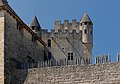
- Nomination Belfort fortifications (citadelle). Bourgeois.A 11:19, 16 August 2013 (UTC)
- Promotion It's tilted and need perspective correction IMO --Christian Ferrer 20:00, 22 August 2013 (UTC)
This is not titled, the walls are naturally inclined. Bourgeois.A 12:08, 25 August 2013 (UTC) It's tilted, I'm not talking about the walls, see notes --Christian Ferrer 15:45, 25 August 2013 (UTC)
Better now ? Bourgeois.A 11:06, 26 August 2013 (UTC) Not enough IMO, regarde sur la page de l'image, j'ai téléchargé une version corrigée avec les frames grises pour que tu vois ce je pense etre correct --Christian Ferrer 16:29, 26 August 2013 (UTC) Done Mieux ? Bourgeois.A 18:08, 26 August 2013 (UTC) C'est mieux bien qu'imparfait, mais j'ai l'impression que tu as croppé la version que j'ai téléchargé et ayant participé à l'édition, je ne peut plus la promouvoir --Christian Ferrer 04:57, 27 August 2013 (UTC) J'ai failli m'en charger, mais l'avant de la voiture rouge me gêne...--Jebulon 09:41, 4 September 2013 (UTC Done Bourgeois.A 14:31, 4 September 2013 (UTC)) Merci. Pour moi, c'est bon.--Jebulon 22:38, 4 September 2013 (UTC)


![* Nomination: Folk dancing on stilts in Courcoury-Charente] in France --Moroder 12:45, 30 August 2013 (UTC) * * Review needed](/wiki/File:Folk_dancing_in_Courcoury-Charente.jpg)


_-_PKS.JPG)


_Kirche.JPG)
Consensual review edit
File:East Midlands Parkway railway station MMB 07.jpg edit

- Nomination Ratcliffe-on-Soar Power Station Mattbuck 20:10, 2 September 2013 (UTC)
- Promotion
- Support - Very unusual for a QIC but I like the idea, the compo, the shoot: OK to me. --Myrabella 21:39, 2 September 2013 (UTC)
- May I ask what you find unusual about it? Mattbuck 21:41, 3 September 2013 (UTC)
- It is not a flat documentary image taken in a bright sunny day. I find it inspired. You manage to capture the fleecy winter athmosphère, strengthened by the melting clouds of steam, and it matchs well with this industrial subject, treated in a rather graphical way. --Myrabella 10:17, 4 September 2013 (UTC)
- This was a very early morning where, due to being a student, I was awake the entire night so decided to go out in the snow. Mattbuck 17:43, 4 September 2013 (UTC)
- It is not a flat documentary image taken in a bright sunny day. I find it inspired. You manage to capture the fleecy winter athmosphère, strengthened by the melting clouds of steam, and it matchs well with this industrial subject, treated in a rather graphical way. --Myrabella 10:17, 4 September 2013 (UTC)
 Weak oppose
 Neutral I'm not sure, but I think that it needs other opinions--Lmbuga 16:51, 3 September 2013 (UTC)
- Support very good photo. --Ralf Roletschek 15:32, 4 September 2013 (UTC)
- Neutral Certainly a very atmospheric and inspiring image but lacks quality: I’d expect a 5.6 MP QIC to be crisp sharp, and without chroma noise in all the gray areas. However, well done, beautiful shot and composition. --Kreuzschnabel 18:36, 4 September 2013 (UTC)
- Comment Was the camera's shake reduction switched on? -- Smial 22:23, 4 September 2013 (UTC)
- Oppose Good compo and good idea, but blurry and noisy. Good for an "artistic picture" maybe, but not for QI, IMO. --Jebulon 22:44, 4 September 2013 (UTC)...And very bad name.--Jebulon 22:46, 4 September 2013 (UTC)
- It was taken at East Midlands Parkway (the power station is right next door) and it was my 7th there. The name is fine. Mattbuck 22:48, 4 September 2013 (UTC)
- Sorry Matt, but I find your naming of images often confusing, too. The name, from my point of view, is supposed to describe the subject of the image rather than the location of the camera. --Kreuzschnabel 19:15, 5 September 2013 (UTC)
- It was taken at East Midlands Parkway (the power station is right next door) and it was my 7th there. The name is fine. Mattbuck 22:48, 4 September 2013 (UTC)
Total: 2 support (excluding the nominator), 1 oppose →  Promoted --A.Savin 18:51, 7 September 2013 (UTC)
File:1982-BOS-2.JPG edit

- Nomination Commonwealth Avenue (by user:Ingfbruno) --Yarl 22:13, 27 August 2013 (UTC)
- Decline Nice, but please add the name of the city in the description, not only in categories (I guess there are many "Commonwealth Avenues" almost everywhere in the anglo-american world...). Thank you.--Jebulon 22:55, 27 August 2013 (UTC) Oppose - Not really sharp, leaning in on left, slightly odd colours, rather bright. Mattbuck 18:55, 3 September 2013 (UTC)
- Oppose As for Mattbuck. Also rather high colour saturation. -- Smial 22:32, 4 September 2013 (UTC)
Total: 0 support (excluding the nominator), 2 oppose →  Declined --A.Savin 18:50, 7 September 2013 (UTC)
File:Friedrichshafen_-_Bootshäfen_-_Fähre_002.jpg edit

- Nomination The ferry port of Friedrichshafen. View through the trail bridge to the ferry. --Mummelgrummel 10:25, 22 August 2013 (UTC)
- Decline Tilted clockwise about half a degree. Mattbuck 21:57, 29 August 2013 (UTC)
Done I tilted the picture and hope it is o.K. --Mummelgrummel 14:28, 30 August 2013 (UTC)
Better, but could you sharpen it please? Mattbuck 10:44, 31 August 2013 (UTC)
Done Yes - I have done it. But in my opinion it was sharp. --Mummelgrummel 10:49, 1 September 2013 (UTC)
Sorry, still unsharp around the edges. Mattbuck 18:33, 3 September 2013 (UTC)
Total: 0 support (excluding the nominator), 1 oppose → Declined --A.Savin 18:49, 7 September 2013 (UTC)
File:13-08-09-hongkong-by-RalfR-092.jpg edit

- Nomination typical air conditions at windows in Hongkong --Ralf Roletschek 15:13, 16 August 2013 (UTC)
- Decline Ralf, it's clearly tilted. Improve the description, bitte (can we say "common" or "usual" instead of typical?). --Kadellar 15:43, 22 August 2013 (UTC) lo siento, pero no entiendo :-( --Ralf Roletschek 15:38, 26 August 2013 (UTC)
Ich versuche auf deutsch. Es scheint gekippt aus, das soll verändert werden. Die Beschreibung des Bildes ist zu kurz und sagt nichts über das Bild, nur "Wikimania", es sollte noch etwas sagen (building, windows, facade or something). Besser jetzt? --Kadellar 18:11, 28 August 2013 (UTC) Comment Subject of this photo in my opion are the air conditions at the windows. What should be said more? It is a impressive photo in good quality for me. -- Spurzem 13:28, 2 September 2013 (UTC)
Tilted, bad description by now. --Kadellar 17:19, 3 September 2013 (UTC) - Oppose Per Kadellar (tilt and names).--Jebulon 09:46, 4 September 2013 (UTC)
- Oppose Do not conform QI standards. --Nino Verde 13:25, 4 September 2013 (UTC)
- Comment Description is changed. The image must tilt, everything else is unnatural. This i do not distorting. --Ralf Roletschek 13:50, 4 September 2013 (UTC)
- Comment Thanks for changing the description, but I don't understand why it must be tilted. I think those green lines could be perfectly vertical, just rotating a little bit. --Kadellar 19:31, 5 September 2013 (UTC)
- left, it is exactly vertical. Since the camera was directed upward, and the rest must be wrong. more correctly it would be if converging lines on both sides would --Ralf Roletschek 10:13, 6 September 2013 (UTC)
Total: 0 support (excluding the nominator), 2 oppose → Declined --A.Savin 18:48, 7 September 2013 (UTC)
File:Avenue des Champs-Elysées from top of Arc de triomphe Paris.jpg edit

- Nomination Avenue des Champs-Elysées, from top of Arc de Triomphe de l'Etoile in Paris, France.--Jebulon 17:24, 31 August 2013 (UTC)
- Promotion
- Not too bad but why f/18? The image is distinctly not quite sharp at 100 percent view due to diffraction, despite its relatively small size. f/8 @ 1/500 s would have triggered a sure promotion. It’s on the border of being overexposed too. I’ll put it into CR. --Kreuzschnabel 18:33, 31 August 2013 (UTC)
- Support Agree that f/18 is not the best idea, but sharpness is passable for QI IMO. --King of Hearts 01:43, 1 September 2013 (UTC)
- Support QI for me, I agree with King of Hearts. Cloning out the nearest cars was a good idea too.--Kadellar 17:24, 3 September 2013 (UTC)
- Support QI. --VT98Fan 21:22, 4 September 2013 (UTC)
Total: 3 support (excluding the nominator), 0 oppose → Promoted --A.Savin 18:46, 7 September 2013 (UTC)
File:Kokerei_Zollverein_IMGP5089_wp.jpg edit

- Nomination Kokerei Zollverein, Essen, Kammertüren weiße Seite --Smial 12:15, 29 August 2013 (UTC)
CA around overexposed areas Poco a poco 18:53, 29 August 2013 (UTC) - Decline QI -- Spurzem 20:48, 29 August 2013 (UTC)
Not like this, please, let's discuss --Poco a poco 17:45, 30 August 2013 (UTC) - Oppose Distorsion, and unacceptable massive CA.--Jebulon 09:49, 4 September 2013 (UTC)
- weak Support The CAs are there, but I find them acceptable.--Dirtsc 17:40, 5 September 2013 (UTC)
- Please, try to avoid this kind of unofficial assessment templates, in "Commons" pages, the bot does not recognize it. Thank you. (corrected)--Jebulon 09:09, 7 September 2013 (UTC)
- Oppose
 chromatic aberration is easy to fix and there are inaceptable in any case --The Photographer 13:33, 6 September 2013 (UTC)
Total: 1 support (excluding the nominator), 3 oppose → Declined --A.Savin 18:44, 7 September 2013 (UTC)
File:Chartreuse_de_la_Verne_2013_01.JPG edit

- Nomination Charterhouse Chartreuse de la Verne, Massif des Maures, France. (left side) --VT98Fan 09:16, 26 August 2013 (UTC)
- Promotion
- Support OK. Heuschrecke 18:34, 1 September 2013 (UTC)
New version is better, but the treeline shows artifacts, and sky seems a bit noisy. Mattbuck 20:15, 1 September 2013 (UTC)- Done Reworked --Christian Ferrer 04:27, 2 September 2013 (UTC)
- The treeline's now a bit blurry in places, but it is a lot better. Mattbuck 21:44, 3 September 2013 (UTC)
- Confirming support. After two revisions, much better. Heuschrecke 10:28, 2 September 2013 (UTC)
![]() Support QI for me--Lmbuga 21:33, 2 September 2013 (UTC)
Support QI for me--Lmbuga 21:33, 2 September 2013 (UTC)
- Support--Jebulon 10:07, 4 September 2013 (UTC)
Total: 3 support (excluding the nominator), 0 oppose → Promoted --A.Savin 18:27, 7 September 2013 (UTC)
File:Balzende Senfweißlinge, Leptidea sinapis 04.JPG edit

- Nomination Balzende Senfweißlinge, Leptidea sinapis --Böhringer 10:51, 22 August 2013 (UTC)
- Promotion
- Oppose Blurred and noise --The Photographer 06:13, 24 August 2013 (UTC)
- Support OK for me. Mattbuck 21:57, 29 August 2013 (UTC)
- Support idem --Christian Ferrer 21:09, 30 August 2013 (UTC)
- Support JDP90 12:23, 5 September 2013 (UTC)
Total: 3 support (excluding the nominator), 1 oppose → Promoted --A.Savin 18:25, 7 September 2013 (UTC)
File:2013-08-15_16-24-09-Acanthosomatidae.jpg edit

- Nomination Acanthosoma haemorrhoidale --ComputerHotline 18:14, 19 August 2013 (UTC)
- Promotion
- SupportExcellent. --Mattbuck 21:27, 26 August 2013 (UTC)
- Oppose The lower part (membrane) is blurred. f7 is not a good choice --Archaeodontosaurus 18:38, 28 August 2013 (UTC)
- Support The such DOF is possible for macro. --Nino Verde 16:52, 29 August 2013 (UTC)
Total: 2 support (excluding the nominator), 1 oppose → Promoted --A.Savin 18:24, 7 September 2013 (UTC)
File:Lüdinghausen, Burg Vischering -- 2013 -- 0293.jpg edit

- Nomination Burg Vischering in Lüdinghausen, North Rhine-Westphalia, Germany --XRay 04:44, 27 August 2013 (UTC)
- Promotion
- Support Good quality. --Ralf Roletschek 09:30, 27 August 2013 (UTC)
- Comment Several dust spots, perspective distortion. All fixable imo --A.Savin 16:34, 27 August 2013 (UTC)
- Support -- Spurzem 11:08, 2 September 2013 (UTC)
Total: 2 support (excluding the nominator), 0 oppose → Promoted --A.Savin 18:23, 7 September 2013 (UTC)
File:Senden, Venner Moor -- 2013 -- 2283-5.jpg edit

- Nomination Venner Moor in Senden, North Rhine-Westphalia, Germany --XRay 04:44, 27 August 2013 (UTC)
- Decline
- Support Good quality. --Ralf Roletschek 09:30, 27 August 2013 (UTC)
- Oppose chromatic aberrations --A.Savin 16:32, 27 August 2013 (UTC)
- Done chromatic aberrations fixed --XRay 17:49, 27 August 2013 (UTC)
- Support. -- Spurzem 15:14, 31 August 2013 (UTC)
- Oppose Per above.--null 19:33, 31 August 2013 (UTC)--Jebulon 19:49, 31 August 2013 (UTC)
- Oppose Sorry, CA remain on leaves (top left corner) and grass (bottom left). Heuschrecke 19:34, 1 September 2013 (UTC)
- Oppose Per above.--Lmbuga 21:29, 2 September 2013 (UTC)
Total: 2 support (excluding the nominator), 4 oppose → Declined --A.Savin 18:21, 7 September 2013 (UTC)
File:13-08-09 Taubertal Jennifer Rostock Jennifer 3.JPG edit

- Nomination Jennifer Rostock at Taubertal Festival 2013 (by User:AllSystemsRed) -- Achim Raschka 18:12, 20 August 2013 (UTC)
- Promotion
- Nice photo with good level of detail, but imho a bit too dark especially in the center (see note). Should be fixable. --Tuxyso 14:22, 26 August 2013 (UTC)
- Seems OK to me, though it's apparently surprisingly cold there given her goosebumps. Mattbuck 21:40, 26 August 2013 (UTC)
- Why "discuss"?? I have not declined previously but only commented. IMHO you should at least wait what the uploader says to my comment. Especially here it is not a big deal to correct it. --Tuxyso 05:10, 27 August 2013 (UTC)
- Support Good quality --High Contrast 23:03, 27 August 2013 (UTC)
- I also think it's a bit underexposed. --Kadellar 18:16, 28 August 2013 (UTC)
- Weak Support. No underexposure. The bandeau on her head is even somewhat overexposed though ineglible due to the very small area. I see a small problem with chroma noise esp. in the face which could be improved. The lighting situation is not the best, the result under these conditions imo acceptable for QI. -- Smial 20:42, 2 September 2013 (UTC)
Weak {{o}}. No underexposure IMO, but chromatic noise, sorry, It's a good picture IMO. Improvable IMO--Lmbuga 21:18, 2 September 2013 (UTC)
- Support agree with smial. I actually think it is a great photo. --AngMoKio 08:00, 6 September 2013 (UTC)
- Comment I've uploaded a version with reduced chroma noise level, please review (purge). -- Smial 09:28, 6 September 2013 (UTC)
- Support now. The new version is very good IMO, and nice--Lmbuga 10:22, 6 September 2013 (UTC)
Total: 4 support (excluding the nominator), 0 oppose → Promoted --A.Savin 18:20, 7 September 2013 (UTC)
File:San_Benito,_el_santo_negro.jpg edit

- Nomination San Benito, el santo negro --The Photographer 17:52, 20 August 2013 (UTC)
- Decline Not fully sharp I think. --Mattbuck 21:40, 26 August 2013 (UTC) Main subject is focused --The Photographer 12:50, 27 August 2013 (UTC)
Total: 0 support (excluding the nominator), 1 oppose → Declined --A.Savin 18:19, 7 September 2013 (UTC)
File:Sand July 2013-1.jpg edit

- Nomination Sand, rock and water in contre-jour. Porto Covo, Portugal -- Alvesgaspar 23:46, 18 August 2013 (UTC)
- Decline
- Oppose Interesting, but too much overexposure for me. --Mattbuck 21:24, 26 August 2013 (UTC)
- Of course, that is the sun reflected on the surface... Alvesgaspar 22:06, 26 August 2013 (UTC)
- Oppose Of couse this is a very difficult to photograph due to the high contrast. And to be honest, I don't have a clue how to make it better. But let's speak about the image as it is. The lights are burned out so you have especially on the left part a flat white space instead of sparkles on the waves. On the other side there is this structureless dark backside of the rocks, which is clearly underexposed. Additionally you cut that potential eye catchers at the bottom. So I have to say this is not QI for me. --LC-de 08:02, 29 August 2013 (UTC)
- Comment I'd suggest a new raw-developement with an underexposure by about 1 f-stop to get some details in the clear white areas at the left side. Combined with some s-curving this would do for QI. As we do not have cameras or film that can handle contrast of 20 f-stops, the dark rocks then would be black - but this would be acceptable for me as graphical element. I do not agree the image has a bad composition, those waves and reflections are not so bad. -- Smial 11:54, 30 August 2013 (UTC)
Total: 0 support (excluding the nominator), 2 oppose → Declined --A.Savin 18:18, 7 September 2013 (UTC)
File:Zamek w Kończycach Małych.JPG edit

- Nomination Castle in Kończyce Małe, Poland --Halavar 09:58, 25 August 2013 (UTC) Halavar
- Decline Nice image --Fbnpch 11:24, 25 August 2013 (UTC) Oppose poor sharpness, oversaturated --A.Savin 11:38, 26 August 2013 (UTC)
- Oppose Too unsharp. --Nino Verde 16:55, 29 August 2013 (UTC)
- Oppose per above.--Jebulon 19:50, 31 August 2013 (UTC)
Total: 1 support (excluding the nominator), 3 oppose → Declined --A.Savin 18:17, 7 September 2013 (UTC)
File:Ak Orda Presidential Palace.jpg edit
- Nomination Ak Orda Presidential Palace, Astana, Kazakhstan --Stomac 07:38, 25 August 2013 (UTC)
- Decline Very good. -- Felix Koenig 09:13, 25 August 2013 (UTC)
No FoP in Kazakhstan --A.Savin 09:18, 25 August 2013 (UTC) - Oppose A.Savin is right.--Jebulon 19:52, 31 August 2013 (UTC)
Total: 1 support (excluding the nominator), 2 oppose → Declined --A.Savin 18:16, 7 September 2013 (UTC)
File:Birmingham MMB 02 Grand Junction 43207.jpg edit

- Nomination 43207 at Grand Junction. Mattbuck 08:15, 18 August 2013 (UTC)
- Promotion
Blur of the surroundings is due to the train's movement, and even at 1/200 you won't get it unblurred. Mattbuck 22:24, 25 August 2013 (UTC) - Support One more I change my vote, because of movements condition --Christian Ferrer 14:54, 31 August 2013 (UTC)
Total: 1 support (excluding the nominator), 0 oppose → Promoted --A.Savin 18:15, 7 September 2013 (UTC)
File:Helsinki July 2013-18.jpg edit

- Nomination Boat in the South Harbour, Helsinki -- Alvesgaspar 22:35, 17 August 2013 (UTC)
- Promotion
- Oppose Blurred. --Mattbuck 09:19, 25 August 2013 (UTC)
- I disagree, subject is perfectly sharp. Please notice the size of the picture. -- Alvesgaspar 09:25, 25 August 2013 (UTC)
- For me it's ok if you correct tilt and perspectives --Christian Ferrer 11:03, 27 August 2013 (UTC)
- Done Alvesgaspar 19:45, 28 August 2013 (UTC)
- Please crop the black frame at top --Christian Ferrer 18:57, 29 August 2013 (UTC)
- Done -- Sorry for the lousy job... Alvesgaspar 11:57, 30 August 2013 (UTC)
- Support Seems to have some very(!) small amount of motion blur, but not really disturbing. --Smial 19:17, 30 August 2013 (UTC)
- Neutral Really sorry but at reflexion and with time I'm not very convinced --Christian Ferrer 15:08, 31 August 2013 (UTC)
- Support Good quality. Pleasant light. Heuschrecke 19:34, 1 September 2013 (UTC)
Total: 2 support (excluding the nominator), 1 oppose → Promoted --A.Savin 18:12, 7 September 2013 (UTC)
File:Morane-Saulnier MS.317 HB-RAO.JPG edit

- Nomination Morane-Saulnier MS.317, at the Prangins Fly-in (Switzerland) --Gzzz 20:55, 17 August 2013 (UTC)
- Decline Tilted and a bit overexposed. --Mattbuck 09:19, 25 August 2013 (UTC) Done Luminosity and tilt corrected, better now ? --Gzzz 11:02, 26 August 2013 (UTC)
- Les "trucs" à gauche, sur le sol, sont gênants (voir note).--Jebulon 16:59, 5 September 2013 (UTC)
Total: 0 support (excluding the nominator), 1 oppose → Declined --A.Savin 18:11, 7 September 2013 (UTC)
File:2013-Fort de la Miotte 02.JPG edit

- Nomination Miotte fortifications and tower. Bourgeois.A 21:12, 15 August 2013 (UTC)
- Promotion
- OpposeDustspot in the sky, close to the upper margin. --Cayambe 07:11, 17 August 2013 (UTC)
- Done Better now ? Bourgeois.A 09:26, 25 August 2013 (UTC)
- Support QI to me.--Jebulon 21:36, 31 August 2013 (UTC)
- Support ok now. --Cayambe 10:30, 1 September 2013 (UTC)
- Support Good quality. Heuschrecke 19:34, 1 September 2013 (UTC)
Total: 3 support (excluding the nominator), 1 oppose → Promoted --A.Savin 18:10, 7 September 2013 (UTC)
File:Micromeria_myrtifolia_LC0048.jpg edit

- Nomination: Micromeria myrtifolia, Thasos, Griechenland(det. Benutzer: RLJ) --LC-de 20:48, 15 August 2013 (UTC)
- Review
- Unsure, subject is rather hard to make out. Mattbuck 20:58, 20 August 2013 (UTC)
- If I remember correctly, I never oppose, it was just a comment --Christian Ferrer 15:21, 7 September 2013 (UTC)
- I think this was a contra, just to come to an end here... --LC-de 10:46, 1 September 2013 (UTC)
Total: 0 support (excluding the nominator), 0 oppose →  Inconclusive result after 8 consensual review days --A.Savin 18:08, 7 September 2013 (UTC)
File:Merops_leschenaulti_by_N.A._Nazeer.jpg edit

- Nomination Chestnut-headed Bee-eaters in India --Innotata 19:40, 23 August 2013 (UTC)
- Decline
* No anonymous vote, please sign with the four tilde, thank you. If you are the nominator, you cannot vote.--Jebulon 09:15, 7 September 2013 (UTC)
![]() Supportvery nice, candinat for FP for me
Supportvery nice, candinat for FP for me
- Oppose Very nice birds and composition, but too muvh noisy IMO --Christian Ferrer 07:58, 24 August 2013 (UTC)
- Support In my opinion not too noisy. Good quality for me. -- Spurzem 12:00, 25 August 2013 (UTC)
- Oppose As nice as the composition and motive are, it's too noisy imo. Julian Herzog 12:55, 26 August 2013 (UTC)
- Support Yes, noise is a problem, but i think this picture should still be a QI. --AmaryllisGardener 14:39, 26 August 2013 (UTC)
- Oppose per others. --Kadellar 18:18, 28 August 2013 (UTC)
- Oppose idem.--Jebulon 19:54, 31 August 2013 (UTC)
- weak Oppose Very nice composition but too noisy for me too, and a bit too dark. --Kreuzschnabel 21:08, 1 September 2013 (UTC)
- Please avoid to use this kind of unofficial assessment templates, the bot does not recognize them, therefore it could be confusing in the final count of votes. Thanks. (corrected).--Jebulon 09:15, 7 September 2013 (UTC)
- Comment I'm curious about the reason for that strong noise level. The 7D is a modern camera and ISO640 not very high setting. With my Pentax k-x or K-5 I do not need or use any noise reduction up to ISO800. Possibly the image had strong underexposure and has been pushed for 2 or even more f-stops? -- Smial 14:55, 6 September 2013 (UTC)
Total: 2 support (excluding the nominator), 5 oppose → Declined --A.Savin 18:06, 7 September 2013 (UTC)
edit

- Nomination Navy Apartment House in Saint Petersburg --Florstein 16:38, 22 August 2013 (UTC)
- Promotion
- Support --A.Savin 16:58, 22 August 2013 (UTC)
- Oppose Sorry, I don’t like the distortion at the right side caused by straightening the verticals. I’m pretty sure the house has a right angle from front to side, but in the picture it rather looks like a 60 degree angle. --Kreuzschnabel 16:30, 23 August 2013 (UTC)
- Support It's the unavoidable result of a rectilinear projection, and I think it's not too bad. Julian Herzog 12:57, 26 August 2013 (UTC)
- Comment To avoid having to make big corrections of perspectives with wild angle you have to avoid at the most tilting the camera downward or to the top. --Christian Ferrer 16:00, 26 August 2013 (UTC)
Total: 2 support (excluding the nominator), 1 oppose → Promoted --A.Savin 18:05, 7 September 2013 (UTC)
File:2013-Fort de la Miotte 04.JPG edit

- Nomination: Miotte fortifications and tower. Bourgeois.A 21:12, 15 August 2013 (UTC)
- Review
- SupportGood quality. --Ralf Roletschek 13:27, 20 August 2013 (UTC)
- Oppose - many dust spots. Mattbuck 20:58, 20 August 2013 (UTC)
- Done Better now ? Bourgeois.A 13:10, 21 August 2013 (UTC)
Total: 1 support (excluding the nominator), 1 oppose → Inconclusive result after 8 consensual review days --A.Savin 18:04, 7 September 2013 (UTC)
File:Conopid July 2013-20.jpg edit

- Nomination A small Conopid fly (Physocephala pusilla) -- Alvesgaspar 22:49, 14 August 2013 (UTC)
- Decline
- Oppose Mostly out of focus. --Mattbuck 20:55, 20 August 2013 (UTC)
- In macro shallow dof is inevitable when photographing living animals. In this case the aperture is already a bit too closed (F/16) because of diffraction problems. -- Alvesgaspar 21:22, 20 August 2013 (UTC)
- No there is no problem of diffraction. You can close to f29 or f32, you have only one light problem. Increases the power of your flash. --Archaeodontosaurus 09:55, 22 August 2013 (UTC)
- In macro shallow dof is inevitable when photographing living animals. In this case the aperture is already a bit too closed (F/16) because of diffraction problems. -- Alvesgaspar 21:22, 20 August 2013 (UTC)
Total: 0 support (excluding the nominator), 1 oppose → Declined --A.Savin 18:03, 7 September 2013 (UTC)
File:Kloster Maria Engelport (2013-07-09 01) Kirche.JPG edit
_Kirche.JPG)
- Nomination Church of monastery Maria Engelport in Rhineland-Palatinate, Germany -- Spurzem 15:21, 17 August 2013 (UTC)
- Promotion
- Comment Some CA should be removed. -- Smial 17:23, 17 August 2013 (UTC)
- Done. -- Spurzem 18:19, 17 August 2013 (UTC)
- I'm sorry, I can't see an enhancement. Look at the small figurines at the right wall, they still have red and green CA, also the loudspeaker and the window above. We should ask for a third opinion. -- Smial 22:29, 17 August 2013 (UTC)
- Oppose I can't see an improvement either, sorry. --Kadellar 12:16, 18 August 2013 (UTC)
I ask for discussion. -- Spurzem 13:07, 19 August 2013 (UTC) - Comment The CAs are visible at lamps, windows and pillars. Without them it can be a good image. --Dirtsc 06:55, 22 August 2013 (UTC)
- The shine of coloured glass in the windows is no CA. The others I will try to reduce. -- Spurzem 11:20, 22 August 2013 (UTC)
- Comment I uploaded new version. Please another look --Rjcastillo 12:46, 24 August 2013 (UTC)
- Support I believe the rework by Rjcastillo now is acceptable for QI. -- Smial 13:49, 25 August 2013 (UTC)
- Support -- Still some CA (column at left, for example) and visible chromatic noise but acceptable, considering the difficult situation. Alvesgaspar 14:07, 25 August 2013 (UTC)
- Support now its QI. --Ralf Roletschek 14:36, 25 August 2013 (UTC)
Total: 3 support (excluding the nominator), 1 oppose → Promoted --A.Savin 18:01, 7 September 2013 (UTC)
File:2013-Fort de la Miotte 07.JPG edit

- Nomination: Miotte fortifications and tower. Bourgeois.A 21:12, 15 August 2013 (UTC)
- Review
- Oppose unsharp, tilted --A.Savin 08:47, 16 August 2013 (UTC)
- Better Now ? Bourgeois.A 09:26, 16 August 2013 (UTC)
- For my part, sharpness is hardly better; but feel free to replace "Decline" by "Discuss" if you want third opinion. --A.Savin 17:22, 16 August 2013 (UTC)
- Oppose Sorry Bourgeois but the image seems overprocessed to me: oversaturated (these colors don't look natural) and oversharpened. Alvesgaspar 21:01, 21 August 2013 (UTC)
They are, however, the colorimetry SONY NEX compare with other outlets on the same premises. Bourgeois.A 22:19, 21 August 2013 (UTC) - Support Saturation is rather high yet not unnatural in my eyes, and I don’t see any oversharpening, the housing in the background looking quite normally blurred. QI for me. --Kreuzschnabel 12:51, 25 August 2013 (UTC)
- Support OK for me. Pleclown 11:23, 28 August 2013 (UTC)
Total: 2 support (excluding the nominator), 2 oppose → Inconclusive result after 8 consensual review days --A.Savin 18:00, 7 September 2013 (UTC)
File:Brucéro,_Rencontres_de_l'imaginaire_de_Brocéliande_2013,_Paimpont,_France.jpg edit

- Nomination Brucéro, french illustrator. --EdouardHue 21:20, 13 August 2013 (UTC)
- Promotion
- Oppose Dark line growing from the head is disturbing. Crop to closeup and the it can get through. --Yndesai 12:53, 14 August 2013 (UTC)
- Comment Not quite convinced by this objection, I'd appreciate other opinions. --EdouardHue 20:01, 16 August 2013 (UTC)
- Support -- I agree that the line is a bit disturbing (it can be easily removed) but that is not a big deal. Good enough for me. Alvesgaspar 21:06, 21 August 2013 (UTC)
- Support Line is a bit but not very disturbing, not need to be perfect, widely QI for me --Christian Ferrer 07:40, 26 August 2013 (UTC)
- Support Moire in the hair but otherwise good imo. Julian Herzog 13:00, 26 August 2013 (UTC)
- Support The line is not really disturbing, otherwise very good. -- Felix Koenig 11:34, 28 August 2013 (UTC)
Total: 4 support (excluding the nominator), 1 oppose → Promoted --King of Hearts 03:36, 5 September 2013 (UTC)
File:Hårstadnebba_and_Langrabbpiken_above_Dalavatnet_in_Litldalen,_Sunndal,_2013_June.jpg edit

- Nomination Dalavatnet in Litldalen, Møre og Romsdal, Norway, in 2013 June. --Ximonic 11:20, 9 August 2013 (UTC)
- Promotion
- Support --Christian Ferrer 11:55, 9 August 2013 (UTC)
{{o}} Sorry, perhaps I'm not right, but the shadows are a bit clear and the blues -see note- are too much saturated (oversaturated), unnatural IMO--Lmbuga 23:36, 9 August 2013 (UTC)- Support Ok, thanks for your opinions--Lmbuga 11:35, 1 September 2013 (UTC)
- I think that Lmbuga has a point. Still those colors could be natural. Only the author can say! Xomonic?... -- Alvesgaspar 21:13, 21 August 2013 (UTC)
- Comment The image shows Norway near the middle of summer. Intense colors and clear views are possible if you have good weather. But it would be good to hear a comment of the author if the colors have been enhanced. --Dirtsc 07:03, 22 August 2013 (UTC)
- Support I think the colors could be natural and don't look unrealistic or oversaturated to me. Julian Herzog 13:36, 24 August 2013 (UTC)
- Support per Julian Herzog. Looks good to me. --High Contrast 23:36, 25 August 2013 (UTC)
Total: 4 support (excluding the nominator), 0 oppose → Promoted --King of Hearts 07:17, 2 September 2013 (UTC)
File:East_Stonesdale,_Keld,_North_Yorkshire.jpg edit

- Nomination East Stonesdale viewed from Keld, Swaledale, North Yorkshire --Kreuzschnabel 17:25, 6 August 2013 (UTC)
- Promotion
- Do you see the possibility to darken the bright areas and especially the sky a bit? --Dirtsc 19:20, 8 August 2013 (UTC)
- I don’t see any reason to do so. The sky was overcast by fine clouds, hence the bright light. --Kreuzschnabel 21:38, 9 August 2013 (UTC)
- Comment I'd like to see more opinions. I like the image, but maybe it's too "overexposed" for a QI? --Dirtsc 20:04, 12 August 2013 (UTC)
- Support There are a few dozen pixels possibly clipping, see interim version, but these are imo negligible. -- Smial 08:42, 17 August 2013 (UTC)
- Oppose -- It is true that lighting is not the best. Not probably because the sky is partially clouded (there are strong shadoes!) but due to the position of the sun. That is one minus. The other one is the composition (which is part of image quality): what a shame that that little house in the foreground is just on the middle! -- Alvesgaspar 21:21, 21 August 2013 (UTC)
- I’ll remember to push the sun into the right place next time, thanks for the hint :-) As for the composition: point taken. I focused on the valleys folding in the background but could have panned a bit to the right. --Kreuzschnabel 13:31, 22 August 2013 (UTC)
- Support That's typical English sky exactly as it looks in life; I don't observe any overexposure/need for darkening. I completely agree with Alvesgaspar concerning the centered house, but despite of that I find it's a QI, and not the worst one. Heuschrecke (talk) 23:41, 24 August 2013 (UTC)
Total: 2 support (excluding the nominator), 1 oppose → Promoted --King of Hearts 07:17, 2 September 2013 (UTC)
File:Aragonit_-_Fluorescence.gif edit

- Nomination Fluorescence of Aragonite --Llez 05:37, 4 August 2013 (UTC)
- Promotion
- Oppose Posterisation due to file format. --Mattbuck 16:17, 10 August 2013 (UTC)
Yes, JPEG was better, but animation is only possibble as GIF, and unfortunately you have a (unavoidable) loss of quality in transforming a JPEG into an animated GIF! --Llez 17:27, 10 August 2013 (UTC) - Support Quality is enough considering the "special" character of this picture, IMO. (But I'm not sure the german museum geocode is relevant for a stone from Sicily, I don't know...)--Jebulon 00:41, 20 August 2013 (UTC)
- Support Fine with me. --King of Hearts 07:16, 2 September 2013 (UTC)
Total: 2 support (excluding the nominator), 1 oppose → Promoted --A.Savin 17:56, 7 September 2013 (UTC)