File:Homoglyphs in Serif and Sans.png

Size of this preview: 800 × 539 pixels. Other resolutions: 320 × 216 pixels | 640 × 431 pixels | 1,024 × 690 pixels | 1,280 × 863 pixels | 1,596 × 1,076 pixels.
Original file (1,596 × 1,076 pixels, file size: 88 KB, MIME type: image/png)
Captions
Captions
Add a one-line explanation of what this file represents
Summary edit
| Description |
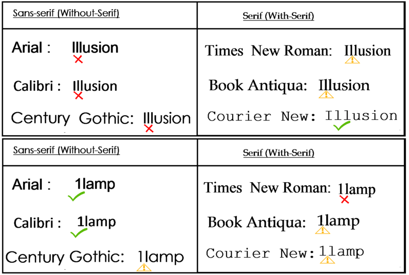
English: Both serif and sans serif fonts have their own advantages and disadvantages. In the above diagram, first example shows serif fonts seem more efficient to distinguish I (uppercase ai) and l (lowercase eL), as in "Illusion" or "Illustration" or "Illinois" etc. and vice versa, sans-serif is less-efficient. But on the second example, sans-serif font seems more efficient to distinguish 1 (One, the numeral) and l (Lowercase eL) due to lack of any serif on l (lowercase eL). On the second example it is harder in serif font, to recognize whether it is "1Lamp" (One Lamp) or 11amp (Eleven Ampere). |
| Date | |
| Source | Own work |
| Author | RIT RAJARSHI |
Licensing edit
I, the copyright holder of this work, hereby publish it under the following license:
This file is licensed under the Creative Commons Attribution-Share Alike 4.0 International license.
- You are free:
- to share – to copy, distribute and transmit the work
- to remix – to adapt the work
- Under the following conditions:
- attribution – You must give appropriate credit, provide a link to the license, and indicate if changes were made. You may do so in any reasonable manner, but not in any way that suggests the licensor endorses you or your use.
- share alike – If you remix, transform, or build upon the material, you must distribute your contributions under the same or compatible license as the original.
File history
Click on a date/time to view the file as it appeared at that time.
| Date/Time | Thumbnail | Dimensions | User | Comment | |
|---|---|---|---|---|---|
| current | 14:41, 18 September 2017 | | 1,596 × 1,076 (88 KB) | RIT RAJARSHI (talk | contribs) | Cross-wiki upload from en.wikipedia.org |
You cannot overwrite this file.
File usage on Commons
There are no pages that use this file.