Promotion Nice color, very sharp Acarpentier 00:29, 29 January 2008 (UTC)
Nomination A picture of very cooperative Cactus Wren taken with point-and-shoot camera at cloudy sunrise. No digital alterations. --Jarekt 04:28, 28 January 2008 (UTC)
Decline What a wonderful view, this look like tasteful Oriental Arts. But too artifacts noise is there! X(--Fukutaro 13:36, 28 January 2008 (UTC)
Nomination Yet another cheap trick in museum to take photo of painting with external flash. #!George Shuklin 03:42, 28 January 2008 (UTC)
Decline Nice color but many white points are there. --Fukutaro 13:36, 28 January 2008 (UTC)
Nomination Two chunks of wood burning in a fireplace --Booksworm 10:41, 27 January 2008 (UTC)
Promotion Looks good for me.--Berru 17:32, 28 January 2008 (UTC)
Decline Quite noisy. Some weird flares too. Beside, the composition is quite good, I think. Sorry.--Berru 17:28, 28 January 2008 (UTC)
Nomination Mushroom Coral --Digon3 21:52, 25 January 2008 (UTC) Comment Details is O.K. But too underexposure for me. I think it should be more lighting. --Fukutaro 11:45, 28 January 2008 (UTC)
Decline Yes, the exposure time is probably too short, or the levels should be standardized. --Berru 07:51, 29 January 2008 (UTC)
Nomination A criped up bup. ← Körnerbrötchen<✉> 21:46, 23 January 2008 (UTC)
Decline Insufficient DOF. Lycaon 12:23, 28 January 2008 (UTC)
Nomination Hibiscus flower Hibiscus rosa-sinensis by B.navez -- nominated by carol 12:19, 23 January 2008 (UTC)
Decline Overall unsharpness (out of focus?) -- Alvesgaspar 21:14, 26 January 2008 (UTC) Where unsharpness ? --B.navez 02:29, 27 January 2008 (UTC) The top petal is reasonably sharp, but the stamens in particular are not --WikiWookie 02:45, 27 January 2008 (UTC) That was the reason I declined this before -- now they promote this one. -- carol 03:01, 27 January 2008 (UTC) discussion closed--B.navez 18:02, 28 January 2008 (UTC)
Nomination Clinton nuclear power station, Illinois, USA. --Dschwen 16:36, 22 January 2008 (UTC)
Promotion Nuclear power seems so quiet ! Good reflection in the frozen river and good picture for industrial spying. --B.navez 18:55, 28 January 2008 (UTC)
Nomination Concrete pillars under a traffic bridge. Thegreenj 02:12, 22 January 2008 (UTC)
Decline A good idea, but DOF is small, and it is noisy. Sorry...--Berru 07:45, 29 January 2008 (UTC)
Nomination: Pumpkins. --bdesham 17:50, 21 January 2008 (UTC)
ReviewNeutral Good detail, focus, color and DOF. Very nice, but there is some shadows which lose composition.. Hummm. --Fukutaro 04:30, 23 January 2008 (UTC)
Nomination Beautifully edited version of a recent candidate. --carol 15:51, 20 January 2008 Did your editing is only croping? --Fukutaro 09:45, 21 January 2008 (UTC) Nope, and the image has been reedited and better documented today. -- carol 13:03, 21 January 2008 (UTC)
Promotion good enough for me. --Berru 07:44, 29 January 2008 (UTC)
Nomination by Yummifruitbat. Thegreenj 02:20, 20 January 2008 (UTC)Cardiff City Hall panorama / Cardiff -- Speagles 21:12, 19 January 2008 (UTC) Smudges in the sky from what looks like (pardon me) sloppy editing. --Dschwen 17:52, 20 January 2008 (UTC)
Decline Easy enough to edit -- too bad there is no motivation for editing images like this. -- carol 05:26, 29 January 2008 (UTC)
Promotion It's super. Beautiful! --Fukutaro 11:26, 28 January 2008 (UTC)
Nomination Fuel Storage Tank Gnangarra 04:53, 26 January 2008 (UTC)
Promotion Works for me --Thermos 16:29, 27 January 2008 (UTC)
Nomination --Böhringer 21:27, 25 January 2008 (UTC)
Decline Too noisy artifects in the sky. When it had taken by day time or during the light, and might be more better. --Fukutaro 11:45, 28 January 2008 (UTC)
NominationPhoebis philea Caterpillar --Richard Bartz 19:35, 22 January 2008 (UTC)
Promotion Composition is a little lacking but otherwise a nice picture. Calibas 23:01, 26 January 2008 (UTC) Haha, crazy world .. especially the composition was it, what i found so nice and funny on this picture because of the freshly eroded leaf ;-) --Richard Bartz 01:05, 27 January 2008 (UTC) You meant, they are after eating? --Fukutaro 11:37, 27 January 2008 (UTC)I think caterpillars are eating all the time, there is no before or after --Richard Bartz 12:39, 27 January 2008 (UTC)
Nomination Some type of reed I think, if anyone knows scientific name let me know. Inspired by Adamantios. --Dori - Talk 18:35, 26 January 2008 (UTC)
Promotion I think (it has to be checked) it's common reed (Phragmites australis) but if reed is common, picture is uncommon : very beautiful, and very sharp about seed releasing ( see also this).--B.navez 19:29, 26 January 2008 (UTC) )
Nomination Jizera Mountains - road to Carlsthal. --Pudelek 18:10, 26 January 2008 (UTC)
Promotion Nice composition, quality OK. But why the small size? -- Alvesgaspar 21:04, 26 January 2008 (UTC) - small memory card :( -- Pudelek 01:20, 27 January 2008 (UTC)
Promotion Good detail and sharpness, nice composition. I like the little spherical water droplets on the waterproof feathers -- Alvesgaspar 19:52, 26 January 2008 (UTC)
Nomination Sleepy bunny :) Adamantios 17:37, 26 January 2008 (UTC)
Promotion Very fine --B.navez 19:40, 26 January 2008 (UTC)
Nomination Native Copper Macro. --Digon3 16:49, 26 January 2008 (UTC)
Promotion Though DOF is not full, a jewellish presentation--B.navez 19:40, 26 January 2008 (UTC)
Nomination Broad-leaved marsh orchid (Dactylorhiza majalis) in Oostkamp, Belgium. Lycaon 13:03, 26 January 2008 (UTC)
Promotion Very nice. Sharp and good colours. RedCoat 19:17, 26 January 2008 (UTC)
Nomination Commons swifts flying. --Keta 10:58, 24 January 2008 (UTC)
Decline They are oversharpened (they all show whitish haloes around them). Lycaon 15:14, 25 January 2008 (UTC) etc... -- carol 13:10, 26 January 2008 (UTC)
Nomination Lutheran Catheddral in Helsinki --AngMoKio 19:09, 23 January 2008 (UTC)
Promotion Very good composition, nice lighting -- Alvesgaspar 21:12, 26 January 2008 (UTC)
NominationGonepteriyx rhamni --Richard Bartz 23:51, 22 January 2008 (UTC)
Promotion Good enough though I would prefer more space around the butterflies. This flower seems crowded! -- Alvesgaspar 21:17, 26 January 2008 (UTC)
Nomination A phantom midge by Richard Bartz --nominated by carol 12:12, 22 January 2008 (UTC)
Decline I know this is a real macro shot (more than 1:1, I presume), but the image is too unsharp -- Alvesgaspar 22:44, 26 January 2008 (UTC)
Nomination Mosaic in Jasna Góra. --YarlTalk • PL 14:15, 19 January 2008 (UTC) Could you have the background (blue wall) cut off, please. If so, it would be then QI for me --B.navez 14:31, 19 January 2008 (UTC) Blue wall: because, white-blance are slightly blue side. --Fukutaro 23:28, 19 January 2008 (UTC) File:Jasna Góra - mosaic 01 edit.jpg, corrected. YarlTalk • PL 17:07, 20 January 2008 (UTC) I meant the wall on which this mosaic is fixed.--B.navez 19:21, 20 January 2008 (UTC) I know, if you can, please upload your version. YarlTalk • PL 21:08, 20 January 2008 (UTC) I do not have the right software, if someone from graphic lab could do it ?--B.navez 03:07, 22 January 2008 (UTC) Done Check it out. --Fukutaro 04:30, 23 January 2008 (UTC) Not removing the blue, but removing the strip of wall please--B.navez 19:31, 25 January 2008 (UTC)
PromotionDone--B.navez 12:15, 26 January 2008 (UTC)
Nomination 2nd try: cleaner cut, better color balance, better contrast of a hig res male budgerigar. --penubag 04:53, 26 January 2008 (UTC)
Decline Still very poor cutting out (see e.g. this). Use a high magnification (600× - 1000×) and remove background with a lasso tool with a slight (1px) feathering. Lycaon 09:38, 26 January 2008 (UTC)
Nomination Workmen in a pearl farm in Rangiroa, French Polynesia --Sémhur 17:57, 25 January 2008 (UTC)
Promotion Nice and clean. --Dori - Talk 21:35, 25 January 2008 (UTC)
Nomination Kenkur Indonesian ingredients cuisine. --Luc Viatour 08:27, 25 January 2008 (UTC)
Promotion It's a Great. --Fukutaro 13:30, 25 January 2008 (UTC)
NominationBanksia Spinulosa in Wollstonecraft, Sydney, Australia showing flower head and characteristic leaves --WikiWookie 08:10, 25 January 2008 (UTC)
Promotion Background noise borderline case but still QI for me. Lycaon 12:30, 25 January 2008 (UTC)
Nomination Hallstätter See, Obertraun, Austria--Bossi (talk • gallery • contrib) 05:02, 25 January 2008 (UTC)
Decline Too much overexposure problems. Lycaon 12:33, 25 January 2008 (UTC)
Nomination View from Mönchsberg, Salzburg, Austria --Bossi (talk • gallery • contrib) 05:02, 25 January 2008 (UTC)
Decline Overexposed and severe CA fringing. Lycaon 12:33, 25 January 2008 (UTC)
Nomination View from Mönchsberg, Salzburg, Austria --Bossi (talk • gallery • contrib) 05:02, 25 January 2008 (UTC)
Decline Focus problems. Lycaon 12:34, 25 January 2008 (UTC)
Nomination View from Mönchsberg, Salzburg, Austria --Bossi (talk • gallery • contrib) 05:02, 25 January 2008 (UTC)
Decline Focus problems. Lycaon 12:34, 25 January 2008 (UTC)
Nomination Originally uploaded by me from Flickr, it turns out that the user in question is also on Commons: Challiyan. Good composition and detail, colors. Arria Belli | parlami 12:55, 24 January 2008 (UTC)
Decline Not sharp and partially overexposed. Lycaon 15:15, 25 January 2008 (UTC)
Nomination A chrysanthemum. --bdesham 18:27, 22 January 2008 (UTC)
Promotion nice photo Pudelek 13:48, 25 January 2008 (UTC)
Decline composition :( -Pudelek 13:46, 25 January 2008 (UTC)
Nomination Small diesel locomotive --Orlovic(talk) 15:10, 21 January 2008 (UTC)
Promotion I think the quality is borderline here, mainly due to the smoke, but I think it's illustrative of actual conditions on the locomotive. --Dori - Talk 21:15, 25 January 2008 (UTC)
Nomination: Branchg church in Żelechów. Sfu 13:09, 19 January 2008 (UTC)
Review needed
Nomination Dworcowa street in Katowice. --Lestat 17:39, 18 January 2008 (UTC)
Decline Lots of artifacs and noise, especially on the left side, look at the tiles of the building. --Dori - Talk 21:12, 25 January 2008 (UTC)
Decline poor compisition -- Pudelek 13:43, 25 January 2008 (UTC)
Nomination Coloring pencils. Thegreenj 23:21, 17 January 2008 (UTC) Very very shallow DOF, and not added to buller? --Fukutaro 09:04, 18 January 2008 (UTC) I do not understand. What does "buller" mean? Thegreenj 20:49, 18 January 2008 (UTC) sorry, I meant "blur", and "bokeh"...--Fukutaro 01:37, 19 January 2008 (UTC) Maybe useful as an illustration of uncomfortable bokh and/or depth of field effects. Nice colours! -- Speagles 21:16, 19 January 2008 (UTC)
Decline There are a lot of things I like about the photograph -- but the tips of the pencils are not in focus. I would have rather seen the center layer in focus -- that is not reason for the decline though. -- carol 16:07, 25 January 2008 (UTC)
Nomination An ordinary window in London. RedCoat 18:01, 17 January 2008 (UTC) Comment The image has very little detail, especially in the bricks… did you use software to reduce noise or something like that? --bdesham Nope, it's as it was taken. RedCoat 22:04, 17 January 2008 (UTC) * A few tilted and overexposure. --Fukutaro 09:04, 18 January 2008 (UTC) * Fixed the tilt. RedCoat 17:58, 24 January 2008 (UTC)
Decline Noise on glass, soft focus, bricks look like they were made of butter. You can have this discussed if you want, worse bricks have been favorably accepted as QI here by people who 'know better'. -- carol 16:13, 25 January 2008 (UTC)
Nomination --Böhringer 22:37, 24 January 2008 (UTC)
Promotion Good action shot, well controlled snow in difficult to photograph situation--Thermos 02:14, 25 January 2008 (UTC)
Nomination --Anuskafm 19:27, 24 January 2008 (UTC)
Decline no description at all :-(. Lycaon 11:12, 25 January 2008 (UTC)
Nomination Idea leuconoe --Richard Bartz 13:58, 24 January 2008 (UTC)
Promotion Very good quality. - Keta 15:21, 24 January 2008 (UTC)
Nomination Adivasi woman --Samsara 23:58, 23 January 2008 (UTC)
Promotion Good --Richard Bartz 22:41, 24 January 2008 (UTC)
Nomination Peppels at a beach near Nice. ← Körnerbrötchen<✉> 21:46, 23 January 2008 (UTC)
Promotion Good Image. I can see no mistakes. _ ABF _ϑ 16:41, 24 January 2008 (UTC)
Nomination A male hoverfly (Eupeodes corollae) visiting a Bermuda Buttercup flower -- Alvesgaspar 10:18, 23 January 2008 (UTC)
Promotion Nice Image, Good detail in head and wing. Looks crisp at full magnification. --WikiWookie 12:02, 25 January 2008 (UTC)
Nomination Clinton power station; shows more of the complex --Dschwen 17:44, 22 January 2008 (UTC)
Nomination A Mediterranean Stork's bill, new and corrected version -- Alvesgaspar 08:33, 22 January 2008 (UTC)
PromotionQuestion Where does the glitter come from? It looks like a jewel (glistening mineral aspect). Lycaon 08:41, 22 January 2008 (UTC) -- I'm not sure, should be from the texture of the petals, like velvet -- Alvesgaspar 09:40, 22 January 2008 (UTC) Comment Nice detaile and 3D effects. But I feel dark for used flash. --Fukutaro 04:30, 23 January 2008 (UTC) Sharp enough --Richard Bartz 22:48, 24 January 2008 (UTC)
Nomination Shoes in telephone wire. Can crop closer, without great loss of quality moralist 12:58, 20 January 2008 (UTC)
Promotion Subject is too far, sky is noisy. Try cropping/noise reduction? --Ianare 08:17, 21 January 2008 (UTC) Maybe not the best technical quality but i like the unusual comp which has quality --Richard Bartz 22:46, 24 January 2008 (UTC)
Nomination Hamman Manus R -- Rama 16:39, 16 January 2008 (UTC) The details and sharpness are nice. Dof is a little bit low and the angle looks a bit strange. Won't decide --Richard Bartz 19:05, 17 January 2008 (UTC)
Promotion DOF runs out a bit at the bottom, but it's not distracting enough for me. Clear, good photo. Arria Belli | parlami 13:00, 24 January 2008 (UTC)
Decline It has too jpg artifacts, so becomeing unsharp and uncleary. --Fukutaro 11:00, 24 January 2008 (UTC)
Nomination The Tower of Terror ride at Disney's Hollywood Studios. --bdesham 04:30, 18 January 2008 (UTC)
Promotion QI - in my opinion --Pudelek 10:39, 24 January 2008 (UTC)
Nomination Ruins of house. Former village Gross Iser - Silesia. -- Pudelek 09:26, 15 January 2008 (UTC)
Promotion Snow is sparkly without being noisy. What does that number mean? -- carol 08:21, 24 January 2008 (UTC) Infothis is number of house - Pudelek 10:36, 24 January 2008 (UTC)
Nomination A giant swallowtail butterfly Papilio cresphontes larva showing defensive behavior. --Ianare 00:59, 22 January 2008 (UTC)The Flashlight is a tad 2 harsh for my taste + noiselevel. Otherwise the detail is good --Richard Bartz 19:37, 22 January 2008 (UTC)
Decline
Nomination A giant swallowtail butterfly larva --Ianare 00:59, 22 January 2008 (UTC) The Flashlight is a tad 2 harsh for my taste + noiselevel. Otherwise the detail is good --Richard Bartz 19:37, 22 January 2008 (UTC)
Decline
Nomination Wooden house in Żelechów. --Sfu 13:09, 19 January 2008 (UTC)
Promotion Good detail, light. --Beyond silence 09:17, 23 January 2008 (UTC)
Nomination: Schloss Neuenstein --Klaus with K 15:12, 16 January 2008 (UTC)
Review needed
Nomination Good composition of a busy scene Superm401 - Talk 03:24, 21 January 2008 (UTC)
Promotion Good composition and quality, DOF acceptable - really puts me there :-) --Ianare 08:08, 21 January 2008 UTC)
Nomination Double-O-Arch in Arches National Park / Utah --Flicka 17:29, 19 January 2008 (UTC) Comment Can we have English description? --Piotr Konieczny aka Prokonsul PiotrusTalk 22:26, 19 January 2008 (UTC) Done. Thegreenj 22:31, 19 January 2008 (UTC)
Promotion I think yours is better (more details, better color), but there is already a picture of the same arch from the same angle. Comment Yes I know. So just one of the pictures can be QI? --Flicka 20:16, 20 January 2008 (UTC) Comment I'm not sure, but if it is possible, take my review as a promotion. --Ianare 07:54, 21 January 2008 (UTC) Good picture. Lycaon 08:04, 21 January 2008 (UTC)
Nomination: Ruins of house. Former village Gross Iser - Silesia. -- Pudelek 09:26, 15 January 2008 (UTC)
Review needed
Nomination: The IllumiNations fireworks at Epcot. --bdesham 03:33, 15 January 2008 (UTC)
Review needed
Nomination Lewis Hamilton (F1 driver) --AngMoKio 21:29, 14 January 2008 (UTC)
Decline Too small, not sharp enough. Candidate for future VI. Lycaon 23:20, 20 January 2008 (UTC)
Nomination: Cumulus and nimbus(?) clouds in a rainy evening. Lisboa, Portugal --Alvesgaspar 19:51, 11 January 2008 (UTC) CommentNice cloud and sky. But I think contrast dark side must be corrected, and not needed antennas on the bottom. --Fukutaro 13:36, 14 January 2008 (UTC)
Review needed
Nomination Florida navel orange. --bdesham 22:27, 21 January 2008 (UTC)
Nomination The IllumiNations fireworks at Epcot. --bdesham 03:33, 15 January 2008 (UTC)
Promotion Good pictures of fireworks are not easy to take! This one has some noise, but composition and sharpness are very good for that type of camera. Nice work! -- MJJR 20:14, 21 January 2008 (UTC)
Nomination Mika Häkkinen (former F1 and DTM driver) --AngMoKio 21:29, 14 January 2008 (UTC) It is needed remove to background noise.--Fukutaro 15:30, 16 January 2008 (UTC)
Promotion Good composition and good enough detail. I don't really see any noise, but I wish the shutter speed was a bit faster. QI nontheless IMO. --Dori - Talk 19:34, 21 January 2008 (UTC) Comment Uploaded removed noise version. --Fukutaro 08:15, 22 January 2008 (UTC)
Nomination Air Canada Airbus A330-300. --MarcusObal 17:33, 17 January 2008 (UTC)
Promotion Lots of detail, nice and sharp, nice and large, good colours. -- Speagles 21:24, 19 January 2008 (UTC)
Nomination The Haunted Mansion in Walt Disney World. --bdesham 03:33, 15 January 2008 (UTC)
Promotion Nice picture, good light, fine--B.navez 12:58, 19 January 2008 (UTC)
Promotion Cool! Awesome quality. Chmehl 17:33, 17 January 2008 (UTC)
Nomination A Blue Gem (Hebe x franciscana), view from the top. -- Alvesgaspar 12:23, 17 January 2008 (UTC)
Promotion I really like the angle, good quality --Ianare 03:01, 19 January 2008 (UTC)
Nomination An air ambulance helicopter, on the helipad on top of Carle Hospital. Dori - Talk 18:05, 16 January 2008 (UTC)
Decline It should be more crisp in my eyes and the power cable divides the picture in a unfortune way ... --Richard Bartz 18:54, 17 January 2008 (UTC) I can crop the bottom to get rid of the cable if it would help, can't do anything about crispness as it was from far away. Dori - Talk 19:49, 17 January 2008 (UTC)
Nomination Elephant seal / Mirounga leonina (female). Created by Hgrobe - nominated by --GeorgHH • talk 17:12, 16 January 2008 (UTC)
Decline Should be color/contrast corrected first --Richard Bartz 18:58, 17 January 2008 (UTC)
Nomination Red Pepper, Capsicum annuum --Nevit 12:04, 16 January 2008 (UTC)
Decline Harsh lighted and there could be more detail on the peppers surface for my taste --Richard Bartz 19:00, 17 January 2008 (UTC)
Nomination Yarra Panorama by Diliff --YarlTalk • PL 22:52, 15 January 2008 (UTC)
Promotion Very nice view based on appropriate exposure. --Fukutaro 03:58, 19 January 2008 (UTC)
Nomination Detail of a wall of the Alhambra palaces, Granada, Spain. --Nattfodd 10:46, 15 January 2008 (UTC)
Promotion Good idea to see DOF possibilities. --Lestat 16:29, 18 January 2008 (UTC)
Nomination: Wolfram von Eschenbach, Abenberg, Germany --Simonizer 09:53, 10 January 2008 (UTC) Comment The cheek is a bit 2 overexposed, should be easy 2 fix --Richard Bartz 12:55, 11 January 2008 (UTC) No sorry Iam not able to fix this --Simonizer 20:03, 12 January 2008 (UTC)
Review needed
Nomination Hyles euphorbiae caterpillar --Banangraut 02:04, 16 January 2008 (UTC)
DeclineThis version is already QI, and the edit just degrades quality. --Dschwen 16:43, 16 January 2008 (UTC)
Nomination Flowering tree in Key West, FL (can someone ID?) --Ianare 07:29, 16 January 2008 (UTC)
Promotion Unfortunately, I can't help for ID. But the picture is QI. -- MJJR 22:41, 16 January 2008 (UTC) Comment update: it's w:Bauhinia blakeana --Ianare 04:49, 17 January 2008 (UTC)
Withdrawn Lovely animal. Its a tad 2 hars lighted and i know its a matter of taste but i disagree with the cut-off tail. It could be more crisp Comment will try again, they are pretty quick :-)
Nomination Panorama of the Winter Garden Hot House in Auckland Domain --Antilived 07:45, 15 January 2008 (UTC)
Promotion Nice. --Dschwen 16:53, 16 January 2008 (UTC)
Nomination Cricket ball by ReneS --YarlTalk • PL 22:52, 15 January 2008 (UTC)
Decline Too small (2 megapixel minimum), especially for something this easy to obtain. Thegreenj 01:12, 16 January 2008 (UTC)
Nomination Dresden Frauenkirche by Phx --YarlTalk • PL 23:23, 14 January 2008 (UTC)
Decline The sign is in the way--Ianare 09:53, 16 January 2008 (UTC)
Nomination Luxor Hotel & Casino by night --Tobi 87 16:10, 11 January 2008 (UTC)
Decline Overexposure, so noisy. --Fukutaro 15:54, 15 January 2008 (UTC)
Nomination A panoramic view of the Mont-Tremblant, Quebec, Canada--Acarpentier 01:49, 15 January 2008 (UTC)
Promotion Splendid! Took a couple minutes just to load, but seems to be pretty crisp at full-res. My only criticism is that there's a bit of blur in the trees near the red & green rooftops. You should have had a friend dress up like Waldo :) --Bossi (talk • gallery • contrib) 03:20, 15 January 2008 (UTC)
Nomination Boeing 737-400 by Airwolf --YarlTalk • PL 22:17, 14 January 2008 (UTC)
Promotion Good shot, sharp as possible, nice colours. --Lestat 22:58, 14 January 2008 (UTC)
Nomination Castle in Ogrodzieniec, Poland. Please let me know how I can remove the wire.--Piotr Konieczny aka Prokonsul PiotrusTalk 19:32, 14 January 2008 (UTC) Comment You should be able to use the "clone" tool in Photoshop or a similar image editor. --bdesham
Decline Disturbing wire --Lestat 22:25, 14 January 2008 (UTC)
Decline Unsharp --Lestat 22:22, 14 January 2008 (UTC)
Nomination Two species of ground bugs on the trunk of a plane-tree, taking a winter sunbath - Alvesgaspar 14:59, 14 January 2008 (UTC)
Decline Color Okey, but unsharp. --Fukutaro 10:40, 15 January 2008 (UTC)
Nomination A door in the crypt of the Cathedral in Salzburg, Austria --Bossi (talk • gallery • contrib) 04:28, 14 January 2008 (UTC)
Decline Distortions --Lestat 22:32, 14 January 2008 (UTC)
Nomination A door in the crypt of the Cathedral in Salzburg, Austria --Bossi (talk • gallery • contrib) 04:28, 14 January 2008 (UTC)
Decline Tilted --Lestat 22:32, 14 January 2008 (UTC)
Nomination A beautiful flower of a Common Hawkweed with a nice detail on the centre -- Alvesgaspar 23:54, 13 January 2008 (UTC)
Promotion Detail, focus, color, contrast, composition, beautiful and excellent.--Fukutaro 14:45, 14 January 2008 (UTC)
Nomination Eiger Glacier viewed from the Eigergletscher Station on the Jungfraubahn, CH --Bossi (talk • gallery • contrib) 17:57, 13 January 2008 (UTC)
Promotion It's grand view. --Fukutaro 14:45, 14 January 2008 (UTC)
Nomination Erdmännchen made by User:Ireas. _ ABF _ϑ 16:23, 13 January 2008 (UTC)
Promotion A little noisy, but otherwise okay. You've caught the meerkat with a nice expression too. RedCoat 15:47, 14 January 2008 (UTC)
Nomination Bell in a French church. --le Korrigan→bla 21:29, 11 January 2008 (UTC)
Decline Good motif. But detailes not fine, some white lines, not in the middle. sorry. --Fukutaro 13:36, 14 January 2008 (UTC)
NominationPhilaethria hecale --Richard Bartz 16:52, 9 January 2008 (UTC)
Promotion Good! -- MJJR 21:40, 10 January 2008 (UTC) Can you supply a cropped version? On the current image the butterfly is quit small on an typical thumb --Hsuepfle 19:56, 12 January 2008 (UTC) Thats for what Creative Commons is for ... everybody can make a crop or do whatever he wants to do. ..Richard Bartz 18:39, 14 January 2008 (UTC)
Nomination Church Hall in Dale Western Australia Gnangarra 11:10, 13 January 2008 (UTC)
Decline Very nice mood. But I'm sorry to that too bad detail.--Fukutaro 21:08, 13 January 2008 (UTC)
Nomination Huhu beetle on KWS fence --Tony Wills 11:09, 13 January 2008 (UTC)
Promotion Good use of DOF, a bit of noise but not disturbing. QI for me. --LucaG 21:47, 13 January 2008 (UTC)
Nomination The Rainbow Valley in Australia.Chmehl 10:08, 13 January 2008 (UTC)
Promotion Impressive sunny scenery. Fine quality.--B.navez 17:39, 13 January 2008 (UTC)
Nomination Panorama of the Opera House in Sydney.Chmehl 10:08, 13 January 2008 (UTC)
Promotion OK. Informative - I had no idea of surroundings, which the image shows nicely --Thermos 17:38, 13 January 2008 (UTC)
Nomination Deck operation aboard of CVN75 (USS H. Truman). Jacopo 14:42, 13 January 2008 (UTC)
Decline out of QI scope as the image from US navy and not self made. Gnangarra 14:45, 13 January 2008 (UTC)
Nomination Old town in Bratislava (Pressburg, Pozsony) - view from castle. -- Pudelek 22:37, 11 January 2008 (UTC)
Decline Chromatic aberration, exposure are little bad.--Fukutaro 17:17, 13 January 2008 (UTC)
Nomination Interior view of a French church. --le Korrigan→bla 21:29, 11 January 2008 (UTC)
Decline Feel so good view, but focus is not good, noisy, some white line.--Fukutaro 17:17, 13 January 2008 (UTC)
Nomination the federal administrative court in Leipzig, Germany at night -- aka 09:03, 10 January 2008 (UTC)
Promotion Great technical quality, and composition. Obvious QI. --Dschwen 18:07, 13 January 2008 (UTC)
Nomination a panoramic image of Mosel, Germany -- aka 09:03, 10 January 2008 (UTC)
Promotion Great tehnical quality. --Aqwis 20:48, 13 January 2008 (UTC)
Nomination a part of the botanical garden in Jena, Germany -- aka 09:03, 10 January 2008 (UTC)
Decline It's focus will match back grass and white balance is blue side. and slant?--Fukutaro 17:17, 13 January 2008 (UTC)
Nomination Marsh Woundwort (Stachys palustris) at Uitkerkse Polders, Belgium. -- Lycaon 10:18, 8 January 2008 (UTC)
Promotion Good show! -- carol 02:53, 14 January 2008 (UTC)
Decline Other of the same series were better.--B.navez 15:19, 13 January 2008 (UTC)
Nomination A ~2m cairn between Eigergletscher Station and Wengernalp, CH --Bossi (talk • gallery • contrib) 18:04, 6 January 2008 (UTC)
Decline Good composition and perspective, but the remote mountains are really too faded and the foreground stones overexposed. I think it would be worth going there again a day of perfect light.--B.navez 15:10, 13 January 2008 (UTC)
Nomination A Yellow Jacket (Vespula germanica) - Alvesgaspar 17:08, 5 January 2008 (UTC) He/she has one transparent antennae that leaves a shadow inconsistent with the rest of the bugs body. Perhaps the image manipulator got bored with the real bugs? -- carol 06:49, 6 January 2008 (UTC) You are quite right, this is not a real wasp but a mechanical device sent by alliens to spy on me. Beware, they are among us !! -- William of Ockham 11:37, 6 January 2008 (UTC) I was thinking it was a Portugesian frankenstein bug -- you know how those Europeans are.... -- carol 06:24, 8 January 2008 (UTC) I think the oddity in the antenna is probably caused by a combination of movement in the natural light exposure combined with the main flash exposure --WikiWookie 08:16, 8 January 2008 (UTC)
Decline Not really natural, nor funny. Just hairy ? Sad background --B.navez 15:00, 13 January 2008 (UTC)
Nomination An image of a high res male budgerigar --Penubag 09:42, 13 January 2008 (UTC)
Decline Details not fine, cutting out not clean, attitude of the bird not flattering --B.navez 11:04, 13 January 2008 (UTC)
Nomination Mandarin Duck in Warsaw by Rovdyr --YarlTalk • PL 22:26, 12 January 2008 (UTC)
Nomination impressive Double O Arch in Arches National Park (Utah) --Tobi 87 15:04, 11 January 2008 (UTC)
Promotion Very nice picture, but it seems that the horizon is tilted. Can you fix this? Chmehl 19:28, 12 January 2008 (UTC) Info I think that this impression is caused by the fact that this day was very hot and hazy so that the horizon is not clearly visible. I understand your objection, but is this detail a reason to not promote this picture as quality image? --Tobi 87 10:59, 13 January 2008 (UTC) You are right, the horizon is not clearly visible. I was looking at the mountains through the arch and there is probably no way to tell how these mountains should be aligned.Chmehl 11:36, 13 January 2008 (UTC)
Promotion Clear detail -- Laitche 20:15, 10 January 2008 (UTC) Technically very good but the wings are heavily damaged and colors are faded. The value for an encyplopedia is limited --Hsuepfle 20:30, 12 January 2008 (UTC)
Promotion Maybe a little bit out of focus but still very good details and good exposure --Hsuepfle 20:30, 12 January 2008 (UTC)
Nomination a moon jelly fish -- aka 09:03, 10 January 2008 (UTC) Could you precise the conditions of the shot and the picture treatment ?--B.navez 18:30, 10 January 2008 (UTC) -- The picture has been taken at an aquarium and there was no special image processing beside removing a little bit noise -- aka 10:05, 13 January 2008 (UTC)
Promotion Fine --B.navez 10:42, 13 January 2008 (UTC)
Nomination A flower of Hibiscus rosa-sinensis --B.navez 19:09, 7 January 2008 (UTC)
Decline The end of the center parts (the stamen and all that) is out of focus. -- carol 09:37, 12 January 2008 (UTC) You'right, it's not perfect. I will try to do it again.--B.navez 12:38, 12 January 2008 (UTC)
Nomination A Yellow Jacket (Vespula germanica) - Alvesgaspar 17:08, 5 January 2008 (UTC)
Decline If you would like to discuss this, that is fine. It is being declined because I think the photographer can take a higher quality image. -- carol 10:43, 12 January 2008 (UTC) -- I really hope so, life is a way to perfection... -- Alvesgaspar 12:37, 12 January 2008 (UTC)
Nomination Tricolored Heron in Costa Rica Chmehl 08:56, 12 January 2008 (UTC)
Promotion Good composition, nice colors, sharpness is so so --Richard Bartz 10:20, 12 January 2008 (UTC)
Promotion Sharp, beautiful colors which make me want to see the whole snake. Do you have an image of the whole snake that is this sharp? -- carol 05:20, 12 January 2008 (UTC) The snake was in a terrarium. If I had chosen the framing such that the whole snake is visible, also ugly artificial objects would have been visible. Nevertheless, the proportions of the snake (like huge body diameter compared to the head) are clearly visible in the image.Chmehl 07:34, 12 January 2008 (UTC) Yeah, sorry. What was I thinking? This is a goregeous photograph -- it is easy to forget the environment it was in.... -- carol 09:36, 12 January 2008 (UTC)
NominationAlnus glutinosa leaf for identification purposes, showing glossiness and shape. Alinja 11:08, 10 January 2008 (UTC)
Decline Reflection of the flash light too harsh--B.navez 18:30, 10 January 2008 (UTC)
Nomination Swan pond with boat in Zwickau, Germany -- aka 09:03, 10 January 2008 (UTC)
Nomination a plant of the species Thuja occidentalis -- aka 09:03, 10 January 2008 (UTC)
Promotion Good details of the cones (an unusual pale variety ?) and of the scale leaves --B.navez 18:30, 10 January 2008 (UTC)
Nomination the Georgius Agricola memorial in Glauchau, Germany -- aka 09:03, 10 January 2008 (UTC)
Decline Composition and sharpness are O.K., but lighting of the main subject (the statue) is not. Overexposed ('burnt white') spots in the background. -- MJJR 21:10, 10 January 2008 (UTC)
Nomination the Pile-dwelling museum Unteruhldingen, Germany -- aka 09:03, 10 January 2008 (UTC)
Promotion Although the picture is rather taken against the light with even some overexposed clouds in the sky, the great sharpness, the nice composition and the lack of stitching errors make a QI promotion just acceptable IMO. -- MJJR 21:28, 10 January 2008 (UTC)
Nomination the Volkswagen factory in Zwickau, Germany -- aka 09:03, 10 January 2008 (UTC)
Promotion Excellent quality in full resolution, no stitching errors. -- MJJR 21:16, 10 January 2008 (UTC)
Nomination Indian Fritillary -- Laitche 06:41, 10 January 2008 (UTC)
Promotion Worthy being a feaured picture. --Reflection of Perfection 13:51, 10 January 2008 (UTC)
Nomination Aletschgletscher in Switzerland --Tobi 87 20:22, 9 January 2008 (UTC)
Promotion Fine image --Simonizer 14:56, 10 January 2008 (UTC)
Decline Very nice composition and atmosphere. A pity it is so noisy -- Alvesgaspar 20:39, 10 January 2008 (UTC) :( how do I get rid of it? --Orlovic(talk) 01:01, 11 January 2008 (UTC) - Try Neat Image (it is freeware), but with no guarantees -- Alvesgaspar 08:50, 11 January 2008 (UTC)
NominationIdea leuconoe --Richard Bartz 16:52, 9 January 2008 (UTC)
Decline I really regret, but part of the main subject is out of focus. -- MJJR 21:37, 10 January 2008 (UTC)
Nomination New version of a previously unassessed Roman Emperor to your kind attention :-)--Szilas 07:17, 9 January 2008 (UTC)
Decline Too noisy and unsharp. The crop is also too tight -- Alvesgaspar 20:40, 10 January 2008 (UTC)
NominationBougainvillea glabra flower, at Dar es Salaam, Tanzania. -- Muhammad Mahdi Karim 14:09, 8 January 2008 (UTC)
Promotion Crisp image, meets all the criteria. --Reflection of Perfection 13:53, 10 January 2008 (UTC)
Nomination Montreal Marché Bonsecours on a foggy night. Acarpentier 02:22, 8 January 2008 (UTC)
Decline Nice atmosphere and good sharpness & lighting, but the composition is not very exciting and the bad perspective distortion of the dome is disturbing... or is this dome really that tilted? -- MJJR 21:47, 10 January 2008 (UTC)
Nomination Common Mallow (Malva sylvestris) -Alvesgaspar 18:06, 6 January 2008 (UTC)
Nomination Freedom Square in Katowice). --Lestat 00:24, 5 January 2008 (UTC)
Promotion Rather unexciting town view with disturbing tram (or trolleybus?) wires, but good technical quality. -- MJJR 22:08, 10 January 2008 (UTC)
Nomination Tentement in Katowice --Lestat 00:26, 5 January 2008 (UTC)
Promotion Subject isn't very interesting, but acceptable image quality. -- MJJR 22:12, 10 January 2008 (UTC)
Nomination a few plants of the species Tagetes tenuifolia -- aka 09:03, 10 January 2008 (UTC)
Promotion Good --Richard Bartz 11:49, 10 January 2008 (UTC)
Nomination a Mayfly of the species Cloeon dipterum -- aka 09:03, 10 January 2008 (UTC)
Promotion DOF and exposure are ok, relatively sharp. Alinja 11:24, 10 January 2008 (UTC)
Nomination a Nikon D200 with a Nikon lens and a Nikon flash -- aka 09:03, 10 January 2008 (UTC)
Promotion Good --Richard Bartz 11:49, 10 January 2008 (UTC)
Nomination a Common Marshmallow (Althaea officinalis) -- aka 09:03, 10 January 2008 (UTC)
Decline Composition and lighting is nice but lacking sharpness. Background is a tad to distracting for my taste --Richard Bartz 11:49, 10 January 2008 (UTC)
Nomination a tomato flower (Solanum lycopersicum) -- aka 09:03, 10 January 2008 (UTC)Nice but DOF is't tight --Richard Bartz 11:49, 10 January 2008 (UTC)
Decline
Nomination Helioconius sp --Richard Bartz 16:52, 9 January 2008 (UTC)
Promotion Nice -- Laitche 06:54, 10 January 2008 (UTC)
NominationHeliconius ismenius --Richard Bartz 16:52, 9 January 2008 (UTC)
Nomination Spindle Ermine caterpillar (Yponomeuta cagnagella) at De Haan, Belgium. -- Lycaon 10:48, 8 January 2008 (UTC) It's a bit blurry and lit a tad too harsh for my taste --Richard Bartz15:13, 8 January 2008 (UTC)[reply]
Nomination Tree Locust on Begonia flowers --B.navez 12:30, 5 January 2008 (UTC)
Promotion The locust is cute. I tried to make a case that one of the legs was missing, but I think it is tucked neatly underneath. -- carol 04:17, 10 January 2008 (UTC)
NominationHeliconius melpomene --Richard Bartz 22:35, 8 January 2008 (UTC)
Promotion This one is the best of the three, though still a bit dark (I know it is a black butterfly ;-) ). Lycaon 23:49, 8 January 2008 (UTC)
NominationIdea leuconoe --Richard Bartz 22:35, 8 January 2008 (UTC)
Promotion Good details. Lycaon 23:49, 8 January 2008 (UTC)
Decline Some noise, jpeg artifacts, not so good lighting, problems with perspective (on the left) and CA (left corner). --Lestat 19:05, 8 January 2008 (UTC)
Decline Bad crop, overexposed parts, thats not the oak, but plaque. --Lestat 18:59, 8 January 2008 (UTC)
Nomination An opened pack of Walkers Salt and Vinegar crisps -- Gerolsteiner91(blubb?) 16:55, 8 January 2008 (UTC)
Decline The black lower right corner ruins it. --JDrewes 17:14, 8 January 2008 (UTC)
Nomination A Blue Gem (Heba x franciscana) flowering in January - Alvesgaspar 16:46, 8 January 2008 (UTC)
Promotion Nice picture, seems to meet the criteria. There is a kind of harsh reflection from the leaf on the left, and the empty space at the top is not appealing. If those are fixed, I will promote. --Muhammad Mahdi Karim 18:37, 8 January 2008 (UTC) -- Done As well as I could -- Alvesgaspar 21:36, 8 January 2008 (UTC)
Nomination Painting of Van Gogh in the Kröller-Müller Museum--Szilas 09:18, 8 January 2008 (UTC)
Decline Too noisy for that kind of photo. --Lestat 19:05, 8 January 2008 (UTC)
Nomination Juvenile Grey Butcherbird (Cracticus torquatus) at Springbrook, Qld, Australia. --WikiWookie 07:16, 8 January 2008 (UTC)
Promotion Looks good. (I did make some adjustments before promotion.) Thegreenj 21:51, 8 January 2008 (UTC)
Nomination Pile of bricks. Thegreenj 22:39, 7 January 2008 (UTC)
Promotion It probably won't win you any prizes ;-), but technically it is fine. Lycaon 13:27, 8 January 2008 (UTC)
Nomination Evening light on the North Sea at Oostduinkerke, Belgium -- MJJR 21:56, 7 January 2008 (UTC)
Promotion Gorgeous composition, quality is so-so. I'm not sure what to do now... -- Alvesgaspar 22:52, 7 January 2008 (UTC) I think the resolution makes up for any shortcomings at full size, and as Alvesgaspar said, simply beautiful composition. Thegreenj 21:48, 8 January 2008 (UTC)
Nomination Palmse manor --Raul6 08:14, 6 January 2008 (UTC)
Decline Noisy in the darker parts and needs perspective correction. Lycaon 23:53, 8 January 2008 (UTC)
Nomination Street light in front of Bratislava Castle. -- 10:39, 3 January 2008 (UTC)
Promotion I could find nothing wrong with the image. -- carol 01:44, 9 January 2008 (UTC)
Nomination Speech of ABBV Worker's Union chairman on Workers Day in Belgium. --Steven Fruitsmaak (Reply) 20:27, 2 January 2008 (UTC)
Decline Very interesting human and social composition but faces too much overexposed by the lateral sunlight--B.navez 19:09, 8 January 2008 (UTC)
Nomination Detail of the Tennessee State Capitol, USA. Thegreenj 18:54, 2 January 2008 (UTC)
Decline It is refreshing to see other types of lightning - it gives an interesting effect, but for me it does not outweigh the negative side-effects, which are that details are almost lost in the building (could have been OK if completely black to just see the silhuet), which is also quite noisy and the edge of the building does not appear sufficiently sharp. -- Slaunger 17:14, 8 January 2008 (UTC)
Nomination Pulley on board of RV Belgica. -- Lycaon 22:18, 7 January 2008 (UTC)
Promotion Good composition and quality. I miss the sea... -- Alvesgaspar 22:46, 7 January 2008 (UTC)
Nomination Pool in Uitweg, the Netherlands --China Crisis 22:07, 7 January 2008 (UTC)
Decline Looks nice in thumbsize but quality is not good enough: the image is noisy (see the roof), unsharp and lacks detail. Also, the shadow in the foreground spoils the composition -- Alvesgaspar 23:36, 7 January 2008 (UTC)
Nomination A flower of Galactites tomentosa with a minute aphid -- Alvesgaspar 13:02, 7 January 2008 (UTC)
Promotion Very good quality and sharpness. Even the legs of the small bug on the flower are visible :)) Chmehl 07:27, 8 January 2008 (UTC)
Withdrawn There is some strange looking artifacting in both of these pictures, perhaps noise reduction? At ISO 200 or 320, I would expect very little objectionable noise... Thegreenj 02:41, 8 January 2008 (UTC )There's no NR applied, so cannot be that. I suppose it can be tiny branches some distance in front of birds (location is same), which simply did not become visible due shallow DOF (same thing than shooting through chain link fence). But you are right there is something odd, hence, I withdraw nomination --Thermos05:12, 8 January 2008 (UTC)[reply]
Nomination Argynnis paphia --Richard Bartz 10:48, 6 January 2008 (UTC)
Promotion very nice Chmehl 17:19, 6 January 2008 (UTC) *Excellent --Böhringer 19:16, 7 January 2008 (UTC)
Nomination A Pastiera Napoletana for Happy belated Birthday GNU! by Mattia_Luigi_Nappi -- carol 07:21, 6 January 2008 (UTC)
Decline DOF too shallow for subject depth, harsh and uneven lighting. Thegreenj 01:04, 8 January 2008 (UTC)
Nomination Tentement in Katowice --Lestat 00:26, 5 January 2008 (UTC)
Decline Tower of main subject is cut off. --Raul6 22:16, 7 January 2008 (UTC)
Nomination Stairs up the Oberer Grindelwaldgletscher, Grindelwald, CH --Bossi (talk • gallery • contrib) 05:11, 4 January 2008 (UTC)
Promotion Composition is not really exciting. Cropping is a little bit too tight on top. But technical quality is certainly O.K. for QI. -- MJJR 21:31, 7 January 2008 (UTC)
Nomination Fishing by the Old Hickory Lock and Dam near Nashville, Tennessee, USA. Thegreenj 03:11, 2 January 2008 (UTC)
Promotion Not too much noise and the large of the river and the small of the fisherman -- very nice. -- carol 07:07, 8 January 2008 (UTC)
Nomination Tropic of Capricorn sign close to the ... well, Tropic of Capricorn in Namibia. -- Lycaon 14:16, 30 December 2007 (UTC) Comment can you geocode that well?
Promotion And to what geodetic datum is this particular line referred to? There could be a difference of some hundred meters! ;-) - Alvesgaspar 20:02, 1 January 2008 (UTC) Is this better then: can you geocode that really well? -- carol 21:31, 1 January 2008 (UTC) It's actually more than a few 100 m off from the correct place whether I'd use WGS84, ED50 or another one ;). Lycaon 01:19, 3 January 2008 (UTC) You will not geocode that real well then. -- carol 03:45, 3 January 2008 (UTC) For no good reason. -- carol 07:00, 8 January 2008 (UTC)
Promotion Very nice! -- MJJR 21:05, 6 January 2008 (UTC)
Nomination Eiger Glacier and a Wengernalpbahn train, Wengernalp, CH --Bossi (talk • gallery • contrib) 18:04, 6 January 2008 (UTC)
Promotion QI for me. -- MJJR 21:08, 6 January 2008 (UTC)
Nomination Later that day... --Dschwen 22:48, 5 January 2008 (UTC)
Promotion Very nice! --Simonizer 23:27, 5 January 2008 (UTC) -- I like this one best and think could be a serious FP candidate - Alvesgaspar 15:13, 6 January 2008 (UTC)
Decline A bit soft and harshly lit Thegreenj 19:22, 6 January 2008 (UTC)
Nomination Hoar frost on a winter day in Germany. --Dschwen 22:48, 5 January 2008 (UTC)
Promotion Great! This is the best of your three "Frostpics" --Simonizer 23:27, 5 January 2008 (UTC)
Nomination Hoar frost macro. --Dschwen 22:48, 5 January 2008 (UTC)
Promotion Nice --Simonizer 23:27, 5 January 2008 (UTC)
Nomination Sanctuary of Arantzazu, panoramic image. --Keta 11:57, 5 January 2008 (UTC)
Promotion Good quality! -- MJJR 23:04, 5 January 2008 (UTC)
Nomination Tower in Arnsberg, self-made. _ ABF _ϑ 08:16, 5 January 2008 (UTC)
Decline Image too dark and noisy. Not the best point of view, causing an exagerated geometric distortion which prevents from appreciating the subject's real proportions -- Alvesgaspar 12:05, 5 January 2008 (UTC)
Nomination Original crop of previously nominated Image -- calyponte 00:45, 5 January 2008 (UTC)
Promotion I think it is on the borderline due to the tight crop. -- Alvesgaspar 10:03, 5 January 2008 (UTC)
Nomination Train station in Katowice. --Lestat 00:26, 5 January 2008 (UTC)
Decline Very noisy and unsharp - Alvesgaspar 12:06, 5 January 2008 (UTC)
Nomination Re-shoot as per Alvesgaspar's suggestion -- calyponte 23:16, 4 January 2008 (UTC)
Decline Too small and underexposed. Please read the guidelines. Lycaon 23:40, 4 January 2008 (UTC) -- Sorry my mistake when processing RAW image, submitted original Jan 5th -- calyponte 01:01, 5 January 2008 (UTC)
Nomination Poppies in a field near Hoegaarden, Belgium. --Donarreiskoffer 19:56, 4 January 2008 (UTC)
Decline A great idea poorly executed. The composition is spoiled by a messy foreground -- Alvesgaspar 20:42, 4 January 2008 (UTC)
Nomination Crepuscular rays in the woods of Kasterlee, Belgium. --Donarreiskoffer 19:43, 4 January 2008 (UTC)
Decline Too much noise, but nice idea. ← Körnerbrötchen<✉> 17:56, 5 January 2008 (UTC)
Nomination flowers and unripen fruits of blackberry--B.navez 19:36, 4 January 2008 (UTC)
Decline The subject is overexposed and a better exposure pair (with a smaller f number) should have been chosen to obtain a larger dof -- Alvesgaspar 20:47, 4 January 2008 (UTC)
Nomination One of my best orchids, Oncidium varicosum-- calyponte 19:03, 4 January 2008 (UTC)
Decline The flower is beautiful and the quality is fine but I think you should re-shoot. The composition is messy due to too many elements in focus and to a tight crop on the main subject. I also suggest a lower f number to reduce DOF -- Alvesgaspar 20:53, 4 January 2008 (UTC)
Decline Forgot to focus ;-). Lycaon 15:49, 4 January 2008 (UTC)
NominationLarus delawarensis by User:Mdf, nom by Lycaon 13:39, 4 January 2008 (UTC)
Promotion Top notch quality. Thegreenj 17:36, 4 January 2008 (UTC)
Nomination A view of Lake Neuchâtel, Switzerland --Booksworm 12:09, 4 January 2008 (UTC)
Decline Maybe after de-noising. You also should try to lighten the image a little bit, so that more details on the left can be seen -- Alvesgaspar 21:05, 4 January 2008 (UTC)
Nomination Rooftop sculpture of the Grand Palais, Paris --Diligent 10:47, 4 January 2008 (UTC)
Decline Too tight crop. Lycaon 15:50, 4 January 2008 (UTC)
Nomination Re-retouched clock (should not have been at CR straight away. ;-). -- Lycaon 07:08, 4 January 2008
Decline (UTC) Color, contrast, etc. This is worse than the original which was not of good quality. -- carol 05:30, 6 January 2008 (UTC)
Nomination View from In der Weid, Grindelwald, CH --Bossi (talk • gallery • contrib) 05:11, 4 January 2008 (UTC)
Decline A few problems: lacks overall crispness, has some fringing (especially to the upper left in the trees) and is cropped too tightly (mountain needs breathing space). Lycaon 14:12, 4 January 2008 (UTC)
Decline That photo was decline by Alvesgaspar 28 December 2007. --Lestat 14:00, 4 January 2008 (UTC) Probably a mistake by Piotrus. Lycaon 14:08, 4 January 2008 (UTC)
Decline Poor framing, overall unsharpness, too much noise and uncorrected geometric distortion - Alvesgaspar 21:08, 4 January 2008 (UTC)
Nomination A sunset near Verbier, Switzerland --Booksworm 23:36, 3 January 2008 (UTC)
Decline Noisy and oversharpened picture, white fringing is too obvious. Maybe with a more gentle and careful processing - Alvesgaspar 12:10, 5 January 2008 (UTC)
Decline Overexposed at top end on right. --Steven Fruitsmaak (Reply) 13:57, 3 January 2008 (UTC) Coloured shadows, some posterization, some overexposure. Lycaon 15:51, 4 January 2008 (UTC)
Nomination Statue of Virgin Mary. Capuchin Church, Bratislava. -- Pudelek 10:30, 3 January 2008 (UTC)
Decline Trivial composition and poor point of view (from below). Also, the main subject is in the shadow -- Alvesgaspar 21:10, 4 January 2008 (UTC)
NominationAlectoris graeca --Richard Bartz 03:29, 3 January 2008 (UTC)
Promotionquestion: Is there something white in the background or is it a bird with a white beard?--Steven Fruitsmaak (Reply) 13:52, 3 January 2008 (UTC) Would say this is excrement --Richard Bartz 20:13, 3 January 2008 (UTC) Though a bit dark, this one passes my (quite tough?) QI requirements. Lycaon 14:35, 4 January 2008 (UTC)
Nomination Geronticus eremita --Richard Bartz 03:29, 3 January 2008 (UTC)
Decline Some motion blur on the breast and tail feathers. --Steven Fruitsmaak (Reply) 13:46, 3 January 2008 (UTC)He's cleaning his plumage, so there should MB --Richard Bartz 20:12, 3 January 2008 (UTC) I think noise reduction/selective blurring has spoiled some of the feathers (I know, it is a difficult tightrope getting it right!). Lycaon 14:33, 4 January 2008 (UTC)
Decline Again, light was quite difficult (for my level at least).--Steven Fruitsmaak (Reply) 02:31, 3 January 2008 (UTC) -- I agree this is a very difficult subject because of the high dynamic range of the theme: very bright vitrals and a dark interior. Some use bracketing techniques, taking various shots with different settings and combining them in the digital lab. Also, I would try to correct the geometric distortion even partially - Alvesgaspar 21:16, 4 January 2008 (UTC)
Nomination Hadrian's Wall west of Housesteads Roman Fort. --Steven Fruitsmaak (Reply) 23:46, 2 January 2008 (UTC)
Promotion This one is on the borderline. The composition and colours rescue it from oblivion despite being a bit overexposed and soft, due to a less than optimal exposure solution -- Alvesgaspar 12:19, 5 January 2008 (UTC)
Nomination Police arrest two anarchist squatters during a demonstration in Leuven, Belgium. --Steven Fruitsmaak (Reply) 21:31, 2 January 2008 (UTC)
Decline I would like to suggest CR. I fully recognise difficulties involved in this kind of shot as well as the informative value - certainly a valuable and appreciated contribution in any case. However, the amount of overexposure makes me wonder if this is a QI? --Thermos 15:34, 3 January 2008 (UTC) *Agree, overexposure ruins it.--Steven Fruitsmaak (Reply) 13:24, 4 January 2008 (UTC)
Nomination Detail of a hand-made table-cloth. Portugal, c.1970 -- Alvesgaspar 12:45, 2 January 2008 (UTC)
Promotion Very good quality, very sharp.--Steven Fruitsmaak (Reply) 22:32, 2 January 2008 (UTC) * top --Böhringer 20:32, 4 January 2008 (UTC)
Nomination Haytor, Dartmoor, with setting sun shining on it. --Chris_huh 01:14, 31 December 2007 (UTC)
Promotion Nice composition, correct panorama. I'll support when the posterization in the sky is corrected -- Alvesgaspar 17:56, 31 December 2007 (UTC) - I'm not too sure how to fix posterization, but i did a bit of an edit. Chris_huh 23:18, 1 January 2008 (UTC) - Noise and posterization reduced version added. Chris_huh 11:14, 4 January 2008 (UTC) -- Good, clear QI now! -- Alvesgaspar 11:50, 6 January 2008 (UTC)
Nomination Colleoni monument in Venice on a rainy day --User:G.dallorto 00:08, 4 January 2008 (UTC)
Decline Image far too dark, statue isn't clear enough and licensing is questionable --Booksworm 00:21, 4 January 2008 (UTC)
Nomination Fog in Venice --User:G.dallorto 00:08, 4 January 2008 (UTC)
Decline Poor lighting, image a tad bit too dark and licensing is questionable --Booksworm 00:21, 4 January 2008 (UTC)
NominationPieris rapae Close_up head --Richard Bartz 22:33, 3 January 2008 (UTC)
Decline Needs a different approach to noise reduction. Has potential though. Lycaon 00:17, 4 January 2008 (UTC)
Nomination The Notre-Dame Basilica at Boulogne-sur-Mer, France -- MJJR 21:07, 3 January 2008 (UTC)
Promotion Very beautiful. The lighing is perfect. Thegreenj 03:41, 4 January 2008 (UTC)
Nomination Anser anser --Richard Bartz 03:29, 3 January 2008 (UTC)
Promotion Overexposed breast part. --Steven Fruitsmaak (Reply) 13:48, 3 January 2008 (UTC) -- Some small parts are very bright indeed, but the balance between bright and dark is excellent, as is the whole picture. Only very few can reach that quality... -- MJJR 21:18, 3 January 2008 (UTC)
Nomination Winter in Vorarlberg --Böhringer 22:18, 2 January 2008 (UTC)
Promotion nice view, good for QI - Pudelek 11:03, 4 January 2008 (UTC)
Nomination Ragwort flowers --Tony Wills 11:33, 2 January 2008 (UTC)
Promotion Very tightly cropped, but I like the composition. Colors, sharpness & light are O.K. -- MJJR 21:48, 3 January 2008 (UTC)
Nomination Bolt on an electricity pylon. Thegreenj 02:52, 2 January 2008 (UTC)
Promotion Good enough. --Thermos 15:21, 3 January 2008 (UTC)
Decline Like the others, it's too blurry. The comp was almost there, though. Rocket000 06:31, 4 January 2008 (UTC)
Nomination Green orb-web spider out fishing --Tony Wills 04:33, 31 December 2007 (UTC)
Decline DOF and comp issues. Rocket000 06:39, 4 January 2008 (UTC)
Nomination Mating Cicindela campestris at Schobbejakshoogte, Brugge - Belgium. -- Lycaon 14:16, 30 December 2007 (UTC)
Promotion Easy QI: great depth, colour, composition, ... wow! --Steven Fruitsmaak (Reply) 22:17, 2 January 2008 (UTC) * Very good ! --Richard Bartz 04:18, 3 January 2008 (UTC) *The word "Schobbejak" is a nice extra :-D . --Steven Fruitsmaak (Reply) 13:43, 3 January 2008 (UTC)
Nomination Medieval crane - Brugge, Belgium. -- Lycaon 14:16, 30 December 2007 (UTC)-- Comment Actually this is not a medieval crane, but a (rather bad) replica of the one which once stood in medieval Bruges ;-) -- MJJR 21:04, 3 January 2008 (UTC) Yes, indeed replica, as stated with the file itself ;-), but I don't agree with the 'rather bad' epitheton!. Lycaon
Promotion Technically good image, no flaws but no waw-factor.--Steven Fruitsmaak (Reply) 22:00, 2 January 2008 (UTC)
Nomination Blocks of salt turned into lamps in the salt mine of Hallstatt, Austria --Bossi (talk • gallery • contrib) 07:12, 30 December 2007 (UTC)
Promotion Looks special and ok sharp for the light. Estrilda 20:32, 3 January 2008 (UTC)
Nomination Bryce Canyon National Park, southwestern Utah, USA. --LucaG 23:20, 2 January 2008 (UTC)
Promotion Obviously great, featured quality.--Steven Fruitsmaak (Reply) 23:47, 2 January 2008 (UTC)
Nomination Sunrise on Monument Valley. Southern border of Utah with northern Arizona, USA. --LucaG 23:20, 2 January 2008 (UTC)
Promotion A clear promotion though I would like to see more of the sky and less of the black foreground -- Alvesgaspar 08:44, 3 January 2008 (UTC)
Nomination Taos Pueblo cemetery. Taos Pueblo, New Mexico, USA. --LucaG 23:20, 2 January 2008 (UTC)
Promotion Technically with the rest of your best. Lycaon 00:01, 3 January 2008 (UTC)
Nomination Police struggle with anarchist squatters during a demonstration in Leuven, Belgium. --Steven Fruitsmaak (Reply) 21:21, 2 January 2008 (UTC)
Decline Camera in first plan --Lestat 22:39, 2 January 2008 (UTC)
Nomination Windmill in Antimahia, Kos, Greece. --Steven Fruitsmaak (Reply) 20:53, 2 January 2008 (UTC)
Promotion I visited this windmill 25 years ago: at that time it stood in the middle of nowhere, with no buildings around! Acceptable picture, although some noise in the sky, and the wall on the foreground slightly unsharp. -- MJJR 21:15, 2 January 2008 (UTC)
Nomination Me holding an artificial pacemaker from St-Jude Medical. --Steven Fruitsmaak (Reply) 20:13, 2 January 2008 (UTC)
Promotion Correct and sharp picture. But I would like to see the whole hand... -- Alvesgaspar 08:48, 3 January 2008 (UTC)
Promotion Nice work though a better sharpness could be reached with another exposure choice - Alvesgaspar 12:54, 2 January 2008 (UTC)
Nomination Railroad trestle of Bicentennial Capitol Mall State Park in Nashville, Tennessee, USA. Thegreenj 02:28, 2 January 2008 (UTC)
Promotion Nice composition. I like the pure white of the bridge. -- Alvesgaspar 21:18, 2 January 2008 (UTC) -- I was reviewing this picture just at the same time, and I agree with Alvesgaspar: nice composition, good quality! -- MJJR 21:21, 2 January 2008 (UTC)
Nomination Sedgwick 'L' station in Chicago.--JeremyA 21:05, 1 January 2008 (UTC)
Promotion Nice composition. Thegreenj 20:02, 2 January 2008 (UTC)
Nomination A blow-fly heating its regurgitated meal in the sun to help digestion (please don't ask what it is) - Alvesgaspar 15:14, 31 December 2007 (UTC)
Promotion What did it eat ? Lycaon 19:14, 31 December 2007 (UTC) -- How should I know? Probably ... dung, considering the colour and the species - Alvesgaspar 22:31, 31 December 2007 (UTC) lol Lycaon 00:07, 1 January 2008 (UTC) *Yuck. Promoted.--Steven Fruitsmaak (Reply) 22:27, 2 January 2008 (UTC)
Nomination My last hoverfly this year, a beautiful Episyrphus balteatus on a Common Hawkweed flower. This is a nicer variety with greyish bands on the abdomen. - Alvesgaspar 15:14, 31 December 2007 (UTC)
Promotion Nice work with very good quality Chmehl 12:22, 2 January 2008 (UTC)
Nomination Pollinated Ox-eye daisy as it develops 'fruit' --Tony Wills 04:43, 31 December 2007 (UTC)
Promotion The background is a bit distracting, but otherwise very good. Thegreenj 18:57, 2 January 2008 (UTC)
Nomination A difficult theme: all sunsets are beautiful, etc... This time I tried to shoot the sun directly while it was still well above the horizon, so it is not really a sunset. The colour effects around the solar disk are weird (but not manipulated). - Alvesgaspar 00:01, 31 December 2007 (UTC)
Promotion If only for the colours... B.T.W., theme should not be an issue on QI. Lycaon 21:50, 31 December 2007 (UTC) The colour effects are jpg compression artefacts. Do you have a version with less compression? Chmehl 12:22, 2 January 2008 (UTC) - I'm afraid it won't work, this is based on the best possible jpeg output of my Nikon and I didn'y use the raw option in this case. The version before the de-noising has exactly the same effects -Alvesgaspar 13:22, 2 January 2008 (UTC)
NominationEristalis tenax on Eupatorium cannabinum at Rijckevelde, Brugge, Belgium. -- Lycaon 14:16, 30 December 2007 (UTC)
Promotion Good composition and depth of field, nice colours. --Steven Fruitsmaak (Reply) 22:09, 2 January 2008 (UTC)
Nomination Hussar armor. "Arsenal" Museum in Lviv. --Lestat 12:34, 30 December 2007 (UTC)
PromotionComment Could you crop the glaring sign at the bottom and the armour on the right? The quality is otherwise good for QI. Lycaon 14:38, 30 December 2007 (UTC) Info I reupload it with new crop. --Lestat 23:52, 1 January 2008 (UTC) QI for me. Lycaon 15:03, 2 January 2008 (UTC)
Nomination Portrait of a swan.--Szilas 06:13, 30 December 2007 (UTC)
Decline Dark and unsharp - Alvesgaspar 21:09, 2 January 2008 (UTC)
Nomination Firefish, picture taken in Zoo Schönbrunn, Vienna, Austria --Chmehl 20:14, 1 January 2008 (UTC)
Promotion Nice. -- Laitche 20:24, 1 January 2008 (UTC)
Decline Poor angle, sky blown white, purple fringing and a distracting wire in the foreground. I would recomend taking a look at the guidelines and going to Photography critiques first - Alvesgaspar 13:10, 1 January 2008 (UTC)
Decline Image is noisy and blurry, sky is blown white. I would try the shoot the same subject from a larger distance to avoid this extreme geometric distortion - Alvesgaspar 13:17, 1 January 2008 (UTC)
Nomination Washington/Wells 'L' station in the Chicago Loop--JeremyA 23:28, 30 December 2007 (UTC)
Decline The composition is good but there an overall unsharpness in the picture probably due to both motion blur and poor dof. Lack of light, I presume. Alvesgaspar 19:52, 1 January 2008 (UTC)
Nomination The dunes at Bredene, near Ostend (Belgium) -- MJJR 21:57, 30 December 2007 (UTC)
Decline The main point in this picture is, IMO, the silhouette of branches against the sky. Unfortunately, they are not sharp enough - Alvesgaspar 19:55, 1 January 2008 (UTC)
Nomination Angola at dawn on the Kunene River seen from Epupa Falls, Namibia. -- Lycaon 14:16, 30 December 2007 (UTC)
Promotion Nice, dramatic mood. Good details and low noise. QI for me. --LucaG 20:21, 1 January 2008 (UTC)
Nomination Wellington wind turbine at sunset. --Tony Wills 12:29, 30 December 2007 (UTC)
Decline Only unsharpness and noise hold it back. Thegreenj 02:26, 2 January 2008 (UTC)
Nomination Festung Hohensalzburg over the Alstadt and Salzach, Salzburg, Austria --Bossi (talk • gallery • contrib) 07:12, 30 December 2007 (UTC)
Decline The composition is good and the picture looks nice in thumb size. But the quality is not enough, the image in unsharp and noisy (probably due to lack of light) -- Alvesgaspar 20:06, 1 January 2008 (UTC)
Nomination A house on the Aarekanal in Thun, CH. I know the top-right is not the best, but I wanted to at least give the rest of the image a whirl. --Bossi (talk • gallery • contrib) 07:12, 30 December 2007 (UTC)
Promotion Due to good composition and colours and despite the overexsposed sky and purple fringing. Some users might disagre... -- Alvesgaspar 20:11, 1 January 2008 (UTC)
Decline Unsharp and noisy. I'm afraid this is not the best camera for macro shots - Alvesgaspar 10:27, 2 January 2008 (UTC)
Nomination Winter in Lower Bavaria Aconcagua 10:59, 27 December 2007 (UTC)
Decline A shame to be obliged to oppose such a beautiful composition and atmosphere, but the image quality is terrible -- Alvesgaspar 20:15, 1 January 2008 (UTC)
Nomination Sad story. Road kill of a jackal. The goshawk that was eating from the carcass, unfortunately flew away on our approach. Lycaon 21:54, 31 December 2007 (UTC)
Nomination Centaurea cyanus --Böhringer 21:24, 31 December 2007 (UTC)
Decline Gorgeous flower and beautiful composition but the image suffers from too obvious compression and noise (just look at the file size!). I think you should re-shoot chosing the best possible possible resolution of your camera -- Alvesgaspar 21:39, 31 December 2007 (UTC)
Nomination The wind turbine blows off the sun for the last time in 2007 --Tony Wills 13:17, 31 December 2007 (UTC)
Decline It can be featured picture, but not QI. Subject out of focus (or blured/shaked) #!George Shuklin 19:45, 31 December 2007 (UTC) 'twas rather windy :-) --Tony Wills 21:04, 31 December 2007 (UTC)
NominationCitrus x limon at Outjo, Namibia. -- Lycaon 14:16, 30 December 2007 (UTC)
Promotion Technically "bad lightning" (shadows on object), but really nice composition, bokke, colors, detais. I think it's QI. #!George Shuklin 19:49, 31 December 2007 (UTC)
NominationInachus dorsettensis (Scorpion spider crab) from the Southern North Sea. -- Lycaon 14:16, 30 December 2007 (UTC)
Promotion Taking into consideration the scientific purpose of the illustration and despite the less-than-perfect masking - Alvesgaspar 21:36, 31 December 2007 (UTC)
Nomination A pumpkin stem. --bdesham 15:56, 29 December 2007 (UTC)
Promotion I don't see much noise, I see nice colours and I see a sharp topic. So QI. Lycaon 19:53, 31 December 2007 (UTC)
Nomination The two most common types of roof-tiles used in Portugal; the tradicional ones (in the foreground) and the modern. Also, an exercise of DOF. - Alvesgaspar 00:45, 29 December 2007 (UTC)
Promotion I think the exercise was well performed. Lycaon 19:56, 31 December 2007 (UTC)
Nomination Fallen leaves over grass in a garden, during December in Portugal - Alvesgaspar 00:45, 29 December 2007 (UTC)
Promotion Good colour and sharpness - nice image. --Lestat 12:40, 30 December 2007 (UTC) not contesting promotion, but can you find out the species of the leaves? Lycaon 19:55, 31 December 2007 (UTC) -- That is too much for me I'm afraid. I tried with the larger leaves (from a shrub), with no success... Alvesgaspar 21:34, 31 December 2007 (UTC)
Nomination detail on the centre of a Common Hawkweed, showing the stamens with pollen - Alvesgaspar 18:07, 27 December 2007 (UTC)
Promotion Very very yellow. Calibas 01:12, 1 January 2008 (UTC)
Nomination Detail on the centre of a Field Marigold, showing the florets and stamen with pollen - Alvesgaspar 18:07, 27 December 2007 (UTC)
Promotion Good detail on the pollen. Calibas 01:12, 1 January 2008 (UTC)
Nomination Arctic Wolf at the Zoo of Berlin Aconcagua 10:59, 27 December 2007 (UTC)
Decline Preview looking nice, but full size image show a strange postprocessing: blured, removed detail (f.e. hair joined to single white area), little noise till yet visible (and uncute). #!George Shuklin 19:40, 31 December 2007 (UTC)
Nomination Moonlandscape, Namibia. -- Lycaon 14:16, 30 December 2007 (UTC)
Promotion Fantastic picture, I think it should be also FP - but unfortunately there are many colleagues who would prefer some natives or at least "desert lions" in the foreground--Szilas 18:52, 30 December 2007 (UTC) Thanks! There is the tourist bus at the right, though ;-). Lycaon 19:46, 30 December 2007 (UTC) Comment Actually, the bus acts as the perfect tool to provide a sense of scale -- in my opinion, that only adds to its potential for FP --Bossi (talk • gallery • contrib) 21:54, 30 December 2007 (UTC)
Nomination Himba mother and child. 15 km north of Opuwo, Namibia. -- Lycaon 14:16, 30 December 2007 (UTC)
Promotion Beautiful picture, I like the composition and skin tones. The harsh light and shadows are all part of the atmosphere - Alvesgaspar 14:50, 30 December 2007 (UTC)
Nomination Kirby's Dropwing (Trithemis kirbyi), in Tsumeb, Namibia. -- Lycaon 14:16, 30 December 2007 (UTC)
Decline Unfortunate, distracting backgroud. Also, the image is dark and has little detail on the thorax and head of the dragonfly- Alvesgaspar 20:27, 30 December 2007 (UTC)
Nomination Mind the dip! Ostrich, Struthio camelus near Omuramba, Kunene, Namibia. -- Lycaon 14:16, 30 December 2007 (UTC)
Promotion Funny! -- MJJR 22:02, 30 December 2007 (UTC)
NominationTockus leucomelas, Southern Yellow-billed Hornbill near Groot Okevi, Etosha, Namibia. -- Lycaon 14:16, 30 December 2007 (UTC)
Promotion Good sharpness and details. --LucaG 20:17, 30 December 2007 (UTC)
Nomination ♂ Greater Kudu (Tragelaphus strepsiceros)at Kalkheuwel waterhole, Eastern Etosha, Namibia. -- Lycaon 14:16, 30 December 2007 (UTC)
Promotion Excellent DOF--Szilas 20:22, 30 December 2007 (UTC)
Nomination A silverfish (Lepisma saccharina) -- Alvesgaspar 13:28, 30 December 2007 (UTC)
Promotion Interesting macro, a bit more dof and a bit higher viewpoint and it would have been FP for me. Lycaon 14:21, 30 December 2007 (UTC)
Nomination Ox eye daisy sans insects. --Tony Wills 12:29, 30 December 2007 (UTC)
Promotion Nice composition though the background is a bit distracting (a lower f number should be better). Quality is on the borderline, you should really offer yourself a better camera - Alvesgaspar 14:09, 30 December 2007 (UTC)
Decline The sky is overexposed. It's tricky to balance a shadowed subject against clouds in a daytime sky -- the contrast tends to be too great for smaller pocket cameras like yours (or mine, for that matter) to handle easily. --Bossi (talk • gallery • contrib) 19:18, 30 December 2007 (UTC)
Promotion Nice compo, good quality, but please change the file name in to something appropriate. Lycaon 10:13, 30 December 2007 (UTC) - It's not mine, actually, so I didn't feel OK with changing the name. I may ask the uploader to do so now. Arria Belli | parlami 11:04, 30 December 2007 (UTC)
Nomination White butterfly blackberry blossom --Tony Wills 10:26, 28 December 2007 (UTC)
Promotion Details look good enough for QI, cat adjusted. Lycaon 20:37, 29 December 2007 (UTC)
Nomination Lost Californian quail chick not hiding in grass, but hoping I will go away anyway --Tony Wills 22:10, 27 December 2007 (UTC)
Promotion Detail especially the face being visible Gnangarra 13:16, 29 December 2007 (UTC)
Nomination edit from scratch. Lycaon 13:31, 7 January 2008 (UTC)
Promotion as promised. Lycaon 13:31, 7 January 2008 (UTC)
Support Okay (^^)/ -- Laitche 14:59, 7 January 2008 (UTC)
Not promoted—other version promoted. --Thegreenj 22:03, 17 January 2008 (UTC)
Info No reason why both can't be promoted (unless this one is withdrawn) --Tony Wills 02:52, 18 January 2008 (UTC)
I understand that QI has no limit for pictures of a particular subject, but this is just an edit—it's the same photo. The other one recieved more support, so I promoted it instead. Thegreenj 03:39, 18 January 2008 (UTC)
Give it a chance, January is a slow month, others may yet wish to move their votes here :-). In cases like this I usually don't close all the different versions until all versions are ready to close so that people can move their votes if they want. --Tony Wills 11:16, 19 January 2008 (UTC)
Fair enough. But even for a slow month, it's been almost two weeks since the last vote on either of these... Thegreenj 22:23, 19 January 2008 (UTC)
Support The noise that I did not like was not part of the photograph but part of the feeling when this image was nominated at FP. I support it now so that it will go away. I also, with this vote of support, make no claim that I have looked at the image at a 100% view. -- carol 04:01, 28 January 2008 (UTC)
Support Another flower, but technically well done. --Dschwen 16:00, 18 January 2008 (UTC)
Comment The other one was in my opinion, better. I would rather not decline that one. -- carol 12:10, 20 January 2008 (UTC)
So? I like the other one too, but do we need to move this one to CR for just stating that? --Dschwen 20:05, 21 January 2008 (UTC)
It is the only way that I know to keep the bot from sweeping it off the page and depositing it in the 'file me as a winner' area here and I think that regardless of recent examples, it is not within the rules to go from support to decline. What is the way to keep the bot from promoting this? Also, I understand that once an image is QI, it is always QI but once an image is declined, is it always declined? -- carol 07:06, 22 January 2008 (UTC)
I don't think there is anything to say that a declined image can not be re-nominated, but it would probably help to address the problems that failed it. Also immediately renominating an image without any changes will probably result in a swift decline and will just annoy everybody :-) --Tony Wills 04:58, 31 January 2008 (UTC)
Comment I put the other image that I declined here. The stamen and the farther petals had soft focus and I thought that by increasing the focus plane the whole flower could be in focus. The second version which is being discussed here has less focus in all of those places. -- carol 07:06, 22 January 2008 (UTC)
I am not sure to do better with my camera. Many flowers QI have much less DOF and tips of the stigma are naturally fluffy. Also as focus plane has to be at least 8 cm for the whole flower and as the column (stamens + stigma) is very sensitive to very soft winds, it needs a very good light which I prefer natural. By now, weather is very rainy and I have to wait perhaps some days before being able to try again. I hope season will not be out then. Each flower last only one day. Personnally I prefer the second version for its composition (curve of the column which is also well located with regard to background) and for the evening light (which makes the difference between greens of older and younger leaves. Now make your judgement, you have it.--B.navez 11:25, 22 January 2008 (UTC)
Oppose I renominated the first one. -- carol 12:20, 23 January 2008 (UTC)
Support high res --Beyond silence 23:28, 25 January 2008 (UTC)
Nomination Schloss Neuenstein --Klaus with K 15:12, 16 January 2008 (UTC)
Promotion
Support Nice. -- MJJR 22:07, 17 January 2008 (UTC)
Infochange of image
I thought that the photograph was too green and that the skies were too noisy. I uploaded another version; I am not sure if my changes make it QI. -- carol 05:33, 19 January 2008 (UTC)
Comment Retouched image are excess of blue side for me. --Fukutaro 09:26, 21 January 2008 (UTC)
Infoimage reverted
Info Have reverted to the original image, the one that was positively assessed. -- Klaus with K 16:00, 22 January 2008 (UTC)
Oppose too green. -- carol 16:49, 22 January 2008 (UTC)
Support Nice composition and light, big resolution.--Beyond silence 17:25, 22 January 2008 (UTC)
Support. Looks okay to me. Very nice photo! --bdesham 19:09, 22 January 2008 (UTC)
Support good quality --Simonizer 21:50, 22 January 2008 (UTC)
Support --Richard Bartz 23:59, 22 January 2008 (UTC)
Yesterday i did a photoprint of it and it looks great --Richard Bartz 14:00, 24 January 2008 (UTC)
How about a photograph of you holding the photoprint? -- carol 14:13, 24 January 2008 (UTC)
Heh, cool. Thank you for doing that! I printed one of my endeavors at an overnight photoprinting place where I could request that no color corrections be made and at a kiosk where if I could tell it not to color correct, I could not find that (self-serve). You have also changed -- you used to look like one of those eurotrash hippies, now you look like a floor with a cord running across it. Maybe all of the commons photographers should update the photographs of themselves..... -- carol 16:23, 24 January 2008 (UTC)
The comment "...you used to look like one of those eurotrash hippies, now you look like a floor with a cord running across it..." is in this borderline class between highly amusing and clearly insulting comments which make me glad I have not published a photo of myself anywhere on the web. -- Slaunger 14:33, 25 January 2008 (UTC)
It is simply a phrase from me. When I was in Norway, there were several times that I was approached because people thought I was native there. It would perhaps be more complimentary if I did not think that I looked like so much eurotrash myself. Forgive me and/or don't worry about the words that are used? I asked for a photograph of the photographer -- I was jokingly pointing out that there was no photograph of a person here. -- carol 14:48, 25 January 2008 (UTC)
Yes, I managed to understand that, and I did find it hilarious. But then again I was not the subject of the amusement. My point is that such linguistic subtleties can very easily be misunderstood by the many non-native English speaking users here - myself included. For me it is a question of showing empathy.-- Slaunger 15:08, 25 January 2008 (UTC)
It is interesting to me how in all these years since 2001 that I have been involved with an international group of people that the sensitivity levels become more and more and more high -- as in the more that is shared, the more easily feelings are hurt. In 1981, my feeling were very hurt by some Iranians who pinched my nose and called me Pedaresac. That translates into 'Your father is a dog.' Now in 2008, I joking called a photograph (which has a link to the page which is showing it on the main page here) of longish blonde hair and not much else -- 'eurotrash' which the definition is to me more of a compliment and the europeans get all hurt? People from the United States are just tougher, sweeter and with feelings that are less easily hurt; until I see evidence that is different... and good luck with the mid-easterns! -- carol 15:51, 25 January 2008 (UTC)
You are right. It was just due to a misconception from my side. I understood the word "eurotrash" as very negative comment about a person, and I did not see it as a compliment. Thank you for enlightening me regarding the more positive interpretation of the word of which I was unaware. I consider it as a perfect example of the linguistic subtleties which are so easily misunderstood by, e.g., Europeans due to a lack of knowledge of the written English language. I agree that the people from the United States are much tougher, and has a way better humour. Like once I worked with a US postdoc, his wife was pregnant on which he commented: "I don't know what it's gonna be, I just pray to God it's humanoid." I thought that was really funny.-- Slaunger 20:31, 25 January 2008 (UTC)
Results from stress testing QIC. I have decided to trust the bots to end the time allotted to change your mind. I think that I have learned that Slaunger is sensitive to cultural sterotypes, that Richard Bartz is more sensitive to opposition to his/her candidates and that Lycaon really doesn't like noise, halos nor it getting personal in CR and those clone tool problems have got to stop for any chance for me to find happiness anywhere. Anything else? (Oh, and list of photographers who do not like to have edited versions uploaded over theirs can be provided if necessary.) -- carol 13:21, 26 January 2008 (UTC)
Comment This is doing so well in CR review, I suggest entering it into FPC! -- carol 12:52, 23 January 2008 (UTC)
Support Carol, you can count me in on the list of photographers, who do not like to have edited versions uploaded over theirs during a nomination. -- Slaunger 21:36, 26 January 2008 (UTC)
Since you wrote this, I have been thinking; there are two definitions of destructive edits. Visually destructive and then destructive in the way that an image loses information (but might look better). I have made one visually destructive edit -- the shadow on Digon3's rock; every other edit that I made I really really thought improved the image. I agree with you, I wouldn't like it if my images were changed either while nominated or not. I am also confused because this last summer, while I was watching FPC, I saw a lot of editing and uploading occurring to nominated images. It wasn't obvious that it was among friends -- and it might have been. It might even have been between sockpuppets. Perhaps the problem with me doing this is more complex, like that it is easy to complain to me and not to other people who were doing it before.
There is a medium ground where a wiki environment doesn't seem to let people be. I made one joke comparing clone tool to something that is male gender specific that I personally would have not understood until I was in my second decade and QIC gets how many entries that take that joke too far and perhaps wrongly? What is the connection between duck images and my ability to fall asleep? The only connection that actually makes sense is this, that the insistence of uniform language and of a false front of proper behavior does not also insure that technology will not be abused.
Rewriting the history on English wikipedia and perhaps here. That is sad, sad, sad. That the people who were trusted with permission to do things like that have either abused the trust or have found themselves in a world in which they must abuse it. The license ceases to matter. I wouldn't do that and wrong to do that is what should matter.
I will upload my edits into the same namespace only when I have permission to do so (especially those in contests) or when I am improving (honestly improving) an image that I find being used from a long ago upload for an article. I cannot just change my confusion about what I observed last summer. Stop abusing technology and privilege. Once I asked 'what if this happens to you' and the answer was 'that is boring, I don't care to answer that'. In approximately 15 years, when everyone gets stripped of their accomplishments -- I do not want to be in a position to make a 'call' on what is boring and not boring for whether I assist making things right again. Use your skills and privileges wisely. -- carol 09:01, 27 January 2008 (UTC)
Nomination Schloss Chenonceau by Wladyslaw --YarlTalk • PL 23:23, 14 January 2008 (UTC)
Promotion
Support Could be sharper, but very nice otherwise. --bdesham 04:10, 22 January 2008 (UTC)
Oppose It should be sharper. -- carol 11:37, 23 January 2008 (UTC)
Support nice composition --Beyond silence 16:29, 24 January 2008 (UTC)
Support I agree that it could be a tad sharper, but I'd say it's still good. --Bossi (talk • gallery • contrib) 04:40, 25 January 2008 (UTC)
I am going to suggest that this be nominated at FPC then. The reason that I suggest this (if I might make a metaphor) is that the best way to improve property value is not to destroy the house next door, but to make your house better and to fill it with happy, decent, educated residents. Making it look like a gang can rule it and keep the authority -- not the best thing for appearances or reality. Try this at FPC! If the focus is too soft there, it should be too soft here. -- carol 07:59, 25 January 2008 (UTC)
Crown of Thorns by Caravaggio (Kunsthistorisches museum Vienna)edit
Nomination Caravaggio's painting -- slightly corrected the redish ligths used by the museum to evidence the chiarobuscuro technique of Caravaggio --Alberto Fernandez Fernandez 09:21, 15 January 2008 (UTC)
Promotion
Neutral There is some bit noises. --Fukutaro 09:04, 18 January 2008 (UTC) Thanks for fixed some ploblem. but I can see some white points(dust?) still. and so vote neutral. sorry. --Fukutaro 09:41, 29 January 2008 (UTC)
Comment Could you be more specific? Tangential illumination in museums tends to accentuate surface imperfectations and introduce illumination "noise". I choose for a 200 iso, f-6.3 and 3 sec of exposure time (could hardly do better given the other visitors). I could wash out the picture like . Any suggestions for improving future pictures (without downsampling to 1600 px) will be appreciated. Alberto Fernandez Fernandez 10:56, 18 January 2008 (UTC)
'bit noises' is 'white point noise'. It could used software it is possible to remove these, but I think then lose originality of painting. --Fukutaro 18:43, 18 January 2008 (UTC)
see the 'bit noise' from here.--Fukutaro 22:55, 19 January 2008 (UTC) URL disappeared. --Fukutaro 13:52, 25 January 2008 (UTC)
Not sure I understand 'bit noises' even with the explanation - the image doesn't look noisy to me. The highlights are slightly blown and there are some dots in the blown areas which look to me like surface imperfections or marks on the painting. Hence support, below Speagles 20:52, 19 January 2008 (UTC)
Support I think the exposure and rendition is a good compromise, but if it's shot raw there might be some scope for recovering more subtlety in the highlights. Overall, this gives me a good impression of the way I recall other baroque works by Caravaggio (although I've not seen this particular one), so I support this as a quality image. Speagles 20:54, 19 January 2008 (UTC)
Done Thanks Fukutaro for your input. I removed most annoying most "white point noise" and uploaded a new version. Old version is available here for comparison. Please revote. Thanks Alberto Fernandez Fernandez 09:35, 25 January 2008 (UTC)
I'm afraid but though one more, I can see the slightly three vertical-lines on the right. What is there? stitching error? --Fukutaro 13:52, 25 January 2008 (UTC)
No stitching. I am afraid it is coming from the canvas used by Caravaggio, which is not perfectly flat. You missed the horizontal "line" at bottom of the painting. Alberto Fernandez Fernandez 18:27, 25 January 2008 (UTC)
There is some lines from canvas's texture, O.K. What's mean of that 'I missed the horizontal line"? If add canvas size/inch or cm to caption, might be more better. --Fukutaro 08:19, 27 January 2008 (UTC)
Done I added the size of the canvas in the description from KHM website. There are more canvas lines in the picture. For example, there is a a very thin line crossing the painting horizontally at the height of Christ's knees. Please reconsider your vote if I meet your requirements-- Alberto Fernandez Fernandez 09:08, 28 January 2008 (UTC)
Support detail --Beyond silence 23:26, 25 January 2008 (UTC)
Nomination Motsugo, Stone moroko. --Seotaro 02:11, 23 December 2007 (UTC)
Decline
Oppose moved opposition a bit down Lycaon 08:08, 28 January 2008 (UTC) Upscaling and denoising does not equal good quality. Lycaon 22:18, 25 December 2007 (UTC)
Comment This is original resolution.--Seotaro 00:41, 27 December 2007 (UTC)
Support Enough good. --Beyond silence 10:23, 27 December 2007 (UTC)
Support -- Laitche 18:48, 31 December 2007 (UTC) Moved to the edited version.(Below) -- Laitche 15:02, 7 January 2008 (UTC)
Support Very nice. Bokeh is a tad noisy, but not bad enough to oppose over. --Mark(Mschel) 13:45, 31 December 2007 (UTC)
Support excellent work, looks sharp. --Steven Fruitsmaak (Reply) 00:46, 3 January 2008 (UTC)
Comment Please upload/reveal EXIF data to rule out upscaling suspicions. Lycaon 13:48, 4 January 2008 (UTC)
Why? The resolution is one used by several Nikon cameras, and the detail (look at the spots on the upside of the fish) wouldn't be possible with much upscaling. I don't see any signs of upscaling, though I do see some noise excacerbated by oversharpening and jpeg compression. Thegreenj 17:31, 4 January 2008 (UTC)
Cause the original upload had no noise/compression artefacts. The subsequent upload over the smaller version was four the times the pixels and six times the bytes in size with all of a sudden massive compression artefacts. Maybe I see ghosts, but it looks all very weird to me. An EXIF could shed some light on this. Lycaon 21:01, 4 January 2008 (UTC)
The original has a very good number of compression artifacts. The only reason that they are less apparent is that noise, which is directly related to the size of the image, is much less (as with resolution). Thegreenj 22:16, 4 January 2008 (UTC)
Done Now uploaded image with EXIF data. Please make sure resolution. If that tells you anything, I took an image with NIKON D70s, also I processed RAW, cleaning up, adjusted tone and sharpened image with Adobe Photoshop. Seotaro 11:38, 5 January 2008 (UTC)
Thanks, that's quite convincing. Lycaon 14:31, 5 January 2008 (UTC)
If you have seen the EXIF data then that should be reverted to the nominated version, otherwise if it would be promoted then different version appears, I think :) -- Laitche 15:55, 5 January 2008 (UTC)
Oppose I don't like the nominated version at all (it is over and underprocessed), give me until tomorrow and I'll fix a new nomination. Lycaon 16:36, 5 January 2008 (UTC)
All right :) -- Laitche 17:32, 5 January 2008 (UTC)
SupportThe wheels seem too blue in this image which is otherwise very nice. -- carol 07:49, 22 January 2008 (UTC)
The wheels are that shade of blue in reality, but if you'd like, I can easily desaturate them. Thegreenj 21:11, 22 January 2008 (UTC)
Nah, I am relying on memory and I don't remember memorizing the colors of this fine vehicle. I changed my vote. -- carol 08:02, 25 January 2008 (UTC)
Question I'm sure about it is photogenic, but why is this background B&W? --Fukutaro 04:30, 23 January 2008 (UTC)
Because I was bored! :) Thegreenj 01:15, 24 January 2008 (UTC)
Support All Right, I even understand why your mind. :):) Though I think also what I doubt whether such B&W as here is necessary for WP. --Fukutaro 08:42, 27 January 2008 (UTC)
Support enough detail --Beyond silence 09:10, 23 January 2008 (UTC)
Nomination After some rain the sunny days came back and spring flowers with it. A wild Crown Daisy (Chrysantemum coronarium) -- Alvesgaspar 13:25, 21 January 2008 (UTC)
Promotion
Oppose There is quite a bit of overexposure on the flower, that precludes it from QI IMO. --Dori - Talk 19:39, 21 January 2008 (UTC)
Comment - Nonsense -- Alvesgaspar 19:53, 21 January 2008 (UTC)
Nonsense?? I've checked with software. How do you determine that it's not overexposed? --Dori - Talk 20:57, 21 January 2008 (UTC)
I tried with another application and the result was different. Maybe my Corel Photo Paint is faulty, I'm sorry - Alvesgaspar 22:01, 21 January 2008 (UTC)
Out of curiosity, I run it through Adobe Lightroom. At least that software says it is not overexposed, there is still some room on the lights before highlights would begin to clip. And on the other hand, if it works, it works - no matter what software says. --Thermos 02:35, 25 January 2008 (UTC)
SupportDoes now my human eye feel uneasy, whatever softwares say ? Not at all.--B.navez 02:49, 22 January 2008 (UTC)
Supportenough detail --Beyond silence 17:27, 22 January 2008 (UTC)
Support Works for me. --Thermos 02:30, 25 January 2008 (UTC)
Nomination A Stork's Bill (Erodium malacoides), a very small and beautiful pink flower -- Alvesgaspar 13:25, 21 January 2008 (UTC)
Decline
Oppose This one also has overexposure, and the DOF is too shallow for much of the flower. --Dori - Talk 19:39, 21 January 2008 (UTC)
Comment - Nonsense, not overexposed and this is a macro shot
Again, I've checked this with software that shows overexposed areas (Bibble if you care). What proof do you have that what you're saying is not nonsense. --Dori - Talk 20:57, 21 January 2008 (UTC)
this proof (and please don't tell me it is not the same picture !!) -- Alvesgaspar 21:25, 21 January 2008 (UTC)
Care to show us a color histogram? I believe it's your reds and blues that are cut off. That's it for me though, I'll let a third party to enlighten us. --Dori - Talk 21:43, 21 January 2008 (UTC)
Comment It does look different somehow, Joaquim, as seen here. Lycaon 21:36, 21 January 2008 (UTC)
Yes, it does! I measured the file copied directly to the clipboard with Corel PhotoPaint. Maybe the application is faulty? - Alvesgaspar 21:44, 21 January 2008 (UTC)
What about this one? -- Alvesgaspar 23:26, 21 January 2008 (UTC)
Oppose Does now my human eye feel uneasy, whatever softwares say ? Yes, surface of petals looks oddly very glossy --B.navez 02:49, 22 January 2008 (UTC)
Oppose since it seems to be disintegrating with each new edit. I am, even while in opposition, curious about what the size difference is between this flower and this flower. -- carol 11:15, 22 January 2008 (UTC)
Nomination Impatiens walleriana. Thegreenj 17:08, 20 January 2008 (UTC)
Decline
Support Very beautiful, and look like a model of good photograph. But it would be crop mainly flower are more better than now for WP? --Fukutaro 09:45, 21 January 2008 (UTC)
Oppose - I don't agree. The composition and photographic quality are a bit poor for QI -- Alvesgaspar 13:50, 21 January 2008 (UTC)
Oppose Long spur of this flower is half cut off, hexagonal patches in the background (a fence ?) make it very artificial--B.navez 19:40, 21 January 2008 (UTC)
I object to your opposition on the "artificial" background. Hexagonal patches are not a fence, nor are they artificial. The photograph is largely backlit from light streaming in through cracks in the bushy area behind the flower. When light is unfocussed (as here), it will form the shape of the lens's aperture on the picture (think about it—the "circle" of confusion for any image is really a polygon), as it does here. Diaphram blades cannot form a circle at all apertures, so the effect is unavoidable. Thegreenj 22:52, 21 January 2008 (UTC)
OK diaphragm effect, but the result is the same on background.--B.navez 03:03, 22 January 2008 (UTC)
This image was hard editing? I seem natural. I agree on about composition for WP though. --Fukutaro 08:15, 22 January 2008 (UTC)
This image is not much edited. It has been through a few brightness and contrast adjustments, but everything else in here is as it was taken. Thegreenj 12:50, 22 January 2008 (UTC)
Yes, I'm sure that I have been knew it. So I wonder why did become problem. --Fukutaro 04:30, 23 January 2008 (UTC)
Nomination Dawn over Ostend, Belgium. -- Lycaon 23:31, 7 January 2008 (UTC)
Promotion Excellent colours. Would you care to straighten the horizon before promoting? Also, I would crop a little at left -- Alvesgaspar 23:39, 7 January 2008 (UTC)
Comment While Lyfe imitates art, I followed the suggestions here and also tried to get rid of those clonetool 'fingerprints' on this image. -- carol 02:51, 14 January 2008 (UTC) I forgot to mention that it would take someone with thicker skin than me to crop it more on the left. -- carol 04:04, 14 January 2008 (UTC)
Comment Uploaded cloped version: (though small, yet beautiful cloud)--Fukutaro 13:43, 15 January 2008 (UTC) 'cause I know it is good enough now. -- carol 08:04, 18 January 2008 (UTC)
CommentThe file has been changed since Carol promoted it. Thegreenj 05:10, 20 January 2008 (UTC)
Yeah, thanks for noticing that. Alvesgaspar said there would be a promotion if the horizon was straightened and the left side cropped. Following those instructions, I made this edited version which also removed some random clone spots. What happens now? -- carol 12:21, 20 January 2008 (UTC)
Comment - The horizon still looks curved to me. Were is the original image so we can compare? - Alvesgaspar 12:39, 20 January 2008 (UTC)
Comment - Original is here. There were no 'clonetool fingerprints' to be removed because no clonetool was used. Just stitched, cropped and resampled for sharpness. Lycaon 12:48, 20 January 2008 (UTC)
Those unsightly large spots in the skies -- I have never seen skies like this. Can you also see them? Is there some meteorological definition for the phenomena? I think that I could clone in some more so you can see the reason that I thought they were clone tool markings (not that I want or wanted to offend). -- carol 13:00, 20 January 2008 (UTC)
Ah now I see. They are dust spots on the sensor. They are repeated because the picture is composed of several images. I'll remove them. Lycaon 13:05, 20 January 2008 (UTC)
It is better when you do this than me? Personally, I was glad to know that it was not just blue problems that I can see. Do you think that I can see these because my monitor has not been professionally calibrated? -- carol 15:25, 20 January 2008 (UTC)
Oppose Clouds above the wimpy contrail are crudely manipulated (crude as in not smooth). Image was better with the -.12degree rotation. -- carol 15:38, 20 January 2008 (UTC)
??? Clouds have never been manipulated!! Lycaon 21:07, 20 January 2008 (UTC)
If you have the time, patience and toleration, please see File:Dawn over Oostende-retouched.jpg for everything that I remember and have recently done or thought about this very beautiful image. -- carol 13:06, 21 January 2008 (UTC)
This is quite the panorama! Am I convinced? -- carol 17:14, 21 January 2008 (UTC)
Of course you are, even the EXIF is real ;-). Lycaon 18:24, 21 January 2008 (UTC)
But they didn't line up and, I really thought they would. -- carol 18:38, 21 January 2008 (UTC)
That's probably because the early morning picture was taken further offshore and more to the west. Lycaon 18:56, 21 January 2008 (UTC)
Support Nice. --Beyond silence 11:59, 21 January 2008 (UTC)
Support That's worth even more. Though I am a bit disappointed for when going on Google Map I can't see your boat and it is full day !--B.navez 19:50, 21 January 2008 (UTC)
Nomination Scoria Macro --Digon3 01:50, 16 January 2008 (UTC)
Promotion
SupportWow, this has come a long way from you early mineral shots, great quality, great lighting. You might want to find a smoother paper to use as a bg though to make the shadow less structured. --Dschwen 16:46, 16 January 2008 (UTC)
CommentOk, it is a very good image. Technichally, bravissimo. But what is it for ? There is no mineralogic indication (obviously a basaltic scoria but I can make a mistake). And where does it come from ? What volcanic place ? FP are not judged on their encyclopedic value anymore and now QI ! Don't forget Commons is first for sharing pictures for all languages WP projects and we need QI for illustrations. BTW what are these blue marks ? Rubbed on painted surface ? --B.navez 18:42, 17 January 2008 (UTC)
Comment Does it matter where it came from? Commons FP were never judged on their encyclopedic value only (only wikipedia FP does that) and certainly not QI. All I know is that I bought it a long time ago and I believe the blue marks are part of the rock and not rubbed off paint. --Digon3 19:24, 17 January 2008 (UTC)
Ok it's true that english speaking people go on making their own encyclopedic FP on Wikipedia but the world is not only english speaking and other WP trust Commons to give and to get good pictures. Shall we be obliged to organize another review for World quality encyclopedic illustrations ? Funds have been raised for all the wikimedia encyclopedic project not just for a photographic blog.
I think you misunderstand what QI is. I am currently working on a proposal for a complementary concept called Valuable Images. This may be of interest to you. -- Slaunger 19:55, 17 January 2008 (UTC)
Good. It should be the first concept, not a complementary one. Just let everyone read again the main page of Commons : a place to share media and then people are invited to discover the best shared media like FP and QI. So I think the misunderstanding here has come along slowly but not from my part.--B.navez 11:01, 18 January 2008 (UTC)
I just quote Commons:Quality Images first sentence :"Quality Images are diagrams or photographs which meet certain quality standards (which are mostly technical in nature) and which are valuable for Wikimedia projects."--B.navez 07:05, 19 January 2008 (UTC)
Yes, precisely, wikimedia projects, go check out www.wikimedia.org, not all are encyclopaedic projects :-) --Tony Wills 11:33, 22 January 2008 (UTC)
Oppose unidentified stone. --B.navez 19:45, 17 January 2008 (UTC)
Comment It is Scoria. --Digon3 20:01, 17 January 2008 (UTC)
Are you sure it is ? Is it really scoria or pumice ? What is the density of the sample ? Round shape is unusual for raw scoria. So it could be not scoria but a pebble of scoria, shaped by water rolling and wearing ? If a pebble, it could be either really coming from a scoria (an aerial ejecta from volcano), either being a fragment of bubbled lava rock (e.g. a'a lava flows). The blue marks on the left are very odd ! If natural, it's an unknown rarity, what does it mean ? If stains, that spoils the picture. You say Commons is not wikipedia but the picture is used on WP and the better a picture is (and it is), the most seen and the most used it is, so it has first to be accurate and reliable. Otherwise this page is just a kind of joke.--B.navez 11:01, 18 January 2008 (UTC)
Support. Inevitably blurry around the edges but otherwise the technical quality is excellent. --bdesham 04:09, 18 January 2008 (UTC)
Support For its technical quality. (Descriptions have been added, BTW) Rocket000 07:10, 18 January 2008 (UTC)
Comment The lighting is not sure whether rounded or flat surface.--Fukutaro 09:04, 18 January 2008 (UTC)
Oppose My instinct was to fix the shadow but I wasn't sure where to start. It does seem like it is a very nice rock though, for a long term investment. -- carol 13:59, 19 January 2008 (UTC)
Hey Carol, something feels wrong. Are you Digon3 too ? Image of the same stone has been uploaded by you --B.navez 06:14, 20 January 2008 (UTC)
That image is not a quality image, imho, and this image was intended for the more comPETitive, sophisticated and perhaps respectable collection that you possibly found it in. I thought for a long while about how to repair that bubbly shadow, and that was the result. What feels wrong to you exactly? Does the word elite come to mind when you see this image? -- (not Digon3) carol 07:11, 20 January 2008 (UTC)
I know now where this stone comes from. From Alice's wonderland. By the way, are you a cousin of Lewis, having lost 2 letters by crossing the ocean ? --B.navez 09:14, 20 January 2008 (UTC)
Info I have hopefully fixed the shadow so tell me what you think. --Digon3 17:01, 21 January 2008 (UTC)
I grabbed the shadow from the tablecloth and applied it. It seems more fun now. -- carol 09:01, 22 January 2008 (UTC)
Very funny ;-) --Tony Wills 11:53, 22 January 2008 (UTC)
Digon I think you should revert to the original version, the textured shadow is odd, but not really a problem, and you already had a majority of support votes before the blurring. --Tony Wills 11:53, 22 January 2008 (UTC)
Oppose -- carol 10:45, 22 January 2008 (UTC) -- my support was for an edit that I would have made certain was uploaded over my not so good edit. I am in opposition of this because I would like for it to be withdrawn and this (or a version with a better shadow) be uploaded into the same namespace as this green version which is already there. -- carol 15:59, 25 January 2008 (UTC)
Ok, I have reverted back to the original. --Digon3 15:19, 22 January 2008 (UTC)
Result: 4 support (excl. nominator) – 3 oppose → promoted to QIUpdated by Lycaon 11:47, 28 January 2008 (UTC)
Nomination Sculpture over the main door of the Santo Condestável (Saint Constable) Church, Lisbon, representing D. Nuno Álvares Pereira (1360-1431). Below it is written "Having a firm hope in God, few of us will prevail over many" -- Alvesgaspar 17:20, 11 January 2008 (UTC)
Promotion
Support -- Composition, depth of field, perspective and proportion. -- carol 04:09, 17 January 2008 (UTC)
Well, if the prophet doesn't go to the mountain, let the mountain come to the prophet - Alvesgaspar 13:02, 22 January 2008 (UTC)
Result: 1 support, 0 oppose >> promoted to QI -- Alvesgaspar 13:02, 22 January 2008 (UTC)
Oppose Photograph is only so-so, promotion was emotional. -- carol 04:50, 19 January 2008 (UTC) Change of mind technically too late --Tony Wills 06:19, 27 January 2008 (UTC)
Comment If we apply sctrictly the agreed rules, this picture is already a QI: more than 48 hours elapsed after the support vote. Other opinions? -- Alvesgaspar 19:07, 19 January 2008 (UTC)
I actually have been trying to stay ahead of QICBot according to the date not the hour and minute. Should QICBot crawl the list by the hour instead of daily? -- carol 13:25, 20 January 2008 (UTC)
I suppose so, if it can be done smoothly (stupid bot!). At least, the correction should be automatic whenever someone complains ... and is right, by the rules. Do you now the words from Verdi's Rigoletto? - La donna e mobile qual piuma al vento, muda d'accento e di pensier... -- Alvesgaspar 20:58, 20 January 2008 (UTC)
What language is that? Itapanituguesish? -- carol 03:40, 18 January 2008 (UTC)
Of course Alvesgaspar is right, we should stick to the agreed rules. I'm sure this has come up before, and I think we over-rode the contributors complaint and processed the image through CR (but I can't remember exactly, and don't really want to search thousands of archived discussions ;-). Of course our problem is that we don't have a de-listing process, so once it gets through it can't be revoked.
It is also unusual for a reviewer to completely reverse their review, one review perhaps cancels out the other, perhaps the net effect is no-decision :-) - perhaps a compromise solution is for the reviewer to withdraw both reviews and let someone else review it :-).
No one else opposed the review, so the image is probably not too bad ;-), insisting that the rules be followed might induce reviewers to be more careful with their decisions :-).
I think I would leave the decision up to Alvesgaspar, he can consent to let it go through the rigours of CR or ask that the letter of the rules be followed and it be promoted as per original review. --Tony Wills 04:08, 21 January 2008 (UTC)
In this case, yes, I would like the rules to be followed. I really don't care about this picture being promoted or not, but fuzzy procedures and confirmation of faulty decisions are not good for the credibility of QIC -- Alvesgaspar 09:05, 21 January 2008 (UTC)
And certainly, I am the only person here who has voted emotionally. I have a question -- how come we do not wait for Dshwen to explain what I meant as was the deciding factor before? -- carol 11:26, 25 January 2008 (UTC)
I was going to make another version with the man-statues' shoulders covered with hoverflies (and maybe some of the angels(?) below). Getting the background out of the transparent wings of the hoverfly images was quite a task though.... -- carol 13:10, 21 January 2008 (UTC)
Comment This should remain in discussion until Dshwen determines what I really meant to do. -- carol 13:32, 26 January 2008 (UTC)
The joke about Dshwen is because of a change of a Promotion to a Decline on some other image here. It was a joke. Having the nominator change an Oppose to a Promotion is not good. It is even worse than the person who made the Promotion changing their mind and since this happened, many time stamps are changing for Promotions. I made an attempt to open a discussion of possible software solutions to problems like this here. 41 minutes and no proof that either timestamp wasn't modified. -- carol 12:29, 27 January 2008 (UTC)
I can't believe you are suggesting that I might have modified the timestamp in order to have my picture promoted! If that is the case, you have no idea of what's going on here and what kind of people you are dealing with. Really sad. -- Alvesgaspar 20:14, 27 January 2008 (UTC)
Blame the mosquito for my belief problems. Blame whoever changed the range map I made. Or blame me for researching some of your images, but please do not accuse me of simple disbelief though. -- carol 03:40, 28 January 2008 (UTC)
@Carol: The only timestamps that are significant here are those of your promotion and your change of mind. From the wiki page history you promoted it here and over 48 hours later you reversed that decision here. So technically the image was promoted as per the rules, and anyone (including the nominator) can tag the image QI from that point on. --Tony Wills 20:46, 27 January 2008 (UTC)
Info I left this discussion here for 8 days to see if anyone else objected to the original promotion, or had any point to make about the process. There was no additional input, so it seems reasonable to stick to the rules as listed and accept that it was technically promoted 48hours after review. Any dispute about the meaning of the rules or alteration of the rules should now be taken to the talk page. --Tony Wills 21:11, 27 January 2008 (UTC)
Withdrawn Oppose unsharp detail, shallow DOF. very sorry. --Fukutaro02:16, 20 January 2008 (UTC)[reply] Comment Please keep in mind that this is a 5x magnification, where the tubus is aprox 1 cm in front of the object and covers it moreless. This isn't a regular macro shot. The whole animal measures aprox 5mm ;) ... --Richard Bartz20:26, 21 January 2008 (UTC)[reply]
1cm!? wowow... You meant it is similar to type Microphotograph and/or Science-photograph? And if it, a scale/mm ruler should be added to image? And then it is easy to understand and unsharp will be not problem for QI, I think this way. (and one more thing, I feel a few dark, especially when thumb image...) --Fukutaro08:15, 22 January 2008 (UTC)[reply]
No, not 1cm it's half size of 1cm. Here is a picture where you cann see that this midge is black. The slight blur is caused by diffraktion at f16 on 5x magnification, which means that we are bending reality here ;-). You can be shure that i took the same effort on this picture as i usually do. --Richard Bartz10:52, 22 January 2008 (UTC)[reply]
All of understand. I could not aware what blurred from diffraction. I know that your much effort and technic, and I look up to your works. I meant think so, but I expect more better photo. Thank you. --Fukutaro12:12, 22 January 2008 (UTC)[reply]
Oppose I am quite certain that you glued little feathers onto this poor little midges head (while 'bending' reality). -- carol11:07, 22 January 2008 (UTC)[reply]
You are welcome; and thank you for your very quick response. I would like to see an image of the really small tweezers if you have the time. -- carol11:47, 22 January 2008 (UTC)[reply]
NominationCaligo eurilochus --Richard Bartz 11:05, 11 January 2008 (UTC)
Promotion Very bearutiful, though a few dark, so not cleary for me. The background more lighted will might be better. --Fukutaro 15:54, 15 January 2008 (UTC)
Included in CR 04:42, 20 January 2008 (UTC) -- carol
Support It looks good to me. The feeling of darkness might be mainly due to the fact that it's not a very colourful subject. --TwoWings * to talk or not to talk... 08:18, 21 January 2008 (UTC)
Support good --Beyond silence 12:01, 21 January 2008 (UTC)
Support I support that 1.6 sec :) -- Laitche 20:20, 21 January 2008 (UTC)
Support I love the color and sharpness. --Mark(Mschel) 13:43, 22 January 2008 (UTC)
Support Fantastic detail. Samsara 00:00, 24 January 2008 (UTC)
Comment This one looks best of all printed pictures this month --Richard Bartz 16:58, 24 January 2008 (UTC)
Support Very nice. Good to see some butterflys with muted colours for a change. Also, nice reflective appearance on lighter parts. --Thermos 02:41, 25 January 2008 (UTC)
Oppose Good color, nice mood. but unsharp, noisy. --Fukutaro 10:40, 15 January 2008 (UTC)
Comment I thought it was sharp enough. Could you elaborate on what is unsharp and noisy, and how to avoid such problems in the future - or how to fix the existing photo? Thanks, --Piotr Konieczny aka Prokonsul PiotrusTalk 22:43, 17 January 2008 (UTC)
I find the whole picture suffers from a little motion blur and a bit of noise, not really surprising because of the 1/3 second exposure and ISO 200. The noise can be treated to some degree in some software, but it usually is at the cost of detail. The motion blur cannot be fixed; if you must shoot in this poor lighting, you can try setting the the camera on its lowest ISO and using a tripod or setting the camera stable, but other than that, I don't know that there is much that you can do. Thegreenj 23:35, 17 January 2008 (UTC)
.....And, lowest F-number(deep DOF) for sharp detail of whole. Like this shooting, usually cable release. (Thanks for explain, Thegreenj.) --Fukutaro 09:04, 18 January 2008 (UTC)
I don't think DOF is a problem in this picture. f/3 gives fairly deep DOF on a compact, and the longer exposure time from a smaller aperture could contribute to noise. Thegreenj 00:30, 19 January 2008 (UTC)
Oppose I do like the shot but it is very grainy and motion blur does ruins the detail and, like Thegreenj said, fixing the noise would lose even more detail. Rocket000 07:02, 18 January 2008 (UTC)
Nomination A few water-turtles or maybe lemmings :-) --Richard Bartz 16:52, 9 January 2008 (UTC)
Promotion
CommentVery dark but maybe typical for images made in the Botanical Garden --Hsuepfle 19:56, 12 January 2008 (UTC)
SupportThat is surely dark. But appropriate contrast, beautiful. Color is a few red side? --Fukutaro 10:40, 15 January 2008 (UTC)--Fukutaro 15:22, 16 January 2008 (UTC)
Support This one was tough. I love the image but it is dark and, at smaller sizes, it's hard to make out the subject. At full size, this is not an issue. Technically it's good, but I hope I'm not letting the "wow" factor influence me too much for a QIC. Rocket000 07:19, 18 January 2008 (UTC)
Result: 2 support (excl. nominator) – 0 oppose → promoted to QI --Tony Wills 11:21, 22 January 2008 (UTC)
Nomination Sprinkbok (Antidorcas marsupialis) in Etosha, Namibia. Lycaon 17:17, 9 January 2008 (UTC)
Promotion
Support Fantastic, clear image. Meets all the criteria. --Reflection of Perfection 13:51, 10 January 2008 (UTC)
Oppose This is one of the worst images (from Lycaon) I have ever seen nominated here. -- carol 02:28, 11 January 2008 (UTC) And more, it seems to have only found a use as a comedy routine for FPC. -- carol 02:29, 11 January 2008 (UTC)
Quoting an opposition from FP:
Body position: the animal seems to be walking away.
Camera angle: shooting from an up to down position makes the contour of the body (top) blend in with background. A larger aperture would have separated the body from the background.
Light direction: it feels as if the light is pushing the animal away and it creates disturbing shadows.
As in people, vision is drawn to the face, and in this case, it is difficult to see the face.
My memory reference for this type of animal is that they are agile and alert and dynamic, a sensation that I do not get here. -- (not my words) carol 12:43, 18 January 2008 (UTC)
Comment Is it a private war or vendetta for something, carol? You're ridiculous.I'll leave this nice company for some time, by-by--Szilas 10:00, 11 January 2008 (UTC)
Support Wow, ok, I'll have to set my mediocre manners aside for a second, this is complete bullshit. I'll change this back to promote since no one opposed it. If anyone does not agree move it to CR yourself! --Dschwen 18:12, 13 January 2008 (UTC)
Comment I didn't review the history of this QIC, but let's not let procedural disagreements affect this image's QI fate. I'm undecided myself, as it's a little grainy and the lighting could have been better (shadow across face), but it's definitly not one of the worst images I have ever seen nominated here. Rocket000 07:32, 18 January 2008 (UTC)
Info As the closure was a little premature, I have changed it back to discuss --Tony Wills 02:17, 18 January 2008 (UTC)
Info I have taken the liberty of moving the procedural disagreement discussion to my talk page :-) --Tony Wills 13:36, 18 January 2008 (UTC)
Result: 2 support (excl. nominator) – 1 oppose → promoted to QI --Tony Wills 11:03, 22 January 2008 (UTC)
Nomination Sunset in Pula, Croatia --Orlovic(talk) 17:38, 8 January 2008 (UTC)
Promotion
Question I'm sorry to that lens flare in the middle, blurred boat, gray areas of noise.... can these fixes? --Fukutaro 17:17, 14 January 2008 (UTC)
CommentNoise removed --Orlovic(talk) 19:05, 14 January 2008 (UTC)
Support I think what loks like a lens flare are lights in a building (see day scene). Have you remarked how Venus is clearly round? --B.navez 19:17, 14 January 2008 (UTC)
Neutral Venus? As far as I look this, I don't think it is building. noise cleary, okey. beautiful sunset, struct in the shadow were tasteful mood. but blurred, sorry. I know that like this shooting is difficult, and I thought that like this image have to need to sharp outline.--Fukutaro 20:41, 14 January 2008 (UTC)
Here are the places : , replace perspectives to locate the building and watch the original to see Venus.--B.navez 02:29, 15 January 2008 (UTC)
Support though the lights of the building could be removed but that doesnt prevent QI only maybe FP. Gnangarra 02:34, 15 January 2008 (UTC)
actually, there's no building there, I don't know how did the light get there.. --Orlovic(talk) 12:34, 15 January 2008 (UTC)
Comment I prefer this of the two images. The skies are noisy though and it would be more interesting with a geocoding. I actually would like the other one to be dropped into the unassessed images so that it can be re-entered here at a later date. -- carol03:02, 14 January 2008 (UTC)[reply] Noise reducted. --Orlovic(talk)11:40, 14 January 2008 (UTC)[reply]
Where is the original? I wanted to see if the glow around the equipment at the left was in the original as well. -- carol02:26, 15 January 2008 (UTC)[reply]
Consider using the "Upload a new version of this file" option. I would have liked to compare the first version with your edit. Only lately have I been uploading edited versions over nominated versions -- some seem not to mind, some seem to mind and know how to revert it -- others just seem to want to be confusing and difficult to deal with. The versions can be reverted just like changes to wikitext can be -- so at the very least, no damage is done and there is a record of how slow things were in January here -- carol15:59, 22 January 2008 (UTC)[reply]
Oppose Something shadow on the lower right. --Fukutaro 15:30, 16 January 2008 (UTC)
Oppose Is that enough to keep this from being QI? -- carol 11:24, 18 January 2008 (UTC) I don't have a problem with the lower right corner. The noise in the hair on the right, noise in the shadows and the small size I do have a problem with. Sorry that I questioned the decline.... -- carol 13:50, 19 January 2008 (UTC)
Yes, woman's face are good. but sorry for lower right...--Fukutaro 18:17, 18 January 2008 (UTC)
Oppose It looks like something has been removed roughly from this lower right place--B.navez 12:57, 19 January 2008 (UTC)
Comment ??? --Richard Bartz 19:02, 10 January 2008 (UTC)
Support Great image. -- carol 10:09, 17 January 2008 (UTC)
SupportThat is a caterpillar --B.navez 01:22, 18 January 2008 (UTC)
Support Distorted? I'm not sure what that's referring to. There's a slight motion blur around the head and the DOF's a tad narrow, but still a great image. Rocket000 07:38, 18 January 2008 (UTC)
Running total: 3 support (excluding the nominator), 1 oppose -> promoted to QI -- Lycaon 07:27, 22 January 2008 (UTC)
Nomination 1-go maja street in Katowice. --Lestat 00:24, 5 January 2008 (UTC)
Decline
This image seemed to be busy, or something -- so I made this version (which can be made better, if this is a good direction to take with this image). -- carol 04:09, 10 January 2008 (UTC)
Info I added second version without wires (upgrade version of Carol version.) --Lestat 23:06, 14 January 2008 (UTC)
Comment I kinda prefer the warts and all version with wires. Gnangarra 02:37, 15 January 2008 (UTC)
Comment Abstain on the second version, as I lack technical skills to check if removal of the wires did not leave some strange artifacts.--Piotr Konieczny aka Prokonsul PiotrusTalk 22:35, 17 January 2008 (UTC)
Support Second version is good for QI --Pudelek 11:11, 19 January 2008 (UTC)
Oppose Needs more work. -- carol 04:22, 20 January 2008 (UTC)
Running total: 1 support (excluding the nominator), 2 oppose -> not promoted to QI -- Lycaon 07:26, 22 January 2008 (UTC)
Question Maybe needs crop for lighting (shadow at bottom)?--Steven Fruitsmaak (Reply) 02:28, 3 January 2008 (UTC)
Comment Good, but some cropping could perhaps improve the image indeed -- MJJR 21:27, 3 January 2008 (UTC)
Question How exactly, I'm not sure what would be best, anybody wants to help?--Steven Fruitsmaak (Reply) 21:03, 7 January 2008 (UTC)
CommentComposition, color, brightness, very nice. But not required building on the right, and horizontal line is right?--Fukutaro 21:01, 13 January 2008 (UTC)
CommentHere is a direct crop to remove the shadow. --Bossi (talk • gallery • contrib) 21:17, 13 January 2008 (UTC)
I made one also and after the doing, I am most impressed with the three file size differences. -- carol 04:34, 14 January 2008 (UTC)
Comment Candidates for confusing edits should be in review. -- carol 01:44, 9 January 2008 (UTC)
Nomination View from Eigerwand near Grindelwald, CH --Bossi (talk • gallery • contrib) 05:11, 4 January 2008 (UTC)
Decline
OpposeYour panoramas are all beautifully stitched and interesting to look at. The images also all have blown out colors and I have yet to see a panorama of yours that has enough sky included. That being said, I did not look at this one full size -- it is obvious that there is not enough sky, again.... -- carol 01:50, 9 January 2008 (UTC)
Comment I agree that some of my other photos may be lacking in sky, but with this one the sky was solely included to provide a visual reference point among the various mountains -- the sky is not intended to be an overwhelming feature, as the geography of the Lütschine valley is the primary subject. Besides, more sky would have been boring: blue blue and more blue :) --Bossi (talk • gallery • contrib) 03:24, 9 January 2008 (UTC)
I looked at it at the full resolution. I am not a great fan of rules, but the 'suggestion' of thirds is generally a good one when composing images. When I divided your image into horizontal thirds, ~800px for the sky, ~800px for the mountains and ~800px for the foreground, and dropped the image in the frame so that it would fit that if there was enough sky and it was easier for me to look at. I am getting a 'resolution out of bounds' warning when viewing your images -- I just mention that because there is the chance that it is the software I am using that makes the colors in your images overall seem soft and not too contrasty while still the darks are too dark and often the whites are too white. And I am not a huge fan of that HDR type crisp and abnormal color type image that shows up here and around every so often either. Somewhere in between those two extremes, things are good.
What little I know about stitching, your panoramas are really awesome. And this image, the name made me laugh. The other things though -- they keep me from promoting the image. -- carol 12:32, 9 January 2008 (UTC)
Running total: 0 support (excl. nominator) – 1 oppose → not promotedUpdated by carol 04:26, 20 January 2008 (UTC)
Nomination Forest at the outskirts of Brussels --Donarreiskoffer 10:56, 4 January 2008 (UTC)
Comment This is a beautiful photo, but why the small size? I'm curious about the reason for downsampling -- Alvesgaspar 21:01, 4 January 2008 (UTC)
Comment: I uploaded a higher resolution version of the photograph. --Donarreiskoffer 19:56, 7 January 2008 (UTC)
Comment: I uploaded a yet another version of the photograph, from which noise has been reduced. --Donarreiskoffer 14:08, 11 January 2008 (UTC)
Decline
Support Forest pictures are very difficult and this one gives back truly the atmosphere of this kind of beech stands. Thanks to the people who give the scale and to the cut clearing on the left that gives the light--B.navez 18:59, 7 January 2008 (UTC)
Comment Image was changed after promotion, so promotion was for a different image. Lycaon 21:41, 7 January 2008 (UTC)
Oppose this image. Now I understand the reason for downsampling. A pity, really... -- Alvesgaspar 23:04, 7 January 2008 (UTC)
Question what reason did you understand for downsampling? -- carol 14:40, 8 January 2008 (UTC)
Info - To minimize the noise -- Alvesgaspar 16:06, 8 January 2008 (UTC)
Oh, it is there on the tree. I really did miss the tree because of the forest this time. -- carol 02:10, 9 January 2008 (UTC)
Question Would the noise of the updated photo be more acceptable? --Donarreiskoffer 14:08, 11 January 2008 (UTC)
Support The paint like reduction of the noise 'works' with the rest of the lighting in this woods. Seeing the image already in use on English Wikipedia, while not a requirement still made this supporter feel more supportful. -- carol 10:37, 12 January 2008 (UTC)
Oppose Still a lot of noise and altogether low quality I am afraid. Estrilda 21:16, 15 January 2008 (UTC)
Oppose Low quality. Rocket000 07:48, 18 January 2008 (UTC)
Nomination Painting of Van Gogh--Szilas 13:59, 3 January 2008 (UTC)
Decline
Support Difficult to judge colour correctness, but looks fine to me. Lycaon 15:55, 4 January 2008 (UTC)
Oppose Given the ISO 1600 setting, I am inclined to believe that the mottled strokes are a result of choma noise rather than the artistic brushwork of Van Gogh. For accuracy, compare to this museum scan; this rendition is too blue and has an ugly shadow at the top. Thegreenj 02:21, 7 January 2008 (UTC)
Comment - it is not nice to start from the ISO 1600 setting, saying that it can't be good even if you see it as all right. I'm sure that the "official" museum scan has not the right colours - maybe it is on purpose, to discourage the copying (I've actually seen the painting, several times, it helps.) With the shadow you are absolutely right, it was impossible for me to avoid, and I don't have yet the know-how to improve it.--Szilas 08:16, 8 January 2008 (UTC)
My apologies. But still, I think the ISO setting would confirm that a fair bit of what looks like detail is actually noise. Thegreenj 22:26, 8 January 2008 (UTC)
Oppose I don't mind the change in color, but my major issue is definitely with the shadow/vignetting. --Bossi (talk • gallery • contrib) 03:40, 7 January 2008 (UTC)
Oppose The edge is dark. And electric Gaussian noise, unsharp. --Fukutaro 10:40, 15 January 2008 (UTC)
Oppose Reminds me it's photo—not good for faithful reproductions. Rocket000 07:51, 18 January 2008 (UTC)
Nomination Image of a weedy scorpionfish, Rhinopias frondosa --Jnpet 11:05, 30 December 2007 (UTC)
Decline
Support Good colour and sharpness for underwater photo. --Lestat 12:38, 30 December 2007 (UTC)
Oppose Sorry Jnpet, again I appreciate your beautiful species illustrations, but the quality is yet not sufficient for QI. The noisy background and the blue chromatic fringes are really below the technical requirements for QI. A very nice 'catch' nevertheless. Lycaon 19:44, 31 December 2007 (UTC)
**No worries. Since it's so bad I've withdrawn the licensing. Who wants this shit on wikipedia? Won't contribute ever again. Good luck getting underwater shots! --Jnpet 20:21, 31 December 2007 (UTC)
Seems you didn't understand what I wrote. Moreover, I've said it before and will repeat it again: it is not because the picture is not QI (or FP for that matter), that it is not valuable (look at all my worm pictures for instance, two out of thirty got a valuation, but the rest is still fine for wikipedia (same story with my shells and my crabs). I know underwater shots are tough (I did a few myself, and I've got several friends from amateurs to pros that make underwater pics), so I feel confident I can judge photographic quality. If the only thing concerned was scientific quality (rarity, species account, etc), you'd pass with flying colours, but that is not what QI (nor FP) is about. Sorry. Lycaon 01:13, 1 January 2008 (UTC)
****I understood completely. This is QI, you are not happy about the nudibranch FP which looks like it will be "kept". You can't accept this and it seems you need to attack anything I put up here. It's personal, I understand. Don't worry, I've removed the license on this image. Should disappear soon enough. Sorry it offends you so badly. --Jnpet 02:10, 1 January 2008 (UTC)
So since one person said this isn't a QI you're going to remove in from Wikipedia altogether? I don't follow your logic. Calibas 02:57, 1 January 2008 (UTC)
That's not very fair. You want me to change my mind because of those threats? What else can I tell you? I like your image but IMO it is NOT QI. Lycaon 03:04, 1 January 2008 (UTC)
You are right, it's not fair. I'm not asking you to change your mind. It seems to me you are questioning Lestat's opinion. I just can't help but feel it's personal, but it certainly appears that way when you consider the Nudibranch image you tried to delist from FP. I certainly don't put up every picture I've uploaded for QI or FP. The ones I do I consider to be good. In this case, so did Lestat. If it's not personal, it means you are questioning Lestat's opinion. Like I said, this lavender fish will be gone soon. Cheers! --Jnpet 03:43, 1 January 2008 (UTC)
Well, I have had some time to cool my jets. I was somewhat taken aback with how angry I got. I rarely do get angry. Perhaps the hang over I was sporting on January 1st didn't help. Anyway, I over reacted, and my apologies for that. I was truly pleased with this picture and where I'd normally accept constructive crisicism, in this case, I had a different impression. I have withdrawn the delete request for this image as it is being used already, but I remain discouraged and I think it may be a while before I contribute another image. I guess I'd like recognition for the value an image brings to wikipedia in general. Perhaps there should be a "Valuable Image" category for images promoted on the basis of an image's usage through out the wiki projects in all languages. As for this image, if it's not QI, so be it. Thanks for your patience, Cheers & Happy New Year! --Jnpet 03:05, 3 January 2008 (UTC)
Oppose The background haze seems artificial. There is posterization in places and the selection around the trees seems too smooth. -- carol 14:07, 19 January 2008 (UTC)My mind added problems between desktops. -- carol14:20, 19 January 2008 (UTC)[reply]
Nomination Street in old town in Bratislava (former Jewish quarter) -- Pudelek 22:45, 11 January 2008 (UTC)
Promotion
Support It's OK, nice colorus and very low noise. QI for me. --Lestat 17:00, 13 January 2008 (UTC)
Oppose Composition is OK but lighting is not: the street is in the shadow. Maybe another time of the day? -- Alvesgaspar 21:59, 14 January 2008 (UTC)
Support I think on it's own, it's good; but I do agree that you could get an even better photo perhaps at high noon in the late spring or early summer (to minimise shadow). --Bossi (talk • gallery • contrib) 03:15, 15 January 2008 (UTC)
Result: 2 support (excl. nominator) – 1 oppose → promoted to QI --Tony Wills 11:56, 19 January 2008 (UTC)
Oppose A tasteful image, but detail is noisy.. sorry.--Fukutaro 14:45, 14 January 2008 (UTC) I'm sorry, I was looking at expanded image.. --Fukutaro 10:40, 15 January 2008 (UTC)
You should be evaluating the images expanded to their full sizes. Thegreenj 05:11, 17 January 2008 (UTC)
Support I find it fine enough for a so sad weather.--B.navez 15:34, 14 January 2008 (UTC)
Support not every photo should or needs to be with blue skies, Gnangarra 02:34, 15 January 2008 (UTC)
Result: 2 support (excl. nominator) – 0 oppose → promoted to QI --Tony Wills 11:50, 19 January 2008 (UTC)
Nomination Bratislava (Pressburg, Pozsony) - view from Crown Tower (Bratislava Castle) --Pudelek 21:16, 6 January 2008 (UTC)
Decline
Support Of course, it is not Paris but I think this is a pretty good picture to present the capital of Slowakia. --B.navez 15:31, 13 January 2008 (UTC)
Oppose Sorry but the picture is too noisy and especially the right side is too washed out --Simonizer 19:30, 13 January 2008 (UTC)
Good return of air pollution ? --B.navez 19:42, 13 January 2008 (UTC)
No, that is not caused by air pollution. That is just a matter of quality --Simonizer 20:18, 13 January 2008 (UTC)
Oppose It is definitely a good photo to show the city, but I have to agree with Simonizer. --Bossi (talk • gallery • contrib) 20:29, 13 January 2008 (UTC)
Comment I was going to oppose this due to the haze, I could forgive the little bit of noise in the water. I am wondering though, what is that building that looks like the drawers of a desk organizer stacked haphazardly and has the river facing side that is sloped and made of glass? Also, if you could more easily see the smoke stacks in the distance, the haze might make more sense. Heh. -- carol 02:19, 14 January 2008 (UTC)
It is the Slowak national museum (source)--B.navez 02:57, 14 January 2008 (UTC)
Oppose I agree with Simonizer and Bossi. It could be that washed-out and haze to retouch possible, but would not possible noise. --Fukutaro 16:58, 14 January 2008 (UTC)
Result: 1 support (excl. nominator) – 3 oppose -> not promoted to QI --Tony Wills 11:42, 19 January 2008 (UTC)
Nomination Bicentennial Capitol Mall State Park in Nashville, Tennessee, USA. Thegreenj 02:05, 2 January 2008 (UTC)
Promotion
I admit that I declined this because the thumbnail never inspired me to look at more of it. -- carol 07:07, 8 January 2008 (UTC)
Well, it's certainly not the most exciting image ever, but still stands well technically. Thegreenj 12:56, 8 January 2008 (UTC)
Oppose After seeing the trestle looking much more interesting in that other photograph, I am even less inclined to look beyond this thumbnail. This thumbnail, it looks blurry. You are certain it is in focus? -- carol 14:39, 8 January 2008 (UTC) -- carol 01:34, 9 January 2008 (UTC)
I'm fairly certain it's in focus... and it almost certainly outresolves the 180 px thumbnail. But still, if composition is your concern, that's perfectly valid. Thegreenj 21:36, 8 January 2008 (UTC)
Support solid composition, with the trees having dropped their leaves it shows more of the surrounds, including the roadways. Looking at in the thumb its does look out of focus but thats due to the detail of trees without leaves on branches. Gnangarra 11:18, 13 January 2008 (UTC)
NominationCyclura cornuta --Richard Bartz 22:55, 3 January 2008 (UTC)
Promotion
Support good quality --Simonizer 00:23, 6 January 2008 (UTC)
Oppose Cat toy. Leg lost in excessive shadow. Clone crap in upper left corner; Selective blur fewmets; etc. -- carol 05:34, 6 January 2008 (UTC)
OpposeNeutral Not so worried about the shadowed front leg (what about the completely hidden rear leg ;-), but the cloning repetitions in the left top corner and blurred 'smudges' along the top and bottom left are a problem :-) --Tony Wills 06:54, 6 January 2008 (UTC)
Oppose Boring colors. Cat toy? -- carol 18:39, 6 January 2008 (UTC) one vote should be enough --Richard Bartz 01:42, 7 January 2008 (UTC)
Clone voodoo or clone hoodoo? -- carol 02:15, 8 January 2008 (UTC)
Comment with all due respect, I have been searching for the QI delistlist. -- carol 02:53, 7 January 2008 (UTC)
Comment The beast itself is fine, I still find the misty nature of the image along the top, distracting (doesn't look like just out-of-focus blur). The composition is a little awkward (almost walking out of the frame), but long tailed beasts are annoying like that :-) --Tony Wills 08:47, 8 January 2008 (UTC)
Support good quality --Beyond silence 16:21, 8 January 2008 (UTC)
Nomination Cardoon (Cynara cardunculus) at the Kalmthout arboretum, Belgium. -- Lycaon 07:19, 4 January 2008 (UTC)
Promotion :
Oppose Too little of the flower is in focus - DOF too short --—the preceding unsigned comment was added byPeripitus (talk • contribs)
Support Better to discuss and to determine the species bug that is also in focus in this pretty little cardoom. -- carol 05:40, 6 January 2008 (UTC)
Comment Not sure what needs discussion unless you are suggesting to promote ? --Tony Wills 06:39, 6 January 2008 (UTC)
Can that bug within be identified first? -- carol 06:56, 6 January 2008 (UTC)
Why do you not take the time to identify it for yourself if you find it so interesting ? --Richard Bartz 02:01, 7 January 2008 (UTC)
I am still trying to determine the reason that all of the European trees seamed to drop their branches and if it is a regular occurrence or a unique incident. -- carol 03:04, 7 January 2008 (UTC)
On Carol's request: The species in the flower is a honey bee (Apis mellifera).Lycaon 13:50, 7 January 2008 (UTC)
Comment On that way its easy :-) :-) :-) --Richard Bartz 18:14, 7 January 2008 (UTC)
Easy, EASY?? I had to go back in time for one and a half years!! An then I had to tilt that bloody flower in my computer!!! ;-))). Lycaon 18:48, 7 January 2008 (UTC)
Everything, because carol wants it so. For becoming a QI Label you have to stoop a lot ;-) Strange business ! :-) --Richard Bartz 23:39, 7 January 2008 (UTC)
Yep, to tilt the cardoon. ;-D Lycaon 00:27, 8 January 2008 (UTC)
Support High resolution. --Beyond silence 21:37, 7 January 2008 (UTC)
Comment I was going to protest that we have no proof that it is the same insect in all photos (even if they were all taken within a 60 second interval) ;-) but I will instead complain that you have fiddled the EXIF data as I do not think you can achieve that depth of field from a camera located that far from the subject without a much longer lens :-( --Tony Wills 09:11, 8 January 2008 (UTC)
Support Patches of light belong to the "in the woods" atmosphere and the photo is so fine technically as well as from a naturalist point of view. --B.navez15:18, 9 January 2008 (UTC)[reply]
I find the worst offender to be underneath the thing's belly. The patch of rocks has become repeating lines. Another bad spot is a little below the rear hoof, where I see some repeating stones. Look at the difference between the two versions on the image page—some of the overexposure recovery is excelent, but more than a few spots show obvious manipulation. Thegreenj17:54, 12 January 2008 (UTC)[reply]
Oppose I looked, I saw, I changed my vote. -- carol 03:00, 13 January 2008 (UTC) Then, I realized the potential depth and breadth of my confusion and refused to vote. -- carol03:39, 13 January 2008 (UTC)[reply]
Support I cloned out anything that looked wrong. It took about 5 to 10 minutes and I think that all I removed were some leaves that seemed flat in this lighting. What I would like to change is the description I read of the species and the community that this fawn was born into. I think that my edit should be deleted once the CR is over and I would still like to know what the pace-maker person intended with the review. -- carol14:57, 12 January 2008 (UTC)[reply]
I am confused. Why did you upload your edit if you want it deleted? And who is the pace-maker person (I assume me since I moved this into review)? Thegreenj17:56, 12 January 2008 (UTC)[reply]
About my edit It is a way to show how very few edits I made and how I did not find the reported clone errors. The two images are almost exactly alike, so much so that I think it is not beneficial to anyone to keep the image I uploaded around.
Huh? How does Steven Fruitsmaak's comment (not review) indicate that he is a sockpuppet? It was B.navez who promoted it, BTW. Looks perfectly valid to me! And the cloning errors, look at the original and the current version. Some of the overexposure recovery is flawless, and some shows significant cloning errors (two of which I listed above). And I'm afraid that I still do not see how your edit ties into this. Thegreenj02:59, 13 January 2008 (UTC)[reply]
First question, it doesn't -- your comment made me think that you were the sockpuppet. First real point -- I changed my vote while you were whatever here. My point -- while looking at all of the QI candidates and trying to work within the time frame given in the rules and while awaiting each photographers fan base to do their thing; I thought that the image had changed and still have yet to look at the original entry. Thanks for asking. -- carol03:35, 13 January 2008 (UTC)[reply]
My latest point. I am just messed up about this image. I thought it was of a fawn laying on a woodland floor. I don't belong here making decisions about its Quality. -- carol03:39, 13 January 2008 (UTC)[reply]
Question As the photographer and perhaps also as a possible by-product of a 20tht century genetic engineering scheme, how do you think this image compares with the other current candidate image of a ruminate? -- carol18:57, 14 January 2008 (UTC)[reply]
These are both good quality pictures, maybe not professional, but thats why they are for free, where Wikimedia can be very happy to have such good pictures --Richard Bartz19:05, 14 January 2008 (UTC)[reply]
So any image which is large enough and sharp enough and uploaded to commons should be considered good enough for QI? -- carol02:39, 15 January 2008 (UTC)[reply]
Nomination Jesuit Church and Statue of Taras Shevchenko in Lviv. --Lestat 15:42, 28 December 2007 (UTC)
Decline
Oppose If the other comment (below) was suppose to be a promotion, please move to CR. I decline because of sharpness and JPEG artifacts. Rocket000 07:09, 4 January 2008 (UTC)
Support I doubted the composition but you can't cut down the trees, nice work. --Steven Fruitsmaak (Reply) 14:37, 3 January 2008 (UTC)
Info Second version with removed tree on left and little sharper. --Lestat 21:41, 4 January 2008 (UTC)
Oppose The top is nice, but the bottom is way to noisy. An OK image, but nothing spectacular enough for a QI.--Piotr Konieczny aka Prokonsul PiotrusTalk 19:07, 14 January 2008 (UTC)
Info To piotrus --> For spectacular photos is FP, not QI. Wow factor isn't required for QI. --Lestat 10:26, 15 January 2008 (UTC)
NominationPorcellio scaber on bark in De Haan, Belgium. -- Lycaon 14:16, 30 December 2007 (UTC)
Decline
Oppose Subject unclear, and the only one that is sharp shows remarkably little detail and suffers from lighting issues. Confusing background. --Steven Fruitsmaak (Reply) 14:39, 3 January 2008 (UTC)
Comment Compared to the other Isopod in QI, this one has quite a bit of detail, so I disagree with the assessor. Lycaon 08:50, 4 January 2008 (UTC)
Support Lovely muted tones. -- carol 06:58, 6 January 2008 (UTC)
Oppose Don't you see DOF and CA on your photo? --Beyond silence 21:39, 7 January 2008 (UTC)
Comment DOF is such that at least one specimen is completely in focus. So called CA is IMO as structural reflection issue which is only visible on the animals and hence probably due to the nature of their teguments. Lycaon 08:10, 8 January 2008 (UTC)
Nomination Swallow chicks Benjamint 02:06, 27 December 2007 (UTC)
Decline
Comment Seems a bit over-edited. Calibas 00:55, 1 January 2008 (UTC)
Support Great colours and depth, very professional but I agree, looks over-edited. --Steven Fruitsmaak (Reply) 21:46, 2 January 2008 (UTC)
Oppose Too much saturation. Estrilda 20:28, 3 January 2008 (UTC)
You mean the reds on the side of their faces? I'll see about burning some more detail in from another channel to fix it. Benjamint 05:04, 6 January 2008 (UTC)
Oppose I agree with Calibas and Estrida. Too saturation, red side is overall. --Fukutaro 15:54, 15 January 2008 (UTC)
Nomination Yamatonumaebi which is Japanese marsh shrimp. --Seotaro 16:21, 25 December 2007 (UTC)
Decline
OpposeUpscaling artefacts. Lycaon 22:19, 25 December 2007 (UTC)
Comment This is original resolution.--Seotaro 00:41, 27 December 2007 (UTC)
Comment I think the artifacts being referred to are the smudges on the side of the aquarium (assuming I'm correct in that this wasn't an underwater photo). There are a couple smudges on this, but I feel like the subject itself is pretty crisp -- except for some focus issues on the tail. That's OK to me, but may draw some ire from other voters. The stone is rather overexposed, though -- looks good if I tilt my monitor a bit: perhaps something that could be addressed in Photoshop? --Bossi (talk • gallery • contrib) 06:22, 30 December 2007 (UTC)
Comment I think the bottom sand of fish tank is not flat. Then the image appear to tilt. Seotaro 12:40, 8 January 2008 (UTC)
Oppose Gives impression of dirt on monitor, smudges. --Steven Fruitsmaak (Reply) 00:52, 3 January 2008 (UTC)
Comment Please upload/reveal EXIF data to rule out upscaling suspicions. Lycaon 13:49, 4 January 2008 (UTC)
Done Uploaded image with EXIF data. Please make sure resolution. Seotaro 12:40, 8 January 2008 (UTC)
NominationButterflies by R. Bartz and Laitche -- 14:58, 15 January 2008 (UTC)
Discussion
Comment I was considering images for my desktop once and looked at the Gingko gallery here, picked a pretty one -- luckily it was big enough and sharp enough, it was a photograph by Derek Ramsey. I had to make the image darker because that is how I like my desktop images to be. The darkened gingko leaves are now only good for a desktop image. I would like these photographers to take photographs and use whatever software and make the image dark for the desktop and regular lighting for documentation purposes. I don't want to work with a consensus of people who vote and then take off and leave the work to the few people who actually care about quality either. I would rather also that photographers question the cause of the condition and not the condition. -- carol 14:58, 15 January 2008 (UTC)
SupportWhile not the best candidate to discuss this with, I have been wondering if it is within the rules of QI to request that certain photographers submit two instead of one image -- a dark one cropped for desktops and another not so dark version cropped for documentation purposes. And perhaps a new sub-gallery in the QI coffers for awesome desktop images. -- carol03:11, 14 January 2008 (UTC)[reply]
CommentYou should move this comment to the QI main discussion page, because it has nothing to do with this picture, as you suspected with "While not the best candidate to discuss this with". Do you feel lonely ?. --Richard Bartz18:53, 14 January 2008 (UTC)[reply]
I did not feel lonely until I looked at the record of who has been taking care of the Quality Images (doing what the bot cannot do) here since March 27, 2007. Lonely are the people who care and respect? -- carol14:58, 15 January 2008 (UTC)[reply]
I feel dislocated; how would a butterfly image affect ones feeling of dislocation? Several of the butterfly images are dark enough and cropped to dimensions that make it perfect for wallpapers (others were darker). I will move this when it has sat here long enough. -- carol20:17, 14 January 2008 (UTC)[reply]
Nomination Aftermath of the California wildfires of October 2007: lingering smoke makes the air hard to breathe and adds color to the sunset. - Durova 03:15, 1 January 2008 (UTC)
Promotion
Support Good overall quality and interesting phenomena. QI for me. --LucaG 20:28, 1 January 2008 (UTC
Luca, what about this denoised edit? Lycaon 20:44, 1 January 2008 (UTC)
Yes, much better. Good work Hans. --LucaG 20:37, 2 January 2008 (UTC)
Thank you for the help. Durova 22:07, 1 January 2008 (UTC)
Oppose - Maybe the improved version can make it but this one is too noisy for QI - Alvesgaspar 10:24, 2 January 2008 (UTC)
Replaced with denoised version. Durova 19:37, 2 January 2008 (UTC)
Support Good overall quality --Beyond silence 23:40, 3 January 2008 (UTC)
Nomination Reichskarte fur Urlauber. --Lestat 15:42, 28 December 2007 (UTC)
Promotion
Neutral There's something chilling about this one. But I can't promote it. It should have a clear background, not a black one, and probably a tighter crop. And it isn't quite square? Is that an accurate representation? Or a distortion introduced somewhere? Regards, Ben Aveling 21:00, 28 December 2007 (UTC)
Question What about the edit? Lycaon 10:48, 30 December 2007 (UTC)
Comment Nice! Thanks! --Lestat 17:31, 30 December 2007 (UTC)
Question Was the original square, and the distortion something that was introduced? If not, it shouldn't have been 'corrected'. Otherwise, Support - looks good. Ben Aveling 07:46, 2 January 2008 (UTC)
Nomination Sakya Monastery, Tibet. --LucaG 21:27, 22 December 2007 (UTC)
Promotion
OpposePavement in overexposed. Sfu 22:07, 23 December 2007 (UTC)
I withdraw my decline, maybe it`s not a problem. Although as for me a shorer exposure time should be used (higher ISO?).Sfu 14:53, 28 December 2007 (UTC)
CommentHand, legs and some parts of monks` robes are blured. Sfu 20:44, 27 December 2007 (UTC)
Yes, they were moving. --LucaG 22:39, 27 December 2007 (UTC)
Oppose (assuming Lycaon redeclined this --Calibas) Pity, too much movement unsharpeness (double image?) on the monks. Composition is prime as usual. Lycaon 20:32, 29 December 2007 (UTC)
Support Easily a QI, could be a FP. Calibas 01:07, 1 January 2008 (UTC)
Support This is a close call. The use of DOF to draw attention to the toes is good. For an encyclopedic article, it would be more useful to have a photo of just the foot, or even just the toes and the balls of the foot, with a neutral background - as is, it is a bit distracting. But for a less formal article, the sort of chatty article that combines a bit of education with some human interest, it is good, so I think I can promote. Ben Aveling 06:33, 2 January 2008 (UTC)
Oppose - Not the best way to illustrate the subject, looks like a snapshot to me -- Alvesgaspar 10:19, 2 January 2008 (UTC)
Comment I transferred this photo from en:wp months ago. Before, I didn't even know millipedes had a toxin. The effects of it look very nasty indeed. What I'm trying to say is that, whatever one may think of the composition, it has an obvious encyclopedic use, being as it is on a subject few may know about. This said, I do understand that QI requirements are quite high, so I'll understand if it doesn't pass. (Personally I like the girl in the background, which gives it a "human interest" angle.) Arria Belli | parlami 12:18, 2 January 2008 (UTC)
Oppose subject, the skin changes, are unclear. --Steven Fruitsmaak (Reply) 01:04, 3 January 2008 (UTC)
Comment For an encyclopedic illustration, where the "human interest" is a negative, this is not the best way to take the shot. And for that reason, I initially declined this image. But this image could be used in wikinews, or wikibooks, where the "human interest" becomes a positive, which is why I went back and endorsed the image. Regards, Ben Aveling 05:17, 3 January 2008 (UTC)
Several images that did not meet the standards of 'Quality Image' approval are used in articles on various wiki's. The other situation exists as well, where several accepted QI images are not being used on any of the wiki that use images from the whole commons collection. There has been a great effort in this image assessment project to not assess on usability of the image as much as the image being an example of a technically great photograph or graphic (in the case of SVG artwork, animations, etc). The featured pictures assessment is the project which can assess by encyclopedic usability as well as rarity -- and overlook photographic flaws. (Or, perhaps I need to reread the suggestions and/or rules. Also, I make no claim to have followed them all either.) -- carol 22:48, 5 January 2008 (UTC)
Well said; I think that's spot on. The only minor minor minor comment is that I don't think that COM:FP is concerned with usability either. EN:FP is, and I assume the other encyclopedias are too. But we judge a photo in the spirit it is presented. If it is intended for a legitimate purpose, that is what we judge it against. Regards, Ben Aveling 10:15, 6 January 2008 (UTC)
Nomination ♀ Panorpa communis at Bourgoyen-Ossemeersen, Ghent, Belgium. -- Lycaon 14:16, 30 December 2007 (UTC)
Decline
Oppose Excellent catch of a beautiful insect, I never saw a scorpion fly in my life! But the subject is not sharp enough - Alvesgaspar 19:58, 1 January 2008 (UTC)
Comment I thought it was rather sharp. Other opinions? Lycaon 20:49, 1 January 2008 (UTC)
Oppose Left leg and antenna is sharp but body seems blurred. --Steven Fruitsmaak (Reply) 01:01, 3 January 2008 (UTC)
Nomination White plume moth --Tony Wills 10:55, 28 December 2007 (UTC)
Decline
Oppose A pity that the characteristic wings are not in focus. Lycaon 20:33, 29 December 2007 (UTC).
Comment Like the antenna, there is motion blur from the characteristic vibration of the wings. --Tony Wills 21:36, 29 December 2007 (UTC)
Oppose Unfocused and annoying small leaf at bottom. --Steven Fruitsmaak (Reply) 00:55, 3 January 2008 (UTC)
Comment I wonder if the moth is annoyed at having a small leaf at it's rear end? ;-) --Tony Wills 03:34, 3 January 2008 (UTC)
Oppose A very interesting animal, same here it's a pity --Richard Bartz 04:16, 3 January 2008 (UTC)
Comment Ah, I fall in love with these creatures (never seen this beast before), love is blind (and so is the photographer you say ;-) --Tony Wills 08:45, 4 January 2008 (UTC)
But it is beautiful (wild animals always are), it's just a technical thing ;-). Lycaon 20:53, 4 January 2008 (UTC)
Damn gear ! Last summer i saw so many interesting insects which flown away during set up my gear or when iam got to close to them. I really wish to download pictures from my brain in 100Mp :-) :-) Hans, can you not develop a eye-to-sensor adapter for me ? --Richard Bartz 11:06, 6 January 2008 (UTC)
Where isn't it clear? This photo was made in late afternoon when sun give that kind of light, but it gives to this photo nice and warm ambience. --Lestat 21:20, 29 December 2007 (UTC)
It's a blurr, you have to concentrate to make out the statue among the trees. It's not a bad photo - the similarity of colors in autumn is nice - but it's not clear, neither.--Piotr Konieczny aka Prokonsul PiotrusTalk 11:58, 30 December 2007 (UTC)
Comment I'm torn between support and oppose. Personally I think the lighting is good and the subject is pretty crisp, but the area around the sky appears somewhat blurred and overexposed. So while I think the subject itself is QI-worthy, that top-left corner is holding me back. --Bossi (talk • gallery • contrib) 06:36, 30 December 2007 (UTC)
Nomination Statue of Taras Shevchenko in Lviv. --Lestat 15:42, 28 December 2007 (UTC)
Decline
Oppose overexposed sky - Pudelek 19:25, 28 December 2007 (UTC)
White sky is in convention of this photo and make it more contrast and expressive. --Lestat 21:11, 29 December 2007 (UTC)
Oppose Not sharp, BW not appropriate IMO, overexposed sky also disturbs. Lycaon 21:19, 29 December 2007 (UTC)
Oppose I don't necessarily think the sharpness is a glaring issue, but I do agree with the sky's overexposure. I also agree that black and white doesn't seem necessary. Though I'm sure it has its place once in awhile, BW is more artsy whereas QI is more for technical merits (or so I understand). --Bossi (talk • gallery • contrib) 06:33, 30 December 2007 (UTC)
Support What's wrong with overexposed sky? The contrast here is good, so is the composition.--Piotr Konieczny aka Prokonsul PiotrusTalk 12:00, 30 December 2007 (UTC)
Oppose - The main problem here is the lack of detail in the statue, caused by underexposure, noise and compression artifacts - Alvesgaspar 10:20, 31 December 2007 (UTC)
Oppose not crisp enough. Lycaon 09:16, 28 December 2007 (UTC)
Oppose agree with Lycaon --Lestat 20:31, 29 December 2007 (UTC)
Oppose If it weren't for the sharpness issues, I think it's otherwise a good photo. I like the birds hovering about. --Bossi (talk • gallery • contrib) 06:30, 30 December 2007 (UTC)
Nomination Winter scene in Ostend, Belgium --Pixar 10:22, 24 December 2007 (UTC)
Decline
Support Clear, light and pure picture. --AKA MBG 14:28, 25 December 2007 (UTC)
Oppose Sorry, 't bosje of niet', this image has to many focus problems, particularly at the left hand side. Lycaon 09:02, 27 December 2007 (UTC)
Oppose I love this photo! It is absolutely beautiful. But... the blur in the top-left is a killer. --Bossi (talk • gallery • contrib) 06:26, 30 December 2007 (UTC)
Nomination Bow draw method. --Fukutaro 09:28, 23 December 2007 (UTC)
Promotion
Support Now OK! Clear, nice svg. Masur 10:22, 25 December 2007 (UTC). It's super, but make it more "international" - numbers on image, and explanation under it (different languages if possible). With japaneese/english words it doesnt look so nice ;) /sorry :) / Masur 09:45, 23 December 2007 (UTC)
Comment delet text from image (or only english leave), and add international explanation to page, all right?--Fukutaro 11:14, 23 December 2007 (UTC)
Comment yep, this's what I meant. Masur 23:17, 23 December 2007 (UTC)
Comment Thx for comment. changed this image. and uploaded lunguage ver, English - Japanese. --Fukutaro 11:34, 24 December 2007 (UTC)
Oppose Images are fine but they would be much better as three separate pictures. Combining them is no added value. Lycaon 16:40, 26 December 2007 (UTC)
Support I think it's fantastic. Lycaon has a good point, though: this image could be handy for a general article on archery, but the image should be split into three for individual articles on draw methods. Now a thought: if this were split: would all of them qualify as QI? I'd personally prefer just the one. Also: I agree with removing most of the text from the image, but you may wish to add the Japanese text into the description section on the image's article via {{ja|blah}} (and English via {{en|blah}} --Bossi (talk • gallery • contrib) 01:54, 27 December 2007 (UTC)
Comment QI is not FP, Look at the resin bubble up, if ten similar images have an equal top quality, then they all get promoted. (This won't happen though if you promote this combination image, you should be consequent.). Lycaon 09:10, 27 December 2007 (UTC)
Comment Well...This image is more emphasis on usability for wikipedia. But a separate image are also useful. This image is in order to clarify the each difference, how to change the background each color, O.K?--Fukutaro 10:28, 28 December 2007 (UTC)
emphasis on usability for wikipedia Yes, that's also my point actually. I only find that there will be even more uses when separated. They can still be used together of course. Lycaon 15:35, 28 December 2007 (UTC)
Support Enough good. --Beyond silence 10:23, 27 December 2007 (UTC)
Comment A language-neutral version without "Fig" might be better. --Steven Fruitsmaak (Reply) 00:48, 3 January 2008 (UTC)
Nomination Clock in the Royal Observatory of Greenwich, UK. This is to certify that this picture was taken on the 17th December at 14:04:48.7 UTC (+- 0.1s) - Alvesgaspar 16:50, 21 December 2007 (UTC)
Decline
Support Lovely shot. RedCoat 21:06, 21 December 2007 (UTC)
Oppose Sure the dial was that blueish? Lycaon 19:04, 22 December 2007 (UTC)
Oppose see my comments below --Tony Wills 10:35, 23 December 2007 (UTC)
Nomination Clock in the Royal Observatory of Greenwich, UK. This is to certify that this picture was taken on the 17th December at 14:04:48.7 UTC (+- 0.1s) - Alvesgaspar 16:50, 21 December 2007 (UTC)
Promotion
Support the retouched version, although there seems to be a little bit of chromatic aberration or fuzz, possibly from the color editing. Very nice otherwise! --bdesham 21:01, 22 December 2007 (UTC)
Support I don't like the first version, but the second is an excellent improvement! --Bossi (talk • gallery • contrib) 04:44, 23 December 2007 (UTC)
Support colour corrected version, though the photo was taken at 14:05:48.7 GMT. Gnangarra 06:34, 23 December 2007 (UTC)
Comment - Maybe you are right, I can't say! But the difference between both is never larger than 0.9s - Alvesgaspar 10:40, 23 December 2007 (UTC)
Oppose Sorry the colour corrected version is far too red, look at the colour of the mortar. Also look at the colouration in , there is a blue cast on the dial, maybe from the casing around the dial - you can balance the colours on that version from the white writing on the sign above. From that version it appears that the white on the top outer edge of the case would be a good point to do the colour correction from on your close-up version (it should be pure white). --Tony Wills 10:01, 23 December 2007 (UTC)
Comment Do you guys really want to promote this while the colour balance is still obviously wrong? --Tony Wills 11:46, 29 December 2007 (UTC)
Comment I'll give it another tick tomorrow ;-). Lycaon 20:22, 29 December 2007 (UTC)
Nomination Olympiaturm from Olympiastadion, München, Germany --Bossi (talk • gallery • contrib) 04:31, 11 December 2007 (UTC)
Decline
Oppose Too blurry, comp. could have been better, but nice capture. Rocket000 03:29, 13 December 2007 (UTC)
Comment Personally I didn't think it to be too blurry, but of course it's tough not to be biased when considering your own photos :) Just want to get some more opinions... --Bossi (talk • gallery • contrib) 05:40, 13 December 2007 (UTC)
Support Enough good for QI. --Beyond silence 17:12, 18 December 2007 (UTC)
Comment If the crowd is the primary issue, I might be able to crop the bottom a bit. --Bossi (talk • gallery • contrib) 13:07, 20 December 2007 (UTC)
Support The composition is good: I like the tower in the center and the rainbow sightly to the left. It's nice to see the secondary rainbow too. After a little denoising and resharpening I think it's good enough for QI. --Ikiwaner 19:48, 22 December 2007 (UTC)
Oppose Nice picture but the quality is not good --Richard Bartz 04:11, 3 January 2008 (UTC)
Nomination Just giving this crop of the image above a shot at the limelight, though personally I prefer having the double-rainbow in the image. Cheers! --Bossi (talk • gallery • contrib) 13:07, 20 December 2007 (UTC)
Promotion
Support I think this cropped image is better in composition than the source photo. --AKA MBG 14:05, 25 December 2007 (UTC)
Oppose wrong procedure. Please move to first time nominations. Lycaon 09:21, 28 December 2007 (UTC)Lycaon 07:05, 4 January 2008 (UTC)
not a valid reason to oppose! I think he just wants to keep the whole conversation together. That's not strictly necessary, but I don't think it hurts either. Ben Aveling 09:30, 28 December 2007 (UTC)
Support I think it's quality. Ben Aveling 09:30, 28 December 2007 (UTC)
Comment Then just move it where it belongs and promote it so QICBot can do it's job. It is very confusing, not to say unfair, to hide an new nomination amongst the CR's. Lycaon 20:18, 29 December 2007 (UTC)
Support - suggest discarding oppose above since its a bureaucratic technicality (meta:CREEP, etc.).--Piotr Konieczny aka Prokonsul PiotrusTalk 03:22, 1 January 2008 (UTC)
Oppose I can see this tower from my window every day :) A subject like this should be razorsharp for QI --Richard Bartz 04:13, 3 January 2008 (UTC)
Comment Suggest discarding supports above and doing this thing properly. Lycaon 23:24, 1 January 2008 (UTC)
In the future, any noms like this should be moved, but I think we should let this one slide. It's been down here for a while and it is an edited version of a CR. I think we can do it this way just this one time. I think what's happening with the clock above is even worse. Personally, I'm not opposing this image as long as Lycaon's vote is being counted (which it should) - my weak oppose and his weak reason = one oppose vote. Edit: Just to clarify I don't like what's happening with the clock only because it's in CR, I love the collaboration though! Rocket000 06:54, 4 January 2008 (UTC)
Agreed, let this one here, but be correct at least in the future. I may be nitpicking (I know I am), but sometimes one has to to avoid escalating situations. Just see it as avoiding a precedent. ...and of course you have a point with the clock thing Lycaon 07:03, 4 January 2008 (UTC)
Understandable. And thanks for moving the clock. Rocket000 07:19, 4 January 2008 (UTC)
Question should I comment on the clock image here? or where? -- carol 22:48, 4 January 2008 (UTC)
Oppose Too much noise in the sky, lack of crispness. Lycaon 07:05, 4 January 2008 (UTC)
Ok, so make that one and a half oppose votes for me and Lycaon. Are half votes breaking the rules, too? ;) Rocket000 07:19, 4 January 2008 (UTC)
Info We have done CRs like this for a long time, edits, crops etc, improving the image and composition. I see no reason to demand that such nominations be done in the main nomination area. Quite the contrary, it makes a lot of sense to keep the discussion of different versions together. If the nominator chooses to nominate the changes as a separate nomination that's fine too.
Mostly agree, only in this case the crop was IMO such that a whole new image was produced. Lycaon 10:38, 6 January 2008 (UTC)
Info People are not required to place oppose or support votes, it just makes it easier (and quicker) to assess peoples support and the balance of opinion. So people can indicate 1/2 support or weak oppose etc if they want (although no-one's vote counts as more than a single vote!), it might make it more difficult to accurately assess the consensus view though :-). Feel free to make corrections were errors are made ;-) --Tony Wills 23:36, 5 January 2008 (UTC)
Running total: 3 support (excluding the nominator), 2½ oppose -> promoted to QI -- Lycaon 08:23, 9 January 2008 (UTC)
Nomination Historic houses in Japan. --Leyo 02:19, 23 December 2007 (UTC)
Promotion
Support very nice --Pudelek 15:47, 23 December 2007 (UTC)
OpposeNeutralI guess those houses are artificial historic houses, and those words are advertising. -- Laitche 20:03, 23 December 2007 (UTC) --Laitche 07:05, 25 December 2007 (UTC)
This house is a souvenir shop.(The front one) --Laitche 20:24, 23 December 2007 (UTC)
Support. OK, not a "historical", "recostructed". Any way, QI (no noise, focus OK, colors ok, comosion ok, light ok, sky ok). #!George Shuklin 21:09, 23 December 2007 (UTC)
Support I even thought of this as a FP candidate. Technically good and a very nice mood. --Ikiwaner 21:46, 23 December 2007 (UTC)
The meaning of the phrases is very disturbing the mood. --Laitche 11:17, 28 December 2007 (UTC)
Comment Yeah, I think technically this photo deserves QI, but if Leyo could have read Japanese then Leyo would never have taken this photo, I think :) -- Laitche 06:23, 24 December 2007 (UTC)
Okay, I changed my vote to neutral but I don't recommend this photo for QI :) -- Laitche 06:47, 24 December 2007 (UTC)
Please understand that I just wanted to maintain the Leyos honor then I opposed this photo. --Laitche 08:59, 24 December 2007 (UTC)
Info This souvenir shop is a real historic house(reconstructed) which is included in World Heritage Site. -- Laitche 06:28, 25 December 2007 (UTC)
Comment Those phrases are shops name and catchphrases and advertising then it looks a little funny to the person who can read Japanese :) -- Laitche 06:28, 25 December 2007 (UTC)


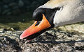


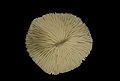
 Comment Details is O.K. But too underexposure for me. I think it should be more lighting. --Fukutaro 11:45, 28 January 2008 (UTC)

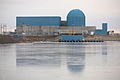


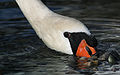

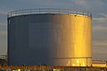


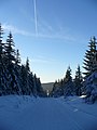
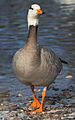


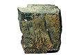


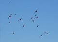

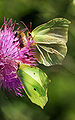


 Done Check it out. --Fukutaro 04:30, 23 January 2008 (UTC)


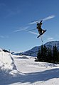


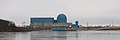

 Question Where does the glitter come from? It looks like a jewel (glistening mineral aspect). Lycaon 08:41, 22 January 2008 (UTC) -- I'm not sure, should be from the texture of the petals, like velvet -- Alvesgaspar 09:40, 22 January 2008 (UTC)

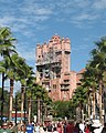


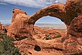


 I'll try again. -- Digon3 02:30, 21 January 2008 (UTC)


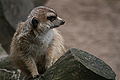


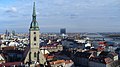


 Info I think that this impression is caused by the fact that this day was very hot and hazy so that the horizon is not clearly visible. I understand your objection, but is this detail a reason to not promote this picture as quality image? --Tobi 87 10:59, 13 January 2008 (UTC)


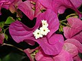


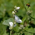


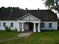


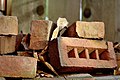


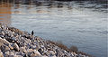
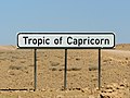


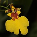

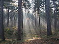


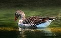
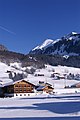


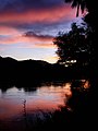


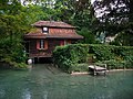


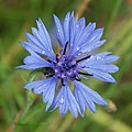


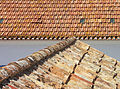


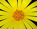


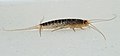


.JPG)


.jpg)


_room_6_-_file_1588.jpg)
_room_4_-_file_1589.jpg)


.JPG)


.jpg)
.jpg)


.JPG)


.jpg)


.jpg)
.jpg)
.jpg)
.jpg)


.jpg)
.jpg)
.jpg)
.jpg)
.jpg)


.JPG)


.jpg)


.jpg)


.jpg)


.jpg)

_head.jpg)


 Support Okay (^^)/ -- Laitche 14:59, 7 January 2008 (UTC)

 Oppose I renominated the first one. -- carol 12:20, 23 January 2008 (UTC)


 Neutral There is some bit noises. --Fukutaro 09:04, 18 January 2008 (UTC) Thanks for fixed some ploblem. but I can see some white points(dust?) still. and so vote neutral. sorry. --Fukutaro 09:41, 29 January 2008 (UTC)
 . Any suggestions for improving future pictures (without downsampling to 1600 px) will be appreciated. Alberto Fernandez Fernandez 10:56, 18 January 2008 (UTC)
.jpg)


 (though small, yet beautiful cloud)--Fukutaro 13:43, 15 January 2008 (UTC)


 --B.navez 06:14, 20 January 2008 (UTC)


 , replace perspectives to locate the building and watch the original to see Venus.--B.navez 02:29, 15 January 2008 (UTC)
.jpg)


.jpg)


.jpg)


.jpg)
_1.jpg)
_2.jpg)


.jpg)
.jpg)


 , there is a blue cast on the dial, maybe from the casing around the dial - you can balance the colours on that version from the white writing on the sign above. From that version it appears that the white on the top outer edge of the case would be a good point to do the colour correction from on your close-up version (it should be pure white). --Tony Wills 10:01, 23 December 2007 (UTC)
.JPG)
_crop.jpg)


