Commons:Quality images candidates/Archives January 09 2017
-

- Nomination Mausoleum in Bukowiec 2 --Jacek Halicki 00:00, 7 January 2017 (UTC)
- Promotion Good quality. -- Johann Jaritz 02:35, 7 January 2017 (UTC)
-
- Nomination Church of St. Joseph in Krzeszów 2 --Jacek Halicki 00:00, 7 January 2017 (UTC)
- Promotion Good quality. -- Johann Jaritz 02:35, 7 January 2017 (UTC)
-

-

- Nomination "Redoute de Panissars", belonging to Fort de Bellegarde, near Le Perthus, France. --Palauenc05 21:43, 6 January 2017 (UTC)
- Promotion Good quality. --Ermell 22:55, 6 January 2017 (UTC)
-
-

- Nomination Garibaldi monument --Ermell 19:44, 6 January 2017 (UTC)
- Promotion Good quality. --Jacek Halicki 23:20, 6 January 2017 (UTC)
-

-

-

-

-

-

-

-

- Nomination Waterfall in Barbian. --Moroder 18:35, 6 January 2017 (UTC)
- Promotion
 Support Good quality --The Photographer 18:43, 6 January 2017 (UTC)
-

- Nomination Well-developed (pneumatoforen) of a bald cypress Taxodium distichum in the separation of land and water. Height from 33 cm water. Width 42 cm.
--Famberhorst 16:45, 6 January 2017 (UTC) - Promotion GQ --Palauenc05 18:16, 6 January 2017 (UTC)
- Nomination Well-developed (pneumatoforen) of a bald cypress Taxodium distichum in the separation of land and water. Height from 33 cm water. Width 42 cm.
-

- Nomination The views of Twigen (left). Location, Langweerderwielen (Langwarder Wielen) and surroundings.
--Famberhorst 16:45, 6 January 2017 (UTC) - Promotion Good quality. --Basotxerri 16:58, 6 January 2017 (UTC)
- Nomination The views of Twigen (left). Location, Langweerderwielen (Langwarder Wielen) and surroundings.
-

-

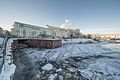
- Nomination The ferry Emelie in Stockholm. --ArildV 14:19, 6 January 2017 (UTC)
- Promotion GQ --Palauenc05 14:37, 6 January 2017 (UTC)
-

- Nomination Northern masked weaver (Ploceus taeniopterus), male, Kenya --Charlesjsharp 13:58, 6 January 2017 (UTC)
- Promotion Support Good quality.--Famberhorst 18:42, 6 January 2017 (UTC)
-

- Nomination Palm nut vulture (Gypohierax angolensis), Uganda --Charlesjsharp 13:58, 6 January 2017 (UTC)
- Withdrawn Good quality. --Cayambe 15:19, 6 January 2017 (UTC)
* Oppose Noise, jpg artifacts and out of focus. --The Photographer 18:42, 6 January 2017 (UTC)
Should not have been nominated. Charlesjsharp 23:08, 6 January 2017 (UTC)
-

-
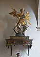
- Nomination Statue of archangel Michael in the parish church of Villanders in South Tyrol --Moroder 12:10, 6 January 2017 (UTC)
- Promotion Support Good quality.--Famberhorst 17:17, 6 January 2017 (UTC)
-
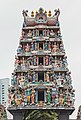
- Nomination Sri Mariamman Temple. Chinatown, Central Region, Singapore. --Halavar 11:39, 6 January 2017 (UTC)
- Promotion Support Good quality.--Famberhorst 17:14, 6 January 2017 (UTC)
-

- Nomination Jamae Mosque. Chinatown, Central Region, Singapore. --Halavar 11:39, 6 January 2017 (UTC)
- Promotion Good quality. --Jacek Halicki 17:37, 6 January 2017 (UTC)
-
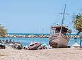
- Nomination Botes de pesca aparcados --The Photographer 10:46, 6 January 2017 (UTC)
- Promotion The image is OK but could you remove the branch or cable in the upper left corner, please? --Basotxerri 13:32, 6 January 2017 (UTC)
 Done Thanks --The Photographer 13:38, 6 January 2017 (UTC)
¡Gracias a ti! Good quality. --Basotxerri 13:51, 6 January 2017 (UTC)
-

- Nomination Typical Food in Margarita --The Photographer 10:46, 6 January 2017 (UTC)
- Promotion Good quality -_Halavar 11:57, 6 January 2017 (UTC)
-

- Nomination People of Isla Margarita --The Photographer 10:46, 6 January 2017 (UTC)
- Decline Oppose The highlights are overexposed and the head is cropped on the top. Also much noise --A.Savin 18:44, 6 January 2017 (UTC)
-

- Nomination Basilica of Our Lady of Licheń, Stary Licheń, Poland --Poco a poco 10:36, 6 January 2017 (UTC)
- Promotion Good quality. --Jacek Halicki 10:56, 6 January 2017 (UTC)
-

- Nomination Collegium Minus, Poznan, Poland --Poco a poco 10:36, 6 January 2017 (UTC)
- Promotion Good quality. --Jacek Halicki 10:56, 6 January 2017 (UTC)
-

- Nomination Golden Gate, Gdansk, Poland --Poco a poco 10:36, 6 January 2017 (UTC)
- Promotion Good quality. --Jacek Halicki 10:56, 6 January 2017 (UTC)
-

- Nomination Basilica of Our Lady of Licheń, Stary Licheń, Poland --Poco a poco 10:36, 6 January 2017 (UTC)
- Promotion Good quality. --Jacek Halicki 10:56, 6 January 2017 (UTC)
-

- Nomination Agricultural gate in the Jarindo mountain area. Warning sign about free-roaming sheep. Álava, Basque Country, Spain --Basotxerri 08:36, 6 January 2017 (UTC)
- Promotion Good quality. --Jacek Halicki 10:06, 6 January 2017 (UTC)
-

- Nomination Acebo en la zona del monte Jarindo. Álava, País Vasco, España --Basotxerri 08:36, 6 January 2017 (UTC)
- Promotion Good quality. -- Johann Jaritz 08:58, 6 January 2017 (UTC)
-
- Nomination Amateur radio near the Jarindo mountain summit. Álava, Basque Country, Spain --Basotxerri 08:36, 6 January 2017 (UTC)
- Promotion Good quality. -- Johann Jaritz 08:58, 6 January 2017 (UTC)
-

- Nomination Amateur radio antenna near the Jarindo mountain summit. Álava, Basque Country, Spain --Basotxerri 08:36, 6 January 2017 (UTC)
- Promotion Good quality --Halavar 11:41, 6 January 2017 (UTC)
-

- Nomination Stairway down from Alto de los Neveros to the Larrein quarter. Vitoria-Gasteiz, Basque Country, Spain --Basotxerri 08:36, 6 January 2017 (UTC)
- Promotion Good quality. --Jacek Halicki 10:06, 6 January 2017 (UTC)
-

- Nomination Stroll across the botanical path from Cogolo to Peio Paese.
--Agnes Monkelbaan 06:02, 6 January 2017 (UTC) - Promotion Good focus to main object --Michielverbeek 06:09, 6 January 2017 (UTC)
- Nomination Stroll across the botanical path from Cogolo to Peio Paese.
-

- Nomination Visit to church of San Rocco surrounded in the military cemetery in Peio Paese.
--Agnes Monkelbaan 06:02, 6 January 2017 (UTC) - Promotion Support Good quality. -- Johann Jaritz 06:08, 6 January 2017 (UTC)
- Nomination Visit to church of San Rocco surrounded in the military cemetery in Peio Paese.
-

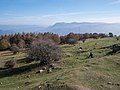
- Nomination Walking around Lago di Pian Palù (1800 m). in the Parco nazionale dello Stelvio (Italy).
--Agnes Monkelbaan 06:02, 6 January 2017 (UTC) - Promotion Support Good quality. -- Johann Jaritz 06:24, 6 January 2017 (UTC)
- Nomination Walking around Lago di Pian Palù (1800 m). in the Parco nazionale dello Stelvio (Italy).
-

- Nomination Southwestern partial view of castle Frauenstein, Frauenstein, Carinthia, Austria --Johann Jaritz 02:48, 6 January 2017 (UTC)
- Promotion Support Good quality. Part of a panorama? --XRay 05:34, 6 January 2017 (UTC)
 Comment Sorry, no plans for a panorama. -- Johann Jaritz 05:45, 6 January 2017 (UTC)
-

- Nomination Southwestern partial view of castle Frauenstein, Frauenstein, Carinthia, Austria --Johann Jaritz 02:48, 6 January 2017 (UTC)
- Promotion Support Good quality. Part of a panorama? --XRay 05:34, 6 January 2017 (UTC) Comment Sorry, no plans for a panorama. -- Johann Jaritz 05:45, 6 January 2017 (UTC)
-

- Nomination Northwestern partial view of castle Frauenstein, Frauenstein, Carinthia, Austria --Johann Jaritz 02:48, 6 January 2017 (UTC)
- Promotion Support Good quality.--Agnes Monkelbaan 05:52, 6 January 2017 (UTC)
-

- Nomination Grunwaldzki Square in Nowa Ruda --Jacek Halicki 00:02, 6 January 2017 (UTC)
- Promotion Support Good quality.--Agnes Monkelbaan 05:54, 6 January 2017 (UTC)
-

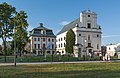
- Nomination Mausoleum in Bukowiec --Jacek Halicki 00:02, 6 January 2017 (UTC)
- Promotion Support Good quality. Sky very bright. --XRay 05:36, 6 January 2017 (UTC)
-

- Nomination Darband, Tehran, Iran --Poco a poco 22:12, 5 January 2017 (UTC)
- Decline Important parts of the image are quite unsharp and the composition could be better: the right chair should be shown entirely, I think. IMO not sufficient for a QI, sorry. --Basotxerri 08:50, 6 January 2017 (UTC)
-

- Nomination Citadelle of Meybod, Iran --Poco a poco 22:12, 5 January 2017 (UTC)
- Promotion Good quality. --Ermell 07:17, 6 January 2017 (UTC)
-

-

-

- Nomination Marabou stork (Leptoptilos crumenifer), Uganda --Charlesjsharp 18:25, 5 January 2017 (UTC)
Nice, except that I am not too keen on the dark plumage, which appears to have some color casts, that could be due to chroma noise and/or an unfortunate applied NR. The OOF background has an unusual structure, but OK. -- Slaunger 19:18, 5 January 2017 (UTC) Done New version uploaded. Charlesjsharp 11:59, 6 January 2017 (UTC) - Promotion Good quality. --Slaunger 18:40, 6 January 2017 (UTC)
- Nomination Marabou stork (Leptoptilos crumenifer), Uganda --Charlesjsharp 18:25, 5 January 2017 (UTC)
-

- Nomination Northern brown-throated weaver (Ploceus castanops) female, Uganda --Charlesjsharp 18:25, 5 January 2017 (UTC)
Great light and colors, and what eyes! However, the noise level is very uneven. In some areas tending to posterization in others such as in the fork of twigs very noisy. I do not know exactly how you post-process your images inPhotoshop, but I would really recommend Lightroom and raw editing. I think you could get so much more out of your otherwise excellent pictures if you had a fruther look into mastering the postprocessing better. Oh, and there is a red-linked category. -- Slaunger 20:16, 5 January 2017 (UTC)
Done Have corrected my sloppy cloning of branch and denoised sky. Charlesjsharp 11:46, 6 January 2017 (UTC) - Promotion Much better. Good quality. --Slaunger 18:43, 6 January 2017 (UTC)
- Nomination Northern brown-throated weaver (Ploceus castanops) female, Uganda --Charlesjsharp 18:25, 5 January 2017 (UTC)
-

- Nomination Vieillot's black weaver (Ploceus nigerrimus nigerrimus).jpg, Uganda --Charlesjsharp 18:25, 5 January 2017 (UTC)
- Promotion Good quality. --Ermell 07:25, 6 January 2017 (UTC)
-

- Nomination Sebastian Scheel, Member of the Parliament of the Free State of Saxony. By User:Martin Kraft --Sandro Halank 18:07, 5 January 2017 (UTC)
- Promotion Good quality.--ArildV 20:33, 6 January 2017 (UTC)
-

- Nomination Lars Rohwer (CDU) --Sandro Halank 18:07, 5 January 2017 (UTC)
- Promotion Support --Christian Ferrer 12:18, 6 January 2017 (UTC)
-

- Nomination Plaza de Europa in Puerto de la Cruz, Tenerife, Canary Islands. --Cayambe 15:28, 5 January 2017 (UTC)
- Promotion Could you crop a bit of the left border to remove that palm tree leaves, please? --Basotxerri 15:54, 5 January 2017 (UTC) Comment The longitude was wrong, I have corrected it. It might be an idea to blur or pixelize some of the faces. -- Renardo la vulpo 16:33, 5 January 2017 (UTC). Done Thanks for correcting the geocode (E to W). New version uploaded: branches at the left side removed and faces blurred. The latter is a general issue, I'll post it to the discussion page. Thanks to both of you. --Cayambe 15:32, 6 January 2017 (UTC) Support QI for me now. -- Renardo la vulpo 21:56, 6 January 2017 (UTC)
-
-

- Nomination Mount Majura Casuarina Trail, ACT -- Thennicke 11:19, 5 January 2017 (UTC)
- Decline Insufficient quality. Too contrasty and not many details in shadow areas. It has some artistic qualities though. --Slaunger 19:25, 5 January 2017 (UTC) @Slaunger: New version uploaded with significantly reduced contrast (I have a RAW file). The image is not super-sharp because f/18 was used for the sunstar, but maybe this is now promotable. Thanks -- Thennicke 02:17, 6 January 2017 (UTC)
Thennicke: Thanks for the new edit, but I am sorry, I still do not think it is QI. Shooting directly against the sun gives a huge dynamic range to handle, and with the f/18 you are also getting diffraction limited. -- Slaunger 18:54, 6 January 2017 (UTC)
-

- Nomination Stone marker of Peak Lisec (1,754 m) on Plačkovica, Macedonia --Kiril Simeonovski 19:23, 4 January 2017 (UTC)
- Decline Insufficient quality. Sorry. --A.Savin 18:36, 6 January 2017 (UTC)
-

- Nomination Fragments of Roman building in the village of Puzderci, Zletovo-Probištip Region, Macedonia --Kiril Simeonovski 19:21, 4 January 2017 (UTC)
- Decline Insufficient quality. Look on the hills, there is total lack of detail. --A.Savin 18:34, 6 January 2017 (UTC)
-
- Nomination This photo was taken by Thomas Bresson. By User:ComputerHotline --Cvmontuy 17:34, 4 January 2017 (UTC)
- Promotion Support good quality --Christian Ferrer 12:26, 6 January 2017 (UTC)
-

- Nomination Píer Duarte Coelho --The Photographer 10:33, 4 January 2017 (UTC) Comment Please remove the dust spot on the very top. If you add some sharpness it might work.--Ermell 14:27, 4 January 2017 (UTC)
Done Thanks --The Photographer 18:54, 4 January 2017 (UTC) - Promotion Good quality. --Ermell 07:29, 6 January 2017 (UTC)
- Nomination Píer Duarte Coelho --The Photographer 10:33, 4 January 2017 (UTC)
-

- Nomination Alexander Krauß (CDU) --Sandro Halank 01:33, 3 January 2017 (UTC)
- Promotion Good quality. --Moroder 12:15, 6 January 2017 (UTC)
-

- Nomination: Topi (Damaliscus lunatus topi), female with calf, Uganda --Charlesjsharp 13:03, 30 December 2016 (UTC)
Please create the red-linked category, The transitin from grass in focus to back is very odd-looking as if the background. Why? -- Slaunger 23:56, 30 December 2016 (UTC)
I afraid I don't understand your question @Slaunger: . There has been no cloning or other processing, only mild sharpening and then NR). Charlesjsharp 14:42, 31 December 2016 (UTC)
Charlesjsharp: It actully looks like NR gone haywire - too aggressive, I think, it can often cause these types of artifacts when grass gradually goes out of focus - in my experience. -- Slaunger 15:51, 31 December 2016 (UTC) - Review
It may seem like aggressive NR, but not so, I could show you the original. Charlesjsharp 18:48, 31 December 2016 (UTC)
OK, well, maybe another reviewer should have a look. -- Slaunger 22:12, 31 December 2016 (UTC)
- Nomination: Topi (Damaliscus lunatus topi), female with calf, Uganda --Charlesjsharp 13:03, 30 December 2016 (UTC)
-

- Nomination Town hall in Muggendorf --Ermell 10:18, 28 December 2016 (UTC)
- Promotion There are some dust spots in the sky, could you remove them? --Basotxerri 16:08, 28 December 2016 (UTC) Done Birds removed.Thanks for the review--Ermell 11:15, 29 December 2016 (UTC)
OK now, thank you! --Basotxerri 08:42, 6 January 2017 (UTC)


_van_een_moerascipres_(Taxodium_distichum)_op_de_scheiding_van_land_en_water_01.jpg)
._Locatie,_Langweerderwielen_(Langwarder_Wielen)_en_omgeving_02.jpg)


_male_non-breeding.jpg)
_in_flight,_Semliki_Wildlife_Reserve.jpg)


.jpg)
.jpg)


._in_het_Nationaal_park_Stelvio_(Itali%C3%AB)_04.jpg)


.jpg)
_female.jpg)
.jpg)

_by_Sandro_Halank%E2%80%931.jpg)


_2.jpg)


_by_Sandro_Halank_(cropped).jpg)
_female_with_calf.jpg)

Consensual review
editFile:St._Andreas_in_Antlas_Ritten_Innenraum.JPG
edit
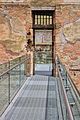
- Nomination Interior of the Saint Andrew chapel in Antlas --Moroder 21:18, 3 January 2017 (UTC)
- Decline
- Oppose There is presence of overexposure and the left border is cropped too tight. I understand that this is a very small chapel and there's not enough space for shooting but IMO the image is not good enough for a QI, sorry. --Basotxerri 16:35, 5 January 2017 (UTC)
- Comment I disagree --Moroder 23:16, 5 January 2017 (UTC)
- Comment - That's a beautiful chapel! I find the uppermost crop strange, as we see the node of the beam (I don't know the technical terms) but not the end of the beam itself. That said, I don't find any of the crops disabling, but there are two places with overexposure that I'd like you to work on: (1) the hymnal near the lower right corner, whose left side is blown and posterized, and the view through the window. You might want to recrop slightly on the top edge of the picture frame, too. Anyway, if you make the edits, this has a real chance of being a relatively uncontroversial QI, I think. -- Ikan Kekek 23:48, 5 January 2017 (UTC)
- Thanks for your comments. The crop depends very much on the space inside the chapel and the kind of lense used. Surely it is not perfect and I understand that you'd prefer to see the whole arch but imo it's not unesthetical. I did my best to correct overexposure, otherwise it would have been necessary to use HDR but y believe very sophisticated techniques go beyond the scope of QI and imo the overexposed spots are irrelevant to the whole of the picture.--Moroder 11:35, 6 January 2017 (UTC)
- I don't think I agree with you. Anything that distracts the viewer is a legitimate point for discussion, and if the distraction is significant enough, it could be a justification for a "decline" vote. How significant is significant enough is a subjective reaction on the part of each viewer. -- Ikan Kekek 13:58, 7 January 2017 (UTC)
Total: 0 support (excluding the nominator), 1 oppose →  Declined --Peulle 14:22, 8 January 2017 (UTC)
File:Saint petersbourg, cimetière de Tikhvin Tombe de Moussorgski.jpg
edit
- Nomination Tombe de Moussorgski dans le cimetière de Tikhvin à Saint-Petersbourg.--PIERRE ANDRE LECLERCQ 11:15, 4 January 2017 (UTC)
- Decline
- Support Good quality.--Scotch Mist 11:35, 4 January 2017 (UTC)
- Oppose Sorry, I disagree. Missing sharpness. --A.Savin 18:57, 4 January 2017 (UTC)
- Oppose - This file's size is over 13 MP, so it might make sense to allow some latitude here, except for the fact that since Mussorgsky was a composer, it is essential to be able to see and read the music notation clearly. That I cannot do, so I agree with A.Savin and oppose. -- Ikan Kekek 07:32, 5 January 2017 (UTC)
- Oppose per A.Savin: missing sharpness. --Sandro Halank (talk) 17:55, 5 January 2017 (UTC)
- Comment Increase radiance by 5, amount 0.5.--PIERRE ANDRE LECLERCQ 09:34, 7 January 2017 (UTC)
- That doesn't help me see the music, so no change in my votes (here or in VIC). -- Ikan Kekek 14:00, 7 January 2017 (UTC)
Total: 1 support (excluding the nominator), 3 oppose → Declined --Peulle 14:18, 8 January 2017 (UTC)
File:Zaleszany_Cemetery_11.jpg
edit
- Nomination Dominik Horodyński Plaque at Horodyński Family Chapel in the cemetery in Zaleszany, southeastern Poland --Scotch Mist 07:17, 31 December 2016 (UTC)
- Promotion
- Oppose Blurred letters. --A.Savin 15:54, 31 December 2016 (UTC)
- Comment Thank you for your review - the lettering of this plaque is engraved in granite in-laid with gold-coloured paint and when viewed at full size on screen is probably more than double the size of the actual lettering so may appear slightly blurred, but for reference the edges of the plaque do not appear to me to be blurred so I propose sending this for consensual review (although admittedly my record here is not great!:) --Scotch Mist 17:39, 31 December 2016 (UTC)
- Support Good enough for a quality image. -- Johann Jaritz 04:50, 1 January 2017 (UTC)
- Oppose Although I have no idea why, the letters do actually appear out of focus to me. For such an easy-to-shoot subject, I think they shold be sharper.--Peulle 20:23, 1 January 2017 (UTC)
- Support It appears to me good quality image and it doesn't seem to be blurry to me. Adamdaley 13:39, 2 January 2017 (UTC)
- Comment New Version --Livioandronico2013 20:16, 2 January 2017 (UTC)
- Comment Thank you for sharpening this image - do you think it is possible for 'amateurs' such as myself to efficiently achieve such results without investing in software like the latest version of Photoshop (I currently use GIMP & RawTherapee for any perspective correction or de-noising required but my attempts at sharpening have not been great to say the least) and perhaps spending many hours attempting to achieve such results? --Scotch Mist 09:25, 3 January 2017 (UTC)
 Neutral now --A.Savin 07:08, 3 January 2017 (UTC)
- Comment Scotch Mist ... To answer your question concerning such photography software it is upto the individual. I cannot afford the outright cost of Photoshop some AU$1,000+ cost of it, which was roughly the price then. Since Christmas 2016, I'm on a monthly plan of about AU$14 per month and I get the full program of Photoshop (2017) and Lightroom (2015). That is all I can afford and I hope to do a Photoshop course later this year. Adamdaley 10:00, 4 January 2017 (UTC)
- Comment Adamdaley ... Thanks for your feedback - don't know of any such 'deals' here at the moment but looks good and allied with the training will no doubt produce positive results that I look forward to seeing as well as to providing evidence to support a similar investment! --Scotch Mist 12:11, 4 January 2017 (UTC)
- Comment Scotch Mist ... Keep an opened mind and a look out for such deals. Whether online, in newspapers or other forms of advertising from your local stores. Even from friends or friends of friends. Maybe ask your friends to keep an eye out for you? Because the more people that know about you looking to improve your photography programs the better chance you may get a program or two. Adamdaley 20:52, 4 January 2017 (UTC)
- Comment You need to marry a teacher to get a good price on Photoshop. Charlesjsharp 11:16, 5 January 2017 (UTC)
- Comment Honestly, guys, I think it would be cheaper to just buy a tripod. :D--Peulle 20:36, 5 January 2017 (UTC)
- Comment Funny thing is, I have a tripod and my "ship" image still came out fuzzy, a little. Adamdaley 20:40, 5 January 2017 (UTC)
- Support QI for me--Ermell 07:37, 6 January 2017 (UTC)
- Support Maybee we should find some other way to deal with pixelpeepers than wasting our money for expensive software or wasting our time with resharpening --Moroder 12:02, 6 January 2017 (UTC)
- meta comment I think there are two issues here. The first is what should in our collective judgment constitute an image of quality? To make an analogy, when trying to achieve a performance of quality on the flute, the skill of the performer is undoubtedly the most important factor, as long as his/her flute is at least playable (no-one can rescue a flute that has leaks from here to eternity). But to achieve a high level of performance, you do normally have to pay some money for a good flute and also for periodic maintenance. $1,000 is a lot of money, but for a flutist, let alone for a pianist or violinist, it actually is not. $1,000 (maybe around $900-1,500 or so) is probably not too far from the minimum necessary to buy a very good (probably not great) student flute in the U.S. today, though it is also possible to rent one and thereby gradually pay for an eventual purchase. There have been efforts to help provide funds for one great photographer, so that he can get better equipment. I think that having a more organized fund for talented photographers who need help to procure excellent equipment and software would be a great thing for Wikimedia to do, even though I am not in a position to contribute at this time.
- The second issue is what to do about "pixel-peepers". Digital photography enables people to pixel-peep, and I think we can expect this to continue to be an issue, analogous to what musicians have been dealing with for decades, since the beginning of analog splicing enabled the creation of sound recordings of inhuman perfection, with unreasonable audience expectations to match. In the last couple of decades, this has helped lead to a most unmusical result, the prevalence of auto-tuning and other much grosser digital falsifications of in-studio performance than splicing. I would suggest that the best way to deal with excessive attention to minute details in huge files is through efforts at patient dialogue and education. What and how many allowances should be made for imperfections in what size of digital photo is definitely not self-explanatory, especially since so much of evaluation is subjective. It might be useful to have a discussion board on this site that specifically addresses this question (I'm struggling for a name - maybe something like Standards of Evaluation, with a description that it is a board for meta discussion, not a policy board?), perhaps with reference to files uploaded with free licenses by non-Wikimedians, in an effort to try to avoid any kind of personal recrimination. -- Ikan Kekek 14:33, 7 January 2017 (UTC)
- Comment Ikan Kekek ... I agree with you. I have to say that I am relatively new here. There is more to add about "meta data", not only to registered but to unregistered users on Wikimedia Commons. Which of course if there was a dedicated page for discussion on "meta data" then I would certainly be active on that page. Adamdaley (talk) 22:27, 7 January 2017 (UTC)
- For the record, I haven't been reviewing at QIC for that long, either. -- Ikan Kekek 03:47, 8 January 2017 (UTC)
Total: 4 support (excluding the nominator), 1 oppose →  Promoted --Peulle 14:17, 8 January 2017 (UTC)