Commons:Quality images candidates/Archives July 05 2017
-
- Nomination Pont in the Langweerder Vaart. Detail.
--Agnes Monkelbaan 04:44, 3 July 2017 (UTC) - Promotion Quality high enough for Q1 --Michielverbeek 04:54, 3 July 2017 (UTC)
- Nomination Pont in the Langweerder Vaart. Detail.
-

- Nomination Shed 10/11, Lübeck, Schleswig-Holstein, Germany --XRay 03:30, 3 July 2017 (UTC)
- Decline Perspective well done, but main object is not sharp enough for me --Michielverbeek 04:58, 3 July 2017 (UTC)
-

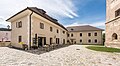
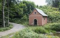
- Nomination Abbey, Monastery Endowment of the Holy Grave, Heiligengrabe, Brandenburg, Germany --XRay 03:30, 3 July 2017 (UTC)
- Promotion Special perspective. Good quality.--Agnes Monkelbaan 04:42, 3 July 2017 (UTC)
-

- Nomination Brachypelma vagans --Cvmontuy 03:09, 3 July 2017 (UTC)
- Promotion Good. -- Ikan Kekek 03:36, 3 July 2017 (UTC)
-

- Nomination Brachypelma vagans --Cvmontuy 03:09, 3 July 2017 (UTC)
- Promotion Both of these are quite good, in my opinion. -- Ikan Kekek 03:36, 3 July 2017 (UTC)
-

- Nomination Parish and pilgrimage church Assumption of Mary, Maria Saal, Carinthia, Austria --Johann Jaritz 01:57, 3 July 2017 (UTC)
- Promotion Good quality. --Tobias "ToMar" Maier 02:08, 3 July 2017 (UTC)
-

- Nomination Northern exterior wall with spiral stairs from the defunct former skyway to the priory building and northern portal of the parish and pilgrimage church Assumption of Mary, Maria Saal, Carinthia, Austria --Johann Jaritz 01:57, 3 July 2017 (UTC)
- Promotion Good quality. --Tobias "ToMar" Maier 02:08, 3 July 2017 (UTC)
-

- Nomination Light column, canonry building and charnel house on Domplatz #6, Maria Saal, Carinthia, Austria --Johann Jaritz 01:57, 3 July 2017 (UTC)
- Promotion Good quality. --Tobias "ToMar" Maier 02:08, 3 July 2017 (UTC)
-
- Nomination Rectory, former deanery, on Domplatz #1, Maria Saal, Carinthia, Austria --Johann Jaritz 01:57, 3 July 2017 (UTC)
- Promotion Good quality. --Tobias "ToMar" Maier 02:09, 3 July 2017 (UTC)
-

- Nomination Ancient Roman grave inscription (CIL III 4950) at the staircase of the former deanery, on Domplatz #1, Maria Saal, Carinthia, Austria --Johann Jaritz 01:57, 3 July 2017 (UTC)
- Promotion Good quality. --Tobias "ToMar" Maier 02:08, 3 July 2017 (UTC)
-

- Nomination Alcatraz Island as seen from the East --Frank Schulenburg 23:21, 2 July 2017 (UTC)
- Promotion Good quality. -- Johann Jaritz 01:59, 3 July 2017 (UTC)
-

- Nomination Second floor of the Ferry Building in San Francisco --Frank Schulenburg 22:45, 2 July 2017 (UTC)
- Promotion Good quality. -- Johann Jaritz 02:08, 3 July 2017 (UTC)
-

- Nomination Green Shield Bug Nymph, Loire. --MirandaAdramin 21:40, 2 July 2017 (UTC)
- Decline
 Oppose Sorry. Subject is too little, uninportant. Most of the picture is out of focus. Picture needs a crop IMO--Lmbuga 02:29, 3 July 2017 (UTC)
-

- Nomination Spider on the lookout, Loire. --MirandaAdramin 21:25, 2 July 2017 (UTC)
- Decline Oppose Sorry, poor quality: Picture must be cropped. Poor detail. --Lmbuga 02:35, 3 July 2017 (UTC)
-

- Nomination Asilinae waiting for his prey in the broom, Loire. --MirandaAdramin 21:25, 2 July 2017 (UTC)
- Promotion Good quality. PumpkinSky 00:51, 3 July 2017 (UTC)
-

- Nomination Large red damselfly (Pyrrhosoma nymphula) male, Berkshire --Charlesjsharp 21:23, 2 July 2017 (UTC)
- Promotion Good quality, Tournasol7 22:15, 2 July 2017 (UTC)
-

- Nomination Bee beetle (Trichius fasciatus), Estonia --Charlesjsharp 17:21, 2 July 2017 (UTC)
- Promotion Good quality. --Peulle 19:30, 2 July 2017 (UTC)
-

- Nomination Bird-cherry ermine moth (Yponomeuta evonymella) caterpillars, Estonia --Charlesjsharp 17:21, 2 July 2017 (UTC)
- Promotion Good quality. A little bit noisy, but IMO enough interesting for QI. --MirandaAdramin 20:09, 2 July 2017 (UTC)
-

- Nomination Libellulidae from Kottayam, Kerala --Deepugn 16:16, 2 July 2017 (UTC)
- Decline abdomen not in focus. Charlesjsharp 17:23, 2 July 2017 (UTC)
-

- Nomination Portal of the Saint Cosmas Church in Saint-Come-d'Olt, Aveyron, France. --Tournasol7 14:34, 2 July 2017 (UTC)
- Promotion Nice scene. You could add some person-related category (pilgrim?). Good quality. --Basotxerri 14:37, 2 July 2017 (UTC)
Category added, Tournasol7 15:49, 2 July 2017 (UTC)
-

- Nomination Bell tower of Saint-Julien Church of Ayrinhac, Bertholene, Aveyron, France. --Tournasol7 14:34, 2 July 2017 (UTC)
- Promotion Good quality and I'm assuming the yellow stuff on the roof is fungus or something else natural. PumpkinSky 14:37, 2 July 2017 (UTC)
To be honest, I don't remember it. Tournasol7 15:46, 2 July 2017 (UTC)
-

- Nomination View from the summit of the Schesaplana northeastward into the valley of Brand, Vorarlberg--Milseburg 14:32, 2 July 2017 (UTC)
- Promotion Pretty. -- Ikan Kekek 17:56, 2 July 2017 (UTC)
-

- Nomination Trail marking of the Green Ring trail. Vitoria-Gasteiz, Basque Country, Spain --Basotxerri 14:23, 2 July 2017 (UTC)
- Promotion
 Support Good quality.
-

- Nomination Onions and tools behind a house in Aretxabaleta. Vitoria-Gasteiz, Basque Country, Spain --Basotxerri 14:23, 2 July 2017 (UTC)
- Promotion Good quality. PumpkinSky 14:36, 2 July 2017 (UTC)
-

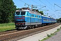
- Nomination A train with the locomotive VL80K-182 -- George Chernilevsky 14:20, 2 July 2017 (UTC)
- Promotion Support Good quality--Lmbuga 02:47, 3 July 2017 (UTC)
-
- Nomination A train with the locomotive ChS4-211 -- George Chernilevsky 14:20, 2 July 2017 (UTC)
- Promotion Support Good quality.--Famberhorst 16:13, 2 July 2017 (UTC)
-

- Nomination Potato plants near Aberasturi on the Alavese Plains. Basque Country, Spain --Basotxerri 12:25, 2 July 2017 (UTC)
- Promotion Good enough for QI, albeit with a tight crop of the left plant; as the subject is the plants (pl) I think it's OK, but it's something to keep in mind. --Peulle 13:57, 2 July 2017 (UTC)
-

- Nomination Potato plants near Aberasturi on the Alavese Plains. Basque Country, Spain --Basotxerri 12:25, 2 July 2017 (UTC)
- Promotion Good quality. PumpkinSky 13:15, 2 July 2017 (UTC)
-
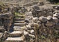
- Nomination Minoan villa of Piskokefalo, Crete. --C messier 09:45, 2 July 2017 (UTC)
- Promotion Good quality. --Basotxerri 14:43, 2 July 2017 (UTC)
-
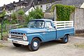
- Nomination Ford F-250, 1965 --Berthold Werner 10:18, 2 July 2017 (UTC)
- Promotion Good quality. --Ermell 12:35, 2 July 2017 (UTC)
-

- Nomination Ford F-250, 1965 --Berthold Werner 10:18, 2 July 2017 (UTC)
- Promotion Good quality. --Ermell 12:38, 2 July 2017 (UTC)
-

- Nomination Polaroid Lightmixer 630 SL --Berthold Werner 10:17, 2 July 2017 (UTC)
- Promotion Good quality. --Cvmontuy 03:25, 3 July 2017 (UTC)
-

-

- Nomination The baptismal font of the roman-catholic Rosenkranz-Basilika ("Rosary Basilica") in Berlin-Steglitz. --Code 09:51, 2 July 2017 (UTC)
- Promotion Good quality. --Livioandronico2013 10:03, 2 July 2017 (UTC)
-

- Nomination Ceiling of Sala degli specchi, Palazzo Ducale, Mantua --Livioandronico2013 09:28, 2 July 2017 (UTC)
- Promotion Support Good quality. Please add the geo location. --XRay 09:32, 2 July 2017 (UTC)
-

-

- Nomination Plans de Cunfin fountain 1 in Santa Cristina Gherdëina. --Moroder 08:42, 2 July 2017 (UTC)
- Promotion Good quality. -- Johann Jaritz 08:48, 2 July 2017 (UTC)
-
- Nomination Chapel in Jerzykowice Małe --Jacek Halicki 08:38, 2 July 2017 (UTC)
- Promotion Support Good quality. Contrast could be improved. --XRay 09:25, 2 July 2017 (UTC)
-
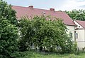
- Nomination 18 Międzyleska Street in Domaszków --Jacek Halicki 08:38, 2 July 2017 (UTC)
- Promotion Support Good quality. IMO the main subject is the tree. --XRay 09:25, 2 July 2017 (UTC)
-

- Nomination Wolności Square in Międzylesie --Jacek Halicki 08:38, 2 July 2017 (UTC)
- Promotion Good quality. -- Johann Jaritz 08:50, 2 July 2017 (UTC)
-

- Nomination 12 Wolności Square in Międzylesie --Jacek Halicki 08:38, 2 July 2017 (UTC)
- Promotion Good quality. -- Johann Jaritz 08:50, 2 July 2017 (UTC)
-

- Nomination 13 Wolności Square in Międzylesie --Jacek Halicki 08:38, 2 July 2017 (UTC)
- Promotion Weak Support Good quality. The cars are disturbing. Minor CAs at the antennas. --XRay 09:25, 2 July 2017 (UTC)
-

- Nomination With the Gaislachkogelbahn to the Ice Q, Sölden, Tyrol, Austria (by Otto Domes) --Ikan Kekek 08:13, 2 July 2017 (UTC)
 Comment I'm afraid it is tilted ccw and the wb a bit off --Moroder 09:14, 2 July 2017 (UTC) Comment Ah well. I wasn't totally sure about the white balance, myself, but it seemed possible to me and I thought a nomination here was worth a try. Otto Domes, if you're reading and want to try to edit the photo to address Moroder's points, please do. -- Ikan Kekek 10:32, 2 July 2017 (UTC)
  Info Since it´s strong tilted I wouldn´t promote, but it has already the QI-tag. --Milseburg 16:27, 2 July 2017 (UTC)
How did I miss that??? There should be a way to nominate a QI for demotion. Meanwhile, I withdraw my nomination. -- Ikan Kekek 17:41, 2 July 2017 (UTC)
 - Withdrawn {{{2}}}
- Nomination With the Gaislachkogelbahn to the Ice Q, Sölden, Tyrol, Austria (by Otto Domes) --Ikan Kekek 08:13, 2 July 2017 (UTC)
-

- Nomination Stafnes, Suðurnes, Iceland --Poco a poco 08:00, 2 July 2017 (UTC)
- Promotion Good quality. --Jacek Halicki 08:45, 2 July 2017 (UTC)
-

- Nomination The Pyramid of the Moon in Teotihuacan, México --Poco a poco 08:00, 2 July 2017 (UTC)
- Promotion Support Good quality. --XRay 09:28, 2 July 2017 (UTC)
-

- Nomination View of the Wat Arun Temple, the Chao Phraya River and the city of Bangkok from the highest Wat Arun tower, Bangkok, Thailand -Poco a poco 08:00, 2 July 2017 (UTC)
- Promotion Good quality. --Jacek Halicki 08:45, 2 July 2017 (UTC)
-

- Nomination Tomb in Tepe Sialk, Kashan, Iran --Poco a poco 08:00, 2 July 2017 (UTC)
- Promotion Support Good quality. --XRay 09:28, 2 July 2017 (UTC)
-

- Nomination Tepe Sialk, Kashan, Iran --Poco a poco 08:00, 2 July 2017 (UTC)
- Promotion Good quality. --Jacek Halicki 08:45, 2 July 2017 (UTC)
-

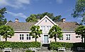
- Nomination Villa in Immensen --Hydro 07:57, 2 July 2017 (UTC)
- Promotion Good quality. --Jacek Halicki 08:47, 2 July 2017 (UTC)
-

- Nomination Tucktoo or tokay gecko, Pakke Wildlife Sanctuary and Tiger Reserve, Arunachal Pradesh. By User:Aparajita Datta --Shankar Raman 07:42, 2 July 2017 (UTC)
- Decline head not in focus, though body is good. Charlesjsharp 17:33, 2 July 2017 (UTC)
-

- Nomination False Cobra in Eaglenest Wildlife Sanctuary, Arunachal Pradesh, India. By User:Rohitjahnavi --Shankar Raman 07:42, 2 July 2017 (UTC)
- Decline not enough definition. Charlesjsharp 17:33, 2 July 2017 (UTC)
-

- Nomination Rhacophorus bipunctatus in Arunachal Pradesh, India. By User:Rohitjahnavi --Shankar Raman 07:42, 2 July 2017 (UTC)
- Promotion Good quality. --PJeganathan 16:10, 2 July 2017 (UTC)
-

- Nomination French Duke in Namdapha Tiger Reserve, Arunachal Pradesh, India. By User:Rohitjahnavi --Shankar Raman 07:42, 2 July 2017 (UTC)
- Decline not enough definition (camera not ideal for QI. Charlesjsharp 17:33, 2 July 2017 (UTC)
-

- Nomination Entrance to the Villa Concordia in Bamberg --Ermell 06:48, 2 July 2017 (UTC)
- Promotion Good quality. --Jacek Halicki 08:40, 2 July 2017 (UTC)
-

- Nomination Sandstone relief above the entrance of Villa Concordia in Bamberg --Ermell 06:48, 2 July 2017 (UTC)
- Promotion Good quality. -- Johann Jaritz 06:54, 2 July 2017 (UTC)
-

- Nomination Entrance to the Böttingerhaus in Bamberg --Ermell 06:48, 2 July 2017 (UTC)
- Promotion Good quality. --Jacek Halicki 08:40, 2 July 2017 (UTC)
-

- Nomination Sandstone relief on the facade of the Böttingerhaus in Bamberg --Ermell 06:48, 2 July 2017 (UTC)
- Promotion Good quality. -- Johann Jaritz 06:54, 2 July 2017 (UTC)
-

- Nomination Sandstone relief on the facade of the Böttingerhaus in Bamberg --Ermell 06:48, 2 July 2017 (UTC)
- Promotion Good quality. --Jacek Halicki 08:40, 2 July 2017 (UTC)
-

- Nomination Liège, monumental bridge (le Pont des Arches) across the Meuse from the north --Michielverbeek 06:17, 2 July 2017 (UTC)
- Decline Is has noise, sorry --Cvmontuy 03:28, 3 July 2017 (UTC)
-

- Nomination Liège-Belgium, street view Place du Marché (left l'église Saint-André and in the middle le Perron) --Michielverbeek 06:17, 2 July 2017 (UTC)
- Promotion Good quality. -- Johann Jaritz 06:55, 2 July 2017 (UTC)
-

- Nomination Liège-Belgium, shopping mall: Passage Lemonnier --Michielverbeek 06:17, 2 July 2017 (UTC)
- Promotion Support Good quality. --Code 09:52, 2 July 2017 (UTC)
-

- Nomination Rio São Francisco, Xique-xique - Bahia --Webysther 06:03, 2 July 2017 (UTC)
- Promotion What a gorgeous sundown! Good quality. -- Johann Jaritz 06:57, 2 July 2017 (UTC)
-

- Nomination Walk through The Strubben-Kniphorstbos. Overview of forest construction.
--Agnes Monkelbaan 04:35, 2 July 2017 (UTC) - Promotion Good quality. -- Johann Jaritz 05:44, 2 July 2017 (UTC)
- Nomination Walk through The Strubben-Kniphorstbos. Overview of forest construction.
-

-

-

- Nomination 9 Bandery Street. Lviv, Ukraine.--Aeou 20:23, 1 July 2017 (UTC)
- Promotion QI for me -- George Chernilevsky 18:59, 2 July 2017 (UTC)
-
- Nomination The parsonage from Leikanger in Sogn, Norway, built 1752. --Peulle 20:11, 1 July 2017 (UTC) I withdraw my nomination Barrel distortion; not enough room to correct. Must re-upload and re-nominate at a later date.--Peulle 15:10, 2 July 2017 (UTC)
- Withdrawn {{{2}}}
- Nomination The parsonage from Leikanger in Sogn, Norway, built 1752. --Peulle 20:11, 1 July 2017 (UTC)
-

-

- Nomination Kass Plateau region, Sahyadri --PJeganathan 13:51, 1 July 2017 (UTC)
- Decline Nice composition, but is not sharp --Cvmontuy 03:35, 3 July 2017 (UTC)
-

- Nomination jungle crow (Corvus macrorhynchos) from anaimalai hills --PJeganathan 13:51, 1 July 2017 (UTC)
- Decline a long long way from QI. Charlesjsharp 17:35, 2 July 2017 (UTC)
-

-

- Nomination Chapel of the Penitents of Saint-Come-d'Olt, Aveyron, France. --Tournasol7 12:47, 1 July 2017 (UTC)
- Promotion Good quality. I am usually not convinced by the vertical corrections, but here, it's a nice job. --MirandaAdramin 20:04, 2 July 2017 (UTC)
-

- Nomination Psidium guajava leaves --PumpkinSky 12:11, 1 July 2017 (UTC)
- Promotion Good quality. --Basotxerri 12:18, 2 July 2017 (UTC)
-

- Nomination Simca 1200 S, 1968 --Berthold Werner 10:06, 1 July 2017 (UTC)
- Promotion Good quality. --Ermell 12:43, 2 July 2017 (UTC)
-

- Nomination Dome of Saint Peter's Basilica (interior) --Livioandronico2013 23:25, 30 June 2017 (UTC)
- Promotion The light getting in at the corners isn't optimum and quite bright, possibly it cannot be avoided. I'd like to promote the image but perhaps you could try to smooth the brightness by applying four graduate filters in the corners first. What do you think? --Basotxerri 08:05, 1 July 2017 (UTC)
OK now! Good quality. --Basotxerri 11:51, 2 July 2017 (UTC)
-

- Nomination Paris peacock in Namdapha National Park & Tiger Reserve, Changlang district, Arunachal Pradesh. By User:Aparajita Datta --Shankar Raman 05:34, 30 June 2017 (UTC)
- Decline I'm afriad a long way from QI. Camera choice and camera settings are not helping you. Try faster shutter speed, smaller F no and higher ISO. Charlesjsharp 17:39, 2 July 2017 (UTC)
-

- Nomination Indian pond heron or paddybird (Ardeola grayii) from keoladeo national park --PJeganathan 05:25, 30 June 2017 (UTC)
- Decline not sharp enough. Charlesjsharp 17:42, 2 July 2017 (UTC)
-

- Nomination Dog from Diana fountain on Palace of Fontainebleau --Daniel VILLAFRUELA 22:04, 29 June 2017 (UTC)
- Promotion Very weak Support DoF is too small, f/3.5 isn't enough. The dog is unsharp at the bottom. --XRay 05:55, 2 July 2017 (UTC)
-

- Nomination OV-10 Bronco at Aircraft Picnic in Kraków --Jakubhal 18:09, 29 June 2017 (UTC)
- Decline Oppose Insufficient quality. Sorry. IMO too unsharp and too much disturbing elements, for example the objects in the background and the person at the right. Geo location missing too. --XRay 06:01, 2 July 2017 (UTC)
-

- Nomination Reconstructors and roleplayers perform at the festival «Times and epochs». Moscow, Tverskaya square. --PereslavlFoto 07:19, 29 June 2017 (UTC)
- Promotion Good quality. You know, you really should enter a personality warning in these files. --Peulle 21:56, 2 July 2017 (UTC)
-

- Nomination Reconstructors and roleplayers perform at the festival «Times and epochs». Moscow, Tverskaya square. --PereslavlFoto 07:19, 29 June 2017 (UTC)
- Promotion Good quality. --Peulle 21:56, 2 July 2017 (UTC)
-

-
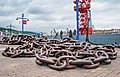
- Nomination Ship anchor chain in front of the Naval Museum. Bilbao, Biscay, Spain --Basotxerri 16:00, 28 June 2017 (UTC)
- Promotion Good quality. --Peulle 22:12, 2 July 2017 (UTC)
-

-

- Nomination: Eröffnungsfeier des WikiBär --Freddy2001 19:08, 26 June 2017 (UTC)
- Review needed
-

- Nomination Eröffnungsfeier des WikiBär --Freddy2001 19:08, 26 June 2017 (UTC)
- Decline Noisy, lack of detail, hand unpleasantly cutted --Cvmontuy 03:20, 3 July 2017 (UTC)
-

- Nomination: Wetland Londermoos in Kastelruth. --Moroder 12:40, 26 June 2017 (UTC)
- Review needed
-

- Nomination common hornbeam; natural monument in Siddinghausen (North Rhine-Westphalia, Germany) --YvoBentele 13:20, 25 June 2017 (UTC)
- Promotion Comment The lower left side of the trunk is overexposed. Can you reduce the exposure there to bring out some of the details? PumpkinSky 12:46, 26 June 2017 (UTC)
 Done I think, its better now - thanks for reviewing --YvoBentele 18:03, 1 July 2017 (UTC)
Support now. PumpkinSky 13:20, 2 July 2017 (UTC)
-

- Nomination Square tower of Castle of Peyreleau, Aveyron, France. --Tournasol7 12:39, 23 June 2017 (UTC) Comment It looks tilted looking at the rail on the left. IMO the rail on the bottom could also be cropped off but I don't consider that essential for QI --Moroder 16:39, 29 June 2017 (UTC) Oppose...but the crop is too tight, anyway.--Jebulon 22:40, 2 July 2017 (UTC)
- Decline {{{2}}}
- Nomination Square tower of Castle of Peyreleau, Aveyron, France. --Tournasol7 12:39, 23 June 2017 (UTC)


_male_Swinley.jpg)
_Estonia.jpg)
_caterpillars.jpg)


.jpg)

.jpg)


.jpg)
.jpg)


_from_anaimalai_hills_JEG3169.jpg)


.jpg)

_from_keoladeo_national_park_JEG3037.jpg)


_WMAR.jpg)


_(freddy2001).jpg)
_(freddy2001).jpg)


.jpg)
.jpg)
Consensual review edit
File:Rodin by Bourdelle Musée Rodin S.006675 Paris.png edit

- Nomination Bronze bust of Rodin by Antoine Bourdelle (1910). Musée Rodin, Paris, France.--Jebulon 15:23, 2 July 2017 (UTC)
- Promotion
- Support Good quality. --Peulle 18:49, 2 July 2017 (UTC)
- Oppose Blueish--Lmbuga 02:40, 3 July 2017 (UTC)
- Thanks for opinion. Could you show me where it is blueish ? Please notice that this bronze is inside, but at the entrance of the museum. It receives light both from inside (artificial), and outside (natural)... But I don't find anything blueish...--Jebulon 09:27, 3 July 2017 (UTC)
- Support on the basis that this is presumably how the sculpture looked in the museum. -- Ikan Kekek 03:51, 3 July 2017 (UTC)
File:Webysther_20150907164050_-_Palácio_Rio_Branco.jpg edit

- Nomination Palácio Rio Branco, Salvador - Bahia --Webysther 06:03, 2 July 2017 (UTC)
- Promotion
- It is ok to me please discuss --Cvmontuy 03:13, 3 July 2017 (UTC)
- Support - Quality Image to me. -- Ikan Kekek 04:44, 3 July 2017 (UTC)
- Support new crop is much better --Magnus (talk) 07:47, 3 July 2017 (UTC)
- Support Of course, it is far much better now !--Jebulon 09:19, 3 July 2017 (UTC)
File:Borut Pahor 2.jpg edit

- Nomination Shot of Slovenian President Borut Pahor (by Andrejj) --Joobo 18:53, 29 June 2017 (UTC)
- Promotion
- Oppose Insufficient quality. Sorry. Nose is sharp, the eyes aren't. And there are red category links. The categories should be created. --XRay 05:59, 2 July 2017 (UTC)
 Neutral Categories are fixed and Ikan Kekek and Peulle are right. The sharpness is acceptable. The resolution should be better, but it is acceptable too. --XRay 05:40, 3 July 2017 (UTC)
- Comment I am not too familar with these categories of nation's politicans, likely they are listed differently. Moreover, I cannot see why the quality is not good enough, to me the range in the image just goes from very sharp to sharp, which should be good enough for a gq rating.--~~~~
- Support - Categories seem OK to me though I do agree that the red-linked one should be created, and the photo is sharp enough, in my opinion. -- Ikan Kekek 17:59, 2 July 2017 (UTC)
- Support I took care of the categories for you; it was overcategorized. Face is sufficiently sharp for QI, imo, while the hair is slightly unfocused.--Peulle 21:59, 2 July 2017 (UTC)
- Support--Jebulon 09:24, 3 July 2017 (UTC)
File:Castle of Severac 13.jpg edit

- Nomination Entrance to Castle of Severac, Severac-le-Chateau, Aveyron, France. --Tournasol7 12:54, 30 June 2017 (UTC)
- Decline
- Oppose I love the tunnel effect here, but I have to oppose because of one thing...the arch is cut off at the top, that ruins this for me. Sorry. PumpkinSky 13:09, 30 June 2017 (UTC)
- I uploaded New version, discuss please. Tournasol7 21:23, 30 June 2017 (UTC)
- Comment That's an awful tight crop at the top and part of the upper left arch is blocked by the item in the foreground, so I will invite other opinions. PumpkinSky 23:42, 30 June 2017 (UTC)
- I uploaded
- Mild Oppose: this is a bit for tastes but it seems too tight for me, too. --Basotxerri 08:59, 1 July 2017 (UTC)
- Comment The crop is a minor composition issue and no problem for me. But: First version and rework show completely different proportions. Which of them represents the "true" proportion of the building? First version also seems to have much more natural colours, the rework is somewhat oversaturated. --Smial 21:49, 1 July 2017 (UTC)
File:Caterpillar_backhoe_loader_at_construction_site_in_Sunnyvale.jpg edit

- Nomination A Caterpillar backhoe loader parked at a construction site in Sunnyvale, California. --Grendelkhan 23:50, 29 June 2017 (UTC)
- Decline
- Comment Please improve the image: too dark, sharpness, leaning out. --XRay 07:31, 30 June 2017 (UTC)
- Oppose same smart phone issues as tomato photo. PumpkinSky 21:19, 30 June 2017 (UTC)
- Comment Please correct me, if you weren't opposing but only commenting. --Basotxerri 08:36, 1 July 2017 (UTC)
- Oppose Unfortunate wide angle perspective, leaning buildings, tone mapping of the sky looks unnatural. --Smial 22:10, 1 July 2017 (UTC)
- Oppose Per Smial.--Peulle 19:31, 2 July 2017 (UTC)
File:Persian_cucumbers_at_Campbell_farmer's_market.jpg edit

- Nomination A box of cucumbers labeled as "Mini Persian cucumbers" at a farmer's market in Campbell, California. --Grendelkhan 23:50, 29 June 2017 (UTC)
- Decline
- Comment Please check your image: DoF (Deepth of Field) could be better, categorization must be better. --XRay 07:44, 30 June 2017 (UTC)
- Oppose same smart phone issues as tomato photo. PumpkinSky 21:19, 30 June 2017 (UTC)
- Oppose Lack of depth means a lot of the image is out of focus.--Peulle 10:32, 1 July 2017 (UTC)
- Oppose Focus not well done. The two nearest cucumbers in the foreground should have been sharp, the background could be less sharp. Unlike the tomato photo, the composition does not work here. Not fixable without extreme cropping. --Smial 22:16, 1 July 2017 (UTC)
- Oppose - Good image for a smartphone, but as others said, not enough of it is sharp for it to earn the QI designation. -- Ikan Kekek 05:55, 2 July 2017 (UTC)
File:Cocktail_tomatoes_at_Campbell_farmer's_market.jpg edit

- Nomination A box of tomatoes labeled as "Cocktail Tomatoes" at a farmer's market in Campbell, California. --Grendelkhan 23:50, 29 June 2017 (UTC)
- Promotion
- Support Good quality. --Vengolis 02:47, 30 June 2017 (UTC)
- Oppose Sorry, DoF could be better, categorization must be better. --XRay 07:39, 30 June 2017 (UTC)
- Comment @XRay: FYI for XRay...@Grendelkhan: There is no rule against photos taken with a smart phone, but it's very hard for smart phone cameras to meet the QI and FP standards. The main problem is that there are no smart phones (that I know of at least) that let you change the f/stop, shutter speed, or ISO. I have heard of a few that let you take RAW photos though. All three of your nominations were taken with a smart phone. PumpkinSky 13:00, 30 June 2017 (UTC)
- @PumpkinSky and Grendelkhan: I've seen the smartphone. Today RAW is possible and much more. The lens is still difficult and the sensor is too small. But IMO this image (and the cucumbers) is not good, but may be acceptable. But the categories must be modified. --XRay 17:59, 30 June 2017 (UTC)
- Comment The image isn't that bad, could be acceptable. The upper tomatoes are quite sharp. --Basotxerri 09:02, 1 July 2017 (UTC)
- Weak Support Categorization is improved now. IMO acceptable now. --XRay 05:48, 2 July 2017 (UTC)
- Oppose DoF too shallow IMO. --Peulle 10:31, 1 July 2017 (UTC)
- Support The picture shows just the advantages of the small sensors and short focal lengths: sufficient depth of field with relatively wide aperture. I think it is a very good example that today you can also make acceptable pictures with a smartphone if you do not overwhelm them. Nice colours, natural lighting, good composition, not too much sharpened, no blurry noise reduction. I would like to see a really significant better image of the same scene made with a DSLR, without focus stacking. Crop is ok, does not need to be a FF. --Smial 22:06, 1 July 2017 (UTC)
- Support - I think enough of the tomatoes are sharp enough. -- Ikan Kekek 05:59, 2 July 2017 (UTC)
- Oppose Sorry, poor light (picture is underexposed) Lmbuga 03:13, 3 July 2017 (UTC)
File:Gâteaux_tunisiens,_juin_2017_DSC_5368.jpg edit

- Nomination Pasteries from Tunisia --Dyolf77 18:29, 26 June 2017 (UTC)
- Decline
- Oppose Insufficient quality.- under 2 megapixels --Joobo 19:04, 29 June 2017 (UTC)
- Comment I'm sorry but the picture is not under 2 megapixels! (actually 3774*2505 so 9,453870 megapixels) --Dyolf77 23:50, 29 June 2017 (UTC)
- Comment My bad. It actually is not. However it looks not absolutely sharp, yet I would let this evaluation to others.--Joobo 08:06, 30 June 2017 (UTC)
- Mild Oppose, the focal plane is bit too much behind the front of the pastry. --Basotxerri (talk) 16:03, 30 June 2017 (UTC)
- Oppose Basotxerri is correct. The back is more in focus than the front. PumpkinSky 11:27, 1 July 2017 (UTC)
- Oppose - Not sharp enough, in my opinion, and more empty space than optimal. Looks tasty, though! -- Ikan Kekek 06:02, 2 July 2017 (UTC)
File:Pano_ouest.jpg edit

- Nomination The Gier valley from Crêt de la Perdrix. --MirandaAdramin 05:55, 25 June 2017 (UTC)
- Decline
- CommentIMO the foregroud is unsharp and could be cropped out. There are minor stitching problems too. And there are CAs. The filename could be improved too. Please check your image. --XRay 05:59, 25 June 2017 (UTC)
- Comment Thanks for this huge review ! Unfortunately, I've already deleted all the files that I used for HDR + panorama stitching. The only thing I could do is to rename the file :-) I think it's better to forget this nomination ! --MirandaAdramin 14:59, 26 June 2017 (UTC)
- Comment I'm sure it is not good to delete source files. A crop is already possible. May be it's good enough for other reviewers and I hope it is OK to set this photograph to discuss. --XRay 14:13, 29 June 2017 (UTC)
- Oppose Two major problems: (1) On the left side we have a sharp foreground and a sharp background, but a blurry area in the middle. (2) The map/information board on the right is either broken or has been "destroyed" through the stitching process. Anyway, it looks weird. Additionally, the image is somewhat pixelated, but that could be solved with some downsampling. --Magnus (talk) 11:58, 30 June 2017 (UTC)
- Oppose Per Magnus PumpkinSky 14:55, 1 July 2017 (UTC)
- Oppose inconsistent exposure, blending not well done. --Smial 22:33, 1 July 2017 (UTC)
- Oppose per others, but please try again. -- Ikan Kekek 06:25, 2 July 2017 (UTC)
- Comment Don't worry, I sure will do another one the next time I'll go there ! ;-) --MirandaAdramin 09:41, 2 July 2017 (UTC)
File:Mosaic_of_Theodora_-_Basilica_San_Vitale_(Ravenna,_Italy).jpg edit
.jpg)
- Nomination Mosaic of Theodora - Basilica of San Vitale (built A.D. 547), Italy. UNESCO World Heritage site. --PetarM 15:46, 26 June 2017 (UTC)
- Decline
- Oppose Sorry, but IMO the bottom crop is too tight, cutting away parts of the fountain column. --Peulle 16:00, 26 June 2017 (UTC)
- Support Sorry,for me is fine. Discuss please --Livioandronico2013 22:24, 26 June 2017 (UTC)
- Support Sorry, for me is fine too. --Manfred Kuzel 09:11, 27 June 2017 (UTC)
- Comment Just for info, my oppose is based on seeing that the other images contain more, so this image doesn't show the whole mosaic.--Peulle 13:00, 27 June 2017 (UTC)
- Oppose per Peulle. -- Ikan Kekek 18:33, 27 June 2017 (UTC)
- Support OK 4 me --Palauenc05 21:53, 27 June 2017 (UTC)
- Oppose Unfortunately it is cropped and it is not a detail but simply incomplete --Moroder 16:32, 29 June 2017 (UTC)
- Oppose Per Moroder.--Jebulon 21:09, 1 July 2017 (UTC)
- Oppose Sorry, very poor quality IMO (sharpness)--Lmbuga 03:03, 3 July 2017 (UTC)
File:Μονή Βιδιανής 3206.jpg edit

- Nomination Vidiani monastery, Crete. --C messier 11:19, 20 June 2017 (UTC)
- Promotion
- Oppose The areas in shadows are too big and aren't sharp, sorry --Ezarate 22:48, 25 June 2017 (UTC)
- Comment I disagree about the unsharpness and the shadows are unavoidable for a building surrounded by big trees. More opinions please. --C messier 12:30, 26 June 2017 (UTC)
- Weak Support Somewhat soft, probably a bit too much noise reduction? Clear sun results in hard shadows, that is ok for me, as there is still some detail in the dark areas, and the lighting looks natural. --Smial 23:06, 28 June 2017 (UTC)
- Support As per Smial, IMO still acceptable. --Basotxerri 09:05, 1 July 2017 (UTC)
- Comment Clarity and contrast are not good IMO. I don't like white balance--Lmbuga 02:59, 3 July 2017 (UTC)