Commons:Quality images candidates/Archives July 26 2014
-

-

-
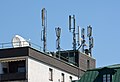
- Nomination GSM, beam, Yagi and parabolic antennas on the roof of a building in Bad Ischl, Upper Austria --P e z i 21:00, 23 July 2014 (UTC)
- Promotion Good quality. --Jacek Halicki 22:43, 23 July 2014 (UTC)
-

- Nomination Wojciech Sanatorium in Lądek-Zdrój --Jacek Halicki 20:51, 23 July 2014 (UTC)
- Promotion A bit tight crop in the top, but QI anyhow --Poco a poco 21:05, 23 July 2014 (UTC)
-

- Nomination Nepomuk fountain, Kreuzplatz, Bad Ischl, Upper Austria --P e z i 20:14, 23 July 2014 (UTC)
- Promotion Good quality. --Poco a poco 21:05, 23 July 2014 (UTC)
-
- Nomination Nepomuk fountain, detail, Kreuzplatz, Bad Ischl, Upper Austria --P e z i 20:14, 23 July 2014 (UTC)
- Promotion
 Support QI --Rjcastillo 20:50, 23 July 2014 (UTC)
-

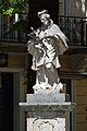
- Nomination Sorrento, Piazza Sant'Antonino --Berthold Werner 19:51, 23 July 2014 (UTC)
- Promotion Support QI --Rjcastillo 20:50, 23 July 2014 (UTC)
-

-

- Nomination A general view of rock formations of Canyonlands National Park as seen from the Island in the Sky district --DXR 19:13, 23 July 2014 (UTC)
- Promotion Good quality. --Poco a poco 21:05, 23 July 2014 (UTC)
-

- Nomination Plaque on the building of the hospital, where the surgeon Voyno-Yasenetsky worked. --PereslavlFoto 18:39, 23 July 2014 (UTC)
- Promotion Good quality. --Poco a poco 19:05, 23 July 2014 (UTC)
-

- Nomination Former Trinkhalle, Bad Ischl, Upper Austria --P e z i 17:56, 23 July 2014 (UTC)
- Promotion Good quality. --Poco a poco 18:41, 23 July 2014 (UTC)
-

- Nomination Rosette of the Cathedral of Leon, Spain-34 --Lmbuga 17:33, 23 July 2014 (UTC)
- Promotion Good quality. --Poco a poco 18:41, 23 July 2014 (UTC)
-

-

-

- Nomination Mes Bridge, Mes, Albania --Poco a poco 17:20, 23 July 2014 (UTC)
- Promotion Good quality. --DXR 19:19, 23 July 2014 (UTC)
-

- Nomination Christ the Savior Cathedral in a rainy day, Pristina, Kosovo --Poco a poco 17:20, 23 July 2014 (UTC)
- Promotion Support QI --Rjcastillo 20:50, 23 July 2014 (UTC)
-
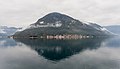
- Nomination View of Perast, Bay of Kotor, Montenegro --Poco a poco 17:20, 23 July 2014 (UTC)
- Promotion Support Good quality--Lmbuga 17:38, 23 July 2014 (UTC)
-

- Nomination A-Ma Temple, Macau --Poco a poco 17:20, 23 July 2014 (UTC)
- Promotion Good quality. --JLPC 21:40, 23 July 2014 (UTC)
-

- Nomination Golconda Fort, India --Bgag 16:47, 23 July 2014 (UTC)
- Promotion Good quality. --Poco a poco 18:46, 23 July 2014 (UTC)
-

-

-

-

-

- Nomination Visitor center National Park De Alde Feanen. Helianthus annuus in the butterfly garden.
Famberhorst 15:09, 23 July 2014 (UTC) - Promotion Good quality. --JLPC 16:00, 23 July 2014 (UTC)
- Nomination Visitor center National Park De Alde Feanen. Helianthus annuus in the butterfly garden.
-

-

-

-

-

-

-

- Nomination Church of Our Lady of Perpetual Help in Nysa --Jacek Halicki 07:53, 23 July 2014 (UTC)
- Promotion A magenta shine around the cross yet to be removed, but overall good quality. --Cccefalon 10:06, 23 July 2014 (UTC)
 Done--Jacek Halicki 11:35, 23 July 2014 (UTC)
Good quality. --Cccefalon 11:53, 23 July 2014 (UTC)
-

- Nomination Church of Our Lady of Perpetual Help in Nysa --Jacek Halicki 07:53, 23 July 2014 (UTC)
- Decline Perspective issues. As the crop is already very tight, I don't see a chance to get it salvaged. --Cccefalon 09:52, 23 July 2014 (UTC)
-

- Nomination Church of Our Lady of Perpetual Help in Nysa --Jacek Halicki 07:53, 23 July 2014 (UTC)
- Promotion Good quality. --Poco a poco 19:05, 23 July 2014 (UTC)
-

- Nomination Church of Our Lady of Perpetual Help in Nysa --Jacek Halicki 07:53, 23 July 2014 (UTC)
- Promotion OK for me. --Bgag 16:56, 23 July 2014 (UTC)
-

- Nomination Church of Our Lady of Perpetual Help in Nysa --Jacek Halicki 07:53, 23 July 2014 (UTC)
- Promotion Support Good quality--Lmbuga 12:13, 23 July 2014 (UTC)
-

-

- Nomination MJ-S 3 Zahrada casemate and observation tower, Šatov (Schattau), Moravia --Pudelek 07:40, 23 July 2014 (UTC)
- Promotion Good quality. --Jacek Halicki 11:35, 23 July 2014 (UTC)
-

- Nomination Rowing boat at river Svartån in Örebro, Sweden. In the background: Allehandaborgen, a historic office building built 1891. --ArildV 07:16, 23 July 2014 (UTC)
- Decline The nose of the boat is touching the image boarder. Thats a compositorial issue and reason to decline for me. Beside that, I expected that the mirroring castle should be rectilinear and not that strong distorted. --Cccefalon 09:49, 23 July 2014 (UTC)
-

-

-

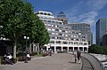
- Nomination Liudgerhaus (left), Diözesanbibliothek (right), Überwasserkirche (background) in Münster (Westphalia) --XRay 06:40, 23 July 2014 (UTC)
- Promotion QI to me, I like it.--~~~~
-

-

-
-
-

-

-

- Nomination Fields and hills, Villeneuvette, Hérault previously withdrawn, it's a reworked version. --Christian Ferrer 05:23, 23 July 2014 (UTC)
- Promotion Still somewhat different to your usual photos of Hérault, but can go as QI IMO. --Cccefalon 05:55, 23 July 2014 (UTC)
-

- Nomination Liausson, Hérault --Christian Ferrer 05:23, 23 July 2014 (UTC)
- Promotion Good quality. --Cccefalon 05:31, 23 July 2014 (UTC)
-

- Nomination National Park De Alde Feanen. Location, It Wikelslân. Bridge in a marked route.
Famberhorst 05:18, 23 July 2014 (UTC) - Promotion Slight reddish and cyan CA in the bridge --Cccefalon 05:26, 23 July 2014 (UTC) Done CA correctie.
Famberhorst 14:54, 23 July 2014 (UTC)
Works for me, thanks. --Cccefalon 20:52, 23 July 2014 (UTC)
- Nomination National Park De Alde Feanen. Location, It Wikelslân. Bridge in a marked route.
-
- Nomination Nationaal Park Weerribben-Wieden, location De Wieden.
Famberhorst 05:14, 23 July 2014 (UTC) - Promotion Good quality. --P e z i 17:20, 23 July 2014 (UTC)
- Nomination Nationaal Park Weerribben-Wieden, location De Wieden.
-

-

-

-

- Nomination Lifting bridge at the Pierre Vandamme Lock in the port of Zeebrugge (Belgium) --Cccefalon 04:29, 23 July 2014 (UTC)
- Promotion Good quality. --Poco a poco 18:46, 23 July 2014 (UTC)
-

- Nomination Optical beam splitter --Démosthène 03:42, 23 July 2014 (UTC)
- Promotion Good quality. --JLPC 16:00, 23 July 2014 (UTC)
-

-

- Nomination Mount Vernon Furnace --Generic1139 23:05, 22 July 2014 (UTC)
- Promotion Good quality. --Cccefalon 05:28, 23 July 2014 (UTC)
-

-

- Nomination Dies ist die stärkste bekannte Buche im Kreis Steinburg. --Nightflyer 22:18, 22 July 2014 (UTC)
- Promotion Support Good quality. (It would be nice to see an english description. ;-) ) --XRay 15:57, 23 July 2014 (UTC)
-

-

-

- Nomination Participants of the Cologne Pride Parade 2014: Mister Rubclub, Mister fetish NRW and Mr Fetish Germany --Cccefalon 20:05, 22 July 2014 (UTC)
- Promotion Support ok --Christian Ferrer 10:51, 23 July 2014 (UTC)
-

- Nomination Gay Cheerleaders at Cologne Pride Parade 2014 --Cccefalon 20:05, 22 July 2014 (UTC)
- Promotion Support good --Christian Ferrer 10:49, 23 July 2014 (UTC)
-

-

- Nomination Crab-eating macaque (Macaca fascicularis), Phi Phi Lay Island, Thailand --Poco a poco 18:53, 22 July 2014 (UTC)
- Promotion Good quality. --Joydeep 06:31, 23 July 2014 (UTC)
-

- Nomination Port of Phuket, Thailand --Poco a poco 18:53, 22 July 2014 (UTC)
- Promotion Support Good IMO, perhaps a the dark areas are a bit dark--Lmbuga 11:15, 23 July 2014 (UTC)
-
-

- Nomination Saint John the Evangelist church in Paczków 02 --Jacek Halicki 17:53, 21 July 2014 (UTC)
- Promotion Good quality.Please give different file descriptions to different nominations --Moroder 15:35, 23 July 2014 (UTC)
-

- Nomination Havraníky (Kaidling) - wine cellar --Pudelek 12:52, 21 July 2014 (UTC)
- Promotion Nice clean image --Daniel Case 02:52, 24 July 2014 (UTC)
-

- Nomination Naples, Castel Nuovo --Berthold Werner 09:06, 21 July 2014 (UTC)
- Promotion Good quality. --Moroder 15:39, 23 July 2014 (UTC)
-
-

- Nomination The M5 in Clevedon. Mattbuck 06:50, 21 July 2014 (UTC)
- Promotion Well done --Daniel Case 02:55, 24 July 2014 (UTC)
-

- Nomination Figuera Bay, Majorca --Taxiarchos228 06:02, 21 July 2014 (UTC)
- Promotion Nice composition --Daniel Case 03:00, 24 July 2014 (UTC)
-

- Nomination Lighthouse at Cap Formentor --Taxiarchos228 06:02, 21 July 2014 (UTC)
- Promotion Good quality. --P e z i 14:48, 23 July 2014 (UTC)
-

- Nomination Preliminary Program (Showreitschule Rabea Schmale, Friesenquadrille); Wildpferdefang 2014, Merfelder Bruch, Dülmen, Germany --XRay 05:54, 21 July 2014 (UTC)
 Comment The crop is too tight on the last pair of horses --Moroder 15:30, 23 July 2014 (UTC)
 - Withdrawn Comment Thanks for your review. You're right, but another crop isn't possible.--XRay 15:39, 23 July 2014 (UTC)
- Nomination Preliminary Program (Showreitschule Rabea Schmale, Friesenquadrille); Wildpferdefang 2014, Merfelder Bruch, Dülmen, Germany --XRay 05:54, 21 July 2014 (UTC)
-

- Nomination By Démosthène. Rosted coffee beans --Démosthène 14:38, 20 July 2014 (UTC)
- Decline The white surface is blown out in portions, giving a mottled appearance. Many dust spots. --Generic1139 21:40, 23 July 2014 (UTC)
-
- Nomination Dali, Yunnan, China: Dali University --Cccefalon 06:40, 20 July 2014 (UTC)
It lacks some contrast Poco a poco 11:58, 20 July 2014 (UTC)
Done increased contrst --Cccefalon 21:17, 23 July 2014 (UTC) - Promotion Good quality. --Poco a poco 21:26, 23 July 2014 (UTC)
- Nomination Dali, Yunnan, China: Dali University --Cccefalon 06:40, 20 July 2014 (UTC)
-

- Nomination Statua Giuseppe Mazzini aventino--Livioandronico2013 17:37, 19 July 2014 (UTC)
- Promotion Good quality. --Σπάρτακος 20:23, 23 July 2014 (UTC)
-

- Nomination Warrior on Horseback, Skopje, Macedonia --Poco a poco 14:17, 19 July 2014 (UTC)
- Promotion Good --Σπάρτακος 20:29, 23 July 2014 (UTC)
-

-

-
-

- Nomination The lactancy of Saint Bernard of Clairvaux. Anonymous Portuguese painter of the 17th century. -- Alvesgaspar 22:45, 18 July 2014 (UTC)
- Decline Insufficient quality. Blurred, category does not exist. Sorry --Moroder 13:58, 23 July 2014 (UTC)
-
-

-

- Nomination 257ers at Vainstream Rockfest 2014 --Achim Raschka 09:38, 17 July 2014 (UTC)
- Decline Insufficient quality. Unfortunate crop, sorry --Moroder 13:00, 23 July 2014 (UTC)
-

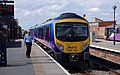
- Nomination 222002 at Derby. Mattbuck 06:56, 17 July 2014 (UTC)
- Promotion Comment Please have a look in the front. There are light reflections and IMO the blue at the top should be reduced.--XRay 06:13, 21 July 2014 (UTC) Support I see no problems in the image. Yes there are reflections, but I don't see how that can be a flaw, as they are natural. it's a great capture in a difficult situation. --Stegop 23:15, 22 July 2014 (UTC) Support I'm convinced now.--XRay 15:43, 23 July 2014 (UTC)
-

-

- Nomination Church (St.-Mariä-Himmelfahrt-Kirche), Wesel, North Rhine-Westphalia, Germany --XRay 04:12, 17 July 2014 (UTC)
- Withdrawn Not the prettiest light and the car is distracting, but tecnnically I find it QI. I would keep some convergence on the tower, because it looks unnatural to see such a high object with all its vertical lines straight. --Stegop 23:15, 22 July 2014 (UTC) Comment Thanks for your review. I've another way of perspective correction, but always the image looks awful. IMO it's the best choice to withdraw the nomination.--XRay 15:48, 23 July 2014 (UTC)
-

- Nomination Objazdowa Street in Kłodzko --Jacek Halicki 21:35, 16 July 2014 (UTC)
- Promotion Comment There is a disturbing spot at the top. Please add geo location and english description.--XRay 05:56, 22 July 2014 (UTC) Done--Jacek Halicki 10:54, 22 July 2014 (UTC) Support Good quality. --XRay 15:50, 23 July 2014 (UTC)
-

- Nomination Zajęcza Street in Kłodzko --Jacek Halicki 21:35, 16 July 2014 (UTC)
- Promotion Comment Please add geo location and english description.--XRay 05:56, 22 July 2014 (UTC) Done--Jacek Halicki 11:03, 22 July 2014 (UTC) Support Good quality. --XRay 15:50, 23 July 2014 (UTC)
-

- Nomination Bristol Parkway. Mattbuck 06:55, 16 July 2014 (UTC)
- Promotion leaning inwards --Cccefalon 07:15, 16 July 2014 (UTC) Done Mattbuck 08:56, 20 July 2014 (UTC) Support I would hardly resist adding a bit more contrast and put the sky more blue, but probably that would put the photo irrealistic, right? Anyway, personal taste apart, IMO it's QI. --Stegop 00:09, 21 July 2014 (UTC)
Good quality. --Cccefalon 20:57, 23 July 2014 (UTC)
-

- Nomination Tauron S.A. on the Dusznicka Street in Kłodzko --Jacek Halicki 20:39, 15 July 2014 (UTC)
A bit dark at the low end, a bit unsharp. Mattbuck 09:18, 20 July 2014 (UTC) - Promotion Done--Jacek Halicki 18:11, 21 July 2014 (UTC)
OK. Mattbuck 21:39, 23 July 2014 (UTC)
- Nomination Tauron S.A. on the Dusznicka Street in Kłodzko --Jacek Halicki 20:39, 15 July 2014 (UTC)
-

- Nomination BP gas station in Kłodzko --Jacek Halicki 20:39, 15 July 2014 (UTC)
Needs sharpening. Mattbuck 09:18, 20 July 2014 (UTC) - Promotion Done--Jacek Halicki 18:11, 21 July 2014 (UTC)
OK. Mattbuck 21:39, 23 July 2014 (UTC)
- Nomination BP gas station in Kłodzko --Jacek Halicki 20:39, 15 July 2014 (UTC)
-
- Nomination Levante beach, Benidorm, Spain --Poco a poco 19:59, 15 July 2014 (UTC)
Bright and lacking high end contrast. Low levels and overall quality looks good. Mattbuck 09:18, 20 July 2014 (UTC)
True, fixed Poco a poco 11:46, 20 July 2014 (UTC) - Promotion
OK. Mattbuck 21:39, 23 July 2014 (UTC)
- Nomination Levante beach, Benidorm, Spain --Poco a poco 19:59, 15 July 2014 (UTC)
-

- Nomination St Pancras at night. Mattbuck 06:52, 15 July 2014 (UTC)
- Withdrawn Right is leaning out --Christian Ferrer 04:40, 21 July 2014 (UTC)
Too unsharp on right, withdrawn. Mattbuck 21:39, 23 July 2014 (UTC)
-

- Nomination: The lion of Lucerne, Switzerland - Photo by Thisisbossi - Vanoot59 12:41, 16 July 2014 (UTC) Comment I find it kind of a dull image. I am not sure if the compo could be improved, but the light surely doesn't help; but I guess that it is very effective showing the subject and that is the most important thing here, isn't it? --Stegop 23:30, 17 July 2014 (UTC)
- Review needed
- Nomination: The lion of Lucerne, Switzerland - Photo by Thisisbossi - Vanoot59 12:41, 16 July 2014 (UTC)
-

- Nomination: The lion of Lucerne, Switzerland - Photo by Gürkan Sengün - Vanoot59 21:44, 14 July 2014 (UTC)) Comment I find it kind of a dull image. I am not sure if the compo could be improved, but the light surely doesn't help; but I guess that it is very effective showing the subject and that is the most important thing here, isn't it? --Stegop 23:30, 17 July 2014 (UTC)
- Review needed
- Nomination: The lion of Lucerne, Switzerland - Photo by Gürkan Sengün - Vanoot59 21:44, 14 July 2014 (UTC))


.JPG)


_-_vinn%C3%BD_sklep.JPG)


.jpg)
.jpg)
Consensual review edit
File:Rosa_×_centifolia_21072014_(1).jpg edit
.jpg)
- Nomination Rosa × centifolia. --Joydeep 08:43, 21 July 2014 (UTC)
- Promotion
 Oppose Too distracting background, could have been better with a lowed dof. --Averater 09:12, 21 July 2014 (UTC)
- Much better with the crop. --Averater 07:59, 24 July 2014 (UTC)
- Comment I don't really see any problem with DoF here. --Joydeep 12:20, 21 July 2014 (UTC)
- Comment Good DOF IMO. Cropping, improve the photo because the door is less visible (see note and then delete it, please)--Lmbuga 11:49, 21 July 2014 (UTC)
- Done Cropped. Thank you! --Joydeep 12:20, 21 July 2014 (UTC)
- Support In any case, QI for me--Lmbuga 12:09, 21 July 2014 (UTC)
- Support QI IMO --Christian Ferrer 17:48, 21 July 2014 (UTC)
- Support Nice photo --Jacek Halicki 23:06, 23 July 2014 (UTC)
File:Portsmouth MMB 25 Harbour.jpg edit

- Nomination Portsmouth harbour. Mattbuck 06:50, 21 July 2014 (UTC)
- Decline Oppose poor quality (very noisy), you seem to run out of ideas? "water of a harbour" isn't a valuable image for QI IMO --Taxiarchos228 06:57, 21 July 2014 (UTC)
Doesn't seem too noisy to me. As for ideas, I thought it was pretty, and QIs do not need to be "valuable" in any manner. --Mattbuck 22:09, 21 July 2014 (UTC)
- sorry, but please study the criteria at Commons:Quality images candidates carefully: Our main goal is to encourage quality images being contributed to Wikicommons, valuable for Wikimedia and other projects. A valuable picture is a must-have in general for alle pictures here at Wikimedia Commons. As administrator you should know what main goal this project have, shouldn`t you?. --Taxiarchos228 19:55, 24 July 2014 (UTC)
- Oppose Noise, colour banding. -- Smial 11:21, 22 July 2014 (UTC)
- Oppose No meaningful description. Why did you upload this photo? What is it supposed to show? --Averater 07:57, 24 July 2014 (UTC)
- Oppose totaly agree with Mattbuck, it is not very noisy and "valuable" is not the question here (for that see COM:VI), however it's blurred and/or unsharp at top left and right --Christian Ferrer 12:00, 24 July 2014 (UTC)
- you're wrong Christian, see my comment above --Taxiarchos228 19:56, 24 July 2014 (UTC)
- Well said Taxiarchos228, I totally agree with the criterion which you mentioned, and if this image had the sufficient qualities so it would have been valuable for the project and I would have been happy to bring my support to its promotion. However in no guidelines I read a list of subjects which can be promoted nor that one of us have the duty (even the right) to choose the subjects which can be promoted. --Christian Ferrer 02:27, 26 July 2014 (UTC)
Running total: 0 support (excluding the nominator), 4 oppose → Decline? --Taxiarchos228 07:16, 25 July 2014 (UTC)
File:Río_Saigón,_Ciudad_Ho_Chi_Minh,_Vietnam,_2013-08-14,_DD_06.JPG edit

- Nomination Saigon river, Ho Chi Minh City, Vietnam --Poco a poco 08:12, 11 July 2014 (UTC)
- Promotion I find it rather messy and dark. --Mattbuck 22:00, 16 July 2014 (UTC) New version uploaded, better now IMO, Poco a poco 20:21, 17 July 2014 (UTC)
Please, let's discuss, good enough to me now --Poco a poco 14:35, 19 July 2014 (UTC) - Support Good quality, but I can't see the river. Image description needs some enhancement so we can learn what is depicted. -- Smial 21:49, 20 July 2014 (UTC)
- Done Poco a poco 19:01, 21 July 2014 (UTC)
- Support QI IMO --Christian Ferrer 17:43, 21 July 2014 (UTC)
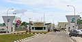
File:Balung_Tawau_Sabah_Sawit-Kinabalu-Seeds-Sdn-Bhd-01.jpg edit

- Nomination Sawit Kinabalu Seeds Sdn Bhd, locate at Balung Estate, tawau, Sabah --Cccefalon 04:36, 11 July 2014 (UTC)
Not sure I like the DOF - the background is rather distracting. Mattbuck 22:00, 16 July 2014 (UTC)
The trees are a little bit too dark to me, but I think it's ok. I would promote it. @Mattbuck: Ok for you? Or third opinion? -- DerFussi 07:01, 19 July 2014 (UTC)
Third opinion please. Oppose Mattbuck 20:50, 19 July 2014 (UTC) - Promotion
- Support ok for me --Christian Ferrer 11:24, 21 July 2014 (UTC)
- Support as stated above -- DerFussi 14:28, 21 July 2014 (UTC)
File:Macaca_sylvanus_at_the_Ouzoud_Waterfalls_(5).jpg edit
.jpg)
- Nomination Barbary macaque (Macaca sylvanus) at the Ouzoud Waterfalls, Morocco. --M0tty 11:34, 18 July 2014 (UTC)
- Decline Oppose Sorry, perhaps FP but too noisy, not QI IMO: "discuss". Yellowish.--Lmbuga 12:02, 18 July 2014 (UTC)
- Oppose per Lmbuga and burned out background --Christian Ferrer 17:41, 21 July 2014 (UTC)
Running total: 0 support (excluding the nominator), 2 oppose → Decline? --Christian Ferrer 05:19, 25 July 2014 (UTC)
File:Playa_de_Levante,_Benidorm,_España,_2014-07-02,_DD_06.JPG edit

- Nomination Levante beach, Benidorm, Spain --Poco a poco 10:32, 14 July 2014 (UTC)
- Promotion
Sorry. I guess you did very good with such a light and subject, but it lacks sharpness (not of that on PP, but the "natural" one) and it looks OE and tilt. --Stegop 23:30, 17 July 2014 (UTC)I still find that the POV and the natural light conditions were far from ideal, but I don't oppose the promotion. --Stegop 22:54, 22 July 2014 (UTC)
Sorry, but I disagree, I uploaded a new version with a tilt of 0,2 degrees and retouched the highs but sharpness is ok IMHO. Please, let's discuss. --Poco a poco 18:51, 18 July 2014 (UTC) - Support ok IMO --Christian Ferrer 21:55, 19 July 2014 (UTC)
Running total: 1 support (excluding the nominator), 0 oppose → Promote? --Christian Ferrer 05:16, 25 July 2014 (UTC)
File:Angkor_Wat,_Camboya,_2013-08-15,_DD_021.JPG edit

- Nomination Bas relief in Angkor Wat, Cambodia --Poco a poco 08:12, 11 July 2014 (UTC)
- Withdrawn Good quality. --Mattbuck 22:00, 16 July 2014 (UTC)
Sure? Too less contrast and maybe a bit overexposed (check curves and levels). IMHO In this case you can exxagarate a bit with the curves to carve out the relief. -- DerFussi 13:38, 18 July 2014 (UTC) Done Poco a poco 18:58, 18 July 2014 (UTC) - Oppose No meaningful description/title. Is it really Angkor wat or som other temple in the area? which wall is it, north/east,south/west? Inner or outer wall? Is it the whole wall or just a section?
- Comment PLEASE SIGN YOUR WORDS. It may have been an oversight, but I request that the above vote is not counted if it don't have firm--Lmbuga 01:49, 25 July 2014 (UTC)
 Question Sorry I can only say this in Spanish: Observo una parte superior con luminosidad verde y más oscura. ¿Realmente el objeto es verde y más oscuro, o es la luz la que provoca eso? Te lo pregunto porque si fuese la luz, en mi opinión (no tenemos que coincidir en los criterios), habría que utilizar un filtro graduado para minorizar su importancia. No he votado anteriormente en esta foto por causa de esa duda. ¿Has usado algún filtro graduado?--Miguel Bugallo (Lmbuga) 01:59, 25 July 2014 (UTC)
- I take it back. It was the outer wall but not sure whether North or East. Quality is not good, either. Poco a poco 20:39, 25 July 2014 (UTC)
File:Cnossos-stegop-53-1.jpg edit

- Nomination Minoan Palace at Knossos. South House. --Stegop 04:07, 17 July 2014 (UTC)
- Promotion Declined for reason of flooding QIC. Please read the nomination rules and come again. Taking part in active review would be highly appreciated. --Cccefalon 04:16, 17 July 2014 (UTC)
I think this might be QI. --Mattbuck 22:53, 17 July 2014 (UTC) - Comment a bit tilted on left --Christian Ferrer 21:58, 19 July 2014 (UTC)
- Tilt or slight perspective distortion? I never correct the perspective completely because it gives a rather unnatural look, as our eyes expect to see a point of fugue when looking up (or down). And note that some elements of the structure on the background are not straight. --Stegop 23:03, 20 July 2014 (UTC)
- Tilt and perspective distortion, it don't need a big correction, so you can correct completely without gives an unnatural look IMO --Christian Ferrer 04:54, 21 July 2014 (UTC)
- I think you are wrong, mistakenly lead by the various "false verticals", like the wall on the right, which is naturally inclined, or the columns, that are thinner below than they are on the top. But I am not the best analyzer after having done the PP. Anyway, can you explain "where" is the tilt and the perspective distortion? --Stegop 21:20, 21 July 2014 (UTC)
- I added notes --Christian Ferrer 11:42, 22 July 2014 (UTC)
- Thank's. I corrected the perspective on the right side, per your suggestion. Is it ok now? --Stegop 22:51, 22 July 2014 (UTC)
- I added notes --Christian Ferrer 11:42, 22 July 2014 (UTC)
- I think you are wrong, mistakenly lead by the various "false verticals", like the wall on the right, which is naturally inclined, or the columns, that are thinner below than they are on the top. But I am not the best analyzer after having done the PP. Anyway, can you explain "where" is the tilt and the perspective distortion? --Stegop 21:20, 21 July 2014 (UTC)
- Tilt and perspective distortion, it don't need a big correction, so you can correct completely without gives an unnatural look IMO --Christian Ferrer 04:54, 21 July 2014 (UTC)
- Tilt or slight perspective distortion? I never correct the perspective completely because it gives a rather unnatural look, as our eyes expect to see a point of fugue when looking up (or down). And note that some elements of the structure on the background are not straight. --Stegop 23:03, 20 July 2014 (UTC)
- Support ok for me --Christian Ferrer 05:27, 23 July 2014 (UTC)
- Support ok for me too --Livioandronico2013 20:48, 24 July 2014 (UTC)
Running total: 3 support (excluding the nominator), 1 oppose → Promote? --Christian Ferrer 05:27, 23 July 2014 (UTC)