Commons:Quality images candidates/Archives March 18 2023
-

- Nomination Tower of London (view from the Thames), London, England, United Kingdom --XRay 04:48, 16 March 2023 (UTC)
- Promotion
 Support It's a good picture, but if you can remove the blurred gull it would be much better. --Fabian Roudra Baroi 04:53, 16 March 2023 (UTC)
-

- Nomination Star “Buddy Holly” at the Hollywood Boulevard in Los Angeles, California, USA --XRay 04:48, 16 March 2023 (UTC)
- Promotion Support Good quality. --Fabian Roudra Baroi 04:54, 16 March 2023 (UTC)
-

- Nomination Assumption church in Coudons, Aude, France. --Tournasol7 04:40, 16 March 2023 (UTC)
- Promotion Support Good quality. --Jakubhal 04:48, 16 March 2023 (UTC)
-

- Nomination Bell tower of the Saints Cosmas and Damian church in Belcaire, Aude, France. --Tournasol7 04:40, 16 March 2023 (UTC)
- Promotion Support Good quality. --Jakubhal 04:48, 16 March 2023 (UTC)
-

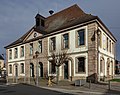
- Nomination Town hall of Roquefeuil, Aude, France. --Tournasol7 04:40, 16 March 2023 (UTC)
- Promotion Support Good quality. --Jakubhal 04:49, 16 March 2023 (UTC)
-

- Nomination Portal of the Saint John the Baptist church in Espezel, Aude, France. --Tournasol7 04:40, 16 March 2023 (UTC)
- Promotion Support Good quality. --Fabian Roudra Baroi 04:57, 16 March 2023 (UTC)
-

- Nomination Rue Principale in Ginoles, Aude, France. --Tournasol7 04:40, 16 March 2023 (UTC)
- Promotion Support Good quality. --Jakubhal 04:50, 16 March 2023 (UTC)
-

- Nomination Be quiet! Dark Rock Top Flow CPU cooler 1 --Jacek Halicki 04:02, 16 March 2023 (UTC)
- Promotion Support Good quality. --XRay 04:52, 16 March 2023 (UTC)
-

- Nomination Corsair Vengeance RGB DDR5 memories --Jacek Halicki 04:02, 16 March 2023 (UTC)
- Promotion Support Good quality. --Fabian Roudra Baroi 04:15, 16 March 2023 (UTC)
-

- Nomination Be quiet! Silent Wings 135 mm fan --Jacek Halicki 04:02, 16 March 2023 (UTC)
- Promotion Support Good quality. --Fabian Roudra Baroi 04:15, 16 March 2023 (UTC)
-

- Nomination Intel Core i7 12700KF --Jacek Halicki 04:02, 16 March 2023 (UTC)
- Promotion Support Good quality. --Fabian Roudra Baroi 04:15, 16 March 2023 (UTC)
-

- Nomination Farmstead “vulgo Buberle” on Goritschacher Weg #27 in Goritschach, Pörtschach, Carinthia, Austria -- Johann Jaritz 03:01, 16 March 2023 (UTC)
- Promotion Good quality. --Jacek Halicki 04:03, 16 March 2023 (UTC)
-

- Nomination Farmhouse “vulgo Strohsack” on Goritschacher Weg #34 in Goritschach, Pörtschach, Carinthia, Austria -- Johann Jaritz 03:01, 16 March 2023 (UTC)
- Promotion Support Good quality. --Fabian Roudra Baroi 03:11, 16 March 2023 (UTC)
-

- Nomination Barred window at the farmhouse “vulgo Strohsack” on Goritschacher Weg #34 in Goritschach, Pörtschach, Carinthia, Austria -- Johann Jaritz 03:01, 16 March 2023 (UTC)
- Promotion Support Good quality. --Fabian Roudra Baroi 03:11, 16 March 2023 (UTC)
-

- Nomination Hazel bushes on Theresienweg in Goritschach, Pörtschach, Carinthia, Austria -- Johann Jaritz 03:01, 16 March 2023 (UTC)
- Promotion Good quality. --Jacek Halicki 04:03, 16 March 2023 (UTC)
-

- Nomination Hazel bushes on Theresienweg in Goritschach, Pörtschach, Carinthia, Austria -- Johann Jaritz 03:01, 16 March 2023 (UTC)
- Promotion Support Good quality. --Fabian Roudra Baroi 03:11, 16 March 2023 (UTC)
-
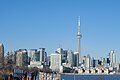
- Nomination Toronto Skyline --Fabian Roudra Baroi 02:51, 16 March 2023 (UTC)
- Promotion Support Good quality -- Johann Jaritz 03:04, 16 March 2023 (UTC)
-

- Nomination Toronto Skyline --Fabian Roudra Baroi 02:51, 16 March 2023 (UTC)
- Promotion Support Good quality -- Johann Jaritz 03:04, 16 March 2023 (UTC)
-

- Nomination Toronto Skyline --Fabian Roudra Baroi 02:51, 16 March 2023 (UTC)
- Promotion Support Good quality -- Johann Jaritz 03:04, 16 March 2023 (UTC)
-

- Nomination Postgasse in eastern direction in Bern --Augustgeyler 01:50, 16 March 2023 (UTC)
- Promotion Good quality. --Jacek Halicki 04:06, 16 March 2023 (UTC)
-

- Nomination Postgasse in eastern direction in Bern --Augustgeyler 01:50, 16 March 2023 (UTC)
- Promotion Support Good quality. --Fabian Roudra Baroi 02:52, 16 March 2023 (UTC)
-

- Nomination Postgasse in eastern direction in Bern --Augustgeyler 01:50, 16 March 2023 (UTC)
- Promotion Support Good quality. --Fabian Roudra Baroi 02:52, 16 March 2023 (UTC)
-

- Nomination Eastern part of Bern's old town with the river Aare in the foreground --Augustgeyler 01:50, 16 March 2023 (UTC)
- Promotion Good quality. --Jacek Halicki 04:06, 16 March 2023 (UTC)
-

- Nomination DDR SDRAM modules for desktop computers --Mister rf 00:03, 16 March 2023 (UTC)
- Promotion Good quality. --Jacek Halicki 04:04, 16 March 2023 (UTC)
-

- Nomination DDR2 SDRAM modules for desktop computers--Mister rf 00:03, 16 March 2023 (UTC)
- Promotion Good quality. --Jacek Halicki 04:04, 16 March 2023 (UTC)
-

- Nomination DDR SDRAM Memory integrated circuit--Mister rf 00:03, 16 March 2023 (UTC)
- Promotion Good quality. --Jacek Halicki 04:04, 16 March 2023 (UTC)
-

- Nomination 32MB Printer Memory Module --Mister rf 00:03, 16 March 2023 (UTC)
- Promotion Good quality. --Jacek Halicki 04:04, 16 March 2023 (UTC)
-

- Nomination EDO DRAM modules for desktop computers --Mister rf 00:03, 16 March 2023 (UTC)
- Promotion Good quality. --Jacek Halicki 04:04, 16 March 2023 (UTC)
-

- Nomination My drawing of Wikipe-tan, an unofficial Wikipedia mascot. --痛 23:47, 15 March 2023 (UTC)
- Promotion Support Nice Work --Fabian Roudra Baroi 00:17, 16 March 2023 (UTC)
-

- Nomination A west view of the outer part of Stenhouse Bay Jetty --DXR 23:32, 15 March 2023 (UTC)
- Promotion Support Good quality. --Augustgeyler 01:52, 16 March 2023 (UTC)
-

- Nomination Ocellated turkey (Meleagris ocellata) --Charlesjsharp 20:19, 15 March 2023 (UTC)
- Promotion Support Good quality. --LexKurochkin 20:38, 15 March 2023 (UTC)
-

- Nomination BMW i7 xDrive60 in Stuttgart.--Alexander-93 20:11, 15 March 2023 (UTC)
- Promotion Support Good quality. --Fabian Roudra Baroi 20:51, 15 March 2023 (UTC)
-

- Nomination BMW 2002 at Leonberger Autoschau 2022.--Alexander-93 17:49, 15 March 2023 (UTC)
- Promotion Support Good quality. --Poco a poco 18:01, 15 March 2023 (UTC)
-

- Nomination Hyundai i30 Fastback N at Leonberger Autoschau 2022.--Alexander-93 17:49, 15 March 2023 (UTC)
- Promotion Support Good quality. --Poco a poco 18:04, 15 March 2023 (UTC)
-
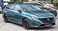
- Nomination Peugeot 308 C SW at Leonberger Autoschau 2022.--Alexander-93 17:49, 15 March 2023 (UTC)
- Promotion Good quality. --Imehling 18:19, 15 March 2023 (UTC)
-

- Nomination Sony Centre, Berlin --Mike Peel 16:29, 15 March 2023 (UTC)
- Promotion Support Good quality. --Poco a poco 18:01, 15 March 2023 (UTC)
-

- Nomination Calle Larios, Málaga --Mike Peel 16:29, 15 March 2023 (UTC)
- Promotion Support Good quality. --Poco a poco 18:01, 15 March 2023 (UTC)
-

-
- Nomination Night view of the Dancing House in Prague, Czechia. (by MiroRosa) --Jan.Kamenicek 16:26, 15 March 2023 (UTC)
- Decline
 Oppose Too noisy, I'm afraid, not a QI to me --Poco a poco 18:01, 15 March 2023 (UTC)
-

- Nomination Park Theatre, Brussels, Belgium --Poco a poco 16:11, 15 March 2023 (UTC)
- Promotion Good quality. --Imehling 18:07, 15 March 2023 (UTC)
-

- Nomination Arcade du Cinquantenaire, Brussels, Belgium --Poco a poco 16:11, 15 March 2023 (UTC)
- Promotion Support Good quality. --Ermell 16:21, 15 March 2023 (UTC)
-

- Nomination Brussels Town Hall, Grand-Place, Brussels, Belgium --Poco a poco 16:11, 15 March 2023 (UTC)
- Promotion Support Good quality. --Ermell 16:21, 15 March 2023 (UTC)
-

- Nomination Justice Palace, Brussels, Belgium --Poco a poco 16:11, 15 March 2023 (UTC)
- Promotion Support Good quality. --Ermell 16:21, 15 March 2023 (UTC)
-
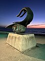
- Nomination Friendship Fountain, Puerto Vallarta --Another Believer 15:33, 15 March 2023 (UTC)
- Promotion Support Good quality. --Poco a poco 18:04, 15 March 2023 (UTC)
-

- Nomination Malecón, Puerto Vallarta --Another Believer 15:33, 15 March 2023 (UTC)
- Decline Oppose I don't see any area in focus here --Poco a poco 18:04, 15 March 2023 (UTC)
-

-

- Nomination Edificio Eguiguren Yrarrázaval, Santiago, Región Metropolitana, Chile --Carlos yo 13:16, 15 March 2023 (UTC)
- Promotion Support Good quality. --Augustgeyler 14:00, 15 March 2023 (UTC)
-

- Nomination Iglesia de San Ignacio, Santiago, Región Metropolitana, Chile --Carlos yo 13:16, 15 March 2023 (UTC)
- Promotion Support Good quality. --Tournasol7 18:13, 15 March 2023 (UTC)
-

- Nomination Palacio Morandé Campino, Santiago, Región Metropolitana, Chile --Carlos yo 13:16, 15 March 2023 (UTC)
- Promotion Support Good quality. --Poco a poco 22:19, 15 March 2023 (UTC)
-

- Nomination dance stick --Cephas 12:31, 15 March 2023 (UTC)
- Promotion Support Good quality. --Poco a poco 22:19, 15 March 2023 (UTC)
-

-

- Nomination No. 1-5 on Strada Polonă, Bucharest --Neoclassicism Enthusiast 11:51, 15 March 2023 (UTC) Support Good quality. --MB-one 15:45, 15 March 2023 (UTC)
- Promotion {{{2}}}
- Nomination No. 1-5 on Strada Polonă, Bucharest --Neoclassicism Enthusiast 11:51, 15 March 2023 (UTC)
-

- Nomination Detail of wayside cross (1606), so-called "Hochgerichtskreuz", near Zemmer, Germany. --Palauenc05 09:22, 15 March 2023 (UTC)
- Promotion Support Good quality. --Augustgeyler 02:19, 16 March 2023 (UTC)
-
- Nomination Town hall of Sainte-Croix-en-Plaine (Haut-Rhin, France). --Gzen92 08:18, 15 March 2023 (UTC)
- Promotion Support Good quality. --Augustgeyler 02:19, 16 March 2023 (UTC)
-

- Nomination St. Bartholomew Church in Sainte-Croix-en-Plaine (Haut-Rhin, France). --Gzen92 08:18, 15 March 2023 (UTC)
- Decline Oppose Sorry, but DoF problem (crosses, part of the roof are out of focus) --LexKurochkin 08:55, 15 March 2023 (UTC)
-

- Nomination Monument to the Dragoon Regiments in Sainte-Croix-en-Plaine (Haut-Rhin, France). --Gzen92 08:18, 15 March 2023 (UTC)
- Promotion Support Good quality. --LexKurochkin 09:02, 15 March 2023 (UTC)
-

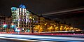
- Nomination New track construction in Strullendorf. --Ermell 07:16, 15 March 2023 (UTC)
- Promotion Support Good quality. --LexKurochkin 07:22, 15 March 2023 (UTC)
-

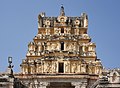
- Nomination Virupaksha Temple / Hampi, Karnataka - Carving in Inner Court --Imehling 06:27, 15 March 2023 (UTC)
- Promotion Support Good quality. --LexKurochkin 07:24, 15 March 2023 (UTC)
-
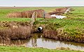
- Nomination The emptiness is palpable on this sad day at Noarderleech. (fencing)
--Agnes Monkelbaan 05:34, 15 March 2023 (UTC) - Promotion Good quality --Michielverbeek 06:27, 15 March 2023 (UTC)
- Nomination The emptiness is palpable on this sad day at Noarderleech. (fencing)
-

- Nomination Ćwilin peak, Island Beskids --Jakubhal 05:14, 15 March 2023 (UTC)
- Promotion Support Good quality.--Agnes Monkelbaan 05:29, 15 March 2023 (UTC)
-
- Nomination Ćwilin peak, Island Beskids --Jakubhal 05:14, 15 March 2023 (UTC)
- Promotion Support Good quality.--Agnes Monkelbaan 05:30, 15 March 2023 (UTC)
-

- Nomination Altar at Michurowa glade, Ćwilin mountain, Island Beskids Mountains, Poland --Jakubhal 05:14, 15 March 2023 (UTC)
- Promotion Support Good quality.--Agnes Monkelbaan 05:32, 15 March 2023 (UTC)
-

-

- Nomination Przewodnik sudecki badge --Jacek Halicki 04:41, 15 March 2023 (UTC)
- Promotion Support Good quality. --Jakubhal 05:16, 15 March 2023 (UTC)
-

- Nomination „Za zasługi dla transportu PRL” 1 --Jacek Halicki 04:41, 15 March 2023 (UTC)
- Promotion Support Good quality. --Jakubhal 05:16, 15 March 2023 (UTC)
-

- Nomination „Za zasługi dla transportu PRL” 2 --Jacek Halicki 04:41, 15 March 2023 (UTC)
- Promotion Support Good quality. --Jakubhal 05:16, 15 March 2023 (UTC)
-

- Nomination „Za zasługi dla transportu PRL” 3 --Jacek Halicki 04:41, 15 March 2023 (UTC)
- Promotion Support Good quality. --Jakubhal 05:16, 15 March 2023 (UTC)
-

- Nomination Memorial plaque on the site of the former birthplace of Anna Magdalena Bach in Zeitz. By User:Dirk Bindmann --Augustgeyler 23:59, 14 March 2023 (UTC)
- Promotion Good quality. --Imehling 18:18, 15 March 2023 (UTC)
-

- Nomination A sea view with palm-tree, Chloraka, Cyprus --LexKurochkin 18:10, 14 March 2023 (UTC)
- Promotion Support Good quality. Looks like this unnatural small bird will hit that palm tree soon. --Der Angemeldete 20:31, 14 March 2023 (UTC)
 Comment Oh, now I see it :) Thanks for the review! --LexKurochkin 07:12, 15 March 2023 (UTC)
-

- Nomination Fort Kochi / Kerala - Chinese Fishing Nets --Imehling 09:57, 14 March 2023 (UTC)
- Promotion
I think it might be a bit Underexposed – fixable? --Augustgeyler 10:58, 14 March 2023 (UTC)
  Done --Imehling 17:59, 14 March 2023 (UTC) Support Good quality. well done --Augustgeyler 13:40, 15 March 2023 (UTC)
-

- Nomination En Busca de la Razón, Puerto Vallarta --Another Believer 00:26, 14 March 2023 (UTC)
- Decline Oppose The image is tilted, lacks detail and has
 chromatic aberration. --Augustgeyler 02:17, 16 March 2023 (UTC)
-

- Nomination Victoria Park Subway Station, Toronto, ON, CA. --Mrb Rafi 17:33, 13 March 2023 (UTC)
- Promotion
It needs a cat about the motif, the location is not enough --Poco a poco 19:27, 13 March 2023 (UTC)
@Poco a poco: thanks for the suggestion, is it okay now? --Mrb Rafi 19:56, 14 March 2023 (UTC) Support Yep --Poco a poco 22:22, 15 March 2023 (UTC)
-
- Nomination Virupaksha Temple / Hampi, Karnataka - Top of Little Gopuram --Imehling 17:29, 13 March 2023 (UTC)
- Promotion
Is the cw tilt for real? --Poco a poco 19:27, 13 March 2023 (UTC) Done I don't remember but now it looks better. --Imehling 17:27, 15 March 2023 (UTC) Support Good quality. --Poco a poco 22:22, 15 March 2023 (UTC)
-

- Nomination Village pump in Hohndorf, Saxony. By User:Kora27 --Augustgeyler 22:05, 12 March 2023 (UTC)
- Withdrawn
 Question The background verticals look asymmetrically tilted. Perspective problem? --LexKurochkin 18:28, 14 March 2023 (UTC) Comment I think this effect comes from the fact that the old pump is not 100% vertical in real live, but the image is oriented to it. --Augustgeyler 13:39, 15 March 2023 (UTC)
Comment I see. But I think, we should document the reality here in Wikimedia Commons, so really vertical things should be vertical and the not vertical ones should be not vertical. --LexKurochkin 20:08, 15 March 2023 (UTC) I withdraw my nomination Good point.
  Agree
Agree  Thank you. --Augustgeyler 02:08, 16 March 2023 (UTC)
-

-

- Nomination Hyundai Staria in Böblingen.--Alexander-93 19:37, 9 March 2023 (UTC)
- Promotion Support Good quality. --MB-one 15:49, 15 March 2023 (UTC)
-

- Nomination Fiat E-Doblò in Böblingen.--Alexander-93 17:22, 9 March 2023 (UTC)
- Promotion Support Good quality. --Mike Peel 21:44, 15 March 2023 (UTC)
-
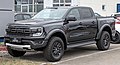
- Nomination Ford Ranger Raptor in Böblingen.--Alexander-93 17:22, 9 March 2023 (UTC)
- Promotion Support Good quality. --MB-one 15:49, 15 March 2023 (UTC)
-

- Nomination: Selangor State Memorial Monument --Wee Hong 16:48, 9 March 2023 (UTC)
- Review needed
-
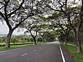
- Nomination: A main road in Universiti Putra Malaysia --Wee Hong 16:48, 9 March 2023 (UTC)
- Review needed
-

-

- Nomination: No. 48 Calea Dorobanților, Bucharest --Neoclassicism Enthusiast 13:09, 9 March 2023 (UTC)
- Review needed
-

- Nomination: No. 15 Strada Pitar Moș, Bucharest --Neoclassicism Enthusiast 13:09, 9 March 2023 (UTC)
- Review needed
-
- Nomination: No. 1-5 Strada Dumbrava Roșie, Bucharest --Neoclassicism Enthusiast 13:09, 9 March 2023 (UTC)
- Review needed
-

- Nomination No. 10 Strada Dumbrava Roșie, Bucharest —Neoclassicism Enthusiast 13:09, 9 March 2023 (UTC) Oppose Lower and right crop less than optimal --MB-one 14:36, 15 March 2023 (UTC)
- Decline {{{2}}}
- Nomination No. 10 Strada Dumbrava Roșie, Bucharest —Neoclassicism Enthusiast 13:09, 9 March 2023 (UTC)
-

- Nomination The Blies bridge leading from Germany to France in Kleinblittersdorf --FlocciNivis 11:18, 8 March 2023 (UTC)
- Promotion Support Good quality. --MB-one 14:21, 15 March 2023 (UTC)
-
- Nomination: Nature as Mother, Puerto Vallarta --Another Believer 19:45, 7 March 2023 (UTC)
- Review
Nice but oversharpened and tilted --Poco a poco 21:38, 7 March 2023 (UTC)
@Poco a poco: Oversharpened? Not sure if you think I altered the photo at all, but this was a natural shot with no filters or other alterations. Thanks! Another Believer 15:49, 8 March 2023 (UTC)
Ok, I rephrase my feedback: there is a halo around the sculpture --Poco a poco 21:58, 9 March 2023 (UTC)
-

- Nomination: Rain (sculpture), Puerto Vallarta --Another Believer 19:45, 7 March 2023 (UTC)
- Review
I find the contrast between foreground and background not enough, compared to your sculpture image to the left of this submission. --痛 08:48, 9 March 2023 (UTC)
-

- Nomination Activities for making Mud Seed ball in BhopalI, the copyright holder of this work, hereby publish it under the following license: --Suyash.dwivedi 18:50, 7 March 2023 (UTC)
- Decline Oppose Unfortunately the person being partially in the frame destroys the composition. --MB-one 14:15, 15 March 2023 (UTC)
-

- Nomination Piazza Grande, Arezzo, Italy --Poco a poco 18:44, 7 March 2023 (UTC)
- Promotion Support Good quality. --MB-one 14:09, 15 March 2023 (UTC)
-

-
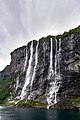
- Nomination: Eastern view of the seven sisters - waterfalls in Geiranger Fjord --Virtual-Pano 08:18, 4 March 2023 (UTC)
- Review
PP error should be fixed. --Ermell 20:17, 9 March 2023 (UTC)
-

- Nomination Headband --Cephas 22:58, 26 February 2023 (UTC)
- Promotion
DoF low, category for the location (museum) missing --XRay 09:09, 6 March 2023 (UTC) Comment It is part of the Lau of Malaita collection, which is a collection shared by Université Laval library museum collections and Collections of the Musée de la civilisation --Cephas 22:54, 8 March 2023 (UTC)
Don't explain, add the category, please. --XRay 15:02, 9 March 2023 (UTC)
Comment @XRay: I have checked the categories. The Cephas' comment is relevant as the category "Université Laval library museum collections" (the museum) includes the category "Lau of Malaita" (one of the collections in this museum). Our policy for categories recommends avoid adding both including and included categories to the same image. --LexKurochkin 07:02, 15 March 2023 (UTC) Support Ups. Sorry. So IMO (weak) support. --XRay 11:32, 15 March 2023 (UTC)

,_Hollywood_Boulevard,_Buddy_Holly_--_2012_--_4994.jpg)
.jpg)
.jpg)
.jpg)
.jpg)
.jpg)
.jpg)


.jpg)


.jpg)
.jpg)
.jpg)
.jpg)


_Orange_Walk_2.jpg)

_Leonberg_2022_1X7A0430.jpg)


_-_070.jpg)
_-_068.jpg)


.jpg)
.jpg)
.jpg)
.jpg)
.jpg)


_32.jpg)


.jpg)
.jpg)


.jpg)

_-_319.jpg)


_1X7A6776.jpg)
.jpg)


.jpg)
.jpg)
.jpg)


.jpg)


.svg)
.jpg)
.jpg)
Consensual review edit
File:Khâm_sai_đại_thần_quan_phòng_(欽差大臣關防).svg edit
.svg)
- Nomination A vectorized Vietnam seal. --痛 09:23, 14 March 2023 (UTC)
- Promotion
- Oppose Too simple to me for QI --Poco a poco 17:44, 14 March 2023 (UTC)
- Comment Hmm.. these seal scripts follow a certain spacing rule and can only be done by hand. So it easily took me 30+ minutes to make. --痛 18:14, 14 March 2023 (UTC)
- Support I'd allow it. These aren't super-simple characters. -- Ikan Kekek 19:11, 14 March 2023 (UTC)
- Support As far as I remember Image guidelines there is no such criteria as "simple", and to me it does not look simple to create. --LexKurochkin 06:38, 15 March 2023 (UTC)
 Info It's more a practice at QIC than an official Guideline, but it has to do with how much one can expect of a Quality Image. For instance, a straight drawn line would be so easy to make that it doesn't really meet the criterion "a Commons user skillfully achieved a desirable level of quality". Exactly where the boundary goes as to what is "too simple" is open to interpretation.--Peulle 11:51, 15 March 2023 (UTC)
- Comment Well, yes, and no. If someone uses modern intelligent camera in automatic mode with autofocus lens it is just pressing one button with reasonable (some 10% I would say) chances to get camera jpeg image good enough for QI. Can we say how much skill, how much modern technology and how much luck in it? I just don't know. The only thing I can do is checking the quality of image itself. --LexKurochkin 19:01, 15 March 2023 (UTC)
- Yes, like I said, it becomes a matter of interpretation. :) --Peulle 09:27, 16 March 2023 (UTC)
- Question Should we make this one QI, too: https://commons.wikimedia.org/wiki/File:Royal_Seal_of_Ryukyu_Kingdom.svg ? Would be consistent.--Der Angemeldete 13:10, 15 March 2023 (UTC)
- Comment I do not see any problem with making it QI too. --LexKurochkin 18:50, 15 March 2023 (UTC)
- Comment The last photo, the one proposed as an example, has huge differences between the digital version and the original subject. Even the minimum proportions between the elements are not respected to be considered a usable option. --Mister rf 20:56, 15 March 2023 (UTC)
- Comment IMHO most of Category:SVG seals of Vietnam shall be listed as quality images (Conflict of interest declaration: I made ~40% of them) On the other hand, I wonder how some works in Commons:Quality images/Subject/Non photographic media got promoted, despite being simple derivative works of others... --痛 01:21, 16 March 2023 (UTC)
Total: 2 support (excluding the nominator), 1 oppose →  Promoted --Augustgeyler 23:07, 17 March 2023 (UTC)
File:Canada_Goose,_inukshuk_park_11.jpg edit

- Nomination Canada Goose --Fabian Roudra Baroi 23:17, 13 March 2023 (UTC)
- Decline
- Support Good quality. --Cr7Carlos 23:35, 13 March 2023 (UTC)
- Oppose Focus is on tail, not head --Charlesjsharp 18:54, 14 March 2023 (UTC)
- Oppose Yes, small DoF, unfortunately--Der Angemeldete 12:59, 15 March 2023 (UTC)
Total: 1 support (excluding the nominator), 2 oppose →  Declined --Augustgeyler 23:08, 17 March 2023 (UTC)
File:Virupaksha_-_Mandapa_Entrance.jpg edit

- Nomination Virupaksha Temple / Hampi, Karnataka - Entrance Hall of Mandapa --Imehling 09:51, 12 March 2023 (UTC)
- Decline
- Oppose The figures in the background are blurred. Seems unfixable. --KaiBorgeest 22:05, 13 March 2023 (UTC)
- Comment I think they aren't so bad for the resolution of the picture. Let's have a discussion about that. --Imehling 09:48, 14 March 2023 (UTC)
 Neutral Very good composition, detailed and useful. But sharpness is borderline. --Augustgeyler 10:25, 15 March 2023 (UTC)
- Oppose + blown out people behind the gates on the left. I also like the composition, but there are to many concerns here. Wish it where sharper though.--Der Angemeldete 13:04, 15 March 2023 (UTC)
Total: 0 support (excluding the nominator), 2 oppose → Declined --Augustgeyler 23:09, 17 March 2023 (UTC)
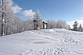
File:Stationäres_Fernglas_am_Aussichtspunkt_Auersberg_im_Winter.jpg edit

- Nomination Stationary coin-operated binoculars on the Auersberg at twilight --Augustgeyler 00:01, 13 March 2023 (UTC)
- Promotion
- Support Good quality. --XRay 04:50, 13 March 2023 (UTC)
- Oppose I disagree. The foreground spoils the composition. --Milseburg 13:24, 13 March 2023 (UTC)
- Oppose+1--Peulle 07:46, 14 March 2023 (UTC)
- Comment Isn't this a mater of taste? I did include the foreground willingly, because this small place with the binoculars was surrounded by a snowy fence. I wanted to show this and give the image a little extra depth by adding a small portion of the unsharp foreground. --August Geyler (talk) 10:48, 14 March 2023 (UTC)
- Support No problem with the foreground. Very nice colours, good lighting, good sharpness. Such a small flaw in the composition, if it is perceived as a flaw at all, should not be used as the sole reason for rejection. If a picture has other weaknesses, such a thing can of course swing the pendulum to one side or the other. --Smial 11:53, 14 March 2023 (UTC)
- Info new version, with a tighter crop. to reduce the impact of the foreground. --Augustgeyler 14:31, 14 March 2023 (UTC)
- Comment Sorry, it's not a minor flaw in my eyes. The area is still too dominant, unnecessary and draws attention. The image would look better without it. My suggestion: Remove 350 pixels at the bottom and retouch a bit on the right side of the wood. --Milseburg 16:30, 14 March 2023 (UTC)
- I too am still on the oppose side, sorry. Seeing that out-of-focus snow bank near the camera is almost like a part of a finger covered the lens; it's just distracting rather than giving a compositional framing.--Peulle 11:46, 15 March 2023 (UTC)
- Support Perfectly good photo and an obvious QI to me. I don't understand the opposition. -- Ikan Kekek 19:17, 14 March 2023 (UTC)
- Support The new crop looks good to me. The foreground fits the bottom naturally without drawing too much attention. --Lion-hearted85 (talk) 01:15, 15 March 2023 (UTC)
- Support Per Ikan --LexKurochkin 06:17, 15 March 2023 (UTC)
- Question With explanations of the photographer I understand the intention, which is indeed not a good sign for a QI, but, if the fence in the foreground would be slightly more visible, I'd be fine with it. Is there more material to add on the bottom from the raw file?--Der Angemeldete 13:15, 15 March 2023 (UTC)
- @Der Angemeldete: Not more than the first version has to offer... --Augustgeyler 13:44, 15 March 2023 (UTC)
- Too bad, because I don't find it self explaining. But the quality itself is ok to me.--Der Angemeldete 03:25, 18 March 2023 (UTC)
- @Der Angemeldete: Not more than the first version has to offer... --Augustgeyler 13:44, 15 March 2023 (UTC)
Total: 5 support (excluding the nominator), 2 oppose → Promoted --Augustgeyler 23:09, 17 March 2023 (UTC)
File:Palazzo_Pubblico_-_View_from_place_in_front_of_Galleria_arte_moderna_e_contemporanea_-_San_Marino_(2022).jpg edit
.jpg)
- Nomination Palazzo Pubblico - Unusual view from a place in front of the Museum: Galleria d'Arte moderna e contemporanea - San Marino (2022)--Gio Terra 10:10, 12 March 2023 (UTC)
- Promotion
- Oppose Sorry, it lacks detail --Poco a poco 10:43, 12 March 2023 (UTC)
- Thanks for the review. It will be useful for my future choices, because I'm posting here, on Commons, to discern what's good (quality) and what's not. --Terragio67 13:13, 12 March 2023 (UTC)
- Support Good to me. --Sebring12Hrs 10:07, 13 March 2023 (UTC)
- Support Sharpness and detail seem acceptable to me, but what is the line just to the right of the flagpole or whatever it is that's sticking up from the building further back? I suppose it's there; I just want to know. -- Ikan Kekek 19:21, 14 March 2023 (UTC)
- It's a feather, a republican symbol of San marino. On the top of the three towers there are three feathers too, as well as on the top of the flagpoles.
Terragio67 05:03, 15 March 2023 (UTC)
- Thanks for explaining. -- Ikan Kekek 22:03, 17 March 2023 (UTC)
- Oppose Per Peulle. Also the blurring out of the faces isn't very well succeeded. --Der Angemeldete 19:58, 14 March 2023 (UTC)
- Yes, Peulle is right, the problem was the light. I was unable to interpret the atmospheric conditions of an exceptionally sunny day without humidity. This resulted in some blurring out and lack of detail (due to overexposure quite noticeable for some).
Thank you all for your reviews, they have all been convincing in prompting me to rework the original RAW file, where the misinterpretation has been corrected. I am sure that the new version is definitely much better than the previous one. Let me know your opinions, please.
(Remember to clear the cache on your browser in order to see the new version uploaded.)
--Terragio67 20:40, 14 March 2023 (UTC)
- Support That is actually much better.--Peulle 11:44, 15 March 2023 (UTC)
- Comment I would also change to team Pro, if the faces of the boys somewhat could be blurred more discreet and with no harsh lines around.--Der Angemeldete 03:28, 18 March 2023 (UTC)
- Yes, Peulle is right, the problem was the light. I was unable to interpret the atmospheric conditions of an exceptionally sunny day without humidity. This resulted in some blurring out and lack of detail (due to overexposure quite noticeable for some).
Total: 3 support (excluding the nominator), 2 oppose → Promoted --Augustgeyler 23:10, 17 March 2023 (UTC)
File:11_Strada_Dumbrava_Roșie,_Bucharest_(13).jpg edit
.jpg)
- Nomination No. 11 Strada Dumbrava Roșie, Bucharest --Neoclassicism Enthusiast 09:32, 4 March 2023 (UTC)
- Promotion
- Oppose Could you light up a bit the entrance part? Except this point it is nice--KaiBorgeest 22:27, 12 March 2023 (UTC)
- * Procedural oppose entered as the image was sent to CR.--Peulle 09:31, 14 March 2023 (UTC)
- Support Ok to me. --Sebring12Hrs 10:05, 13 March 2023 (UTC)
- Support Per Sebring --Ermell 16:16, 15 March 2023 (UTC)
Total: 2 support (excluding the nominator), 1 oppose → Promoted --Augustgeyler 23:11, 17 March 2023 (UTC)