Commons:Quality images candidates/Archives October 20 2015
-
- Nomination Parish church Saints Peter and Paul and Saint Anne chapel on Pfalzstrasse in Karnburg, Maria Saal, Carinthia, Austria --Johann Jaritz 02:57, 18 October 2015 (UTC)
- Promotion Good quality.--Famberhorst 04:50, 18 October 2015 (UTC)
-

- Nomination Escalator at the Nevsky Prospekt (Saint Petersburg Metro) in Saint Petersburg. --Moroder 00:04, 18 October 2015 (UTC)
- Promotion Good quality. --Ralf Roletschek 00:06, 18 October 2015 (UTC)
-

- Nomination Ennskai in Steyr, Upper Austria, with the rear of houses of Stadtplatz. --Isiwal 23:40, 17 October 2015 (UTC)
- Promotion Good quality. --Ralf Roletschek 00:07, 18 October 2015 (UTC)
-

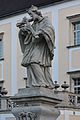
- Nomination Monastery Kremsmünster, statue of Saint Benedict --Isiwal 23:40, 17 October 2015 (UTC)
- Promotion Good quality. --Ralf Roletschek 00:07, 18 October 2015 (UTC)
-
- Nomination Monastery Kremsmünster, statue Saint John of Nepomuk --Isiwal 23:40, 17 October 2015 (UTC)
- Promotion
 Support Good quality. --Johann Jaritz 02:56, 18 October 2015 (UTC)
-

- Nomination Pilgrimage church St. Blasien, statue of Saint Wolfgang --Isiwal 23:40, 17 October 2015 (UTC)
- Promotion Support Good quality. --Johann Jaritz 02:56, 18 October 2015 (UTC)
-

- Nomination Altar of the cross, church Peter and Paul, Salla, Styria --Isiwal 23:40, 17 October 2015 (UTC)
- Promotion Support Good quality. --Johann Jaritz 02:56, 18 October 2015 (UTC)
-
- Nomination Escalator at the Nevsky Prospekt (Saint Petersburg Metro) in Saint Petersburg. --Moroder 22:13, 17 October 2015 (UTC)
- Withdrawn
-

- Nomination Main facade Grand Hotel Europe in Saint Petersburg 1905. --Moroder 22:13, 17 October 2015 (UTC)
- Withdrawn
-

- Nomination Das Ehrenmal in Lohbarbek --Nightflyer 21:16, 17 October 2015 (UTC)
- Promotion Good quality. --Ralf Roletschek 21:21, 17 October 2015 (UTC)
-

- Nomination Die Wegebek in Sarlhusen --Nightflyer 21:16, 17 October 2015 (UTC)
- Promotion Good quality. --Ralf Roletschek 21:21, 17 October 2015 (UTC)
-

- Nomination The Sony FE 28mm F2 lens for the Sony FE-mount, shown here with lens hood and lens cap. --Dllu 21:03, 17 October 2015 (UTC)
- Promotion Good quality. --Ralf Roletschek 21:21, 17 October 2015 (UTC)
-

- Nomination The Sony Carl Zeiss Zeiss Sonnar T* FE 55mm F1.8 ZA lens for the Sony FE-mount, shown here with lens hood and lens cap. --Dllu 21:03, 17 October 2015 (UTC)
- Promotion Good quality. Denis Barthel 22:59, 17 October 2015 (UTC)
-
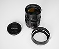
- Nomination The Voigtländer Heliar Classic 75mm f/1.8 VM lens for the Voigtländer VM mount, shown here with lens hood and lens cap. --Dllu 21:03, 17 October 2015 (UTC)
- Promotion Good quality. --Ralf Roletschek 21:21, 17 October 2015 (UTC)
-

-

- Nomination Skulptur in der Katholische Pfarrkirche St. Petrus und Paulus in Oberschwarzach --Ermell 19:28, 17 October 2015 (UTC)
- Promotion Good quality. --Jacek Halicki 21:17, 17 October 2015 (UTC)
-

- Nomination Decorated altar in Tianjin Tianhou Palace --Ermell 19:28, 17 October 2015 (UTC)
- Promotion Good quality. --Jacek Halicki 21:17, 17 October 2015 (UTC)
-

-

- Nomination Tower of the church of San Saturnino, Oto, Huesca, Spain --Poco a poco 17:39, 17 October 2015 (UTC)
- Promotion Good quality. --Ermell 18:42, 17 October 2015 (UTC)
-

- Nomination St Peter's church, Lasieso, Huesca, Spain Please, don't ask me to straighten the church it isn't straight for real --Poco a poco 17:39, 17 October 2015 (UTC)
- Promotion Support Good quality. --Code 18:38, 17 October 2015 (UTC)
-

- Nomination Church of St Benito, Cambados, Pontevedra, Spain --Poco a poco 17:39, 17 October 2015 (UTC)
- Promotion Support Good quality. --Code 18:38, 17 October 2015 (UTC)
-

-

-

- Nomination Zeiss Milvus f/1.4 50mm ZE --Denis Barthel 14:21, 17 October 2015 (UTC) - This file has been nominated here recently and finally been withdrawn as it showed a lot of dust and fibres. After some PP I hope it fits now and retry. Denis Barthel 14:21, 17 October 2015 (UTC)
- Promotion Support Looks clean now. Crop is a little bit tight though. Dllu 16:38, 17 October 2015 (UTC)
-

- Nomination Vehicle registration plates of diplomat of Luxembourg --Ralf Roletschek 12:39, 17 October 2015 (UTC)
- Promotion Good quality.--Agnes Monkelbaan 16:42, 17 October 2015 (UTC)
-

- Nomination Thomas Bach, president of the International Olympic Committee --Ralf Roletschek 12:39, 17 October 2015 (UTC) Good quality. Denis Barthel 14:31, 17 October 2015 (UTC)
- Promotion
-
-

- Nomination Faisal Mosque at dusk with scattered clouds in the sky. © Ali Mujtaba Photography 2014. By User:Alimujtaba79 --Saqib 11:50, 17 October 2015 (UTC)
- Decline Too much unatural filter. Too much distortion and crop too tight on top. --Cccefalon 14:38, 17 October 2015 (UTC)
-

- Nomination Islamia College Peshawar. By User:Hamzaniazii --Saqib 11:50, 17 October 2015 (UTC)
- Decline Unsucessful clone out of a mast. Lot of dust spots. --Cccefalon 14:36, 17 October 2015 (UTC)
-
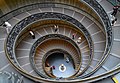
- Nomination Spiral staircase in the Vatican Museums -- Alvesgaspar 11:34, 17 October 2015 (UTC)
- Promotion Good quality. --Ajepbah 12:10, 17 October 2015 (UTC)
-

- Nomination Europa and the Bull. Pius-Clementine Museum, Vatican. Alvesgaspar 11:31, 17 October 2015 (UTC)
- Promotion Good quality. --PierreSelim 11:34, 17 October 2015 (UTC)
-

- Nomination Statue of Apoxyomenos, 1st century AD, after a 4th cent. BC bronze original. Pius Clementine Museum, Vatican. Alvesgaspar 11:30, 17 October 2015 (UTC)
- Promotion Good quality. --PierreSelim 11:34, 17 October 2015 (UTC)
-
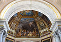
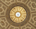
- Nomination Room of the Muses, Vatican Museums, Detail of the ceiling. Alvesgaspar 11:29, 17 October 2015 (UTC)
- Promotion Good quality. --Ermell 12:30, 17 October 2015 (UTC)
-

- Nomination Pope Gregorious IX with the face of Pope Julius II (!!), by Raphael. Vatican Museums, Rome. Alvesgaspar 11:28, 17 October 2015 (UTC)
- Promotion Support Good quality. P.S. I changed the licence to the proper. Please do the same with your other images from this place (images of 2D arts) --Halavar 12:18, 17 October 2015 (UTC)
 Comment@Alvesgaspar: This is funny, and common in the Vatican : see File:Detail coronation Charles the Great (Francis 1st of France) by Pope Leo III (Leo X) Vatican 11.jpg.--Jebulon 16:10, 17 October 2015 (UTC)
-
-

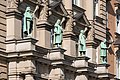
- Nomination Hanseatic Higher Regional Court in Hamburg. --Ajepbah 10:43, 17 October 2015 (UTC)
- Promotion Good quality. --Jacek Halicki 21:21, 17 October 2015 (UTC)
-

-

-

-

-

-

-

- Nomination Minoriten church, Arcades at the Minoriten square (with Epitaphs), on the left side the Federal Chancellery. WB and colors are correct. --Hubertl 08:25, 17 October 2015 (UTC)
- Promotion Support Good quality. --Johann Jaritz 09:35, 17 October 2015 (UTC)
-
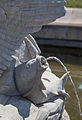
- Nomination Triton and Najad Fountain A, Artist: Anton Schmidgruber. This is one of four fountains at the Maria-Theresien-Square in Vienna --Hubertl 08:25, 17 October 2015 (UTC) Good quality. Denis Barthel 09:51, 17 October 2015 (UTC)
- Promotion
-

- Nomination Leopold Hasner von Artha (1818-1891), halfrelief (marble) in the Arkadenhof of the University of Vienna --Hubertl 08:25, 17 October 2015 (UTC)
- Promotion Support Good quality. --Johann Jaritz 09:35, 17 October 2015 (UTC)
-
- Nomination Plate at Fort Nauders, Nauders, Tyrol --Hubertl 08:25, 17 October 2015 (UTC) Good. Denis Barthel 09:51, 17 October 2015 (UTC)
- Promotion
-

- Nomination Chapel of finding Jesus in the Temple, in Bardo 2 --Jacek Halicki 08:16, 17 October 2015 (UTC)
- Promotion Good quality. I like this scenery --Hubertl 08:27, 17 October 2015 (UTC)
-

- Nomination Chapel of Prayer in the Garden of Gethsemane, in Bardo 1 --Jacek Halicki 08:16, 17 October 2015 (UTC)
- Promotion Good quality. --Hubertl 08:27, 17 October 2015 (UTC)
-

- Nomination White-throated kingbird (Tyrannus albogularis) on Capybara (Hydrochoeris hydrochaeris), the Pantanal, Brazil --Charlesjsharp 08:10, 17 October 2015 (UTC)
- Promotion Good quality. --Ermell 20:06, 17 October 2015 (UTC)
-

- Nomination White-winged swallow (Tachycineta albiventer), the Pantanal, Brazil --Charlesjsharp 08:10, 17 October 2015 (UTC) Good quality. Denis Barthel 08:47, 17 October 2015 (UTC)
- Promotion
-

- Nomination Yellow-billed cardinal (Paroaria capitata), the Pantanal, Brazil --Charlesjsharp 08:10, 17 October 2015 (UTC)
- Promotion Good quality. --Ermell 12:34, 17 October 2015 (UTC)
-

- Nomination Yellow-billed cardinal (Paroaria capitata) juvenile, the Pantanal, Brazil --Charlesjsharp 08:10, 17 October 2015 (UTC)
- Promotion Good quality. --Hubertl 09:12, 17 October 2015 (UTC)
-
- Nomination Pervomayskaya Street in Yaroslavl --Florstein 07:45, 17 October 2015 (UTC)
- Promotion Good quality. --Jacek Halicki 08:25, 17 October 2015 (UTC)
-

- Nomination Dobrynin Palace of Culture in Yaroslavl --Florstein 07:45, 17 October 2015 (UTC)
- Promotion Good quality. --Jacek Halicki 08:25, 17 October 2015 (UTC)
-

-

- Nomination Brest. Brest Fortress. Kholm Gate. By User:Alexxx1979 --Чаховіч Уладзіслаў 07:28, 17 October 2015 (UTC)
- Decline You can upload only 5 images a day, sorry --Moroder 07:35, 17 October 2015 (UTC)
-

- Nomination Brest. Brest Fortress. Fortress church of Saint Nicholas in Brest. By User:Alexxx1979 --Чаховіч Уладзіслаў 07:28, 17 October 2015 (UTC)
- Decline Please upload only 5 images a day, sorry --Moroder 07:37, 17 October 2015 (UTC)
-

- Nomination Belarus. Mir. Mir Castle Complex. By User:Alexxx1979 --Чаховіч Уладзіслаў 07:28, 17 October 2015 (UTC)
- Decline You can upload only 5 images a day, sorry --Moroder 07:37, 17 October 2015 (UTC)
-

- Nomination Grodno. Palace of Culture. By User:Alexxx1979 --Чаховіч Уладзіслаў 07:28, 17 October 2015 (UTC)
- Decline You can upload only 5 images a day, sorry --Moroder 07:38, 17 October 2015 (UTC)
-

- Nomination Grodno. Old Castle. By User:Alexxx1979 --Чаховіч Уладзіслаў 07:28, 17 October 2015 (UTC)
- Decline You can upload only 5 images a day, sorry --Moroder 07:38, 17 October 2015 (UTC)
-
- Nomination Grodno. Palace of Culture. By User:Alexxx1979 --Чаховіч Уладзіслаў 07:24, 17 October 2015 (UTC)
- Decline You can upload only 5 images a day, sorry --Moroder 07:39, 17 October 2015 (UTC)
-

- Nomination Muraŭjoŭ House in Hrodna. By User:Alexxx1979 --Чаховіч Уладзіслаў 07:12, 17 October 2015 (UTC)
- Promotion Good quality. --Jacek Halicki 08:25, 17 October 2015 (UTC)
-

-

-

-
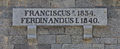
- Nomination Königsbronn, Baden-Württemberg, Germany: Memorial plaque to Georg Elser, attached at the wall of Georg-Elser-Museum. --Cccefalon 06:31, 17 October 2015 (UTC)
- Promotion Support Good quality. Do you know the template "inscription"? ;-) --XRay 06:48, 17 October 2015 (UTC)
Yes, but it is tedious to add longer inscriptions. Anyway, as you asked for it, I added the inscription. --Cccefalon 07:01, 17 October 2015 (UTC)
-
-

-

-

-

-
-

-

- Nomination Reseda alba (White mignonette) --Christian Ferrer 05:37, 17 October 2015 (UTC)
- Promotion Nice.--Agnes Monkelbaan 05:55, 17 October 2015 (UTC)
-
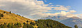
- Nomination Mountain hike from Homene Dessus to Vens, Valle d'Aosta. View Valle d'Aosta from the mountain path.
Famberhorst 04:45, 17 October 2015 (UTC) - Promotion Support --Iifar 06:11, 17 October 2015 (UTC)
- Nomination Mountain hike from Homene Dessus to Vens, Valle d'Aosta. View Valle d'Aosta from the mountain path.
-
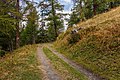
- Nomination Mountain hiking Vens at Bettex in Valle d'Aosta (Italy). Trail to Bettex.
Famberhorst 04:45, 17 October 2015 (UTC) - Promotion Support good quality --Christian Ferrer 05:40, 17 October 2015 (UTC)
- Nomination Mountain hiking Vens at Bettex in Valle d'Aosta (Italy). Trail to Bettex.
-

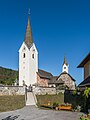
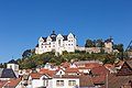
- Nomination Parish church Holy Margareta in Gottestal, Wernberg, Carinthia, Austria --Johann Jaritz 02:17, 17 October 2015 (UTC)
- Promotion Support --Iifar 06:11, 17 October 2015 (UTC)
-

- Nomination Subsidiary church Saint Stephen in Foederlach, Wernberg, Carinthia, Austria --Johann Jaritz 02:17, 17 October 2015 (UTC)
- Promotion Support --Iifar 06:11, 17 October 2015 (UTC)
-

- Nomination Pointed arch windows at the western walll of the subsidiary church Saint Stephen in Foederlach, Wernberg, Carinthia, Austria --Johann Jaritz 02:17, 17 October 2015 (UTC)
- Promotion Good quality.--Agnes Monkelbaan 05:53, 17 October 2015 (UTC)
-
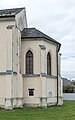
- Nomination Apse of the subsidiary church Saint Stephen in Foederlach, Wernberg, Carinthia, Austria --Johann Jaritz 02:17, 17 October 2015 (UTC)
- Promotion Support good quality --Christian Ferrer 05:43, 17 October 2015 (UTC)
-

-

-

-
-

-

- Nomination Hórreo in St James's Way, Lugo, Spain --Poco a poco 16:45, 16 October 2015 (UTC)
- Promotion Good quality. --Cccefalon 06:41, 17 October 2015 (UTC)
-

-

- Nomination Government House of Armenia. Yerevan, Armenia. --Halavar 11:09, 16 October 2015 (UTC). Two small dustspots in the sky left to the main building. Otherwise good. --Cayambe 07:20, 17 October 2015 (UTC)
 Done Fixed. New version uploaded. Please take a look again. --Halavar 10:35, 17 October 2015 (UTC)
 - Promotion QI to me now. --Cayambe 12:34, 17 October 2015 (UTC)
- Nomination Government House of Armenia. Yerevan, Armenia. --Halavar 11:09, 16 October 2015 (UTC). Two small dustspots in the sky left to the main building. Otherwise good. --Cayambe 07:20, 17 October 2015 (UTC)
-

-

-

-

- Nomination Apis Mellifera drone - moments at birth. By User:Jonathan Wilkins --Rodrigo.Argenton 02:19, 16 October 2015 (UTC)
- Promotion Support good macro shoot --Elrond 09:58, 17 October 2015 (UTC)
-

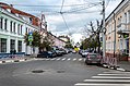
- Nomination 33 Kulisha Street. Lviv, Ukraine.--Aeou 09:48, 15 October 2015 (UTC)
- Promotion Comment Please add a description in another language and the date of when the photograph was taken. --Code 11:15, 15 October 2015 (UTC)
I added the date of creation. But English description contains the same information as Ukrainian and as the file name. Usually I give the architect's name and the year of construction. But currently I have no other information about the object.--Aeou 19:23, 15 October 2015 (UTC) Comment Ok, but please fix the perspective problem. The building looks like leaning backwards. Additionally it would be nice if you could increase the sharpness a little bit. --Code 08:57, 16 October 2015 (UTC) Done At least I hope that done.--Aeou 21:08, 16 October 2015 (UTC) Support Good quality. --Code 05:58, 17 October 2015 (UTC)
-

- Nomination Sculpture “Saint Anne”, Holy Cross chapel, Dülmen, North Rhine-Westphalia, Germany --XRay 03:30, 15 October 2015 (UTC)
- Withdrawn * Comment do you think you can fix it? It´s really not sharp --Hubertl 04:26, 15 October 2015 (UTC)
 I withdraw my nomination No, I can't fix it. You're right, it is not QI. Sorry for nomination of an unsharp image. I haven't seen the problem. I've checked my images but there are still images with fixable and not fixable problems.--XRay 06:45, 17 October 2015 (UTC)
-

- Nomination Hermitage of the Holy Sepulchre, Ibdes, Zaragoza, Spain --Poco a poco 20:15, 14 October 2015 (UTC)
- Promotion Support Good quality. --XRay 09:49, 17 October 2015 (UTC)
-

-

-

-

- Nomination Vermilion flycatcher (Pyrocephalus rubinus) male, the Pantanal, Brazil --Charlesjsharp 13:25, 14 October 2015 (UTC) Good quality. Denis Barthel 08:57, 17 October 2015 (UTC)
- Promotion
-
-

-

- Nomination cathedral in the City of Campeche, Yucatan, Mexico --Ralf Roletschek 19:24, 13 October 2015 (UTC)
- Promotion Support Good quality. --XRay 07:47, 17 October 2015 (UTC)
-

- Nomination station forecourt Jinan West Railway Station --Ermell 17:01, 13 October 2015 (UTC)
Some problem as above, categories, Poco a poco 17:31, 13 October 2015 (UTC)
Good quality. Denis Barthel 09:01, 17 October 2015 (UTC) - Promotion
- Nomination station forecourt Jinan West Railway Station --Ermell 17:01, 13 October 2015 (UTC)
-

- Nomination Boudhnatha Temple Top (by Ronixdhungana) --बिप्लब आनन्द 11:59, 13 October 2015 (UTC)
Extremely strong sharpening halos Poco a poco 17:33, 13 October 2015 (UTC) Comment not correctable--बिप्लब आनन्द 06:12, 17 October 2015 (UTC) - Withdrawn {{{2}}}
- Nomination Boudhnatha Temple Top (by Ronixdhungana) --बिप्लब आनन्द 11:59, 13 October 2015 (UTC)
-

-

-
-
- Nomination Am Jagdhaus, Wuppertal --Atamari 18:39, 12 October 2015 (UTC)
- Promotion Good quality. --Ralf Roletschek 14:01, 17 October 2015 (UTC)
-
- Nomination Am Jagdhaus, Wuppertal --Atamari 18:39, 12 October 2015 (UTC)
- Promotion Good quality. --Ralf Roletschek 14:01, 17 October 2015 (UTC)
-

- Nomination: Interior of the old distillery Löhning, Dülmen, North Rhine-Westphalia, Germany --XRay 03:09, 12 October 2015 (UTC)
- Review needed
-

- Nomination: St. John's Church in Lette, Coesfeld, North Rhine-Westphalia, Germany --XRay 03:09, 12 October 2015 (UTC)
- Review needed
-

- Nomination: Am Jagdhaus, Wuppertal --Atamari 23:14, 11 October 2015 (UTC)
- Review needed
-

- Nomination: Am Jagdhaus, Wuppertal --Atamari 23:14, 11 October 2015 (UTC)
- Review needed
-

- Nomination: Am Jagdhaus, Wuppertal --Atamari 23:14, 11 October 2015 (UTC)
- Review needed
-

-

- Nomination Don Quichotte by Honoré Daumier in Neue Pinakothek, Munich. --Yelkrokoyade 17:50, 11 October 2015 (UTC)
- Promotion Good quality. --Cccefalon 07:11, 17 October 2015 (UTC)
-

- Nomination: Oil tanker EKO 4. --C messier 16:42, 11 October 2015 (UTC)
- Review needed
-
- Nomination: Child labour in Rajbiraj (Hard working Child).... --Bijay chaurasia 15:15, 11 October 2015 (UTC)
- Review needed
-

- Nomination: Sunset view from Rajbiraj Ward no.6 kharshal Tole.. --Bijay chaurasia 14:52, 11 October 2015 (UTC)
- Review needed
-

- Nomination: Fahrradcorso in Mexico D. F. --Ralf Roletschek 12:43, 11 October 2015 (UTC)
- Review needed
-

- Nomination: Pipe organ in the Saint-Louis Church. Sète, Hérault, France. --Christian Ferrer 12:04, 11 October 2015 (UTC)
- Review needed
-

- Nomination: Rufous-tailed jacamar (Galbula ruficauda rufoviridis) male, the Pantanal, Brazil --Charlesjsharp 11:39, 11 October 2015 (UTC)
- Review needed
-

- Nomination: Saffron finch (Sicalis flaveola) male juvenile, the Pantanal, Brazil --Charlesjsharp 11:39, 11 October 2015 (UTC)
- Review needed
-

- Nomination: North Slope of the roc des Bœufs since Lake Annecy in Talloires, France. --Medium69 10:06, 11 October 2015 (UTC)
- Review needed
-
- Nomination: Southwestern slope of the dents de Lanfon, since Lake Annecy in Talloires, France. --Medium69 10:06, 11 October 2015 (UTC)
- Review needed
-

- Nomination: Group Tribal Percussion marching in Annecy (France) playing Brazilian percussion: the Batucada. --Medium69 10:06, 11 October 2015 (UTC)
- Review needed
-

- Nomination: Naturwaldreservat Brunnstube --Ermell 09:40, 11 October 2015 (UTC)
- Review needed
-

- Nomination: Naturwaldreservat Waldhaus im Handthalgrund --Ermell 09:40, 11 October 2015 (UTC)
- Review needed
-

- Nomination Nina Hagen auf der Premiere des Films "Der Siebte Zwerg" am 21. September 2014 --Denis Barthel 08:37, 11 October 2015 (UTC)
- Promotion Good quality. --Moroder 22:24, 17 October 2015 (UTC)
-

- Nomination: Norbert Heisterkamp bei der Premiere des Films "Der siebte Zwerg" am Zoopalast, 21. September 2014 --Denis Barthel 08:37, 11 October 2015 (UTC)
- Review needed
-

- Nomination: 12 Braci Gierymskich Street in Kłodzko 2 --Jacek Halicki 08:32, 11 October 2015 (UTC)
- Review needed
-

- Nomination Boudhanath (by Cfynn) --बिप्लब आनन्द 14:34, 11 October 2015 (UTC)
- Promotion Comment Please check your image. The moons is burned out, perspective correction is necassary, at least one dust spot.--XRay 05:46, 11 October 2015 (UTC) Done dot spot removed--बिप्लब आनन्द 09:44, 14 October 2015 (UTC)
Weak Support Good quality. It's not the best and the perspective could be better, but IMO still QI. --XRay 06:40, 17 October 2015 (UTC)
-

-

-

-
- Nomination: Interior of the old distillery Löhning, Dülmen, North Rhine-Westphalia, Germany --XRay 04:00, 10 October 2015 (UTC)
- Review Comment The halos at the window frame will be hard to solve --Ermell 13:27, 10 October 2015 (UTC) Comment I've tried other compositions but the lights are still there. IMO it's a minor problem. But please, it's your decision. --XRay 05:42, 11 October 2015 (UTC)
-

-

-

-

-

-
-

- Nomination Phasi Dega Temple, Bhaktapur --Gerd Eichmann by बिप्लब आनन्द 14:25, 9 October 2015 (UTC)
- Decline Comment The image needs perspective correction. And please see the notes.--XRay 06:07, 9 October 2015 (UTC) Done and Thanks--बिप्लब आनन्द 09:32, 14 October 2015 (UTC)
 Oppose Insufficient quality. Sorry. MAy be it's better, but there are still a lot of problems. At the top are red shadows. You can try to improve the image, but IMO it isn't fixable. --XRay 06:38, 17 October 2015 (UTC)
-
- Nomination Vatsala Temple, Bhaktapur --Gerd Eichmann by बिप्लब आनन्द 14:25, 9 October 2015 (UTC)
- Decline Comment A lot of (color) noise and other things to do. Please see the notes.--XRay 06:07, 9 October 2015 (UTC) Done and Thanks--बिप्लब आनन्द 09:09, 14 October 2015 (UTC) Oppose Insufficient quality. Sorry. May be it's better, but there are still a lot of problems. Plase havbe a look to the halos. You can try to improve the image, but IMO it isn't fixable. --XRay 06:38, 17 October 2015 (UTC)
-

- Nomination: An Avro Vulcan B.2 on display at the Barksdale Global Power Museum at Barksdale Air Force Base near Bossier City, Louisiana (United States). --Michael Barera 02:24, 8 October 2015 (UTC)
- Review Comment Would be better if wing was not cut off. Dllu 07:22, 11 October 2015 (UTC)


_September_2015.1a.jpg)
_September_2015-1.jpg)
_September_2015-1a.jpg)
_September_2015-1a.jpg)
.Ziviljustizgeb%C3%A4ude.Bauschmuck.Plastiken.0.2.12260.ajb.jpg)
.Hanseatisches_Oberlandesgericht.5.12621.ajb.jpg)


.jpg)
.jpg)


_Bust_in_the_Arkadenhof,_University_of_Vienna-9376.jpg)


_on_Capybara.jpg)
.JPG)
.JPG)
_juvenile.JPG)


.jpg)


_--_2015_--_4902.jpg)

.jpg)


._Bergpad_naar_Bettex.jpg)


.jpg)
.jpg)
.jpg)
.jpg)

.jpg)


.jpg)
_male,_Pantanal,_Brazil_2.jpg)
.Nordgiebel_(links).29302.ajb.jpg)
.Geb%C3%A4ude_N30.3.20777.ajb.jpg)


.jpg)


.JPG)


_male_2.JPG)
_male_juvenile.JPG)


.jpg)


.jpg)


.jpg)
_by_Pope_Leo_III_(Leo_X)_Vatican_11.jpg)
Consensual review edit
File:Campilhas July 2015-2a.jpg edit

- Nomination A typical country view of Alentejo, Portugal, with a solitary cork oak and the undulated field. -- Alvesgaspar 16:53, 12 October 2015 (UTC)
- Comment Pretty, but the tree is oversharpened Poco a poco 17:48, 12 October 2015 (UTC) --
- Done You are right, thanks. It is fixed now -- Alvesgaspar 22:44, 12 October 2015 (UTC)
- Promotion
- Support ok now for me --Hubertl 07:55, 15 October 2015 (UTC)
- Support QI Poco a poco 18:13, 15 October 2015 (UTC)
Total: 2 support (excluding the nominator), 0 oppose →  Promoted --Poco a poco 18:13, 15 October 2015 (UTC)
File:2015_Kłodzko,_ul._Braci_Gierymskich_6.JPG edit

- Nomination 6 Braci Gierymskich Street in Kłodzko --Jacek Halicki 06:49, 8 October 2015 (UTC)
- Support Almost QI, but the strong artifacts in the shadow (not fixable, I assume) spoiled it. Sorry, Denis Barthel 09:47, 8 October 2015 (UTC)
- Promotion
 Fixed@Denis Barthel:I corrected this--Jacek Halicki 15:30, 8 October 2015 (UTC)
- Comment Please discussion --Jacek Halicki 21:36, 8 October 2015 (UTC)
- Thank you Jacek. Denis Barthel 08:50, 10 October 2015 (UTC)
- Support IMO OK. --XRay 06:28, 9 October 2015 (UTC)
- Oppose Composition is certainly a key quality factor and the present framing is not good. Alvesgaspar 23:34, 8 October 2015 (UTC)
 Question What is bad in the framing, please ?--Jebulon 19:07, 14 October 2015 (UTC)
- Composition doesn't look right, that is the problem. From this pont of view, maybe a wider framing would hep. In my opinion, composition (of which framing is a component) is a very important part of image quality, usually ignored here in favour of pixel counting: exact verticals, absolute absence of CA and noise, and so on. More and more I feel closer to the classic elements of a good photography: good subject, good composition (and framing) and good lighting. Clear now? Alvesgaspar 20:54, 15 October 2015 (UTC)
- Not really, actually. First sentence, you repeat your affirmation. Second sentence, "maybe". For the rest, I strongly agree with you of course, but I have no better explanations regarding the picture. No matter anyway, I'm not interested by this image--Jebulon 22:43, 16 October 2015 (UTC)
- Sorry but I can't be more helpful. The composition looks wrong and that is enough for me, although I can't explain exactly why. Two possible resaons: the distortion introduced by a small focal distance and the assymetry. Alvesgaspar 10:35, 17 October 2015 (UTC)
- Oppose Composition is awkward. I can see that the corner of the building is in the center, but it just doesn't work. Move the frame to the left and it is much better. -- RaboKarbakian 02:53, 16 October 2015 (UTC)
- Support --Ralf Roletschek 14:06, 17 October 2015 (UTC)
Total: 3 support (excluding the nominator), 2 oppose → Promoted --Hubertl 13:02, 19 October 2015 (UTC)