Commons:Quality images candidates/Archives September 03 2019
-

- Nomination Nissan Stagea.
—User3204 04:52, 1 September 2019 (UTC) - Promotion
 Support
Good quality. --Manfred Kuzel 04:54, 1 September 2019 (UTC)
- Nomination Nissan Stagea.
-

- Nomination Ketelbrug (Flevoland) Ketelbrug from the Ketelmeer.
--Agnes Monkelbaan 04:37, 1 September 2019 (UTC) - Promotion Support
Good quality. --Manfred Kuzel 04:51, 1 September 2019 (UTC)
- Nomination Ketelbrug (Flevoland) Ketelbrug from the Ketelmeer.
-

- Nomination Hulshorster sand. This dead tree looks very lonely on the living sand drift.
--Agnes Monkelbaan 04:37, 1 September 2019 (UTC) - Promotion Support
Good quality. --Manfred Kuzel 04:51, 1 September 2019 (UTC)
- Nomination Hulshorster sand. This dead tree looks very lonely on the living sand drift.
-

- Nomination The Frans Hals Museum in Haarlem in the Netherlands. --Moroder 03:57, 1 September 2019 (UTC)
- Promotion Support
Good quality. --Manfred Kuzel 04:01, 1 September 2019 (UTC)
-

- Nomination Fruit dryer at the meadow orchard «Am Kåte», Gaisrückenstrasse in Winklern, Pörtschach am Wörther See, Carinthia, Austria -- Johann Jaritz 03:21, 1 September 2019 (UTC)
- Promotion Good quality. --Seven Pandas 03:23, 1 September 2019 (UTC)
-

- Nomination Fruit dryer at the meadow orchard «Am Kåte», Gaisrückenstrasse in Winklern, Pörtschach am Wörther See, Carinthia, Austria -- Johann Jaritz 03:21, 1 September 2019 (UTC)
- Promotion Good quality. --Seven Pandas 03:23, 1 September 2019 (UTC)
-

- Nomination Wayside shrine on Gaisrückenstrasse in Winklern, Pörtschach am Wörther See, Carinthia, Austria -- Johann Jaritz 03:21, 1 September 2019 (UTC)
- Promotion Good quality. --Seven Pandas 03:23, 1 September 2019 (UTC)
-
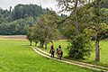
- Nomination Horse riding on Gaisrückenstrasse «Am Kåte» in Winklern, Pörtschach am Wörther See, Carinthia, Austria -- Johann Jaritz 03:21, 1 September 2019 (UTC)
- Promotion Good quality. --Seven Pandas 03:23, 1 September 2019 (UTC)
-

- Nomination Fruit dryer at the meadow orchard «Am Kåte», Gaisrückenstrasse in Winklern, Pörtschach am Wörther See, Carinthia, Austria -- Johann Jaritz 03:21, 1 September 2019 (UTC)
- Promotion Good quality. --Seven Pandas 03:23, 1 September 2019 (UTC)
-

- Nomination Zombie walk 2011 in Brisbane, Queensland --Bald white guy 03:21, 1 September 2019 (UTC)
- Promotion Good quality. --Moroder 04:01, 1 September 2019 (UTC)
-

- Nomination Zombie walk 2011 in Brisbane, Queensland --Bald white guy 03:21, 1 September 2019 (UTC)
- Promotion Good quality. --Moroder 04:03, 1 September 2019 (UTC)
-

- Nomination Eastern Bearded Dragon (Pogona barbata) --Bald white guy 03:21, 1 September 2019 (UTC)
- Promotion Support
Good quality. --Manfred Kuzel 03:41, 1 September 2019 (UTC)
-

- Nomination Australasian swamphen (Porphyrio melanotus) --Bald white guy 03:21, 1 September 2019 (UTC)
- Promotion Support
Good quality. --Manfred Kuzel 03:41, 1 September 2019 (UTC)
-

- Nomination Australian Pelicans (Pelecanus conspicillatus) --Bald white guy 03:21, 1 September 2019 (UTC)
- Promotion Support
Good quality. --Manfred Kuzel 03:41, 1 September 2019 (UTC)
-

- Nomination Chapel of the village of Tres Morros, Jujuy Province, Argentina --Bgag 03:11, 1 September 2019 (UTC)
- Promotion Support
Good quality. --Manfred Kuzel 03:38, 1 September 2019 (UTC)
-

- Nomination village of Tres Morros, Jujuy Province, Argentina --Bgag 03:11, 1 September 2019 (UTC)
- Promotion Support
Good quality. --Manfred Kuzel 03:38, 1 September 2019 (UTC)
-

- Nomination village of Tres Morros, Jujuy Province, Argentina --Bgag 03:11, 1 September 2019 (UTC)
- Promotion Support
Good quality. --Manfred Kuzel 03:38, 1 September 2019 (UTC)
-

- Nomination Cattle in the village of Tres Morros, Jujuy Province, Argentina --Bgag 03:11, 1 September 2019 (UTC)
- Promotion Support
Good quality. --Manfred Kuzel 03:38, 1 September 2019 (UTC)
-

-

- Nomination Hot air balloons at the 49th Montgolfiade in Münster (1st race), North Rhine-Westphalia, Germany --XRay 03:04, 1 September 2019 (UTC)
- Promotion Good quality. --Seven Pandas 03:10, 1 September 2019 (UTC)
-

- Nomination Hot air balloons at the 49th Montgolfiade in Münster (1st race), North Rhine-Westphalia, Germany --XRay 03:04, 1 September 2019 (UTC)
- Promotion Support
Good quality. --Manfred Kuzel 03:33, 1 September 2019 (UTC)
-

- Nomination Hot air balloons at the 49th Montgolfiade in Münster (1st race), North Rhine-Westphalia, Germany --XRay 03:04, 1 September 2019 (UTC)
- Promotion Good quality. --Seven Pandas 03:10, 1 September 2019 (UTC)
-

- Nomination Hot air balloons at the 49th Montgolfiade in Münster (1st race), North Rhine-Westphalia, Germany --XRay 03:04, 1 September 2019 (UTC)
- Promotion Good quality. --Seven Pandas 03:10, 1 September 2019 (UTC)
-

- Nomination Objekt in der Kellergasse Schintagrube in Kleinweikersdorf (Niederösterreich). --Manfred Kuzel 03:03, 1 September 2019 (UTC)
- Promotion Support Good quality. --XRay 03:05, 1 September 2019 (UTC)
-

- Nomination Objekt in der Kellergasse Schintagrube in Kleinweikersdorf (Niederösterreich). --Manfred Kuzel 03:03, 1 September 2019 (UTC)
- Promotion Support Good quality. --XRay 03:05, 1 September 2019 (UTC)
-

- Nomination Side view of a sitting Asian elephant (Elephas maximus) bathing in Tad Lo river, Laos --Basile Morin 01:49, 1 September 2019 (UTC)
- Promotion Good quality. --Bgag 03:14, 1 September 2019 (UTC)
-

-

- Nomination The Frans Hals Museum in Haarlem in the Netherlands. --Moroder 18:52, 31 August 2019 (UTC)
- Promotion Good quality. --Seven Pandas 19:50, 31 August 2019 (UTC)
-

-

- Nomination Tongue tie on a french Thoroughbred horse --Tsaag Valren 16:29, 31 August 2019 (UTC)
- Promotion Support Good quality. --Ermell 18:58, 31 August 2019 (UTC)
-
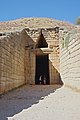
- Nomination Greece, Mycenae, Treasury of Atreus --Berthold Werner 15:12, 31 August 2019 (UTC)
- Promotion Support Good quality. --XRay 15:54, 31 August 2019 (UTC)
-

-

- Nomination Front suspension of Lotus Seven Spurzem 14:30, 31 August 2019 (UTC)
- Promotion Support Good quality.--Agnes Monkelbaan 04:34, 1 September 2019 (UTC)
-

-

- Nomination Rainbow Lorikeet feeding on the flowers of a Bombax ceiba --Bald white guy 13:59, 31 August 2019 (UTC)
- Promotion Support Good quality. --Ermell 18:45, 31 August 2019 (UTC)
-

- Nomination Australian Water Dragon (Intellagama Lesueurii) --Bald white guy 13:59, 31 August 2019 (UTC)
- Promotion Support Good quality. --Ermell 18:45, 31 August 2019 (UTC)
-

- Nomination Crested Pigeon (Ocyphaps lophotes) in Brisbane, QLD --Bald white guy 13:59, 31 August 2019 (UTC)
- Promotion Beautiful image, good quality -- Spurzem 18:15, 31 August 2019 (UTC)
-
-

-

- Nomination War memorial of Dreux, France. --Chabe01 13:43, 31 August 2019 (UTC)
- Promotion Good quality --Michielverbeek 17:34, 31 August 2019 (UTC)
-

-

-

-

- Nomination Typenschild eines BMW 502 Spurzem 12:33, 31 August 2019 (UTC)
- Promotion Good quality --Michielverbeek 17:28, 31 August 2019 (UTC)
-

-

-

- Nomination Cinnamon roll in Stockholm --Kritzolina 10:21, 31 August 2019 (UTC)
- Decline Not everything is sharp, a higher f-value would have been better --Michielverbeek 17:31, 31 August 2019 (UTC)
-

- Nomination Military orchestra in front of the Stockholm Palace - clarinet player --Kritzolina 10:21, 31 August 2019 (UTC)
- Promotion Good quality. --D-Kuru 18:25, 31 August 2019 (UTC)
-

-

-

-

-

- Nomination Chevrolet Corvette 3 at the Kulmbach 2018 Oldtimer Meeting --Ermell 06:34, 31 August 2019 (UTC)
- Promotion Good quality --Michielverbeek 08:37, 31 August 2019 (UTC)
-

-
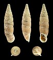
- Nomination Shell of a Greece land snail, Siciliaria aff. lamellata, length 1,6 cm --Llez 05:43, 31 August 2019 (UTC)
- Promotion Support
Good quality. --Manfred Kuzel 05:53, 31 August 2019 (UTC)
-

- Nomination File:I.A.M.E._Pampa_T_01_tractor_--Llez_05:43,_31_August_2019_(UTC)_
- Promotion Support
Good quality. --Manfred Kuzel 05:53, 31 August 2019 (UTC)
-

- Nomination Deutz D 6005 tractor --Llez 05:43, 31 August 2019 (UTC)
- Promotion Support
Good quality. --Manfred Kuzel 05:51, 31 August 2019 (UTC)
-

- Nomination Koala in Zoo Duisburg, Germany. --Till.niermann 05:39, 31 August 2019 (UTC)
- Promotion Support Good quality. Nice, interesting posture --Podzemnik 06:16, 31 August 2019 (UTC)
-

- Nomination Buildings at Nordallee 14-16 in Trier, Rhineland-Palatinate, Germany. --Tournasol7 05:38, 31 August 2019 (UTC)
- Promotion Good quality --Llez 05:50, 31 August 2019 (UTC)
-

- Nomination Church of La Besse-Vors, commune of Villefranche-de-Panat, Aveyron, France. --Tournasol7 05:38, 31 August 2019 (UTC)
- Promotion Support
Good quality. --Manfred Kuzel 05:49, 31 August 2019 (UTC)
-

- Nomination Building at 5 Place Maruejouls in Aubin, Aveyron, France. --Tournasol7 05:38, 31 August 2019 (UTC)
- Promotion Support
Good quality. --Manfred Kuzel 05:48, 31 August 2019 (UTC)
-

- Nomination Avenue Jean Jaures in Cransac, Aveyron, France. --Tournasol7 05:38, 31 August 2019 (UTC)
- Promotion Support
Good quality. --Manfred Kuzel 05:47, 31 August 2019 (UTC)
-

- Nomination Panoramic view of Broquies, Aveyron, France. --Tournasol7 05:38, 31 August 2019 (UTC)
- Promotion Support
Good quality. --Manfred Kuzel 05:46, 31 August 2019 (UTC) Comment I agree, but the unsharp airplain/bird in the middle of the picture should be removed --Llez 05:48, 31 August 2019 (UTC)
-

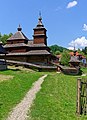
- Nomination De Strubben-Kniphorstbos archeologische reservaat Gnarled old oak trunks. (Quercus)
--Famberhorst 05:27, 31 August 2019 (UTC) - Promotion Good quality --Llez 05:49, 31 August 2019 (UTC)
- Nomination De Strubben-Kniphorstbos archeologische reservaat Gnarled old oak trunks. (Quercus)
-

- Nomination Flower bud of a Magnolia covered with raindrops. (After flowering in August).
--Famberhorst 05:27, 31 August 2019 (UTC) - Promotion Support
Good quality. --Manfred Kuzel 05:44, 31 August 2019 (UTC)
- Nomination Flower bud of a Magnolia covered with raindrops. (After flowering in August).
-

- Nomination Taxus seeded in a gap of a willow Pollard willow. at 1.20 meters above the ground.
--Famberhorst 05:27, 31 August 2019 (UTC) - Promotion Support Good quality. --Tournasol7 05:40, 31 August 2019 (UTC)
- Nomination Taxus seeded in a gap of a willow Pollard willow. at 1.20 meters above the ground.
-

- Nomination Detail des Pfeilerbildstockes in der Kellergasse in Grub (Niederösterreich). --Manfred Kuzel 04:56, 31 August 2019 (UTC)
- Promotion Support Good quality.--Famberhorst 05:22, 31 August 2019 (UTC)
-

- Nomination Pfeilerbildstock in der Kellergasse in Grub (Niederösterreich). --Manfred Kuzel 04:56, 31 August 2019 (UTC)
- Promotion Support Good quality. --Tournasol7 05:41, 31 August 2019 (UTC)
-

- Nomination Detail des Pfeilerbildstockes in der Kellergasse in Grub (Niederösterreich). --Manfred Kuzel 04:56, 31 August 2019 (UTC)
- Promotion Support Good quality.--Famberhorst 05:24, 31 August 2019 (UTC)
-

- Nomination Kellergasse „Kirchweg“ in Stillfried (Niederösterreich). --Manfred Kuzel 04:56, 31 August 2019 (UTC)
- Promotion Support Good quality. --XRay 05:26, 31 August 2019 (UTC)
-

- Nomination Beginning of Mount Herbert Walkway --Podzemnik 04:51, 31 August 2019 (UTC)
- Promotion Support Good quality. --Tournasol7 05:40, 31 August 2019 (UTC)
-
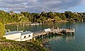
- Nomination Boat dock in Diamond Harbour, New Zealand --Podzemnik 04:51, 31 August 2019 (UTC)
- Promotion Support Good quality.--Famberhorst 05:19, 31 August 2019 (UTC)
-

- Nomination Pier in Diamond Harbour, New Zealand --Podzemnik 04:51, 31 August 2019 (UTC)
- Promotion Support Good quality.--Famberhorst 05:18, 31 August 2019 (UTC)
-

- Nomination New Zealand bush during the rain, Mt Oxford area --Podzemnik 04:51, 31 August 2019 (UTC)
- Promotion Nice.--Famberhorst 05:21, 31 August 2019 (UTC)
-

-

- Nomination Ostermann chapel (around 1900) on Gaisrückenstrasse in Winklern, Pörtschach am Wörther See, Carinthia, Austria -- Johann Jaritz 03:31, 31 August 2019 (UTC)
- Promotion Support Good quality. --XRay 05:21, 31 August 2019 (UTC)
-

- Nomination Ostermann chapel (around 1900) on Gaisrückenstrasse in Winklern, Pörtschach am Wörther See, Carinthia, Austria -- Johann Jaritz 03:31, 31 August 2019 (UTC)
- Promotion Support Good quality.--Famberhorst 05:15, 31 August 2019 (UTC)
-

- Nomination Darlington Nuclear Generating Station, Ontario. --The Cosmonaut 02:14, 31 August 2019 (UTC)
- Promotion Good quality --Michielverbeek 06:20, 31 August 2019 (UTC)
-

-

-

- Nomination Charles Philippe Prize, steeple-chase race at the Saint-Jean-des-Prés racecourse, Guillac, France --Tsaag Valren 23:57, 30 August 2019 (UTC)
- Promotion Good quality -- Spurzem 08:59, 31 August 2019 (UTC)
-

- Nomination Photograph pictures old metal, wood-covered chest. In the background you can see volumes of writings of Bolesław Prus and Jack London. By User:PawełMM --Piotr Bart 21:22, 30 August 2019 (UTC)
- Decline
 Oppose Insufficient quality. Please check the images at 100% before nominating --Podzemnik 06:19, 31 August 2019 (UTC)
-

- Nomination Mirror of BMW Concept 8 Series, IAA 2017 --MB-one 21:16, 30 August 2019 (UTC)
- Promotion Good quality. --Peulle 21:31, 30 August 2019 (UTC) Comment You have to look closely to see the mirror. But nevertheless it is a quality picture of this component (?). -- Spurzem 10:21, 31 August 2019 (UTC)
-

-

- Nomination Cape starling (Red-shouldered glossy-starling) (lamprotornis nitens) in Halali, Etosha, Namibia --Axel Tschentscher 18:05, 30 August 2019 (UTC)
- Promotion Good quality -- Spurzem 19:04, 31 August 2019 (UTC)
-
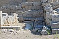
- Nomination Greece, Ancient Corinth, remains of public toilets at the Lechaion Road --Berthold Werner 08:12, 30 August 2019 (UTC)
- Promotion Support
Good quality. --Manfred Kuzel 03:55, 1 September 2019 (UTC)
-
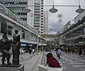
- Nomination View of a pedestrian street in Stockholm, Sweden --Ezarate 00:16, 30 August 2019 (UTC)
- Decline It needs a perspective correction (left side is hanging to the right and right side is hanging to the left). Also the bottom crop is not well done (the feet are cut off) --Michielverbeek 06:44, 30 August 2019 (UTC) @Michielverbeek: see now, please Ezarate 21:57, 30 August 2019 (UTC) It is looking better, but the left part is still hanging too much to the right - sorry --Michielverbeek 06:30, 31 August 2019 (UTC)
-

- Nomination Lake Rotorua in Rotorua, Bay of Plenty, North Island of New Zealand. --Tournasol7 06:12, 29 August 2019 (UTC)
- Promotion Support Good quality. --Aristeas 07:50, 31 August 2019 (UTC)
-

- Nomination Brushtail Possum (Trichosurus vulpecula) --Bald white guy 20:47, 28 August 2019 (UTC)
- Promotion Support Good quality. --Aristeas 07:53, 31 August 2019 (UTC)
-

- Nomination Brushtail Possum (Trichosurus vulpecula) --Bald white guy 20:47, 28 August 2019 (UTC)
- Promotion Support Good quality. --Aristeas 07:53, 31 August 2019 (UTC)
-

- Nomination Building at 1 Place Champollion in Figeac, Lot, France. --Tournasol7 06:16, 28 August 2019 (UTC)
- Promotion Support Good quality. --Aristeas 07:55, 31 August 2019 (UTC)
-

- Nomination Empty wine bottle --193.171.152.103 09:36, 27 August 2019 (UTC) Oppose Insufficient quality for a sudio shot, too noise and unsharp --Ezarate 21:26, 31 August 2019 (UTC)
- Decline {{{2}}}
- Nomination Empty wine bottle --193.171.152.103 09:36, 27 August 2019 (UTC)
-

-

- Nomination: BMW M2 at Geneva International Motor Show 2018 --MB-one 12:41, 25 August 2019 (UTC)
- Review needed
-

- Nomination Salzburg Cathedral and church of St. Peter from the west --Clemens Stockner 19:05, 24 August 2019 (UTC)
- Promotion The verticals are straight, but the main tower is still hanging to the left. IMO not possible to correct those kind of distortions --Michielverbeek 06:36, 31 August 2019 (UTC)

._20.jpg)
._03.jpg)


_--_2019_--_9798.jpg)
_--_2019_--_9801.jpg)
_--_2019_--_9804.jpg)
_--_2019_--_9813.jpg)
_--_2019_--_9819.jpg)


_bathing_in_Tad_Lo_river,_Laos.jpg)


.JPG)
.JPG)


.jpg)


.jpg)


.jpg)


._01.jpg)
._03.jpg)


.jpg)
.jpg)


.jpg)

Consensual review edit
File:Vogtlandmuseum_in_Plauen_20192808_001.jpg edit

- Nomination The Vogtlandmuseum in Plauen (Saxony) seen from the front. --PantheraLeo1359531 22:19, 28 August 2019 (UTC)
- Decline
- Support Good quality. --Manfred Kuzel 05:10, 29 August 2019 (UTC)
- Oppose I disagree. Sorry but this image need a perspective correction. --Tournasol7 06:15, 29 August 2019 (UTC)
- Comment Ich habe das wohl gesehen, bin aber der Meinung, daß bei einem tiefen Kamerastandort in der Nähe eines Objektes die Umrissse nicht exakt vertikal sein müssen, sofern sie nur auf beiden Seiten mit gleicher Neigung nach oben zusammenlaufen. Das entspricht auch durchaus dem Eindruck, den auch das menschliche Auge wahrnimmt. --Manfred Kuzel 13:31, 29 August 2019 (UTC)
- Oppose per Tournasol7 --Milseburg 05:29, 30 August 2019 (UTC)
 DonePerspective correction. Is it now okay? :) --PantheraLeo1359531 13:40, 30 August 2019 (UTC)
- Comment Not really, look for example how tilted the gutter is on the left. I'm afraid the crop is too tight for full perspective correction. It also become unsharp towards the top of the roof. --Milseburg 14:48, 30 August 2019 (UTC)
- Oppose The falling lines are even stronger now. I'm afraid there's nothing to improve. Sorry. -- Spurzem 17:56, 30 August 2019 (UTC)
- Oppose Roof not sharp. But I would really like to learn, how it is possible, that the roof has double contours looking like camera shake while the inscription in the middle of the image has not. I'm pretty sure, this can not be the wind... --Smial 09:37, 31 August 2019 (UTC)
- Comment No, definitely not the wind ;–). This is quite interesting; what could be the reason? Camera shake seems unlikely, for the reasons stated by Smial (image centre is clear). I have seen such “outlining” of unsharp contours in the out-of-focus areas of images created by some lenses, e.g. by my Loxia 35mm/2.0; maybe it’s related to astigmatism. Could this apply to the lens used here, too? In addition, the lens used here seems to have some field curvature, because the centre of the building is sharp, the left and right margins (which should be in the same plane of focus) are already unsharp; this makes the roof appear even more out of focus, and therefore enforces the outlining. So the reason could be a combination of insufficient DOF and of weaknesses of the lens. Maybe it would have been better to focus not on the centre, but on the midfield, to get a more uniform distribution of sharpness. --Aristeas 12:11, 31 August 2019 (UTC)
Total: 1 support (excluding the nominator), 4 oppose →  Declined --Peulle 10:39, 2 September 2019 (UTC)
File:Fischburg_in_Gröden_Südtirol.jpg edit

- Nomination The castle Fischburg in Gröden. --Moroder 19:46, 25 August 2019 (UTC)
- Promotion
- Oppose Most areas of the photo show outstanding sharpness and detail, the image is also well composed and the lighting conditions are very good. But the stitching error on the prominent tree in the left third of the image completely destroys it. --Smial 21:17, 25 August 2019 (UTC)
- I disagree It's not a stitching error, it's the shake from the wind. IMO it does not ruin the image because the tip of the tree is not the main object and it is irrelevant. You can consider it as a bokeh --Moroder 06:01, 27 August 2019 (UTC)
- If it is not a stitching error, you have selected an inappropriate shutter speed or the camera has shaken. This is in any case an avoidable error and the picture can therefore not be a QI. I don't think the argument with the wind is valid, because it must have been an enormous gust that turned diagonally from top left to bottom right, moving not only thin branches, but also, increasingly from bottom to top, thick branches and parts of the trunk, all at the same time around the same path in the same direction, if you look at the same image height. --Smial 12:07, 28 August 2019 (UTC)
 Question @Smial: Do you see camera shake also on the roofs and buidings --Moroder 16:56, 28 August 2019 (UTC)
- Sure I do. Compare the metal balls on the tower roofs. On the right in the picture all crisp, the ones in the middle visibly blurrier. The grey mountain massif to the right of the shaky tree is also clearly blurrier than the mountains in the right half of the picture, the same applies to the background mountains to the left of the tree. I would normally ignore such a small blur, because it is a photo with a very high resolution. But you ask for proofs, so I deliver them. --Smial 18:11, 28 August 2019 (UTC)
- If it is not a stitching error, you have selected an inappropriate shutter speed or the camera has shaken. This is in any case an avoidable error and the picture can therefore not be a QI. I don't think the argument with the wind is valid, because it must have been an enormous gust that turned diagonally from top left to bottom right, moving not only thin branches, but also, increasingly from bottom to top, thick branches and parts of the trunk, all at the same time around the same path in the same direction, if you look at the same image height. --Smial 12:07, 28 August 2019 (UTC)
- I disagree It's not a stitching error, it's the shake from the wind. IMO it does not ruin the image because the tip of the tree is not the main object and it is irrelevant. You can consider it as a bokeh --Moroder 06:01, 27 August 2019 (UTC)
- Support Overall very good. The unsharpness of the distant forest may result in some haze. The top of the left tree is indeed unsharp, but it's not disturbing until you view the image at full resolution. Greetings --Dirtsc (talk) 06:16, 28 August 2019 (UTC)
- Support per Dirtsc. The unsharp tree at the left does not bother me; it really looks as if the tree was moved by the wind, because the unsharpness increases towards the top of the tree; and the main subject is the castle, so a wind-shaken tree is IMHO no problem. Of course the image would be even better if the left-top part of the castle would be as crisp as the rest of it, but considering the resolution and the overall quality this is an almost sophistic question. --Aristeas 18:22, 28 August 2019 (UTC)
- Support per Aristeas Seven Pandas 22:29, 28 August 2019 (UTC)
- Support per others. --Manfred Kuzel 04:51, 29 August 2019 (UTC)
- Comment Thus, an obvious error in the technical realization of a photo is tolerable, if only the image resolution is high enough? Lesson learned. I should probably urgently check my ideas of QI and read the QI criteria again... --Smial 10:18, 29 August 2019 (UTC)
- Comment Imho it is possible to tolerate a reasonable but small amount of technical problems in photos. E.g. if sharpness is lacking in some parts of the image, but composition and lighting is excellent, the image can be judged as QI. But of course, this is just my vote and here at CR the majority decides. Greetings --Dirtsc 07:19, 30 August 2019 (UTC)
- Comment It may be easy to take “almost perfect” photos of simple things, but the more complex the subject (motif) of a photo becomes the more difficult it is to take a good photo of it without some problems. In addition, the higher the resolution and quality of a camera/lens combination is, the more obvious some of these problems will become. (Examples: Even the same lens can show no CAs and almost no deterioration of resolution in the corners when used on a 12 MPx camera, but may reveal CAs and weak corners if used on a 42 MPx sensor; the same, small amount of camera shaking may be invisible when the photo was taken with a 12 MPx camera, but obvious when taken with a 50 MPx camera.) Therefore we cannot demand perfection in every regard from photos of complex subjects (motifs), else there would be very few QIs. IMHO we should, as Dirtsc put it, “tolerate a reasonable but small amount of technical problems in photos”. And in photographs taken with high-resolution camera/lens combinations (like this one) some of these problems are more obvious; we must accept this to some degree, else it would become very difficult (not to say: impossible) to promote any high-resolution photos as QIs, and we would practically punish photographers for using high-resolution cameras and uploading photos in high resolution. We can't want to do that, can we? --Aristeas 10:30, 30 August 2019 (UTC)
- Comment For the records: This argumentation shows a certain hubris or at least an inner contradiction. In the past, QI candidates presented in full resolution often were rejected due to low blur, although they were sufficiently sharp at "normal" viewing distances or magnifications. If the uploader then resized and resharpened the photo slightly, it was rejected because of the downscaling. @Poco a poco: can surely sing a song about it. With the picture shown here it is argued that with reduced display size the obvious technical error would not be noticed. A double standard, which I really don't get. --Smial 13:51, 2 September 2019 (UTC)
- Comment Let’s come to the point. What makes a good image? Is it the pixels, the focus, the exposure time, the technical issues or is it the object, the colours, the composition, the ambiance? That is quality imo --Moroder 21:18, 29 August 2019 (UTC)
- Comment Look at the QI guidelines. All aspects you mentioned are valid QI criteria, except "object". The valid criteria can be weighted. If images are taken under difficult conditions, near technical limits, they still can be QI even with e.g. rather strong noise or low DOF. I wouldn't support strong noise in architectural photography, where use of a tripod could have avoided the problem. I don't accept unsharp images taken under bright lighting except the blur is intended to visualize "action". The kind of "object" is never a QI criteria. There are tons of "ugly" objects or situations all around, if depicted in a reasonable manner, they of course can be QI. --Smial 10:06, 31 August 2019 (UTC)
Total: 4 support (excluding the nominator), 1 oppose →  Promoted --Seven Pandas 11:58, 2 September 2019 (UTC)