File talk:COVID-19 Outbreak World Map.svg
|
File description edit
The description linking colours to case numbers does not to seem to be correct. For example, the US would have more than 100 million cases. If I see correctly, there are 10 colours listed, but only 8 used. The colours are very similar so sometimes it is hard to distinguish them. Sorry, I do not know how to correct this.
French Guiana edit
Please change the map for french guiana. It's not the correct number. — Preceding unsigned comment was added by 109.62.69.84 (talk) 13:16, 28 March 2020 (UTC)
Faroe Island edit
Hello! Please add Faroe Island to map. Thank you!~ https://www.in.fo/news-detail/news/coronavirus-i-foeroyum-fyra-folk-eru-i-karantenu/ Numizmatyk123 (talk) 14:15, 4 March 2020 (UTC)
First case in DR Congo edit
First case in the Dem. Rep. of Congo: https://www.reuters.com/article/us-health-coronavirus-congo/democratic-republic-of-congo-confirms-first-coronavirus-case-idUSKBN20X20F — Preceding unsigned comment added by Gyokuro-du-Rhin (talk • contribs) 15:05, 10 March 2020 (UTC) Crimea is not Russia. Thank you. — Preceding unsigned comment added by 46.200.76.210 (talk) 19:04, 15 March 2020 (UTC)
Mouse hover & Western Sahara edit
It's a shame that we don't get to see the countries names while hovering the zones with the mouse. Also what happened to Western Sahara ? Last I saw, it had some cases of COVID-19 — Preceding unsigned comment added by 165.225.95.52 (talk) 07:53, 17 March 2020 (UTC)
Uruguay edit
The color of the country hasn't been updated to fit the current number of cases. 2001:8003:D1DD:B800:A9DC:6DDB:1F4C:E817 (talk) 06:02, 18 March 2020 (UTC)
French Guiana edit
French Guiana has incorrect numbers, both in this map and in the deaths map. French Guiana only has 15 cases, not 10,000+. — Preceding unsigned comment was added by 64.18.146.37 (talk) 19:32, 20 March 2020 (UTC)
Pies instead of color ranges edit
Media is increasingly using pies or circles to show case count rather than colors. The colors are misleading unless per capita, although probably better than nothing. One example is NYTimes for the U.S., section "United States"; another is BBC for Europe, section "3. Numbers across Europe are also rising". (Thanks Ratherous and others for all the updates.) --Dan Polansky (talk) 12:08, 14 March 2020 (UTC)
Deaths per capita edit
It would be interesting to have a graph with deaths per capita. Since, the reported cases are often very unrealistic (low), while the deaths could be much more realistic, since people with medical difficulties would be much more likely tested than all those asymptomatic infected cases. The idea is based on medium.com (thanks to a friend who pointed that out to me), and seems very plausible. --Dan Polansky (talk) 18:33, 14 March 2020 (UTC)
- I agree. A pro capita presentation is much more informative. Jakro64 (talk) 11:08, 17 March 2020 (UTC)
- We can have both, but the per capita number is what counts. Even better would be to split large countries into regions for this.--Bk1 168 (talk) 16:09, 17 March 2020 (UTC)
- Here: File:COVID-19 Outbreak World Map Total Deaths per Capita.svg. Splitting large countries into regions would be good but we would need to figure out how to do it; we need data sources for regions and we need a blank map that has the required split into regions. --Dan Polansky (talk) 10:21, 18 March 2020 (UTC)
- We can have both, but the per capita number is what counts. Even better would be to split large countries into regions for this.--Bk1 168 (talk) 16:09, 17 March 2020 (UTC)
Crimea edit
14.03 the map has been replaced by the new one, which shows Crimea apart of Ukraine by filling it in different colour. Please fix this problem — Preceding unsigned comment was added by 94.76.121.168 (talk) 00:23, 15 March 2020 (UTC)
Is the file locked? edit
I attempted to update it and failed with a warning saying the file name cannot be modified. Bill497 (talk) 08:22, 15 March 2020 (UTC)
- Yeah same with me. Can someone unlock it? --Ratherous (talk) 08:23, 15 March 2020 (UTC)
- I've asked for unprotection, you can comment here. Bill497 (talk) 08:45, 15 March 2020 (UTC)
Protected edit request. edit
.svg)
Updated version of the file. Bill497 (talk) 08:37, 15 March 2020 (UTC)
Please timestamp this file at the top edit
I understand the unwillingness to se text in such visualizations, but please put the date of the data at the top. It is misleading otherwise and does not reflect the text if used on Wikipedia projects. Jane023 (talk) 08:42, 15 March 2020 (UTC)
- The file is already assumed to be up to date. As are most maps regarding fast-changing topics. --Ratherous (talk) 09:34, 15 March 2020 (UTC)
Crimea edit
Crimean peninsula is part of Ukraine, according to the international law and stance of the all main international organisations. However, it is shown in different colour with Ukraine. Correct it please! Euroserhi (talk) 19:56, 15 March 2020 (UTC)
Chile edit
Fix Chile's color please. has 155 cases thanks, addition Belgium and austria has 1000+ cases --Titsor8976 (talk) 16:08, 16 March 2020 (UTC)
Add Uruguay COVID 19 Map to the summary edit
Hi,
I created this map and I want it to put it in the summary but I can't. Thank you.

France edit
France now has more than 10000 confirmed cases and should be colored to the darkest shade.
Please sign your name as it is required for talk pages whoever you are. Humiebees (talk) 22:25, 19 March 2020 (UTC)
Hover text: "Layer 1" / country names edit
Please remove hover text "Layer 1" displayed wherever mouse is put.
If possible, add three letter official codes for every country/territory.
Extra color for 50,000? edit
Can you add a new color? @Ratherous ( talk)
- 50000+ Confirmed cases
- 10000-49999 Confirmed cases
- 1000-9999 Confirmed cases
- 100-999 Confirmed cases
- 10-99 Confirmed cases
- 1-9 Confirmed cases
Now that 5 countries (China, Italy, USA, Spain, and Germany) have above 50,000 it makes sense to add a new color. Humiebees (talk) 16:36, 27 March 2020 (UTC) Huh, surprised that you did 100,000 category but thanks @Ratherous ( talk) and good night/morning (wherever you live) Humiebees (talk) 00:46, 29 March 2020 (UTC)
Modification de la carte edit
La Guyane Française n'a pas plus de 100 000 cas de coronavirus. Veuillez modifier la carte. — Preceding unsigned comment was added by 109.62.69.84 (talk) 13:13, 28 March 2020 (UTC)
Automating this map edit
@Ratherous: Would you have any objection to this map being automatically updated once per day with a script? It looks like right now it's being updated by hand about once every day or two. Kaldari (talk) 15:21, 27 April 2020 (UTC)
Discussion at the COVID-19 WikiProject on standardizing various aspects of maps edit
![]() You are invited to join the discussion at w:Wikipedia talk:WikiProject COVID-19#Best universal colors for maps and graphs?. Sdkb (talk) 21:42, 14 May 2020 (UTC)
You are invited to join the discussion at w:Wikipedia talk:WikiProject COVID-19#Best universal colors for maps and graphs?. Sdkb (talk) 21:42, 14 May 2020 (UTC)
New color for over 5 million edit
Given that several countries are now over 5 million total cases, I think adding a darker color (maybe black?) would be more illustrative of the current situation. LissanX (talk) 01:59, 8 October 2020 (UTC)
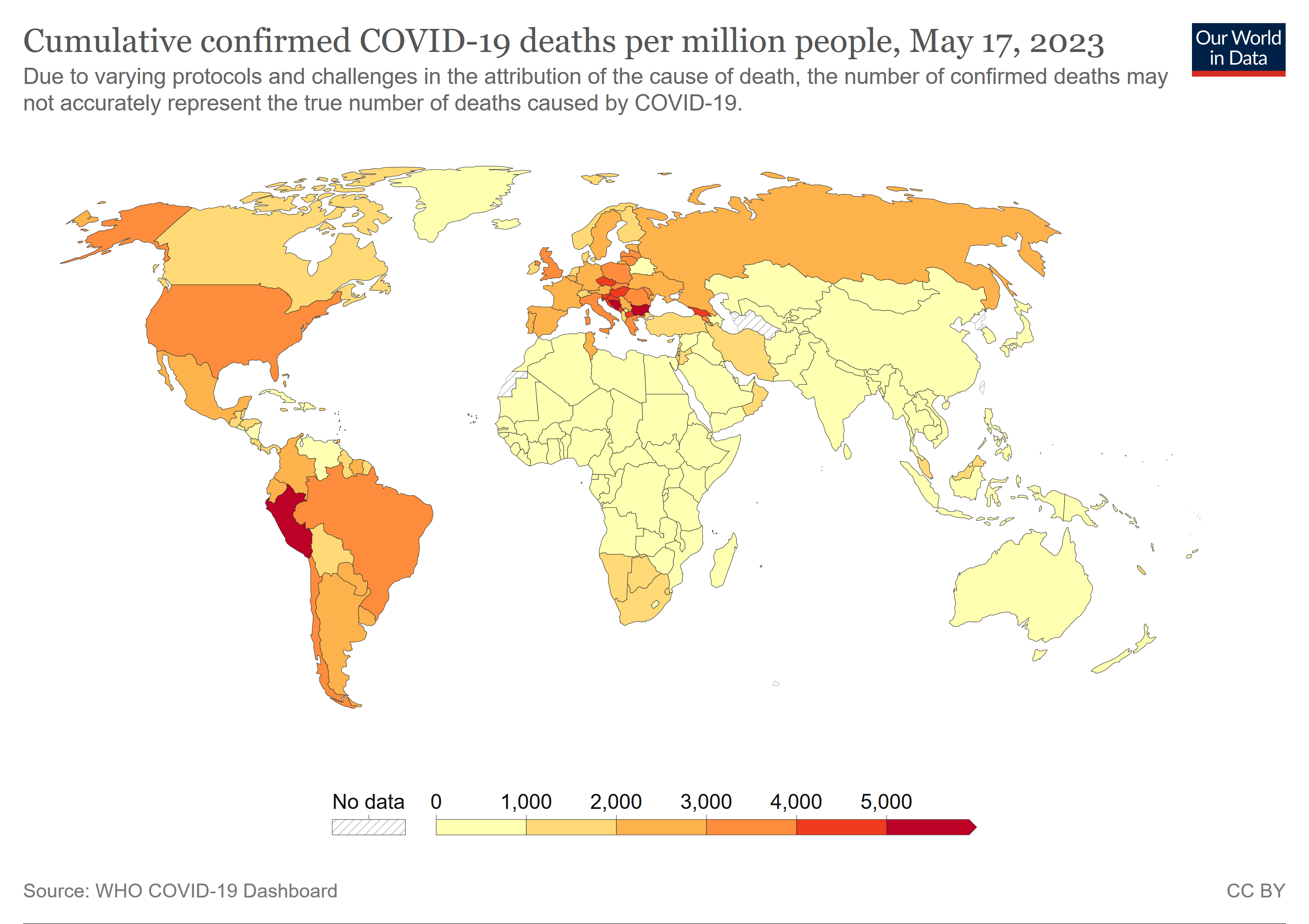
Our World in Data maps are better edit
The Our World in Data maps are better. They are continually updated from data by COVID-19 Data Repository by the Center for Systems Science and Engineering (CSSE) at Johns Hopkins University. The news media worldwide uses the Johns Hopkins University data.
Plus the Our World in Data source page has a table tab that lists the exact data for each country, territory, etc.. --Timeshifter (talk) 14:09, 16 June 2021 (UTC)
- Are you going to replace Wikipedia's data tables by pasting "Our World in Data" tables as well?
- No, the "Our World in Data Maps" are not better. The prior maps were Wikipedia's own work product based on its case number tabulations. The master table listing case numbers for each country had the appropriate links and citations to external number sources as evidence, whether they were official government numbers or Johns Hopkins data. Deleting Wikipedia's own maps and just replacing them by pasting and relying upon another site's maps (with the other site's logo stamped on them) is inappropriate outsourcing and advertisement of an external site. If there are going to be maps based on case numbers, they should be Wikipedia's own maps.
- The Wikipedia maps only needed to be updated or changed color-wise whenever a certain country passed a certain numerical threshold, like 10,000, 100,000 or 1,000,000 cases, etc. That was not required often, certainly not as often as the tables are updated. Even if the old maps had to be updated as frequently as Timeshifter complained, resorting to external "Our World in Data" maps would not solve that problem, because somebody would have to be pasting new data maps from "our World in Data" every time the numbers/colors changed instead of changing the colors on Wikipedia's maps.
- Additionally, by attempting to substitute the "Our World in Data" maps in place of Wikipedia's maps, the color bar legend contained within the "Our World in Data" map contradicts the color bar legend in the Wikipedia template captions.
- Are we also going to use "Our World in Data" maps to replace the death per capita maps that are at the tops of the main page and the "country and territory" page?
- The Wikipedia original maps use small circles to indicate and identify small areas or jurisdictions, like really small islands or tiny countries sandwiched between larger countries. You know, like St. Helena, Fiji, Guam, Singapore, Liechtenstein, or the Vatican, etc. The "Our World in Data" maps do not display for those smaller areas. Try finding Lebanon, Guam, Singapore, or Macau on the "Our World in Data" map. — Preceding unsigned comment added by 2600:1700:82e0:a690:ac8c:224d:d312:b8d9 (talk • contribs) 16 June 2021 (UTC)
- I see that you copied your answer from this talk page:
- wikipedia:Talk:COVID-19 pandemic by country and territory#Our World in Data Maps?
- You can see Lebanon on the Our World in Data maps when you click them in order to enlarge them. For example on a different Our World in Data map:
- https://upload.wikimedia.org/wikipedia/commons/2/26/World_map_of_total_confirmed_COVID-19_deaths_per_million_people_by_country.png
- The Our World in Data maps are better because the legend is on the bottom of the map. The color bar legend.
- Everything is easier on the Our World in Data maps. And we have a single link with all the current numbers in a table.
- --Timeshifter (talk) 00:11, 17 June 2021 (UTC)
~~ You told me you moved the discussion to the thread on this page, so I copied my responses to your assertions. It's not like you've made any new arguments here. To see Lebanon on the "Our World in Data" maps, you have to enlarge twice. And you haven't answered about the other minute islands and countries. Even when I click enlarge twice, I don't see them. For the Wikipedia map, I can see Lebanon and most other small islands and countries with one enlargement. You keep saying how the "Our World in Data Maps" are so great because the numerical-color legend is contained in the map. Since Wikipedia maps have the color legend in the caption template and they use different colors than "Our World in Data" maps, they are going to contradict the "Our World in Data" maps and you will have to delete or alter the Wikipedia caption templates to make them consistent across the board.
You keep singing praises for how great "Our World in Data" maps and tables are. Wikipedia already has a table of all numbers by country in the "by country and territory" page. Do you propose to delete the Wikipedia table and replace it with "Our World in Data" tables? Or just replace all Wikipedia maps and tables with links to "Our World in Data" sites? And you said "we have a single link." Who is "we"? Do you work for "Our World in Data"? Is that why you're trying to get Wikipedia to use and link to them for everything on COVID? ~~ — Preceding unsigned comment was added by 2600:1700:82E0:A690:A4DD:42B0:79A6:3A93 (talk) 02:29, 17 June 2021 (UTC)
- I don't work or volunteer for Our World in Data.
- You obviously know little about how Wikipedia and the Commons work. For example; you don't know how to sign your posts. Click the signature icon, or add 4 of these to the end of your posts: ~~~~
- You can see all the minute islands and countries on the Our World in Data maps. For example, on this one (after going there, click again to enlarge):
- https://upload.wikimedia.org/wikipedia/commons/2/26/World_map_of_total_confirmed_COVID-19_deaths_per_million_people_by_country.png
- And those islands are in their correct sizes and locations.
- You can't see those islands on the map you like. You see a bunch of circles. And it is hard to tell what those circles apply to in some cases.
- Your map does not have an accompanying table with the exact current data for the countries, territories, etc.
- That table link is provided in the reference details for the maps on the Commons page.
- The reference details are also linked from the map caption in Wikipedia articles. Or they should be, but some people forget to add the reference since many people just click the map to get to the reference details on the Commons.
- No one wants to delete the existing tables in Wikipedia articles. We regular editors did a lot of work setting up those tables. You really are new at this, aren't you?
- --Timeshifter (talk) 02:51, 17 June 2021 (UTC)
No, I don't know how to sign posts and I don't see how that makes a difference in anything. When people do sign posts here, it's just with nicknames and aliases.
And no, I don't see all minute islands and countries on the "Our World in Data" map, even when I enlarge it. The reason why Wikipedia puts circles over those islands and minute countries is that they would be otherwise overlooked and so the map uses circles to indicate some territory or jurisdiction is there and here is its corresponding color for numerical case value. That's a pretty standard method of representing minute areas on otherwise scale maps. Since the "Our World in Data" maps don't use that, then those jurisdictions are effectively omitted.
And don't refer to "your" or "my" map then. I had nothing to do with any maps, tables, or anything on any pages. I've never been an editor and don't wish to be one. I'm just a reader. But even readers can complain on the talk page about pages being modified or outsourced to plug some external site. ~~ — Preceding unsigned comment was added by 2600:1700:82E0:A690:A4DD:42B0:79A6:3A93 (talk) 03:22, 17 June 2021 (UTC)
- Wikipedia didn't add the circles. The editors of those maps did. Due to the software they use, or the online map making sites they use. They aren't "Wikipedia maps". They are just maps that people uploaded with a free license.
- Here are some more Our World in Data maps having to do with COVID-19:
- File:World map of daily new confirmed COVID-19 deaths per million people by country.png
- File:World map of share of people who received at least one dose of COVID-19 vaccine by country.png
- File:World map of total confirmed COVID-19 deaths per million people by country.png
- Read the descriptions on those map pages and you will see a link to the table containing the data. Those tables contain data by country, territory, and other subnational area. Including data for many islands.
- Click on any of the maps to enlarge them, and you will see many small islands. Look at the Caribbean area for example.
- There are many more Our World in Data maps on the Commons. People like them. They are very high quality maps.
- Your objection to them makes no sense. If your main complaint is the "Our World in Data" logos, then feel free to remove them. But you will be doing that at least once a week for these maps. They are often updated at least once a week. So people don't want to spend the time removing logos all the times. Logos (of all types) are often removed from maps that aren't updated as often. Most people aren't all that offended by the logos. The description pages are required to mention Our World in Data since all Our World in Data maps are under a {{Cc-by-4.0}} license that requires attribution. Please learn more about this, and maybe try your hand at editing.
- --Timeshifter (talk) 12:51, 17 June 2021 (UTC)
Stop trying to parse between "Wikipedia" and the individual editors who formatted the prior maps. By that premise, there is no such thing as "Our World in Data" maps either, but merely maps edited by whatever individual person who made them using whatever program, unless "Our World in Data" has its own special proprietary map-making software and all its maps are made under official collective auspice.
Using a circle to indicate or signal a small area on an otherwise scale map is used on other "Wikipedia" maps and on other sites. It's a longstanding method of making sure small areas aren't omitted or erased on an otherwise scale display. Don't act like it's some kind of egregious deviation.
I've clicked on the "Our World in Data" maps to enlarge them. It doesn't expand to being large enough to observe or indicate small islands or micro-states. This is what is displayed.
https://upload.wikimedia.org/wikipedia/commons/2/26/COVID-19_Outbreak_World_Map.svg
You say "feel free to remove" the "Our World in Data" logos. But as you yourself point out, "Our World in Data" requires its maps to be attributed if they are used by another party.
https://ourworldindata.org/faqs#how-is-your-work-copyrighted
Removing the logos would run afoul of their attribution requirement, so that's just a fool's errand you're suggesting to me. And I don't know how to edit and delete logos from images while leave the rest of the image intact.
You keep praising how the "Our World in Data" map is better because it has the color legend contained within the map itself. But that leaves the map image contradicting the color legend contained in the Wikipedia caption.
https://en.wikipedia.org/wiki/COVID-19_pandemic#/media/File:COVID-19_Outbreak_World_Map.svg
So either change the map or change the Wikipedia captions.
And do you plan to use "Our World in Data" maps to replace the deaths per capita maps that are at the top of main page and the country and territory pages?
Don't tell me to try my hand at editing. That's just going to be an edit/deletion war. 2600:1700:82E0:A690:597:E20F:D378:B943 20:24, 17 June 2021 (UTC)
- Click a couple times on any of these COVId-19 Our World in Data map links, and you can see the Caribbean islands when the map is enlarged. I forgot to note that for some SVG maps one has to click on one of the size links below the map. On png map pages one just has to click on the map itself to enlarge it.
- File:World map of daily new confirmed COVID-19 deaths per million people by country.png
- File:World map of share of people who received at least one dose of COVID-19 vaccine by country.png
- File:World map of total confirmed COVID-19 deaths per million people by country.png
- File:COVID-19 Outbreak World Map.svg
- File:COVID-19 Outbreak World Map per Capita.svg
- Incorrect legends in captions are easily corrected by removing them from the captions. Since there is a color bar legend on all of the above-linked maps.
- Attribution on the Commons page is sufficient attribution to the meet the {{Cc-by-4.0}} standard. Logo or other attribution is not needed on the image itself.
- I remove logos with freeware IrfanView image editor and viewer. It is easy, but time-consuming, if you have to do it on many frequently uploaded images.
- --Timeshifter (talk) 13:46, 18 June 2021 (UTC)
Our World in Data maps. Link to another discussion edit
Please see discussion here too:
--Timeshifter (talk) 17:58, 25 June 2021 (UTC)
- I moved the discussion to File talk:COVID-19 Outbreak World Map per Capita.svg
- --Timeshifter (talk) 00:31, 27 June 2021 (UTC)
Colour Highlight of Norway on Maps edit
Question: Why isn't all parts of Norway highlighted on the map when reporting for Covid cases? On the world map for deaths, Norway (number 15; the main Norway region and its island which is slightly above it) is highlighted. So why don't the other maps have it highlighted?
Maps that does highlight all of Norway:
Number of deaths map: https://en.wikipedia.org/wiki/COVID-19_pandemic_by_country_and_territory#/media/File:COVID-19_Outbreak_World_Map_Total_Deaths_per_Capita.svg
Maps that does not highlight all of Norway:
Map 1: https://en.wikipedia.org/wiki/File:COVID-19_Outbreak_World_Map.svg
Map 2: https://en.wikipedia.org/wiki/File:COVID-19_Outbreak_World_Map.svg#/media/File:COVID-19_Outbreak_World_Map-Confirmed.svg
Map 3: https://en.wikipedia.org/wiki/File:COVID-19_Outbreak_World_Map.svg#/media/File:COVID-19_Outbreak_World_Map-Deaths.svg
Map 4: https://en.wikipedia.org/wiki/File:COVID-19_Outbreak_World_Map_per_Capita.svg
Edit: Also, there was a time when all parts of Norway was highlighted on maps as per here:
https://commons.wikimedia.org/wiki/File_talk:COVID-19_Outbreak_World_Map.svg#/media/File:COVID-19_Outbreak_World_Map_(33).svg — Preceding unsigned comment was added by 115.134.114.190 (talk) 08:07, 10 July 2021 (UTC)
.svg)
Antartica is now 100 edit
Can someone change the map colour for Antartica to state that it is now 100+ as the current one is 1-99. 2001:E68:6540:1500:5C7B:AD33:637F:7F76 09:01, 24 August 2022 (UTC)
Recalibrating the legend edit
Hello @AKS471883 and S17003: how about recalibrating the legend to have less dark countries? (The scale was created in 2020 but now all countries are dark red, it does not help to identify which countries are more or less affected.) Hérisson grognon (talk) 17:20, 28 February 2023 (UTC)