Commons:Featured picture candidates/File:Eat sign Portland Oregon.jpg
File:Eat sign Portland Oregon.jpg, not featured
edit
Voting period is over. Please don't add any new votes.Voting period ends on 20 May 2010 at 22:33:45 (UTC)
Visit the nomination page to add or modify image notes.

 Info created by Flickr user Tammy - uploaded by Steven Walling - nominated by Steven Walling -- Steven Walling 22:33, 11 May 2010 (UTC)
 Support -- Steven Walling 22:33, 11 May 2010 (UTC)
 Neutral OK quality, but not stunning. --The High Fin Sperm Whale 23:48, 11 May 2010 (UTC)
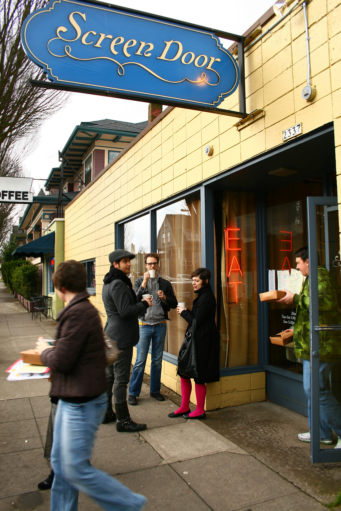
 Comment I agree it's not stunning. But I nominated it because of the composition, and (most importantly) when it comes to educational value it's a good non-specific example of a restaurant sign. It may be the best generic example we have currently, compared to its counterparts. Steven Walling 00:08, 12 May 2010 (UTC)
- Support The window reflection is a nice touch. ~Kevin Payravi (Talk) 02:59, 12 May 2010 (UTC)
 Oppose Tilted. --99of9 (talk) 10:51, 12 May 2010 (UTC)
- Comment Not quite sure what you mean, but FYI the subject is on an incline, which may be why it seems tilted. Steven Walling 19:52, 12 May 2010 (UTC)
- Comment I mean that none of the verticals are vertical. Even if built on an incline, the builder would ensure that the walls and window frames were plumb. The photographer did not IMO. --99of9 (talk) 07:35, 13 May 2010 (UTC)
- Neutral I'm not angry, but I'm not hungry, sorry...--Jebulon (talk) 20:26, 17 May 2010 (UTC)
- Support per nom. Tilt is not an issue for me here, and I suspect it may actually look better this way. It would be nice if someone fixed the hot pixel on the left, though, and maybe did some careful denoising. I might try that later, but not today. —Ilmari Karonen (talk) 22:20, 19 May 2010 (UTC)
Confirmed results: