Commons:Quality images candidates/Archives August 22 2013
-

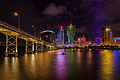
- Nomination Nam Van Lake, Macau --Poco a poco 13:01, 20 August 2013 (UTC)
- Promotion Beautiful! -- Felix Koenig 13:55, 20 August 2013 (UTC)
-
- Nomination Nam Van Lake, Macau --Poco a poco 13:01, 20 August 2013 (UTC)
- Promotion Good quality. --Ralf Roletschek 13:34, 20 August 2013 (UTC)
-

- Nomination A Porsche 356 (C-Model) at the vintage car event Oldtimerumzug Aidenbach in Bavaria (Germany) in August 2013. --High Contrast 10:39, 20 August 2013 (UTC)
- Promotion Good quality. --Poco a poco 12:56, 20 August 2013 (UTC)
-

- Nomination The river Main in Aschaffenburg with Pompejanum (on the left) and Frühstückstempel (on the right). -- Felix Koenig 10:21, 20 August 2013 (UTC)
- Promotion Good quality. --Poco a poco 12:51, 20 August 2013 (UTC)
-
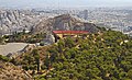
- Nomination Lycabettus Theater in Athens. --A.Savin 09:59, 20 August 2013 (UTC)
- Promotion Good Quality --Rjcastillo 10:23, 20 August 2013 (UTC)
-

- Nomination Statue of Saint Donatus in Vienna-Rodaun, Austria. --Ailura 09:54, 20 August 2013 (UTC)
- Promotion Good quality. --Poco a poco 12:51, 20 August 2013 (UTC)
-

- Nomination Old charcoal ovens in Dalsbruk, Kimitoön, Finland. --Esquilo 09:27, 20 August 2013 (UTC)Good Quality --Rjcastillo 10:23, 20 August 2013 (UTC)
- Promotion {{{2}}}
-

- Nomination The observatory of Tübingen, Baden-Württemberg (re-nominated because it was archived without review) -- Felix Koenig 08:38, 20 August 2013 (UTC)
- Promotion
 Support ok --A.Savin 09:55, 20 August 2013 (UTC)
-

- Nomination Green Gomphid (Ophiogomphus cecilia), Wittgensdorf, Germany --LC-de 08:03, 20 August 2013 (UTC)
- Promotion Support Good quality. --High Contrast 09:10, 20 August 2013 (UTC)
-

- Nomination Averbode Abbey. Already a FP, IMO worthy of QI status (by MJJR) TintoMeches 08:03, 20 August 2013 (UTC)
- Promotion Support --A.Savin 09:53, 20 August 2013 (UTC)
-

- Nomination Azure Damselfly (Coenagrion puella), Chemnitz, Germany --LC-de 08:00, 20 August 2013 (UTC)
- Promotion Support Good quality. --High Contrast 09:10, 20 August 2013 (UTC)
-

-

- Nomination Ruddy Darter (Sympetrum sanguineum), Chemnitz, Germany --LC-de 07:55, 20 August 2013 (UTC)
- Promotion Support Good quality. --High Contrast 09:11, 20 August 2013 (UTC)
-

- Nomination Senegalese wrestling --Pyb 07:41, 20 August 2013 (UTC)
- Promotion Good quality. --Poco a poco 12:51, 20 August 2013 (UTC)
-

- Nomination Senegalese wrestling --Pyb 07:41, 20 August 2013 (UTC)
- Promotion Support ok --A.Savin 09:42, 20 August 2013 (UTC)
-

- Nomination Shell of a Black Tinted Olive, Oliva bulbiformis --Llez 05:16, 20 August 2013 (UTC)
- Promotion Good quality. --Poco a poco 12:56, 20 August 2013 (UTC)
-

- Nomination Breakwater light and fog bell at the mole tower in Friedrichshafen. --Mummelgrummel 04:29, 20 August 2013 (UTC)
- Promotion Good quality. --Poco a poco 12:56, 20 August 2013 (UTC)
-

- Nomination Palais des Beaux-Arts in Lille, France. --Velvet 23:33, 19 August 2013 (UTC)
- Promotion Good quality. I like the little girl running, it's like she was painted on purpose. TintoMeches 08:36, 20 August 2013 (UTC)
-

-

- Nomination St. Spyridon Church in Piraeus, Athens Prefecture. --A.Savin 22:31, 19 August 2013 (UTC)
- Promotion Good quality. --Berthold Werner 09:17, 20 August 2013 (UTC)
-

-
-

- Nomination Suuns auf dem Haldern Pop Festival 2013. Max Henry (keyboards). --Smial 20:55, 19 August 2013 (UTC)
- Promotion Good quality. --Ralf Roletschek 13:35, 20 August 2013 (UTC)
-

-

-

-

-

- Nomination Успенский собор в КемиРусский: Assumption Cathedral In Kem ----Vitold Muratov 23:37, 19 August 2013 (UTC)
- Decline Nice in thumbnail, but massive CA, noise and sharpness problems. English description is also missing. --Tuxyso 20:16, 19 August 2013 (UTC)
-

- Nomination Acanthosoma haemorrhoidale --ComputerHotline 18:14, 19 August 2013 (UTC)
- Promotion Good quality. --NorbertNagel 18:51, 19 August 2013 (UTC)
-

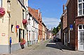
- Nomination Country landscape along road D 141, Vaux-Lavalette, Charente, France. --JLPC 17:03, 19 August 2013 (UTC)
- Promotion Good quality. --NorbertNagel 18:39, 19 August 2013 (UTC)
-

-

- Nomination Wye appliance, fire hose, Brigade des Sapeurs-Pompiers de Paris, France.--Jebulon 16:33, 19 August 2013 (UTC)
- Promotion Good quality. --NorbertNagel 18:37, 19 August 2013 (UTC)
-

- Nomination Guan Yin Statue, Macau --Poco a poco 16:02, 19 August 2013 (UTC)
- Promotion Support --A.Savin 21:50, 19 August 2013 (UTC)
-

- Nomination Guan Yin Statue, Macau --Poco a poco 16:02, 19 August 2013 (UTC)
- Promotion QI for me. It's seems like it's flying because of the clouds. --Kadellar 15:12, 20 August 2013 (UTC)
-

- Nomination Guan Yin Statue, Macau --Poco a poco 16:02, 19 August 2013 (UTC)
- Promotion Good quality. --NorbertNagel 18:31, 19 August 2013 (UTC)
-

-

- Nomination The day after the fire at Hôtel Lambert in Paris, France. Firemen still at work.--Jebulon 15:43, 19 August 2013 (UTC)
- Promotion Good quality. --Poco a poco 16:17, 19 August 2013 (UTC)
-

- Nomination Clevedon Pier. Mattbuck 15:27, 19 August 2013 (UTC)
- Promotion Good quality. --Poco a poco 16:23, 19 August 2013 (UTC)
-

-

- Nomination Orange bell peppers in a basket.--Jebulon 14:25, 19 August 2013 (UTC)
- Promotion Very noisy at the shady areas of the peppers, isn't it? --A.Savin 21:45, 19 August 2013 (UTC)Really ? I don't see very noisy areas. Could you please annotate them in order to help me for correction ? Thanks in advance.--Jebulon 23:58, 19 August 2013 (UTC)OK, I've seen and understood now. Uploaded a new denoised version. Better ?--Jebulon 00:33, 20 August 2013 (UTC)
Imo yes, enough for QI. Support --A.Savin 09:15, 20 August 2013 (UTC)
-

- Nomination Reaper, Jammer from Southern Discomfort during a Roller Derby match in Toulouse --PierreSelim 14:04, 19 August 2013 (UTC)
- Promotion Good quality. --Poco a poco 16:23, 19 August 2013 (UTC)
-

- Nomination Reaper, Jammer from Southern Discomfort during a Roller Derby match in Toulouse --PierreSelim 14:04, 19 August 2013 (UTC)
- Promotion Good quality. --JLPC 17:00, 19 August 2013 (UTC)
-

- Nomination A Brown-lipped Snail, Cepaea nemoralis --Llez 11:14, 19 August 2013 (UTC)
- Promotion Good quality. --Poco a poco 16:17, 19 August 2013 (UTC)
-

- Nomination Völkermarkter Stausee, Southern Carinthia. -- Felix Koenig 10:04, 19 August 2013 (UTC)
- Promotion Good quality. --JLPC 16:57, 19 August 2013 (UTC)
-

- Nomination The Protestant church of Bexbach, Saarland. -- Felix Koenig 09:39, 19 August 2013 (UTC)
- Promotion Good quality. --Berthold Werner 12:38, 19 August 2013 (UTC)
-

- Nomination Opel Olympia Rekord P1 Kombi --Berthold Werner 09:10, 19 August 2013 (UTC)
- Promotion Support Good quality. --High Contrast 09:57, 19 August 2013 (UTC)
-

- Nomination Stations of the Cross - Altar in Schwarzenfeld, Bavaria --Avarim 07:22, 19 August 2013 (UTC)
- Promotion Good quality. --Berthold Werner 09:10, 19 August 2013 (UTC)
-

- Nomination Litzner-group in the Silvretta-region of the Austrian-Swiss Alps --Avarim 07:04, 19 August 2013 (UTC)
- Promotion Good and usefull --Haneburger 08:28, 19 August 2013 (UTC)
-

- Nomination Makeup and headpiece of a synchronized swimmer. --Pyb 05:23, 19 August 2013 (UTC)
- Promotion Good quality. --Martin Falbisoner 05:50, 19 August 2013 (UTC)
-

- Nomination The Swedish synchronized swimmer Malin Gerdin. --Pyb 05:23, 19 August 2013 (UTC)
- Promotion Good quality. --PierreSelim 14:06, 19 August 2013 (UTC)
-

- Nomination Monumento Heroes caídos --Rjcastillo 00:37, 19 August 2013 (UTC)
- Promotion Good quality. --Pyb 05:27, 19 August 2013 (UTC)
-
- Nomination Placa Himno Nacional de Venezuela (Letra) --Rjcastillo 00:37, 19 August 2013 (UTC)
- Promotion Good quality. --Poco a poco 16:17, 19 August 2013 (UTC)
-

- Nomination Female Ruby-throated Hummingbird hovering.--Pslawinski 11:20, 19 August 2013 (UTC)
- Promotion Very nice, candidate for FP --Poco a poco 16:17, 19 August 2013 (UTC)
-

- Nomination James Johnston of Biffy Clyro at Rock im Pott 2013. --Krd 18:35, 19 August 2013 (UTC)
- Decline Nice moment but too noisy. --Kadellar 15:10, 20 August 2013 (UTC)
-

- Nomination Simon Neil of Biffy Clyro at Rock im Pott 2013. --Krd 18:35, 19 August 2013 (UTC)
- Decline Nice moment but too noisy. --Kadellar 15:10, 20 August 2013 (UTC)
-

- Nomination War monument of Lesponne, France --France64160 23:34, 18 August 2013 (UTC)
- Promotion Needs a perspective correction IMO.--Jebulon 10:40, 19 August 2013 (UTC)
 Done --France64160 14:13, 19 August 2013 (UTC)much better now, thank you.--Jebulon 20:44, 19 August 2013 (UTC)
-

-

- Nomination central Railway Station, Helsinki -- Alvesgaspar 21:23, 18 August 2013 (UTC)
- Promotion Good quality. --NorbertNagel 18:45, 19 August 2013 (UTC)
-

- Nomination Columba livia on a town well pipe --Kreuzschnabel 19:19, 18 August 2013 (UTC)
- Promotion Good quality. --Pyb 05:41, 19 August 2013 (UTC)
-

- Nomination Crater rim, volcano Vesuvius, Campania, Italy. --NorbertNagel 19:17, 18 August 2013 (UTC)
- Promotion QI for me --Haneburger 08:31, 19 August 2013 (UTC)
-

- Nomination Ancient Roman Pompeii panorama with colosseum in the foreground, Campania, Italy. --NorbertNagel 19:17, 18 August 2013 (UTC)
- Promotion Good quality. --JLPC 17:01, 19 August 2013 (UTC)
-

- Nomination MGM Grand in Macau --Poco a poco 16:25, 18 August 2013 (UTC)
- Promotion Good quality. Did you take the picture through a pane? --Martin Falbisoner 05:52, 19 August 2013 (UTC)
No, I was just standing at the other side accross the road Poco a poco 13:39, 19 August 2013 (UTC)
OK, I was just wondering because of the - what I considered them to be - reflections in the lower half of the picture, left side... --Martin Falbisoner 14:35, 19 August 2013 (UTC)
-

- Nomination Batterie de l'Eperon : gunpowder room --ComputerHotline 15:57, 18 August 2013 (UTC)
- Promotion Good quality. --NorbertNagel 20:42, 18 August 2013 (UTC)
-

- Nomination Historical oil mill in Dörzbach, Germany --Harke 10:54, 18 August 2013 (UTC)
- Promotion --Xicotencatl 02:42, 20 August 2013 (UTC)
-

- Nomination Olympiastadion, Munich, at dusk --Martin Falbisoner 21:30, 17 August 2013 (UTC)
- Promotion Contrast correction. (the file updated) --Aleks G 23:09, 18 August 2013 (UTC)
Thanks! --Martin Falbisoner 21:53, 18 August 2013 (UTC)
-

-

- Nomination Belgian electric multiple unit #632 (other side) -- MJJR 20:31, 16 August 2013 (UTC)
- Promotion Good quality. --Ralf Roletschek 13:25, 20 August 2013 (UTC)
-

- Nomination Stevens Tillman at Austrian Bowl XXIX in St. Pölten --AleXXw 17:19, 16 August 2013 (UTC)
- Promotion Good quality. --Ralf Roletschek 13:25, 20 August 2013 (UTC)
-

- Nomination MGM Grand, Macau --Poco a poco 15:34, 16 August 2013 (UTC)
- Promotion Good quality. --Ralf Roletschek 13:25, 20 August 2013 (UTC)
-

- Nomination Logo at car wing of a Chevrolet BelAir --Smial 10:02, 16 August 2013 (UTC)
- Promotion Good quality. --Ralf Roletschek 13:25, 20 August 2013 (UTC)
-

- Nomination Henri Morvan, member of the group Frères Morvan. --XIIIfromTOKYO 21:19, 14 August 2013 (UTC)
- Promotion OK for me --AleXXw 06:37, 20 August 2013 (UTC)
-
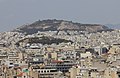
- Nomination Tourkovounia hill in Athens, Greece. --A.Savin 09:55, 14 August 2013 (UTC)
- Promotion --Xicotencatl 02:35, 20 August 2013 (UTC)
-

- Nomination American Football ball laying in grass at Austrian Bowl XXIX in St. Pölten --AleXXw 08:19, 14 August 2013 (UTC)
- Promotion Good quality. --Ralf Roletschek 13:29, 20 August 2013 (UTC)
-

- Nomination Minister Petra Bohuslav at Austrian Bowl XXIX in St. Pölten --AleXXw 08:14, 14 August 2013 (UTC)
- Promotion Good quality. --Ralf Roletschek 13:29, 20 August 2013 (UTC)
-
-

- Nomination Tram in Bratislava --Darkweasel94 22:56, 13 August 2013 (UTC)
- Promotion Good quality. --Ralf Roletschek 13:31, 20 August 2013 (UTC)
-

- Nomination Tram in Brno --Darkweasel94 22:02, 13 August 2013 (UTC)
- Promotion Good quality. --Ralf Roletschek 13:31, 20 August 2013 (UTC)
-

-

- Nomination Spanish rock band M Clan live in May 2013. --Kadellar 14:44, 13 August 2013 (UTC)
- Promotion Good quality. --Ralf Roletschek 13:31, 20 August 2013 (UTC)
-

- Nomination Carro de karting #2 --Rjcastillo 12:21, 13 August 2013 (UTC)
- Promotion Good quality. --Ralf Roletschek 13:31, 20 August 2013 (UTC)
-

- Nomination Carro de karting #8 --Rjcastillo 12:21, 13 August 2013 (UTC)
- Promotion Good quality. --Ralf Roletschek 13:31, 20 August 2013 (UTC)
-

- Nomination Historical tram in Gmunden --Darkweasel94 12:11, 13 August 2013 (UTC)
- Promotion OK for me --AleXXw 06:51, 20 August 2013 (UTC)
-

- Nomination young female Blue-tailed Damselfly, Ischnura elegans f. rufescens --Leviathan1983 08:50, 13 August 2013 (UTC)
- Promotion OK for me --Berthold Werner 07:45, 20 August 2013 (UTC)
-

-

- Nomination Organ (built 2013) in the parish church of Saint James and Saint Leonard in San Linert --Moroder 18:09, 12 August 2013 (UTC)
- Promotion --Xicotencatl 02:31, 20 August 2013 (UTC)
-

- Nomination Paisaje andino --Rjcastillo 16:53, 12 August 2013 (UTC)
- Decline Unfortunately a little unsharp and poor light conditions. --AleXXw 06:46, 20 August 2013 (UTC)
-

- Nomination Bus and tram station of the main railways station Dijon, France, --Pline 11:54, 12 August 2013 (UTC)
- Promotion Need perspective corrections, left is leaning out --Christian Ferrer 19:08, 12 August 2013 (UTC) Done--Pline 22:30, 19 August 2013 (UTC) Support OK, much better --Christian Ferrer 05:11, 20 August 2013 (UTC)
-

-

- Nomination Stachys macrantha 'Superba'. Beautiful in a natural garden. --
Famberhorst 15:54, 11 August 2013 (UTC) - Promotion Good for me.--Jebulon 16:37, 19 August 2013 (UTC)
- Nomination Stachys macrantha 'Superba'. Beautiful in a natural garden. --
-

- Nomination Helmut Holter, MdL Mecklenburg-Vorpommern, Fraktionsvorsitzender Die Linke --Martin Kraft 20:52, 10 August 2013 (UTC)
- Promotion Very good portrait. The color problem is acceptable here. Let's participate to the future elections campaign in Germany !--Jebulon 16:44, 19 August 2013 (UTC)
-
- Nomination Memorial of the World War I inside the Walter-Seitz factory of Granges-sur-Vologne, France. --ComputerHotline 19:45, 8 August 2013 (UTC)
- Decline Yellow cast I'm afraid.--Jebulon 16:48, 19 August 2013 (UTC)
-

-

-

-


_(Haldern_Pop_2013)_IMGP2650_smial_wp.jpg)
.JPG)
.JPG)
.JPG)
_IMGP3067_smial_wp.jpg)


.jpg)

.JPG)


_-_19.jpg)


.jpg)
.jpg)


_128.JPG)
_129.JPG)
Consensual review edit
File:Sue_Gardner_at_Wikimania_2013_in_Hong_Kong.jpg edit

- Nomination Sue Gardner during her last speech as Executive Director of the Wikimedia Foundation at a Wikimania. Hong Kong, August 11th, 2013. --Frank Schulenburg 10:31, 12 August 2013 (UTC)
- Promotion *
 Oppose
 Neutral Quality is OK (with regard to the resolution but could benefit from masked sharpening to reduce noise on the background), but the shooting position is IMHO too low for a QI portrayal and leads to a very unfortunate photo of Sue Gardner. --Tuxyso 15:24, 12 August 2013 (UTC)
 - Support OK for me. CR. --Kadellar 16:31, 13 August 2013 (UTC)
- Frank is a very good photographer, we all know that. But sometimes I do not understand why human portrayals are reviewed that laxly (compared to macro shots or architecture shots). She looks anywhere but not in direction to the camera (that should be the minimum requirement for a QI portrayal despite artistic shots). --Tuxyso 20:07, 13 August 2013 (UTC)
- I disagree, Tuxyso. I'm not reviewing so laxly, I just don't think people have always to be looking at the camera (e.g. this one). Of course it's nice if they're looking, but it's not mandatory. --Kadellar 11:17, 14 August 2013 (UTC)
- Support To me it's a very good portrait, telling a story besides its technical merit. Sue Gardner's pre-eminent position (as the post she had in WMF, and as an acknowledged powerful woman) is well called to mind by the low-angle shot, and she is looking elsewhere, further—that evokes her departure (this was her last speech as Executive Director of the Wikimedia Foundation at a Wikimania).--Myrabella (talk) 13:16, 14 August 2013 (UTC)
- I am unsure if this was the original intention of the photographer but your argument sounds plausible to me. I've changed to neutral. But I stick to my opinion that the shooting position is not really good for a human portrayal if the main interest lies on the person and not on the context and/or event the person is speaking on. --Tuxyso 14:15, 14 August 2013 (UTC)
 Comment Here's my thinking behind the shot: the image captures Sue in a way that's very typical for her – listening to someone in the audience and being super focused and attentive. The low angle – as Kadellar already pointed out – somewhat naturally highlights her position as ED of the Foundation. This one shows her with a friendlier face, although – as someone who knows Sue well – I can tell you that both images capture what I find most typical about her (focused, open, friendly). However, I'm totally ok if people don't like the photos. I'm not here to make a point, I just want to explain what my thinking behind the shots was. --Frank Schulenburg (talk) 01:13, 17 August 2013 (UTC)
- Support As for Kadellar -- Smial 07:44, 17 August 2013 (UTC)
- Support --Ralf Roletschek 13:33, 20 August 2013 (UTC)
Total: 4 support (excluding the nominator), 0 oppose →  Promoted --A.Savin 22:48, 21 August 2013 (UTC)
File:Hyacinthoides × massartiana LC0140.jpg edit

- Nomination Common Bluebell (Hyacinthoides non-scripta), Wittgensdorf, Germany --LC-de 21:42, 11 August 2013 (UTC)
- Decline Oppose Background is disturbing (please, see the picture with other size)--Lmbuga 21:51, 11 August 2013 (UTC) SupportI cannot understand your contra vote, sorry. This is a detail shot, DoF is OK. Probably LC-de can you reduce the highlights. --Tuxyso 22:15, 13 August 2013 (UTC)
![]() Comment I try to explain: Just behind the flowers there is another set of flowers. The composition seems to me not appropriate if the subject is front of some flowers with the same color. The picture is not QI for me. The background is disturbing. Sorry--Lmbuga 19:40, 14 August 2013 (UTC)
Comment I try to explain: Just behind the flowers there is another set of flowers. The composition seems to me not appropriate if the subject is front of some flowers with the same color. The picture is not QI for me. The background is disturbing. Sorry--Lmbuga 19:40, 14 August 2013 (UTC)
- Support Not featured of course but QI for me --Christian Ferrer 05:00, 15 August 2013 (UTC)
- Oppose Lmbuga is right there are too many blurred areas --Archaeodontosaurus 10:28, 17 August 2013 (UTC)
- Oppose -- Agree with Miguel, another angle (and exposure...) should have been chosen. Alvesgaspar 21:30, 17 August 2013 (UTC)
Total: 2 support (excluding the nominator), 3 oppose →  Declined --A.Savin 22:47, 21 August 2013 (UTC)
File:Heroés_trujillenses_I.jpg edit

- Nomination Heroes trujillenses. Parque Fuerzas Armadas Nacionales --Rjcastillo 12:31, 12 August 2013 (UTC)
- Decline
- Oppose f/11 is definetly the wrong decision here, f/5,6 would have resulted in a less distracting background, in addition the lighting is poor, sorry --Poco a poco 15:51, 12 August 2013 (UTC)
- Support Not featured but enough quality IMO --Christian Ferrer 20:14, 12 August 2013 (UTC)
- Oppose -- Agree with Poco a poco. Alvesgaspar 21:38, 17 August 2013 (UTC)
Total: 1 support (excluding the nominator), 2 oppose → Declined --A.Savin 22:46, 21 August 2013 (UTC)
File:Mammoet_skelter.jpg edit

- Nomination Mammoet skelter with moped engine --Uberprutser 21:01, 5 August 2013 (UTC)
- Promotion Good but you could add some contrast and reduce the slight CW tilt. --Tuxyso 21:26, 5 August 2013 (UTC)
* I think there is more then enough contrast and no tilt to worry about. I assume you are talking about the horizon level. Tilt is usually used when pointing the lens up or down. btw, the ground is not flat. It's parked at a slightly bend corner. --Uberprutser 00:37, 6 August 2013 (UTC)
It's ok to me. Mattbuck 16:14, 11 August 2013 (UTC)
Total: 1 support (excluding the nominator), 0 oppose → Promoted --A.Savin 22:44, 21 August 2013 (UTC)
File:Kaluga 2013 trolleybus 01.jpg edit

- Nomination AKSM trolley in Kaluga, Russia. Photo by Kaluga.2012. --A.Savin 18:59, 5 August 2013 (UTC)
- Promotion The composition doesn't feel quite right. It's not wide-angle enough to show the full context of the wires, but too wide to just be of the bus itself. Mattbuck 16:14, 11 August 2013 (UTC)
- Support Enough quality, trolley bus is entire --Christian Ferrer 12:09, 12 August 2013 (UTC)
- And sharpness, colors, contrast... are very goods, I don't understand why this picture can't be QI, it is! --Christian Ferrer 18:21, 15 August 2013 (UTC)
- Support As Christian Ferrer. --Dirtsc 17:59, 16 August 2013 (UTC)
Total: 2 support (excluding the nominator), 1 oppose → Promoted --A.Savin 22:43, 21 August 2013 (UTC)
File:Ford_A_ver_2.jpg edit

- Nomination Ford A --Villy Fink Isaksen 19:05, 4 August 2013 (UTC)
- Decline
Corrected --Villy Fink Isaksen 17:28, 5 August 2013 (UTC)
Flot billede. Førerens moustache passer også godt til bilen :-) --Slaunger 18:27, 8 August 2013 (UTC) Oppose - overexposed. Mattbuck 19:23, 10 August 2013 (UTC)
- Tried to fix overexposed --Villy Fink Isaksen 11:40, 14 August 2013 (UTC)
- Remapping the white point is not a fix. Mattbuck 21:55, 15 August 2013 (UTC)
- Tried to fix overexposed --Villy Fink Isaksen 11:40, 14 August 2013 (UTC)
- Comment Sorry, all your images of the ford are good pictures IMO, but the blue of the sky of this image seems unnatural: too yellow, perhaps? --Lmbuga 19:30, 14 August 2013 (UTC)
new attempt adjustment whitebalance --Villy Fink Isaksen 17:51, 15 August 2013 (UTC)
Total: 0 support (excluding the nominator), 1 oppose → Declined --A.Savin 22:42, 21 August 2013 (UTC)
File:Educatieve doe- en beleeftuin van It Fryske Gea nabij De Alde Feanen. 03.JPG edit

- Nomination Garden Structure benefit of insects and butterflies.--
Famberhorst 07:03, 4 August 2013 (UTC) - Decline
- SupportGood quality. --Dirtsc 15:53, 7 August 2013 (UTC)
- Oppose - the flowers just don't look right. Lack of fine detail causing oversharpness I think. Mattbuck 16:17, 10 August 2013 (UTC)
- Oppose Same as above, I'm afraid.--Jebulon 00:45, 20 August 2013 (UTC)
Total: 1 support (excluding the nominator), 2 oppose → Declined --A.Savin 22:41, 21 August 2013 (UTC)
File:Evangelische Kirche Lorsch 2013.jpg edit

- Nomination The Protestant church of Lorsch, Southern Hesse. -- Felix Koenig 16:08, 3 August 2013 (UTC)
- Promotion Further vertical correction necessary (especially at the left). --Tuxyso 06:42, 4 August 2013 (UTC)
- It seems ok to me. Mattbuck 09:21, 10 August 2013 (UTC)
- Support OK for me. --Dirtsc 16:20, 19 August 2013 (UTC)
Total: 2 support (excluding the nominator), 1 oppose → Promoted --A.Savin 22:40, 21 August 2013 (UTC)
File:Retford railway station MMB 09.jpg edit

- Nomination: Retford railway station. Mattbuck 07:38, 2 August 2013 (UTC)
- Review Neutral Blurred IMO, sorry --Christian Ferrer 14:18, 10 August 2013 (UTC)
I don't see what you mean. Mattbuck 16:00, 10 August 2013 (UTC) I Change to neutral, the right is too much blurred and also there is a spot, I have added note --Christian Ferrer 17:38, 10 August 2013 (UTC)Maybe I have been a little too fast, IMO you can improve it. I have maked a test and uploaded it, revert it and rework your version or keep mine, as you want--Christian Ferrer 18:22, 10 August 2013 (UTC) Forget, my version is a disaster, sorry --Christian Ferrer 18:28, 10 August 2013 (UTC) Now I've uploaded a new version (much better I hope --Christian Ferrer 18:42, 10 August 2013 (UTC)
Total: 0 support (excluding the nominator), 0 oppose →  Inconclusive result after 8 consensual review days --A.Savin 22:39, 21 August 2013 (UTC)
File:RheinFantasie (ship, 2011) 128.JPG edit
_128.JPG)
- Nomination Passenger ship RheinFantasie in Cologne --Rolf H. 07:35, 2 August 2013 (UTC)
- Decline Very dark shadows. Mattbuck 07:54, 10 August 2013 (UTC) CommentI photographed the image at 6:00 p.m.. The ship has tinted windows - I do not see any dark shadows. --Rolf H. 06:47, 12 August 2013 (UTC)
Total: 0 support (excluding the nominator), 1 oppose → Declined --A.Savin 22:37, 21 August 2013 (UTC)
File:RheinFantasie (ship, 2011) 129.JPG edit
_129.JPG)
- Nomination Passenger ship RheinFantasie in Cologne --Rolf H. 07:35, 2 August 2013 (UTC)
- Decline
- Oppose Very dark shadows. Mattbuck 07:54, 10 August 2013 (UTC)
- CommentI photographed the image at 6:00 p.m.. The ship has tinted windows - I do not see any dark shadows. --Rolf H. 06:47, 12 August 2013 (UTC)
- Oppose -- I agree with Mattbuck, the constrasts are too harsh. Please notice the underexposed front of the ship's bridge showing noise due to lack of light. -- Alvesgaspar 14:20, 18 August 2013 (UTC)
Total: 0 support (excluding the nominator), 2 oppose → Declined --A.Savin 22:36, 21 August 2013 (UTC)
File:Nottingham MMB D7 Wollaton Road.jpg edit

- Nomination Wollaton Road, Nottingham. Mattbuck 07:12, 30 July 2013 (UTC)
- Decline
- Support OK --Christian Ferrer 04:58, 7 August 2013 (UTC)
- Oppose missing sharpness --Rolf H. 09:00, 13 August 2013 (UTC)
- Oppose -- Indeed. I think I understand the purpose of the photo: to illustrate dof. But I don't think it works. -- Alvesgaspar 22:56, 17 August 2013 (UTC)
Total: 1 support (excluding the nominator), 2 oppose → Declined --A.Savin 22:35, 21 August 2013 (UTC)
File:Sines July 2013-1.jpg edit

- Nomination Beach and sky -- Alvesgaspar 23:14, 29 July 2013 (UTC)
- Promotion
- Oppose Dust spots, fairly dark, feels unbalanced. --Mattbuck 19:33, 6 August 2013 (UTC) -- Two dust spots removed. I don't agree that the image is dark and the composition unbalanced. Alvesgaspar 22:12, 12 August 2013 (UTC)
- Comment Compo ok for me but a little dark for me too --Christian Ferrer 11:29, 15 August 2013 (UTC)
- Comment 1/2 f-stop brighter would be better. The red channel clips at the dark side of the histogram, all channels have some room in the bright areas. -- Smial 09:17, 17 August 2013 (UTC)
 Info-- Ok, here is an improved version. I just wanted to preserve the end of the day mood... Alvesgaspar 11:56, 17 August 2013 (UTC)
- Support Ok now in my opinion. More votes? -- Smial 08:37, 18 August 2013 (UTC)
- Support OK for me too. --Jebulon 18:05, 19 August 2013 (UTC)
Total: 2 support (excluding the nominator), 1 oppose → Promoted --A.Savin 22:34, 21 August 2013 (UTC)