Commons:Quality images candidates/Archives January 04 2018
-

- Nomination Glade on Bannwaldweg #8 in Winklern, Pörtschach, Carinthia, Austria --Johann Jaritz 02:51, 2 January 2018 (UTC)
- Promotion Good quality. --Vengolis 02:52, 2 January 2018 (UTC)
-

- Nomination Glade on Bannwaldweg #8 in Winklern, Pörtschach, Carinthia, Austria --Johann Jaritz 02:51, 2 January 2018 (UTC)
- Promotion Good quality. -- PumpkinSky 02:57, 2 January 2018 (UTC)
-

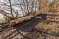
- Nomination Pile of beech logs at the forest road on Bannwaldweg #8 in Winklern, Pörtschach, Carinthia, Austria --Johann Jaritz 02:51, 2 January 2018 (UTC)
- Promotion Good quality. -- PumpkinSky 02:57, 2 January 2018 (UTC)
-

- Nomination Glade on Bannwaldweg #8 in Winklern, Pörtschach, Carinthia, Austria --Johann Jaritz 02:51, 2 January 2018 (UTC)
- Promotion Good quality. -- PumpkinSky 02:57, 2 January 2018 (UTC) Heavy overlighted (2,5 EV), not only overexposed, and a pitty composition. --blue sky is bollywood, shadows are not dark, light wood is too shiny. Pls tell me D810 is not like a Canon Bell, ore time phrase...
-
- Nomination Beech log at the forest road on Bannwaldweg #8 in Winklern, Pörtschach, Carinthia, Austria --Johann Jaritz 02:51, 2 January 2018 (UTC)
- Promotion Good quality. -- PumpkinSky 02:57, 2 January 2018 (UTC)
-

- Nomination Chromolaena odorata --Vengolis 02:34, 2 January 2018 (UTC)
- Promotion Good quality. --PumpkinSky 02:42, 2 January 2018 (UTC)
-

- Nomination Telicota bambusae --Vengolis 02:34, 2 January 2018 (UTC)
- Promotion Good quality. --PumpkinSky 02:42, 2 January 2018 (UTC)
-

- Nomination Pentas lanceolata --Vengolis 02:34, 2 January 2018 (UTC)
- Promotion Good quality. --PumpkinSky 02:42, 2 January 2018 (UTC)
-

- Nomination Montanoa bipinnatifida --Vengolis 02:34, 2 January 2018 (UTC)
- Promotion Good quality. --PumpkinSky 02:42, 2 January 2018 (UTC)
-

- Nomination Tagiades litigiosa --Vengolis 02:34, 2 January 2018 (UTC)
- Promotion Good quality. --PumpkinSky 02:42, 2 January 2018 (UTC)
-

- Nomination A view of Glen Orchy in the Scottish Highlands --Spike 02:17, 2 January 2018 (UTC)
- Promotion Good quality. --PumpkinSky 02:24, 2 January 2018 (UTC)
-

- Nomination Gold Mine Museum in Złoty Stok, main building --Jacek Halicki 00:00, 2 January 2018 (UTC)
- Promotion Good quality, Tournasol7 00:06, 2 January 2018 (UTC)
-

- Nomination Saint George church in Kamienica 1 --Jacek Halicki 00:00, 2 January 2018 (UTC)
- Promotion Good quality. --PumpkinSky 00:03, 2 January 2018 (UTC)
-

- Nomination Saint George church in Kamienica 2 --Jacek Halicki 00:00, 2 January 2018 (UTC)
- Promotion Good quality, Tournasol7 00:04, 2 January 2018 (UTC)
-

- Nomination Saint John the Evangelist church in Paczków --Jacek Halicki 00:00, 2 January 2018 (UTC)
- Promotion Good quality. --PumpkinSky 00:03, 2 January 2018 (UTC)
-

- Nomination Virginia Beach City Hall sign. FYI wind blowing this day. --PumpkinSky 00:00, 2 January 2018 (UTC)
- Promotion Good quality. --Jacek Halicki 00:04, 2 January 2018 (UTC)
-

- Nomination Virginia Beach Courthouse 1 --PumpkinSky 00:00, 2 January 2018 (UTC)
- Promotion Good quality. --Jacek Halicki 00:05, 2 January 2018 (UTC)
-

- Nomination Virginia Beach Police HQ --PumpkinSky 00:00, 2 January 2018 (UTC)
- Promotion Good quality. --Jacek Halicki 00:04, 2 January 2018 (UTC)
-

- Nomination Flower of Urospermum dalechampii in Dunedin Botanic Garden, Dunedin, New Zealand. --Tournasol7 00:00, 2 January 2018 (UTC)
- Promotion Good quality. --Jacek Halicki 00:31, 2 January 2018 (UTC)
-

- Nomination Window of the chapel of the Penitents of Marcillac-Vallon, Aveyron, France. --Tournasol7 00:00, 2 January 2018 (UTC)
- Promotion Good quality. -- Johann Jaritz 04:10, 2 January 2018 (UTC)
-
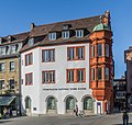
- Nomination Buinding at Marktplatz 1 in Würzburg, Bavaria, Germany. --Tournasol7 00:00, 2 January 2018 (UTC)
- Promotion Good quality. --Jacek Halicki 00:03, 2 January 2018 (UTC)
-
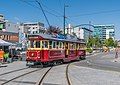
- Nomination Christchurch Tram at Cathedral Square in Christchurch, New Zealand. --Tournasol7 00:00, 2 January 2018 (UTC)
- Promotion Good quality. --Jacek Halicki 00:02, 2 January 2018 (UTC)
-

- Nomination Pont Valentré in Cahors, Lot, France. --Tournasol7 00:00, 2 January 2018 (UTC)
- Promotion Good quality. --PumpkinSky 00:01, 2 January 2018 (UTC)
-

- Nomination Panoramic view from the lookouttower Siebenburgenblick near Niederheimbach over the Rhine Gorge --Milseburg 22:18, 1 January 2018 (UTC)
- Promotion Good quality. --PumpkinSky 22:42, 1 January 2018 (UTC)
-

- Nomination French cycle-car Sima-Violet from about 1924 at Nürburgring -- Spurzem 21:12, 1 January 2018 (UTC)
- Promotion Good quality. --PumpkinSky 21:43, 1 January 2018 (UTC)
-

- Nomination Acro standing lap dance variation (DSCF2432, denoised using bm3d-gpu) --Trougnouf 19:00, 1 January 2018 (UTC)
- Promotion Good quality. --PumpkinSky 20:57, 1 January 2018 (UTC)
-
 Good quality. --Granada 18:14, 1 January 2018 (UTC) WTC Red and blue, not only at pront??}
 -

- Nomination Barahona, Soria, Spain --Poco a poco 18:05, 1 January 2018 (UTC)
- Promotion Good quality. --Granada 18:14, 1 January 2018 (UTC)
-

- Nomination Hermitage of St Saturio, Soria, Spain --Poco a poco 18:05, 1 January 2018 (UTC)
- Promotion Good quality. --Granada 18:14, 1 January 2018 (UTC)
-
 Kann Poco ja sagen was er will, für mich ist das einer seiner besten, the Top Five !!(from him with five faults). Total egal, Ansalm Adams is gone....
- Nomination Hermitage of the Lady of the Augustinians, Recuerda, Soria, Spain --Poco a poco 18:05, 1 January 2018 (UTC)
- Promotion Good quality. --Granada 18:14, 1 January 2018 (UTC)
-

- Nomination Church of St Blas, Villaciervitos, Soria, Spain --Poco a poco 18:05, 1 January 2018 (UTC)
- Promotion Good quality. --Granada 18:14, 1 January 2018 (UTC)
-

- Nomination ils sont comestibles. --The Photographer 18:00, 1 January 2018 (UTC)
- Promotion
 Support Good quality.--Famberhorst 18:05, 1 January 2018 (UTC)
-

- Nomination Vestimenta típica Venezolana --The Photographer 18:00, 1 January 2018 (UTC)
- Promotion Good quality. --Poco a poco 18:46, 1 January 2018 (UTC)
-
- Nomination Misling-Upper Austria, lake: the Attersee --Michielverbeek 17:40, 1 January 2018 (UTC)
- Promotion Good quality --Halavar 17:52, 1 January 2018 (UTC)
-

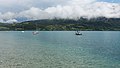
- Nomination Attersee am Attersee-Upper Austria, view to the Attersee --Michielverbeek 17:40, 1 January 2018 (UTC)
- Promotion Good quality--Armenak Margarian 22:11, 1 January 2018 (UTC)
-

- Nomination Attersee am Attersee-Upper Austria, view to the Attersee --Michielverbeek 17:40, 1 January 2018 (UTC)
- Promotion Good quality. -- Johann Jaritz 04:12, 2 January 2018 (UTC)
-

- Nomination Attersee am Attersee-Upper Austria, church: die Katholische Pfarrkirche Mariä Himmelfahrt --Michielverbeek 17:40, 1 January 2018 (UTC)
- Promotion Support Good quality.--Famberhorst 17:42, 1 January 2018 (UTC)
-

- Nomination Shell of a nutmeg snail, Solatia cf. piscatoria --Llez 17:22, 1 January 2018 (UTC)
- Promotion Support Good quality.--Famberhorst 17:31, 1 January 2018 (UTC)
-

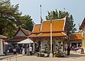
- Nomination Wihan. Wat Traimit Witthayaram. Samphanthawong District, Bangkok, Thailand. --Halavar 17:21, 1 January 2018 (UTC)
- Promotion Support Good quality.--Famberhorst 17:32, 1 January 2018 (UTC)
-
- Nomination Wat Chana Songkhram. Phra Nakhon District, Bangkok, Thailand --Halavar 17:21, 1 January 2018 (UTC)
- Promotion Good quality. --Poco a poco 18:46, 1 January 2018 (UTC)
-

-

- Nomination Stone statue. Wat Suthat. Phra Nakhon District, Bangkok, Thailand. --Halavar 17:21, 1 January 2018 (UTC)
- Promotion Good for me--Armenak Margarian 22:14, 1 January 2018 (UTC)
-

- Nomination Birch mushroom (Piptoporus betulinus) on broken birch branch in natural habitat.
--Famberhorst 16:30, 1 January 2018 (UTC) - Promotion Good quality. --PumpkinSky 16:31, 1 January 2018 (UTC)
- Nomination Birch mushroom (Piptoporus betulinus) on broken birch branch in natural habitat.
-

- Nomination Wijnjeterper Schar, Natura 2000 area of Friesland province. Heavy rain showers above the nature reserve.
--Famberhorst 16:30, 1 January 2018 (UTC) - Promotion Good quality at 200% of my monitor, clouds are a bit noisy in 1:1 --Trougnouf 17:39, 1 January 2018 (UTC)
- Nomination Wijnjeterper Schar, Natura 2000 area of Friesland province. Heavy rain showers above the nature reserve.
-

- Nomination Fireworks on New Year's Eve in a small village in Swabia (1) --AWeith 15:43, 1 January 2018 (UTC)
- Promotion
 Comment Nice picture! I think that a perspective correction is necessary. Look at the houses on the right.--Famberhorst 16:23, 1 January 2018 (UTC)
 Done ... as much as possible without loosing any fireflares. Thx for the hint! --AWeith 16:59, 1 January 2018 (UTC) Support Good quality.--Famberhorst 17:37, 1 January 2018 (UTC)
-
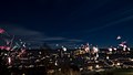
- Nomination Fireworks on New Year's Eve in a small village in Swabia (2) --AWeith 15:43, 1 January 2018 (UTC)
- Promotion Support Good quality.--Famberhorst 17:39, 1 January 2018 (UTC)
-

- Nomination Red-naped ibis (Pseudibis papillosa), Chambal River, India --Charlesjsharp 15:16, 1 January 2018 (UTC)
- Promotion Good quality. --PumpkinSky 16:30, 1 January 2018 (UTC)
-

- Nomination Red-wattled lapwing (Vanellus indicus indicus), Salai, India --Charlesjsharp 15:16, 1 January 2018 (UTC)
- Promotion Support Good quality.--Famberhorst 16:19, 1 January 2018 (UTC)
-

- Nomination Red-whiskered bulbul (Pycnonotus jocosus fuscicaudatus), Kerala --Charlesjsharp 15:16, 1 January 2018 (UTC)
- Promotion Good quality. --Jacek Halicki 15:28, 1 January 2018 (UTC)
-

- Nomination Red-whiskered bulbul (Pycononotus jocosus fuscicaudatus) with grasshopper, Kerala --Charlesjsharp 15:16, 1 January 2018 (UTC)
- Promotion Good quality. --Jacek Halicki 15:28, 1 January 2018 (UTC)
-

- Nomination River tern (Sterna aurantia), Chambal River, India --Charlesjsharp 15:16, 1 January 2018 (UTC)
- Promotion Good quality. --Jacek Halicki 15:28, 1 January 2018 (UTC)
-

- Nomination Subway line U9 at station Zoologischer Garten Berlin --JoachimKohlerBremen 12:23, 1 January 2018 (UTC)
- Promotion Good quality. --Jacek Halicki 15:31, 1 January 2018 (UTC)
-
-

-

- Nomination Scaffolded towers of the former Benedictine Abbey St. Michael in Bamberg --Ermell 11:59, 1 January 2018 (UTC)
- Promotion Good quality. --Jacek Halicki 15:31, 1 January 2018 (UTC)
-

- Nomination Wooden fence on a Mekong bank, around a small cultivated island near Don Loppadi, in Si Phan Don (4000 islands), Laos, with a couple working --Basile Morin 11:31, 1 January 2018 (UTC)
- Promotion Good quality including a cat! --Granada 11:36, 1 January 2018 (UTC)
-
- Nomination Children playing at sunset on a Mekong bank, near a submerged fence reflecting in the water, not far from the island of Don Loppadi in Si Phan Don (4000 islands), Laos --Basile Morin 11:31, 1 January 2018 (UTC)
- Promotion Good quality. --Granada 11:36, 1 January 2018 (UTC)
-

- Nomination Submerged Albizia Saman (rain tree) in the Mekong, near the island of Don Loppadi, Laos, during the dry season (when the river is low), in the afternoon at 4:00 pm --Basile Morin 11:31, 1 January 2018 (UTC)
- Promotion Good quality. --Granada 11:36, 1 January 2018 (UTC)
-

- Nomination Kitchen garden on the Mekong bank of the island of Don Loppadi, Laos, with two boats racing in the distance --Basile Morin 11:31, 1 January 2018 (UTC)
- Promotion Good quality. --Granada 11:36, 1 January 2018 (UTC)
-

- Nomination Mekong beach near the island of Don Loppadi, in Si Phan Don (4000 islands), Laos, at sunset, with 3 children returning to their boat --Basile Morin 11:31, 1 January 2018 (UTC)
- Promotion Good quality. --Granada 11:36, 1 January 2018 (UTC)
-

- Nomination Hochschwab --Uoaei1 11:06, 1 January 2018 (UTC)
- Promotion Good quality. -- Johann Jaritz 11:22, 1 January 2018 (UTC)
-

- Nomination Flughafen Madrid-Barajas --Ralf Roletschek 10:22, 1 January 2018 (UTC)
- Promotion Good quality. --Uoaei1 11:09, 1 January 2018 (UTC)
-
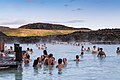
- Nomination Blaue Lagune, Island --Ralf Roletschek 10:22, 1 January 2018 (UTC)
- Promotion Good quality. --Jacek Halicki 10:58, 1 January 2018 (UTC)
-

- Nomination Akan Gold Weight, Geometric weight. Spiral- patterned --Ercé 09:28, 1 January 2018 (UTC)
- Promotion Good quality. --Jacek Halicki 10:58, 1 January 2018 (UTC)
-

- Nomination Statuette Karajà, man sitting. --Ercé 09:27, 1 January 2018 (UTC)
- Promotion Good quality. --Jacek Halicki 10:58, 1 January 2018 (UTC)
-

-

-

-

- Nomination Magnifying glass / biconvex lens creates a distant scene upside-down and smaller. --AntanO 08:47, 1 January 2018 (UTC)
- Promotion Interesting --Basile Morin 11:35, 1 January 2018 (UTC)
-

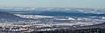
- Nomination Mountain trip from Churwalden Mittelberg (1500 meter) via Ranculier and Praden towards Tschiertschen. View of Chur.
--Agnes Monkelbaan 06:34, 1 January 2018 (UTC) - Promotion Support Good quality. -- Johann Jaritz 07:32, 1 January 2018 (UTC)
- Nomination Mountain trip from Churwalden Mittelberg (1500 meter) via Ranculier and Praden towards Tschiertschen. View of Chur.
-

- Nomination Mountain trip from Churwalden Mittelberg (1500 meter) via Ranculier and Praden towards Tschiertschen. Foggy on the way.
--Agnes Monkelbaan 06:34, 1 January 2018 (UTC) - Promotion Support Good quality. -- Johann Jaritz 07:31, 1 January 2018 (UTC)
- Nomination Mountain trip from Churwalden Mittelberg (1500 meter) via Ranculier and Praden towards Tschiertschen. Foggy on the way.
-

- Nomination Université Laval --The Photographer 23:38, 31 December 2017 (UTC)
- Promotion Good quality. --Ralf Roletschek 19:07, 1 January 2018 (UTC)
-

- Nomination João Alfredo, Pernambuco, Brazil --The Photographer 23:38, 31 December 2017 (UTC)
- Promotion Good quality. --Ralf Roletschek 19:07, 1 January 2018 (UTC)
-
- Nomination João Alfredo, Pernambuco, Brazil --The Photographer 23:38, 31 December 2017 (UTC)
- Promotion Good quality. --Basile Morin 11:39, 1 January 2018 (UTC)
-
- Nomination João Alfredo, Pernambuco, Brazil --The Photographer 23:38, 31 December 2017 (UTC)
- Promotion Good quality. --Basile Morin 11:38, 1 January 2018 (UTC)
-

- Nomination João Alfredo, Pernambuco, Brazil --The Photographer 23:38, 31 December 2017 (UTC)
- Promotion Quality high enough for Q1 --Michielverbeek 19:01, 1 January 2018 (UTC)
-

- Nomination Kop Blokslootpolder (Bloksleatpolder). Panorama.
--Famberhorst 07:29, 31 December 2017 (UTC) Comment You should fix the the cropping errors.--Ermell 07:37, 31 December 2017 (UTC) Done. Small correction. Thanks for your reviews. --Famberhorst 16:30, 31 December 2017 (UTC) - Promotion Good quality. --Ermell 21:28, 1 January 2018 (UTC)
- Nomination Kop Blokslootpolder (Bloksleatpolder). Panorama.
-

- Nomination Schwanenstadt-Upper Austria, townhall and church (die Katholische Pfarrkirche heilige Michael) in background --Michielverbeek 07:18, 31 December 2017 (UTC)
- Promotion Good quality. -- Johann Jaritz 07:26, 31 December 2017 (UTC) Comment I think the left tower is crooked.--Famberhorst 07:33, 31 December 2017 (UTC)
I guess you are right; tomorrow I will look to it. --Michielverbeek 13:59, 31 December 2017 (UTC)
It's quiet difficult to realize Donea perfect perspective because of the tight bottom crop --Michielverbeek 19:44, 1 January 2018 (UTC)
-

- Nomination Cross in La Frontera, Cuenca, Spain --Poco a poco 11:28, 29 December 2017 (UTC)
- Promotion Comment Dust spot that should be remove --Halavar 14:20, 29 December 2017 (UTC) Done Poco a poco 17:21, 31 December 2017 (UTC) Support Good now --Halavar 19:27, 1 January 2018 (UTC)
-

- Nomination: Blaue Lagune, Island --Ralf Roletschek 04:36, 27 December 2017 (UTC)
- Review needed
-
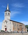
- Nomination: Saint Dionysius church of Cruzilles-lès-Mépillat, France. --Chabe01 00:01, 27 December 2017 (UTC)
- Review Chabe01: you have always problem with persective correction. Can you fix it? Tournasol7 00:04, 27 December 2017 (UTC)
-

- Nomination Metro Station BKK Chong Nonsi --Hans-Jürgen Neubert 14:08, 25 December 2017 (UTC)
- Decline
 Oppose Missing sharpness. And overcategorized --A.Savin 16:12, 1 January 2018 (UTC)
-

- Nomination: Beginning of Rue Franciscus Vandevelde (North end) on a foggy late afternoon in December (Auderghem, Belgium) --Trougnouf 16:48, 21 December 2017 (UTC)
- Review CommentActual you discover the shadows, that´s good. But you run in a strange mood for the viewer, will not call it style. Pics don´t have only to bee shiny, funny, happy or something like that. Only the bicycle tries to tell a story. (I can imagine it´s only lazy) will not tell belgium is a lot of time boring enough.Play in LR/PS with strong reduced clearness you will earn the same results. Hope that´s an idea for finding your style in winter time;-) --Hans-Jürgen Neubert 11:08, 26 December 2017 (UTC)


,_Baujahr_um_1924_(2008-06-28).JPG)
.jpg)


_unsharp.jpg)


.jpg)
.jpg)
.jpg)
.jpg)
_op_afgebroken_berkentak_in_een_natuurlijk_biotoop_03.jpg)

.jpg)
.jpg)
.jpg)
.jpg)
.jpg)
_with_grasshopper.jpg)
.jpg)


_in_the_Mekong.jpg)


_and_upside-down_image.jpg)
_via_Ranculier_en_Praden_naar_Tschiertschen_014.jpg)
_via_Ranculier_en_Praden_naar_Tschiertschen_006.jpg)


_28.jpg)


_Bangkok_Chong_Nonsi_001.jpg)
_on_a_foggy_late_afternoon_in_December_(Auderghem,_Belgium).jpg)
_by_Sandro_Halank%E2%80%932.jpg)
Consensual review edit
File:20171004_UWCL_SKN-MCW_StPoelten_Georgia_Stanway_850_1317.jpg edit

- Nomination UEFA Women's Champions League 2017/18, Runde der letzten 32, SKN St. Pölten gegen Manchester City W.F.C. am 4.10.2017, Bild zeigt: Georgia Stanway (12, MCW) --Granada 10:25, 27 December 2017 (UTC)
- Promotion
- Support Good quality. --Ralf Roletschek 11:15, 27 December 2017 (UTC)
- Oppose Doesn't look quite sharp, looking at features like the text and the shoes, I think there's some blur or something wrong with the processing. Let's get some views at CR.--Peulle 11:41, 27 December 2017 (UTC) Support Looks good to me. The head is sharp, sharpness of the rest of the body seems acceptable. --Basotxerri 17:09, 27 December 2017 (UTC)
- Comment Vote stricken; you only get one.--Peulle (talk) 13:50, 28 December 2017 (UTC)
- right, sorry. --Ralf Roletschek 14:31, 28 December 2017 (UTC)
- Support - Fine for QI, IMO. -- Ikan Kekek 09:44, 28 December 2017 (UTC)
- Support - Sicher mehr als Q1 . Mir gefällt nur was anderes nicht, ist so ein 3 von 5 Punkte. --> Die fliegenden Rasenteile HINTER dem Schuß. Wir sind ja nicht auf dem Golfplatz.-) Egal ob groß oder klein (wie es bezahlt und gedacht ist) sieht es für mich einfach komisch aus. Die Farbsättigung ist viel besser als schon mal diskutiert. Schade sind die Anmerkungen hier dennoch, gerade wenn High Gain Up ausgestellt wurde wird es angezählt, dabei ist das ein Stilmittel und wurde hier gar nicht übertrieben--Hans-Jürgen Neubert 11:08, 28 December 2017 (UTC)
- Comment Die fliegenden Rasenteile darf man nicht wegretuschieren, das wäre zu manipulativ und Rasenteile fliegen beim Fußball andauernd umher. Die Farbsättigung ist übrigens standard Nikon D850-Profil "neutral", ansonsten ist das Foto ein gecropptes sooc-jpeg mit immer noch riesigen 30MP - also ebenfalls kein Wunder, daß man hier in einem Foto aus einem Fußballspiel 1. Unmengen an Details hat und 2. bei den für Fußball üblichen Belichtungszeiten selbst im T-Shirt Bewegungsunschärfen erkennbar werden, die man früher nie gesehen hätte. --Granada 11:34, 28 December 2017 (UTC)
- CommentNaja...manipulativ...Ist halt zu klein, stört mich als "Fleck". Sowas entscheidet normalerweise der Redakteur nach: "Wer zahlt, schafft an!" gerade bei football zählt doch der Sponsor am meisten - Zur Sättigung: Tausche "ausgestellt" gegen "abgewählt".Du nutzt ja auch High Gain Up nur nicht hier :)) Das mit der alten Auflösungsdiskussion kommt oft vom Marketing um neue Gläser zu vermarkten. Ich verstehe es selten... Die Alpha hat 100Mp, fotografiert wird oft mit richtigem Altglas mit einem Bildkreis von 4x5", die Fläche kann kein Sensor. Dachte die D850 hat extra Modi für kleinere RAW´s? --Hans-Jürgen Neubert 13:28, 28 December 2017 (UTC)
- CommentJa, die D850 hat recht ordentliche M- und S-RAWs, die sogar minimal weniger rauschen bei hohem ISO als das vergleichbare Full-RAW, aber die nutzt weiterhin niemand von dem ich wüßte. Beim Fußball mache ich pro Spiel knapp 1000 Fotos, da fotografiert niemand ernsthaft RAW. Warst Du mal mit einer PhaseOne XF 100 auf dem Fußballplatz? Die macht 0,5 Bilder pro Sekunde und braucht zum Scharfstellen auch immer eine halbe Sekunde. :) Altes Glas habe ich jede Menge rumfliegen, aber nur wenig davon würde ich als an der D850 nicht hinreichend scharf bezeichnen. Das da oben ist mit dem 300er Nikkor f/2,8 gemacht, knackscharf an der D850. Apropos gain: Sport fotografiere ich fast ausnahmslos auf M mit Auto-ISO. --Granada 12:58, 28 December 2017 (UTC)
- Comment Wir komment total vom Thema oder zumindest dem Bild ab.Bei Auto-ISO drehst Du normalerweise immer am Farbraum. Fußball-Plätze sind doch, wie eine Bühne, sehr hart mit Kunstlicht "ausgestrahlt".Düften nur 4 EV Unterschied sein und so gut wie alles "übertünchen". RAW macht keiner, da sich mehrere hunderte pics auch schwierig stappeln lassen (geht, dauert nur ewig selbst mit Monster-PC). Wenn Du hier ein Bild einstellst, kannst Du auch das jpeg in ACR "zurückschubsen" und hast damit alle Mittel der digitalen Dunkelkammer. Geht das in LR nicht? Ich arbeite nicht mit LR, nicht mal mit Bridge, das geht ab CS4. Gerade Farben sind Zeitgeist. Oft wollen die Hersteller die Filmzeiten wieder zurück implementieren. Ist der XF100 schon so schnell? Da geht fast schon Freihand, Leaf hatte da noch andere Zeiten...Du schreibst es doch selber, das was ein Glas ausmacht, ist selten das was Marketing uns erzählen will. Nikon ist da aufgrund des Auflagemasses sehr "unfreundlich". Ein 300er (Angeber!:) nützt mir indoor wenig. Mir geht es oft um die Weitwinkel, so was wie ein Distagon gibt es selten und ich werde selten glücklich mit den hier, digital entzerrten und korrigierten. Schreibe da selten was, sieht dennoch "strange" aus.--Hans-Jürgen Neubert 11:28, 29 December 2017 (UTC)
- Comment Zitat: "Bei Auto-ISO drehst Du normalerweise immer am Farbraum." - das ist das Schöne an der D850: egal ob ISO 64 oder ISO 6400 - die Farben sind immer gleich und driften nicht ab wie früher bei anderen Kameras, nur der Dynamikumfang nimmt prinzipbedingt natürlich ab, liegt aber auch bei ISO 6400 noch fast auf dem Niveau der D5. Zudem ist der automatische Weißabgleich der D850 absolute Spitze selbst in Hallen mit verschiedenstem Licht, das aus LEDs von der Bandenwerbung oder Leuchtstoffröhren an den Decken in Kombination mit irgendwelchen Punktstrahlern dazu usw. besteht. Die automatische Flimmererkennung paßt den Aufnahmezeitpunkt dem Flackern von Lichtern (nach der Netzspannung) an und auch das machen die D5 und die D850 spitze. Die gesamten Bilder aus dem o.g. Spiel haben immer wieder schwankende ISO-Werte, sehen aber von der Farbe her alle identisch aus, wie man im Überblick der Bilder gut sehen kann: Category:SKN_St._Pölten_-_Manchester_City_W.F.C._2017-10-04. --Granada 10:35, 29 December 2017 (UTC)
- Comment Das wäre ein Totargument für mich, fand die 800er schon seltsam. IMO gibt es nicht so wirklich große Fortschritte (milestones) bei den Produkten. Bei Nikon FM2, F4s, D700, D4 alles dazwischen (was ich in die Finger bekommen habe) hat mich nicht wirklich überzeugt. Ich hatte meinem Dealer folgende Fragen für die 850er mitgegeben (konnte er adHoc auch nicht drauf antworten) a) Kann ich endlich den Bildzähler auf 6 digits einstellen. (damit ich nicht bei der Suche "DSC_4711" x unterschiedliche Bilder in der Datenbank erhalte. b) Bekommen sie es endlich hin mit Snap-Bridge Geotaggs automatisch in exif zu spiegeln&schreiben? hat ja bluetooth und nfc. Meine Geo-Mouse war teuer und ist schweinelangsam, smartphone hat jeder dabei. Erst dann beisse ich an und nehme auch so Hürden wie XQD-Cards in Kauf, die Auflösung allein brauche ich seltenst outdoor. Nicht mit dem Weißabgleich "spielen" zu können oder eben mit dem Farbraum killt mir ein Gestaltungsmittel. Ich will bei nackter Haut keine Realität! Igitt :-) --Hans-Jürgen Neubert 12:38, 29 December 2017 (UTC)
- Commenta) Meine D850 habe ich zwar schon drei Monate, aber sie hat leider erst 9xxx Auslösungen und ich fürchte, daß der Zähler noch immer nur 4 Stellen hat, denn bei den ersten Bildern hatten die Zahlen genau drei Nullstellen vorne dran, also 0001 und im Menü gibt es dafür keinen Punkt, um das zu ändern. b) Das habe ich selbst noch nicht probiert, aber es geht. GPS am Handy an, Snap-Bridge anmachen und einstellen, daß die GPS-Daten des Handys in die EXIFs eingetragen werden sollen. --Granada 11:54, 29 December 2017 (UTC)
- Support --Smial 19:46, 29 December 2017 (UTC)
- Support No FP but undoubted QI -- Spurzem 21:54, 31 December 2017 (UTC)
Total: 6 support (excluding the nominator), 1 oppose →  Promoted --W.carter 09:51, 3 January 2018 (UTC)
File:20170114_Handball_AUT_SUI_DSC_9576.jpg edit

- Nomination Handballdreiländerturnier Österreich, Schweiz, Tschechien 12.-14.1.2017 im BSFZ Südstadt Maria Enzersdorf. Spiel AUT-SUI 14.1.2017. Bild zeigt: Ante Ešegović --Granada 10:25, 27 December 2017 (UTC)
- Promotion
- Comment I go all in with this image and want to see more opinions. Look here, this is also downsampled and even an FP: File:Mara Friton 2006.jpg --Granada 12:42, 27 December 2017 (UTC)
- Sorry
- Support Ich finde es gut, daß Torund Torwart unscharf mit auf dem Foto sind. So erkennt man, wo der Schütze hinsieht. --Ralf Roletschek 08:28, 28 December 2017 (UTC)
- Oppose - Very poor composition, IMO: Almost the entire left half is a blur. -- Ikan Kekek 17:49, 28 December 2017 (UTC)
- Yes, right. This is the great composition. --Ralf Roletschek 20:37, 28 December 2017 (UTC)
- You think so. I obviously don't, and said why. -- Ikan Kekek 09:40, 29 December 2017 (UTC)
- Yes, right. This is the great composition. --Ralf Roletschek 20:37, 28 December 2017 (UTC)
- Support --Smial 19:26, 29 December 2017 (UTC)
- Oppose per others. --Palauenc05 07:54, 30 December 2017 (UTC)
- Comment Uploaded a new version that's straightened, cropped differently and newly developed with LR (the other one was done in darktable). --Granada 09:51, 30 December 2017 (UTC)
- Comment It's better now, I'll admit. 1) It is now bigger, rather than the downsized resolution you first posted. 2) With the current crop, the composition is better; the focus is now more clearly on the shooter, meaning that the unsharp left side becomes less relevant. That said, I'm still not sure the sharpness is good enough so I'll vote
 Neutral and leave the others to make their comments.--Peulle 14:22, 30 December 2017 (UTC)
 - Comment - The left side is still too distracting to me. -- Ikan Kekek 05:12, 31 December 2017 (UTC)
- Comment When I see this photo I think that it might be a good idea to hide my face, excellent! One step to the right might have been a FP+quality, but the blurred part at the left is quiet large so I change my opinion, into a weak Support --Michielverbeek 18:47, 1 January 2018 (UTC), sorry I forgot to sign
- @Michielverbeek: Was that your vote above? Remember that votes must be signed in order to be valid. :) --Peulle 14:50, 31 December 2017 (UTC)
Total: 3 support (excluding the nominator), 2 oppose → Promoted --W.carter 09:50, 3 January 2018 (UTC)
File:2017-11-16_Klaus_Lederer_(Wiki_Loves_Parliaments_2017_in_Berlin)_by_Sandro_Halank–2.jpg edit
_by_Sandro_Halank%E2%80%932.jpg)
- Nomination Klaus Lederer (Die Linke), mayor of Berlin and Senator for Culture and Europe --Sandro Halank 12:27, 13 December 2017 (UTC)
- Promotion
- Comment A lot of empty space. IMO it should be portrait format. --XRay 12:32, 13 December 2017 (UTC)
- Comment There are other crops in the category, but I think this is also a good quality shot and this is the reason why I nominate this picture. --Sandro Halank 10:35, 16 December 2017 (UTC)
- Oppose IMO sharpness and all other issues are good or acceptable, but this kind of composition does not work for me. Sorry. --XRay 14:43, 23 December 2017 (UTC)
- Oppose A few days ago, there have been similar cases. I'm not sure but I think they finally got promoted. However, in this concrete case, IMO the crop is very extreme. Almost half of the image is empty space and there isn't any space left on the left handside (while IMO this for me seems quite acceptable). Others might think differently, though. --Basotxerri (talk) 09:49, 23 December 2017 (UTC)
- Support That's how professional portraits are made. @XRay and Basotxerri: Please read some basic documentation about portrait photography. Thanks, Yann 17:44, 23 December 2017 (UTC)
- Hi Yann, as I've said recently on FPC, I'm not a portrait shooter and I may be wrong, let's see what others say. But please explain why a portrait is to be considered a good one when there's half of the image filled with grey, empty space and even though a part of the arm is cut off. --Basotxerri 18:28, 23 December 2017 (UTC)
- Support --Ralf Roletschek 18:49, 23 December 2017 (UTC)
- Support Composition should not be the sole reason for decline. All other QI criteria are imho fulfilled. --Smial 20:00, 23 December 2017 (UTC)
 Question Why should composition not be the sole reason to decline? It's a very weird composition, for no apparent reason. I'm rather inclined to vote to decline, too. Please explain what in the rules prevents that, or otherwise, why you think it's not OK to do so. -- Ikan Kekek 06:53, 25 December 2017 (UTC)
- I'd like to see your answer, but in the meantime, I will Oppose. -- Ikan Kekek 01:43, 26 December 2017 (UTC)
- Comment In my opinion, composition is a subordinate criterion in QIC, because it is not really objectively to judge, but strongly dependent on the personal taste. In this portrait it is similar to photos of architecture with extreme falling lines: the composition is obviously intentional. And if a subsequent user does not like the empty space, he can cut it off and still has a crisp portrait with more than 16 megapixels, which undoubtedly fulfills all requirements. Of course, there are also design flaws that completely spoil a photo, such as the notorious lampposts or fence posts in the background of a portrait that seem to grow out of the head. But we do not have such a mistake here. --Smial 11:09, 26 December 2017 (UTC)
- I understand your point of view but feel constrained to react to the photo in front of me. I agree that there's a good deal of leeway in composition for QIs, and where each of us will draw the line will differ. -- Ikan Kekek 05:00, 27 December 2017 (UTC)
- I'd like to see your answer, but in the meantime, I will
- SupportComposition is an important criterion for QIC and I wouldn't have shot this portrait in landscape, but I don't see any reason to decline this because of its composition. Technically the portrait is well done. --Granada 16:35, 31 December 2017 (UTC)
Total: 4 support (excluding the nominator), 3 oppose → Promoted --W.carter 09:48, 3 January 2018 (UTC)