Commons:Quality images candidates/Archives March 28 2015
-

- Nomination Istanbul. Bosphorus. Cruise ship "Ruby Princess" --Alexxx1979 03:45, 26 March 2015 (UTC)
- Promotion Good quality.--Johann Jaritz 04:13, 26 March 2015 (UTC)
-

- Nomination Volkertmarkt, Vienna, Leopoldstadt --Hubertl 01:12, 26 March 2015 (UTC)
- Promotion Good quality.--Johann Jaritz 04:10, 26 March 2015 (UTC)
-
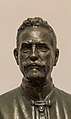
- Nomination Archduke Eugen von Österreich (1863-1954), last curator of the Academy from the monarchy. Bust from Karl Stemolak (1963) --Hubertl 01:12, 26 March 2015 (UTC)
- Promotion Good quality.--Johann Jaritz 04:09, 26 March 2015 (UTC)
-

- Nomination Black lory (Chalcopsitta atra), Gembira Loka Zoo, Yogyakarta Crisco 1492 00:08, 26 March 2015 (UTC)
- Promotion
 Support Good quality.--Johann Jaritz 04:18, 26 March 2015 (UTC)
-

- Nomination Little corella (Cacatua sanguinea), Gembira Loka Zoo, Yogyakarta Crisco 1492 00:08, 26 March 2015 (UTC)
- Promotion Support Good quality.--Johann Jaritz 04:16, 26 March 2015 (UTC)
-

- Nomination De Dion Bouton built in 1908 at Oldtimer Festival 2007 on Nürburgring -- Spurzem 22:33, 25 March 2015 (UTC)
- Promotion Good quality. --Livioandronico2013 23:27, 25 March 2015 (UTC)
-

- Nomination Rear of a De Dion Bouton from 1908 light-- Spurzem 22:33, 25 March 2015 (UTC)
- Promotion Good quality. --Livioandronico2013 23:27, 25 March 2015 (UTC)
-

-

- Nomination Portal of the Church of São Julião, Setúbal, Portugal. Alvesgaspar 21:48, 25 March 2015 (UTC)
- Promotion Good quality. --Crisco 1492 00:13, 26 March 2015 (UTC)
-
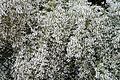
- Nomination Retama monosperma (Bridal veil broom) in flower -- Alvesgaspar 21:48, 25 March 2015 (UTC)
- Promotion Good quality. --Crisco 1492 00:13, 26 March 2015 (UTC)
-

- Nomination Church of San Xulián de Moraime. Muxía. Galicia (Spain). --Lmbuga 21:36, 25 March 2015 (UTC)
- Promotion Good quality.--PIERRE ANDRE LECLERCQ 22:02, 25 March 2015 (UTC)
-

-

- Nomination San Xulián de Moraime. Muxía. Galicia (Spain).-2 --Lmbuga 21:36, 25 March 2015 (UTC)
- Promotion Good quality. --Livioandronico2013 22:17, 25 March 2015 (UTC)
-

- Nomination Wayside cross in Muxía, Galicia (Spain). --Lmbuga 21:36, 25 March 2015 (UTC)
- Promotion Good quality. --Livioandronico2013 22:17, 25 March 2015 (UTC)
-

- Nomination Great tit, Parus major, Lancashire, UK. --Baresi franco 21:29, 25 March 2015 (UTC)
- Promotion Support Nice--Lmbuga 21:38, 25 March 2015 (UTC)
-

- Nomination Chapel of Catherine of Siena in Santa Sabina --Livioandronico2013 20:26, 25 March 2015 (UTC)
- Promotion Good quality. --Isiwal 00:34, 26 March 2015 (UTC)
-

- Nomination Chapel of Catherine of Siena in Santa Sabina --Livioandronico2013 20:25, 25 March 2015 (UTC)
- Promotion Good quality. --Hubertl 21:18, 25 March 2015 (UTC)
-
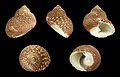
- Nomination Shell of a Canal Monodont, Monodonta canalifera --Llez 20:01, 25 March 2015 (UTC)
- Promotion Good quality. --Livioandronico2013 20:27, 25 March 2015 (UTC)
-

- Nomination Joseph von Sonnenfels, bust(white marble) in the Arkadenhof of the University of Vienna, (Maisel# 4 ). Artist: Alois Düll (1843-1900), unveiled 1891. By Hubertl --XRay 19:11, 25 March 2015 (UTC)
- Promotion Good quality. --Livioandronico2013 20:30, 25 March 2015 (UTC)
-

-

-

-

-

- Nomination Warthogs (Phacochoerus africanus) males, Tswalu Kalahari Reserve, South Africa --Charlesjsharp 18:41, 25 March 2015 (UTC)
- Promotion Good quality. --XRay 19:13, 25 March 2015 (UTC)
-

- Nomination Warthogs (Phacochoerus africanus) male, Tswalu Kalahari Reserve, South Africa --Charlesjsharp 18:41, 25 March 2015 (UTC)
- Promotion Good quality. --Óðinn 19:03, 25 March 2015 (UTC)
-

- Nomination Meerkats (Suricata suricatta), Tswalu Kalahari Reserve, South Africa --Charlesjsharp 18:41, 25 March 2015 (UTC)
- Promotion Support --Halavar 20:23, 25 March 2015 (UTC)
-

- Nomination Chania Gate, Heraklio, Crete. --C messier 17:41, 25 March 2015 (UTC)
- Promotion Good quality.--Famberhorst 18:27, 25 March 2015 (UTC)
-

-

- Nomination The Garibaldi Barracks, Milan. --Óðinn 16:19, 25 March 2015 (UTC)
- Promotion Good quality.--Famberhorst 16:48, 25 March 2015 (UTC)
-

- Nomination Copy of a Roman relief, Brera Academy, Milan. --Óðinn 16:19, 25 March 2015 (UTC)
- Decline Sorry,unsharp --Livioandronico2013 20:30, 25 March 2015 (UTC)
-

- Nomination Oak (Quercus) in decline. Location Natuurterrein The Famberhorst.
Famberhorst 16:09, 25 March 2015 (UTC) - Promotion Good quality. --Livioandronico2013 20:30, 25 March 2015 (UTC)
- Nomination Oak (Quercus) in decline. Location Natuurterrein The Famberhorst.
-
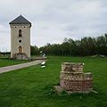
- Nomination Villeneuve d'Ascq, Musée de Plein air pigeonnier de Frethun.--PIERRE ANDRE LECLERCQ 14:18, 25 March 2015 (UTC)
- Promotion Good quality. --Livioandronico2013 20:30, 25 March 2015 (UTC)
-

- Nomination Villeneuve d'Ascq, Musée de Plein air Forges d' Hondschoote.--PIERRE ANDRE LECLERCQ 14:13, 25 March 2015 (UTC)
- Promotion Support Good quality.--Johann Jaritz 14:57, 25 March 2015 (UTC)
-

-

-
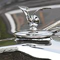
- Nomination Hood ornament of Horch automobiles in 1936 -- Spurzem 12:29, 25 March 2015 (UTC) Verbessere mich mit einem guten Argument: Ich meine, das Bild wäre besser, wenn man es gerade richtet.--Hubertl 12:59, 25 March 2015 (UTC)
Was soll geradegerichtet werden? Ich sehe den Kühlerverschluss waagerecht. -- Spurzem 15:17, 25 March 2015 (UTC) * Comment ich hab jetzt genau nachgeschaut, es muss tatsächlich um 1,3° nach links gedreht werden, damit es gerade ist.--Hubertl 15:55, 25 March 2015 (UTC)
Jetzt in Ordnung? -- Spurzem 20:41, 25 March 2015 (UTC) - Promotion Jetzt ist es perfekt! Denn es ist nämlich ein ganz außerordentlich gelungenes Bild! --Hubertl 21:16, 25 March 2015 (UTC)
- Nomination Hood ornament of Horch automobiles in 1936 -- Spurzem 12:29, 25 March 2015 (UTC) Verbessere mich mit einem guten Argument: Ich meine, das Bild wäre besser, wenn man es gerade richtet.--Hubertl 12:59, 25 March 2015 (UTC)
-

- Nomination Karltinden, Troms, Norway, 2014 August --Ximonic 12:19, 25 March 2015 (UTC)
- Promotion Good quality.--PIERRE ANDRE LECLERCQ 15:54, 25 March 2015 (UTC)
-

- Nomination Lille Piggtinden, Troms, Norway, 2014 July --Ximonic 12:19, 25 March 2015 (UTC)
- Promotion Support Good quality.--Johann Jaritz 13:01, 25 March 2015 (UTC)
-
-

- Nomination Ring flash Aputure LED HALO HN100 --Jacek Halicki 10:08, 25 March 2015 (UTC)
- Promotion Good quality. --Smial 11:26, 25 March 2015 (UTC)
-

- Nomination Former evangelical church in Ludwikowice Kłodzkie 1 --Jacek Halicki 10:08, 25 March 2015 (UTC)
- Promotion Good quality.--Johann Jaritz 12:59, 25 March 2015 (UTC)
-
- Nomination Former evangelical church in Ludwikowice Kłodzkie 2 --Jacek Halicki 10:08, 25 March 2015 (UTC)
- Promotion Good quality. --Cccefalon 10:58, 25 March 2015 (UTC)
-

- Nomination Former evangelical church in Ludwikowice Kłodzkie 3 --Jacek Halicki 10:08, 25 March 2015 (UTC)
- Promotion Good. --Ximonic 11:05, 25 March 2015 (UTC)
-

- Nomination Nakkefjellet mountain massif seen from Kjosen fjord, Troms, Norway, 2014 August --Ximonic 10:00, 25 March 2015 (UTC)
- Promotion Support Good quality.--Johann Jaritz 12:57, 25 March 2015 (UTC)
-

- Nomination Quarry in Fornes by Kjosen fjord in Troms, Norway in 2014 August --Ximonic 10:00, 25 March 2015 (UTC)
- Promotion Good quality. --Crisco 1492 00:18, 26 March 2015 (UTC)
-

-

-

-

-

- Nomination Franz Anton Felix Edler von Zeiller, bust(white marble) in the Arkadenhof of the University of Vienna --Hubertl 08:05, 25 March 2015 (UTC)
- Promotion Support Good quality.--Johann Jaritz 12:50, 25 March 2015 (UTC)
-

- Nomination Hans Kelsen (1881-1973), bust (dark bronce) in the Arkadenhof of the University of Vienna --Hubertl 08:05, 25 March 2015 (UTC)
- Promotion QI for me.--Johann Jaritz 12:50, 25 March 2015 (UTC)
-

- Nomination Raw milk Reblochon colombière from Stans, Aargau - Maître fromager affineur Rolf Beeler --Hubertl 08:05, 25 March 2015 (UTC)
- Promotion Support That`s unfair! Having to pay a close look at this tasty cheese and not being able to try it. Anyway good quality.--Johann Jaritz 12:54, 25 March 2015 (UTC)
-

- Nomination Churchill Place. Mattbuck 07:42, 25 March 2015 (UTC)
- Promotion Good quality.--Johann Jaritz 07:50, 25 March 2015 (UTC)
-

- Nomination Subsidiary church Saint Matthew at Lind, Griffen, Carinthia, Austria --Johann Jaritz 07:30, 25 March 2015 (UTC)
- Promotion Good quality. --Isiwal 08:25, 25 March 2015 (UTC)
-

- Nomination Painting of Saint Christopher at the subsidiary church Saint Matthew at Lind, Griffen, Carinthia, Austria --Johann Jaritz 07:29, 25 March 2015 (UTC)
- Promotion Good quality. --Ximonic 11:09, 25 March 2015 (UTC)
-

- Nomination Motorway bridge of the A2 across the Granitz valley at Goenitz, Sankt Paul im Lavanttal, Carinthia, Austria --Johann Jaritz 07:28, 25 March 2015 (UTC)
- Promotion Good quality. --Isiwal 08:25, 25 March 2015 (UTC)
-

- Nomination Subsidiary church Saints John and Paul at Gablern, Eberndorf, Carinthia, Austria --Johann Jaritz 07:26, 25 March 2015 (UTC)
- Promotion Good quality. --Hubertl 07:27, 25 March 2015 (UTC)
-

- Nomination Crucifix at the subsidiary church Saints John and Paul at Gablern, Eberndorf, Carinthia, Austria --Johann Jaritz 07:25, 25 March 2015 (UTC)
- Promotion Good quality. --Hubertl 07:27, 25 March 2015 (UTC)
-

- Nomination Due to heavy storm uprooted Spruce (Picea) grows through the upward side branches.
Famberhorst 05:42, 25 March 2015 (UTC) - Promotion Support Nice. Good quality.--Johann Jaritz 06:59, 25 March 2015 (UTC)
- Nomination Due to heavy storm uprooted Spruce (Picea) grows through the upward side branches.
-

- Nomination Budding leaves of hawthorn (Crataegus). Location Natuurterrein The Famberhorst.
Famberhorst 05:42, 25 March 2015 (UTC) - Promotion Good quality. --Cccefalon 05:47, 25 March 2015 (UTC)
- Nomination Budding leaves of hawthorn (Crataegus). Location Natuurterrein The Famberhorst.
-

- Nomination Universiti Teknologi Mara, Campus Sabah, Kota Kinabalu; Student Dorm (Women) --Cccefalon 05:39, 25 March 2015 (UTC)
- Promotion Good quality.--Famberhorst 05:49, 25 March 2015 (UTC)
-

- Nomination Florence, Italy: Ponte Vecchio, seen from Piazzale Michelangelo --Cccefalon 05:39, 25 March 2015 (UTC)
- Promotion Support Wonderful place. Superb quality.--Johann Jaritz 07:02, 25 March 2015 (UTC)
-

- Nomination Shilin, Yunnan, China: Stone forest, a set of Karst Limestone rock formations. Part of the UNESCO South China Karst World Heritage Site. --Cccefalon 05:39, 25 March 2015 (UTC)
- Promotion Support Wow! Good quality.--Johann Jaritz 07:03, 25 March 2015 (UTC)
-

-

-

- Nomination The Canal du Midi. Vias, Hérault, France. --Christian Ferrer 05:33, 25 March 2015 (UTC)
- Promotion Nice.--Famberhorst 05:46, 25 March 2015 (UTC)
-

- Nomination Screws, tool shed of the Quarzwerke in Sythen, Haltern, North Rhine-Westphalia, Germany --XRay 04:36, 25 March 2015 (UTC)
- Promotion Support --Christian Ferrer 05:35, 25 March 2015 (UTC)
-

-
- Nomination Launching rescue helicopter, Juist, Lower Saxony, Germany --XRay 04:36, 25 March 2015 (UTC)
- Withdrawn
 I withdraw my nomination Sorry, not really QI. --XRay 11:44, 25 March 2015 (UTC)
-
-

-

-

- Nomination Kalahari scrub robin (Cercotrichas paena), Tswalu Kalahari Reserve, South Africa --Charlesjsharp 21:32, 24 March 2015 (UTC)
- Withdrawn Sorry,Below minimum size requirement! --Livioandronico2013 21:36, 24 March 2015 (UTC) I withdraw my nomination Will resubmit in due course with larger file. --Charlesjsharp 18:32, 25 March 2015 (UTC)
-

-

- Nomination 153s at Patchway. Mattbuck 08:04, 24 March 2015 (UTC)
- Promotion Good quality.--PIERRE ANDRE LECLERCQ 15:51, 25 March 2015 (UTC)
-

- Nomination Cabo de Santa Maria in Boa Vista, Cape Verde in 2010 December --Ximonic 06:28, 24 March 2015 (UTC)
- Promotion Good quality.--PIERRE ANDRE LECLERCQ 15:46, 25 March 2015 (UTC)
-
- Nomination Statue of Jesus out of Church of St. Alphonsus Liguori, Roma --Livioandronico2013 21:26, 22 March 2015 (UTC)
- Promotion Main object sharp, OK for QI --Isiwal 08:30, 25 March 2015 (UTC)
-

- Nomination Echternach-Luxemburg, chapel --Michielverbeek 20:37, 22 March 2015 (UTC)
- Promotion Good quality.--PIERRE ANDRE LECLERCQ 15:26, 25 March 2015 (UTC)
-

- Nomination Barracks Caporal Trésignies in Charleroi. Protected heritage site. --Jmh2o 12:02, 22 March 2015 (UTC)
- Promotion Good quality.--PIERRE ANDRE LECLERCQ 15:30, 25 March 2015 (UTC)
-

- Nomination Solar eclipse 20.03.2015 in Kłodzko --Jacek Halicki 10:24, 22 March 2015 (UTC)
- Decline This is a long way from QI. No detail anywhere. --Mattbuck 17:55, 25 March 2015 (UTC)
-

- Nomination Kunming, Yunnan, China: Jinrilou - Southern gate of old Kunming. --Cccefalon 07:10, 22 March 2015 (UTC)
- Promotion Good quality.--PIERRE ANDRE LECLERCQ 15:05, 25 March 2015 (UTC)
-

-

- Nomination Dome of Santa Maria delle Grazie, Milan. --Óðinn 16:36, 20 March 2015 (UTC)* Comment Severe CA problems, I hope its fixable. --Hubertl 18:48, 20 March 2015 (UTC)
- Withdrawn I withdraw my nomination tried to fix, but not happy with the result.--Óðinn 01:53, 26 March 2015 (UTC)
- Nomination Dome of Santa Maria delle Grazie, Milan. --Óðinn 16:36, 20 March 2015 (UTC)*
-

- Nomination: Haus Alst, Horstmar, North Rhine-Westphalia, Germany --XRay 04:36, 20 March 2015 (UTC)
- Review needed
-
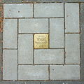
- Nomination: Stolperstein, Bonn, Germany (by Reinhardhauke).--Leit 16:40, 19 March 2015 (UTC)
- Review needed
-
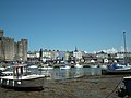
- Nomination: Harbwr Caernarfon Harbour, Gwynedd, North Wales, by User:Lesbardd --Llywelyn2000 14:38, 19 March 2015 (UTC)
- Review needed
-

- Nomination: Hangzhou East Railway Station --Good afternoon 13:16, 19 March 2015 (UTC)
- Review needed
-
-

-

- Nomination: Stingray skin wallet, open --Crisco 1492 00:42, 19 March 2015 (UTC)* Comment this is not a stingray skin, this is from a phyton.--Hubertl 07:04, 19 March 2015 (UTC)
Then the box lied (and such a shame, too... it was a nice birthday present). Renamed.Crisco 1492 11:26, 19 March 2015 (UTC) - Review needed
- Nomination: Stingray skin wallet, open --Crisco 1492 00:42, 19 March 2015 (UTC)*
-

-

- Nomination: Honda RR250 of 1972, Helsinki, Finnland --Poco a poco 21:09, 18 March 2015 (UTC)
- Review The front wheel is too bright. -- Spurzem 21:54, 18 March 2015 (UTC)
 New version Poco a poco 18:19, 19 March 2015 (UTC)
-

-

-

-

-

- Nomination detail of the "Gortyn Code", Gortys, Crete, Grece. See Boustrophedon--Jebulon 20:24, 17 March 2015 (UTC)
- Promotion nice detail all around --Daniel Case 05:59, 25 March 2015 (UTC)
-

- Nomination Bus in Poitiers --Billy69150 16:56, 17 March 2015 (UTC)
- Promotion Another well-captured French bus --Daniel Case 05:59, 25 March 2015 (UTC)
-
-

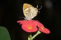
- Nomination Whirlabout butterfly (Polites vibex praeceps) mating, Tobago --Charlesjsharp 15:16, 17 March 2015 (UTC)
- Promotion More great Wikipedia insect pr0n! Seriously, nice detail work --Daniel Case 05:59, 25 March 2015 (UTC)
-

- Nomination Sundown at lake in Steinwedel --Hydro 08:07, 17 March 2015 (UTC)
- Promotion Good sunset detail --Daniel Case 05:59, 25 March 2015 (UTC)
-

- Nomination Main fassade of the Parish Church of Urtijëi, built in the second half of the 18th century --Moroder 07:56, 17 March 2015 (UTC)
- Decline Nice detail, but noticeable CA on roof --Daniel Case 05:59, 25 March 2015 (UTC)
-

-

-
-

- Nomination Russischer Bär - Euplagia quadripunctaria --Hockei 20:21, 16 March 2015 (UTC)
- Promotion Maybe you should chose only one or two, I'm not sure we need four pictures of the same.--Jebulon 12:35, 17 March 2015 (UTC)
You're right the pictures are quite or too similar but not equal. The details and size are a bit different. So I couldn't decide and uploaded all four I have. I'll see the next time. --Hockei 16:27, 17 March 2015 (UTC) Support --Christian Ferrer 05:37, 25 March 2015 (UTC)
-
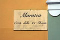
- Nomination Plaque - Maratea - Italy --Jbribeiro1 01:26, 13 March 2015 (UTC) Comment Technically, quality is OK for QI, but please, improve description. What is that plaque showing? --C messier 12:50, 20 March 2015 (UTC) Done. The sign boasts one the best known epiteths for Maratea: "The city with 44 churches". Jbribeiro1 23:34, 20 March 2015 (UTC)
Bit of CA in the top right. Mattbuck 12:47, 21 March 2015 (UTC) - Decline
 Not done --Mattbuck 17:49, 25 March 2015 (UTC)
- Nomination Plaque - Maratea - Italy --Jbribeiro1 01:26, 13 March 2015 (UTC)
-

- Nomination View from the Erebuni Fortress. Erebuni District. Yerevan, Armenia. --Halavar 10:05, 12 March 2015 (UTC)
Tilt/perspective issues. Mattbuck 22:48, 19 March 2015 (UTC) Done New fixed version (also with better crop) uploaded. Please take a look again. --Halavar 01:07, 23 March 2015 (UTC)
Better, but left side still leaning out. Mattbuck 19:17, 23 March 2015 (UTC) Done Hope it's good now. --Halavar 22:17, 23 March 2015 (UTC) - Promotion Not the best but ok for QI. --Mattbuck 17:47, 25 March 2015 (UTC)
- Nomination View from the Erebuni Fortress. Erebuni District. Yerevan, Armenia. --Halavar 10:05, 12 March 2015 (UTC)
-
-

- Nomination Cerdanyola del Vallès, Catalunya --Ralf Roletschek 06:40, 12 March 2015 (UTC)
Pretty clearly tilted. Mattbuck 22:48, 19 March 2015 (UTC) - Decline Not done --Mattbuck 17:47, 25 March 2015 (UTC)
- Nomination Cerdanyola del Vallès, Catalunya --Ralf Roletschek 06:40, 12 March 2015 (UTC)
-

- Nomination Virgen del Carmen, the child and the souls in hell. Church of Bethlem, Barcelona -- Alvesgaspar 09:30, 11 March 2015 (UTC) Comment Can you get the crop symmetrical? --C messier 15:23, 19 March 2015 (UTC) -- Done You are right, thanks Alvesgaspar 20:55, 19 March 2015 (UTC)
Left side is leaning in, generally not sharp enough. Mattbuck 22:45, 19 March 2015 (UTC) - Decline Not done --Mattbuck 17:43, 25 March 2015 (UTC)
- Nomination Virgen del Carmen, the child and the souls in hell. Church of Bethlem, Barcelona -- Alvesgaspar 09:30, 11 March 2015 (UTC)


,_Gembira_Loka_Zoo,_Yogyakarta_2015-03-15_03.jpg)
,_Gembira_Loka_Zoo,_Yogyakarta,_2015-03-15_04.jpg)
.jpg)
.jpg)
_Petroleumlampe.jpg)


_-_bust_in_the_Arkadenhof,_University_of_Vienna_-_0207.jpg)


_young_males_eyeballing.jpg)
_male.jpg)
_Tswalu.jpg)


_in_verval._Locatie,_Natuurterrein_De_Famberhorst_02.jpg)


_Horch_853,_Bj._1936,_K%C3%BChlerfigur.JPG)


_-_Bust_in_the_Arkadenhof,_University_of_Vienna_-_0215.jpg)
_-_Bust_in_the_Arkadenhof,_University_of_Vienna_-_0290.jpg)


._Locatie,_Natuurterrein_De_Famberhorst_04.jpg)
._Locatie,_Natuurterrein_De_Famberhorst_02.jpg)


.jpg)
.jpg)
.jpg)


.jpg)
_mating.jpg)


.JPG)
.jpg)


Consensual review edit
File:Stone bull's head rhyton archmus Heraklion.jpg edit

- Nomination The stone bull's head rhyton, archaeological museum of Heraklion, Crete, Greece.--Jebulon 09:29, 24 March 2015 (UTC)
- Promotion
![]() SupportGood quality. --Livioandronico2013 09:40, 24 March 2015 (UTC)
SupportGood quality. --Livioandronico2013 09:40, 24 March 2015 (UTC)
* Sorry Jebulon, WB is off. IMHO, it (the stone head) is too blue/green. --C messier 12:21, 25 March 2015 (UTC)
![]() Oppose
Oppose
- Comment Sorry to disagree, C messier. The background is very blue and cold in real, and there are a lot of blue/green reflections on the subject. I'll try to change, but only a little.--Jebulon 17:12, 26 March 2015 (UTC)
- I used the horns as reference. --C messier 17:19, 26 March 2015 (UTC)
- Done for you ! --Jebulon 17:29, 26 March 2015 (UTC)
- Support OK now the blue/green background doesn't help --C messier 17:45, 26 March 2015 (UTC)
- Thx.The original bg was very ugly and dirty, with reflections of the glass. But it is blue/green... And I had some blue/green reflections on the object itself, I hope you understand.--Jebulon 19:33, 26 March 2015 (UTC)
The only opposer change one's mind --Livioandronico2013 22:33, 27 March 2015 (UTC)
- Support Good quality.--PIERRE ANDRE LECLERCQ 22:35, 27 March 2015 (UTC)
Running total: 2 support (excluding the nominator), 0 oppose → Promote? --Hubertl 02:20, 27 March 2015 (UTC)
File:Žemaičių Kalvarija Church 2, Lithuania - Diliff.jpg edit

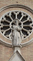
- Nomination Žemaičių Kalvarija Church. Lithuania. (by Diliff) --Pofka 17:48, 8 March 2015 (UTC)
Could you increase the top end contrast? There seems to be a loss of detail due to brightness. Mattbuck 19:20, 15 March 2015 (UTC) - Decline Not done --Mattbuck 12:18, 21 March 2015 (UTC)
- Support All details are clearly visible. --Palauenc05 19:16, 21 March 2015 (UTC)
 Oppose I agree with Mattbuck. The westwork is too bright so that the lesenes don't contrast with the wall. -- Spurzem 19:55, 22 March 2015 (UTC)
- Oppose too bright --Σπάρτακος 12:41, 24 March 2015 (UTC)
- Support Quality to me. Some seem a little too nit picky. Bsmalley 02:50, 28 March 2015 (UTC)
Running total: 2 support (excluding the nominator), 2 oppose → More votes? --Hubertl 13:59, 26 March 2015 (UTC)
File:De_Soto_Club_Coupe_de_1948,_Helsinki,_Finlandia,_2012-08-14,_DD_01.JPG edit

- Nomination De Soto Club Coupe of 1948, Helsinki, Finnland --Poco a poco 09:16, 8 March 2015 (UTC)
- Promotion Support QI for me --Halavar 09:46, 8 March 2015 (UTC) Oppose Sorry. But is no QI for me because of the very short lense. Further the car is too bright in front and a bit noisy. Please discuss. -- Spurzem 10:21, 8 March 2015 (UTC)
 NeutralBetter --Livioandronico2013 20:04, 8 March 2015 (UTC)
 - Support QI for me --PIERRE ANDRE LECLERCQ 15:13, 13 March 2015 (UTC)
- Oppose As for Spurzem. Too noisy for an object that can not run away, unsufficiant perspective. -- Smial 14:42, 16 March 2015 (UTC)
- Support Something in me say: This distorted image shows exactly the bullyish and typical character of this car: "Get lost when I come!"--Hubertl 15:42, 24 March 2015 (UTC)
Running total: 3 support (excluding the nominator), 2 oppose → Promote? --Hubertl 01:27, 16 March 2015 (UTC)