Commons:Graphic Lab/Illustration workshop/Archive/2012

Flag request edit
Request: Please make this flag into SVG high quality version Drax90 (talk) 13:56, 1 June 2011 (UTC)
Graphist opinion(s):![]() Request taken by Fred the Oyster
Request taken by Fred the Oyster
- Not sure why you didn't mention that you uploaded File:Flag of The Holy Empire of Britannia.svg... AnonMoos (talk) 14:25, 7 December 2011 (UTC)
Coat of arm of "State Forestry Corps" edit
Request: I want to ask if you could create a high-quality vector version of this image:
Greetings! Angelus (talk) 03:09, 1 June 2011 (UTC)
Graphist opinion(s):
Coat of arm of "Vigili del Fuoco" edit
Request: I want to ask if you could create a high-quality vector version of this image:
P.S. Dragon and crown should be golden. Let me know. Greetings! Angelus (talk) 03:09, 1 June 2011 (UTC)
Graphist opinion(s):
Argentine Confederation edit
-
 Coat of Arms of the Argentine Confederation

Request: Is it possible to make a .svg coat of arms with this design? Cambalachero (talk) 03:07, 9 June 2011 (UTC)
Graphist opinion(s):Sure it's possible. Is all you want a .svg? Nothing more than that? Joe Gazz84 (talk) 14:28, 20 June 2011 (UTC)
- Yes, I guess it's an easy request, but my previous attempts with SVG images have always been a disaster, and I never managed to do anything worth uploading. Cambalachero (talk) 19:01, 20 June 2011 (UTC)
SVG subscript problem edit
-
 Graph
Graph

Request: I tried to convert PNG file into SVG (at least text) using Inkscape and i have problem with subscript. First attempt is straight from Inkscape, second simplified in Notepad. But in both cases it looks OK in Inkscape but not in brower or commons png preview. Jklamo (talk) 23:28, 21 June 2011 (UTC)
Graphist opinion(s):
It comes from nesting a <tspan>...</tspan> within another <tspan>...</tspan>, something which should be avoided (and which is annoying to try to fix). By the way, most of that SVG is non-vector... AnonMoos (talk) 03:35, 22 June 2011 (UTC)
- Thanks, it looks OK now in browser SVG renderers (i tried 3), but commons png preview is still not OK. --Jklamo (talk) 19:30, 26 June 2011 (UTC)
- I'd converted text to path. Is it allright now?? --Robot8A (talk) 15:49, 25 August 2011 (UTC)
- The text is the least of your problems when the SVG has a raster image embedded in it. Try removing the raster image then see how the renderer then deals with any text. --Fred the Oyster (talk) 17:26, 25 August 2011 (UTC)
- I'd converted text to path. Is it allright now?? --Robot8A (talk) 15:49, 25 August 2011 (UTC)
Commons process icons edit
I'd like to have some good icons, in a consistent set, which represent different Commons processes. I think this would be helpful to make policy and help clearer, particularly from the point of view of users whose first language is not English, since consistent use of these icons would make it easier grasp what's going on.
Request: Icon set Rd232 (talk) 16:32, 30 June 2011 (UTC)
Graphist opinion(s): Have you tried looking for icons at the Nuvola project? NikNaks talk - gallery - wikipedia 07:22, 5 July 2011 (UTC)
- I've looked around Commons at different icons available, yes. Nothing really suitable. Rd232 (talk) 09:02, 5 July 2011 (UTC)
- That icon set is perhaps the most complete. Which additional icons do you need? NikNaks talk - gallery - wikipedia 15:56, 5 July 2011 (UTC)
- Well, to start with I was thinking a consistent style set for the 3 types of deletion process: speedy (i.e. more or less immediate), ordinary by discussion, and "deletion tagging" (delete if tagged for 7 days). Rd232 (talk) 18:06, 5 July 2011 (UTC)
- That icon set is perhaps the most complete. Which additional icons do you need? NikNaks talk - gallery - wikipedia 15:56, 5 July 2011 (UTC)
Hydrogen spectrum edit
-
 Spectral lines of hydrogen on a logarithmic length scale
Request: Colors are important for spectra, and at present these in w:Hydrogen spectral series are confusing. Currently the lines are colored by spectral series, but that information could be conveyed by different line heights for each series. The lines from the "visible" portion should be from the actual visible light Hydrogen spectrum[1] (not black as they all are now) with violet-to-blue on the left and red on the right. I recommend that all the ultraviolet lines on the far left be in color #0088aa dark violet-cyan and all the infrared lines on the middle to right be #aa220 dark red-brown. The important part is to make sure invisible light does not appear to be spectral colors, but the two different sets in ultraviolet and infrared should at least be darkish and seem similar to violet and red.
The nearest ultraviolet lines are shown as visible, which is either a mistake, or a borderline mistake because they are technically visible but relatively faint. Someone who knows the frequency response of the human eye should figure that out, please.
Finally, the emission spectra should be depicted on a black background with white text. 99.24.223.58 22:41, 11 July 2011 (UTC)
Graphist opinion(s):
Coat of Maldonado edit
-
 Coat of Arms of the Department of Maldonado, Uruguay.

Request: Hi, could someone please make a SVG version of the coat, notice that there are huge differences between one coat and another, thanks in advance. Kineto (talk) 22:31, 19 July 2011 (UTC)
Graphist opinion(s):
Signature edit
Article(s): en:John Edward Bush, en:Hiram Bingham II
Request: Victorize these signatures please...--KAVEBEAR (talk) 06:48, 25 September 2011 (UTC)
Graphist opinion(s): The John E. Bush signature is too small and of extremely poor quality; vectorization from this sample is not possible —Quicksilver@ 10:45, 16 December 2011 (UTC)
Personal Standard of Pomare IV edit
en:File:Personal Standard of Pomare IV.gif
Article(s): en:Pōmare IV, en:Kingdom of Tahiti
Request: Can someone vectorize this flag, make it larger, and upload it to the commons... KAVEBEAR (talk) 05:52, 30 August 2011 (UTC)
Graphist opinion(s):
Flag of Hawaii edit
.svg)
Article(s): en:Flag of Hawaii
Request: Create all with union jack at same palace and same proportion 1. nine stripe flag that goes white, red, blue, 2. & 3. two seven stripe flags is white, red, blue and red, white, blue. 4. and 5. red and white stripe flags with no blue stripe. 6. and 7. white and red stripe flags with no blue stripe.
Stick with the exact color as the version above. The first image should be called File:Flag of Hawaii 1818 variant.svg and I don't care about the title of the others. KAVEBEAR (talk) 06:13, 29 July 2011 (UTC)
- Also I don't known the exact position of the Union jack on the seven stripe version. Is it five stripe down or four stripe down? So either someone should find out or create different versions.--KAVEBEAR (talk) 07:10, 29 July 2011 (UTC)
- Also if anybody is wondering why. I'm not making these things up. They were actually observed by visiting sea captains and explorers in from 1816 to 1845.--KAVEBEAR (talk) 07:10, 29 July 2011 (UTC)
Graphist opinion(s):
Buryatia-geo-stub logo edit

Request: Fix some borders and match the colors of file:flag of Buryatia.svg. 112.202.106.232 01:30, 26 November 2011 (UTC)
Graphist opinion(s): Fixed colours per request, I don't see what's wrong with the borders though. Fry1989 eh? 02:11, 26 November 2011 (UTC)
- Just an FYI. If just changing colours in a SVG, it is far better done in a text editor using search and replace, instead of using Inkscape to add 25%-50% of bloat. --Fred the Oyster (talk) 10:35, 26 November 2011 (UTC)
- Not to mention often creating bogus conflicting color specifications, as currently in Image:Syria-flag-changes.svg, and notoriously formerly at Image:Gay flag.svg... AnonMoos (talk) 16:31, 26 November 2011 (UTC)
- Anonmoos, let it go. You're as bitter as a lemon about that. Fry1989 eh? 19:50, 29 November 2011 (UTC)
- Maybe you should learn a little bit more about the SVG format, so that you wouldn't commit such blunders. AnonMoos (talk) 01:44, 3 December 2011 (UTC)
- And maybe if you didn't address me like a child, I wouldn't ignore you. Fry1989 eh? 01:46, 3 December 2011 (UTC)
- Maybe you should learn a little bit more about the SVG format, so that you wouldn't commit such blunders. AnonMoos (talk) 01:44, 3 December 2011 (UTC)
- Anonmoos, let it go. You're as bitter as a lemon about that. Fry1989 eh? 19:50, 29 November 2011 (UTC)
- Not to mention often creating bogus conflicting color specifications, as currently in Image:Syria-flag-changes.svg, and notoriously formerly at Image:Gay flag.svg... AnonMoos (talk) 16:31, 26 November 2011 (UTC)
WikiProject logos Spanish versions? edit
Hi! Would anyone mind making Spanish versions of the following images?:
-
 Just replace "WikiProject United States" with "Wikiproyecto Estados Unidos"
 -

-
 Wikiproyecto Perú
 -

 Done
Done -
 Wikiproyecto Chile
 -
 Done
Done -
 Wikiproyecto Bolivia
 -
 Done
Done


.svg)
Thanks WhisperToMe (talk) 11:54, 17 December 2011 (UTC)
- Chile done: --Fred the Oyster (talk) 12:56, 19 December 2011 (UTC)
- Thank you so much! I look forward to seeing the other three :) WhisperToMe (talk) 14:53, 20 December 2011 (UTC)
- Thanks for getting Bolivia done! WhisperToMe (talk) 09:12, 22 December 2011 (UTC)
- Thank you so much! I look forward to seeing the other three :) WhisperToMe (talk) 14:53, 20 December 2011 (UTC)
- Peru done. --Fred the Oyster (talk) 12:45, 23 December 2011 (UTC)
- Thank you! Just notified the Spanish Peru project that there is a new logo available :) WhisperToMe (talk) 01:43, 24 December 2011 (UTC)
- Niknaks, thank you very much for making the last one! WhisperToMe (talk) 00:57, 18 January 2012 (UTC)
- Thank you! Just notified the Spanish Peru project that there is a new logo available :) WhisperToMe (talk) 01:43, 24 December 2011 (UTC)
Graduated version of Abaque wulff.svg edit
-
 Abaque wulff.svg

Request: Hi everyone! I'd very much like to have a graduated version of Abaque wulff.svg. How the graduation should be can be seen on this file. I only need graduation in 10° steps from the center to the right (0° to 90°) along the horizontal line and the same outside the circle between the points E and S (the points themselves shouldn't be named). I intend to use this Abaque wulff graduated.svg in [2] in place of Abaque wulff.svg which is used at the moment. I'd like to try for myself but I don't even know how to save the svg to my computer (and then I'd need to learn how to edit svg files, which I'll have to do anyway someday). Thanks for your help. Perditax (talk) 08:31, 9 January 2012 (UTC)
Graphist opinion(s):
![]() Done: I also made the background of the original image transparent. Please mark this as resolved if completed satisfactorily. Gauravjuvekar (talk) 16:37, 14 January 2012 (UTC)
Done: I also made the background of the original image transparent. Please mark this as resolved if completed satisfactorily. Gauravjuvekar (talk) 16:37, 14 January 2012 (UTC)
- Please check the copy right(copyleft rather) info of the new file and make changes as needed. I'm not an expert in copyrights. Gauravjuvekar (talk) 16:54, 14 January 2012 (UTC)
- Thanks a lot, that's perfect! I corrected the graduation on the outside of the circle (first time I successfully edited a svg
 , I think I've found out how to download the file) and put the same license info as the original file - I'm no expert either but I did the same as for derivative works. Perditax (talk) 21:43, 14 January 2012 (UTC)
- Thanks a lot, that's perfect! I corrected the graduation on the outside of the circle (first time I successfully edited a svg
- Please check the copy right(copyleft rather) info of the new file and make changes as needed. I'm not an expert in copyrights. Gauravjuvekar (talk) 16:54, 14 January 2012 (UTC)


Request: The new naval ensign is confirmed, but the new flag in the canton needs a fix. The proportion of the ensign overall is right, but the national flag will have to be changed to fit in it's canton properly. Fry1989 eh? 06:47, 12 January 2012 (UTC)
Graphist opinion(s): ![]() Done NikNaks talk - gallery - wikipedia 22:02, 13 January 2012 (UTC)
Done NikNaks talk - gallery - wikipedia 22:02, 13 January 2012 (UTC)
- Thank you! :) Fry1989 eh? 23:14, 13 January 2012 (UTC)
Bandeira do Leal Senado (Flag of Leal Senado) edit
-
The flag of the now extinct Leal Senado, which was the municipal chamber of the portuguese Municipality of Macau.
-
 A start

Request: Please create the Bandeira do Leal Senado.svg, based on these images: Flags of the World - Bandeiras do Concelho de Macau and Flag of Macau Municipality (Wikipedia). This flag is very relevant, because it represents the old Macau, the Macau governed by the portuguese... this flag is so representative that in the handover ceremony of Macau, this flag was used to represent the portuguese Macau (view more information in pt:Bandeira do Leal Senado (Macau)). AdriAg (talk) 23:15, 9 April 2011 (UTC)
Graphist opinion(s): I've made something as a basis for a complete version. It needs work on colours and the crown is also missing. Which crown should it be? NikNaks talk - gallery - wikipedia 18:28, 10 April 2011 (UTC)
- Here are some files you can use:
- File:Flag of Portuguese Colony Governor.svg: from here you can take the sphere and the cross to put above the angels' heads (can you check the cross's symmetry? It looks wrong to me.)
- File:Corona real abierta.svg: and here's the crown.
- Category:Angels in supporters: maybe you can find something here to save some time on the angels (wings?)
- Regards! -- Orionist ★ talk 20:30, 10 April 2011 (UTC)
- It also misses the eyes, mouth and other elements of the faces of the angels and the crosses in the clothes of the angels!! Hope that you guys can finish this flag as soon as possible!! Thank you!! AdriAg 15:48, 29 April 2011 (UTC)
- I've improved it some (apologies for the slight delay of almost eight months), but I still don't think it's perfect. More sources for the banners and columns would be wonderful. Otherwise, voila. NikNaks talk - gallery - wikipedia 15:34, 24 December 2011 (UTC)
- It also misses the eyes, mouth and other elements of the faces of the angels and the crosses in the clothes of the angels!! Hope that you guys can finish this flag as soon as possible!! Thank you!! AdriAg 15:48, 29 April 2011 (UTC)
Request for BR Portuguese translation edit
-
 Original English version (PNG)
 -
 Original English version (SVG)
Request: I would like to have this map translated into Brazilian Portuguese (and put in both PNG and SVG formats). AF447 had many Brazilian people on board, so Portuguese is an important language to consider. Thank you, WhisperToMe (talk) 22:00, 24 October 2011 (UTC)
graphist: I've added a translation tag to the SVG. You should be able to use that link to make the Portuguese version on your own. Jon C (talk) 16:00, 3 January 2012 (UTC)
-
 GIF version
 -
 JPG version
 -
 Done
Done


Request: Is there someone who would be willing to vectorize Croatian Navy's Emblem. Thnx in advanceEx13 (talk) 21:27, 14 November 2011 (UTC)
Graphist opinion(s):
Hexagonal Prism with crystallographic directions.svg edit

Request: Hello, I have a problem with this file, the minus signs on the direction indices are not placed correctly in different previews of commons, although it looks good when I edit the file on my computer (I also tried loading the file from commons and then edit it and it still looks ok with Inkscape). It should look like and . Can you fix this? Perditax (talk) 11:48, 22 January 2012 (UTC)
![{\displaystyle [10{\bar {1}}0]}](https://wikimedia.org/api/rest_v1/media/math/render/svg/0da6b56f118a0ab445a5da1de70bb02f6227eca6)
![{\displaystyle [01{\bar {1}}0]}](https://wikimedia.org/api/rest_v1/media/math/render/svg/51a5bd298351214f17d794649645313eb5c14425)
Graphist opinion(s): I've fixed it, thanks to the link below posted by Perhelion, thanks and sorry for the trouble. Perditax (talk) 08:11, 23 January 2012 (UTC)
![]() Done
Done
-
 Description of image
Request: Rasterizes w ugly black rectangle instead of words "слоевое сжигание" although original SVG looks good in Firefox and InkView. File maybe needs i18n (it's free replace of deleted File:Combustion systems for solid fuels.gif). Ignatus (talk) 15:17, 22 January 2012 (UTC) Found grammatic error, shall fix by myself.Ignatus (talk) 15:34, 22 January 2012 (UTC)
- Oh, I couldn't fix that rectangle! Help me please if you can! Ignatus (talk) 15:38, 22 January 2012 (UTC)
- Hello Ignatus, take a look at Help:SVG#Fonts!? -- πϵρήλιο ℗ 01:17, 23 January 2012 (UTC)
- It's just the standard old Inkscape "flowtext" nonsense, which I've fixed in at least a hundred SVG files on Commons so far... You can diagnose the problem at Commons:SVG Check. AnonMoos (talk) 10:13, 23 January 2012 (UTC)
- Thank you. people. I didn't know these pages.--Ignatus (talk) 13:29, 23 January 2012 (UTC)
- It's just the standard old Inkscape "flowtext" nonsense, which I've fixed in at least a hundred SVG files on Commons so far... You can diagnose the problem at Commons:SVG Check. AnonMoos (talk) 10:13, 23 January 2012 (UTC)
Fix English in diagram photo edit

Request: - Please change "survivors' sittings" to "seat locations of survivors" since the latter is a form that would be used by native English speakers Thank you WhisperToMe (talk) 03:40, 24 January 2012 (UTC)
![]() Done--overwritten--Gauravjuvekar (talk) 11:19, 24 January 2012 (UTC)
Done--overwritten--Gauravjuvekar (talk) 11:19, 24 January 2012 (UTC)
- Thank you very much :) WhisperToMe (talk) 11:52, 24 January 2012 (UTC)
Japanese version of diagram photo edit
-

-
 Japanese version
Request: - Please make a Japanese language version of this image. Here is what to put in...
- "seat locations of survivors" -> 生存者の座席
- "section A" "section B" etc. -> セクション A, セクション B etc.
- "row 60" and "row 54" -> 60列, 54列
Thank you, WhisperToMe (talk) 01:14, 26 January 2012 (UTC)
Graphist opinion(s): ![]() Done I've uploaded a ja version with your translations. I did use one of the installed fonts listed here (Kochi Gothic) and it displayed as sans-serif in Inkscape, but it's showing as a more serif font in the rendered image, not sure why, I don't know if that's a problem or not. On a side note there's an embedded image in the SVG file so it could do with some clean-up which I'll do when I get a spare minute. Ch1902 (talk) 15:14, 26 January 2012 (UTC)
Done I've uploaded a ja version with your translations. I did use one of the installed fonts listed here (Kochi Gothic) and it displayed as sans-serif in Inkscape, but it's showing as a more serif font in the rendered image, not sure why, I don't know if that's a problem or not. On a side note there's an embedded image in the SVG file so it could do with some clean-up which I'll do when I get a spare minute. Ch1902 (talk) 15:14, 26 January 2012 (UTC)
- Thank you very much WhisperToMe (talk) 18:08, 26 January 2012 (UTC)
English versions of diagrams edit
These documents are in Polish, but I would like to have English versions made.
-

-

-
 Done--File:Spoiny English.svg
 -


In the first two:
- Tokio -> Tokyo
- Góra Osutaka -> Mount Osutaka
- Miejsce eksplozji -> Site of explosive decompression
In the third:
- "Część A", "Część B" -> "Part A" and "Part B"
- "Prawidłowo wykonana naprawa" -> "Repairs carried out correctly"
- "Błędnie wykonana naprawa" -> "Repairs carried out incorrectly"
The fourth:
- "Pzegroda ciśnieniowa" -> "Rear pressure bulkhead"
Thank you, WhisperToMe (talk) 23:23, 26 January 2012 (UTC)
![]() Done--Gauravjuvekar (talk) 15:40, 27 January 2012 (UTC)
Done--Gauravjuvekar (talk) 15:40, 27 January 2012 (UTC)
- Thank you very much! WhisperToMe (talk) 16:08, 27 January 2012 (UTC)
South African flag edit
.svg)

.svg)
Request: It's time we get this done right, there's so many scaling issues when people try and do work with this flag. Can someone please properly put in the little flags (provided above) into the old South African flag? The Union Jack is reversed, so you will have to flip it around. The black border around all three flags is part of the design, so that it also a must. Fry1989 eh? 02:14, 30 January 2012 (UTC)
Graphist opinion(s):![]() Request taken by NikNaks
Okay, this is definitely more work than I'd anticipated! No worries, though. Working at it. However, surely the Union Jack should be 2-3 ratio like the others? There's a couple in that proportion on Commons, so it's not a problem, but I want to check. NikNaks talk - gallery - wikipedia 21:39, 30 January 2012 (UTC)
Request taken by NikNaks
Okay, this is definitely more work than I'd anticipated! No worries, though. Working at it. However, surely the Union Jack should be 2-3 ratio like the others? There's a couple in that proportion on Commons, so it's not a problem, but I want to check. NikNaks talk - gallery - wikipedia 21:39, 30 January 2012 (UTC)
- Yeah it's supposed to be the same ratio as the flag of Transvaal. I know it's a battle, but it's worth it to have it done right. I can't scale the flag or else it goes haywire and the three little flags shrink and disappear, and there's a lot of uses for this flag that are stopped dead in their tracks by that problem. Fry1989 eh? 21:44, 30 January 2012 (UTC)
- Righty ho. I don't like the way this 3x2 Union Flag is made, so I might end up rewriting it completely. On a bit of a Notepad rush at the minute! NikNaks talk - gallery - wikipedia 21:51, 30 January 2012 (UTC)
- How's that? NikNaks talk - gallery - wikipedia 18:16, 31 January 2012 (UTC)
- It still has scaling issues, but I can fix them myself by changing a couple properties, I believe. Let me play around for a moment, and we'll see. Still way better than it was before :) Fry1989 eh? 21:08, 31 January 2012 (UTC)
- Oh crap, you're gonna hate me, but you accidentally cut off the bottom white stripe from the File:Flag of the Orange Free State.svg, it's supposed to have 4 white stripes, not three. Can you please fix that, you can just put it in the same way you did before, and then I can change the properties so that scaling issues are resolved, and then we're good. Sorry. Fry1989 eh? 21:15, 31 January 2012 (UTC)
- Bollocks. I was working off the thumbnails (and hence couldn't see it). Whelp, I'll have to fix that tomorrow! Feel free to revert it to something more accurate in the meantime. NikNaks talk - gallery - wikipedia 21:32, 31 January 2012 (UTC)
- If it's any consolation, at least you only have to add one white stripe, and not completely redo all three flags again, but yeah, I make mistakes like that too so I know how annoying it can be. Anyhow, take your time, no rush. Fry1989 eh? 21:48, 31 January 2012 (UTC)
- I see you uploaded another version. If you let me know what the issue is, I can make a file that's much more efficient (like mine). NikNaks talk - gallery - wikipedia 09:22, 1 February 2012 (UTC)
- What I did was make every element a path. If you have them as strokes, and somebody tries to scale the flag, they go all wonky. You can try if you wish to make the file size smaller, but honestly I think we can live with the flag being only 9 kb, I've seen alot worse, like over 2 mb. Fry1989 eh? 20:29, 1 February 2012 (UTC)
- Nine when it could be under 2 is a travesty. :P I'll turn them into rectangles and see if that helps. NikNaks talk - gallery - wikipedia 20:42, 1 February 2012 (UTC)
- Actually, I don't understand. All the objects are already paths, so I'm not sure what you want me to do. NikNaks talk - gallery - wikipedia 21:00, 1 February 2012 (UTC)
- The way you uploaded it, all the parts of the Union Jack, and the orange red and blue stripes of the flag of Orange Free State were strokes. I had to convert them from stroke to path. That's the change I made. Fry1989 eh? 23:13, 1 February 2012 (UTC)
- this is what happens when I try and scale the flag (how you uploaded it, and how it had been uploaded in the past) to a difference size. As you can see, everything screws up. After I converted all the elements to paths, this is no longer a problem. Fry1989 eh? 23:25, 1 February 2012 (UTC)
- The way you uploaded it, all the parts of the Union Jack, and the orange red and blue stripes of the flag of Orange Free State were strokes. I had to convert them from stroke to path. That's the change I made. Fry1989 eh? 23:13, 1 February 2012 (UTC)
- What I did was make every element a path. If you have them as strokes, and somebody tries to scale the flag, they go all wonky. You can try if you wish to make the file size smaller, but honestly I think we can live with the flag being only 9 kb, I've seen alot worse, like over 2 mb. Fry1989 eh? 20:29, 1 February 2012 (UTC)
- I see you uploaded another version. If you let me know what the issue is, I can make a file that's much more efficient (like mine). NikNaks talk - gallery - wikipedia 09:22, 1 February 2012 (UTC)
- If it's any consolation, at least you only have to add one white stripe, and not completely redo all three flags again, but yeah, I make mistakes like that too so I know how annoying it can be. Anyhow, take your time, no rush. Fry1989 eh? 21:48, 31 January 2012 (UTC)
- Bollocks. I was working off the thumbnails (and hence couldn't see it). Whelp, I'll have to fix that tomorrow! Feel free to revert it to something more accurate in the meantime. NikNaks talk - gallery - wikipedia 21:32, 31 January 2012 (UTC)
- Oh crap, you're gonna hate me, but you accidentally cut off the bottom white stripe from the File:Flag of the Orange Free State.svg, it's supposed to have 4 white stripes, not three. Can you please fix that, you can just put it in the same way you did before, and then I can change the properties so that scaling issues are resolved, and then we're good. Sorry. Fry1989 eh? 21:15, 31 January 2012 (UTC)
- It still has scaling issues, but I can fix them myself by changing a couple properties, I believe. Let me play around for a moment, and we'll see. Still way better than it was before :) Fry1989 eh? 21:08, 31 January 2012 (UTC)
- How's that? NikNaks talk - gallery - wikipedia 18:16, 31 January 2012 (UTC)
- Righty ho. I don't like the way this 3x2 Union Flag is made, so I might end up rewriting it completely. On a bit of a Notepad rush at the minute! NikNaks talk - gallery - wikipedia 21:51, 30 January 2012 (UTC)
- A stroke is an attribute a path has, so I don't really understand. Anyhow, this is an issue with the way you're scaling in your editor, not the file itself. If you're using Inkscape, then there's a button on the toolbar (the first one to the right of the word "Affect") that will scale the stroke with the rest of the image. If you're using another editor, there's a similar option, but I'd have to look it up. I'll revert the file. NikNaks talk - gallery - wikipedia 07:52, 2 February 2012 (UTC)
- Ah, ok, I didn't know that trick. What I used was holding down CTRL while scaling. Fry1989 eh? 20:23, 2 February 2012 (UTC)
![]() Done
Done
New image edit

Request: Uncyclopedia logo must be renewed. The new logo (w/o the word) is a derivative of old logo. Kungfu2187 (talk) 13:36, 29 August 2011 (UTC)
Graphist opinion(s):
Blank spaces of Uncyclopedia logo edit
-
 Hey! Could you remove black spaces of this logo?
Request: Hey! Could you remove black spaces of this logo? 112.202.33.89 04:27, 25 September 2011 (UTC)
- Do you by any chance mean that you want the excess transparent background cropped away? This could have been done 6 weeks ago if you had stated such a request clearly in standard terminology... AnonMoos (talk) 15:29, 21 November 2011 (UTC)
- Remove blank spaces of the logo. --112.202.106.232 05:37, 26 November 2011 (UTC)
- I don't really know what you mean when you say that (and the confusion between "black" and "blank" doesn't help either). Probably your request could be done pretty quickly and easily, but no one will do it until they understand your request... AnonMoos (talk) 16:36, 26 November 2011 (UTC)
- I choose removing blank spaces immediately! --112.202.3.153 23:24, 29 November 2011 (UTC)
- If they're blank then they've already been removed haven't they? And given that the artists here are volunteers and work on their own schedule your insistence that they should be done "immediately" will piss off most of us and actually be counter-productive. Now, what you are asking for makes no sense to us, so there's very little point in repeating it. If your English isn't up to the task I suggest you find someone whose is, either that or find a wikigraphist who speaks Tagalog. --Fred the Oyster (talk) 09:31, 4 December 2011 (UTC)
Graphist opinion(s):
Uncyclopedia 3 edit
Request: Remove the blank spaces and vectorize immediately!!! 112.202.3.153 05:39, 3 December 2011 (UTC)
- This request should be done quickly. --112.202.3.153 06:30, 4 December 2011 (UTC)
- Your emphatic use of exclamation points combined with your consistent failure to explain your meaning clearly, gives your request a somewhat flailing headless-chicken-running-around quality which does not predispose others to assign it a high priority. If we still don't know whether it's "black" or "blank" after over 2 months, then your communications skills and/or command of the English language would appear to be extraordinarily poor... AnonMoos (talk) 09:22, 4 December 2011 (UTC)
Graphist opinion(s): Yeah, right. Like that's going to happen!!! --Fred the Oyster (talk) 12:19, 3 December 2011 (UTC)
Defunct Airline Logos edit
Request: Please vectorize and upload here under PD-text and PD-shape. Thanks. Connormah (talk | contribs) 04:52, 13 September 2011 (UTC)
Graphist opinion(s):
Broken SVG-files edit
Request: A lot of SVG-files in this category seem to be broken with stuff that should be removed. Who can do that? See: Category:Population pyramids of counties of Illinois - Thanks! Romaine (talk) 18:12, 5 October 2011 (UTC)
- Also: Category:Population pyramids of counties of Kentucky + Category:Population pyramids of counties of Iowa Romaine (talk) 18:40, 5 October 2011 (UTC)
- From what I can tell, it's an RSVG font bug (see discussions at Commons:Graphics village pump, meta:Talk:SVG fonts etc.) rather than with the SVG files themselves. AnonMoos (talk) 21:49, 5 October 2011 (UTC)
- See also User_talk:DieBuche#Bot_request_.28again.29 from 2010. Times, Helvetica, Courier are not fully supported. -- πϵρήλιο ℗ 16:48, 6 October 2011 (UTC)
- They're easily enough changed by sticking to Arial,san serif for the font family. I've already changed the first one (Kentucky), though I don't intend doing them all as I don't have the time, concentration or stamina. :) Let's just hope that whoever does changes them uses a text editor rather than Inkscape! (or even Illustrator for that matter). --Fred the Oyster (talk) 18:13, 6 October 2011 (UTC)
- I propose, make a new request to User:DieBuche or COM:BR. -- πϵρήλιο ℗ 18:22, 6 October 2011 (UTC)
- They're easily enough changed by sticking to Arial,san serif for the font family. I've already changed the first one (Kentucky), though I don't intend doing them all as I don't have the time, concentration or stamina. :) Let's just hope that whoever does changes them uses a text editor rather than Inkscape! (or even Illustrator for that matter). --Fred the Oyster (talk) 18:13, 6 October 2011 (UTC)
- It's safer to convert the text entities into paths: You can't assume that any given system has Arial, San Serif, or any other font family installed. They won't be editable as text anymore, but the conversion isn't all that hard to do. As paths, the text appears on the Web page exactly is it does when viewed in Inkscape, but since there are such images for every county in every one of the 50 United States, there are literally hundreds of these files that need fixing — a huge job. Unfortunately, this conversion results in severe file size bloat. It would be better if the Wikimedia rendering engine got fixed, instead. That said, I tested an edit on the age pyramid diagram for Adams County, Illinois using gedit, simply stripping out the references to "Courier" and "Times" in one line of XML code, then uploaded the file again. This avoids the bloat problem and the thumbnail on the category page now looks OK. To do this effectively, one should use a programmer's editor capable of working on collections of files, such as Bluefish. Such an editor can find/replace text in all currently opened files and save the changes in batch mode. This would save much effort. It could also be done on a Unix/Linux system with a script using utilities such as grep and sed. —Quicksilver@ 02:43, 3 December 2011 (UTC)
Protest comparison graph SVG and nonfree clearance edit
w:File:Occupy-wall-st-vs-tea-party.png
http://graphics8.nytimes.com/images/2011/10/07/us/politics/fivethirtyeight-1007-occupy2/fivethirtyeight-1007-occupy2-blog480.png
Comparison count of news stories on Tea Party movement and Occupy Wall Street protests
by Nate Silver (October 7, 2011) "Police Clashes Spur Coverage of Wall Street Protests" New York Times FiveThirtyEight blog
Request: Please convert to SVG by digitization of the data points to replace with superior format and clear copyright in pertinent jurisdictions. Please place the author(s)' name(s) and any necessary attribution in the image file. Please use the same color scheme. Thank you. 69.171.160.90 02:20, 9 October 2011 (UTC)
Graphist opinion(s):
Without knowing the actual numbers for the datapoints any other chart will be inaccurate, and ultimately worthless. With the actual numbers a different style of chart would be simplicity. So for the moment all that could be done is convert the existing image to an SVG, although the copyright problem would still exist. As for the attribution, as usual that necessarily goes in the summary box, not on the actual image. --Fred the Oyster (talk) 09:16, 9 October 2011 (UTC)
- It is public domain in the US because it has less original authorship than a phone book, so it can be uploaded to Commons. Does that help? Dualus (talk) 07:52, 15 October 2011 (UTC)
House and Senate seals of the Philippines edit


Request: Please make an SVG of the two seals above. The House seal has a ring of 80 stars (just so you don't have to count them). Thank you. Fry1989 eh? 00:03, 6 November 2011 (UTC)
Graphist opinion(s): I count 72 stars myself. :P NikNaks talk - gallery - wikipedia 17:37, 15 February 2012 (UTC)
- It looks like Fred has already done the second, so I think this is done. NikNaks talk - gallery - wikipedia 18:15, 15 February 2012 (UTC)
- 72? Should be 80, there are 80 provinces. I assumed, I was too lazy to physically count. Anyhow, hurray! Thanks guys! Fry1989 eh? 20:51, 15 February 2012 (UTC)
Twitter bird edit
-
updated version(!)
Request: Please. Could you make the Twitter bird (intended for userboxes) from that image and then vectorize? MW3 Warrior (talk) 10:33, 29 January 2012 (UTC)
Graphist opinion(s):
- The Twitter bird is copyright Twitter. It's de minimis at the moment but it wouldn't be after the crop. Jarry1250 (talk) 16:43, 1 February 2012 (UTC)
- Actually it's for consideration for a move to Commons, so it may not be. Fry1989 eh? 21:39, 3 February 2012 (UTC)
- Well, it seems copyrighted. I don't even think it should be on commons at all. Richardprins (talk) 15:43, 5 February 2012 (UTC)
- "Seems copyrighted" does not help. Either it is or it isn't. Fry1989 eh? 20:03, 5 February 2012 (UTC)
- To my knowledge it is neither PD nor freely licensed and not DM in that image. I have removed it. --Saibo (Δ) 02:44, 6 February 2012 (UTC)
- -It's just text and a graph. It is PD as there are no logos. PD-ineligible.Gauravjuvekar (talk) 07:07, 6 February 2012 (UTC)
- The image you see above is already the revised version! It contained (before the edit) the bird which you see on top of http://twitter.com/ Cheers --Saibo (Δ) 13:33, 6 February 2012 (UTC)
- -It's just text and a graph. It is PD as there are no logos. PD-ineligible.Gauravjuvekar (talk) 07:07, 6 February 2012 (UTC)
- To my knowledge it is neither PD nor freely licensed and not DM in that image. I have removed it. --Saibo (Δ) 02:44, 6 February 2012 (UTC)
- "Seems copyrighted" does not help. Either it is or it isn't. Fry1989 eh? 20:03, 5 February 2012 (UTC)
- Well, it seems copyrighted. I don't even think it should be on commons at all. Richardprins (talk) 15:43, 5 February 2012 (UTC)
- Actually it's for consideration for a move to Commons, so it may not be. Fry1989 eh? 21:39, 3 February 2012 (UTC)
- This section was archived on a request by: Saibo (Δ) 13:33, 6 February 2012 (UTC)
Japanese versions of diagrams edit


![]() Done
Done


May I have Japanese versions of the first four diagrams (the fifth is already in Japanese, but I would like to have a modification made to it)?
In the first two:
- Tokyo -> 東京
- Osaka -> 大阪
- Mount Osutaka -> 御巣鷹山
- Site of explosive decompression -> 異常事態発生機定位置
In the third:
- "Part A" and "Part B" -> "A:ベイ" and "B:L18接続部" or 部品A and 部品B
Note. As for the en version, I think "A:Bay" and "B:L18 of the fastener joint" would be more accurate than just "Part A" and "Part B". The sources are these. See sequel, [3], and the bigger image is here, on page 12 in the official report in ja. - "Repairs carried out correctly" -> 適切な修理
- "Repairs carried out incorrectly" -> 不適切な修理
The fourth:
- "Rear pressure bulkhead" -> ボーイング747型機の後部圧力隔壁
Also I would like to make a modification to the fifth picture. Would it be alright if:
- "60列" and "54列" became "座席列番号60" and "座席列番号54", since the original Japanese report uses those terms?
Thank you WhisperToMe (talk) 05:21, 29 January 2012 (UTC)
- The fifth image. "Section A", "Section B" etc./セクション A, セクション B etc.->A部位, B部位
部位 is the term used in the official report in ja. See page 6/33. You can also see the term 座席列番号 on the same page.
I corrected some words in ja and two in en. If you have any questions, ask me on my talk page at en WP. Thank you. Oda Mari (talk) 07:03, 30 January 2012 (UTC)
I modified all the images, however I have a trouble to upload the images. Please be patient untill I successfully upload the images. Phoenix7777 (talk) 09:11, 5 February 2012 (UTC)
- Done -- I changed some words: ボーイング747型機の後部圧力隔壁->後部圧力隔壁, 異常事態発生機定位置->急減圧発生地点. If you find any problem, please let me know. Phoenix7777 (talk) 09:57, 5 February 2012 (UTC)
- Thank you for your work! I have two additional requests:
- 1. Would it be alright if you made an English version of the new diagram file you uploaded (File:Bulkhead Repair ja.png)? So that way there's a Japanese version and an English version of the new version. If you are unsure what terms need to be used, please refer to the English report.
- 2. For the old diagram (File:Spoiny English.svg) is it alright if that one also has a Japanese version? So that the old diagram uploaded by Eluveitie and the new diagram are both available in Japanese. If you want to suggest changes to the old diagram to use better terminology, that's fine too. If you think the old diagram is misleading or incorrect, please let us know.
- Thank you,
- WhisperToMe (talk) 19:26, 5 February 2012 (UTC)
- 1. I already created an English version (File:Bulkhead Repair.png) and replaced File:Spoiny English.svg with it in en:Japan Airlines Flight 123.[4]
- 2. I think File:Spoiny English.svg is inappropriate. The position of Part.A and B should be the same. The difference is the setting of the splice plate as you can see File:Bulkhead Repair.png. Without depicting the splice plate, the correct difference cannot be explained. Phoenix7777 (talk) 20:43, 5 February 2012 (UTC)
- 1. Thank you very much!
- 2. In that case, we have two options. We could correct the image of the original image to match what is in the reports, or 2. we could nominate the file for deletion, saying it is inaccurate
- WhisperToMe (talk) 23:11, 5 February 2012 (UTC)
- I think it is difficult to depict the difference between the two from the front view. I first thought to create a side view image from this drawing.[5] However I decided to create a 3D image because 3D image is more visually intuitive. I think the image should be deleted. Phoenix7777 (talk) 00:40, 6 February 2012 (UTC)
- I agree. Front view doesn't say too much, side view looks much better. I think File:Spoiny English.svg should be deleted. --Eluveitie (talk) 06:44, 6 February 2012 (UTC)
- Alright - then the "spoiny" images can be nominated for deletion. Anyway, would you be interested in having a Polish version of the new image made? If so, how would you translate "Bulkhead" and "Splice plate"? WhisperToMe (talk) 08:08, 6 February 2012 (UTC)
- Comment: I watched the Mayday (Air Crash Investigation) episode "Out of Control" and it does use a "front-facing" view" to illustrate how the repair had been incorrectly done. The documentary's diagram has a "Panel A" and "Panel B" and shows that one row of rivets held the repair, versus two rows. WhisperToMe (talk) 08:20, 6 February 2012 (UTC)
- I agree. Front view doesn't say too much, side view looks much better. I think File:Spoiny English.svg should be deleted. --Eluveitie (talk) 06:44, 6 February 2012 (UTC)
- I think it is difficult to depict the difference between the two from the front view. I first thought to create a side view image from this drawing.[5] However I decided to create a 3D image because 3D image is more visually intuitive. I think the image should be deleted. Phoenix7777 (talk) 00:40, 6 February 2012 (UTC)
PNG/SVG file background edit
Hello ! Could someone convert the backround of this logo to transparent, and save a new version of the file as PNG or SVG, with no compression..
-
 Transparent background png
 -
 Vector version
I tried it myself with XnView (set the transparency value to palette entry), but it didn't work for some reason.. I have no idea how to do it. Sincerely, Hoikka1 (talk) 18:07, 15 December 2011 (UTC)
- All done, well the png sans background anyway. The reason you couldn't make the background go away was that the file was actually a bitmap, ie it only had 2 colours, white and black. There was no index for transparent. It just had to be converted from 'indexed' to RGB or greyscale, then have the background removed. The file now has 4 colours, black, white, grey and transparent. You'll also notice the considerable size difference between the before and after. I have no idea why, but as you can see there is absolutely no difference in image quality. --Fred the Oyster (talk) 18:31, 15 December 2011 (UTC)
- PS: I almost forgot. PNG compression is lossless so there is no benefit whatsoever to having no compression. The SVG will be even smaller, even though no compression is used (or required). It's just a text file after all. --Fred the Oyster (talk) 18:33, 15 December 2011 (UTC)
- Thanks man ! Oh yeah, the alpha channel on RGB, I forgot about it.. I got so used to work on those b&w images on 1 colour bitmaps in Paint (or what is it called in English). Very good job overall. Hoikka1 (talk) 18:58, 15 December 2011 (UTC)
- Also the WikiBilim logo, recolor per [6] and vectorize. --Norilgow (talk) 11:23, 16 December 2011 (UTC)
- I added transparency to the WikiBilim logo and recolored it: File:WikiBilim.png. —Quibik (talk) 17:24, 16 December 2011 (UTC)
- Also the WikiBilim logo, recolor per [6] and vectorize. --Norilgow (talk) 11:23, 16 December 2011 (UTC)
- Thanks man ! Oh yeah, the alpha channel on RGB, I forgot about it.. I got so used to work on those b&w images on 1 colour bitmaps in Paint (or what is it called in English). Very good job overall. Hoikka1 (talk) 18:58, 15 December 2011 (UTC)
- PS: I almost forgot. PNG compression is lossless so there is no benefit whatsoever to having no compression. The SVG will be even smaller, even though no compression is used (or required). It's just a text file after all. --Fred the Oyster (talk) 18:33, 15 December 2011 (UTC)
- Laserdisc logo SVG uploaded. --Fred the Oyster (talk) 17:47, 16 December 2011 (UTC)
Two Flags edit
Request: Please create File:Flag of the Zimbabwe Rhodesian Air Force.svg [7] using File:Rhodesian Air Force (1970-1979).svg and File:Flag of the Prime Minister of Zimbabwe Rhodesia.svg[8] using File:Flag of Zimbabwe Rhodesia.svg. Antemister (talk) 22:06, 2 December 2011 (UTC)
- File:Flag of the Zimbabwe Rhodesia Air Force 1979-1980.svg
- I did the Air Force ensign, the PM's flag I'l play around with, but can't make any promises. If somebody else wants to do it, go ahead Fry1989 eh? 01:54, 3 December 2011 (UTC)
Graphist opinion(s): I've done the second as best I can. It's excruciatingly difficult to tell what it's meant to look like. NikNaks talk - gallery - wikipedia 16:41, 16 February 2012 (UTC) Correctly done--Antemister (talk) 20:10, 16 February 2012 (UTC)
SVG corrections 2 edit
-
 1 Done
 -
 2
2 -
 2 Done
 -
 3
3 -
 Done
Done -
 4 Done

.svg)

.svg)


Request: Please modify above images:
Image 1 looks good as SVG, but png thumbnail has mistake: black strip at the letters ВО (see image note).
Image 2 should be modified according this offciial symbol (you should create new file).
Image 3 should be modified using new CoA (image 2) and this PNG (you should create new file).
Image 4 should be modified according this official flag (CoA at the top left on the blue strip).--Anatoliy (talk) 10:44, 30 November 2011 (UTC)
Graphist opinion(s): Image 1 looked like a render bug rather than an error, but I optimised the hell out of it from 44k to 16k anyway :) --Fred the Oyster (talk) 11:24, 30 November 2011 (UTC)
- Image 2: I've only modified signficants. -- Perhelion (talk) 13:03, 4 December 2011 (UTC)
Royal Standards of Australia edit
.svg)
.svg)
Request: Alrighty, I've been putting this one off for some time. The Royal Standard of Australia is made of 6 segments of equal size. However, there's a problem with them on these two flags. They should "fit" together, but currently they do not. Also, the Commonwealth Star on top could use a re-do, it is currently not even a full star, each point is a different piece. If possible, please redo the star with thinner borders, but the same shape and size (not wider or thinner points please). Fry1989 eh? 01:16, 29 November 2011 (UTC)
Graphist opinion(s): I can't see the issues with this one. Have they been fixed? NikNaks talk - gallery - wikipedia 20:09, 15 January 2012 (UTC)
- No. The problem is, the six segments should be set to fit together like a puzzle piece (see how the triangles below the eagle fit exactly together in File:Coat of arms of South Africa.svg?), but currently they're uneven and do not fit together (see at Standard of Australia (1962–2022).svg/2000px-Royal Standard of Australia (1962–2022).svg.png 2000px magnification), and also the first section representing New South Wales, the St George's Cross should fit within the black border, not stretch out over it. Second, if you remove the blue disk with Queen Lizzy's cypher, you will see that the Commonwealth Star is not actually a full star, but it's made up of 14 individual pieces. It would be nice to have it be made out an an actual 7-pointed star, and with thinner and more pointy borders (but I would appreciate the spoke ratio of the star generally maintained). See what I mean now? Fry1989 eh? 05:12, 3 February 2012 (UTC)
 Request taken by NikNaks 21:33, 8 February 2012 (UTC)
- From what I've seen of the flag, the beveled Commonwealth Star has no (or very little) black borders, as opposed to the realllly thick ones it has now. If you can do it without borders, like the beveled stars on File:National emblem of Bangladesh.svg, that would be great. Thanks for taking! Fry1989 eh? 00:37, 9 February 2012 (UTC)
- Let me know how progress looks to you at Test.svg. Once I've done all the simple geometry, I'll add in the fancier bits and it should look fairly good. NikNaks talk - gallery - wikipedia 17:54, 10 February 2012 (UTC)
- If you know of existing files for the central seal, the animals or the crowns, I can use them. The current ones are huge and somewhat broken and I would prefer to avoid using them. NikNaks talk - gallery - wikipedia 19:32, 10 February 2012 (UTC)
- It's looking great. Most of the animals are alright and seem pretty close to pics of the flag I've seen. The only one I would change is the swan for Western Australia, I would use the swan from File:Flag of Western Australia 1870-1953.svg. The central disk with Queen Lizzy's cypher, you can use the one from Her Canadian standard if you prefer (File:Royal Standard of Canada.svg), but remember on the Aussie standard the laurel is within the blue disk, rather then surrounding it like on the Canadian one. The Commonwealth Star should also be a bit bigger, but other than that, looking good. Fry1989 eh? 21:26, 10 February 2012 (UTC)
- Thanks, do you intend to also do the shorter ratio version? Fry1989 eh? 21:07, 11 February 2012 (UTC)
- Yes, I'm just trying to get this one as good as possible first. I've somehow lost the white frill of the crown, for instance, so I'll have to modify that tomorrow, as well as remaking the star a little larger. Once that's done, it should be easy to change the ratios. NikNaks talk - gallery - wikipedia 21:25, 11 February 2012 (UTC)
- Thank you :) Fry1989 eh? 22:05, 11 February 2012 (UTC)
- Yes, I'm just trying to get this one as good as possible first. I've somehow lost the white frill of the crown, for instance, so I'll have to modify that tomorrow, as well as remaking the star a little larger. Once that's done, it should be easy to change the ratios. NikNaks talk - gallery - wikipedia 21:25, 11 February 2012 (UTC)
- Thanks, do you intend to also do the shorter ratio version? Fry1989 eh? 21:07, 11 February 2012 (UTC)
- It's looking great. Most of the animals are alright and seem pretty close to pics of the flag I've seen. The only one I would change is the swan for Western Australia, I would use the swan from File:Flag of Western Australia 1870-1953.svg. The central disk with Queen Lizzy's cypher, you can use the one from Her Canadian standard if you prefer (File:Royal Standard of Canada.svg), but remember on the Aussie standard the laurel is within the blue disk, rather then surrounding it like on the Canadian one. The Commonwealth Star should also be a bit bigger, but other than that, looking good. Fry1989 eh? 21:26, 10 February 2012 (UTC)
- From what I've seen of the flag, the beveled Commonwealth Star has no (or very little) black borders, as opposed to the realllly thick ones it has now. If you can do it without borders, like the beveled stars on File:National emblem of Bangladesh.svg, that would be great. Thanks for taking! Fry1989 eh? 00:37, 9 February 2012 (UTC)
- I think that ought to do it. :) NikNaks talk - gallery - wikipedia 21:16, 15 February 2012 (UTC)
- Just one thing, the common wealth star on the shorter-ratio version should fit within the two middle segments, like on the 1:2 ratio flag. Other than that, perfect. Fry1989 eh? 22:31, 15 February 2012 (UTC)
- Fixed! I've also suggested it be renamed. NikNaks talk - gallery - wikipedia 13:03, 16 February 2012 (UTC)
- Thanks! The rename was denied, but for a very weak reasoning. I'm going to go ahead and rename it for you, I can replace all it's uses in about 5 minutes. Thanks again. Fry1989 eh? 21:01, 16 February 2012 (UTC)
- Great! :D Now I need to bring myself to doing some seals. NikNaks talk - gallery - wikipedia 21:20, 16 February 2012 (UTC)
- Thanks! The rename was denied, but for a very weak reasoning. I'm going to go ahead and rename it for you, I can replace all it's uses in about 5 minutes. Thanks again. Fry1989 eh? 21:01, 16 February 2012 (UTC)
- Fixed! I've also suggested it be renamed. NikNaks talk - gallery - wikipedia 13:03, 16 February 2012 (UTC)
- Just one thing, the common wealth star on the shorter-ratio version should fit within the two middle segments, like on the 1:2 ratio flag. Other than that, perfect. Fry1989 eh? 22:31, 15 February 2012 (UTC)
Some odds and ends (yes, more seals!) edit
-

-

-
 One
One -
 Two
Two -
 Three
Three -
 Four
Four -
 Five
Five -
 Six
Six


Request: Ok so, for Alabama, we have the Seal of the Speaker of the House, the Seal of the Securities Commission, the seal of the Alabama National Guard, the seal of the Alabama Branch of Homeland Security, the seal of the Alabama Emergeny Management Agency, and the Coat of arms of the Alabama State Defense Force. Major SVG elements that will be needed are provided above, feel free to take your time as I will be on vacation for a couple weeks, and as always, thank you. Fry1989 eh? 01:24, 12 December 2011 (UTC)
Graphist opinion(s): ![]() Request taken by NikNaks talk - gallery - wikipedia Do you still have a link to the gavel? I can easily find the CoA and a sword, but I recall there being a specific gavel you posted last time. NikNaks talk - gallery - wikipedia 21:37, 16 February 2012 (UTC)
Request taken by NikNaks talk - gallery - wikipedia Do you still have a link to the gavel? I can easily find the CoA and a sword, but I recall there being a specific gavel you posted last time. NikNaks talk - gallery - wikipedia 21:37, 16 February 2012 (UTC)
- There's a gavel on File:Seal of Speaker of the House of Texas.svg, File:Seal of State Senate of Texas.svg and File:Flag of the General Assembly of Tennessee.svg, though none of them are like the one on the Alabama Speaker's seal, but I'm not picky about that, just as long asit looks good :) Fry1989 eh? 22:56, 16 February 2012 (UTC)
- Well, it's hardly perfect, but in lieu of another one, it'll do! Three down. NikNaks talk - gallery - wikipedia 12:51, 17 February 2012 (UTC)
- That the lot? NikNaks talk - gallery - wikipedia 14:45, 17 February 2012 (UTC)
- Yes Sir, yes it is! Thank you as always. Fry1989 eh? 20:52, 17 February 2012 (UTC)
- Great! I tried to match the colours as best I could, but if you want to bring some uniformity to it, by all means. I might try Pennsylvania tomorrow. Or I might do something a bit different! NikNaks talk - gallery - wikipedia 21:21, 17 February 2012 (UTC)
- Rightio, looks all good on my end :) Fry1989 eh? 21:55, 17 February 2012 (UTC)
- Great! I tried to match the colours as best I could, but if you want to bring some uniformity to it, by all means. I might try Pennsylvania tomorrow. Or I might do something a bit different! NikNaks talk - gallery - wikipedia 21:21, 17 February 2012 (UTC)
- Yes Sir, yes it is! Thank you as always. Fry1989 eh? 20:52, 17 February 2012 (UTC)
- That the lot? NikNaks talk - gallery - wikipedia 14:45, 17 February 2012 (UTC)
- Well, it's hardly perfect, but in lieu of another one, it'll do! Three down. NikNaks talk - gallery - wikipedia 12:51, 17 February 2012 (UTC)
Hawaii signatures vectorization edit

Article(s): en:John Edward Bush, en:Robert Crichton Wyllie, en:Kekūanāoa, en:Henry Ernest Cooper, en:Walter F. Frear, en:William Luther Moehonua
Request: Vectorize. Some may need rotation and other have extra letters and parts of letters in them. --KAVEBEAR (talk) 16:49, 23 October 2011 (UTC)
Graphist opinion(s):
Can't be done, at least not in a meaningful way. The bitmap originals are too small and of insufficient resolution for a tracing program to do anything worthwhile, and trying to do it manually will produce too many subjective interpretations. Original samples should be scanned at 600 to 1200 dpi resolution. —Quicksilver@ 21:33, 1 December 2011 (UTC)
WikiBilim logo edit
Request: Recolor (see [9]), remove white background, vectorize and reduce file size. 112.202.3.153 05:24, 3 December 2011 (UTC)
Graphist opinion(s): File has been deleted. NikNaks talk - gallery - wikipedia 20:21, 18 February 2012 (UTC)
CoA and WikiBilim edit
-

-

-
 Done
Done -

-

-

-

-
I almost forgot the Uncyclopedia logo. Please remove blank spaces and vectoize that logo.


Request: Vectorize. Thank you. 112.202.94.91 00:43, 25 December 2011 (UTC)
Graphist opinion(s):
- You still haven't explained what "blank spaces" means.
- "Please" and "thank you" go a long way round here to getting one's requests completed, as does not asking for many at a time.
I hope that helps? --Fred the Oyster (talk) 02:35, 25 December 2011 (UTC)
- blank spaces mean unnecessary spaces. --112.202.94.91 03:54, 25 December 2011 (UTC)
- Do you mean that it requires cropping? --Fred the Oyster (talk) 15:51, 27 December 2011 (UTC)
One is done. Although require SVG code checking and color validation. I also added the star according to Yamal-Nenetsia CoA specification.
Remove background art from signature edit
Would someone be willing to remove the (probably) copyrightable background from w:File:Amoola signature.JPG? It can't be transferred to Commons because we don't know if signatures are copyrightable in Lebanon, but we can hold it on english Wikipedia per w:Template:PD-ineligible-USonly. Magog the Ogre (talk) 20:04, 31 December 2011 (UTC)
Boy Scout Association 1920-1967 edit

Request: Please vectorize... Kintetsubuffalo (talk) 02:22, 7 January 2012 (UTC)
Graphist opinion(s):
Various flags edit
-
 Done
Done -
 Done
Done -
 Done
Done -
 Done
Done -
 Done
Done -

-

-

-

-

-

-

-


Request: Need cleanup and validation. 112.202.94.91 08:55, 7 January 2012 (UTC)
- Could you be more specific please? --Fred the Oyster (talk) 09:18, 9 January 2012 (UTC)
Graphist opinion(s):
WikiProject Colombia join request edit

Would anyone mind making a version in Spanish? To do this:
- WikiProject Colombia -> Wikiproyecto Colombia
- "Join Us" -> "Únase a nosotros"
WhisperToMe (talk) 20:06, 11 February 2012 (UTC)

uploaded
Done, is this satisfactory?: GregorDS (talk) 13:44, 15 February 2012 (UTC)
Submarines edit
-
 German Type VII submarine, the most common German type of subs in WW2 (67.1 m)
 -
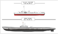 US Gato class submarine, the most common US type of subs in WW2 (95.00 m)
 -
 Japanese i-400 class submarine, the largest sub in WW2 (122 m )
 -
 Typhoon class submarine, the largest subs ever made (175 m)
 -
 Done
Done


Request: Can sameone make image of those subs on the same scale, similar to this photo? Bojan Talk 14:22, 22 October 2011 (UTC)
Graphist opinion(s):
- Request taken by Jembezmamy (talk) 09:28, 14 January 2012 (UTC)
Emblem of India edit
-

-

-
please vectorize while you're at it
-
please vectorize while you're at it


Request: Please create:
- File:Seal of Andaman and Nicobar Islands.svg
- File:Seal of Dadra and Nagar Haveli.svg
- File:Seal of Daman and Diu.svg
- File:Seal of Puducherry.svg
- File:Seal of the National Capital Territory of Delhi.svg
including the text "Government of X" as in the examples above. Government websites show these versions.Kintetsubuffalo (talk) 15:36, 2 February 2011 (UTC)
Graphist opinion(s): ![]() Request taken by NikNaks93 This shouldn't take too long. NikNaks talk - gallery - wikipedia 19:52, 31 March 2011 (UTC)
Request taken by NikNaks93 This shouldn't take too long. NikNaks talk - gallery - wikipedia 19:52, 31 March 2011 (UTC)
Here's a few. Do you want the names on two lines like this, or not? NikNaks talk - gallery - wikipedia 20:52, 31 March 2011 (UTC)
- Those are great, sorry it took me a while to answer. Please continue!--Kintetsubuffalo (talk) 12:48, 5 April 2011 (UTC)
- I'll finish these off. Completely forgot that I was the one doing them! NikNaks talk - gallery - wikipedia 20:03, 21 January 2012 (UTC)
- Done. NikNaks talk - gallery - wikipedia 16:57, 16 February 2012 (UTC)
- I'll finish these off. Completely forgot that I was the one doing them! NikNaks talk - gallery - wikipedia 20:03, 21 January 2012 (UTC)
air ensigns edit
-
 Australian civil air ensign
 -
 New Zealand air force ensign
 -
Syrian air force ensign
-


Request: Just the stars need a fix in the Australian civil air ensign, right now they're in some weird state that I can do anything with them. You can just take the stars from the File:Flag of Australia (converted).svg and put them on File:Civil Air Ensign of the United Kingdom.svg, and they wont need re-sizing. The Southern Cross constellation is supposed to be rotated counter-clockwise 45%.
The New Zealand air force ensign actually uses the Type D roundel, not the Type A currently on it. And the letters NZ could use a redo in block letter form, like you can see here.
The Syrian air force ensign just need to be made SVG. I'm not sure about the ratio, but it's a bit wider than a square ([10]). The national flag in canton, the stars should be more inward because it's a square version, when I made the PNG I just chopped off the sides. SVG elements are File:Flag of Syria.svg and File:Roundel of the Syrian Air Force.svg.
Fry1989 eh? 22:30, 18 February 2012 (UTC)
Graphist opinion(s): ![]() Done NikNaks talk - gallery - wikipedia 15:58, 19 February 2012 (UTC)
Done NikNaks talk - gallery - wikipedia 15:58, 19 February 2012 (UTC)
- Thanks, but I have to ask that you use use British ensign I linked, and put the stars from File:Flag of Australia (converted).svg on it. I tested it, and the stars from the Aussie flag I linked are the right size for the British ensign without you needing to change their size. The Commonwealth Star is supposed to be equally in between the top and bottom of the lower left sky-blue quadrant, and aligned with the vertical bar of the St George's Cross like it is on the Australian national flag. Sorry. Fry1989 eh? 23:39, 19 February 2012 (UTC)
- I did do that, but I had to alter the sizes of the stars because the files were written very weirdly. The Aussie flag is written as if it's 30 000 wide, and the air ensign is only 35! Is the issue the size of the stars? I can generate some new ones that'll be exactly the right size using a program if you like. NikNaks talk - gallery - wikipedia 07:41, 20 February 2012 (UTC)
- I'm sorry, but I don't understand. I took the British file, and the Aussie flag (the converted one I linked), and copied and pasted the stars right from the Aussie flag onto the British air ensign, and they're the right size, they just need a bit of repositioning. Fry1989 eh? 20:32, 20 February 2012 (UTC)
- I was working from the text files themselves to try and make it accurate. Anyway, I've made a new version using accurately sized stars. How's this? NikNaks talk - gallery - wikipedia 21:20, 20 February 2012 (UTC)
- It's not quite there, but I can work with it. Thanks. Fry1989 eh? 21:47, 20 February 2012 (UTC)
- I was working from the text files themselves to try and make it accurate. Anyway, I've made a new version using accurately sized stars. How's this? NikNaks talk - gallery - wikipedia 21:20, 20 February 2012 (UTC)
- I'm sorry, but I don't understand. I took the British file, and the Aussie flag (the converted one I linked), and copied and pasted the stars right from the Aussie flag onto the British air ensign, and they're the right size, they just need a bit of repositioning. Fry1989 eh? 20:32, 20 February 2012 (UTC)
- I did do that, but I had to alter the sizes of the stars because the files were written very weirdly. The Aussie flag is written as if it's 30 000 wide, and the air ensign is only 35! Is the issue the size of the stars? I can generate some new ones that'll be exactly the right size using a program if you like. NikNaks talk - gallery - wikipedia 07:41, 20 February 2012 (UTC)
- Thanks, but I have to ask that you use use British ensign I linked, and put the stars from File:Flag of Australia (converted).svg on it. I tested it, and the stars from the Aussie flag I linked are the right size for the British ensign without you needing to change their size. The Commonwealth Star is supposed to be equally in between the top and bottom of the lower left sky-blue quadrant, and aligned with the vertical bar of the St George's Cross like it is on the Australian national flag. Sorry. Fry1989 eh? 23:39, 19 February 2012 (UTC)
John Henry Newman COA edit
-
 Coat of arms of John Henry Newman
 -
 Existing svg elements.
 -
 Result


Request: Please convert to SVG. Mangwanani (talk) 21:54, 14 January 2012 (UTC)
Graphist opinion(s):
![]() Done The shield shapes in the PNG and the SVG are both rather ugly, but I did it. AnonMoos (talk) 02:06, 15 January 2012 (UTC)
Done The shield shapes in the PNG and the SVG are both rather ugly, but I did it. AnonMoos (talk) 02:06, 15 January 2012 (UTC)
-
 drupe
drupe

Problem: black space instead of text -- Common Good (talk) 18:28, 27 February 2012 (UTC)
Graphist opinion(s):
![]() Done
Converted the flowed text to a regular text. Also removed hidden flowRoot elements. Inkscape's flowed text is not supported by Commons. Phoenix7777 (talk) 08:46, 28 February 2012 (UTC)
Done
Converted the flowed text to a regular text. Also removed hidden flowRoot elements. Inkscape's flowed text is not supported by Commons. Phoenix7777 (talk) 08:46, 28 February 2012 (UTC)
Chemical structure edit
Request: This file is under a deletion request. To save it, it needs to be a non linear molecula (see, for example, File:Aminoazobenzene.png) and, if you wish, converted to SVG. Thank you very much.--Trixt (talk) 13:31, 1 March 2012 (UTC)
Graphist opinion(s):
![]() Request taken by Gauravjuvekar (talk)
Request taken by Gauravjuvekar (talk)
![]() Gauravjuvekar (talk)--File:Unmetallized acid dye.svg--Gauravjuvekar (talk) 17:31, 1 March 2012 (UTC)
Gauravjuvekar (talk)--File:Unmetallized acid dye.svg--Gauravjuvekar (talk) 17:31, 1 March 2012 (UTC)
Two SVG images that do not show correctly the letters edit
-
 Panel for Italian trucks (a)
 -
 Another panel for Italian trucks (d)


Request: Can you fix the problem? Carnby (talk) 20:57, 10 March 2012 (UTC)
Graphist opinion(s): There were two causes, 1. You used Inkscape when it could have been done in a text editor which would have created a file six times smaller 2. You used flowed text in Inkscape instead of just plain text. HTH. --Fred the Oyster (talk) 23:51, 10 March 2012 (UTC)
- @Carnby: Do you have a little reference for this? -- πϵρήλιο ℗ 09:05, 11 March 2012 (UTC)
- Thanks a lot, in fact I redrew them using a normal text editor (I'm a beginner!); @Perhelion: they are panels used on Italian trucks to show they are carrying perishable goods (such as vegetables, meat, eggs and so on). Take a look here.--Carnby (talk) 10:32, 11 March 2012 (UTC)
- Done: Oh* That's good, I've uploaded the source version. -- πϵρήλιο ℗ 11:17, 11 March 2012 (UTC) -- πϵρήλιο ℗ 11:17, 11 March 2012 (UTC)
- Thanks a lot, in fact I redrew them using a normal text editor (I'm a beginner!); @Perhelion: they are panels used on Italian trucks to show they are carrying perishable goods (such as vegetables, meat, eggs and so on). Take a look here.--Carnby (talk) 10:32, 11 March 2012 (UTC)
-
 update needed

Request:
Can anyone color Vietnam blue because Keangnam has been completed?
-- Common Good (talk) 18:41, 25 March 2012 (UTC)
Graphist opinion(s): ![]() Done NikNaks talk - gallery - wikipedia 11:54, 27 March 2012 (UTC)
Done NikNaks talk - gallery - wikipedia 11:54, 27 March 2012 (UTC)
-

-
 Done
Done


Request: Please make a Spanish version with the text "Sólo un ejemplo" - Currently the Spanish Wikipedia uses the English "Just an Example" - We need a Spanish version for use on Spanish language projects Thanks WhisperToMe (talk) 12:01, 3 April 2012 (UTC)
![]() Done SVG ok? You could make a pixle copy. --Perhelion (talk) 11:14, 4 April 2012 (UTC)
Done SVG ok? You could make a pixle copy. --Perhelion (talk) 11:14, 4 April 2012 (UTC)
![]() Done File:Example-Spanish.jpg--Gauravjuvekar (talk) 11:27, 4 April 2012 (UTC)
Done File:Example-Spanish.jpg--Gauravjuvekar (talk) 11:27, 4 April 2012 (UTC)
- I`m sorry we are doing double work, but we both have not tagged "take request". ^^ -- πϵρήλιο ℗ 11:58, 4 April 2012 (UTC)
Thanks, guys! I notified the Spanish Wikipedia at es:Wikipedia:Café/Portal/Archivo/Propuestas/Actual#Nueva_versi.C3.B3n_de_Example.jpg_para_la_Wikipedia_en_espa.C3.B1ol, and also the Spanish Cafe on the Commons at Commons:Café#Nueva_versi.C3.B3n_de_Example.jpg_para_la_Wikipedia_en_espa.C3.B1ol_y_la_Commons WhisperToMe (talk) 12:51, 4 April 2012 (UTC)
File:Pourcentage de wikipédiens par pays de résidence - secteurs - août06.jpg edit
-

-
 Done
Done

,_August_2006.jpg)
Please make an English version of this chart. Here is what to do:
- Belgique -> Belgium
- Autres -> Others
- Suisse -> Switzerland
- Allemagne -> Germany
- États-Unis -> United States
- Royaume-Uni -> United Kingdom
- Espagne -> Spain
- Maroc -> Morocco
- wikipédiens par pays de résidence -> Wikipedians by country of residence
Thanks WhisperToMe (talk) 04:59, 4 April 2012 (UTC)
![]() Request taken by Gauravjuvekar (talk) 08:09, 4 April 2012 (UTC)
Request taken by Gauravjuvekar (talk) 08:09, 4 April 2012 (UTC)
Do you have the raw data? Recreating as SVG would be best so that it could be translated into other languages easily too.--Gauravjuvekar (talk) 10:18, 4 April 2012 (UTC)
![]() DoneGauravjuvekar (talk) 11:00, 4 April 2012 (UTC)
DoneGauravjuvekar (talk) 11:00, 4 April 2012 (UTC)
- Thanks! I'll contact the people involved and see if any of them have the raw data WhisperToMe (talk) 12:41, 4 April 2012 (UTC)
- I perhaps won't be able to do it myself. I searched for any tools to export Excel/LibreOffice Calc charts to SVG but couldn't find anything. I would be able to do a simple pie chart but not 3-D like this one.--Gauravjuvekar (talk) 17:36, 4 April 2012 (UTC)
AC-DC-converter.svg - minor cleanup edit
-
 electrical stuffz

Request:
- Please resize the page to the drawing.
- There is a wrong white filling "below" the L1 marker. It is there (apparently) to cover the line which goes trough "below" (hidden by the white filling). Please remove the filling and cut the black line below away.
- if possible save as {{Valid SVG}} ;-)
Thank you! --Saibo (Δ) 01:50, 24 February 2012 (UTC)
Graphist opinion(s):
![]() Done
Done
- Removed a filling and corrected a line.
- Improved cell symbols.
- Other minor improvement
The original file has a problem. The file size become 15KB from 137KB which is apparently some problems.
- Phoenix7777 (talk) 11:13, 24 February 2012 (UTC)
- Not a problem per se as produced in an old version of Illustrator with the parameters set so that it retained a lot of Illustrator proprietary code so as to retain Illustrator native editability. It's now a third the size that you uploaded it as because Inkscape also retains a lot of its own proprietary code, ie bloat. I removed said bloat. --Fred the Oyster (talk) 22:07, 24 February 2012 (UTC)
- Thank you for enlightening me about that. Phoenix7777 (talk) 00:10, 25 February 2012 (UTC)
- Transparented the rectangle behind the R.--One quick way-Create any shape(eg a circle), Fill it with a suitable colour(say red), lower it to bottom and just drag it under the image-all the white areas that should be transparent would show up.
- Also, does anyone know why most of those paths weren't black?--Gauravjuvekar (talk) 17:11, 25 February 2012 (UTC)
- Thank you for enlightening me about that. Phoenix7777 (talk) 00:10, 25 February 2012 (UTC)
- Not a problem per se as produced in an old version of Illustrator with the parameters set so that it retained a lot of Illustrator proprietary code so as to retain Illustrator native editability. It's now a third the size that you uploaded it as because Inkscape also retains a lot of its own proprietary code, ie bloat. I removed said bloat. --Fred the Oyster (talk) 22:07, 24 February 2012 (UTC)
- Phoenix7777 (talk) 11:13, 24 February 2012 (UTC)
Well done, thanks! Just a minor thing: the "C" was at a better position before. Currently "C" and "L1" may be confused with "CL1". C should move a bit up to separate, I guess. --Saibo (Δ) 11:50, 10 April 2012 (UTC)
![]() Done:Gauravjuvekar (talk) 17:06, 11 April 2012 (UTC)
Done:Gauravjuvekar (talk) 17:06, 11 April 2012 (UTC)
- Thank you, nice! Have added an additional cat and {{Translation possible}} --Saibo (Δ) 17:30, 11 April 2012 (UTC)
-
 Done
Done

Problem: flowed text -- Common Good (talk) 17:20, 9 March 2012 (UTC)
Graphist opinion(s): I tidied up the labelling and optimised the code whilst I was at it. --Fred the Oyster (talk) 22:34, 9 March 2012 (UTC)
Tuva flag edit
-

-

-
 Use the blue-like color from the CoA

.svg)

Request: Match the blue colors of the flags to the blue color from the CoA. ToluMen200 (talk) 11:09, 16 March 2012 (UTC)
- Not vice versa? Because the flag has a concrete color reference. -- πϵρήλιο ℗ 12:05, 16 March 2012 (UTC)
- I wouldn't, since there are government references for the colours, and until recently the emblem matched the flag. Fry1989 eh? 19:30, 16 March 2012 (UTC)
Graphist opinion(s):
New SVG icon edit
-
 Example base image
 -
 Example base image
 -
 Example base image
 -
 Done
Done


Request: I was wondering if someone could please create another version of one of the images above which has the letters of "FT" on a black background. Also, it would be great if the letters could be a shade of green seen in the logo here (maybe #9CC344). The new file could be uploaded at File:Warner Bros. Movie World Fast Track availability.svg. Regards Themeparkgc Talk 00:57, 6 April 2012 (UTC)
Graphist opinion(s):
- For what use? -- πϵρήλιο ℗ 19:10, 6 April 2012 (UTC)
- These icons are used in amusement ride infoboxes on the English Wikipedia for rides which have the particular brand of virtual queue. Warner Bros. Movie World recently introduced their own system called Fast Track. As none of the existing icons are suitable, I would like a new icon to be created for use in Warner Bros. Movie World ride articles which have this virtual queue system. Themeparkgc Talk 22:48, 6 April 2012 (UTC)
- For what use? -- πϵρήλιο ℗ 19:10, 6 April 2012 (UTC)
Archdioceses of Church of England (map) edit
here--Gauravjuvekar (talk) 06:40, 12 April 2012 (UTC)
TRANSFERRED TO MAP WORKSHOP
-
 Map showing the two dioceses of the Church of England

Request: Also, a slightly different file exists on the English Wikipedia. Please can you convert this to an .svg file, making the background transparent, and upload it to Commons (the slightly different png file has been flagged for transfer on en). --000peter (talk) 13:43, 11 April 2012 (UTC)
Graphist opinion(s): You may get a better response if you place this request in the Map Workshop, rather than here. --Fred the Oyster (talk) 15:56, 11 April 2012 (UTC)


Request: Please make these two naval ensigns in SVG. I found an old black and white photo of one of them, but I lost it. It showed them with a much thinner firmbriation between the flag in the canton and the St. George's Cross, I'd say about 1/3 as thick as I made it on my PNGs.
Thanks Fry1989 eh? 22:03, 21 April 2012 (UTC)
- The source you gave didn't have any blue fimbriation, where did you get it from? --Fred the Oyster (talk) 18:41, 22 April 2012 (UTC)
Graphist opinion(s):![]() Request taken by Camerooon (talk): Camerooon
I'm not sure if 1/3 was the right thickness, but anyway... — Preceding unsigned comment added by Camerooon (talk • contribs)
Request taken by Camerooon (talk): Camerooon
I'm not sure if 1/3 was the right thickness, but anyway... — Preceding unsigned comment added by Camerooon (talk • contribs)
- Not done. The request was to create SVGs not a PNG. Also, the fimbriation being referred to was the blue between the canton and the cross, not the cross itself. --Fred the Oyster (talk) 18:41, 22 April 2012 (UTC)
- Yes, I would like them in SVG, and the firmbriation is the blue between the canton and the St George's Cross. The cross is the same thickness as in my PNGs. Thanks. Fry1989 eh? 20:03, 22 April 2012 (UTC)
- Nevermind, i figured out how to do the math :) Fry1989 eh? 02:52, 23 April 2012 (UTC)
- Yes, I would like them in SVG, and the firmbriation is the blue between the canton and the St George's Cross. The cross is the same thickness as in my PNGs. Thanks. Fry1989 eh? 20:03, 22 April 2012 (UTC)
Roundels need a fix edit
-
 Laos
Laos -
 Ethiopia
 -
 Slovakia
 -
 Congo
Congo

.svg)
.svg)
.svg)
Request: Please correct the faults in the above roundels. Laos needs to have proper circles (right now they're kinda ovoid). Ethiopia's is a 3 point star with a triangle over it like in the source. Slovakia has problems with the cross and the circle. The Congolese roundel needs the disk centered on the bars, and needs the star centred in the disk. --Fry1989 eh? 22:18, 8 May 2012 (UTC)
Graphist opinion(s):
![]() Request taken by Dommccas (talk):
Request taken by Dommccas (talk):
Well, I think I've done these. If you have any comments or amendments drop me a line. I have had a couple of issues with the Ethiopian roundel. It doesn't seem to display correctly in thumbnail. Dommccas (talk) 15:29, 9 May 2012 (UTC)
- Yep, that's great. Thank you! Fry1989 eh? 19:17, 9 May 2012 (UTC)
Lenovo edit
-
 The logo used in many laptops, desktops, mice, keyboard, etc.
 -
 Usage of this logo, probably used as a corporate logo
Request: Please vectorize the general logo of Lenovo with colors from Vectorized one. Remove "TM" symbol. --112.210.89.161 13:12, 26 May 2012 (UTC)
Graphist opinion(s):
![]() Request taken by Fry1989 eh?
Request taken by Fry1989 eh?
![]() Done
Done
Logo edit
-
png image
-
New svg image. :)
Request: Can someone please vectorize this logo, into svg, and make it flat? It looks a bit turned on right.. And somehow poor to me... This would mean a lot to me, and you may expect one quite barnstar! :) For any other question, i am here! All best! --WhiteWriter speaks 20:34, 19 May 2012 (UTC)
Graphist opinion(s):
![]() Done - uploaded as [[:]] --Wylve (talk) 14:08, 27 May 2012 (UTC)
Done - uploaded as [[:]] --Wylve (talk) 14:08, 27 May 2012 (UTC)
Black box in SVG edit
-
 Domain organization of PKS of rapamycin and biosynthetic intermediates

Request: Could somebody remove the black box in this SVG? I've no idea where it is coming from. Thanks, ἀνυπόδητος (talk) 22:12, 23 February 2012 (UTC)
Graphist opinion(s):
- Mysterious black rectangles in SVG images are almost always due to the Inkscape "flowtext" nonsense, which can be diagnosed at Commons:SVG Check... -- AnonMoos (talk) 08:07, 24 February 2012 (UTC)
- Removed flowtext, but I'm having difficulty regenerating the thumbnail to the new version... AnonMoos (talk) 08:22, 24 February 2012 (UTC)
- The thumbnail looks ok now. Thanks for the work and the link to the checking tool! --ἀνυπόδητος (talk) 12:54, 24 February 2012 (UTC)
- I would also propose you read first Help:SVG ^^ I tryed also to import the BKChem code but I got a Python error... :-| I would prefer you save the text as font (the file size would be <70kB)!? -- πϵρήλιο ℗ 02:25, 25 February 2012 (UTC)
- Perhelion -- Representing text with <text><tspan>...</tspan></text> simply does not give reliable or consistent good results on Wikipedia/Wikimedia, and I would not advise anybody to replace vector paths with <text><tspan>...</tspan></text> in a complicated graphic with a lot of text, considering the amount of effort and vigilance that's involved in making and keeping an ultra-simple graphic such as File:Simple inverse relationship chart.svg looking half-way decent... AnonMoos (talk) 04:29, 25 February 2012 (UTC)
- AnonMoos -- I beg to differ! The new render version is a bit better in font displaying. You know that's depending on the font family. Penmanship is only conditionally required. -- πϵρήλιο ℗ 19:10, 1 March 2012 (UTC)
- If you mean MediaWiki 1.19, it would be nice if it fixes longstanding SVG font woes, but I'm not sure I've seen evidence of this yet... AnonMoos (talk) 01:36, 4 March 2012 (UTC)
Yandex edit
Request: Vectorise. Will be used on en:Yandex. Яндекс (talk) 00:02, 24 March 2012 (UTC)
Graphist opinion(s):
![]() Done: Vector file uploaded as File:Yandex English logo.svg. --Jackl (talk) 17:47, 7 May 2012 (UTC)
Done: Vector file uploaded as File:Yandex English logo.svg. --Jackl (talk) 17:47, 7 May 2012 (UTC)
Elks Pin edit
-
 Please vectorize
 -
 Done
Done -
 Done2. more like original, stronger colors -- πϵρήλιο


Request: This should be an easy vectorization for any pro or good practice for anyone trying to get good at vectorizing. Please make into an SVG. Ignore the background. Should be a perfect circle in the end (this is a photo of a pin and it is tilted, so if it's not round, that's why). Please let me know when you're finished. Thanks in advance! upstateNYer 22:38, 3 April 2012 (UTC)
Graphist opinion(s):![]() Request taken by Fred the Oyster (talk)
Request taken by Fred the Oyster (talk)![]() Done
Done
- I really don't think there are white or two different yellow colors. I've uploaded a better version in contour and form, but you have claimed the color and reverted. We don't know what are the right colors, or you have any reference? (the lower text is also not exactly positioned) If you want I upload a second version. Your drawing is much too diverse, small details that do not exist. The figure is smaller, the face looks completely different. It's no different stroke weights, etc... -- πϵρήλιο ℗ 14:39, 10 April 2012 (UTC)
- Yes there are different colours, I sampled them directly from the original. I can only suggest that you calibrate your monitor if you are seeing such radically different colours. I don't know about you but I use a professional grade monitor which is manually calibrated every week (using an x-rite i1 Display 2 calibrator) as this is my trade. The colours you chose didn't come anywhere near the original colours. And yes, I used different stroke weights because the original does. For example the under arm strokes are thicker than the rest. Unlike a lot of people I manually trace so I know that the image is the same relative size (I enlarged the original before I traced) as the original. The text is aligned to the new circle, the soldier is aligned to the circle. I do know what I'm doing you know, but if you are so concerned that the image is off I suggest you upload your version as a new file and let the requester choose which he prefers. --Fred the Oyster (talk) 15:41, 10 April 2012 (UTC)
- I really don't think there are white or two different yellow colors. I've uploaded a better version in contour and form, but you have claimed the color and reverted. We don't know what are the right colors, or you have any reference? (the lower text is also not exactly positioned) If you want I upload a second version. Your drawing is much too diverse, small details that do not exist. The figure is smaller, the face looks completely different. It's no different stroke weights, etc... -- πϵρήλιο ℗ 14:39, 10 April 2012 (UTC)
- That has nothing to do with your professional monitor. This is a "photo" of a "printed pin", this yields at least twice a color distortion, also you can clearly see a blur. Ensure that you do it 20 years, you're not an expert. You know the properties of stylization? I do not think so. -- πϵρήλιο ℗ 10:14, 13 April 2012 (UTC)
- I shall be sure to pass along your recommendation to my clients, but I somehow doubt it will affect their continued patronage. --Fred the Oyster (talk) 08:30, 14 April 2012 (UTC)
- Great work Fred; for the requester, gotta question-is this absolutely trivial local trinket going to be used in anything remotely encyclopedic anywhere in the Wikimedia universe? Where/why?--Kintetsubuffalo (talk) 15:07, 14 April 2012 (UTC)
- I'm wondering if the Brunswick Elks forgot that the redcoats (British professional troops) were on the other side in the Revolutionary War... AnonMoos (talk) 03:25, 15 April 2012 (UTC)
Sport records edit
-
 The source file
 -

Request: Hi! Could somebody create SVG file similar to this file with text "LR" on it. It would be fine if you could name the file as "File:Sport records icon LR.svg" --Edgars2007 (talk) 13:51, 16 April 2012 (UTC)
Graphist opinion(s):
![]() DoneFile:Sport records icon LR.svg, But may need improvement--Gauravjuvekar (talk) 11:10, 18 April 2012 (UTC)
DoneFile:Sport records icon LR.svg, But may need improvement--Gauravjuvekar (talk) 11:10, 18 April 2012 (UTC)
- OK, thanks! --Edgars2007 (talk) 17:35, 18 April 2012 (UTC)
Homeless kids in the United States edit
-
 Graph of homeless children in the US

Request: Please redraw File:Homeless children in US 2006-10.png on a plain background so as to save it from its deletion nomination which is apparently based on the gradient colors. This should be easy. Thank you. --71.212.237.94 15:40, 18 April 2012 (UTC)
Graphist opinion(s):
![]() Done: CLDunlap (talk) 20:02, 19 April 2012 (UTC)
Done: CLDunlap (talk) 20:02, 19 April 2012 (UTC)
Make Brazilian Portuguese version of image edit
-
Original image in English
-
 image in Portuguaise
Please make a Brazilian Portuguese version, using these terms:
- exits-> Saídas
- toilet->Banheiro
- recovered-> Recuperado
- unrecovered-> Não recuperado
- galley-> Copa
- Storage - Armazém
For the image description, please use the following:
- PT: "Gráfico dos corpos recuperados do voo 447 da Air France durante as buscas em 2009 (Português)"
- EN: "Seating chart Air France Flight 447 indicating bodies recovered in the 2009 searches (Portuguese)"
- FR: "Plan des sièges du vol Air France 447 avec indication des corps retrouvés pendant les recherches de 2009 (Portugais)"
- DE: "Sitzplan, aus dem der Sitz der Passagiere hervorgeht, deren Leichen 2009 gefunden wurden. (Portugiesisch)"
Thank you WhisperToMe (talk) 23:08, 30 August 2012 (UTC)
- I just find-and-replaced these texts and uploaded the Portuguaise version. As the text objects where apparently center-aligned, they are currently not really perfectly-positioned. That is an issue to be corrected globally (including the English version) in order to facilitate creation of further derivative works if anyone thinks it's important.--Yuwash (talk) 18:38, 10 September 2012 (UTC)
- Thank you WhisperToMe (talk) 11:03, 6 February 2013 (UTC)
- The text in the Portuguese version is still not aligned correctly, this should be fixed to resolve this request for good. --Patrick87 (talk) 14:43, 5 July 2013 (UTC)
- And the images are not rendered correctly (also those in the following request). I'm afraid there's a lot left to do here. --Patrick87 (talk) 14:58, 5 July 2013 (UTC)
- Thank you WhisperToMe (talk) 11:03, 6 February 2013 (UTC)
- I finally fixed the rendering and the alignment of the text, so this is probably resolved now. --Patrick87 (talk) 17:23, 18 September 2013 (UTC)
- This section was archived on a request by: Patrick87 (talk) 17:23, 18 September 2013 (UTC)
Fix key in image edit
-
 File to change "kombüse" to "kombüse/Stauraum"
 -
 File to change "Stauram to "Stauraum"
 -
What Airfrance447diag-de.png should look like
The key in File:Airfrance447diag-de.png says "kombüse" when it should say "kombüse/stauram" like File:Af447diag-de.svg does. This is because this is a translation of an English-language diagram that says "Galley/storage" - kombüse = galley, stauram = storage Thanks WhisperToMe (talk) 21:11, 6 September 2012 (UTC)
- Actually it should be "Stauraum" in both images. --ἀνυπόδητος (talk) 19:33, 11 September 2012 (UTC)
- Thank you. I made a note of this WhisperToMe (talk) 05:04, 23 October 2012 (UTC)
- I fixed the remaining error in spelling and adjusted the SVG according to the changes above. --Patrick87 (talk) 17:30, 18 September 2013 (UTC)
- Thank you. I made a note of this WhisperToMe (talk) 05:04, 23 October 2012 (UTC)
- This section was archived on a request by: Patrick87 (talk) 17:30, 18 September 2013 (UTC)
Karakalpakstani coat of arms edit


Request: Vectorize.. --112.210.52.85 11:24, 6 November 2012 (UTC)
Graphist opinion(s): That's easy: Take File:Emblem of Uzbekistan.svg, modify the flags and replace the text in the banner by "Қарақалпақстан".--Antemister (talk) 20:49, 18 November 2012 (UTC)
- It's not quite so simple. The sunburst behind the bird is of a different color and has a radial gradient, although the gradient may be an illusion due to the low resolution. The two lower banners have a solid red stripe in them, not a white stripe with red borders. The mountains in the background are different. All in all, the PNG prototype is too small to be of use. This conversion should only be attempted if a better raster prototype can be located, at least four times larger than the present sample. — Quicksilver@ 08:45, 7 February 2013 (UTC)
- Done I have done a preliminary hand trace for the different elements. If a larger version is found, then the detail can be added, but as it is I think this is a fair representation. Please let me know if I've made any glaring errors. NikNaks talk - gallery - wikipedia 14:00, 25 March 2013 (UTC)
- This looks very nice! Only thing I'd change are the sunrays (they appear too thick), you could decrease their width or use a gradient to achieve a similar effect like in the original. The orange parts of the banners on the left and right are a little to wide, too. -- Patrick87 (talk) 14:35, 25 March 2013 (UTC)
- Better? NikNaks talk - gallery - wikipedia 14:36, 28 March 2013 (UTC)
- Yes, much better now. The most obvious difference remaining compared to the PNG version is the darker tone of the green – was this intended? Otherwise it's a fair representation of the source now. -- Patrick87 (talk) 16:25, 28 March 2013 (UTC)
- The darker green was inherited from the CoA of Uzbekistan; I'm not sure which is correct. NikNaks talk - gallery - wikipedia 17:13, 28 March 2013 (UTC)
- Yes, much better now. The most obvious difference remaining compared to the PNG version is the darker tone of the green – was this intended? Otherwise it's a fair representation of the source now. -- Patrick87 (talk) 16:25, 28 March 2013 (UTC)
- Better? NikNaks talk - gallery - wikipedia 14:36, 28 March 2013 (UTC)
- This looks very nice! Only thing I'd change are the sunrays (they appear too thick), you could decrease their width or use a gradient to achieve a similar effect like in the original. The orange parts of the banners on the left and right are a little to wide, too. -- Patrick87 (talk) 14:35, 25 March 2013 (UTC)
- This section was archived on a request by: Patrick87 (talk) 17:34, 18 September 2013 (UTC)
OpenJDK Logo edit
Request: Please make a SVG version of OpenJDK Logo or OpenJDK Logo on English Wikipedia and upload it on commons as {{PD-textlogo}}. Thanks :) −ebraminiotalk 11:53, 12 September 2012 (UTC)
Graphist opinion(s):
- en:File:OpenJDK logo.png is claimed to be under copyright, and it's used on en.wiki by Fair Use. Fair Use is not accepted on Commons, so it wouldn't be safe to convert it to SVG (although it would be easy) and/or transferring it to Commons. If you think that it should be in Public Domain, please start a discussion in the appropriate place and report the result here. --Ricordisamoa (talk) 10:23, 11 January 2013 (UTC)
- Actually, the logo is copyright ineligible. The license tag at enwiki is incorrect, as the logo does not meet the threshold of originality. Even though the image is appropriate on Commons, I can't find a vector version of the logo online. --Wylve (talk) 11:19, 11 January 2013 (UTC)
- The logo is now correctly licensed as {{Pd-textlogo}}, however I still wasn't able to find a vector version of the logo anywhere. I also tried to find the exact font used in the logo to recreate it from scratch but didn't succeed. It seems to be some variant of Glasgow font, but the version I got didn't match the original in all deatails. -- Patrick87 (talk) 02:20, 23 March 2013 (UTC)
- Actually, the logo is copyright ineligible. The license tag at enwiki is incorrect, as the logo does not meet the threshold of originality. Even though the image is appropriate on Commons, I can't find a vector version of the logo online. --Wylve (talk) 11:19, 11 January 2013 (UTC)
-
 like this?
![]() Done -- Fulvio 314 12:05, 8 October 2013 (UTC)
Done -- Fulvio 314 12:05, 8 October 2013 (UTC)
- Thanks a lot! :) −ebraminiotalk 17:09, 8 October 2013 (UTC)
- This section was archived on a request by: −ebraminiotalk 17:09, 8 October 2013 (UTC)
Coat of arms of Guinea edit
-
 SVG (trace)
 -
 PNG
PNG -
 PNG 2
PNG 2 -
 New SVG


Request: Unfortunately, while the SVG is a very good trace, it still has issues. Could someone please redo it into a good SVG? Fry1989 eh? 21:51, 21 January 2012 (UTC)
Graphist opinion(s): What are the issues? Be more specific. :P I can see a few stray bits of colour, but I'm not sure if that's what you mean. NikNaks talk - gallery - wikipedia 12:37, 22 January 2012 (UTC)
- Well for example, all the yellow is one big chunk, when it should be separate parts, the shield, the banner, the bird and olive branch. The part with the three colours of the flag should be independent, when it's actually all yellow with the red and green on top. Lastly, there should be transparency where the coat of arms ends. Fry1989 eh? 20:05, 22 January 2012 (UTC)
- The SVG is a pretty good reflection of the image it was vectorized from. Anyway I mostly fixed transparency (the easy part). AnonMoos (talk) 10:40, 23 January 2012 (UTC)
- Yes, but there is still alot of crap and layers in there that shouldn't be, but come with the territory of a direct trace. I tried to clean up what I can, but the file would still benefit from being made the way it was supposed to, with all the pieces and elements separate. Fry1989 eh? 21:46, 23 January 2012 (UTC)
- Now separated bird and shield (as well as the yellow flag partition just formally). The path objects are now given meaningful ids so you can easily identify them. It seems to be slowly approaching the goal. --Flekstro (talk) 15:19, 7 September 2012 (UTC)
- What remains to be fixed here? NikNaks talk - gallery - wikipedia 14:07, 25 March 2013 (UTC)
- I have made the bird opaque, as requested. Anything else? The SVG is by no means perfect to use, but it seems to be accurate at least. NikNaks talk - gallery - wikipedia 15:38, 25 March 2013 (UTC)
- What remains to be fixed here? NikNaks talk - gallery - wikipedia 14:07, 25 March 2013 (UTC)
There is already an SVG... Will follow some days later here.--Antemister (talk) 16:29, 25 March 2013 (UTC)
- I redesigned the whole COA (based on "PNG 2") File:Coat of arms of Guinea-new.svg. --Avenhar (talk) 14:41, 27 April 2013 (UTC)
- This section was archived on a request by: NikNaks talk - gallery - wikipedia 14:14, 20 October 2013 (UTC)
-
 PNG flag
 -
 SVG flag with bitmap corrupted CoA
 -
 Extra flag
.png)
.svg)
.svg)
Request: Make vectorized CoA based on PNG version of flag. Malarz pl (talk) 21:24, 21 August 2012 (UTC)
Graphist opinion(s): ![]() Done NikNaks talk - gallery - wikipedia 14:38, 31 March 2013 (UTC)
Done NikNaks talk - gallery - wikipedia 14:38, 31 March 2013 (UTC)
- For those crown experts here, is it possible to create SVGs for the earlier flags with slightly different crowns, as shown in de:Flagge der Bahamas. I'am sure that those corwon do already exist as SVGs.--Antemister (talk) 19:52, 31 March 2013 (UTC)
- If you can locate the crowns, I'm happy to do the swaps. NikNaks talk - gallery - wikipedia 21:07, 31 March 2013 (UTC)
- I believe it is File:Tudor Crown (Heraldry).svg for the 1904-1923 and 1923-1953 period, and File:Crown of Saint Edward (Heraldry).svg for the 1869-1904 and 1953-1964 period.
- If you can locate the crowns, I'm happy to do the swaps. NikNaks talk - gallery - wikipedia 21:07, 31 March 2013 (UTC)
![]() Done (Version with the Tudor Crown) NikNaks talk - gallery - wikipedia 14:14, 20 October 2013 (UTC)
Done (Version with the Tudor Crown) NikNaks talk - gallery - wikipedia 14:14, 20 October 2013 (UTC)
- This section was archived on a request by: NikNaks talk - gallery - wikipedia 14:14, 20 October 2013 (UTC)
File:Goldbach-1000000.svg edit
-
 A graph showing the number of ways an even number can be written as the sum of two primes (4 <= n <= 1000000)
Request: Probably because of the huge file size, this file does not render a thumbnail. Can someone rescale it or try regenerating the thumbnail? --Sreejith K (talk) 12:26, 18 April 2012 (UTC)
Graphist opinion(s): I suggest that this is an inappropriate image for SVG. When there are several megabytes of elements, and none of them are language-specific, why not just take a screen shot of it at maximum resolution and use a PNG version? This should compress very well as a PNG, so you can use a very large screen and won't lose much fine detail. CLDunlap (talk) 20:10, 19 April 2012 (UTC)
- If this image cannot be compressed to a size that is useful, lets do was you suggested. Can you please upload a PNG file with lesser than 12 MP resolution? --Sreejith K (talk) 10:41, 20 April 2012 (UTC)
- Done You can find the file here A graph showing the number of ways an even number can be written as the sum of two primes (4 <= n <= 1000000) and check so the info on it is correct, thanks. ---Goran tek-en (talk) 16:37, 5 December 2013 (UTC)
- This section was archived on a request by: Goran tek-en (talk) 20:42, 5 January 2014 (UTC)
Mozilla Firefox 3.5 logo 256.png edit
-
 Logo of Mozila Firefox (version 3.5 and above)
Request: Convert this image to SVG. I cannot find any SVG version of this logo online, and it is a bit difficult to draw so I cannot convert it myself. The old logo (Firefox 3.0 and earlier) has an SVG version but that is copyrighted (the new logo, shown here, is freely licensed) --Jfd34 (talk) 06:32, 13 October 2012 (UTC)
Graphist opinion(s):Mozilla offers a 2169*2081px png version at [11]--Gauravjuvekar (talk) 19:03, 24 October 2012 (UTC)
- Even at that size, if you embed it in an SVG file the size of the SVG size will become very large. Converting the logo to SVG will allow it to be scaled infinitely, while keeping the file size relatively small. Jfd34 (talk) 09:59, 3 November 2012 (UTC)
- The Category descriptions points to Commons:Deletion requests/Image:Firefox.svg as Mozilla does not allow high-resolution version of their trademarked logos. Matt (talk) 14:26, 8 November 2012 (UTC)
- You're wrong. Your remark was true on past Firefox versions but not with the current logos that are given 3 open licences (MPL, GPL and LGPL), thus permitting publication, reuse and production and publication of derived works (provided that one of the 3 licences are kept, with the required attribution). In other words, the vectorization request os perfectly valid (and the Mozilla Foundation will be also credited on them, having full rights to reuse these SVG versions if it wishes...). The 3 open licences are covering the copytight, the author's right, but not directly the trademark right (but as long as we are told to keep the attribution and say this is atrademark, it is safe to publish the logo or any derived logo that preserves the same trademark right). verdy_p (talk) 16:06, 18 December 2012 (UTC)
- The Category descriptions points to Commons:Deletion requests/Image:Firefox.svg as Mozilla does not allow high-resolution version of their trademarked logos. Matt (talk) 14:26, 8 November 2012 (UTC)
- Well. There a vector version of logo on Mozilla site - in Adobe Illustrator CS4 EPS format. But it is can't be simple exported to svg - many of filters not implemented yet in RSVG(render used on wikipedia). It's need a big editing, to make similar logo without that filters. But altering is not permitted! Just using a png file, and providing link to to vector(for print's) - best way in my opinion.
- The EPS-Version doesn't contain unsupported filters but a whole lot of raster graphics to create the gradients (and "prevent" incompatibilities)... It's not possible to convert it to SVG without the original vector file. -- Patrick87 (talk) 02:12, 23 March 2013 (UTC)
- Err.. What? Do you even downloaded and opened the EPS file in Illustrator? There NO ANY RASTER GRAPHICS! It's 100% vector file - just simple curves with gradient fills, gausian blur, and color blending modes.
- No, I used Inkscape. Those must be proprietary extensions by Adobe then that do not follow the SVG standard. Are you able to export a valid plain SVG without any Adobe extensions and not containing rasterized effects? -- Patrick87 (talk) 19:31, 13 April 2013 (UTC)
- Err.. What? Do you even downloaded and opened the EPS file in Illustrator? There NO ANY RASTER GRAPHICS! It's 100% vector file - just simple curves with gradient fills, gausian blur, and color blending modes.
- The EPS-Version doesn't contain unsupported filters but a whole lot of raster graphics to create the gradients (and "prevent" incompatibilities)... It's not possible to convert it to SVG without the original vector file. -- Patrick87 (talk) 02:12, 23 March 2013 (UTC)
- It is not the purpose of this lab to attempt to mimic trademarked logos like this. Any errors or inaccuracies would be a misrepresentation, so we shouldn't even attempt it. It's clear that they haven't released an SVG version, so if no-one can convert the EPS there's nothing we can reasonably do. NikNaks talk - gallery - wikipedia 15:55, 1 April 2013 (UTC)
- This section was archived on a request by: Perhelion (talk) 20:32, 24 March 2014 (UTC): SVG now File:Mozilla Firefox logo 2013.svg
File:Political System of the United States.svg and File:Politisches System der Vereinigten Staaten.svg edit
-
 English version
 -
 German version


.svg)
![[1]](http://3.bp.blogspot.com/_nxSb3loAy3A/TGd001bGzGI/AAAAAAAAANc/Y-fts8sOAYw/s1600/hydrogen-spectra.jpg)
![[3]](http://www.sozogaku.com/fkd/en/mfen/MB1071008_05.jpg)
![[6]](https://kk.wikipedia.org/wiki/%D0%A1%D1%83%D1%80%D0%B5%D1%82:WIKIBILIMlogo.png)
![[7]](http://www.rhodesians-worldwide.com/rhoflaginv_files/image156.gif)
.svg)
![[8]](http://www.rhodesians-worldwide.com/rhoflaginv_files/image158.jpg)
.png)
.svg)
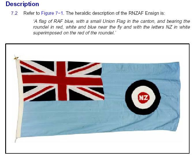
![[10]](http://www.fahnenversand.de/fotw/images/s/sy%5Eaf.gif)
.svg)
.svg)
.svg)
.svg)
.svg)
.svg)
Request: It would be nice if someone could review these graphics and may improve them or do some bugfix (I'm using Adobe Illustrator and so the text is a bit displaced). Thanks and greetings — Allrounder (talk) 01:06, 25 November 2012 (UTC)
Graphist opinion(s):
- I didn't see any great problems, but I moved a few captions slightly, and changed the wording of the bottom white box to "18 years and older". The discrepancies between what you see in Illustrator and how the images render on Commons are due to the fact that the "ArialMT" font is not installed on Wikimedia servers (which substitute a different font with different metrics). If you could install a font which is on the Wikimedia servers onto your own system, and specify it in the SVG file, then theoretically you could see the same thing in Illustrator as here... AnonMoos (talk) 03:17, 25 November 2012 (UTC)
- Also, the diagram seems to be modified from one near the beginning of the second volume of the Penguin Atlas of World History by Kinder and Hilgemann, but I'm not sure all the changes are improvements. There's no indications of the Supreme Court's ability to rule laws and executive actions unconstitutional, and the senate's main authority over the armed forces is funding. The senate has the ability to confirm presidential appointees and supreme court justices, but no direct power to give orders to the cabinet or Supreme Court. The president does not have a "suspensive" veto over legislation, but a veto overridable by a 2/3 vote of both houses. "Executive Office" is the name of a building, but not really of a layer of government. "§" seems to mean legislative authority, but is not explained. Etc. AnonMoos (talk) 05:49, 25 November 2012 (UTC)
- Thanks. I don't know a Penguin Atlas of World History - what's that? I made this one by myself. Allthough I'm quite sure that the graphics should be correct. However, I made a request at w:Wikipedia_talk:WikiProject_Politics/American_politics.
- There's no indications of the Supreme Court's ability to rule laws and executive actions unconstitutional -> I could improve that by connecting the Supreme court and the red arrow.
- The senate has [...] no direct power to give orders to the cabinet or Supreme Court -> Right. But where's the allusion on that in the graphic?
- The president does not have a "suspensive" veto over legislation, but a veto overridable by a 2/3 vote of both houses -> A "suspensive veto" means exactly that: "a suspensive veto is the ability of an executive to return a bill to the legislature without the bill becoming law. The veto is suspensive because the Congress can override the veto, given a large enough majority. The opposite of a suspensive veto is an absolute veto, a power the President does not have." [12]
- "Executive Office" is the name of a building -> No, see w:Executive Office of the President of the United States
- "§" seems to mean legislative authority -> Right. I think that's prettyself-explanatory ;-)
- Greetings — Allrounder (talk) 00:01, 27 November 2012 (UTC)
- Thanks. I don't know a Penguin Atlas of World History - what's that? I made this one by myself. Allthough I'm quite sure that the graphics should be correct. However, I made a request at w:Wikipedia_talk:WikiProject_Politics/American_politics.
- Also, the diagram seems to be modified from one near the beginning of the second volume of the Penguin Atlas of World History by Kinder and Hilgemann, but I'm not sure all the changes are improvements. There's no indications of the Supreme Court's ability to rule laws and executive actions unconstitutional, and the senate's main authority over the armed forces is funding. The senate has the ability to confirm presidential appointees and supreme court justices, but no direct power to give orders to the cabinet or Supreme Court. The president does not have a "suspensive" veto over legislation, but a veto overridable by a 2/3 vote of both houses. "Executive Office" is the name of a building, but not really of a layer of government. "§" seems to mean legislative authority, but is not explained. Etc. AnonMoos (talk) 05:49, 25 November 2012 (UTC)
- The "Penguin Atlas of World History" is a translation of something which was apparently called the "DTV (Deutscher Taschenbuch Verlag) Atlas zur Weltgeschichte" in 1966 (have no idea whether it may have been republished since). I've noticed that a number of political diagrams originating from German Wikipedia seemed to be based on diagrams in that book...
- —The blue arrow from the Senate to the Cabinet and to the Armed Forces is oversimplified, since it looks exactly like the blue arrow from the president to the Cabinet and to the Armed Forces, yet the authority of the Senate and the authority of the president are quite different...
- —The president's veto power would not usually be called "suspensive" by native English speakers; a veto is final (with no time limit) unless the Congress acts against it within a specified time. "Suspensive" would tend to imply the power to suspend the operation of laws for a certain time, or in the face of emergency.
- —The Executive Office of the President is his personal staff (plus outside advisers and certain extra-departmental "czars"), but few outside Washington know or care much about it, and it isn't part of the constitution. The president controls the executive government of the United States, not just the Executive Office.
- —I really don't know that § would be very "self-explanatory" to those who haven't perused the Penguin Atlas of World History... -- AnonMoos (talk) 04:27, 27 November 2012 (UTC)
- OK, I don't know the Atlas zur Weltgeschichte...
- Yea, of course the powers are slightly different, but this graphic does not intend to describe every detail of the political system, but give a overview about it. But of course you're right that the arrows could be too similar - what would you change to make them more understand- and differentiable?
- Hmm, I'm not a native speaker (like you may have noticed ;-), but I think that this expression is known in English political science, too though (see eg the link). And the presidential veto is not final, but does suspend the operation of laws for a certain time...
- The w:Executive Office of the President of the United States even has it own WP-article; of course the President controls all of the executive, but the graphic leaves no doubt about this though..
- Yes, § is IMHO really self-explanatory (or with what could you confuse it?)
- Greetings — Allrounder (talk) 18:07, 29 November 2012 (UTC)
- I uploaded a new version (before - after). Better? — Allrounder (talk) 16:32, 1 December 2012 (UTC)
- OK, I don't know the Atlas zur Weltgeschichte...
OK, now I think the content problems should be solved (if not, please comment). But there's still a formal problem with the text in both pictures (it's still displaced, allthough I used Liberation Sans...). Would be nice if sby could solve this and do a bit bug fix, so we can use the graphics in the articles =). Greetings — Allrounder (talk) 15:18, 3 December 2012 (UTC)
- The blue arrow from the state legislatures to the state courts should be removed. There are many ways of selecting state courts, depending on the state, and I don't think they can be shown on a simplistic diagram like this one. They include direct partisan election, Federal-style appointment and confirmation, Missouri plan-selection of candidates by a judicial nomination convention and a gubernatorial selection of one of them (the Missouri plan also includes "yes-or-no" retention elections). – Philosopher Let us reason together. 03:46, 3 February 2013 (UTC)
- Of course there are many ways of selecting state courts but all of them have sth to do with the state legislature. But u can remove the arrow if you want to.. — Allrounder (talk) 13:12, 3 February 2013 (UTC)
- No, that was kind of my point. 2 of the 3 common ways have nothing to do with the state legislature at all. – Philosopher Let us reason together. 23:54, 8 February 2013 (UTC)
- ...and removed. – Philosopher Let us reason together. 00:02, 9 February 2013 (UTC)
- This section was archived on a request by: Perhelion (talk) 18:22, 26 March 2014 (UTC)