Commons:Graphic Lab/Photography workshop/Archive/2013
Brightness/contrast adjust edit

Request: Can brightness/contrast be adjusted without losing detail?--Canoe1967 (talk) 10:11, 31 December 2012 (UTC)
Graphist opinion(s):![]() Done I think that you can see even more details after adjusting brightness and contrast.--Hic et nunc (talk) 09:00, 2 January 2013 (UTC)
Done I think that you can see even more details after adjusting brightness and contrast.--Hic et nunc (talk) 09:00, 2 January 2013 (UTC)
- Thank you, good work. I have tried a few myself in GIMP and was wondering if there are good and bad ways to do it. I just increase brightness first, then adjust contrast. All by eye. Are there any tricks to get them almost perfect for the detail that does exist?--Canoe1967 (talk) 00:30, 3 January 2013 (UTC)
- Often it's better to increase gamme a bit at first. Then you see sometimes details in the black parts. And then you can improve contrast. But too much contrast cuts details.--Hic et nunc (talk) 11:31, 3 January 2013 (UTC)
- Thank you for the advice. I may try it on my own again next time.--Canoe1967 (talk) 17:29, 3 January 2013 (UTC)
- Often it's better to increase gamme a bit at first. Then you see sometimes details in the black parts. And then you can improve contrast. But too much contrast cuts details.--Hic et nunc (talk) 11:31, 3 January 2013 (UTC)
Crosley Field photos edit
-
 Crosley Field 1946
 Done
Done -
 Crosley Field 1946 Done --~~~
 -
 Crosley Field 1946 Done
 -
 Crosley Field 1946 Done
 -
 Crosley Field 1946 Done --~~~~
 -
 Crosley Field Done


Request: If possible, please remove scratches and fix coloration in color photos, which looks a bit overly green in each image. In B&W shot, lessening the brightness to make the light towers and field a little more visible would be great. Thanks! Delaywaves talk • contribs 19:47, 16 August 2011 (UTC)
Graphist opinion(s):
- I adjusted color balance in all the images. —Quibik (talk) 00:04, 17 August 2011 (UTC)
Thanks a lot! But if possible, could you reduce the saturation a tiny bit on "File:Crosley Field infield and LF 1946.jpg" and "File:Crosley Field left-center and scoreboard.jpg"? They just look a little too dark. The others are perfect, though. Thanks again. Delaywaves talk • contribs 05:16, 17 August 2011 (UTC)
![]() Done decreased saturation a bit on the two photos as requested Warfieldian (talk) 03:26, 20 August 2011 (UTC)
Done decreased saturation a bit on the two photos as requested Warfieldian (talk) 03:26, 20 August 2011 (UTC)
- OK, so, I did the 5th one a while back. And started on the last one. But these pictures are a ton of work, like a full days worth each. I know this archive should be independent from Wikipedia, but I don't see them being used. Maybe my standards are too high. Should I archive this puppy? --Vera (talk) 16:57, 8 January 2013 (UTC)
- I'll try to improve a bit more, time after time.--Hic et nunc (talk) 16:11, 10 January 2013 (UTC)
- One could do much more but I think so it can stay.--Hic et nunc (talk) 12:30, 22 January 2013 (UTC)
- I'll try to improve a bit more, time after time.--Hic et nunc (talk) 16:11, 10 January 2013 (UTC)
Fueling of the MSL MMRTG edit
-
 Fueling of the MSL MMRTG 001
 -
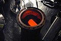 Fueling of the MSL MMRTG 002


Request: Can these two images be improved ? The first one in particular has a terrible amount of noise. Thanks... --Bomazi (talk) 07:58, 8 January 2013 (UTC)
Graphist opinion(s):![]() Done Both images are unsharp and seems to consist of noise only. I reduced the noise in both images. But, sorry, it is not possible to make good images out of them.--Hic et nunc (talk) 12:10, 8 January 2013 (UTC)
Done Both images are unsharp and seems to consist of noise only. I reduced the noise in both images. But, sorry, it is not possible to make good images out of them.--Hic et nunc (talk) 12:10, 8 January 2013 (UTC)
- Thanks, it is a lot better. Bomazi (talk) 13:59, 8 January 2013 (UTC)
John Brown (Seminole Chief) edit

Request: Remove the watermark. David1217 (talk) 03:08, 14 January 2013 (UTC)
Graphist opinion(s):
![]() Done. --McZusatz (talk) 10:33, 14 January 2013 (UTC)
Done. --McZusatz (talk) 10:33, 14 January 2013 (UTC)
- Thank you! David1217 (talk) 00:19, 17 January 2013 (UTC)
A rather spectacular shot that could use a few touchups edit
Featured! Thanks for all of your help.
-
 Times Square Ball from above

Request: De-noise and white balance were both brought up before withdrawn from FP nomination.--Canoe1967 (talk) 20:38, 19 January 2013 (UTC)
Graphist opinion(s):
- He had the rare opportunity to literally at the top of the crossroads of the world, and used it to take a very elusive image. Even more spectacular is the fact that he also gave it free license too. Personally, I think this could make a good featured image candidate (probably on December 31, 2013 if you want to be festive), but something about it doesn't quite feel right (well, the curvature, though I'm not sure if it's supposed to be like that or not. I'm not saying anything's wrong with it, I'm just wanting to see if we can make it even better. ViperSnake151 (talk) 01:38, 16 January 2013 (UTC)
- You may wish to put it up for featured and have those critics critique it for changes they can see. Keep the original of course, and upload any mods as new files. After a quick glance, I can see some wishing to remove the feet and others wanting to keep them in. A 180 deg. rotate may have an interesting effect as well, with the feet at the top to cause even more vertigo looking at it.--Canoe1967 (talk) 05:38, 16 January 2013 (UTC)
- The curvature is normal for the 15mm lens that was used. I think most film lenses below 50mm are termed 'wide angle' have the same effect. I think below 20-25mm they are termed 'fish-eye lenses'. Digital cameras can vary depending on the 'crop factor' of the sensor. I think this is the ratio of image to focal plane compared to 35mm film cameras. I may be wrong and others may correct me.--Canoe1967 (talk) 17:24, 17 January 2013 (UTC)
- Featured image discussion seems to suggest that the white balance needs to be tweaked, and it needs a denoising. ViperSnake151 (talk) 03:53, 18 January 2013 (UTC)
- You may wish to withdraw it until these wonderous workers of miracles can do the work on it. As you see from the vote count it will probably fail in its current state. This will allow you to enter it again and those oppose votes may not happen.--Canoe1967 (talk) 19:15, 18 January 2013 (UTC)
- Okay, I reduced noise and chromatic aberration. White balancing did lead to minor changes only.--Hic et nunc (talk) 11:54, 22 January 2013 (UTC)
- Great work! It is back in FP again with 4 support and 0 oppose. This section can probably be closed after it passes. ViperSnake151 is the one who actually entered it here and there so he may wish to tick it as resolved.--Canoe1967 (talk) 14:09, 9 February 2013 (UTC)
- Losing 5 to 2 now. Anyone want to help support it after all the effort done? It needs at least 7 support and a 2/3 majority.--Canoe1967 (talk) 22:38, 10 February 2013 (UTC)
- Okay, I reduced noise and chromatic aberration. White balancing did lead to minor changes only.--Hic et nunc (talk) 11:54, 22 January 2013 (UTC)
- You may wish to withdraw it until these wonderous workers of miracles can do the work on it. As you see from the vote count it will probably fail in its current state. This will allow you to enter it again and those oppose votes may not happen.--Canoe1967 (talk) 19:15, 18 January 2013 (UTC)
- Featured image discussion seems to suggest that the white balance needs to be tweaked, and it needs a denoising. ViperSnake151 (talk) 03:53, 18 January 2013 (UTC)
Three nice Mimbres pots with very busy backgrounds edit
-
 Macaw pot
 -
 Macaw pot (cut out)
 -
 Geometric Mimbres pot
 -
 Geometric Mimbres pot (cut out)
 -
 Mythical fish
 -
 Mythical fish (cut out)


Request: Three nice Mimbres pots from the Museum Rietberg (Zürich), with very busy backgrounds. Would it be possible to substitute a neutral gray background? Start with the Macaw pot, please, if you only have time for one fix. TIA, Pete Tillman (talk) 06:46, 20 January 2013 (UTC)
Graphist opinion(s):First two are done.--Hic et nunc (talk) 15:38, 22 January 2013 (UTC) Okay, it's done. ![]() Done--Hic et nunc (talk) 09:16, 23 January 2013 (UTC)
Done--Hic et nunc (talk) 09:16, 23 January 2013 (UTC)
- Thanks! Big difference. Cheers, Pete Tillman (talk) 01:40, 25 January 2013 (UTC)
Slight cropping needed edit
-
 View of the Patrick Henry College campus
 -
 rotated (EG)
Request: While the subject of the image is on a steep hill, this view is slightly skewed. Can it be cropped so that it is straight? The windows of the closest dorm should be able to serve as a guide, since the floor is (obviously) flat. --– Philosopher Let us reason together. 12:47, 21 January 2013 (UTC)
Graphist opinion(s): I uploaded a rotated version, taking the street lamp in the middle as a reference. Unfortunately, this led to a rather tight crop … --El Grafo (talk) 13:27, 21 January 2013 (UTC)
Amber Ann - 2013.jpg edit
Request: The above photograph contains a non-free image on the backdrop. To rescue the photograph from being deleted, is it possible to crop the image to remove the backdrop, blur it out, or otherwise remove the non-free image? Thanks. — SMUconlaw (talk) 16:19, 28 January 2013 (UTC)
Graphist opinion(s):![]() Done The non-free background photo is removed.--Hic et nunc (talk) 10:22, 29 January 2013 (UTC)
Done The non-free background photo is removed.--Hic et nunc (talk) 10:22, 29 January 2013 (UTC)
- Great! Thanks very much. — SMUconlaw (talk) 13:46, 29 January 2013 (UTC)
Lip glare edit
. Thank you! Great work as usual.

Request: The white glare on her lips makes her article infobox image look funny. Tone down or clone from the pink areas? Your ideas are probably better than mine. Btw does anyone think that the New Years ball image, a few sections above, can be submitted to featured again after the wonderful work you have done with it? --Canoe1967 (talk) 03:00, 30 January 2013 (UTC)
Graphist opinion(s):![]() Done Now she has less lip gloss. A new try with the other photo is possible, I tink. If it will be succesfull, we will see. --Hic et nunc (talk) 09:44, 30 January 2013 (UTC)
Done Now she has less lip gloss. A new try with the other photo is possible, I tink. If it will be succesfull, we will see. --Hic et nunc (talk) 09:44, 30 January 2013 (UTC)
Improve contrast and reduce haziness edit
-
 Fresno de Cantespino
 -
 Fresno de Cantespino
 -
 Pajares de Fresno
 -
 Fresno de Cantespino
 -
Fresno de Cantespino


Request: I wonder if you could try to improve the contrast and white balance of the pictures above. Some are a bit too dark and others are a bit too hazy. It would be great if you could change this if at all possible. Thanks in advance.--Rowanwindwhistler (talk) 11:02, 9 February 2013 (UTC)
Graphist opinion(s): ![]() Request taken by PawełMM
Request taken by PawełMM
- Done: Done as requested. PawełMM (talk) 11:36, 11 February 2013 (UTC)
- Great, thanks!--Rowanwindwhistler (talk) 11:41, 11 February 2013 (UTC)
Portrait of Wendela Bicker by Adriaen Hanneman edit
-
 Portrait of Wendela Bicker by Adriaen Hanneman
 -
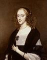 Coat of arms removed

Request: This image needs its watermark removed. Thank you, --Vincent Steenberg (talk) 18:20, 17 February 2013 (UTC)
Graphist opinion(s): is this ok ? Penyulap ☏ 07:25, 23 February 2013 (UTC)
- Thanks a lot. It's ok, but I still can detect an "r" on the lower right side. Vincent Steenberg (talk) 21:06, 23 February 2013 (UTC)

Could you edit this page and move the circle over the spot you mean, I cannot see a 'R' at all I'm sorry. Change the text which looks like <div style="position: absolute; left: 300px; top: 400px"> that will move the circle over the area you speak of. Penyulap ☏ 21:59, 23 February 2013 (UTC)
- I removed the "r"s in both pics.--Hic et nunc (talk) 08:24, 24 February 2013 (UTC)
- I admit the r was quite faint (only the outline showed), but now it's perfect. So everybody involved, thank you very much. Vincent Steenberg (talk) 08:48, 24 February 2013 (UTC)
- Wah ! I almost put the circle on top and I don't even see it. Penyulap ☏ 08:53, 24 February 2013 (UTC)
- Is there a tool to place that little red circle? Or did you mark it up manually? – JBarta (talk) 23:53, 24 February 2013 (UTC)
- Sorry I just noticed your question, the circle is easy to move manually, you just edit the section and change the numbers, use preview to see the result until happy. I do it manually. Penyulap ☏ 22:38, 9 March 2013 (UTC)
- Thanks. It's quite a little useful thing. – JBarta (talk) 01:07, 10 March 2013 (UTC)
- Sorry I just noticed your question, the circle is easy to move manually, you just edit the section and change the numbers, use preview to see the result until happy. I do it manually. Penyulap ☏ 22:38, 9 March 2013 (UTC)
- Is there a tool to place that little red circle? Or did you mark it up manually? – JBarta (talk) 23:53, 24 February 2013 (UTC)
- Wah ! I almost put the circle on top and I don't even see it. Penyulap ☏ 08:53, 24 February 2013 (UTC)
- I admit the r was quite faint (only the outline showed), but now it's perfect. So everybody involved, thank you very much. Vincent Steenberg (talk) 08:48, 24 February 2013 (UTC)
Two images for fix perspective edit


Please, if possible to straighten that images and see if they aren't too much pixelized so I like to nominate them for QI. Thanks!! Ezarateesteban 19:28, 19 February 2013 (UTC)
Graphist opinion(s):![]() DoneI hope that it's okay so. If not revert the versions.--Hic et nunc (talk) 13:45, 20 February 2013 (UTC)
DoneI hope that it's okay so. If not revert the versions.--Hic et nunc (talk) 13:45, 20 February 2013 (UTC)
- Thanks Hic, Regards!!! --Ezarateesteban 13:49, 20 February 2013 (UTC)
Possible to improve perspective? edit


Request: Is it possible to improve the perspective of images such as these, when they've been photographed at an angle instead of straight-on? I seem to recall seeing a couple of images on Commons that had been fixed, but maybe this is wishful thinking. (I don't have much knowledge when it comes to the technical side of graphics.) --Cynwolfe (talk) 19:35, 30 January 2013 (UTC)
- Thank you! I agree that in representing historical works like this it wouldn't be good to fabricate.
Graphist opinion(s):![]() Done This is what was possible without adding phantasy parts.--Hic et nunc (talk) 08:57, 31 January 2013 (UTC)
Done This is what was possible without adding phantasy parts.--Hic et nunc (talk) 08:57, 31 January 2013 (UTC)
Fix errors, please edit

From QIC revision, "Perspective needs to be fixed - left side leaning out, and bad crop (white background visible)." if possible Ezarateesteban 14:22, 24 February 2013 (UTC)
- like this ? Penyulap ☏ 23:33, 24 February 2013 (UTC)
- Thank you very much!!!! Ezarateesteban 11:32, 25 February 2013 (UTC)
- You're welcome :) Penyulap ☏ 12:23, 25 February 2013 (UTC)
Wang Gungwu - 20101125.jpg edit

Request: Please remove the white spot in the bottom left-hand corner and the line above the subject's head. Thanks! — SMUconlaw (talk) 18:36, 25 February 2013 (UTC)
Graphist opinion(s):
![]() Done - cropped as well. – JBarta (talk) 18:54, 25 February 2013 (UTC)
Done - cropped as well. – JBarta (talk) 18:54, 25 February 2013 (UTC)
- OK, that's a good solution. Thanks again for getting to this so speedily. — SMUconlaw (talk) 19:13, 25 February 2013 (UTC)
Boeing 787 cockpit edit
-
 Boeing 787 cockpit

Request: Remove the black strip on the bottom, and if possible remove the light watermark across the lower part of the photo. David1217 (talk) 01:06, 18 January 2013 (UTC)
Graphist opinion(s):![]() Done Phoenix7777 removed the black stripe and I did the same with the watermark. There were heavy CAs. So I reduced this a bit.--Hic et nunc (talk) 14:53, 22 January 2013 (UTC)
Done Phoenix7777 removed the black stripe and I did the same with the watermark. There were heavy CAs. So I reduced this a bit.--Hic et nunc (talk) 14:53, 22 January 2013 (UTC)
- I still see the watermark and black strip... David1217 (talk) 01:00, 23 January 2013 (UTC)
- Maybe a problem of the browser cache... Try to purge and reload.--Hic et nunc (talk) 07:00, 23 January 2013 (UTC)
Brighten and clean up this portrait edit
-
 Sir Richard Levett, Lord Mayor of London, by Godfried Schalcken, 1699
.jpeg)
Request: I wondered if the wizards here could find a way to brighten and clean up this portrait? Many thanks, as always. MarmadukePercy (talk) 01:54, 8 February 2013 (UTC)
Graphist opinion(s):
![]() Done: I added some contrast. Yann (talk) 10:06, 8 February 2013 (UTC)
Done: I added some contrast. Yann (talk) 10:06, 8 February 2013 (UTC)
- Many thanks! MarmadukePercy (talk) 17:41, 8 February 2013 (UTC)
- I tried again. Because of more contrast it became very green. I reduced gamma and added contrast too. If you don't enjoy it revert.--Hic et nunc (talk) 06:56, 10 February 2013 (UTC)
- It was better before. MarmadukePercy (talk) 09:49, 10 February 2013 (UTC)
- Okay, I reverted it.--Hic et nunc (talk) 07:18, 11 February 2013 (UTC)
- It was better before. MarmadukePercy (talk) 09:49, 10 February 2013 (UTC)
- I tried again. Because of more contrast it became very green. I reduced gamma and added contrast too. If you don't enjoy it revert.--Hic et nunc (talk) 06:56, 10 February 2013 (UTC)
Remove watermark, Barnum edit

Request: Remove watermark --Scewing (talk) 19:18, 21 February 2013 (UTC)
Graphist opinion(s):![]() Done In addition I restorated a bit.--Hic et nunc (talk) 10:27, 22 February 2013 (UTC)
Done In addition I restorated a bit.--Hic et nunc (talk) 10:27, 22 February 2013 (UTC)
- Did a little more cleanup and cropped some off the top. – JBarta (talk) 04:52, 11 March 2013 (UTC)
- Good idea and nice work.--Hic et nunc (talk) 15:26, 12 March 2013 (UTC)
Improve the piano edit
-
 improved original
 -
 a bit cropped version


Request: if possible, fix the CA in the right side of the piano and reduce the excesive bright withow loss of quality. Regards!!! Ezarateesteban 03:12, 4 March 2013 (UTC)
Graphist opinion(s):![]() Done The Cyan parts are reduced. To reduce he excessive bright is not so easy because the dark parts become nearly black. That would be not so good. I made a second version, turned the piano a bit, cropped to the instrument and sharpened a bit.--Hic et nunc (talk) 08:48, 4 March 2013 (UTC)
Done The Cyan parts are reduced. To reduce he excessive bright is not so easy because the dark parts become nearly black. That would be not so good. I made a second version, turned the piano a bit, cropped to the instrument and sharpened a bit.--Hic et nunc (talk) 08:48, 4 March 2013 (UTC)
Old map of Ceuta edit
-
 1797 map of Ceuta
 -
 without enlargement
 -
 complete plan


Request: Is that possible to remove the watermarking in the upper part of the picture? If possible, I'd like to remove also the leftovers of the frame in the lower part of the image. --Ecemaml talk to me/habla conmigo 22:36, 5 March 2013 (UTC)
Graphist opinion(s):
![]() Done - The image is of rather poor quality and pixelated because it's been enlarged at some point. It's a nice image, would be nice to have the full resolution unadulterated map. – JBarta (talk) 23:09, 5 March 2013 (UTC)
Done - The image is of rather poor quality and pixelated because it's been enlarged at some point. It's a nice image, would be nice to have the full resolution unadulterated map. – JBarta (talk) 23:09, 5 March 2013 (UTC)
- I downloaded the original and cropped it again without enlargment.--Hic et nunc (talk) 12:32, 8 March 2013 (UTC)
badly compressed (artefacts) edit
-
 Montage

Request: The montage is too low resolution and has a high jpeg compression. Could you please recreate a high res. montage out of the source images? --93.132.92.139 12:06, 10 March 2013 (UTC)
Graphist opinion(s):
![]() Done – JBarta (talk) 02:29, 11 March 2013 (UTC)
Done – JBarta (talk) 02:29, 11 March 2013 (UTC)
Too dark to read well edit
-
 Temple of Vesta (improved original)
 -
version by Ezarate
-
existing image?
-
3
-
4
-
number five

Request: Can the contrast/lighting be improved? It's used on a couple of pages at en.Wikipedia. --Cynwolfe (talk) 18:40, 10 March 2013 (UTC)
Graphist opinion(s):
Look this, If you like it Ezarateesteban 18:52, 10 March 2013 (UTC)
![]() Done – JBarta (talk) 22:25, 10 March 2013 (UTC)
Done – JBarta (talk) 22:25, 10 March 2013 (UTC)
- I tried to improve the sky and the trees in the background a bit. They were too bright now.--Hic et nunc (talk) 12:15, 11 March 2013 (UTC)
- Today is one of those 'commons wizard wants to search every one of it's 22 million pictures for duplicates and will really take it's time to do so' days. There are maybe 3 images to upload, there are different techniques in each one for altering the image.
- looks like it'll take a while. Penyulap ☏ 16:34, 11 March 2013 (UTC)
- Of course there are many ways to alter a pic. But what happend to your versions? If it was your intention to show that not every alteration makes sense, now it should be clear.--Hic et nunc (talk) 08:19, 12 March 2013 (UTC)
- No, it wasn't like that, I take the work seriously, (unusual for me :) eh?) the internet is causing trouble, or commons, or both. This is often the way with large files for me. Battling the commons wozzard is often harder than making the image itself.
- I do have the images, different techniques for making them selected parts lighter, but I cannot send them easily. Penyulap ☏ 09:36, 12 March 2013 (UTC)
- Seeing as the original image has been fixed, maybe it's time to abandon your ill-fated upload and mark it for deletion. – JBarta (talk) 10:40, 12 March 2013 (UTC)
- I have already requested a deletion of that part, however I'll upload it at some stage. It would be possible to upload parts which could be joined together, but that's hard work. Another connection should do the trick.
- Seeing as the original image has been fixed, maybe it's time to abandon your ill-fated upload and mark it for deletion. – JBarta (talk) 10:40, 12 March 2013 (UTC)
- Of course there are many ways to alter a pic. But what happend to your versions? If it was your intention to show that not every alteration makes sense, now it should be clear.--Hic et nunc (talk) 08:19, 12 March 2013 (UTC)
- Has the requester said it is done ? Penyulap ☏ 10:54, 12 March 2013 (UTC)
- I didn't know we we were waiting for him. Sometimes the requester never comes back ;-). I take it by your statements that you wish to continue in your effort. Carry on wayward son... carry on... – JBarta (talk) 11:23, 12 March 2013 (UTC)
- Indeed. Generally if the image is totally new and they put it in the article themselves and don't come back it's done, otherwise good to wait, or post a note on their tp. Penyulap ☏ 12:05, 12 March 2013 (UTC)
- I didn't know we we were waiting for him. Sometimes the requester never comes back ;-). I take it by your statements that you wish to continue in your effort. Carry on wayward son... carry on... – JBarta (talk) 11:23, 12 March 2013 (UTC)
- Has the requester said it is done ? Penyulap ☏ 10:54, 12 March 2013 (UTC)
three different versions at last, the fourth was lost, are any of these any good, or in the right direction ? Penyulap ☏ 15:11, 14 March 2013 (UTC)
- Sorry, I didn't mean to leave you hanging. I didn't place the image in the articles; I just saw them and found it hard to discern the objects in the foreground that were described in the article caption. I'll be happy with the version those of you with graphics expertise decide on. Cynwolfe (talk) 03:08, 16 March 2013 (UTC)
- No problem. I have no opinion, so if you guys want to pick whatever and delete the rest it's done. Penyulap ☏ 07:01, 16 March 2013 (UTC)
- I think the original (left) image is fine now. The rest can be deleted IMO. – JBarta (talk) 07:59, 16 March 2013 (UTC)
- Yes, it's vastly improved. Thank you so much. Cynwolfe (talk) 15:52, 16 March 2013 (UTC)
- I think the original (left) image is fine now. The rest can be deleted IMO. – JBarta (talk) 07:59, 16 March 2013 (UTC)
- No problem. I have no opinion, so if you guys want to pick whatever and delete the rest it's done. Penyulap ☏ 07:01, 16 March 2013 (UTC)
Penyulap, are we just leaving all those other versions littered about? Are you deleting any of them? – JBarta (talk) 16:53, 18 March 2013 (UTC)
- See below and/or see above. Penyulap ☏ 04:44, 19 March 2013 (UTC)
- Responded below. – JBarta (talk) 05:16, 19 March 2013 (UTC)
Try to apply HDR edit
 (EV0) |
(EV-1) (deleted) |
(EV1) (deleted) |
.jpg) New version of (EV0) |
 Another version of (EV0) |
Please if possible with any HDR technique to obtain a valid picture of the bust to José de San Martín, kinds regards!!! Ezarateesteban 20:13, 12 March 2013 (UTC)
- Maybe I'm missing something, but what are you trying to accomplish and why have you uploaded three copies of the same image? – JBarta (talk) 21:43, 12 March 2013 (UTC)
- They aren't identical, they have three differents Exposure value (0,1,-1) I am trying to obtain a good version Ezarateesteban 23:31, 12 March 2013 (UTC)
- I was trying to make a HDR, but the result is not good (because of the wind, which makes the branches of the tree moves). The good news is that you dont need to create a HDR here. Simple adjustment of shadow and highlight is enough.--ArildV (talk) 00:11, 13 March 2013 (UTC)
- Thanks AridV Ezarateesteban 00:23, 13 March 2013 (UTC)
- They aren't identical, they have three differents Exposure value (0,1,-1) I am trying to obtain a good version Ezarateesteban 23:31, 12 March 2013 (UTC)
- Well now we have four versions, none of which are very good (except the first). At least the fourth addresses the camera tilt... even if the coloring is rather horrid. Why not simply brighten the first a smidgen, fix the tilt and be done with it? Why these other light and dark versions littered about? Seems a wasteful exercise. – JBarta (talk) 00:46, 13 March 2013 (UTC)
The purpose of HDR is to photograph a scene with high dynamic range (hence the name) that cannot otherwise be captured by a single image, and then reduce its dynamic range to produce a final image. This scene, having low dynamic range, would have been better photographed using ETTR in order to maximize the data. Also, if you do take bracketed photos with the intention of creating a HDR I'd recommend loading them as a single image, one overwriting the other. The final image can then be uploaded to the same file and this keeps everything in one place. (Unless previous versions are likely to be quickly removed, in which case I'm wrong!)
That said, I took the middle (EV0) exposure, properly exposed/developed it, removed the graffiti and cropped to a more complimentary aspect ratio. (Actually I couldn't clean the graffiti from behind the trees so I though it easier to chop the sides off!) nagualdesign (talk) 04:31, 13 March 2013 (UTC)
- I did nearly the same but blurred the background and tried to achieve a HDR-like look.--Hic et nunc (talk) 11:59, 13 March 2013 (UTC)
Thank you very much to all!!! --Ezarateesteban 12:21, 13 March 2013 (UTC)
- Before reolving this, I think there's a little housekeeping that needs done. Delete images that are not useful and any that are kept put in the "other versions" sections. Just leaving these littered about unconnected is just a mess for someone else to clean up. – JBarta (talk) 16:57, 18 March 2013 (UTC)
- I think there are people who love to
argue overdiscuss which is the only version of an image that is the correct version and the one and only image that should exist, at DR. If there are 3 different artists with three different ideas here, there will surely be more opinions on which one is the correct version elsewhere. The percentage of editors who are artists is small. The number of editors is large. The number who like to argue is nefarious. Ten articles, ten projects, only 5 choices is not really an over-supply of choices and regardless of what happens they are on the hard drive in the database just the same. Penyulap ☏ 04:44, 19 March 2013 (UTC)- I think if a person uploaded a version of an image that is quite obviously inferior to the the one being used, then it is up to the uploader to request deletion of his own file. This idea that it's ok to have multiple unused images lying around because "hey, someone might find a use for my edit it someday" is just plain silly. If an editor cannot bring himself to delete his version, then at the very least he should make an effort to incorporate them into a category or other versions section or something rather than just making a mess and walking away from it. Creating files and uploading them is grand fun... but there's a little responsibility involved too. – JBarta (talk) 04:58, 19 March 2013 (UTC)
- This is the Graphics lab, it even says so at the top of the page. I think you're in the wrong room perhaps, or maybe it's the talkpage you're after. Penyulap ☏ 07:15, 19 March 2013 (UTC)
- I think if a person uploaded a version of an image that is quite obviously inferior to the the one being used, then it is up to the uploader to request deletion of his own file. This idea that it's ok to have multiple unused images lying around because "hey, someone might find a use for my edit it someday" is just plain silly. If an editor cannot bring himself to delete his version, then at the very least he should make an effort to incorporate them into a category or other versions section or something rather than just making a mess and walking away from it. Creating files and uploading them is grand fun... but there's a little responsibility involved too. – JBarta (talk) 04:58, 19 March 2013 (UTC)
- I think there are people who love to
Overburnt sky edit
-
 Overburnt sky

Request: Please fix the "Overburnt sky". --Ταπυροι (گپ) 10:03, 13 March 2013 (UTC)
Graphist opinion(s):![]() Done Now the sky is not overburnt anymore. Additionally I sharpened a bit and reduced chromatic aberration.--Hic et nunc (talk) 12:11, 13 March 2013 (UTC)
Done Now the sky is not overburnt anymore. Additionally I sharpened a bit and reduced chromatic aberration.--Hic et nunc (talk) 12:11, 13 March 2013 (UTC)
- Thank you very much Ταπυροι (گپ) 14:55, 13 March 2013 (UTC)
crop irregular frame edit
-
 Crop frame

Request: Could you please crop the frame. --Oursana (talk) 15:36, 15 March 2013 (UTC)
Graphist opinion(s):
Thank you––Oursana (talk) 01:56, 16 March 2013 (UTC)
- Ooops! Maybe I misunderstood the request. I assumed you wanted the grey 'frame' cropping. I didn't realize that that was the cropped version until I'd uploaded. Feel free to revert. nagualdesign (talk) 02:03, 16 March 2013 (UTC)
- No thank you, meanwhile I worked with gimp for the first time.––Oursana (talk) 08:25, 16 March 2013 (UTC)
- Good for you. Just remember to use plenty of lube and be firm but gentle. It's okay to hurt him but not okay to harm him. ..You are talking about this li'l fella, right?! :-P nagualdesign (talk) 22:58, 16 March 2013 (UTC)
- No thank you, meanwhile I worked with gimp for the first time.––Oursana (talk) 08:25, 16 March 2013 (UTC)
A bit too dark, perhaps crop edit
-
 I'm dark and mysterious.

Request: This image is dark and very hard to interpret. If the borders at top and bottom can be cropped without compromising the composition, that would be good, too. Thank you, Davidiad (talk)
Graphist opinion(s): Is this better ? open the image, hold down shift and click refresh to see the new picture. You can open the old image at the bottom of the file page. Penyulap ☏ 17:24, 16 March 2013 (UTC)
- Yes, I think much better ... and it doesn't look like much of anything was washed out. Thank you so much for taking care of that so quickly! Davidiad (talk) 17:35, 16 March 2013 (UTC)
- That's no problem, my invoice is in the mail :) Penyulap ☏ 17:49, 16 March 2013 (UTC)
- Penyulap, I think your second edit is oversharpened. Somewhere between your first and second edit would be better. – JBarta (talk) 19:44, 16 March 2013 (UTC)
- Well you're welcome to do your own adjustments of course, however as the requester, Davidiad, seems happy I'm done. I can make another version for you if you want to fill in the details of the file created. Penyulap ☏ 00:42, 17 March 2013 (UTC)
- No, more versions are not necessary. I just uploaded a less sharp edit. – JBarta (talk) 17:07, 18 March 2013 (UTC)
- Thanks, folks. It was a rough scan to begin with ... this is much more readable. Davidiad (talk) 02:44, 19 March 2013 (UTC)
- No, more versions are not necessary. I just uploaded a less sharp edit. – JBarta (talk) 17:07, 18 March 2013 (UTC)
- Well you're welcome to do your own adjustments of course, however as the requester, Davidiad, seems happy I'm done. I can make another version for you if you want to fill in the details of the file created. Penyulap ☏ 00:42, 17 March 2013 (UTC)
- Penyulap, I think your second edit is oversharpened. Somewhere between your first and second edit would be better. – JBarta (talk) 19:44, 16 March 2013 (UTC)
badly edit
-
 original image (Updated to final version by Centpacrr)
 -
 by penyulap
 -
by Centpacrr (Speedy delete has been requested by Centpacrr as this file is now redundant)


Request: Please fix the its sky, sun and sea. --Ταπυροι (گپ) 10:06, 19 March 2013 (UTC)
Graphist opinion(s):
Not entirely sure what you're looking for, but I rotated it level, lightened it slightly and cleaned up a few spots in the sky. – JBarta (talk) 10:26, 19 March 2013 (UTC)
- Can the sun be more normal? --Ταπυροι (گپ) 10:39, 19 March 2013 (UTC)
- Looks "normal" to me. Can you be more specific or point to some images that show the sun as you would consider "normal"? – JBarta (talk) 10:58, 19 March 2013 (UTC)
- no need to argue with the requester, it's like in shops where they have that sigh 'the customer is always right' anything else, and they might not ask again !!!
- Looks "normal" to me. Can you be more specific or point to some images that show the sun as you would consider "normal"? – JBarta (talk) 10:58, 19 March 2013 (UTC)
Like this ? f you can find a picture of a sun that you like somewhere on the internet and point to it for me, I can change the image accordingly. Penyulap ☏ 12:38, 19 March 2013 (UTC)
- The sun was not a certain geometry. However, thanks.--Ταπυροι (گپ) 13:48, 19 March 2013 (UTC)
- If you like a circular sun, I can make it. If you are happy, I can close the request. Penyulap ☏ 13:57, 19 March 2013 (UTC)
- I have made a new sun. Penyulap ☏ 14:13, 19 March 2013 (UTC)
- I gotta admit... that's a nice looking sun. – JBarta (talk) 03:22, 20 March 2013 (UTC)
- I am immune to your praise ! only the opinion of محک is important.
- (pauses a moment)
- ...ok, it didn't take me long to crumble, thank you :) Penyulap ☏ 03:38, 20 March 2013 (UTC)
- No one is immune to praise. Now if only people would be so welcoming of criticism... then we'd have something. – JBarta (talk) 03:42, 20 March 2013 (UTC)
- I am immune to praise if I choose, ok I choose now. Go ahead hit me with your best barrage ! Penyulap ☏ 03:46, 20 March 2013 (UTC)
- Rats! didn't work. (picks up fishing-for-too-many-extra-compliments fishing rod and net and goes home) Penyulap ☏ 03:57, 20 March 2013 (UTC)
- I am immune to praise if I choose, ok I choose now. Go ahead hit me with your best barrage ! Penyulap ☏ 03:46, 20 March 2013 (UTC)
- No one is immune to praise. Now if only people would be so welcoming of criticism... then we'd have something. – JBarta (talk) 03:42, 20 March 2013 (UTC)
- I gotta admit... that's a nice looking sun. – JBarta (talk) 03:22, 20 March 2013 (UTC)
- I have made a new sun. Penyulap ☏ 14:13, 19 March 2013 (UTC)
- If you like a circular sun, I can make it. If you are happy, I can close the request. Penyulap ☏ 13:57, 19 March 2013 (UTC)
- The sun was not a certain geometry. However, thanks.--Ταπυροι (گپ) 13:48, 19 March 2013 (UTC)
- Made and uploaded a new derivative (Jack-up-rig-in-the-caspian-sea_Derivative.jpg) in which I cleaned up multiple lens flare and rainbowing artifacts in sky (especially URQ) and redid sun with much reduced corona. Centpacrr (talk) 07:25, 20 March 2013 (UTC)
- FYI, there is a light round spot that appears on your edit to the right of the flame reflection. And am I really the only one who saw fit to level the horizon? – JBarta (talk) 07:30, 20 March 2013 (UTC)
- Spot left intentionally to give you something to complain about, although curiously none of the many lens flare artifacts and other faults or the lack of rotation seemed to bother you in this version that you say you like so much. Oh well.
- FYI, there is a light round spot that appears on your edit to the right of the flame reflection. And am I really the only one who saw fit to level the horizon? – JBarta (talk) 07:30, 20 March 2013 (UTC)
- As for leveling the horizon, as this image was most likely taken from a boat I actually think having the horizon tilted slightly (0.5º CW) gives it a more realistic feel than having it at exactly 90º. Of course that's just my personal taste and thus may not meet that mysterious arbitrary standard of what is considered "acceptable" for use on WP, but I'll take my chances and hope I am not reverted as having made yet another "poor" or "inferior" edit that is unworthy of seeing the light of day beyond just this page. Only time will tell presumably. Centpacrr ( talk) 07:38, 20 March 2013 (UTC) (NOTE: I reserve the option in advance to make modifications to this comment if I feel it would be useful for clarity whether or not it has been "responded to" in the interim.)
- Oooh, I like this one best of all. Not that it matters, the ONLY opinion that matters as I keep having to remind people, is the requester's opinion, and we must be careful not to scare them away! but I like that one :)
- is the FX lab a drama board ? I didn't know. I'm always last to know these things. Oh, I can hear the critics now "Penyulap has been editing the Graphics Lab, he won't stop, it's out of hand and needs blocks" Penyulap ☏ 08:22, 20 March 2013 (UTC)
- Not to worry, Penyulap, the issues referred to in my comment above have nothing whatever to do with anything you did which was all completely appropriate and appreciated, and you are also absolutely correct that "the ONLY opinion that matters as I keep having to remind people, is the requester's opinion" with which I agree completely although unfortunately that is not always the case with some other editors. I have no problem at all with you or your contributions in here. Centpacrr (talk) 08:52, 20 March 2013 (UTC)
- Dang! my efforts to annoy you have all been in vain, back to the drawing board :D Penyulap ☏ 08:54, 20 March 2013 (UTC)
- Not to worry, Penyulap, the issues referred to in my comment above have nothing whatever to do with anything you did which was all completely appropriate and appreciated, and you are also absolutely correct that "the ONLY opinion that matters as I keep having to remind people, is the requester's opinion" with which I agree completely although unfortunately that is not always the case with some other editors. I have no problem at all with you or your contributions in here. Centpacrr (talk) 08:52, 20 March 2013 (UTC)
This notion that the "only" opinion that matters here is the requester's is pure nonsense. It's ownership by transference. "I may not own the image... but he does, so I'm only going to listen to him". – JBarta (talk) 16:17, 20 March 2013 (UTC)
sigh Penyulap ☏ 17:49, 20 March 2013 (UTC)
- Thank you very, very, very much. My reply was too late for the Nowruz. Excuse me.--Ταπυροι (گپ) 19:56, 21 March 2013 (UTC)
- Replaced the last inferior edit on original file page with tweaked final edit of the "Derivative" so that this version now appears on all the pages in various Wikipedia projects to which the "original" file is linked. Centpacrr (talk) 22:39, 21 March 2013 (UTC)
- Personally, I like Penyulap's sun better than Centpacrr's. But beyond spitting out an opinion on the matter, I don't really care too much one way or the other. – JBarta (talk) 23:26, 21 March 2013 (UTC)
- Really, you like an image with multiple lens flare artifacts, several Moiré pattern-like ring distortions in the solar corona, severe rainbowing in the sky, and being 1º out of horizontal better than one in which all those defects have been cured? I am just wondering on what objective and/or subjective basis you would make that judgement so that I don't make these mistakes in the future. Centpacrr (talk) 01:21, 22 March 2013 (UTC)
- Centpacrr, if it has all the fields filled out for licensing and so on, I recommend keeping it, it's lovely. Just put a list of all the variations into the 'other versions' field of each file. In the future, on different languages and different projects, someone will find it to be just what they look for.
- Really, you like an image with multiple lens flare artifacts, several Moiré pattern-like ring distortions in the solar corona, severe rainbowing in the sky, and being 1º out of horizontal better than one in which all those defects have been cured? I am just wondering on what objective and/or subjective basis you would make that judgement so that I don't make these mistakes in the future. Centpacrr (talk) 01:21, 22 March 2013 (UTC)
- Personally, I like Penyulap's sun better than Centpacrr's. But beyond spitting out an opinion on the matter, I don't really care too much one way or the other. – JBarta (talk) 23:26, 21 March 2013 (UTC)
- Replaced the last inferior edit on original file page with tweaked final edit of the "Derivative" so that this version now appears on all the pages in various Wikipedia projects to which the "original" file is linked. Centpacrr (talk) 22:39, 21 March 2013 (UTC)
- Jbarta La lalalalalalalalalalala Penyulap ☏ 02:42, 22 March 2013 (UTC)
- Centpacrr, I said I like the sun. I didn't mention anything else. I think his sun is attractive and photorealistic and yours looks like a white hot moon. I suppose we can file that one under subjective. Penyulap, I get it... you're still not listening. No problem. – JBarta (talk) 03:04, 22 March 2013 (UTC)
- La lalalalalalalalalalala Penyulap ☏ 03:49, 22 March 2013 (UTC)
- Centpacrr, I said I like the sun. I didn't mention anything else. I think his sun is attractive and photorealistic and yours looks like a white hot moon. I suppose we can file that one under subjective. Penyulap, I get it... you're still not listening. No problem. – JBarta (talk) 03:04, 22 March 2013 (UTC)
- This all goes to prove my point made here that it is possible for there to be more than one acceptable way to edit an image file. Centpacrr (talk) 04:31, 22 March 2013 (UTC)
- Not really. There's a difference between genuine subjectivity and just plain sloppy work. If you build a garage and it's crooked, you're not going to have much luck convincing me it's just a subjective thing and a crooked garage is acceptable and all just a matter of taste. Now of course if you painted it green with hot pink polka dots, then maybe you'd have a case. You wouldn't have much work, but you'd have a case.... – JBarta (talk) 04:59, 22 March 2013 (UTC)
- This all goes to prove my point made here that it is possible for there to be more than one acceptable way to edit an image file. Centpacrr (talk) 04:31, 22 March 2013 (UTC)
- Wow, talk about a non-responsive false tautology to the issue being raised. Centpacrr (talk) 05:59, 22 March 2013 (UTC)
Please, let me help you here Centpacrr, now, first thing is to put your fingers in your ears, then repeat after me, "LA LA LA LA LA LA LA LA LA LA LA LA LA LA LA LA LA LA LA", now you try it. Penyulap ☏ 06:37, 22 March 2013 (UTC)
Restort it rectangular edit
 Please distort it rectangular. Ezarateesteban 12:56, 19 March 2013 (UTC)
![]() Done--Hic et nunc (talk) 14:59, 19 March 2013 (UTC)
Done--Hic et nunc (talk) 14:59, 19 March 2013 (UTC)
- Thanks Hic Ezarateesteban 23:44, 19 March 2013 (UTC)
Spot removal edit
-
 Lydia Pinkham trade card

Request: Can you remove the brown stains from the top and bottom of the image? --Oaktree b (talk) 16:04, 21 March 2013 (UTC)
Graphist opinion(s): like this ? Penyulap ☏ 16:25, 21 March 2013 (UTC)
- Yes, that's great. Thanks! Oaktree b (talk) 17:14, 21 March 2013 (UTC)
I have a difficult one ... edit
 |
 |
Request: I assume you've noticed the gigantic black rectangle in the upper right hand corner. Would it be possible for someone to get rid of it? Ed [talk] [en:majestic titan] 08:44, 22 March 2013 (UTC)
- No problem, you no doubt know a lot more about this ship than I do, if you are able to point to any photos of that part of the ship for me, I can reconstruct it using CGI.
- I've started with the easy parts, what a person's head and hat look like, I can guess some more and do a bit here and there. Maybe some ship experts can help a bit.
- There is a nice picture here of the wrong end, looks like a pleasant place to sit and enjoy the sun, until they fire that gun, then a short person would get their hat blown off.
- Does the MINAS GERAES have a sister ship ? it may indicate the shape of the ship. Penyulap ☏ 11:38, 22 March 2013 (UTC)
- Can always make it a gigantic gray rectangle. Might make it a little less obvious. – JBarta (talk) 08:55, 22 March 2013 (UTC)
- Can also crop, which will make the problem area smaller. – JBarta (talk) 09:12, 22 March 2013 (UTC)
- Cropping seemed out of the question to me because it sandwiched the crewmen against the right side of the image, but I'm not an image expert either. :-)
- The relevant categories are under Category:Minas Geraes class battleship. All photos of the sister ship, Sao Paulo, are fair game along with any Minas Geraes photos that have two funnels (not one). There are also more images here and here.
- Given that the boat davit and main gun seems to be farther away in this picture, it seems safe to say that this is taken from the rear port side of the ship (the other option, front starboard, is unlikely, because there would be a gigantic gun directly behind these guys, which a boat right over it). Your best bet for an image may be File:Minas Geraes coaling.jpg or this small but exact image. Ed [talk] [en:majestic titan] 12:36, 22 March 2013 (UTC)
- Can also crop, which will make the problem area smaller. – JBarta (talk) 09:12, 22 March 2013 (UTC)

- I agree with the camera position. I shall study those images and blueprints. ....
- It looks like the ship has guns fore and aft, they look to be the same configuration fore and aft on the blueprints and photographs, but the upper deck may be different.
- What about moving the text as I have (hold shift and click refresh) does that weigh into how much needs reconstruction at all ? Penyulap ☏ 12:51, 22 March 2013 (UTC)
- Everything should be symmetrical except for the two middle main gun turrets, which are mounted en echelon. I completely skipped over that main deck photo—it looks like that is the same place. These pictures were taken at close to the same time, so it's also safe to assume that they didn't change the gun's aim... do you think you only have to rebuild the smooth-sided barbette, part of the gun turret, and tarp(?) directly to the left of the turret? And can you copy that in from the other image, or is the change in perspective (different image locations) too much? P.S. a en:barbette is the big armored thing beneath the turret itself, which holds the guns. :-) Ed [talk] [en:majestic titan] 14:06, 22 March 2013 (UTC)
- Here is some more. This IS quite time consuming, but anything is possible. Penyulap ☏ 16:54, 22 March 2013 (UTC)
- There, I'd say that is pretty much a reconstruction, a good backbone is there, if not job done. Penyulap ☏ 18:51, 22 March 2013 (UTC)
- I gotta say, while it's attractive work, it's not historically accurate. If you flip back and forth between the images, this becomes plain. I think it's better to see no information than false information. We're supposed to be making an encyclopedia... a reliable encyclopedia. I'm not really liking this. – JBarta (talk) 20:03, 22 March 2013 (UTC)
- Repeat after me JBarta, Lalalalalalala :)
- An image is meant the same as the text in an article, it can simply describe a subject without the need to infringe copyright, it just has to get the gist of the idea across. A line drawing showing the battleship is just fine, so CGI or whatever is a fine as an advance on that description. It's just a different medium.
- If you want to argue these points further it does NOT go in the request sections it goes on the discussion page. Penyulap ☏ 20:14, 22 March 2013 (UTC)
- That last is a good point. Theoretically we can create any sort of made up nonsense we wish here... just hope those editing an encyclopedia article use some discretion. And again, very pretty work. – JBarta (talk) 20:31, 22 March 2013 (UTC)
- I gotta say, while it's attractive work, it's not historically accurate. If you flip back and forth between the images, this becomes plain. I think it's better to see no information than false information. We're supposed to be making an encyclopedia... a reliable encyclopedia. I'm not really liking this. – JBarta (talk) 20:03, 22 March 2013 (UTC)
- There, I'd say that is pretty much a reconstruction, a good backbone is there, if not job done. Penyulap ☏ 18:51, 22 March 2013 (UTC)
- Here is some more. This IS quite time consuming, but anything is possible. Penyulap ☏ 16:54, 22 March 2013 (UTC)
- Everything should be symmetrical except for the two middle main gun turrets, which are mounted en echelon. I completely skipped over that main deck photo—it looks like that is the same place. These pictures were taken at close to the same time, so it's also safe to assume that they didn't change the gun's aim... do you think you only have to rebuild the smooth-sided barbette, part of the gun turret, and tarp(?) directly to the left of the turret? And can you copy that in from the other image, or is the change in perspective (different image locations) too much? P.S. a en:barbette is the big armored thing beneath the turret itself, which holds the guns. :-) Ed [talk] [en:majestic titan] 14:06, 22 March 2013 (UTC)
- Re cropping, I wouldn't be so quick to dismiss it. There's some room to do so. Here is a quick mockup of a cropped and edited image. The benefit is a whole lot less area to fill in... and the area you do fill in is less obvious. – JBarta (talk) 17:17, 22 March 2013 (UTC)
- Why don't we combine the two ideas? We know for sure that the barbette and turret will be there, but possibly not exactly where the guns are, so can we take Penyulap's restoration and crop it just to the left of the guns? Also I don't have a problem with digitally restoring missing pieces of an image; I've seen User:Durova do it many times back in the day. Ed [talk] [en:majestic titan] 18:55, 23 March 2013 (UTC)
- Do you mean move the heavy guns to the right, out of view, or the machinegun that is up top, or both ? We have those other images and apparently the blueprints to help position them. Penyulap ☏ 19:01, 23 March 2013 (UTC)
- I meant the heavy guns on the right, but if you're confident they are in the right position, then I'm fine with it. :-) Just two last requests: can we get rid of the written caption on the top, and is it possible to fix the scratches on the heavy gun turret? Thank you so much for your helpfulness. Ed [talk] [en:majestic titan] 11:43, 25 March 2013 (UTC)
- It seems correct to me according to the pics and blueprints, though I did wipe off a small flat section on the front of the housing.
- I meant the heavy guns on the right, but if you're confident they are in the right position, then I'm fine with it. :-) Just two last requests: can we get rid of the written caption on the top, and is it possible to fix the scratches on the heavy gun turret? Thank you so much for your helpfulness. Ed [talk] [en:majestic titan] 11:43, 25 March 2013 (UTC)
- Do you mean move the heavy guns to the right, out of view, or the machinegun that is up top, or both ? We have those other images and apparently the blueprints to help position them. Penyulap ☏ 19:01, 23 March 2013 (UTC)
- Why don't we combine the two ideas? We know for sure that the barbette and turret will be there, but possibly not exactly where the guns are, so can we take Penyulap's restoration and crop it just to the left of the guns? Also I don't have a problem with digitally restoring missing pieces of an image; I've seen User:Durova do it many times back in the day. Ed [talk] [en:majestic titan] 18:55, 23 March 2013 (UTC)
- What about moving the text as I have (hold shift and click refresh) does that weigh into how much needs reconstruction at all ? Penyulap ☏ 12:51, 22 March 2013 (UTC)
- Ok, I've done the cleanup and removed text, the cache seems to be not updating right now, but you can click the thumb for the new image. If it is ok I'll mark it as resolved, though, there is some cloning work for anyone who is interested in fine tuning. Penyulap ☏ 13:54, 25 March 2013 (UTC)
- Sorry for the slow reply—thank you so much! :-) Ed [talk] [en:majestic titan] 00:21, 2 April 2013 (UTC)
- Ok, I've done the cleanup and removed text, the cache seems to be not updating right now, but you can click the thumb for the new image. If it is ok I'll mark it as resolved, though, there is some cloning work for anyone who is interested in fine tuning. Penyulap ☏ 13:54, 25 March 2013 (UTC)
Posters covering a building near Lynchburg edit
-
Posters covering a building near Lynchburg to advertise a Downie Bros. circus by Walker Evans
Request: Please gently crop this photograph by Walker Evans. Many thanks. --MarmadukePercy (talk) 09:48, 25 March 2013 (UTC)
Graphist opinion(s): Like this ? (don't forget to hold down the shift key and click refresh to see the new image) Penyulap ☏ 10:35, 25 March 2013 (UTC)
- Looks great. Many thanks for the fast turnaround! MarmadukePercy (talk) 10:41, 25 March 2013 (UTC)
- Welcome. Penyulap ☏ 10:44, 25 March 2013 (UTC)
- I'm sorry but this constitutes a derivative work, I've nominated it for deletion.--Vera (talk) 12:45, 31 March 2013 (UTC)
- Welcome. Penyulap ☏ 10:44, 25 March 2013 (UTC)
Remove watermark: Adam Johann Braun, Mädchenschule, 1789 edit
-
 Watermark in 2nd version

Request: The second version of this (see file history) is considerably larger, but unfortunately has a watermark across it. Can it be removed? If yes, please save larger version without watermark as the current version. Thanks. --Vydra (talk) 00:11, 31 March 2013 (UTC)
Graphist opinion(s):
| Extended content |
|---|
|
Penyulap will be right on it as watermark removal is virtually effortless for him and he is quite close to finishing the concept for an automated watermark removal tool making watermarked images practically a non-issue. – JBarta (talk) 21:49, 31 March 2013 (UTC)
|
![]() Done - Oh well, I tried. Penyulap just won't do it. I went and did it manually the old fashioned way. Actually, I didn't remove all of the watermark... traces do remain, but they are completely unnoticeable. Also cleaned up a bunch of white spots. – JBarta (talk) 13:26, 1 April 2013 (UTC)
Done - Oh well, I tried. Penyulap just won't do it. I went and did it manually the old fashioned way. Actually, I didn't remove all of the watermark... traces do remain, but they are completely unnoticeable. Also cleaned up a bunch of white spots. – JBarta (talk) 13:26, 1 April 2013 (UTC)
- Awesome ! surprising how much less effort needs to be put into GIMP rather than trying to argue with people I'm sure. Penyulap ☏ 13:46, 1 April 2013 (UTC)
- Actually I don't use GIMP very much. But thanks. And who's arguing? I was just trying to enlist your services for the good of all. – JBarta (talk) 14:50, 1 April 2013 (UTC)
Thank you. --Vydra (talk) 16:53, 1 April 2013 (UTC)
Remove watermark, Cathedral edit
-
 Cathedral of Ciudad Quesada

Request: Is that possible to remove the watermarking? --Ecemaml talk to me/habla conmigo 17:44, 3 April 2013 (UTC)
- Better now? The cache isn't purging so it may take a while to show. I put one in the notes at 300px wide.--Canoe1967 (talk) 19:41, 3 April 2013 (UTC)
Much better. I'd like to know why the page refuses to purge the cache, but I've verified it works. Thanks!!! --Ecemaml talk to me/habla conmigo 21:58, 3 April 2013 (UTC)
- You are very welcome. The purge is a tech glitch that is very common. Sometimes you can fix it by making an odd sized thumb like 199 or 299px. I tried that to no avail. Sometimes it takes a day or so but they will fix themselves. I will mark this section as resolved then.--Canoe1967 (talk) 00:33, 4 April 2013 (UTC)
- In the past I've always been able to see the current version by appending ?action=purge to the direct file name (not the image description page). Oddly today even that isn't working. Maybe those in the front office should spend less effort making things like glossy brochures and more effort seeing that software & servers actually run reliably. Who needs his & her climate control seats when the wheels keep falling off? </rant> – JBarta (talk) 03:36, 4 April 2013 (UTC)
- You are very welcome. The purge is a tech glitch that is very common. Sometimes you can fix it by making an odd sized thumb like 199 or 299px. I tried that to no avail. Sometimes it takes a day or so but they will fix themselves. I will mark this section as resolved then.--Canoe1967 (talk) 00:33, 4 April 2013 (UTC)
Graphist opinion(s):
Remove watermark, Spanish painter edit
-
 Portrait of a Spanish painter

Request: Remove the watermark if possible, please --Ecemaml talk to me/habla conmigo 21:59, 3 April 2013 (UTC)
Graphist opinion(s):
![]() Done – JBarta (talk) 03:17, 4 April 2013 (UTC)
Done – JBarta (talk) 03:17, 4 April 2013 (UTC)
- Thanks again :-) --Ecemaml talk to me/habla conmigo 06:27, 4 April 2013 (UTC)
Aerial photo of Southampton Television Centre edit

Request: Can this photo be colour corrected or can I replace it with a colour-corrected version?. --Murgatroyd49 (talk) 12:04, 4 April 2013 (UTC)
Graphist opinion(s): I make only a small additional adjustment, your own work was fine, though I think it is possible that you cannot see your own good work, hold down the shift key and press refresh to clear the cache on your browser. Penyulap ☏ 12:16, 4 April 2013 (UTC)
- Penyulap, your last has a wicked green cast. While Murgatroyd49's last was a little bluish, your fix is way too much IMO. I think the final color should be closer to his. – JBarta (talk) 17:58, 4 April 2013 (UTC)
- Really ? I was aiming for an ominous turquoise actually. Either way, so far Murgatroyd49 seems happy enough, (Penyulap tilts head and looks over the top of their glasses like a professor) and we all know that is the only opinion that counts now don't we, hmm ?
- Anyhow, i was thinking the problem was simply the cache update, I think Murgatroyd49 was looking at the original version and thought something went wrong, but it was actually just the server. I was going to leave it for a day or two and see if Murgatroyd49 said anything, and then go from there, asking or whatever. Penyulap ☏ 18:14, 4 April 2013 (UTC)
- Uploaded an alterate color correction. Actually it turned out pretty close to Murgatroyd49's. And while the cache problem is particularly bad lately, the green tint isn't caused by that. At any rate, there are a few versions to choose from. – JBarta (talk) 18:33, 4 April 2013 (UTC)
Thanks folks, it was probably the cache that was confusing me at first. Looks a lot better nowMurgatroyd49 (talk) 16:10, 8 April 2013 (UTC)
- you're welcome, and don't worry that cache thing confuses absolutely everyone, and that's when it's working normally, sometimes it is even worse than that, and nothing you can do except wait a week will work. Take care. Penyulap ☏ 18:46, 8 April 2013 (UTC)
Why is this black? edit
-
 Three sides of a Gallo-Roman altar
 -
 same problem


Request: What's up with this image? When you place it on the page, it looks black, but when you click on it to zoom/download, it looks normal. --Cynwolfe (talk) 17:36, 5 April 2013 (UTC)
Graphist opinion(s): It is a transitory problem on the internet, it works sometimes but not others. Could be anything, a bug, a DDOS attack, slow server, don't know. Check if it keeps happening. Or has it happened for a while ?
When you say black, do you mean the colour black, or blank / missing ? Penyulap ☏ 18:10, 5 April 2013 (UTC)
- When I go to the file page, the image looks so black that I can barely see the outlines. It almost looks like a negative. When I click on it, however, and it goes to the zoom/download view, it looks fine: the monuments are a sandstone color, on a blank white background. When I tried to place the image at en.Wikipedia, it looks black in preview, so I didn't use it. It's used for an article at fr.Wikipédia (fr:Autels tauroboliques de Lyon), where it also looks black when I visit the page. (So when I say "black", I mean that's the dominant color, with gray outlines, rather like a negative image, and I can't discern the objects very well.) Cynwolfe (talk) 20:27, 5 April 2013 (UTC)
I don't see any problems personally with the original image, but have seen many instances of what (for lack of a better term) I call the CMYK bug. Forgive me, I may not use the correct terminology here, but when an image is saved using CMYK colors rather than RGB colors, sometimes squirrely things happen when displaying the image here. The cure is simply resaving it with RGB colors. So, I resaved it, uploaded and it should be ok now (at least it will when the servers get around to updating the image). – JBarta (talk) 20:20, 5 April 2013 (UTC)
- Thanks. Just noticed there's a second one with the same problem: it looks fine when I click to zoom or download, but not in the regular page display. Cynwolfe (talk) 20:33, 5 April 2013 (UTC)
- Resaved and uploaded. And leave a note here if the problem you see goes away with this fix. – JBarta (talk) 20:42, 5 April 2013 (UTC)
- I notice now the color of the displayed images has changed slightly. For me, the new images don't have a greenish hue. Hopefully that's a good thing rather than a bad thing. (I think it is a good thing, because when I load the original image into both GIMP and IrfanView, the image shows up without the greenish tint.) – JBarta (talk) 20:48, 5 April 2013 (UTC)
Cynwolfe, I had checked the French pages at the start, as soon as you brought it up here. I expect that you'll find it is your setup, the browser most likely. If you burn an "Ubuntu live CD" (just google for one) you can quickly rule out the Internet and commons as the cause of the problem. Other things you can try is to hold Ctrl and press + to zoom in (Ctrl and 0 to reset) and uploading a screenshot. If it doesn't come out on a screenshot then it's your graphics card that is a possible suspect. Save a screenshot and look at it in an image viewer. Penyulap ☏ 21:51, 5 April 2013 (UTC)
- Thanks. It seems that what Jbarta did fixed the problem without my doing anything on my end. I haven't encountered a similar problem with any other images. Cynwolfe (talk) 23:44, 5 April 2013 (UTC)
light Problem edit
-
 An old man Standing in front of bazaar in hurghada, egypt.

Request:Intense light at the top... --Emara (talk) 16:30, 11 April 2013 (UTC)
Graphist opinion(s):
Reduced the glare overall. It's a bit of an improvement, but not a whole lot. I think to do more would require some creative editing. – JBarta (talk) 22:13, 11 April 2013 (UTC)
- I tried too. So you can take the version that you like most.--Hic et nunc (talk) 14:21, 12 April 2013 (UTC)
- Thank you--Emara (talk) 15:53, 12 April 2013 (UTC)
Noisy dark parts edit
-
 Entrance to a cellar

Request:
- The dark parts became noisy after lighting them up. Is it possible to denoise them. Thanks -- Wolfgang Moroder (talk) 20:43, 11 April 2013 (UTC)
Graphist opinion(s):I tried to improve. If you don't like it revert.--Hic et nunc (talk) 14:23, 12 April 2013 (UTC)
- It's QI now. Thanks a lot--Wolfgang Moroder (talk) 00:11, 13 April 2013 (UTC)
Watermarks edit
Great work! My browser cache cleared and it is fine for the infobox now. I may look for a better version in a day or so to save any further time on this one.--Canoe1967 (talk) 03:46, 16 April 2013 (UTC)

I uploaded three versions of File:James Daly Medical Center 1975.jpg to the same page. All have watermarks but in different places. Would it be easy to cut and paste the good bits together or wait until a clean version shows up on Ebay?--Canoe1967 (talk) 19:13, 15 April 2013 (UTC)
- I made the watermark less visible. If someone wants to improve, go ahead. Amada44 talk to me 20:03, 15 April 2013 (UTC)
- Thanks and no rush. I just noticed that File:Chad Everett James Daly Medical Center 1969.JPG is in his infobox at en:wp and went looking for a better head shot. I tried Google but can't find that image. After google gets mine up in a few days I may be able to search similar.--Canoe1967 (talk) 20:11, 15 April 2013 (UTC)
a university building edit
-
 a university building in 1908
.jpg)
Article(s): [[]]
Request:
- There's a watermark in the lower right corner; can that be removed? -- DS (talk) 21:40, 14 April 2013 (UTC)
Graphist opinion(s):
![]() Done - Uploaded the original from LOC. – JBarta (talk) 02:29, 15 April 2013 (UTC)
Done - Uploaded the original from LOC. – JBarta (talk) 02:29, 15 April 2013 (UTC)
overexposed image edit
-
 I need some love

Request:
- This image is badly overexposed and needs some brightness fixing. -- 77.2.45.71 17:08, 12 April 2013 (UTC)
Graphist opinion(s): ![]() Done Colours are better now. A bit contrast, less saturation...--Hic et nunc (talk) 11:17, 15 April 2013 (UTC)
Done Colours are better now. A bit contrast, less saturation...--Hic et nunc (talk) 11:17, 15 April 2013 (UTC)
That image is beyond awful. It doesn't look over-exposed... it looks like someone made a mess out of it with Photoshop. Is there an original image as it came from the camera? If so, upload that and we'll see what we can do with it. Other than that, the deletion request is correct... it's embarassingly bad and we have better pictures of that bridge. – JBarta (talk) 19:13, 12 April 2013 (UTC)
- Nevermind, Hic et nunc did a fine job
rescuing it"giving it some love" and making it somewhat presentable. – JBarta (talk) 11:35, 15 April 2013 (UTC)
- Jbarta is it always necessary to argue with every requester that their request is somehow invalid because you can't do it ? I stumbled onto old comments from when I first started drawing back last year, and it looks like the same thing now as it was way back then. It is easy to get some tutorials and learn what Hic et nunc and I can do, then you don't need to have an argument, because you could just do the request in a trifle, rather than argue it can't be / shouldn't be / won't be done because it's not proper / too hard / impossible / needs a genius the likes of which the world has never seen / not making sense / the requester is raving mad lunatic / I'm hungry call back later / whatever.
- It is easy to learn, there are many tutorials and much documentation if you need help you can just ask the multitude of helpers. Look how far I have come, and I'm a complete moron, everyone knows that. Penyulap ☏ 12:05, 15 April 2013 (UTC)
- Actually I've seen some of your work Penyulap... some of it not bad at all. Too bad you don't do more of that and less of this. Then you wouldn't have to keep calling yourself a complete moron. Wouldn't be necessary any more. – JBarta (talk) 18:16, 15 April 2013 (UTC)
- Done I have some enhanced. PawełMM (talk) 11:05, 20 April 2013 (UTC)
- Actually I've seen some of your work Penyulap... some of it not bad at all. Too bad you don't do more of that and less of this. Then you wouldn't have to keep calling yourself a complete moron. Wouldn't be necessary any more. – JBarta (talk) 18:16, 15 April 2013 (UTC)
- This section was archived on a request by: McZusatz (talk) 19:45, 17 May 2013 (UTC)
Noise reduction of background edit
- This section was archived on a request by: {{resolvedKevjonesin (talk) 12:48, 22 May 2013 (UTC)}}
-
 Plaster cast
 -
 cgi background
 -
 cgi background 2
 -
 A plain dark blue rendered photographers backdrop
 -
 by Hic et nunc


Request: Please reduce noise in the blue background --Wolfgang Moroder (talk) 06:46, 19 March 2013 (UTC)
Graphist opinion(s):![]() Done I reduced noise. If anybody is able to get a better work, feel free to revert.--Hic et nunc (talk) 09:30, 19 March 2013 (UTC)
Done I reduced noise. If anybody is able to get a better work, feel free to revert.--Hic et nunc (talk) 09:30, 19 March 2013 (UTC)
- Here is a cgi version. If you care to go in that direction I can work the shadows and colour as you please. (like the base and so on) Penyulap ☏ 09:45, 19 March 2013 (UTC)
- Thanks, looks fine to me --Wolfgang Moroder (talk) 12:56, 19 March 2013 (UTC)
![]() Request Sorry, didn't see the color banding, the hue is nice. Can you fix it please? --Wolfgang Moroder (talk) 06:56, 20 March 2013 (UTC)
Request Sorry, didn't see the color banding, the hue is nice. Can you fix it please? --Wolfgang Moroder (talk) 06:56, 20 March 2013 (UTC)
- Ok, here is irony, I've done the obvious which is to add noise to the background texture prior to rendering.

- Ok, here is irony, I've done the obvious which is to add noise to the background texture prior to rendering.
- however, it's mathematically pure and should do the job as intended. While adding the image and shadow to the render, I think I improved presentation a little, is this ok ? also, I can upload shadows and background separate from the image of the artwork if you like. Penyulap ☏ 07:50, 20 March 2013 (UTC)
Just a comment here... this "noise" in the background of the original image is just the texture of the background and isn't something that needs to be "fixed". Not every background needs to be smooth and groovy. Some of us like a simple non-obtrusive background that doesn't overwhelm the subject. Just sayin. – JBarta (talk) 07:19, 20 March 2013 (UTC)
- It looks like corrugated card background, sorry, I have redone the next render without that look, is it the right direction otherwise though ? I can try to squeeze in some more hues, I should examine the numbers that it is producing on those grains to see how far apart in spectrum they are, and make them smaller as well.
- I'm uploading a plain background now..Penyulap ☏ 08:00, 20 March 2013 (UTC)
- If you must go the "smooth and groovy" background route, might I suggest the shadows be a little (lot) smaller and less pronounced? And the "shelf" a little less rounded? More like a shelf that such a piece might actually sit on and less like a waterslide. – JBarta (talk) 16:29, 20 March 2013 (UTC)
- I'm uploading a plain background now..Penyulap ☏ 08:00, 20 March 2013 (UTC)
- No, you cannot. You'll need to put in a request like everyone else at the top of the page. Penyulap ☏ 17:52, 20 March 2013 (UTC)
- Amusing reply. At any rate, here are some ideas for a slightly lower key background. You (or anyone else) may use or not use as you wish. (Your cgi2 background is fairly attractive, but would be better IMO with the suggestions I mentioned above.) – JBarta (talk) 18:23, 20 March 2013 (UTC)
Don't care, am not listening. pls tell someone else. Penyulap ☏ 18:32, 20 March 2013 (UTC)
- Well obviously you are listening or you wouldn't have replied. If it makes you feel any better, the suggestion was aimed at anyone (though, admittedly primarily at you because you made the edit). – JBarta (talk) 18:41, 20 March 2013 (UTC)
- I'm not listening and I'm not replying either. Point that thing at someone else. Penyulap ☏ 18:44, 20 March 2013 (UTC)
- (fingers in ears) lalalalalalalaaa. Ha it's working, I can't hear a thing. Penyulap ☏ 19:03, 20 March 2013 (UTC)
- I'm not listening and I'm not replying either. Point that thing at someone else. Penyulap ☏ 18:44, 20 March 2013 (UTC)
Remove cable and glare edit
- This section was archived on a request by: Kevjonesin (talk) 12:46, 22 May 2013 (UTC)
-
 Church of San Pedro, Gumiel de Mercado

Article(s): es:Gumiel de Mercado
Request: I wonder if someone could remove the overhead cables that got in my way in this picture and, if at all possible, remove/decrease the effect of the glare on the right hand-side of it. Thank you.-- Rowanwindwhistler (talk) 19:32, 15 April 2013 (UTC)
- I did a bit. Amada44 talk to me 20:19, 15 April 2013 (UTC)
- Hmmm, no not really. I meant removing the cable altogether so that it does not show at all (if possible, that is)...--Rowanwindwhistler (talk) 21:04, 15 April 2013 (UTC)
- Did the rest. – JBarta (talk) 06:51, 16 April 2013 (UTC)
- I think it is very nice now, no cable any more and the glare has decreased quite a lot. Thank you both for your efforts!--Rowanwindwhistler (talk) 18:43, 16 April 2013 (UTC)
- Did the rest. – JBarta (talk) 06:51, 16 April 2013 (UTC)
- Hmmm, no not really. I meant removing the cable altogether so that it does not show at all (if possible, that is)...--Rowanwindwhistler (talk) 21:04, 15 April 2013 (UTC)
Graphist opinion(s):
Request for image review and potential editing edit
- This section was archived on a request by: Kevjonesin (talk) 12:45, 22 May 2013 (UTC)
-
 Unedited original photo
 -
 a cropped example of the image
 -
 JBarta's edit
 -
 Hic et nunc's version


.JPG)
.jpg)
Article(s): Thailand
Request: The following request was originally posted on the help desk and I was subesequently redirected to submit here in the Graphic Lab:
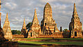
I have uploaded in Commons an image of Wat Chaiwatthanaram which is a historic temple located in Ayutthaya, Thailand. This image is currently being used in the main Thailand Wikipedia page as part of the history section. I have been considering submitting the photo for the featured photo review and have been reviewing the photo submission guidelines. So far, the only adjustments I have made are two cropped versions where the top and bottom of the image have been trimmed. All other aspects of the photo are as originally created. One area of the photo that may need help is the far right structure near the edge of the photo, where some lack of focus and minor distortion is apparent. The featured photo submission pages mention that there are photo experts that may be able to review the photo for potential improvement if I make a submission to the help desk. Can someone please take a look at the photo and advise if you feel any improvements can be made. Any other opinions are welcomed.
Per the help desk's recommendation, I have uploaded the original photo at this URL:
http://commons.wikimedia.org/wiki/File:WatChaiwatthanaram_2292_original.JPG
Examples of cropped images that have been used in the Wikipedia Thailand web page are located here:
http://commons.wikimedia.org/wiki/File:WatChaiwatthanaram_2292.JPG
G2nfreeb (talk) 10:50, 19 April 2013 (UTC)
>>> Thanks for your help - appreciate it
Graphist opinion(s):
Uploaded an edit. Slightly different crop, sharpened the structure on the right, cleaned up a couple small spots and slightly adjust color & brightness. – JBarta (talk) 11:26, 19 April 2013 (UTC)
- I tried too but it's very similar.--Hic et nunc (talk) 12:42, 19 April 2013 (UTC)
Two scans that need to be stitched together edit
- This section was archived on a request by: {{resolved OP seems satisfied. Kevjonesin (talk) 12:43, 22 May 2013 (UTC)}}
-
 Top part
 -
 Bottom part
 -
 combined


Article(s): probably w:Polish–Soviet War
Request:
- I came here after receiving help desk advice from Canoe1967 (talk · contribs). My original plan was to just tag the two images with a template that marked them as needing to be stitched together. For my purposes, that's all I need, but to talk someone into actually doing it get is even better. Thanks in advance. — 67.101.5.251 07:51, 26 April 2013 (UTC) P.S. I still think a {{Needs stitching}} template is needed.
Graphist opinion(s):This would be no problem if the scan were complete. But if you look on both parts you see that the text is not complete. Could you scan this again, if possible with a bit of overlapping? Even three parts would be okay to be stitched.--Hic et nunc (talk) 08:05, 26 April 2013 (UTC)
![]() Done - You may want to fix the source (not that you scanned it, but where specifically it's from) and the author (not you, but who wrote it). – JBarta (talk) 08:17, 26 April 2013 (UTC)
Done - You may want to fix the source (not that you scanned it, but where specifically it's from) and the author (not you, but who wrote it). – JBarta (talk) 08:17, 26 April 2013 (UTC)
- Oh, I wrote a bit of nonsense. It was complet and your work is great. I think User:Piotrus will like it. --Hic et nunc (talk) 14:23, 26 April 2013 (UTC)
- We all trip over ourselves from time to time ;-) – JBarta (talk) 15:55, 26 April 2013 (UTC)
Parliament House sign, Singapore - 20100803.jpg edit
- This section was archived on a request by: Kevjonesin (talk) 12:41, 22 May 2013 (UTC)

Article(s): en:Exclusion of judicial review in Singapore law
Request:
- The photograph is slightly skewed. Can someone please fix this? Thanks! — SMUconlaw (talk) 19:49, 15 May 2013 (UTC)
Graphist opinion(s):![]() Done --Hic et nunc (talk) 06:18, 16 May 2013 (UTC)
Done --Hic et nunc (talk) 06:18, 16 May 2013 (UTC)
- That looks great. Thanks! — SMUconlaw (talk) 07:28, 16 May 2013 (UTC)
White-spectacled Bulbul edit
- This section was archived on a request by: {{resolved OP expressed satisfaction. Kevjonesin (talk) 12:40, 22 May 2013 (UTC)}}
-
 White Spectecled Bulbul
 -
 taller, centred on eye
 -
 taller, centred on body


Article(s): [[]]
Request:
- Can you please Corp this photo so that the bird is in the center exactly, without effecting its resolution, since its photographer intends to nominate it as a featured photo on ar. Wiki. Thanks -- باسم (talk) 13:47, 21 May 2013 (UTC)
Graphist opinion(s):
- like this ? Penyulap ☏ 15:59, 21 May 2013 (UTC)
- I did a lossless crop on the original while keeping the 4:3 resolution. --McZusatz (talk) 16:06, 21 May 2013 (UTC)
- Yes, both look great :-) thanks for both of you!--باسم (talk) 19:14, 21 May 2013 (UTC)
DVD cover edit
- This "stale" section was archived by --Kevjonesin (talk) 20:01, 23 June 2013 (UTC)

See:http://en.wikipedia.org/wiki/File_talk:Elephants_dream_(DVD_cover).jpg for details. Anyone want tro try making one from a free licence screen shot?--Canoe1967 (talk) 01:07, 31 March 2013 (UTC)
Like this ? :D
no, but seriously, what should it be tailored to, articles somewhere else or a dvd you're making ? (either is good) Penyulap ☏ 01:29, 31 March 2013 (UTC)
- Everything about the movie is CC-by-sa except the DVD cover. Most elements of the cover are free licence or PD. I think they just wish a DVD cover made from scratch to be legal. "Artists conception" may be needed in all captions. We could use my latest image File:Protest info image draft.png and a similar caption linking to their image page and the laws involved. See the caption layout I did on mine?--Canoe1967 (talk) 01:53, 31 March 2013 (UTC)

- Possibly I shouldn't have used the term 'protest'. 'Information campaign' may be a less harsh term. My yellow on black my seem a little harsh as well. I have brought up similar issues at Mr. Wales' talk page: http://en.wikipedia.org/wiki/User_talk:Jimbo_Wales#Wisdom_needed concerning the need for works made from scratch to replace all the fair use ones that are being deleted there and 3D sculpture images being deleted here. Technically we can't host http://en.wikipedia.org/wiki/File:Oscar_statuette.jpg over there because free licence images are available if we have one under FOP or contact the rights holders to provide official images. The WWE fans over there may fight a battle by putting the Oscar image and others up for deletion. If that happens then the issue may be noticed by far more editors. So far no one on Mr. Wales' talk page seems concerned but the WWE project is very concerned as they are losing many images for their articles.--Canoe1967 (talk) 14:06, 31 March 2013 (UTC)
- Oh good luck getting some sense out of that editors talkpage. I can't help, I tried asking Jimbo himself what I would think is a pretty straightforward question about some artwork he was the subject of, and I did get a response that is true, but I can't say I could make heads or tails out of it. I can see you're query there is met with nonsense but when I first opened the page, it lined up with the section below, regarding bullying destroying the project, I'll tell you now, that's a subject not worth raising because it is policy to back it up, or ignore it. I can't see how you'll get much chatter and input in public venues over there, they are all soaked in blood (Colosseum type figurative blood, not that girl who killed herself over Internet bullying type blood). You'll need to persist with the fans is all you can do I guess, or start an alternative wiki like wikialpha. That is the straightforward perfect solution, search engines find them just the same. Penyulap ☏ 14:57, 31 March 2013 (UTC)
- Possibly I shouldn't have used the term 'protest'. 'Information campaign' may be a less harsh term. My yellow on black my seem a little harsh as well. I have brought up similar issues at Mr. Wales' talk page: http://en.wikipedia.org/wiki/User_talk:Jimbo_Wales#Wisdom_needed concerning the need for works made from scratch to replace all the fair use ones that are being deleted there and 3D sculpture images being deleted here. Technically we can't host http://en.wikipedia.org/wiki/File:Oscar_statuette.jpg over there because free licence images are available if we have one under FOP or contact the rights holders to provide official images. The WWE fans over there may fight a battle by putting the Oscar image and others up for deletion. If that happens then the issue may be noticed by far more editors. So far no one on Mr. Wales' talk page seems concerned but the WWE project is very concerned as they are losing many images for their articles.--Canoe1967 (talk) 14:06, 31 March 2013 (UTC)
- I am hoping Mr. Wales will respond there. I used his page only because the WWE is not responding to emails from other editors. He may contact them himself or have a connection that can contact them. I changed the link in my image above to the url of an official Oscar image from the Academy site. I may put the same version in the Oscar article on April 1. They may think it is April Fool's vandalism but technically it is not. It would just provide information as to why we can't host a fair use image of the award and at the same time provide a link to an image that readers can see. Is my yellow on black the wrong choice of colours? The font size and format could be more balanced as well. Would anyone here with better skills than I like to try one? We may also wish to re-name it 'information image' as opposed to protest.--Canoe1967 (talk) 15:19, 31 March 2013 (UTC)
Glare to fix edit
- This section was archived on a request by: --Kevjonesin (talk) 20:49, 10 June 2013 (UTC)
-

-
 Pfarrkirche Völs am Schlern Gemälde Joseph Renzler (digital restoration).jpg Adjusted color/contrast levels and cleaned up some of the scratches, artifacts, and anomalies.
 -
 My upload of the picture without frame Wolfgang Moroder
 -
 a restorated version by H&N

.jpg)

.jpg)
Article(s):
Request:
- Please fix the glare on the bottom right of the canvas -- Wolfgang Moroder (talk) 11:56, 31 May 2013 (UTC)
Graphist opinion(s):
| Graphist opinion(s): |
|---|
*Penyulap, it's not a question of whether we have the permission of the photographer. It's a question of whether we have permission from the builder/designer of the frame. Or so I gather from reading the details of the templates mentioned previously along with their associated links. --Kevjonesin (talk) 11:46, 4 June 2013 (UTC)
Sorry about the redundant CropBot uploads edit...to Pfarrkirche Völs am Schlern Gemälde Joseph Renzler.jpg. I'm still getting used to working with CropBot's lossless JPEG crop function. It's not always WYSIWYG as it has to make cuts along incremental blocks of pixels. Sorry, I've uploaded a new "digital restoration" version at : File:Pfarrkirche Völs am Schlern Gemälde Joseph Renzler (digital restoration).jpg. Adjusted color/contrast levels and cleaned up some of the more blatant scratches, artifacts, and anomalies via GIMP. --Kevjonesin (talk) 16:13, 4 June 2013 (UTC) |
Gerrit P. Judd edit
- This section was archived on a request by: --Kevjonesin (talk) 21:25, 10 June 2013 (UTC)
-
 Done
Done -
-
 Done
Done -
 Done
Done -
 Done
Done
.jpg)


Article(s): many
Request:
- Please clean up these images, crop away the frames and change them to black and white. The colors are not original; their not sepia or anything. -- KAVEBEAR (talk) 21:34, 2 June 2013 (UTC)
Graphist opinion(s):
- Done I did the last three ones.--Hic et nunc (talk) 06:54, 3 June 2013 (UTC)
Mend sky and remove blur from church edit
- This section was archived on a request by: --Kevjonesin (talk) 21:19, 10 June 2013 (UTC)
-
 Plaza de España, Paredes de Nava
Article(s): Paredes de Nava
Request:
- I wonder if someone could try mending the central part of the sky (the black patch in the middle of the picture) and, if possible, fixing a bit the 2 blurred parts on the church (rain drops on the lense). Thanks in advance!-- Rowanwindwhistler (talk) 09:51, 7 June 2013 (UTC)
Graphist opinion(s):
- Done I tried to improve this. Please revert if you don't like it.--Hic et nunc (talk) 13:11, 7 June 2013 (UTC)
- Very nice, thank you!--Rowanwindwhistler (talk) 13:39, 7 June 2013 (UTC)
Captain John Dominis edit

Article(s): w:John Owen Dominis
Request:
- Can someone make a larger crop of this image? The original is a locket with more background. The link to the PDF is listed in the file. .. --KAVEBEAR (talk) 03:22, 5 July 2013 (UTC)
Graphist opinion(s):
![]() Done – JBarta (talk) 04:19, 5 July 2013 (UTC)
Done – JBarta (talk) 04:19, 5 July 2013 (UTC)
- Thanks.--KAVEBEAR (talk) 04:58, 5 July 2013 (UTC)
Fix the horizon tilted edit
![]() Fix the horizon tilted, please Ezarateesteban 14:04, 2 July 2013 (UTC)
Fix the horizon tilted, please Ezarateesteban 14:04, 2 July 2013 (UTC)

like this ? Penyulap ☏ 14:40, 2 July 2013 (UTC)
- Thanks!!! Ezarateesteban 14:45, 2 July 2013 (UTC)
- you're welcome. Penyulap ☏ 14:55, 2 July 2013 (UTC)
I edited the original, then came back here and saw Penyulap uploaded another you seem to be happy with. Use, choose or revert as you wish. – JBarta (talk) 15:06, 2 July 2013 (UTC)
- maybe you can rotate yours in the opposite direction :D Penyulap ☏ 15:16, 2 July 2013 (UTC)
- Thanks to both, we can keep both images Ezarateesteban 18:55, 2 July 2013 (UTC)
Anthony Kahoʻohanohano edit

Article(s): w:Anthony Kahoʻohanohano
Request:
- Can anyone clean up File:Kahoʻohanohano2.jpg by restoring the scratched areas? He doesn't have a straw in his mouth, that's what I first thought.KAVEBEAR (talk) 02:56, 5 July 2013 (UTC)
Graphist opinion(s):
Starting with the original I cleaned the bit off his face. I know there are some spots in other areas, but I left them. It's such a bad image, defects elsewhere are not noticable unless you're looking for them. – JBarta (talk) 04:03, 5 July 2013 (UTC)
- No need it's fine. I only noticed the bit on his face. Thanks.--KAVEBEAR (talk) 04:57, 5 July 2013 (UTC)
Henry E. Cooper edit


Article(s): Ministry of Finance (Hawaii)
Request:
- Please create a profile image in a separate derivative file that is applicable for bother the table on Ministry of Finance (Hawaii) and the infobox on Henry E. Cooper. Henry E. Cooper is the second figure from left, the man in black next to Dole. Just need one for Cooper, no one else. --KAVEBEAR (talk) 18:16, 28 June 2013 (UTC)
Graphist opinion(s):
![]() Done – JBarta (talk) 18:56, 28 June 2013 (UTC)
Done – JBarta (talk) 18:56, 28 June 2013 (UTC)
- How about some more torso? Thanks.--KAVEBEAR (talk) 20:55, 28 June 2013 (UTC)
- There you go... more torso. Who is the the greatest and most obliging graphist on the planet? – JBarta (talk) 21:18, 28 June 2013 (UTC)
- Thank you very much.--KAVEBEAR (talk) 00:53, 29 June 2013 (UTC)
- No, you see, I say Who's the greatest and most obliging graphist on the planet?
- Then you say You are JBarta.
- Then I say Good answer.
- Oh well, maybe next time... – JBarta (talk) 07:27, 29 June 2013 (UTC)
- Maybe he thinks you're the greatest and most obliging graphist in the galaxy ? maybe he thought of me for a moment and that made him vomit uncontrollably, so he couldn't type. Who knows. Penyulap ☏ 07:58, 29 June 2013 (UTC)
- Ah, now I see what happened. He probably thought YOU are greatest and most obliging graphist on the planet and he didn't want to hurt my feelings by telling me I was the SECOND greatest and most obliging graphist on the planet. – JBarta (talk) 09:04, 29 June 2013 (UTC)
- Can't say he isn't diplomatic and thoughtful. Penyulap ☏ 09:12, 29 June 2013 (UTC)
- Ah, now I see what happened. He probably thought YOU are greatest and most obliging graphist on the planet and he didn't want to hurt my feelings by telling me I was the SECOND greatest and most obliging graphist on the planet. – JBarta (talk) 09:04, 29 June 2013 (UTC)
- Maybe he thinks you're the greatest and most obliging graphist in the galaxy ? maybe he thought of me for a moment and that made him vomit uncontrollably, so he couldn't type. Who knows. Penyulap ☏ 07:58, 29 June 2013 (UTC)
Charles Nahl, The Royal Family of Hawaii on horseback edit

Article(s): w:Kamehameha IV
Request:
- Please clean it up, crop a little (just enough to remove the book part; keep the caption though), and try to remove the text that are coming from the other page. Also turn it black and white. Please be careful with this one. Complete portraits of the Hawaiian Royal Family are super rare and it took me a while to find this one. Upload over the original. Thank you. -- KAVEBEAR (talk) 05:30, 18 June 2013 (UTC)
Graphist opinion(s):
![]() Done – JBarta (talk) 10:46, 18 June 2013 (UTC)
Done – JBarta (talk) 10:46, 18 June 2013 (UTC)
- Looks great thanks.--KAVEBEAR (talk) 16:00, 18 June 2013 (UTC)
John William Pitt Kinau (PP-98-5-004) edit
- This section was archived on a request by: KAVEBEAR (talk) 00:13, 26 June 2013 (UTC)
-
-
 new restoration by H&N
.jpg)
.jpg)
Article(s): w:John William Pitt Kīnau
Request:
- Could someone please clean File:John William Pitt Kinau (PP-98-5-004).jpg using its original in the upload log. PawełMM did a good job but it seems a bit "invasive" in retrospect? Any opinion?-- KAVEBEAR (talk) 00:46, 18 June 2013 (UTC)
Graphist opinion(s):
Personally I don't think you're going to get much better than his last edit (17:18, 29 February 2012). I'm sure it could be done a little better... but it would take a lot of time and for very little benefit. I'm certainly not going to bother with it ;-) – JBarta (talk) 01:26, 18 June 2013 (UTC)
- Well let's leaves this here for a while and see what others may think.--KAVEBEAR (talk) 02:40, 18 June 2013 (UTC)
- Done PawełMM did a really good job. It was not so easy to make a second version that is different from the existing file. I'm not sure if it's really better but it's different but even more "invasive". So I uploaded it as a new file.--Hic et nunc (talk) 10:24, 19 June 2013 (UTC)
Jane Franklin edit
-

-
 PNG
PNG


Article(s): w:Jane Franklin
Request:
- Please create a png transparent background version of this image please under File:LadyJaneFranklin.png.--KAVEBEAR (talk) 23:23, 17 June 2013 (UTC)
Graphist opinion(s):
![]() Done - Wiki software would not allow "LadyJaneFranklin.png"... considers it a duplicate of "LadyJaneFranklin.jpg". – JBarta (talk) 00:21, 18 June 2013 (UTC)
Done - Wiki software would not allow "LadyJaneFranklin.png"... considers it a duplicate of "LadyJaneFranklin.jpg". – JBarta (talk) 00:21, 18 June 2013 (UTC)
- Thank you. Are you sure? Could I move it? I am a little paranoid about getting titles right.--KAVEBEAR (talk) 00:39, 18 June 2013 (UTC)
- I'm sure it could not be uploaded as "LadyJaneFranklin.png". I went through the Upload Wizard. Can it be renamed? A filemover can, but he might not because it's not a valid reason for renaming. You can try though. Alternatively, if you know something I don't, you are more than welcome to attempt uploading the file yourself as "LadyJaneFranklin.png" (or anything else you wish) then request my upload deleted as a duplicate. – JBarta (talk) 01:36, 18 June 2013 (UTC)
- So you are a filemover. Well that worked out well for you ;-) – JBarta (talk) 09:34, 18 June 2013 (UTC)
- I'm sure it could not be uploaded as "LadyJaneFranklin.png". I went through the Upload Wizard. Can it be renamed? A filemover can, but he might not because it's not a valid reason for renaming. You can try though. Alternatively, if you know something I don't, you are more than welcome to attempt uploading the file yourself as "LadyJaneFranklin.png" (or anything else you wish) then request my upload deleted as a duplicate. – JBarta (talk) 01:36, 18 June 2013 (UTC)
Sophia Cracroft edit
.jpg)
Article(s): w:Jane Franklin
Request:
- Can someone round off the oval by recreating the parts on the right and left that are crop off, make the background white (it seems to be pink) and also make the picture black and white? No need for a transparent image. -- KAVEBEAR (talk) 22:58, 17 June 2013 (UTC)
Graphist opinion(s):
![]() Done – JBarta (talk) 00:02, 18 June 2013 (UTC)
Done – JBarta (talk) 00:02, 18 June 2013 (UTC)
- Thanks.--KAVEBEAR (talk) 00:39, 18 June 2013 (UTC)
Princess Anaziene, granddaughter of Tupou I, 1884 edit

.jpg)
Article(s): [[]]
Request:
- Please help me upload this the largest resolution from this image here. The resolution should in the 5000s like this File:Semi-formal outdoor portrait in front of the Tongan palace, 1884 (with captions).jpg. -- KAVEBEAR (talk) 00:36, 17 June 2013 (UTC)
Graphist opinion(s):
![]() Done - Also uploaded a crop of the lady. – JBarta (talk) 02:15, 17 June 2013 (UTC)
Done - Also uploaded a crop of the lady. – JBarta (talk) 02:15, 17 June 2013 (UTC)
- Thank you very much. --KAVEBEAR (talk) 03:31, 17 June 2013 (UTC)
Coat of arms sign at Parliament House, Singapore - 20070725 (original).jpg edit
.jpg)


Request:
- The photograph is a bit underexposed. Can it be brightened? Also, there is a reflection of a camera flash on the sign that needs to be removed. Thanks. — SMUconlaw (talk) 14:29, 15 June 2013 (UTC)
Graphist opinion(s):
like this ? Penyulap ☏ 05:32, 16 June 2013 (UTC)
- I tried too and uploaded a version with stronger contrast.--Hic et nunc (talk) 14:24, 16 June 2013 (UTC)
- Yes, that's great. thanks! — SMUconlaw (talk) 14:54, 16 June 2013 (UTC)
Cleaning edit


Article(s): Lahaina
Request:
- Could you someone whiten the first image out a bit? It seems there is some yellow color on the left side of the pictures in the mountains and blue colorings on the edges of the image. As for the second image, just a simple cleaning is good (nothing too drastic) mainly the black blemishes all over the picture and I think there is still a little of pink from the background in one corner; just crop enough to remove the pink streak. -- KAVEBEAR (talk) 05:41, 14 June 2013 (UTC)
Graphist opinion(s):
- Done --Hic et nunc (talk) 12:21, 14 June 2013 (UTC)
Brightening edit

Article(s): Ranavalona III
Request:
- Just brighten and maybe clean the image a bit. Please don't crop at all.. -- KAVEBEAR (talk) 08:55, 13 June 2013 (UTC)
Graphist opinion(s):
- Done First I uploaded a cropped version. Then I saw your request not to cropp. So I uploaded a new, now uncropped version and at least the same cropped. If you don't like it revert.--Hic et nunc (talk) 14:30, 13 June 2013 (UTC)
- Could you just crop the source text on the bottom away? I just notice it.--KAVEBEAR (talk) 16:29, 13 June 2013 (UTC)
- Is it ok this way? --McZusatz (talk) 20:06, 13 June 2013 (UTC)
- Thanks.--KAVEBEAR (talk) 22:49, 13 June 2013 (UTC)
- Is it ok this way? --McZusatz (talk) 20:06, 13 June 2013 (UTC)
- Could you just crop the source text on the bottom away? I just notice it.--KAVEBEAR (talk) 16:29, 13 June 2013 (UTC)
Chan Chun Sing edit
-

-

-
 Infobox image
.jpg)

.jpg)
Article(s): Chan Chun Sing, Third Lee Hsien Loong Cabinet
Request:
- I realize this isn't a very good photograph but it's the only free one we have right now. Can the colour be made more natural? — Cheers, JackLee –talk– 19:14, 12 June 2013 (UTC)
Graphist opinion(s):
Graphist opinion(s):![]() Request taken by --Kevjonesin (talk) 20:22, 12 June 2013 (UTC)
Request taken by --Kevjonesin (talk) 20:22, 12 June 2013 (UTC)
- made some improvement. --Kevjonesin (talk) 21:32, 12 June 2013 (UTC)
- That's great. Thanks! — Cheers, JackLee –talk– 06:24, 13 June 2013 (UTC)
The following was moved from en:User talk:Centpacrr:
Your version of 06:11, 13 June 2013 is an improvement over your last version, but you leave/introduce odd color issues. There is purple in the ceiling and the floor, the plants are a strange blue-green and the black appliance on the floor has a significant purplish hue. At the moment I believe my version is the superior to Kevjonesin's or either of yours, but I will hold off on reverting yet again and give you a chance to make improvements. If you're going to upload additional versions, please do the courtesy of uploading a version that is at least equal in quality to what is there already. – JBarta (talk) 06:33, 13 June 2013 (UTC)
I would also point out the previously reddish-purple flowers are now grayish green. – JBarta (talk) 06:43, 13 June 2013 (UTC)
- The subject of this image is Chan Chun Sing, and his face and hands in both your and Kevjonesin's versions are deeply off color and nowhere near to natural skin tone. The room and the stage on which he is speaking are clearly not being illuminated with white light, and in fact the "black appliance" on the floor is a Tango 700 multi-color stage lighting instrument which is providing some of the colored light being reflected by the plant and the rest of the room. The room is also clearly intended to be fairly dark to enable video of the subject giving the speech to be projected on a screen behind him.
- You reverted my previous edit because you said it had too much of a magenta hue which I desaturated. While the plant and other things in the room are still not going to look the same in colored light as they would in white light, none of these things are the subject of the image either. There is no way that a room illuminated by colored light is going to look the same as if it were illuminated by white light not should it. The subject is the speaker, Mr. Chan, and therefore it is the color of his skin that should look correct. Also please notice that the full size awards ceremony image is also not being used anywhere in WP, but is instead just as the source of the detail of the speaker which is being used as an infobox image for the article about him.
- For all of these reasons I find that the two versions I uploaded are not inferior as you say, but are in fact the superior ones because the more accurately depict what the subject of the illustration (Chan Chun Sing) looks like. The OP apparently also agrees with this because shortly after I uploaded these new versions of the images he marked the request "resolved". Centpacrr (talk) 07:27, 13 June 2013 (UTC)
- As usual, instead of addressing the problem, you just spew forth assorted nonsense. I'm going to revert again to the more normally color corrected image. I have no objection to someone improving on my edit or uploading a superior version. It can be done and I welcome it. But don't upload badly done work and try to convince me it's supposed to look that way. – JBarta (talk) 07:50, 13 June 2013 (UTC)
- I will say this, the face color in mine can certainly be colored better (I didn't do any region-specific coloring). In that, yours may be an improvement. But let's not color the face while trashing the rest of the image. – JBarta (talk) 07:58, 13 June 2013 (UTC)
- As I pointed out above a room illuminated with colored lights is not going to look the same as a room illuminated with white light and there is no way to make it look so. The subject of the image, however, is Mr. Chan. That's what people are looking at and should be made to look natural. The photograph also appears to have been taken way out of temperature (white balance) which is an additional issue. So why don't you make the rest of the picture the way you like it and when you have done so I will take care of the skin tones. Centpacrr (talk) 08:23, 13 June 2013 (UTC)
- You're just assuming the room was flooded with magenta lighting. The bad color probably has more to do with the way the camera took the picture than the lighting in the room at the time. At any rate, what's most important is a natural and realistic hue to the entire shot.. and not introducing even more color issues in the process. As far as the face color, yes, mine is as the camera took it (less overall color adjustments). It's not all that bad, but some subtle color could be added. Your coloring is a little over-done in my opinion, but generally on the right track. – JBarta (talk) 08:31, 13 June 2013 (UTC)
- I truly don't what it takes to please you, but if you want him purple I guess that's just the way it's going to be. It's all yours now. Centpacrr (talk) 08:54, 13 June 2013 (UTC)
- Now you've resized the original for no particular reason. I reverted that. Your compromise on the face color is fine, but there is no need to resize the image. If you wish to resize the head crop I have little objection. Also, as I said, I thought your face coloring was overdone. I would be happy to see the face toned up a bit if you wish... but subtly. The face color should also fit into the whole image and not be reminiscient of an oompa-loompa. – JBarta (talk) 08:57, 13 June 2013 (UTC)
- I truly don't what it takes to please you, but if you want him purple I guess that's just the way it's going to be. It's all yours now. Centpacrr (talk) 08:54, 13 June 2013 (UTC)
- You're just assuming the room was flooded with magenta lighting. The bad color probably has more to do with the way the camera took the picture than the lighting in the room at the time. At any rate, what's most important is a natural and realistic hue to the entire shot.. and not introducing even more color issues in the process. As far as the face color, yes, mine is as the camera took it (less overall color adjustments). It's not all that bad, but some subtle color could be added. Your coloring is a little over-done in my opinion, but generally on the right track. – JBarta (talk) 08:31, 13 June 2013 (UTC)
- As I pointed out above a room illuminated with colored lights is not going to look the same as a room illuminated with white light and there is no way to make it look so. The subject of the image, however, is Mr. Chan. That's what people are looking at and should be made to look natural. The photograph also appears to have been taken way out of temperature (white balance) which is an additional issue. So why don't you make the rest of the picture the way you like it and when you have done so I will take care of the skin tones. Centpacrr (talk) 08:23, 13 June 2013 (UTC)
- I've contributed four versions and you've reverted them all in favor of yours with the subject having purple skin so it looks like that's the way it's going to stay. Centpacrr (talk) 09:41, 13 June 2013 (UTC)
- Why did you resize the original image in your last edit? Why did you not meet me halfway on the face coloring? – JBarta (talk) 10:17, 13 June 2013 (UTC)
- I apparently resized the image by 12 pixels from 612x612 to 600x600 when I saved my last edit. This was inadvertent and I don't know how it happened, but 2% also seems to me to be an insignificant change and does not in any way diminish the image. I also desaturated the skin tone from my original toning and find my last version not only perfectly acceptable but even a little washed out. (Perhaps you need to check the calibration of your monitor if it looks too saturated for your taste.) As I noted above, however, I have now uploaded four different versions and you have reverted them all to your purple skin version. Since I have been unable to please you with any of them even though the OP apparently approved of my original version by marking his request resolved after I posted it (you appear to have been reverted that as well), my uploading of a fifth version seems likely to meet the same fate. So unless somebody else comes along, it looks like your purple skin tone version of Mr. Chan stands. Centpacrr (talk) 11:15, 13 June 2013 (UTC)
- You don't know how the resize happened? Just an innocent accident? I feel ya... accidental resizing happens all the time ;-) Well, look on the bright side... it gives you cause to stomp your feet and say I can never be pleased. – JBarta (talk) 11:26, 13 June 2013 (UTC)
- Why would I or anyone intentionally resize an image by only 2%? But again, sir or madame, you have completely missed the point. As a courtesy to the OP, however, I have uploaded a larger natural skin tone "infobox" version of the image of Mr. Chan to Commons as a new separate file so that the requester has the option to pick which one he likes better. (I have not uploaded a new full size version as that image is not being used anywhere in WP so it seems unnecessary.) Hopefully this will end this latest adventure into WP omphaloskepsis. Centpacrr (talk) 11:40, 13 June 2013 (UTC)
- That's a good question.... why would anyone intentionally resize the image? Only the person resizing it would know for sure. Since you seem to have given up on a compromise over the face coloring, maybe I'll give it look myself. – JBarta (talk) 11:53, 13 June 2013 (UTC)
- Why would I or anyone intentionally resize an image by only 2%? But again, sir or madame, you have completely missed the point. As a courtesy to the OP, however, I have uploaded a larger natural skin tone "infobox" version of the image of Mr. Chan to Commons as a new separate file so that the requester has the option to pick which one he likes better. (I have not uploaded a new full size version as that image is not being used anywhere in WP so it seems unnecessary.) Hopefully this will end this latest adventure into WP omphaloskepsis. Centpacrr (talk) 11:40, 13 June 2013 (UTC)
- You don't know how the resize happened? Just an innocent accident? I feel ya... accidental resizing happens all the time ;-) Well, look on the bright side... it gives you cause to stomp your feet and say I can never be pleased. – JBarta (talk) 11:26, 13 June 2013 (UTC)
- I apparently resized the image by 12 pixels from 612x612 to 600x600 when I saved my last edit. This was inadvertent and I don't know how it happened, but 2% also seems to me to be an insignificant change and does not in any way diminish the image. I also desaturated the skin tone from my original toning and find my last version not only perfectly acceptable but even a little washed out. (Perhaps you need to check the calibration of your monitor if it looks too saturated for your taste.) As I noted above, however, I have now uploaded four different versions and you have reverted them all to your purple skin version. Since I have been unable to please you with any of them even though the OP apparently approved of my original version by marking his request resolved after I posted it (you appear to have been reverted that as well), my uploading of a fifth version seems likely to meet the same fate. So unless somebody else comes along, it looks like your purple skin tone version of Mr. Chan stands. Centpacrr (talk) 11:15, 13 June 2013 (UTC)
- Why did you resize the original image in your last edit? Why did you not meet me halfway on the face coloring? – JBarta (talk) 10:17, 13 June 2013 (UTC)
- I've contributed four versions and you've reverted them all in favor of yours with the subject having purple skin so it looks like that's the way it's going to stay. Centpacrr (talk) 09:41, 13 June 2013 (UTC)
- By the way, I don't suppose you work on illustrations, do you? I've got an outstanding request over at "Commons:Graphic Lab/Illustration workshop#Coat of arms of Malaysia (1963-1965).jpg". — Cheers, JackLee –talk– 12:08, 13 June 2013 (UTC)
- Whichever version you prefer, Jacklee, is fine with me. As the OP requester, you are the final judge of what works best for you. Both images will always be available for however you may want to use either or both. The newer version is a bit larger than the other and is perfectly square (260x260). Despite all the niggling among the editors, everyone in here is trying to do their best. And now I am heading for the cellar as there is a monster line of thunderstorms heading this way with wicked wind, lots of lightning, hail, and even possible tornadoes. Centpacrr (talk) 12:16, 13 June 2013 (UTC)
- Storm came through here earlier. Hail like friggin bowling balls.... – JBarta (talk) 12:35, 13 June 2013 (UTC)
- Whoops, take care. — Cheers, JackLee –talk– 13:14, 13 June 2013 (UTC)
- Jacklee, I made an .svg file of the coat of arms for you (using Adobe Illustrator) and uploaded it on Commons as "The_Coat_of_arms_of_Malaysia_(1963-1965).svg". For some reason just the transparent background shows up on the host page but if you click on it the image shows up in your browser. I must have done something wrong but I don't exactly what. Perhaps you can go to the page and figure it out. Centpacrr (talk) 14:00, 13 June 2013 (UTC)
- Whoops, take care. — Cheers, JackLee –talk– 13:14, 13 June 2013 (UTC)
- Storm came through here earlier. Hail like friggin bowling balls.... – JBarta (talk) 12:35, 13 June 2013 (UTC)
- Whichever version you prefer, Jacklee, is fine with me. As the OP requester, you are the final judge of what works best for you. Both images will always be available for however you may want to use either or both. The newer version is a bit larger than the other and is perfectly square (260x260). Despite all the niggling among the editors, everyone in here is trying to do their best. And now I am heading for the cellar as there is a monster line of thunderstorms heading this way with wicked wind, lots of lightning, hail, and even possible tornadoes. Centpacrr (talk) 12:16, 13 June 2013 (UTC)
- Hey Jacklee, I also felt that some of "the red tone"—perhaps counter intuitively-gave a more natural look. Perhaps there was actually some such tones in the environment rather than it all being camera error. So I merged some of the previous versions and then did a bit of my own tweaking and uploaded it. Didn't see that this section had received more comment and been flagged "resolved" until I came back afterwards. Anyway, it's there now. --Kevjonesin (talk) 14:24, 13 June 2013 (UTC)
Two images edit


Article(s): None as of now
Request:
- Request was made at Commons:Village_pump#Two_images to fix these images. I think this is a right forum to request than Village pump. §§Dharmadhyaksha§§ {T/C} 09:47, 12 June 2013 (UTC)
Graphist opinion(s):![]() Done --Hic et nunc (talk) 10:27, 12 June 2013 (UTC)
Done --Hic et nunc (talk) 10:27, 12 June 2013 (UTC)
Eleanor Kekoaohiwaikalani Wright Prendergast edit

Article(s): w:Kaulana Nā Pua
Request:
- Crop to image and clean up any noise. No derivative images needed just upload over original. -- KAVEBEAR (talk) 18:18, 11 June 2013 (UTC)
Graphist opinion(s):
- I cropped a little, little bit more and did some restoration.--Hic et nunc (talk) 10:19, 12 June 2013 (UTC)
Kaʻiulani edit
originals


penyulap's suggestions
.jpg)
Article(s): Kaʻiulani
Request:
- Please remove all the noise and strange color streaks from these images. Don't crop. -- KAVEBEAR (talk) 21:29, 2 June 2013 (UTC)
Graphist opinion(s):
something like this ? I have some other ideas to try as well. Penyulap ☏ 00:40, 7 June 2013 (UTC)
- I won't overwrite on some, because I don't think I do a good job. I should do a bit of study and then re-visit the work. Penyulap ☏ 12:07, 7 June 2013 (UTC)
In the mean time, by using FFT (with no defocusing), I removed the halftone patterns (and color streaks) in 5th (Kaiulani in 1892) and 6th (Kaiulani07) images. --GianniG46 (talk) 09:59, 10 June 2013 (UTC)
- Could you just FFT clean the rest of them and remove the halftone patterns (and color streaks) which are most predominant in the second, third, and fourth images? Thanks.--KAVEBEAR (talk) 19:12, 11 June 2013 (UTC)
- Could you change File:Kaiulani07.jpg to greyscale?--KAVEBEAR (talk) 19:22, 17 June 2013 (UTC)
- Done. – JBarta (talk) 20:18, 17 June 2013 (UTC)
- Thank you.--KAVEBEAR (talk) 21:18, 17 June 2013 (UTC)
- Done. – JBarta (talk) 20:18, 17 June 2013 (UTC)
- Could you change File:Kaiulani07.jpg to greyscale?--KAVEBEAR (talk) 19:22, 17 June 2013 (UTC)
South Sea Islands edit
![[1]](/wiki/File:Royal_women_of_the_Society_Islands.jpg)
![[2]](/wiki/File:George_Tupou_II_of_Tonga.jpg)
![[3]](/wiki/File:Hinoi_Pomare_in_uniform.jpg)
Article(s): George Tupou II
Request:
- Please use the links I have provided for these higher resolution version and crop, turn black and white, clean and denoise with the same quality and care for all three that was originally done to the last two by User:Quibik. Just upload over the original. --KAVEBEAR (talk) 05:14, 6 June 2013 (UTC)
Graphist opinion(s):
- Done --Hic et nunc (talk) 13:13, 19 June 2013 (UTC)
Stitch pictures together edit
-
 Bishop's gate 1
 -
 Bishop's gate last
 -
 alternate treatment
 -


-tight-n-dark.jpg)

Article(s): Catedral de San Antolín de Palencia
Request:
- I wonder if someone could put pictures CatedralDePalencia20130518100051P1170514.jpg to CatedralDePalencia20130518100248P1170540.jpg (some 26 pictures, I hope none is missing or at least the arch is complete) together to form the arch and tympanum of the Bishop's Gate in the Cathedral of Palencia. I would do it myself but hugin is crashing my machine since the last update. Many thanks in advance.-- Rowanwindwhistler (talk) 13:27, 4 June 2013 (UTC)
- I recently installed hugin on my Linux system. If you provide me with a list of links for the relevant images I'm willing to take it for a test drive and see what happens. --Kevjonesin (talk) 12:18, 5 June 2013 (UTC)
- Certainly. The images are consecutive in number (the last 3 digits of the file name), namely: [4]
[5] [6] [7] [8] [9] [10] [11] [12] [13] [14] [15] [16] [17] [18] [19] [20] [21] [22] [23] [24] [25] [26] [27] [28] [29] [30]
- I am pretty sure they should fit from 514 to 531, from that one onwards they may or may not as I cannot remember if I took the pictures from the same place. Thanks!--Rowanwindwhistler (talk) 19:56, 5 June 2013 (UTC)
- Thanks, that made it easier. I run an old monocore (Pentium 4) computer. Anything helps. If I'd really been on my game I'd have asked you to package them all as a single .zip (or .tar.gz) file and place them in file hosting somewhere (I use my Google Drive for such sometimes. Has the multi-editor collaborative options as well as basic file hosting). --Kevjonesin (talk) 16:25, 6 June 2013 (UTC)
- Hello again. It seems my hugin is back in business and I managed to put the pictures together. So the goal has changed somewhat. Unless someone can come up with a better version (very welcome), the version I have just uploaded would need a bit of work to make it final. The model would be this tympanum. I would be grateful if someone could remove the black background, add the small pieces that are missing from the outer archivolt and trim the edges similar to the model to keep just the tympanum, archivolts and side statues. Thanks a lot in advance!--Rowanwindwhistler (talk) 20:03, 7 June 2013 (UTC)
- I'm breathing a bit of a sigh of relief. Was looking into Hugin a bit more and started to suspect that I'd bit off a learning curve. I'll do a bit of trimming for you. That's already in my skill set. : } Have you an image taken from farther back showing more of the building in which this arch resides? I'd be curious to see the context. --Kevjonesin (talk) 21:40, 7 June 2013 (UTC)
- Not an expert myself, I mostly stick to the default values... You can see the full gate at its category page in Commons, there are several pictures showing it in full. The parent category shows most of the building and you can see the side of the cathedral were the gate is as well.--Rowanwindwhistler (talk) 22:44, 7 June 2013 (UTC)
- Hello again. It seems my hugin is back in business and I managed to put the pictures together. So the goal has changed somewhat. Unless someone can come up with a better version (very welcome), the version I have just uploaded would need a bit of work to make it final. The model would be this tympanum. I would be grateful if someone could remove the black background, add the small pieces that are missing from the outer archivolt and trim the edges similar to the model to keep just the tympanum, archivolts and side statues. Thanks a lot in advance!--Rowanwindwhistler (talk) 20:03, 7 June 2013 (UTC)
Graphist opinion(s):
- Here's a link to a notated image showing where I'm considering making the edits and reconstructions. Rowanwindwhistler, let me know your thoughts. I flagged my Google drive file as open to comments and edits if that's helpful. Feel free to overwrite more notes/indicators. Oh, and thanks for pointing me to the cathedral shots. --Kevjonesin (talk) 23:33, 7 June 2013 (UTC)
- p.s. — Updated the link. Smaller file. Now viewable online in Google Drive Viewer. --Kevjonesin (talk) 00:36, 8 June 2013 (UTC)
- Great, thank you! I have added a note in the link. I would say the best option taking into account I did not preserve the bases of the statues on the sides and the upper decoration of the outer archivolt is to remove both (purple line). I would not keep the doorway bit below the statue of the Virgin either (the plain part with no decoration) as it does not add much. I hope that is ok.--Rowanwindwhistler (talk) 07:08, 8 June 2013 (UTC)
- I'm sorry, Rowanwindwhistler, but I must concede defeat. My old computer just doesn't have enough under the hood to effectively edit a file of that size in GIMP. As I got into it further, rendering started locking up my CPU for long stretches. It's a shame as I like the example you provided and looked forward to doing something similar. I'll place a request on your behalf on the English Wikipedia's Photo workshop with relevant links. It usually sees more activity than this Commons one. Sorry for raising expectations and producing delay instead--Kevjonesin (talk) 06:01, 10 June 2013 (UTC),
- No problem at all!! I must have warned you these files take up a lot of cpu and memory to handle them (my computer also takes a very long time to do anything on them). Thank you for trying!--Rowanwindwhistler (talk) 06:47, 10 June 2013 (UTC)
- I went ahead and posted this on the Wikipedia Photo workshop page. Fell free to add to it and/or respond to comments. --Kevjonesin (talk) 07:02, 10 June 2013 (UTC)
- Thanks a lot, very kind of you to post the request and make such a good summary of what the image needs doing. Let us see what the people can do here.--Rowanwindwhistler (talk) 08:45, 10 June 2013 (UTC)
- Done As requested, image cropped, reconstructed and uploaded at full size (12,320 × 6,911 File size: 71.84 MB) to the original file host page. Now ready for in-line use. Centpacrr (talk) 00:41, 11 June 2013 (UTC)
- Thanks a lot, very kind of you to post the request and make such a good summary of what the image needs doing. Let us see what the people can do here.--Rowanwindwhistler (talk) 08:45, 10 June 2013 (UTC)
- Rowanwindwhistler, I've added some more composition ideas to the thread at the WP:Photo workshop including a low resolution example derived from one of the full views and based on my understanding of our previous discussions. What are your thoughts? Is that the way you'd like to see it developed? --Kevjonesin (talk) 14:55, 11 June 2013 (UTC)
- I think they are fine. I just added a few comments on the English wikipedia site with my point of view now. I have no preference on the version (whichever the community thinks reflects the portal best is perfect with me). I would just try to remove the bottom part with no relevant information when it comes to the decoration of the portal (as you did in your lower resolution example) if possible and if it is not too bothersome. And I would keep it big so that we can zoom in to see the details (the main goal of putting all these pictures together instead of taking just one that covered the whole portal). That's all really. Many thanks! --Rowanwindwhistler (talk) 16:17, 11 June 2013 (UTC)
- Hi Rowan, Nagual has uploaded his Photoshop composite and we are discussing it here. Would you offer us your opinion, please? I'd value your input. It likely helps that you've actually seen the building. : } --Kevjonesin (talk) 19:06, 12 June 2013 (UTC)
- Hello, sorry for my late reply, I have not been active in wikipedia in the last few days. The version looks good to me, I think we now have two nice versions of the portal, good for the encyclopaedia I would say... Thank you for all your work!--Rowanwindwhistler (talk) 20:08, 14 June 2013 (UTC)


- Just a thought, for the background, would the surrounding stonework look good ? for example, where the background is darker than the parts which are of interest, like this. Penyulap ☏ 05:35, 19 June 2013 (UTC)
- I see what you're getting at, Penyulap. Something like what I did with
 .
.
- Unfortunately, not applicable in this case though. Here's the composite from which work has progressed: CatedralDePalencia --Kevjonesin (talk) 01:18, 20 June 2013 (UTC)
- A link to the thumb page would be better. Then I might see that. no, I was just suggesting to the uploader, that if they would like, it may be possible to fill in the rest of the picture with the stonework as it exists in real life, but fuzzier and a little darker to indicate it is not the focus of the pic. It's not even worth making unless the requester would like the idea first though.
- Actually it may be a smaller size if I did it, it would need a machine with a lot of memory to do it full size, I would have to look into that a bit to do it right. Penyulap ☏ 04:37, 20 June 2013 (UTC)
- A thumb is provided in the file history of ADmpanoDeLaPuertaDelObispoCatedralDePalencia.jpg. It shows the original upload by Rowanwindwhistler before cropping. As one can see, the original composite didn't include any significant amount of the surroundings. I suppose one could attempt to synthesize something from a texture sample but I suspect most attempts at such would come out looking contrived and end up distracting from the featured feature. I suppose one could pull in stuff from one of the lower resolution views which shows more of the building but it would be tricky to get the perspective, distortion, color settings to line up and one would have to blur it quite a bit to hide the pixelation. Wikipedia:Hugin (software) may shine some light on the topic as well. --Kevjonesin (talk) 08:19, 20 June 2013 (UTC)
- I see what you're getting at, Penyulap. Something like what I did with
- Just a thought, for the background, would the surrounding stonework look good ? for example, where the background is darker than the parts which are of interest, like this. Penyulap ☏ 05:35, 19 June 2013 (UTC)
Pomare, Queen of Tahiti, the persecuted Christian, by George Baxter, 1845 edit
-

-
 Pomare, Queen of Tahiti, the persecuted Christian, by George Baxter, 1845 (frameless).jpg
 -
 Pomare, Queen of Tahiti, the persecuted Christian, by George Baxter, 1845 (frameless)-digital restoration.jpg

.jpg)
.jpg)
Request:
- Please create a derivate file called File:Pomare, Queen of Tahiti, the persecuted Christian, by George Baxter, 1845 (frameless).jpg from the original. Don't edit the original. The frame needs to be cropped (don't crop any part of the picture within) and the picture needs to be cleaned and retouched. Please don't be too bold in editing and draartstically alter it. -- KAVEBEAR (talk) 09:29, 5 June 2013 (UTC)
Graphist opinion(s):
- I got 'the ball rolling' with a lossless JPEG crop via the wiki's native CropBot (check it out, it's straightforward and pretty handy, even automagically fills in some of the file-page info). I leave it to others to tweak the filepage info (e.g. cross link "other versions" section, etc.) and to make the further requested graphic edits. --Kevjonesin (talk) 12:44, 5 June 2013 (UTC)
- Done— File:Pomare, Queen of Tahiti, the persecuted Christian, by George Baxter, 1845 (frameless)-digital restoration.jpg
- KAVEBEAR, a favor in return, please. There's an error notice —carried over to all three pages— which needs attention:
{{PD-Art}} template without parameter: please specify why the underlying work is public domain in both the source country and the United States (Usage: {{PD-Art|1=|deathyear=|country=|date=}}, where parameter #1 can be PD-old-auto, PD-old-auto-1923, PD-old-100 or similar)
- --Kevjonesin (talk) 23:46, 10 June 2013 (UTC)
- Hey KAVEBEAR, I saw that you made the file page edits. Thank you.
- Is it now safe to assume that you are satisfied with my new version? And may we then consider this request section as
{{section resolved|1=~~~~}}? --Kevjonesin (talk) 02:52, 11 June 2013 (UTC)
- Is it now safe to assume that you are satisfied with my new version? And may we then consider this request section as
Help for restoring a historical image edit
- This "stale" section was archived by --Kevjonesin (talk) 20:01, 23 June 2013 (UTC)
Archived far too soon. Penyulap ☏ 11:41, 5 July 2013 (UTC)
- re-archiving, per comment by the artist Hic et nunc Penyulap ☏ 02:12, 6 July 2013 (UTC)
-

-
 version H&N

.jpg)
I am trying to restoring a B&W historical photo of Argentina the best as possible, I need to know what I have to do for achieve it. Regards!!!! --Ezarateesteban 22:04, 9 May 2013 (UTC)
- Do you want to do it yourself, or do you want someone to do it for you? – JBarta (talk) 22:22, 9 May 2013 (UTC)
- I am trying to learn to do it but it's the same for me Ezarateesteban 23:52, 9 May 2013 (UTC)
- I restorated the file in the original colours to compare. There's a bit that could be done additionally. --Hic et nunc (talk) 10:12, 10 May 2013 (UTC)
- Meanwhile black and white with removed or reduced scratches. But it looks like what it is: an older photo. I think this is done. --Hic et nunc (talk) 01:30, 6 July 2013 (UTC)
- I am trying to learn to do it but it's the same for me Ezarateesteban 23:52, 9 May 2013 (UTC)
Joseph Lane edit
-

-

-
 new infobox png file
 -
 new infobox jpg file
.jpg)


.jpg)
Article(s): Joseph Lane
Request:
- Please clean up and crop the first image like its original in the upload history. And then crop a separate infobox image from the larger resolution like File:JosephLane.png.
-- KAVEBEAR (talk) 06:14, 14 June 2013 (UTC)
Graphist opinion(s):
- Done I restorated first the cropped version but now the larger original. --Hic et nunc (talk) 13:01, 18 June 2013 (UTC)
- This section was archived on a request by: --Kevjonesin (talk) 22:39, 23 June 2013 (UTC)
Svolvaer Airport edit
-
 Svolvaer Airport

Article(s): en:Svolvær Airport, Helle#Ground_transportation
Request:
- Please delete the cross-hair in the middle of the map. I forgot to remove it in Marble, and I can't seem to upload a revised version. --Oaktree b (talk) 16:18, 1 July 2013 (UTC)
Graphist opinion(s): The revised version is there. No worries. – JBarta (talk) 16:22, 1 July 2013 (UTC)
- This section was archived on a request by: – JBarta (talk) 05:18, 5 July 2013 (UTC)
Ladi6 edit


Request:
- Please crop and tilt so it looks like a proper profile picture. Crop away the microphone. Actually is there anyway to edit it out and maybe recreate the background there. I would like to keep the figures shoulder directly under it, which would under a normal crop would be in the way. --KAVEBEAR (talk) 03:48, 13 July 2013 (UTC)
Graphist opinion(s):
- like this ? if you can suggest a border, I can add something, I just don't know what style. There is some brightening to do too.
- An illusion of a foreground object may be more pleasing to the eye, a wall or aluminium rail, or an arbitrary colour like this may be a solution. Penyulap ☏ 05:03, 13 July 2013 (UTC)
- Could you crop away the triangular black space and bit more of the space on her left side? It doesn't matter if it take away from that part of her torso.--KAVEBEAR (talk) 05:35, 13 July 2013 (UTC)
- Like this ? I find it very hard to crop the left edge, because of the 'rule of thirds' or whichever one applies, her eye is like locked to the centre and it is hard to move, it's hard-wired into my bwain as a photographer. Penyulap ☏ 05:53, 13 July 2013 (UTC)
- I look at it, and it wants a tiny bit more black on the left. Anyhow, I think someone can change the lighting, there are artists better than I in that department. Is the cropping closer ? Penyulap ☏ 06:01, 13 July 2013 (UTC)
- I think the last one will do. Thanks.--KAVEBEAR (talk) 06:46, 13 July 2013 (UTC)
- Ok. You're welcome. Penyulap ☏ 07:31, 13 July 2013 (UTC)
- I think the last one will do. Thanks.--KAVEBEAR (talk) 06:46, 13 July 2013 (UTC)
- I look at it, and it wants a tiny bit more black on the left. Anyhow, I think someone can change the lighting, there are artists better than I in that department. Is the cropping closer ? Penyulap ☏ 06:01, 13 July 2013 (UTC)
- This section was archived on a request by: McZusatz (talk) 08:21, 14 July 2013 (UTC)
David Malo edit
.jpg)
.jpg)
Article(s): w:David Malo, w:Template:Native Hawaiians infobox
Request:
- Please create, in a derivative file, a restored and clean and properly cropped version of this image that can be used for the bio infobox and the people montage on Template:Native Hawaiians infobox. --KAVEBEAR (talk) 00:58, 22 July 2013 (UTC)
Graphist opinion(s):
- Done – JBarta (talk) 14:57, 22 July 2013 (UTC)
- Thanks.--KAVEBEAR (talk) 17:04, 22 July 2013 (UTC)
- This section was archived on a request by: McZusatz (talk) 22:25, 22 July 2013 (UTC)
Help with this photo!! edit
¡Hello! I need that I came up with better image quality definition is the first to appear. Can anyone do it?. Thank you very much.
-
This photo is the old and the new is in the File history.
I restorated the photo and improved some things.--Hic et nunc (talk) 08:08, 7 July 2013 (UTC)
- ¡Hi! I wanted the opposite, that is, replace it at that for this I went up with better quality. Thanks!.
- Sorry, I'm not sure waht you exactly mean. You uploaded twice the same file in the same resolution (first one, second one). I only removed the white border at the left side und the crinkles.
- The original file is larger but not better. The resolution of original file and yours are just the same: 72x72 DPI. I uploaded a new one that is a bit larger. If you like the original one more you can revert to the first one.--Hic et nunc (talk) 08:30, 8 July 2013 (UTC)
- This section was archived on a request by: – JBarta (talk) 03:43, 26 July 2013 (UTC)
Faisal Mosque edit
Article(s): [[]]
Request:
- Any chance to improve this photo so it actually can be used in an article? --Hedwig in Washington (mail?) 07:13, 19 July 2013 (UTC)
Graphist opinion(s):
- We already have a bunch and could have a few more. Why bother with this particular low quality image? – JBarta (talk) 09:47, 19 July 2013 (UTC)
- I found this one not categorized. Just wanted to know if there's an easy fix. I'll tag the photo for deletion. Thanks for having a look! :) --Hedwig in Washington (mail?) 21:14, 19 July 2013 (UTC)
- You can look at other photos of the mosque for categorization tips. And just because one editor (me) sees no reason to invest time in trying to improve the image, that doesn't mean it needs to be deleted. Just let it sit there along with the others. – JBarta (talk) 22:07, 19 July 2013 (UTC)
- Already tagged and found more / better ones on Flickr. I think you guys have more and better things to do. :-) Thanks anyway, much obliged! --Hedwig in Washington (mail?) 22:20, 19 July 2013 (UTC)
- You can look at other photos of the mosque for categorization tips. And just because one editor (me) sees no reason to invest time in trying to improve the image, that doesn't mean it needs to be deleted. Just let it sit there along with the others. – JBarta (talk) 22:07, 19 July 2013 (UTC)
- I found this one not categorized. Just wanted to know if there's an easy fix. I'll tag the photo for deletion. Thanks for having a look! :) --Hedwig in Washington (mail?) 21:14, 19 July 2013 (UTC)
Note: Image discussed above (Faisal Mosque Islamabad Pakistan.jpg) has been deleted. – JBarta (talk) 17:54, 26 July 2013 (UTC)
- This section was archived on a request by: – JBarta (talk) 03:41, 26 July 2013 (UTC)
Mae West up & side edit
-
 Mae West with Tram
 -
 Mae West with heaven and longer (right) side


Article: de:Mae West (Kunstwerk)
Request:
- en: Can someone embed the first picture with the right- and upside of the second picture? I need it for the named article because the first picture ends to close to the sculpture and I want to have the tram inside.
- de: Kann man das 1. Bild bitte ein bisserl nach oben (und nach Möglichkeit noch nach rechts) erweitern? Vielleicht das 2. Bild dabei helfen. Ich brauche es dringend für die KALP, also bitte auch versuchen, wenn es ein wenig mehr Zeit beansprucht. Ein neues Foto zu schießen wäre nämlich durch Timing & Glück sehr schwer (Geschweige denn besser). --M(e)ister Eiskalt (talk) 14:09, 25 July 2013 (UTC)
Graphist opinion(s):
- Added a little sky to the first image. I think that will achieve your same objective. Then I cropped it a little to more center the sculpture in the shot. – JBarta (talk) 17:45, 25 July 2013 (UTC)
- Thank you. --M(e)ister Eiskalt (talk) 18:16, 25 July 2013 (UTC)
- Added a little sky to the first image. I think that will achieve your same objective. Then I cropped it a little to more center the sculpture in the shot. – JBarta (talk) 17:45, 25 July 2013 (UTC)
- This section was archived on a request by: – JBarta (talk) 03:41, 26 July 2013 (UTC)
School Begins edit
-

-
 140MB version, cropped and cleaned up
 -
 140MB version, cropped, cleaned up and further cropped (cropped off top and sides, but left bottom caption)

.jpg)
.jpg)
Article(s): w:American imperialism
Request:
- Is there anyway to smooth out the crease in the middle and clean it up? Thanks. --KAVEBEAR (talk) 19:08, 28 July 2013 (UTC)
- Actually if possible could someone help me upload both version (revert this one to original 4.4mb version and upload the 140.7mb tiff file but first converting it to a jpg image) from Library of Congress and clean the larger one with the request above as a derivative file instead. The mobile device I am using is having some problems converting the 140.7mb tiff file and I am alway from my computer at the moment.--KAVEBEAR (talk) 02:55, 29 July 2013 (UTC)
- I'm working on the 140MB tif file right now and will probably upload as a separate file (that includes the caption). – JBarta (talk) 08:12, 29 July 2013 (UTC)
- Uploaded the 140MB version. First upload is the entire illustration as shown in the book. The second upload crops off the top and sides but leaves the bottom caption (an integral part of the illustration in my opinion.) – JBarta (talk) 10:44, 29 July 2013 (UTC)
- Thank you it looks great.--KAVEBEAR (talk) 17:59, 29 July 2013 (UTC)
- Uploaded the 140MB version. First upload is the entire illustration as shown in the book. The second upload crops off the top and sides but leaves the bottom caption (an integral part of the illustration in my opinion.) – JBarta (talk) 10:44, 29 July 2013 (UTC)
- I'm working on the 140MB tif file right now and will probably upload as a separate file (that includes the caption). – JBarta (talk) 08:12, 29 July 2013 (UTC)
- Actually if possible could someone help me upload both version (revert this one to original 4.4mb version and upload the 140.7mb tiff file but first converting it to a jpg image) from Library of Congress and clean the larger one with the request above as a derivative file instead. The mobile device I am using is having some problems converting the 140.7mb tiff file and I am alway from my computer at the moment.--KAVEBEAR (talk) 02:55, 29 July 2013 (UTC)
- This section was archived on a request by: – JBarta (talk) 19:14, 30 July 2013 (UTC)
Graphist opinion(s):
Abigail Kuaihelani Campbell edit

Article(s): w:Abigail Kuaihelani Campbell
Request:
- Basic clean up needed also do you think there is any need to create some more white space on the right to centralize the figure a bit more. I want the caption to remain.--KAVEBEAR (talk) 06:50, 31 July 2013 (UTC)
Graphist opinion(s):
- Done - Whitespace is fine in my opinion. Also, I see you cropped the image out of the newspaper, then reduced it in size. Don't do that. High resolution is always better. – JBarta (talk) 16:06, 31 July 2013 (UTC)
- Thanks. I didn't notice the size change. I was using an Ipad to do all of this, so somehow it changed from 6,376 × 8,677 (13.66 MB) to 1,594 × 2,170 (1.63 MB).--KAVEBEAR (talk) 16:12, 31 July 2013 (UTC)
- Fair enough... accidents happen. Reminds me of a joke... What is one word you never want to hear from your surgeon or your barber? .... "oops" – JBarta (talk) 16:32, 31 July 2013 (UTC)
- Thanks. I didn't notice the size change. I was using an Ipad to do all of this, so somehow it changed from 6,376 × 8,677 (13.66 MB) to 1,594 × 2,170 (1.63 MB).--KAVEBEAR (talk) 16:12, 31 July 2013 (UTC)
- This section was archived on a request by: KAVEBEAR (talk) 16:17, 31 July 2013 (UTC)
en:Katrin Schultheis and Sandra Sprinkmeier portrait(s) edit
-
 Please crop this photo, similarly to what was done with the second picture
 -
 original
 -
 cropped version
 -
 Done
Done


Article(s): en:Katrin Schultheis and Sandra Sprinkmeier
Request:
- en:Katrin Schultheis and Sandra Sprinkmeier is an article about a team of two competitive artistic cyclists. When I cleaned up the article a little, it turned out that the more recent pictures of them appeared tiny on the page. One of them had a cropped version readily available, so I replaced the non-cropped version. The other did not seem to have a cropped version, so that's what I'm asking for here. No harm if you have other ideas to improve both pictures for the article. --Nczempin (talk) 11:07, 30 July 2013 (UTC)
Graphist opinion(s):
- Done – JBarta (talk) 12:25, 30 July 2013 (UTC)
- thanks! --Nczempin (talk) 10:38, 1 August 2013 (UTC)
- This section was archived on a request by: – JBarta (talk) 16:14, 1 August 2013 (UTC)
Owana Salazar edit
.jpg)
.jpg)
.jpg)
.jpg)
Article(s): w:Owana Salazar
Request:
- Need a second opinion, which one of these images on Flickr looks better as a profile picture on the same level as File:Abigail Kinoiki Kekaulike Kawānanakoa a0002554.jpg? Most of them just look terrible either because she is moving her hands too much or she is in an odd position or the mike covers obstructs her face. Can someone help me choose a suitable profile image and crop it and do any necessary cleaning.--KAVEBEAR (talk) 21:21, 31 July 2013 (UTC)
- Maybe this one crop to the shoulders but another's opinion would help.--KAVEBEAR (talk) 21:27, 31 July 2013 (UTC)
Graphist opinion(s):
- Done - Uploaded two. Choose whichever you like. Personally I'm partial to the first. I will leave to you the fleshing out of the image description pages. Also, I inadvertantly uploaded the crops with bad names... you may wish to change those. – JBarta (talk) 15:46, 1 August 2013 (UTC)
- Also color adjusted that first crop. – JBarta (talk) 23:52, 1 August 2013 (UTC)
- Thanks. Could you adjust the second crop for kicks?--KAVEBEAR (talk) 00:03, 2 August 2013 (UTC)
- Done. – JBarta (talk) 04:11, 2 August 2013 (UTC)
- Thanks. Could you adjust the second crop for kicks?--KAVEBEAR (talk) 00:03, 2 August 2013 (UTC)
- Also color adjusted that first crop. – JBarta (talk) 23:52, 1 August 2013 (UTC)
- This section was archived on a request by: KAVEBEAR (talk) 00:03, 2 August 2013 (UTC)
- Making a flipped version to face the text rather than facing off the page is a good idea too. Penyulap ☏ 06:34, 2 August 2013 (UTC)
- You know, I never really liked doing that. I realize that sometimes it's no big deal, but it just hits me as unencyclopedic... especially if there's a part in the hair or one side of the face is different than the other. Even if we don't immediately notice a difference, maybe there is one we're not seeing. All in all it's safest, simplest and most encyclopedic to present as is and just deal with the inconvienence of her being turned the wrong way. – JBarta (talk) 08:53, 2 August 2013 (UTC)
- Making a flipped version to face the text rather than facing off the page is a good idea too. Penyulap ☏ 06:34, 2 August 2013 (UTC)
Quentin Kawānanakoa edit


Article(s): w:Quentin Kawānanakoa
Request:
- Please create two derivative files for these two images that is a crop (head, torso basically anything without the car in the way) of the figure in the car and do any necessary cleaning. Thanks. --KAVEBEAR (talk) 22:21, 31 July 2013 (UTC)
Graphist opinion(s):
- Done – JBarta (talk) 16:04, 1 August 2013 (UTC)
- Thank you. Just how I imagined it.--KAVEBEAR (talk) 00:02, 2 August 2013 (UTC)
- This section was archived on a request by: KAVEBEAR (talk) 00:02, 2 August 2013 (UTC)
Nanasipauʻu Tukuʻaho edit
-
 crop/edit

Article(s): w:Nanasipauʻu Tukuʻaho
Request:
Choose either one of these (I think they are the exact same picture except with two different links) andcrop a profile picture for the queen (alone)? Thanks.. --KAVEBEAR (talk) 05:34, 4 August 2013 (UTC)
Graphist opinion(s):
- Done – JBarta (talk) 01:56, 5 August 2013 (UTC)
- Thanks.--KAVEBEAR (talk) 03:02, 5 August 2013 (UTC)
- This section was archived on a request by: KAVEBEAR (talk) 03:02, 5 August 2013 (UTC)
Panorama for Santa María de Lebeña edit
- This section was archived on a request by: Rowanwindwhistler (talk) 09:43, 12 August 2013 (UTC)
-
 Santa María de Lebeña 1
 -
 Santa María de Lebeña 2


-
 Version 1 (Hugin)
 -
 Version 2 (ICE)
 -
 Version 3
Use #1 as a base and fill in the top
(Jbarta) -
 Version 4
Use #2 as a base and fill in the bottom
(Jbarta)


Article(s): es:Iglesia de Santa María (Lebeña)
Request:
- I wonder if someone could try stiching the two pictures above together. I gave hugin a try but got nothing really worth it. Thank you!--Rowanwindwhistler (talk) 18:17, 6 August 2013 (UTC)
Graphist opinion(s):
- It was possible. I tried with two different programms. The results are similar.--Hic et nunc (talk) 12:08, 7 August 2013 (UTC)
- I took a different approach. I basically glued the top of the tower onto the other image. I suppose at quick glance it's Ok... but don't look too close or you'll see a little perspective wierdness. – JBarta (talk) 14:06, 7 August 2013 (UTC)
- Thank you both. The problem (that I also got when I tried) is that Version 1 & Version 2 show a slightly tilted tower while Jbarta's attempt shows no bending of the tower but it does show some stretching of the tower top... Just wondering but, would it be a way to either minimize the tilt or reduce the effect on the top of the tower? Maybe not, just asking in case you find it feasible (I am no good with hugin's parameters)...--Rowanwindwhistler (talk) 17:18, 7 August 2013 (UTC)
- I reduced the roof angles a bit. (And I didn't use Hugin... just good old fashioned digital fiddling). – JBarta (talk) 18:17, 7 August 2013 (UTC)
- And I edited the version 1 again to reduce the tilted tower.--Hic et nunc (talk) 08:48, 8 August 2013 (UTC)
- I think the new Version 1 is probably the one that looks more natural? I gave hugin a try again and it seemed to me the stereographic projection was the one that gave me the best panorama. However it seems it was too big and the stitching failed on my computer. If you think trying stereographic is not really worth it I think I will keep the new version one. Thank you again for your efforts!--Rowanwindwhistler (talk) 08:58, 8 August 2013 (UTC)
- I agreee, version one looks outstanding now. Question though... do we want to keep the overhanging branches? – JBarta (talk) 13:11, 8 August 2013 (UTC)
- The ones on the left-hand side? They do not add much to the panorama but they do not do any harm either. If you want them out, it is ok with me...---Rowanwindwhistler (talk) 16:10, 8 August 2013 (UTC)
- Hic et nunc, what do you think?
Also, anyone have an objection to nominating for deletion versions 2,3 &4?– JBarta (talk) 17:41, 8 August 2013 (UTC)- I think the tower looks too small in (1). Version 3 seems to have the best perspective. --McZusatz (talk) 20:46, 8 August 2013 (UTC)
- You was right. I stretched the buildings a bit. And in my opinion there's no need to delete any version. --Hic et nunc (talk) 10:56, 9 August 2013 (UTC)
- I think the tower looks too small in (1). Version 3 seems to have the best perspective. --McZusatz (talk) 20:46, 8 August 2013 (UTC)
- Hic et nunc, what do you think?
- The ones on the left-hand side? They do not add much to the panorama but they do not do any harm either. If you want them out, it is ok with me...---Rowanwindwhistler (talk) 16:10, 8 August 2013 (UTC)
- I agreee, version one looks outstanding now. Question though... do we want to keep the overhanging branches? – JBarta (talk) 13:11, 8 August 2013 (UTC)
- I think the new Version 1 is probably the one that looks more natural? I gave hugin a try again and it seemed to me the stereographic projection was the one that gave me the best panorama. However it seems it was too big and the stitching failed on my computer. If you think trying stereographic is not really worth it I think I will keep the new version one. Thank you again for your efforts!--Rowanwindwhistler (talk) 08:58, 8 August 2013 (UTC)
- And I edited the version 1 again to reduce the tilted tower.--Hic et nunc (talk) 08:48, 8 August 2013 (UTC)
- I reduced the roof angles a bit. (And I didn't use Hugin... just good old fashioned digital fiddling). – JBarta (talk) 18:17, 7 August 2013 (UTC)
Peter Johnson Gulick edit


Article(s): w:Peter Johnson Gulick
Request:
- For the first image, could someone clean this and crop along with create some extra space to the left so it looks like its previous version? And the second one, clean and oval crop (without the extra white space you see now) the image of Peter Johnson Gulick from here. For the third image, just desaturated and clean. Thank you.--KAVEBEAR (talk) 01:52, 11 August 2013 (UTC)
Graphist opinion(s):![]() Done --Hic et nunc (talk) 11:23, 12 August 2013 (UTC)
Done --Hic et nunc (talk) 11:23, 12 August 2013 (UTC)
- Do you think they are a bit too bright?--KAVEBEAR (talk) 17:10, 12 August 2013 (UTC)
- Maybe a bit. I reduced it a bit.--Hic et nunc (talk) 06:23, 14 August 2013 (UTC)
- Thanks.--KAVEBEAR (talk) 06:40, 14 August 2013 (UTC)
- Maybe a bit. I reduced it a bit.--Hic et nunc (talk) 06:23, 14 August 2013 (UTC)
- This section was archived on a request by: KAVEBEAR (talk) 06:40, 14 August 2013 (UTC)
Henry Opukahaia (1867) edit
-
 Please help extract the largest version possible from google book linked in source section if it isn't already the largest it can be. Then clean/restore and adjust contrast/lighting a bit and uploaded this as a derivative file leaving original alone.
 -
 restored version (H&N)
 -
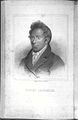 Can you crop and clean/restore and upload it as a derivative (restored) file?
 -
 restored version (H&N)
 -
 Can you crop and clean/restore and upload it as a derivative (restored) file?
 -
 restored version (H&N)
 -
 DoneRemove barely visible border and somehow get rid of the wave patterns. No need for derivative file here just upload over it.
.jpg)
.jpg)

.jpg)

.jpg)

Article(s): w:Native Hawaiians, w:Henry Opukahaia
Request:
- Requests and images above. Thanks in advance.--KAVEBEAR (talk) 20:00, 11 August 2013 (UTC)
Graphist opinion(s):
- Done I hope that's okay so.--Hic et nunc (talk) 07:28, 12 August 2013 (UTC)
- Thank you.--KAVEBEAR (talk) 06:39, 14 August 2013 (UTC)
- This section was archived on a request by: KAVEBEAR (talk) 06:39, 14 August 2013 (UTC)
Teriimaevarua with servants and dog edit

Article(s): w:Teriimaevarua III
Request:
- Please restore by cropping, cleaning and removing letterings. No derivatives please and ignore this. Thanks.--KAVEBEAR (talk) 20:11, 15 August 2013 (UTC)
Graphist opinion(s):
- Done – JBarta (talk) 21:11, 15 August 2013 (UTC)
- Thank you.--KAVEBEAR (talk) 21:52, 15 August 2013 (UTC)
- This section was archived on a request by: KAVEBEAR (talk) 21:52, 15 August 2013 (UTC)
Remove text and sharpen image edit
-
 James C. Earle
.jpg)
Article(s): en:Lawrence Carmichael Earle
Request:
- Can someone remove the bits of text from the right side of the image and sharpen the image? --Oaktree b (talk) 00:20, 11 August 2013 (UTC)
Graphist opinion(s): ![]() Done --Hic et nunc (talk) 08:45, 11 August 2013 (UTC)
Done --Hic et nunc (talk) 08:45, 11 August 2013 (UTC)
- This section was archived on a request by: – JBarta (talk) 03:29, 16 August 2013 (UTC)
Franklin Pierce edit

Article(s):Franklin Pierce
Request:
- Remove watermark. thx --Scewing (talk) 01:08, 13 August 2013 (UTC)
Graphist opinion(s):
- Done – JBarta (talk) 13:05, 13 August 2013 (UTC)
- This section was archived on a request by: – JBarta (talk) 03:29, 16 August 2013 (UTC)
Kaiulani03 edit

Article(s): Kaʻiulani
Request:
- Anyway to clean, remove letterings, minimal crop and restore this larger version to look like the current version created by Materialscientist. Please upload over original. Thanks. --KAVEBEAR (talk) 01:13, 16 August 2013 (UTC)
Graphist opinion(s):![]() Done --Hic et nunc (talk) 13:10, 16 August 2013 (UTC)
Done --Hic et nunc (talk) 13:10, 16 August 2013 (UTC)
- Thank you. This looks great.--KAVEBEAR (talk) 14:08, 16 August 2013 (UTC)
- Can you make out what the wording said in the original?--KAVEBEAR (talk) 14:58, 16 August 2013 (UTC)
- Picture is on a Dutch domain. (That doesn't necessarily prove anything, but it's a good place to start, and it does end up resulting in a coherent translation.) "Prinses Kaiulani, nicht der K---" in Dutch translates to "Princess Kaiulani, niece of K---" in English. I'd say the chances are pretty good that the first word is in fact "Prinses". The name is pretty clear and so is "nicht der". The only remaining mystery is who is "K---"? And I can think of no one better to figure that out than you KAVEBEAR. – JBarta (talk) 21:07, 16 August 2013 (UTC)
- It is koningin of queen. I found the original source link. Thanks anyway.--KAVEBEAR (talk) 21:29, 16 August 2013 (UTC)
- Picture is on a Dutch domain. (That doesn't necessarily prove anything, but it's a good place to start, and it does end up resulting in a coherent translation.) "Prinses Kaiulani, nicht der K---" in Dutch translates to "Princess Kaiulani, niece of K---" in English. I'd say the chances are pretty good that the first word is in fact "Prinses". The name is pretty clear and so is "nicht der". The only remaining mystery is who is "K---"? And I can think of no one better to figure that out than you KAVEBEAR. – JBarta (talk) 21:07, 16 August 2013 (UTC)
- Can you make out what the wording said in the original?--KAVEBEAR (talk) 14:58, 16 August 2013 (UTC)
- This section was archived on a request by: KAVEBEAR (talk) 14:08, 16 August 2013 (UTC)
Edward T. Perkins edit
- This section was archived on a request by: – JBarta (talk) 22:18, 4 September 2013 (UTC)

Article(s): w:Kīlauea
Request:
- Anyway to recreate truncated area. It doesn't show in the archive.org book page either. The google book page is here. If you can please crop and restore and upload over existing file. -KAVEBEAR (talk) 00:40, 16 August 2013 (UTC)
Graphist opinion(s):
- Done – JBarta (talk) 07:19, 16 August 2013 (UTC)
- How did you get the different shot of the page? Could you do the same for other pages on Category:Edward T. Perkins?--KAVEBEAR (talk) 07:23, 16 August 2013 (UTC)
- Go to http://archive.org/details/namotuorreefrovi00perkrich. Click on "All files: HTTPS". You'll find a list of stuff. "namotuorreefrovi00perkrich_jp2.zip" are all the cropped files used in the viewer. "namotuorreefrovi00perkrich_raw_jp2.zip" are all the original scans before they are cropped. Usually the jp2 files are sufficient. In this case, the raw scans were useful to us. And yes, I have all the full scans from that book on my computer at the moment. If you want anything else from that book, let me know. Just point to (or create) image description pages for them. – JBarta (talk) 07:37, 16 August 2013 (UTC)
- They are all here on Category:Edward T. Perkins, eleven other ones. I went back and added page numbers to them. Can you perform the clean up in the same manner as the one above with the three steps: 1. full page from archive.org, 2. rotate, crop, little cleanup, 3. grayscale, contrast? And also keeping the caption as you have already done. Thank you.--KAVEBEAR (talk) 14:25, 16 August 2013 (UTC)
- Done – JBarta (talk) 22:16, 4 September 2013 (UTC)
- They are all here on Category:Edward T. Perkins, eleven other ones. I went back and added page numbers to them. Can you perform the clean up in the same manner as the one above with the three steps: 1. full page from archive.org, 2. rotate, crop, little cleanup, 3. grayscale, contrast? And also keeping the caption as you have already done. Thank you.--KAVEBEAR (talk) 14:25, 16 August 2013 (UTC)
- Go to http://archive.org/details/namotuorreefrovi00perkrich. Click on "All files: HTTPS". You'll find a list of stuff. "namotuorreefrovi00perkrich_jp2.zip" are all the cropped files used in the viewer. "namotuorreefrovi00perkrich_raw_jp2.zip" are all the original scans before they are cropped. Usually the jp2 files are sufficient. In this case, the raw scans were useful to us. And yes, I have all the full scans from that book on my computer at the moment. If you want anything else from that book, let me know. Just point to (or create) image description pages for them. – JBarta (talk) 07:37, 16 August 2013 (UTC)
- How did you get the different shot of the page? Could you do the same for other pages on Category:Edward T. Perkins?--KAVEBEAR (talk) 07:23, 16 August 2013 (UTC)
File:Cerro el plomo.JPG color correction edit
- This section was archived on a request by: – JBarta (talk) 22:18, 4 September 2013 (UTC)
-
 Cerro el Plomo Street in Santiago, Chile

Request:
- The colors of the images need to be fixed. It is way to yellowish / brownish. --ALE! ¿…? 19:30, 26 August 2013 (UTC)
Graphist opinion(s):
- Done – JBarta (talk) 21:41, 26 August 2013 (UTC)
Diego Kravetz edit
- This section was archived on a request by: – JBarta (talk) 22:19, 4 September 2013 (UTC)

Fix please, if possible, the space at the top, per COM:QIC requeriment, thanks!!! Ezarateesteban 21:45, 28 August 2013 (UTC)
- Uploaded an edit with a few adjustments. Not sure if it's what you're looking for, but now it's a suitable portrait. Actually, could probably crop even tighter. – JBarta (talk) 00:28, 29 August 2013 (UTC)
- I went and cropped it a little tighter. – JBarta (talk) 00:29, 29 August 2013 (UTC)
- Thanks JBarta!!! Ezarateesteban 02:26, 31 August 2013 (UTC)
- I went and cropped it a little tighter. – JBarta (talk) 00:29, 29 August 2013 (UTC)
Helags edit
- This section was archived on a request by: This thread has been idle since 8 April 2013! Kevjonesin (talk) 04:41, 15 September 2013 (UTC)
-
 Description of image
Request: Dark line between the white snow and blue sky (see images note). Possible to remove?--ArildV (talk) 10:32, 7 April 2013 (UTC)
Graphist opinion(s):
Took a shot at this by moving the sky down a couple pixels, then a slight blurring of the sky, but I'm not really liking the result. The file is so huge and I didn't want to upload my edit, but you'll find a cropped portion of it here. The dark line (actually white in some places) is likely cause by unsharp masking somewhere along the line. As far as "imperfections" go... it's a fairly minor one. – JBarta (talk) 10:30, 8 April 2013 (UTC)
Joining images edit
- This section was archived on a request by: This thread has been idle since 31 March 2013! Kevjonesin (talk) 04:47, 15 September 2013 (UTC)
- This "stale" section was archived by --Kevjonesin (talk) 20:01, 23 June 2013 (UTC)
Archived far too soon. Penyulap ☏ 11:41, 5 July 2013 (UTC)
-

-

-
 combined (JPG)
 -
 combined (PNG)
.png)
.png)
.jpg)
.png)


Request: With photoshop elements 10, I have problems joining File:Journal de Bruxelles nr 142 1800 (414).png and File:Journal de Bruxelles nr 142 1800 (415).png to create a downsized File:Journal de Bruxelles nr 142 1800 (414, 415).png (middle white space removed). The fotomerge options seem to demand a common merge area to work. Under elements 8 it was no problem as I could manually align the two before joining. Has anyone handy solutions? I dont know if the mentioned paint solution would work with png files. (make a big empty file and paste the two files in it). Smiley.toerist (talk) 13:11, 30 March 2013 (UTC)
A much bigger ambition is to join the files File:Borinage SNCV.png, File:Hainaut centre SNCV names.png and File:Charleroi SNCV SNCB maximum extend.png or File:Borinage SNCV openstreetmap.png, File:Hainaut centre SNCV openstreetmap.png and File:Charleroi SNCV-SNCB openstreetmap background.png. They are exactly the same scale, precisely aligned and the same colour lines. They have different heights. Smiley.toerist (talk) 13:11, 30 March 2013 (UTC)
Graphist opinion(s):
Combined pp 414-415 of the text. Darkened it a little and uploaded as JPG. PNG's can be problematic on a wiki (as you can see). For this, a low compression JPG is not only completely adequate, it's a lot less trouble. – JBarta (talk) 03:17, 31 March 2013 (UTC)
- I use png not jpg because jpg is unstable. I have to do a lot of manual cleaning between the letters after the initial scan. The rerendering after every edit creates a lot of noise. A clean white space doesnt remain a clean white space. One can always make a jpg version for practical use and keep the png version as master copy. Smiley.toerist (talk) 08:12, 31 March 2013 (UTC)
- A clean white space will remain white for practical visual purposes, though minor (and invisible to the naked eye) artifacts may exist. This image is however not so valuable and sensitive to invisible perfections as to require a "master copy". I think a simple JPG will do the job for any concievable use. Plus there's the issue of piss poor PNG thumbnail renderings of PNG images by the wiki software if one were to rely solely on a PNG. – JBarta (talk) 08:34, 31 March 2013 (UTC)
- It turns out I had saved it as a PNG before also saving it as a JPG, so I uploaded that PNG over the old.... and now it's showing up because it's been cropped slightly and has slightly less than 25M pixels. – JBarta (talk) 20:04, 31 March 2013 (UTC)
- A clean white space will remain white for practical visual purposes, though minor (and invisible to the naked eye) artifacts may exist. This image is however not so valuable and sensitive to invisible perfections as to require a "master copy". I think a simple JPG will do the job for any concievable use. Plus there's the issue of piss poor PNG thumbnail renderings of PNG images by the wiki software if one were to rely solely on a PNG. – JBarta (talk) 08:34, 31 March 2013 (UTC)
Matelita edit
- This section was archived on a request by: Thread was previously tagged "resolved" and has been idle since 17 July 2013. Kevjonesin (talk) 04:55, 15 September 2013 (UTC)

Article(s): w:Tui Manuʻa Elisala
Request:
- Could someone clean and crop this newspaper illustration of the Queen of Manua here? The highest resolution possible would be best. I don't know how to do that except to copy the computer screen. I have already created the file description here just upload over it. One version will be enough. Thank you. --KAVEBEAR (talk) 09:35, 14 July 2013 (UTC)
Graphist opinion(s):
- Done -- The next question may be, can the smudge on her face be cleaned up? I suppose it can be improved a little. I really don't have the urge to do it now though. If someone else wants to mess with it, feel free.... – JBarta (talk) 03:26, 15 July 2013 (UTC)
- It probably can't. Wish I could find a better archive image of the newspaper. Thank you.--KAVEBEAR (talk) 03:31, 15 July 2013 (UTC)
- Actually Kavebear, this is a very simple reconstruction. The pencil drawing in this image is similar to the newsprint, the same techniques would apply to this job. I've done a much larger work where the technique had to be faithfully reproduced in colour rather than just black and white, if you think of the written words in this image as the 'smudges', then you can see in the reconstruction what's been done, especially where the text is written across the ocean waves. The waves required redrawing all across the image, it was a lot more work than this image, which is trivial by comparison, and would take about 15 or 20 minutes to do, (except for the reasons outlined on the top of my talkpage). This Matelita, she wasn't a great figure of hope amongst her people was she ? Penyulap ☏ 09:03, 17 July 2013 (UTC)
- Well if you can do something, by all means do. As for Matelita, she was a reluctant monarch, who could be consider a secluded demigod or a "prisoner princess".--KAVEBEAR (talk) 18:05, 17 July 2013 (UTC)
- Actually Kavebear, this is a very simple reconstruction. The pencil drawing in this image is similar to the newsprint, the same techniques would apply to this job. I've done a much larger work where the technique had to be faithfully reproduced in colour rather than just black and white, if you think of the written words in this image as the 'smudges', then you can see in the reconstruction what's been done, especially where the text is written across the ocean waves. The waves required redrawing all across the image, it was a lot more work than this image, which is trivial by comparison, and would take about 15 or 20 minutes to do, (except for the reasons outlined on the top of my talkpage). This Matelita, she wasn't a great figure of hope amongst her people was she ? Penyulap ☏ 09:03, 17 July 2013 (UTC)
Collection of photos in a single photo edit
- This section was archived on a request by: – JBarta (talk) 22:47, 11 September 2013 (UTC)
-
 Striped Hyena
 -
 Arabian Oryx
 -
 Mountain Gazelle
 -
 Persian Leopard
 -
 Indian/Iranian Wolf
 -
 Persian Fallow Deer


Article(s): I Need to use them in a new list on ar. Wiki
Request:
- Can you please mix them in one photo, such as this one, i need to use such a photo in a new list i'll be creating on ar. wiki, about the mammals of the Levant (Syria, Lebanon, Jordan, and Palestine/Israel)... --باسم (talk) 20:38, 5 September 2013 (UTC)
Graphist opinion(s):
- Done – JBarta (talk) 21:28, 5 September 2013 (UTC)
- Thank you :-)--باسم (talk) 07:32, 6 September 2013 (UTC)
Lahaina from the Anchorage by Lossing-Barritt edit

Article(s): w:Lahaina Banyan Court Park
Request:
- Please clean and crop to someone like File:Lahaina from the Anchorage by Lossing-Barritt.png except with maybe a bit more elbow room on the right, left and top of the picture would make it look better. --KAVEBEAR (talk) 22:07, 11 September 2013 (UTC)
Graphist opinion(s):
- Done – JBarta (talk) 22:42, 11 September 2013 (UTC)
- Thank you.--KAVEBEAR (talk) 00:02, 12 September 2013 (UTC)
- This section was archived on a request by: KAVEBEAR (talk) 00:02, 12 September 2013 (UTC)
Happy Laborday Weekend edit
.jpg)
Article(s): none so far
Request:
- The text should be removed, otherwise the file is not really usable. --Hedwig in Washington (mail?) 00:33, 28 September 2013 (UTC)
Graphist opinion(s):![]() Done Centpacrr (talk) 04:03, 28 September 2013 (UTC)
Done Centpacrr (talk) 04:03, 28 September 2013 (UTC)
- Thanks a bunch! :-)) --Hedwig in Washington (mail?) 19:40, 28 September 2013 (UTC)
- This section was archived on a request by: Hedwig in Washington (mail?) 19:40, 28 September 2013 (UTC)
License plate blurring needed edit
- This section was archived on a request by: Thanks! – Philosopher Let us reason together. 17:45, 30 September 2013 (UTC)
-
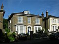 Please blur the number on the car's license plate.

Article(s): en:Frederick G. Creed
Request:
- Please blur the license plate number (privacy concern). Request received on OTRS at ticket:2013092610019258 --– Philosopher Let us reason together. 02:33, 29 September 2013 (UTC)
Graphist opinion(s):
- Done -- Fulvio 314 05:29, 29 September 2013 (UTC)
Text to add to a satellite picture. edit
-
 Victor Diamond Mine
 -
 objects marked
 -


Article(s): Victor Diamond Mine
Request:
- I would like to add text to the image. Near the bottom along the river are two white circles, can these be marked as "Village". And if you follow the road to the top, you will see three dark circles that go are curving upwards; these are the mine pits. Is it possible to have a circle placed around them and mark them as "Pits"? If my description isn't clear, I've uploaded an open street map that might be easier to follow that shows the river and village at the bottom, and the pits at the top. Please don't add the annotations to the Open Street Map, only to the sat. picture as shown. Thanks! --Oaktree b (talk) 04:05, 6 October 2013 (UTC)
Graphist opinion(s):
- Done – I created an SVG for easy editability. So if you want something changed let me now. If you prefer a PNG I could upload that, too. --Patrick87 (talk) 04:40, 6 October 2013 (UTC)
- Oh, can you also include the two dark spots above the word "pits" you indicated in yellow? Those are pits as well. Thanks, it's looks great in yellow! Oaktree b (talk) 15:01, 6 October 2013 (UTC)
- OK, changed. I hope I got it roght now. --Patrick87 (talk) 16:02, 6 October 2013 (UTC)
- Ok, perfect! Thanks. Oaktree b (talk) 16:44, 6 October 2013 (UTC)
- OK, changed. I hope I got it roght now. --Patrick87 (talk) 16:02, 6 October 2013 (UTC)
- This section was archived on a request by: Patrick87 (talk) 19:42, 9 October 2013 (UTC)
"In the deepening shadows" remove artifact of transfer process edit
-
 The dying Senator Mark Hanna is comforted by Uncle Sam, who has removed his hat in respect, and as the late president, William McKinley, stands by to welcome Hanna to the other side.

Article(s): en:Homer Davenport
Request:
- There is a cross next to Hanna's head which seems to be an artifact, likely of transfer from microfilm. Can it be removed? --Wehwalt (talk) 16:50, 14 October 2013 (UTC)
Graphist opinion(s):
- Done -- Uploaded and cleaned up a higher resolution version from source. – JBarta (talk) 18:25, 14 October 2013 (UTC)
It looks a lot better, thanks!
- This section was archived on a request by: Wehwalt (talk) 00:01, 15 October 2013 (UTC)
Replace two non-free headshots in a widely used collage File:Woman Montage (1).jpg edit
-
 Collage of 20 women
.jpg)
Article(s): en:Woman, and related articles on sister projects.
Request:
- This collage has been nominated for deletion because two of images used in collage are non-free images. This collage is widely used by various WIkimedia projects, so it would great if we could preserve it by replacing the two non-free photos in the collage. Some of the uses of this image identify the individuals in the collage in a caption, so ideally we want to replace the non-free photos with free photos of the same women. I'd suggest square headshot crops from File:Wangari_Maathai_in_Nairobi.jpg (replacing 4 over and 2 down) and File:Aung_San_Suu_Kyi_(December_2011).jpg (replacing 3 over and 4 down) would make suitable replacements. Please upload new version at existing location so old revision can be rev. deleted, preserving file history. Thanks. —RP88 10:07, 16 October 2013 (UTC)
Graphist opinion(s):
- Done — User:Bleff was nice enough to perform this fix on his own initiative, assistance from the Photography workshop is no longer necessary. —RP88 21:42, 16 October 2013 (UTC)
- Sorry; I'm still seeing the old pictures. Is it just a bug? JKadavoor Jee 02:45, 17 October 2013 (UTC)
- Works for me. Try clearing your browser cache. —RP88 03:17, 17 October 2013 (UTC)
- This section was archived on a request by: —RP88 21:43, 16 October 2013 (UTC)
Replace two non-free headshots in a collage File:Men_montage.jpg edit
-
 Collage of 20 men

Article(s): en:Man, and related articles on sister projects.
Request:
- This collage has been nominated for deletion because two of images used in collage are non-free images. This collage is used by various WIkimedia projects, so it would great if we could preserve it by replacing the two non-free photos in the collage. Some of the uses of this image identify the individuals in the collage in a caption, so ideally we want to replace the non-free photos with free photos of the same men. I'd suggest square headshot crops from File:Kofi_Annan.jpg (replacing 4 over and 2 down) and File:Man and child (Fylkesarkivet i Sogn og Fjordane).jpg (replacing 3 over and 5 down) would make suitable replacements. Please upload new version at existing location so old revision can be rev. deleted, preserving file history. Thanks. —RP88 11:03, 16 October 2013 (UTC)
Graphist opinion(s):
- Done -- Fulvio 314 17:30, 17 October 2013 (UTC)
- Thanks, looks great. —RP88 17:38, 17 October 2013 (UTC)
- This section was archived on a request by: McZusatz (talk) 16:50, 19 October 2013 (UTC)
Broken files edit


Category:JPG files with errors (The files without thubnails)
Request: I hope someone is able to open the broken files without thumbnails (file names start with 'Stetson') with Photoshop (GIMP does not work). They seem to be encoded with some weird compression and maybe PS is able to decode them properly. --McZusatz (talk) 19:04, 16 October 2013 (UTC)
Graphist opinion(s): ![]() Done Corrupted "Stetson" files fixed and reuploaded. Centpacrr (talk) 02:40, 19 October 2013 (UTC)
Done Corrupted "Stetson" files fixed and reuploaded. Centpacrr (talk) 02:40, 19 October 2013 (UTC)
- Thx. However there are two other files which are broken this way: One of them was deleted some years ago and I can't find it, the other was added above. --McZusatz (talk) 09:49, 19 October 2013 (UTC)
- Third file fixed and uploaded. Centpacrr (talk) 15:56, 19 October 2013 (UTC)
- This section was archived on a request by: McZusatz (talk) 16:49, 19 October 2013 (UTC)
Add heading for request here! edit
-
 Enric Tàrrega at the Theater

Article(s): Enric Tàrrega
Request:
- I made three pictures, and this is the best one. It's a little bit blurry, but maybe someone whit editing knowlege can save it. --Coentor (talk) 23:01, 2 November 2013 (UTC)
Graphist opinion(s):
- Done I tried my very best but the original was not only blurry but had also much moise and is a small file. If you don't like revert it. If anybody gets a better result overwright my version. --Hic et nunc (talk) 15:20, 6 November 2013 (UTC)
- Thanks!--Coentor (talk) 10:51, 8 November 2013 (UTC)
- This section was archived on a request by: McZusatz (talk) 12:52, 8 November 2013 (UTC)
Wrong aspect ratio/fisheye/wide angle? edit
-
 Alfa Romeo MiTo shot with fisheye/wide-angle lens?

Article(s): Juan Manuel Díaz (diseñador)
Request:
- I wonder if there's a way to properly enhance the aspect ratio of this pic. The width seems to be awkwardly small. Also, should license plates be blurred in Commons?--Carnby (talk) 15:38, 9 October 2013 (UTC)
Graphist opinion(s):
- Done? --McZusatz (talk) 17:04, 9 October 2013 (UTC)
- I've seen the car in my town and I concluded that the pic was not shot with a fisheye lens: it's the car itself that's awkwardly narrow.--Carnby (talk) 09:49, 11 November 2013 (UTC):This section was archived on a request by: Carnby (talk) 09:49, 11 November 2013 (UTC)
ShofarSound edit
-
 A man sounding a shofar

Article(s): Currently used in multiple languages, including en:Shofar
Request:
- Would someone be able and willing to clear away the clutter in the lower left? Ideally, I would like to have just the man and the shofar on a nuetral background. --Jonathunder (talk) 02:00, 23 November 2013 (UTC)
Graphist opinion(s):![]() Done Centpacrr (talk) 06:20, 23 November 2013 (UTC)
Done Centpacrr (talk) 06:20, 23 November 2013 (UTC)
- Thank youǃ TODA RABA. Jonathunder (talk) 06:49, 23 November 2013 (UTC)
- This section was archived on a request by: McZusatz (talk) 19:44, 23 November 2013 (UTC)
Streisand Estate edit
-

-
 new version


Article(s): en:Streisand effect
Request:
- It has been mentioned at Commons:Featured picture candidates/File:Streisand Estate.jpg/2 that this image could be improved with respect to (1) Image tilting of present image, and (2) en:Curve (tonality) issues. I'd really appreciate it if someone could upload an improvement to File:Streisand Estate edit.jpg. ---- Cirt (talk) 17:52, 15 December 2013 (UTC)
- Or perhaps just upload the improvements (if minor tweaking only I suppose) back over the original at the same image location? I'm just not sure which is more common practice when thinking of then nominating for Featured Picture candidate later? -- Cirt (talk) 17:55, 15 December 2013 (UTC)
Graphist opinion(s):
- My version is uploaded. --Alchemist-hp (talk) 18:14, 15 December 2013 (UTC)
- Thank you so much, -- Cirt (talk) 21:18, 15 December 2013 (UTC)
- This section was archived on a request by: Alchemist-hp (talk) 19:45, 21 December 2013 (UTC)
Please blur registration number edit
-
 Car photo

Article: de:Alpine (Automobilhersteller)
Request:
- I'm looking for the opposite of image improvement. The owner of the vehicle (presumably not the uploader) has requested removal of the photo or hiding of the registration plate. Could the number be blurred so it is not legible? Thanks. OTRS agents can see Template:OTRS ticket --Sphilbrick (talk) 18:20, 26 December 2013 (UTC)
Graphist opinion(s):
- Done --Goran tek-en (talk) 18:45, 26 December 2013 (UTC)
- Thanks! That was quick!--Sphilbrick (talk) 19:05, 26 December 2013 (UTC)
- This section was archived on a request by: McZusatz (talk) 23:09, 26 December 2013 (UTC)
Mohandas K. Gandhi edit
-
 Mohandas K. Gandhi, portrait

Request:
- Could you please remove the line at the top. I tried but only got poor results. Thanks, --Yann (talk) 21:54, 30 December 2013 (UTC)
Graphist opinion(s):![]() Done Centpacrr (talk) 06:13, 31 December 2013 (UTC)
Done Centpacrr (talk) 06:13, 31 December 2013 (UTC)
- This section was archived on a request by: Yann (talk) 06:35, 31 December 2013 (UTC)
Boki and Liliha edit

Article(s): Kuini Liliha, Boki (Hawaiian chief)
Request:
- Please clean and restore corners like the previous upload.-KAVEBEAR (talk) 09:33, 20 October 2013 (UTC)
Graphist opinion(s):
- Done -- Fulvio 314 18:38, 20 October 2013 (UTC)
- This section was archived on a request by: Goran tek-en (talk) 17:05, 10 January 2014 (UTC)
Pomare edit
-
 Leave original
.jpg)
Article(s): w:Pōmare I
Request:
- Please clean up like previous smaller version under the file name File:John Webber's oil painting of Otoo, 1777 (restored).jpg. Then create a new transparent oval version and a square version like File:John Webber's oil painting of Otoo, 1777sq.jpg and File:John Webber's oil painting of Otoo, 1777.png. Don't overwrite these two I guess since that made my previous request stale for a year. Just name them File:John Webber's oil painting of Otoo, 1777 (restored, sq).jpg and File:John Webber's oil painting of Otoo, 1777 (restored).png. Thank you very much.-KAVEBEAR (talk) 09:41, 20 October 2013 (UTC)
Graphist opinion(s):
- Do you also want the cracking to be removed?
- To me that is a bit of the value of an old image to keep it. --Goran tek-en (talk) 16:46, 7 December 2013 (UTC)
 Request taken by Goran tek-en (talk) 16:40, 7 December 2013 (UTC)
- At those two links you can have a look at the images:
- squared
- transparent
- Have a look and tell me if you want something changed or so. --Goran tek-en (talk) 20:08, 9 December 2013 (UTC)
- It's okay. Thanks.--KAVEBEAR (talk) 21:33, 10 December 2013 (UTC)
- Here they are;
- Head and shoulders portrait of a young Tahitian male, oval.
- Head and shoulders portrait of a young Tahitian male, squared.
- You should check the information on the images because I'm not sure I have done it right. It's still complicated to me, thanks. --Goran tek-en (talk) 15:50, 11 December 2013 (UTC)
- Done--Goran tek-en (talk) 16:18, 11 December 2013 (UTC)
- Could you create a non-transparent version under the name File:John Webber's oil painting of Otoo, 1777 (restored).jpg? It will look like File:John Webber's oil painting of Otoo, 1777 (restored).png except be in jpg and not transparent. --KAVEBEAR (talk) 19:43, 21 December 2013 (UTC)
- Here they are;
- It's okay. Thanks.--KAVEBEAR (talk) 21:33, 10 December 2013 (UTC)
- At those two links you can have a look at the images:
I had to change the name some: Head and shoulders portrait of a young Tahitian male.. --Goran tek-en (talk) 21:28, 21 December 2013 (UTC)
- This section was archived on a request by: Goran tek-en (talk) 17:05, 10 January 2014 (UTC)
collage of photos of famous Muslims edit
-
 Al-Khansā’
 -
 Tāriq bin Zīyād
 -
Al-Mutanabbī
-
 Ibn Rušd (Averroës)
 -
 Al-Kindī
 -
 Al-Fārābī (Alpharabius)
 -
 Al-Khwārizmī
 -
 Abū Rayḥān al-Bīrūnī
 -
 ʿUmar al-Khayyām
 -
 Nūr ad-Dīn Zengī
 -
 Timūr
Timūr -
 Ẓahīr ad-Dīn Bābur
 -
 Meḥmed the Conqueror
 -
 Ismāʿil as-Safavī (Ismail I)
 -
 Suleimān the Magnificent
 -
 Mi'mâr Sinân
 -
 Muḥammad ‘Alī Paşa
 -
 ʿAbd al-Qādir El Djezairi
 -
 Ismā‘īl Paşa
 -
 Jamāl ad-Dīn al-Afghānī
 -
 ‘Abd al-Raḥman al-Kawākibī
 -
 Omar Mukhtar
 -
 Ahmed Shawqi
 -
 Mohammed Abd el-Wahaab
 -
 Muhammad Amin al-Husayni
 -
 Malcolm X
 -
 Muhammad Ali Clay
 -
 Ice Cube
 -
 Rebiya Kadeer
 -
 Recep Tayyip Erdoğan
 -
 Hidayet "Hedo" Türkoğlu
 -
 Mesut Özil
 -
 collage of photos of famous christians

.jpg)


.jpg)


.jpg)

Article(s): meant to be used in "Muslims" article in ar. wiki.
Request:
- Can you please make a collage of these photos of some of the most famous Muslims throughout history, just like this collage of photos of famous Christians...--باسم (talk) 19:27, 5 November 2013 (UTC)
- Feel comfortable to reorganize the photos in the manner that seems best--باسم (talk) 19:37, 5 November 2013 (UTC)
Graphist opinion(s):
- Request taken by Fulvio 314 08:30, 6 November 2013 (UTC)
- Done -- Fulvio 314 19:14, 6 November 2013 (UTC)
- This section was archived on a request by: Goran tek-en (talk) 17:05, 10 January 2014 (UTC)
إزالة تشويش من الصورة - Clear an image from noise. edit
-
 Arabian sea in India
 -
 another version (H&N)

.jpg)
Article(s): بحر العرب
Request:
- The Image used in the article is full of noise I uploaded it to be a featured one but it seems it needs some modifications so would you help me enhancing the picture without affecting its size --May Hachem93 (talk) 15:21, 15 November 2013 (UTC)
Graphist opinion(s):
- Done -- Fulvio 314 18:00, 15 November 2013 (UTC)
- Done I tried it another way and uploaded the result as a new file. Only the photograph knows how the situation really was, the light, the wind... --Hic et nunc (talk) 15:40, 19 November 2013 (UTC)
- This section was archived on a request by: Goran tek-en (talk) 17:04, 10 January 2014 (UTC)
Add heading for request here! edit

Article(s): Switzerland during the World Wars
Request:
- Please rotate the image, and convert back to a positive. --Oaktree b (talk) 02:34, 27 November 2013 (UTC)
Graphist opinion(s):
- Done --Hic et nunc (talk) 07:34, 27 November 2013 (UTC)
- This section was archived on a request by: Goran tek-en (talk) 17:03, 10 January 2014 (UTC)
Charles I of Austria.jpg edit

Article(s): [[]]
Request:
- Could someone restore this, keep most of the background and trying filing/recreating the spots with the stamp sfn letters.. --The Emperor's New Spy (talk) 03:21, 30 November 2013 (UTC)
Graphist opinion(s):![]() Request taken by Centpacrr (talk) 03:49, 2 December 2013 (UTC)
Request taken by Centpacrr (talk) 03:49, 2 December 2013 (UTC) ![]() Done Centpacrr (talk) 04:14, 2 December 2013 (UTC)
Done Centpacrr (talk) 04:14, 2 December 2013 (UTC)
- This section was archived on a request by: Goran tek-en (talk) 17:03, 10 January 2014 (UTC)
Remove watermark from Cranach painting edit
-
 Watermarked painting

Request:
- Commons just rejected a DCMA request on this image based on the fact that the CDA logo was stamped on it. While it won't mollify those who submitted the request, it would be nice to remove them. I found one on the chest of Christ sitting on the rainbows, center top; I didn't find more, but it didn't exactly jump out at me.--Prosfilaes (talk) 21:05, 5 December 2013 (UTC)
Graphist opinion(s):
- Done --Botaurus stellaris (talk) 15:50, 7 December 2013 (UTC)
- This section was archived on a request by: Goran tek-en (talk) 17:03, 10 January 2014 (UTC)
Jan Brueghel d.Ä.- Großer Fischmarkt-Familie des Malers edit

Request:
- Could you please work off the reflexions --Oursana (talk) 02:17, 15 December 2013 (UTC)
Graphist opinion(s):![]() Done Centpacrr (talk) 16:18, 15 December 2013 (UTC)
Done Centpacrr (talk) 16:18, 15 December 2013 (UTC)
- This section was archived on a request by: Goran tek-en (talk) 17:02, 10 January 2014 (UTC)
Crop edit
-
 Romanian Post official

Article(s): Poșta Română
Request:
- Please crop to remove the ragged edges. I would like to keep the entire shot as is, it shows the majority of the uniform. Oaktree b (talk) 17:02, 27 December 2013 (UTC)
Graphist opinion(s):![]() Request taken by Centpacrr (talk) 03:40, 29 December 2013 (UTC)
Request taken by Centpacrr (talk) 03:40, 29 December 2013 (UTC)
- Done Crop and general cleanup. Centpacrr (talk) 03:59, 29 December 2013 (UTC)
- This section was archived on a request by: Goran tek-en (talk) 17:01, 10 January 2014 (UTC)
King Oscar I of Sweden edit
-
 1844 daguerreotype of Oscar I of Sweden, the first ever photo of a Swedish monarch
 -
 cleaned version

.jpg)
Article(s): en:Oscar I of Sweden, sv:Oscar I, eo:Oskaro la 1-a (Svedio), also there's a Thai article on... something (I don't know, I don't read Thai - maybe it's about Sweden, or Oscar I, or daguerreotypes?).
Request:
- This photo is understandably very poor condition, and cleaning it up would probably be quite a task; however, due to its immense historic value, I think it's worth doing. Perhaps if we keep the original and add a cleaned version? --DS (talk) 14:39, 9 October 2013 (UTC)
Graphist opinion(s):
- Are there any Scans with higher quality/resolution or color images? --McZusatz (talk) 16:50, 9 October 2013 (UTC)
- I scanned this from a book ages ago. Maybe it can be scanned with a higher resolution, but since it's already scanned from a digitalization, it would probably be better to find a higher resolution source. /grillo (talk) 07:21, 10 October 2013 (UTC)
- And obviously there's no version in colour... /grillo (talk) 07:23, 10 October 2013 (UTC)
- I tried to clean it without totally destroying the character of this old daguerreotype. --Hic et nunc (talk) 14:13, 11 October 2013 (UTC)
- Yes, of course the original photograph is meant to be greyscale. However I thought of a colored scan/photograph of the original. This could make cleanup easier. Do you know whether the original still exists? --McZusatz (talk) 18:14, 11 October 2013 (UTC)
- This section was archived on a request by: Goran tek-en (talk) 19:45, 16 January 2014 (UTC)
Color tone advice edit
Is there a way to get close to normal color tone with the three right images in Category:Rick Remender? We are discussing which to use for an article at w:Talk:Rick Remender. To me they are good enough now but others on the talk page may wish a third better version than the two they are looking at now. Feel free to overwrite File:Rick Remender April 2013.jpg which I did quickly in GIMP. I just slid +10 from magenta to green, in color balance, midtone only. From other images in the set I may be able to see if halide or sodium lighting was used in the arena. Although the camera used flash I think the ambient light affected the tone.--Canoe1967 (talk) 12:53, 30 July 2013 (UTC)

- The middle file looks good for a standard article. For lighting generally, redder color spectrums are for more attractive emotional things like nights out at a restaurant. Blues are more clinical like hospital situations. The middle looks good for a general article imo fwiw.
- actually, the middle for the thumb in the article, and the left one for the fans who want to adore ;) (like this, just copy the code for the best effect for the most readers) Penyulap ☏ 13:27, 30 July 2013 (UTC)
- I think File:Rick Remender - 01 edit.jpg is just fine. – JBarta (talk) 13:47, 30 July 2013 (UTC)
- If we find a white section in an image can we compare it to 6500K from w:Color temperature and then adjust temperature from there? The discussion seems to have died out with m:The Wrong Version in the article.--Canoe1967 (talk) 21:13, 31 July 2013 (UTC)
- This section was archived on a request by: Goran tek-en (talk) 19:09, 17 January 2014 (UTC)
Small request edit
-
 Description of first image

Article(s): AK-74 rifle
Request: Could somebody correct the levels and enhance the brightness? Thanks in advance
Graphist opinion(s): Adjusted as requested. Centpacrr (talk) 20:08, 28 September 2013 (UTC)
We seem to have an edit war brewing over which edit is preferable. Others are requested to look at the two edits posted (Centpacrr's and mine) and offer their opinion. Maybe this can be resolved by consensus rather than edit warring or multiple versions. – JBarta (talk) 22:25, 1 October 2013 (UTC)
- The problem is that JBarta materially altered the coloring of this image from that of the original source file located here. As the original image is the "best evidence" of the proper coloring, without proof positive to the contrary arbitrarily altering the color based on unsupported speculation is an unencyclopedic practice. Centpacrr (talk) 22:56, 1 October 2013 (UTC)
- Here are a whole bunch of images of similar rifles. Does that satisfy the green issue? – JBarta (talk) 23:09, 1 October 2013 (UTC)
- No not to me as the wood in the two rifles in the subjet image appears to be very much lighter ("blonder") than in any of those other examples. The "best evidence" is still the original image. Centpacrr (talk) 01:32, 2 October 2013 (UTC)
- Another image of a similar rifle with the same type of wood. Might even be the same rifle shown in the top of the disputed image. – JBarta (talk) 08:00, 2 October 2013 (UTC)
- No not to me as the wood in the two rifles in the subjet image appears to be very much lighter ("blonder") than in any of those other examples. The "best evidence" is still the original image. Centpacrr (talk) 01:32, 2 October 2013 (UTC)
- Here are a whole bunch of images of similar rifles. Does that satisfy the green issue? – JBarta (talk) 23:09, 1 October 2013 (UTC)
- While I don't want to decide on the color issues Jbartas version might have, I have to say that Centpacrr's version is drastically overexposed and his modifications exceed the available dynamic range by far (resulting in unacceptable color artifacts). Sorry, Centpacrr...
- If you can't agree on Jbartas version (which is more pleasing than the original subjectively) then it would be favorable to revert to the original for the time being. --Patrick87 (talk) 04:57, 2 October 2013 (UTC)
- I'm happy to leave it up to User:RussianTrooper, the OP requester, as he is the one who knows what he wanted, I simply tried to meet what I understood his request to be which was limited to levels and brightness, not color. As the requester whatever he decides is fine with me. Centpacrr (talk) 18:06, 2 October 2013 (UTC)
- I think the final version done by Centpacrr is just fine. Thanks for the work. However, as for Jbarta's work - it is not bad at all.. and may be could be uploaded separately --RussianTrooper (talk) 14:26, 4 October 2013 (UTC)
- You know, we're supposed to be building an encyclopedia here... not running a therapy service. Doubling over backwards in a misguided attempt to be nice about an obviously problematic edit does no one any good. – JBarta (talk) 18:19, 4 October 2013 (UTC)
- All I did, JBarta, was to fulfill the OP's request the way he made it. We all know that you see every request made in the Graphics Labs in "your own way" even if the requester approves (and to the exclusion of) what another editor does to meet it. Oh well, as I have said many times before there is not, as you still seem to believe, only one way to do things (i.e. your way) thus making every other version "inferior" and unacceptable. (Also thanks for another dose of your amateur psychiatry but again that is probably best kept to yourself.) Centpacrr (talk) 04:54, 6 October 2013 (UTC)
- You know, we're supposed to be building an encyclopedia here... not running a therapy service. Doubling over backwards in a misguided attempt to be nice about an obviously problematic edit does no one any good. – JBarta (talk) 18:19, 4 October 2013 (UTC)
- I think the final version done by Centpacrr is just fine. Thanks for the work. However, as for Jbarta's work - it is not bad at all.. and may be could be uploaded separately --RussianTrooper (talk) 14:26, 4 October 2013 (UTC)
- I'm happy to leave it up to User:RussianTrooper, the OP requester, as he is the one who knows what he wanted, I simply tried to meet what I understood his request to be which was limited to levels and brightness, not color. As the requester whatever he decides is fine with me. Centpacrr (talk) 18:06, 2 October 2013 (UTC)
It seems as this request has been halted and no action is performed here so i suggest that it's archived.
- This section was archived on a request by: Goran tek-en (talk) 19:08, 17 January 2014 (UTC)
London Portal icon edit
-
 Image which is illegible when shrunk to icon size

Article(s): en:Template:Portal/Images/London
Request:
- The image which is currently used as the icon for en:Portal:London is too difficult to identify as
Big Benthe "Elizabeth Tower" when shrunk to the size of an icon. Could a new file be made of a close-up, cropped somewhere below the clock face (possibly with a gradient effect at the bottom?) and with a transparent background? Ham (talk) 14:22, 17 October 2013 (UTC)
Graphist opinion(s):
-
 Like this?
-- Fulvio 314 08:02, 18 October 2013 (UTC)
![]() Done
Done
- This section was archived on a request by: Goran tek-en (talk) 13:07, 17 January 2014 (UTC)
File:Marie karel2.jpg edit
-
 Original
 -
 (cropped, five daughters)

.jpg)
.jpg)
.jpg)
.jpg)
.jpg)
.jpg)
.jpg)
.jpg)
![[4]](https://commons.wikimedia.org/wiki/File:CatedralDePalencia20130518100051P1170514.jpg)
![[5]](https://commons.wikimedia.org/wiki/File:CatedralDePalencia20130518100055P1170515.jpg)
![[6]](https://commons.wikimedia.org/wiki/File:CatedralDePalencia20130518100058P1170516.jpg)
![[7]](https://commons.wikimedia.org/wiki/File:CatedralDePalencia20130518100102P1170517.jpg)
![[8]](https://commons.wikimedia.org/wiki/File:CatedralDePalencia20130518100106P1170518.jpg)
![[9]](https://commons.wikimedia.org/wiki/File:CatedralDePalencia20130518100110P1170519.jpg)
![[10]](https://commons.wikimedia.org/wiki/File:CatedralDePalencia20130518100116P1170520.jpg)
![[11]](https://commons.wikimedia.org/wiki/File:CatedralDePalencia20130518100120P1170521.jpg)
![[12]](https://commons.wikimedia.org/wiki/File:CatedralDePalencia20130518100125P1170522.jpg)
![[13]](https://commons.wikimedia.org/wiki/File:CatedralDePalencia20130518100129P1170523.jpg)
![[14]](https://commons.wikimedia.org/wiki/File:CatedralDePalencia20130518100133P1170524.jpg)
![[15]](https://commons.wikimedia.org/wiki/File:CatedralDePalencia20130518100136P1170525.jpg)
![[16]](https://commons.wikimedia.org/wiki/File:CatedralDePalencia20130518100147P1170526.jpg)
![[17]](https://commons.wikimedia.org/wiki/File:CatedralDePalencia20130518100156P1170527.jpg)
![[18]](https://commons.wikimedia.org/wiki/File:CatedralDePalencia20130518100159P1170528.jpg)
![[19]](https://commons.wikimedia.org/wiki/File:CatedralDePalencia20130518100203P1170529.jpg)
![[20]](https://commons.wikimedia.org/wiki/File:CatedralDePalencia20130518100206P1170530.jpg)
![[21]](https://commons.wikimedia.org/wiki/File:CatedralDePalencia20130518100211P1170531.jpg)
![[22]](https://commons.wikimedia.org/wiki/File:CatedralDePalencia20130518100215P1170532.jpg)
![[23]](https://commons.wikimedia.org/wiki/File:CatedralDePalencia20130518100219P1170533.jpg)
![[24]](https://commons.wikimedia.org/wiki/File:CatedralDePalencia20130518100228P1170534.jpg)
![[25]](https://commons.wikimedia.org/wiki/File:CatedralDePalencia20130518100231P1170535.jpg)
![[26]](https://commons.wikimedia.org/wiki/File:CatedralDePalencia20130518100235P1170536.jpg)
![[27]](https://commons.wikimedia.org/wiki/File:CatedralDePalencia20130518100238P1170537.jpg)
![[28]](https://commons.wikimedia.org/wiki/File:CatedralDePalencia20130518100241P1170538.jpg)
![[29]](https://commons.wikimedia.org/wiki/File:CatedralDePalencia20130518100244P1170539.jpg)
![[30]](https://commons.wikimedia.org/wiki/File:CatedralDePalencia20130518100248P1170540.jpg)
-digital_restoration.jpg)
.jpg)
.jpg)
.jpg)
.jpg)
.jpg)
.jpg)
.png)
.jpg)
.png)
.jpg)
Article(s): [[]]
Request:
- Can someone crop one picture of the five daughters (full length view and together since they are indistinguishable) to use on their articles? Thanks.--The Emperor's New Spy (talk) 09:25, 29 December 2013 (UTC)
Graphist opinion(s):
- Is it Done? --McZusatz (talk) 09:47, 29 December 2013 (UTC)
- This section was archived on a request by: McZusatz (talk) 18:25, 18 February 2014 (UTC)