As imagens candidatas devem atender a todos os requisitos a seguir, deve ter um "fator surpreendente" e pode ou não ter sido criado por um usuário do Commons. Dado o "fator de surpresa" suficiente e as circunstâncias atenuantes, uma imagem apresentada pode ficar aquém da qualidade técnica.
Observe que imagens de valor geralmente não são tão restritas em termos de qualidade visual, as candidate se tiverem um valor histórico intrínseco e não puderem ser reproduzidas. O melhor que pode ser feito é mostrá-las com precisão em seu estado atual de conservação, mesmo que tenham alguns defeitos (como alteração de cores, vinhetas, poeira e assim por diante), desde que tenham uma resolução razoável preservando a maioria de seus detalhes.
Normalmente não deve haver várias imagens em destaque que sejam muito semelhantes entre si. O objetivo do status é reconhecer que uma imagem está atualmente entre as melhores — a fração superior de um por cento. À medida que a qualidade geral da imagem melhora, algumas imagens serão removidas da lista. O objetivo do status é reconhecer que, no momento da criação, um usuário do Commons alcançou habilmente um nível desejável de qualidade, um reconhecimento que não é apagado por avanços posteriores.
Não há restrição quanto ao número de imagens de qualidade semelhante e não há mecanismo formal para remover imagens de qualidade.
Uma imagem "fala" a pessoas diferentes de forma diferente e tem a capacidade de evocar emoções como a ternura, raiva, desejo, rejeição, felicidade e tristeza; boas fotografias não se limitam a evocar sensações agradáveis.
Para imagens em destaque, muitos eleitores acreditam legitimamente que uma imagem tecnicamente comum de um assunto extraordinário pode ser percebido como uma imagem mais valiosa do que uma imagem tecnicamente excelente de um assunto comum. Muitos outros eleitores acreditam que cada imagem deve ser julgada puramente por seus próprios méritos. Por exemplo, uma imagem tecnicamente ruim de um evento importante muitas vezes receberá algum apoio devido à importância do evento retratado e uma quantidade igual de oposição por causa da qualidade técnica.
Acima de tudo, seja educado. A imagem que você está julgando é obra de alguém. Evite usar frases como "parece terrível" e "odeio". Se você se opor, adicione uma explicação. Lembre-se de que nem todo mundo tem o mesmo domínio do inglês. Escolha suas palavras com cuidado.
Boa nomeação, feliz votação e lembre-se… as regras podem ser quebradas.
Antes de revisar o trabalho dos autores, é recomendável que você calibre o seu monitor. Se você não fizer isso, lembre-se de que você pode não ver detalhes em áreas muito claras ou muito escuras. Além disso, alguns monitores podem ser muito tingidos para uma determinada cor e não ter uma cor "neutra".
Veja a imagem abaixo em tela inteira em um fundo totalmente preto. Você deve ser capaz de ver pelo menos três dos quatro círculos nesta imagem. Se você ver quatro, a configuração de brilho está no alto, se você ver três está bem, mas se menos de três forem discerníveis, então ele está definido muito baixo.
Em uma tela com brilho alto, os quatro círculos na imagem se misturam ao fundo quando vistos a alguns metros de distância. Caso contrário, você pode ajustar a configuração do seu aparelho até que isso ocorra. Isso pode ser "muito" difícil de conseguir. Monitores de PC não corrigidos geralmente mostram os círculos mais escuros do que o fundo.
Observe que na maioria dos monitores LCD de consumo (laptop ou tela plana), o ângulo de visão afeta fortemente essas imagens — o ajuste correto em uma parte da tela pode estar incorreto em outra parte. Clique nas imagens para mais informações técnicas.
Se possível, a calibração com um calibrador de monitor de hardware é recomendada.
Também é importante garantir que seu navegador esteja exibindo imagens na resolução correta. Para verificar isso, abra o full 4000x2000 version que você vê à esquerda. Ela tem 8 quadrados de largura por 4 quadrados de altura, com os quadrados medindo 500 pixels de cada lado. Depois de ampliar para 100%, você deve verificar se parece razoável dada a resolução do seu monitor. Por exemplo, se você tiver um monitor de 1920x1080, a largura horizontal deve ser apenas menor que 4 quadrados, o que seria de 2.000 pixels. Devido à barra de rolagem, menu, etc., a quantidade real de espaço disponível será um pouco menor que a resolução da tela.
O Firefox é conhecido por ter problemas em um computador Windows em que a configuração de vídeo foi definida para algo diferente de 100%; é comum ter um padrão de 125% (Médio) para monitores grandes. Isso resulta no Firefox aumentando a resolução de tudo em 25%, fazendo com que as imagens pareçam menos nítidas do que realmente são! Para corrigir esse problema, você pode alterar o fator de escala no Display para 100% ou ir para about:config (na barra de URL) e mude layout.css.devPixelsPerPx para 1.0.
FP disallows solely "GFDL" or combined "GFDL and an NC-only" licensed images as the requirements of these licenses are impractical to reuse and therefore don't represent "our best work".
No advertisements, signatures, or other watermarks in image. Copyright/authorship information of all images should be located on the image's description page and should not interfere with content of the image.
Images should have at least 2 real megapixels of information (with the exception of animations, videos, and SVGs), for example, 1600 × 1250. For "easy to take" images, reviewers may choose to demand more if the image would benefit from it. This rule excludes images computer generated and constructed using a free licensed source code available in the image description.
Images should not be downsampled (sized down) in order to appear of better quality. Downsampling reduces the amount of information stored in the image file. Downsampling images of living persons can be advisable if the images would otherwise show details of the body (e. g. skin, teeth) in unacceptable magnification, which could be considered offensive or violate the person's rights. However for Featured Pictures, the original non-downsampled version is preferred.
As imagens localizadas no Commons podem ser usadas de outras formas além da visualização em uma tela de computador convencional. Elas também podem ser usadas para impressão ou visualização em monitores de resolução muito alta.
Não podemos prever quais dispositivos podem ser usados no futuro, por isso é importante que nossas melhores fotos tenham a resolução mais alta possível.
Esta foto é de alta qualidade e um pouco acima do mínimo de 2 megapixels.
Low JPEG quality settings in camera or when saving
Visible JPEG artifacts
Images should not use too strong compression.
Use high-quality settings in your camera and imaging software. For example, set JPEG quality "superfine" in camera, or, if your camera can save images as RAW files, you can process these into uploadable JPEG files with appropriate software later. Use a JPEG compression quality between 80% and 90% when saving finished copies for upload, depending on acceptable file size.
When saving an image between multiple editing steps, use the editing software’s native format, or use a standard lossless format such as TIFF or PNG if you need to open the image in different editing software. Repeatedly editing and saving as a JPEG image will gradually lose quality.
Do not save edited JPEGs with a significantly higher quality than the original—doing so increases an image's file size but not its quality.
This image has a low JPEG compression level.
This image has a strong JPEG compression level and visible artifacts.
Noise
Chromatic noise
Luminance noise
Visible grain
Scratches, dust and dirt
Spots
Images should not have distracting amount of noise when viewed in full size.
To reduce noise, use the lowest practical sensitivity or film speed (for example: 200 ISO film is less grainy than 1600 ISO!).
If the photo was taken in unique circumstances and cannot be repeated, the image can sometimes be improved by filtering.
Noisy image taken with a high ISO and fast shutter speed.
No noise here, the image was taken at base ISO with a longer exposure.
Exposure
Overexposure
Blown out highlights
Underexposure
Lost details in shadow areas
Considering the circumstances, images should be correctly and appropriately exposed.
In correctly exposed images, details in a significant part of image are retained.
It should be noted that exposure may serve a creative purpose, and this guideline should be evaluated with understanding of the idea or intent of the image. Exposure refers to the shutter diaphragm combination that renders an image with a tonal curve that ideally is able to represent in acceptable detail shadows and highlights within the image. This is called exposure latitude. Images can be on the low side of the tonal curve (low range), the middle (middle range) or high side (upper range). Digital cameras (or images) have a narrower latitude than film.
Lack of shadow detail is not necessarily a negative characteristic. In fact, it can be part of the desired effect. Burned highlights in large areas are a distracting element. When shooting with a digital camera, inspect the histogram. In challenging circumstances you may be forced to use overlap several photographs with different exposures – this is called HDR stitching.
Quality images must have reasonable colors and shouldn’t be too bright. Note that this does not necessarily mean natural colors.
Color balance can be often corrected by editing programs.
When taking Photographs in a RAW image format, it is possible to adjust the white-balance in post-production, i.e. on the computer, without any loss in quality.
Every important object on the picture should be sharp, considering the idea of the image.
The overall image should have clearly defined focus, for example, the main subject is in focus and the foreground and background are out of focus, or else, the whole scene is in focus.
Depth of field is often low intentionally. If in doubt, ask.
"Depth of field" (DOF) refers to the area in focus in front of and beyond main subject. Depth of field is chosen according to the specific needs of every picture.
Large or small DOF can add to or detract from the quality of the image. Low depth of field can be used to bring attention to the main subject, separating it from the general environment. High depth of field can be used to emphasize space. At a given subject distance, short focal length lenses (wide angles) yield larger DOF than longer focal length lenses (telephotos). Narrow apertures (high f-numbers) yield larger DOF than wide apertures (low f-numbers).
Bad problem with focus.
Correct focus and depth of field.
Shallow depth of field serving a purpose.
Motion Blur
Too long exposure: image has become blurred because of hand shaking or subject moving too fast.
Motion blur should have a purpose, most often to emphasize motion.
"Movement control" refers to the manner in which motion is represented in the image.
Motion can be frozen or blurred. Neither is better over the other by itself – it's representation that matters. Movement is relative within the objects of the image. For example, photographing a race car that appears frozen in relation to the background does not give us a sense of speed or motion, so technique dictates to represent the car in a frozen manner but with a blurred background, thus creating a sense of motion. This is called "panning". On the other hand, representing a basketball player in a high jump frozen in relation to everything else, due to the "unnatural" nature of the pose may well be a good photograph.
Adequately handled motion.
Subjects blurred.
Iluminação
Distracting reflections (usual problem with built-in flash)
Lighting should be appropriate for portraying the subject.
Light is said to be the most important ingredient of a photograph, and quality images are expected to have it right. The quality of a shot may depend on conditions beyond the photographer’s control, like weather at outdoor shots or stage light.
Contrary to general belief, front lighting is not usually the best light as it flattens the subject. Side lighting often gives a better “texture” to surfaces. The best daylight is often early morning or late afternoon, or on a slightly cloudy day.
When photographing in strong light, you may want to soften the shadows by using “fill flash”.
Soft, nicely blended shadows, and lighting from different angles shows that subject is not flat.
Harsh and flat lighting resulting from the camera's pop-up flash.
Editing
Unnecessary or inappropriate use of artistic filters and effects. Editing programs have wonderful artistic filters and scripts. Unnecessary use of these, however, can be detrimental to the image.
Digital manipulation for the purpose of correcting flaws in an image is generally acceptable, provided it is limited, well-done, and not intended to deceive. Typical acceptable manipulations include cropping, perspective correction, sharpening/blurring, colour/exposure correction, and removal of distracting background elements.
Extensive manipulations must be clearly described in the image text, for example by means of the {{Retouched picture}} template. Unmentioned or misrepresented manipulations, or manipulations which cause the main subject to be misrepresented are never acceptable.
A part of post-processing includes HDR and tonemappings. Some like using strong HDR effects for images shared online, but the possibilities of such techniques are often used in a way that means that images have little resemblance with reality.
On the other side, some subjects such as church interiors often require further editing work and the combination of multiple images to avoid over- or underexposure. In such cases, extensive post-processing can even be desirable if done with appropriate care.
Overprocessed.
Well-handled dynamic range.
Composição
Unbalanced composition
Unclear subject
Non-existent subject
Too tight crop
Too busy
The arrangement of the elements within the image should support depiction of the subject, not distract from it.
Foreground and background objects should not be distracting.
The subject should not be cropped, unless it is only a specific part of the subject that is of interest. Foreground and background objects should not be distracting. Objects in front of the subject shouldn't hide important elements and background elements shouldn't spoil the composition (for example that the streetlight doesn't "stand" on someone's head).
The Golden Ratio and Rule of Thirds are common guidelines for composition that have been inherited from painting. Centering the subject is often considered a negative practice. Subjects of interest are placed in one of the "interest points", where horizontal and vertical lines intersect (4 interest points are created). Horizons are almost never placed in the middle, for they "cut" the image in half. They are placed either in the upper or lower horizontal line. The main idea here is NOT to center the subject without a very good reason (such as symmetry).
Typical use of the rule of thirds.
Distorções
Tilt
Perspective distortion
Barrel distortion
As imagens não devem ser inclinadas involuntariamente.
Imagens de arquitetura geralmente devem ser retilíneas.
A distorção de perspectiva deve ter um propósito ou ser insignificante.
The human brain is a sensitive detector capable of spotting even a small tilt. Falling trees, towers and inclined water surfaces rarely improve landscape photography.
Tilt can be easily corrected in almost any photo editing software. Various more complicated distortions can be adjusted in programs such as hugin and Panorama Tools. If you don't have access to suitable programs or don't understand them, ask at the Commons:Graphics village pump and someone may be able to process the image.
Distorted perspective.
Perspective corrected.
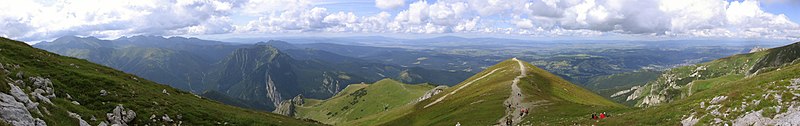
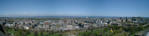
Stitched images, panoramas
Altura
Diretriz: as imagens panorâmicas precisam ter uma altura mínima de 800px.
Stitching
Common problems: Stitching artifacts. Colors or luminance are not consistent across the image. Horizon line sinusoidal or even more complicated shape.
Guideline: Getting a good panorama ready takes time. Recent releases of programs like hugin and Enblend make simple errors like bad alignment and ghosts at blurred seam lines less common than they used to be, but parallax errors and more intricate quality problems still occur. Two examples:
The ingredient photos were taken with a camera not in panorama mode, and camera-bundled software was used for the top stitch. One notices that the left part is darker, due to the camera exposing each photo individually. This could be dealt with by adjusting brightness before stitching.
More subtle errors are at the right of the castle, where there appear to be two vertical bands in the sky. Look where these bands touch the hill, at the middle one the stitching program misaligned, producing a ghost. Also, the program feathers the transitions. While this avoids a visible edge, one can see that in such feathering region, image noise is reduced, which makes these parts stand out from the rest of the image.
A imagem inferior mostra que usando um software diferente, as fotos podem ser juntas sem esses erros.
Lighting
Common problem: different exposure in different images, leading to overexposure or visible differences in brightness and posterisation.
Guideline: Even when photos are taken with the camera in panorama mode, unless one chooses an overall exposure for all images to handle the brightest part of the brightest image, then blown highlights are likely.
Ciemniak panorama.jpg
If possible, set for underexposure, as well as panorama mode. Expected advances in software based exposure correction may soon make panorama construction viable from a photo series not shot in panoramic mode. Until then, use the brightest part of your panoramic scene to set the in-camera exposure when shooting.
Some software provides blending algorithms that make the seamline invisible. But if the brightness of the original photos differs significantly, one still notices a transition in between photos. A few minor misalignments notwithstanding, this is what the top photo shows.
Some programs incorporate brightness adjustment for the photos, but the algorithm has to be designed carefully otherwise one can end up with posterisation effects like the purple and light blue patches in the clouds on the left in the bottom image.
Vignetting
Blending-only programs can do away with seam lines and smooth structure using feathered overblending, but to correct lens vignetting one needs a radius-dependent brightness correction.
Vinheta deliberadamente forte
The left image shows a technically acceptable stitch, except for the vignetting effect which has been strongly exaggerated. Good stitching programs incorporate vignetting correction. Make sure to incorporate good vignetting correction. Pre-processing the input images is less elegant, but one can obtain good results. In the sky can be seen three bright areas, separated by two darker bands. These correspond to the middles and the sides of the three original images. Although programs like Enblend remove visible seam lines, they do not remove vignetting effects. In the sequence hugin-enblend it is at the hugin stage where vignetting has to be corrected, either inside a recent hugin version or as already corrected input.
On the right is a more subtle example of vignetting, most visible in the sky, where one can see three bright areas from left to right separated by two darker bands. These correspond to the middle and the sides/corners of the three original images.
See in the photo below how the sky brightness spans the spectrum without being burnt out, but still the sky brightness has a wavy structure, most noticeable in the left part.
Tatra Mountains Panorama 01.jpg
Posicionamento da câmera
For the left stitch, the photographer captured the bottom part of the church, then stepped left and took a photo of the top part. The seam line is visible in the windows just below the clock, and one sees shifts in different directions in the middle and on the tower structures. Stitching software is not meant to cope with such parallax error as the problem here is located behind the camera, and the way out in this case was the availability of matching photos, albeit from a different perspective, to create the image on the right.
Alinhamento da imagem
Proper alignment of images is a crucial first step and has been achieved in this view taken in the Western Scottish Highlands. But the exposure differs between images and cameras have vignetting, both make seamlines visible. And as these photos have been aligned regarding the distant features, some parallax errors can be seen at seamlines in the foreground. There exists software that makes such seams disappear and the parallax errors can be concealed by choosing a suitable seamline.
Composição
Problemas comuns: os panoramas frequentemente não têm um ponto focal central. Se for tirada em ambientes urbanos, grande parte da cena pode ser desinteressante com características pouco atraentes, como latas de lixo e postes de luz quase impossíveis de evitar.
Color space
Diferentes color spaces cobrem diferentes cores e geram diferentes renderizações.
Different color spaces exist, which determine how the colors in an image are stored and displayed. sRGB is most common and compatible, while other color spaces, notably Adobe RGB, allow more colors but are less compatible, and must be correctly supported by users' computers.
O mais simples é usar sRGB, que normalmente é o padrão no Windows e Linux, mas deve ser selecionado ao salvar arquivos no Mac (antes do OS X 10.6). Para mais opções, continue lendo.
Images should either be in sRGB (either untagged, or specifically tagged as sRGB), or, if in another color space, explicitly tagged as such. Tagging means either including an Exif tag with the name of the color space (options are "sRGB", "Adobe RGB", and "other"), or including an ICC profile, which explicitly specifies the color space. Including an embedded profile is safer, as Exif tags are not always respected by web browsers. Untagged non-sRGB images ("mystery meat") will not render correctly on the vast majority of computers.
Para a maioria dos usuários do Windows e Linux, sRGB é o padrão, a menos que seja alterado, e as imagens não marcadas geralmente serão sRGB. No entanto, os usuários de Mac devem cuidar para que suas imagens sejam exportadas em sRGB, e não em "RGB genérico" ou "RGB Apple".
Best color spaces are sRGB or, optionally, Adobe RGB, which is wider, as these are standard color spaces and hence easiest to support and for other editors to use. If using a non-sRGB color space – say for greater color range – consider making an sRGB version of the image for greater compatibility.
Detalhes técnicos
É mais seguro usar sRGB: que é o padrão na maioria dos computadores, incluindo Windows e Mac OS X 10.6 e posterior. Imagens em outros tipos não serão renderizadas corretamente em absoluto em muitos navegadores da web; o suporte ao perfil de cores está incluído e habilitado por padrão no Safari e no Firefox 3.5, mas não em todos os navegadores.
Untagged non-sRGB images will not render correctly except by chance. Notably, untagged Mac images prior to OS X 10.6 used a different color space (Apple RGB prior to OS X, "Generic RGB" in OS X prior to 10.6), which notably included a gamma of 1.8, rather than 2.2; these images thus appearing dark when viewed on non-Mac computer that assumes sRGB (with gamma of 2.2).
Se for difícil determinar a localização (por exemplo, em áreas selvagens), você tem a opção de estimar a localização (use {{Location estimated}}) ou simplesmente mencionando uma característica geográfica próxima (por exemplo, vale, rio, cordilheira) ou um assentamento que ajudaria a identificar o local.
Fotos que não podem ou não devem ser geocodificadas incluem aquelas que mostram a localização de plantas e animais ameaçados de extinção, instalações militares, fotos de estúdio ou locais que devem ser ocultados para respeitar os direitos de privacidade. Para comunicar isso na imagem, você pode usar a predefinição {{Location withheld}}.
Exif
Veja Commons:Exif para obter ajuda sobre como usar e editar metadados Exif.


_(8118611842).jpg)


