Commons:Quality images candidates/Archives April 2011
-

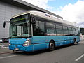
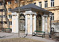
- Nomination Flag of Canada (in Halifax) --Taxiarchos228 08:12, 28 April 2011 (UTC)
- Promotion ich hätte mir etwas Bewegungsunschärfe gewünscht, ich weiß, damit stehe ich ziemlich alleine ;) --Ralf Roletschek 10:42, 28 April 2011 (UTC)
-

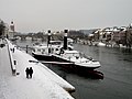
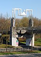
- Nomination Weil am Rhein: Tree Country Bridge --Taxiarchos228 07:51, 28 April 2011 (UTC)
- Promotion schöne Dynamik, schönes Licht --Ralf Roletschek 10:51, 28 April 2011 (UTC)
-

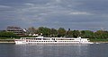
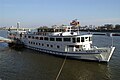
- Nomination Sundeck and chimney on cruise ship MS Romantika. --V-wolf 09:04, 28 April 2011 (UTC)
- Promotion little CA, but good enough, there is s.th. wrong with the geo-location, please proof it --Taxiarchos228 07:23, 28 April 2011 (UTC)
 Comment Hmm, I can't make the approximate location work, do I have to set it up as precise (but wrong) coordinates? --V-wolf 10:17, 28 April 2011 (UTC)
the syntax was not correct, I have fixed it (see at the file history), but for sure I don't know if you mean this coordinates --Taxiarchos228 10:30, 28 April 2011 (UTC)
-

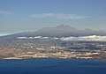
- Nomination Valle de La Orotava. --Quartl 07:02, 28 April 2011 (UTC)
- Promotion of course QI --Taxiarchos228 07:23, 28 April 2011 (UTC)
-

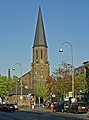
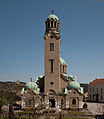
- Nomination Cologne-Höhenberg, St. Elisabeth --Rolf H. 05:21, 28 April 2011 (UTC)
- Decline Insufficient quality: extreme compression artifact at 100 % view --Taxiarchos228 06:37, 28 April 2011 (UTC)
-
- Nomination Cologne-Kalk, St. Marien --Rolf H. 05:21, 28 April 2011 (UTC)
- Decline Insufficient quality: extreme compression artifact at 100 % view --Taxiarchos228 06:37, 28 April 2011 (UTC)
-

- Nomination The Tennis Court Oath, bronze relief, Monument to the Republic, Paris.--Jebulon 22:06, 27 April 2011 (UTC)
- Promotion Good quality. --Mbdortmund 01:01, 28 April 2011 (UTC)
-

- Nomination Nijojo-ninomaru-garden in Kyoto, Japan --663highland 21:57, 27 April 2011 (UTC)
- Promotion Good.--Jebulon 22:10, 27 April 2011 (UTC)
-

- Nomination Rendering of a Roller Chain --Niabot 21:50, 27 April 2011 (UTC)
- Promotion Good quality. --Taxiarchos228 06:34, 28 April 2011 (UTC)
-

- Nomination Blankaart castle in Woumen (Diksmuide), Belgium -- MJJR 21:23, 27 April 2011 (UTC)
- Promotion Good quality. --Taxiarchos228 07:54, 28 April 2011 (UTC)
-

- Nomination House at Karowa Street, Warsaw, Poland. --Sfu 21:04, 27 April 2011 (UTC)
- Promotion Good quality. --Taxiarchos228 07:54, 28 April 2011 (UTC)
-

- Nomination Park named Niendorfer Gehege in Hamburg, Germany --Cb22hh 15:35, 27 April 2011 (UTC)
- Decline
 Oppose Overexposed --Archaeodontosaurus 16:58, 27 April 2011 (UTC)
-
- Nomination One of the entrances to the Amphitheater in Gatchina --Art-top 14:55, 27 April 2011 (UTC)
- Promotion
 Support Some CA, acceptable. --Archaeodontosaurus 17:03, 27 April 2011 (UTC)
-
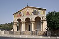
- Nomination Jerusalem, Mount of Olives, Gethsemane, Church of all nations --Berthold Werner 14:43, 27 April 2011 (UTC)
- Promotion Support Some CA, acceptable --Archaeodontosaurus 17:07, 27 April 2011 (UTC)
-

-

- Nomination Funerary model: calving cow. Middle Empire, 12th Dynasty (1990-1786 BCE). -- Rama 13:47, 27 April 2011 (UTC)
- Promotion Support Very useful, very good caption. The color temperature is different between the base and animal. The correct temperature is that of the base.--Archaeodontosaurus 17:13, 27 April 2011 (UTC)
-

- Nomination Caesarion offering fabric and ointment to Horus-King as a child and Isis protecting her son. -- Rama 13:20, 27 April 2011 (UTC)
- Promotion Support Color temperature too high --Archaeodontosaurus 17:15, 27 April 2011 (UTC)
-

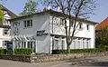
- Nomination Tadoussac: Tourist office --Taxiarchos228 07:14, 27 April 2011 (UTC)
- Promotion Good quality. --Cayambe 15:53, 27 April 2011 (UTC)
-

- Nomination Tadoussac: Tadoussac Hotel --Taxiarchos228 07:14, 27 April 2011 (UTC)
- Promotion Very sharp and good. --Cayambe 03:12, 28 April 2011 (UTC)
-

- Nomination Weil am Rhein: Three Country Bridge (Dreiländerbrücke) --Taxiarchos228 07:14, 27 April 2011 (UTC)
- Promotion like it - good quality and composition --LuFiLa 12:38, 27 April 2011 (UTC)
-

- Nomination Weil am Rhein: Three Country Bridge (detail) --Taxiarchos228 07:14, 27 April 2011 (UTC)
- Promotion like it - good quality and composition --LuFiLa 12:38, 27 April 2011 (UTC)
-

- Nomination Plumeria Flower, India. --Sankarshansen 06:50, 27 April 2011 (UTC)
- Decline Oppose Depth of field too short --Archaeodontosaurus 17:20, 27 April 2011 (UTC)
-

- Nomination The Town Hall of Paris.--Jebulon 23:01, 26 April 2011 (UTC)
- Promotion Very good -- George Chernilevsky 13:25, 27 April 2011 (UTC)
-

- Nomination Fortifications at Rhodes, Greece. --Jebulon 22:36, 26 April 2011 (UTC)
- Promotion Very good -- George Chernilevsky 13:26, 27 April 2011 (UTC)
-

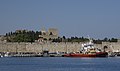
- Nomination A research ship in harbour of Rhodes, Greece.--Jebulon 22:20, 26 April 2011 (UTC)
- Promotion Support QI for me --Archaeodontosaurus 17:25, 27 April 2011 (UTC)
-
-
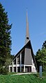
- Nomination The Mummelsee chapel in Black Forest, Baden-Württemberg. -- Felix Koenig 13:49, 26 April 2011 (UTC)
- Promotion Good. Please add geotag. --Cayambe 15:57, 27 April 2011 (UTC)
-

- Nomination Midsummer and Midnight in Hietaniemi, Helsinki, Finland --Ralf Roletschek 13:27, 26 April 2011 (UTC)
- Promotion Very nice colors. --King of Hearts 22:56, 27 April 2011 (UTC)
-

- Nomination Tyche -- Rama 11:37, 26 April 2011 (UTC)
- Promotion good, but strange structures in the upper background --Mbdortmund 18:00, 26 April 2011 (UTC) Seems to be the raw(?) structure of the concrete wall. QI to me.--Jebulon 22:57, 27 April 2011 (UTC)
-

-
- Nomination View of the city of Rhodes, Greece. --Jebulon 22:09, 25 April 2011 (UTC)
- Promotion Good -- George Chernilevsky 13:29, 27 April 2011 (UTC)
-

- Nomination Victoria Memorial in London --Carschten 18:40, 23 April 2011 (UTC)
- Promotion Good. --King of Hearts 22:54, 27 April 2011 (UTC)
-

- Nomination sports photographer --Taxiarchos228 10:58, 23 April 2011 (UTC)
- Promotion Good. --King of Hearts 22:51, 27 April 2011 (UTC)
-

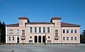
- Nomination Chur: Graubündner Kantonalbank --Taxiarchos228 10:58, 23 April 2011 (UTC)
- Promotion Nice --Sfu 21:13, 27 April 2011 (UTC)
-

- Nomination: Visiophone by Matra, 1970. -- Rama 10:10, 22 April 2011 (UTC)
- Review needed
-

- Nomination: Unidentified Pulsatilla, Marki, Poland. --Crusier 07:27, 22 April 2011 (UTC)
- Review needed
-

- Nomination Unidentified Pulsatilla flower, Marki, Poland. --Crusier 07:27, 22 April 2011 (UTC)
- Promotion Very good. Cookie 21:14, 27 April 2011 (UTC)
-

-

- Nomination Paris: Gare du Nord --Taxiarchos228 08:22, 21 April 2011 (UTC)
- Promotion Good --Sfu 21:21, 27 April 2011 (UTC)
-
- Nomination Veliko Tarnovo Cathedral. --MrPanyGoff 08:47, 27 April 2011 (UTC)
- Promotion branches are disturbing a little but, but QI --Taxiarchos228 09:43, 27 April 2011 (UTC)
-

- Nomination Tadoussac: Presbyterian Church --Taxiarchos228 07:14, 27 April 2011 (UTC)
- Promotion Good quality. --AngMoKio 07:38, 27 April 2011 (UTC)
-
- Nomination Cultural Centre, Sevlievo. --MrPanyGoff 06:26, 27 April 2011 (UTC)
- Promotion Good quality. --Taxiarchos228 09:43, 27 April 2011 (UTC)
-

- Nomination Stairway to Heaven. São Martinho do Porto, Portugal. -- Alvesgaspar 00:10, 27 April 2011 (UTC)
- Promotion Very nice composition, quality good. - Basvb 08:36, 27 April 2011 (UTC)
-

-

-

-

- Nomination Hebomoia glaucippe --ComputerHotline 18:29, 26 April 2011 (UTC)
- Promotion Good. --Quartl 20:30, 26 April 2011 (UTC)
-

- Nomination Hebomoia glaucippe --ComputerHotline 18:29, 26 April 2011 (UTC)
- Promotion Fine. --Quartl 20:30, 26 April 2011 (UTC)
-

- Nomination Danaus plexippus --ComputerHotline 18:29, 26 April 2011 (UTC)
- Decline unfavourable colour contrast with background --R-bitzer 00:38, 27 April 2011 (UTC)
-

- Nomination Hebomoia glaucippe --ComputerHotline 18:29, 26 April 2011 (UTC)
- Promotion Nice. --Quartl 20:30, 26 April 2011 (UTC)
-

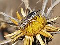
- Nomination Nursery web spider Pisaura mirabilis --Leviathan1983 16:48, 26 April 2011 (UTC)
- Promotion Great shot! --AngMoKio 17:16, 26 April 2011 (UTC)
-

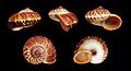
- Nomination Shell of a Lister's Conch, Mirabilistrombus listeri --Llez 16:44, 26 April 2011 (UTC)
- Promotion Good quality. --Mbdortmund 17:57, 26 April 2011 (UTC)
-

- Nomination Rothenburg o.d.T.Weihnahtzeit. --Vitold Muratov 14:37, 26 April 2011 (UTC)
- Decline Insufficient quality. Toomuch noise and not really sharp. --Berthold Werner 18:00, 26 April 2011 (UTC)
-

- Nomination Curatorial offices of the Canadian Museum of Civilization, Gatineau --Taxiarchos228 12:00, 26 April 2011 (UTC)
- Promotion Good quality. --AngMoKio 14:50, 26 April 2011 (UTC)
-

- Nomination Bas-relief: Nemesis, Allāt and the dedicator -- Rama 11:37, 26 April 2011 (UTC)
- Promotion Good quality. --Mbdortmund 18:00, 26 April 2011 (UTC)
-

- Nomination Bad Mitterndorf: Cemetery at Church Saint Margareta --Taxiarchos228 07:04, 26 April 2011 (UTC)
- Promotion Good quality. --Mbdortmund 17:55, 26 April 2011 (UTC)
-

-

-

- Nomination A ship of the greek navy, harbour of Rhodes, Greece. Complete ID and technical specifications available on the file description page.--Jebulon 21:49, 24 April 2011 (UTC).
 Info New version uploaded, with less dust spots in the sky... --Jebulon 21:01, 25 April 2011 (UTC)
 - Promotion Très bien. --Cayambe 18:23, 26 April 2011 (UTC)
- Nomination A ship of the greek navy, harbour of Rhodes, Greece. Complete ID and technical specifications available on the file description page.--Jebulon 21:49, 24 April 2011 (UTC).
-

-
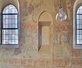
- Nomination Fischingen: fresco at protestant church --Taxiarchos228 18:38, 24 April 2011 (UTC)
- Promotion Good quality. --Cayambe 18:28, 26 April 2011 (UTC)
-
-
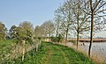
- Nomination The nature reserve of the Viconia Kleiputten in Stuivekenskerke, West Flanders, Belgium -- MJJR 20:43, 23 April 2011 (UTC)
- Promotion Good quality. --Taxiarchos228 11:14, 27 April 2011 (UTC)
-

- Nomination Serhij Hontschar --Taxiarchos228 10:58, 23 April 2011 (UTC)
- Decline Good but just 1Mpix.--Ankara 09:53, 24 April 2011 (UTC)
Resolution too low. Sorry. --AngMoKio 11:10, 27 April 2011 (UTC)
-

- Nomination Andy Schleck --Taxiarchos228 10:58, 23 April 2011 (UTC)
- Decline Resolution too low. Sorry. --AngMoKio 11:10, 27 April 2011 (UTC)
-

-

- Nomination Detail of an hellenistic mosaic representing Medusa, Palace of the Grand Master of the Knights of Rhodes, Greece. --Jebulon 22:45, 22 April 2011 (UTC)
- Promotion Good quality. --Ralf Roletschek 13:38, 26 April 2011 (UTC)
-

-

- Nomination České Budějovice (Budweis) - town hall in the night --Pudelek 17:44, 22 April 2011 (UTC)
- Promotion nice picture --Ralf Roletschek 13:38, 26 April 2011 (UTC)
-

- Nomination Projector of Maybach 63 --Taxiarchos228 15:53, 22 April 2011 (UTC)
- Promotion Good quality. --Ralf Roletschek 13:38, 26 April 2011 (UTC)
-
-

-

- Nomination: Statue of Diogenes of Sinope in the park of Versailles. --Coyau 09:54, 21 April 2011 (UTC)
- Review needed
-

- Nomination: Statue of Heracles in the park of Versailles. --Coyau 09:54, 21 April 2011 (UTC)
- Review needed
-
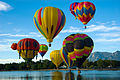
- Nomination: Colorado Springs hot air baloons competition--Slfi 09:21, 21 April 2011 (UTC)
- Review needed
-

- Nomination: Observation platform and helideck at Tour Montparnasse --Taxiarchos228 08:22, 21 April 2011 (UTC)
- Review needed
-

- Nomination: Lüneburg: Organ at Saint Johannis --Taxiarchos228 08:22, 21 April 2011 (UTC)
- Review needed
-

- Nomination: Lüneburg: Saint Nicolai church (choir side) --Taxiarchos228 08:22, 21 April 2011 (UTC)
- Review needed
-
- Nomination Lörrach-Stetten: fountain --Taxiarchos228 08:22, 21 April 2011 (UTC)
- Decline The cropped and red car ruins the composition.--Jebulon 16:47, 25 April 2011 (UTC)
this is a picture of the fountain, not of the car --Taxiarchos228 16:40, 25 April 2011 (UTC) To be honest. I do not like the composition, it is messy. The fountain is not the image focus, rather the square behind. Why not use manual focus? --Ankara 20:58, 26 April 2011 (UTC)
-

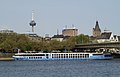
- Nomination: River cruise ship Alemannia in Cologne-Deutz --Rolf H. 05:16, 21 April 2011 (UTC)
- Review needed
-

- Nomination: River cruise ship Alemannia in Cologne-Deutz --Rolf H. 05:16, 21 April 2011 (UTC)
- Review needed
-

- Nomination: River cruise ship Alemannia in Cologne-Deutz --Rolf H. 05:16, 21 April 2011 (UTC)
- Review needed
-

- Nomination: Trains at Birmingham New Street. Mattbuck 19:39, 20 April 2011 (UTC)
- Review needed
-

- Nomination: View over Paris --Taxiarchos228 13:57, 20 April 2011 (UTC)
- Review Tilted ?--Jebulon 14:44, 20 April 2011 (UTC)
-

- Nomination: Bausenhagen: Saint Agnes church (photographer: User:smial) --Taxiarchos228 13:31, 20 April 2011 (UTC)
- Review needed
-

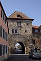
- Nomination Lörrach: castle ruin Rötteln --Taxiarchos228 07:17, 18 April 2011 (UTC)
- Promotion Need perspective correction IMO.--Ankara 16:16, 18 April 2011 (UTC)
done--Taxiarchos228 16:37, 22 April 2011 (UTC) Right part still tilted IMO. --Ankara 16:48, 22 April 2011 (UTC)
Good after new correction Jovianeye 19:48, 26 April 2011 (UTC)
-

- Nomination: Solothurn: Buris tower --Taxiarchos228 07:17, 18 April 2011 (UTC)
- Review Necessity to correct the perspective of building on the right. The sky is overexposed. --Archaeodontosaurus 13:44, 20 April 2011 (UTC)
-

- Nomination: Toronto: Royal Alexandra Theatre --Taxiarchos228 09:54, 13 April 2011 (UTC)
- Review Aberration of perspective. The horizontal lines of the roof are curved. --Archaeodontosaurus 14:07, 20 April 2011 (UTC)
-

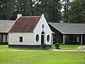
- Nomination Farm (1909) in Vries, the Netherlands - Basvb 11:12, 26 April 2011 (UTC)
- Promotion Good quality. --Taxiarchos228 11:20, 26 April 2011 (UTC)
-
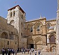
- Nomination Jerusalem, Church of the Holy Sepulchre --Berthold Werner 10:50, 26 April 2011 (UTC)
- Promotion Good quality. --Taxiarchos228 10:51, 26 April 2011 (UTC)
-

- Nomination Town hall of Alpirsbach, Black Forest, Baden-Württemberg. -- Felix Koenig 10:38, 26 April 2011 (UTC)
- Promotion Good quality, but are these trivial annotations really necessary? --Taxiarchos228 10:51, 26 April 2011 (UTC)
-

- Nomination Castle Hoensbroek, Heerlen, the Netherlands - Basvb 09:22, 26 April 2011 (UTC)
- Promotion very nice --Ralf Roletschek 11:58, 26 April 2011 (UTC)
-

- Nomination Helsinki Lutheran Cathedral in Helsinki, Finland by de:User:Ralf Roletschek --Mbdortmund 08:10, 26 April 2011 (UTC)
- Promotion Good quality and nice picture --Taxiarchos228 08:18, 26 April 2011 (UTC)
-

- Nomination Backside of the RheinEnergie --Rolf H. 07:39, 26 April 2011 (UTC)
- Promotion Good quality. --Taxiarchos228 07:47, 26 April 2011 (UTC)
-

- Nomination Kranhäuser Cologne and the RheinEnergie. --Rolf H. 07:39, 26 April 2011 (UTC)
- Decline nice image but not sharp --Taxiarchos228 07:47, 26 April 2011 (UTC)
-

- Nomination Head of an Ara ararauna, blue parrot.--Jebulon 21:57, 25 April 2011 (UTC)
- Promotion Good quality. --Mbdortmund 07:11, 26 April 2011 (UTC)
-

-

- Nomination The new town hall of Freudenstadt, Black Forest, Baden-Württemberg. -- Felix Koenig 18:24, 25 April 2011 (UTC)
- Promotion Good quality. --Taxiarchos228 06:10, 26 April 2011 (UTC)
-

-

- Nomination Scania truck in Austria. --High Contrast 13:42, 25 April 2011 (UTC)
- Promotion QI --Jebulon 22:36, 25 April 2011 (UTC)
-

- Nomination A dark Hyla arborea. --Von.grzanka 13:04, 25 April 2011 (UTC)
- Promotion For me a QI--Holleday 17:41, 25 April 2011 (UTC)
-

- Nomination A cluster of Oxalis acetosella. --Von.grzanka 12:37, 25 April 2011 (UTC)
- Promotion Very nice--Holleday 17:36, 25 April 2011 (UTC)
-
-

-

-

- Nomination Green-veined White on Garlic Mustard. --Quartl 10:49, 25 April 2011 (UTC)
- Promotion QI for me. --Von.grzanka 12:34, 25 April 2011 (UTC)
-

- Nomination Green-winged Orchid --Archaeodontosaurus 09:46, 25 April 2011 (UTC)
- Promotion Very good --Llez 15:48, 25 April 2011 (UTC)
-

- Nomination Alter Turm (~ old tower), Ottweiler, Saarland. -- Felix Koenig 07:58, 25 April 2011 (UTC)
- Promotion not as sharp as could be but good for QI --Taxiarchos228 06:37, 26 April 2011 (UTC)
-

- Nomination Waterskin bearer. Fragment of a procession of servants bearing meals for a banquet that ornated a wall near stairs in a Persepolis palace. -- Rama 00:21, 25 April 2011 (UTC)
- Promotion Support QI & Useful --Archaeodontosaurus 17:54, 25 April 2011 (UTC)
-

- Nomination Leaf of a Oleander (Nerium olenader) -- Alvesgaspar 23:52, 24 April 2011 (UTC)
- Promotion sharp and beautiful --Croucrou 22:52, 25 April 2011 (UTC)
-

- Nomination The house at Sparkassaplatz 4, 15th district of Vienna, was built in 1903 for the --Herzi Pinki 21:02, 24 April 2011 (UTC)
- Promotion Good quality. --Taxiarchos228 06:39, 26 April 2011 (UTC)
-

- Nomination The Gemeindebau Rauchfangkehrergasse 26 in Rudolfsheim-Fünfhaus, the 15th district of Vienna, was built in 1924-25. It is a Cultural Heritage Monument. --Herzi Pinki 21:02, 24 April 2011 (UTC)
- Promotion Good quality. --Taxiarchos228 06:39, 26 April 2011 (UTC)
-

- Nomination A sgraffito on a residential building in Braunhirschengasse 12-20, Rudolfsheim-Fünfhaus, Vienna, showing a tree motiv. --Herzi Pinki 21:02, 24 April 2011 (UTC)
- Promotion Good quality. --Taxiarchos228 06:39, 26 April 2011 (UTC)
-

- Nomination Fo-Guang-Shan temple Vienna, Schönbrunnerstraße 50, Rudolfsheim-Fünfhaus, Vienna. The street going strait is the Reindorfgasse. --Herzi Pinki 21:02, 24 April 2011 (UTC)
- Promotion Good quality. --Taxiarchos228 06:39, 26 April 2011 (UTC)
-

-

-

- Nomination Hoshizuna-no-hama in Iriomote Island, Okinawa, Japan --663highland 22:43, 21 April 2011 (UTC)
- Promotion QI for me. --Coyau 23:40, 25 April 2011 (UTC)
-

-

- Nomination View of the village of Lindos, island of Rhodes, Greece.--Jebulon 21:07, 21 April 2011 (UTC)
- Promotion f 3,5 produces a lack of sharpnes imo --Mbdortmund 12:51, 22 April 2011 (UTC)
Lack of sharpness is compensated by the file size. Qi for me. --Coyau 23:40, 25 April 2011 (UTC)
-
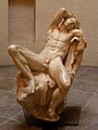
- Nomination Faun.Author unbekannt.Um 220 v.Chr.Glyptothek.München.Aus Palazzo Barberini. --Vitold Muratov 22:50, 21 April 2011 (UTC)
- Promotion
 Question Who is the author (artist) of the sculpture? -- MJJR 21:21, 21 April 2011 (UTC)
And where is this sculpture? Please add some more info to the photo. --AngMoKio 21:28, 21 April 2011 (UTC)Category adjusted. Pictures in "Commons" are useless if not seriously/carefully categorized or described. Asking for help is always possible. --Jebulon 16:50, 22 April 2011 (UTC) But what else?-- Vitold Muratov 23:50, 21 April 2011 (UTC)
Slight distortion, white balance leads a bit to red, but imo QI, because of good composition --Mbdortmund 23:00, 24 April 2011 (UTC)/ But that is of true colour indeed!Vitold Muratov 19:45, 25 April 2011 (UTC)
-
-

- Nomination: RoRo ship Forenso --Rolf H. 10:04, 20 April 2011 (UTC)
- Review needed
-

- Nomination: Interior of Myralucke, a cave in Lower Austria, municipality Muggendorf. --Herzi Pinki 21:43, 19 April 2011 (UTC)
- Review needed
-

- Nomination: Church of the Candlemas in Pereslavl in the evening.--PereslavlFoto 14:28, 19 April 2011 (UTC)
- Review needed
-

- Nomination Lutheran Cathedral in Helsinki, Finland --Ralf Roletschek 13:46, 18 April 2011 (UTC)
- Decline Korrektur der stürzenden Linien und der perspektivischen Verzerrung nötig, außerdem ist der Himmel unterbelichtet. --Carschten 14:14, 18 April 2011 (UTC)Das entzerre ich nicht, das ist steil nach oben geknipst. In den Breiten von Helsinki sind Kontraste stärker als hier --Ralf Roletschek 15:21, 18 April 2011 (UTC)
Wie findest Du meinen Versuch File:Lutheran Cathedral in Helsinki Ralf.jpg? --Mbdortmund 23:38, 24 April 2011 (UTC) Hmmm, ok--Ralf Roletschek 05:40, 26 April 2011 (UTC) Oppose there's a supported and much better derivative version --Carschten 09:27, 26 April 2011 (UTC)
-

- Nomination Solothurn: Saint Ursan cathedral, statues --Taxiarchos228 07:17, 18 April 2011 (UTC)
- Promotion Good quality. --Coyau 20:18, 25 April 2011 (UTC)
-

- Nomination: Sarraguzan Church -- Florent Pécassou 21:32, 16 April 2011 (UTC)
- Review Good, but needs a perspective correction IMO. --Cayambe 19:31, 19 April 2011 (UTC)
-

- Nomination Västra Orminge, built in the late 60s --Ankara 13:23, 16 April 2011 (UTC)
- Promotion Comment bad white balance (too blue) and ccw tilted. Please fix it and I will support --Carschten 20:43, 21 April 2011 (UTC) Thank you for pointing it out. IIs it better now? But are you sure that the image is tilted, for me, all vertical lines looks straight.--Ankara 21:06, 21 April 2011 (UTC) I leaned the image 0.1 degrees clockwise.--Ankara 21:16, 21 April 2011 (UTC) better now?:)--Ankara 08:42, 24 April 2011 (UTC) Comment it's much better now. The only problem I still have the the snow looks blue-grey anymore. Maybe the snow had really thia color at that day? --Carschten 08:29, 26 April 2011 (UTC) It was a gray morning and not really clear (haze / thin cloud cover). Most of the pictures in the category was taken one hour later when it had become clearer. Meantime I took the photos in Category:Hasseludden (same pale colors).--Ankara 08:46, 26 April 2011 (UTC)
Sorry, I wasn't there. If it's like reality, I believe you and Support --Carschten 11:13, 26 April 2011 (UTC)
-

- Nomination Tower of Madrid, Madrid, Spain. --Kadellar 13:21, 16 April 2011 (UTC)
- Promotion Comment at least a little perspective distortion correction is needed --Carschten 20:43, 21 April 2011 (UTC)
Is it better right now? Kadellar 13:17, 24 April 2011 (UTC) Support I'm surprised that this small distortion correction looks much better now. QI imo --Carschten 08:29, 26 April 2011 (UTC)
-

- Nomination The turret Mougin inside the fort du Parmont, near Remiremont, France. --ComputerHotline 11:05, 16 April 2011 (UTC)
- Decline Comment perspective distortion correction needed --Carschten 20:43, 21 April 2011 (UTC) Oppose no reaction after 5 days --Carschten 08:29, 26 April 2011 (UTC)
-

- Nomination The casemate Mougin inside the fort du Parmont, near Remiremont, France. --ComputerHotline 11:05, 16 April 2011 (UTC)
- Decline Comment perspective distortion correction needed --Carschten 20:43, 21 April 2011 (UTC) Oppose no reaction after 5 days --Carschten 08:29, 26 April 2011 (UTC)
-

- Nomination Orange Tip on Garlic Mustard. --Quartl 09:36, 25 April 2011 (UTC)
- Promotion Gut -- George Chernilevsky 09:51, 25 April 2011 (UTC)
-

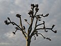
- Nomination Solitary tree near Lausheim in Southern Germany -- Simisa 04:58, 25 April 2011 (UTC)
- Promotion nice composition, QI for me --Herzi Pinki 06:31, 25 April 2011 (UTC)
-

-

-

- Nomination Virgin giving milk to the Child. -- Rama 22:59, 24 April 2011 (UTC)
- Promotion QI & useful --Archaeodontosaurus 09:44, 25 April 2011 (UTC)
-

- Nomination Torso of a Venus Anadyomene. -- Rama 22:51, 24 April 2011 (UTC)
- Promotion impressive, good lighting. (Maybe there are either some pixel errors or some cristals flaring, that could be corrected) --Herzi Pinki 06:35, 25 April 2011 (UTC)
-

- Nomination An eye, painted on a tree trunk, Rhodes, Greece.--Jebulon 22:43, 24 April 2011 (UTC)
- Promotion Support --Archaeodontosaurus 07:52, 25 April 2011 (UTC)
-

- Nomination Duvnäs gård. Home to Swedish artist Olle Nyman. --Ankara 22:40, 24 April 2011 (UTC)
- Promotion Support QI for me --Archaeodontosaurus 07:51, 25 April 2011 (UTC)
-

- Nomination The Artist's Conk (Ganoderma applanatum) -- George Chernilevsky 21:04, 24 April 2011 (UTC)
- Promotion Support QI for me --Archaeodontosaurus 08:14, 25 April 2011 (UTC)
-

-

- Nomination Foundation nail dedicated by Gudea to Ningirsu for the building of his temple, the E-ninnu: "For Ningirsu, the powerful hero of Enlil, his king, Gudea, prince of Lagash, accomplished what had to be; his temple of E-innu, the shining thunder-bird, he built and restaured." -- Rama 20:31, 24 April 2011 (UTC)
- Promotion Oh que oui.--Jebulon 21:55, 24 April 2011 (UTC)
-

- Nomination Campanula sulphurea in bloom. -- Gidip 20:19, 24 April 2011 (UTC)
- Promotion Good photo -- George Chernilevsky 21:05, 24 April 2011 (UTC)
-

- Nomination Lesser periwinkle (Vinca minor). -- George Chernilevsky 20:06, 24 April 2011 (UTC)
- Promotion Support QI & Useful --Archaeodontosaurus 08:13, 25 April 2011 (UTC)
-

-

- Nomination Caesarion (?) wearing the nemes. -- Rama 19:43, 24 April 2011 (UTC)
- Promotion Support QI & Useful (The caption is a bit heavy especially if other languages are added to.) --Archaeodontosaurus 08:11, 25 April 2011 (UTC)
-

- Nomination Wollbach: epitaph at protestant church --Taxiarchos228 18:38, 24 April 2011 (UTC)
- Decline because of the shadow.--Jebulon 22:00, 24 April 2011 (UTC)
-
- Nomination A strobilus of Equisetum arvense. --Von.grzanka 18:05, 24 April 2011 (UTC)
- Promotion Support QI & Useful (damage to F5, F10 would have been better)--Archaeodontosaurus 08:02, 25 April 2011 (UTC)
-
- Nomination Jerusalem, Ziongate, Townside --Berthold Werner 17:24, 24 April 2011 (UTC)
- Promotion Good quality. --Taxiarchos228 18:10, 24 April 2011 (UTC)
-

-

- Nomination Dendrocoelum cavaticum (very rare picture of this animal)--Holleday 15:53, 24 April 2011 (UTC)
- Promotion SiSwati: (missing text)QI & Useful --Archaeodontosaurus 16:13, 24 April 2011 (UTC)
-

- Nomination Machines room inside an old NATO base. --ComputerHotline 15:26, 24 April 2011 (UTC)
- Promotion Good quality. --Taxiarchos228 18:10, 24 April 2011 (UTC)
-

- Nomination A corridor inside an old NATO base. --ComputerHotline 15:26, 24 April 2011 (UTC)
- Promotion Good quality. --Taxiarchos228 18:10, 24 April 2011 (UTC)
-

- Nomination Frankfurt Cathedral as seen from the south. --Quartl 12:18, 24 April 2011 (UTC)
- Promotion I would like to suggest a tighter crop at the bottom, maybe only save the roof of the house?--Ankara 15:40, 24 April 2011 (UTC) I tried the crop you suggested, but the result looks strange since the cathedral does extend further down. It is nowadays surrounded by high buildings so the only viewpoints from where it is fully visible are high up in the air . --Quartl 17:23, 24 April 2011 (UTC) You may be right (saw that there was a picture, perhaps not a better crop). Anyway, the quality is very good!--Ankara 17:53, 24 April 2011 (UTC)
-

- Nomination Water Tower at the Noorderbinnensingel, Groningen, the Netherlands - Basvb 07:42, 24 April 2011 (UTC)
- Promotion Good quality. --Taxiarchos228 17:09, 24 April 2011 (UTC)
-
- Nomination Shell of a Sumatran land snail, Cyclophorus rafflesi --Llez 06:25, 24 April 2011 (UTC)
- Promotion Support QI & Useful --Archaeodontosaurus 16:15, 24 April 2011 (UTC)
-

- Nomination Hellenistic head of god Helios.--Jebulon 22:13, 23 April 2011 (UTC)
- Promotion Support Good work, good caption --Archaeodontosaurus 16:18, 24 April 2011 (UTC)
-

- Nomination Boats in a harbour of Rhodes, Greece.--Jebulon 22:45, 23 April 2011 (UTC)
- Promotion Good quality. --Ralf Roletschek 19:18, 24 April 2011 (UTC)
-

- Nomination Peacock butterfly (side view). --Quartl 18:08, 23 April 2011 (UTC)
- Promotion Support Good for "in vivo" --Archaeodontosaurus 16:21, 24 April 2011 (UTC)
-

- Nomination Baking house from Kasteel Hoekelum, Ede, Rijksmonument in the Netherlands - Basvb 15:55, 23 April 2011 (UTC)
- Decline Im sorry, but the tree destroy the composition IMO. Please change to the discussion if you want a second opionion.--Ankara 20:33, 23 April 2011 (UTC) Ok, the tree was there on purpose (I like it), but I'll try one of the versions without a tree. Mvg, Basvb 18:02, 24 April 2011 (UTC)
-

-

- Nomination Shell of a Tiger Cowry, Cypraea tigris --Llez 05:40, 22 April 2011 (UTC)
- Promotion Comment There seems to be quite a lot of reflections in the shells. --Lokal Profil 22:34, 22 April 2011 (UTC) Comment The shell surface is glossy like a mirror, impossible to make a photo without reflections --Llez 06:20, 23 April 2011 (UTC)Good to me.--Jebulon 15:06, 23 April 2011 (UTC) Impossible to do better. --Archaeodontosaurus 15:24, 23 April 2011 (UTC) Comment What I reacted to was what looked like the outline of the photographer in the reflections. This could possibly be fixed by using a remote or standing in front of a darker/less reflective background. Not opposing QI though. --Lokal Profil 12:05, 24 April 2011 (UTC)
-

-

- Nomination Street mapping vehicle --Jovianeye 23:52, 20 April 2011 (UTC)
- Promotion Support Useful --Archaeodontosaurus 16:25, 24 April 2011 (UTC)
-
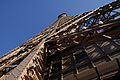
- Nomination Eiffel tower, upper part as seen from the middle observation deck --Taxiarchos228 13:57, 20 April 2011 (UTC)
- Promotion Interesting perspective. --Cayambe 09:21, 25 April 2011 (UTC)
-

-

-

- Nomination: Tower Železná panna (Iron Virgin) and restaurant Staré časy - České Budějovice (Budweis), Czech Republic --Pudelek 10:00, 19 April 2011 (UTC)
- Review needed
-

-

- Nomination: Buildings from 1940s and 50s in Saltängen, Nacka. --Ankara 22:12, 18 April 2011 (UTC)
- Review needed
-

-
- Nomination: Nytorpskolan (Nytorp school). Built in the 1950s. Architect David Dahl. --Ankara 16:08, 18 April 2011 (UTC)
- Review needed
-

- Nomination: The flower of a Thalictrum aquilegifolium. --Lokal Profil 15:58, 18 April 2011 (UTC)
- Review needed
-

- Nomination: Schwalefeld panorama --Carschten 15:19, 18 April 2011 (UTC)
- Review needed
-
- Nomination: City Hall in Helsinki, Finland --Ralf Roletschek 13:46, 18 April 2011 (UTC)
- Review Korrektur der stürzenden Linien und der perspektivischen Verzerrung nötig, außerdem ist der Himmel unterbelichtet. Des weiteren: Was ist das für eine komsiche weiße Spur (siehe Annotation)? --Carschten 14:14, 18 April 2011 (UTC) Die Spur ist nichts weiter als ne Wolke
-

- Nomination: Village Niederfinow in Germany; evening in winter --Ralf Roletschek 13:35, 18 April 2011 (UTC)
- Review needed
-

- Nomination The flower of a Himalayan fleabane (Erigeron multiradiatus). --Lokal Profil 16:28, 17 April 2011 (UTC)
- Decline Oppose Depth of field a little weak. F10 might have been better. --Archaeodontosaurus 13:17, 23 April 2011 (UTC) Comment Thanks for the feedback. The new camera should hopefully give me a little more control. --Lokal Profil 12:22, 24 April 2011 (UTC)
-

-

- Nomination Hot air balloon in Marki, Poland. --Crusier 14:21, 15 April 2011 (UTC)
- Promotion Comment very nice, but needs perspective distortion correction --Carschten 16:20, 21 April 2011 (UTC)
 Done Now? --Crusier 11:50, 23 April 2011 (UTC)
The crop has become more tight but I think its ok since the balloon is still anchored to the ground. Jovianeye 16:27, 24 April 2011 (UTC)
-

- Nomination Lörrach: church Saint Peter, seen from west --Taxiarchos228 08:34, 15 April 2011 (UTC)
- Promotion Good quality. --Carschten 16:20, 21 April 2011 (UTC) Info there is a dust un the sky who need to be delete beafore pormotion --Croucrou 21:45, 23 April 2011 (UTC)
done --Taxiarchos228 12:04, 24 April 2011 (UTC)
-

-

- Nomination Crossroads in Luxemb. City. This is to show the location of the small monument under the trees at the midright. --Cayambe 08:32, 24 April 2011 (UTC)
- Promotion Not a very exciting composition, but as you pointed out useful. The quality is sufficient for QI.--Ankara 09:40, 24 April 2011 (UTC)
-

- Nomination St-Alphonse church in Luxemb. City. --Cayambe 07:57, 24 April 2011 (UTC)
- Promotion Ok imho --Berthold Werner 08:35, 24 April 2011 (UTC)
-
- Nomination Kriegerdenkmal Kirchplatz Hohenems by User:Böhringer --Mbdortmund 00:46, 24 April 2011 (UTC)
- Promotion Very nice composition imo. --Cayambe 09:29, 24 April 2011 (UTC)
-

-
-

-

-

-
-

- Nomination E. arvense. --Bartiebert 19:25, 23 April 2011 (UTC)
- Promotion Good quality. --Carschten 20:06, 23 April 2011 (UTC)
-

- Nomination en:Sergey Glazyev, Russian economist. A.Savin 19:15, 23 April 2011 (UTC)
- Promotion Very good. --Cayambe 08:34, 24 April 2011 (UTC)
-

-

- Nomination Mining lamp memorial, spoil tip Halde Rheinpreußen, Moers --Carschten 18:40, 23 April 2011 (UTC)
- Promotion Good quality and clearly QI. Just one thing; the person to the right (to show the scale?) is cropped, it is deliberately? --Ankara 20:19, 23 April 2011 (UTC)
-

- Nomination Flower and leaves of a pomegranate -- Alvesgaspar 17:53, 23 April 2011 (UTC)
- Promotion QI to me with enough space for the flower to breathe ;-) --Llez 21:33, 23 April 2011 (UTC)
-

- Nomination Metatorbernite --Archaeodontosaurus 17:11, 23 April 2011 (UTC) (UTC)
- Promotion Very good and useful. --Cayambe 08:36, 24 April 2011 (UTC)
-

- Nomination Composition with two flowers of Echinopsis. --Bff 16:26, 23 April 2011 (UTC)
- Decline Nice composition, but the image seems to be affected by excessive denoising; also needs a more specific id of the flowers. --Quartl 11:45, 24 April 2011 (UTC)
-
- Nomination Jerusalem, Jewish Quarter Road --Berthold Werner 15:48, 23 April 2011 (UTC)
- Promotion Good--Jebulon 09:46, 24 April 2011 (UTC)
-

- Nomination Centaurea jacea. --Bartiebert 14:59, 23 April 2011 (UTC)
- Decline good, but below 2 MP --Carschten 15:04, 23 April 2011 (UTC)
-

-

- Nomination Jens Voigt --Taxiarchos228 10:58, 23 April 2011 (UTC)
- Promotion Good. --Ankara 09:54, 24 April 2011 (UTC)
-

- Nomination Peggy's Point Lighthouse --Taxiarchos228 10:58, 23 April 2011 (UTC)
- Decline The lighting is a bit too harsh. The tourist standing underneath is helpful, but the others distract. --Avenue 11:09, 24 April 2011 (UTC)
-

- Nomination Orchis punctulata in bloom. --Gidip 08:04, 23 April 2011 (UTC)
- Promotion Support Good & Useful go to VA --Archaeodontosaurus 14:08, 23 April 2011 (UTC)
-
- Nomination Centaurea ammocyanus in bloom. --Gidip 07:39, 23 April 2011 (UTC)
- Promotion Support Good & Useful go to VA --Archaeodontosaurus 14:07, 23 April 2011 (UTC)
-

- Nomination Head of a priest, Gypsum alabaster, 3rd quarter of the 8th century BCE, Palace of Tiglath-Pileser III, Nimrud, Assyria. -- Rama 06:53, 23 April 2011 (UTC)
- Promotion Support QI & Useful --Archaeodontosaurus 14:05, 23 April 2011 (UTC)
-

- Nomination a parrot's profile.--Jebulon 22:21, 22 April 2011 (UTC)
- Promotion Support Nice --Archaeodontosaurus 14:01, 23 April 2011 (UTC)
-

- Nomination Office building in Munich in the "Arnulfpark". --High Contrast 22:04, 22 April 2011 (UTC)
- Promotion Good --Jebulon 15:11, 23 April 2011 (UTC)
-
- Nomination Part of the old walls of the medieval city of Rhodes, Greece.--Jebulon 21:49, 22 April 2011 (UTC)
- Promotion Support QI for me --Archaeodontosaurus 14:02, 23 April 2011 (UTC)
-

-
-

- Nomination Mulhouse: Saint Fridolin church --Taxiarchos228 15:53, 22 April 2011 (UTC)
- Promotion Good quality. --Cayambe 08:02, 24 April 2011 (UTC)
-

-

- Nomination Hotel Nirakanai in Iriomote Island, Okinawa, Japan --663highland 22:43, 21 April 2011 (UTC)
- Promotion Good quality. --Cayambe 16:27, 23 April 2011 (UTC)
-

-

- Nomination View to the north from Taipei 101 --AngMoKio 20:39, 21 April 2011 (UTC)
- Promotion Good quality. --Taxiarchos228 15:09, 23 April 2011 (UTC)
-

- Nomination The point here is not just show houses, but to show the 1960s urban planning. The division into different zones, a traffic and parking zone separated from residential buildings. You must park outside, before going into residential zone.--Ankara 20:15, 21 April 2011 (UTC). I like this type of images... please remove the dust spot in the sky and I'll promote it. Would also like to suggest a slightly tighter crop at the bottom, just below the rock at the right, and the removal of the branch extremities in the sky at right. But this is optional. Regards. --Cayambe 11:26, 23 April 2011 (UTC) Done Thanks for the good suggestions (sorry i forgot the dustspot again)--Ankara 12:02, 23 April 2011 (UTC)
- Promotion ok now :-) --Cayambe 12:10, 23 April 2011 (UTC)
- Nomination The point here is not just show houses, but to show the 1960s urban planning. The division into different zones, a traffic and parking zone separated from residential buildings. You must park outside, before going into residential zone.--Ankara 20:15, 21 April 2011 (UTC). I like this type of images... please remove the dust spot in the sky and I'll promote it. Would also like to suggest a slightly tighter crop at the bottom, just below the rock at the right, and the removal of the branch extremities in the sky at right. But this is optional. Regards. --Cayambe 11:26, 23 April 2011 (UTC)
-

- Nomination Buildings in Luxembourg City. This image is mainly about composition. --Cayambe 20:02, 21 April 2011 (UTC)
- Promotion Support QI for me --Archaeodontosaurus 13:39, 23 April 2011 (UTC)
-
- Nomination Bibionidae sp. on a leaf. --ComputerHotline 17:58, 21 April 2011 (UTC)
- Decline Oppose Poor depth of field. Caption too poor (this does not scream in QI)--Archaeodontosaurus 13:44, 23 April 2011 (UTC)
-
- Nomination Tipulidae sp. portrait. --ComputerHotline 17:58, 21 April 2011 (UTC)
- Decline Oppose Poor depth of field. Caption too poor (this does not scream in QI) --Archaeodontosaurus 13:47, 23 April 2011 (UTC)
-
- Nomination Coccinellidae sp. --ComputerHotline 17:58, 21 April 2011 (UTC)
- Decline Should be Propylea quatuordecimpunctata (and these are small!), but visible CA all around the beetle. --Quartl 18:11, 23 April 2011 (UTC)
-

- Nomination Lörrach: (New) City Hall, upper part and roof --Taxiarchos228 08:22, 21 April 2011 (UTC)
- Decline OpposeThe edges are inclined and curved --Archaeodontosaurus 13:33, 23 April 2011 (UTC)
-

-

-

- Nomination Eiffel tower, upper part as seen from the middle observation deck --Taxiarchos228 13:57, 20 April 2011 (UTC)
- Promotion Interesting perspective. --Jovianeye 05:29, 24 April 2011 (UTC)
-

- Nomination Dragon's teeth from WW2 in Hoek van Holland, Netherlands --Ralf Roletschek 13:27, 20 April 2011 (UTC)
- Promotion Good--Jebulon 09:24, 24 April 2011 (UTC)
-

- Nomination Beach of Ter Hejde, Netherlands, in the background Oil refinery and harbour of Rotterdam --Ralf Roletschek 13:27, 20 April 2011 (UTC)
- Promotion Good, even if the color of the sky looks strange (not wrong, but strange) --Jebulon 09:24, 24 April 2011 (UTC)
-

-

- Nomination Merkava Mk4 tank. --MathKnight 15:04, 19 April 2011 (UTC)
- Promotion Good--Jebulon 14:46, 23 April 2011 (UTC)
-

-

-

- Nomination Pancake cafe on Soviet street in Pereslavl.--PereslavlFoto 16:55, 18 April 2011 (UTC)
- Promotion QI. The cat looks hungry...--Jebulon 14:39, 23 April 2011 (UTC)
-
- Nomination: Terrace house built 1943 at Gillevägen (Gille road), Nacka. Architect Backström & Reinius Arkitekter AB. --Ankara 11:44, 18 April 2011 (UTC)
- Review needed
-

- Nomination Lörrach-Brombach: war monument --Taxiarchos228 07:17, 18 April 2011 (UTC)
- Promotion Good.--Jebulon 09:21, 24 April 2011 (UTC)
-

- Nomination Ottawa: Canadian Parliament (Centre Block) --Taxiarchos228 07:17, 18 April 2011 (UTC)
- Promotion Comment Need perspective correction --Chmee2 13:07, 18 April 2011 (UTC)
done--Taxiarchos228 16:37, 22 April 2011 (UTC) Support Good now --Archaeodontosaurus 13:21, 23 April 2011 (UTC)
-

- Nomination: River cruise ship Serenade 1 at night in cologne --Rolf H. 06:37, 18 April 2011 (UTC)
- Review needed
-

- Nomination Ixeridium chinense: High Sharpness and good depth of field--龙鳞 12:14, 17 April 2011 (UTC)
- Decline Oppose Subject very interresting never seen in COMMONS. I suggest going on VA. But the image quality is poor. The depth of field is poor and the framing too. --Archaeodontosaurus 13:12, 23 April 2011 (UTC)
-

- Nomination: Bust in the inner cour d'honneur of Versailles. --Coyau 08:23, 16 April 2011 (UTC)
- Review barrel distortion should be repaired --Mbdortmund 10:13, 16 April 2011 (UTC)
Bricks are not horizontal, I see no barell distortion here. --Coyau 17:00, 16 April 2011 (UTC)
J'ai ajouté une note pour montrer, ce que je veux dire. --Mbdortmund 08:50, 18 April 2011 (UTC)
I see that:the wall is that way, it does not come from the photo. I corected perspective according to the stone frame (which is more likely straight than the bricks). --Coyau 08:55, 18 April 2011 (UTC)
-
- Nomination A window in Lin An Tai Historical House, Taipei --Bgag 04:25, 23 April 2011 (UTC)
- Promotion Good quality. --Mbdortmund 09:36, 23 April 2011 (UTC)
-

- Nomination White marble bust of Antoninus Pius. Made near Rome circa 140 CE.-- Rama 20:54, 22 April 2011 (UTC)
- Promotion Very nice. Deserves the QI-badge. --High Contrast 11:45, 23 April 2011 (UTC)
-

- Nomination White marble bust of Antoninus Pius. Made near Rome circa 140 CE.-- Rama 20:54, 22 April 2011 (UTC)
- Promotion Very nice. Deserves the QI-badge. --High Contrast 11:45, 23 April 2011 (UTC)
-

-

- Nomination The Lyon Tablet. -- Rama 19:09, 22 April 2011 (UTC)
- Promotion Good, with very high informative value.--Jebulon 22:48, 22 April 2011 (UTC)
-
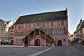
- Nomination Mulhouse: City hall --Taxiarchos228 15:53, 22 April 2011 (UTC)
- Promotion good.--Jebulon 17:02, 22 April 2011 (UTC)
-

- Nomination Weil am Rhein: Tree country bridge --Taxiarchos228 15:53, 22 April 2011 (UTC)
- Promotion Interesting view and good image quality -- MJJR 21:31, 22 April 2011 (UTC)
-

- Nomination Bourges: Cathedral of Bourge (choir) --Taxiarchos228 15:53, 22 April 2011 (UTC)
- Promotion Gut. Sky is not always standard-blue. No detail lost near the white part.--Jebulon 16:54, 22 April 2011 (UTC)
-
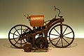
- Nomination Daimler Reitwagen --Taxiarchos228 15:53, 22 April 2011 (UTC)
- Promotion not perfectly sharp but good--Jebulon 16:57, 22 April 2011 (UTC)
-
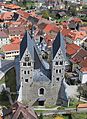
- Nomination Parish church in Friesach by Neithan90 --Mbdortmund 22:48, 21 April 2011 (UTC)
- Promotion Good quality. --Taxiarchos228 16:09, 22 April 2011 (UTC)
-

- Nomination Dominican-Order-cloister in Friesach by Neithan90 --Mbdortmund 22:48, 21 April 2011 (UTC)
- Promotion Good quality. --Taxiarchos228 16:09, 22 April 2011 (UTC)
-

- Nomination St Pierre by Véronique PAGNIER --Mbdortmund 22:48, 21 April 2011 (UTC)
- Decline It seems to me it is not Saint-Pierre... The electric wire and the power point are ugly and disturbing IMO.--Jebulon 13:46, 22 April 2011 (UTC)
-

- Nomination at Yubu Island in Okinawa, Japan --663highland 22:43, 21 April 2011 (UTC)
- Promotion Good composition. There are heavy shadows on the oxen, and some CA, but I infer from the composition that the vehicle is the main subject, and the quality there seems good enough. --Avenue 14:16, 22 April 2011 (UTC)
-

-

-

-

- Nomination London Eye at night with double decker bus --Ralf Roletschek 16:56, 20 April 2011 (UTC)
- Decline The white balance is too red, and the bus is blurred. I see you can't really push the ISO much higher, so you should probably try panning. -- King of Hearts 20:55, 22 April 2011 (UTC)
-

- Nomination Park Valkenberg in Breda, Netherlands --Ralf Roletschek 13:27, 20 April 2011 (UTC)
- Promotion Good quality. --Cayambe 09:43, 23 April 2011 (UTC)
-

- Nomination Jerusalem, Jewish Quarter, Cardo --Berthold Werner 11:26, 20 April 2011 (UTC)
- Promotion Good quality. --Cayambe 09:45, 23 April 2011 (UTC)
-

-

- Nomination Faun.Pompeii--Vitold Muratov 19:35, 18 April 2011 (UTC)
- Decline Blurry, few details. Would also need a more accurate and specific description (too much noise reduction?).--Ankara 16:22, 22 April 2011 (UTC)
-

- Nomination Ottawa: Canadian Tulip Festival --Taxiarchos228 07:17, 18 April 2011 (UTC)
- Promotion Clearly tilted. Easy to fix.--Ankara 16:19, 18 April 2011 (UTC)
done--Taxiarchos228 16:37, 22 April 2011 (UTC) Good now.--Ankara 16:48, 22 April 2011 (UTC)
-
- Nomination: Estampes Church, Gers, France -- Florent Pécassou 21:32, 16 April 2011 (UTC)
- Review Comment Need perspective correction IMO.--Ankara 22:44, 16 April 2011 (UTC)
-
- Nomination: TriHyBus - Hydrogen hybrid bus in Brno.--Slfi 19:50, 16 April 2011 (UTC)
- Review needed
-

- Nomination: Sickla strand. Built 1947-48. --Ankara 19:43, 16 April 2011 (UTC)
- Review needed
-

- Nomination: Orminge centre. --Ankara 13:36, 16 April 2011 (UTC)
- Review needed
-
- Nomination Steam ship on Danube.Regensburg. --Vitold Muratov 17:50, 15 April 2011 (UTC)
- Promotion Comment needs English description and perspective distortion correction --Carschten 16:20, 21 April 2011 (UTC) But the guides checking shows: there is no perspective distortion. --Vitold Muratov 11:35, 22 April 2011 (UTC)No need of a correction IMO. English and french captions added. QI to me.--Jebulon 15:46, 22 April 2011 (UTC)
-
- Nomination Ludwig Feuerbach grave. St.Johannis cemetery. Nuremberg. --Vitold Muratov 19:16, 12 April 2011 (UTC)
- Promotion * Comment Please, a caption in English --Archaeodontosaurus 09:45, 16 April 2011 (UTC)* Done, in french too. QI, furthermore.--Jebulon 15:21, 22 April 2011 (UTC)
-

- Nomination Metasequoia glyptostroboides branches, Marki, Poland. --Crusier 07:50, 22 April 2011 (UTC)
- Decline Composition looks accidental, not really sharp, short DOF --Mbdortmund 09:34, 22 April 2011 (UTC)
-

- Nomination Pulsatilla sp. in Marki, Poland. --Crusier 19:51, 21 April 2011 (UTC)
- Promotion Great! Please add Locaton. --AleXXw 20:24, 21 April 2011 (UTC) Done --Crusier 06:31, 22 April 2011 (UTC)
-

- Nomination Shell of a Pliocene marine snail, Echinofulgur dalli --Llez 15:30, 21 April 2011 (UTC)
- Promotion Good quality. --Mbdortmund 19:38, 21 April 2011 (UTC)
-

- Nomination Sun setting in a field in Stafford, Staffordshire --Tyw7 22:48, 20 April 2011 (UTC)
- Decline Insufficient quality. Please read guidelines before nominating further images. A.Savin 16:55, 21 April 2011 (UTC)
-

- Nomination British Rail Class 220 in CrossCountry livery at Truro Station --Tyw7 22:04, 20 April 2011 (UTC)
- Decline Insufficient quality. Please read guidelines before nominating further images. A.Savin 16:55, 21 April 2011 (UTC)
-
- Nomination ruins of an old church by night in Rhodes, Greece.--Jebulon 20:58, 20 April 2011 (UTC)
- Promotion Good -- George Chernilevsky 13:49, 21 April 2011 (UTC)
-

- Nomination Paris: Sacré-Cœur --Taxiarchos228 13:57, 20 April 2011 (UTC)
- Promotion Comment Beautiful colors, but please geotag. --King of Hearts 07:08, 21 April 2011 (UTC)
added geotag --Taxiarchos228 07:15, 21 April 2011 (UTC)
Good. --King of Hearts 19:30, 21 April 2011 (UTC)
-

- Nomination Lörrach-Brombach: Brombach sign --Taxiarchos228 07:17, 18 April 2011 (UTC)
- Promotion The subject isn't that exciting... but it's useful and the quality is ok. --Cayambe 19:09, 21 April 2011 (UTC)
-

- Nomination Solothurn: fresco at Saint Ursen cathedral --Taxiarchos228 07:17, 18 April 2011 (UTC)
- Promotion Good quality. --Cayambe 19:13, 21 April 2011 (UTC)
-
- Nomination Platane in Werne --Mbdortmund 23:42, 17 April 2011 (UTC)
- Withdrawn Comment nice, but underexposed --Carschten 09:41, 22 April 2011 (UTC)
-

- Nomination Monument "Vienoti Latvijai" in Rēzekne --Dark Eagle 21:42, 17 April 2011 (UTC)
- Decline sky is a bit noisy, blown out wthite, nothing really sharp --Carschten 09:41, 22 April 2011 (UTC)
-

- Nomination Cherry blossom in a park in Bucharest. Andrei Stroe 20:54, 17 April 2011 (UTC)
very nice but rather noisy --Taxiarchos228 06:17, 18 April 2011 (UTC) - Decline bad light: one half is in shadow and the other half is blown out --Carschten 09:41, 22 April 2011 (UTC)
- Nomination Cherry blossom in a park in Bucharest. Andrei Stroe 20:54, 17 April 2011 (UTC)
-

- Nomination The flower of a Meconopsis 'Slieve Donard'. --Lokal Profil 16:28, 17 April 2011 (UTC)
- Promotion nice --Carschten 09:41, 22 April 2011 (UTC)
-

-
-

- Nomination Snowwiper near Toronto Tomer T 08:48, 17 April 2011 (UTC)
- Decline I like it! But the truck is very dark. Could you increase the shadows a little?--Ankara 16:31, 18 April 2011 (UTC) Comment Also out of focus quite a bit. Comment I don't know how to do it. Tomer T 21:39, 18 April 2011 (UTC) I uploaded a new version. You can read more about shadow here. (I didnt use photshop) --Ankara 21:50, 18 April 2011 (UTC) Oppose very nice composiion and a good action shot, but the car and the whole image is unsharp --Carschten 09:41, 22 April 2011 (UTC)
-

- Nomination Clubhouse, Skuru IK --Ankara 16:52, 16 April 2011 (UTC). Please remove two round dustspots in the upper left sky... and i'll promote. --Cayambe 16:59, 20 April 2011 (UTC)I think they are gone now. --Ankara 16:41, 21 April 2011 (UTC)
- Promotion Ok now :-) --Cayambe 08:37, 22 April 2011 (UTC)
-

-

-

- Nomination View of the fort du Parmont, near Remiremont, France. --ComputerHotline 11:05, 16 April 2011 (UTC)
- Promotion nice --Carschten 20:43, 21 April 2011 (UTC)
-

- Nomination: Inside the fort du Parmont, near Remiremont, France. --ComputerHotline 11:05, 16 April 2011 (UTC)
- Review needed
-
- Nomination: Inside the fort du Parmont, near Remiremont, France. --ComputerHotline 11:05, 16 April 2011 (UTC)
- Review needed
-

- Nomination Bedroom inside the fort du Parmont, near Remiremont, France. --ComputerHotline 11:05, 16 April 2011 (UTC)
- Promotion Good quality. --Carschten 20:43, 21 April 2011 (UTC)
-

- Nomination Bedroom inside the fort du Parmont, near Remiremont, France. --ComputerHotline 11:05, 16 April 2011 (UTC)
- Promotion Good quality. --Carschten 20:43, 21 April 2011 (UTC)
-

- Nomination Inside the fort du Parmont, near Remiremont, France. --ComputerHotline 11:05, 16 April 2011 (UTC)
- Promotion Good quality. --Carschten 20:43, 21 April 2011 (UTC)
-

- Nomination Inside the fort du Parmont, near Remiremont, France. --ComputerHotline 11:05, 16 April 2011 (UTC)
- Decline poor white balance --Carschten 20:43, 21 April 2011 (UTC)
-
-
-

-

- Nomination: Stockholm Arena under construction, april 2011. --Ankara 20:20, 15 April 2011 (UTC)
- Review needed
-
- Nomination: Kfar Saba Bridge in Mülheim/Ruhr (Germany) --Carschten 16:51, 15 April 2011 (UTC)
- Review needed
-
- Nomination Lörrach: church Saint Peter, glas-concrete-wall --Taxiarchos228 08:34, 15 April 2011 (UTC)
- Decline Too tight crop (left) IMO.--Ankara 16:42, 19 April 2011 (UTC) Oppose per Ankara --Carschten 16:20, 21 April 2011 (UTC)
-

- Nomination Solothurn: dom of saint Ursen cathedral --Taxiarchos228 08:34, 15 April 2011 (UTC)
- Promotion interesting --Carschten 16:20, 21 April 2011 (UTC)
-

- Nomination Golden Gate Bridge, from the southeast. -- King of Hearts 06:16, 15 April 2011 (UTC)
- Promotion tilted and hazy --Carschten 16:20, 21 April 2011 (UTC)
What you are seeing is not haze, but overdone highlight recovery and shadow lifting; also, tilt fixed. Uploaded new version. --King of Hearts 19:15, 21 April 2011 (UTC)
1. Please don't change a evaluation-vote from another user back to nomination, therefore you should use the "discuss" status. 2. changed my vote to promotion, because it's good enough for QI now. Focussing the first bridge pier would be better imo though --Carschten 20:56, 21 April 2011 (UTC)
-

-

- Nomination Wappen von Köln, Passenger ship in cologne (2) --Rolf H. 10:08, 14 April 2011 (UTC)
nice composition but not really sharp --Taxiarchos228 10:50, 14 April 2011 (UTC) - Decline per Taxiarchos228. Very nice composition, but it's really unsharp --Carschten 16:05, 21 April 2011 (UTC)
- Nomination Wappen von Köln, Passenger ship in cologne (2) --Rolf H. 10:08, 14 April 2011 (UTC)
-

-

-

-

- Nomination Pseudotsuga menziesii in Marki, Poland. --Crusier 12:41, 13 April 2011 (UTC)
- Decline too soft imo --Carschten 16:05, 21 April 2011 (UTC)
-

- Nomination The Ochsenburg castle in St. Pölten, Austria --AleXXw 06:49, 21 April 2011 (UTC)
- Promotion Good quality, but I would crop the branches out at the left side --Taxiarchos228 06:52, 21 April 2011 (UTC) Done, thanks for the hint ;) --AleXXw 07:05, 21 April 2011 (UTC)
-

-

- Nomination Temple of Athena on the acropolis of Lindos, Rhodes, Greece.--Jebulon 21:44, 20 April 2011 (UTC)
- Promotion QI for me, maybe the upper crop is a bit too tight. --Herzi Pinki 22:06, 20 April 2011 (UTC) Agree about the crop, I noticed this when uploading. Thank you. --Jebulon 22:32, 20 April 2011 (UTC)
-

- Nomination Office tower in Münster, Germany.--Elektroschreiber 21:01, 20 April 2011 (UTC)
- Promotion Some parts are blown out, but not distracting IMO. --King of Hearts 07:10, 21 April 2011 (UTC)
-

- Nomination Zwankendamme train station (Bruges, Belgium) -- MJJR 20:38, 20 April 2011 (UTC)
- Promotion Good quality. --Taxiarchos228 06:54, 21 April 2011 (UTC)
-

- Nomination Zwankendammme (Bruges, Belgium): St Leo the Great church -- MJJR 20:38, 20 April 2011 (UTC)
- Promotion Good quality, very nice --Taxiarchos228 06:54, 21 April 2011 (UTC)
-

- Nomination Railway bridge on the Boudewijn canal in Dudzele (Bruges, Belgium) -- MJJR 20:38, 20 April 2011 (UTC)
- Promotion Good quality. --Taxiarchos228 06:54, 21 April 2011 (UTC)
-

- Nomination Looking north from Cam & Dursley station. Mattbuck 19:39, 20 April 2011 (UTC)
- Promotion Good quality. I like the sky. I don't like the horizon placed in the middle. --Elektroschreiber 21:59, 20 April 2011 (UTC)
-

- Nomination London Taxis at Parliament Square, London (the fuzziness is intentional) --Ralf Roletschek 16:56, 20 April 2011 (UTC)
- Decline I don't find a blurred picture taxi ist a good representation of a taxi in London. This is not a race car. --Elektroschreiber 21:49, 20 April 2011 (UTC)
-

- Nomination Waterloo Station, London --Ralf Roletschek 16:56, 20 April 2011 (UTC)
- Decline Insufficient quality. Too noisy. The tower in the foreground is falling to the left. --Elektroschreiber 21:59, 20 April 2011 (UTC)
-

- Nomination Luxembourg City: statue of Guillaume II (1792-1849), king of The Netherlands and Grand-Duke of Luxembourg. --Cayambe 16:39, 20 April 2011 (UTC)
- Promotion Good quality. --Taxiarchos228 07:02, 21 April 2011 (UTC)
-
- Nomination Lörrach: Seventh-day Adventist Church --Taxiarchos228 13:57, 20 April 2011 (UTC)
- Promotion Good quality. --Ralf Roletschek 17:09, 20 April 2011 (UTC)
-

- Nomination Shell of an Endive Murex, Hexaplex cichoreum --Llez 13:05, 20 April 2011 (UTC)
- Promotion Support QI & Useful --Archaeodontosaurus 13:29, 20 April 2011 (UTC)
-

-

- Nomination The Boudewijn canal from Bruges to Zeebrugge, Belgium -- MJJR 21:21, 19 April 2011 (UTC)
- Promotion I really like it. Just one thing, the grass on the left. Is the strong, green color really natural or oversaturated?--Ankara 21:50, 19 April 2011 (UTC)
As the picture was a little bit hazy, contrast and saturation have slightly been increased, but the color of the young (spring time!) grass and herbs is pretty natural. -- MJJR 19:04, 20 April 2011 (UTC) Ok. Regards --Ankara 06:27, 21 April 2011 (UTC)
-

- Nomination The village of Zwankendamme near Bruges, Belgium -- MJJR 21:21, 19 April 2011 (UTC)
- Promotion Good quality, sharpness OK. --King of Hearts 06:59, 21 April 2011 (UTC)
-

- Nomination Portrait of Corvus Monedula. Didn't make it as a FA but perhaps QI? --Ainali 20:36, 19 April 2011 (UTC)
- Promotion Not the sharpest photo, but good enough. --King of Hearts 07:04, 21 April 2011 (UTC)
-

- Nomination en:Heidi Hautala, a politician from Finland. A.Savin 18:45, 19 April 2011 (UTC)
- Promotion Good quality. --Taxiarchos228 12:49, 20 April 2011 (UTC)
-

- Nomination Dornach: Goeteheanum (detail) --Taxiarchos228 06:51, 19 April 2011 (UTC)
- Decline Comment ccw tilted --Carschten 09:39, 19 April 2011 (UTC)
now in line, but my deliberate purpose for this picture was not a strictly symmetrical view --Taxiarchos228 13:15, 20 April 2011 (UTC)
Oppose Aberration of perspective --Archaeodontosaurus 13:39, 20 April 2011 (UTC)
-

- Nomination Fontrailles Church (Hautes-Pyrénées, France) -- Florent Pécassou 21:32, 16 April 2011 (UTC)
- Promotion Support a little noise but acceptable --Archaeodontosaurus 13:49, 20 April 2011 (UTC)
-

-

-

- Nomination Entry of the fort du Parmont, near Remiremont, France. --ComputerHotline 11:05, 16 April 2011 (UTC)
- Promotion Good.--Ankara 12:42, 20 April 2011 (UTC)
-

- Nomination Lörrach: Castle ruin Rötteln --Taxiarchos228 08:34, 15 April 2011 (UTC)
- Promotion Good quality. --Slfi 09:27, 21 April 2011 (UTC)
-

- Nomination Lörrach: (New) City Hall, view from east --Taxiarchos228 08:34, 15 April 2011 (UTC)
- Decline Comment Did you correct the perspective? It looks kinda over-corrected (top of the building seems to be wider than its base) --BennyJ 10:16, 15 April 2011 (UTC)
Oppose Aberration of perspective --Archaeodontosaurus 13:53, 20 April 2011 (UTC)
-

- Nomination České Budějovice (Budweis) - hotel Budweis --Pudelek 15:30, 14 April 2011 (UTC)
- Promotion OK -- George Chernilevsky 09:30, 21 April 2011 (UTC)
-
- Nomination: The flower of a Helichrysum ecklonis --Lokal Profil 14:45, 14 April 2011 (UTC)
- Review needed
-

- Nomination Western fortification of the castle Schloss Broich in Mülheim, Germany --Carschten 13:49, 13 April 2011 (UTC)
- Promotion for me --Archaeodontosaurus 14:00, 20 April 2011 (UTC)
-

- Nomination Декоративный источник. Нюрнберг --Vitold Muratov 20:35, 12 April 2011 (UTC)
- Decline Unsharp, color aberrations/noise. --King of Hearts 05:44, 21 April 2011 (UTC)
-

- Nomination Abandoned iron mine Intrånget, Sweden.--V-wolf 17:28, 11 April 2011 (UTC)
- Decline the tower is heavily underxposed, nearly black! --Carschten 08:04, 19 April 2011 (UTC) Comment Ehm...yes? This is on the countryside, not in a city.--V-wolf 12:38, 19 April 2011 (UTC)
And what should I evaluate at this big dark image? I just can see and say that this motive is senseless for a night photo and that it's underexposed. --Carschten 21:01, 19 April 2011 (UTC) So, if I understand you right, you think that silhouettes are pointless? --V-wolf 12:54, 20 April 2011 (UTC)
for an encyclopedia it's mainly pointless imo and here I don't know how to evaluate the image in quality because I can't see much details at the underexposed subject. So I don't think this pic is QI. If you want a CR, you can set the "discuss" status (if you like). --Carschten 20:57, 20 April 2011 (UTC)
-

- Nomination TV Tower Stuttgart --AngMoKio 07:37, 20 April 2011 (UTC)
- Promotion Good quality. --Taxiarchos228 07:39, 20 April 2011 (UTC)
-

- Nomination Taipei 101 --AngMoKio 07:37, 20 April 2011 (UTC)
- Promotion Good quality. --Taxiarchos228 07:39, 20 April 2011 (UTC)
-

- Nomination the summit area of the Almesbrunnberg (1079m) is completely covered with wood. --Herzi Pinki 21:43, 19 April 2011 (UTC)
- Promotion The dramatic qualities of this scene compensates for the blown-out cloud and vertical distortion IMO. --~~~
-

- Nomination Rotten house in Thal, Muggendorf, Lower Austria. In the left background the Hausstein (664m). --Herzi Pinki 21:43, 19 April 2011 (UTC)
- Promotion Good quality. --Mbdortmund 00:28, 20 April 2011 (UTC)
-

- Nomination 3 trees near the top of Almesbrunnberg (1079m), Lower Austria. Heading ENE during sunset. --Herzi Pinki 21:43, 19 April 2011 (UTC)
- Promotion Good quality. --Taxiarchos228 07:48, 20 April 2011 (UTC)
-

- Nomination Doronicum sp. --Bartiebert 20:23, 19 April 2011 (UTC)
- Promotion High Sharpness,Good!I like it. --龙鳞 10:00, 20 April 2011 (UTC)龙鳞
-

- Nomination Lothar Späth, German politician (CDU), former minister-president of Baden-Württemberg. -- Felix Koenig 18:16, 19 April 2011 (UTC)
- Promotion Good. --Jovianeye 18:56, 19 April 2011 (UTC)
-

- Nomination Red Kite -- Simisa 16:26, 19 April 2011 (UTC)
- Promotion The crop seems too tight. Can you upload a more relaxed crop version? --Jovianeye 18:10, 19 April 2011 (UTC) Comment Changed back to the original landscape format. Better now? -- Simisa 19:24, 19 April 2011 (UTC)
Very nice. --Quartl 19:49, 19 April 2011 (UTC)
-

-

-
- Nomination Young leaves of Sambucus racemosa --Bff 11:49, 19 April 2011 (UTC)
- Decline Oppose Too much background noise. --Archaeodontosaurus 14:42, 19 April 2011 (UTC)
-

- Nomination Inflorescence, completed the flowering, of Succisa pratensis --Bff 11:45, 19 April 2011 (UTC)
- Decline Oppose Too much background noise. --Archaeodontosaurus 14:42, 19 April 2011 (UTC)
-

- Nomination Hotel Budweis in the evening, České Budějovice (Budweis) --Pudelek 10:00, 19 April 2011 (UTC)
- Promotion Support QI for me --Archaeodontosaurus 16:00, 19 April 2011 (UTC)
-

-

- Nomination Quebec City: St. Patrick Pub --Taxiarchos228 06:51, 19 April 2011 (UTC)
- Promotion QI --Carschten 09:39, 19 April 2011 (UTC)
The upper left corner of the brown building is too high for me. But this distortion is acceptable. --Archaeodontosaurus 17:01, 19 April 2011 (UTC)
-

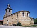
- Nomination Schallbach: Protestant Church --Taxiarchos228 06:51, 19 April 2011 (UTC)
- Decline Oppose need to correct the perspective --Archaeodontosaurus 16:04, 19 April 2011 (UTC)
-
- Nomination Schallbach: Protestant Church --Taxiarchos228 06:51, 19 April 2011 (UTC)
- Promotion Support QI for me --Archaeodontosaurus 16:14, 19 April 2011 (UTC)
-

- Nomination Inflorescence of a Tower of Jewels, Echium wildpretii --Llez 16:50, 18 April 2011 (UTC)
- Promotion QI & Useful --Archaeodontosaurus 17:10, 19 April 2011 (UTC)
-

- Nomination The flower of the Nymphaea cultivar 'Pamela'. --Lokal Profil 16:03, 18 April 2011 (UTC)
- Promotion Good quality. --Mbdortmund 02:51, 20 April 2011 (UTC)
-

- Nomination Trainings ship Themis II in action --Rolf H. 11:22, 18 April 2011 (UTC)
- Promotion Good quality. --Mbdortmund 22:25, 19 April 2011 (UTC)
-

- Nomination Monument in Mersch. --Cayambe 09:34, 18 April 2011 (UTC)
- Promotion Support QI & Useful --Archaeodontosaurus 17:14, 19 April 2011 (UTC)
-
- Nomination Jerusalem, Dome of the rock, in the background the Mount of Olives --Berthold Werner 08:50, 18 April 2011 (UTC)
- Promotion Good quality. --Cayambe 16:08, 19 April 2011 (UTC)
-

- Nomination River cruise ship Premicon Queen at night in cologne --Rolf H. 06:37, 18 April 2011 (UTC)
- Decline not really sharp --Mbdortmund 22:28, 19 April 2011 (UTC)
-

-
-
-
- Nomination Sickla strand. Built 1947-48. --Ankara 19:43, 16 April 2011 (UTC). Will promote after 2 dustspots will have been removed from the sky :-) --Cayambe 19:35, 19 April 2011 (UTC) Thank you. New version uploaded.--Ankara 19:58, 19 April 2011 (UTC)
- Promotion Ok now. --Cayambe 20:48, 19 April 2011 (UTC)
-

-
-
-

-

-

-

- Nomination Solothurn: Landhouse --Taxiarchos228 08:34, 15 April 2011 (UTC)
- Promotion A little blurry on the far right, but overall very good and beautiful colors.--Ankara 16:42, 19 April 2011 (UTC)
-

- Nomination Detail of a Ducato Bicycle --Ralf Roletschek 06:57, 15 April 2011 (UTC)
- Decline The wheel is out of focus, and it is a pretty important part IMO. --King of Hearts 09:50, 20 April 2011 (UTC)
-

-

-

- Nomination: Sailing ship in "Nyhavn", Copenhagen, Denmark, frozen in the ice. --BennyJ 19:37, 13 April 2011 (UTC)
- Review Comment Did you already try to correct the vertical lines with ShiftN? --Mbdortmund 20:00, 13 April 2011 (UTC) -- Yes and the result looked unnatural. However, I did apply some other lens correction. --BennyJ 20:28, 13 April 2011 (UTC)
-

- Nomination: Southeastern portal of the castle Schloss Broich in Mülheim, Germany --Carschten 13:49, 13 April 2011 (UTC)
- Review needed
-

- Nomination Hornbeam. Jardin des Plantes of Paris.--Jebulon 21:29, 11 April 2011 (UTC)
- Decline Poor composition, can't see very well what the plant is. --King of Hearts 09:47, 20 April 2011 (UTC)
-

- Nomination a flower of tulipa, cultivar. jardin des Plantes of Paris.--Jebulon 21:19, 11 April 2011 (UTC)
- Decline Needs a specific identification --Carschten 08:04, 19 April 2011 (UTC) Red channel clipped slightly in the highlights, blue channel clipped severly in the shadows. --King of Hearts 09:46, 20 April 2011 (UTC)
-

- Nomination Plum (Prunus domestica) blossom. --David Perez 19:03, 11 April 2011 (UTC)
- Decline Central parts of it are out of focus. --King of Hearts 09:48, 20 April 2011 (UTC)
-

- Nomination Maturing C. pepo fruit. Juliancolton 22:30, 9 April 2011 (UTC)
- Decline The leaf on the upper left corner is rather distracting. Could you crop it out? -- King of Hearts 06:28, 15 April 2011 (UTC)
No response. -- King of Hearts 09:21, 20 April 2011 (UTC)
-

- Nomination Western part of the Faroe islands village Elduvík --Snaevar 23:41, 7 April 2011 (UTC)
- Decline A bit dark. Could you increase the shadows just a little? -- King of Hearts 06:24, 15 April 2011 (UTC)
No response. -- King of Hearts 09:20, 20 April 2011 (UTC)
-

- Nomination California gray squirrel --King of Hearts 09:01, 19 April 2011 (UTC)
- Promotion Good quality. --Carschten 09:39, 19 April 2011 (UTC)
-

- Nomination Tadoussac: Interior of Presbyterian church --Taxiarchos228 06:51, 19 April 2011 (UTC)
- Promotion a bit noisy, but I like it --Carschten 09:39, 19 April 2011 (UTC)
-

- Nomination Graz: double spiral staircase at castle Graz --Taxiarchos228 06:51, 19 April 2011 (UTC)
- Decline noisy --Carschten 09:39, 19 April 2011 (UTC)
-

- Nomination Wieslet: town hall --Taxiarchos228 06:51, 19 April 2011 (UTC)
- Promotion Good quality. --Carschten 09:39, 19 April 2011 (UTC)
-

- Nomination Weil am Rhein-Märkt: Protestant church --Taxiarchos228 06:51, 19 April 2011 (UTC)
- Promotion nice --Carschten 09:39, 19 April 2011 (UTC)
-

-

-

-

-

-

-

-

- Nomination Village Schönfeld (Germany) --Ralf Roletschek 13:46, 18 April 2011 (UTC)
- Promotion nice --Carschten 14:14, 18 April 2011 (UTC)
-

- Nomination Wünschelbrücke über der Schwärze in Eberswalde --Ralf Roletschek 13:35, 18 April 2011 (UTC)
- Decline blurry, overexposed --Carschten 14:14, 18 April 2011 (UTC)
-

- Nomination Sue Gardner at Wikipedia Academy 2008 --Ralf Roletschek 13:35, 18 April 2011 (UTC)
- Decline very good! But it's below the size requirement and the hand (?) at the left is disturbing :-( --Carschten 14:14, 18 April 2011 (UTC)1,95 MPx ;)--Ralf Roletschek 15:23, 18 April 2011 (UTC)
Benötigt also 0,05 MP mehr... ;-) --Carschten 17:23, 18 April 2011 (UTC)
-
- Nomination Ryuhoukaku of Togo Onsen --663highland 11:41, 18 April 2011 (UTC)
- Promotion Good quality. --Taxiarchos228 12:30, 18 April 2011 (UTC)
-

- Nomination Tudumari-no-hama Beach in Iriomote Island, Okinawa, Japan --663highland 11:41, 18 April 2011 (UTC)
- Promotion Good quality. --Taxiarchos228 12:30, 18 April 2011 (UTC))
-

- Nomination Orotava valley panorama. Note that this image is huge, but scaled-down versions are available. --Quartl 11:07, 18 April 2011 (UTC)
- Promotion Good quality. --Taxiarchos228 11:17, 18 April 2011 (UTC) Comment It's really nice image, just please make better crop. See left down corner of the image. Regards --Chmee2 13:02, 18 April 2011 (UTC)
Why? The road is part of the scenery, cropping it means cutting away a large part of the valley. --Quartl 14:30, 18 April 2011 (UTC) CommentI do not mean road. See exactly the leftdowner corner. There is problem with composing panorama image. There is small area which is not real corner but is bowled. --Chmee2 14:38, 18 April 2011 (UTC)
Ah, I see. I will repair this, thanks for the hint. --Quartl 14:51, 18 April 2011 (UTC)
-

-
- Nomination TUI Allegra in cologne --Rolf H. 06:16, 18 April 2011 (UTC). Will promote after the removal of the (faint) dustspot at the top left of the tower spire. --Cayambe 10:28, 18 April 2011 (UTC) I think - done. Thanks --Rolf H. 18:07, 18 April 2011 (UTC)>
- Promotion Ok now :-) --Cayambe 21:02, 18 April 2011 (UTC)
-

- Nomination Alexander Nevsky Cathedral side entrance fragment. --MrPanyGoff 12:08, 16 April 2011 (UTC)
- Decline the crop at top is too tight. --Berthold Werner 11:51, 19 April 2011 (UTC)
-
- Nomination: harbour in Alma, Canada --Taxiarchos228 09:54, 13 April 2011 (UTC)
- Review needed
-

- Nomination: sculpture "The Audiance" from Michael Snow at Rogers Centre, Toronto --Taxiarchos228 09:54, 13 April 2011 (UTC)
- Review needed
-

- Nomination: Lörrach: City Hall, view from southeast --Taxiarchos228 03:48, 12 April 2011 (UTC)
- Review Comment Not the best perspective of the building, the front is in shade--Lmbuga 18:48, 12 April 2011 (UTC)
-

- Nomination: Grenzach-Wyhlen: Church of Peace, bell tower --Taxiarchos228 03:48, 12 April 2011 (UTC)
- Review Comment Needs a little of distortion correction, otherwise good--Lmbuga 01:28, 13 April 2011 (UTC)
-

-

-

- Nomination Sgraffito in Tábor, Czech Republik --Pudelek 17:33, 11 April 2011 (UTC)
- Decline underexposed, white balance,
 chromatic aberrations --Carschten 08:04, 19 April 2011 (UTC)
-
- Nomination Female Hipparchia fatua. --Gidip 17:24, 11 April 2011 (UTC)
- Promotion Good. --David Perez 14:40, 18 April 2011 (UTC)
-

-

-

-

-

-
- Nomination two types of polish EN57 Trains --Ralf Roletschek 10:37, 11 April 2011 (UTC)
- Promotion Good quality. --Carschten 08:27, 19 April 2011 (UTC)
-
- Nomination Grenzach-Wyhlen: winged altar at Saint Georgs church --Taxiarchos228 08:42, 11 April 2011 (UTC)
- Promotion good --Carschten 08:27, 19 April 2011 (UTC)
-

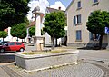
- Nomination Lörrach-Brombach: fountain --Taxiarchos228 07:17, 18 April 2011 (UTC)
- Decline Sorry, unshurp in full size --Chmee2 08:50, 18 April 2011 (UTC)
-

-
- Nomination Platane in Werne --Mbdortmund 23:42, 17 April 2011 (UTC)
- Promotion Good -- George Chernilevsky 07:36, 18 April 2011 (UTC)
-

- Nomination Platane in Werne --Mbdortmund 23:42, 17 April 2011 (UTC)
- Promotion Good quality. --Taxiarchos228 06:17, 18 April 2011 (UTC)
-

- Nomination Platane in Werne --Mbdortmund 23:42, 17 April 2011 (UTC)
- Promotion Also good -- George Chernilevsky 07:36, 18 April 2011 (UTC)
-

- Nomination Vanadium --Alchemist-hp 22:56, 17 April 2011 (UTC)
- Promotion Good quality. --Mbdortmund 23:42, 17 April 2011 (UTC)
-

-

- Nomination Pohlia nutans --Holleday 14:24, 17 April 2011 (UTC)
- Promotion Good photo of this tiny plants -- George Chernilevsky 15:23, 17 April 2011 (UTC)
-

- Nomination Lucanus hermani --Holleday 13:20, 17 April 2011 (UTC)
- Promotion Good photo -- George Chernilevsky 15:29, 17 April 2011 (UTC)
-
- Nomination Germany, Freinsheim, Haintor --Berthold Werner 13:05, 17 April 2011 (UTC)
- Promotion Good quality. --Taxiarchos228 06:17, 18 April 2011 (UTC)
-

- Nomination Villa Folkvang, built around 1900. Architect Folke Zetterwalls. --Ankara 10:16, 17 April 2011 (UTC)
- Promotion house clearly tilted cw --Mbdortmund 10:50, 17 April 2011 (UTC) Clearly! New version uploaded. Thank you.--Ankara 10:55, 17 April 2011 (UTC)
Good now --Mbdortmund 08:46, 18 April 2011 (UTC)
-

-

- Nomination Nursery inside the fort du Parmont, near Remiremont, France. --ComputerHotline 11:05, 16 April 2011 (UTC)
- Promotion Good quality. --Mbdortmund 10:18, 18 April 2011 (UTC)
-

- Nomination 360° panorama seen from the fort du Parmont, near Remiremont, France. --ComputerHotline 11:05, 16 April 2011 (UTC)
- Promotion Good quality. -- King of Hearts 08:27, 18 April 2011 (UTC)
-

-

- Nomination Rolls Royce: radiator mascot --Taxiarchos228 13:13, 13 April 2011 (UTC)
- Promotion Nice --Chmee2 08:42, 18 April 2011 (UTC)
-

-

- Nomination Адам Крафт.Алтарь Тэтцель капеллы.Нюрнберг --Vitold Muratov 18:25, 12 April 2011 (UTC)
- Decline Comment Beautiful subject, but chromatic aberrations, color noise...--Lmbuga 18:54, 12 April 2011 (UTC) Oppose I agree with Lmbuga --Chmee2 08:38, 18 April 2011 (UTC)
-

- Nomination: Lörrach: prison --Taxiarchos228 03:48, 12 April 2011 (UTC)
- Review needed
-

- Nomination Schallbach: Protestant Church --Taxiarchos228 03:48, 12 April 2011 (UTC)
- Decline Comment Clear distortion: The base of the building is right (horizontally). The superior horizontal lines of the building are tilted--Lmbuga 18:06, 12 April 2011 (UTC) Oppose Tilted (and 6 days without response or correction) --Chmee2 08:38, 18 April 2011 (UTC)
-

- Nomination Grenzach-Wyhlen: Epitaph at protestant church --Taxiarchos228 03:48, 12 April 2011 (UTC)
- Decline Comment The uppon and botton horizontal lines are not stright: Horizontal distortion. To me not QI, but perhaps I'm not right--Lmbuga 20:15, 12 April 2011 (UTC)
they are not straight because the stone is not --Taxiarchos228 07:24, 15 April 2011 (UTC) Oppose You are right that stones are not exactly straight but still image is falling to one side. Same opinion like Lmbuga --Chmee2 08:38, 18 April 2011 (UTC)
-

- Nomination Baby portrait --Kozuch 10:04, 17 April 2011 (UTC)
- Promotion Good quality. --Mbdortmund 10:53, 17 April 2011 (UTC)
-

- Nomination 10-months-old baby in winter --Kozuch 08:41, 17 April 2011 (UTC)
- Promotion Good quality. --Mbdortmund 10:54, 17 April 2011 (UTC)
-

-

-

- Nomination A Fenghuang at Longshan Temple, Taipei --Bgag 16:27, 16 April 2011 (UTC)
- Promotion Good quality. --Mbdortmund 20:50, 16 April 2011 (UTC)
-

- Nomination A cavalier at Longshan Temple, Taipei --Bgag 16:27, 16 April 2011 (UTC)
- Promotion Good quality. --Mbdortmund 20:50, 16 April 2011 (UTC)
-

-

- Nomination Jerusalem, the church of the Holy Sepulchre --Berthold Werner 11:55, 16 April 2011 (UTC)
- Promotion Support QI & Useful --Archaeodontosaurus 15:10, 16 April 2011 (UTC)
-

- Nomination The top of the fort du Parmont, near Remiremont, France. --ComputerHotline 11:05, 16 April 2011 (UTC)
- Promotion Support QI for me --Archaeodontosaurus 15:12, 16 April 2011 (UTC)
-

-

- Nomination Mollov House in Sofia. Note that the main facade has oval shape. --MrPanyGoff 09:44, 16 April 2011 (UTC)
- Decline Insufficient quality. Overall very dark, but still the white parts are posterized. --Niabot 11:32, 16 April 2011 (UTC)
Can you explain more accurately what do you mean by insufficient quality.--MrPanyGoff 13:15, 16 April 2011 (UTC)
-

- Nomination Boranup karri forest --Gnangarra 08:19, 15 April 2011 (UTC)
- Decline overexposed parts (top left) --Taxiarchos228 08:33, 15 April 2011 (UTC) Comment I don't actually find the overexposure to be a problem, but the chromatic aberration is rather bad. -- King of Hearts 18:43, 16 April 2011 (UTC)
-

- Nomination The Old Slaveykov School in Targovishte. --MrPanyGoff 21:41, 13 April 2011 (UTC)
- Promotion Support QI for me --Archaeodontosaurus 15:08, 16 April 2011 (UTC)
-

- Nomination: Two rocks Słoneczna and Okiennik Rzędkowicki in Polish Jura --Przykuta 11:25, 11 April 2011 (UTC)
- Review needed
-

- Nomination: The rock Studnisko in Polish Jura --Przykuta 11:25, 11 April 2011 (UTC)
- Review needed
-

- Nomination: Ruins of the Mirów Castle, Poland --Przykuta 11:25, 11 April 2011 (UTC)
- Review needed
-

- Nomination: Winterling, Eranthis hyemalis --Ralf Roletschek 10:39, 11 April 2011 (UTC)
- Review needed
-
- Nomination: inside of an czech intercity train toilette --Ralf Roletschek 10:38, 11 April 2011 (UTC)
- Review needed
-
- Nomination: Church of the Candlemas in Pereslavl in the evening. View from the Moskovskaya street.--PereslavlFoto 10:03, 11 April 2011 (UTC)
- Review needed
-

- Nomination: Rümmingen: Protestant Church --Taxiarchos228 08:42, 11 April 2011 (UTC)
- Review needed
-

- Nomination: Rümmingen: Protestant Churchm bell tower --Taxiarchos228 08:42, 11 April 2011 (UTC)
- Review needed
-

- Nomination: Bust of a roman emperor, Versailles. --Coyau 07:20, 11 April 2011 (UTC)
- Review needed
-
-

- Nomination 1949 Ford Coupe.--V-wolf 20:33, 10 April 2011 (UTC)
- Promotion Comment Suggestive image, but color noise--Lmbuga 01:44, 13 April 2011 (UTC) New version up. Is it smooth enough? --V-wolf 21:28, 13 April 2011 (UTC)
Yes, it is, imo. --David Perez 09:24, 17 April 2011 (UTC)
-

- Nomination Estelas islands, Monteferro, Nigrán, Galicia (Spain). This day there was African wind warm, full of dirt--Lmbuga 19:58, 10 April 2011 (UTC). Comment Here I can see the horizon, I think--Lmbuga 19:58, 10 April 2011 (UTC)
- Promotion Very good quality. --Carschten 20:35, 16 April 2011 (UTC)
- Nomination Estelas islands, Monteferro, Nigrán, Galicia (Spain). This day there was African wind warm, full of dirt--Lmbuga 19:58, 10 April 2011 (UTC).
-
- Nomination: Rue Royale, from Place de la Concorde, Paris.--Jebulon 16:02, 10 April 2011 (UTC)
- Review Comment Perhaps can be more sharp (to me). Green chromatic aberration, see columns of the left--Lmbuga 19:02, 10 April 2011 (UTC)
New version. If you don't like it, "puedes eliminar esa versión"--Lmbuga 19:16, 10 April 2011 (UTC) thanks for improvements.--Jebulon 20:47, 10 April 2011 (UTC)
-

- Nomination: Estelas islands, Monteferro, Nigrán, Galicia (Spain). This day there was African wind warm, full of dirt.--Lmbuga 09:24, 10 April 2011 (UTC)
- Review horizon seems tilted to me --Carschten 09:36, 10 April 2011 (UTC)
I have thought about that possibility. But I am not able to see the horizon. New version (the central tree is straight)--Lmbuga 12:13, 10 April 2011 (UTC)
-

- Nomination Замок Эльц --Vitold Muratov 23:42, 8 April 2011 (UTC)
- Decline artifacts, poor light --Carschten 20:31, 16 April 2011 (UTC)
-

-

-

-

-

- Nomination Bulgarian Academy of Sciences, corner fragment. --MrPanyGoff 07:41, 16 April 2011 (UTC)
- Promotion Good quality, but tends a little to overexposure --Niabot 11:32, 16 April 2011 (UTC)
-
-

-

- Nomination A Frill-necked Lizard, Chlamydosaurus kingii --Llez 14:27, 15 April 2011 (UTC)
- Promotion Good quality. --Mbdortmund 20:02, 15 April 2011 (UTC)
-

- Nomination Jerusalem, Church of the Holy Sepulchre, --Berthold Werner 12:10, 15 April 2011 (UTC)
- Promotion Good quality. --Cayambe 06:41, 16 April 2011 (UTC)
-

- Nomination Metal sculpture in Cologne, Am Leystapel --Rolf H. 10:49, 15 April 2011 (UTC)
- Promotion nice composition --Mbdortmund 19:44, 15 April 2011 (UTC)
-

- Nomination Lörrach: Seventh-day Adventist Church --Taxiarchos228 08:34, 15 April 2011 (UTC)
- Promotion Good quality. --Mbdortmund 20:03, 15 April 2011 (UTC)
-
- Nomination Inzlingen: Catholic Church --Taxiarchos228 08:34, 15 April 2011 (UTC)
- Promotion Good quality. --Cayambe 06:43, 16 April 2011 (UTC)
-

- Nomination The flower of a Trollius ledebourii --Lokal Profil 14:48, 14 April 2011 (UTC)
- Promotion For me a QI--Holleday 10:55, 16 April 2011 (UTC)
-

- Nomination Toronto: shore of Ontariolake with Toronto Islands in the background --Taxiarchos228 10:50, 14 April 2011 (UTC)
- Promotion Comment nice but a little bit ccw tilted --Carschten 12:11, 14 April 2011 (UTC)
ausgerichtet --Taxiarchos228 10:44, 15 April 2011 (UTC) Support --Carschten 13:19, 15 April 2011 (UTC)
-

- Nomination boat in Nova Scotia --Taxiarchos228 10:50, 14 April 2011 (UTC)
- Promotion and also ccw tilted --Carschten 12:11, 14 April 2011 (UTC)
ausgerichtet --Taxiarchos228 10:44, 15 April 2011 (UTC) Support --Carschten 13:19, 15 April 2011 (UTC)
-

- Nomination Lymnaea stagnalis-Gliding at the water surface --Holleday 17:32, 13 April 2011 (UTC)
- Withdrawn I saw the immage at another computer-not so perfect--Holleday 10:59, 16 April 2011 (UTC)
-

-

- Nomination St. Chrischona: Television tower from the North --Taxiarchos228 13:05, 10 April 2011 (UTC)
- Promotion Good quality. --Cayambe 06:37, 16 April 2011 (UTC)
-

-

- Nomination Aqueduct of Hauingen --Taxiarchos228 06:35, 8 April 2011 (UTC)
- Promotion Good quality. --Coyau 08:18, 16 April 2011 (UTC)
-

-

- Nomination Golden Gate Bridge, from the south. -- King of Hearts 07:10, 15 April 2011 (UTC)
- Promotion Good quality and very nice view --Taxiarchos228 07:13, 15 April 2011 (UTC)
-

- Nomination Jürgen Vahlberg, Marketing Director of euronews --Ralf Roletschek 06:56, 15 April 2011 (UTC)
- Decline Insufficient resolution, sorry. -- King of Hearts 07:27, 15 April 2011 (UTC)
-

-

-

-
- Nomination Барлах.Слепой нищий. --Vitold Muratov 22:30, 14 April 2011 (UTC)
- Decline Slightly overexposed and strong color noise --Niabot 23:54, 14 April 2011 (UTC)
-

- Nomination MAN NG 363 Lion's City G #3432 in Marki, Poland--Crusier 19:51, 14 April 2011 (UTC)
- Decline Top part is overexposed with visible CA (Chromatic Aberation) --Niabot 23:54, 14 April 2011 (UTC)
-

- Nomination Tostat Church (Hautes-Pyrénées, France) --Florent Pécassou 18:26, 14 April 2011 (UTC)
- Decline Bottom part is strongly distorted --Niabot 23:54, 14 April 2011 (UTC)
-

-

-

- Nomination House in Colmar-Berg, Luxemb. --Cayambe 14:00, 14 April 2011 (UTC)
- Promotion good compoistion, well balanced lighting Gnangarra 08:32, 15 April 2011 (UTC)
-

- Nomination Lunenburg: sign UNESCO world hertitage site --Taxiarchos228 10:50, 14 April 2011 (UTC)
- Decline shadow across sign, background/border is distracting Gnangarra 08:25, 15 April 2011 (UTC)
-

- Nomination Valley Verzasca, Switzerland: Contra-Dam --Taxiarchos228 10:50, 14 April 2011 (UTC)
- Decline the middle is too bright and misses details imo. --Carschten 12:11, 14 April 2011 (UTC)
-
- Nomination Locarno: Madonna del Sasso --Taxiarchos228 10:50, 14 April 2011 (UTC)
- Promotion QI --Carschten 12:11, 14 April 2011 (UTC)
-

- Nomination Quebec-City --Taxiarchos228 10:50, 14 April 2011 (UTC)
- Promotion also very nice, but seems ccw tilted to me, too --Carschten 12:11, 14 April 2011 (UTC)
Woran machst Du das fest? --Mbdortmund 13:14, 14 April 2011 (UTC) Support ich hatte mir das Ende des Tals (den dortigen Horizont) angeschaut, aber stimmt: alle Gebäudelinien sehen alle gerade aus. Sorry --Carschten 15:04, 14 April 2011 (UTC)
-
- Nomination Toronto: Royal Ontario Museum --Taxiarchos228 10:50, 14 April 2011 (UTC)
- Promotion some noise and overexposure, but QI imo --Carschten 12:11, 14 April 2011 (UTC)
-

- Nomination Residential building in Goethestraße, Köln-Marienburg. --Severinus1970 21:54, 13 April 2011 (UTC)
- Promotion Question The shadow of the roof looks too dark to me. Perhaps you can make it somewhat brighter? --Berthold Werner 06:49, 14 April 2011 (UTC) Comment Thank you for your suggestion. I brightened up the shadows. Do you prefer the new version? --Severinus1970 15:22, 14 April 2011 (UTC)
OK now. --Berthold Werner 06:29, 15 April 2011 (UTC)
-

-

-

- Nomination Pseudotsuga menziesii, Marki, Poland. --Crusier 14:41, 13 April 2011 (UTC)
- Decline Not a good angle for depicting the tree - it is massively obscured. Also not a good depiction of the site as it misses the ground level. --Elekhh 22:58, 14 April 2011 (UTC)
-

- Nomination Pseudotsuga menziesii branch, Marki, Poland. --Crusier 12:41, 13 April 2011 (UTC)
- Decline Composition confusing: distracting elements everywhere. --Elekhh 22:49, 14 April 2011 (UTC)
-

- Nomination Замок Немецкого ордена в Эллингене --Vitold Muratov 20:06, 12 April 2011 (UTC)
- Decline Sorry but it is too noisy and strong CA at the tree branches.--MrPanyGoff 15:09, 14 April 2011 (UTC)
-
-

- Nomination Lörrach: Museum am Burghof --Taxiarchos228 03:48, 12 April 2011 (UTC)
- Promotion QI to me--Lmbuga 18:44, 12 April 2011 (UTC)
I wonder why, the roof is also distorted --Taxiarchos228 07:25, 15 April 2011 (UTC)
-

-

-

- Nomination :Сорренто. Памятник Торквато Тассо, --Vitold Muratov 0.29 9 April 2011 (UTC)
- Decline Sorrento. Monument to Torquato Tasso.--Jebulon 09:49, 10 April 2011 (UTC) Oppose Too tight framing on the top. --Elekhh 23:11, 14 April 2011 (UTC)
-

- Nomination Jackdaw.--V-wolf 16:28, 9 April 2011 (UTC)
- Promotion Pretty nice. -- King of Hearts 06:29, 15 April 2011 (UTC)
-

- Nomination A moss-lined pool. --Avenue 09:06, 9 April 2011 (UTC)
- Decline Too zoomed in. I can't tell what is being portrayed here. -- King of Hearts 06:31, 15 April 2011 (UTC)
-

- Nomination: Church tower of St. Mang Basilica in Füssen (Bavaria) --Carschten 21:30, 8 April 2011 (UTC)
- Review needed
-

- Nomination: Courtyard of the castle Hohes Schloss in Füssen (Bavaria) --Carschten 21:30, 8 April 2011 (UTC)
- Review needed
-

- Nomination Walks like a duck. --Quartl 18:13, 8 April 2011 (UTC)
- Promotion QI to me. Does it also quack like a duck ? --D4m1en 12:32, 14 April 2011 (UTC)
-

- Nomination Hand loom, Yaroslavl region, Russia--PereslavlFoto 15:19, 8 April 2011 (UTC)
- Promotion Sharp, in focus, good quality. The bottom is a little cut off, but that's a minor concern. -- King of Hearts 06:27, 15 April 2011 (UTC)
-
- Nomination: Woquard Church in East Frisia --Carschten 12:28, 8 April 2011 (UTC)
- Review needed
-
- Nomination Residential buildings built in 1958-62. Tallbacken, Nacka. --Ankara 14:12, 6 April 2011 (UTC)
- Decline Tight crop, obscured by trees, unsharp. -- King of Hearts 06:18, 15 April 2011 (UTC)
-

- Nomination Lentille verte du Puy --Ankara 10:25, 6 April 2011 (UTC)
- WARNING: third template parameter added – please remove.
-

- Nomination Jerusalem, Via Dolorosa, Station IX. --Berthold Werner 09:33, 14 April 2011 (UTC)
- Promotion Good quality. --Taxiarchos228 11:48, 14 April 2011 (UTC)
-

- Nomination The flowers of a Sempervivum x funckii --Lokal Profil 14:26, 13 April 2011 (UTC)
- Promotion really nice --Carschten 14:48, 13 April 2011 (UTC)
-

- Nomination Crane and halls of the former Neptun ship yard in Rostock, Mecklenburg-Western Pomerania, Germany. --Grand-Duc 14:19, 13 April 2011 (UTC)
- Promotion Good quality. --Taxiarchos228 14:49, 13 April 2011 (UTC)
-

- Nomination Portal of the Catholic St. Mary's Church of Rheinberg-Budberg --Carschten 13:49, 13 April 2011 (UTC)
- Decline Insufficient quality. --Taxiarchos228 14:49, 13 April 2011 (UTC) Comment Please get more precise! --Carschten 14:59, 13 April 2011 (UTC)
curious bright "border" between building and sky, sign for an unpurified retouch work? at all no good light --Taxiarchos228 20:38, 13 April 2011 (UTC)
-

- Nomination Bridge over the Rhine-Herne-Canal in Oberhausen --Carschten 13:49, 13 April 2011 (UTC)
- Decline Insufficient quality. --Taxiarchos228 14:49, 13 April 2011 (UTC) Comment Please get more precise! --Carschten 14:59, 13 April 2011 (UTC)
the right side is really dark --Taxiarchos228 20:38, 13 April 2011 (UTC)
-

-
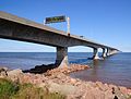
- Nomination Confederation Bridge, Canada --Taxiarchos228 09:54, 13 April 2011 (UTC)
- Promotion Good quality. --Carschten 14:00, 13 April 2011 (UTC)
-

- Nomination Fredericton: City Hall --Taxiarchos228 09:54, 13 April 2011 (UTC)
- Decline distorted --Carschten 14:00, 13 April 2011 (UTC)
-

- Nomination Trans-Canada-Highway 2 in New Brunswick, Canada --Taxiarchos228 09:54, 13 April 2011 (UTC)
- Promotion good and interesting --Carschten 14:00, 13 April 2011 (UTC)
-

- Nomination Montmorency waterfalls, Canada --Taxiarchos228 09:54, 13 April 2011 (UTC)
- Decline unsharp (why is the foreground focussed??) --Carschten 14:00, 13 April 2011 (UTC)
-

- Nomination Eiffel Tower, Paris: second platform --Taxiarchos228 09:14, 13 April 2011 (UTC)
- Decline Tilt and perspective distortion. The picture doesn't feel right when I look at it. --Letartean 12:26, 13 April 2011 (UTC)
easy to correct --Taxiarchos228 12:28, 13 April 2011 (UTC)
-

-

- Nomination The first perfect sphere ever created by man refracts an image of Einstein. It is exact to 40 atoms. -- IdLoveOne 02:34, 12 April 2011 (UTC)
- Withdrawn Is it by a wikipedian? --Mbdortmund 04:05, 12 April 2011 (UTC) Well, the photo was uploaded by a Wikipedian and is public domain... Not sure what the precedent is with that or if it could pass at FPC. I guess if an old painting could pass here, which I'm not sure if that's allowed, this should be able to also? -- IdLoveOne 11:51, 13 April 2011 (UTC)
Being made by a Wikipedian is a requirement only for QIs, not FPs. And "made" is inherently ambiguous, but we have drawn the line to include our own photos and scans of 2-D (and 3-D) objects, and to exclude our uploads of those made by other people. Whether it's public domain is beside the point. --Avenue 17:06, 13 April 2011 (UTC)Withdrawn in that case. -- IdLoveOne 03:12, 14 April 2011 (UTC)
-

- Nomination Sacyr Vallehermoso Tower in Madrid at night. --Kadellar 15:47, 11 April 2011 (UTC)
- Promotion Comment To me it is not a good image: Distortion, and the building of left is disturbing, but I'm not sure--Lmbuga 01:36, 13 April 2011 (UTC)
Imo QI --Mbdortmund 17:49, 13 April 2011 (UTC)
-

-
- Nomination The church of Pyhra, Austria. --AleXXw 00:30, 10 April 2011 (UTC)
- Promotion Good quality. --Taxiarchos228 09:10, 14 April 2011 (UTC)
-
- Nomination Love padlocks --Schlurcher 16:02, 8 April 2011 (UTC)Interesting composition. -- IdLoveOne 03:44, 14 April 2011 (UTC)
- Promotion {{{2}}}
-

- Nomination snow in the fog, River Oder in Poland --Ralf Roletschek 14:58, 8 April 2011 (UTC)
- Promotion made some corrections at File:2010-01-03-schnee-im-nebel-by-RalfR-38-CN.jpg. --Carschten 15:40, 8 April 2011 (UTC) better now --Carschten 15:21, 13 April 2011 (UTC)
-

- Nomination: Paris: bell tower of Sacré-Cœur de Montmartre --Taxiarchos228 06:35, 8 April 2011 (UTC)
- Review needed
-

- Nomination: Hauingen: town hall --Taxiarchos228 06:35, 8 April 2011 (UTC)
- Review needed
-

- Nomination: Pelhřimov (Pilgram), Czech Republic - town hall --Pudelek 16:37, 7 April 2011 (UTC)
- Review needed
-
- Nomination: Ringlokschuppen and MüGa-Park in Mülheim, Germany --Carschten 13:31, 7 April 2011 (UTC)
- Review needed
-

- Nomination Tower of Tholey Abbey, Benedictine monastery in Saarland. -- Felix Koenig 18:59, 6 April 2011 (UTC)
- Promotion Technically QI. --David Perez 08:12, 14 April 2011 (UTC)
-
- Nomination Wind farm in East Frisia (long exposure) --Carschten 17:39, 6 April 2011 (UTC)
- Promotion Beautiful light and colors. Technically good. --David Perez 08:19, 14 April 2011 (UTC)
-

- Nomination Luxemb. City: building in the city centre, with some surroundings to show the localisation. --Cayambe 10:14, 13 April 2011 (UTC)
- Promotion Good quality, but: could be sharper and why looks a picture with the great D700 like this? not the best lence I quess. --Taxiarchos228 10:39, 13 April 2011 (UTC)
-

- Nomination Germany, Berlin, Reichstag building --Berthold Werner 09:27, 13 April 2011 (UTC)
- Promotion Good enough --Niabot 09:36, 13 April 2011 (UTC)
-

- Nomination Detail of Eiffel Tower below the pillars --Taxiarchos228 09:14, 13 April 2011 (UTC)
- Promotion Good quality. --Niabot 09:36, 13 April 2011 (UTC)
-

- Nomination Lörrach: (New) City Hall, plenary hall --Taxiarchos228 09:14, 13 April 2011 (UTC)
- Promotion Good quality. --Niabot 09:36, 13 April 2011 (UTC)
-

- Nomination Lörrach: Saint Josephs church, choir --Taxiarchos228 09:14, 13 April 2011 (UTC)
- Promotion good enough for QI --Niabot 09:36, 13 April 2011 (UTC)
-

- Nomination Lörrach: Saint Josephs church, side altar of Maria --Taxiarchos228 09:14, 13 April 2011 (UTC)
- Promotion a little bit of noise, but good otherwise --Niabot 09:36, 13 April 2011 (UTC)
-

- Nomination Upper side of the Church by Antonio Palacios, Panxón, Nigrán, Galicia (Spain)--Lmbuga 01:21, 13 April 2011 (UTC)
- Promotion Good quality. --Mbdortmund 04:27, 13 April 2011 (UTC)
-

- Nomination Samson's fountain and Black Tower in České Budějovice (Budweis), Czech Republic --Pudelek 20:56, 12 April 2011 (UTC)
- Promotion could be sharper but good for QI --Taxiarchos228 08:31, 13 April 2011 (UTC)
-

- Nomination Náměstí Přemysla Otakara II, České Budějovice - houses --Pudelek 20:56, 12 April 2011 (UTC)
- Decline for illustrating the facade not a good view (to much stuff in front), also too dark --Taxiarchos228 08:31, 13 April 2011 (UTC)
-

- Nomination Lotenhulle (Belgium): the church -- MJJR 20:42, 12 April 2011 (UTC)
- Promotion Good quality. --Taxiarchos228 08:31, 13 April 2011 (UTC)
-

-

- Nomination Rhine gauge in Cologne. A.Savin 19:08, 12 April 2011 (UTC)
- Decline Poor quality: Strong horizontal distortion, little vertical distortion, color noise, underexposed, halo with a little chromatic aberrations, color noise. --Lmbuga 19:23, 12 April 2011 (UTC)
-

- Nomination Карманные часы Хенляйна --Vitold Muratov 20:57, 12 April 2011 (UTC)
- Decline Poor quality: Unsharp, noise, I don't like the crop--Lmbuga 18:58, 12 April 2011 (UTC)
-

- Nomination Shell of a Flag Cone, Rhizoconus vexillum --Llez 16:36, 12 April 2011 (UTC)
- Promotion Comment I don't like the background (it's disturbing to me, perhaps can be better a black background). Five images (each one
1400x13002200 x 2000 pixels approximately) and noise and not too much DOF in the three of above. I don't like it, but the image can be QI to me. I'm not sure--Lmbuga 19:15, 12 April 2011 (UTC) CommentI tried first a black background, but this one was better because of the dark "base" of the upper ones --Llez 19:47, 12 April 2011 (UTC)
Ok. I tink that the image can be QI, I only can say that I'm not sure, but to me QI--Lmbuga 20:06, 12 April 2011 (UTC)
-

-

- Nomination Statue of Alphonse Daudet, Jardin des Champs-Elysées, Paris.--Jebulon 22:07, 11 April 2011 (UTC)
- Promotion Very sharp and otherwise also good. --Cayambe 20:39, 12 April 2011 (UTC)
-

- Nomination another flower of japanese peony.--Jebulon 21:05, 11 April 2011 (UTC)
- Promotion Nice -- George Chernilevsky 17:02, 12 April 2011 (UTC)
-

-

- Nomination Natural reserve Zeller See in Austria --Chmee2 20:52, 11 April 2011 (UTC)
- Withdrawn I withdraw my nomination due to high unsharpness --
Lmbuga18:14, 12 April 2011 (UTC)
Error of signatures, I did not write those words and the "Withdrawn"--Lmbuga 18:29, 12 April 2011 (UTC) It was me, some problems with this page --Chmee2 07:52, 13 April 2011 (UTC)
-

-

- Nomination Герб пресёкшегося рода --Vitold Muratov 23^:10 11 April 2011 (UTC)
- Decline Very interesting, but tilted and oversharpened IMO. Other opinions ?--Jebulon 20:41, 11 April 2011 (UTC)
Oppose chromatic aberrations, Color noise, little vertical distortion and as Jebulon--Lmbuga 18:23, 12 April 2011 (UTC)
-

-

-

-

-

- Nomination Lörrach: Local Court --Taxiarchos228 08:42, 11 April 2011 (UTC)
- Promotion I think it is OK for QI.--MrPanyGoff 06:24, 13 April 2011 (UTC)
-

- Nomination Gare de Wilwerwiltz. --Cayambe 08:02, 11 April 2011 (UTC)
- Promotion Well framed. --Elekhh 06:05, 13 April 2011 (UTC)
-

-

-

-

-

- Nomination Lörrach: Housing Area "Stadion" --Taxiarchos228 06:35, 8 April 2011 (UTC)
- Promotion Very sharp and otherwise also good. --Cayambe 20:55, 12 April 2011 (UTC)
-

- Nomination Lörrach: bell tower of Christ church --Taxiarchos228 06:35, 8 April 2011 (UTC)
- Decline Sorry, a little vertical distortion and a strong horizontal distortion. The tile roof is not sharp, because the correction of distortion (I think). Perhaps the dark zones are underexposed--Lmbuga 00:44, 13 April 2011 (UTC)
-

- Nomination Red hibiscus flower. --Quartl 19:19, 7 April 2011 (UTC)
- Promotion I like the composition a lot, except perhaps for the white background blob near the gynoecium. A wider DoF would be useful, although the focus is well placed. Borderline IMO. Any chance you could fix the burnt patches in the red channel around the flower's far edge? --Avenue 16:43, 12 April 2011 (UTC)
Fixed the fringe. Unfortunately I'm not skilled enough to convincingly photoshop the blob away. --Quartl 17:42, 12 April 2011 (UTC)
That version looks fine in my browser, but when I download it, it looks quite garish (under Mac OS X 10.6). I'm not sure why - maybe a colorspace issue? Anyway, I think my concern was not about the blob itself, but its brightness. I've uploaded an attempt at fixing that, and a lighter adjustment to the reds. Feel free to revert. --Avenue 01:26, 13 April 2011 (UTC)
I changed the colorspace to Adobe RGB, probably your image viewer doesn't support this. Your version in sRGB, however, is good to me as well, thanks. --Quartl 01:44, 13 April 2011 (UTC)
QI IMO despite out of focus parts. --Avenue 04:29, 13 April 2011 (UTC)
-

- Nomination: Lörrach-Stetten vom Tüllinger hill in winter time --Taxiarchos228 07:45, 7 April 2011 (UTC)
- Review needed
-

- Nomination: Lörrach-Tüllingen: Church Saint Ottilia --Taxiarchos228 07:45, 7 April 2011 (UTC)
- Review needed
-

-

- Nomination Cooperative State University Lörrach --Taxiarchos228 08:36, 6 April 2011 (UTC)
- Promotion Perhaps can be more sharp, but good--Lmbuga 00:47, 13 April 2011 (UTC)
-

- Nomination View on Matterhorn/Cervino from the old Monte Rosa Chalet. --Ondřej Žváček 21:30, 5 April 2011 (UTC)
- Promotion Comment Good
, but the camera location is missing-Florival fr 18:23, 9 April 2011 (UTC) - Comment Thank you, camera location added.--Ondřej Žváček 10:50, 11 April 2011 (UTC)- Support now its QI for me - Florival fr 19:54, 12 April 2011 (UTC)
-

- Nomination Scarlet Dragonfly. --Quartl 11:32, 5 April 2011 (UTC)
- Promotion Good quality. --David Perez 06:59, 13 April 2011 (UTC)
-

- Nomination Viburnum lantanoides --Taxiarchos228 07:58, 5 April 2011 (UTC)
- Promotion Good, for me QI. --Alchemist-hp 20:19, 12 April 2011 (UTC)
-

- Nomination portal crane at hydroelectric power plant in Rheinfelden --Taxiarchos228 07:00, 5 April 2011 (UTC)
- Promotion Good. --David Perez 07:03, 13 April 2011 (UTC))
-

-
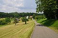
- Nomination Hauingen: Rechberg (hamlet) --Taxiarchos228 03:48, 12 April 2011 (UTC)
- Promotion Good quality. --Mbdortmund 04:05, 12 April 2011 (UTC)
-

-

- Nomination Close up of a rostral column with lamps. Place de la Concorde, Paris--Jebulon 20:38, 11 April 2011 (UTC)
- Promotion Good quality. --Mbdortmund 04:06, 12 April 2011 (UTC)
-

- Nomination Abandoned iron mine Smältarmossgruvan, Sweden.--V-wolf 17:28, 11 April 2011 (UTC)
- Withdrawn Poor image to me, perhaps I don't understand your proposal--Lmbuga 18:02, 11 April 2011 (UTC) It looks quite nice for me. Maybe my screen settings are rouge. Perhaps I should check them before more noms.
 I withdraw my nomination
-

- Nomination Female Eucera pollinating a Salvia flower. --Gidip 17:13, 11 April 2011 (UTC)
- Promotion Support QI & Useful --Archaeodontosaurus 19:49, 11 April 2011 (UTC)
-

-

- Nomination Germany, Church of Springiersbach monastry --Berthold Werner 14:58, 11 April 2011 (UTC)
- Promotion Good !--Jebulon 21:08, 11 April 2011 (UTC)
-

-

-

-

- Nomination A Volvo BM A30 dumper. --High Contrast 23:22, 10 April 2011 (UTC)
- Promotion Good. --Cayambe 18:50, 11 April 2011 (UTC)
-

-

-

-

-

-

- Nomination Montreal, Canada: Habitat 67 --Taxiarchos228 21:58, 10 April 2011 (UTC)
- Decline Sorry, in my opinion the completely white sky, lack of geotagging and EXIF are annoying. --D4m1en 14:12, 11 April 2011 (UTC)
-

- Nomination Montreal, Canada: Habitat 67 --Taxiarchos228 21:58, 10 April 2011 (UTC)
- Decline Same: blown sky, no geotagging, no EXIF. --D4m1en 14:12, 11 April 2011 (UTC)
-
- Nomination University of Surrey stag statue in Guildford without human scale. --Tony Wills 20:52, 10 April 2011 (UTC)
- Promotion Support Now QI for me --Archaeodontosaurus 19:15, 11 April 2011 (UTC)
-

- Nomination The obelisk of Luxor, facing the Champs-Elysées avenue, Place de la Concorde, Paris.--Jebulon 17:36, 10 April 2011 (UTC) Comment It's still not vertical. In fact I can see no difference before and after your perspective correction, maybe you uploaded the uncorrected file by mistake ? D4m1en 14:18, 11 April 2011 (UTC) Corrected. My best possible. Thank you for review.--Jebulon 19:54, 11 April 2011 (UTC)
- Promotion I tried to do better tilt correction and couldn't, which means you already did the best job possible ! -- D4m1en 21:04, 11 April 2011 (UTC)
- Nomination The obelisk of Luxor, facing the Champs-Elysées avenue, Place de la Concorde, Paris.--Jebulon 17:36, 10 April 2011 (UTC)
-
- Nomination Chromium --Alchemist-hp 15:40, 10 April 2011 (UTC)
- Promotion great documentation, but can you try to get the middle of the left stick a little darker? --Mbdortmund 15:45, 10 April 2011 (UTC) I tried it several times, but it is simple a high shiny mirror. --Alchemist-hp 15:52, 10 April 2011 (UTC) QI for me given how difficult it must be to photograph a mirror. PS I want your lens ! --D4m1en 14:26, 11 April 2011 (UTC)
-
- Nomination Fukushima nuclear accident by User:Sodacan. --Jovianeye 16:18, 8 April 2011 (UTC)
- Promotion High quality illustration, informative and factually correct. --Jkwchui 20:03, 11 April 2011 (UTC)
-
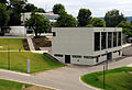
- Nomination: Cooperative State University Lörrach, library --Taxiarchos228 08:36, 6 April 2011 (UTC)
- Review needed
-

- Nomination: Toronto City Centre Airport --Taxiarchos228 08:36, 6 April 2011 (UTC)
- Review needed
-
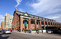
- Nomination Toronto: St Lawrence Market --Taxiarchos228 08:36, 6 April 2011 (UTC)
- Promotion The perspective distortion and shadows are almost too strong, but I think the colours and composition are good enough to compensate. I like the cloud coming out of the chimney, BTW. --Avenue 14:52, 11 April 2011 (UTC)
-

- Nomination: Toronto: Direct Energy Centre --Taxiarchos228 08:36, 6 April 2011 (UTC)
- Review needed
-

- Nomination: Vineyards of Alsace, Soultzmatt & Zinnkoepfle --Florival fr 10:08, 6 April 2011 (UTC)
- Review needed
-

- Nomination: Fatehpur Sikiri, India --Sfu 19:30, 5 April 2011 (UTC)
- Review needed
-

- Nomination: Fatehpur Sikiri, India --Sfu 19:30, 5 April 2011 (UTC)
- Review needed
-

- Nomination: Holy Trinity Church in Moscow --Lodo27 16:35, 5 April 2011 (UTC)
- Review needed
-

- Nomination: Inside the Redoute de Saint-Apollinaire, near Dijon, France. --ComputerHotline 16:24, 5 April 2011 (UTC)
- Review needed
-

- Nomination Inside the Redoute de Saint-Apollinaire, near Dijon, France. --ComputerHotline 16:24, 5 April 2011 (UTC)
- Promotion Good. --Cayambe 19:35, 11 April 2011 (UTC)
-

- Nomination Inside the Fort de la Motte-Giron, Dijon, France. --ComputerHotline 16:24, 5 April 2011 (UTC)
- Promotion Ok to me. --Cayambe 19:35, 11 April 2011 (UTC)
-
- Nomination high-rise-impression in Toronto --Taxiarchos228 14:49, 5 April 2011 (UTC)
- Promotion Interesting... Please add geotag. --Cayambe 19:35, 11 April 2011 (UTC)
geotag added --Taxiarchos228 19:48, 11 April 2011 (UTC)
-

- Nomination Buildings in the historical centre of Luxemb. City. --Cayambe 14:48, 5 April 2011 (UTC)
- Promotion Good quality and nice view --Taxiarchos228 03:49, 12 April 2011 (UTC)
-

- Nomination: A Ratana church near Raetihi. Photo by Alan Liefting. --Avenue 12:42, 5 April 2011 (UTC)
- Review needed
-

-

- Nomination Dornach: Goeteheanum (detail) --Taxiarchos228 09:48, 5 April 2011 (UTC)
- Promotion Good. --Cayambe 19:30, 11 April 2011 (UTC)
-

- Nomination Dornach: Goeteheanum (detail) --Taxiarchos228 09:48, 5 April 2011 (UTC)
- Decline I like this, but I think it's not a QI due to the top crop. --Avenue 13:18, 11 April 2011 (UTC)
-

-

-

-

- Nomination Spire of Camera Obscura museum in Mülheim, Germany --Carschten 17:37, 4 April 2011 (UTC)
- Promotion Support QI for me --Archaeodontosaurus 08:13, 6 April 2011 (UTC)
-
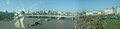
-

- Nomination Hafnium. --Alchemist-hp 23:15, 10 April 2011 (UTC)
- Promotion QI & useful --Archaeodontosaurus 07:47, 11 April 2011 (UTC)
-

-

-

-

- Nomination The shopping center Europa-Galerie in Saarbrücken, Saarland. -- Felix Koenig 16:38, 10 April 2011 (UTC)
- Promotion Good quality. --Taxiarchos228 16:58, 10 April 2011 (UTC)
-

- Nomination Fountain (south) Place de la Concorde, Paris.--Jebulon 16:26, 10 April 2011 (UTC)
- Promotion Good quality. --Taxiarchos228 16:58, 10 April 2011 (UTC) Comment CA and perspective distortions need a correction --Carschten 17:14, 10 April 2011 (UTC) Agree for (very little, and acceptable IMO) CA, new version uploaded. But disagree for perspective correction. As the point of view is unusual (from below), and due to the curved lines of the object, the distortion of the far away background elements is my conscious choice. Many thanks for review anyway.--Jebulon 17:45, 10 April 2011 (UTC)
-

- Nomination Zirconium --Alchemist-hp 13:35, 10 April 2011 (UTC)
- Promotion Good quality. --Taxiarchos228 13:38, 10 April 2011 (UTC)
-

- Nomination Germany, part of Springiersbach monastry --Berthold Werner 13:20, 10 April 2011 (UTC)
- Promotion CA visible --Taxiarchos228 13:38, 10 April 2011 (UTC)
Good quality. --Mbdortmund 15:19, 10 April 2011 (UTC)
-

- Nomination Inzlingen: moated castle --Taxiarchos228 13:05, 10 April 2011 (UTC)
- Promotion Good quality. --Mbdortmund 15:19, 10 April 2011 (UTC)
-

- Nomination Inzlingen: moated castle --Taxiarchos228 13:05, 10 April 2011 (UTC)
- Promotion Great! --AleXXw 16:56, 10 April 2011 (UTC)
-

- Nomination Inzlingen: moated castle --Taxiarchos228 13:05, 10 April 2011 (UTC)
- Decline For me too many trees, too little castle. --AleXXw 16:56, 10 April 2011 (UTC)
-

-

- Nomination Shell of a Thai land snail, Amphidromus atricallosus leucoxanthus --Llez 08:11, 10 April 2011 (UTC)
- Promotion Good quality. --Mbdortmund 15:23, 10 April 2011 (UTC)
-

-
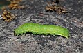
- Nomination Green caterpillar of Phlogophora meticulosa --Holleday 16:53, 9 April 2011 (UTC)
- Promotion Comment Very good quality of the caterpillar, but I'd prefer a somewhat tighter crop. --Quartl 06:33, 10 April 2011 (UTC)Hello Quartl, I cut the borders a little bit. What do you think about it?--Holleday 17:49, 10 April 2011 (UTC)
Okay, good to me now. --Quartl 18:22, 10 April 2011 (UTC)
-

-
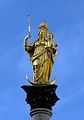
- Nomination Mariensäule in Munich by Biser Todorov; retouched and nominated by --Carschten 12:52, 7 April 2011 (UTC)
- Promotion Needs a rotation --Jebulon 22:28, 7 April 2011 (UTC) Done better now? --Carschten 12:30, 8 April 2011 (UTC) Yes, ok now.--Jebulon 20:57, 10 April 2011 (UTC)
-

- Nomination Blue Gemm Galudophane --Archaeodontosaurus 18:48, 6 April 2011 (UTC)
- Promotion QI and informative --Llez 05:56, 11 April 2011 (UTC)
-

- Nomination The Headquarters of the Bulgarian Academy of Sciences. --MrPanyGoff 13:47, 5 April 2011 (UTC)
- Promotion Support. Sugar-Baby-Love 21:10, 10 April 2011 (UTC)
-

- Nomination: Red-veined Darter, side view. --Quartl 10:22, 5 April 2011 (UTC)
- Review needed
-

- Nomination: Osireion in Abydos, Egypt. --Oltau 07:32, 5 April 2011 (UTC)
- Review needed
-

- Nomination: Sídliště Řepy tram loop — Jagro 22:12, 4 April 2011 (UTC)
- Review needed
-
- Nomination: Roadworks at night in Rembo, Sweden.--V-wolf 22:10, 4 April 2011 (UTC)
- Review needed
-

- Nomination: Reading railway station. Mattbuck 20:57, 4 April 2011 (UTC)
- Review needed
-

- Nomination: Helsingborg. Morning+ -- Vitold Muratov 20:04, 4 April 2011 (UTC)
- Review needed
-
- Nomination: Southeastern portal of the castle Schloss Broich in Mülheim, Germany --Carschten 18:01, 4 April 2011 (UTC)
- Review needed
-
- Nomination: Portal of the Catholic St. Mary's Church of Rheinberg-Budberg --Carschten 17:37, 4 April 2011 (UTC)
- Review needed
-
- Nomination: Bridge over the Rhine-Herne-Canal in Oberhausen --Carschten 17:37, 4 April 2011 (UTC)
- Review needed
-
- Nomination: Western fortification of the castle Schloss Broich in Mülheim, Germany --Carschten 17:37, 4 April 2011 (UTC)
- Review needed
-
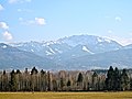
- Nomination View over the Loisach-Kochelsee-Moor with the Benediktenwand in the background (seen from St. Johannisrain close to Penzberg), Upper Bavaria, Germany. View over the Loisach-Kochelsee-Moor with the Benediktenwand in the background (seen from St. Johannisrain close to Penzberg), Upper Bavaria, Germany. --Smial 15:03, 4 April 2011 (UTC)
- Promotion Good Quality. --~~~~
-

- Nomination Peugeot: radiator mascot --Taxiarchos228 09:17, 4 April 2011 (UTC)
- Promotion Good --Jebulon 10:14, 11 April 2011 (UTC)
-

- Nomination Škoda 15T in Prague — Jagro 13:31, 3 April 2011 (UTC)
- Promotion Good. --David Perez 10:54, 11 April 2011 (UTC)
-

- Nomination Tatra T3SUCS in Prague — Jagro 13:31, 3 April 2011 (UTC)
- Promotion Good. --David Perez 10:54, 11 April 2011 (UTC)
-

- Nomination Monument à la Gloire de la République Française, 1883, Place de la République, Paris.--Jebulon 12:37, 3 April 2011 (UTC)
- Promotion Good. --David Perez 10:54, 11 April 2011 (UTC)
-

-
- Nomination Coat of arms at Schloss Broich in Mülheim a.d. Ruhr, Germany --Carschten 09:22, 2 April 2011 (UTC)
- Promotion Tilted a bit ? --Jebulon 17:57, 2 April 2011 (UTC)
Yeah, I think you're right. But it's difficult, because there was a construction hoarding so I can't stand exacly in front of that coat of arms and I had to photograph sidewise: Now it's difficult to find a realistic straight point. But I will see waht I can do. --Carschten 17:37, 3 April 2011 (UTC)Good enough.--Jebulon 10:12, 11 April 2011 (UTC)
-

- Nomination towboats close the door of the dock "Elbe 17" --Mbdortmund 21:22, 24 March 2011 (UTC)
- Decline Comment looks a bit ccw tilted and a bit oversharpened to me. Can you correct it? --Carschten 08:25, 2 April 2011 (UTC) Oppose then just not --Carschten 09:48, 10 April 2011 (UTC) "then just not" gefällt *g* --Mbdortmund 10:28, 11 April 2011 (UTC)
-

-

- Nomination Virgin Mary, the queen of the seas, Monteferro, Nigrán, Galicia (Spain)--Lmbuga 21:03, 9 April 2011 (UTC)
- Promotion OK --Jebulon 09:46, 10 April 2011 (UTC)
-
-

-

-
-

-

-

-
- Nomination Siberian Musk Deer Moschus moschiferus --Archaeodontosaurus 14:08, 9 April 2011 (UTC)
- Promotion Tu t'es surpassé, là, à mon avis.--Jebulon 14:38, 9 April 2011 (UTC) Pas tant que çà, c'est plus facile de faire un profil qu'un 3/4 --Archaeodontosaurus 07:15, 10 April 2011 (UTC)
-

-

-

- Nomination Flood protection dike in Cologne-Flittard, Germany. A.Savin 13:03, 9 April 2011 (UTC)
- Promotion CA on the chimneys, correctible. Strange thing to be deleted on the ground of the corner right below. --Jebulon 14:34, 9 April 2011 (UTC) OK A.Savin 17:40, 9 April 2011 (UTC) Better now, indeed.--Jebulon 22:39, 9 April 2011 (UTC)
-

-

-

-
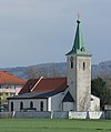
- Nomination Church St. Georgen am Steinfelde in St. Pölten, Austria --AleXXw 11:49, 9 April 2011 (UTC)
- Promotion Good quality. --Mbdortmund 12:07, 9 April 2011 (UTC)
-

- Nomination Panorama of Oberstdorf (Germany) with Allgäu alps in background. Alofok 11:29, 9 April 2011 (UTC)
- Decline This image has several issues: first, the sun obviously isn't doing any good here and makes large parts of the right half blown. Second, the horizon is curved downwards left and right. Third, the subject itself, Oberstdorf, is too far away to make out anything and in the left half largely obscured by trees. --Quartl 13:55, 9 April 2011 (UTC)
-

- Nomination A small Lower Jurassic Ammonite, Holcophylloceras calypso --Llez 04:01, 9 April 2011 (UTC)
- Promotion Support QI & Useful --Archaeodontosaurus 14:11, 9 April 2011 (UTC)
-

-

- Nomination "Resurrection of Christ", vault fresco by Michel Corneille l'Ancien, 17th century, Church Saint Nicolas des Champs in Paris. Central detail.--Jebulon 23:06, 8 April 2011 (UTC)
- Promotion Comment The portrait, we will prevent neck pain --Archaeodontosaurus 08:24, 9 April 2011 (UTC) Done but you could rotate your screen !!
 --Jebulon 10:41, 9 April 2011 (UTC)
QI "merci pour mes cervicales" --Archaeodontosaurus 13:30, 9 April 2011 (UTC)
-

- Nomination Notre-Dame de Paris. Choir (exterior) --Jebulon 21:57, 8 April 2011 (UTC)
- Promotion Good -- George Chernilevsky 09:08, 10 April 2011 (UTC)
-

-
-

-

- Nomination Inside the Cravanche caves (Grottes de Cravanche), near Belfort, France. --ComputerHotline 18:12, 6 April 2011 (UTC)
- Promotion Good quality. --Coyau 11:19, 10 April 2011 (UTC)
-
- Nomination Inside the Cravanche caves (Grottes de Cravanche), near Belfort, France. --ComputerHotline 18:12, 6 April 2011 (UTC)
- Promotion Good quality. --Coyau 11:19, 10 April 2011 (UTC)
-

- Nomination Inside the Cravanche caves (Grottes de Cravanche), near Belfort, France. --ComputerHotline 18:12, 6 April 2011 (UTC)
- Promotion Good quality. The spotlight almost gives a sense of scale. --Coyau 11:19, 10 April 2011 (UTC)
-

-

- Nomination Green Vegetable Bug, top view. --Quartl 16:47, 5 April 2011 (UTC)
- Withdrawn In hindsight, no QI (the other one is good, though). --Quartl 06:47, 10 April 2011 (UTC)
-

-

- Nomination Dornach: Goeteheanum (detail) --Taxiarchos228 09:48, 5 April 2011 (UTC)
- Promotion Good quality. --Mbdortmund 01:25, 10 April 2011 (UTC)
-

- Nomination The church St. Johannisrain in St. Johannisrain close to Penzberg, Upper Bavaria, Germany. The church St. Johannisrain in St. Johannisrain close to Penzberg, Upper Bavaria, Germany. --Smial 15:03, 4 April 2011 (UTC)
- Promotion Hab lange überlegt, ob die Kanten rötlich lackiert sind oder ob's CA ist... --Mbdortmund 01:28, 10 April 2011 (UTC)
-

- Nomination: Bouchon de radiateur d'une Delage CO 4 ½ litre Salamanca de 1920. --Thesupermat 08:52, 4 April 2011 (UTC)
- Review needed
-

- Nomination: The Smeden Gate in Bruges, Belgium -- MJJR 21:08, 3 April 2011 (UTC)
- Review needed
-

- Nomination: NP Plitvice Lakes, Croatia - ferry in the rain --Pudelek 20:03, 3 April 2011 (UTC)
- Review needed
-

- Nomination: Людвиг Эрхард --Vitold Muratov 21:14, 3 April 2011 (UTC)
- Review Bust of Ludwig Erhard.--Jebulon 23:18, 3 April 2011 (UTC)
-

- Nomination: Цветущая Вишня --Vitold Muratov 20:31, 3 April 2011 (UTC)
- Review needed
-

- Nomination: A wooden ancient door (18th century) in Paris.--Jebulon 17:00, 3 April 2011 (UTC)
- Review needed
-

- Nomination: Reconstruction of tram track, Prague — Jagro 13:31, 3 April 2011 (UTC)
- Review needed
-

-

-

-

-

-

-

-
- Nomination Ford Taunus in Trogir, Croatia --Pudelek 14:55, 26 March 2011 (UTC)
- Promotion Comment good, but the chromatic aberrations need a fixing --Carschten 08:44, 2 April 2011 (UTC) Comment where is CA? I don't see --Pudelek 10:44, 2 April 2011 (UTC)
No problem, I made annotations --Carschten 12:16, 2 April 2011 (UTC)
thanks --Pudelek 12:45, 2 April 2011 (UTC) Support better now (not perfect), but it's good enough for QI imo --Carschten 09:46, 10 April 2011 (UTC)
-

-

- Nomination Fluorite --Archaeodontosaurus 08:11, 9 April 2011 (UTC)
- Promotion Good quality, small masking rest marked on the left --Mbdortmund 11:04, 9 April 2011 (UTC)
-

- Nomination Bulgarian Academy of Sciences. --MrPanyGoff 06:49, 9 April 2011 (UTC)
- Promotion Good quality. --Taxiarchos228 10:26, 9 April 2011 (UTC)
-

-

-

- Nomination Resurrection of Christ, vault fresco by Michel Corneille l'Ancien, 17th century, Church Saint Nicolas des Champs in Paris.--Jebulon 22:47, 8 April 2011 (UTC)
- Promotion Support QI & Useful --Archaeodontosaurus 08:21, 9 April 2011 (UTC)
-

- Nomination Female Maniola telmessia. --Gidip 22:04, 8 April 2011 (UTC)
- Promotion Good quality. --Mbdortmund 23:56, 8 April 2011 (UTC)
-

- Nomination Bronze lion, monument "to the Republic", Paris.--Jebulon 21:41, 8 April 2011 (UTC)
- Promotion Good quality. --Mbdortmund 23:54, 8 April 2011 (UTC)
-
-

- Nomination Мост через пролив Эресунн--Vitold Muratov 23:52 8 April 2011 (UTC)
- Decline nice coulors, but not good quality, especially the bridge is not good visible and noisy --Taxiarchos228 10:26, 9 April 2011 (UTC)
-

- Nomination Panorama of Tannheim moutains near Nesselwängle in a heavy cloud cover --Carschten 19:41, 8 April 2011 (UTC)
- Promotion Nice -- George Chernilevsky 19:58, 8 April 2011 (UTC)
-

-

- Nomination Church by Antonio Palacios, Panxón, Nigrán, Galicia (Spain)--Lmbuga 15:43, 8 April 2011 (UTC) Comment Perhaps the first version it was better than the second--Lmbuga 15:51, 8 April 2011 (UTC)
- Promotion Comment nice church, nice photo. The lighting looks like sunshine, but at the left the sky looks grey (lie a try of overexposure-fixing) and the remain of the sky is blown out. What happened? --Carschten 15:54, 8 April 2011 (UTC)
Ok, now a lot of more of blown-out-parts are fixed. But looks strange imo... --Carschten 15:57, 8 April 2011 (UTC)
I am going to work the image again. But it is difficult. I begin now, in case of I not to be able… “decline”. Thanks--Lmbuga 16:13, 8 April 2011 (UTC)
New version, perhaps not better. The light is at first hour (10:00h-11:00h) but the image was taken in special day because there was African wind warm, full of dirt. To me the image is not overexposed, but... I understand if you decline the image--Lmbuga 17:14, 8 April 2011 (UTC) Support yeah! That's very good now imo. Not perfect, but I really like it now --Carschten 19:27, 8 April 2011 (UTC)
- Nomination Church by Antonio Palacios, Panxón, Nigrán, Galicia (Spain)--Lmbuga 15:43, 8 April 2011 (UTC)
-

- Nomination snow in the fog, River Oder in Poland --Ralf Roletschek 14:58, 8 April 2011 (UTC)
- Promotion snow may( )be a bit overexposed, some minor chromatic aberration, otherwise very nice --Carschten 15:40, 8 April 2011 (UTC)
-

- Nomination Capernaum, Sea of Galilee --Berthold Werner 11:34, 8 April 2011 (UTC)
- Promotion Good composition. Nice and useful image. -- MJJR 09:35, 9 April 2011 (UTC)
-

- Nomination Wild daffodils in Luxembourg. --Cayambe 10:09, 8 April 2011 (UTC)
- Promotion Support QI for me --Archaeodontosaurus 08:16, 9 April 2011 (UTC)
-

-
- Nomination Stropharia squamosa. --Bartiebert 20:41, 7 April 2011 (UTC)
- Decline Too low dof, only the front section of the cap is in focus. --Quartl 17:10, 8 April 2011 (UTC)
-

-

-

- Nomination Putney Railway Station as viewed from the overpass on Oxford Road, Putney, London. (Photographer: User:Diliff) --Taxiarchos228 08:28, 7 April 2011 (UTC)
- Promotion what i have to say? Its an Diliff! --Ralf Roletschek 18:38, 8 April 2011 (UTC)
-

- Nomination Rubus spectabilis (Salmonberry), fruit --Wsiegmund 04:49, 7 April 2011 (UTC)
- Promotion Support QI of course --Archaeodontosaurus 08:27, 9 April 2011 (UTC)
-

- Nomination The Smeden Gate in Bruges, Belgium -- MJJR 21:16, 5 April 2011 (UTC)
- Promotion Good -- George Chernilevsky 20:03, 8 April 2011 (UTC)
-

- Nomination Sculpture symbolizing the Kingdom of Croatia-Slavonia in Zagreb --Pudelek 20:51, 5 April 2011 (UTC)
- Promotion Good -- George Chernilevsky 20:05, 8 April 2011 (UTC)
-

-

- Nomination Inside the Redoute de Saint-Apollinaire, near Dijon, France. --ComputerHotline 16:24, 5 April 2011 (UTC)
- Promotion Good. --Jovianeye 16:03, 8 April 2011 (UTC)
-

- Nomination Inside the Fort de la Motte-Giron, Dijon, France. --ComputerHotline 16:24, 5 April 2011 (UTC)
- Promotion QI. --Jovianeye 16:03, 8 April 2011 (UTC)
-

- Nomination Inside the Fort de la Motte-Giron, Dijon, France. --ComputerHotline 16:24, 5 April 2011 (UTC)
- Promotion QI --Jovianeye 16:03, 8 April 2011 (UTC)
-

-

- Nomination: a Bateau-Mouche on Seine river in Paris.--Jebulon 17:29, 2 April 2011 (UTC)
- Review needed
-

- Nomination: 156413 speeds through a snowy Radcliffe. Mattbuck 14:19, 2 April 2011 (UTC)
- Review needed
-

- Nomination Interior of Southeastern Javelin unit 395018. Mattbuck 12:57, 23 March 2011 (UTC)
- Decline Noisy--Jebulon 22:12, 30 March 2011 (UTC) -- yes too noisy and too dark, not sharp enough, unfavorable composition (not symmetrical)--BennyJ 08:25, 4 April 2011 (UTC)
Yes, exposure dissatisfying, but where do you see too much noise? -- Smial 16:00, 4 April 2011 (UTC) -- e.g. at the blue seat backs or at the white/grey areas of the cabin --BennyJ 16:15, 4 April 2011 (UTC) Then I oppose now. --Jebulon 11:37, 9 April 2011 (UTC)
-

-

- Nomination Drago Infructescence. --Quartl 18:46, 7 April 2011 (UTC)
- Promotion Nice -- George Chernilevsky 18:58, 7 April 2011 (UTC)
-

-
- Nomination A gantry crane in the Stadthafen Rostock. --Grand-Duc 14:33, 7 April 2011 (UTC)
- Promotion not perfect, but very good. I like it --Carschten 16:12, 7 April 2011 (UTC)
-

- Nomination St Willibroerd Chapel near Wilwerwiltz. --Cayambe 14:19, 7 April 2011 (UTC)
- Promotion very good --Carschten 16:12, 7 April 2011 (UTC)
-

- Nomination Germany, Springiersbach Monastry, entrance of the church --Berthold Werner 12:52, 7 April 2011 (UTC)
- Promotion CA at top, but otherwise very good quality --Carschten 12:52, 7 April 2011 (UTC)
-

-
- Nomination Paris: Panthéon --Taxiarchos228 07:45, 7 April 2011 (UTC)
- Promotion good--Jebulon 22:19, 7 April 2011 (UTC)
-

- Nomination Paris: Dôme des Invalides from Tour Montparnasse --Taxiarchos228 07:45, 7 April 2011 (UTC)
- Promotion Good--Jebulon 22:19, 7 April 2011 (UTC)
-

-

- Nomination Campen Lighthouse in East Frisia --Carschten 13:40, 6 April 2011 (UTC)
- Promotion It fits to the criteria - and a Question: was there a heliocopter flying around? The dark spot near the left base of the framework has a shape that looks like an aircraft... Grand-Duc 14:42, 7 April 2011 (UTC)
-

- Nomination: Inside the Fort des Hautes Perches, near Belfort, France. --ComputerHotline 08:50, 2 April 2011 (UTC)
- Review needed
-

- Nomination: Inside the Fort des Hautes Perches, near Belfort, France. --ComputerHotline 08:50, 2 April 2011 (UTC)
- Review needed
-

- Nomination: Inside the Fort des Hautes Perches, near Belfort, France. --ComputerHotline 08:50, 2 April 2011 (UTC)
- Review needed
-

- Nomination: Inside the Fort des Hautes Perches, near Belfort, France. --ComputerHotline 08:50, 2 April 2011 (UTC)
- Review needed
-

- Nomination: Inside the Fort des Hautes Perches, near Belfort, France. --ComputerHotline 08:50, 2 April 2011 (UTC)
- Review needed
-

- Nomination: Inside the Fort des Hautes Perches, near Belfort, France. --ComputerHotline 08:50, 2 April 2011 (UTC)
- Review needed
-

- Nomination: The part of monument of John of Nepomuk in Wrocław --Lvova 16:21, 1 April 2011 (UTC)
- Review needed
-

- Nomination: Ghats in Varanasi, India --Sfu 15:55, 1 April 2011 (UTC)
- Review needed
-

- Nomination: Ghats in Varanasi, India --Sfu 15:55, 1 April 2011 (UTC)
- Review needed
-
- Nomination: Church of the Candlemas in Pereslavl in the evening. View from the Moskovskaya street.--PereslavlFoto 15:21, 1 April 2011 (UTC)
- Review needed
-

- Nomination: Table information about mines near Žitnić, Croatia --Pudelek 12:34, 1 April 2011 (UTC)
- Review needed
-

- Nomination: Lomographic ActionSampler. --Lvova 12:21, 1 April 2011 (UTC)
- Review needed
-

- Nomination: Westgiebel des Tempels von Äegina --Vitold Muratov 21:18,30 March 2011 (UTC)
- Review The filename is not acceptable at all. --Dschwen 16:02, 1 April 2011 (UTC)
-

- Nomination Inzlingen: Old City Hall --Taxiarchos228 06:40, 7 April 2011 (UTC)
- Promotion Meets the criteria, imo.--MrPanyGoff 08:25, 7 April 2011 (UTC)
-

-
-

-

-
-
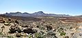
- Nomination Phonolitic lava flows in the Caldera de las Cañadas. --Quartl 19:34, 6 April 2011 (UTC)
- Promotion Good quality. --Taxiarchos228 20:08, 6 April 2011 (UTC)
-

-

- Nomination Kapelle in Brenden --Böhringer 19:26, 6 April 2011 (UTC)
- Promotion Good quality. --Taxiarchos228 20:08, 6 April 2011 (UTC) Comment please remove the dust! --Carschten 20:48, 6 April 2011 (UTC) Comment Sorry, New version File:Kapelle in Brenden, Doren - retouched.jpg, to me without several errors, but the image have still little zones underexposed. The original image has vertical distortion, tilted, noise at the sky, and a little vignetting. --Lmbuga 21:04, 6 April 2011 (UTC) To me the image can be QI, but it is not the best possible--Lmbuga 21:21, 6 April 2011 (UTC)
-
-

- Nomination A monument in Worms, Rhineland-Palatinate. -- Felix Koenig 18:59, 6 April 2011 (UTC)
- Decline declined is declined... --Carschten 20:47, 6 April 2011 (UTC)
-

- Nomination Panoramic view (extension: about 190º) of the Praça dos Três Poderes in Brasília, Brazil. View towards West., Brazil. View towards West. (Photographer: User:Sting) --Taxiarchos228 18:36, 6 April 2011 (UTC)
- Promotion Great valuable panorama, very informative. Meets the criteria for QI, imo.--MrPanyGoff 08:30, 7 April 2011 (UTC)
-
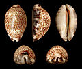
-

-

- Nomination A tree frog in turkey Innotata 14:29, 6 April 2011 (UTC)
- Promotion QI & Useful --Archaeodontosaurus 14:33, 6 April 2011 (UTC)
-

-

- Nomination Warszawa Draisine, Public Transport Days 2010, Warsaw, Poland. --Crusier 13:39, 6 April 2011 (UTC)
- Promotion Support QI for me --Archaeodontosaurus 18:51, 6 April 2011 (UTC)
-

- Nomination Campen Lighthouse in East Frisia --Carschten 13:12, 6 April 2011 (UTC)
- Promotion Good quality. --Taxiarchos228 13:17, 6 April 2011 (UTC)
Looks oversaturated. --Quartl 13:28, 6 April 2011 (UTC) Done I think you're right. Better now? --Carschten 13:40, 6 April 2011 (UTC)
Ok. --Quartl 14:33, 6 April 2011 (UTC)
-
-

- Nomination Toronto: Art Gallery of Ontario --Taxiarchos228 08:36, 6 April 2011 (UTC)
- Promotion Support QI for me --Archaeodontosaurus 18:50, 6 April 2011 (UTC)
-

- Nomination Garter snake in the wild (!) --Taxiarchos228 08:36, 6 April 2011 (UTC)
- Decline Below 2 mpx. --Quartl 17:57, 6 April 2011 (UTC)
-

-

- Nomination Funny door in Manternach, Luxembourg. --Cayambe 19:13, 5 April 2011 (UTC)
- Promotion Good quality. --Mbdortmund 19:17, 5 April 2011 (UTC)Translation added for the greek inscription --Jebulon 15:17, 6 April 2011 (UTC)
Thanks, Jebulon. --Cayambe 09:22, 7 April 2011 (UTC)
-

-

-

-

-

- Nomination Tower of the church of Weiskirchen, Saarland. -- Felix Koenig 16:47, 3 April 2011 (UTC)
- Decline bell tower is aslope --Taxiarchos228 08:30, 7 April 2011 (UTC)
-

-

- Nomination Neolithic ax --Archaeodontosaurus 10:33, 2 April 2011 (UTC)
- Promotion Good quality. --Cayambe 07:13, 7 April 2011 (UTC)
-

- Nomination Belfort seen from the Perches quarter. --ComputerHotline 08:50, 2 April 2011 (UTC)
- Promotion Good quality. --Cayambe 07:15, 7 April 2011 (UTC)
-

-

- Nomination: Rheinfelden-Herten: bell tower of church Saint Joseph --Taxiarchos228 07:26, 1 April 2011 (UTC)
- Review needed
-

- Nomination: Weil am Rhein: church Saint John --Taxiarchos228 07:26, 1 April 2011 (UTC)
- Review needed
-

- Nomination Weil am Rhein: water tower --Taxiarchos228 07:26, 1 April 2011 (UTC)
- Decline Tilted to the left, too much of the water tower is obscured by branches. --Quartl 08:08, 7 April 2011 (UTC)
-

- Nomination: Weil am Rhein-Friedling: organ of church Saint Mary --Taxiarchos228 07:26, 1 April 2011 (UTC)
- Review needed
-

- Nomination: Sett texture. --M0tty 06:01, 1 April 2011 (UTC)
- Review needed
-
- Nomination: Wonnerup House Gnangarra 03:34, 1 April 2011 (UTC)
- Review needed
-

- Nomination: Old house in National Park Krka, Croatia --Pudelek 15:24, 31 March 2011 (UTC)
- Review needed
-

- Nomination: Aircraft over Trogir and Adriatic Sea, Croatia --Pudelek 15:24, 31 March 2011 (UTC)
- Review the chromatic aberrations need a fixing --Carschten 15:43, 31 March 2011 (UTC)
-

-
-
- Nomination: Boranup forest - verticle view up Karri tree Eucalyptuse diversicolor Gnangarra 13:04, 31 March 2011 (UTC)
- Review needed
-

-
- Nomination Pink-backed pelican --Remi Mathis 06:32, 30 March 2011 (UTC)
- Decline Underexposed, noisy, blurry, strange composition. --Quartl 17:37, 6 April 2011 (UTC)
-
- Nomination Pinus sylvestris, Marki, Poland. --Crusier 05:58, 30 March 2011 (UTC)
- Decline The quality of the young pine in from is quite good, but the second pine and the blue thing (watering hose?) in the background disturb the composition. --Quartl 08:25, 7 April 2011 (UTC)
-

- Nomination: Castetpugon War memorial, France --France64160 14:18, 29 March 2011 (UTC)
- Review Oui. Mieux. Coupe un peu à droite et à gauche (en veillant au centrage !) et je voterai "pour". --Jebulon 22:29, 30 March 2011 (UTC) C'est trop serré en haut, laisse un peu de marge, tant pis pour le truc qui dépasse.--Jebulon 23:07, 31 March 2011 (UTC)
-

- Nomination Astis church, France --France64160 14:18, 29 March 2011 (UTC)
- Decline Blurry, tilted, subject too small and partially obscured. --Quartl 08:31, 7 April 2011 (UTC)
-
- Nomination Marki, Poland. --Crusier 12:09, 29 March 2011 (UTC)
- Promotion Good quality. --Ralf Roletschek 10:06, 7 April 2011 (UTC)
-

- Nomination Þingvallavatn in Iceland -- Simisa 20:09, 29 March 2011 (UTC)
- Decline A nice scene, but the composition is too central IMO. Cropping away half the sky would improve it, I think, as would removing the foreground fenceposts and the half sheep on the right side. --Avenue 22:44, 30 March 2011 (UTC)
There's been no response in over a week, so I'm now declining this. --Avenue 09:59, 7 April 2011 (UTC)
-
![* Nomination View at harbour of Lunenburg, Canada --Taxiarchos228 15:17, 27 March 2011 (UTC) * Promotion geocode would be nice --Mbdortmund 12:36, 28 March 2011 (UTC) done --Taxiarchos228 07:06, 1 April 2011 (UTC) Good quality. --Mbdortmund 06:03, 5 April 2011 (UTC) Sorry, but looks oversaturated to me. --Quartl 08:29, 7 April 2011 (UTC) but it is not indeed, buildings in Lunenburg have strong coulours, especially when sun is shining --Taxiarchos228 08:31, 7 April 2011 (UTC) If you compare other images [1], most have more subdued colors, also in bright sunlight. --Quartl 08:44, 7 April 2011 (UTC) After discussion ok. --Quartl 09:44, 7 April 2011 (UTC)](https://upload.wikimedia.org/wikipedia/commons/thumb/0/09/Lunenburg_-_NS_-_Lunenburg_Hafen2.jpg/120px-Lunenburg_-_NS_-_Lunenburg_Hafen2.jpg)
- Nomination View at harbour of Lunenburg, Canada --Taxiarchos228 15:17, 27 March 2011 (UTC)
- Promotion geocode would be nice --Mbdortmund 12:36, 28 March 2011 (UTC)
done --Taxiarchos228 07:06, 1 April 2011 (UTC)
Good quality. --Mbdortmund 06:03, 5 April 2011 (UTC)
Sorry, but looks oversaturated to me. --Quartl 08:29, 7 April 2011 (UTC)
but it is not indeed, buildings in Lunenburg have strong coulours, especially when sun is shining --Taxiarchos228 08:31, 7 April 2011 (UTC)
If you compare other images [1], most have more subdued colors, also in bright sunlight. --Quartl 08:44, 7 April 2011 (UTC)
After discussion ok. --Quartl 09:44, 7 April 2011 (UTC)
-

-
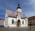
-

-

-

- Nomination Inside the Fort de la Motte-Giron, Dijon, France. --ComputerHotline 16:24, 5 April 2011 (UTC)
- Promotion I believe that this image fits in our standards. --Grand-Duc 02:50, 6 April 2011 (UTC)
-
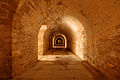
- Nomination Inside the Fort de la Motte-Giron, Dijon, France. --ComputerHotline 16:24, 5 April 2011 (UTC)
- Promotion Good quality. --Mbdortmund 19:20, 5 April 2011 (UTC)
-
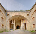
- Nomination Inside the Fort de la Motte-Giron, Dijon, France. --ComputerHotline 16:24, 5 April 2011 (UTC)
- Promotion Good quality. --Mbdortmund 19:20, 5 April 2011 (UTC)
-

- Nomination Wild west. Cowboy. --Bartiebert 15:31, 5 April 2011 (UTC)
- Decline Not commoners work. Qiqritiq 07:30, 6 April 2011 (UTC)
-

-

-

-
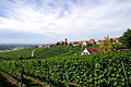
- Nomination Ötlingen, Germany --Taxiarchos228 07:26, 5 April 2011 (UTC)
- Promotion Good quality. --BennyJ 13:12, 5 April 2011 (UTC)
-

- Nomination Rheinfelden: new hydroelectric power plant with two portal cranes --Taxiarchos228 07:00, 5 April 2011 (UTC)
- Promotion QI. --Elekhh 21:07, 5 April 2011 (UTC)
-

- Nomination New hydroelectric power plant in Rheinfelden --Taxiarchos228 07:00, 5 April 2011 (UTC)
- Promotion Good quality. --Cayambe 18:18, 5 April 2011 (UTC)
-

- Nomination causeway aw new hydroelectric power plant in Rheinfelden--Taxiarchos228 07:00, 5 April 2011 (UTC)
- Promotion Good quality. --Cayambe 18:18, 5 April 2011 (UTC)
-

- Nomination Sul Ross statue. --Jujutacular 01:11, 5 April 2011 (UTC)
- Decline Incorrect white balance/false colors, main subject hardly distinguishable (disturbing background) --BennyJ 13:09, 5 April 2011 (UTC)
-

- Nomination Luxemb. City: top of building in the centre of the city. --Cayambe 20:53, 4 April 2011 (UTC)
- Promotion Support QI for me --Archaeodontosaurus 08:11, 6 April 2011 (UTC)
-

-

-
- Nomination Rheinfelden: bell tower of Christ church --Taxiarchos228 06:26, 4 April 2011 (UTC)
- Promotion Meets the criteria, imo.--MrPanyGoff 14:34, 5 April 2011 (UTC)
-

- Nomination Diceros bicornis, male --Jonathunder 04:19, 4 April 2011 (UTC)
- Promotion Good. --Cayambe 18:21, 5 April 2011 (UTC)
-

-
-

-

- Nomination: Bad-Säckingen: statue of Fridolin of Säckingen --Taxiarchos228 09:07, 31 March 2011 (UTC)
- Review needed
-
- Nomination Cygnus olor head, Zielonka, Poland. --Crusier 19:20, 30 March 2011 (UTC)
- Decline I'm unhappy with the composition. The trees interfere too much with the main subject, I guess that by a move of the swan of the photographer of only a few centimetres left of right, the trees would have been in no way distraction, but a nice feature. Grand-Duc 11:18, 6 April 2011 (UTC)
-
- Nomination: St. Mary church of Woquard, East Frisia --Carschten 17:57, 30 March 2011 (UTC)
- Review needed
-
- Nomination: Trogir - memorial of Croatian War --Pudelek 16:16, 30 March 2011 (UTC)
- Review needed
-

- Nomination: Remington typewriter. Photo by User:Edaen--Ankara 07:17, 30 March 2011 (UTC)
- Review nice arrangement but noise und CA should be reduced --Mbdortmund 12:20, 30 March 2011 (UTC)
-

- Nomination Church of Chariez, France. -- Remi Mathis 13:50, 29 March 2011 (UTC)
- Promotion Good quality. --Cayambe 19:39, 5 April 2011 (UTC)
-

- Nomination: Old border crossing enters France and Spain --France64160 08:48, 28 March 2011 (UTC)
- Review Passable. Coupe largement en bas, ainsi que l'arrière des voitures. je voterai "pour".--Jebulon 22:21, 30 March 2011 (UTC)
-

- Nomination Red-veined Dropwing. --Quartl 05:50, 5 April 2011 (UTC)
- Promotion Good quality. --Taxiarchos228 07:27, 5 April 2011 (UTC)
-

-

-

-

-

- Nomination A butcher, 17th century stained glass window, detail. Church Saint Etienne du Mont in Paris.--Jebulon 21:35, 4 April 2011 (UTC)
- Promotion Good quality. --Mbdortmund 22:33, 4 April 2011 (UTC)
-

- Nomination Fluorite --Archaeodontosaurus 19:21, 4 April 2011 (UTC)
- Promotion Good quality. --Mbdortmund 22:36, 4 April 2011 (UTC)
-

- Nomination Triturus cristatus (juvenile) --Holleday 18:23, 4 April 2011 (UTC)
- Promotion Support QI & Useful --Archaeodontosaurus 05:58, 5 April 2011 (UTC)
-

-

- Nomination Mount Rainier --Wsiegmund 17:02, 4 April 2011 (UTC)
- Withdrawn Comment There are some strange black stripes on the right at some glacier/snow area. I think one should remove them. --Ximonic 17:29, 4 April 2011 (UTC) Indeed, very strange boundary between sky and snow at top. Furthermore, due to a slight vignetting of each photo, the stitching is visible in the sky (different blue areas)--Jebulon 21:42, 4 April 2011 (UTC)
I see all three problems. Thank you for the reviews. --Wsiegmund 22:28, 4 April 2011 (UTC)
-

-

-

- Nomination Helsingborg. Morning -- Vitold Muratov 17:22, 4 April 2011 (UTC)
- Promotion nearly a painting --Mbdortmund 22:36, 4 April 2011 (UTC)
-

- Nomination CN Tower, Toronto: View from the glasfloor --Taxiarchos228 14:14, 4 April 2011 (UTC)
- Decline white parts heavily blown out --Carschten 18:05, 4 April 2011 (UTC)
-

- Nomination Breisach Minster. General view from Mount Eckartsberg. Breisach am Rhein, Germany. Breisach Minster. General view from Mount Eckartsberg. Breisach am Rhein, Germany. --Taxiarchos228 14:14, 4 April 2011 (UTC)
- Promotion Good quality. --Smial 15:17, 4 April 2011 (UTC)
-
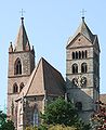
- Nomination bell tower of Breiach Minster --Taxiarchos228 14:14, 4 April 2011 (UTC)
- Promotion Good quality. --Smial 15:17, 4 April 2011 (UTC)
-

- Nomination De Dion-Bouton Type G 4,5 CV vis-à-vis de 1900. --Thesupermat 08:41, 4 April 2011 (UTC)
- Promotion QI for me. --D4m1en 13:25, 4 April 2011 (UTC)
-

- Nomination Germany, Freinsheim, tTownhall and church --Berthold Werner 07:52, 4 April 2011 (UTC)
- Promotion Some CA, otherwise good. --Smial 15:17, 4 April 2011 (UTC)
-

- Nomination Rheinfelden: Statue at Christ church --Taxiarchos228 06:26, 4 April 2011 (UTC)
- Decline Technically ok, but bad background, the window above the head disturbs strongly. --Smial 15:23, 4 April 2011 (UTC)
-

-

-
-
-

- Nomination Waterform of a male Triturus helveticus --Holleday 18:44, 3 April 2011 (UTC)
- Promotion Good photo -- George Chernilevsky 18:58, 4 April 2011 (UTC)
-

- Nomination Bust of A.-M. Ampère, façade of the Lycée Voltaire, Paris.--Jebulon 16:15, 3 April 2011 (UTC)
- Promotion QI and Useful --Archaeodontosaurus 19:27, 4 April 2011 (UTC)
-

- Nomination Podaxis pistillaris in the Wadi Rum, Jordan --Bgag 14:31, 3 April 2011 (UTC)
- Withdrawn Size. Not 2 megapixels. Hard or strong shade: The shade is disturbing--Lmbuga 14:51, 3 April 2011 (UTC) Sorry I have forgot to check the size before nominate the picture.--Bgag 12:43, 4 April 2011 (UTC)
-

- Nomination Relief. Ball court in Chichén Itzá, Mexico--Lmbuga 12:08, 3 April 2011 (UTC)
- Promotion Very nice, interesting, and "pinsharp".--Berthold Werner 12:58, 3 April 2011 (UTC)
That wasn't me, but I agree. --Berthold Werner 15:40, 3 April 2011 (UTC) Sorry, I don't understand what happened with the tildes-signatures. I Jebulon am the author of the first (and immortal) review of this picture. Jebulon
...but who has written it knows I like Jebulon--Lmbuga 14:42, 4 April 2011 (UTC)
-

-

- Nomination: National Academy of Arts in Sofia. --MrPanyGoff 08:38, 30 March 2011 (UTC)
- Review needed
-
- Nomination: Ströms church in Strömsund, Jämtland, Sweden. Photo User:Njaelkies Lea--Ankara 07:17, 30 March 2011 (UTC)
- Review needed
-

- Nomination: Folkungavallen. Photo User:Kavelgrisen--Ankara 07:17, 30 March 2011 (UTC)
- Review needed
-
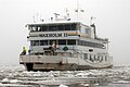
- Nomination: M/S Waxholm II. Photo User:Larske--Ankara 07:17, 30 March 2011 (UTC)
- Review needed
-

- Nomination: Grenzach-Wyhlen: transept of Saint George --Taxiarchos228 07:14, 30 March 2011 (UTC)
- Review needed
-

- Nomination: Grenzach-Wyhlen: bell tower of Saint George --Taxiarchos228 07:14, 30 March 2011 (UTC)
- Review needed
-
- Nomination: Grenzach-Wyhlen: three stations of the Cross at Saint George --Taxiarchos228 07:14, 30 March 2011 (UTC)
- Review needed
-

- Nomination: Grenzach-Wyhlen: church Saint George --Taxiarchos228 07:14, 30 March 2011 (UTC)
- Review needed
-

- Nomination: Organ of Marcel Dupré, France. --Remi Mathis 06:32, 30 March 2011 (UTC)
- Review needed
-

- Nomination: Insane, Gröna lund (new version) --Ankara 14:53, 29 March 2011 (UTC)
- Review needed
-

- Nomination: Denguin town hall, France --France64160 14:18, 29 March 2011 (UTC)
- Review No FOP in France...--Jebulon 23:38, 29 March 2011 (UTC)
-

- Nomination: Laà-Mondrans town hall, France --France64160 14:18, 29 March 2011 (UTC)
- Review needed
-

- Nomination: Bérenx river, France --France64160 14:18, 29 March 2011 (UTC)
- Review not bad, but needs a crop below (bridge)--Jebulon 23:41, 29 March 2011 (UTC)
-

- Nomination: Boueilh-Boueilho-Lasque church, France --France64160 14:18, 29 March 2011 (UTC)
- Review Severe tilt and distortion. Correctible--Jebulon 23:44, 29 March 2011 (UTC)
-

- Nomination: Theotokos of Tikhvin. XV A.D. --Vitold Muratov 14:40, 29 March 2011 (UTC)
- Review needed
-

- Nomination Arrol-Johnston 3 cylindres 20 CV limousine à toit démontable de 1904. --Thesupermat 08:29, 4 April 2011 (UTC)
- Promotion Good quality. --Berthold Werner 08:45, 4 April 2011 (UTC)
-

- Nomination Panhard et Levassor 7 CV bicylindre Voiturette par Clément-Rothschild de 1902 --Thesupermat 08:24, 4 April 2011 (UTC)
- Promotion Support QI & Useful --Archaeodontosaurus 10:12, 4 April 2011 (UTC)
-
- Nomination Old Courthouse seen from the Gateway Arch in Saint Louis, Missouri --Jonathunder 03:56, 4 April 2011 (UTC)
- Decline nice view, but bad quality (noisy, no good sharpness) --Taxiarchos228 07:18, 4 April 2011 (UTC)
-

- Nomination Dolphin performing a salto. --Quartl 21:09, 3 April 2011 (UTC)
- Promotion Good quality. --Taxiarchos228 07:18, 4 April 2011 (UTC)
-

- Nomination Canary Islands Large White. --Quartl 19:34, 3 April 2011 (UTC)
- Promotion Good quality, for me not only QI --Taxiarchos228 19:46, 3 April 2011 (UTC)
-

-

- Nomination Dornach: Goetheanum --Taxiarchos228 18:54, 3 April 2011 (UTC)
- Promotion Tolles Bild mit fast anthroposophischen Farben --Mbdortmund 19:16, 3 April 2011 (UTC)
-

- Nomination Detail of a stained glass window by William Early in St. Michael's Church, Ballinasloe. --AFBorchert 13:26, 3 April 2011 (UTC)
- Promotion A little CA in the corners, but lovely colours and detail. QI to me. --Avenue 10:01, 4 April 2011 (UTC)
-

- Nomination Germany, Church of Springiersbach monastry --Berthold Werner 12:58, 3 April 2011 (UTC)
- Promotion Good quality. --Mbdortmund 19:18, 3 April 2011 (UTC)
-

- Nomination: Grenzach-Wyhlen: interior of Saint Michael --Taxiarchos228 09:05, 29 March 2011 (UTC)
- Review good composition but windows overexposured --Mbdortmund 11:47, 29 March 2011 (UTC)
-

- Nomination: Strontium --Alchemist-hp 15:24, 26 March 2011 (UTC)
- Review Comment Several defect reconstruction, and CA, difficult to QI, but certainly VA. --Archaeodontosaurus 09:19, 28 March 2011 (UTC) Comment You saw/read it: the photo is taken from outside in a glas vial/ampoule, this very air sensitive sample is inside! My lens don't have CA. --Alchemist-hp 11:17, 28 March 2011 (UTC) Comment This is an image very difficult to do, I placed in the article in French on strontium. --Archaeodontosaurus 17:14, 28 March 2011 (UTC)
-

-

-

- Nomination Bust of Voltaire, façade of the Lycée Voltaire in Paris.--Jebulon 20:54, 2 April 2011 (UTC)
- Promotion Support QI for me --Archaeodontosaurus 09:31, 3 April 2011 (UTC)
-

- Nomination Archangel Michael:Saint Isaac's Cathedral --Vitold Muratov 20:50, 2 April 2011 (UTC)
- Decline Very noisy --Jebulon 21:57, 2 April 2011 (UTC)
-

-

- Nomination Inside the Fort des Hautes Perches, near Belfort, France. --ComputerHotline 08:50, 2 April 2011 (UTC)
- Promotion Good quality. --Mbdortmund 18:59, 2 April 2011 (UTC)
-
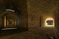
- Nomination Inside the Fort des Hautes Perches, near Belfort, France. --ComputerHotline 08:50, 2 April 2011 (UTC)
- Promotion Good quality. --Mbdortmund 18:59, 2 April 2011 (UTC)
-
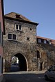
- Nomination Germany, Freinsheim, Haintor --Berthold Werner 07:23, 2 April 2011 (UTC)
- Promotion Good. --Cayambe 21:45, 2 April 2011 (UTC)
-

-

-

-

- Nomination The part of monument of John of Nepomuk in Wrocław --Lvova 16:21, 1 April 2011 (UTC)
- Promotion Support QI for me --Archaeodontosaurus 09:44, 3 April 2011 (UTC)
-
- Nomination Mushroom in the Wadi Rum, Jordan --Bgag 15:04, 1 April 2011 (UTC)
- Promotion Support QI & Useful --Archaeodontosaurus 13:59, 2 April 2011 (UTC)
-

-

-

-

- Nomination: Teide Observatory --Taxiarchos228 08:14, 28 March 2011 (UTC)
- Review needed
-

-

- Nomination: Painting of Saint Bernard of Clairvaux. 17th century. Church Saint-Etienne du Mont, Paris.--Jebulon 15:27, 27 March 2011 (UTC)
- Review needed
-

- Nomination: Old houses in Spas-Klepiki, Russia. A.Savin 15:27, 27 March 2011 (UTC)
- Review needed
-
- Nomination: Rhine flood in Leverkusen, Germany. A.Savin 15:27, 27 March 2011 (UTC)
- Review needed
-

- Nomination: Aesculus_hippocastanum in Marki, Poland, --Crusier 14:11, 27 March 2011 (UTC)
- Review needed
-

- Nomination: Contrail --Crusier 14:11, 27 March 2011 (UTC)
- Review needed
-

-

- Nomination Habour in Aarhus, Denmark --Villy Fink Isaksen 18:32, 26 March 2011 (UTC)
- Promotion A bit unsharp, but really nice colors and composition. --Jagro 00:49, 3 April 2011 (UTC)
-

-
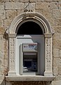
-

- Nomination The lighthouse of Blankenberge, Belgium -- MJJR 21:42, 1 April 2011 (UTC)
- Promotion Good quality. --Berthold Werner 10:34, 2 April 2011 (UTC)
-

- Nomination 159002 arrives at Westbury. Mattbuck 19:50, 1 April 2011 (UTC)
- Promotion Good quality. --Taxiarchos228 19:52, 1 April 2011 (UTC)
-

- Nomination 150252 at Tondu. Mattbuck 19:50, 1 April 2011 (UTC)
- Promotion Good quality. --Taxiarchos228 19:52, 1 April 2011 (UTC)
-

-

- Nomination Stained glass window by Harry Clarke depicting St Rose of Lima in St. Michael's Church, Ballinasloe, Ireland. --AFBorchert 16:01, 1 April 2011 (UTC)
- Promotion Good quality. --Mbdortmund 20:06, 1 April 2011 (UTC)
-

- Nomination Rock formation in the Wadi Rum, Jordan --Bgag 15:04, 1 April 2011 (UTC)
- Promotion Good quality. --Berthold Werner 10:34, 2 April 2011 (UTC)
-

- Nomination Rock formation in the Wadi Rum, Jordan --Bgag 15:04, 1 April 2011 (UTC)
- Promotion Good quality. --Berthold Werner 10:34, 2 April 2011 (UTC)
-

- Nomination Salix caprea. --Bartiebert 12:46, 1 April 2011 (UTC)
- Promotion Good quality. --Taxiarchos228 12:48, 1 April 2011 (UTC)
-

- Nomination Stained glass window by Harry Clarke in Ballinasloe, depicting Saint Patrick preaching to his disciplies. --AFBorchert 09:28, 1 April 2011 (UTC)
- Promotion good Mbdortmund 20:06, 1 April 2011 (UTC)
-

- Nomination Rheinfelden: organ of Gallus church --Taxiarchos228 07:26, 1 April 2011 (UTC)
- Decline Important C.A. --Archaeodontosaurus 10:40, 2 April 2011 (UTC)
-

- Nomination Weil am Rhein: workers' housing estate --Taxiarchos228 07:26, 1 April 2011 (UTC)
- Promotion Support Good quality. --Berthold Werner 12:24, 1 April 2011 (UTC)
-

- Nomination Shell of a Common Delphinula, Angaria delphinus --Llez 05:30, 1 April 2011 (UTC)
- Promotion Support very careful work QI & Useful --Archaeodontosaurus 14:20, 1 April 2011 (UTC)
-

- Nomination A corner of the ceiling of "Salon de la Guerre" in Palace of Versailles.--Jebulon 22:53, 31 March 2011 (UTC)
- Promotion Support QI for me --Archaeodontosaurus 14:22, 1 April 2011 (UTC)
-

-

- Nomination Stained glass window (early 17th century) of Christ washing the feet of the Apostles. Church Saint Etienne du Mont, Paris.--Jebulon 21:51, 31 March 2011 (UTC)
- Promotion Good -- George Chernilevsky 11:22, 2 April 2011 (UTC)
-

-

- Nomination Another Bufo bufo, this half in water. --David Perez 18:44, 31 March 2011 (UTC)
- Promotion Very good--Holleday 13:55, 1 April 2011 (UTC)
-

-

- Nomination Lasclaveries War memorial, France --France64160 14:18, 29 March 2011 (UTC)
- Decline Disturbing background. Needs a crop below.--Jebulon 23:42, 29 March 2011 (UTC)
too dark for me --Pudelek 14:32, 1 April 2011 (UTC)
-

-
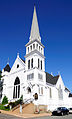
- Nomination Lunenburg, Canada: Zion's Lutheran Church --Taxiarchos228 15:17, 27 March 2011 (UTC)
- Decline Some overexposure (esp around door) loses detail. --Mattbuck 16:42, 1 April 2011 (UTC)
-
- Nomination Viscum albumin Marki, Poland, --Crusier 14:11, 27 March 2011 (UTC)
- Promotion Despite some (unavoidablel) CA here, QI to me. --Cayambe 20:28, 1 April 2011 (UTC)
-

- Nomination: Freudenberg-Büschergrund. --Bartiebert 11:19, 27 March 2011 (UTC)
- Review needed
-
- Nomination: Lomocamera Fisheye Woodgrain. --Lvova 09:33, 27 March 2011 (UTC)
- Review needed
-
- Nomination: Solitary man near inuit village of Kangiqsualujjuaq, Quebec, Canada --Nicolas M. Perrault 02:24, 27 March 2011 (UTC)
- Review white balance not OK --Mbdortmund 02:23, 27 March 2011 (UTC)
-
- Nomination The Shopping Mall Traisenpark in St. Pölten, Austria --AleXXw 23:51, 26 March 2011 (UTC)
- Promotion interesing object --Pudelek 14:34, 1 April 2011 (UTC)
-

-

- Nomination King of France Robert II the Pious, Château de Versailles.--Jebulon 22:02, 26 March 2011 (UTC)
- Promotion QI to me. --Cayambe 20:31, 1 April 2011 (UTC)
-

- Nomination: Chrysocyon brachyurus in Oliwa Zoo in Gdańsk, Poland. --Crusier 19:54, 26 March 2011 (UTC)
- Review needed
-

- Nomination A World War II memorial in the village of Remich, Luxembourg. -- Felix Koenig 19:26, 26 March 2011 (UTC)
- Promotion Good quality. --Cayambe 20:32, 1 April 2011 (UTC)
-

- Nomination: Herrenfleet in Hamburg --Mbdortmund 17:34, 26 March 2011 (UTC)
- Review Comment I see some halos around the building edges, maybe too much postprocess sharpening? Grand-Duc 21:46, 26 March 2011 (UTC)
-

-

-
- Nomination Inside the fort Lachaux, near Montbéliard, France. --ComputerHotline 13:32, 26 March 2011 (UTC)
- Decline foreground under- and background overexposed. For a HDR it should can made better imo --Carschten 08:44, 2 April 2011 (UTC)
-
- Nomination: Portal of the Catholic St. Mary's Church of Rheinberg-Budberg (re-nomination with fixed issues) --Carschten 13:28, 26 March 2011 (UTC)
- Review needed
-
- Nomination: Bridge over the Rhine-Herne-Canal in Oberhausen --Carschten 12:58, 26 March 2011 (UTC)
- Review needed
-

- Nomination vineyard in port of Hamburg --Mbdortmund 01:09, 26 March 2011 (UTC)
- Promotion OK -- George Chernilevsky 11:06, 2 April 2011 (UTC)
-

- Nomination Hamburg Landungsbrücken and docks --Mbdortmund 00:45, 26 March 2011 (UTC)
- Promotion Good quality and composition --Carschten 08:35, 2 April 2011 (UTC)
-
- Nomination Temple of Monthu in el-Tod, Egypt. --Oltau 20:35, 25 March 2011 (UTC)
- Decline bad crop, overexposed sky at left, chromatic aberrations --Carschten 08:35, 2 April 2011 (UTC)
-

-

-

- Nomination: Alternate view of the picture to the left (File:Landsendtyw7.JPG) --Tyw7 22:28, 24 March 2011 (UTC)
- Review Comment I took back the promotion, signature and reason missinbg, sorry. --Mbdortmund 12:40, 26 March 2011 (UTC)
-

- Nomination: Cardiff Holiday Inn. Mattbuck 03:07, 21 March 2011 (UTC)
- Review composition is good, but noisy and could be sharper --Mbdortmund 05:32, 21 March 2011 (UTC)
Tried, but not sure I can fix those, at least not at the same time. Mattbuck 00:32, 27 March 2011 (UTC)
-

-

-

-

-

- Nomination Pride of Baltimore --Taxiarchos228 14:59, 31 March 2011 (UTC)
- Promotion very nice --Carschten 15:11, 31 March 2011 (UTC) Info there is a small dust that can be delete (i put a note on the image) --Croucrou 19:39, 31 March 2011 (UTC)
done --Taxiarchos228 20:16, 31 March 2011 (UTC) Could be a FP on "Commons" IMO...--Jebulon 21:53, 31 March 2011 (UTC) Done Nominated by me... Please go there to support it !! --Jebulon 22:55, 31 March 2011 (UTC)
-

- Nomination An adult black-headed gull in flight trying to catch a bread crumb (Chroicocephalus ridibundus). I know, framing isn't that good (there were many other gulls at the same time). But I think it's sort of a unique action shot so I'll still give it a try --BennyJ 14:53, 31 March 2011 (UTC)
- Promotion For me very good -- Holleday 16:29, 31 March 2011 (UTC)
-

- Nomination Cro-Magnon tool - Collection Louis Lartet --Archaeodontosaurus 14:43, 31 March 2011 (UTC)
- Promotion Only a question: Is it really that kind of red? --Mbdortmund 17:55, 31 March 2011 (UTC) On the label? --Archaeodontosaurus 19:04, 31 March 2011 (UTC)
Because of the title "silex" I thougt the stone would look grey, but I see, the Category:Flintstone shows red variations, too. --Mbdortmund 23:05, 31 March 2011 (UTC) The flint can have a large variability in composition and color: white, pink, brown, and sometimes bluish. This peculiarity has shown that the flint, as materials, travel a lot. --Archaeodontosaurus 05:51, 1 April 2011 (UTC)
-

- Nomination Grenzach-Wyhlen: cross --Taxiarchos228 09:07, 31 March 2011 (UTC)
- Decline Has to be lightened with a flashlight, as shoot contra sun light.--PereslavlFoto 22:58, 31 March 2011 (UTC)
-
- Nomination Nikon FM10 --Jovianeye 23:35, 30 March 2011 (UTC)
- Decline Hot pixels, low DOF. But what a perfect composition and colours, so I ask you to remake the photo, please!--PereslavlFoto 23:03, 31 March 2011 (UTC)
I spotted only one hot pixel on the lens barrel. Reshooting wont be possible. The camera is no longer in my possession and I only have the RAW files now. --Jovianeye 05:36, 1 April 2011 (UTC)
-

- Nomination Roman bridge, Le Pouzin, France. --Remi Mathis 06:32, 30 March 2011 (UTC)
- Decline Not sharp, especially on the right side. The house is falling to the right.--PereslavlFoto 23:03, 31 March 2011 (UTC)
-

- Nomination Monument in Vianden, Luxembourg. --Cayambe 21:53, 29 March 2011 (UTC)
- Promotion Support QI & Useful --Archaeodontosaurus 15:28, 31 March 2011 (UTC)
-

- Nomination Advocaat cream in a cup. --M0tty 15:56, 29 March 2011 (UTC)
- Decline Oppose Lighting interesting but too many blurry areas. --Archaeodontosaurus 15:32, 31 March 2011 (UTC)
-

- Nomination Roman Bridge, Le Pouzin (France) --Remi Mathis 14:55, 29 March 2011 (UTC)
- Decline Tilted clockwise, and lacks sharpness in places. Not quite QI material IMO. Nice reflections though. --Avenue 10:25, 1 April 2011 (UTC)
-
- Nomination Germany, Freinsheim. garden house in the Barockgarten --Berthold Werner 13:09, 28 March 2011 (UTC)
- Promotion Good... though I rather think that the two cut-off bushes below should be cloned away. --Cayambe 08:03, 30 March 2011 (UTC)
Done --Berthold Werner 09:18, 1 April 2011 (UTC)
-

-

- Nomination Lunenburg, Canada: St. John's Anglican Church --Taxiarchos228 15:17, 27 March 2011 (UTC)
- Decline Overxposed some parts of the church. Not the best moment for the picure I think. Would be better later on the day as sun will light the facade. --Sfu 17:00, 31 March 2011 (UTC)
-
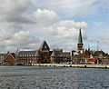
- Nomination: Aarhus seen from habour, Denmark --Villy Fink Isaksen 21:28, 25 March 2011 (UTC)
- Review good composition but lack of details on the buildings --Mbdortmund 00:47, 26 March 2011 (UTC)
-
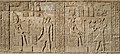
- Nomination: Relief in the temple of Monthu in el-Tod, Egypt. --Oltau 20:35, 25 March 2011 (UTC)
- Review needed
-
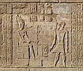
- Nomination: Relief in the temple of Monthu in el-Tod, Egypt. --Oltau 20:35, 25 March 2011 (UTC)
- Review needed
-
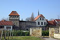
- Nomination Germany, Freinsheim, Part of the City Wall --Berthold Werner 19:10, 25 March 2011 (UTC)
- Promotion QI for me --Archaeodontosaurus 15:34, 31 March 2011 (UTC)
-
- Nomination: Toronto: Ontario College of Art and Design --Taxiarchos228 10:07, 25 March 2011 (UTC)
- Review That is a strange building. There are some purple haloes around the wires. Mattbuck 17:52, 25 March 2011 (UTC)
-

- Nomination: Sun setting on Land's End. --Tyw7 22:28, 24 March 2011 (UTC)
- Review needed
-
- Nomination: View from w:Land's End --Tyw7 22:28, 24 March 2011 (UTC)
- Review needed
-

- Nomination: View from Land's End, the southern most tip of Great Britain --Tyw7 22:28, 24 March 2011 (UTC)
- Review needed
-

- Nomination Manhole cover with a big coat of arms of Wrocław --Lvova 19:51, 24 March 2011 (UTC)
- Promotion IMO, such a circle needs a better (symmetric, like a nice square) framing. The crops, then the composition, are not good...--Jebulon 00:01, 27 March 2011 (UTC)
cropped. --Lvova 09:16, 27 March 2011 (UTC) Better, thank you, even if the crop is too tight a bit, now... --Jebulon 21:59, 31 March 2011 (UTC)
-

- Nomination Drawing of a girl in a sukumizu. --Niabot 09:28, 31 March 2011 (UTC)
- Promotion Good quality. --Taxiarchos228 09:34, 31 March 2011 (UTC)
-

- Nomination Weil am Rhein: detail of Vitra house --Taxiarchos228 09:22, 31 March 2011 (UTC)
- Promotion Looks ok to me --Niabot 11:47, 31 March 2011 (UTC)
-

- Nomination Bad-Säckingen: covered wooden bridge --Taxiarchos228 09:07, 31 March 2011 (UTC)
- Promotion Also OK --Niabot 11:47, 31 March 2011 (UTC)
-

- Nomination Schwörstadt: hydroelectric power station --Taxiarchos228 09:07, 31 March 2011 (UTC)
- Promotion Good --Niabot 11:47, 31 March 2011 (UTC)
-

- Nomination Weil am Rhein: Vitra house --Taxiarchos228 09:07, 31 March 2011 (UTC)
- Promotion Looks fine to me --Niabot 11:47, 31 March 2011 (UTC)
-

-

- Nomination God herdsman from ancient Rom --Vitold Muratov 21:54,30 March 2011 (UTC)
- Decline unsharp and noisy in full solution --Mbdortmund 20:41, 30 March 2011 (UTC)
-
- Nomination Harbor of Greetsiel during twilight --Carschten 13:55, 30 March 2011 (UTC)
- Promotion schöne Stimmung --Mbdortmund 16:05, 30 March 2011 (UTC)
-

- Nomination Coats of arms collège Louis-le-Grand on an old book --Remi Mathis 13:01, 30 March 2011 (UTC)
- Promotion Not absolute sharpness but good.--Jebulon 22:35, 30 March 2011 (UTC)
-

- Nomination Coats of arms de Luynes on an old book --Remi Mathis 12:59, 30 March 2011 (UTC)
- Promotion Très bien !--Jebulon 22:34, 30 March 2011 (UTC)
-

- Nomination Grenzach-Wyhlen: vaulted ceiling of Saint George --Taxiarchos228 07:14, 30 March 2011 (UTC)
- Promotion Excellent quality Remi Mathis 18:45, 30 March 2011 (UTC)
-

- Nomination Old books --Remi Mathis 06:32, 30 March 2011 (UTC)
- Decline DoF problem, not sharp enough. Sorry.--Jebulon 22:37, 30 March 2011 (UTC)
-

-

- Nomination Morlaàs church, France --France64160 08:48, 28 March 2011 (UTC)
- Decline Trop de "bruit" (post processing ?). Photo à prendre de face, sinon on ne comprend pas bien le sujet. Trop de parties coupées (statues, haut du tympan etc...)--Jebulon 22:24, 30 March 2011 (UTC)
-

- Nomination Saint - Jammes city hall, France --France64160 08:48, 28 March 2011 (UTC)
- Decline Le mât penche (distorsion de perspective). Pixellisation entre les deux fenêtres et dans les lettres de "Mairie". Aberration chromatique dans les arbres. Composition insuffisante : trop de sol au premier plan, à couper largement. --Jebulon 22:19, 30 March 2011 (UTC)
-

- Nomination Argynnis paphia. --Bartiebert 16:10, 27 March 2011 (UTC)
- Promotion Very good quality -- Cookie 18:15, 30 March 2011 (UTC)
-
- Nomination: Thelephora terrestris --Holleday 19:21, 24 March 2011 (UTC)
- Review needed
-

- Nomination Electric locomotive Škoda ChS4-042 -- George Chernilevsky 21:33, 23 March 2011 (UTC)
- Promotion Good and interesting--Jebulon 22:10, 30 March 2011 (UTC)
-

- Nomination Inside the fort du Lomont, near Pont-de-Roide, France. --ComputerHotline 11:28, 23 March 2011 (UTC)
- Promotion Nice and interesting light.--Jebulon 22:09, 30 March 2011 (UTC)
-

- Nomination Bern: cage tower (Käfigturm) --Taxiarchos228 09:52, 29 March 2011 (UTC)
- Promotion Meets the criteria, imo.--MrPanyGoff 10:38, 29 March 2011 (UTC)
-

- Nomination Feed of river power plant Isarwerk 3, Munich, Germany Richard Bartz 09:30, 29 March 2011 (UTC)
- Promotion Good quality. --Taxiarchos228 09:33, 29 March 2011 (UTC)
-

- Nomination Feed of river power plant Höllriegelskreut, Germany Richard Bartz 09:30, 29 March 2011 (UTC)
- Promotion Good quality. --Taxiarchos228 09:33, 29 March 2011 (UTC)
-

- Nomination Feed of river power plant Stauwehr Oberföhring, Munich, Germany Richard Bartz 09:30, 29 March 2011 (UTC)
- Promotion Good quality. --Taxiarchos228 09:33, 29 March 2011 (UTC)
-
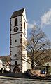
- Nomination Grenzach-Wyhlen: church Saint Leodegar --Taxiarchos228 09:05, 29 March 2011 (UTC)
- Promotion Meets the criteria, imo.--MrPanyGoff 10:38, 29 March 2011 (UTC)
-

- Nomination Grenzach-Wyhlen: church Saint Leodegar --Taxiarchos228 09:05, 29 March 2011 (UTC)
- Promotion Good quality. --Mbdortmund 11:06, 29 March 2011 (UTC)
-

- Nomination Grenzach-Wyhlen: epitaph at church Saint Leodegar --Taxiarchos228 09:05, 29 March 2011 (UTC)
- Promotion Good quality. --Mbdortmund 10:56, 29 March 2011 (UTC)
-
- Nomination Grenzach-Wyhlen: altar of Saint Michael --Taxiarchos228 09:05, 29 March 2011 (UTC)
- Decline Strong CA besides the windows --Mbdortmund 10:58, 29 March 2011 (UTC) Info the effect at the edge of the windows is because of irradiation and has noting to do with CA. It is not perfect but I guess the quality is good for this extrem situation of bright and dark parts. --Taxiarchos228 11:17, 29 March 2011 (UTC)
-

- Nomination MediaWiki developer Brion Vibber shot in 2008. --TeleComNasSprVen 07:03, 29 March 2011 (UTC)
- Decline Not by a Commoner? Qiqritiq 07:10, 29 March 2011 (UTC)
-

-

- Nomination Volcanic crater at Lanzarote. --Alchemist-hp 20:12, 28 March 2011 (UTC)
- Promotion Good quality and nice. --Taxiarchos228 07:13, 29 March 2011 (UTC)
-
- Nomination Anas platyrhynchos (male) in Soest --Mbdortmund 18:09, 28 March 2011 (UTC)
- Promotion Average composition, but technically fine. Qiqritiq 06:47, 29 March 2011 (UTC)
-

- Nomination Door knocker in Soest --Mbdortmund 17:51, 28 March 2011 (UTC)
- Promotion Good quality. --Ianare 20:04, 28 March 2011 (UTC)
-
- Nomination Door knockers in Soest --Mbdortmund 17:51, 28 March 2011 (UTC)
- Promotion Also good. Qiqritiq 06:45, 29 March 2011 (UTC)
-

- Nomination decorative hinges in Soest --Mbdortmund 17:51, 28 March 2011 (UTC)
- Promotion Good quality. --Ianare 20:04, 28 March 2011 (UTC)
-

-
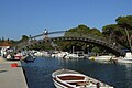
- Nomination Small bridge over canal in Trogir, Croatia --Pudelek 17:29, 28 March 2011 (UTC)
- Decline crop of the boat in the foreground is disturbing --Mbdortmund 11:49, 29 March 2011 (UTC)
-
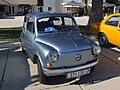
- Nomination Zastava 850 in Trogir --Pudelek 17:29, 28 March 2011 (UTC)
- Promotion Good quality. --Taxiarchos228 07:13, 29 March 2011 (UTC)
-

- Nomination Tulipa agenensis, Israel. --MathKnight 16:41, 28 March 2011 (UTC)
- Promotion
-

- Nomination Columba palumbus head --France64160 08:48, 28 March 2011 (UTC)
- Decline La définition doit être de 2M pixel --Archaeodontosaurus 12:37, 28 March 2011 (UTC)
-

- Nomination Cabel Car at Teide --Taxiarchos228 08:14, 28 March 2011 (UTC)
- Promotion bit small but ok --Ianare 20:04, 28 March 2011 (UTC)
-

- Nomination The tomb of Saint Genevieve, saint patron of Paris, Church St Etienne du Mont.--Jebulon 23:07, 27 March 2011 (UTC)
- Promotion A bit more DOF would have been nice. Qiqritiq 21:24, 28 March 2011 (UTC) Thanks for review. I don't think so.--Jebulon 22:07, 28 March 2011 (UTC)
Ok then. Qiqritiq 06:39, 29 March 2011 (UTC)
-
- Nomination Téléphérique de l'aiguille du Midi, France --France64160 20:55, 27 March 2011 (UTC)
- Decline Noisy, unsharp and some CA.--Jebulon 21:58, 28 March 2011 (UTC)
-

- Nomination Téléphérique de l'aiguille du Midi, France --France64160 20:55, 27 March 2011 (UTC)
- Decline Unsharp and very noisy, sorry.--Jebulon 21:57, 28 March 2011 (UTC)
-

- Nomination Trametes pubescens --Holleday 17:09, 27 March 2011 (UTC)
- Withdrawn Comment F18 would be better suited than, F10 --Archaeodontosaurus 12:07, 28 March 2011 (UTC)
-

-

- Nomination Schimpanse, Pan troglodytes --Böhringer 22:51, 26 March 2011 (UTC)
- Promotion Info beautiful picture but there is a dust very disturbing who need to be delete before promotion --Croucrou 08:35, 27 March 2011 (UTC) Done--Böhringer 20:27, 27 March 2011 (UTC) Support Looks good now. --Makele-90 22:26, 28 March 2011 (UTC)
-

- Nomination Mercedes 300SL --Thesupermat 13:45, 24 March 2011 (UTC)
- Promotion crop a bit tight, but ok --Ianare 20:16, 28 March 2011 (UTC)
-
-

-

- Nomination: At the top of the North battery of the fort du Lomont, near Pont-de-Roide, France. --ComputerHotline 11:28, 23 March 2011 (UTC)
- Review needed
-
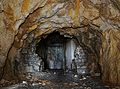
- Nomination: Inside the fort du Lomont, near Pont-de-Roide, France. --ComputerHotline 11:28, 23 March 2011 (UTC)
- Review needed
-

- Nomination: Inside the fort du Lomont, near Pont-de-Roide, France. --ComputerHotline 11:28, 23 March 2011 (UTC)
- Review needed
-
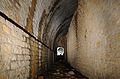
- Nomination: Inside the fort du Lomont, near Pont-de-Roide, France. --ComputerHotline 11:28, 23 March 2011 (UTC)
- Review needed
-

- Nomination: Nature reserve Süsselberg, Germany. --Bartiebert 18:13, 22 March 2011 (UTC)
- Review needed
-
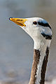
- Nomination Portrait of (Anser indicus) --Richard Bartz 16:23, 22 March 2011 (UTC)
- Promotion Der Hals unter dem Kopf könnte imo etwas Nachbelichtung vertragen. --Mbdortmund 18:30, 22 March 2011 (UTC) Comment Throat and forehead are little bit overexposed, otherwise fine image. Can you fix that? --Makele-90 22:24, 26 March 2011 (UTC)
 FIXED. Richard Bartz 20:14, 28 March 2011 (UTC) Support Looks good now. --Makele-90 22:24, 28 March 2011 (UTC)
-

- Nomination: The building of a church. a 1912 bronze replica of a basrelief at the wooden Saint George and the Dragon statue in Storkyrkan. --Ankara 15:53, 22 March 2011 (UTC)
- Review needed
-

- Nomination: Castello Sforzesco (Milan) - Filarete Tower --MaryG90 15:00, 22 March 2011 (UTC)
- Review needed
-

- Nomination: Rheinfelden: Statue at Saint Felix and Regula --Taxiarchos228 14:40, 22 March 2011 (UTC)
- Review needed
-

-

- Nomination Germany, Freinsheim, Eisentor (irongate) --Berthold Werner 13:27, 21 March 2011 (UTC)
- Promotion Good QI. --David Perez 16:47, 28 March 2011 (UTC)
-

-

-

- Nomination Flowers of Magnolia stellata. --Myrabella 11:39, 30 March 2011 (UTC)
- Promotion Flower imo overexposured --Mbdortmund 12:06, 30 March 2011 (UTC) Done Adjusted. --Myrabella 14:47, 30 March 2011 (UTC) Support I see no evidence of overexposure in the histogram of the initial file, but it has been processed using Photoshop CS4 according to the EXIF data. I see some loss in detail on a small part of one or two petals, probably due to overexposure. It is acceptable, in my opinion. Good resolution and depth of field. Useful. --Wsiegmund 15:25, 30 March 2011 (UTC)
-

- Nomination Lerbo kyrka. Photo User:Kavelgrisen--Ankara 07:17, 30 March 2011 (UTC)
- Promotion Crop at the top a bit tight but otherwise very good. -- Felix Koenig 15:31, 30 March 2011 (UTC)
-
- Nomination: The part of monument of John of Nepomuk in Wrocław --Lvova 14:17, 24 March 2011 (UTC)
- Review needed
-
- Nomination: The part of monument of John of Nepomuk in Wrocław --Lvova 14:17, 24 March 2011 (UTC)
- Review needed
-
- Nomination: The part of monument of John of Nepomuk in Wrocław --Lvova 14:17, 24 March 2011 (UTC)
- Review needed
-
- Nomination: The part of monument of John of Nepomuk in Wrocław --Lvova 14:17, 24 March 2011 (UTC)
- Review needed
-

- Nomination Green-headed Tanager in Ubatuba, Brazil. Photo User:Njaelkies Lea--Ankara 07:17, 30 March 2011 (UTC)
- Promotion QI Remi Mathis 07:43, 30 March 2011 (UTC)
-
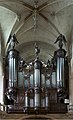
- Nomination Organ, Church Saint-Etienne du Mont in Paris. Monument historique.--Jebulon 23:23, 29 March 2011 (UTC)
- Promotion QI Remi Mathis 07:57, 30 March 2011 (UTC)
-

- Nomination Wooden house in Vyoska village near Glebovskoe village. Imitation of bricks.--PereslavlFoto 16:17, 29 March 2011 (UTC)
- Promotion Good quality. --Carschten 18:16, 29 March 2011 (UTC)
-

-
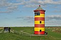
- Nomination Lighthouse of Pilsum, East Frisia --Carschten 15:22, 29 March 2011 (UTC)
- Promotion Good quality. --Richard Bartz 15:33, 29 March 2011 (UTC)
-

- Nomination Schöpfwerk Greetsiel --Carschten 14:38, 29 March 2011 (UTC)
- Promotion could be sharper, but good --Taxiarchos228 14:45, 29 March 2011 (UTC)
-
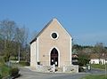
- Nomination Salles-Mongiscard town hall, France --France64160 14:18, 29 March 2011 (UTC)
- Promotion Good quality. --Carschten 18:16, 29 March 2011 (UTC)
-

- Nomination Boueilh-Boueilho-Lasque War memorial, France --France64160 14:18, 29 March 2011 (UTC)
- Decline Too tight crop above, we miss a part of the cross.--Jebulon 23:42, 29 March 2011 (UTC)
-

- Nomination Argelos church, France --France64160 14:18, 29 March 2011 (UTC) Sorry distortion, hard to fix (tight crop above). --Ankara 07:35, 30 March 2011 (UTC)
- Decline {{{2}}}
-

- Nomination Present Bavarian state chancellery, minister president's office, Munich, Germany, formerly Bayerisches Armeemuseum Richard Bartz 14:00, 29 March 2011 (UTC)
- Promotion sky maybe a bit overexposed, but very good quality --Carschten 18:16, 29 March 2011 (UTC)
-

- Nomination Braunauer Eisenbahnbrücke près de Munich, en Allemagne. Richard Bartz 13:46, 29 March 2011 (UTC)
- Promotion ich hätte gern auch so ein Gewässer in der Nähe, die so schön auf Brückenfotos aussehen --Carschten 18:16, 29 March 2011 (UTC)
-
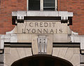
- Nomination Crédit Lyonnais building, Paris --Remi Mathis 13:44, 29 March 2011 (UTC)
- Promotion Good quality. --Carschten 18:16, 29 March 2011 (UTC)
-

-

- Nomination Grenzach-Wyhlen: Church of Peace --Taxiarchos228 08:14, 28 March 2011 (UTC)
- Promotion Very sharp and otherwise also good. Why are the camera data missing? Please add geotag. --Cayambe 08:08, 30 March 2011 (UTC)
there is no EXIF because this is a panorama/HDR, object location added --Taxiarchos228 08:50, 30 March 2011 (UTC)
-
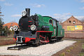
-

- Nomination Landscape of Laruns, France --France64160 15:48, 27 March 2011 (UTC)
- Decline Noisy and JPEG artifacts, although impressive for a cameraphone --D4m1en 15:16, 29 March 2011 (UTC)
-

- Nomination Pintano, Spain --France64160 15:48, 27 March 2011 (UTC)
- Decline Noisy and JPEG artifacts, specifically in sky, although impressive for a cameraphone --D4m1en 15:16, 29 March 2011 (UTC)
-

- Nomination Queen of the Franks Bertha Broadfoot, Château de Versailles --Jebulon 23:10, 26 March 2011 (UTC)
- Promotion A little pale because of the subject but good picture Remi Mathis 15:47, 29 March 2011 (UTC)
-
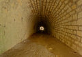
- Nomination Inside the fort Lachaux, near Montbéliard, France. --ComputerHotline 13:32, 26 March 2011 (UTC)
- Promotion Good. --Cayambe 08:11, 30 March 2011 (UTC)
-

- Nomination Inside the fort Lachaux, near Montbéliard, France. --ComputerHotline 13:32, 26 March 2011 (UTC)
- Promotion Good quality. --Cayambe 08:14, 30 March 2011 (UTC)
-
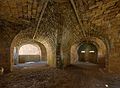
- Nomination Inside the fort Lachaux, near Montbéliard, France. --ComputerHotline 13:32, 26 March 2011 (UTC)
- Promotion Good quality. --Cayambe 08:14, 30 March 2011 (UTC)
-

- Nomination: Berne, Switzerland: cage tower (Käfigturm) --Taxiarchos228 08:18, 24 March 2011 (UTC)
- Review needed
-
- Nomination: Lomographic ActionSampler. --Lvova 07:32, 24 March 2011 (UTC)
- Review needed
-
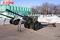
- Nomination: ZiS-3 at Mound of Glory. --Lvova 07:32, 24 March 2011 (UTC)
- Review needed
-

- Nomination Coat of arms of grand master Franz Ludwig von Pfalz-Neuburg. --Lvova 07:32, 24 March 2011 (UTC)
- Promotion Nice symmetry, detail, color --Daniel Case 02:01, 27 March 2011 (UTC) Question Grand-Master of what, please ?--Jebulon 21:49, 28 March 2011 (UTC) Info Count Palatine Francis Louis of Neuburg, bishop of Breslau since 1683, archbishop of several dioceses, Hochmeister of the Teutonic Order (1694-1732). --Rave 09:23, 29 March 2011 (UTC) very interesting, thank you very much.--Jebulon 11:39, 30 March 2011 (UTC).
-
- Nomination: The part of monument of John of Nepomuk in Wrocław. --Lvova 07:32, 24 March 2011 (UTC)
- Review needed
-

- Nomination: Sculpture on the Soldier Tomb, Petra --Bgag 00:43, 24 March 2011 (UTC)
- Review needed
-

- Nomination: Church tower detail --Kozuch 21:34, 23 March 2011 (UTC)
- Review needed
-

-

- Nomination Lenin memorial, Gorki village, Pereslavl district.--PereslavlFoto 16:00, 23 March 2011 (UTC)
- Promotion Good quality. --Cayambe 08:17, 30 March 2011 (UTC)
-

- Nomination: Beach in Stobreč, Croatia --Pudelek 14:31, 23 March 2011 (UTC)
- Review needed
-
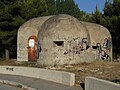
- Nomination: Bunker in Stobreč, Croatia --Pudelek 14:31, 23 March 2011 (UTC)
- Review needed
-

- Nomination: Lörrach: protestant church in Rötteln --Taxiarchos228 12:06, 23 March 2011 (UTC)
- Review needed
-

- Nomination Inzlingen, Germany: bell tower of catholic church --Taxiarchos228 07:32, 23 March 2011 (UTC)
- Promotion OK Remi Mathis 15:42, 29 March 2011 (UTC)
-

-

- Nomination Rheinfelden: bell tower of Saint Felix and Regula --Taxiarchos228 09:50, 22 March 2011 (UTC)
- Promotion Good quality Remi Mathis 15:37, 29 March 2011 (UTC)
-

-

- Nomination: Split, Croatia - detail of ancient Roman relief --Pudelek 16:12, 16 March 2011 (UTC)
- Review f 3,1 produces DOF problems here --Mbdortmund 22:38, 23 March 2011 (UTC)


.jpg)


.jpg)


_002.jpg)
_003.jpg)
_004.jpg)


_010.JPG)
_016.JPG)


_005.jpg)


.JPG)


.JPG)


_005.jpg)
.jpg)


_008.jpg)


_001.jpg)

_005.jpg)
_006.jpg)


.jpg)


_007.jpg)


.JPG)


_014.jpg)


.JPG)


.jpg)


.jpg)


_002.jpg)


_009.JPG)


_005.JPG)


_006.jpg)

.jpg)


.jpg)
_-_ulica_N%C3%A1dra%C5%BEn%C3%AD.jpg)


_011.jpg)


_003.jpg)


_showing_clonal_plantlets_in_gemma_cups.jpg)


.jpg)
_03.jpg)


.JPG)
_-_gymn%C3%A1zium.jpg)
_-_main_statue.JPG)


.jpg)


_001.jpg)


_-_radnice.jpg)


.jpg)
_-_houses.jpg)


.JPG)


_-_houses_on_market_place_and_fountain.JPG)


.jpg)


.jpg)


.jpg)
.jpg)


.JPG)


.jpg)
.jpg)


.jpg)


.jpg)


![* Nomination View at harbour of Lunenburg, Canada --Taxiarchos228 15:17, 27 March 2011 (UTC) * Promotion geocode would be nice --Mbdortmund 12:36, 28 March 2011 (UTC) done --Taxiarchos228 07:06, 1 April 2011 (UTC) Good quality. --Mbdortmund 06:03, 5 April 2011 (UTC) Sorry, but looks oversaturated to me. --Quartl 08:29, 7 April 2011 (UTC) but it is not indeed, buildings in Lunenburg have strong coulours, especially when sun is shining --Taxiarchos228 08:31, 7 April 2011 (UTC) If you compare other images [1], most have more subdued colors, also in bright sunlight. --Quartl 08:44, 7 April 2011 (UTC) After discussion ok. --Quartl 09:44, 7 April 2011 (UTC)](/wiki/File:Lunenburg_-_NS_-_Lunenburg_Hafen2.jpg)


.jpg)


_2.jpg)


_pipes_2.JPG)


.jpg)


_Saint_Etienne_du_Mont.jpg)


._Arche.JPG)


_2.JPG)


.JPG)
.JPG)


.jpg)


_vue_3.JPG)


.jpg)


Consensual review edit
File:Moon Marki 19032011 2.JPG edit

- Nomination Full Moon through clouds from Marki, Poland. --Crusier 08:35, 20 March 2011 (UTC)
- Decline Support Nice. --Mattbuck 12:20, 25 March 2011 (UTC) Comment In the sky you'll see several red dots and one purple dot. What are they? --Makele-90 22:37, 26 March 2011 (UTC) Info Hot pixels, I fixed it. Check now. --Crusier 13:09, 27 March 2011 (UTC)
- Oppose Too much darkness, too small. --Yikrazuul 14:12, 27 March 2011 (UTC)
- Oppose As Yikrazuul. To me, poor quality--Lmbuga 01:07, 28 March 2011 (UTC)
File:Monument aux morts de Castetner .JPG edit

- Nomination Castetner War memorial, France --France64160 14:18, 29 March 2011 (UTC)
- Decline house cutted off at right --Carschten 18:16, 29 March 2011 (UTC) Done fixed --France64160 19:46, 29 March 2011 (UTC)
- Oppose Wire shadow on the monument, tight crop of the building.--Jebulon 22:07, 30 March 2011 (UTC)
File:Miracle des billettes Saint etienne du Mont.jpg edit

- Nomination Early 17th century stained glass window in church Saint-Etienne du Mont, Paris.--Jebulon 21:26, 28 March 2011 (UTC)
- Promotion Seems to suffer from the same CA problems as your previous (withdrawn) nomination, especially visible at the bottom sections. Qiqritiq 06:41, 29 March 2011 (UTC) Support QI for me --Archaeodontosaurus 12:08, 29 March 2011 (UTC)
I'm sorry but the bottom sections were especially very carefully reworked...--Jebulon 19:35, 29 March 2011 (UTC)
That's a pity, it seems to be a difficult object to make picture of without disturbing CA. Qiqritiq 21:37, 30 March 2011 (UTC)
- Question In way to improve, could you please annotate CA ? Thank you --Jebulon 22:05, 30 March 2011 (UTC)
- Support I don't see any CA. Very nice, QI to me. --Avenue 22:30, 30 March 2011 (UTC)
File:Autre vue du lavoir Tramezaïgues.jpg edit

- Nomination Wash, Tramezaïgues, France --France64160 15:48, 27 March 2011 (UTC)
- Decline good and useful --Mbdortmund 11:54, 29 March 2011 (UTC)
Sorry I disagree, in my opinion too low quality for QI, because of JPEG compression artifacts, notably in overhead wires. --D4m1en 15:16, 29 March 2011 (UTC)
- Oppose + Bad composition: to tight crop at right.--Jebulon 22:04, 30 March 2011 (UTC)
File:Scutalus_alauda_01.JPG edit

- Nomination Shell of a Peruvian land snail, Scutalus alauda --Llez 21:57, 28 March 2011 (UTC)
- Promotion
- OpposeUnfortunately not sharp. Qiqritiq 06:42, 29 March 2011 (UTC)
- Support Insufficient for FP, but enough to QI, for this definition. --Archaeodontosaurus 10:33, 29 March 2011 (UTC)
- Support For me a QI Holleday 16:44, 30 March 2011 (UTC)
File:Parasol-macrolepiota procera.jpg edit

- Nomination Macrolepiota procera (Growth-7 days) --Holleday 19:01, 26 March 2011 (UTC)
- Promotion Support good --Villy Fink Isaksen 19:06, 26 March 2011 (UTC)
Support Very good, I suggest going to VA --Archaeodontosaurus 15:35, 28 March 2011 (UTC) - Support Very good QI. --David Perez 14:15, 29 March 2011 (UTC) Support Good --Llez 16:42, 29 March 2011 (UTC) Question Who is User null??? Must be checked! Has he the right to vote? --Llez (talk) 16:43, 29 March 2011 (UTC)
- That was me, something went awry with the java script. And don't be so paranoid, every logged in user can vote. Qiqritiq 18:08, 29 March 2011 (UTC)
File:Bagatelle Paris cascade.jpg edit

- Nomination Cascade in the park of Bagatelle, Paris, France. --Myrabella 07:54, 26 March 2011 (UTC)
- Promotion Support some minor CA, but overall very good --Carschten 10:54, 26 March 2011 (UTC) Oppose Sorry, but I find the CA quite bothersome. --Jovianeye 17:23, 27 March 2011 (UTC)
- Support Its better now. --Jovianeye 20:55, 31 March 2011 (UTC)
- Support Per Carschten.--Jebulon 21:46, 28 March 2011 (UTC)
- Support Good QI. --David Perez 06:45, 30 March 2011 (UTC)
- Support Good quality Remi Mathis 06:50, 30 March 2011 (UTC)
File:Николай_II_-_Государь_в_тужурке_._Серов_В.А..jpg edit

- Nomination Nicolaus II. Portret by Serov --Vitold Muratov 18:36, 26 March 2011 (UTC)
- Decline Support Good. --Jovianeye 18:45, 26 March 2011 (UTC)
Fails the COM:QIC#Creator requirement. A.Savin 07:25, 27 March 2011 (UTC)
"Photographical reproductions of two-dimensional works of art, made by Wikimedians, are eligible" - I dont see any issues. --Jovianeye 17:19, 27 March 2011 (UTC)
![]() Comment It is impossible to understand the data of the image. I am against while they are not more intelligible (I can understand several languages)--Lmbuga 00:18, 28 March 2011 (UTC)
Comment It is impossible to understand the data of the image. I am against while they are not more intelligible (I can understand several languages)--Lmbuga 00:18, 28 March 2011 (UTC) ![]() Oppose see above (¿can you translate the data to es, gl, pt, en, fr, it, ro, ca or other language than I can, easily, translate with a automatic translator? Which is the language of the image?--Miguel Bugallo 00:22, 28 March 2011 (UTC)
Oppose see above (¿can you translate the data to es, gl, pt, en, fr, it, ro, ca or other language than I can, easily, translate with a automatic translator? Which is the language of the image?--Miguel Bugallo 00:22, 28 March 2011 (UTC)
![]() Comment Valentin Alexandrovich Serov: January 19, 1865 - December 5, 1911. I don't know why
Comment Valentin Alexandrovich Serov: January 19, 1865 - December 5, 1911. I don't know why |Date=1913, but Serov's works is in public domain. Lvova 12:34, 28 March 2011 (UTC)![]() Comment The language of the image is Russian. (That is so frequent in use as Spain language).But the data is wrong.This picture was made earlier December 5,1911.Vitold Muratov 23.13, 28 March 2011 (UTC)
Comment The language of the image is Russian. (That is so frequent in use as Spain language).But the data is wrong.This picture was made earlier December 5,1911.Vitold Muratov 23.13, 28 March 2011 (UTC)![]() Comment Ok. So the data in the sourcebook is wrong. I tried to find a date: my version is 1900-1904, 1900 is more possible (see descripiton page). The paint in public domain, so I'm think that promote, but if Vitold Muratov'll help with the date, it would be better then my description. Lvova 20:58, 29 March 2011 (UTC)
Comment Ok. So the data in the sourcebook is wrong. I tried to find a date: my version is 1900-1904, 1900 is more possible (see descripiton page). The paint in public domain, so I'm think that promote, but if Vitold Muratov'll help with the date, it would be better then my description. Lvova 20:58, 29 March 2011 (UTC)
![]() Oppose Looking for "Guidelines" on QIC page I see the Creator section. It states: "Pictures must have been created by a Wikimedian in order to be eligible for QI status. ... Photographical reproductions of two-dimensional works of art, made by Wikimedians, are eligible." But this image is not made by Wikimedian, it is done by some other photographer.--PereslavlFoto 21:23, 29 March 2011 (UTC)
Oppose Looking for "Guidelines" on QIC page I see the Creator section. It states: "Pictures must have been created by a Wikimedian in order to be eligible for QI status. ... Photographical reproductions of two-dimensional works of art, made by Wikimedians, are eligible." But this image is not made by Wikimedian, it is done by some other photographer.--PereslavlFoto 21:23, 29 March 2011 (UTC)
File:Euro-manifestation - Brussels - 24-03-2011 (17).jpg edit
.jpg)
- Nomination Policeman and water canon during a demonstration in Brussels --M0tty 23:08, 24 March 2011 (UTC)
- Decline
- Oppose Overexposed. --Mattbuck 17:54, 25 March 2011 (UTC)
- The policemans and water canon are not overexposed. The background is overexposed, but it's not the subject. --M0tty 21:34, 25 March 2011 (UTC)
- QI is about technical quality and this fails at being a technically good photo due to the large amount of overexposure. Mattbuck 22:56, 25 March 2011 (UTC)
- Oppose --per Mattbuck. --Elekhh 03:01, 30 March 2011 (UTC)
File:Euston railway station MMB 16 350247.jpg edit

- Nomination 350247 at Euston. Mattbuck 12:57, 23 March 2011 (UTC)
- Decline A little confusing... I think --Tyw7 22:38, 24 March 2011 (UTC)
How do you mean? Mattbuck 12:16, 25 March 2011 (UTC)
Like the rail line. Anyways, I will switch to discussion if you want. --Tyw7 23:20, 25 March 2011 (UTC) - Oppose A few compositional shortfalls, perhaps none fatal on the their own, but they add up. Probably too much lead room, definitely too much head room, and the post in front of the train is distracting. --Avenue 10:28, 31 March 2011 (UTC)
File:Grantham MMB 03 Nottingham to Grantham Line 158774.jpg edit

- Nomination: Maker's mark on a double-glazed window. Mattbuck 04:23, 4 March 2011 (UTC)
- Review Comment Is this free to use, or is it classed as a deriviate of a logo? --V-wolf 04:25, 4 March 2011 (UTC)
I hadn't thought of that, the logo could very well be PD-ineligible, or PD-old, I think it's a British Standards mark. Mattbuck 07:15, 10 March 2011 (UTC)
If you're still unsure, DR it. Mattbuck 09:24, 18 March 2011 (UTC) I was hoping someone here among all the pros could give an answer and review the picture. --V-wolf 13:37, 18 March 2011 (UTC)
File:2010-09-07-pilze-by-RalfR-20.jpg edit

- Nomination eine junge "Braunkappe" --Ralf Roletschek 12:26, 14 March 2011 (UTC)
- Decline
- Support Good --Jebulon 10:53, 19 March 2011 (UTC)
- Oppose Not. Insufficient DOF, to little detail. Camera issue? --Qiqritiq 13:15, 20 March 2011 (UTC)
- Support --Mbdortmund 21:42, 21 March 2011 (UTC)
- Oppose Noised and oversaturated, sorry -- George Chernilevsky 09:40, 22 March 2011 (UTC)
- Comment I like the composition, but for a stationary object I would have used a slower shutter speed which would have allowed a lower ISO setting (less noise) , and a larger f stop number (deeper depth of field). --Tony Wills 09:07, 26 March 2011 (UTC)
- Oppose I'm sorry, I agree with Qiqritiq, George Chernilevsky and Tony Wills, very little DOF and noise, but not especially from the ISO but from the global composition. Next time, you should lower the shutter speed and increasing f values of 8 or higher. --DPC (talk) 07:18, 31 March 2011 (UTC)
File:Sofia Synagogue 11c.jpg edit

- Nomination Sofia Synagogue east elevation. --MrPanyGoff 22:16, 22 March 2011 (UTC)
- Promotion
- Oppose Blown highlights at top center --Daniel Case 01:58, 27 March 2011 (UTC)
- Blown highlights cannot be seen here, give another reason for opposition, please.--MrPanyGoff 18:19, 27 March 2011 (UTC).
- Support Seems OK to me Remi Mathis 07:55, 30 March 2011 (UTC)
- Support --Jebulon 22:02, 30 March 2011 (UTC)
- I think that the above calculation is not correct.--MrPanyGoff 10:27, 31 March 2011 (UTC)
- Don't worry too much about that, formatting and sum are always corrected before closure, but I fixed it for now. --Elekhh 20:27, 31 March 2011 (UTC)
File:Arvicola sapidus 02 by-dpc.jpg edit

- Nomination Southwestern Water Vole (Arvicola sapidus), León (Spain). --David Perez 16:52, 28 March 2011 (UTC)
- Promotion
- Support some CA but imo acceptable --Mbdortmund 21:13, 28 March 2011 (UTC)
- Oppose Too much CA, especially on the vole, which matters. Qiqritiq 21:22, 28 March 2011 (UTC)
- Comment CA corrected, imo. --David Perez 10:47, 30 March 2011 (UTC)
- Support For me a Ql and usefull Holleday 16:42, 30 March 2011 (UTC)
- Support Very nice composition, good quality, and useful indeed. Cookie 17:59, 30 March 2011 (UTC)
- Support Much improved. How did you do it? Qiqritiq 21:32, 30 March 2011 (UTC)
- Support --MarisaLR 13:03, 31 March 2011 (UTC)
- Support Congratulation for the correction --Archaeodontosaurus 15:39, 31 March 2011 (UTC)
File:Col de Labays8.jpg edit

- Nomination Cows at the Col de Labays, France --France64160 15:48, 27 March 2011 (UTC)
- Decline
- Supportyes, no FP quality, but I like it and it's imo good enough for QI --Carschten 16:33, 27 March 2011 (UTC)
- Comment QI is not for second rate FPs. FP usually requires images to be of a QI standard but also having some "wow" factor that makes them stand out. --Tony Wills 21:31, 30 March 2011 (UTC)
- OpposeI like it too, but the technical side is insufficient for a QI: too many compression/camera artifacts. Qiqritiq 06:50, 29 March 2011 (UTC)
- Oppose Agree with Qiqritiq. But I regret because it lacks little technically to make it good. --Archaeodontosaurus 15:43, 31 March 2011 (UTC)
File:Louis XIV Versailles Cartellier Petitot Crozatier.jpg edit

- Nomination Louis XIV. Versailles.--Jebulon 23:23, 23 March 2011 (UTC)
- Promotion
- SupportTrès bien découpé. --Cayambe 20:46, 24 March 2011 (UTC)
- Oppose Sorry, but do you really think that this is QI? Upper part of statue is not sharp and disturbing white background. I do not agree with QI status. --Chmee2 10:09, 25 March 2011 (UTC)
- Comment do you really think that this is QI? Yes, the first reviewer thought so, obviously. Maybe he his wrong, maybe not, but I think he is nor blind neither stupid... It should be better to avoid comments of comments...--Jebulon 17:11, 25 March 2011 (UTC)
- Support Per Cayambe --Llez 21:29, 25 March 2011 (UTC)
- Support This picture is not perfect but it's better than many images promoted here --Croucrou 23:43, 25 March 2011 (UTC)
- Oppose I dont like the white mask used. It's not pleasant on the eyes. Perhaps you should change the colour of the mask.--Jovianeye 03:06, 26 March 2011 (UTC)
 Neutral Jovianeye 21:31, 26 March 2011 (UTC)
- Comment Sorry my friends, but there is no mask here, neither " cut", but only the natural color of the sky over Versailles this day !! Thanks for reviews, but It may change many votes...--Jebulon 21:04, 26 March 2011 (UTC)
- Support Qiqritiq 21:20, 28 March 2011 (UTC)
- Support Good quality considering the lighting, which I agree creates a harsh contrast. Slightly tilted CCW; QI to me nonetheless. BTW, I learnt a little something new here - I wasn't aware that horseshoes could have studs. --Avenue 10:20, 31 March 2011 (UTC)
- Comment Thank you. Yes they have. Now (today), Parade horses (Régiment de Cavalerie de la Garde Républicaine in France, for example) or Police horses have some, for they have to work and walk on "urban" slippery grounds.--Jebulon 22:05, 31 March 2011 (UTC)
File:Blancpain Endurance Series - BMW Z4 - 022.jpg edit

- Nomination BMW Z4--Thesupermat 13:31, 13 March 2011 (UTC)
- Promotion
- Oppose Tilted --Jovianeye 02:37, 17 March 2011 (UTC)
- C'est volontaire--Thesupermat 12:34, 17 March 2011 (UTC)
- Support That sort of thing is common in motorsport photography. Apart from the tilt there's nothing wrong. Mattbuck 11:39, 20 March 2011 (UTC)
- Support Per Mattbuck. En la matière, le choix esthétique du photographe me parait devoir être respecté. Technically good (maybe crop a bit tight right nevertheless...)--Jebulon 09:31, 23 March 2011 (UTC)
- Oppose tilt and upright format are imho not appropriate for wikipedia. --Berthold Werner 10:13, 24 March 2011 (UTC)
- Oppose Tilted. --Yikrazuul 18:50, 26 March 2011 (UTC)
- Oppose Tilted.--Lmbuga 00:39, 28 March 2011 (UTC)
- All votes under this line are given after the maximum CR time period of 8 days and are thus void, I'm very sorry. --Carschten 12:24, 31 March 2011 (UTC)
- Support Of course, it's tilted but on purpose, to make a great composition! And the picture is technically good. Remi Mathis 14:36, 29 March 2011 (UTC)
- Support technically good; Commons no is Wikipedia, its usuable for other projects. --Ralf Roletschek (talk) 04:19, 30 March 2011 (UTC)
- Support Good DOF and composition. Inisheer 15:18, 30 March 2011 (UTC)
- Support Tilt on purpose, technically fine. Qiqritiq 21:43, 30 March 2011 (UTC)
- Support per Jebulon and Remi Mathis. --Avenue 10:37, 31 March 2011 (UTC)
- Reopen under rules stating closure after a minimum period of 48 hours since the last entry. Mattbuck 17:30, 31 March 2011 (UTC)
- Yeah, the minimum period of a CR is 48 hours (always after last entry), but the final maximum period is 8 day (independent of the last entry). So IMO the voting period is over. --Carschten 19:59, 31 March 2011 (UTC)
- Info The 8 day thing was just added as a timeout for when no decision can be made and there is no on going discussion. The basic idea is to try and reach a decision and keep it open so long as comments/votes are coming in at a rate of at least one every two days. But if it is obvious that there is no discussion or a draw, then to close it after 8 days. Discussion can continue forever if further comments or votes are coming in until there is a break for at least 2 days. If there is a break for at least two days, and a decision can be made, then the entry can be closed - but it doesn't have to be closed at that point, but it can be if desired. There is no point in closing an entry without a decision as the image can simply be re-submitted, might as well strive for a decision when we can. --Tony Wills 22:53, 31 March 2011 (UTC)
- Yeah, the minimum period of a CR is 48 hours (always after last entry), but the final maximum period is 8 day (independent of the last entry). So IMO the voting period is over. --Carschten 19:59, 31 March 2011 (UTC)
- Reopen under rules stating closure after a minimum period of 48 hours since the last entry. Mattbuck 17:30, 31 March 2011 (UTC)
File:Inzlingen - Katholische Kirche2.jpg edit

- Nomination Inzlingen, Germany: catholic church --Taxiarchos228 07:32, 23 March 2011 (UTC)
- Withdrawn
- Support Nice composition ; technically good Remi Mathis 15:42, 29 March 2011 (UTC)
- Oppose Errors in the top left corner (tree, roff - see image) - maybe bad retouching? --Tlusťa 22:04, 30 March 2011 (UTC)
- Oppose Stitching errors -- Smial 15:55, 4 April 2011 (UTC)
![]() I withdraw my nomination --Taxiarchos228 07:21, 5 April 2011 (UTC)
I withdraw my nomination --Taxiarchos228 07:21, 5 April 2011 (UTC)
File:Guildford MMB 03 University of Surrey.jpg edit

- Nomination University of Surrey stag statue (renom after CR timeout). Mattbuck 21:53, 22 March 2011 (UTC)
- Decline
- Oppose Previous discussion here. I disagree with the legalistic closure previously, as stated in other occasions. Nevertheless, if it is reopened my opinion regarding the qualities of the image remains. --Elekhh 22:30, 22 March 2011 (UTC)
- But it was not promoted and the closure was correct. Please use discussion page instead. --Mbdortmund 22:37, 23 March 2011 (UTC)
- Comment The idea of CR is to get a decision, closing off the nomination without a decision was pointless when there were in fact subsequent votes that came to a conclusion. As it was closed without a decision it can of course be re-nominated. Normally if there is no decision it is because it is marginal, or uninteresting, so no great point in re-nominating. But in this case there was actually sufficient votes for a decision, the no-decision closure was unnecessary, and just necessitates this re-nomination. I hope all those who voted originally will vote again, in a timely fashion this time :-) --Tony Wills 21:57, 25 March 2011 (UTC)
- Support again... --Carschten 09:35, 26 March 2011 (UTC)
- Oppose For me, the people in front is disturbing. --Bgag 14:47, 30 March 2011 (UTC)
- Oppose Same opinion, the person should have been removed --Archaeodontosaurus 14:40, 1 April 2011 (UTC)
File:AKW Biblis 05.jpg edit

- Nomination Biblis Nuclear Power Plant (Germany), cooling towers and core from block A seen from North-West --PS-2507 09:07, 3 April 2011 (UTC)
- Decline
- Oppose IMHO bad composition, what is main object power plant, or water?; overexposed at cooling tower --Jagro 13:31, 3 April 2011 (UTC)
- Support Water is needing for cooling, so it should be of course a part in the composition. The small blown out parts aren't disturbing and because of sun almost inevitable. The quality is very good and it's a picture with high EV about a current much-debated topic --Carschten 17:08, 3 April 2011 (UTC)
- Oppose - good composition, but unsharp at the left side and crop a bit too tight. -- Felix Koenig 19:26, 4 April 2011 (UTC)
File:Notre-Dame Seine Pont.jpg edit

- Nomination Notre-Dame de Paris, this 2 april 2011, morning.--Jebulon 17:55, 2 April 2011 (UTC)
- Promotion
- Nice view but perspective should be corrected --Mbdortmund 18:56, 2 April 2011 (UTC)
- Thank you. It was ! What is wrong, please ?--Jebulon 22:58, 2 April 2011 (UTC)
- Support ok imho. Vielleicht eine optische Täuschung durch die Diagnale? --Berthold Werner 13:04, 3 April 2011 (UTC)
- I think I know what Mbdortmund means, I made image annotations. The composition is nice, but the quality isn't very good, too: the image is soft and there are hard chromatic aberrations (visible already at 100%, conspicuous at above 300%/400%). Should be discussed imo, sorry... --Carschten 17:37, 3 April 2011 (UTC)
- Danke alle ! Ich bin gar nicht einverstanden mit perspektive problemen, alles ist gut für mich. Please notice that the bridge is not strictly perpendicular to the point of view. But I agree with you regarding the CA (not so biiiig !), and I'll correct this soon. Merci pour ces revues germaniques !--Jebulon 17:53, 3 April 2011 (UTC)
- I think I know what Mbdortmund means, I made image annotations. The composition is nice, but the quality isn't very good, too: the image is soft and there are hard
- Support convinced by Jebulons annotation --Mbdortmund 19:21, 3 April 2011 (UTC)
File:2009-11-28-fahrradmesse-by-RalfR-13.jpg edit

- Nomination Hub Dynamo --Ralf Roletschek 18:47, 1 April 2011 (UTC)
- Promotion CA red and blue in the left part, unsharp in nearest part.--PereslavlFoto 18:56, 1 April 2011 (UTC)
- Support Can't see any visible or disturbing CA and it is sharp where it matters. --Niabot 20:29, 1 April 2011 (UTC)
- Support I feel the same: there is no technical problem in the photograph. However the caption is too much reduced. It lacks the size of the constructor's name ...--Archaeodontosaurus 06:25, 2 April 2011 (UTC)
- Support per Niabot --Carschten 15:36, 2 April 2011 (UTC)
- Oppose Support No useful description. Keine sinnvolle Beschreibung. Gerne pro, wenn das repariert ist. -- Smial 15:50, 4 April 2011 (UTC)
- ok, wenn du Recht hast... ;) --Ralf Roletschek 16:56, 4 April 2011 (UTC)
File:Paysage depuis Castetner vue 2.JPG edit

- Nomination Point of view from Castetner, France --France64160 14:18, 29 March 2011 (UTC)
- Decline
- Too much empty sky. Rule of thirds...--Jebulon 23:39, 29 March 2011 (UTC)
- Done fixed --France64160 14:05, 30 March 2011 (UTC)
- Bien meilleur. Merci. Tu aurais pu/du garder les couleurs originales. Mais maintenant ça penche !!.--Jebulon 22:30, 30 March 2011 (UTC)
- Oppose Lots of compression artefacts. Wetenschatje 22:06, 4 April 2011 (UTC)
File:Grenzach_-_Rathaus.jpg edit

- Nomination Grenzach: City hall --Taxiarchos228 12:36, 3 April 2011 (UTC)
- Promotion
- Support --AFBorchert 20:45, 3 April 2011 (UTC)
- Oppose vertical distortion --Tlusťa 07:09, 4 April 2011 (UTC)
- There is no vertical distortion --Taxiarchos228 07:17, 4 April 2011 (UTC
{{o}} Per Tlusťa--Lmbuga 15:03, 4 April 2011 (UTC)
- Support Ok. No vertical distortion, perhaps a little horizontal distortion (correction of vertical distorion), but good --Lmbuga 18:15, 4 April 2011 (UTC)
- Support Ok to me. --Cayambe 19:41, 5 April 2011 (UTC)
File:SeagullBansin7.jpg edit

- Nomination A young gull (Larus argentatus (immature)) --BennyJ 14:51, 31 March 2011 (UTC)
- Promotion
- Too much (oversharpened) noise, a halo around the head and too harsh lighting. Dunno how you made so much noise at ISO 100... --Grand-Duc 15:04, 31 March 2011 (UTC)
- OK, I'll try to fix the sharpening later. Noise seems ok to me though, but I'll apply some filtering for that as well. --BennyJ 15:18, 31 March 2011 (UTC)
- Done Problems fixed, thanks for your help @Grand-Duc --BennyJ 07:25, 3 April 2011 (UTC)
- Support It seems to be OK by now. Grand-Duc 00:57, 6 April 2011 (UTC)
- Comment I would love to see the original (non photoshopped) image straight from the camera, could you perhaps upload it as a separate file? --Tony Wills 11:08, 6 April 2011 (UTC)
- There is none. I shoot in RAW only so there is no original image and every image gets "photoshopped" to some extent. The older version can be found in the history. However, the differences are rather subtil (a bit darker, more noise, too much sharpness). --BennyJ 11:44, 6 April 2011 (UTC)
- Isn't there any small JPEG preview image in the RAW file that could serve this purpose? Regards, Grand-Duc 11:51, 6 April 2011 (UTC)
- There is none. I shoot in RAW only so there is no original image and every image gets "photoshopped" to some extent. The older version can be found in the history. However, the differences are rather subtil (a bit darker, more noise, too much sharpness). --BennyJ 11:44, 6 April 2011 (UTC)
- I dont keep the RAW anyway cause I convert everything to DNG. The DNG contains a preview but as far as I know it's created by the converter using default settings (or gets overwritten once you change something in CR). At least it doesn't look like the JPEGs that would come straight from the camera. Aside from that, I don't see what this should be useful for after all, since it would just be another (and usually worse) way of interpreting the RAW. --BennyJ 12:09, 6 April 2011 (UTC)
- The original uploaded image shows photoshop in the EXIF data, the image background exhibits a sort of criss-cross pattern characteristic of some sharpening/smoothing processing. I am wondering how much this processing has affected the definition of the feathers. I would have expected that a photo of this resolution from a good camera, at low ISO, would have shown much better definition of the feathers at full resolution. So could I see the image with default conversion straight from the DNG, or even the DNG file (you could email it)? --Tony Wills 21:31, 6 April 2011 (UTC)
- It shows Photoshop in the EXIF cause I use CR as my RAW(DNG)-to-RGB-converter which is, of course, a Photoshop plugin. So the resulting JPEG image (original version) has been saved - but not processed - by Photoshop. I don't wanna hand out the DNG actually, sorry. But you can trust me: I'm not interested in making things look worse than they need to :) The image wasn't shot under perfect conditions and the lens isn't so great either, so I'm sorry if the quality does not meet your expectations as to what a 60D image should look like. Next time I'll pay more attention and avoid some little mistakes I did on this one. --BennyJ 22:18, 6 April 2011 (UTC)
- The original uploaded image shows photoshop in the EXIF data, the image background exhibits a sort of criss-cross pattern characteristic of some sharpening/smoothing processing. I am wondering how much this processing has affected the definition of the feathers. I would have expected that a photo of this resolution from a good camera, at low ISO, would have shown much better definition of the feathers at full resolution. So could I see the image with default conversion straight from the DNG, or even the DNG file (you could email it)? --Tony Wills 21:31, 6 April 2011 (UTC)
- I dont keep the RAW anyway cause I convert everything to DNG. The DNG contains a preview but as far as I know it's created by the converter using default settings (or gets overwritten once you change something in CR). At least it doesn't look like the JPEGs that would come straight from the camera. Aside from that, I don't see what this should be useful for after all, since it would just be another (and usually worse) way of interpreting the RAW. --BennyJ 12:09, 6 April 2011 (UTC)
- Support little CA at the edge of the bird, but for QI it is okay. nevertheless I would scale the image down (66 % of original size): (1) it is enough resulution (2) the little technical problems are not as good visible --Taxiarchos228 12:22, 6 April 2011 (UTC)
File:Sergey Lukyanenko MOW 03-2011.jpg edit

- Nomination Russian sci-fi writer Sergey Lukyanenko. A.Savin 15:27, 27 March 2011 (UTC)
- Promotion
- Support Good quality. --Taxiarchos228 15:39, 27 March 2011 (UTC)
- I'm sure he hasn't red hair so the strong CAs at the hair of his occiput should be fixed. Otherwise very good. --Carschten 15:56, 27 March 2011 (UTC)
- Better version now? A.Savin 17:45, 27 March 2011 (UTC)
- yeah, it's a little bit better, but tehre's still the red fringe --Carschten 14:53, 29 March 2011 (UTC)
- @Carschten: de:Wikipedia:Fotowerkstatt#CA_von_einem_Porträt_entfernen - A.Savin 06:52, 1 April 2011 (UTC)
- Comment Hair CA fixed. If it weren't so good, just revert. --David Perez 09:41, 4 April 2011 (UTC)
- Support very good now --Carschten 13:10, 5 April 2011 (UTC)
- @Carschten: de:Wikipedia:Fotowerkstatt#CA_von_einem_Porträt_entfernen - A.Savin 06:52, 1 April 2011 (UTC)
- yeah, it's a little bit better, but tehre's still the red fringe --Carschten 14:53, 29 March 2011 (UTC)
- Better version now? A.Savin 17:45, 27 March 2011 (UTC)
- Support for me QI --Ralf Roletschek 05:16, 30 March 2011 (UTC)
File:Gleitschirmflieger qtl1.jpg edit

- Nomination Paraglider closeup. --Quartl 17:52, 4 April 2011 (UTC)
- Promotion
- Support Good quality. --Carschten 18:01, 4 April 2011 (UTC)
- Comment I tried to remove the halo - better now? --Quartl 21:06, 5 April 2011 (UTC)
- Support looks good now --BennyJ 11:23, 6 April 2011 (UTC)
File:Gorki 5470.jpg edit

- Nomination Walkway to the museum «Ganshin Manor», Gorki village. --PereslavlFoto 21:38, 24 March 2011 (UTC)
- Decline
- overexposed --Carschten 08:25, 2 April 2011 (UTC)
- What place is 255,255,255 bright white colour?--PereslavlFoto 16:59, 2 April 2011 (UTC)
- Where did I write something about blown out places? --Carschten 09:16, 3 April 2011 (UTC)
- What is overexposed then? The whole picture looks too bright for you? Well, as for me, it is not too bright, and some spots in the picture are even too dark... Hope to get others' thoughts.--PereslavlFoto 14:02, 3 April 2011 (UTC)
- Thank you for the comment in picture. This is a Sun, its light cannot be managed. The exposition is corrected to show the whole picture, so the sun-beamed places are brighter. Still there is no overexposition, all colours and details are clearly visible. And the tree is bright yellow because of Autumn time.--PereslavlFoto 13:13, 5 April 2011 (UTC)
- Where did I write something about blown out places? --Carschten 09:16, 3 April 2011 (UTC)
- Oppose Parts of the plants are unsharp, perhaps motion blur. --Mbdortmund 16:06, 8 April 2011 (UTC)
- Could you please make me an advice about how to stop the leaves from moving and the wind from blowing?--PereslavlFoto 16:19, 8 April 2011 (UTC)
- 1/40 Sek. is simply too long for this situation. --Mbdortmund 23:58, 8 April 2011 (UTC)
- Tripod used. The lightning conditions (dark clouds and sudden sun beams) did not allow to use shorter times with f/9 aperture for correct DOF. ISO 100 on canon 350d is the only possible setting to avoid any colour noise. And there was to aim to photo the leaves and branches; the aim was to photo the walkway in whole.--PereslavlFoto 08:56, 9 April 2011 (UTC)
- 1/40 Sek. is simply too long for this situation. --Mbdortmund 23:58, 8 April 2011 (UTC)
File:HH-110314-19808-Blohm-Voss.jpg edit

- Nomination Blohm+Voss Dock --Mbdortmund 19:27, 18 March 2011 (UTC)
- Promotion

levels adjusted - Support Good composition and fine "schietwetter"-(bad weather)photo --Alupus 20:23, 18 March 2011 (UTC) - and not underexposed for topic "bad weather" --Alupus (talk) 22:26, 19 March 2011 (UTC)
- Oppose underexposed --Carschten 11:57, 19 March 2011 (UTC) - and underexposed, no matter for which topic. --Carschten 19:34, 21 March 2011 (UTC)
- Info Looking at the histogram for the image, it is definitely under-exposed, I adjusted it using the levels tool in GIMP, and have posted the result above. It retains the "bad weather" mood. --Tony Wills (talk) 06:43, 23 March 2011 (UTC)
- Hab's mal aus dem Raw ein wenig verstellt. --Mbdortmund 19:30, 23 March 2011 (UTC)
- Oppose underexposed, as Carschten--Lmbuga 00:41, 28 March 2011 (UTC)

.jpg)
.jpg)
.JPG)
.png)
- All votes under this line are given after the maximum CR time period of 8 days and are thus void. --Carschten 12:11, 31 March 2011 (UTC)
- Support I think your new version shows technically ok exposure, personally I would probably tweek it a bit more to bring out the buildings --Tony Wills 22:32, 30 March 2011 (UTC)
- Reopen under rules stating closure after a minimum period of 48 hours since the last entry. Mattbuck 17:30, 31 March 2011 (UTC)
- Support Good new version. --David Perez 11:13, 1 April 2011 (UTC)
*{{opp}} Underexposed and not sharp enough. To me, at right, vertical distortion--Lmbuga 21:31, 4 April 2011 (UTC) I can't vote 2 times --Lmbuga 21:41, 4 April 2011 (UTC)
- Support es gibt nicht nur Sonnenschein --Ralf Roletschek 17:52, 5 April 2011 (UTC)
- Oppose Unsharp on the top of the photo. And too dark also.--PereslavlFoto 16:26, 8 April 2011 (UTC)
File:Town hall in Trogir.JPG edit

- Nomination Trogir - town hall --Pudelek 16:16, 30 March 2011 (UTC)
- Decline
- Oppose Tight crop.--PereslavlFoto 16:36, 30 March 2011 (UTC)
- geocoding is not required in QI --Pudelek 18:02, 30 March 2011 (UTC)
- GC is not required (and it is supplemented) --Tlusťa 9:57, 31 March 2011 (UTC)
- Support Nice view, minor CA, otherwise ok. -- Smial 15:53, 4 April 2011 (UTC)
- Oppose Crop. It is possible to get the whole left side of the building on the picture, see here. --Quartl 17:06, 8 April 2011 (UTC)
- Oppose Per Quartl--Lmbuga 18:33, 8 April 2011 (UTC)
- Oppose - I don't particularly think the cropping looks good. Sugar-Baby-Love 21:02, 10 April 2011 (UTC)
File:Bronze eagle from the german Reichskanzlei.jpg edit

- Nomination The famous Nazi Eagle that often stood behind Hitler --Tyw7 10:25, 11 April 2011 (UTC)
- Decline
- Oppose Background is (c) by Евгений Халдей; † 1997 - copyright violation --Ralf Roletschek 10:44, 11 April 2011 (UTC)
- What do you mean? I took the picture... --Tyw7 11:35, 11 April 2011 (UTC)
- Oppose Noisy, unsharp, bad exposure, heavy distortions. Sorry, I do not expect high end equipment for a QI, elaborated pix from compact cameras are ok. But this is not. -- Smial 14:23, 11 April 2011 (UTC)
- Oppose Per Smial--Lmbuga 17:10, 11 April 2011 (UTC)
- Oppose Not even worth to think about QI on this one. Really bad image. --BennyJ 14:51, 12 April 2011 (UTC)
- Oppose I agree with the above comments. Sugar-Baby-Love 19:48, 12 April 2011 (UTC)
File:Hauingen_-_Fasnachtsbrunnen.jpg edit

- Nomination Hauingen: carnival water well --Taxiarchos228 06:35, 8 April 2011 (UTC)
- Decline
- Oppose DOF is too shallow (whole wheel should have been in focus) and crop is too tight (whole basin should have been visible). Qiqritiq 07:20, 8 April 2011 (UTC)
- the whole wheel is in focus. --Taxiarchos228 07:23, 8 April 2011 (UTC)
- Support all ist sharp, lets discuss. --Ralf Roletschek 18:35, 8 April 2011 (UTC)
- OpposeComposition. The crop is too tight at right, sorry.--Jebulon 10:10, 11 April 2011 (UTC)
- Oppose Per others--Lmbuga 17:09, 11 April 2011 (UTC)
- Oppose Good composition, but tight crop (on the right side), wrong colours (red clouds), the wheel needs to be sharp.--PereslavlFoto 19:03, 11 April 2011 (UTC)
File:Male Anas platyrhynchos breeding plumage side portrait.jpg edit

- Nomination A portrait of a male of Anas platyrhynchos in breeding plumage. --Grand-Duc 14:33, 7 April 2011 (UTC)
- Decline
- Support stange crop, good quality --Carschten 16:12, 7 April 2011 (UTC)
- Oppose The composition is not good, since there is way too much headroom, please propose a different crop. --Quartl 17:02, 8 April 2011 (UTC)
- CommentDo you have any suggestion where I can place the cuts? I'm without a good clue at the moment. :-) Grand-Duc 14:26, 9 April 2011 (UTC)
- It is always a good idea to apply the rule of thirds. Currently, the eye is right in the center of the image. Cutting away 1/4 of the height of the image from the top would place the eye on the 1/3-line. Maybe also crop a bit from the left and the right to keep the aspect ratio. --Quartl (talk) 17:31, 9 April 2011 (UTC)
- At the moment of the shot, I thought about a horizontal composition, where there are three bands. The lower one find its limits by the horizontal line that could be drawn on the top of the back of the duck, the upper has a limit at the change of structure in the background. There should be also two eye guiding lines: the diagonals intersect approximately in the eye, the beak and the back of the head equally sit on them. I'll try a rule-of-the-third based crop later. Regards, Grand-Duc 10:07, 12 April 2011 (UTC)
- It is always a good idea to apply the rule of thirds. Currently, the eye is right in the center of the image. Cutting away 1/4 of the height of the image from the top would place the eye on the 1/3-line. Maybe also crop a bit from the left and the right to keep the aspect ratio. --Quartl (talk) 17:31, 9 April 2011 (UTC)
- Oppose Per Quartl--Lmbuga 14:06, 11 April 2011 (UTC)(UTC)
- Support It is a pretty standard compositional technique to place the eye on the vertical center line. -- King of Hearts 05:30, 15 April 2011 (UTC)
File:Sarcoscypha-jurana-kelchbecherling.jpg edit

- Nomination The rare Sarcoscypha jurana--Holleday 17:42, 5 April 2011 (UTC)
- Promotion
- Support I like the colours and the accentuation of the diagonal --Llez 17:50, 5 April 2011 (UTC)
- Support The previously blown-out part still doesn't show as much detail as other parts, but I think it's good enough. --Avenue 21:50, 10 April 2011 (UTC)
- Better now. --Quartl 19:19, 9 April 2011 (UTC)
- Support I can see real colors and textures of mushroom and moss around. Technically good. --David Perez 07:45, 9 April 2011 (UTC)
- Comment Hello, at the original picture I didn´t change the colours. Now you see a new version with a minimised red colour. What do you think about it? Many greetings--Holleday 16:11, 9 April 2011 (UTC)
- Support good --BennyJ 14:55, 12 April 2011 (UTC)
- Support What Llez said. Sugar-Baby-Love 19:50, 12 April 2011 (UTC)
File:Asperitas_inquinata_penidae_01.JPG edit

- Nomination Shell of an Indonesian land snail, Asperitas inquinata penidae --Llez 13:46, 3 April 2011 (UTC)
- Promotion
- Support Really sharp,
but perhaps (I'm not sure) chromatic aberrations. Probablyvery good--Lmbuga 14:19, 3 April 2011 (UTC)
- Sorry, now I think that the image is very good--Lmbuga 14:27, 3 April 2011 (UTC)
- Question Did you use stacking? Qiqritiq 07:34, 6 April 2011 (UTC)
- Info Yes, otherwise it is impossible to reach this DOF with f/5 (Diameter of the shell only 3,3 cm) --Llez 05:16, 7 April 2011 (UTC)
- Oppose It didn't exactly work out perfectly here: some shells are sharp on top, sharp on the bottom image, but blurry in the middle. Qiqritiq 07:09, 8 April 2011 (UTC)
- Support --Mbdortmund 15:28, 10 April 2011 (UTC)
- Support --Archaeodontosaurus 06:44, 12 April 2011 (UTC)
- Support Rather visually appealing. Sugar-Baby-Love 20:02, 12 April 2011 (UTC)
File:Minsk Metro in 2010 - Construction site on Dzerzhinsky avenue.jpg edit

- Nomination A subway construction site in Minsk. A.Savin 19:08, 12 April 2011 (UTC)
- Withdrawn Oversaturated. Could you tone it down just a little bit? -- King of Hearts 07:29, 15 April 2011 (UTC) Oppose prefer the original upload for colours/light, but the crane is cut off Gnangarra 08:49, 15 April 2011 (UTC) Oppose due to cropped crane -- Lokal_Profil 13:56, 15 April 2011 (UTC)
File:Rajpoots_2.png edit

- Nomination Rajpoots --Jovianeye 21:46, 12 April 2011 (UTC)
- Promotion
cannot be QI, becaUse not made by a wikipedian, if I'm not wrong.--Jebulon 22:05, 12 April 2011 (UTC)- It can be a QI. It is a scanned reproduction by a Commons User. The QI rule says "Photographical reproductions of two-dimensional works of art, made by Wikimedians, are eligible" --Jovianeye 00:11, 13 April 2011 (UTC)
- Support Excellent quality, horrible thumbnail! This is no less a Wikipedian's work than File:Résurrection Corneille cartouche central 2.jpg, for example. --Avenue 04:19, 13 April 2011 (UTC)
- I have to remove my technical opposition because it seems I was wrong. But the comparison between a two dimensional scan of a whole engraving (very fine work, indeed) and a photograph of a detail of a fresco vault is totally wrong too. Assuming good faith is sometimes very hard... I know it does not look like a personal attack, but it is, obviously, even if well done.--Jebulon (talk) 14:34, 13 April 2011 (UTC)
- I meant no offense, but it seems I have offended you. I'm sorry. Using your photo as an example was clearly not as clever as I thought. I'll also happily apologise if my analogy is incorrect. It still seems true to me, though. I think both images are meant to be accurate copies of an essentially two dimensional artwork, and both would be copyright violations if the artwork was younger. Yes, one used a scanner, the other a camera, but I don't see any real difference. --Avenue 16:56, 13 April 2011 (UTC)
File:Château de Versailles, salon de la paix, buste d'empereur romain (Othon).jpg edit
.jpg)
- Nomination Bust of roman emperor Otho, Versailles. --Coyau 07:20, 11 April 2011 (UTC)
- Decline
- Support Good.--Jebulon 21:32, 11 April 2011 (UTC)
- Oppose Light spot distracting. --Elekhh 05:58, 13 April 2011 (UTC)
- Oppose Yes, the lower left corner is too bright. --Avenue 13:47, 13 April 2011 (UTC)
File:Toronto_-_ON_-_CN_Tower_from_Harbor2.jpg edit

- Nomination Toronto: CN Tower --Taxiarchos228 14:14, 4 April 2011 (UTC)
- Decline
- Comment looks a bit ccw tilted to me --Carschten 18:05, 4 April 2011 (UTC)
- better? --Taxiarchos228 20:04, 5 April 2011 (UTC)
- Ja, es ist besser, aber Turm scheint immer noch nach links zu kippen... --Carschten 20:05, 8 April 2011 (UTC)
- Oppose As Carschten. I can't understand your words, but tilted. It is easily improvable--Lmbuga 17:32, 11 April 2011 (UTC)
- Support looks straight enough, see my notice on the file. --Mbdortmund 15:24, 12 April 2011 (UTC)
- Comment It seems well to me that you see it different. Your note demonstrates for me that it is tilted. To me it's impossibel "enough": or tilted, or stright. It's easily improvable --Lmbuga 17:54, 12 April 2011 (UTC)
- Support straight and good --BennyJ 08:40, 13 April 2011 (UTC)
- Oppose really not straight --Carschten 14:45, 13 April 2011 (UTC)
- Oppose The tower is right... but the right side building is not at all --Archaeodontosaurus 08:02, 14 April 2011 (UTC)
File:Rheinfelden_-_Christuskirche.jpg edit

- Nomination Rheinfelden: Christ church --Taxiarchos228 12:39, 3 April 2011 (UTC)
- Promotion
- Support Nice photo and colors. --Jagro 13:31, 3 April 2011 (UTC)
- Comment Sorry, I think that there are distortions: A little vertical distortion (the tower isn't right) and a big horizontal distortion (to me). Perhaps only to me. Perhaps the image can be QI and I am not right--Lmbuga 14:03, 3 April 2011 (UTC)
- of course there are distortions, this is unavoidable and natural, so what? --Taxiarchos228 07:20, 4 April 2011 (UTC)
- Comment (spanish, sorry) No quiero discutir: Me siento perseguido. Retiro el voto y lo coloco como comentario. Para mí la imagen no es de calidad, pero no me siento con la verdad. Puedo aprender, aunque a veces sea tozudo. Un cordial saludo--Lmbuga 15:02, 4 April 2011 (UTC)
- of course there are distortions, this is unavoidable and natural, so what? --Taxiarchos228 07:20, 4 April 2011 (UTC)
- Support for me QI with all distortion - without no. --Ralf Roletschek 19:19, 7 April 2011 (UTC)
- Oppose As Mbdortmund says, «Parts of the plants are unsharp, perhaps motion blur».--PereslavlFoto (talk) 16:25, 8 April 2011 (UTC)
- Support Perhaps some small distortions, doesn't bother me... overall seems rather nice. Sugar-Baby-Love 21:04, 10 April 2011 (UTC)
- Sorry, I must vote Strong 'Oppose'--Lmbuga 17:07, 11 April 2011 (UTC)
- would be very nice if you bring arguments --Taxiarchos228 19:56, 11 April 2011 (UTC)
- Kommentare hat er ja oben abgegeben. Das Spanische heißt etwa: "Ich will nicht streiten: Ich fühle mich verfolgt. Ich ziehe mein Votum zurück, und lesen Sie es als Kommentar. Für mich ist die Bildqualität nicht OK, aber ich bin nicht der alleinige Inhaber der Wahrheit. Ich kann lernen, wenn ich auch manchmal dickköpfig bin. Regards" mfg --Mbdortmund 17:21, 12 April 2011 (UTC)
- Arguments are in the note (Somebody has erased previous notes)--Lmbuga 17:45, 12 April 2011 (UTC)
- The note can be deleted after the voting--Lmbuga 17:59, 12 April 2011 (UTC)
- Your argument is not comprehensible for me: why should be the distortion of the bell towers roof not okay but the distortion of the nave? And particularly: how you want seriously avoid distortion of a building that you photograph from a sloped angle? Every picture has distortions and that is how perspective-geometrical rules are working. Give an advise to make the picture better in your opinion. I am very curious about that. --Taxiarchos228 19:02, 12 April 2011 (UTC)
- Ok. Your better than me (it is what you wish to hear?), but I can have opinion--Lmbuga 20:27, 12 April 2011 (UTC)
- For sure you can and my opinion is: your acquaintance in photographie is nearly 0. You can also have the opinion that the moon is a cube. ¡hasta luego! --Taxiarchos228 21:39, 12 April 2011 (UTC)
- To avoid those distortions you may use 2 steps. First (basic), get a shift lens. Second, get a scaffolding to avoid shooting from the ground. You may also use a truck-mounted raising cabin, or make a photo from some nearest building.--PereslavlFoto 21:58, 12 April 2011 (UTC)
- For sure you can and my opinion is: your acquaintance in photographie is nearly 0. You can also have the opinion that the moon is a cube. ¡hasta luego! --Taxiarchos228 21:39, 12 April 2011 (UTC)
- Ok. Your better than me (it is what you wish to hear?), but I can have opinion--Lmbuga 20:27, 12 April 2011 (UTC)
- Your argument is not comprehensible for me: why should be the distortion of the bell towers roof not okay but the distortion of the nave? And particularly: how you want seriously avoid distortion of a building that you photograph from a sloped angle? Every picture has distortions and that is how perspective-geometrical rules are working. Give an advise to make the picture better in your opinion. I am very curious about that. --Taxiarchos228 19:02, 12 April 2011 (UTC)
- The note can be deleted after the voting--Lmbuga 17:59, 12 April 2011 (UTC)
- Arguments are in the note (Somebody has erased previous notes)--Lmbuga 17:45, 12 April 2011 (UTC)
- Kommentare hat er ja oben abgegeben. Das Spanische heißt etwa: "Ich will nicht streiten: Ich fühle mich verfolgt. Ich ziehe mein Votum zurück, und lesen Sie es als Kommentar. Für mich ist die Bildqualität nicht OK, aber ich bin nicht der alleinige Inhaber der Wahrheit. Ich kann lernen, wenn ich auch manchmal dickköpfig bin. Regards" mfg --Mbdortmund 17:21, 12 April 2011 (UTC)
- would be very nice if you bring arguments --Taxiarchos228 19:56, 11 April 2011 (UTC)
![]() Comment poor english: Taxiarcos has been denounced: four or five times he deleted my note (see the history of the image).--Lmbuga 22:01, 12 April 2011 (UTC)
Comment poor english: Taxiarcos has been denounced: four or five times he deleted my note (see the history of the image).--Lmbuga 22:01, 12 April 2011 (UTC)
- Please stop this conflict immediatly, we had no serious problems here on QI since a long time and I hope it will not be necessary to stop this conflict as an admin. --Mbdortmund 22:44, 12 April 2011 (UTC)
- Comment Warum ist das leider überschriebene Originalfoto weniger stark verzerrt als der Kandidat? --Smial 07:01, 13 April 2011 (UTC)
- Wieso soll es weniger stark verzerrt sein? Die Dachkante vom Glockenturm fällt doch noch steiler ab (zumal in der ersten Version der Turm ja noch "stürzt"). Generell zur Situation vor Ort: will man Langhaus und Glockenturm zusammen abbilden bleibt nur diese Seite, die leider von einem (im Bild auch noch im Ansatz sichtbaren) Mäuerchen getrübt wird. Weniger Schräge in der Dachkante würde bedingen, dass ich mich mehr nach links bewege was wiederum dazu führt, dass das Langhaus stärker verzerrt würde und dazu (was noch schlimmer ist): man würde es weniger sehen. Zum Schluss noch: wieso müssen wir 5 Tonnen für ein QI diskutieren? Man könnte fast den Eindruck gewinnen hier ging es um FP. Sehr verwunderlich. --Taxiarchos228 07:08, 13 April 2011 (UTC)
- Support Distortions seams only natural to me. Otherwise sharp, light is ok. So no reason to deny it. --Niabot 17:54, 13 April 2011 (UTC)
- Oppose Distortion exists --Archaeodontosaurus 07:04, 14 April 2011 (UTC)
- and nobody negates this, every picture has distortions. --Taxiarchos228 09:15, 14 April 2011 (UTC)
- Support good quality, insignificant distortions are totally accepatable for a QI --BennyJ 09:08, 14 April 2011 (UTC)
File:Breisacher_Altstadt.jpg edit

- Nomination: Breisach --Taxiarchos228 14:14, 4 April 2011 (UTC)
- Review
- Support Good view and quality --Smial 15:17, 4 April 2011 (UTC)
- Oppose View is good but I don't agree in terms of quality. The white parts of the buildings are clearly overexposed/clipped, there's a strong lack of detail, especially at the sides (trees etc.) and the overall image is too soft. Don't think it deserves QI status. --BennyJ 11:19, 6 April 2011 (UTC)
File:Mirów zamek 29.05.2010 p5.jpg edit

- Nomination Ruins of the Mirów Castle, Poland --Przykuta 11:25, 11 April 2011 (UTC)
- Promotion
- Oppose underexposed --BennyJ 08:54, 13 April 2011 (UTC)
- Support Imo the best one of the serie --Mbdortmund 19:55, 13 April 2011 (UTC)
- Support The underexposure gives it a dramatic mood IMO. Good use of contrast of light and dark. -- King of Hearts 05:35, 15 April 2011 (UTC)
- Support Exposure is fine and picturesque. Colour noise is horrible, please clear the image with a noise reduction filter.--PereslavlFoto 16:45, 15 April 2011 (UTC)
File:JJelcz M121I 4922 Marki 2.JPG edit

- Nomination Jelcz M121I (#4922) in Marki, Poland. --Crusier 08:16, 9 April 2011 (UTC)
- Decline
- Support Good quality. Please add geotag. --Cayambe 20:50, 12 April 2011 (UTC)
- Oppose the wheel are cut by the foreground --Croucrou 22:38, 13 April 2011 (UTC)
- Oppose If the vehicle is the thing that is to be shown on the photograph, you must see it completely. Not here. --A.Ceta 19:37, 16 April 2011 (UTC)
File:Papaver somniferum 01 by-dpc.jpg edit

- Nomination Opium poppy (Papaver somniferum) in Valladolid, Spain. --David Perez 06:37, 6 April 2011 (UTC)
- Decline
- Oppose I think the harsh light from the flash spoils this image. --Quartl 13:30, 9 April 2011 (UTC)
- Support I disagree, the object is absolutely neat, the colors look pure and the image is technically correct and nice. Cookie 22:39, 9 April 2011 (UTC)
- Support I agree about the harsh light but for me it does not spoil the otherwise great image. Sugar-Baby-Love 21:06, 10 April 2011 (UTC)
- Weak oppose
Too tightly cropped on top,dark shadows on foliage underneath, and IMO the light makes the flower look too unnatural. It does show lots of detail though. --Avenue 22:04, 10 April 2011 (UTC)
- Tightly cropped on top fixed. The other observations are impossible to change (shadows and flash light) or, imo, are personnal apreciations (unnatural). Thanks for your comments. --David Perez 14:55, 11 April 2011 (UTC)
- Thanks for improving it. --Avenue 21:34, 11 April 2011 (UTC)
 Abstain Colors are great. My only objection would be towards the composition. A different angle would of been interesting. It would of permitted the viewer to appreciate the depth of the different parts of the flower. I'm truly ambivalent on this one, I abstain from voting. Good work though, keep it up. Nicolas M. Perrault 19:51, 12 April 2011 (UTC)
- Weak oppose Per Quartl and Avenue--Lmbuga 20:45, 12 April 2011 (UTC)
File:2010-01-03-schnee-im-nebel-by-RalfR-39.jpg edit

- Nomination snow in the fog, River Oder in Poland --Ralf Roletschek 14:58, 8 April 2011 (UTC)
- Promotion
- Comment CAs needs a correction, snow in foreground looks a strange (see annotations) --Carschten 15:40, 8 April 2011 (UTC)
- Support nice atmosphere --Mbdortmund 04:32, 13 April 2011 (UTC)
- Comment snow looks much better now. But a chromatic aberration correction is till needed --Carschten 15:04, 13 April 2011 (UTC)
File:Guildford railway station MMB 10 455907.jpg edit

- Nomination 455907 at Guildford. Mattbuck 18:00, 25 March 2011 (UTC)
- Decline
- Support QI, technically good --David Perez 21:18, 2 April 2011 (UTC)
- Oppose for me it's Underexposed, less discuss about it --Croucrou 21:07, 4 April 2011 (UTC)
- Comment Looking at a histogram of the colours in this image, I would say the image is perfectly exposed. Because of the painted white elements in the photo, if you exposed it for any longer they would be over-exposed. But presumeably it was an overcast day (no strong shadows), and the train itself is not very brightly lit. So apart from taking the photo when the train is better lit, or covering up anything glaringly white before taking the shot, the easiest way to keep QI reviewers happy would be to tweek the brightness levels with something like the "curves" tool in GIMP (which distorts reality but illustrates the train better). --Tony Wills 08:17, 8 April 2011 (UTC)
- Comment Barrell distortion should be corrected --Mbdortmund 16:03, 8 April 2011 (UTC)
- Comment I tried to correct exposure, barrell distortion, perspective. Please delete my version, if you don't like it. --Mbdortmund 06:22, 14 April 2011 (UTC)
- Oppose Bad composition --A.Ceta 19:35, 16 April 2011 (UTC)
File:Furcifer_pardalis_03.JPG edit

- Nomination Furcifer pardalis is watching you! --Llez 08:19, 17 April 2011 (UTC)
- Decline
- Support QI & Useful --Archaeodontosaurus 16:10, 17 April 2011 (UTC)
- Oppose Nose is unsharp (low DOF) and there is strong flash reflectance --Chmee2 08:22, 18 April 2011 (UTC)
- Comment I know, but I want to draw the attention to the eyes! --Llez 05:31, 19 April 2011 (UTC)
- Comment I see and I have to say, that you made a good job in eyes area, however in my opinion downer part of image is not done well. For this reason is not QI for me (QI is not if you like some part of image, but that you made whole image right). Sorry for it and regards --Chmee2 07:46, 19 April 2011 (UTC)
- Oppose low DOF, orange stain in the foreground --Tlusťa 08:10, 19 April 2011 (UTC)
File:Sea Life_Aquarium.jpg edit

- Nomination EDF Energy London Eye ticketing office/Sea Life Aquarium building --Tyw7 18:07, 16 April 2011 (UTC)
- Decline Oppose Poor composition and light. A.Savin 21:05, 16 April 2011 (UTC)
What do you mean poor composition and light? --Tyw7 16:38, 17 April 2011 (UTC)<br\>If I may : The poor light probably refers to the general lack of contrast of the image (everything appears washed out). This was probably caused by the sun shining directly onto the camera's lens. You can avoid this effect by 1- keeping the lens very clean, especially on a cameraphone 2- using your hand to cast a shadow on the lens 3- using high-quality equipment with multi-coated lens designed to avoid this effect (the hand is cheaper and works just as well) D4m1en 18:28, 17 April 2011 (UTC) - Oppose I upped the contrast in Photoshop, which made it better, but the noise reduction is really obvious especially on the roof of the building, where it destroyed all of its texture. For QI you should have equipment at the very minimum as good as an iPhone 4 camera (preferably point-and-shoot, and even better DSLR). -- King of Hearts 09:27, 20 April 2011 (UTC)
- Oppose Lack of contrast and details --Mbdortmund 12:35, 20 April 2011 (UTC)
- Oppose As I said before I don't think many quality images will come out of this camera. Letartean 19:07, 20 April 2011 (UTC)
File:Lörrach_-_Bonifatiuskirche_-_Kirchturm.jpg edit

- Nomination Lörrach: Saint Bonifatius church, bell tower --Taxiarchos228 09:14, 13 April 2011 (UTC)
- Decline
- Oppose distorted --Carschten 14:00, 13 April 2011 (UTC)
- Noch einmal zu Mitschreiben: "verzerrt" ist kein Contra-Grund, zumal Verzerrungen von dem Standpunkt auch was ganz normales ist. Genauso gut hättest du "blauer Himmel" als Begründung angeben können. --Teikszweizweiacht 14:32, 13 April 2011 (UTC)
- Ok, dann noch mal für die Leute, die scheinbar nicht in Lage sind, sich das Bild in größerer Auflösung anschauen, zum Mitschreiben: ich stehe wirklich selten vor Kirchtürmen, bei denen die rechte Seite des Turms kerzengerade ist, die linke Seite unten jedoch nach links und oberhalb das rechts kippt. Falls dir das zu schnell ging: ich hab dir noch mal ein paar Anmerkungen auf der Bildbeschreibungsseite hinterlassen. --Carschten 15:28, 13 April 2011 (UTC)
- Diese Art Bemerkungen kommt regelmäßig zurück. Dennoch ist es ganz einfach: die "Verzerrung" ist nur die Wirkung der Perspektive. Es ist vielleicht etwa befremdend, aber es ist OK. Deshalb ist dies für mich kein Grund um dieses Bild abzulehnen. Ich unterstütze es jedoch vorläufig auch nicht, weil der Turm eine leichte Kissenformige Verzerrung hat. -- MJJR 20:47, 14 April 2011 (UTC)
- Zunächst mal nach Diskussion verschieben. --Berthold Werner 18:13, 16 April 2011 (UTC)
- Ich bin ja meist dafür stürzende Linien zu korrigieren, was aber nicht immer zu guten Ergebnissen führt wenn man beim fotografieren zu dicht am Objekt stand und man deshalb die Kamera zu weit nach oben schwenken musste. Das hier ist nach meiner bescheidenen Meinung an der Grenze. Ich bin mir nicht schlüssig und enthalte mich deshalb. Die Äußerung von Teikszweizweiacht scheint mir überzogen, Wladyslaw wird es verkraften wenn eines seiner Fotos nicht QI wird (ja das denke ich auch, nein ich stehe nicht auf der Leitung ;-) --Berthold Werner 12:29, 17 April 2011 (UTC)
- Oppose The edge right of the tower is too high compared to the left edge. The perspective is distorted --Archaeodontosaurus 14:47, 20 April 2011 (UTC)
File:MAN NG 363 Lion's City G 3432 Marki.JPG edit

- Nomination MAN NG 363 Lion's City G #3432 in Marki, Poland. --Crusier 19:51, 14 April 2011 (UTC)
- Promotion Disturbingly usharp background on right side --Niabot 23:54, 14 April 2011 (UTC) Comment But the main object is sharp... --Crusier 11:09, 15 April 2011 (UTC) Support QI IMO --Carschten 10:02, 16 April 2011 (UTC) Support The main object is perfectly sharp indeed. The unsharp right side of the image could perhaps slightly be cropped? -- MJJR 20:51, 17 April 2011 (UTC) Comment Like that? --Crusier (talk) 08:55, 18 April 2011 (UTC)
File:Breisacher_Muenster_Tympanon_des_Westportals.jpg edit

- Nomination Breisach Minster west portal tympanum. Breisach Minster west portal tympanum. --Taxiarchos228 14:14, 4 April 2011 (UTC)
- Decline Poor image. Unsharp. Pink color. Perhaps a bit tilted--Lmbuga 17:20, 11 April 2011 (UTC)
Comment Perhaps the pink color can be natural... I don't know, but I think that it's not normal: File:Breisacher Munster Ostwand.jpg--Lmbuga 17:22, 11 April 2011 (UTC)
what is not normal and what should the link to my other picture improve? --Taxiarchos228 19:51, 11 April 2011 (UTC) Oppose There's also a large yellowish circle from lens flare, upper right. --Avenue 16:23, 12 April 2011 (UTC)
Please Taxiarcos228, you must be respectful (I think)--Lmbuga 00:51, 13 April 2011 (UTC)
aha, it is respectless to ask if you give an argument that pose a question. must be your characteristical appreciation --Taxiarchos228 14:44, 13 April 2011 (UTC)
File:Mersch Maison Servais front.jpg edit

- Nomination Luxembourg, National Literature Centre in Mersch. --Cayambe 20:02, 14 April 2011 (UTC)
- Promotion
- Support Well done and valuable. --Elekhh 22:42, 14 April 2011 (UTC)
- Oppose Slightly overexposed. Bottom part is tilted --Niabot 23:54, 14 April 2011 (UTC)
- Support IMHO OK --Berthold Werner 13:13, 17 April 2011 (UTC)
File:Okavango Sunset.JPG edit

- Nomination A sunset upon the okavango river in Botswana --Nicolas M. Perrault 01:30, 7 April 2011 (UTC)
- Decline Too dark IMO. But since people's tastes differ, I think it's best to open this up to discussion. -- King of Hearts 06:23, 15 April 2011 (UTC)
- Comment Thank-you for opening this discussion, it shows your respect towards me and other people's opinion. -- Nicolas M. Perrault 20:23, 15 April 2011 (UTC)
- Question Forgive me for asking a silly question, but why is it so dark? The sun is well above the horizon, it should be basically daylight. Was there cloud, or was there severe haze from dust in the air? Perhaps if we saw the original un-photoshopped image? --Tony Wills 12:40, 16 April 2011 (UTC)
- Comment This picture was never retouched. I manually reduced the exposure before taking the shot. -- Nicolas M. Perrault 13:16, 16 April 2011 (UTC)
- Sorry, the background noise pattern looked like the result of photoshop sharpening/smoothing ... probably the camera firmware then?
- I finally realised, that I am being a bit slow - of course if you point the camera at the sun, and you haven't got everything set to manual, it will automatically compensate: the sun will probably still be overexposed (difficult to avoid ;-) but the surroundings will be rather darker than reality. If I take a shot at the sun at mid day I get a bright blob surrounded by a black sky :-). --Tony Wills 03:50, 17 April 2011 (UTC)
- Oppose This sort of image is difficult because of the extreme range of brightness of the subject. Objects and features are lighted from behind. The side facing the camera is shadowed. In this instance, the image conveys little information in that most of the frame is underexposed while the sun is overexposed. Only the tree silhouette suggests Botswana rather than another low or mid-latitude location. High dynamic range imaging may provide a more faithful representation, but the rather featureless sky (other than the barely resolved bird silhouettes) and backlighted shore would still detract from its quality, in my opinion. --Wsiegmund 16:13, 17 April 2011 (UTC)
File:Dornach_-_Glaushaus.jpg edit

- Nomination: Dornach: Glaushouse Dornach: Glaushouse --Taxiarchos228 09:48, 5 April 2011 (UTC)
- Review Support Good. --David Perez 07:03, 13 April 2011 (UTC) Oppose Not composition-wise: one step to the left and the entrance would be visible. Also better time for taking images from the bush could have been chosen. --Elekhh 23:17, 14 April 2011 (UTC)
File:Kabira Bay Ishigaki Island08s3s4592.jpg edit

- Nomination Kabira Bay in Ishigaki Island, Okinawa, Japan --663highland 11:41, 18 April 2011 (UTC)
- Decline
- Support Good quality. --Taxiarchos228 12:30, 18 April 2011 (UTC)
- Comment I will be glad have here another opinion. In my view, ships are overexposed, am I wrong?--Chmee2 12:56, 18 April 2011 (UTC)
- Comment Yes they are but that might be inevitable since they reflect the sunlight. But there's also different kinds of CAs, for instance at top of the mountains... --BennyJ 14:08, 19 April 2011 (UTC)
- Oppose blown out boats. Because they are an important part of the main motive, is that a reason to oppose IMO --Carschten 14:16, 19 April 2011 (UTC)
- Oppose per blown out boats and CA on horizon. Otherwise a nice landscape. --Elekhh 21:01, 19 April 2011 (UTC)
File:Château de Versailles, cour royale, buste de Romain, Vdse 143 01.jpg edit

- Nomination Bust in the inner cour d'honneur of Versailles. --Coyau 08:23, 16 April 2011 (UTC)
- Promotion
- Support Good quality. --Niabot 11:32, 16 April 2011 (UTC)
- Info Corrected. --Coyau 17:06, 16 April 2011 (UTC)
- Support but I would prefer the distracting sides be cropped out. -- King of Hearts 09:28, 20 April 2011 (UTC)
File:Caralluma europaea 1.jpg edit

- Nomination Caralluma europaea in bloom. --Gidip 07:42, 14 April 2011 (UTC)
- Promotion
- Supportok --Carschten 10:06, 16 April 2011 (UTC)
- Neutral After corrections --Llez (talk) 15:20, 20 April 2011 (UTC)
- Reduced noise and Support. -- King of Hearts 09:35, 20 April 2011 (UTC)
File:Obélisque louqsor concorde vertical.jpg edit

- Nomination The obelisk of Louqsor, Place de la Concorde, Paris.--Jebulon 09:40, 10 April 2011 (UTC)
- Promotion
- Support Good quality Remi Mathis 13:02, 15 April 2011 (UTC)
- Oppose nice lightng and compositzion, but it's unsharp --Carschten 20:35, 16 April 2011 (UTC)
- Support Not horribly unsharp. If you reduced it to the 2 MP minimum, it would be very sharp. -- King of Hearts 09:37, 20 April 2011 (UTC)
File:Grottes-crav-2.jpg edit

- Nomination: Inside the Cravanche caves (Grottes de Cravanche), near Belfort, France. --ComputerHotline 18:12, 6 April 2011 (UTC)
- Review
- SupportNice shot. There are some very bright and very dark areas, but they add up nicely to produce a contrasty image. -- King of Hearts 06:20, 15 April 2011 (UTC)
- Oppose Distorted perspective and the center of the image is overexposed. --Archaeodontosaurus 14:38, 16 April 2011 (UTC)
File:Ceratites nodosus MHNT.PAL.CEP.2001.105.jpg edit

- Nomination: Ceratites nodosus --Archaeodontosaurus 09:37, 16 April 2011 (UTC)
- Review Support Good and informative --Llez 09:46, 16 April 2011 (UTC) Oppose I disagree. The cropout is in most parts unsharp and has some errors. Please try to use masks or submit me the original to improve the cropout. Niabot 11:32, 16 April 2011 (UTC)
- Done I have a little difficulty translating, but I think I have found several errors in cropping. Is this better? --Archaeodontosaurus 15:04, 16 April 2011 (UTC)
- There are still some errors, mainly to the top left. You would not need to do this by yourself. In many cases this could be done automatically. If you would like to show the uncut original im sure that i could make it for you with a much sharper outline, as i did in this example: Original/Edit. --Niabot 15:50, 16 April 2011 (UTC)
- I am here to learn. Can you show me the errors, with a frame? --Archaeodontosaurus 06:56, 17 April 2011 (UTC)
- Thank you for drawing my attention to these 4 points, but there is no error trimming.--Archaeodontosaurus 17:03, 18 April 2011 (UTC)
File:Lörrach_-_Rathaus1.jpg edit

- Nomination Lörrach: (New) City Hall, view vom northeast --Taxiarchos228 09:14, 13 April 2011 (UTC)
- Decline
- Support Good quality. --Niabot 09:36, 13 April 2011 (UTC)
- Comment Obviously left tilted, needs a slight CW rotation. --Elekhh 23:03, 14 April 2011 (UTC)
- Oppose as issue not addressed; --Elekhh 22:00, 16 April 2011 (UTC)
- please make clear what here is the problem with this picture. The verticals are correct and the perspective looks for me correct too. --Taxiarchos228 12:56, 19 April 2011 (UTC)
- Than please look again. The left edge is (fairly) vertical, while the right edge is strongly left leaning, thus the whole building appears to be left leaning. I have nothing against retaining the slight perspective distortion, but a tower building which is vertical must appear as vertical. (Nochmal auf Deutsch: das Gebäude ist nicht senkrecht abgebildet. Du kannst es überprüfen bei dem du die linke Kante mit die rechte Kante vergleichst. Bei einem Hochhaus ist dies ein Problem). -- Elekhh 20:54, 19 April 2011 (UTC)
- Dass die rechte Kante wesentlich von der Vertikalen abweichen würde ist eher deine Fantasie denn Realität. --Taxiarchos228 07:23, 20 April 2011 (UTC)
- Look again! --Elekhh 11:46, 20 April 2011 (UTC)
- Aha, Argumente gehen aus. Ich frage mich direkt wie dieses File:Clore Gallery London Dec07.JPG Bild hier nur QI werden konnte wobei die Vertikalen hier ebenfalls nicht exakt ausgerichtet sind. --Taxiarchos228 11:47, 20 April 2011 (UTC)
- Aha, now you switch to nonsensic personal attack detracting from the discussion of the image. Too bad. --Elekhh 12:07, 20 April 2011 (UTC)
- Sehr sinnfrei und persönlich erscheint mir mein Vergleich nicht, dass die Vertikalen eines wesentlich niedrigeres Gebäude eines von Dir aufgenommenen Bildes kein Problem scheinen als die marginale Abweichung in diesem Bild bei einem 85 Meter hohen Bauwerks. Zu Schade: eine Begründung würde schon interessieren. --Taxiarchos228 12:13, 20 April 2011 (UTC)
- I will not participate in this one sided discussion: you refuse to look and refuse to listen, instead talk about another image which has nothing to do with this one, and removed twice the explanatory notes I placed on the image. All the explanations are above, bilingual. I can't do more for you. --Elekhh 21:19, 20 April 2011 (UTC)
- Of course you could: you could answer my question instead of acting the fool. --Taxiarchos228 06:12, 21 April 2011 (UTC)
- I will not participate in this one sided discussion: you refuse to look and refuse to listen, instead talk about another image which has nothing to do with this one, and removed twice the explanatory notes I placed on the image. All the explanations are above, bilingual. I can't do more for you. --Elekhh 21:19, 20 April 2011 (UTC)
- Sehr sinnfrei und persönlich erscheint mir mein Vergleich nicht, dass die Vertikalen eines wesentlich niedrigeres Gebäude eines von Dir aufgenommenen Bildes kein Problem scheinen als die marginale Abweichung in diesem Bild bei einem 85 Meter hohen Bauwerks. Zu Schade: eine Begründung würde schon interessieren. --Taxiarchos228 12:13, 20 April 2011 (UTC)
- Aha, now you switch to nonsensic personal attack detracting from the discussion of the image. Too bad. --Elekhh 12:07, 20 April 2011 (UTC)
- Aha, Argumente gehen aus. Ich frage mich direkt wie dieses File:Clore Gallery London Dec07.JPG Bild hier nur QI werden konnte wobei die Vertikalen hier ebenfalls nicht exakt ausgerichtet sind. --Taxiarchos228 11:47, 20 April 2011 (UTC)
- Look again! --Elekhh 11:46, 20 April 2011 (UTC)
- Dass die rechte Kante wesentlich von der Vertikalen abweichen würde ist eher deine Fantasie denn Realität. --Taxiarchos228 07:23, 20 April 2011 (UTC)
- Than please look again. The left edge is (fairly) vertical, while the right edge is strongly left leaning, thus the whole building appears to be left leaning. I have nothing against retaining the slight perspective distortion, but a tower building which is vertical must appear as vertical. (Nochmal auf Deutsch: das Gebäude ist nicht senkrecht abgebildet. Du kannst es überprüfen bei dem du die linke Kante mit die rechte Kante vergleichst. Bei einem Hochhaus ist dies ein Problem). -- Elekhh 20:54, 19 April 2011 (UTC)
- please make clear what here is the problem with this picture. The verticals are correct and the perspective looks for me correct too. --Taxiarchos228 12:56, 19 April 2011 (UTC)

- Support noch mehr Verzerren und es wird vollkommen unrealistisch, bitte die Fotos nicht dontworrysieren! --Ralf Roletschek 08:49, 20 April 2011 (UTC)
- Oppose Perspective correction that was made, increases too much central edge of the building. This side is too high and distorts perspective.(Too bad for comment in German I do not understand.).--Archaeodontosaurus 14:31, 20 April 2011 (UTC)
- This building is 85 meters high and my location was about 200 meters away from it (otherwise there is no possibility to take a picture of the building including the basement). Even architectural pictures of professional photographer have for sure distorts. They are not avoidable and actually natural. So what's the problem? --Taxiarchos228 14:50, 20 April 2011 (UTC)
- The problem is in your method of correction, it is good for vertical but stretches the center of your photos, I'm sure you can find a good setting.--Archaeodontosaurus 15:02, 20 April 2011 (UTC)
- As I said: it is not avoidable that the middle vertical border is stretched. On the contrary it is natural: when you look (with or without a camera lens) at the corner of a rectangular building, the roof edge is "falling". We can not chance the laws of geometry. Look at the picture for comparison this situation. --Taxiarchos228 06:20, 21 April 2011 (UTC)
![]() Oppose as per Archaeodontosaurus. Visible perspective "correction" (I would rather call it "deterioration" ;-) ), building looks unnatural and deformed. --BennyJ 21:21, 20 April 2011 (UTC)
Oppose as per Archaeodontosaurus. Visible perspective "correction" (I would rather call it "deterioration" ;-) ), building looks unnatural and deformed. --BennyJ 21:21, 20 April 2011 (UTC)
- Do you think this version is looking more File:Loerrach-rathaus-01.jpg more natural? This would regard the proposition of Elekhh. --Taxiarchos228 06:23, 21 April 2011 (UTC)
File:Paris_-_Palais_du_Luxembourg1.jpg edit

- Nomination Paris: Palais du Luxembourg --Taxiarchos228 09:14, 13 April 2011 (UTC)
- Decline
- Support Good quality. --Niabot 09:36, 13 April 2011 (UTC)
- Oppose The red lady in the center of the compo is disturbing/distracting to me. I think that The shadow of the left wing of the building is too strong. Please let's have a discussion.--Jebulon 21:32, 13 April 2011 (UTC)
- Support I think it's good. The red lady is rather interesting than disturbing to me. It's obviously a crowded sight so that's what you would expect. --BennyJ 09:01, 19 April 2011 (UTC)
- Oppose perpective distortions --Carschten 09:36, 20 April 2011 (UTC)
- Oppose Per Carschten; The first building is leaning, but not the chimney. --Archaeodontosaurus 14:40, 20 April 2011 (UTC)
File:Habropoda male 1b.jpg edit

- Nomination: Male Habropoda tarsata on Asphodelus. --Gidip 07:08, 2 April 2011 (UTC)
- Review
- Support Good quality. --ComputerHotline 08:50, 2 April 2011 (UTC)
- Oppose I disagree, seems to be heavily oversharpend. --Berthold Werner 13:11, 3 April 2011 (UTC)
- Comment Should I upload it without sharpening? My experience with editing programs is limited, I will be happy if anyone can edit it better. Gidip (talk) 18:39, 3 April 2011 (UTC)
- Comment I've tried to. Check it now. If you don't like it or it's worse, just revert. --David Perez 09:31, 4 April 2011 (UTC)
- Comment Thank you but let's do this properly. It's always better to go back to the original file. I uploaded it now. Gidip 18:16, 4 April 2011 (UTC)
- Oppose The image is truly not bad, and bees are notoriously hard to capture well, but it imho doesn't quite qualify as QI since it is too noisy and too unsharp. The main reason for this is the combination f/25 and ISO 400. With the very closed aperture you get a nicely wide dof but also lose sharpness due to refraction. With the high ISO you get a lot of noise, at least with the D60. Try an f-stop around 14 and an ISO of around 200 next time. --Quartl 17:18, 6 April 2011 (UTC)
- Support I disagree. The amount of noise and sharpness is acceptable. This is a difficult shot to do. -- King of Hearts 05:27, 15 April 2011 (UTC)
- Support per King of Hearts --Carschten 20:00, 15 April 2011 (UTC)
- Oppose Not sharp enough --A.Ceta 19:35, 16 April 2011 (UTC)
File:Sickla_strand_april_2011.jpg edit

- Nomination Sickla strand. Built 1947-48. --Ankara 19:43, 16 April 2011 (UTC)
- Decline
- Oppose I don't like the shadow. Sorry. --A.Ceta 19:44, 16 April 2011 (UTC)
- Comment You will always have shadows from the balconies there (remember that the sun is lower in the north = longer shadows). I think the image was taken in the best possible conditions in terms of light. With all due respect, it is a weak justification (and more a matter of taste, than about the quality). Best regards --Ankara 19:55, 16 April 2011 (UTC)
File:QC_-_Basilique_de_Sainte-Anne-de-Beaupré.jpg edit

- Nomination Basilique de Sainte-Anne-de-Beaupré, Canada --Taxiarchos228 08:36, 6 April 2011 (UTC)
- Promotion
- Oppose Per Jebulon --Carschten 09:50, 14 April 2011 (UTC)
- Neutral per Lmbuga --Carschten 07:50, 19 April 2011 (UTC)
- Support Perspective corrected. (I've never tried to take credit for my edits, they're just to help the nomination succeed, so I think I'm allowed to vote. In theory, this is to resolve coordination games.) --King of Hearts 05:16, 15 April 2011 (UTC)
- Support Good job King of Hearts, it looks much better. -- Nicolas M. Perrault 01:36, 16 April 2011 (UTC)
- Support Good now --Archaeodontosaurus 09:53, 16 April 2011 (UTC)
- Support - very good after perspective correction. -- Felix Koenig 19:41, 17 April 2011 (UTC)
- Support No problem more for QI.--Jebulon 14:53, 20 April 2011 (UTC)
- Support Nice file. Deserves the QI.badge. --High Contrast 06:45, 23 April 2011 (UTC)
File:Hausstein,_Muggendorf.jpg edit

- Nomination The Hausstein (664m), a mountain in Muggendorf, Lower Austria. West face. --Herzi Pinki 21:43, 19 April 2011 (UTC)
- Withdrawn Good quality. --Taxiarchos228 07:48, 20 April 2011 (UTC) OpposeSignificant chromatic aberation in right side of image. --Chmee2 08:53, 20 April 2011 (UTC)
- Oppose The CA is not too disturbing to me, but the shade in foreground right is. --Jebulon 14:57, 22 April 2011 (UTC)
- I withdraw my nomination I made a tighter crop and removed the tips of the branches on the right margin and most of the shadow in the foreground. See below for a second chance proposal. --Herzi Pinki (talk) 21:41, 24 April 2011 (UTC)
.jpg)
- Please open a new nomination for the new version. --Quartl (talk) 11:59, 25 April 2011 (UTC)
File:Stèle funéraire dans le cimetière de Castex (Gers, France).JPG edit
.JPG)
- Nomination Funerary stele in Castex Cimetery, Gers, France -- Florent Pécassou 21:32, 16 April 2011 (UTC)
- Decline
- Supportok --Carschten 20:43, 21 April 2011 (UTC)
- Oppose Too tight crop above.--Jebulon 14:27, 23 April 2011 (UTC)
- Oppose per Jebulon --Archaeodontosaurus 16:28, 24 April 2011 (UTC)
File:Bausenhagen_St_Agnes_IMGP6613_wp.jpg edit

- Nomination Bausenhagen: Saint Agnes church, frontal view (photographer: User:smial) --Taxiarchos228 13:31, 20 April 2011 (UTC)
- Decline
- Oppose The central edge of the tower is too high compared to the edge Right. The perspective is distorted. Error of perspective on the building left.--Archaeodontosaurus 14:52, 20 April 2011 (UTC)
- I always thought the nominator had no vote, but I couldn't find this rule in our guidelines. Am I wrong? --Mbdortmund 09:00, 21 April 2011 (UTC)
- I found it here: "The decision is taken by majority of opinions, including the one of the first reviewer and excluding the nominator's." --Mbdortmund 16:38, 21 April 2011 (UTC)
- Support (despite the non optimal lighting) -- MJJR 20:42, 20 April 2011 (UTC)
- Oppose perspective distortions and hard shadows --Carschten 17:37, 21 April 2011 (UTC)
- Oppose perspective distortions --Ankara 15:03, 22 April 2011 (UTC)
- Comment There is no distortion error. 12mm wide angle is 12mm wide angle, and perspective correction is intentionally not set to 100%. It is ok to decline a candidate because of unpleasant perspective, but please with technically correct reason. The lighting is really not very good, but I wasn't able to turn the church or the earth by 180 degrees to get the sun's light on the northern side of the building. Also my nuclear pocket flash was on service that day, so I could not fill in ;-) --Smial 21:28, 22 April 2011 (UTC)
- Perspective distortion is always a result of the choice of lens and angle. You have chosen lens, time, perspective correction, and angle here. Thus, perspective distortion is a valid, technically correct reason here. You probably also chosen to shoot in JPG, which gave you less opportunity to correct the exposure, shadows and dark areas of the image. I know I sound like an arrogant pro here (which I am not), but I do not think your explanation is convincing. --Ankara 22:20, 22 April 2011 (UTC)
- Sorry, my comment was related to Archaeodontosaurus's vote. I do not defend this nomination. If it's declined then it's declined. No problem, I'm not dying to get the Bapperl. But we have obviously a different opion about "distortion", but I'm sorry, my capabilities in english language are too bad to explain this in detail. -- Smial 01:02, 25 April 2011 (UTC)
- Perspective distortion is always a result of the choice of lens and angle. You have chosen lens, time, perspective correction, and angle here. Thus, perspective distortion is a valid, technically correct reason here. You probably also chosen to shoot in JPG, which gave you less opportunity to correct the exposure, shadows and dark areas of the image. I know I sound like an arrogant pro here (which I am not), but I do not think your explanation is convincing. --Ankara 22:20, 22 April 2011 (UTC)
File:Lin An Tai Historical House 03.jpg edit

- Nomination Doors in Lin An Tai Historical House, Taipei --Bgag 14:31, 23 April 2011 (UTC)
- Decline
- Oppose Very noisy.--Jebulon 15:18, 23 April 2011 (UTC)
- I have imported a new version. Should be better. --Bgag 15:02, 24 April 2011 (UTC)
File:Ecuador Manta Murciélago fishermen.jpg edit

- Nomination Ecuador, Manta, Pacific Ocean: fishermen. --Cayambe 20:23, 20 April 2011 (UTC)
- Promotion
- Oppose Insufficient quality. The main subject is too little and placed in the middle. Just a grey sky. --Elektroschreiber 21:59, 20 April 2011 (UTC)
- I rarely do this... but I really want to hear other opinions here. Please see the general mood: two fishermen among rolling waves, with every detail being recognizable. --Cayambe 08:30, 22 April 2011 (UTC)
- Support It's a QI to me, and a good one.--Jebulon 15:01, 22 April 2011 (UTC)
- Support I like it. --Ankara 15:01, 22 April 2011 (UTC)
- Support Good composition. This is not intended to be a headshot of the two fishermen. -- King of Hearts 20:59, 22 April 2011 (UTC)
- Weak support I'm not convinced by the composition. The fishermen, which act as a focal point, seem too centrally placed, and other crops seem better. Otherwise it's good though. --23:08, 22 April 2011 (UTC)
- Neutral Could it be that there is a small anti-clockwise tilt? Qiqritiq 09:23, 24 April 2011 (UTC)
- Comment I agree. -- Nicolas M. Perrault 13:32, 24 April 2011 (UTC)
File:Red_Rock_Canyon_Panorama_-_Calico_Basin.jpg edit
![]()
- Nomination Panorama of Calico Basin --ZooFari 00:59, 16 April 2011 (UTC)
- Promotion
- Oppose Multiple stitching errors --Niabot 11:32, 16 April 2011 (UTC)
- Comment I think I fixed the errors Niabot was referring to (forgot to fix the sky), but I didn't receive any response from Niabot's talk page, so putting this into discussion. --ZooFari 22:20, 17 April 2011 (UTC)
- Support I checked the image and found no further errors. Good quality. --Quartl 11:19, 24 April 2011 (UTC)
- Support Good job. This might be a little tedious, but would it be easy to fill in some blue in the the upper right corner? It seems like a last, small, stitching error... -- Nicolas M. Perrault 16:26, 25 April 2011 (UTC)
File:Calotes_versicolor_01.jpg edit

- Nomination A lizard from the family "Calotes versicolor" --Sreejithk2000 06:53, 8 April 2011 (UTC)
- Promotion *
nice picture, but please add a discription --Taxiarchos228 07:01, 8 April 2011 (UTC) - now Support --Taxiarchos228 07:51, 8 April 2011 (UTC)
- No species name. Qiqritiq 07:04, 8 April 2011 (UTC)
- I have requested to add the name, no reason to decline a few minutes after the nomination has started. --Taxiarchos228 07:16, 8 April 2011 (UTC)
- Comment beautiful colors --BennyJ 15:12, 8 April 2011 (UTC)
- Oppose the colors may be nice, but only very small portion of the whole image is in focus. --Quartl 16:51, 8 April 2011 (UTC)
- Oppose As Quartl--Lmbuga 18:31, 8 April 2011 (UTC)
 Disagree
  Strong support Shallow depth of field is not something that you must systematically spot as faulty. As a matter of fact, if used in a judicious context, it can build intimacy between the subject and the viewer. This picture uses this artistic technique in a masterful way and thus has my strong support. Nicolas M. Perrault 12:18, 9 April 2011 (UTC)
- Oppose As Quartl --Archaeodontosaurus 08:14, 9 April 2011 (UTC)
- Oppose As above, and for the cut off tail. I like the shot, but IMO it's not a QI. --Avenue 13:51, 9 April 2011 (UTC)
- Oppose Don't like the cut off tail at all. Sugar-Baby-Love 21:12, 10 April 2011 (UTC)
- Strong support totally agree with Nicolas M. Perrault. Shallow DOF is an artistic technique demonstrated very well in this image. --BennyJ 08:55, 11 April 2011 (UTC)
- Support --Anoopan 09:53, 11 April 2011 (UTC)
- Colour noise visible in left top corner. Was there any noise reduction done?--PereslavlFoto 19:01, 11 April 2011 (UTC)
- Comment - No noice reduction done. This image is straight out from the camera. --Ajaykuyiloor 06:09, 13 April 2011 (UTC)
- Oppose strongly. Colour noise visible in left top corner, no noise reduction, wrong colours, no post-processing.--PereslavlFoto 20:47, 13 April 2011 (UTC)
- Support Very nice picture ! Antoinetav 03:16, 14 April 2011 (UTC)
- Comment Definitely a very nice picture, it is a cute animal, and the shallow DOF technique is well employed. The question is if is quality, and indeed the depth of focus is slightly too shallow and the crop of the tail another minor imperfection. --Elekhh 23:39, 14 April 2011 (UTC)
- Support A striking image. -- King of Hearts 05:24, 15 April 2011 (UTC)
- Support --Junaidpv 05:36, 19 April 2011 (UTC)
- Oppose Imo, everything is OK but the cut off tail. --David Perez 11:47, 20 April 2011 (UTC)
- Support Nice image. The cut off tail does not bother me since it is hardly visible due to the depth of focus. --High Contrast 07:04, 23 April 2011 (UTC)
- Support Nice Photograph -- Raghith 09:30, 23 April 2011 (UTC)
- Oppose, as per others, focus and tail...--Jebulon 09:11, 24 April 2011 (UTC)
- Oppose Thanks for finding the name, the cut tail is however an issue here, though I agree with Nicolas M. Perrault about the DOF being intentionally shallow at times (and with moderation). Qiqritiq 09:12, 24 April 2011 (UTC)
 Weak support the focus is super, the DOF makes it interesting. Just the cut off tail... But the image is good enough for QI imo (a bit per High Contrast) --Carschten 09:29, 24 April 2011 (UTC)
- Support this is not VI, and if I want a photo of the head of this species then this photo is a good choice. --AngMoKio 20:11, 24 April 2011 (UTC)
- Oppose - what Jebulon says - Silver Spoon 19:18, 26 April 2011 (UTC)
File:Roller Chain Render (with numbers).png edit
.png)
- Nomination Rendering of a Roller Chain (with numbers) --Niabot 21:50, 27 April 2011 (UTC)
- Promotion
- Support Good quality. --Taxiarchos228 06:34, 28 April 2011 (UTC),
- Support Good illustration. Both number 2s are inner plates with large holes, the left one having a bushing (4) attached to it while the right one hasn't. Similarly, both number 1s are outer plates with small holes and with the left one having a pin (3) attached to it. --Quartl 10:48, 29 April 2011 (UTC)
- It has been corrected: Support now. Mvg, Basvb 11:06, 29 April 2011 (UTC) If it's possible i withdraw my consensual review. Mvg, Basvb 11:34, 29 April 2011 (UTC)
- Support Far much better than the first version IMO.--Jebulon 21:26, 29 April 2011 (UTC)
- Support --AngMoKio 10:59, 30 April 2011 (UTC)
File:MosMetro VDNKh 2011.jpg edit
- Nomination: VDNKh Metro, Moscow. A.Savin 18:45, 19 April 2011 (UTC)
- Review No FOP in Russia.--PereslavlFoto 18:50, 19 April 2011 (UTC)
- It was kept as per DR, besides, are there any QI rules on copyright issues? A.Savin 19:54, 19 April 2011 (UTC)
- Let's discuss the problem. --Mbdortmund 20:14, 19 April 2011 (UTC)
- No reason to discuss non-free image. The whole design of this station is protected by copyright, so the photo is a copyvio.--PereslavlFoto 20:34, 19 April 2011 (UTC)
- I still expect an answer: Is there a QI rule on copyright issues? Besides, you are not the copyright police here; editing in long closed DR's is clear vandalism and may cause a ban of your account. A.Savin 07:38, 20 April 2011 (UTC)
- I have not edited in a closed DR. I started a new DR that was somehow added to the previous one. Thus I hope to hear your apologies.--PereslavlFoto 18:29, 20 April 2011 (UTC)
- You may check Commons:Image guidelines to see that an image requires a suitable license. This image cannot have a free license due to copyright prohibitions in Russia. The photograph violates the rights of four architects: I. G. Taranov, N. A. Bykova, Yu. A. Cherepanov and I. G. Goharai-Kharmandaryan.--PereslavlFoto 18:29, 20 April 2011 (UTC)
- I still expect an answer: Is there a QI rule on copyright issues? Besides, you are not the copyright police here; editing in long closed DR's is clear vandalism and may cause a ban of your account. A.Savin 07:38, 20 April 2011 (UTC)
- No reason to discuss non-free image. The whole design of this station is protected by copyright, so the photo is a copyvio.--PereslavlFoto 20:34, 19 April 2011 (UTC)
- Let's discuss the problem. --Mbdortmund 20:14, 19 April 2011 (UTC)
- The image has a suitable license (CC+GFDL), and the question whether the depicted things are subject to copyright can only be discussed in a regular DR. Now, there was a DR and the result is at the moment: no, there is nothing depicted which would have enough originality to be protected in general. A.Savin 19:00, 20 April 2011 (UTC)
- This is against the Civil Code of Russian Federation. All architect work is protected, and architect's approval is needed to set any derivative works free.--PereslavlFoto 20:27, 20 April 2011 (UTC)
- Where does the Russian Civil Code say that all (!) architect work is protected? A.Savin 21:58, 20 April 2011 (UTC)
- Article 1259 explains: «Объектами авторских прав являются произведения науки, литературы и искусства независимо от достоинств и назначения произведения, а также от способа его выражения». This means: «Objects of copyright are works of science, literature and art, regardless of the merits of the product and destination, as well as the method of its expression» (translated by Google).--PereslavlFoto 07:44, 21 April 2011 (UTC)
- Where does the Russian Civil Code say that all (!) architect work is protected? A.Savin 21:58, 20 April 2011 (UTC)
- This is against the Civil Code of Russian Federation. All architect work is protected, and architect's approval is needed to set any derivative works free.--PereslavlFoto 20:27, 20 April 2011 (UTC)
- The image has a suitable license (CC+GFDL), and the question whether the depicted things are subject to copyright can only be discussed in a regular DR. Now, there was a DR and the result is at the moment: no, there is nothing depicted which would have enough originality to be protected in general. A.Savin 19:00, 20 April 2011 (UTC)