Commons:Quality images candidates/Archives October 15 2020
-

- Nomination Special ammunition depot in the Dernekamp hamlet, Kirchspiel, Dülmen, North Rhine-Westphalia, Germany --XRay 04:25, 13 October 2020 (UTC)
- Promotion
 Support Good quality -- Johann Jaritz 04:36, 13 October 2020 (UTC)
-

- Nomination Ammunition depot in the Dernekamp hamlet, Kirchspiel, Dülmen, North Rhine-Westphalia, Germany --XRay 04:25, 13 October 2020 (UTC)
- Promotion Support Good quality.--Agnes Monkelbaan 04:33, 13 October 2020 (UTC)
-

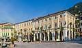
- Nomination Gable at Prinzipalmarkt 5, Münster, North Rhine-Westphalia, Germany --XRay 04:25, 13 October 2020 (UTC)
- Promotion Support Good quality.--Agnes Monkelbaan 04:35, 13 October 2020 (UTC)
-

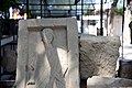
- Nomination Plaque at St Lambert's Church, Münster, North Rhine-Westphalia, Germany --XRay 04:25, 13 October 2020 (UTC)
- Promotion Support Good quality.--Agnes Monkelbaan 04:30, 13 October 2020 (UTC)
-

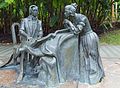
- Nomination Grave “Roth von Schreckenstein”, Überwasser cemetery, Münster, North Rhine-Westphalia, Germany --XRay 04:25, 13 October 2020 (UTC)
- Promotion Support Good quality -- Johann Jaritz 04:36, 13 October 2020 (UTC)
-

- Nomination Relief of coat of arms of the prince-bishop Christoph Andreas Freiherr von Spaur 1583 at the granary and barn building of the former bishop`s castle on Schlossweg #6, Straßburg, Carinthia, Austria -- Johann Jaritz 02:55, 13 October 2020 (UTC)
- Promotion Support Good quality. --XRay 04:26, 13 October 2020 (UTC)
-

- Nomination Memorial slab with figure in relief work of a knight in armor with banner and sword (16th century) at the lapidarium of the arcade yard of the former bishop`s castle on Schlosssweg #6, Straßburg, Carinthia, Austria -- Johann Jaritz 02:55, 13 October 2020 (UTC)
- Promotion Support Good quality. --XRay 04:26, 13 October 2020 (UTC)
-

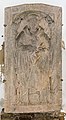
- Nomination Memorial slab of Egydius Willaner (died in 1506), canon in Straßburg, at the lapidarium of the arcade yard of the former bishop`s castle on Schlosssweg #6, Straßburg, Carinthia, Austria -- Johann Jaritz 02:55, 13 October 2020 (UTC)
- Promotion Support Good quality. --XRay 04:26, 13 October 2020 (UTC)
-
- Nomination Figural memorial slab of Mathias Plank (died in 1518) at the lapidarium of the arcade yard of the former bishop`s castle on Schlosssweg #6, Straßburg, Carinthia, Austria -- Johann Jaritz 02:55, 13 October 2020 (UTC)
- Promotion Support Good quality. --XRay 04:30, 13 October 2020 (UTC)
-
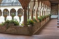
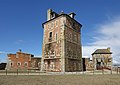
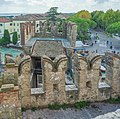
- Nomination Arcade yard of the former bishop`s castle on Schlossweg #6, Straßburg, Carinthia, Austria -- Johann Jaritz 02:55, 13 October 2020 (UTC)
- Promotion Support Good quality. --XRay 04:30, 13 October 2020 (UTC)
-

- Nomination Kiwanis Club, Cape May. --King of Hearts 01:32, 13 October 2020 (UTC)
- Promotion Support Good quality.--Agnes Monkelbaan 04:40, 13 October 2020 (UTC)
-
- Nomination Peter Shields Inn, Cape May. --King of Hearts 01:32, 13 October 2020 (UTC)
- Promotion Good quality --Llez 04:57, 13 October 2020 (UTC)
-

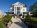
- Nomination Morning Star Villa, Cape May. --King of Hearts 01:32, 13 October 2020 (UTC)
- Promotion Support Good quality.--Agnes Monkelbaan 04:38, 13 October 2020 (UTC)
-

- Nomination View on the Brenta group in the Adamello Brenta nature reserve. --Lion-hearted85 00:42, 13 October 2020 (UTC)
- Promotion Support Good quality. --Podzemnik 00:59, 13 October 2020 (UTC)
-

- Nomination View on the Brenta group in the Adamello Brenta nature reserve. --Lion-hearted85 00:42, 13 October 2020 (UTC)
- Promotion Support Good quality. --Podzemnik 00:59, 13 October 2020 (UTC)
-

- Nomination Mountain creek in the trail towards Lake Carezza (South Tyrol). --Lion-hearted85 00:42, 13 October 2020 (UTC)
- Promotion Support Good quality. --Podzemnik 00:59, 13 October 2020 (UTC)
-

- Nomination Grazing cattle in the Adamello Brenta nature reserve. --Lion-hearted85 00:42, 13 October 2020 (UTC)
- Promotion Support Good quality. --Podzemnik 00:59, 13 October 2020 (UTC)
-

- Nomination Grottoes of Catullus in Sirmione. View towards Lake Garda during the golden hour. --Lion-hearted85 00:42, 13 October 2020 (UTC)
- Promotion Support Good quality. --Podzemnik 00:59, 13 October 2020 (UTC)
-

- Nomination Banksia spinulosa - flower, Christchurch Botanic Gardens --Podzemnik 00:41, 13 October 2020 (UTC)
- Promotion Support Good quality -- Johann Jaritz 02:57, 13 October 2020 (UTC)
-

- Nomination Banksia spinulosa - flower, Christchurch Botanic Gardens --Podzemnik 00:41, 13 October 2020 (UTC)
- Promotion Support Good quality -- Johann Jaritz 02:57, 13 October 2020 (UTC)
-

- Nomination Banksia spinulosa - flower, Christchurch Botanic Gardens --Podzemnik 00:41, 13 October 2020 (UTC)
- Promotion Support Good quality -- Johann Jaritz 02:57, 13 October 2020 (UTC)
-

-
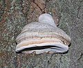
- Nomination Tinder fungus (Fomes fomentarius) (1) -- George Chernilevsky 22:54, 12 October 2020 (UTC)
- Promotion Support Good quality. --Podzemnik 01:04, 13 October 2020 (UTC)
-

- Nomination Tinder fungus (Fomes fomentarius) (2) -- George Chernilevsky 22:54, 12 October 2020 (UTC)
- Promotion Support Good quality. --Podzemnik 01:04, 13 October 2020 (UTC)
-

- Nomination Two tinder fungus (Fomes fomentarius) -- George Chernilevsky 22:54, 12 October 2020 (UTC)
- Promotion Support Good quality. --Podzemnik 01:04, 13 October 2020 (UTC)
-

- Nomination Stowmarket railway station --Sumitsurai 20:52, 12 October 2020 (UTC)
- Decline
 Oppose IMO too soft for the resolution provided --Podzemnik 01:04, 13 October 2020 (UTC)
-

- Nomination Storrow Drive, Boston. --King of Hearts 16:48, 12 October 2020 (UTC)
- Promotion Support Good quality. Nice colours and lighting! --Lion-hearted85 00:46, 13 October 2020 (UTC)
-

- Nomination Panorama of Boston Common. --King of Hearts 16:48, 12 October 2020 (UTC)
- Promotion Support Good quality. Very well done panorama. --Lion-hearted85 00:49, 13 October 2020 (UTC)
-

- Nomination Panorama of Longfellow Bridge, Boston. --King of Hearts 16:48, 12 October 2020 (UTC)
- Promotion Support Good quality. --Ermell 18:51, 12 October 2020 (UTC)
-

- Nomination 931 Beach Avenue, Cape May. --King of Hearts 16:48, 12 October 2020 (UTC)
- Promotion Support Good quality. --Ermell 18:51, 12 October 2020 (UTC)
-

- Nomination 937 Beach Avenue, Cape May. --King of Hearts 16:48, 12 October 2020 (UTC)
- Promotion Support Good quality. --George Chernilevsky 21:17, 12 October 2020 (UTC)
-

- Nomination Tomb of Bade khan - Delhi--Vijay Barot 16:36, 12 October 2020 (UTC)
- Decline Oppose distorted and blown sky --George Chernilevsky 21:15, 12 October 2020 (UTC)
-

-

- Nomination Portugal, Alcobaça, Mosteiro de Alcobaça --Berthold Werner 15:44, 12 October 2020 (UTC)
- Promotion Support Good quality. --George Chernilevsky 15:51, 12 October 2020 (UTC)
-

- Nomination Jameh Mosque of Yazd By User:SeyedTaha --Hanooz 14:06, 12 October 2020 (UTC)
- Promotion Support Good quality. --King of Hearts 17:12, 12 October 2020 (UTC)
-

- Nomination Kazem Dashi By User:Hosein.Kheiryfam --Hanooz 14:06, 12 October 2020 (UTC)
- Promotion Support Not the sharpest but adequate IMO. --King of Hearts 17:12, 12 October 2020 (UTC)
-

- Nomination Soccer, Flyeralarm Frauen-Bundesliga, Team photos FF USV Jena; Anna Weiß (FF USV Jena, 21) --Stepro 13:10, 12 October 2020 (UTC)
- Promotion Support Good quality. --George Chernilevsky 13:17, 12 October 2020 (UTC)
-

- Nomination Soccer, Flyeralarm Frauen-Bundesliga, Team photos FF USV Jena; Leonie Kreil (FF USV Jena, 11) --Stepro 13:10, 12 October 2020 (UTC)
- Promotion Support Good quality. --George Chernilevsky 13:17, 12 October 2020 (UTC)
-

-

- Nomination Soccer, Flyeralarm Frauen-Bundesliga, Team photos FF USV Jena; Julie Karn (FF USV Jena, 15) --Stepro 13:10, 12 October 2020 (UTC)
- Promotion Support Good quality. --George Chernilevsky 13:19, 12 October 2020 (UTC)
-

- Nomination Soccer, Flyeralarm Frauen-Bundesliga, Team photos FF USV Jena; Inga Schuldt (FF USV Jena, 31, goal keeper) --Stepro 13:10, 12 October 2020 (UTC)
- Promotion Support Good quality. --George Chernilevsky 13:19, 12 October 2020 (UTC)
-

- Nomination Metropolitan building of the university. Chernivtsi, Ukraine by user Андрій Жерновий -- George Chernilevsky 12:19, 12 October 2020 (UTC)
- Promotion Support Good quality. --Ermell 18:53, 12 October 2020 (UTC)
-

- Nomination Toilet with bidet aboard an Embraer Lineage 1000 at EBACE 2019, Palexpo, Switzerland --MB-one 11:12, 12 October 2020 (UTC)
- Decline Oppose The bidet is out of focus. --Augustgeyler 12:58, 12 October 2020 (UTC)
-

-

- Nomination IFA Simson S50 at Pfingsttreffen Pütnitz 2018 --MB-one 11:12, 12 October 2020 (UTC)
- Promotion Good quality --Michielverbeek 11:56, 12 October 2020 (UTC)
-

- Nomination 106 Rue Brancion, Paris 15 (by DXR) --Sebring12Hrs 11:02, 12 Octobre 2020 (UTC)
- Promotion Support Good quality. --Podzemnik 00:52, 13 October 2020 (UTC)
-
- Nomination Belvedere Palace, Vienna, Austria --Poco a poco 10:44, 12 October 2020 (UTC)
- Promotion Support Very pretty --Podzemnik 00:52, 13 October 2020 (UTC)
-

- Nomination Belvedere Palace, Vienna, Austria --Poco a poco 10:44, 12 October 2020 (UTC)
- Promotion Support Good quality. --George Chernilevsky 12:21, 12 October 2020 (UTC)
-

- Nomination Belvedere Palace, Vienna, Austria --Poco a poco 10:44, 12 October 2020 (UTC)
- Promotion Support Good quality. --George Chernilevsky 12:22, 12 October 2020 (UTC)
-

- Nomination Belvedere Palace, Vienna, Austria --Poco a poco 10:44, 12 October 2020 (UTC)
- Promotion Support Good quality. --George Chernilevsky 12:22, 12 October 2020 (UTC)
-

- Nomination Belvedere Palace, Vienna, Austria --Poco a poco 10:44, 12 October 2020 (UTC)
- Promotion Good quality. --Milseburg 11:10, 12 October 2020 (UTC)
-
- Nomination Vauban tower in Camaret-sur-Mer (Finistère, France). --Gzen92 10:25, 12 October 2020 (UTC)
- Promotion Support Good quality. --Augustgeyler 12:58, 12 October 2020 (UTC)
-

- Nomination Vauban tower in Camaret-sur-Mer (Finistère, France). --Gzen92 10:25, 12 October 2020 (UTC)
- Promotion Good quality. --Berthold Werner 10:59, 12 October 2020 (UTC)
-
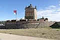
- Nomination Vauban tower in Camaret-sur-Mer (Finistère, France). --Gzen92 10:25, 12 October 2020 (UTC)
- Promotion Good quality. --Berthold Werner 10:59, 12 October 2020 (UTC)
-

-

- Nomination Roman Bridge of Cangas de Onís (Cangas de Onís, Asturias, Spain) --Javierm18 09:58, 12 October 2020 (UTC)
- Promotion Support Not very sharp, but very good composition. --Augustgeyler 12:58, 12 October 2020 (UTC)
-

- Nomination 10 Pfennig "Notgeld" banknote (1920) of Greiffenberg (Schlesien). --Palauenc05 09:50, 12 October 2020 (UTC)
- Promotion Good quality -- Spurzem 15:39, 12 October 2020 (UTC)
-

- Nomination Beef brisket sandwich at a western restaurant in Malaysia. --Vincent60030 09:52, 12 October 2020 (UTC)
- Promotion Can you add geographic coordinates? The name of the city would also be useful. In terms of the photo, I'd call it good quality, though I have a question: Why did you choose not to turn the plate around, so that the sharp sandwich could be in the foreground and the out-of-focus fries in the background? It's OK; I just wonder why. -- Ikan Kekek 10:19, 12 October 2020 (UTC)
 Question How do I add the geographic coordinates cuz I'm still a noob here haha @Ikan Kekek: . As for the sandwich thing, yea I did that for artistic purposes. Another reason is because the grilled cheese (another dish) is more prominent there hence why I chose this angle. --Vincent60030 11:17, 12 October 2020 (UTC)
 Done I’ve found out how to add haahhahaha --Vincent60030 15:40, 12 October 2020 (UTC)
Cool. Support Good quality. -- Ikan Kekek 23:08, 12 October 2020 (UTC)
-

- Nomination Bust of Gasparo da Salò in the town Hall Salò. --Moroder 09:41, 12 October 2020 (UTC)
- Promotion Support Great job Moroder! Good quality :) --Vincent60030 09:54, 12 October 2020 (UTC)
-
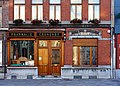
- Nomination Pharmacy, 6 place du Général-de-Gaulle in Wambrechies, France --Velvet 09:00, 12 October 2020 (UTC)
- Promotion Support Good quality. --Vincent60030 09:54, 12 October 2020 (UTC)
-

- Nomination Богородицкая церковь: Порез, Унинский район, Кировская областьЭто фотография памятника культурного наследия России c номеромЯ, владелец авторских прав на это произведение, добровольно публикую его на условиях следующей лицензии:Это изображение было загружено в рамках соревнования Вики любит памятники — 2020. --Ele-chudinovsk 08:35, 12 October 2020 (UTC)
- Decline Focus is not well done, it is not sharp enough --Michielverbeek 08:40, 12 October 2020 (UTC)
-

- Nomination Stained glass window of Hospice Gantois in Lille, France. --Velvet 08:33, 12 October 2020 (UTC)
- Promotion Beautiful window and a fine capture. If you have a bigger version, I'd like to see it. -- Ikan Kekek 10:24, 12 October 2020 (UTC)
-

- Nomination Statue of Louis Faidherbe, place Richebé, in Lille, France --Velvet 08:23, 12 October 2020 (UTC)
- Promotion Good quality --Michielverbeek 08:42, 12 October 2020 (UTC)
-

- Nomination eggs of - Oeufs de Mouette pygmée --Ercé 08:05, 12 October 2020 (UTC)
- Promotion Support Good quality. --George Chernilevsky 15:48, 12 October 2020 (UTC)
-

- Nomination "Closed centres, open dreams", by Freddy Tsimba (Royal Museum for Central Africa in Tervuren, Belgium) --Trougnouf 07:15, 12 October 2020 (UTC)
- Promotion Support Good quality. --Augustgeyler 08:01, 12 October 2020 (UTC)
-

- Nomination 2 Budowlana Street in Świdnica --Jacek Halicki 06:39, 12 October 2020 (UTC)
- Promotion
Good quality but should be better categorized (what and where) --Trougnouf 07:57, 12 October 2020 (UTC)@Trougnouf: Done--Jacek Halicki 17:31, 12 October 2020 (UTC) Support Good quality, thank you --Trougnouf 20:08, 12 October 2020 (UTC)
-

- Nomination 1 Rynek Square in Świdnica --Jacek Halicki 06:39, 12 October 2020 (UTC)
- Promotion Good quality, walking people don't disturb the composition --Michielverbeek 07:13, 12 October 2020 (UTC)
-

- Nomination Painting of two women by Anton Maria Mucchi in the town hall of Salò. --Moroder 06:31, 12 October 2020 (UTC)
- Promotion Good quality. --Jacek Halicki 06:42, 12 October 2020 (UTC)
-

- Nomination The Protestant Trinity Church in Neudrossenfeld --Ermell 06:11, 12 October 2020 (UTC)
- Promotion Good quality. --Jacek Halicki 06:42, 12 October 2020 (UTC)
-

- Nomination The Protestant Trinity Church in Neudrossenfeld --Ermell 06:11, 12 October 2020 (UTC)
- Promotion Good quality. --Jacek Halicki 06:42, 12 October 2020 (UTC)
-

- Nomination Cruise ship Anna Katharina on the MD channel in Bamberg. Direction Danube. --Ermell 06:11, 12 October 2020 (UTC)
- Promotion Good quality. --Jacek Halicki 06:42, 12 October 2020 (UTC)
-

- Nomination Cruise ship Anna Katharina on the MD channel in Bamberg. Direction Danube. --Ermell 06:11, 12 October 2020 (UTC)
- Promotion Good quality. --Jacek Halicki 06:42, 12 October 2020 (UTC)
-

- Nomination Hortus Haren. ‘Live Lines 3’. Artwork by Jeroen Boersma.
--Famberhorst 05:40, 12 October 2020 (UTC) - Promotion Support Good quality -- Johann Jaritz 05:54, 12 October 2020 (UTC)
- Nomination Hortus Haren. ‘Live Lines 3’. Artwork by Jeroen Boersma.
-

- Nomination Shell of a Grove snail, Cepaea nemoralis --Llez 05:24, 12 October 2020 (UTC)
- Promotion Good quality.--Famberhorst 05:34, 12 October 2020 (UTC)
-

- Nomination "Big Mutter" by Erwin Wurm (2015/16, Painted bronze, height about 4 m), Karlsruhe --Llez 05:24, 12 October 2020 (UTC)
- Promotion Good quality.--Famberhorst 05:35, 12 October 2020 (UTC)
-
- Nomination Town hall and Palazzo dei Magistrti in Salò. --Moroder 04:51, 12 October 2020 (UTC)
- Withdrawn Sorry, completely unsharp in the lower left corner --Llez 05:21, 12 October 2020 (UTC)
 I withdraw my nomination Thanks for the note --Moroder 07:31, 12 October 2020 (UTC)
-

- Nomination Painting of laundresses by Anton Maria Mucchi AD 1903 in the town hall of Salò. --Moroder 04:51, 12 October 2020 (UTC)
- Promotion Support There's some color noise in the painting. :-) Good quality. I'm sure the blue light on the door on the right is real. -- Ikan Kekek 06:03, 12 October 2020 (UTC)
 Comment Thanks for the review. I suspected color noise but at full size it disappears. Btw the camera settings were perfect and ISO 100. The room was pretty dark with several different light sources.--Moroder 06:37, 12 October 2020 (UTC) Comment I was joking! I was saying that the painting itself had color noise, not your photo. :-) -- Ikan Kekek 10:29, 12 October 2020 (UTC) Comment @Ikan Kekek: Brush noise! --Moroder 15:18, 12 October 2020 (UTC)
-

- Nomination Walking route along sand sculptures in the Kuinderbos-Flevoland. (A bridge too far).
--Agnes Monkelbaan 04:42, 12 October 2020 (UTC) - Promotion Support Good quality -- Johann Jaritz 05:53, 12 October 2020 (UTC)
- Nomination Walking route along sand sculptures in the Kuinderbos-Flevoland. (A bridge too far).
-

- Nomination Overgrown fairly wet habitat. Location, Stuttebosch in the lime valley. Friesland province.
--Agnes Monkelbaan 04:42, 12 October 2020 (UTC) - Promotion Support Good quality -- Johann Jaritz 05:53, 12 October 2020 (UTC)
- Nomination Overgrown fairly wet habitat. Location, Stuttebosch in the lime valley. Friesland province.
-

- Nomination Side view of the Nicolaaskerk (Hemelum) is a hall church built in 1668.
--Agnes Monkelbaan 04:42, 12 October 2020 (UTC) - Promotion Good quality --Llez 05:16, 12 October 2020 (UTC)
- Nomination Side view of the Nicolaaskerk (Hemelum) is a hall church built in 1668.
-

-

-

- Nomination Schlatenkees. --Tesla 00:06, 12 October 2020 (UTC)
- Promotion Support Good quality. --Lion-hearted85 00:58, 13 October 2020 (UTC)
-

- Nomination Zadni Staw Polski lake in Tatra Mountains, view from Szpiglasowa Pass --Jakubhal 16:37, 11 October 2020 (UTC)
- Promotion Support Good quality. --Augustgeyler 08:01, 12 October 2020 (UTC)
-

- Nomination Founders Memorial, Boston Common. --King of Hearts 04:54, 10 October 2020 (UTC)
- Promotion
Too dark --Poco a poco 07:55, 10 October 2020 (UTC) Fixed --King of Hearts 17:43, 10 October 2020 (UTC)
Would you please go one step further? --Poco a poco 09:00, 11 October 2020 (UTC) Fixed --King of Hearts 17:18, 12 October 2020 (UTC) Support Good quality. --Poco a poco 21:33, 12 October 2020 (UTC)
-

- Nomination: Fragment of a tombstone in the necropolis of Gorgippia. Anapa, Krasnodar territory --Александр Байдуков 18:13, 6 October 2020 (UTC)
- Review needed
-
- Nomination: Fragments of ancient tombstones in the necropolis of Gorgippia. Anapa, Krasnodar territory --Александр Байдуков 18:13, 6 October 2020 (UTC)
- Review needed
-

- Nomination: Cenotaph of Admiral A. I. Kruse At the Lutheran (German) cemetery in Kronstadt --Александр Байдуков 18:13, 6 October 2020 (UTC)
- Review needed
-

- Nomination: COA of Trogen. --PantheraLeo1359531 18:05, 6 October 2020 (UTC)
- Review needed
-

- Nomination: Dalmansporten, Visby. --ArildV 15:57, 6 October 2020 (UTC)
- Review
two dust spots on the sky at top left and top right --George Chernilevsky 17:44, 6 October 2020 (UTC)
-
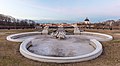
- Nomination: Frederic Chopin statue. Botanic Gardens. Central Region, Singapore. --Halavar 09:08, 6 October 2020 (UTC)
- Review
You cropped a portion at the bottom, fixable? --Poco a poco 11:42, 6 October 2020 (UTC)
-

- Nomination: Lauch lake from the reservoir (Haut-Rhin, France). --Gzen92 08:59, 6 October 2020 (UTC)
- Review needed
-

- Nomination: Penguins at Boulders Beach, Cape Town --Liridon 08:31, 6 October 2020 (UTC)
- Review strange object in lower left corner- limited detail--Virtual-Pano 10:40, 6 October 2020 (UTC)
Thanks, added another corrected version. --Liridon 12:12, 6 October 2020 (UTC)
-

- Nomination: Hietzinger Church, Vienna, Austria --Poco a poco 07:34, 6 October 2020 (UTC)
- Review Perspective correction needed, too tight crop below. -- Spurzem 11:40, 6 October 2020 (UTC)
-

- Nomination Assumption of the Blessed Virgin Church in Voznesenskaya Davidova Pustyn. Russia. --Bff 20:01, 5 October 2020 (UTC)
- Promotion
Tilted in ccw direction --Poco a poco 20:19, 5 October 2020 (UTC)
Adjusted. --Bff 12:45, 6 October 2020 (UTC) Support Good quality. --MB-one 07:21, 12 October 2020 (UTC)
-

- Nomination Protestant parish hall in Trogen. --PantheraLeo1359531 13:10, 5 October 2020 (UTC)
- Promotion Support Good quality. --MB-one 07:19, 12 October 2020 (UTC)
-
-
-

-
-

-

- Nomination: Santa Maria Annunziata church in Salò. --Moroder 05:21, 1 October 2020 (UTC)
- Review
The lighting is far from ideal (strong reflections below, underexposed top). It might work if you can recover some details on the top paintings. --Trougnouf 14:45, 6 October 2020 (UTC) Comment Light conditions in churches are not always optimal as you surely know. This is the best I could do. Thanks for the note --Moroder 16:45, 6 October 2020 (UTC)


.jpg)
.jpg)


.jpg)
.jpg)
.jpg)


.jpg)
.jpg)
.jpg)


.jpg)
.jpg)


_04.jpg)


._31-08-2020._(actm.)_04.jpg)
_03.jpg)
_20-07-2020._(actm.)_18.jpg)


.jpg)


.jpg)

.jpg)


Consensual review edit
File:Making_a_nail_01.jpg edit

- Nomination Blacksmithing demonstration at the farm museum Jexhof, Bavaria - Making a nail --Kritzolina 11:18, 11 October 2020 (UTC)
- Decline
- Oppose Not sharp enough, sorry. Even the tong is out of focus. --Peulle 13:17, 11 October 2020 (UTC)
- Support Good for me and interesting. Please discuss. -- Spurzem 16:10, 11 October 2020 (UTC)
- Oppose Blurred, subject not in focus --Jakubhal 04:00, 12 October 2020 (UTC)
- Oppose Good moment. But the hole image is unsharp due to motion blur. --Augustgeyler 07:33, 12 October 2020 (UTC)
- Oppose per others. Camera shake. --Smial 18:47, 12 October 2020 (UTC)
Total: 1 support (excluding the nominator), 3 oppose →  Declined --Augustgeyler 18:59, 14 October 2020 (UTC)
File:Church_in_Autumn.jpg edit

- Nomination St. Martin (Nörten-Hardenberg) in Autumn. --Tesla 06:48, 9 October 2020 (UTC)
- Decline
- Support Good quality. --Augustgeyler 07:39, 9 October 2020 (UTC)
- Oppose I think this is worth a discussion. It's not quite a silhouette, there's a lot of color noise, and the blurry leaves with borders are a really disturbing foreground. -- Ikan Kekek 08:35, 9 October 2020 (UTC)
 Info Thank you for the feedback, i'll fix theese issues soon. --Tesla 11:11, 9 October 2020 (UTC) Done removed color noise, but the leaves are intentional: The are like a natural frame to express the theme "autumn". --Tesla 17:16, 9 October 2020 (UTC)
 - Oppose Although intentional, the blurred foreground is awkward -- Basile Morin 06:29, 10 October 2020 (UTC)
- Comment in the guidelines there is only the rule, that "Objects in front of the subject shouldn't hide important elements", what isn't the case. But of course, I don't want to argue your vote! Maybe there are other votes?--Tesla - 💬 15:24, 10 October 2020 (UTC)
- Composition: "The arrangement of the elements within the image should support depiction of the subject, not distract from it. Foreground and background objects should not be distracting." These blurred leaves are just intrusive in my view. It could be anything like garment edge or a plastic bag -- Basile Morin 04:41, 11 October 2020 (UTC)
- Image title: "Church in Autumn". It's clear that this are maple leaves in autumn, so they support the image theme. "The arrangement of the elements within the image should support depiction of the subject", witch is the case in my oppinion. Without the leaves the theme of the image would be gone. Nobody would think of a plasic bag... --Tesla - 💬 08:48, 11 October 2020 (UTC)
- A plastic bag yes, a piece of cloth or a flag, anything of this kind, very possible in autumn too. This level of blurriness is absolutely awful in my opinion, and I find the foreground more than distracting: repulsive like a mistake -- Basile Morin (talk) 10:47, 11 October 2020 (UTC)
- Yeah, its abselutely likely that plenty of dark-yellow plastic bags and clothes are hanging from trees in autumn and I would have chosen them as a motif... ;) The discussion rounds in circles, I would appreciate more votes!— Preceding unsigned comment added by Tesla (talk • contribs)
- You have chosen this motif that gives me this impression exactly, sort of dirty bag or something strange orange and blurry that should definitely not be included within the frame. Regards -- Basile Morin (talk) 13:10, 11 October 2020 (UTC)
- Oppose I find the foreground elements too disturbing.--Peulle 13:32, 11 October 2020 (UTC)
- Oppose Per Peulle --Jakubhal 19:09, 11 October 2020 (UTC)
Total: 1 support (excluding the nominator), 4 oppose → Declined --Peulle 06:27, 14 October 2020 (UTC)
File:44-b Kamennoostrovsky Prospekt. Main building.jpg edit

- Nomination Wing: 44-b Kamennoostrovsky Prospekt, Petrogradsky district, Saint Petersburg --Александр Байдуков 02:30, 9 October 2020 (UTC)
- Decline
- Support Good quality. --Augustgeyler 21:46, 9 October 2020 (UTC)
- Oppose Overexposed sky and window at the right. --A.Savin 03:06, 10 October 2020 (UTC)
- Oppose per A.Savin. -- Ikan Kekek 08:12, 10 October 2020 (UTC)
- Oppose per A.Savin.--Peulle 13:34, 11 October 2020 (UTC)
Total: 1 support (excluding the nominator), 3 oppose → Declined --Peulle 06:27, 14 October 2020 (UTC)
File:Estergebirge_in_blau.jpg edit

- Nomination A Raven in front of the Estergebirge, covered in the blue cold of winter --Tesla 09:51, 8 October 2020 (UTC)
- Decline
- Support Good quality. --Augustgeyler 10:03, 8 October 2020 (UTC)
- Oppose
 Oversaturated. This electric blue is unrealistic, especially at this time of the day (12:51 according to the metadata). The first version was probably overprocessed, and the history clearly shows the saturation has been pushed excessively later on ("vignettierung, Farbton geändert" means "vignetting, hue changed"). This is a current nomination for the photo challenge "natural's blues" of this month (apparently more artificial than natural though), that has gained votes already. However it should not be promoted QI in state. Please read our guidelines (section Color): "Quality images must have reasonable colors" --Basile Morin 01:14, 10 October 2020 (UTC)
- Done I changed color temp to the original version and I can ensure you, that no other saturation corrections were made. It was just the color temp, but i've reverted this now. It was a winter day and with a long distance, objects seems to be blue. So it's a real natural blue.--Tesla 07:51, 10 October 2020 (UTC)
- The sky might be blue, not the snow (at 12:51) -- Basile Morin 23:52, 10 October 2020 (UTC)
- Oppose I apologize, but it's not believable to my eyes. The trees are also blue. It's also not really advantageous in a portrait of a raven for most of what we see to be so dark. -- Ikan Kekek 08:16, 10 October 2020 (UTC)
*thank you for your evaluation. I forgot, that i pushed the dust-removal slider so the blue color got stronger. The original is blue too, but not strong enough for me.--Tesla 08:55, 10 October 2020 (UTC)- I read the guidelines again, you didn't cite the whole phrase: "Quality images must have reasonable colors [...] Note that this does not necessarily mean natural colors." It's not exactly natural, but in my oppinion not oversaturated. When I took the picture, my impression was a blue landscape. To underline this, i pushed the dust-removal so the effect is clearer (see my last revision of the file). Therefore, I open the discussion again.--Tesla 16:28, 10 October 2020 (UTC)
- Comment You are absolutely right. That's why I think this image is defiantly QI. --Augustgeyler 21:49, 10 October 2020 (UTC)
- Comment I don't consider the colors reasonable. -- Ikan Kekek 23:43, 10 October 2020 (UTC)
- Oppose per Basile.--Peulle 13:25, 11 October 2020 (UTC)
- Oppose Unnatural colors --Jakubhal 05:14, 12 October 2020 (UTC)
- Oppose No resonable colors. --Milseburg (talk) 10:42, 12 October 2020 (UTC)
Total: 1 support (excluding the nominator), 5 oppose → Declined --Peulle 13:07, 14 October 2020 (UTC)
File:Bienenfresser_übergibt_Beute_im_FFH-Gebiet_Kaiserstuhl.jpg edit

- Nomination Two European Bee-eaters (Merops apiaster) looking like one feeding the other in the special area of conservation Kaiserstuhl. By User:Hwbund --Tomer T 08:26, 8 October 2020 (UTC)
- Promotion
- Support Good quality -- Spurzem 08:35, 8 October 2020 (UTC)
- I think that Smial got a point here Poco a poco 21:18, 11 October 2020 (UTC)
- Support Good quality, especially because it's a difficult motif -- Tesla 07:51, 10 October 2020 (UTC)
- Support We allow images down to 2 MPixels if it is difficult to take the photo. This has about 20 Mpixels and has really minor flaws, only to be detected f the viewer is pixelpeeping. Viewed in A3 size there is no visible unsharpness. Some colour channel clipping in small, bright highlights is tolerable. --Smial 13:12, 11 October 2020 (UTC)
Total: 3 support (excluding the nominator), 0 oppose →  Promoted --Augustgeyler (talk) 08:59, 14 October 2020 (UTC)
File:Riga_Landmarks_67.jpg edit

- Nomination Latvian National Theatre entrance pinnacle sculpture with Riga COA --Scotch Mist 05:47, 6 October 2020 (UTC)
- Promotion
- Comment Thank you for your review - have attempted to sharpen and forwarded for other opinions --Scotch Mist 09:26, 6 October 2020 (UTC)
- Comment It is sharper. Are those green CAs on the left and right? -- Ikan Kekek 05:45, 8 October 2020 (UTC)
- Comment @Ikan Kekek: The areas to which I think you are referring have not been 'processed' and exist on the original image - it appears that the 'light green' aged copper roof cladding, which is clearly visible along roof edges (also in the photos of others), is also probably the source of reflected 'colour' into some of the neighbouring shadows --Scotch Mist 09:39, 8 October 2020 (UTC)
- Comment OK, cool. I still feel the sharpness is marginal and not good enough. Let's see what others think, as I hope there will be other opinions. -- Ikan Kekek 11:08, 8 October 2020 (UTC)
- Comment @Augustgeyler: Your comment of 'very low detail' seems quite subjective, or do you have photos you can reference that were taken after restoration work was carried out that shows such detail? (If anything, in slightly sharpening without noise reduction I was more concerned with perhaps creating artificial detail rather than removing it!:) --Scotch Mist 09:39, 8 October 2020 (UTC)
- Comment I am with you. I see what you mean. But in real live even the best renovated façades of buildings have a visible structure at the surface caused by the plaster used to build it. That's what I can not find here. --Augustgeyler 21:55, 8 October 2020 (UTC)
- Comment @Ikan Kekek: @Augustgeyler: Reluctant as I am in general to post-process images, I have attempted to sharpen this image further in order to seek out your opinions as to whether further increased sharpening has been effective or has comprised QI? (This should help me to decide whether in such instances it is advisable to engage in post-processing to improve the quality of images or not!:) --Scotch Mist 17:44, 10 October 2020 (UTC)
 Neutral It improved: pre-processiong resolution could be a bit higher and noise a bit lower. But it shows more detail now. --Augustgeyler 21:57, 10 October 2020 (UTC)
- Comment I think it's a bit oversharpened now, as most clearly shown by the textures of the golden areas. See if you can reach a happy medium by dialing back the sharpening just a bit. -- Ikan Kekek 06:37, 11 October 2020 (UTC)
- Comment @Ikan Kekek: Thank you for your patience through repeated reviews but am struggling to find a compromise that would seemingly satisfy both sets of opinions expressed here - perhaps all I can add is that possibly the gold surfaces are not quite as smooth and regular as one might suspect (as best I can judge from limited third-party photos!:) --Scotch Mist 17:39, 12 October 2020 (UTC)
- Support Current version looks fine to my eye (full-screen on a calibrated 34-inch 4K monitor). With the sun at that angle, surface detail would be harder to pick out, but I do see texture in a number of places (cracks in the paint, a slightly rougher surface around the flower pattern in the columns, a sculpted look to the faces at the top). The shadows have possibly been pushed a little far, as the noise in the shade is higher, but this is only visible at 100% (which requires getting absurdly close). Overall I'd say that the exposure looks good, composition is clean, the colour appears natural, and the detail is sufficient. --Bobulous 20:58, 12 October 2020 (UTC)
- Comment I still don't like the golden areas, but at this point, I'm going to abstain and leave the decision up to others. -- Ikan Kekek 23:15, 12 October 2020 (UTC)
Total: 1 support (excluding the nominator), 0 oppose → Promoted --Augustgeyler 04:30, 15 October 2020 (UTC)
File:Burial_ground_crypt_Town_of_the_dead_Dawn.jpg edit

- Nomination North Ossetia. The Village Of Dargavs. Dawn over the necropolis of the 14th-18th century. Above-ground tombs --Александр Байдуков 19:28, 5 October 2020 (UTC)
- Decline
- Support Good quality. -- Bwag 21:19, 5 October 2020 (UTC)
- Oppose I disagree. Large areas of the mountain are blown. -- Ikan Kekek 07:36, 6 October 2020 (UTC)
 Weak oppose I love that composition but have to vote with Ikan. --Augustgeyler 14:22, 10 October 2020 (UTC)
- Weak oppose there is a better version nominated which is a QI. --Tesla 17:03, 11 October 2020 (UTC)
Total: 1 support (excluding the nominator), 3 oppose → Declined --Peulle 06:25, 14 October 2020 (UTC)